CLEAN-UP ON AISLE FIVE
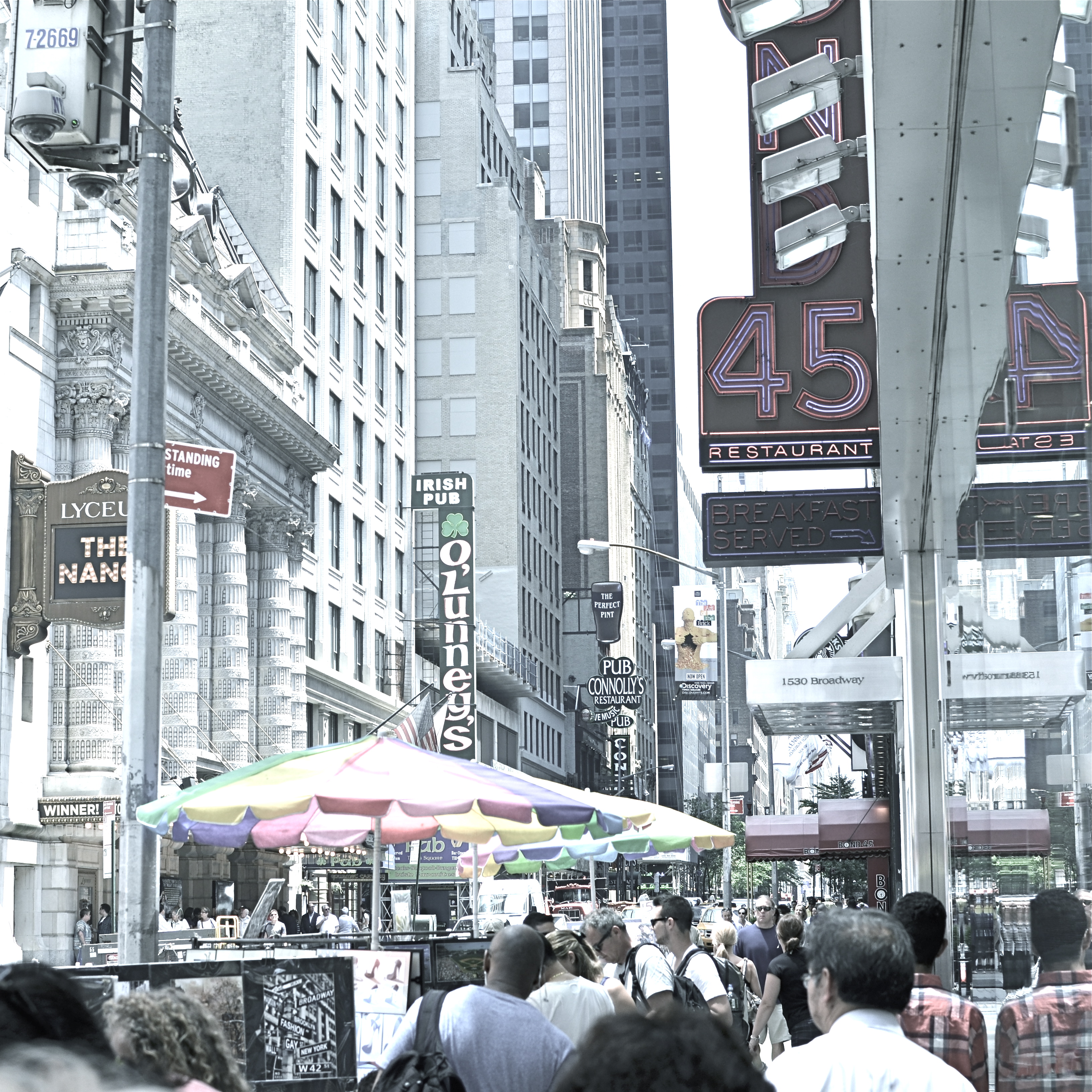
A post-processed “color compromise” of the image below. 1/320 sec., f/5.6, ISO 100, 35mm.
By MICHAEL PERKINS
TAKE ENOUGH PHOTOGRAPHS AND YOU WILL DEVELOP YOUR OWN SENSE OF “SIMPLICITY”. That is, you will arrive at your own judgement about how basic or complex a composition you need in a given situation. Some photographers are remarkable in their ability to create images that contain a mad amount of visual information. Some busy city scenes or intricate landscapes benefit wonderfully from an explosion of detail. Other shooters render their best stories by reducing elements to a bare minimum. And of course, most of us make pictures somewhere in the vast valley between those approaches.
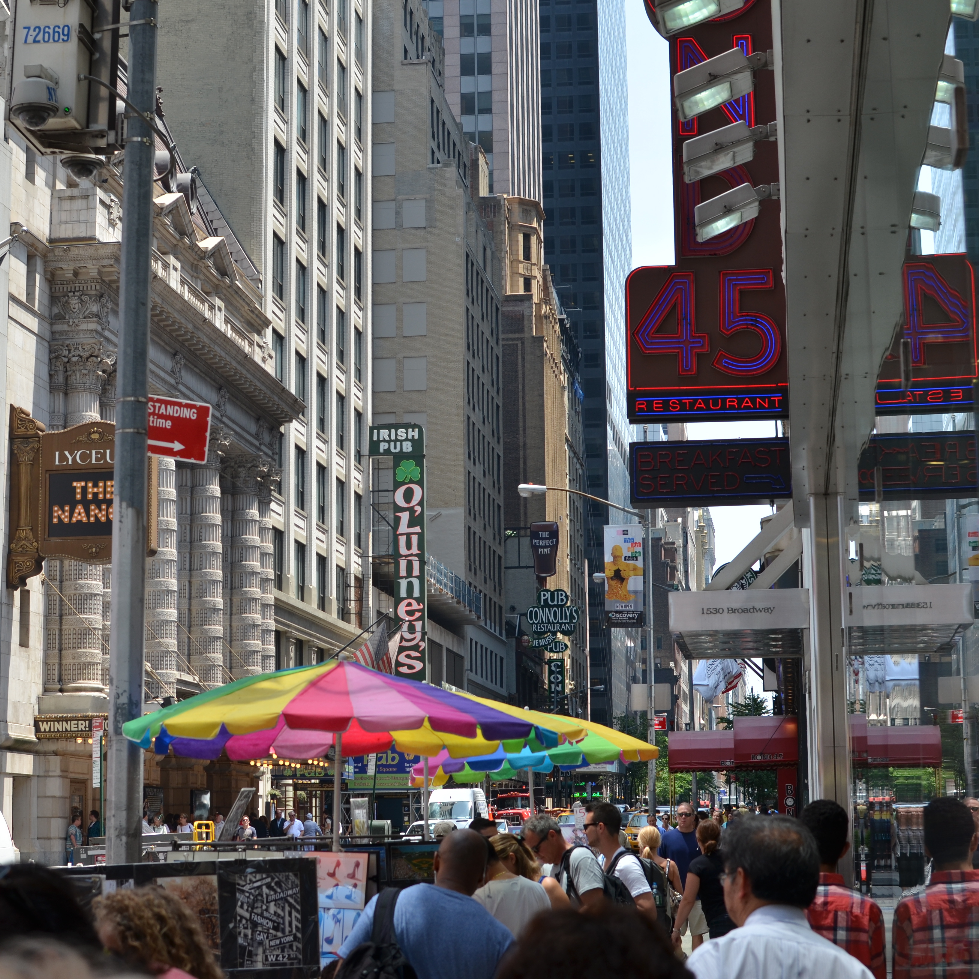
Before the fiddling ensued.
I’m pretty accustomed to thinking of overly-busy pictures as consisting of a specific kind of “clutter”, usually defined as cramming too many objects or people into a composition. But I occasionally find that color can be a cluttering element, and that some very visually dense photos can be rendered less so by simply turning down hues, rather than rooting them out completely. Recently I’ve been taking some of the pictures that seem a little too “overpopulated” with info and taking them through what a two-step process I call a color compromise (patent not applied for).
First step involves desaturating the picture completely, while also turning the contrast way down, amping up the exposure and damn near banishing any shadows. This almost results in a bleached-out pencil drawing effect and emphasizes detail like crazy. Step two involves the slow re-introduction of color until only selected parts of the image render any hues at all, and making sure that the color that is visible barely, barely registers.
The final image can actually be a clearer “read” for your eyes than either the garish colored original or a complete b&w. Objects will stand out from each other a little more distinctly, and there will be an enhanced sensation of depth. It also suggests a time-travel feel, as if age has baked out the color. A little of this washed-out jeans look goes a long way, however, and this whole exercise is just to see if you can make the picture communicate a little better by allowing it to speak more quietly.
Compare the processed photo at the top, taken in the heart of the visually noisy Broadway district, with its fairly busy color original and see if any of this works for you. I completely stipulate that I may just be bending over backwards to try to salvage a negligible photo. But I do think that color should be a part of the discussion when we fault an image for being cluttered.

Leave a comment