THE FLOATING 50
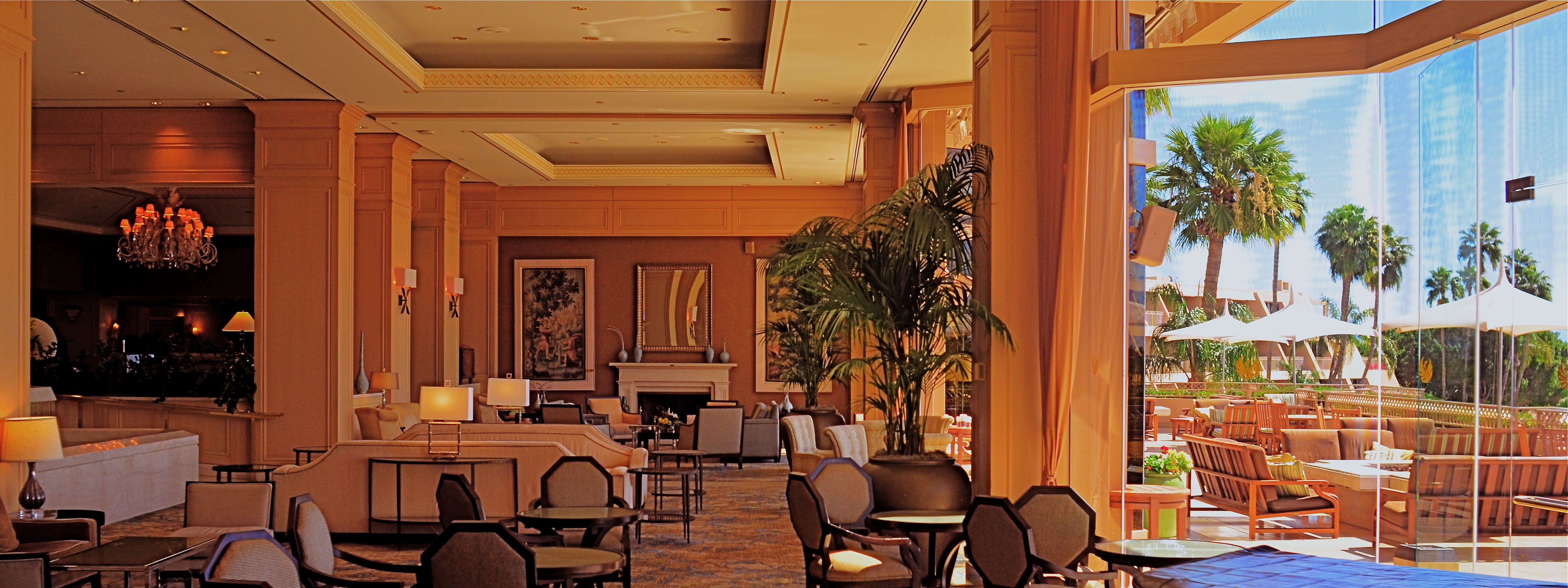
From Lobby To Terrace, 2015. A near 50% crop from the original, seen below at left.
By MICHAEL PERKINS
YOU CANNOT BECOME A GREAT PHOTOGRAPHER WITHOUT BEING YOUR OWN BEST EDITOR, no matter how brilliant or instinctual your shooter’s eye may be. Art is both addition and subtraction, and the image frame is about both inclusion and exclusion. You get your viewers’ attention by knowing what to show. You hold that attention, and burn your images into their minds, by learning what to pare away.
I’ve written several variations on this theme, so the best way to restate it is in the voice of the truly visionary godfather of street photography, Henri Cartier-Bresson. Ironically, this master of in-camera composition (he is reputed never to have cropped a single shot after it was taken) was nonetheless remarkably aware of what most of us must do to improve an image through post-editing:
This recognition, in real life, of a rhythm of surfaces, lines, and values is for me the essence of photography; composition should be a constant of preoccupation, being a simultaneous coalition – an organic coordination of visual elements. We must avoid snapping away, shooting quickly and without thought, overloading ourselves with unnecessary images that clutter our memory and diminish the clarity of the whole.
Insert whatever is French for “Amen” here.
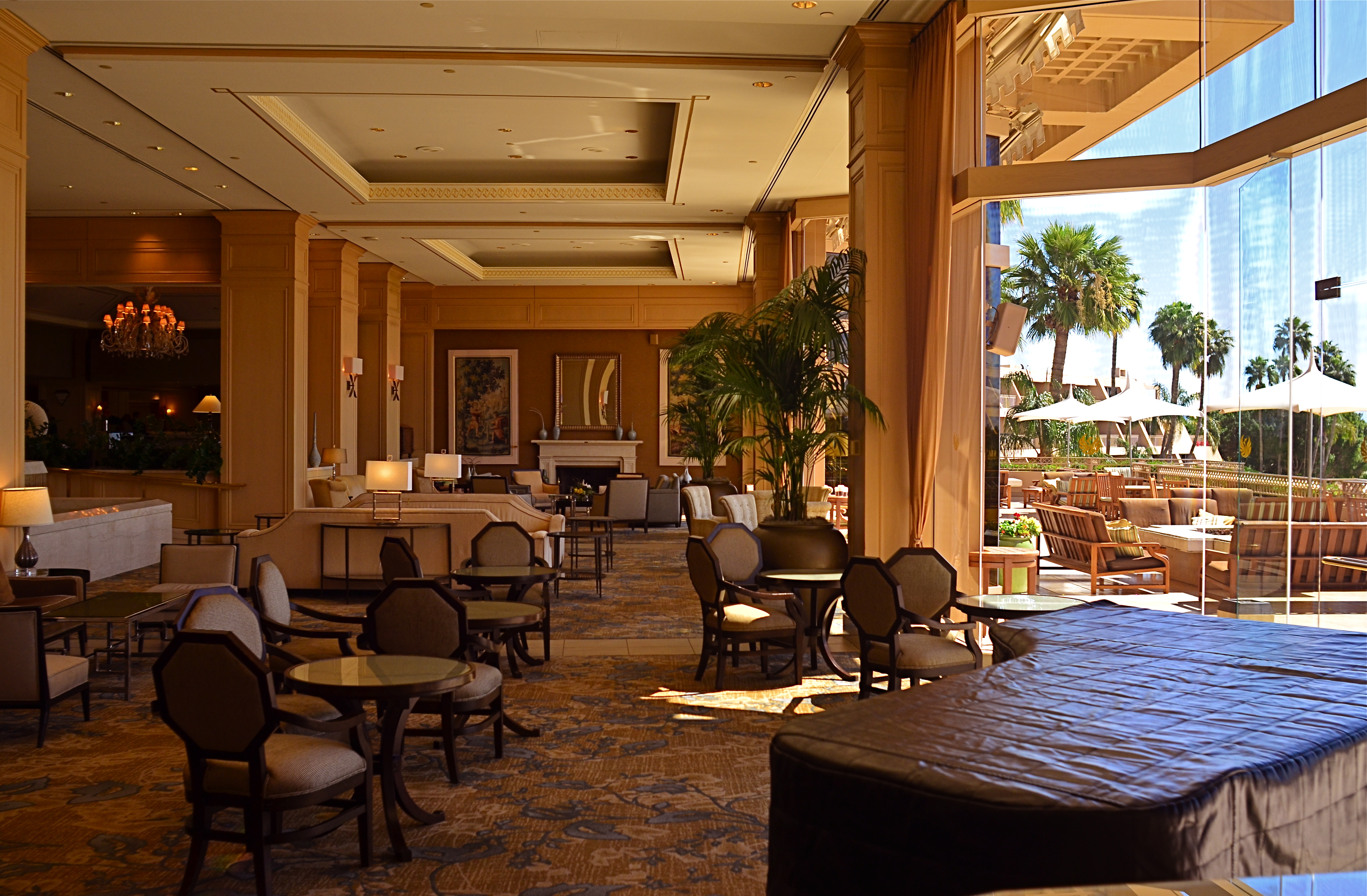
The original. It’s easy to see what needs to be cut out of this one.
I often find that up to 50% of some of my original shots can later be excised without doing any harm to the core of the photograph, and that, in many cases, actually improving them. Does that mean that my original concept was wrong? Not so much, although there are times when that’s absolutely true. The daunting thing is that the 50% floats around. Sometimes you need to cut the fat in the edges: other times the dead center of the shot is flabby. Sometimes the 50 is aggregate, with 25% trimmed from two different areas of the overall composition.
On occasion, as with the above picture (see the original off to the left), the entire bottom half of the shot drags down the top. In the cropped shot, the long lateral line between indoors and outdoors is much more unbroken, making for a more “readable” shot from left to right. The disappearance of the dark furniture at the bottom of the master shot creates no problems, and actually solves a few. Do a disciplined search of the nobler near-misses in your own work and see how many floating 50’s you discover. Freeing your shots of the things that “clutter our memory and diminish the clarity of the whole” is humbling, but it’s also a revelation.

Leave a comment