BACKING OFF, BACKING AWAY
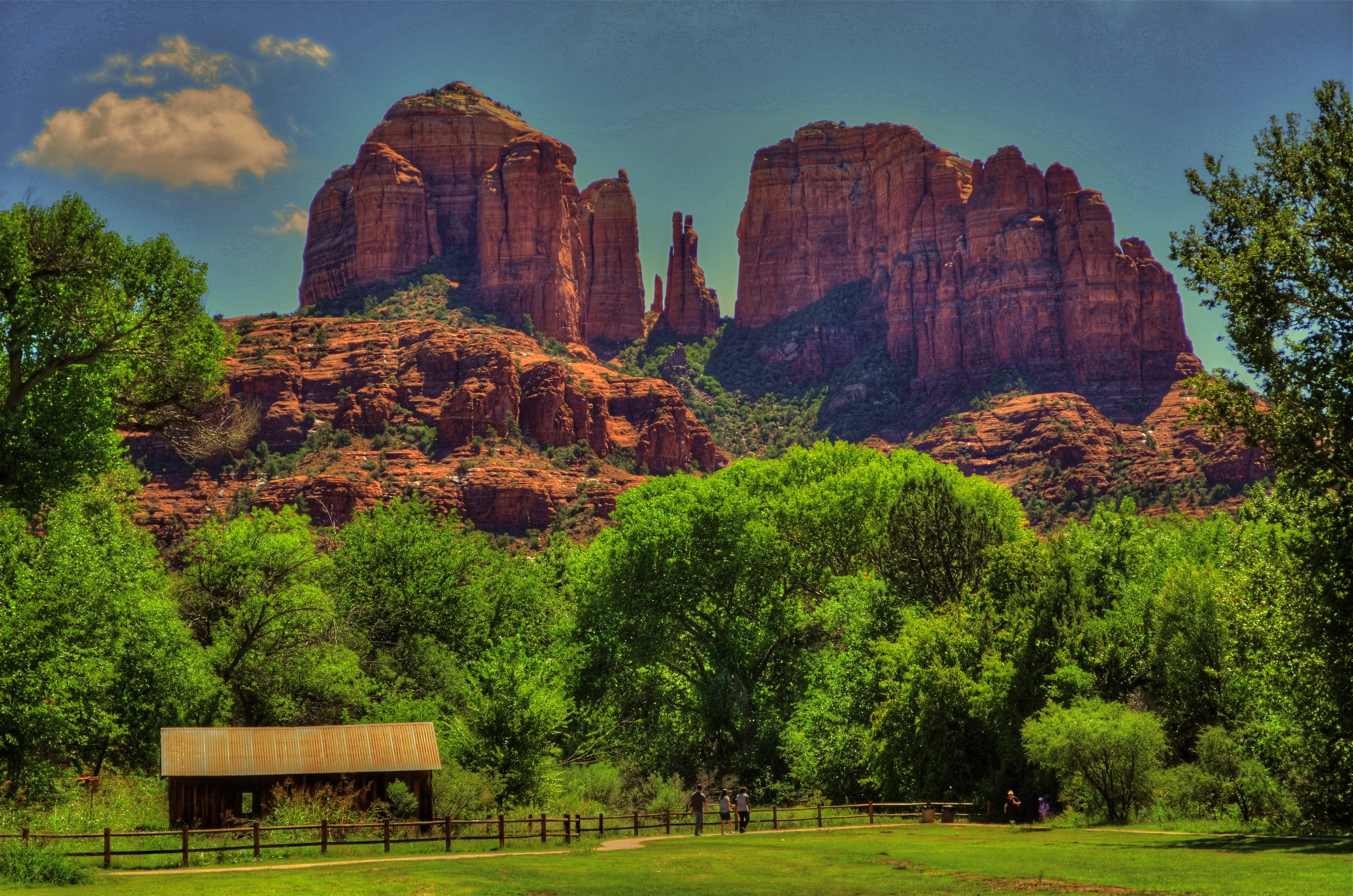
An early case of HDR madness on your humble author’s part. Yeah, nothing in nature looks like this. Ever.
By MICHAEL PERKINS
YOU MAY HAVE HEARD THE JOKE ABOUT THE COUNTRY PARSON WHO WAS IN THE HABIT of writing, in the margins of his sermon script, “Argument weak here. Scream like hell.” If he were a man of the camera instead of a man of the cloth, this instruction might have read, “photograph ineffective here. Over-cook everything.”
Choose your favorite post-editing workflow and chances are that you, or someone like you, have tried to rescue an indifferent image by pouring a few gallons of digital gravy over it, hoping to turn flank steak into filet. And you probably have your own personal folder of shame for the results of such attempts. Mine would fill up a small bookshelf. In the Library of Congress.
One of the hallmarks of the early digital age seems to be an affection for over-saturated color, as if we had had quite enough of natural tones, thank you, and were desperate to return to the earliest days of photographic color, when everything was played on the loud pedal. It’s kind of perverse, but it seems like, as soon as photographers outdistance an old technical barrier, they seem to get nostalgic for it and try to revive it. Why resuscitate daguerreotypes, pinhole cameras, high grain slow films, etc. Irony? Curiosity? Novelty? Who knows?
Whatever the motivation, the result has been a cornucopia of mobile apps that aim for an unnatural distortion of color values (spend ten minutes on Instagram for as many samples as you want) and the lo-fi or lomography movement toward cheap plastic toy cameras that can’t help but deliver hyped up hues (again, Instagram). There are also a number of HDR programs which tend to tempt people beyond their endurance when it comes to electrifying color even in an image’s shadows, making everyday like a day-glo version of your uncle’s golf togs and resulting in some pretty hideous excess (and yet, alas, such was I. See left).
What’s the new normal? Again, can’t tell you. It’s pretty certain, though, that we love cranking the color up to 11, whether it serves the photo or not. Backing off and backing away on the hue-mongous overkill takes real discipline. The amped-up image is fascinating in some kind of moth-to-the-flame way, but eventually it becomes like any other excess, in that it stifles, rather than frees, your art. No effect is so miraculous as to work in every situation. Eventually, it’s about what you’re seeing and saying.

Leave a comment