GOING NEGATIVE
Negative space is your best friend when trying to establish scale.
By MICHAEL PERKINS
I got plenty of nothin’, and nothin’s plenty for me. —Ira Gershwin, Porgy and Bess
I BELIEVE THAT MANY PHOTOGRAPHS ARE IMPROVED BY THE SIMPLEST OF MATH OPERATIONS: addition and subtraction. Look at nearly any image you’ve created that “worked” and you can see that there is not one more thing in the image than there needs to be. Something told you to either supply or eliminate elements in the composition until the impact of the picture was maximized. Realizing the reverse effect is pretty easy as well, although not as much fun. If there is one tree too many or one object too few in the frame, you can sense the imbalance in your near-miss pictures. And man, does that hurt.
 We used to refer to open areas of a picture as “blank” space, and were often talked out of using it at all by various A-B-C composition tutorials that told us that large expanses of sky could kill a good landscape. Today, we refer to this unused real estate as “negative” space, but we are now more inclined to see it as well, a positive thing. The take-home from this is, simply, that no technique should be universally ruled out, or ruled in, for every image. Truth is, there are times when not filling the frame with stuff, or selectively making use of negative space boosts the wattage of what you’re trying to say.
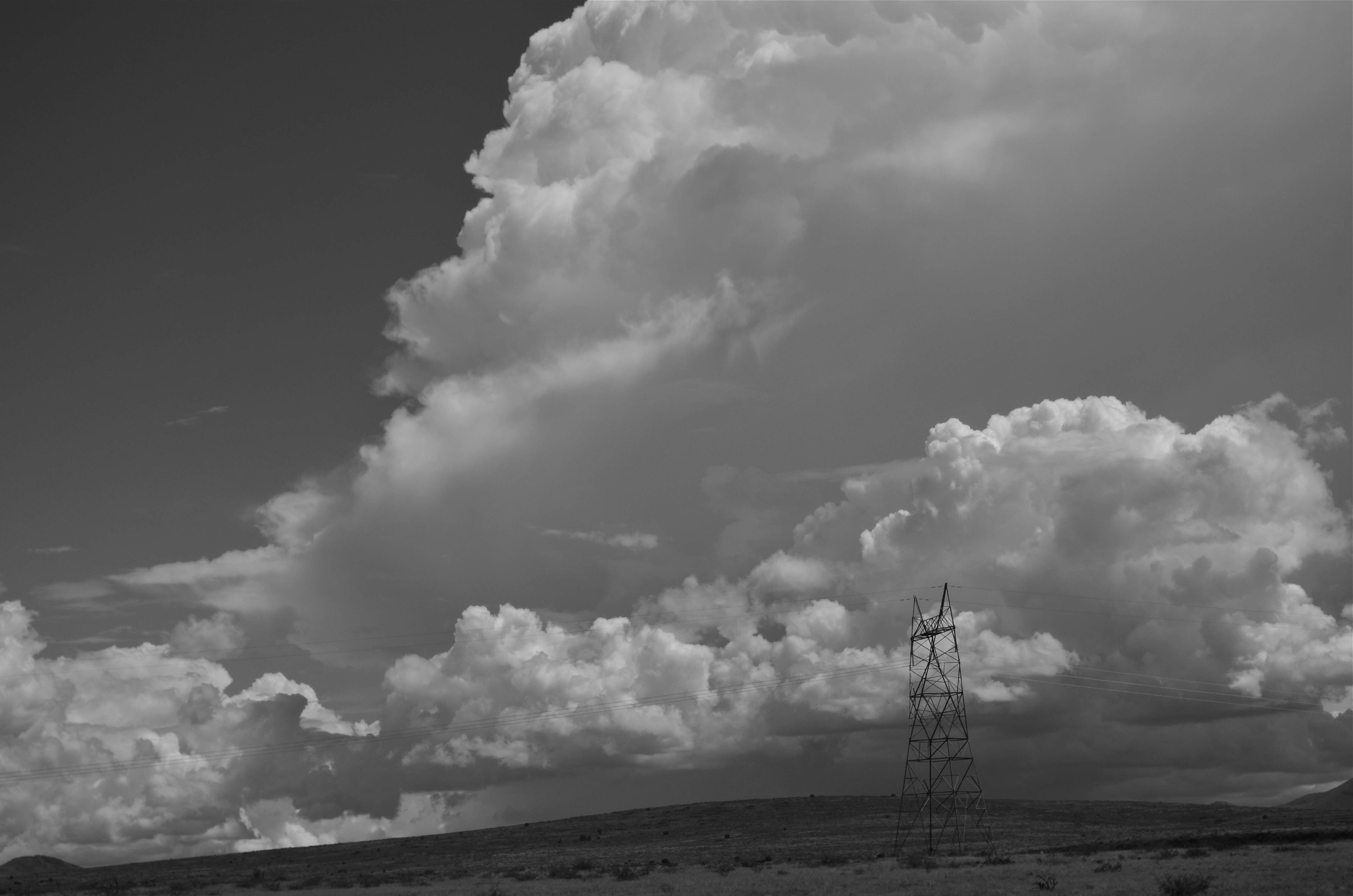
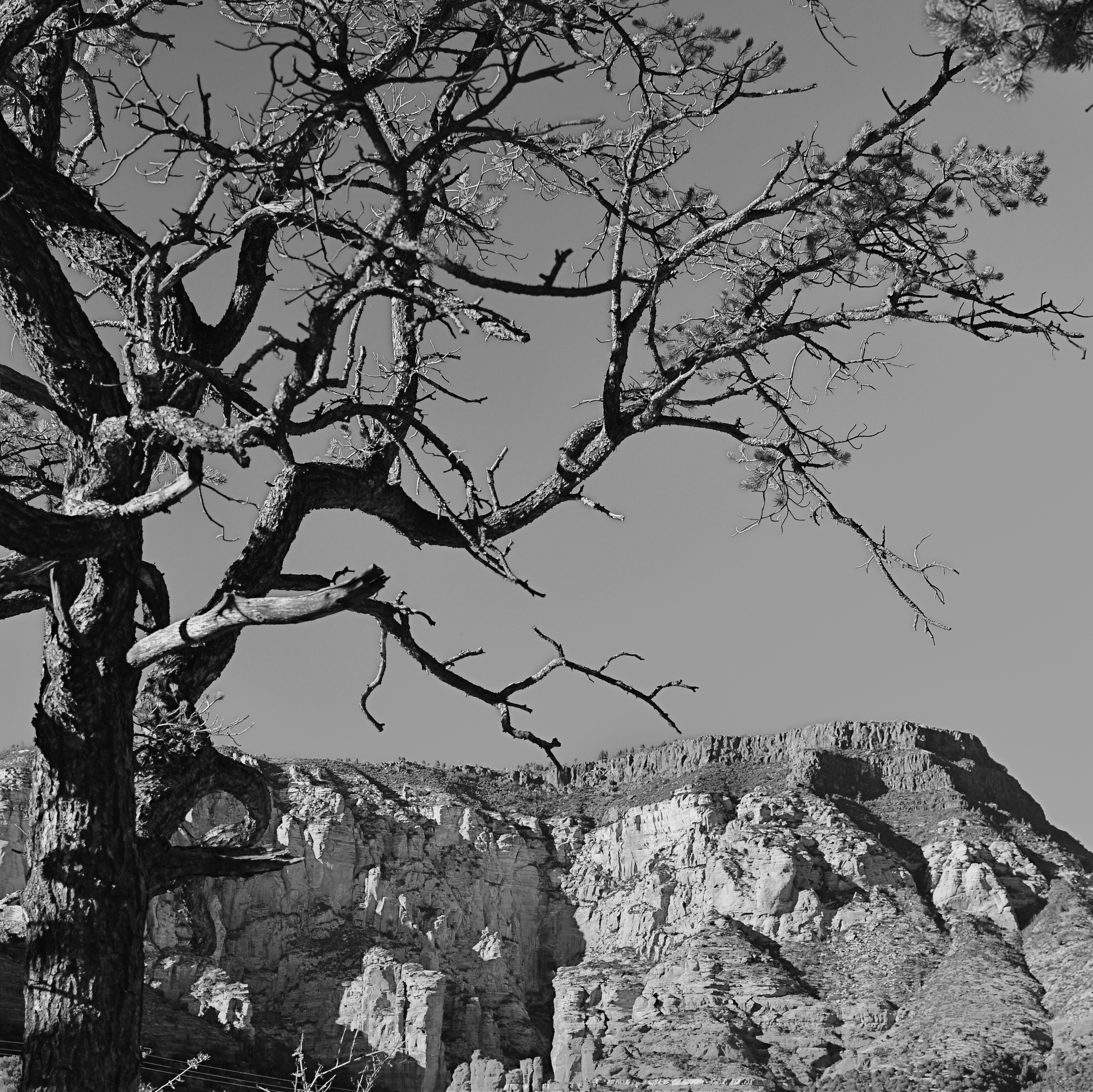
Instead of “negative” space, I prefer the term “secondary space”, since what you’re really doing is mapping your pictures into zones of the things that should be of primary interest and those that should complement those things without competing with them. Landscapes are the easiest way to demonstrate this. In the image at left, I wanted to accentuate the distance between the foreground tree and the background mountain. Framing the two elements to merely overlap gave no sense of space, and, in color, actually made the photo busy and hard to read. There seemed to be no primary object in the frame. Composing so that some sky intervened to the right of the tree and the top of the mountain re-established the sense of distance and kept the textures of both objects from fighting with each other.
Secondary space need not be empty. It can take the form of a texture, be it a body of water, cloud formations, a flooring pattern, or a stone wall. The idea is to use the space to support, but never upstage the primary space. Sometimes what you need to complete an image is nothing. You just have to stick the nothing in the right place.

That’s nice, It looks dramatic.
April 15, 2015 at 6:46 AM