ADDITION BY SUBTRACTION
By MICHAEL PERKINS
PHOTOGRAPHIC COMPOSITION IS A CONSCIOUS PRIORITIZING OF EVERYTHING WITHIN A PICTURE’S FRAME, a ruthless process of demanding that everything inside that square justify its presence there. When we refer to the power of an image, we are really talking about the sumtotal of all the decisions that were made, beforehand, of what to include or lose in that image. Without that deliberate act of selection, the camera merely records everything it’s pointed at. It cannot distinguish between something essential and something extraneous. Only the human eye, synched to the human mind, can provide the camera with that context.
Many of our earliest photographs certainly contain the things we deem important to the picture, but they also tend to include much too much additional information that actually dilutes the impact of what we’re trying to show. In one of my own first photos, taken when I was about twelve, you can see my best friend standing on his porch…absolutely…..along with the entire right side of his house, the yard next door, and a smeary car driving by. Of course, my brain, viewing the result, knew to head right for his bright and smiling face, ignoring everything else that wasn’t important: however, I unfairly expected everyone else, looking at all the auxiliary junk in the frame, to guess at what I wanted them to zero in on.
Heritage, 2016.
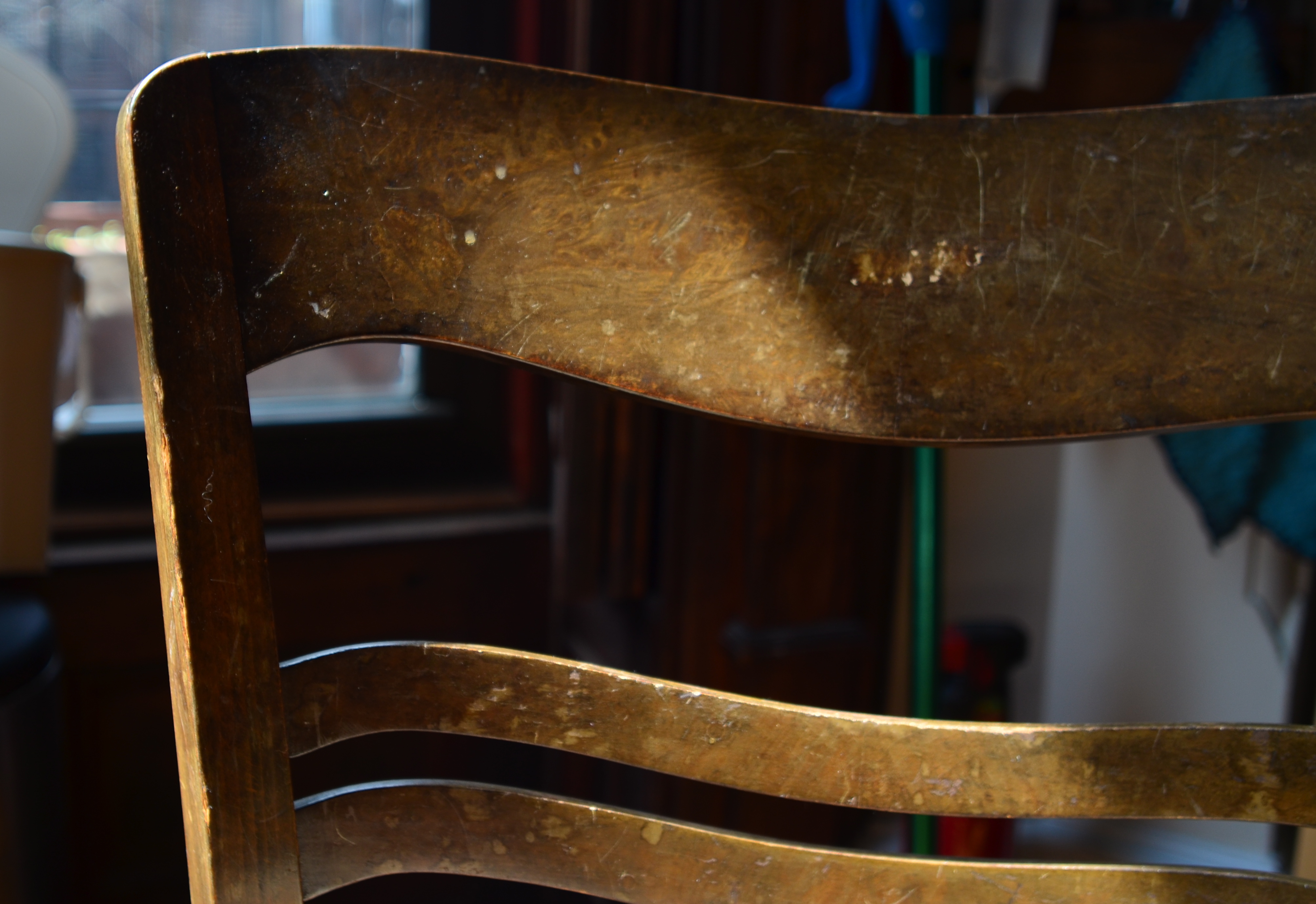
Jump forward fifty years or so, to my present reality. I actively edit and re-edit shots before they’re snapped, trying to pare away as much as I can in pictures until only the basic storytelling components remain….that is, until there is nothing to distract the eye from the tale I’m attempting to tell. The above image represents the steps of this process. It began as a picture of a worn kitchen chair in a kitchen, then the upper half of the chair near part of a window in the kitchen, and then, as you see above, only part of the upper slats of the chair with almost no identifiable space around them. That’s because my priorities changed.
At first, I thought the entire kitchen could sell the idea of the worn, battered chair. Then I found myself looking at the sink, the floor, the window, and…oh, yeah, the chair. Less than riveting. So I re-framed for just the top half of the chair, but my eye was still wandering out the window, and there still wasn’t enough visible testimony to the 30,000 meals that the chair had presided over. So I came in tighter, tight enough to read the scratches and discolorations on just a part of the chair’s back rest. They were eloquent enough, all by themselves, to convey what I wanted, without the rest of the chair or anything else in the room to serve as competition. So, in this example, it took me about five trial frames to teach myself where the picture was.
And that’s the point, although I still muff the landing more often than I stick it (and probably always will). To get stronger compositions, you have to ask every element in the picture, “so what do you think you’re doing here?” And anyone who doesn’t have a good answer….off to the principal’s office.

Leave a comment