WHEN AND WHERE FOR WHAT AND WHY
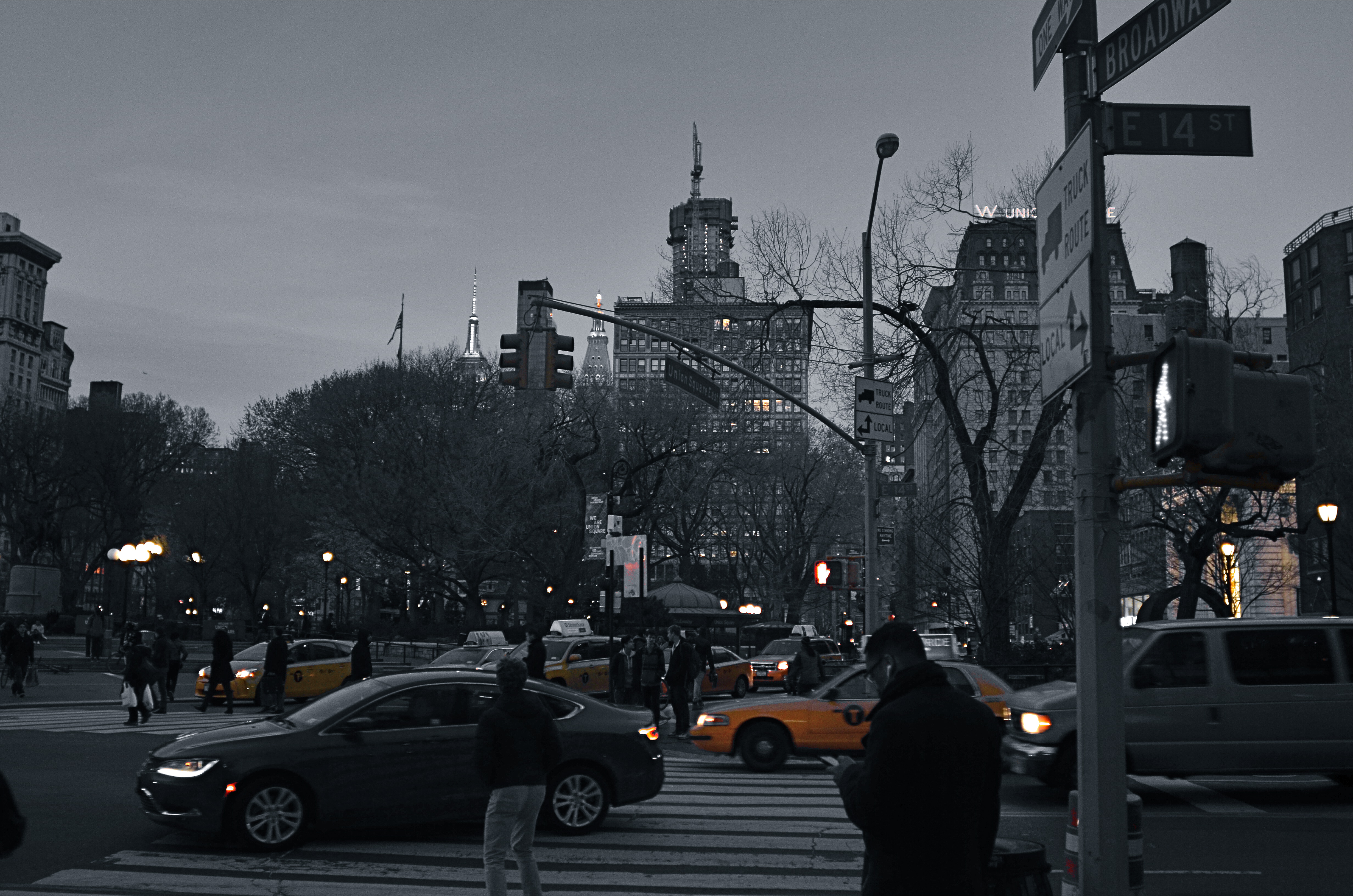
Manhattan yellow cabs in a grey street scene. A classic selective desaturation effect.
By MICHAEL PERKINS
THE SHEER NUMBER OF PHOTOGRAPHERS IN THE WORLD pretty much insures that not too many of us are artistically, um, unique. If there was ever a time in the history of the medium when it was nearly impossible to develop a style free of influence (good or bad), it’s now.
That doesn’t make originality impossible. But it does mean that, when one of us evolves a new way of doing things, the speed of adoption means there’s about a half a global second before innovation becomes cliche. And the worldwide online community likewise switches its evaluation of an idea from “brilliant!!” to “hackneyed” within an ever shorter cycle.
One of the tricks that only really came to the fore in the early days of digital editing is the look of selective de-saturation of color. The technique was originally met with great enthusiasm, but to hear the wags that whine and howl around the web, you should now sooner be caught dead rather than use it.
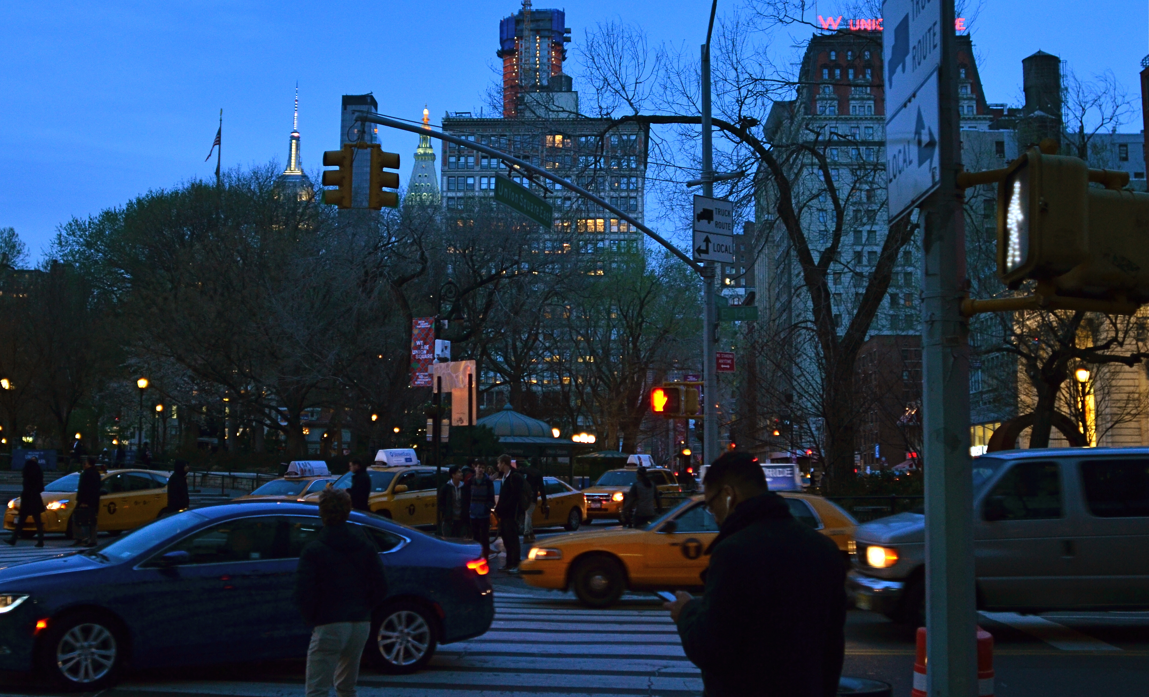
Same scene as above, in natural color. Which version sells the story the best?
Only, it’s not a given technique, per se, that becomes a drag, only its over-use or abuse. Think of canvas art for a moment. No one ever complains that “everybody uses oils to paint!” because it ain’t the pigment that separates the greats from the grunts. It’s what you do once you pick up that brush.
I steer away from partially desaturated shots because, while they can be real attention -getters, I myself don’t encounter many instances where I feel that they will actually help one of my pictures work better. The choice between monochrome and full color is, itself, fraught with a lot of mental measurement, meaning that you have a 50/50 chance in the making of an image to choose the wrong way to make it. Then there are color to b&w conversions, some of which really destroy the power of a photo. All this is before we get into the rather exotic decision of whether to make a picture “part” color.
Let’s say that there’s something to be gained by killing off all but the signature Manhattan cab yellow, as seen in the top image of NYC’s Union Square. Okay. It’s certainly technically easy to bring that off, but first you have to get beyond the initial “hey, that’s cool” sensation and ask, very critically, “what else am I giving away to nearly eliminate all the color in this image? Is the color of the dusky sky worth anything? How about the red glow of neon, the amber of lit windows, the darkening skin and fabric tones of passersby?
Lots of techniques fall or rise on whether they add or subtract from the image’s overall selling power. You have to learn when and where to do what…and to know why.

As you said, everything depends on how these techniques and technologies are used. Selective desaturation does work pretty well at times.
July 21, 2016 at 8:41 PM