ON ITS OWN TERMS
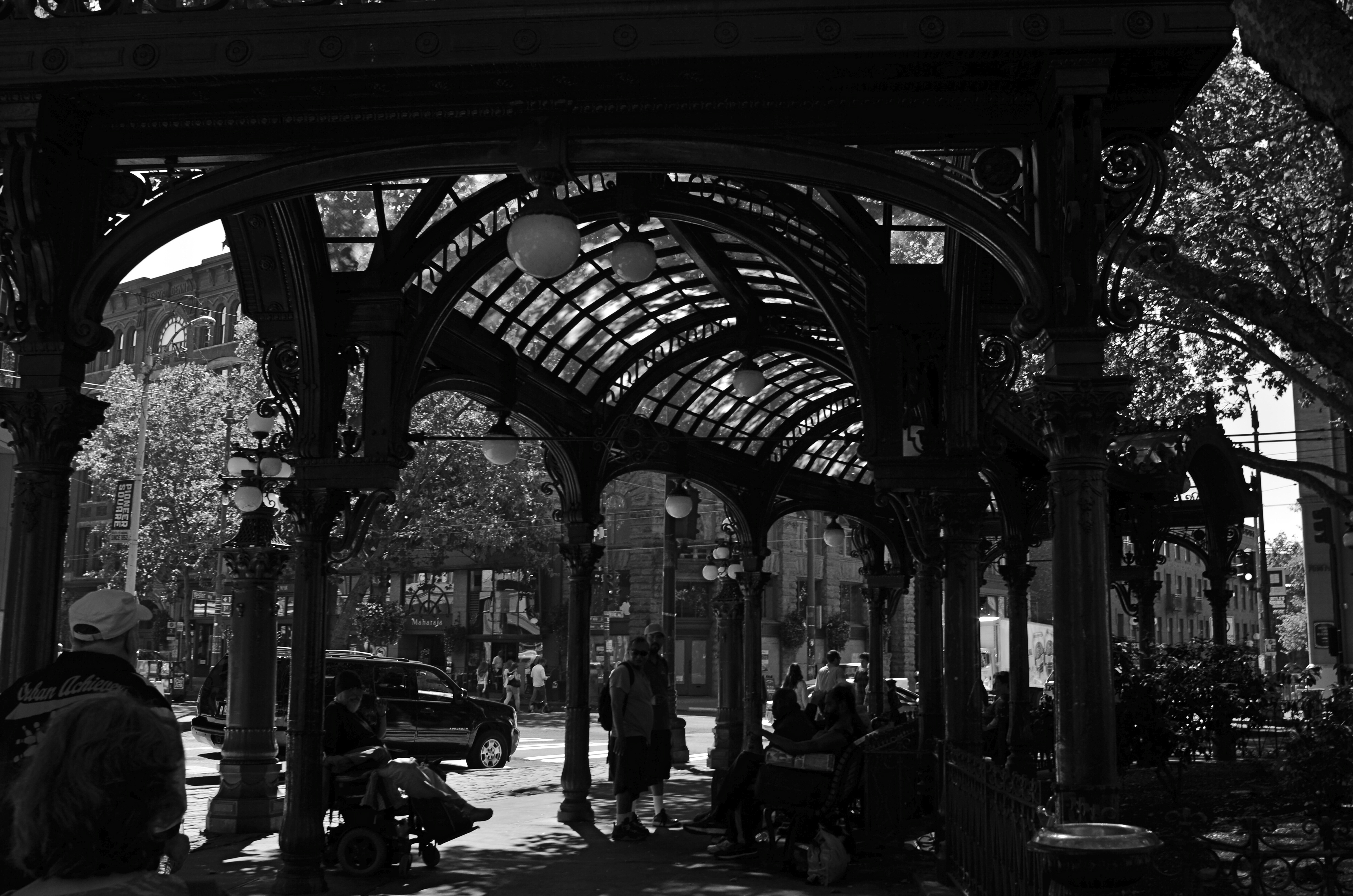
Gaslight Reverie (2016). Local characters convene under an aging arch in downtown Seattle.
By MICHAEL PERKINS
ONE OF THE FIRST EDITORIAL TRUTHS THAT PHOTOGRAPHERS LEARN is that just pointing and recording is not photography. The marvelous device which was designed to arrest time in its flight and imprison it for future reference is truly effective for setting down the facts of a scene….details, textures, dimensions, etc. But, once the shooter is bent upon making any kind of statement…amplifying, clarifying, commenting….then the unadorned data of reality may prove to be a set of chains holding him earthbound. Every picture has it own terms, its own rules of engagement. And sometimes that means moving mere reality to the second chair.
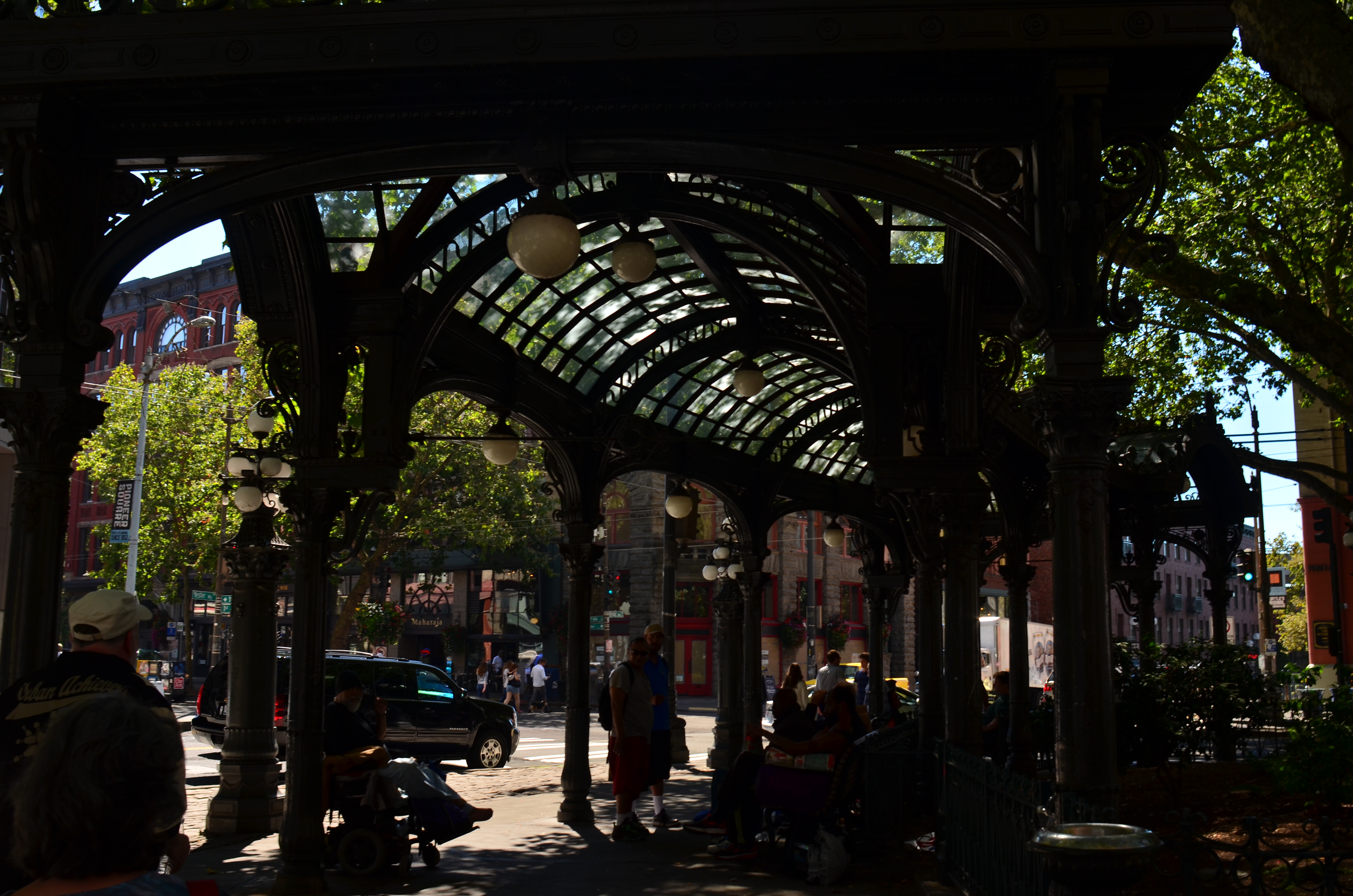
The same shot in color is a bit too charming.
Things that are only recorded are, to a degree, raw, in that they contain important information and extraneous data that might keep an image from being, well, a photograph. A deliberate act. Consider the purest form of “factual” photography, a reconnaissance flyover photo. Seen in its basic “real” state, the colllection of shapes, shades, and wiggles makes little sense to the observer. It needs the help of an interpreter to ferret out the pertinent narrative. Yes, this squiggle is a river. This grey smear is the warehouse. These scratchy cross-hatches are railroad lines. Photographs need to shaped so they can be interpreted. Sometimes this means, for lack of a more grammatical phrase, “including something out.”
There are many ways to achieve this, but, in the interest of brevity, I often find that a simple switch from color to monochrome goes a long way toward streamlining an image. Hues can be distractions, slowing the eye in its pursuit of a picture’s best impact. It prettifies. It luxuriates in tonal shifts, details, textures. Black and white can cut the busier parts of an image in half and convey a starkness (at least in some settings) that color can find problematic. Amping up the contrasts in black & white, eliminating many middle tones, can purify the image even further.
In the above comparison, a neighborhood in Seattle which is, in effect, its local Skid Row, is far more charming, far less gritty in the color rendering than in the mono version. Of course, the choice between the two approaches is made based on what you want to achieve. The same evaluation in a different situation dictates a different choice. Maybe.
Photography is not reality, and, if it were, it would never have flowered into an art, because reality is essentially dull. To make a picture, you have to determine the specific terms for that picture….what weight it wants to carry. Then it starts to become a photograph.

Leave a comment