BREAKING THE GEOMETRY
Zoom (2016)
By MICHAEL PERKINS
CONTRAST IN PHOTOGRAPHY IS NOT JUST ABOUT A COMPARISON BETWEEN DARK AND LIGHT VALUES. The word contrast also applies to things placed next to each other in a composition that fight for dominance. Happy faces next to sad. Images of wealth and opulence juxtaposed with poverty and misery. Some of it can be a kind of forced irony, and, as such, can produce pictures that get a little preachy, or appear deliberately staged.
I love urban architecture because many of its design elements are enough to create a compelling image all by themselves….that is, without the larger context of what’s around them. They don’t have to be about anything; they just are. Contrast isn’t needed in many cases, because I’m not trying to show mankind’s place versus the space of a building…..I’m just seeking absolute patterns. No comment, no message.
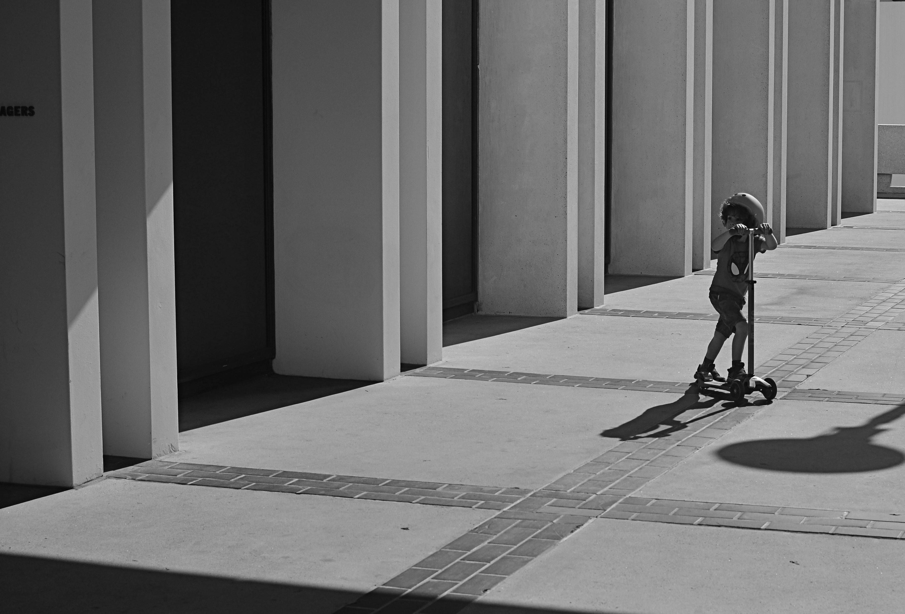
Occasionally, however, it’s great to invade all those clinical lines and angles with a bit of humanity, to break the geometry and inject something warm or whimsical. It doesn’t have to be deliberate and it doesn’t have to be amped up with busy staging. The best contrast shots between disparate elements are the ones that you simply witness.
In the above image, the boy on the scooter is neither a “bad” nor “good” subject, but he gains a little amplitude because of his odd placement amongst the more antiseptic surrounding textures. The shot also worked a little better in monochrome because, in the original shot, the boy’s shirt was so vivid that it drew too much attention to that part of the picture.
Photographers benefit from a million tiny collisions between seemingly opposed subjects every single day. Learning which ones to isolate and massage into pictures can be an enjoyable detective game.

Leave a comment