ISLANDS IN THE SHADOWS
By MICHAEL PERKINS
FIFTY-PLUS YEARS INTO MY LOVE AFFAIR WITH PHOTOGRAPHY, I now regard my earliest concept of a “good picture” as I regard other ideas of my youth….that is, seeing how I viewed the world given the limited scope of my own experience. When I first started making my own pictures, my models were drawn from the pages of the then-dominant photo magazines, like Life, Look, and National Geographic. Thus, for me, “good” photographs served either the reportorial functions of a news assignment or the color-saturated visions of landscape lovers. And that, for me, back then, was more than enough.
Both these kinds of images favored a fairly literal translation from the actual into the photographed: interpretation and abstraction was not anything I gave serious thought to, since I wanted my simple box-camera creations to look like “real photographs”. Art photography certainly existed, but very much at the edges of the culture. Most museums, by the early 1960’s, had still not mounted their own photographic exhibitions. Most popular photography, shaped by a large middle-class consumer culture (think Kodak Instamatic), was candid and personal in nature. Most people wanted Grandma to look like Grandma, unfiltered through any Warholian irony, commentary or experimentation. It was still a compliment for someone to say of your pictures that they “looked like a photograph”.
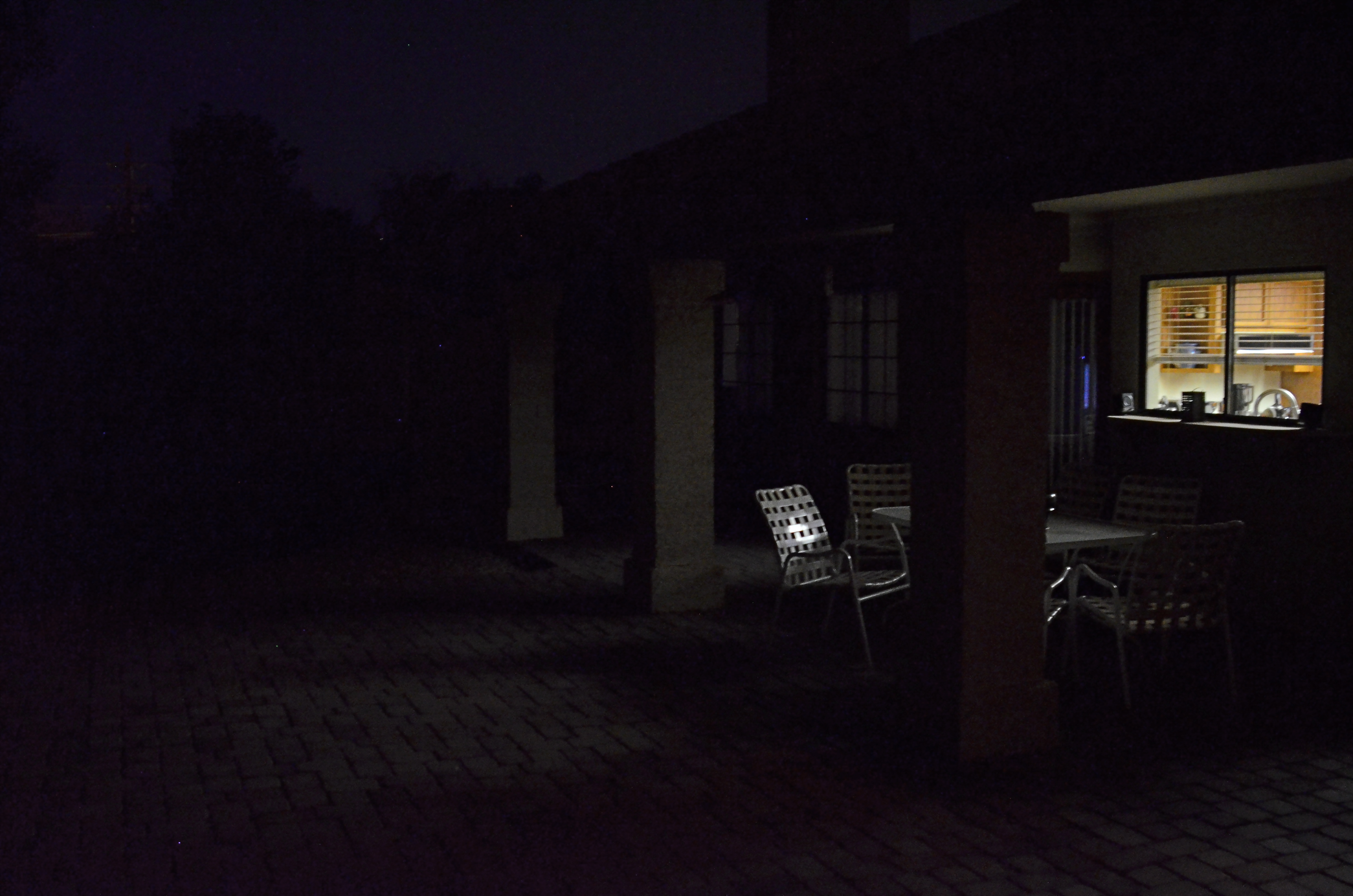
Would more light, more detail, convey the story any better in this image? 1/10 sec., f/2.8, ISO 2000, 24mm.
Strangely, one of the things that revised my thinking on what was “good” was an increased awareness of the works of some of the first photographers, pioneers who sweated mightily to wrangle the infant media into something like reliable performance. In their work with ever-changing combinations of plates, media, lenses and emulsions, the first photogs’ breakthrough photographs often failed from a purely technical viewpoint, producing irregular patches of light appearing randomly like islands in a sea of shadows.
But what these wizards’ first attempts often achieved, almost by accident, was the first real abstraction in photography: pieces of reality, rather than its totality: hints of the truth which invited speculation, examination. New questions were posed: what was missing, and did it matter if it wasn’t there? Could a photographer, in fact, deliberately extract parts of the “whole” picture, letting the minimum speak for everything that was left out? I gradually began to wander in search of answers to these questions.
There are times when a picture speaks louder the less it says. My original orientation to “good” images, seeing them as the most faithful translation of the literal onto film, expanded gradually to include whatever visual language communicates best in a given picture. Sometimes, in some very key instances, it helps to think like the first practitioners, who discovered, however haphazardly, that mere reality sometimes comes up short.

Michael, well said and I agree. It is nice to see museums not only show photography but establish departments of photography.
In answer to your question. More light and detail could convey the story better but it depends on what the photograph wants to portray. I find the image creates mystery and a desire to look for details that may be partially hided. A fully lighted image is a documentation of the place. As it is, it expresses more emotion. Isn’t that what many of us want from our images?
February 10, 2017 at 11:42 AM
As a matter of fact, I have done several versions of this shot over the tears that were formal time exposures, with a great deal of definition in the darker elements. This particular frame was handheld and an attempt to use the night as a brooding, atmospheric element. It is thus pretty nearly over-exposed overall. It was fun to go the opposite direction from earlier versions.
February 10, 2017 at 3:51 PM