SQUARING UP YOUR SHOT
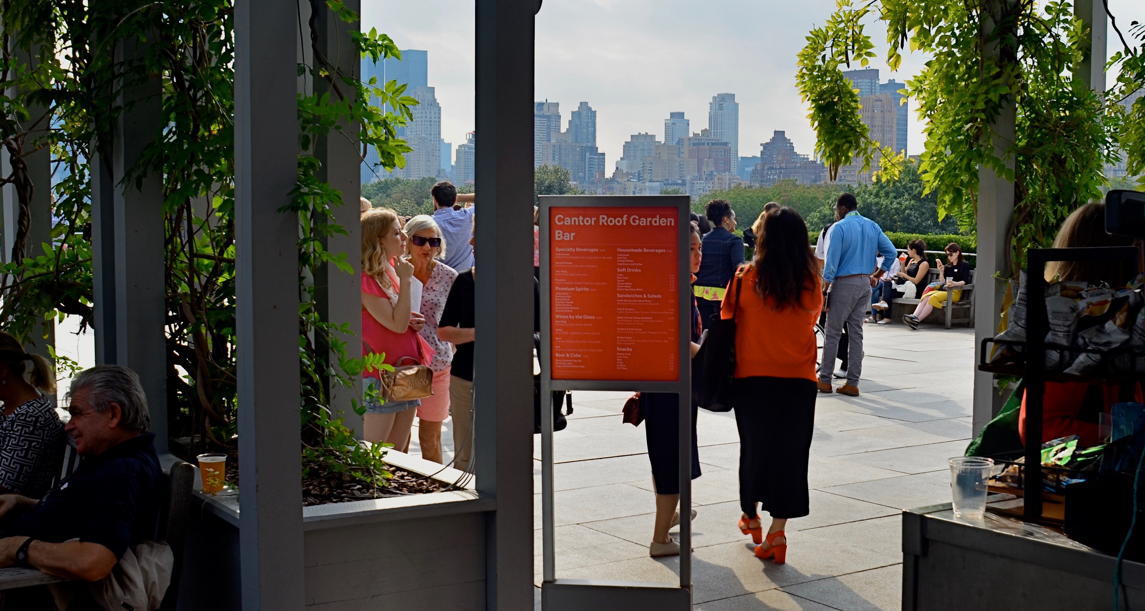
Master shot, taken at the entry to a roof garden atop the Met museum in Manhattan.
By MICHAEL PERKINS
IN THE PRESENT PHOTOGRAPHIC ERA, the default frame for composition is, with some notable exceptions, a rectangle, the 3-to-2 ratio that is the descendant of Oscar Barnack’s first 35mm Leicas of the late 1920’s. Most of us have been taught to automatically compose in this format, a hard-wired habit that informs our entire concept of how to fill a frame. The “notable exceptions” I refer to are the square films that have accompanied the return of instant photography, the lomography movement with its square-framed analog film formats, and, by virtue of a built-in app choice, the mobile phone. Strangely, some of the most sophisticated cameras on the market do not allow you to shoot an original square image: the shot must be captured in a 35mm equivalent and cropped later. But that’s a rant for another day.
The thing is, if you don’t typically investigate square composition, you are robbing yourself of an important tool, or, more specifically, you are allowing yourself to always see subjects in the same “frame” of mind. There are distinct advantages to creating a square composition, not the least of which is that it forces the viewer to take in your picture’s information in a distinct way. While shots that are wider than tall are marvelous for any number of reasons, they do, in effect, invite the viewer to scan an image linearly, that is, to look left to right and back again. By contrast, the square reinforces its equal dimensions, almost forcing the eye into a continuously circular sweep of the contents. I hear people complain that a square just “doesn’t give me enough room to get everything in”: however, I would counter that argument by contending that, in many 3/2 compositions, there is a wealth of visual information that not only is not needed, but actively distracts the eye from the most interesting parts of the photograph. Think of a glass of ice tea that, over time, actually has more volume in it, due to melted ice, than was originally poured into the glass. More liquid, but a greatly diluted flavor.
The problem is not that many square images aren’t being made…far from it. It’s that they are, in many cases, being re-made from rectangular originals, in the editing process. We have to shoot wide and edit square. But therein may lie the best way for us to start seeing what a square composition can do, not merely to define the space of a picture, but to invite the viewer into it more efficiently. And it’s easy and cheap to do it.
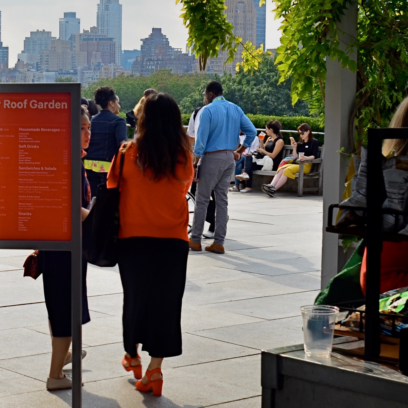
The above image recomposed as a square shot. Net loss or net gain?
Try this: select a series of wide master shots that you feel fairly strongly about, dupe work copies of them, and then crop new compositions within the copies. Junk the ones that don’t work and do as many re-takes as you see fit. Did any of the cropped images emerge as stronger without all that extra stuff you originally felt you had to include? And even if they did not, that’s also a good thing. The mere fact that you’ve begun to intentionally look for pictures within pictures means you’ve entered a new phase of your vision as a photographer. We’re certainly used to thinking of pictures that “came out pretty good’ as final or complete, but it’s a good thing to think of them instead as workable drafts. In the wider shot seen ay top, I successfully conveyed that people were stepping onto the roof of the Met museum in NYC, but I also got a lot of things in the shot that aren’t necessary to the telling of that story. The main tellers in the picture are the two women, who, like us, have just arrived. They are our surrogates or guides. Cropping actually makes the red of the sign in front of one of the women cry for your attention, guiding you to the women even as it partly conceals one of them. Additionally, the same top to bottom space that they occupy also shows part of the skyline that borders Central Park. The front to back scale of the shot says “on the roof, in the city”, at some distance.”
So judge for yourselves, as you would with your own pictures. Did anything I took away in cropping diminish the impact of the picture? Does the lower frame now feel open, cramped, or, in Goldilocks fashion, about right? Is there an appropriate emotional distance from the subject, or a welcome intimacy with it? Is there, in short, an overall net gain for the narrative power of the image once it’s been cropped? And most importantly, even if this experiment fails (with the wider picture still being stronger), haven’t I already begun to see every picture in at least two fundamentally different ways? New ways of seeing are among the most powerful tools in a photographer’s kit. The world of cameras may indeed default to a rectangle, but that doesn’t mean our brains need to follow suit.

Great post and very true – it is too easy to fall into our rectangular view and not think of the storytelling aspect of square framing our shots. Another classic is we fall prey to the trap of not actually “looking” at the whole frame we are shooting, often having to crop out unsightly things in post that had we been more awake to it when we shot it we could have recomposed and saved the trouble.
Great post – and I agree your second square crop brings me more into the story than the first.
August 26, 2019 at 12:12 AM