INFORMATION AVENUES
By MICHAEL PERKINS
JUST AS THE TAKING OF A PHOTOGRAPH IS ACCOMPLISHED IN AN INSTANT, so too is the messaging that the resulting image conveys to the viewer. The impact of a picture is immediate, established within nanoseconds of the eye’s initial contact with it. Additional viewing and pondering may, certainly, reveal deeper truths about a photograph, but I firmly believe that the main love it /don’t get it choice about a photo is made by the brain at first glance.
That said, information must be arranged in such a way as to expedite this choice. That’s the art of composition. What stays in, what is excluded, where the frame hits, and what its limits imply. The nature of the information is determined by the impact of light, which shapes and defines. That is in turn aided by texture, which adds dimension and context in how new or old, rough, smooth, substantial or ethereal things appear in the image. And finally, mood and aesthetic are established in the range of color or tonal data.
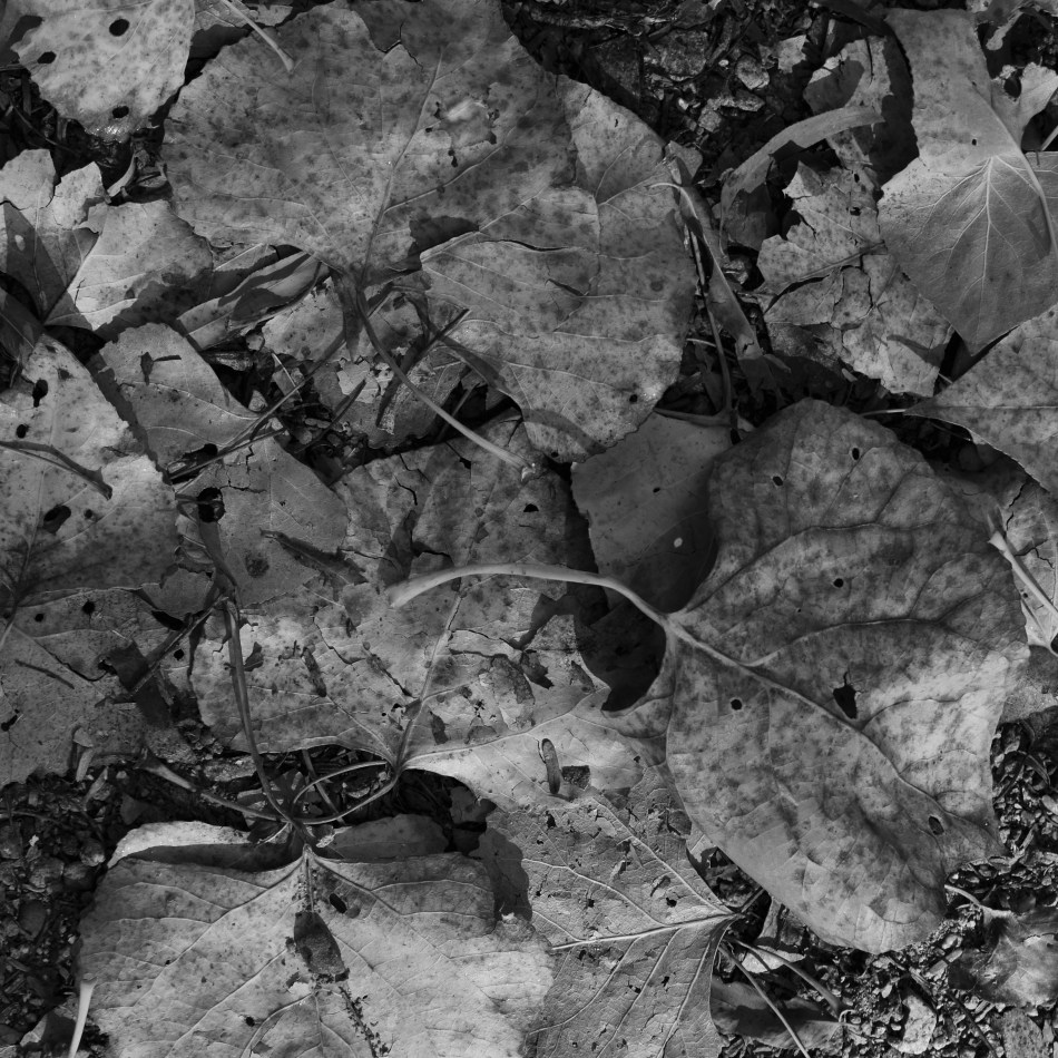
All of these elements are created by a series of decisions on whether “to do” or “not do”. Which is to say that all photographs have an assembly process. Steps. Priorities. More of this, less of that. The fact that the best photographers learn how to navigate all these decisions instantaneously is really a kind of miracle. Take the truly fundamental choice of color, for example. Not only do a picture’s hues have to be conceived in the mind before they’re attempted in the camera: they must be refined enough for the shooter to choose how all the shaping elements described above work in conjunction with each other. Think of the graphic equalizers on our old stereos, each ‘band” or part of the hearable spectrum trimmed or maximized to get a “mix” most pleasing to the ear. In visual terms, color is a key choice because it is an element that can shape so many other elements in turn. In the above image, color can resonate with memory and emotion. It can render what we term “warmth”. It also aids in the perception of depth. Consider as well that color has only become the default option for our photography in about the last sixty years. Before that, due to technical challenges for film emulsions and printing processes, it was a luxury item, even a novelty for many.
“Going back” to monochrome, the original default option for all photography, means actively recognizing what kind of information is lost and what kind of impact is gained by eschewing color. Is the image strengthened or weakened with its removal? Is converting a color shot to b/w as an afterthought (as I’ve done here) less effective than intentionally shooting the original in mono? Are the remaining tones strong enough to convey your message? Is one tonal palette more reportorial or “authentic” than the other? And, above all, what if the choice you’ve made (color or no color) isn’t the choice your viewer makes (in the case of this pair, for example, my wife prefers the color version, although “they’re both nice”)? Photography is about making decisions and learning to live with them. Or just canning the entire thing and trying again.
“We must remember that a photograph can hold just as much as we put into it” Ansel Adams once wrote, “and no one has ever approached the full possibilities of the medium”. Which is a lot like God saying, “hey, don’t get hung up on making just one kind of tree”. The possibilities in making pictures are indeed endless, but each are rooted in our very purposeful choices.


Leave a comment