CHROMEDOMES

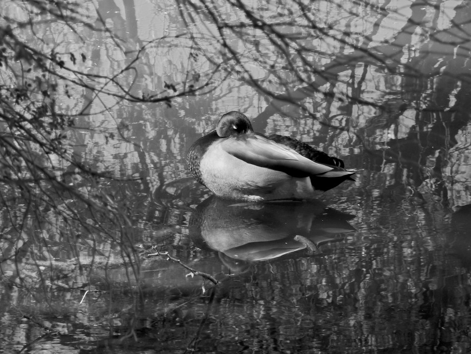
This color original is lovely, but the multiple hues on the water seem to fight with the duck for attention.
By MICHAEL PERKINS
THERE IS FAIRLY SOLID CONSENSUS, among those who teach the basics of photographic composition, that the path to success lies in reducing a picture to its simplest terms. Removal of extraneous distraction, proper placement of a subject within a frame, depth-of-field calculations…all these techniques work toward a common goal; to help the eye engage the photo efficiently, to lock onto its essential story without being confused or deflected toward something less important. Often a cleaner composition is just a matter of cropping, or merely limiting the number of elements contending for the viewer’s attention.
But there is one approach to basic composition that may not be instinctive to us all, and that’s the role that color plays in our pictures.
Color is the current instinctive default for most of our photos. It took a long time for it to be technically capable of taking that mantle from monochrome, which was, by necessity, the palette that shooters painted on for over a century. Color is seductive, and seems like a more “realistic” medium for our very personal universes of family and friends. However, in the composition of any picture, it must be reckoned with as another object in the frame, no less than a tree or a cloud. It is one more thing in there that demands our notice, and, for many images, it certainly earns that attention. However, color can become the message of a picture, not just the way the picture is rendered, drawing off the viewer’s eye in exactly the same way as extra props, extraneous scenery or other clutter can.
Some would argue that black and white is more nuanced and subtle in the rendering of emotional directness, or texture, or contrast when compared to color, and yet some of us think of monochrome as somehow incomplete or unfinished. Try telling that to several dozen Pulitzer winners, some of whom, admittedly, worked before color was practical (and therefore not a real option), along with others who continued to choose b&w even after it became the minority medium. And this is not about unilaterally choosing sides, forever pitting the Kodak Tr-X crowd in a pitched battle against the Fuji Velvia cadre. It’s only about choosing the right tool for every picture, and not getting so locked into the global color default that you refuse to peer into the opposite camp. I continue to master every shot in color to this day, but a full fifth of my final output consists of mono conversions, with modern post-processing giving me every bit as much control over the results as in the old darkroom days (as seen in the illustrations). The best course, I believe, is to form the habit of looking at all your pictures both ways. Often, you will just stick with the color original, because it works. And other times you will play in the other playground because, for some pictures, that works.
Color is an object within your pictures, no less than a mountain or a chair. Think of it as another piece of visual furniture fighting for dominance in the frame, and deal with it accordingly. Monochrome is not photography’s simpler, poorer step-kid. Sometimes, it can be the pride of the family.

Leave a comment