A SHADE-Y BUSINESS
By MICHAEL PERKINS
PHOTOGRAPHY WAS NO SOONER OUT OF THE CRADLE than it was being aggressively tweaked and twiddled with, in a thousand myriad experiments aimed at improving it both technically and aesthetically. Seldom has the birth of an art form been accompanied by a surge of re-inventive energy equal to or greater than its release of creative energy. Photographs were both art and science, a strange hybrid of human expression and mechanical reproduction. One of the earliest and most consistent treasure hunts in the young craft was the quest for color, simulated and daubed on at first, then integrated into the actual making of the picture in-camera. In this age, which could be labeled Photography Century III, we use color mostly without thinking, even though it is one of the most crucial elements in how we tell stories in pictures.
Although the first practical color films date back to the early 1930’s, mostly by way of Kodachrome and its later imitators, the majority of important photographs for the first half of the twentieth century were taken and published in monochrome. In the minds of the pros like Ansel Adams, early printing processes for color were unsteady or “untrue”, with only mass-circulation magazines using them with any regularity (with a ton of touch-up) until well after World War II. After all the G.I. Joes and Janes came home, the tidal wave of leisure culture that accompanied them also brought a new explosion in amateur color photography, although it was not until the 1970’s that the economy of global film sales truly tipped in favor of the rainbow. Today, for many, monochrome is now a nostalgic effect, a quaint way of recalling the “look” of earlier photographic eras.
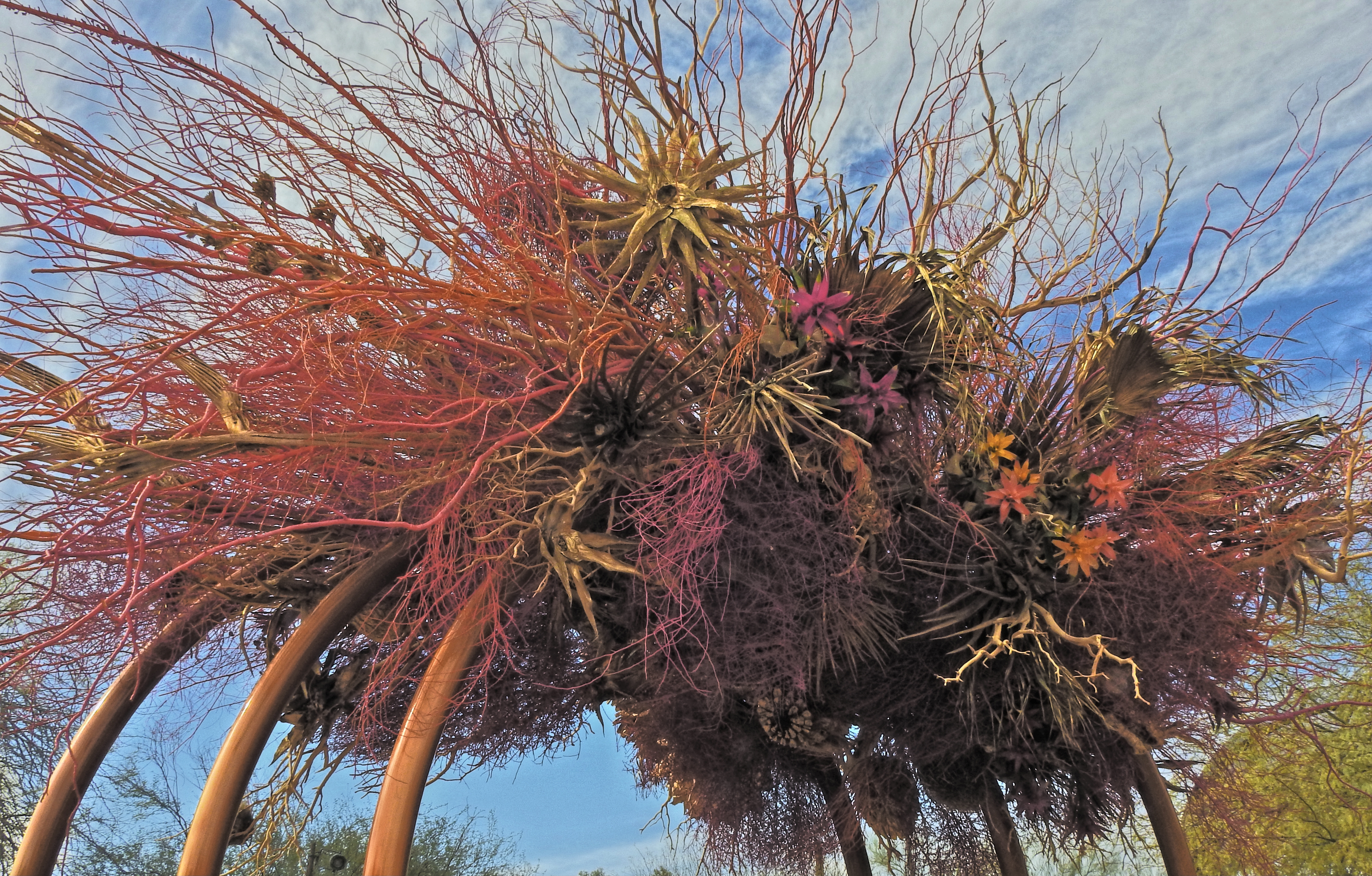
“Wind”, an art installation by Natasha Lasitsa and Daniel Schultz
In 2021, our attitude about hue is all over the road. Some still obsessively pursue the most accurate depiction of “natural” colors as is technically possible, while, for many others, color is negotiable, malleable. We acknowledge its power as an expressive tool, but we tinker with it for interpretative purposes more than ever before. We even seek out software designed to re-produce the color errors or biases of bygone brands of film stock, seeking a color that is technically “wrong” in order to get the right “feel”. We shoot with color as we use any other modern means of expression, which is to say, with an overlay of irony.
In making an image like the one seen here, the very nature of the subject is a kind of unreality, since the desert blooms and bushes used in this art installation have been dyed before the work was assembled, in an array of colors that is nothing like the limited palette they would display in their natural state. The resulting work is thus a kind of psychedelic fever dream of a desert scene. Do I record this as I find it? Do I remix the colors even further to interweave my own mood into it? Just trying to render an accurate record of this object with the color films of long ago would have been enough to send the most battle-hardened photo editor into choleric fits, and yet today, we accept that color is, as with any other element in a photograph, precisely what we say it is, and nothing more. In a way, we’ve come full circle to photography’s earliest days, before the development of actual color film, when painters touched up black-and-white images with whatever arbitrary color choices they thought “completed” the picture. Is it art? Is it not? The answer is, it is ours, a response which silences all other questions.

Leave a comment