WHO SHALL I SEND?
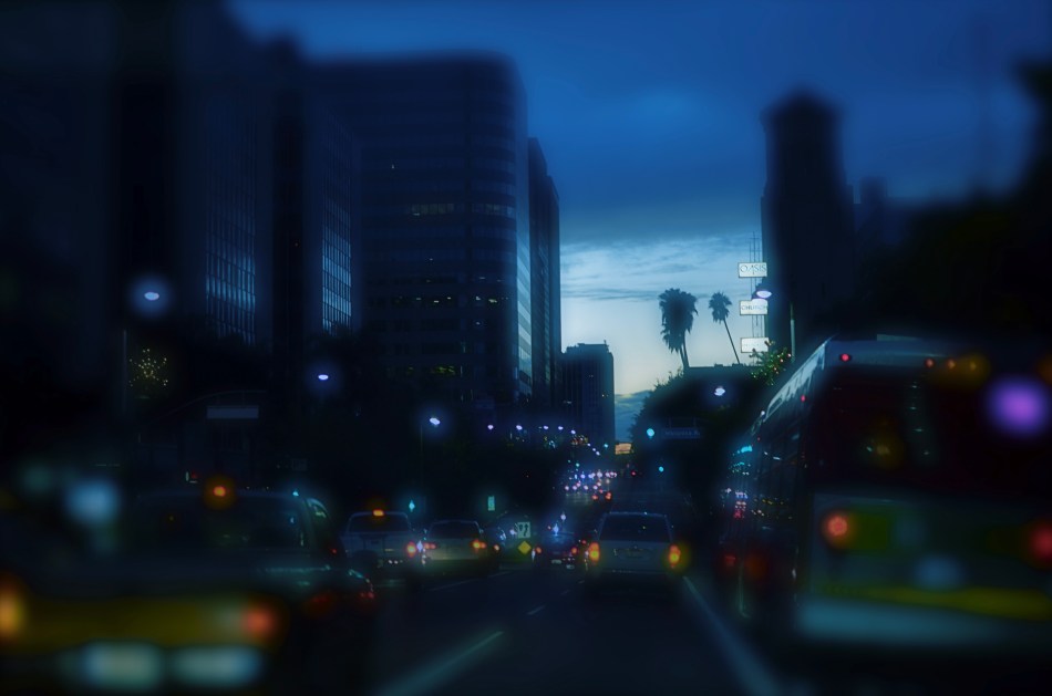
Central Los Angeles, 2013. Is color the right “messenger” for this night shot, or will the monochrome version, seen below, do the job more effectively?
By MICHAEL PERKINS
COMMUNICATION IS ABOUT TAILORING MESSAGES WITH THE MESSENGERS THAT DELIVER THEM. In conveying ideas and information, we work both to shape its content, and to send it under the care of the correct carrier. Some messages are best transmitted in pure sonic terms, fitting the formatics of, say, radio or telephone. Other have truer impact in visual media. And within the overall scope of visual media, in that special folder marked “photography”, we make additional choices. Because, even after we’ve chosen a still image to get our point across, there remain more specific decisions within that folder that may enhance the delivery of our idea. And the most fundamental of those decisions revolves around the simple choice of color/no color.
There certainly must be a reason why, more than 75 years into the era of convenient and available color media, many photographers still deliberately choose monochrome as their primary messenger. It can’t be merely for the novelty or nostalgia that it can evoke. Indeed, black and white is much, much more than the mere absence of the full color spectrum. We need to weigh this choice just as carefully as we do exposure or focus, because there is something about either option that describes an aesthetic, a way of seeing the world. You can probably recite the various claims yourself: color is more “natural” or “realistic”: b&w is more journalistic, authentic: mono streamlines the impact of an image, simplifying its readability without distraction: color allows the fine-tuning of mood. And so on.
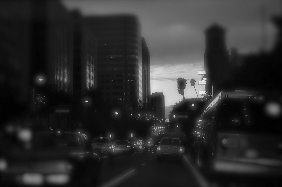
Is the absence of color here equal to the absence of impact?
Some of us shoot in mono as a default, while others master their images in color and make postmortem decisions to desaturate them in post. Some of us have returned to film, solely to reacquaint us with earlier colorless versions of our camera eye. Even in the age of full-color graphics in any and all publications, part of our monkey memory still imparts a certain authority to black and white, disdaining color as too “pretty” or decorative. The argument is endless.
My point here is that, since our cameras and apps can now make anything look like, well, anything, we need to examine the message we’re trying to transmit and match it as perfectly as we can to the messenger that best gets the idea across. We need to, as with the kings and emperors of old, ask not just about what we want to convey, but “who shall I send?”. We have more choices available to us than any other generation across the vast history of photography. We never need to weaken the power of our images by dressing them up in the wrong suit.

Leave a comment