STUMBLING IN
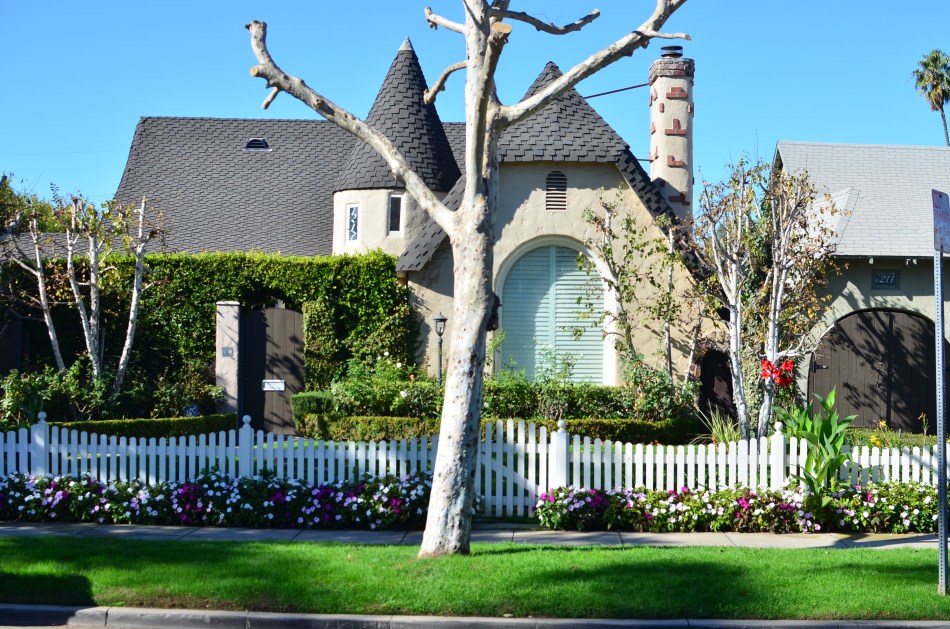
Nice house, decent shot, but not quite the fantasy look I wanted for this subject. So, into the Nikon “retouch” menu we go (see next image).
By MICHAEL PERKINS
JUST AS SOME PAINTERS PRIDE THEMSELVES on producing works that “look just like a photograph” there are photographers who love it when someone tells them their image “looks just like a painting.” Both arts borrow strongly from each other, each envies what the other does, and, in pages such as this one, spend altogether too much time worrying about it. Still, if your foot is predominantly in one camp, it’s fun to occasionally dip a toe into the other, just to see what it feels like.
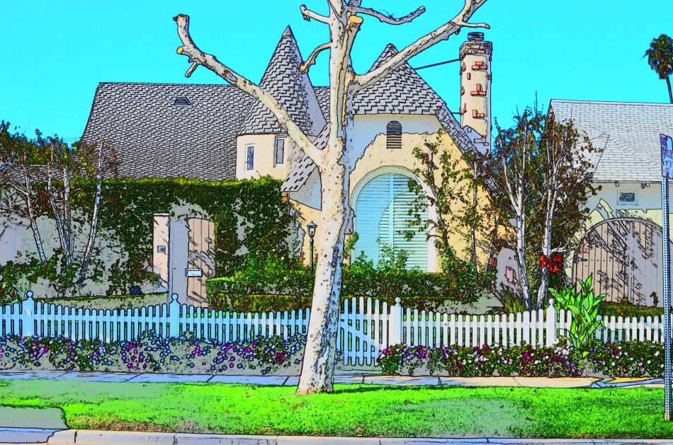
The “pencil sketch” effect created in-camera, via Nikon’s retouch menu. Cool, but now a little too much like a drawing. Almost there (go to next image)……
In trying to use photos to idealize certain subjects, to, in effect, make them better visually than they may be in mere reality, I’ve tried lots of tricks, many of them just novelty effects and some of them useful tools. You have to judge their effectiveness one picture at a time. Recently I went back to an in-camera look that most Nikons have contained in their “retouch” menus for years, mostly because it never seemed to deliver quite what I wanted. In the “color sketch” mode, you make a second copy of a master shot that is mostly just the outlines of the objects and people within, losing a lot of interior detail within the image and making it look as if you whipped it up with, yeah, okay, a set of colored pencils. I had created occasional copies with the effect over the years but never fell in love with it. Please forgive me, but the word sketchy is the only one that applies, and not in a groovy way. Over the years, I mostly forgot that the effect existed, along with several others that Nikon gave me without asking me if I wanted them (!)
Recently, however, I have been reworking several pictures of homes I considered to be nearly in a fantasy category, old designs so fanciful and fussy that they’d look at home in a fairy tale or a Hobbit community. I wanted some extra quality of unreality mixed into their post processing, and so was taking multiple exposures of the same house and tweaking them in exposure fusion programs like Photomatix, which allows you to blend a custom mix of both pictures together with sliders, almost like working on a movie dissolve that’s frozen in the middle. I found that mixing a pencil-sketch tweak with the original shot it was derived from made for an interesting look. A controlled amount of detail, a lot of color patches that looked as if they were washed on by a brush, and a super-sharpening of the peripheral lines. I had stumbled into something useful.
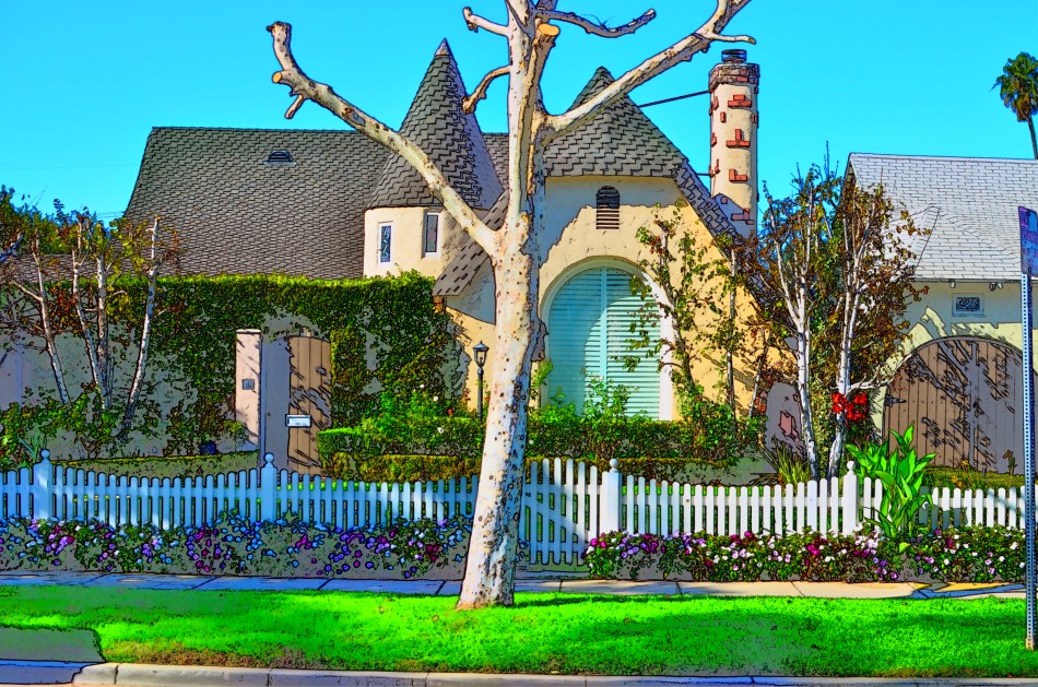
Final composite of original and sketch images, hand-mixed as an “exposure fusion” in Photomatix.
The result is part photo, part painting, and controllably surreal. It almost recalls those lovely artist renderings that architects used to produce as previews for investors in the early days of acrylics…the kinds of “coming soon” illustrations you saw in sales brochures. And, even though it’s certainly like birthday cake, in that a little of it is more than plenty, it’s fun to just make some pictures that are solely about process, not to try to hide a lousy picture, but to explore what happens when you kick Papa Reality out of the room and just get down on the floor with the other kids and play.

Leave a comment