PLAYING IN THE RIGHT KEYS

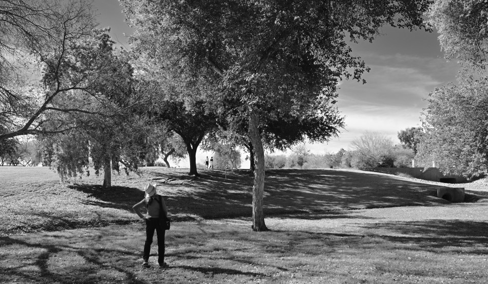
Listening For The Lark, 2022. A monochrome conversion from a color master shot.
By MICHAEL PERKINS
SOME OF OUR PHOTOGRAPHS CERTIFY THEMSELVES TO US AS “RIGHT” OR “WRONG” over time, not registering instantly as either keepers or pitchers, but slowly making the case for their final disposition. These are the truly tricky shots, the ones whose success or failure is not readily apparent upon first, or second, or even fifth glance. Such images go in and out of the workflow bin again and again, sometimes over years, while we decide whether we recognize them as our own offspring.
Sometimes it means we partially embrace a shot, loving it in spite of a slight technical miscalculation or a composition that’s slightly off. Other times, we trust/mistrust our original intention, which is French for “what was I thinking?”. In recent years, as I’ve returned to the tonal range of my first days as a shooter, I often stick pictures in the “still under consideration” pile over the choice of whether to re-render them in monochrome. I often think of color and b/w as two different arrangements of the same theme, or maybe a song played in one of two very distinct keys.

The color original.
Since mono was the default of my earliest days, I naturally learned to shoot in it first. Once color became the go-to for most photography, I deferred to that. I don’t intentionally shoot my master shots in mono because it means pre-empting a choice that I might want to exercise later. You can easily go from color to no color, but,…. well you know the argument, and so that seems to mark me as a conversion person. Black and white is a choice, but not if you had no other choice in the first place, right? Mono has its own tonal vocabulary and creates a separate mood or priority of light than color. And for that reason, as well as the need to weigh and re-weigh my options pretty much forever, many of the pictures I can’t decide to love or hate hinge on the strengths and weaknesses or the two tonal “keys”.
Is color more bold, or can a more dramatic statement be made in its absence? Does monochrome tantalize, tease the appetite for more information, stimulate the imagination, and does it do so more effectively than a garish explosion of hue? Which of the two modes is, for me, in this particular instance, more “authentic”? And is that what I even want in the first place?
There are lots of images which cry out to be completed, to have their case file marked “closed” with a final determination of their value. But if art is about forcing flexibility where some would favor rigidity, then it’s probably a desirable thing for us not to rush to judgement on some of our pictures. Maybe they came into the world fully formed, and maybe not. But maybe, after all, it’s us who need to become more complete, in a variety of ways.
Leave a comment