A WALK ALONG “K” STREET

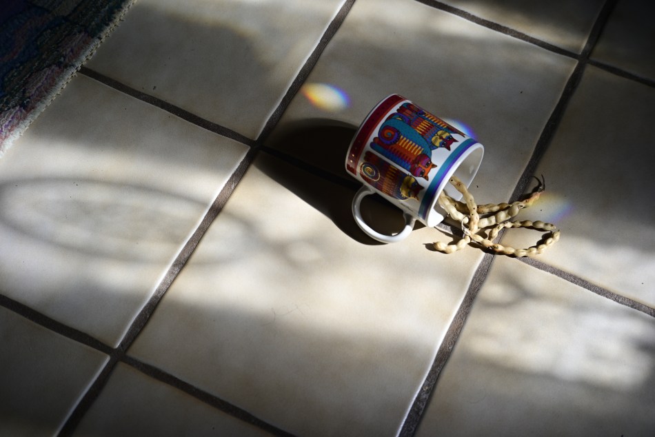
An example of a custom mix of in-camera pre-sets designed to emulate the bygone Kodachrome film (details at bottom of page).
By MICHAEL PERKINS
KODACHROME FILM HAS, AT THIS WRITING, BEEN GONE FROM PLANET EARTH for thirteen years (!), and yet it continues to echo through the corridors of nostalgia for photographers of a certain age. As the first widely sold and truly practical color film shot by millions, its native strengths (and biases) in color rendition were enshrined across billions of images as a specific way of seeing the world. People try to characterize its look with adjectives like natural or warm or dozens of other modifiers, all of which fall short in comparison with the act of just looking at its effect. Photography may be the art that is most self-referential, in that we never completely live in the moment, but always have the looks, or systems, or tools of earlier versions of that art peering over our shoulders. Kodachrome is dead. Long live Kodachrome.
Just as we have never stopped simulating sepiatone, the painterly aspects of the Pictorialist movement of the early 1900’s, or even emulsion-smeared glass plates, we have never stopped trying to emulate the look of Kodachrome. The web is littered with the photographic equivalent of recipes that claim to be able to perfectly mimic McDonalds’ secret sauce, promising to conjure up the perfect re-creation of the big K’s tones and flavors. Nearly all of these are post-processing techniques in Lightroom or a half-dozen other editing suites, with a few puny phone apps, mostly horrible, taking a crack at the task here or there. Recently, however, there have been more and more tips on pre-sets that would allow shooters to do faux K-chrome in-camera, which is what would most appeal to me personally. Fuji users got the ball rolling by cooking up their own specific how-to’s, and I have recently been kitchen-testing a mix I stumbled across for Nikon’s Z-platform mirrorless cameras*. We are now in the “tasting” phase of the process. Too salty? Needs garlic? Who knows?

Another exposure of the above subject, this time with standard color rendition.
What’s easy to see in the two “with” and without” images seen here is that there is a decidedly different rendering of the range of reds and yellows, a hallmark of Kodachrome’s warm appearance (and key to its wonderful skin tones). The ability to store a bundle of settings in a special separate dial click (such as the “U” or user buttons on Nikons), so that it’s available virtually on demand, is of great value to me, since my camera has an electronic viewfinder, allowing me to see precisely what will be captured on the sensor in real time. That flexibility is worth more to me in the field than all the after-the-fact editing suites in the world. Is the ersatz K-chrome seen here much different than merely using, say, a very warm white balance setting, such as “shade” or “cloudy skies”? I’m still weighing all that, even as I’m trying to weigh my emotional fondness for this bygone film versus whether the look of it actually adds anything to what I’m doing. Do I love it because I loved what I was doing, back when I was first using it? Is a walk down “K” Street just a stroll down Memory Lane? Again, the final verdict comes picture by picture.
*For those who care: From the Nikon Photo Shooting menu, select “Set Picture Control”. Select menu item 15 for RED and set the level effect to 20. Within that sub-menu, set Filter Effects to GREEN with a toning level of 7, and then exit Photo Shooting. Set White Balance control for Direct Sunlight. Finally, to imitate the low ASA (ISO) of Kodachrome, you might experiment with slight under-exposure for deeper saturation. Or not, your mileage may vary.
Leave a comment