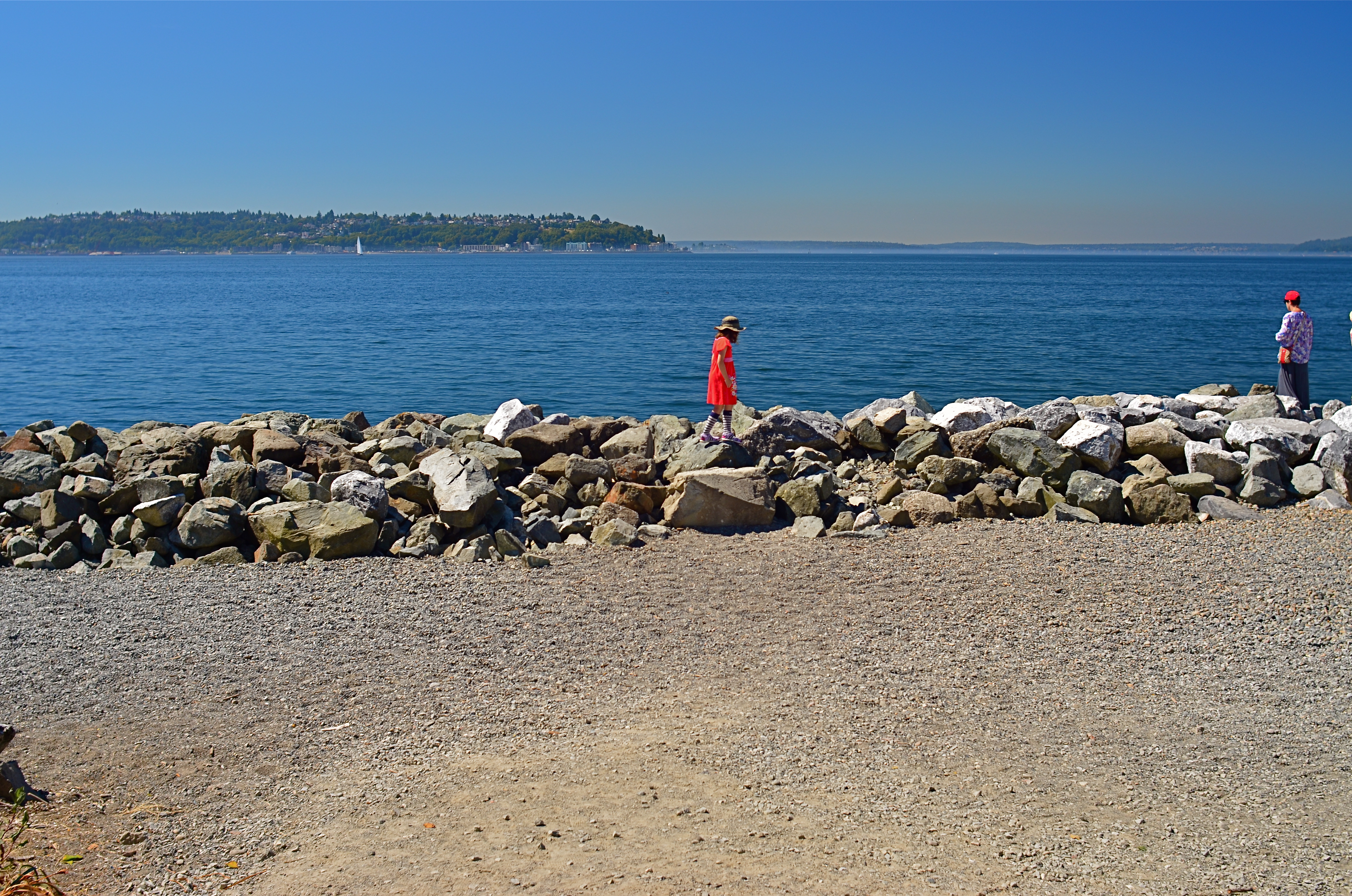
WIDE x HIGH x ACCIDENT
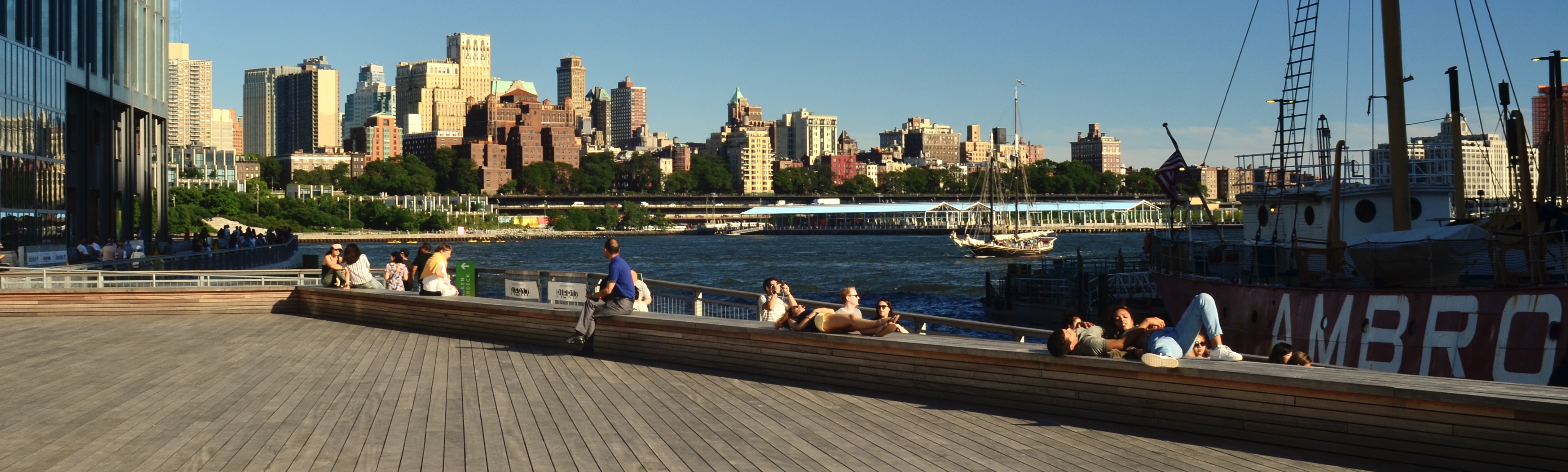
Brooklyn From Fulton Street, 2018. A faux pano cropped from a really large 24mm landscape master frame.
By MICHAEL PERKINS
I MAY NOT BE PHOTOGRAPHER ENOUGH TO FOOL THE HUMAN EYE, but on a good day, I can apparently con Photos for Mac. I know this because I caught the program using its own “logic” to arrange images into categories for which, truly, they don’t qualify. One such category is “panoramas”, a folder which Photos has chocked with pictures that were not made either with a true panoramic camera or a stitch-up phone app, but merely by cropping larger shots. The thing is, such clipped art work as panoramas because of what they ask of the viewer’s eye.
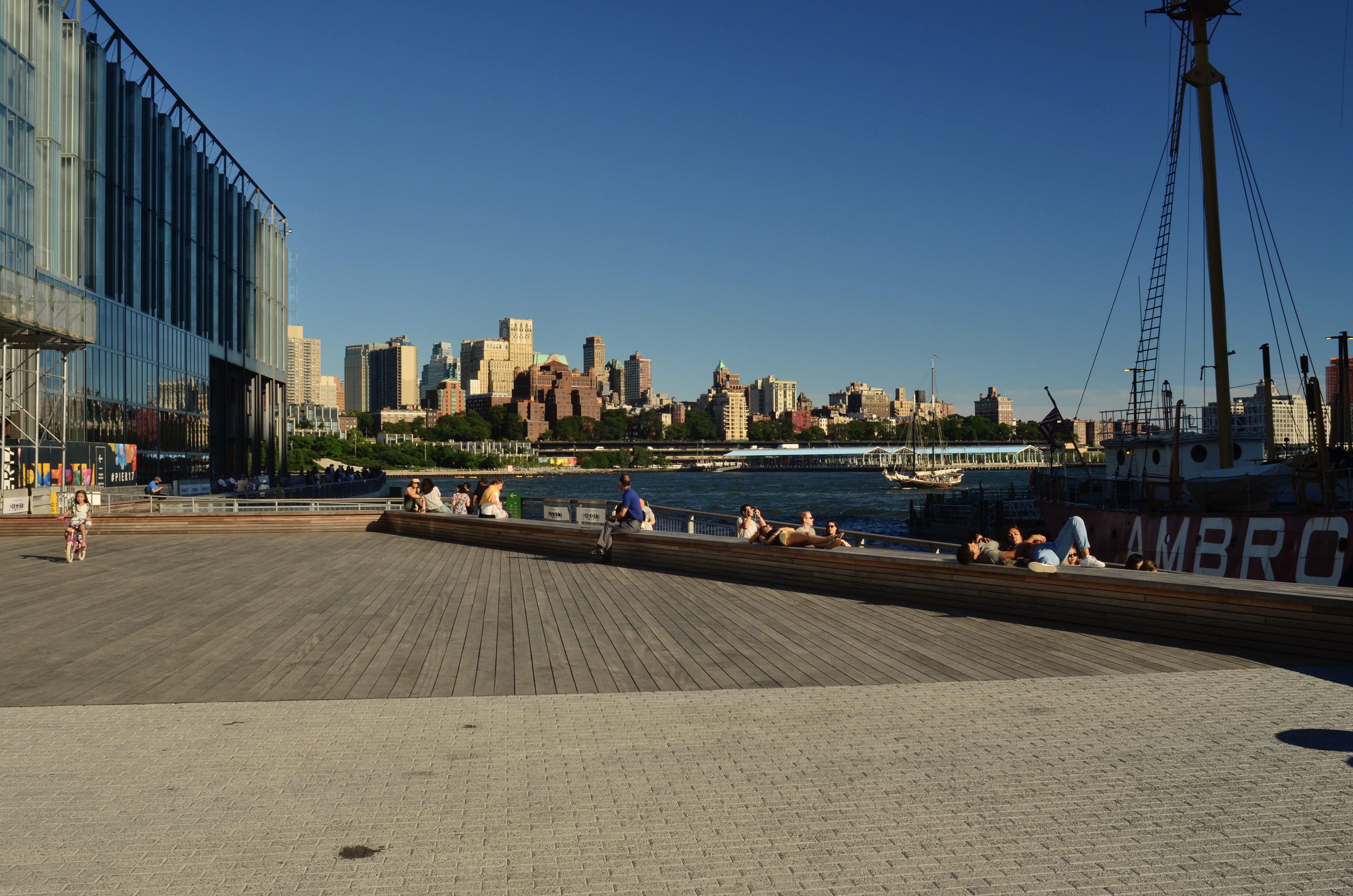
The original shot has too much unneeded visual information.
Most of my landscapes, in town or out in the country, are shot with a 24mm f/2.8 wide-angle, which is my go-to for urban work. It adds little in the way of barrel distortion if you aim it right, and allows for very inclusive framing when you’re in cramped quarters (lower Manhattan, I’m talking to you). It’s also as sharp as a diamond, and so, at its sweet spot of efficiency (around f/5.6) it’s a snap to focus manually. It’s a sophisticated lens that performs almost as easily as a point-and-shoot, and even though landscapes shot with it will result in a lot of excess detail, this one lens will do nearly 100% of what I need on an average day. And since there’ll often be way too much info in the landscapes, a-cropping I will go.
Panos are often tiresome because there simply aren’t a lot of linear subjects that are uniformly fascinating from left-to-right. I mean, if you’re bent on having all of General Grant’s 103rd regiment muster up in front of you, or if you’re trying to drink in all the delicious detail along the Cote D’Azur, it can be worth the extra effort. But this is me confessing that most of the shots that my Mac calls “panos” depict decisions made after the shutter snap, and only then because most of the useful visual info in the shot turned out to be linear in nature. I don’t intentionally head out of a morning to “do a pano”, and, in making landscape shots with other objectives in mind, I often don’t see, in the moment, the super-wide image lurking within the greater one. But on days when the camera gods are in a good mood, you find that, even in paring away half of your original, you’ve actually rescued something workable inside your master frame.
In the two examples seen here, the contrast is fairly obvious. The human activity, the line of the boats and, beyond, the skyline of the Brooklyn shore seem to be primarily inviting the eye into a left-to-right reading of the image, whereas crowding the frame with extraneous structures, more boardwalk lumber, or extra sky really saps the picture of any impact it might potentially have, and so, out come the scissors. I also believe that giving the eye more stuff to process means it will do some of it badly. Just as a portrait is usually made more effective by framing its subject mid-waist to head only, so do landscapes often benefit from cutting off their top and bottom thirds, depending on the image. I’m not one of those faux purists who believe you’ve “cheated” by cropping a picture after it’s made. I believe that resizing the frame is part of the making, albeit a part that takes place after the click.
So, yes, my trusty wide-angle is, in most cases, also my trusty makeshift pano lens. I’ve done the same thing with fisheyes, cropping them to highlight the super-wide center of a shot to the exclusion of the extreme bends at the edges. In many such cases, I am trending toward carrying less and less glass with me and getting more and more flexibility out of what I do take along, a development applauded by my aging neck and shoulders. It may be true that you need to suffer to be beautiful, but in the name of a healthy spine, I’m going to keep testing that theory.
DOCTOR’S ORDERS

This Nikkor 24mm won’t do everything. But it will do everything I need for this particular trip…
By MICHAEL PERKINS
IN THE POST JUST PREVIOUS TO THIS ONE, I tried to explain the value, at least to me, of learning how to shoot the most with the least….that is, to streamline my photographic equipment options to the bare minimum, teaching myself how to make any kind of picture over an extended period of time with just a single lens. Having read the accounts, over the years, of many others who have undergone the same experiment, I see several words emerge again and again…words like “freeing”, “mindfulness”, even “revelatory”. Far from being a mere stunt, taking one’s entire tool bag and winnowing it down to one universal tool is an exercise in seeing, in self-reliance, and, to a great degree, in establishing just who is making the picture….us, or our equipment.
The reason this has again occupied my mind in recent weeks is the insistence by my doctor that, following recent surgery, I could only be approved for my next vacation if I were willing to keep any kind of lifting as close to a zero load as possible. Now, it’s no great trick to bribe my wife into hoisting my suitcase onto the luggage belt, but trimming out my camera bag for light travel has proven more problematic. Now, I don’t quite tote the toy tonnage of a NatGeo photog when I fly, but my shoulders and neck can attest to the fact that I tend to pack quite a few “just in case” items, items which, upon my return from various locales, spent the entire trip sleeping in the bottom of the satchel. For this flight, then, it was both medically and mentally smart to see how stripped-out I could manage to be.
Of course, no single lens can do everything, but I find that, if I’ve been even halfway accurate in assessing where I’ll be going, I can closely predict what kind of likely shooting situations I’ll face…certain “knowns” that I can factor into my decision. For example, during the trip at hand, I am likely to spend a lot of time walking in city streets, and, since I can’t predict how tall the buildings or how cramped the composing space will be, I will need something fairly wide, meaning that 85mm or greater will probably not work. I will also probably, percentage-wise, be about 80/20 urban-to-rural for my subject matter, so I will not need anything like a telephoto for, say, landscape work. I can also safely bet that Marian and I will be out at night, so I need something fast, since I will be working handheld and want to keep ISO below about 1400 to hold down noise.
Finally, in thinking about some of the places I might visit, there is a smaaaalll chance that I may want my lens to be easily adaptable for macro work, as in, compact screw-on diopters that fit in a pocket. So, to summarize, I need a pretty wide, fast, macro-capable, non-zoom lens, something inside a compact, light body that will not add a lot of bulk or weight. Weighing all of these factors, I have chosen my 1970’s-vintage Nikon 24mm prime. Its biggest aperture is f/2.8, so there’s plenty of light to be had. It’s also wide without being so wide that buildings look bent over backwards and perspectives seem somewhat normal. Additionally, it’s sharp as a razor, fast to focus, small in size, and will take 52mm screw-on diopters to nail focus at less than 12 inches out. Additional benefit: if I attach it to a crop-sensor body, the 24mm actually works more like 36mm, making the lens flattering for portraits as well.
So will I fly with just one lens? I might. I could. If I can convince myself that I’m not missing out on anything by not packing more choices (relaxing my control-freak death grip by a little), I probably will. Or maybe I’ll just throw all the equipment I own into my suitcase and make Marian heft it onto the belt. Hey, she’s been working out.
THE YEAR OF GOING FOR BROKE
BY MICHAEL PERKINS
I NEVER EXPECTED MY APPROACH TO PHOTOGRAPHIC TECHNIQUE to actually become less rigid as I veered into my, er, golden years. For years, I’ve feared that either technical challenges or life bias or just my own stubborn cussedness might make me tend to cling to established rules in a way that would stunt my late-stage growth. After all, we all like to feel that an underpinning of of our accumulated experiences and habits will ensure consistent, if not spectacular picture making, as if it’s our reward for a lifetime of playing by the rules. And yet, somehow, I seem to be experiencing, at present, a kind of Year Of Going For Broke, a feeling of being comfortable being uncomfortable. I like flying without a net. Instead of worrying about whether an image will technically “work out”, I’m find myself more concerned with whether it emotionally works.
It’s not that I care so much less about what I used to think of as “precision”: it’s more that the term now means something different from mere technical recording of what is in front of me. We start off as photographers by trusting the camera to do the heavy lifting: we end, if we’re fortunate, by placing that burden on ourselves.
f/2.8, 1/80 sec., ISO 1000, 24mm.
Looking at the pictures that I’m content with over the past few years, I see a curve toward much more instinctual shooting. Some of this is because technical advancements have made preparing to take picture ever easier and faster. That means that the gear is responsive enough to “save” more shots that would have been lost in earlier years. The evolution of increasingly better sensors, for example, has emboldened me to at least try shots that, in the film era, I would have avoided as impossible. Nabbing the shot you see here with a handheld camera would have been a fantasy for me prior to about 2000. Today, while not technically perfect, such a shot is (a) achieveable and (b) close enough to what I envisioned that I’m encouraged to keep trying for these kinds of pictures.
But I don’t want to be unclear: I’m not shooting looser just because equipment can compensate for my lack of skill or bad judgement. It’s more like my learning to let go of ultra-rigid ways of seeing is partnering with technology that encourages me to peace the hell out. That’s due in part to the example of a new kind of photographer, one borne of the cellphone era. I want to pay tribute to that person in some detail, and I will, in the very next post.
OH, THAT TOWERING FEELING
 By MICHAEL PERKINS
THE AMERICAN SKYSCRAPERS OF THE EARLY TWENTIETH CENTURY are the closet modern equivalent to the pyramids of ancient Egypt, in intention if not in design. Both types of structures are bids for immortality by powerful individuals looking to make a permanent record of their temporary successes, to proclaim I was here in bold characters and broad gestures.
Frank W. Woolworth, whose “five-and-dime” stores defined discount retail for generations, decided, in 1910, to essentially generate his own ludicrously overwrought headstone, which sprung, two years later, to the then-insane height of 792 feet, at 195 Broadway in lower Manhattan, catty-corner from the New York City Hall. Architect Cass Gilbert, whose beaux-arts styling suggested a transplantation of the values of old-world Rome and Greece to the USA, was contracted by Woolworth for the creation of his redolent redoubt, a project that effectively kick-started the first golden age of the American skyscraper and reigned as tallest building in the world for nearly seventeen years. Gilbert’s ongoing homage to classical architecture, seen in such landmarks as the U.S. Supreme Court building, resulted in a structure that resembled a gothic cathedral, minus the pesky God parts.
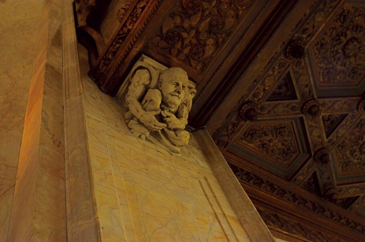
A cartoonish Frank Woolworth counts nickels and dimes, perched atop a pillar flanking his namesake building’s elevator lobby.
Indeed, the only “deity” enshrined in the Woolworth was Frank W., himself, his surname initial crowning dozens of doors and panels and his visage captured in the image you see here, a sculpted caricature of the magnate counting…what else?….coins (Illustrator Thomas Johnson also inspired similar carved likenesses of architect Gilbert and other key players in the tower project).
Open once more to guided tours in recent years (following a post 9/11 security lockdown), the Woolworth’s riot of rich woods, veined marble, stained glass and whimsical ornamentation are a treasure trove for photographers. To encourage your own visit, I’ve created a small gallery from my own, viewable by clicking the page tab marked The Wonderful Woolworth, seen at the top of this page.
In terms of technical specs, all images were shot handheld in existing light (flash would be worthless there, even were it permitted) with a manual 24mm Nikkor wide-angle shooting at apertures of either f/4 or f/2.8, shutter speeds from 1/13 to 1/60 of a second, and ISOs ranging from 1250 to 1600. But in terms of just being able to walk inside Cass Gilbert’s politely profane Edwardian birthday cake, you won’t need a camera to come away with some astounding memories.
LEADING THE WITNESS
By MICHAEL PERKINS
PHOTOGRAPHY IS GUILTY OF MANY AN UNTRUTH, simply by the very nature of how it mimics reality. And chief among these falsehoods is its assertion that it’s reproducing depth as well as length and breadth, that you’re not only looking at a photograph but into it as well. Compositional tricks employed to sell this illusion are as old as the medium itself, many employing the technique familiarly known as leading lines.
The phrase is practically an explanation in itself: two or more lines of some kind seem to originate near the foreword edge of the picture and trail inward, receding toward the “back” of the frame, usually toward a horizon line of infinity, at a point at which the lines seem to converge, like train tracks that grow closer as they fade into the distance. Leading lines can take the form of a spiral staircase, a winding stream, or some similar invitation for your eye to “buy into” the idea that the flat image is actually “deep”.
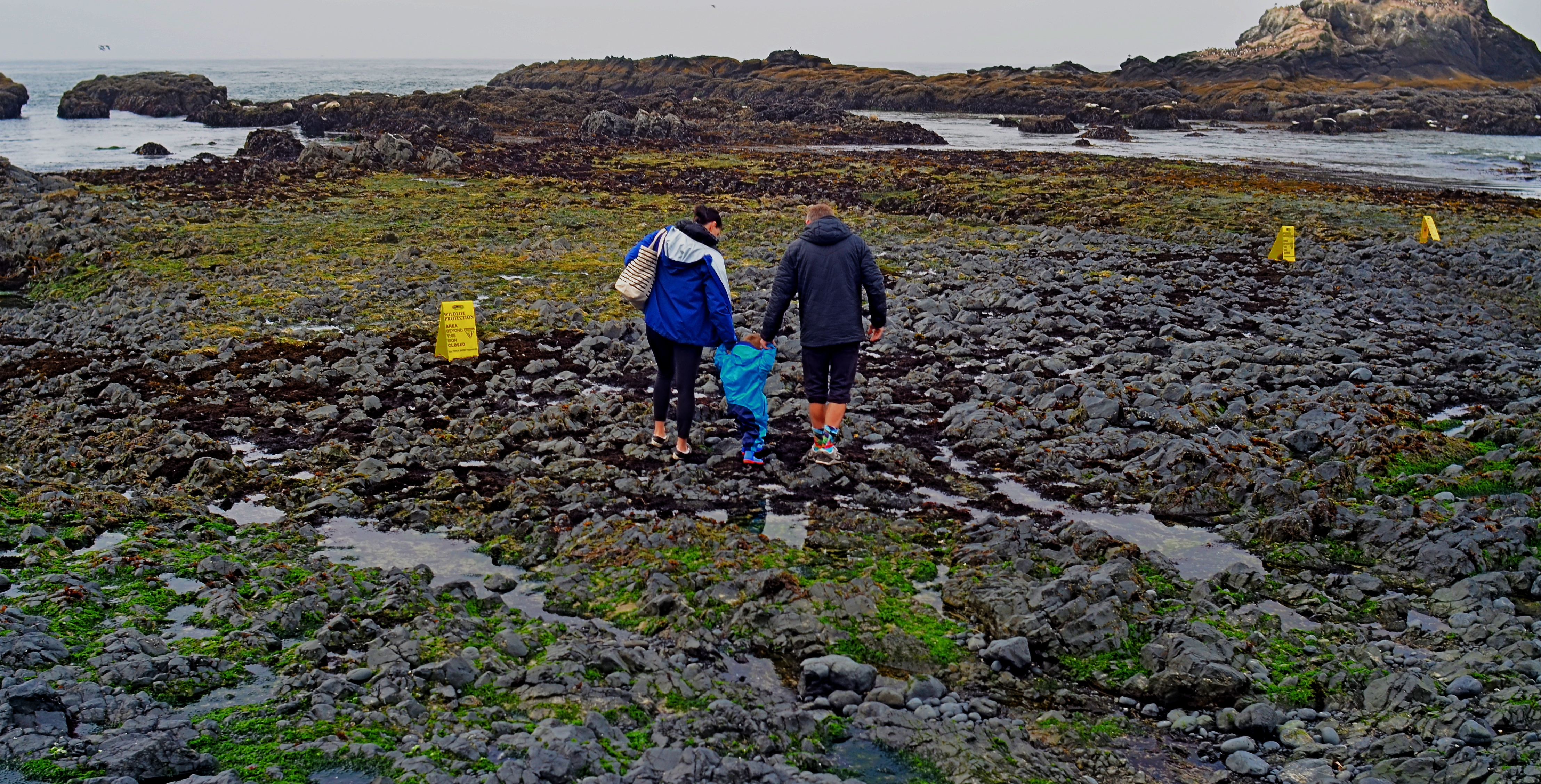
As surefire as leading lines can be, it’s also fun to experiment with other ways to convey the illusion of depth. The image seen here uses no obvious leading lines, and yet it achieves a reasonable effect of dimensionality. Several things can help “sell” the trick.
First and easiest is the choice of a 24mm lens. This optic qualifies as an “ultra-wide” and will always exaggerate the distance from front to back. Then there’s the detailed texture of rock and sand, whose particles shrink in size as the tide pool recedes toward the sea, and just as our mind knows it would in nature. As to focus, setting at infinity helps the eye look deeper into the shot, whereas just shooting only the family in sharpness might stop the audience at a shallower viewing point. Finally, the placing of the family at center and at the mid-point of the front-to-back distance means you have to “look into” the shot fairly deeply just to engage them, at which point your brain has already been dragged halfway to the rear of the shot.
And this is only one very elementary example of how you can effect the depth of a leading line image without….the leading lines. In some ways, photographic compositions are much like musical ones: both require orchestration and a willful conductor.
THE COWGIRL IN THE BLEACHERS
By MICHAEL PERKINS
I AM NEVER TRULY COMFORTABLE working with a camera that isn’t physically locked onto my eye. Shooting without a viewfinder was, for me, perhaps the hardest part of gradually embracing cel photography, and continues to be a control issue that still inclines me toward my Nikons most of the time. Part of it, I freely admit, is mere sentimental habit……maybe even, who knows, superstition?…..and yet when I’m crammed up against that little square of glass, I feel as if I’m “really” taking a picture.
That’s why it’s really a rare bird for me to “shoot from the hip” with a DSLR, to try to sneak a street candid without my camera anywhere near my face at all, holding the thing at mid-chest or waist level or even squeezing off a frame while it’s hanging from my shoulder. If the opportunity is literally too juicy to resist, and if looking like a (gasp) photographer will spook my quarry (or get a Coke thrown in my face), well, then, desperate times call for desperate measures.
I arrived at such a “desperate times” moment the other day by being caught out with the wrong lens. I had thought that I would be spending my afternoon at a horse show inside barns and stables, indicating a wide-angle to open up cramped spaces, so I packed a 24mm to go wide but keep distortion to a minimum. Once Marian and I arrived at the event, however, she got interested in an arena competition, and so in we went. Now I’m taking big shots of a cavernous hall punctuated by long lines of little tiny horses. If a rider lopes directly in front of my seat, I can almost make out his face. Otherwise I’m zoomless and story-less. Can we go home now?
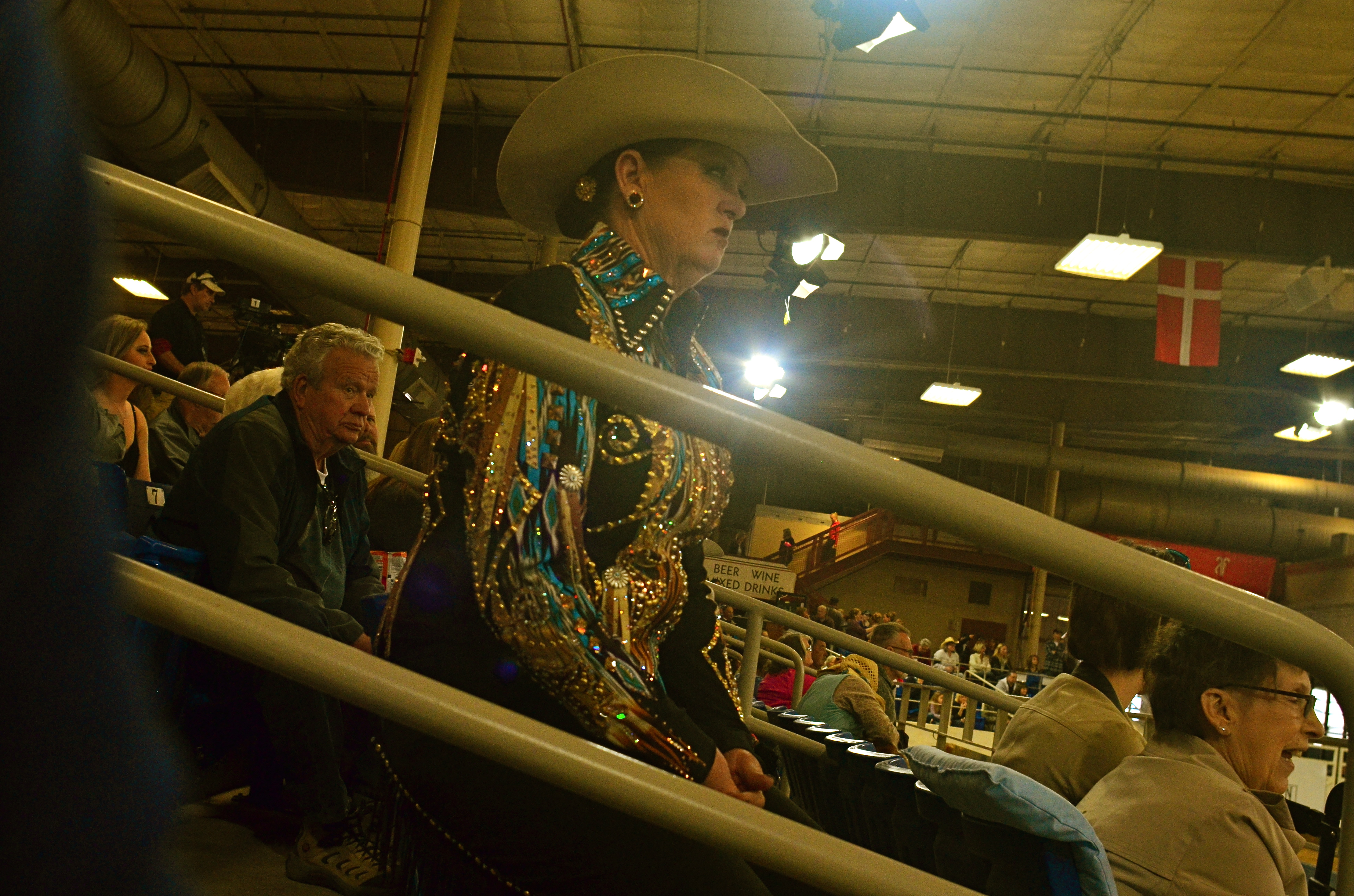
I hear a husky female drawl off to the left.
“Jus’ let her walk, Annie. She wants to walk.”
Turns out the voice belongs to a spangled matron with a Texas twang sharp enough to chop cheddar, herself apparently just off the competition track and now shouting guidelines to another woman in the field. I immediately fall in love with this woman, hypnotized by her steely stare, her no-nonsense focus, and the fact that, unlike the far-away formations of horses directly in front of me, she is a story. A story I need to capture.
But any visible sign of guy-with-a-camera will ruin it all. I will swing into the range of her peripheral vision. Her concentration will break. Worse, the change in her face will make the story all about the intrusive jerk six feet away. And so I hug the camera to the middle of my chest, the lens turned generally in her direction. Of course I have no reliable way to compose the shot, so I spend the next several minutes shooting high, low, losing her completely in the frame, checking results after every click, and finally settling on the image you see here, which, despite my “calculations” for a level horizon, looks a bit like a shot from the old Batman tv series. Holy carsickness.
Strangely, shooting at actual horses (at least with the glass I brung) was telling me nothing about horse culture. But the lady with the spangly blouse and Stetson got me there. It’s literally her beat, and I was grateful to, yes, sneak a glimpse at it.
“LEVON”
By MICHAEL PERKINS
MANY PHOTOGRAPHERS ARRIVE AT WHAT I CALL a minimalist reset, evolving in their technique to the point at which they can do more varied work with fewer tools. This process leads many to designate a personal “go-to” lens, the chunk of glass that solves nearly every problem on a given shooting day by itself. I’ve tried to take this a step further, going from ” what one lens do I most need today?” to “what one lens can I probably use for everything, nearly every day?”, a lens so flexible that I’d actually have to have a very good reason not to use it on any given day. To express it another way, instead of thinking of a “go-to” lens, I’ve tended to work toward finding a “leave-on” lens.
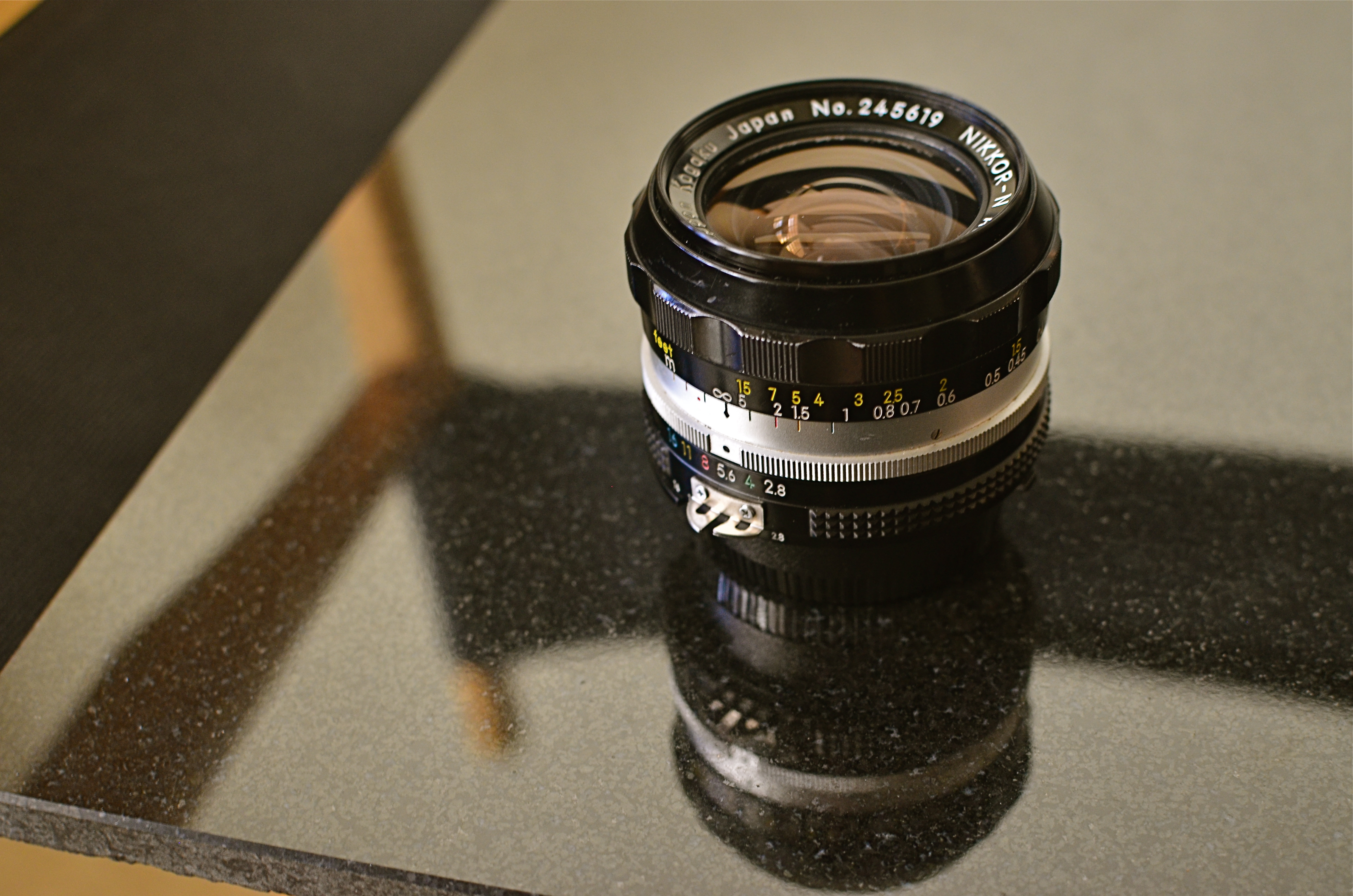
My “Levon” is the venerable Nikon 24mm f/2.8, in production continuously from 1967 (about when mine was made) to the present as a metal-barreled, fully manual lens. There is a cheaper, plastic autofocus version also available, but optics are generally the same. That is to say, damned sharp and damned fast. Both lenses are extremely compact and thus easy to lug about.
24mm is correctly called an “ultra-wide angle”, but I originally switched to it from something even wider, the ubiquitous 18-55mm “kit lens” most Nikons ship with these days. Doing a lot of shooting in big cities with crowded streets, I originally thrilled to just how much the 18 could cram into a frame. Eventually, however, I came to hate the severely in-bent slant on tall structures, and the fact that the 18, wide open, is pretty slow, at a max aperture of f/3.5. With the 24, I still get plenty of more natural-looking width and another fat half-stop of light in the bargain.
Handheld night scenes make up about a third of my urban shooting, and, here again, the 24 is Mikey’s Best Friend. Its manual focusing means my camera never spazzes in search of a focus lock in the dark, allowing me to actually shoot faster. And city scenes can be sharp even wide open at f/2.8, giving me crisp results from 12 feet all the way to just under 50, and from 17 feet pretty much to infinity. Combine that with a fairly low ISO like 800, and I can even keep the grain down.
Being a prime lens, the 24mm can’t zoom, but outside of occasional nature work, I seldom need a telephoto, so you don’t miss what you don’t use: another reason to leave the 18-55 home. Besides, primes, being optically simpler, are usually sharper, meaning it looks better than the kit lens dialed to 24mm. Finally, Levon is not a macro, but focuses at just one foot out, so some modest close-up work is feasible.
Standard disclaimer: this analysis is offered not to claim that any one lens is perfect for any one person. It’s just an exercise to show how, for the way I shoot, I have been able to do over 75% of my typical work without swapping out glass. I gain speed, ease, and flexibility in the process, and, if you conduct your own experiments, chances are you too can progressively spend less time fiddling and more time shooting.
“….and it shall be Leave-On…”
DEFINING SPACE
The use of an extreme wide-angle lens, like this fisheye, need not generate the bendy look of “barrel distortion”. It’s all in the composition.
By MICHAEL PERKINS
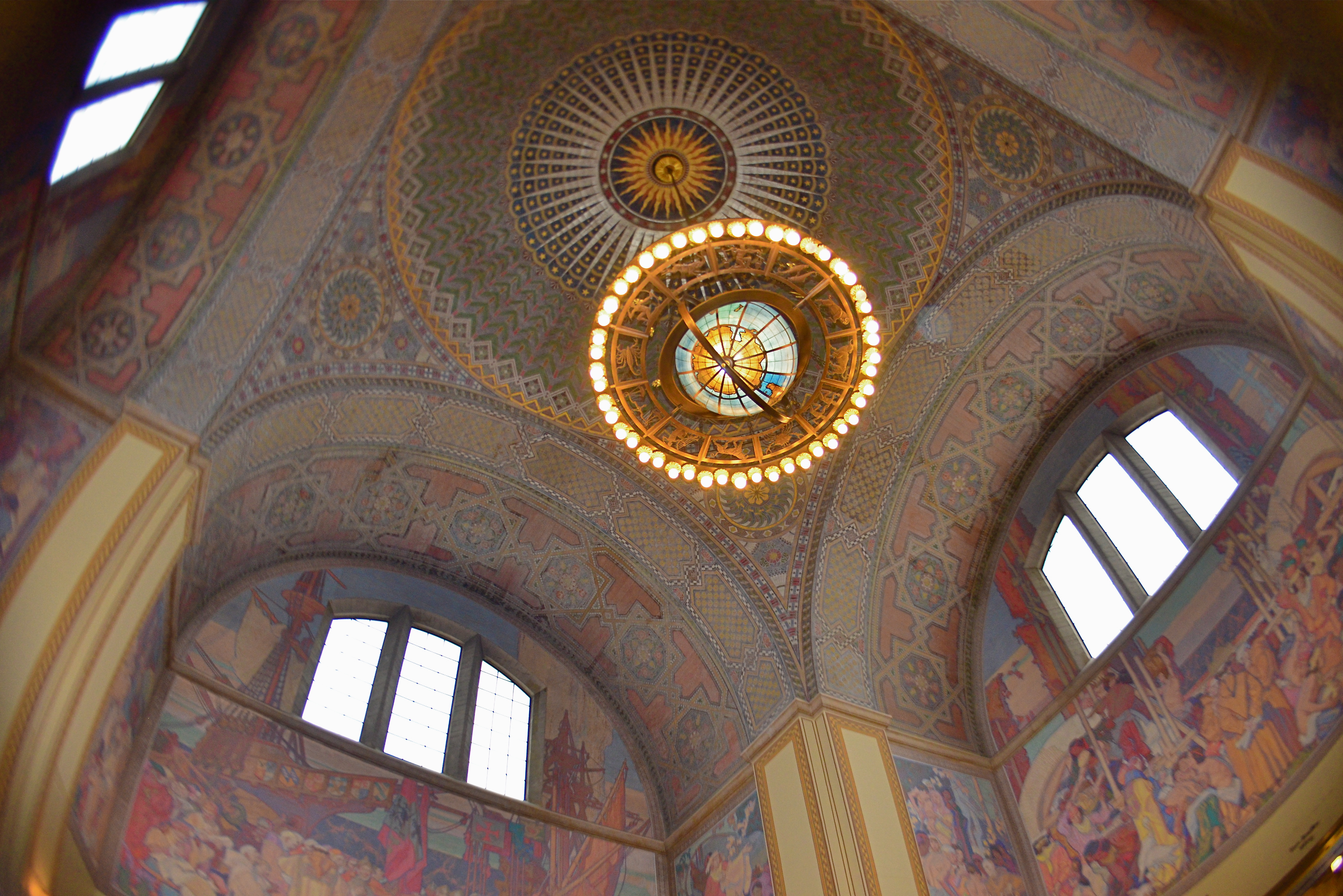
VISIT ENOUGH TOURIST SITES and you will eventually encounter the challenge of capturing very large objects, trying to squeeze the whole of a cathedral or a canyon into a single frame. Using a wide-angle lens is the first instinct, of course, but since even a 35mm is considered a wide-angle of sorts, there are any number of choices that all have their own pluses and minuses.
The lower the millimeter number, of course, the wider the lens. Simple enough on the surface, but you still have to decide what kind of wide you prefer. Each lens has slightly different coverage and properties, with the “super-wides” adding their own distinctive traits to the space you’re trying to capture. The two main properties you’ll notice most are barrel distortion and dimensional exaggeration, both of which will affect your lens choice for a given shooting situation.
Let’s look at barrel distortion. Lenses wider than about 24mm can make straight walls appear to bend outwards like the sides of a barrel, creating an unreal, and, for some, somewhat claustrophobic appearance most associated with the ultimate width of a fisheye (something around 8mm). The effect is that of a world cramped into the inside of a snow globe, and, depending on what look you’re going for, it can either be marvelous or miserable. It’s marvelous, for example, if you want to suggest tremendous depth in a shot.
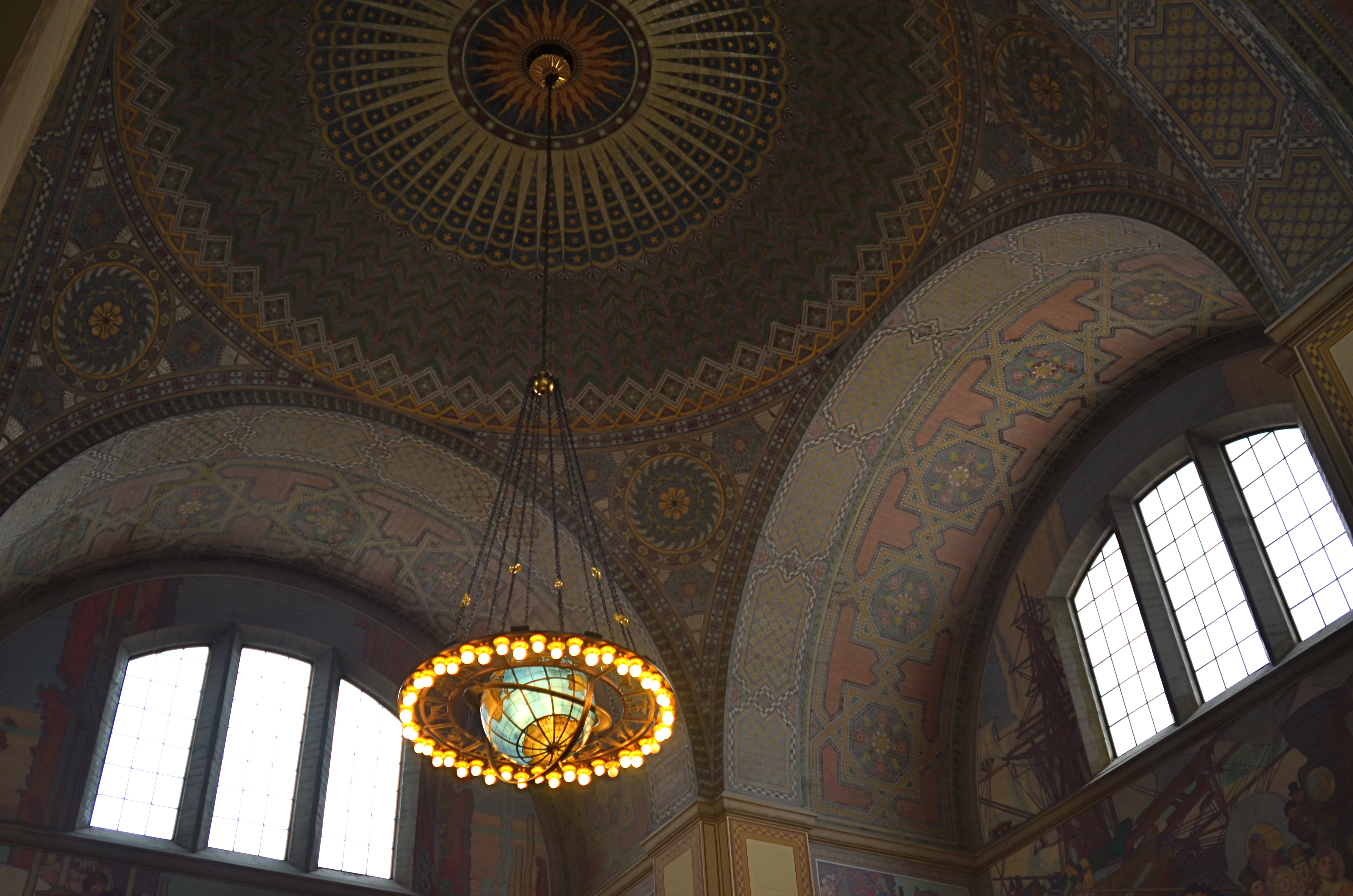
A more modest wide-angle, like this 24mm delivers more conventional dimensions, but not as much coverage.
And that’s dimensional exaggeration, the other key trait of a super-wide, in which the perception of distance from front to back is greatly hyped, making a deep space look even deeper. Shooting a cavernous area like the inside of the rotunda at the Los Angeles Central Library, as seen in the frame at top, you may want to suggest vastness, and a fisheye, such as was used here, does that superbly. All I’ve done to defeat the accompanying barrel distortion is to crop away the original frame edges. Of course, using a more conventional focal length like a 24mm, as seen directly above, shows all dimensions in a much more natural way, but they sacrifice coverage area, revealing less of the ceiling and sides and creating the sensation that the shot is not inclusive of enough information. In the case of both lenses, how you frame and where you stand will produce significant variations on how you render the space.
Photography is about what to fill the frame with, of course, but it also involves some planning as to how technology does that best, based on the tools at hand and what they’re equipped to do.
THE COMPOUND ILLUSION
Next Will Be The Soup Course (2016). 1/60 sec., f/8, ISO 400, 24mm.
By MICHAEL PERKINS
ASK THE AVERAGE PERSON FOR A BRIEF COMPARISON BETWEEN PHOTOGRAPHY AND PAINTING, and you may hear the assertion that, ‘well, photographs are real..”, a statement that reveals the fundamental flaw in our thinking about photographs from their earliest beginnings. Simply because a camera measures and records light (perhaps also because it’s a machine), we’ve come to regard its end product as a literal representation of the world. But no serious examination of what artists have done with the photographic image will support that idea. Photographs are no more real than daubs of pigment, and no more reliable in their testimony.
Photographers twist and torture light and shadow to present their version of the world, not its literal translation. If they worked with top hats and wands instead of Leicas, their audiences would accept, with a wink. that a live rabbit was not actually produced out of the hat’s crown, but was, in fact, a feat of misdirection, of persuasion. The camera, on the other hand, gets far more credit for being faithful to the real world than it deserves. As the old saying goes, a photograph is a lie that tells the truth.
Making any kind of image, the photographer has any number of simple techniques available to him to make the inaccurate seem real, most of it achieved in-camera. Take, for example, the attempt, in the above photo, to create as great a sense of depth as is possible in a flat image. First, the use of a wide 24mm lens will optically exaggerate the distance between the front and back of the scene, nearly doubling the sense of space versus that of the actual room. On top of that, the image is composed with the most severe diagonal possible to pull the eye into its already over-accented dimensions.
As a final touch, the shot is taken at the smallest aperture practicable in the available light, insuring uniform sharpness as the eye looks “into” the scene. The result is a three-decker compound illusion……fairly removed from “reality” and yet suggesting itself to it, much as the rabbit seems to have emerged from the hat. Indeed, with the creative manipulation of the photographic process, you might not need, in terms of reality, either the hat or the rabbit to perform your “trick”. But you can certainly show them both in the shot.
Really.
(LESS THAN) PRIME OPPORTUNITY
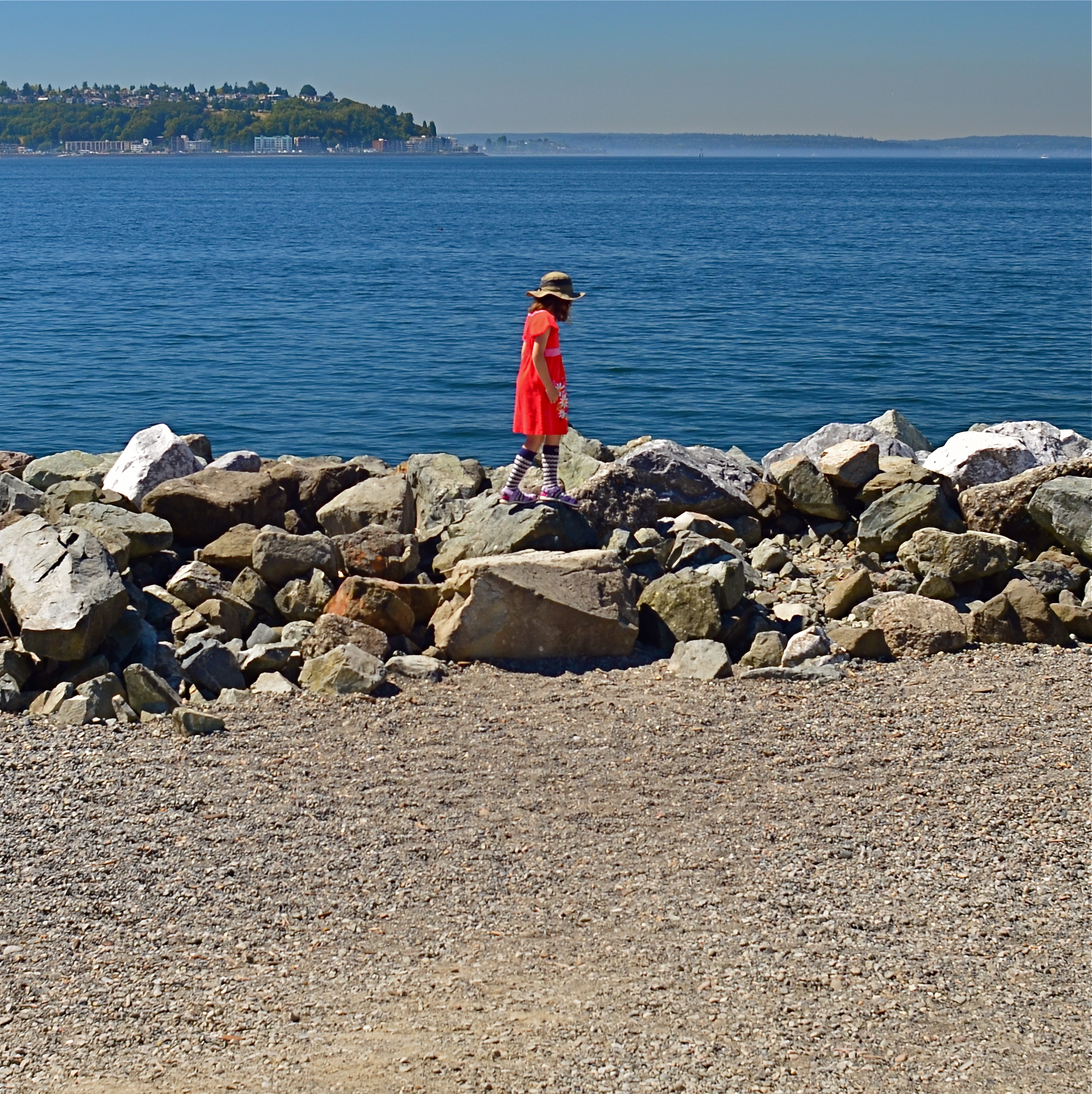
To Susan On The West Coast Waiting (2016). Shot from over 50 feet away with a 24mm wide-angle prime, then cropped nearly 70% from the original frame.
By MICHAEL PERKINS
EVERY DAY-LONG SESSION OF TRAVEL PHOTOGRAPHY dictates its own distinct rules of engagement. You can predict, to some degree, the general trend of the weather of the place where you’ll be staying/playing. You can pre-study the local attractions and map out at least a start-up list of things you might like to shoot. And you can choose, based on all your other prep, the equipment that will work best in the majority of situations, which keeps you from carting around every scrap of gear you own, saving reaction time, and, possibly, your marriage.
All well and good. However, even assuming that you make tremendously efficient choices about what lens you’ll most likely need on walkabout, there will be the occasional shot that is outside the comfort zone of said lens, something that it won’t do readily or easily. In such cases, the lens that would be perfect for that shot is likely forty miles away, back at your hotel. And here’s the place where you can pretty much predict what I advise.
Take the shot anyway.
The original composition.
I tend to work with a 24mm prime f/2.8 lens when walking through urban areas. It just captures a wider field within crowded streets, allowing me to grab most vistas without standing in the path of onrushing traffic (a plus) or spending a ton of time re-framing before each shot (a pain). This particular 24 was made in the ’70’s and is both lightning fast and spectacularly sharp, which, being a manual lens, also saves time and prevents mishaps.
24mm, to me, produces a more natural image than the wide end of the more popular 18-55 kit lenses being sold today, since there is less perspective distortion (straight lines remain straight lines). However, since it is a wide-angle, front-to-back distances will appear greater than they are in reality, so that things that are already in the distance seem even more so. And, since it is also a prime, there is no zooming. In the case at left, I wanted the girl’s bonnet, dress and presence on those rocks, but, if I was going to get any picture at all, plenty of other junk that I didn’t need would have to come along for the ride.
You deal with the terms in front of you at the time. Without a zoom, I either had to take the shot, with the idea of later cropping away the excess, or lose it altogether. There are times when you just have to visualize the final composition in your mind and extract it when it’s more convenient. Simply capture what you truly need within a bigger frame of stuff you don’t need, and fix it later. It’s a cornball cliché, but the only shot you are guaranteed not to get is the one you don’t go for. And this is also a good time to remember that it’s always smart to shoot at the biggest file size you can, allowing for plenty of pixel density even in the aftermath of a severe crop.
You can’t pre-plan all the potential pitfalls out of a photo vacation. Can’t be done. Come as close as you can, and trust your eye to help you rescue the outliers down the road.
But take the shot.
A MATTER OF DEGREE
By MICHAEL PERKINS
NIGHT CREATES SUCH A DRASTICALLY DIFFERENT FLAVOR in anyone’s photography that some shooters, romantically attracted to its unique look, have made night-time their exclusive domain. Night is also the toughest time of day to render properly, and a zone wherein one’s interpretation of “reality” varies wildly. From the earliest days of the photographic medium, the hours after sunset were, first and foremost, a technical minefield, filled with pitfalls and perils.
Today, fast lenses and the higher ISO that can be dialed up pretty much at will mean fewer tripod shots, more hand-held shots, and thus a much bigger yield of often stunning night-time images. Even modest cameras are evolving so quickly that it’s getting hard to remember a time when we couldn’t shoot pretty much whatever we desired.
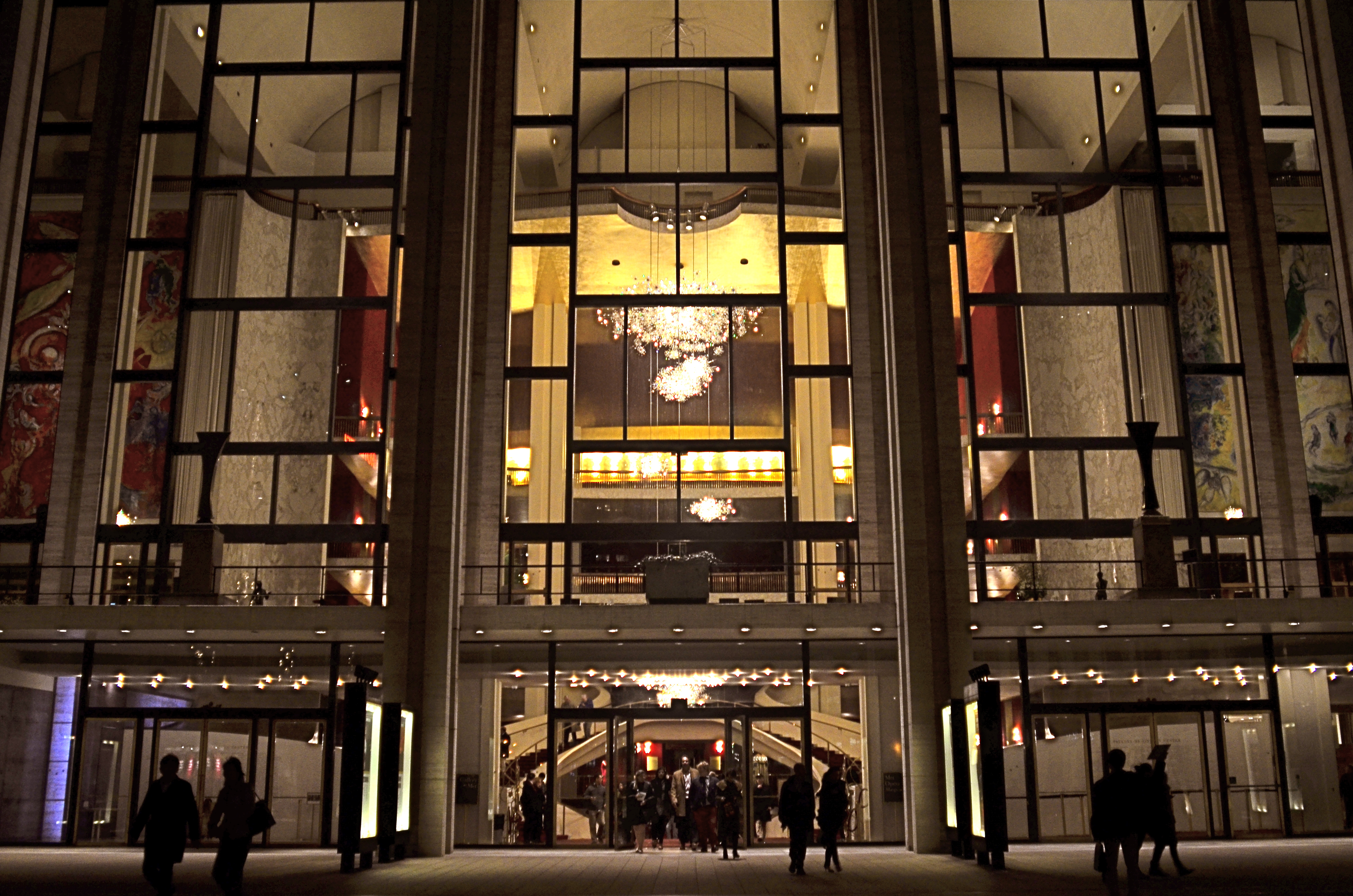
Lincoln Center, 2016
In many night settings, the contrast between bright and dark objects is dramatically multiplied. That means that getting proper exposure still has to be calculated based on widely varying elements within the frame. The night I took this image at New York’s Lincoln Center, I shot the various performance buildings on the “campus” in every compositional combination and setting possible, using a Nikon f/2.8 24mm prime lens. I framed the theatres at right angles to each other, by themselves, juxtaposed with neighboring skyscrapers, with and without the center’s fountain plaza, from medium distances to the lobby, tight distances to the lobby, and so on. In one “almost” calculation, I shot at f/8 and about 1/80 sec. at 1500 ISO, didn’t like how grungy it looked, then cranked the lens wide open to f/2.8, used as slow an exposure as I could execute hand-held (about 1/20 sec.), and backed off the ISO to about 400. That’s the combo you see above.
Normally, an aperture like f/2.8 produces a very shallow depth of field, which is generally bad for distant subjects. However, if you are focused to infinity, and your subject is, say, forty feet away, the image starts to get a little sharper at about twenty feet out, and is pretty sharp by forty. One sharpness caveat: if you use a slow exposure, as I chose to, and you’re also boosting your ISO, the electrical lights in your image will begin to go soft and globby fairly quickly…to “burn in” to some degree. You can see this in my image in the lobby chandelier, which registers as a velvety glow instead of a sharp grouping of individual bulbs. As an alternative, if you have time to experiment, you can amp up the up the ISO a little more, speed up your shutter, and perhaps render the lights a little sharper. This depends greatly on how many wives you have standing nearby, asking, “can we please just walk to the subway now?” It’s also not the only solution possible. Fiddle with it and see what works for you.
Also, if you are lucky enough to be shooting on a tripod, then you can shoot at minimal ISO, an aperture of f/11 or narrower, and as long an exposure as you desire. But the above guidelines are offered for someone shooting hand-held, and in a moderate hurry. I use very fast prime lenses to give me the sharpest focus and the most light latitude possible in the greatest number of situations, assuming that I won’t be allowed to mount a pod, even if I wanted to take one to the theatre (I don’t). So, as always, you have to decide a little ahead of time what you might be shooting, what the reality on the ground will be, and what you’ll need in the way of toys to bring home a goodie. Night is a very different animal, but trying to tame it is surprising and fun.
DEM DARN DONT’S
By MICHAEL PERKINS
THE GLIB REMARK THAT YOU HAVE TO LEARN ALL THE RULES IN LIFE BEFORE YOU CAN BREAK THEM is maddeningly true, at least for me. Early on in my foto-fiddling, I was eager to commit all the world’s accumulated photographic do’s and don’ts to memory, like a biblical scholar nailing scripture passages, and shooting as if to enshrine those stone-written truths in art. I used words like always and never to describe how to make pictures in a given situation. I kept the faith.
And then, when I suddenly didn’t, my stuff stopped being pictures and started being photographs. Absolutes of technique are good starting places but they usually aren’t the best places to stick and stay for life. And at this point in my personal trek (seventh-inning stretch), I feel the shadow of all those do’s and don’ts swirling about like little guardian angels, but I worry first and foremost about what makes a given image work.
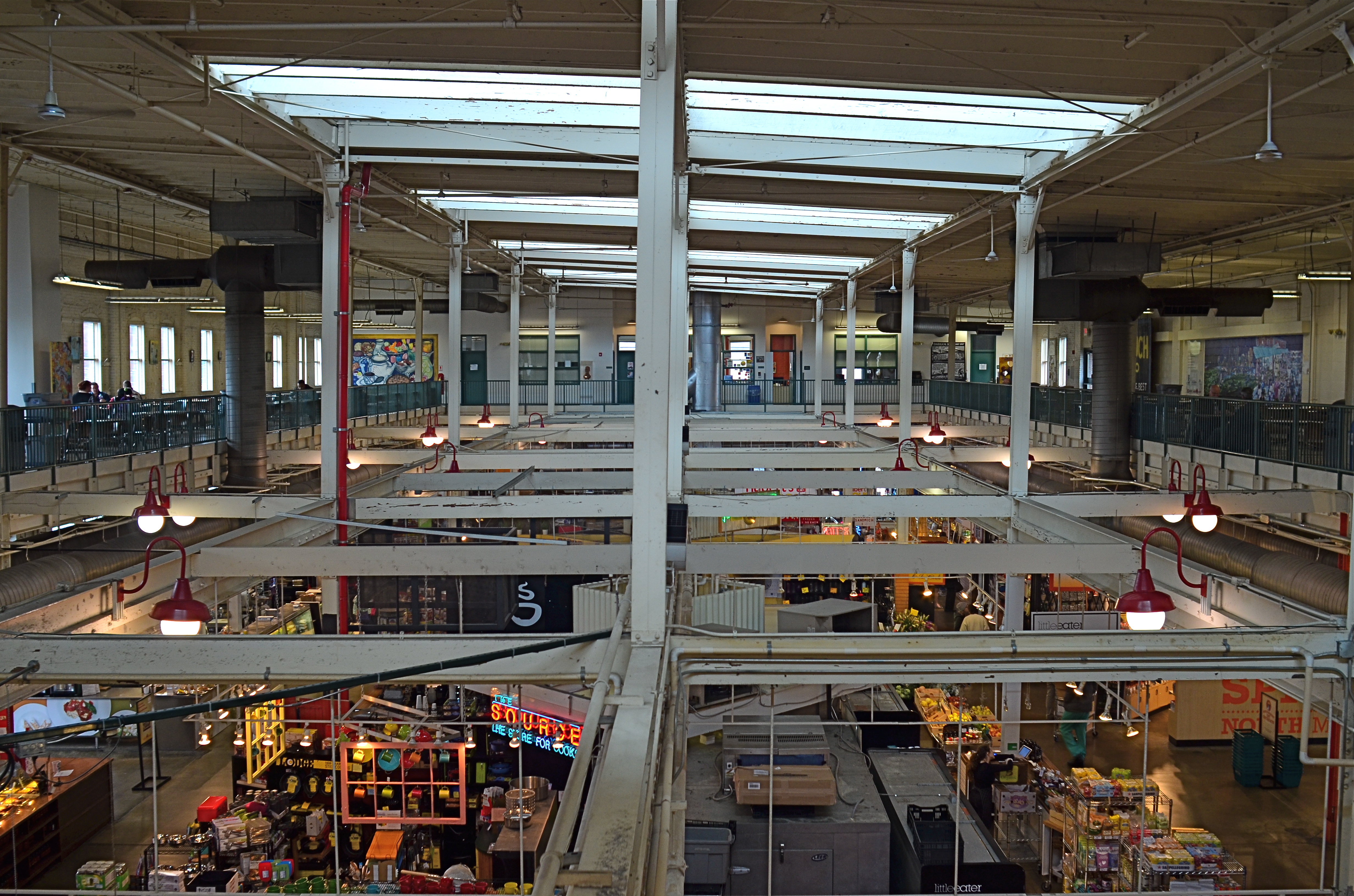
North Market, 2016. Straight out of the camera at 1/40 sec., f/5.6, ISO 200, 24mm.
You no doubt have many pictures you’ve made which you simply like, despite the fact that they flaut, or even fracture, the rules. The above image, shot earlier this week at a multi-floor urban marketplace/eatery, struck me for two reasons. First, because of how many basic rules of “proper” composition it clearly violates; and secondly, just how much I don’t care, because I like what it does. To illustrate my point, I’ve provided citations from an article titled Principles Of Composition to cite specific ways that the photo is, well, wrong.
Have A Strong point of interest. Well, there isn’t any particular one, is there? Lots of conflicting stuff going on, but that’s the natural rhythm of this place. It’s a beehive. One man’s clutter is another man’s full “pulse of life”, and all that.
Don’t place the horizon line, or any strong vertical or horizontal lines, right in the middle of a picture. And make sure the lines aren’t tilted. Okay, well, since there is a distinct difference between the “level-ness” of the crossbeams over the lower floor and the slanted lines of the skylight above, there really isn’t a way to make the entire picture adhere to the same horizontal plane. However, the off-kilter sagginess of the old building actually lends it a little charm , unless I’m just drunk.
Keep compositions simple, avoiding busy backgrounds that distract from your subject. Granted, there are about five different sub-pictures I could have made into separate framings within this larger one, but that would defeat the object of overall bustle and sprawl that I experienced looking out over the entire scene. Sure, some compositions get so busy that they look like a page out of Where’s Waldo?, but certain chaotic scenes, from Grand Central Terminal to Picadilly, actually reward longer, deeper viewing.
Place a subject slightly off-center rather than in the middle of a photo. Yeah, well, that’s where that “strong point of interest” rule might have helped. Sorry.
Do these deviations mean the image was wrong, or wrong for certain circumstances? Every viewer has to call that one as he sees it. Me, I am glad I decided to shoot this scene largely as I found it. It needed to work with natural light, it needed to be shot wide and deep, and it needed to show a lot of dispirate activity. Done done and done. I heard all the rules in my head and chose the road not taken.
Or taken. I forget which.
RUN WHAT YA BRUNG
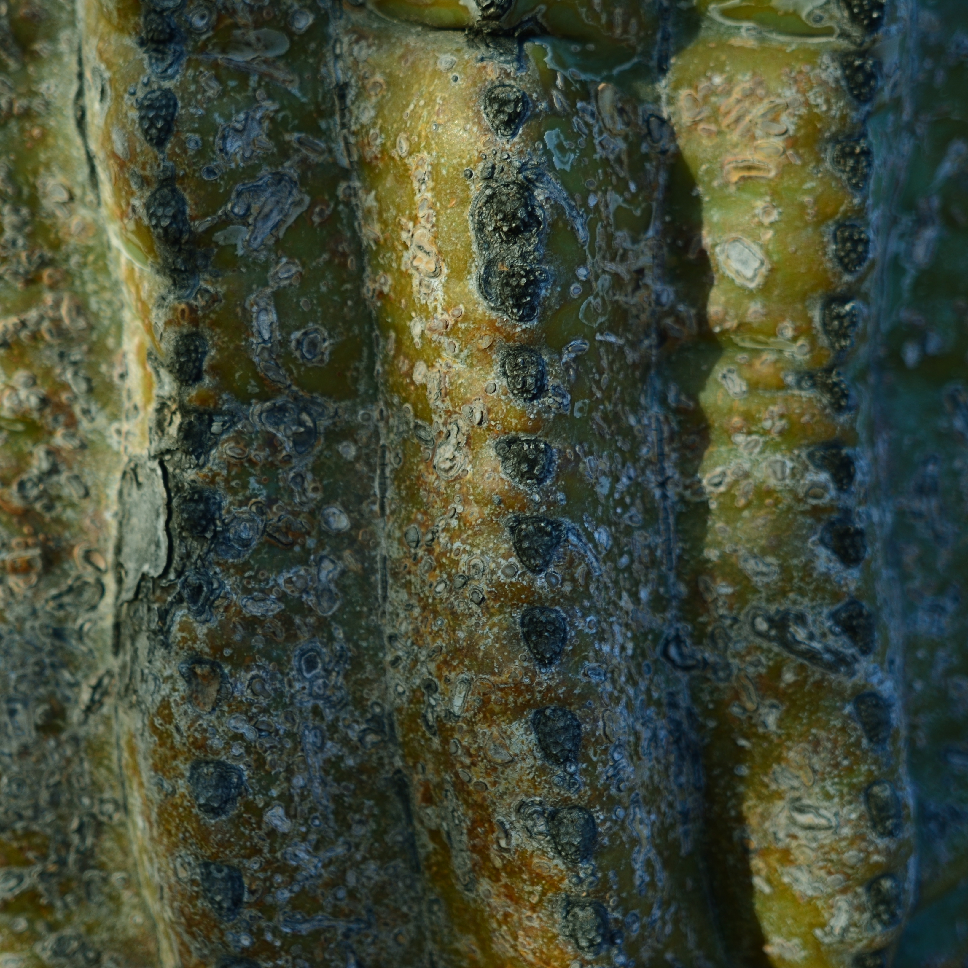
Didn’t bring a close-up or macro lens on this shoot, so had to ask my 24mm wide-angle to do double duty. And it could.
By MICHAEL PERKINS
NORMALEYE PHOTOGRAPHIC PARADOX No.346: You have to think hard about your equipment when you’re not shooting so that you don’t have to give much thought when you are.
Reacting “in the moment” to a photographic situation is often lauded as the highest state of human existence, and, indeed, the ability to see, and do, on the spot, can yield amazing results. But, in that marvelous inspirational instant, the smallest item on your checklist should be dithering about your gear. What it will do. What it can’t do. What you don’t know how to make it do. These are ruminations you run through when there’s no picture making going on.
Simply, the more you know about what you’ve taken to a shoot, the less creative energy will be drained off worrying about how to use it once you get there. You will get to the point where, for a given day’s subject matter, you take the wide lens, of course, or the macro lens, of course, or the portrait lens, of course. You’ll anticipate the majority of situations you’ll be in, and, unless you like driving yourself crazy, you’ll likely select one lens that will just about do it all. But whatever lens you select, you will want to know how much farther you can push it, as well. You know what you generally need it to do, but can it, in a tight spot, do a decent job outside its specialty? The answer is, probably yes.
One of my favorite lenses for landscape work is my ancient Nikkor 24mm f/2.8 prime. Nice and wide for most outdoors subjects, pretty fast for the close and dark stuff, and sharp as cheddar cheese in my most used apertures, especially the middle range, like around f/5.6. Can it do macro work, when I swing my attention from distant mountains to detail on a nearby cactus? Well, yes, within reason.
The minimum near-focus distance for this lens is about ten inches, more than close enough to fill a frame with the trunk of the saguaro with a little spare space to the right and left. I shoot in big files, so even with a post-op crop I preserve lots of resolution, and bang, the wide-angle does a respectable job as a faux macro.
I grew up around amateur race arenas which invited people to haul any old hunk of automotive junk to the track, to be run in so-called “run what ya brung” events. I personally hate to haul my entire optical array out on a project, swapping out glass for every new situation. I’d much rather save my neck and shoulder by calculating ahead of time which lens will do most of what I want, but be able to stand-in for some other lens in special situations. There are usually work-arounds and hidden tricks in even the most limited lenses. You just have to seek them out.
Run what ya brung.
WEIRD SCIENCE
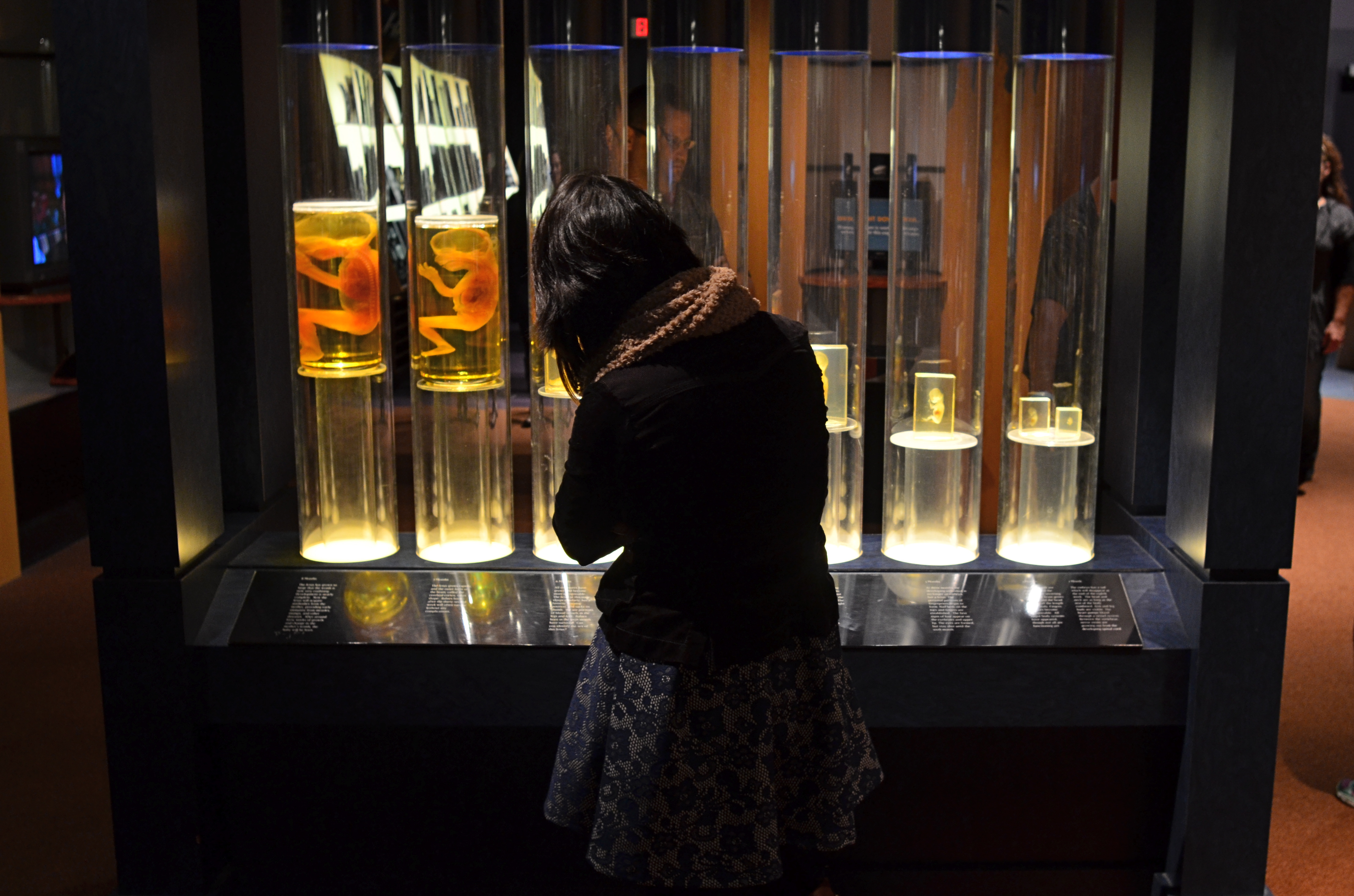
The fetal gestation timeline at Columbus, Ohio’s Center Of Science & Industry. 1/60 sec., f/3.5, ISO 500, 24mm.
By MICHAEL PERKINS
ONE OF THE RITES OF PASSAGE FOR SCHOOL KIDS IN COLUMBUS, OHIO IN THE 1960’s was a field trip to the Center of Science and Industry, or COSI, one of the nation’s first interactive tech museums, mounted before either the terms “interactive” or “hands-on” were common parlance. In those JFK-flavored days of early space exploration and Jetson-gee-whiz futurism, flying cars and picture phones seemed our inevitable legacy, and the Center’s exhibits often veered closer to the World’s Fair than the science fair, its dazzling displays often trumping pure enlightenment. A generation later, the sizzle lingers in the mind a little better than the steak. Something to work on.
Science was presented as something of a magic trick then, a sure and certain answer to all human needs and desires. But to my tween-sized mind, it also retained an air of mystery, something wondrously alien to my daily experience. Few of COSI’s exhibits from the time created more of a sense of wonder in me than an illuminated timeline of fetal gestation, with each crucial stage between embryo and newborn illustrated by a separately preserved specimen of a transitional human that never made it to the delivery room. As fascinating as the display was, it was also a little creepy, somewhat like, if you will, viewing pre-mummies from a colony of visitors from the future.
In a recent visit to the new COSI, now re-located to a larger, brighter HQ across from Columbus’ downtown riverfront, I was both amused and amazed to see that the timeline had been retained in nearly the same way I remembered it from 1964. Having survived to the era of iPhones and DNA mapping, its dim, the strange, amber-glow profiles still had a hypnotic effect on me, housed as they were in a dark, shadowy sector of the museum, sealed within a showcase that distorted the faces of passersby, even as it shrouded their bodies in mystery. For the shot you see here, I liked the strange juxtaposition of the exhibit’s clinical coldness with the form of a young visitor, casually viewing the timeline as if it were no more notable than a collection of butterflies. I shut the exposure down so that the case provided the only light, opened the lens as far as I dared for the right depth of field, and jacked the ISO slightly to compensate for the murky room ambience.
The COSI of the New Frontier years was always a place that could cast science in a distinctly optimistic light. In 2015, I hoped to re-imagine that magic through the insight of an additional fifty years of living. Mood in photography is created as much by what you conceal as by what you reveal, and trying to get that balance right is 90% of the game.
POINTERS
A traditional wide-angle approach to the suggestion of depth.
By MICHAEL PERKINS
WE ALL WENT THROUGH THAT OLD PERSPECTIVE EXERCISE IN ART 101. You know, the one where we draw the train tracks trailing away to an imaginary horizon, compressing the distance between the tracks as they “recede” to suggest depth, or a simulation of the way our eyes perceive it. It’s a lesson that dances somewhere back in our lizard brain whenever we compose a shot to suggest three dimensions on a flat plane (film or sensor) that only possesses two. Ongoing challenge, etc., etc.
In composing a photograph, it’s pretty easy to decide which factors in the picture actually aid that illusion, creating a big fat neon arrow to the thing we’re want to draw attention to. And some ways are better than others at selling that idea. One of the strong myths about these kinds of shots is that you need a wide-angle to make the argument for depth. Of course, that’s like a lot of “rules” in photography. It’s always true, except in those cases when it’s kinda…not.
In the top image, shot with a 24mm lens, the building at the back of the shot is lit better than the two alley walls that lead to it….a basic no-brainer of a composition. Moving left or right a bit can put the major emphasis on one wall or the other to be the arrow pointing to that object, or you can make the shot even more compact, although no less effective, in the cropping process.
Instead of two leading lines heading for the building at the back, let’s try just one.
Of the two walls, the rows of trash cans and receding lines of windows on the left seem, at least to me, to lead more powerfully to the back building than the right, where detail is darker and objects that could act as a leading line are a little more angled and compressed. Just for kicks, I cropped the shot to a square you see just above, reframing the back building as the end of a straight, single diagonal along the left wall, making the instruction to the eye a lot more streamlined.
It’s not that the fuller frame is “wrong” per se, but I always believe that inside many shots just might be a better shot waiting to get out. Some photographs are full-born in-camera, while others emerge during what I call the “on second thought” phase.
Now to try this idea out at a railroad crossing….
7/4/15: OH, SAY, CAN YOU SEE?
Honor Guard, 2015. 1/50 sec., f/5.6, ISO 100, 24mm.
By MICHAEL PERKINS
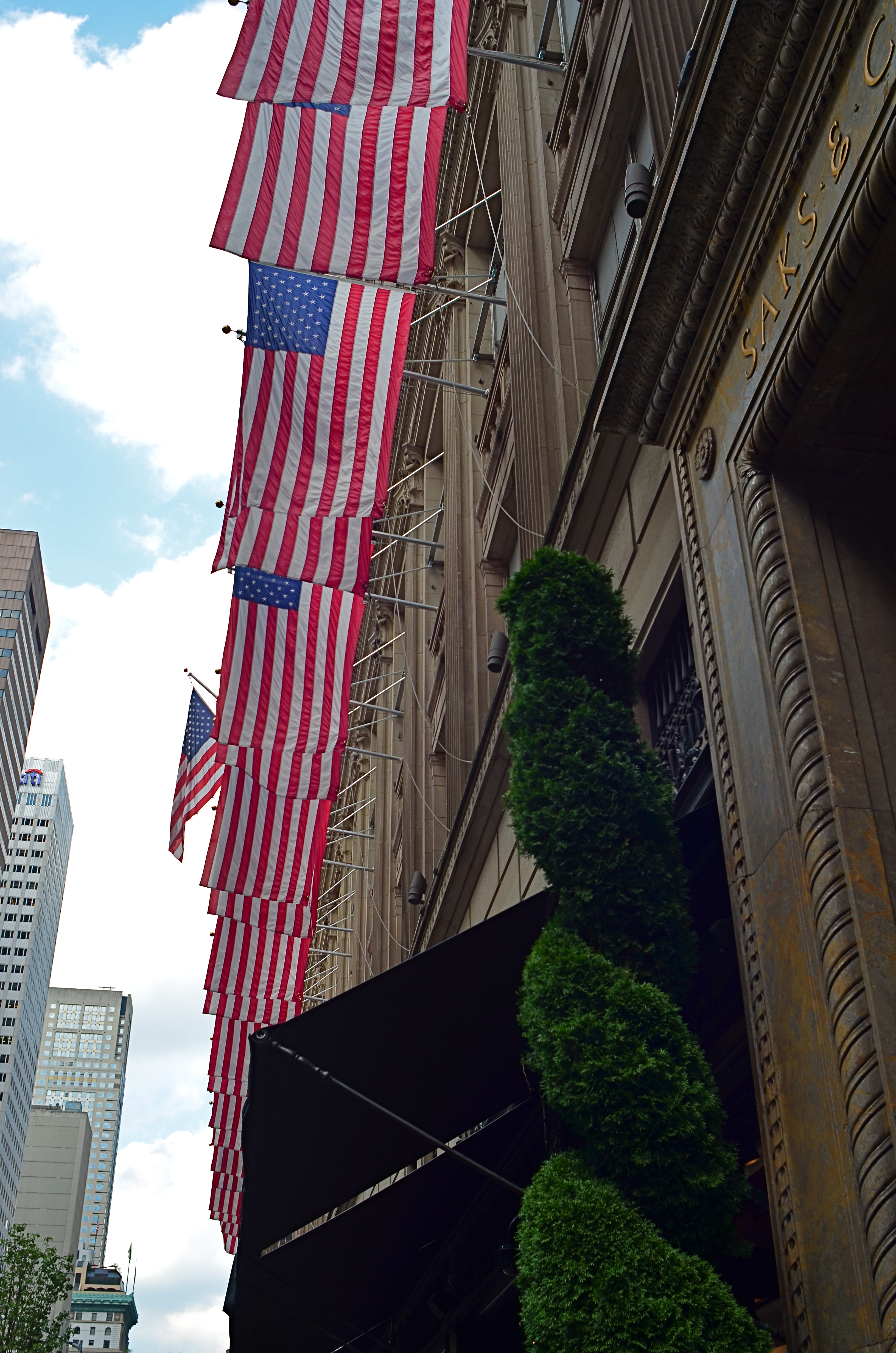
FOR AS LONG AS THERE HAS BEEN PHOTOGRAPHY, the United States of America has flown some version of the Stars and Stripes, a banner that has symbolized, in cloth and thread, what we profess and hope for ourselves as one of the world’s experiments in self-government. That argues for the flag being one of the most photographed objects in history, and, therefore, one of the most artistically problematic. Those things that are visualized most, by most of us, endure the widest extremes in interpretation, as all symbols must, and observing that phenomenon as it applies to the flag is both fascinating and frustrating.
Fascinating, because the flag can embody or evoke any emotion, any association, any memory, providing a gold mine for photographers who always must look beyond the mere recording of things to their underlying essences. Frustrating, because that task can never be complete, in that there can be no definitive or final statement about a thing that resonates so intensely, so personally with a diverse nation. Photographing the flag is always new, or, more precisely, it can always be made new.
The problem with fresh photographic approaches to the flag is really within ourselves. The banner is so constantly present, on public buildings, in pop culture, even as commentary, that it can become subliminal, nearly invisible to our eye. Case in point: the image at left of the front facade to Saks’ in Manhattan. The building is festooned in flags across its entire Fifth Avenue side, which is, being across the street from Rockefeller, a fairly well-trafficked local. And yet, in showing this photo to several people from the city, I have heard variations on “where did you take that?” or “I never noticed that before” even though the display is now several years old.
And that’s the point. Saks’ flags have now become as essential a part of the building as its brick and mortar, so that, at this point, the only way the building would look “wrong” or “different” is if the flags were suddenly removed. Training one’s eye to see afresh what’s just been a given in their world is the hardest kind of visual re-training, and the American flag, visually inexhaustible as a source of artistic interpretation, can only be blunted by how much we’ve forgotten to see it.
Photography has found a cure for sharpness, clarity, exposure, even time itself. But it can’t compensate for blindness. That one’s on us.
WORKING THE BLINDS
I love this building, but the real star of this image is light; where it hides, bounces, conceals, and reveals.
By MICHAEL PERKINS
ONE OF THE MOST CHALLENGING ASPECTS OF URBAN PHOTOGRAPHY, versus shooting in rural settings, is the constant variability of light. On its way to the streets of a dense city, light is refracted, reflected, broken, interrupted, bounced and just plain blocked in ways that sunshine on a meadow can never be. As a result, shooting in cities deals with direct light only intermittently: it’s always light plus, light in spite of, light over here, but not over there. And it’s a challenge for all but the most patient photographers. Almost every frame must be planned somewhat differently from its neighbors, for there can be no “standard” exposure strategy.
I often think of city streets as big window sills sitting below a massive set of venetian blinds, with every slat tilted a little differently. And I personally greet this condition as an opportunity rather than a deficit, since the unique patterns of abstraction mean that even mundane scenes can be draped in drama at any given moment. That’s why, as I age, I’ve come to highly value selective lighting, for mood, since I’m convinced that perfectly even lighting on an object can severely limit that selfsame drama.
I’m also reminded of the old Dutch masters painters, who realized that a partially dark face contains a kind of mystery. Conversely, a street scene that contains no dropouts of detail or light makes everything register just about the same with the eye, and can keep your images from having a prominent point of interest. Darkness, by contrast, asks your imagination to supply what’s missing. Even light is a kind of full disclosure, and it can rob your pictures of their main argument, or the “look over here” cue that’s needed to make a photograph really connect.
Back to street photography. Given that glass and metal surfaces, the main ingredients in urban structures, can run a little to silver and blue, I may actually take an unevenly lit scene and either modify it toward those colors with a filter, or simply under-expose by a half-stop to see how much extra mood I can wring out of the situation, as in the above image of an atrium in midtown Manhattan. Think of it as “working” those big venetian blinds. Cities both reveal and conceal, and your images, based on your approach, can serve both those ends.
NOT AS ULTRA
At its widest (18mm) setting, an 18-55 lens exaggerates front-to-back distances and slightly distorts the shapes of objects.
By MICHAEL PERKINS
SINCE THE 1990’s, THE MOST COMMON BASIC HUNK OF PHOTOGRAPHIC GLASS for new DSLRs has been the 18-55mm wide-angle, dubbed the “kit lens”. It allows beginners to move from landscape-friendly wides to moderate zooms without switching lenses. Depending on how much a given shooter experiments, the kit can allow for a lot of nuanced compositional options between the lens’ range.
If you find yourself shooting at the widest angle most of the time, then you are really using an effects lens, since, at 18mm, the lens is more than wide enough to distort angles and distances in ways that, while dramatic, don’t reflect the way your eyes actually see. This makes for expansive vistas in crowded urban streets and a little extra elbow room for mountain views, but is substantially more exaggerated than focal ranges from 35-50mm, which produce proportions more like human eyesight. However, the focal length you eventually choose has to be dictated by what you care to create; there can’t be any yardstick than that, all people’s opinions off to the side.
The same scene, taken from the same location at 24mm. Still plenty wide but displaying more normal space and perspective.
I have found a personal sweet spot by going a tad narrower, back to 24mm, and I also work with a dedicated prime lens that will only work at that exact focal length. By trimming back from 18mm, I find the distances from front to back in an image are a little more natural to my eye, and that I still have a yard of room from side to side without ushering in that Batman-type bending of perspective.
For comparison, I have re-shot subjects that I’d photographed at 18mm and found, at 24, no loss in impact. In the images in this post you can see the difference in how the two settings frame up. The composition in the 24 is a little tighter, but, if that’s not wide enough for you, you can simply step back a bit and there’s the same composition you saw in the 18, albeit with a little more normal proportion.
The most important thing with a variable focal length lens is to give yourself the flexibility of being able to get good results all through the focal range, simply to avoid getting too comfortable, i.e., sliding into a rut from always doing everything in the same way. Putting yourself into unfamiliar territory is always a good route to growth, and playing with your gear long enough to know everything it has to give you is the best way to periodically refresh your enjoyment.
When Grandma serves broccoli, you don’t gotta eat and pound-and-a-half of it, but heck, try it. You might like it.
THAT’S YOUR QUEUE
By MICHAEL PERKINS
AS CONVENIENT AND SIMPLE AS MANY PANORAMIC APPS AND TECHNIQUES HAVE BECOME OF LATE, there are many ways to accent a wide linear line of photo information within a standard camera frame. With images shot in very large file sizes these days, (even without shooting in RAW), plenty can be cropped from a photograph to produce the illusion of a wide composition with no loss in quality. It’s the pano look without the pano gear, and it’s a pretty interesting way to do exposition on crowds.
I first started noodling with this in an effort to save images that were crammed with too much non-essential information, most of them random streets shots that were a little busy or just lacking a central “point”. One such image was an across-the-street view of the area around the Chinese Theatre in Hollywood. Lots of building detail, lots of wandering tourists, and too much for a coherent story. Lopping off the top two-thirds of the frame gave me just the passing crowd, an ultra-wide illusion which forced the viewer to review the shot the way you’d “read” a panel in a comic strip, from left to right.
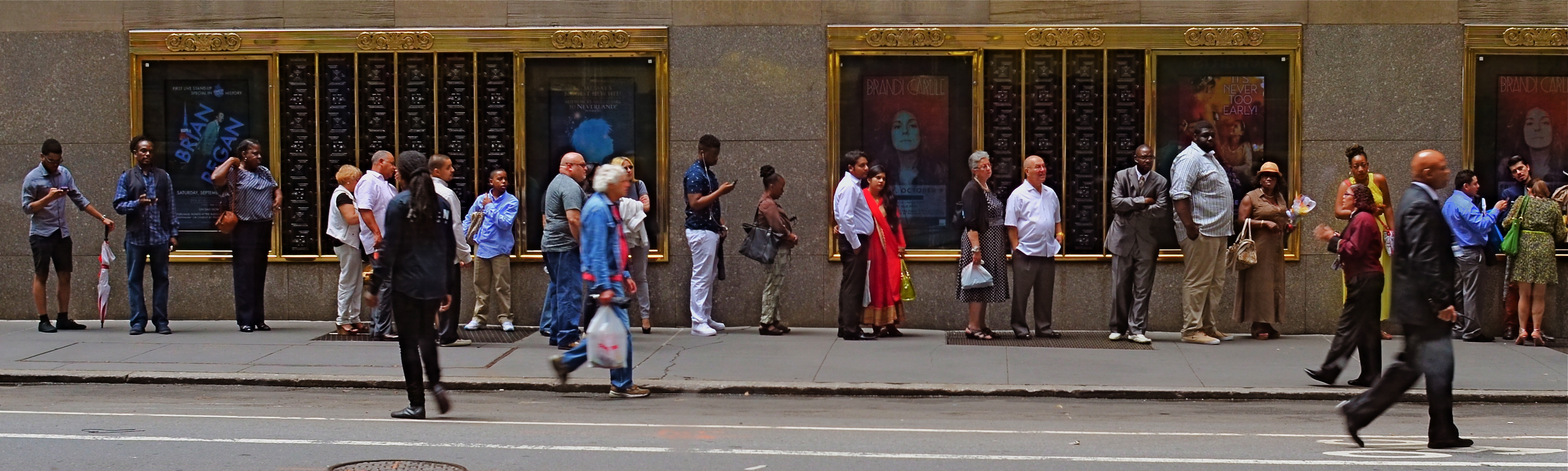
Tickets, Please, New York City, 2015.
Lately, I’ve been looking for a purer version of that crowd, with more space between each person, allowing for a more distinct comparison between individuals. That is, short guy followed by tall woman followed by little kid followed by….you get the idea. Then, last week, I happened upon the ideal situation while shooting randomly through a window that looked out on the 51st street side of New York’s Radio City Music Hall: a long line of folks waiting to pre-purchase event tickets. The space between them and the street rhythm shown by a few out-of-focus passersby was all the composition I needed, so in the editing process I once again aced the top two-thirds of the picture, which had been taken without zoom. A bit of light was lost in shooting through the window, so I added a little color boost and texturizing in Photomatix (not HDR but Tone Compression settings) and there was my pseudo-pano.
It’s a small bit of cropping choreography, but worth trying with your own street shots. As as is the case with many images, you might gain actually strength for your pictures the more ruthlessly you wield the scissors. Some crowd shots benefit by extra context, while others do fine without it. You’ll know what balance you’ll need.
THE LOOK OF SILENCE
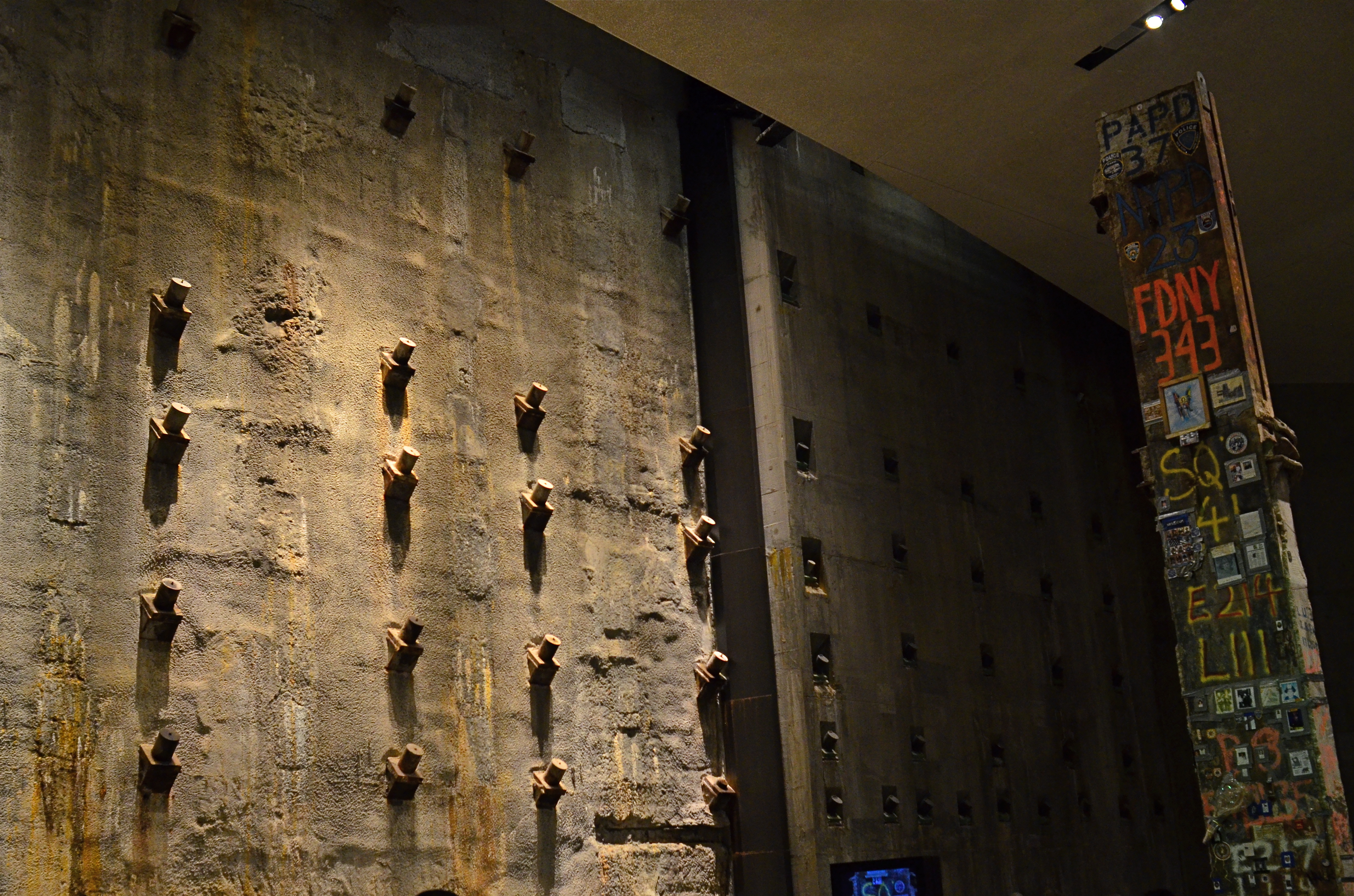
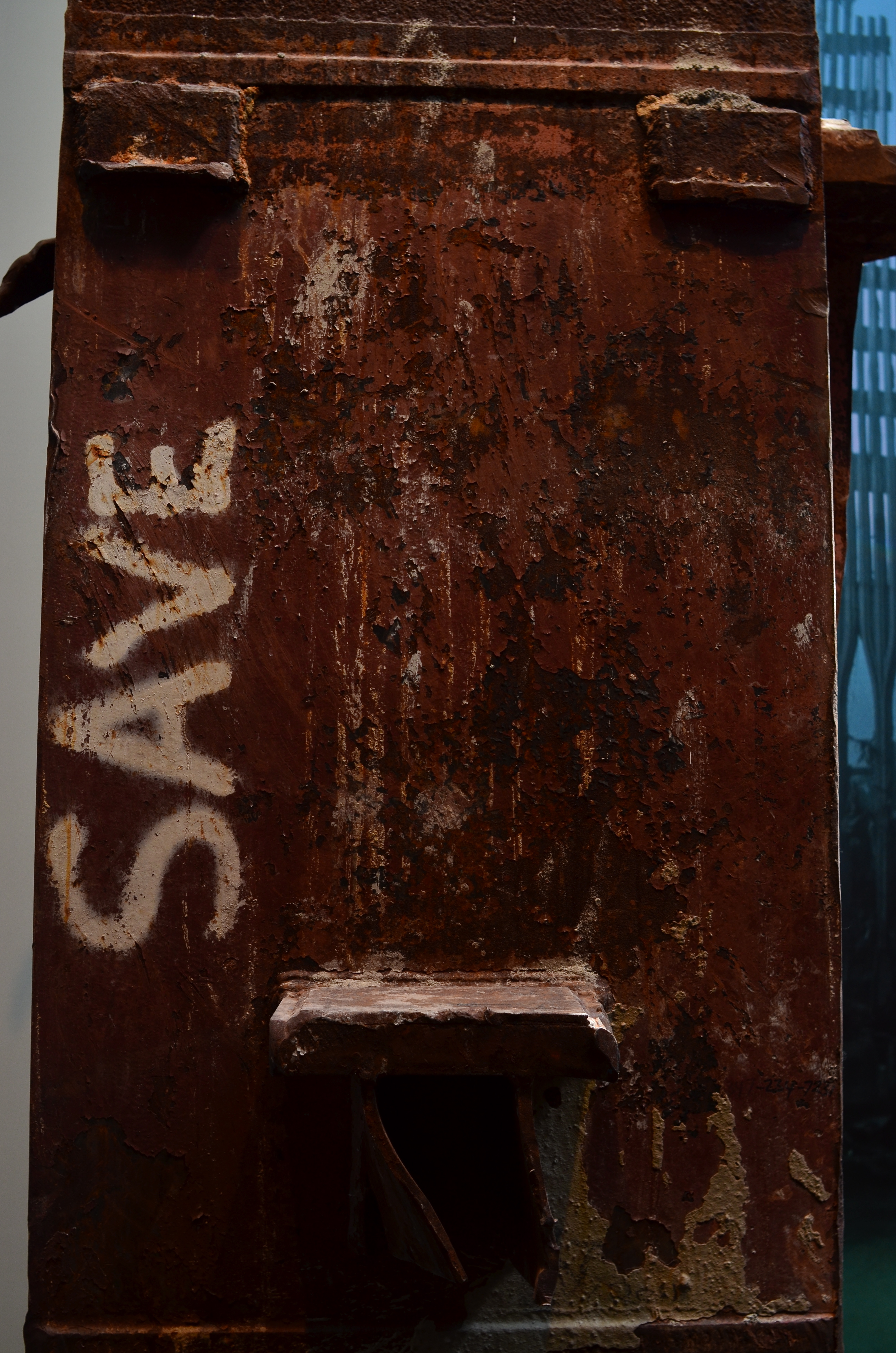
Slurry Wall And Hero’s Girder, 2015. The 9/11 Memorial Museum in New York is a cathedral of grim silence.
By MICHAEL PERKINS
AS THE MOST PHOTO-DOCUMENTED EVENT IN HUMAN HISTORY, the attacks of September 11, 2001 have spawned images that can never be unseen. Images that tear at you, slam you in the back of the head, wring tears and rage from you, stun you mute.
As the keeper and curator of many of the most powerful of these images, the 9/11 Memorial Museum in lower Manhattan has achieved a tough but fair balance of emotion and academia. Given the staggering number of people whose personal stake in this space covers every human motive and perspective, the making of this part-exhibit-part-shrine may have been one of the most thankless jobs imaginable.
And yet the job has been done, with eloquence and a spare, stark restraint that is poetic. Visiting the museum is no easy task. As Shakespeare said, if you have tears to shed, prepare to shed them now. But visit you should, and, yes, there is something that a camera can capture there without being crass or irreverent. The designers have seen to it.
 Firstly, they have guaranteed that the main central exhibits of debris, personal documents, voice messages and news video are completely off-limits to any kind of photography. Walk in there, and you’ll know why. Those who accidentally caught this epic horror in the moment of its occurrence will never be equaled or surpassed by anyone taking a casual snap on a smartphone anyway, and trying to do so would be like setting off sparklers at a requiem mass.
No, the real photographic opportunities are in the dark, cavernous spaces under the surface of the street, dim caves that make you feel as if you yourself, are, for a moment, trapped, running out of light and time. The enormous foundation known as the slurry wall, which, in surviving the titanic forces of the towers’ collapse, kept the Hudson River from flooding all of lower Manhattan. The rusted girder that, like a day-glo-autographed tombstone, bears the signature of every working company of first responders that slaved away at Ground Zero, first as rescuers, next as salvagers, always as heroes.
It is here, in the quiet arrangement of these incredibly scaled spaces, that the 9/11 Memorial Museum becomes more spiritual than any hour you will ever pass in church. It is in these dark, harrowing parts of the hall that you fully sense what a slender thread we all hang from, and understand that light and darkness struggle for the same real estate, now as then.
