A SHADE-Y BUSINESS
By MICHAEL PERKINS
PHOTOGRAPHY WAS NO SOONER OUT OF THE CRADLE than it was being aggressively tweaked and twiddled with, in a thousand myriad experiments aimed at improving it both technically and aesthetically. Seldom has the birth of an art form been accompanied by a surge of re-inventive energy equal to or greater than its release of creative energy. Photographs were both art and science, a strange hybrid of human expression and mechanical reproduction. One of the earliest and most consistent treasure hunts in the young craft was the quest for color, simulated and daubed on at first, then integrated into the actual making of the picture in-camera. In this age, which could be labeled Photography Century III, we use color mostly without thinking, even though it is one of the most crucial elements in how we tell stories in pictures.
Although the first practical color films date back to the early 1930’s, mostly by way of Kodachrome and its later imitators, the majority of important photographs for the first half of the twentieth century were taken and published in monochrome. In the minds of the pros like Ansel Adams, early printing processes for color were unsteady or “untrue”, with only mass-circulation magazines using them with any regularity (with a ton of touch-up) until well after World War II. After all the G.I. Joes and Janes came home, the tidal wave of leisure culture that accompanied them also brought a new explosion in amateur color photography, although it was not until the 1970’s that the economy of global film sales truly tipped in favor of the rainbow. Today, for many, monochrome is now a nostalgic effect, a quaint way of recalling the “look” of earlier photographic eras.
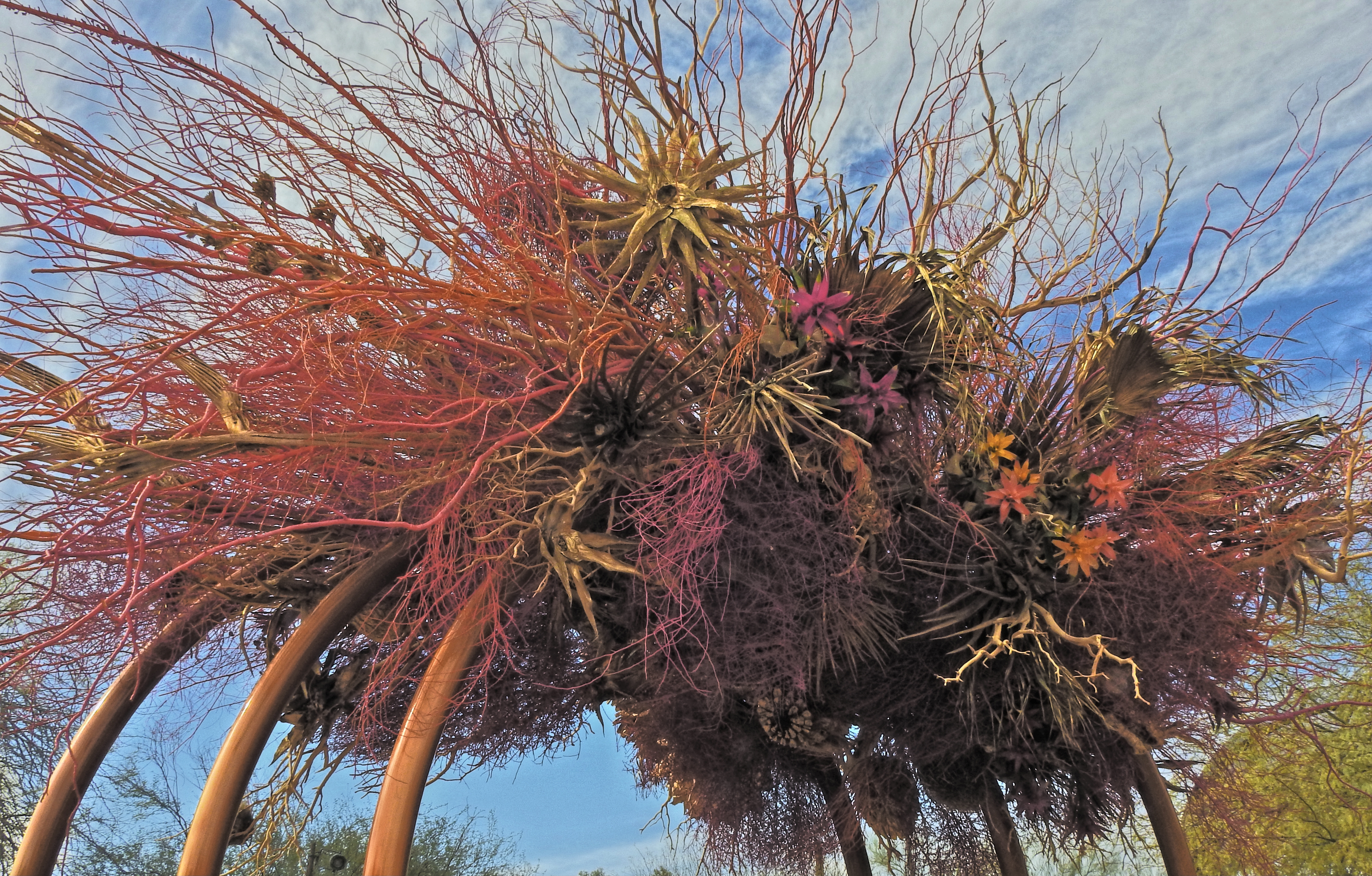
“Wind”, an art installation by Natasha Lasitsa and Daniel Schultz
In 2021, our attitude about hue is all over the road. Some still obsessively pursue the most accurate depiction of “natural” colors as is technically possible, while, for many others, color is negotiable, malleable. We acknowledge its power as an expressive tool, but we tinker with it for interpretative purposes more than ever before. We even seek out software designed to re-produce the color errors or biases of bygone brands of film stock, seeking a color that is technically “wrong” in order to get the right “feel”. We shoot with color as we use any other modern means of expression, which is to say, with an overlay of irony.
In making an image like the one seen here, the very nature of the subject is a kind of unreality, since the desert blooms and bushes used in this art installation have been dyed before the work was assembled, in an array of colors that is nothing like the limited palette they would display in their natural state. The resulting work is thus a kind of psychedelic fever dream of a desert scene. Do I record this as I find it? Do I remix the colors even further to interweave my own mood into it? Just trying to render an accurate record of this object with the color films of long ago would have been enough to send the most battle-hardened photo editor into choleric fits, and yet today, we accept that color is, as with any other element in a photograph, precisely what we say it is, and nothing more. In a way, we’ve come full circle to photography’s earliest days, before the development of actual color film, when painters touched up black-and-white images with whatever arbitrary color choices they thought “completed” the picture. Is it art? Is it not? The answer is, it is ours, a response which silences all other questions.
HUE MUST REMEMBER THIS….
By MICHAEL PERKINS
DECADES INTO THE DIGITAL ERA IN PHOTOGRAPHY, we are still coming to terms with just how much the shift away from film-based technology has profoundly changed the way we make pictures. Much has been written, for example, about the “instant feedback loop” that allows us to correct our errors on the fly, which is huge. Even more has been said about the increased intuitive nature of our devices in digital, and that, too is a massive factor. In fact, it was in stopping to catalog all the treats and toys that are at one’s fingertips in even the most basic cameras these days that I lit on what I think is the most profound change: our relationship to color.
One of the most universal tweaks engineered into cameras, for years now, is the incredible power to control saturation, with the option becoming the most common feature in all cameras from disposables to Leicas. Of course, even in analog days, we were able to play somewhat to the color properties of a particular emulsion, or to shape it with adjustments in lighting or white balance. But now the ability to attenuate color both before and after the shutter click, even without post-processing software, is instantaneous and universal. Depending on your perspective, this is either good or…oh, who am I kidding? No one thinks this is bad. The fact that control of one of the most crucial determinants of picture quality is forevermore in the hands of the user rather than the lab technician is an obvious net gain.
Is there any such thing as “straight out of the camera”? Depends on my mood, and whether I can keep my fingers off the saturation controls….
However, simply because we have the ability to tweak color to our liking doesn’t mean we need to do it uniformly, even though, admittedly, saturation is rewarded mightily in the marketplace of public opinion. Show someone an image dripping in color and ask them what they like about it. Chances are good that they’ll say it looks “realistic” or “natural”, neither of which, of course, is accurate. Ansel Adams, skeptically slow to come over to the color camp, criticized editors for boosting hues just because it met with popular applause, saying “if all else fails, make it red”. The irony for photographers, who at one time or another fancy themselves as recorders of the authentic, is that most of them love, love, love them some bright tones, and find it hard to resist goosing up the numbers beyond what the eye actually sees. But since a photograph exists in the mind before it ever exists in the camera, we can only assume that we, personally, regard many “real” things as, well,…. drab. Thus we creatively lie, in the harmless way that a fisherman increases the size of his catch every time he repeats the story of how he pulled it onto the boat. We give reality a little help. Well, sometimes more than a little. So much for the mythical construct of “straight out of the camera” which is as elusive, and as attainable, as a blind date with Sasquatch.
Am I without sin myself? Not on your grandma’s Kodachrome, as demonstrated in the above frame. However, photography (and this little hometown newspaper of ours) is about questioning intentions just as much as snapping the shutter. Maybe more so. Because if you never wonder if you’re on the wrong path, chances are good that you are. The best artists in any field ask just one more question.
Maybe two.
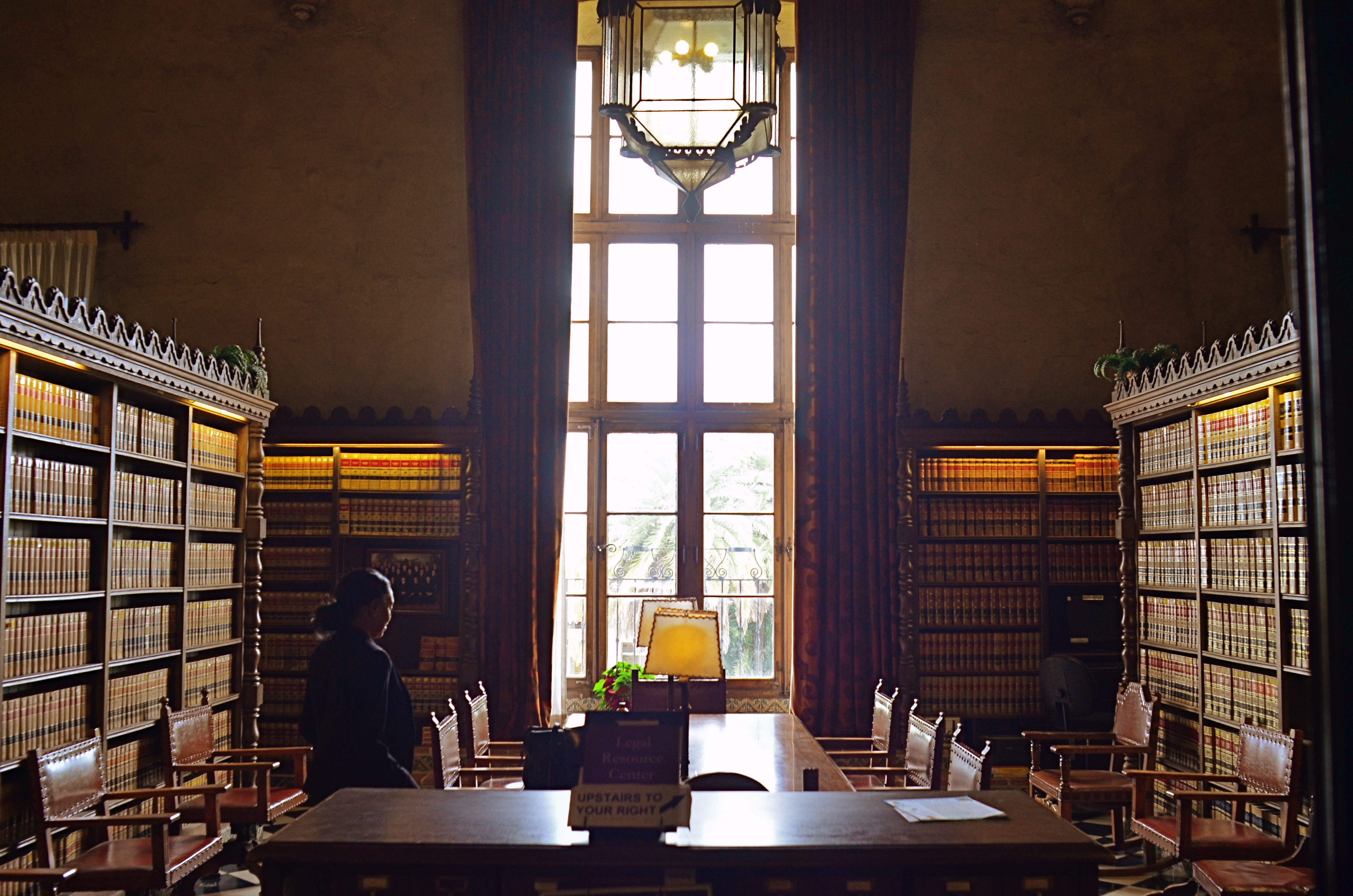
INFORMATION AVENUES
Phytomorphology 623, 2020
By MICHAEL PERKINS
JUST AS THE TAKING OF A PHOTOGRAPH IS ACCOMPLISHED IN AN INSTANT, so too is the messaging that the resulting image conveys to the viewer. The impact of a picture is immediate, established within nanoseconds of the eye’s initial contact with it. Additional viewing and pondering may, certainly, reveal deeper truths about a photograph, but I firmly believe that the main love it /don’t get it choice about a photo is made by the brain at first glance.
That said, information must be arranged in such a way as to expedite this choice. That’s the art of composition. What stays in, what is excluded, where the frame hits, and what its limits imply. The nature of the information is determined by the impact of light, which shapes and defines. That is in turn aided by texture, which adds dimension and context in how new or old, rough, smooth, substantial or ethereal things appear in the image. And finally, mood and aesthetic are established in the range of color or tonal data.
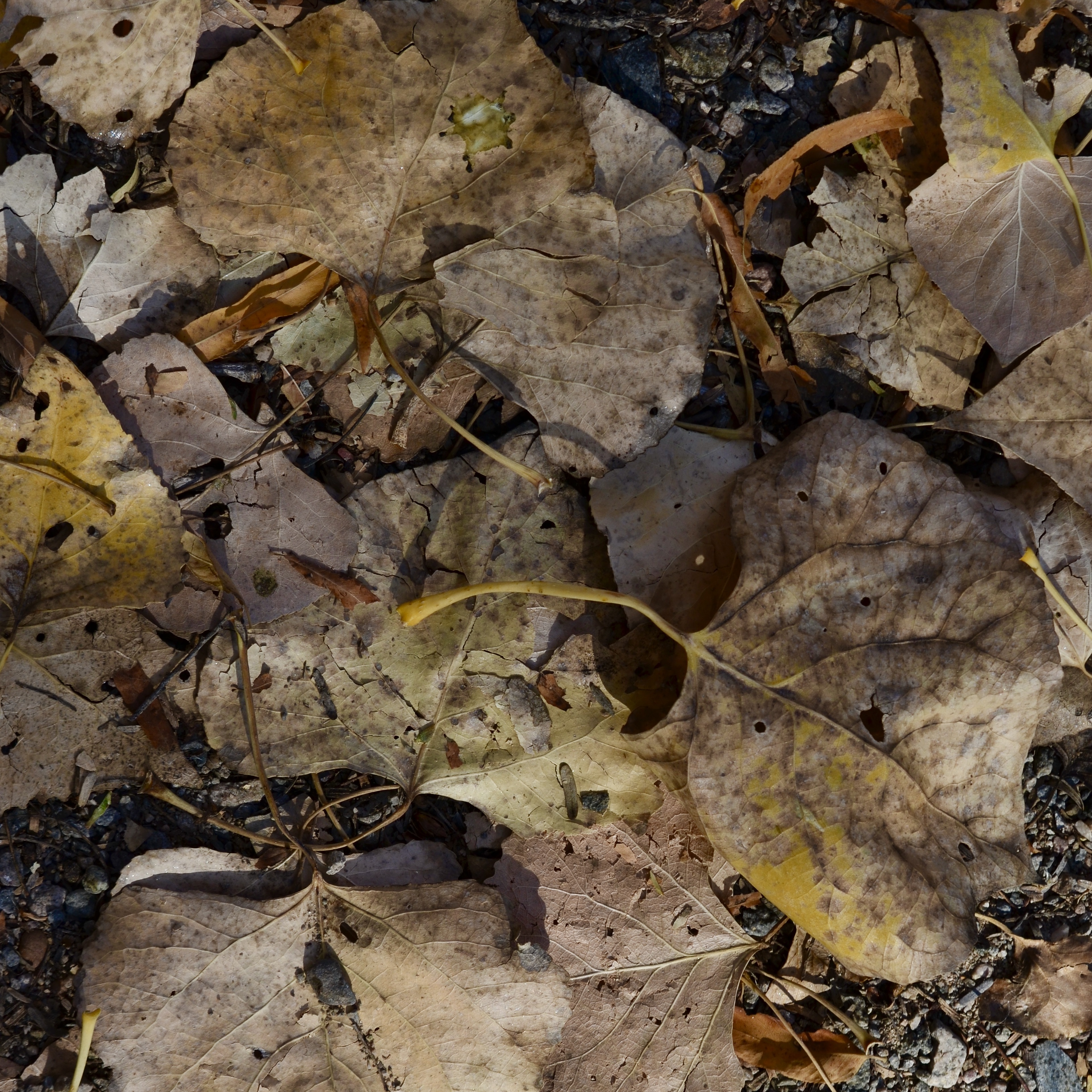
All of these elements are created by a series of decisions on whether “to do” or “not do”. Which is to say that all photographs have an assembly process. Steps. Priorities. More of this, less of that. The fact that the best photographers learn how to navigate all these decisions instantaneously is really a kind of miracle. Take the truly fundamental choice of color, for example. Not only do a picture’s hues have to be conceived in the mind before they’re attempted in the camera: they must be refined enough for the shooter to choose how all the shaping elements described above work in conjunction with each other. Think of the graphic equalizers on our old stereos, each ‘band” or part of the hearable spectrum trimmed or maximized to get a “mix” most pleasing to the ear. In visual terms, color is a key choice because it is an element that can shape so many other elements in turn. In the above image, color can resonate with memory and emotion. It can render what we term “warmth”. It also aids in the perception of depth. Consider as well that color has only become the default option for our photography in about the last sixty years. Before that, due to technical challenges for film emulsions and printing processes, it was a luxury item, even a novelty for many.
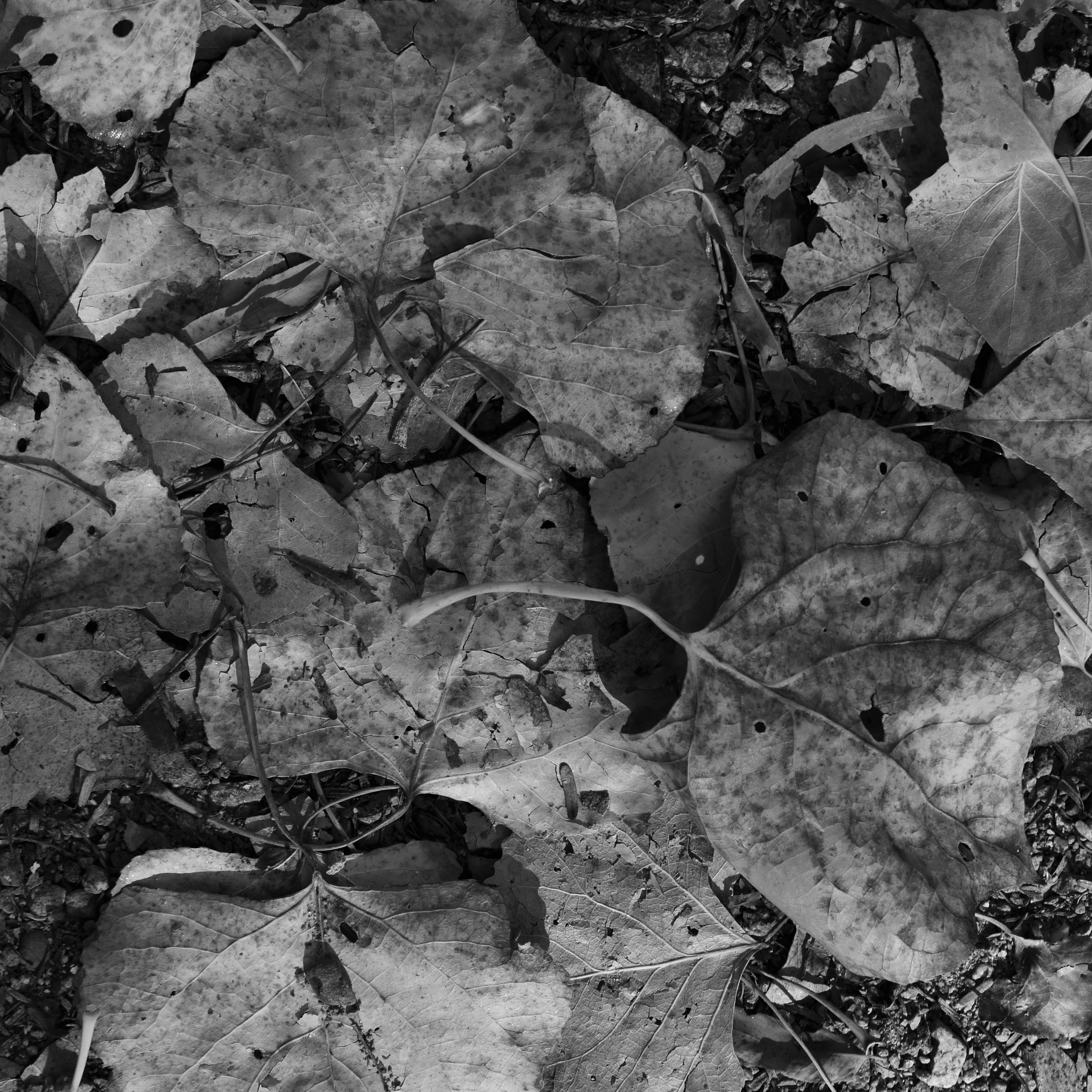
Monochrome conversion.
“Going back” to monochrome, the original default option for all photography, means actively recognizing what kind of information is lost and what kind of impact is gained by eschewing color. Is the image strengthened or weakened with its removal? Is converting a color shot to b/w as an afterthought (as I’ve done here) less effective than intentionally shooting the original in mono? Are the remaining tones strong enough to convey your message? Is one tonal palette more reportorial or “authentic” than the other? And, above all, what if the choice you’ve made (color or no color) isn’t the choice your viewer makes (in the case of this pair, for example, my wife prefers the color version, although “they’re both nice”)? Photography is about making decisions and learning to live with them. Or just canning the entire thing and trying again.
“We must remember that a photograph can hold just as much as we put into it” Ansel Adams once wrote, “and no one has ever approached the full possibilities of the medium”. Which is a lot like God saying, “hey, don’t get hung up on making just one kind of tree”. The possibilities in making pictures are indeed endless, but each are rooted in our very purposeful choices.
LIGHT ‘EM UP
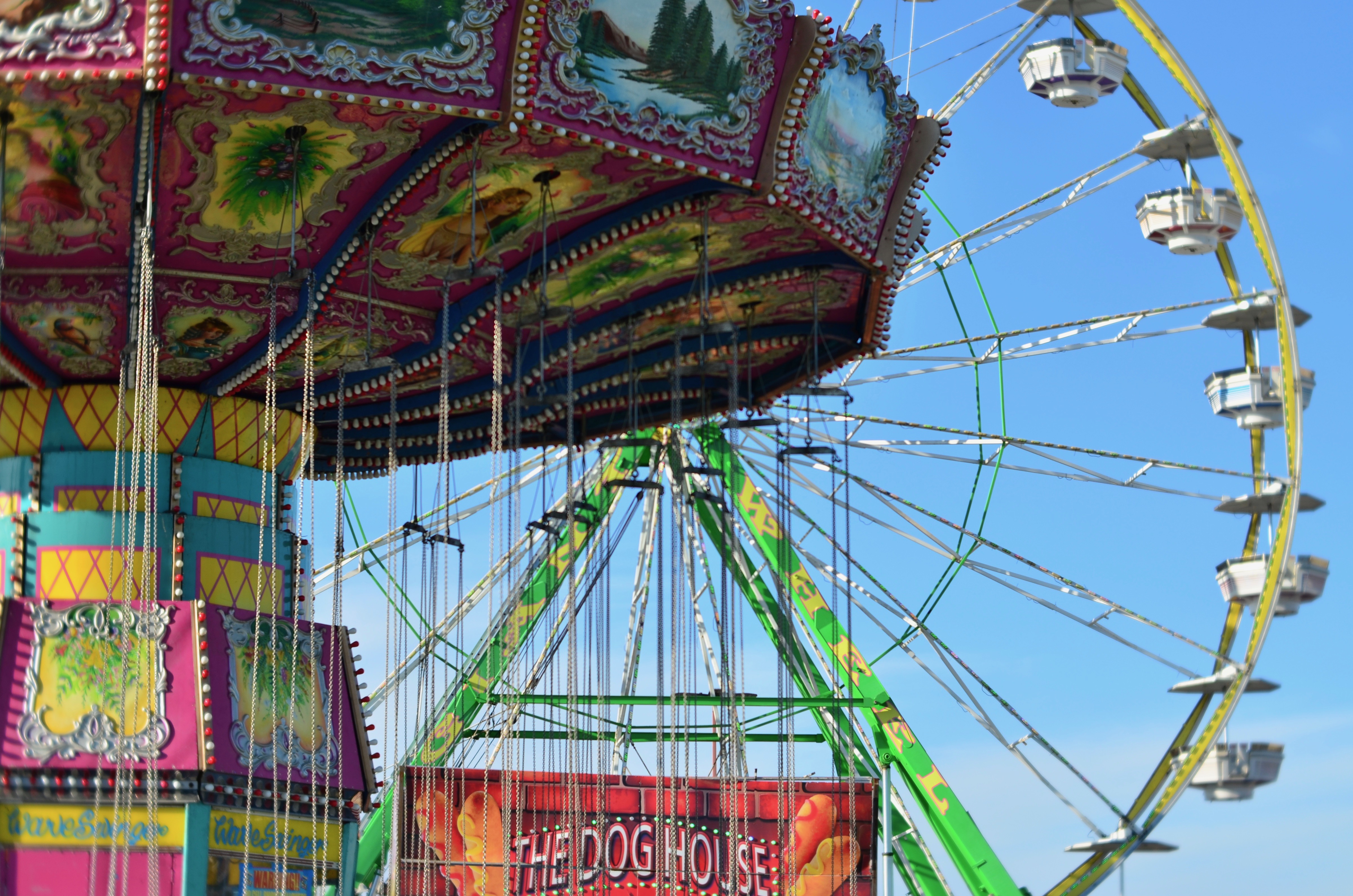
The Wave Swinger (Day), 2019
By MICHAEL PERKINS
THE GLOBAL INTRODUCTION OF ELECTRICITY IN THE 19th CENTURY was one of several singular scientific events that arrived in close parallel to the birth and development of photography. Prior to the throwing of the first voltage switches around the world, most objects had only one image identity, that being how they looked when delineated by natural daylight. After that first surge of power, however, the idea of “lighting” something….that is, creating a specific scheme for illuminating it at night, began to suggest itself as a specialized art in itself. These first mass glowings were, suitably, mass gatherings like expositions, world’s fairs, and circuses, with a new breed of engineer deliberately designing how something should appear when lit, making those kinds of choices for the very first time. And even as the Victorian era was exploring new ballets of shadow, frequency, intensity and color in cities all over the globe, photography was also trying to free itself from the limits of light as historically dictated by local sunset. Suddenly there were two ways to see everything, with many objects having a completely different visual signature when viewed after dark.
Decades later, we hardly stop to consider how very distinctive a city’s day is from its night. It seems as if things have always been this way, with many of us customizing the bright/dark light schemes of our personal gardens and homes in a way that only city planners and showmen could have accomplished a century ago. And yet, there are still things which create dramatic contrast between its daytime and nighttime versions. One of these is the brash collision of color and sensation that, as a holdover from the 1800’s, is finally vanishing from American life: the carnival midway. Subtle as a brickbat, corny as a Kansas cob and vivid to the point of vulgarity, carnies still crop up in vacant lots and small towns across America, continuing to enchant with their odd mix of ballyhoo and mystery. They are brash, loud, crude, and great fun. All our 21st-century entertainment options off to the side, there is still something visually visceral about these slightly disreputable encampments from the days of P.T. Barnum. They cry out for cameras, reminding us of an era in which a mere change of light was enough to quicken the imagination.
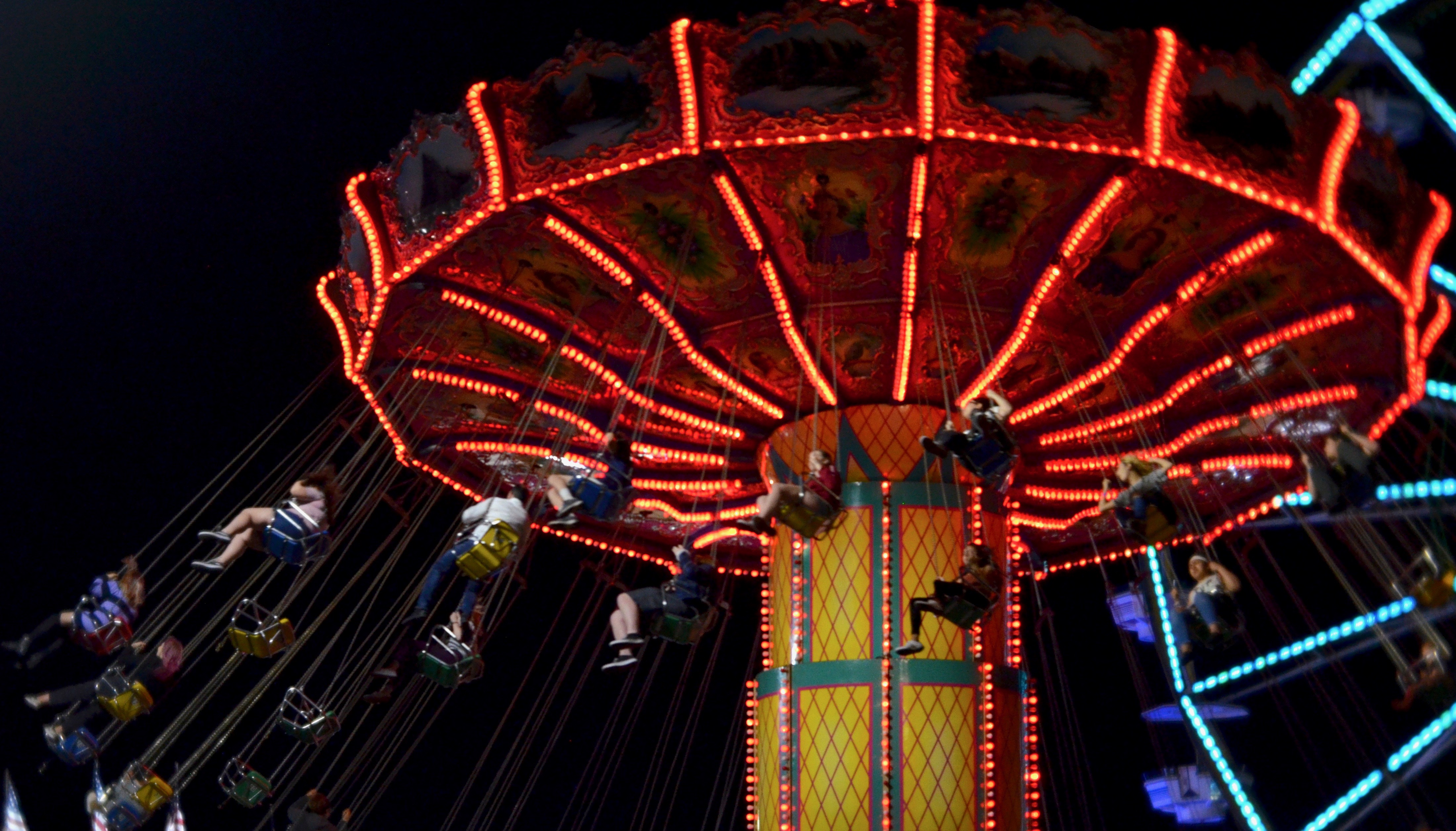
The Wave Swinger (Night), 2019
Daytime at a carnival is a tamer prelude to the noise and song that will explode from the tents and rides after sundown. Nothing is natural, yet everything is believable. The weird, seductive magic of blaring neon and exploding color still tugs at the photographer’s eye, building and intensifying as afternoon becomes dusk and dusk becomes show time. Everything in such an over-the-top environment deserves to be viewed by both day and night, as it’s often hard to imagine that two views of the same things could be so amazingly different. Circuses and tent shows historically were a great testing ground for the first color films, and they still test the performance of both gear and shooter today. Photography and artificial light, born side by side, are still strongly about putting on a performance. The show must go on.
YOU’VE HAD AN EFFECT ON ME
By MICHAEL PERKINS
“FULL–FUNCTION” CAMERAS (I try not to call them “real”) have made several concessions to the invasion of the mobiles over the last decade, adding features that tweak or sweeten images after they are taken, in the manner of cel-camera apps. The most commonly used functions, like cropping or straightening, have been joined over the years by monochrome converters, fisheye-like distorters, and selective color effects, which allow the user to desaturate discrete parts of a picture for a part-color, part B&W composite. Occasional use of these DSLR tweaks, as with those in App World, can yield interesting results. Their over-use, however, can erase the thin wall between tool and gimmick.
Effects oftimes go beyond merely enhancing a shot to loudly calling attention to themselves, and thus upstaging said shot completely. Of course, if you want to establish a personal style that always expresses itself in sepia tone or double exposures, by all means rock and roll and Godspeed. Generally speaking, though, special effects have the greatest impact when they are the spice, and not the meat in the recipe.
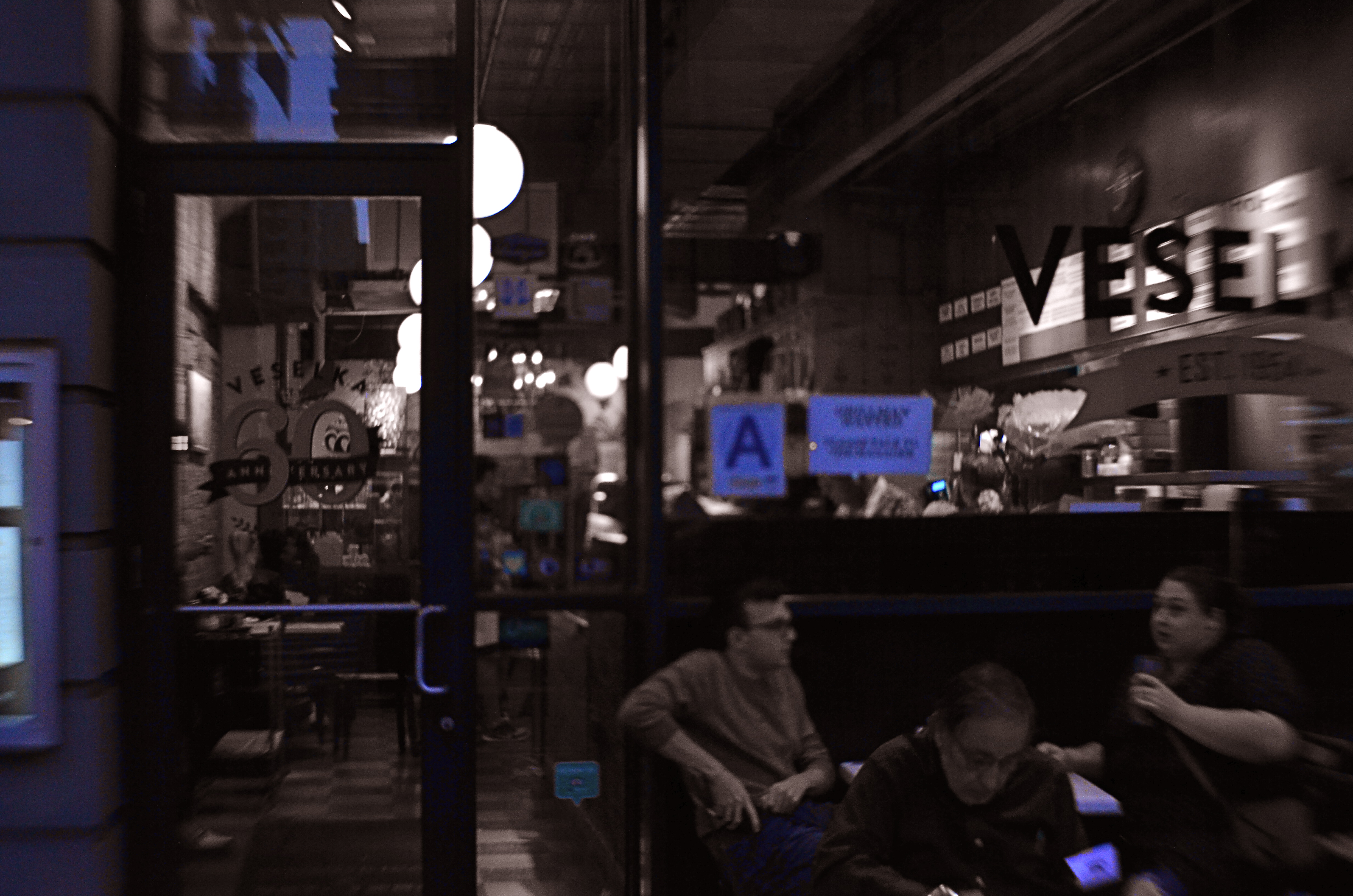
Later, At Veselka’s, 2018
One that I keep playing with, trying to decide if it’s truly useful, is the aforementioned selective color. Desaturating only parts of an image is tricky, because the monochrome elements must work in at least some way with the remaining chroma, lest the color/no color ratio be jarring. Remember, you merely want your viewer to get the impression that something has been subtly improved in the picture, not drastically rehauled.
In the restaurant scene shown here, night had already rendered most of the darkened areas as nearly grey already, so converting that to b/w wasn’t a stretch. I took out the reds from various neon signs and the ambers and yellows caused by my camera’s misreading of the light temperature, and elected to keep the blues, in an attempt to use them as an extension of the blacks and grays. Whether I think I succeeded depends on which day I view the result, but my intention was to add just a flavor of mood to a photograph that was essentially mono.
I think the best way to avoid going wrong with the use of a post-processed effect is to begin with a picture that’s already 99% of what you were going for……using the tools to give a “pretty good” image a nudge, rather than a shove. As in photography in general, it’s a game of inches.
NARROW PALETTES
An early example of two-strip, or “red-green” Technicolor as seen in The King Of Jazz (1930)
By MICHAEL PERKINS
I’M A HUGE FAN OF THE EARLIEST VERSION of the classic Technicolor film process, the so-called “two-strip” technique from the 1920’s, which simultaneously exposed two separate frames of black and white film of a single subject, one strip through a green filter, the other through a red one. Combined in the lab, the composite image simulated most of the colors of nature that contained either red or green, but absent the third layer of blue/cyan which would be added in the more advanced three-strip Technicolor process, the one which became the industry standard by the early ’30’s. Two-strip features like Mystery Of The Wax Museum or The King Of Jazz are a kind of object lesson for photographers in learning to work with narrow color palettes. The message: do the most with what you’ve got.
Every shooter encounters situations, most of them dictated by changes in available light, which severely limit the full spectrum of reproducible color. We might eagerly embrace the warmth of the two daily “golden hours” that bathe most bright hues in gold. We might bemoan cloudy days, which can drain everything of saturation or contrast. We might have to make adjustments when shade makes our cameras read light at the wrong color temperature, giving our images “the blues”. Whatever the challenge, photographers make myriad choices about color in a single minute, and, unlike the early technicians at Technicolor, they don’t necessarily see a faithful rendering of “reality” as Job One. How “natural” do we want to present color, and how do we define that word, anyway? Is color a determinant of comfort, tension, revelation, drama? Do we intentionally choose hues that either conceal or reveal?
Deep sunset, as seen in the above image, is one situation in which nature itself narrows the color palette. All yellows and reds tend to morph into orange. All blacks, browns and grays migrate to blues. Middle tones head for the hills. Contrast jumps off the meter. Subtlety takes a vacation. Suddenly, as in the case of the old two-strip Technicolor, you’re forcing very few colors to do the work of many….to deliver a version of the world rather than a faithful reproduction of it.
Color processes since the beginning of photography have embraced the idea that you could either reflect reality or, in the pursuit of a great picture, bend it a little.
Or more than a little.
Or a hell of a lot more.
POST STARTS NOW
By MICHAEL PERKINS
THE POST–PROCESSING REVOLUTION wrought by the introduction of Photoshop in 1988 has so profoundly influenced the act of picture-making that many shooters think of the program as half of a complete two-step process of photography. In Step One, you shoot the image. In Step Two, you fix it.
However, being conversant with more of the menu options built in to nearly every level of camera in use today can mean solving most “post” dilemmas without resorting to Photoshop’s full suite of solutions. Just as you change lenses less the more you understand what lenses can be stretched to achieve, you can avoid the extra step of computer-based tweaking the more you understand what’s already available while your subject, your shooting conditions and your mental presence are all in play. Some would argue that such adjustments would be more finely attenuated working with a RAW file in Photoshop than by fixing flaws in-camera with a JPEG, and you have to decide where you come down in that debate.
The original shot suffers from the “blues“.
Let’s take color as one example. A great many photographs with off-kilter values are corrected in Photoshoppish apps, yet can be quite satisfactorily fixed in-camera. White balance settings allow you to pre-program a number of light temperature pre-sets that make your camera “see” colors as if they are occurring in sunshine, shade, or a variety of artificial light sources. But even if you shoot everything on the “auto” white balance setting and get the wrong colors occasionally, there is still a way to repair the damage without resorting to Photoshop. What Nikon and Canon both call color balance allows fairly fine-tuned adjustments to get the hues to look either (a) more like you saw it, or (b) the way you wish it had looked.
The shot at top, adjusted with Nikon’s color balance option, produced the warmer look in the bookshelves that would have resulted if the light coming through the window had been warmer. In the original image, taken with an auto white balance setting, the camera, far from “guessing wrong”, actually recorded the room light as it appeared in reality, since the sky was severely cloudy and was a little blue in cast. However, with the in-camera color balance tweak, no Photoshop intervention was required. Moreover, I could check my work while in the moment, a handy thing, since tours were moving in and out of the room all day, meaning that, if I wanted to shoot the room (nearly) empty, I had to work fast.
Digital photography’s original bragging point over film was the ability to shoot, fix, and shoot again rather than rely on the darkroom to rescue tragically few of our miscalculations. Working our in-camera menus for all they’re worth helps deliver on that promise.
WHEN COLOR IS ALL
By MICHAEL PERKINS
JUST A LITTLE SCROLL STROLL THROUGH GOOGLE will show just how long and how intensely the debate over color has raged in the photographic world……that is to say, whether color should be used at all, or whether, indeed, it was the spawn of Satan, turning the art of imaging into a crude carnival trick. Today, we routinely concede that both monochrome and color have distinct uses in the making of images, each bringing singular strengths to the process. But it was not that long ago that the two camps went at it like Hatfields and McCoys.
Many still feel that color should only be called on to help complete or “sell” a picture, a finishing touch of sorts. “In black and white you suggest”, wrote Paul Outerbridge in Modern Photography. “In color, you state.” Others, like myself, believe that there are times when color is content, complete in itself, regardless of the “official” subject of the image. Or, as Alex Webb writes, “Color is very much about atmosphere and emotion and the feel of a place.”
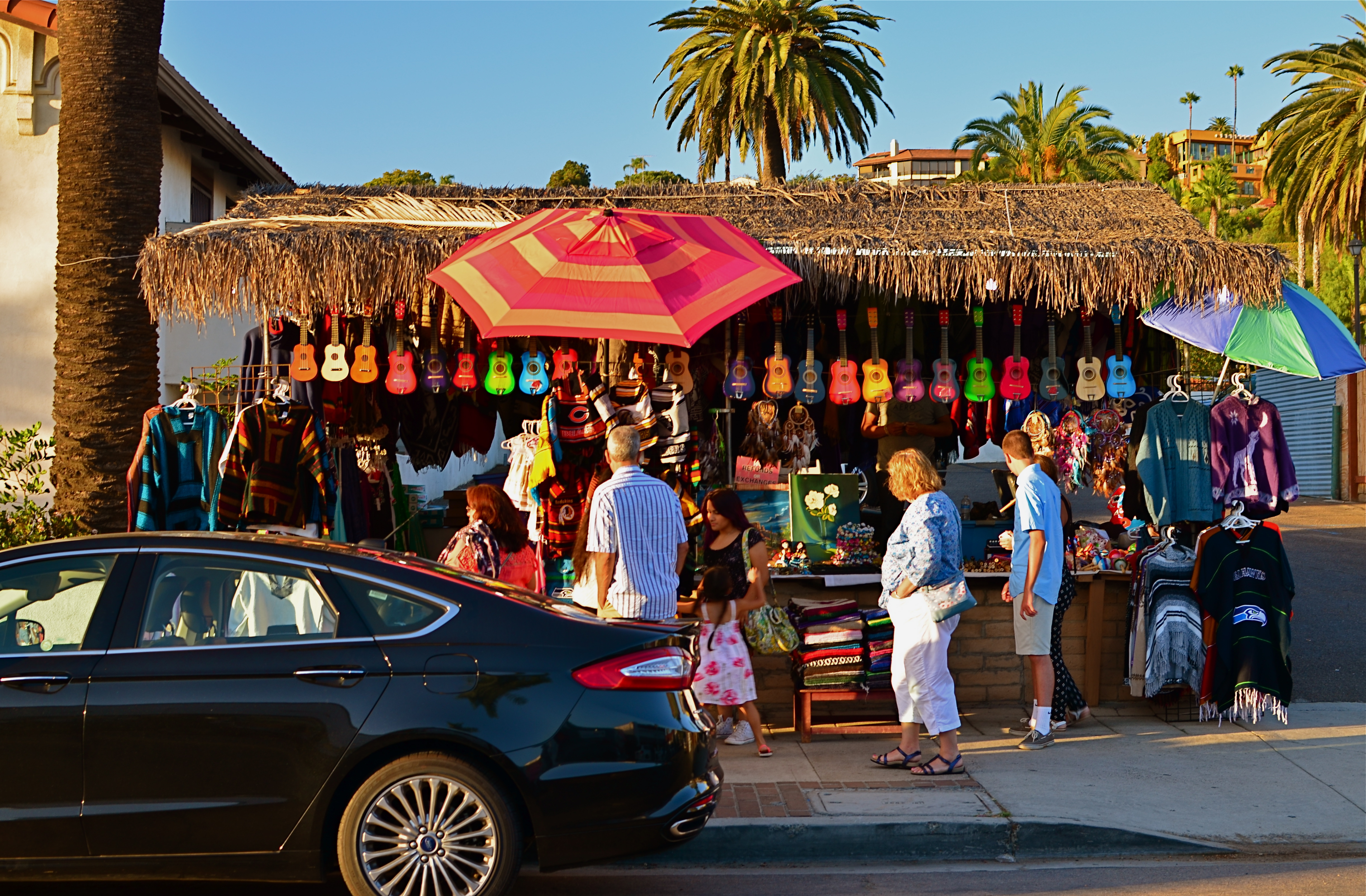
The photos seen here show how, if color is a compelling enough messenger, most of the visual information in a picture can be pared away to let that color message breathe. The master shot of a street vendor at sundown (seen at directly above) might have worked out if I had done one or two things better, but upon later examination, I realized that the long horizontal string of neon-hued ukuleles at the top of the shot could work if cropped loose from the less effective uber-shot (as seen at top). Better still, the color in the cropped shot is not actually about “ukuleles”, since a string of tropical fruits or a rack of hats with the same tonal palette would sell the image just as well. This is truly a case of color “just because”, conveying Alex Webb’s “emotion and feel” without assistance.
A lot of the photo world’s resistance to color, which ended barely more than a generation ago, stemmed in part from a loathing for the limited printing processes which made it harder to predict or control results compared to monochrome. But there was also the fear that untalented shooters would use it as a sensational crutch to boost mediocre work. Now it seems clear that color, like any other technical element, lives or dies based on what it is called upon to do, and how well the individual artist makes his argument.
THE NEW ERA OF TESTIMONY
By MICHAEL PERKINS
WHETHER THERE IS CONSENSUS ABOUT THE PRESENT OR FUTURE STATE OF THE NATURAL WORLD, we are certainly in the midst of the most muscular conversation about its fate than many of us have ever known. That means that we are changing and challenging our relationship to the globe almost daily…and, along with that relationship, the way that we see, and visually report upon it. That generates a new emphasis on bearing witness to what the planet is/can be/ might be.
I call it the new era of testimony.
The birth of photography coincided with the first great surge of cross-continental expansion in America, as well as an explosion in invention and mechanization. The new system for making a physical record of the world was immediately placed into service to help quantify the scope of the nation…to measure its mountains, track its rivers, count its standing armies. Photographers like Timothy Sullivan and William Henry Jackson lugged their cameras east-to-west alongside geological surveys, railroad agents, and the emerging naturalist movement. While some shooters chose to capture the creation of new trestle bridges, others helped poets illustrate their Walden-esque reveries. In all cases, photography was tasked with the job of showing the natural world and our interaction with it. Most importantly, the images that survive those times are a visual seismograph on both the grand and grotesque choices we made. They are testimony.
Brittle Bush In Bloom (2017)
And now is a time of radical re-evaluation of what that interaction should look like. That means that there is a visual story to tell, one of the most compelling and vital that photography has ever told. Regardless of your personal stances or stats, man’s place on the planet will be in a state of fundamental shift over the coming decades. And the images that this change generates will define both photography as an art and ourselves as stewards of an increasingly fragile ecology.
Ansel Adams, for all his gorgeously orchestrated vistas, was, I believe, mistaken in almost deliberately subtracting people from his grand scenes, as if they were irrelevant smudges on nature’s work. It doesn’t have to be that way. We need not make war on our native world. But whatever we do, we need to use the camera to mark the roads down which we have chosen to walk. Whether chronicling wise or foolish decisions, the photograph must be used to testify, to either glorify or condemn our choices going forward.
AT WAR WITH THE OBVIOUS
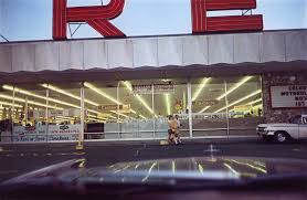
“I had this notion of what I called a democratic way of looking around, that nothing was more or less important. It quickly came to be that I grew interested in photographing whatever was there, wherever I happened to be. For any reason.” –William Eggleston
It’s a red ceiling. Don’t, says William Eggleston, look for anything else.
By MICHAEL PERKINS
MOST PHOTOGRAPHERS ARE NOT PRIME MOVERS, in that the majority of us don’t personally carve out the foundations of new truths, but rather build on the foundations laid by others. Art consists of both revolutionaries and disciples, and the latter group is always the larger. With that in mind, it’s more than enough for an individual shooter to establish a single beachhead that points the way for those who follow, and to be able to achieve two such breakthroughs is almost unheard of. Strangely, one of the photographers who did just that is, himself, also almost unheard of, at least outside of the intellectual elite.
William Eggleston (b. 1939) can correctly be credited as one of the major midwives of color photography at a time that it was still largely black and white’s unwanted stepchild. Great color work by others certainly preceded his own entry to the medium in 1965, but the limits of print technology, as well as a decidedly snobby bias toward monochrome by the world at large, slowed its adoption into artsy circle by decades. After modeling himself on the great b&w street shooters Robert Frank and Henri Cartier-Bresson, Eggleston practically stumbled into color, getting many of his first prints processed at ordinary drugstores rather than in his own darkroom. His accidental discovery of the dye-transfer color process on a lab’s price list sparked his curiosity, and he soon crossed over into brilliantly saturated transparencies, images bursting with radiant hues that were still a rarity even in major publications. Eggleston’s work was, suddenly, all about color. That was Revolution One.
Is it Eggelston’s job to provide the story context for this image? Or yours? or neither?
Revolution Two emerged when he stopped worrying about whether his pictures were “about” anything else. Eggleston began what he later termed his “war with the obvious”, eschewing the popular practice of using photographs to document or comment. His portfolios began to center on mundane subjects or street situations which fell beneath the notice of most other shooters. The fact that something was in the world was, for Eggleston, enough to warrant having a picture made of it. A street sign, an abandoned tricycle, a blood-red enameled ceiling..anything and everything was suddenly worth his attention.
Reaction in the photographic world was decidedly mixed. While John Szarkowski, the adventurous director of photography at the New York Museum Of Modern Art, marveled at a talent he saw as “coming out of the blue”, making Eggleston only the second major color photographer to exhibit at MOMA, others called the work ugly, banal, meaningless. Even today, Eggleston’s subjects elicit reactions of “…so what??” from many viewers, as if someone told them the front end of a joke but omitted the punch line. “People always want to know when something was taken, where it was taken, and, God knows, why it was taken”, Eggleston remarked in one interview. “It gets really ridiculous. I mean, they’re right there, whatever they are.”
However, as can frequently happen in the long arc of photographic history, Eggleston’s work reverberates today in the images created by the Instantaneous Generation, the shoot-from-the-hip, instinctive shooters of the iPhone era who celebrate randomness and a certain hip detachment in their view of the world. As a consequence of Eggleston’s work, images have long since been freed of the prison of “relevance”, as people rightfully ask who is qualified to say what a picture is, or if there is any standard for photography at all. Thus does the obvious become a casualty of war.
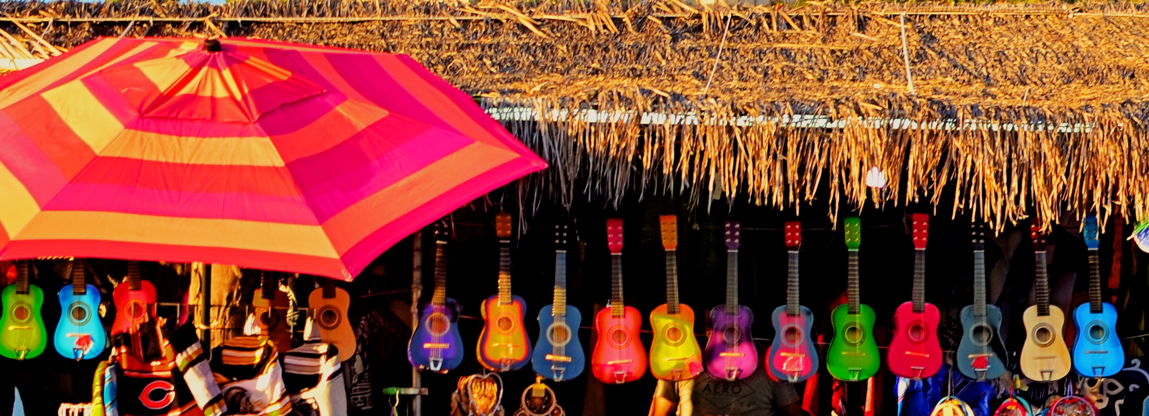
SPLIT DECISION
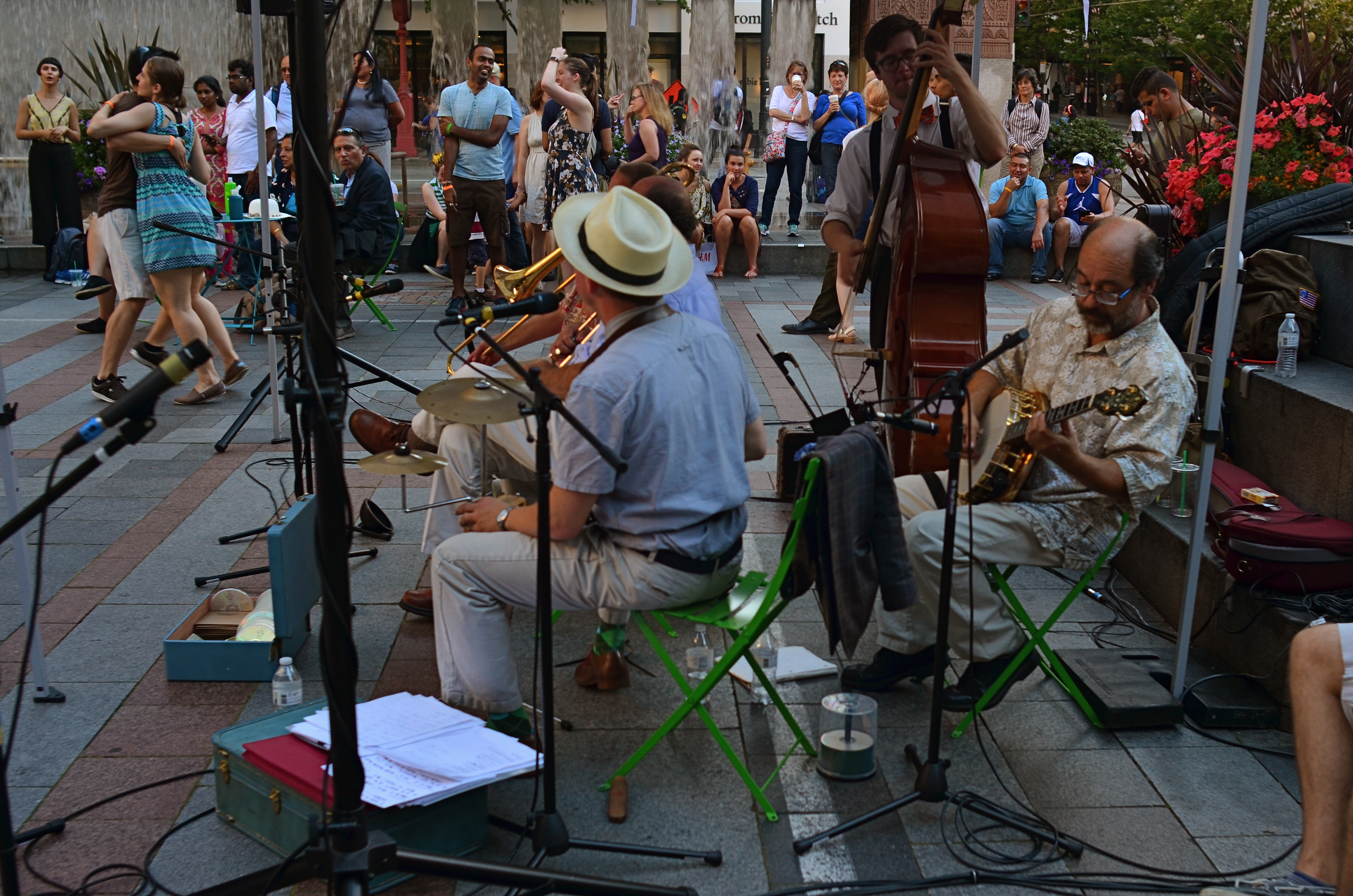
Which version of this street shot carries the most impact…the color master shot….?
By MICHAEL PERKINS
THERE SEEMS TO BE A BIAS IN WHAT WE CALL STREET PHOTOGRAPHY that leans toward monochrome images, as if black and white were somehow more emotionally honest, maybe even more reportorially accurate as regards social commentary. I suppose this preference borrows a bit from the fact that journalism and photographic critique sort of grew up alongside each other, with black-and-white news coverage pre-dating the popular use of color by several decades. However, since color has become the primary, rather than the secondary choice for most photographers over the past forty or so years, there may be no leader or “winner” between bright and subdued hues, no real rule of thumb over what’s more “real.” Street, and the tones used to convey it, are in the eyes of the beholder.
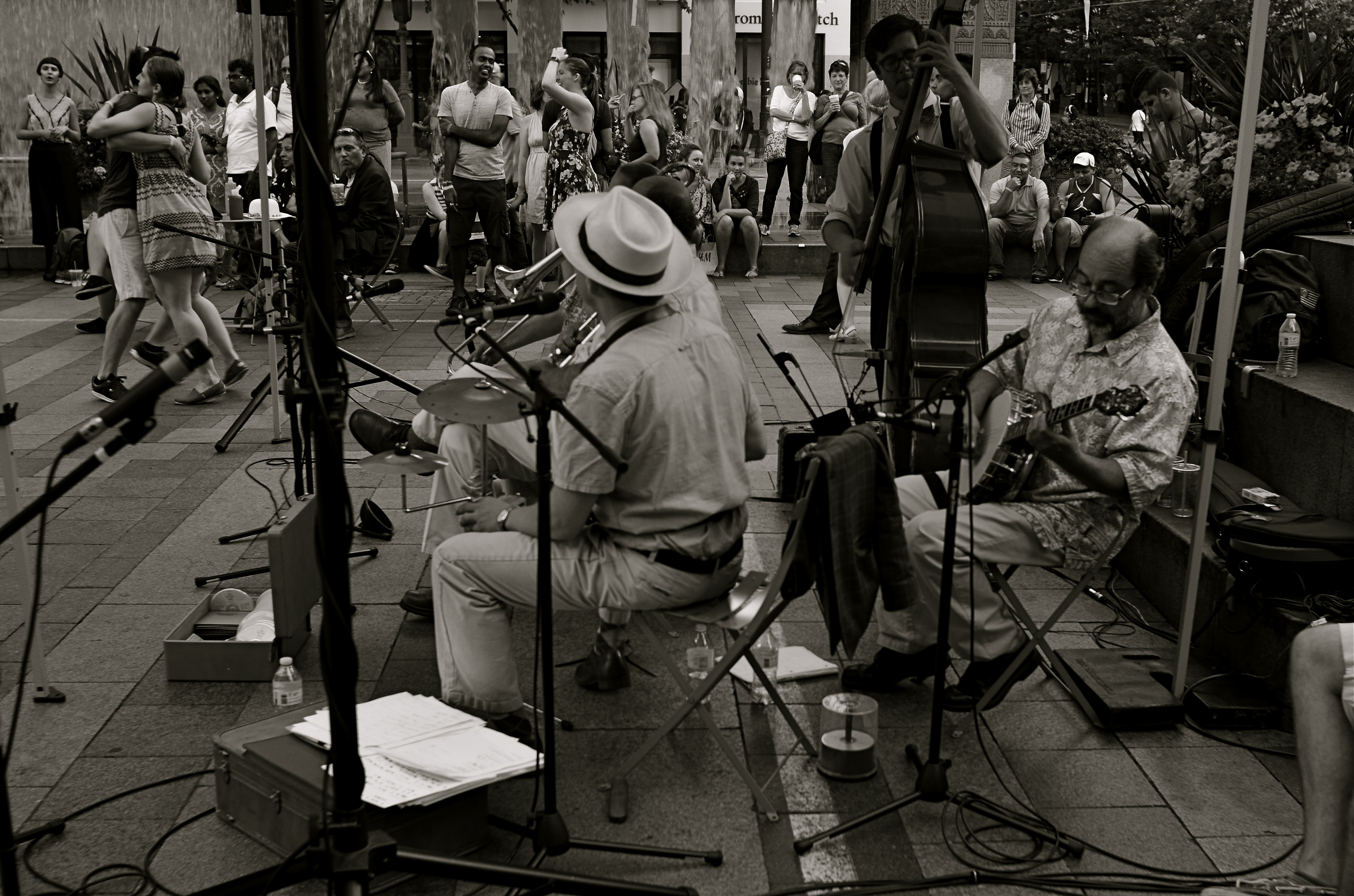
…or the re-mastered mono version?
There must be dozens of images that I myself take in color each year, that, upon later reflection, I re-imagine in mono. Of course, with digital imaging, it’s not only possible but probably smart to make one’s “master shots” in color, since modern editing programs can render more in the way of black and white than mere desaturation. Just sucking the color out of a shot is no guarantee that it will be more direct in its impact, and may actually drain it of a certain energy. Other times, taking out color can streamline the “reading” of a photograph, removing the distraction that can occur with a full range of tones. The only set answer is that there is no set answer.
In the film era, if you loaded black & white, you shot black & white. There was no in-camera re-think of the process, and few monochrome shots were artificially tinted after the fact. Conversely, if you loaded color, you shot color, and conversion to mono was only possible if you, yourself were expert in lab processing or knew someone who was. By contrast, in the digital age, there are a dozen different ways to reconfigure from one tone choice to another in seconds, offering the chance for anyone to produce almost limitless variations on an image while the subject is there is front of them, ripe for re-takes or re-thinks.
None of these new processes solve the ultimate problem of what tonal system works best for a given picture, or when you exercise that choice. However, the present age does place more decision-making power than ever before in the hands of the average photographer. And that makes street photography a dynamic, ever-changing state of mind, not merely an automatic bow to black-and-white tradition.
ON ITS OWN TERMS
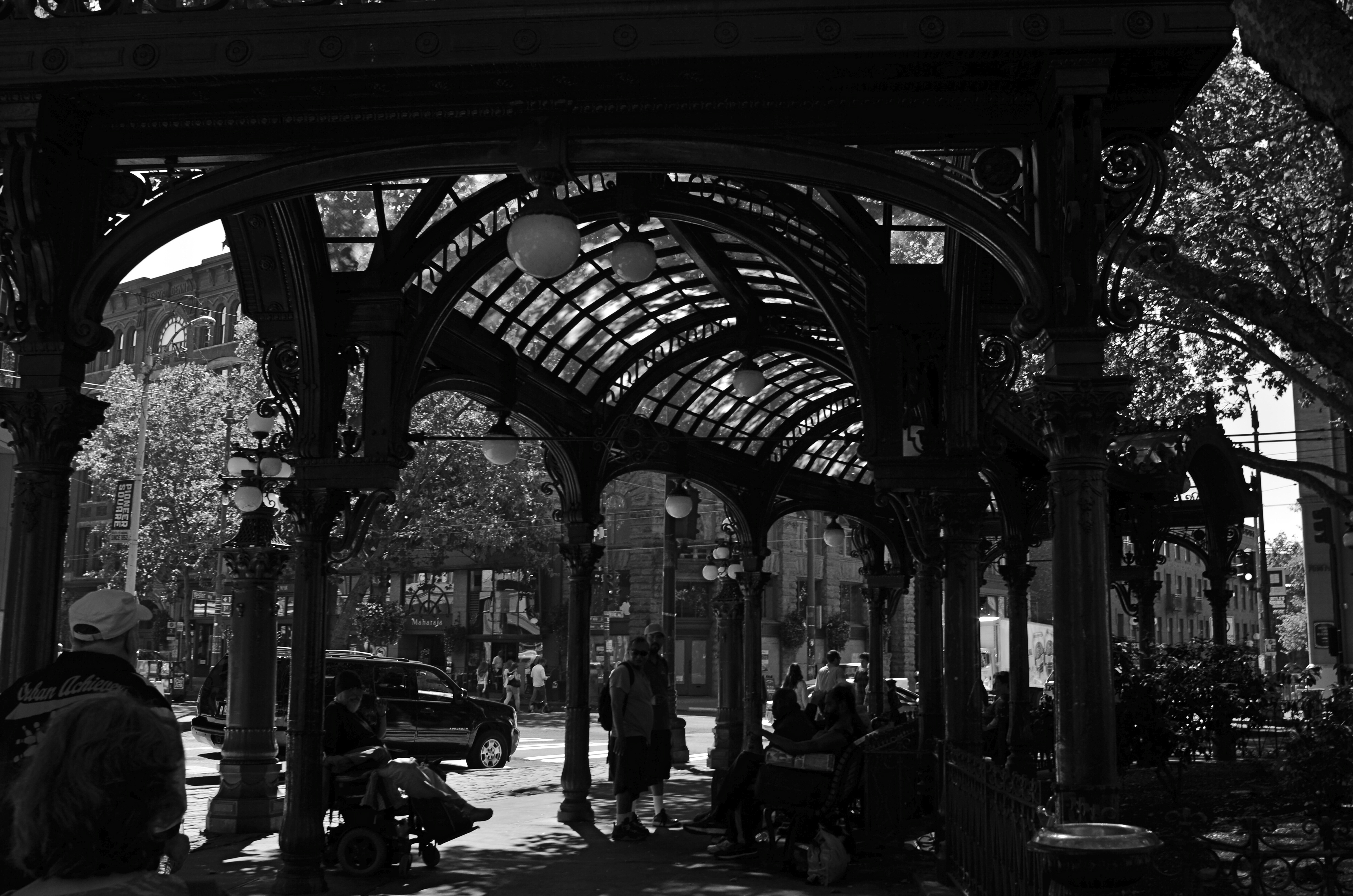
Gaslight Reverie (2016). Local characters convene under an aging arch in downtown Seattle.
By MICHAEL PERKINS
ONE OF THE FIRST EDITORIAL TRUTHS THAT PHOTOGRAPHERS LEARN is that just pointing and recording is not photography. The marvelous device which was designed to arrest time in its flight and imprison it for future reference is truly effective for setting down the facts of a scene….details, textures, dimensions, etc. But, once the shooter is bent upon making any kind of statement…amplifying, clarifying, commenting….then the unadorned data of reality may prove to be a set of chains holding him earthbound. Every picture has it own terms, its own rules of engagement. And sometimes that means moving mere reality to the second chair.
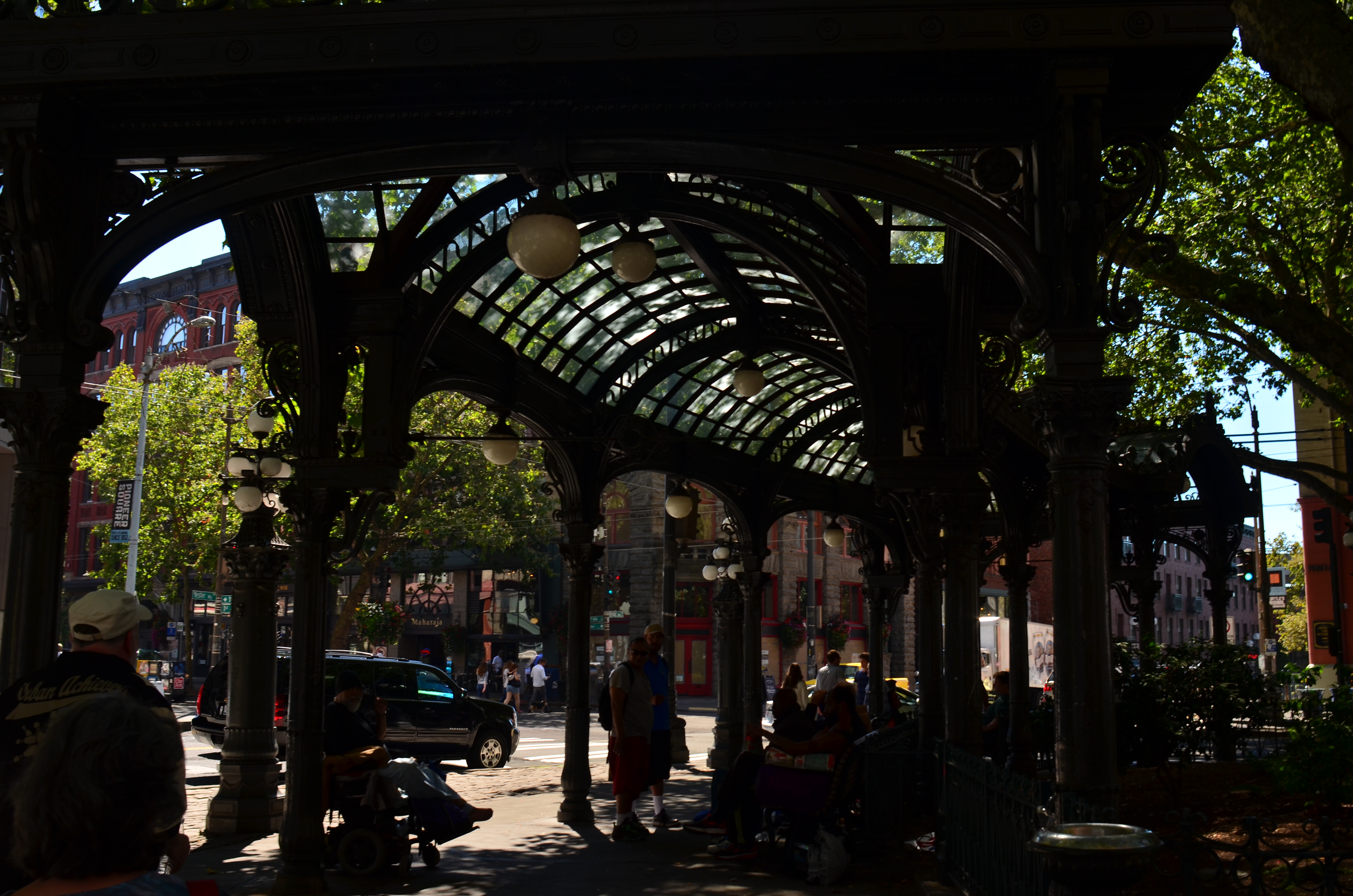
The same shot in color is a bit too charming.
Things that are only recorded are, to a degree, raw, in that they contain important information and extraneous data that might keep an image from being, well, a photograph. A deliberate act. Consider the purest form of “factual” photography, a reconnaissance flyover photo. Seen in its basic “real” state, the colllection of shapes, shades, and wiggles makes little sense to the observer. It needs the help of an interpreter to ferret out the pertinent narrative. Yes, this squiggle is a river. This grey smear is the warehouse. These scratchy cross-hatches are railroad lines. Photographs need to shaped so they can be interpreted. Sometimes this means, for lack of a more grammatical phrase, “including something out.”
There are many ways to achieve this, but, in the interest of brevity, I often find that a simple switch from color to monochrome goes a long way toward streamlining an image. Hues can be distractions, slowing the eye in its pursuit of a picture’s best impact. It prettifies. It luxuriates in tonal shifts, details, textures. Black and white can cut the busier parts of an image in half and convey a starkness (at least in some settings) that color can find problematic. Amping up the contrasts in black & white, eliminating many middle tones, can purify the image even further.
In the above comparison, a neighborhood in Seattle which is, in effect, its local Skid Row, is far more charming, far less gritty in the color rendering than in the mono version. Of course, the choice between the two approaches is made based on what you want to achieve. The same evaluation in a different situation dictates a different choice. Maybe.
Photography is not reality, and, if it were, it would never have flowered into an art, because reality is essentially dull. To make a picture, you have to determine the specific terms for that picture….what weight it wants to carry. Then it starts to become a photograph.
SOFTER AND QUIETER
By MICHAEL PERKINS
THE MEANING OF THE WORD NOISE HAS, IN RECENT YEARS, been expanded beyond its familiar role as an audio term, extending its usage into our visual vocabulary as well. A key shift in photo terminology, as film converted to digital, has been the re-purposing of the word to denote a degradation in quality, with noise replacing grain as the way to describe a less-than-pristine image. Same idea, different wording.
And now, in recent years, I have heard the word used even more widely to denote weaknesses in a composition, describing a picture with too much information or distraction as “noisy”. In a recent post on the blog PhotographyMad.com, you find the following citation:
Often a photo will lack impact because the main subject is so small it becomes lost among the clutter of its surroundings. By cropping tight around the subject you eliminate the background “noise”, ensuring the subject gets the viewer’s undivided attention.
I personally would extend this metaphor to include not only the subject matter within a frame but its color range as well. That means, simply, that too many colors in an image might dilute the effect of a shot as much as the density of its elements, and extends the idea of noise to encompass anything that lessens the communicative power it has for the viewer.

Deflowered (2016). 1/50 sec., f/4, ISO 100, 35mm.
In the above shot, the idea of the composition was to convey the bits of orange peel as some kind of spent or withered flower. I didn’t decide, in advance, to eat an orange in a yellow bowl, but I believe that the same peels in a red bowl might have hardened the look of the shot by calling attention to contrast instead of content. Keeping the entire composition to a two-tone color range (along with a decidedly shallow depth-of-field to reduce the texture detail) rendered it nice and soft. Of course there are a million ways to conceive this image; I just chose this way.
Noise is not merely a technical registration of visual or audio distortion. I think the word has real value if you’re looking to streamline your images. Just think noise=clutter.
Then turn down the volume.
WHEN AND WHERE FOR WHAT AND WHY
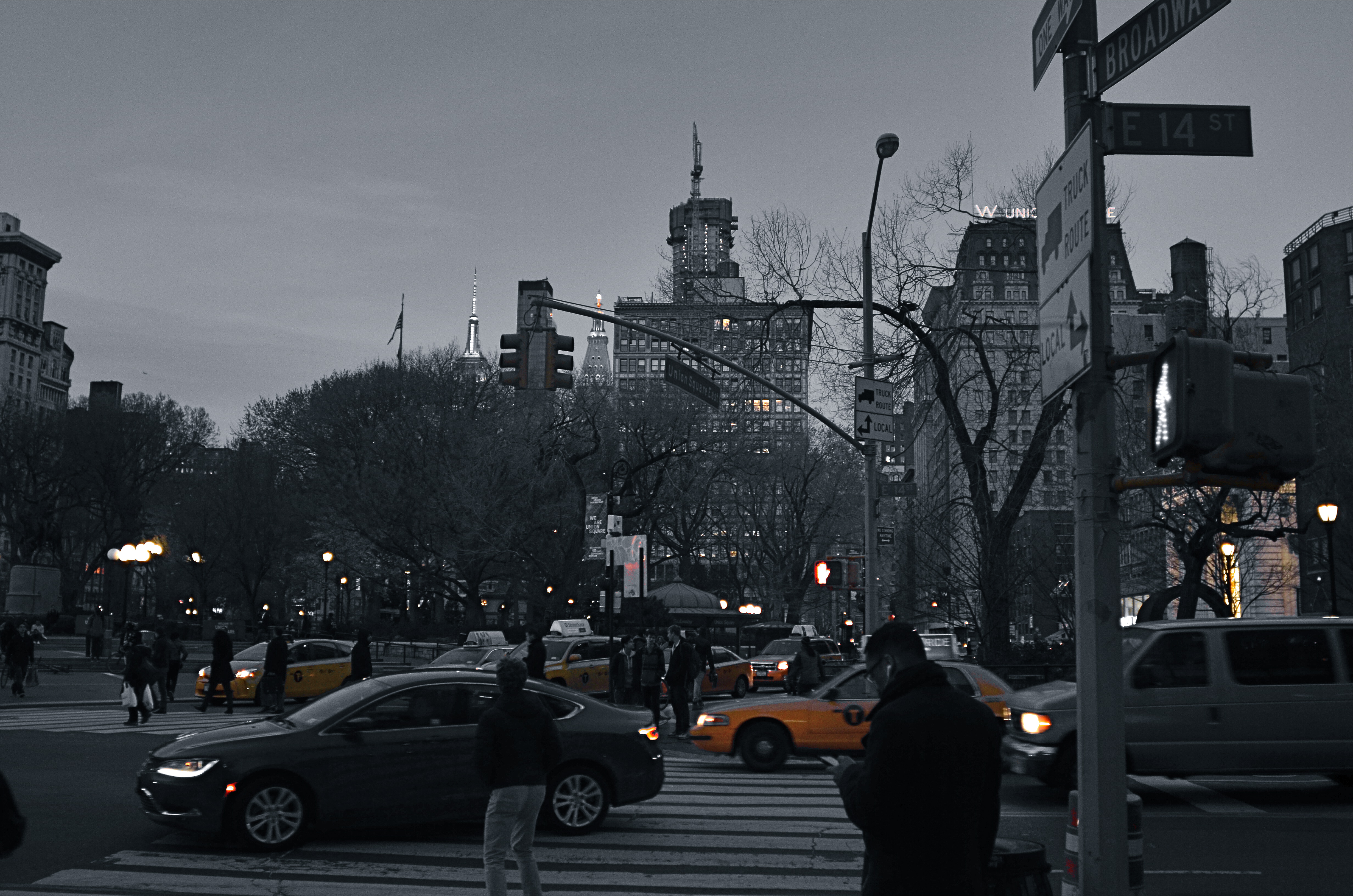
Manhattan yellow cabs in a grey street scene. A classic selective desaturation effect.
By MICHAEL PERKINS
THE SHEER NUMBER OF PHOTOGRAPHERS IN THE WORLD pretty much insures that not too many of us are artistically, um, unique. If there was ever a time in the history of the medium when it was nearly impossible to develop a style free of influence (good or bad), it’s now.
That doesn’t make originality impossible. But it does mean that, when one of us evolves a new way of doing things, the speed of adoption means there’s about a half a global second before innovation becomes cliche. And the worldwide online community likewise switches its evaluation of an idea from “brilliant!!” to “hackneyed” within an ever shorter cycle.
One of the tricks that only really came to the fore in the early days of digital editing is the look of selective de-saturation of color. The technique was originally met with great enthusiasm, but to hear the wags that whine and howl around the web, you should now sooner be caught dead rather than use it.
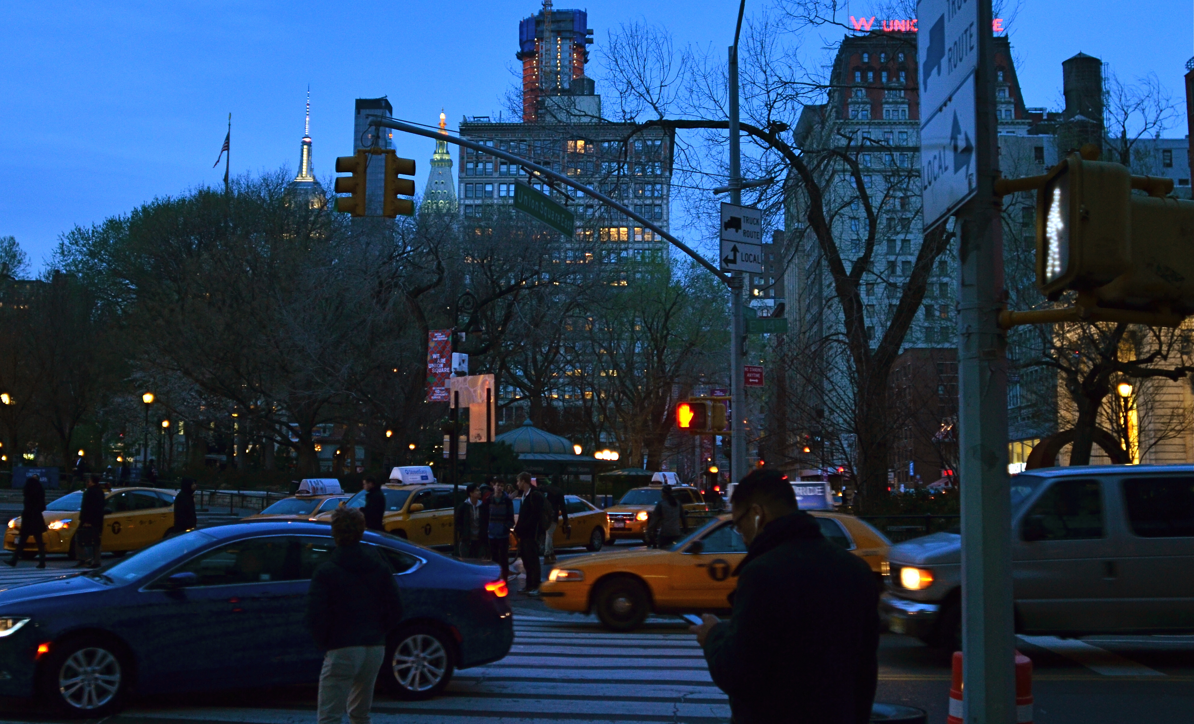
Same scene as above, in natural color. Which version sells the story the best?
Only, it’s not a given technique, per se, that becomes a drag, only its over-use or abuse. Think of canvas art for a moment. No one ever complains that “everybody uses oils to paint!” because it ain’t the pigment that separates the greats from the grunts. It’s what you do once you pick up that brush.
I steer away from partially desaturated shots because, while they can be real attention -getters, I myself don’t encounter many instances where I feel that they will actually help one of my pictures work better. The choice between monochrome and full color is, itself, fraught with a lot of mental measurement, meaning that you have a 50/50 chance in the making of an image to choose the wrong way to make it. Then there are color to b&w conversions, some of which really destroy the power of a photo. All this is before we get into the rather exotic decision of whether to make a picture “part” color.
Let’s say that there’s something to be gained by killing off all but the signature Manhattan cab yellow, as seen in the top image of NYC’s Union Square. Okay. It’s certainly technically easy to bring that off, but first you have to get beyond the initial “hey, that’s cool” sensation and ask, very critically, “what else am I giving away to nearly eliminate all the color in this image? Is the color of the dusky sky worth anything? How about the red glow of neon, the amber of lit windows, the darkening skin and fabric tones of passersby?
Lots of techniques fall or rise on whether they add or subtract from the image’s overall selling power. You have to learn when and where to do what…and to know why.
SIMPLEST TERMS
Two colors, and only two colors. Is anything else needed to sell this image?
By MICHAEL PERKINS
ENTIRE BOOKSHELVES OF MATERIAL HAVE BEEN WRITTEN on the mysterious art of composition at it applies to photography. The variations are endless: what to shoot, how much to shoot, how to determine how little to shoot, theories on addition, subtraction, choice of subject, and so on. The only constant is that every compositional inclusion also embodies an exclusion. When you choose one thing, you un-choose everything else.
One such choice is that of color over monochrome, an argument which raged over a large part of the early 20th century, since, for many years, photographers thought they could rely upon black and white, even though an abstraction of reality, to convey a consistent feel, whereas early color films often produced uneven results. Some photographers decided to ban color altogether, to embrace the predictable un-reality of b&w rather than gamble on hues that might not be reproduced or printed with true fidelity, or worse, register as too brassy or garish. Today we seldom choose monochrome over color for the same reasons, but compositions still rise and fall on whether we use color, as well as what kind of color we use.
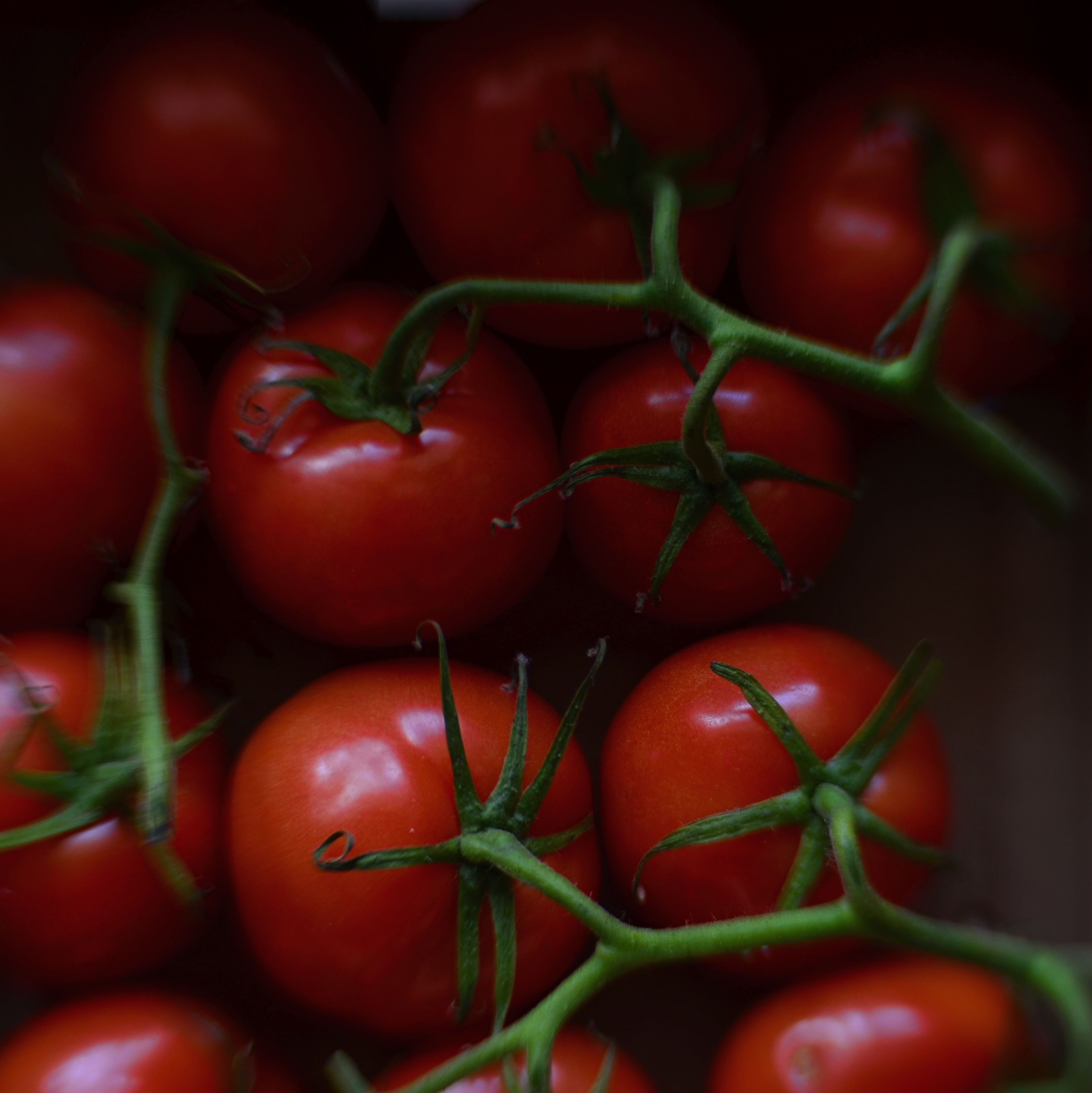
Sometimes, just as a photograph that’s poorly cropped or loosely composed can be too busy, a color scheme that has too much variety can prove distracting, actually diluting a picture’s impact. Occasionally, I like to see how few distinct colors I can use in an image and still consider it complete, as in the case of the tomatoes above, which makes it case with only red and green values. In this instance, adding extra space around the box holding the tomatoes, or expanding the frame to include other shapes, objects or hues, will do nothing to improve the strength of my composition, so why include them? This is an easy editing choice that occurs in real time in the framing of the shot, and, with the instant feedback afforded by digital, you know immediately if the picture is lacking anything.
The problem with a lot of photography is that we tend to go no further than framing up an “acceptable” picture, one that doesn’t overtly fail. However, the more we practice a mindful approach to composition, the more adept we get at putting just enough, from subject to hue, into the image, and not one item more. This gives our photographs a streamlined communicative power that directs the eye and conveys the story.
THE BLUE LION
The “natural” colors in the original of this shot were the “wrong” colors for what I wanted to say. So I changed them.
By MICHAEL PERKINS
I CONDUCT TOURS FOR KINDERGARTEN STUDENTS AT PHOENIX’ MUSICAL INSTRUMENT MUSEUM, the world’s largest collection of its kind on the planet. Frequently, I ask my young guests, who are viewing various animal-inspired music exhibits in the Asia gallery, why the sculpted lions seen on South Korean chimes are blue. Now, in fact, there are no lions in Korea, so in summoning the big cat’s strength and courage as a protective symbol for their music, the locals probably had to try to imagine one, including its features and hues. But pose this question to a five-year-old and the answers are far more instinctual:
“They wanted to”.
“Cause it looks cool that way”.
“It’s their lion…they can do what they want.”
Never do these children suggest that the lion is blue because the Koreans don’t know the “correct” color, nor do they think that there’s anything about its color that renders it “inaccurate”. And when I ask if they’ve ever used a “different” crayon to color something just the way they want it, every hand shoots up. Of course. Why wouldn’t I?
It’s my coloring book. I can do what I want.
Early color photography was about reproducing nature faithfully, accurately recording and reproducing reality. That makes sense, since you must have a standard before you can wander away from that standard. And at a time when color imaging was a novelty, science understandably put the emphasis on “getting it right”, which for publication and printing purposes, was a big enough mountain to climb, at first.
However, we have long since entered a phase in which the colors which nature or our eyes have assigned to an object is only one way, not “the” way to creatively depict it. We can use color counter-intuitively, emotionally. We can cast an image in every aspect of the rainbow, not merely within the narrow channel of “reality”. Color interpretation is surely as important as exposure or any other aspect of making a picture. In the above photo, my mind needed this old row house to be drenched in the burned gold of sunset. Since I was shooting at one in the afternoon, that wasn’t going to happen, so….
And if we forget to think with a child’s suppleness as we age into old habits, the next generation is always there to prod us back into the same state of wonder that makes a five-year-old perfectly okay with creatively colored animals. Recent retro movements among shooters, for example, include the simulation of improperly processed film, which is an optional filter on many of today’s phone apps. It’s a deliberate choice to take the quirky color caused by a lab error and turn it into an interpretive tool.
The over-arching rule here is: try it and see what happens. You don’t need to defend your choice to a committee or write a lengthy treatise (like this one) on why it’s justified.
You just have to wonder what a blue lion might look like.
DON’T EVER ALWAYS DO ANYTHING
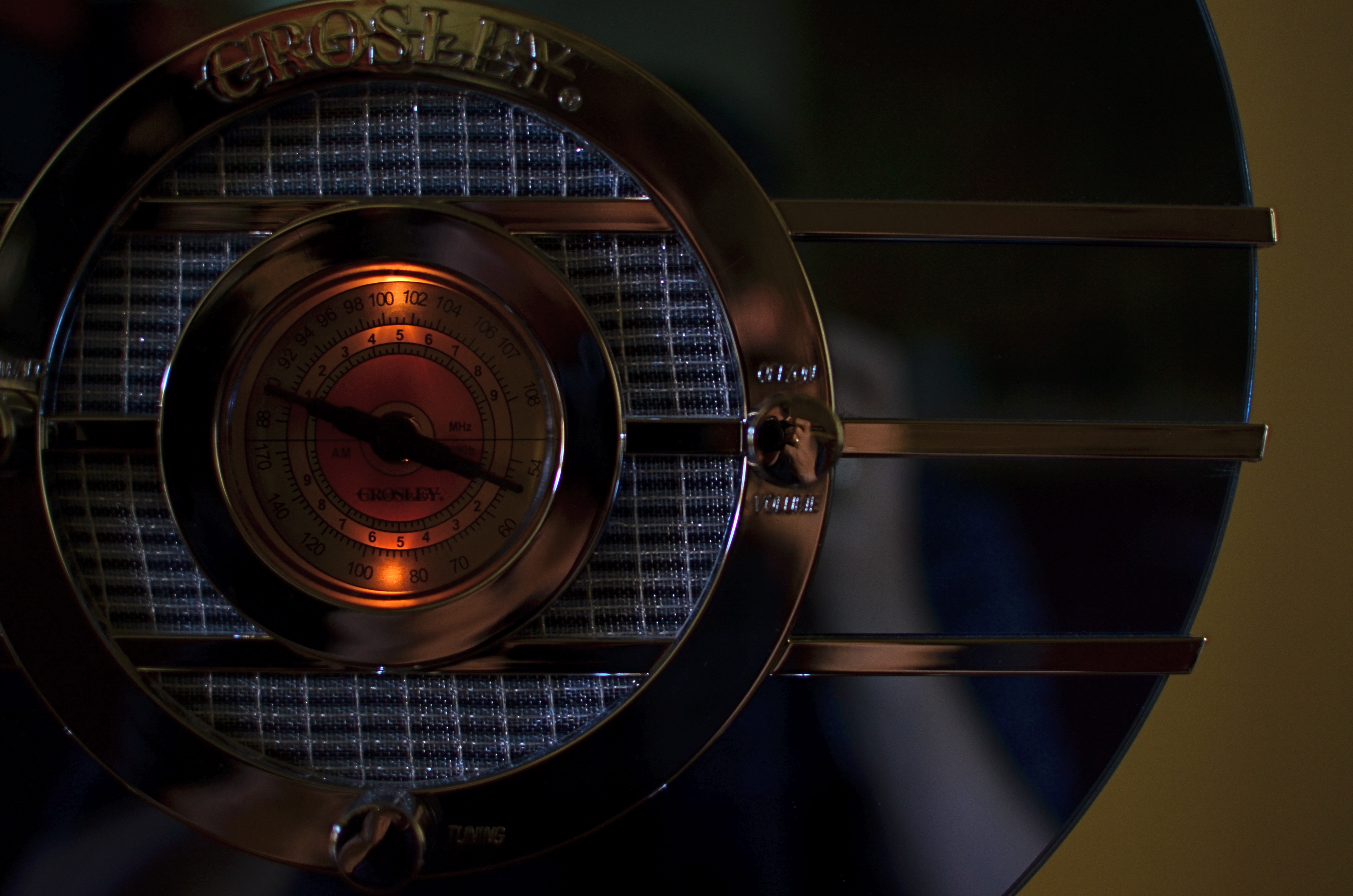
This shot, as the one below, is taken at 1/60 sec,, f/2.2, ISO 250, 35mm. The difference between the two images is the white balance setting.
By MICHAEL PERKINS
IF YOU’VE EVER GLANCED AT THE NORMAL EYE’S HOME PAGE MISSION STATEMENT, you might come away with the impression that I am unilaterally opposed to automodes, those dandy little pre-sets that do their best to predict your needs when making a photo. The truth is that I am against doing anything “all the time”, and thus caution against the universal use of automodes as a way of idiot-proofing your shoots. They can be amazing time-savers, sometimes. They are reliable shortcuts, sometimes. Just like I sometimes like bacon on a burger. There are no universal fixes.
I meet many people who, like myself, prefer to shoot on manual most of the time, eschewing the Auto, Program, Aperture Priority and Shutter Priority modes completely. Oddly, many of these same people almost never take their white balance off its default auto setting, which strikes me as a little odd, since the key to color photography is getting the colors to register as naturally as possible. Auto WB is remarkably good at guessing what whites (and in turn, other hues) ought to look like in a pretty wide variety of situations, but it does make some bad guesses, many of them hard to predict.
A gross-oversimplification of white balance is that it reads the temperature of light from cold to warm. Colder temp light runs bluer. Warmer temp light reads more orange. Auto WB tries to render things as naturally as it can, but your camera also has other customizable WB settings for specific situations, and it’s worth clicking through them to see how easy it is to produce subtle variations.
In the picture in the upper left corner, I’m taking a picture indoors, in deep shade, of a reproduction 1930’s Bluebird Sparton radio, a wondrous Art Deco beauty featuring a blue-tinted mirror trimmed in bands of chrome. To emphasize: blue is the dominant color of this item, especially in shade. Shade, being “colder” light, should, in Auto White Balance mode, have registered all that blue just fine, but, in this case, the chrome trim is completely (and unnaturally) painted in the same orange glow. As for the blue values, they’re well, kind of popsicle-y . That’s because, when it’s all said and done, Auto White Balance is your camera’s educated guess, and it sometimes guesses wrong. If you always use it, you will occasionally have to eat a bad picture, unless you take action.
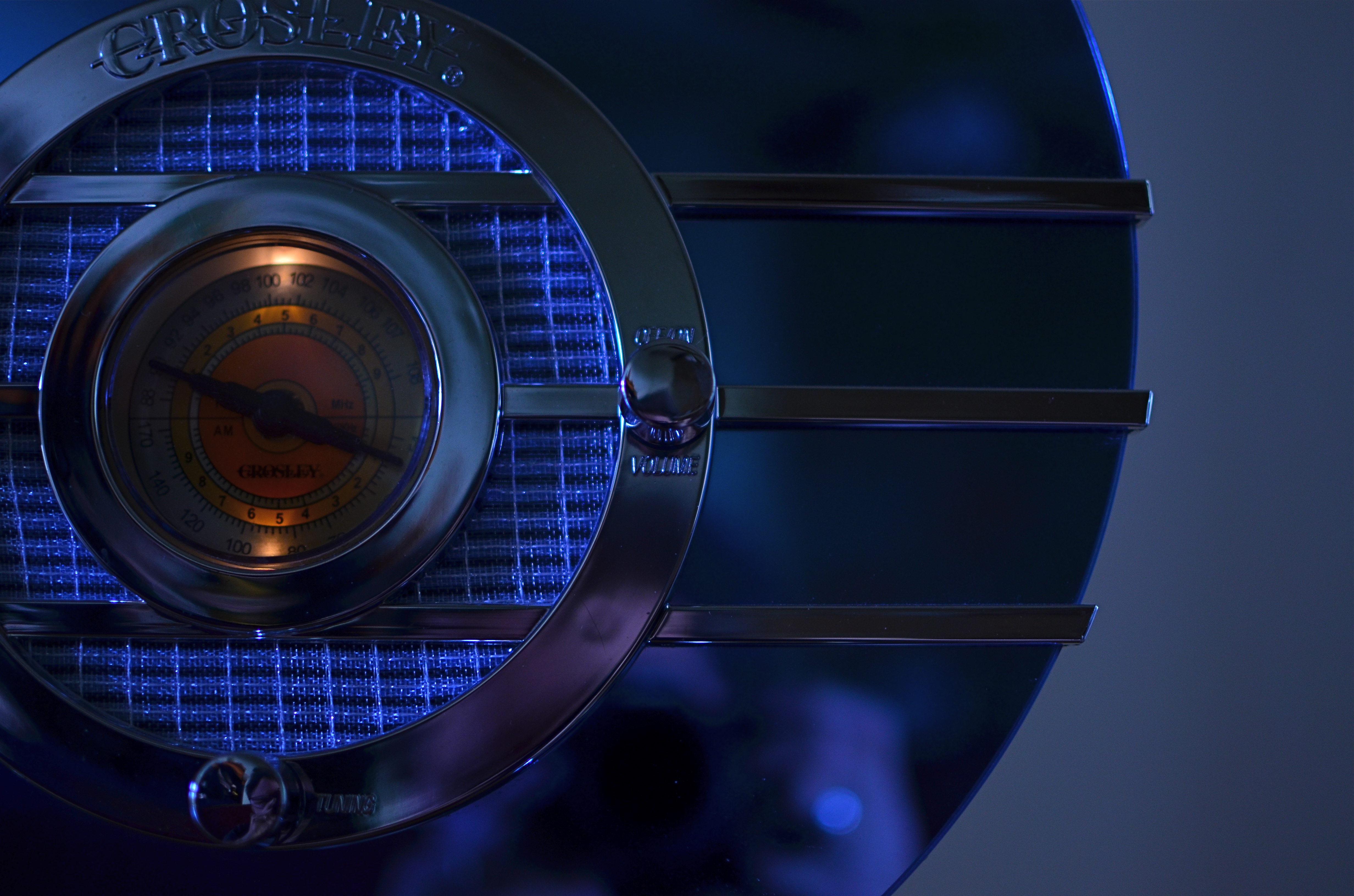
I get blue when I listen to the radio, or when I dial up the appropriate white balance.
For the above image, I want the dial to be nice and orange, but just the dial. To try to get the blues back to normal on the rest of the radio, I switch to the Tungsten white balance setting (symbolized by a light bulb, since they burn, yes, tungsten filaments), something I normally wouldn’t do in either daylight or shade, but hey, this is an experiment anyway, right? To make it even weirder, Tungsten might read neutrally in some kinds of indoor night settings…but it also doesn’t behave the same way in all cases. In this case, I caught a break: the orange in the radio dial registers pretty true and all the metals are back to shades of silver or blue.
Notice how both white balance settings, in this strange case, both performed counter to the way they are supposed to. One misbehaviour created my problem and another misbehaviour solved it. Hey, that’s show business.
Hence the strange but appropriate title of this post. Don’t ever “always” do…anything. If you want the shot you want (huh?) then pull an intervention and make the camera give it to you. Automode in white balance is just as fraught with risk as any other automatic setting. It works great until it doesn’t. Then you have to step in.
UNTRUE-TO-LIFE
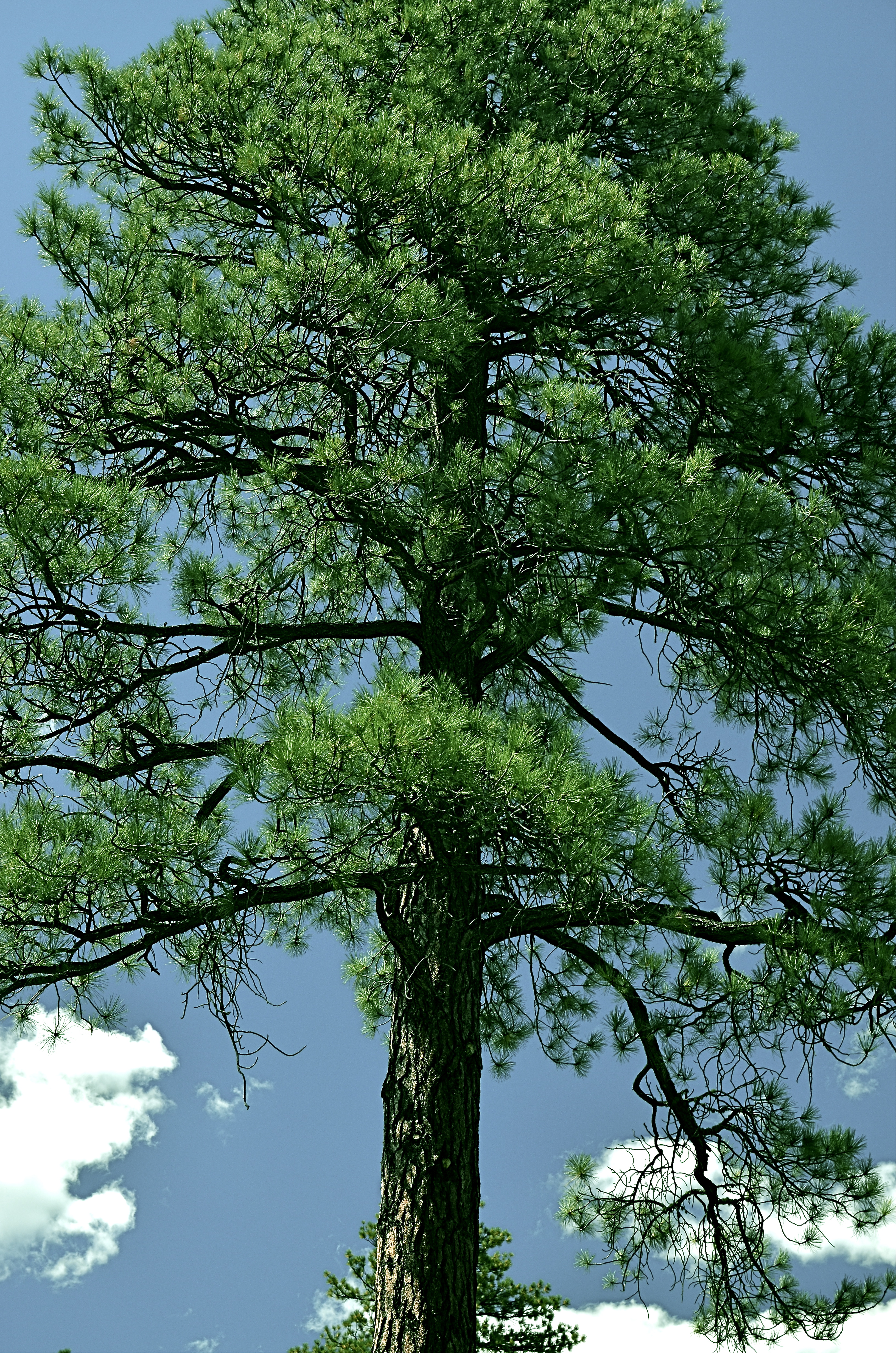
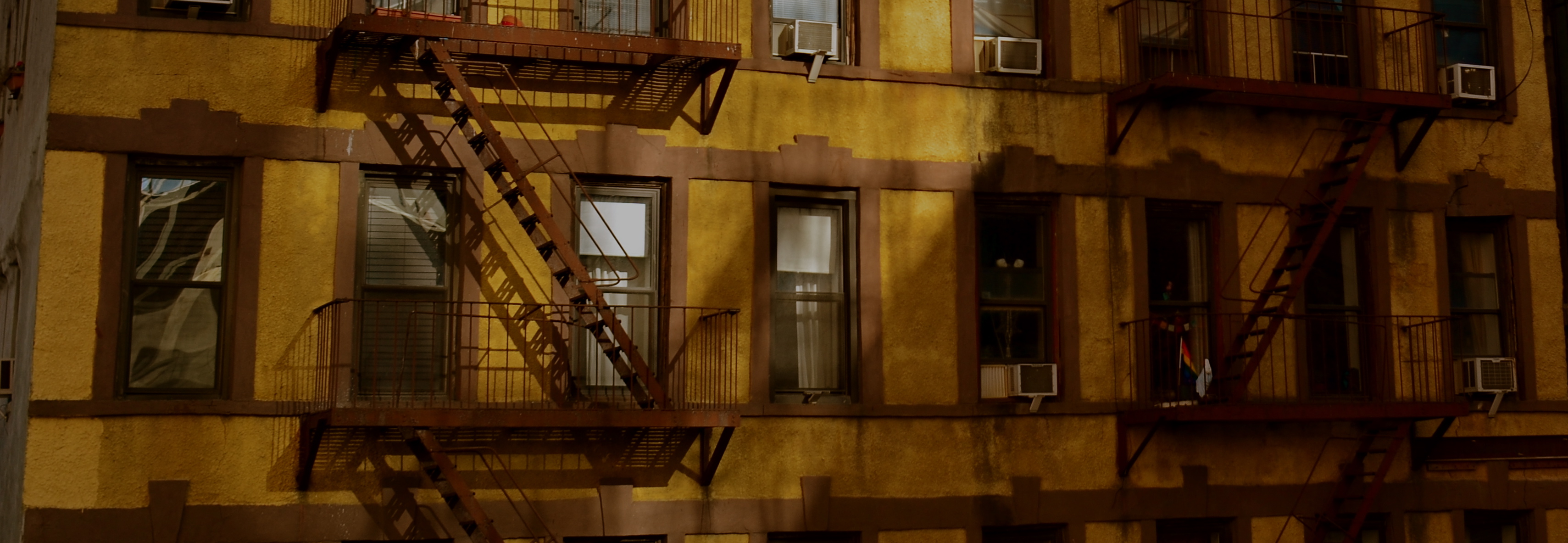
Go Green: A Flagstaff pine with all the brown values tuned out.
By MICHAEL PERKINS
I VOLUNTEER AT A MUSEUM WHICH SERVES, IN LARGE PART, SCHOOL TOURS. And, in trying to explain the color choices made by varying cultures on the depiction of everything, from flowers to animals, I frequently ask my groups if anyone has ever colored something with a “different” crayon. Not “the wrong color”, just a different crayon, a choice resulting in a purple squirrel or a brown rose. I usually get at least a few “yeses” on the question, and, when I probe further as to what went into their decision, I almost always get one child who says, simply, “I just like it that way.”
At this point, I realize that at least one person in every mob will always be thinking of color as a choice, rather than as a right/wrong answer. In my early school days, teacher often handed out the same mimeographed picture to all thirty of us, expecting all thirty to produce precisely the same results: green grass, blue skies, yellow honeybees. Strangely, we kind of expected the same of ourselves. It was comforting to hand in a “correct” piece of art, something guaranteed to please, a safe shortcut to a gold star.
In photography, we start as witnesses to color, but should never remain slaves to it. The present generation of shooters, born and bred in iPhone Land, know that changing your mind and your thinking on color is just an app away, and why not? The same force that has finally democratized photography worldwide is also legitimizing any and every kind of artistic choice. With billions of uploads each day, uniformity of style is worse than a lifelong gig as a worker ant, and as uninteresting.
Color is as big a determinant in interpretation as any other choice that a photographer makes, and can result in subtle shaping of the mood of your work. The above tree was originally captured in natural color, but I thought the overall design of the tree was served by one tone fewer, so I reworked everything into three values….blue, green, and black. I believe that the central trunk hits with more impact as light and dark shades of emerald, and the conversion of the pine needles to a more severe shade gives me some of the directness of monochrome. Of course, you might reach a completely different conclusion, but we’re beyond right or wrong here, aren’t we?
The mimeograph is dead, and with it, solid notions of color assignment. Fewer rules means fewer obvious signposts, but that’s why there’s more than one crayon in the box, innit?
SURVEYING THE SURFACE WORLD
By MICHAEL PERKINS
COLOR, IN A PHOTOGRAPH, IS OFTEN THOUGHT OF IN OVER-SIMPLIFIED TERMS, as if there were one even tone to every part of everything we capture, what I call the “paint roller” school of thought. One of the reasons color was so long in development in the film era was because it had to become accurate at measuring the myriad inconsistencies in the hues of objects. Consider the wide range of pinks, reds, even blues in the contours of a single human face. There is no “flesh” color outside of a box of Crayolas, and color photography has evolved over time to deliver the real, if tricky, inch-to-inch changes in the tone of every kind of surface.
Skin or wood, plastic or metal, color changes frequently over the surface of an object, and good photographers learn how to get stunning effects through application of that principle. One subject which can deliver dramatic results with little effort is the urban building, primarily the metal urban building. Many of the metals used in construction are actually alloys, and so they already contain color elements of their constituent ingredients.
Metal alloys produce wide color variations under the right lighting conditions. 1/50 sec., f/5.6, ISO 100-24mm.
I try to shoot alloys in fairly indirect light, as this amps up the shimmer and gloss of their surfaces in a way straight-on lighting tends to bleach out or subdue. I also set my camera for whatever “vivid” color setting it allows, since more color information means more clear reproduction of the subtle changes in tone from, say, one end of a section of metal to the other. In post-production, I will often play with contrast and temperature to enhance whatever I want to present in the image’s overall color mood.
Metal can run the gamut from grey to blue to green to pure white, and learning how to place those shades where you want them can add dimension to your photos.

ALL THERE IN BLACK AND WHITE(?)
By MICHAEL PERKINS
YOUR CONCEPT OF “STREET” PHOTOGRAPHY, assuming it interests you at all, is shaped by a variety of influences, including your idea of appropriate subject matter, biases in style or equipment, even your technical limits. But from my own particular perch, I think that the era into which I was born may be one of the strongest determinants of my preferences in street work, at least when it comes to the choice between black and white and color. To me, this kind of reportorial photography is vastly different either side of a key time line, with one side, say the world up to about 1955, weighted toward monochrome, and the other, the years that follow that mark and track forward up to the present day, being the more “color” era.
Before the mid-50’s, nearly all “important” photography was still being rendered in monochrome, much of it of a journalistic or editorial nature. From the crash of the Hindenburg to the New Deal’s chronicling of the impact of the Great Depression through endless newsreel and magazine essays, the pictures of record, of the stuff that mattered, was black and white. Consumer photography generally followed suit. Early color films were available from the 1930’s on, but the overarching curve of Everyman hobbyist work did not immediately flip to general use. Color was largely for commercial work, for selling things in a hyper-saturated advertising spread or brochure. Seminal black and white essays like Robert Frank’s The Americans or Henri Cartier-Bresson’s The Decisive Moment seemed to reinforce the idea of monochrome as the messenger of realism, authenticity, grit. Ugly, sad, tragic, important things happened in black and white. Color was for kids’ parties.
What “color” is your reality?
By the 1960’s, faster consumer color films changed candid photography virtually overnight as amateurs opted for more “lifelike” images. Color print, slide and movie film sales soared, and, while magazine and newspaper “documentarians” continued to emphasize mono as the “official” tonal language of street work, younger photographers began to reframe the argument as to what constituted a fit format for commentary. In the present day, both approaches live comfortably side by side, and many shooters are not exclusively in the ‘either” or “or” camp, deciding one frame at a time whether a narrow or wide palette is right for a given image. Even the shooters who embraced color as young photographers may, today, toggle back to monochrome for a singular impact or even a nostalgic evocation of the past. Fashion historians can easily lose count: we’ve zoomed past ironic, post-ironic, post-post-ironic, and back to innocence again, spinning through both unconscious and super-self-conscious styles like the blades of a pinwheel. Beneficiaries of technologies that abett and invite multiple ways to rendering the same subject, we shoot in all eras and influences at once. Everything about photography is a la carte.
For me, black and white isn’t a signature, but then again, neither is color. I find them both adequate for the candid work that encompasses “street”, and I reserve the right to make the choice between the two at a moment’s notice. Tonal properties, after all, should be as improvisational as the decision to make a given picture. We are freer than ever to worry less about the how of a photograph, and focus on the why.
Share this:
February 10, 2019 | Categories: Americana, Black & White, Color, Commentary, Documentary | Tags: history, Street Photography | Leave a comment