CHOREOGRAPHY IN THE PARK
By MICHAEL PERKINS
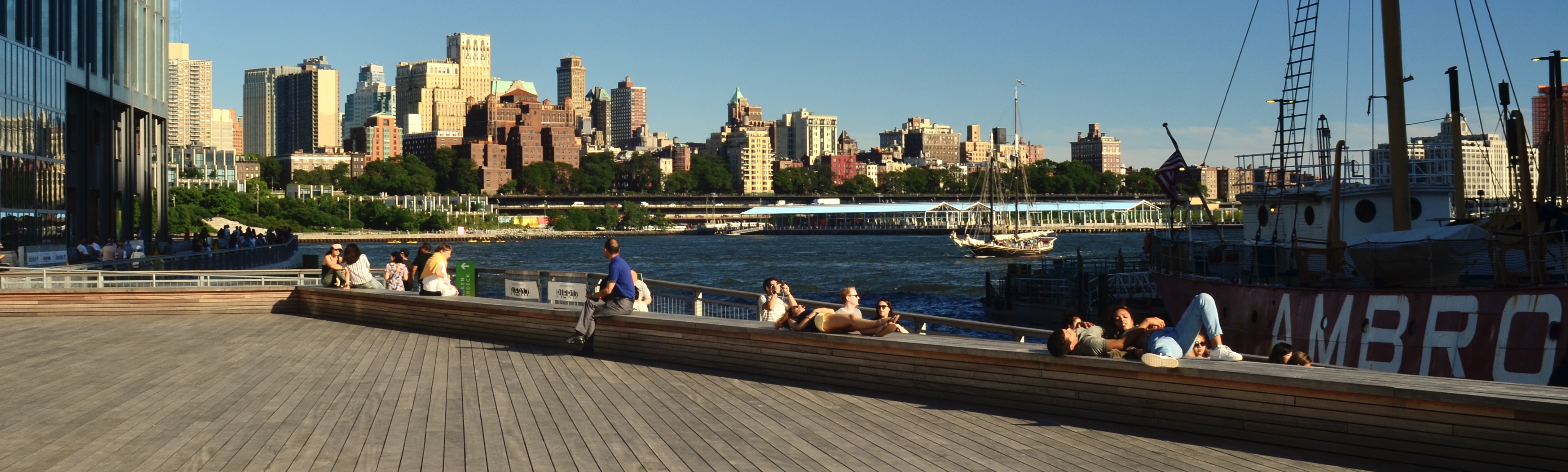
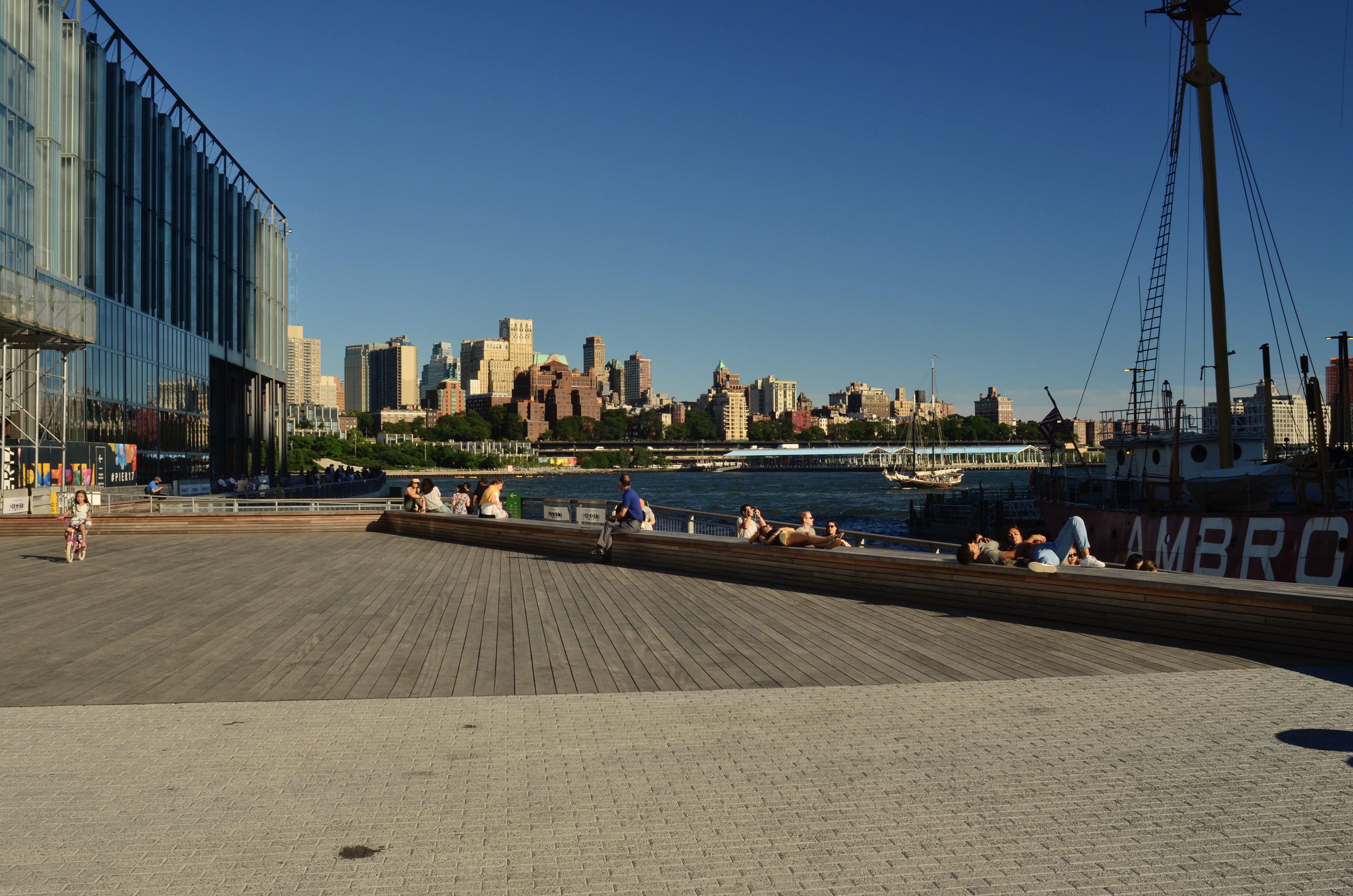
STREET PHOTOGRAPHY IS A UNIQUE MARRIAGE OF SETTING AND SUBJECTS, that delicate balance of locations and denizens that make streets into neighborhoods. The drama created in such studies is always a thrilling, moment-to-moment improvisation in which small things generate big effects. Incremental changes in the scenario, like waiting for the old man with the dog to walk directly under the deli sign, or framing the sullen teen right next to a reflective window, can be the difference between something that’s merely quaint and something that’s universal. And the more crowded with subjects the frame is in a street shot, the more options there are to weigh. Doing choreography for a lone dancer is not the same thing as blocking out space an entire troupe.
Streets shots are about weighing the importance of several things at once, in opposition to each other rather than as isolated elements. Tensions are set, tightened and released; motives are explored and exploited. In 2021’s cautious re-emergence from our respective quarantine caves, we are not only re-learning the flexing of our own muscles; we are also watching the equivalent adjustment in others. With or without a camera in hand, we are all more deliberate people watchers in this nervous re-entry phase. People are not, at least for right now, mere wallpaper, but active orbiting bodies in little constellations. We are a little more keenly aware, as we venture out, what their personal Great To Be Back moments are. Perhaps, in time, we will go back to our old habit of generally walking past each other, but now, in this careful new world, we are paying a little more attention. And those of us who, through photography, are in the habit of seeing with a little extra intensity will be in for a feast.
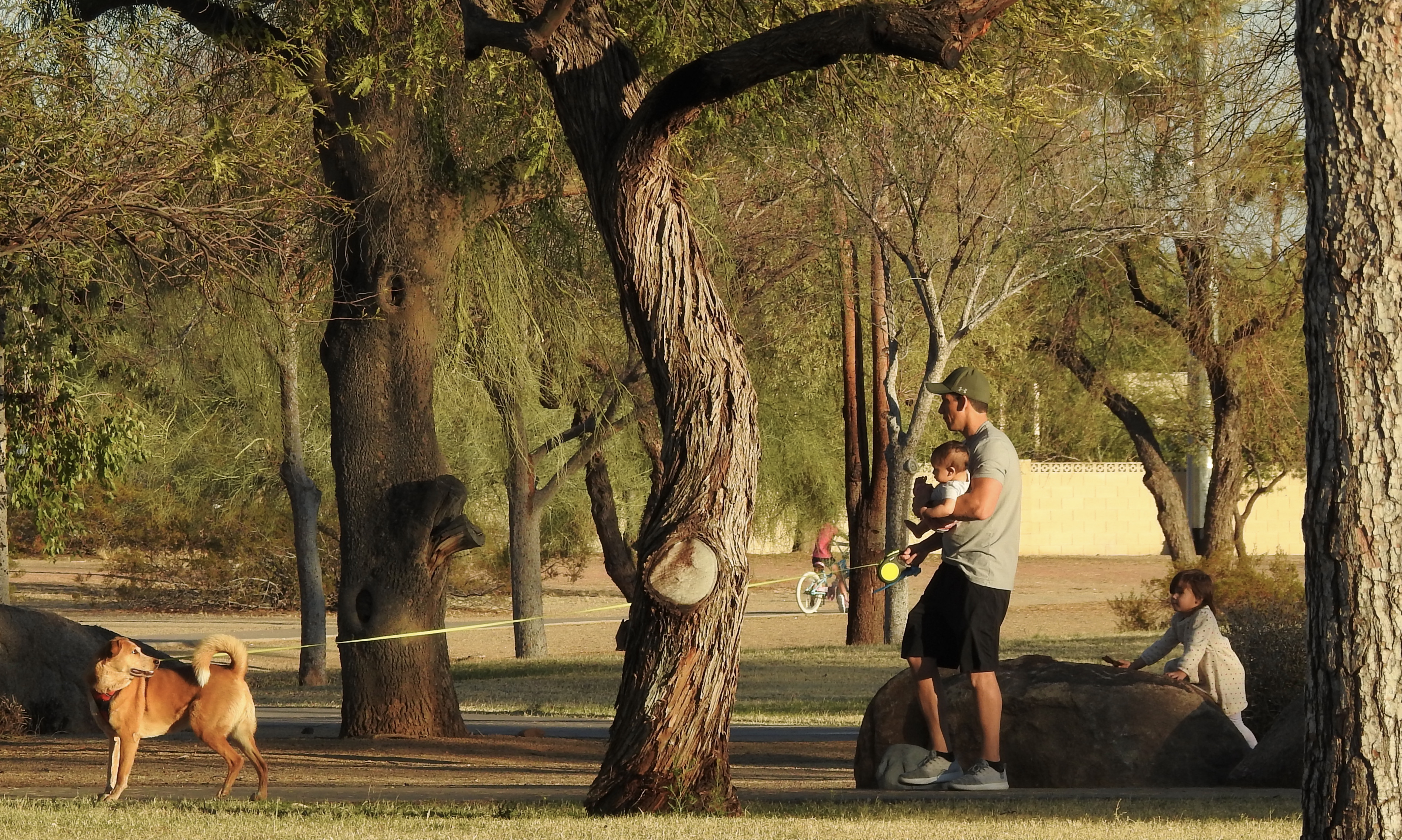
Dad’s Busy Day, 2021
As stated before, the more people you decide to include in a street shot, the more choreography there is to fuss over. In the “day-out-with-dad” scenario shown here, I had several stories that all wanted telling at the same time. In some frames shot over the space of a minute (about eight), various players were all contending for star status. In some shots, the father seemed to be guiding the kids and the dog. In a few, the dog’s personality as explorer-at-large seemed to place his energy in charge. In yet more, the young girl seemed to be trying to run things by standing atop the rock on which, in the selected frame, she’s seen leaning. Thus, in the final version, she’s a little more passive, Dad is trying to keep things in balance, and the dog is definitely on point as the overall leader of the expedition.
All versions of this scene had their elements of tension, warmth and humor, and so in choosing a single final rendition, I was neither right or wrong. The joy of the enterprise was in the element of spontaneous creation offered by what was happening upon the stage and amongst the players. I could write the ending so the guy gets the girl or where the cowboy just rides into the sunset, but that part is really unimportant. In street photography, the potential is the attraction. We are only able to extract a single instant to suggest a whole reality, and both the thrill and the terror of that choice, while it’s no walk in the park, is, for some, simply irresistible.
COMP RULE #1 (There is no #2)
Lots to see here. Maybe too much.
By MICHAEL PERKINS
IN BEGINNING FORMAL INSTRUCTION IN PHOTOGRAPHY, students are typically steeped in whole systems of procedure on the creation of a composition. In this pursuit, we’ve all trudged through swamps of techno-sludge, from “golden triangle” to “rule of thirds” to “leading lines”, along with dozens of other schemes for organizing visual information within the frame. Many of these credos are, in fact, valuable in training the eye to prioritize the data in their pictures and streamline their effectiveness, and I applaud their use. What irks the semanticist within me, however, is when these tips are referred to as rules. That’s when things wander into the weeds.
This is not mere finicky wordplay on my part; first, the idea of the word “rules” being applied to something as mutative as art makes no sense to me. It is in the defiance of accepted norms that art fully triumphs, and photography cannot breathe if it’s drowning in its own catechism. I understand that we humans love to list things, to map steps out in order of perceived importance. However, when it comes to arranging the photographic frame, I contend that all the approaches we learn about are merely that…approaches, and that, were I to grudgingly use the word rule in regard to composition, that there would only be one: engage the eye.
What else is there? Photographs begin as one person’s vision sent forth with the aspiration of becoming a shared experience. To that end, everything is about grabbing the viewer’s eye and effectively saying, here is where I want you to look; here is the order of importance among the things in this picture. All of the tricks taught about composition are merely a means to acheiving, by many roads, this one objective. Use whatever graphs, spirals, force perspectives or focus tricks you like, or mix them all together; if they don’t result in a conversation between you, the picture and the audience, then you have nothing except mere technical mastery. And just as there are paintings that are more expert in execution than in emotional effect, there are millions of wondrous exposures that communicate nothing.
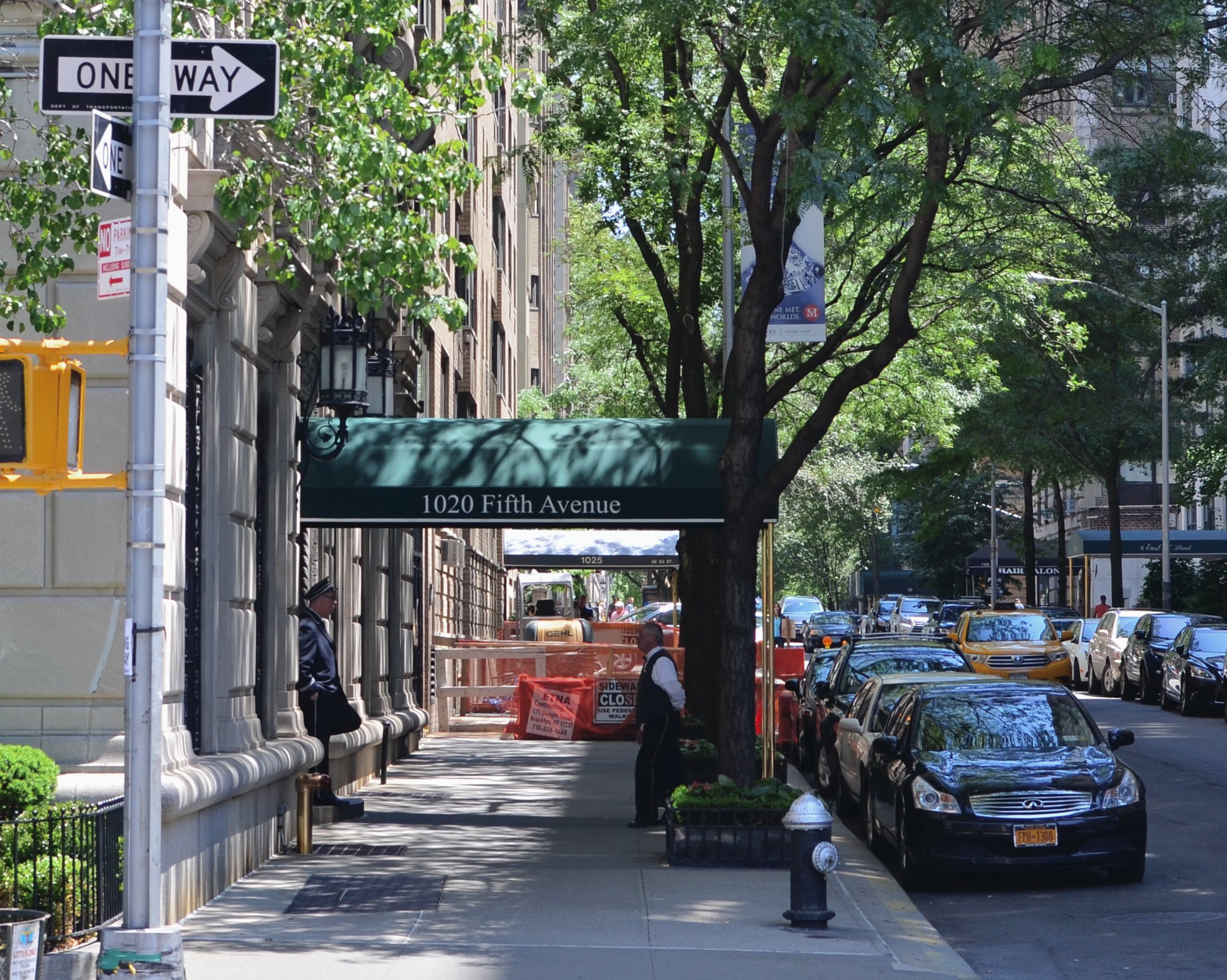
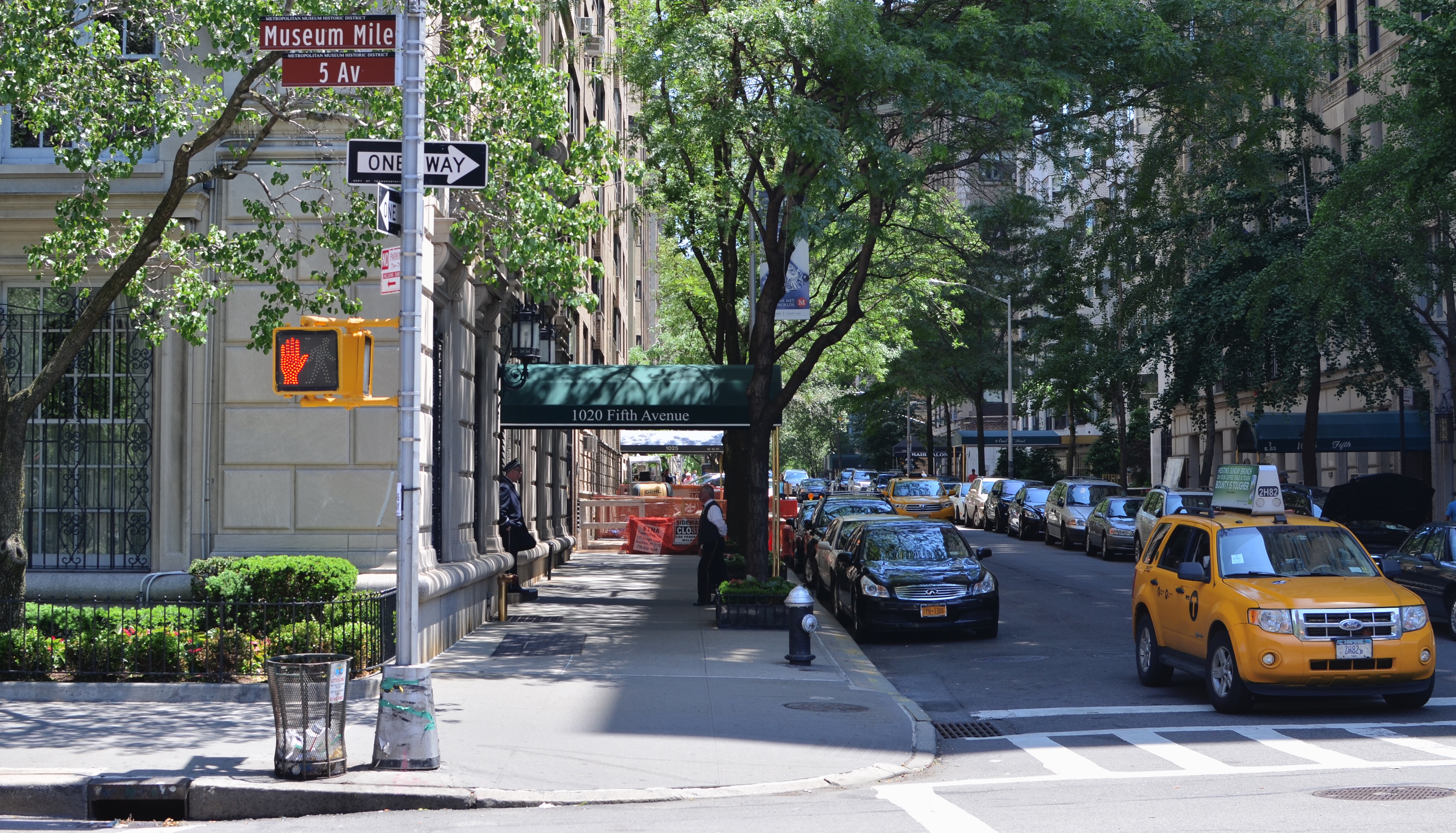
In the inset above, the original of a street scene image is an attempt to express the size and energy of an urban neighborhood. There’s nothing technically wrong with the picture, but, after looking at it for several weeks, I decided that the energy of the shot lay not in the car traffic or even the height of the buildings, but in the conversation between the two men at left. In the cropped version of the shot, seen directly above, this relationship is pushed to the foreground, without losing the feel of the city’s busy energy or scope. Certainly, basic compositional rules might have pronounced the first shot “balanced”, but it’s the deliberate intervention taken to create the tighter version that is an act of composition. And, of course, this is not meant to hold my own work out as an example to be followed. It’s just an illustration of the point that rule-breaking is where pictures begin, not where they go to die. Even though a picture is mounted on a wall with the help of a hammer and nail, no one would argue that either the hammer or the nail is what makes the picture compelling. Engage the eye, and you will have faithfully executed the only compositional “rule” that matters.
ADVENTURES IN THE REEL WORLD
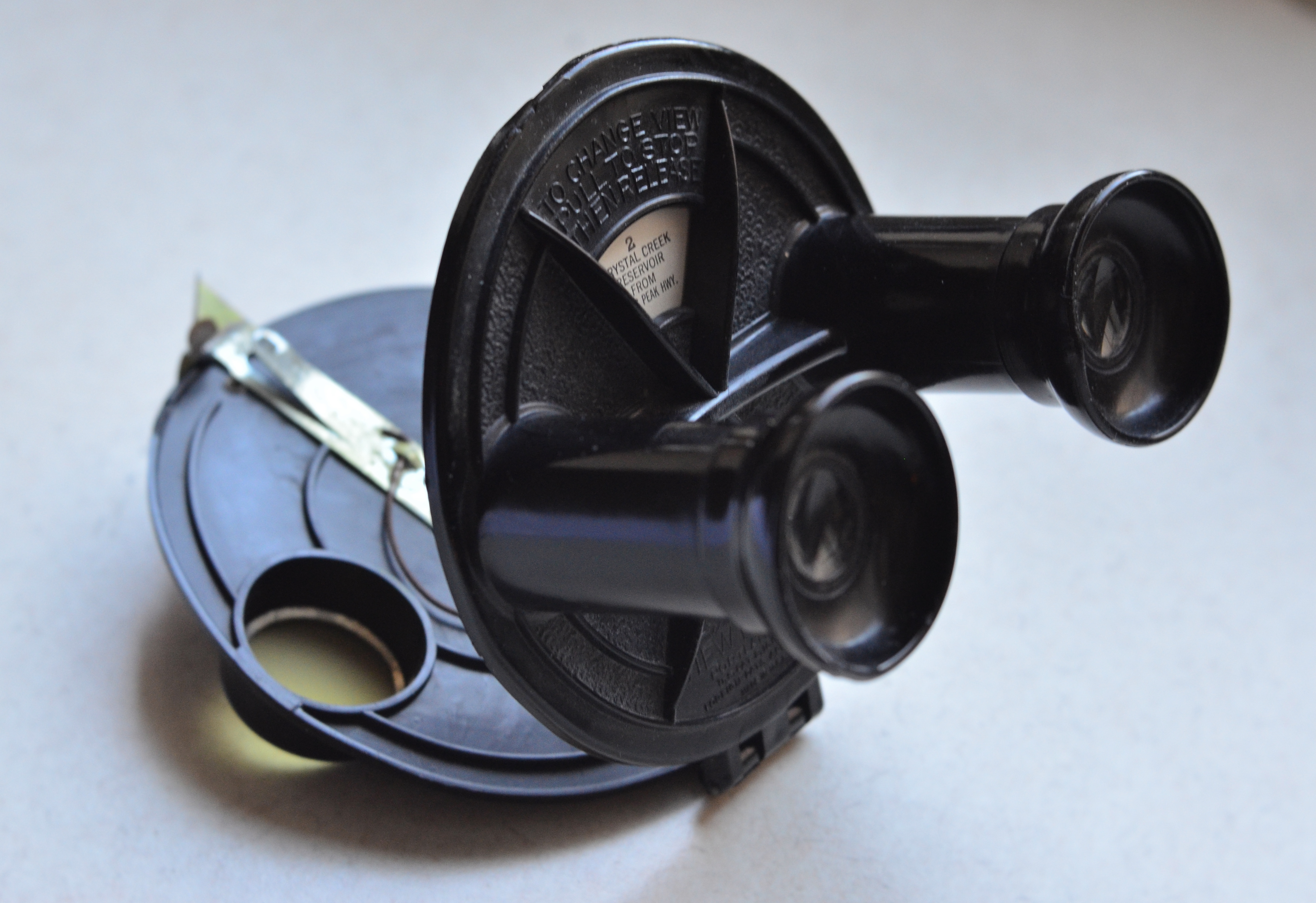
Model “A”, the first version of the classic View-Master viewer (1939), which originally opened like a clamshell for loading of the picture reel. The scene change lever (with wire spring attached) is on the inside back of the unit.
By MICHAEL PERKINS (author of the new image collection FIAT LUX, available now from NormalEye Press)
IN 1939, THIS STRANGE CLAMSHELL-SHAPED OBJECT sneaked onto the photographic market as a souvenir of the New York World’s Fair, offering itself as a thoroughly modern version of the 19th-century stereopticon. Instead of a rectangular card, the gizmo contained a disc, inside of which were sandwiched seven matching pairs of color transparencies, one for each eye of a stereoscopically-abled human, and which, when held up to any light source, allowed the brain to blend the two slightly different versions of the subject into a convincing illusion of depth. Model “A” of the contraption, called a “View-Master” by its inventors, would, over the next eight year, allow armchair adventurers to travel the world without leaving their living rooms, seeing in each reel, as the advertisement went, “seven more wonders of the world.”
At this writing (December 2020), those ubiquitous little discs, about 1.5 billion of them so far, could easily circle said globe several dozen times, with the View-Master brand growing over the generations to include lighted viewers, talking viewers, models shaped like Mickey Mouse, Batman and Barbie, both two and three-dimensional projectors, study guides for surgical anatomy, sighting practice for WWII fighter pilots, and, by the second decade of the 21st century, even virtual reality headpieces linked to phone app content. The brainchild of postcard magnate Edwin Mayer and photographer William Gruber grew from primarily scenic travel titles sold in serious camera shops to one of the biggest purveyors of affordable kiddie entertainment, starting with View-Master’s first contract with Disney in the 1950’s and continuing with every major cartoon and movie tie-in since then, marketed mostly through major toy chains.
Over the years, the company passed through the hands of several corporations, from the original Sawyer’s optical company to GAF, then Mattel, Fisher-Price, and other firms major and minor. The venture into virtual reality of recent years, sadly, seems to have spelled the end for the product, which is, alas, finally too slow and low-tech for the world of 2020. As recently as last year, there was talk (and only talk) of a feature film based on VM, based on the proposition that, as with The Lego Movie, every classic toy has a big-screen blockbuster lurking inside it, if only you look hard enough. Turns out…no.
But I must shed at least a quiet tear at View-Master’s demise, given that it was the product’s seductively scenic “packets” that initially excited me about the idea of making my own pictures. Those cramped little squares taught me a lot about what to include or exclude in a composition for minimum clutter and maximum narrative impact. Decades later, I even managed to scavenge a View-Master stereo camera (yes, there were such things) and a Stereo-Matic 500 projector, allowing me to come full circle, both shooting and projecting my own reels in 3-D (thus pre-paying my Geek Insurance for the next foreseeable lifetime). More importantly, the dozens of VM shooters (most of them uncredited in their lifetimes) who covered everything from the Grand Canyon to the moon landing over 81 years informed the way I approach the very idea of photography. The lessons were simple; make something beautiful; tell a story; and keep looking around the next corner, for, who knows, seven more wonders of the world.
PARING AWAY THE BROWN SPOTS
What was originally a general scene in a cafe cropped down to a decent candid.
By MICHAEL PERKINS
I’M A BIG FAN OF THE PRACTICE of distancing yourself from photographs that didn’t immediately connect with you. Some of our images just don’t register with us at first glance, however, in many cases, they can be approached with a fresh eye if you just shove them in a shoebox (digitally speaking) for a time, giving them a second hearing somewhere down the road.
Of course, once you get down that road, you may conclude that your first impression was correct, and that something in the picture was off, or just ineffective. But then there are the late-arriving miracles, the photographs that had to wait until your mind was right to reveal their best truths, eliciting some reaction like “that’s not so bad, after all.” In other words, the ones you’re now glad you didn’t delete in a fit of initial disappointment. The late bloomers.
Often I find that a simple cropping reveals that there really was a decent picture in there all the time, but that it was being eclipsed by all the extra dead space, props or distractions that were also captured in the moment. In such cases, the entire apple wasn’t rotten; it merely needed a few brown spots to be pared away. The trick is to think of cropping not as an admission of failure but as an opportunity.
Few of us have the chops to perfectly frame a great story in an instant. There are a few among us with that talent, and they are the ones enshrined in museums and textbooks. The rest of us can often capture a great picture within a larger picture, however, and in eliminating the fluff and filler we actually redeem it instead of writing it off as defective. One old-school photo editor was famous for telling his shooters to “crop ’til it hurts”, revealing his own belief that, if you kept wielding the scissors without mercy, good pictures would often be freed from the junk that surrounded them. Taking an understandable amount of ownership in our own work, we can often become overly attached to the first version of a project. We protect it like a young mother who cries the first time her baby gets his hair cut. But while great pictures are often “taken” (see earlier remark about the people in museums), many more are revealed by merely peeling away a few dead leaves.
The candid seen here retains less than 50% of the content that surrounded it, which originally included additional people and most of the interior of a good-sized cafe. Given the chance to add all that other clutter back in, I would issue a hard “no” and be grateful for having hacked at the task until I found the real essence of the picture. You have no doubt experienced the same Christmas-morning unwrapping thrill in your own pix. We need to remember that what comes out of the camera is often just the first draft of history, and that helping the best part of it be amplified is not cheating, or “making the best of a bad situation” but staging, directing our dramas for the audience’s best experience.
CHROMEDOMES
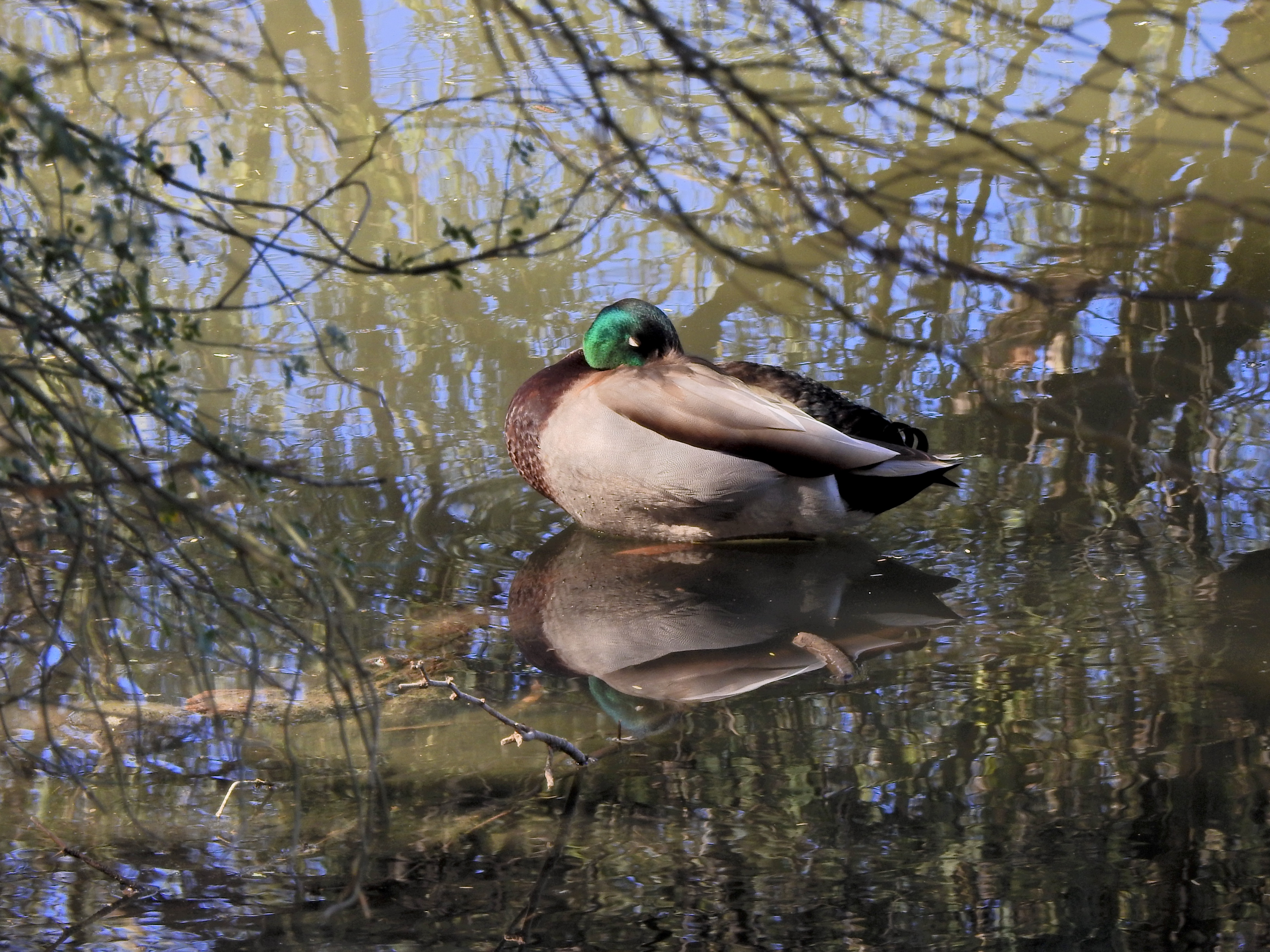
This color original is lovely, but the multiple hues on the water seem to fight with the duck for attention.
By MICHAEL PERKINS
THERE IS FAIRLY SOLID CONSENSUS, among those who teach the basics of photographic composition, that the path to success lies in reducing a picture to its simplest terms. Removal of extraneous distraction, proper placement of a subject within a frame, depth-of-field calculations…all these techniques work toward a common goal; to help the eye engage the photo efficiently, to lock onto its essential story without being confused or deflected toward something less important. Often a cleaner composition is just a matter of cropping, or merely limiting the number of elements contending for the viewer’s attention.
But there is one approach to basic composition that may not be instinctive to us all, and that’s the role that color plays in our pictures.
Color is the current instinctive default for most of our photos. It took a long time for it to be technically capable of taking that mantle from monochrome, which was, by necessity, the palette that shooters painted on for over a century. Color is seductive, and seems like a more “realistic” medium for our very personal universes of family and friends. However, in the composition of any picture, it must be reckoned with as another object in the frame, no less than a tree or a cloud. It is one more thing in there that demands our notice, and, for many images, it certainly earns that attention. However, color can become the message of a picture, not just the way the picture is rendered, drawing off the viewer’s eye in exactly the same way as extra props, extraneous scenery or other clutter can.
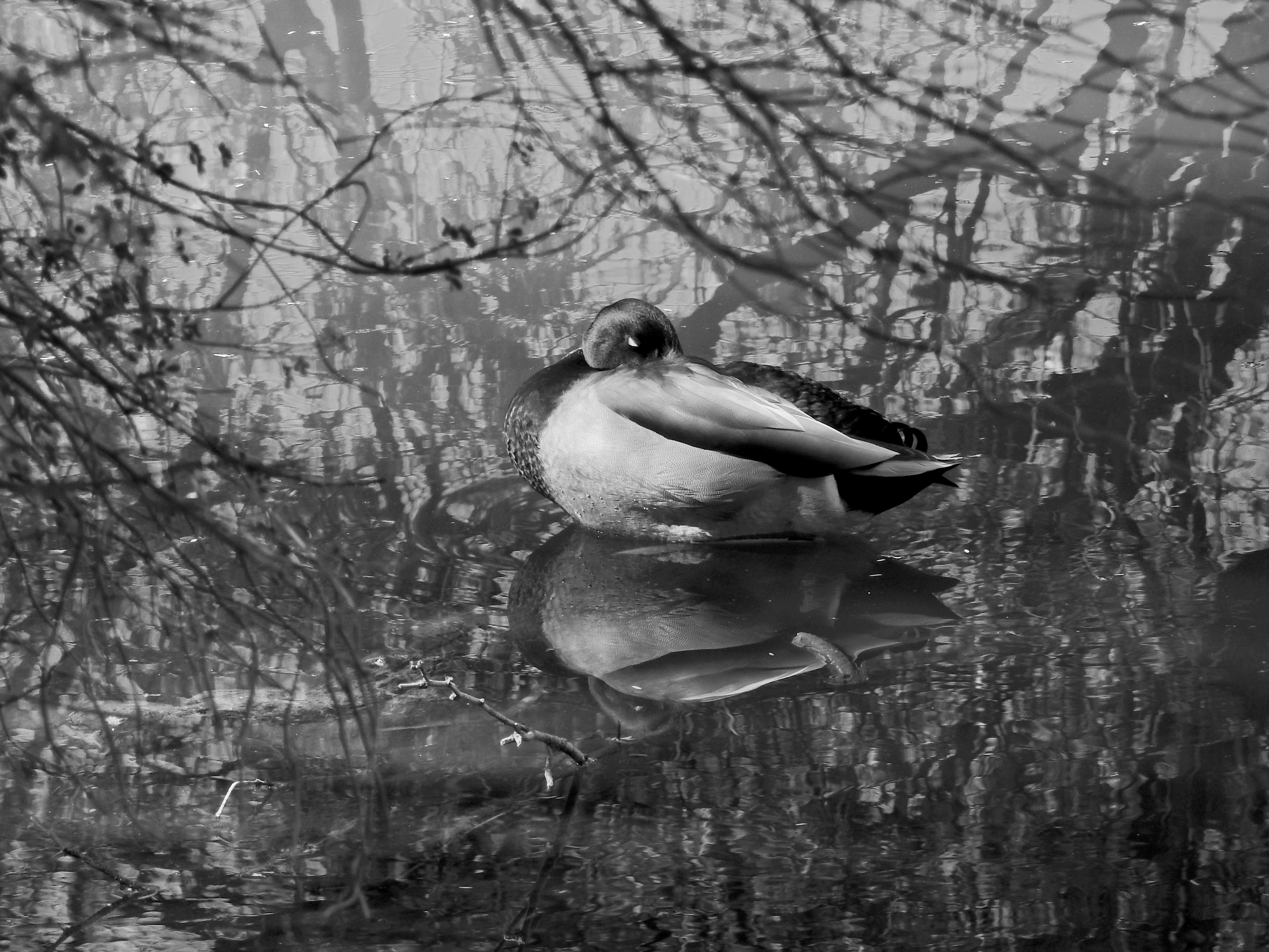
Neutralizing the reflective hues on the water can make the center subject a bit more prominent.
Some would argue that black and white is more nuanced and subtle in the rendering of emotional directness, or texture, or contrast when compared to color, and yet some of us think of monochrome as somehow incomplete or unfinished. Try telling that to several dozen Pulitzer winners, some of whom, admittedly, worked before color was practical (and therefore not a real option), along with others who continued to choose b&w even after it became the minority medium. And this is not about unilaterally choosing sides, forever pitting the Kodak Tr-X crowd in a pitched battle against the Fuji Velvia cadre. It’s only about choosing the right tool for every picture, and not getting so locked into the global color default that you refuse to peer into the opposite camp. I continue to master every shot in color to this day, but a full fifth of my final output consists of mono conversions, with modern post-processing giving me every bit as much control over the results as in the old darkroom days (as seen in the illustrations). The best course, I believe, is to form the habit of looking at all your pictures both ways. Often, you will just stick with the color original, because it works. And other times you will play in the other playground because, for some pictures, that works.
Color is an object within your pictures, no less than a mountain or a chair. Think of it as another piece of visual furniture fighting for dominance in the frame, and deal with it accordingly. Monochrome is not photography’s simpler, poorer step-kid. Sometimes, it can be the pride of the family.
EITHER / OR, EITHER WAY

By MICHAEL PERKINS
CERTAINLY, PHOTOGRAPHY IS PARTLY ABOUT LIGHT, AND EQUIPMENT, AND TECHNICAL MASTERY. However, after all those means are applied, the only determinant of the ends of all our energies comes from human choices. Arguments within the mind of the photographer about what “belongs” in a picture. How to convince the viewer that it belongs. How to apply all the means to make that information compelling, or universal.
It’s knowing what to say “yes” to, but, just as crucially, it’s about being able to say no to every other option, and being prepared to live with your decision. Of course, deciding what to put in an image is not, literally, a matter of life and death, as a choice of career, mate, or philosophy might be, but it is a very visual demonstration of what choice entails. Because, when you choose something, in a picture or in a life path, you automatically unchoose everything else. There is no way, in art in life in general, to have it all.
But better voices, voices far wiser than mine, have already spoken brilliantly of this process. One, in particular, has been considered by many to be the final word on the subject, so today it serves as my own picture’s caption:
COLLISIONS OF CONVENIENCE
By MICHAEL PERKINS
UNLIKELY JUXTAPOSITIONS are the very essence of photography. We use the camera to extract the mood from one time of day and paste it over the atmosphere of another. We put light in places where once was only darkness. We take the colors of joy and superimpose them over somber scenes. We shove the past up against the present and force the two of them to become BBFs. And so, as picture makers, we should be comfortable when elements that seem to have nothing in common co-exist comfortably within a single image.
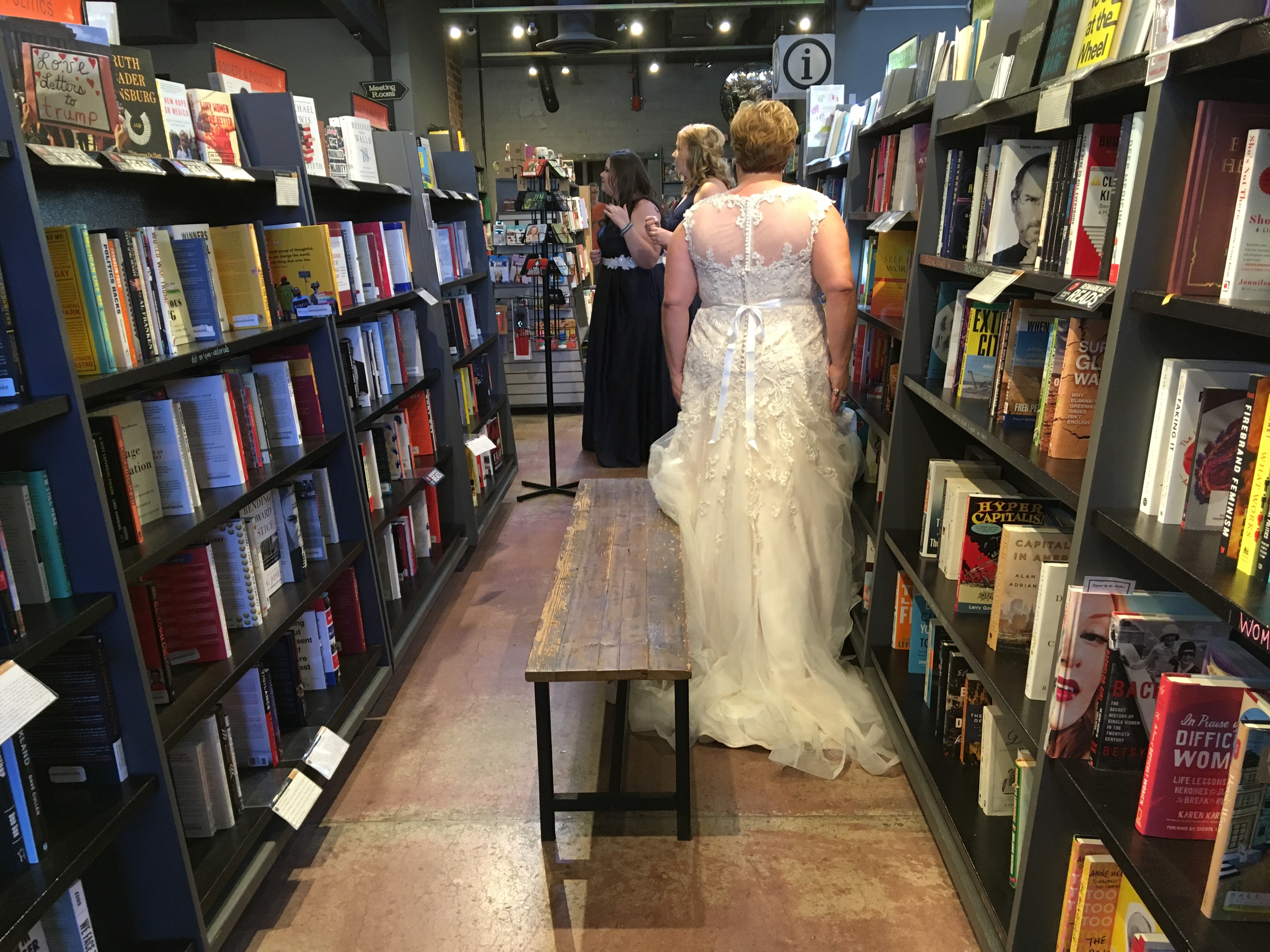
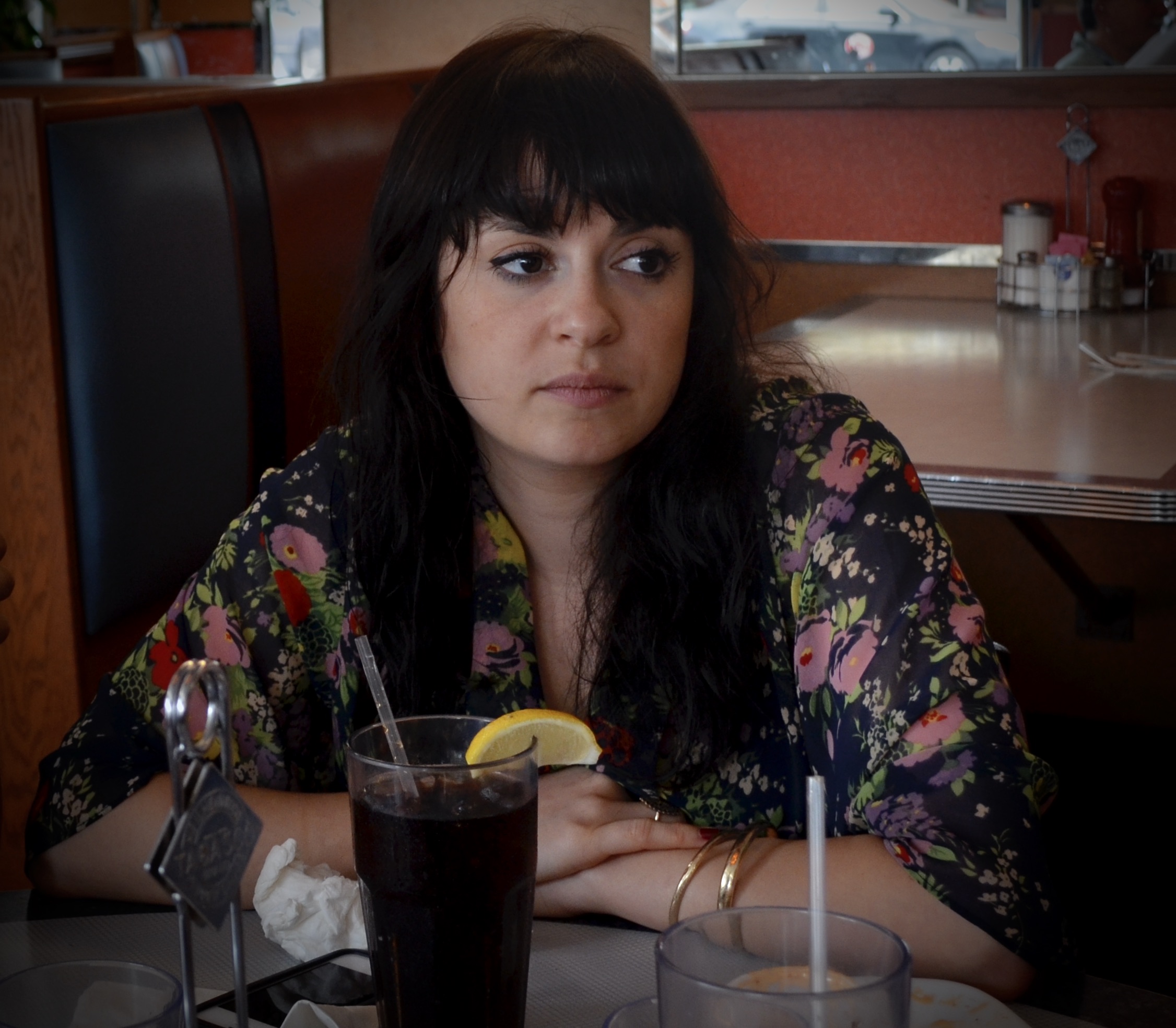
That said, this picture, which pretty much fell into my lap last year, feels very much like the kind of improvisation that informs the re-imagining of practically every rite and routine right now, rather than a “fun” idea from 2019. That is, in the present state of affairs, observers might understandably react to, say, a wedding rehearsal inside a bookstore with a big, “um, sure, why the hell not?” In this way, the great hibernation has made more of us think like, well, photographers.
Here’s why: shoot enough photos and you will inevitably become more limber in your idea of what fits or doesn’t fit within a single frame. Quite simply, the randomness of life will force you to look at seemingly exclusive realities and admit that, yes, they actually do justify each other in your final composition.
And just as so many non-shooters have learned, in plague times, to accommodate plans “B”, “C”, “D”, photographers must stay in the game, stay loose, and conclude that, yes, all things considered, holding a wedding in a bookstore is a pretty dope idea.
FROM EYE TO DOCUMENT
 By MICHAEL PERKINS
THE UNIQUE BLEND OF TECHNICAL AND MENTAL PROCESSES that combines to form the phenomenon of photography is as real, and as elusive, as smoke. Real, because it results in a physical transfer of information from eye to document. Elusive, because, like smoke, photographs waft and curl in different contours with each and every image.
The making of a photograph is forever thrilling because it is an attempt to make something purely mental cohere into a tangible object. It’s a tantalizing dream that ends in a frustrating compromise, something pure that often enters the real world hobbled by impurities. And yet it’s the flawed part of this process that makes it irresistible.
If the Magic Picture Box had actually been able to reproduce reality, as many feared at its introduction, it would have long since lost its allure, and would offer no more romance than a seismograph or any other mere recording instrument. But something different happened instead.
Instead of the camera being reliable as a mirror of “the truth”, the very imperfectIon of its nature made it a messenger for “my truth”….a machine that must bend to the whims of its user. That’s why even the best camera is only as good as the eye behind it. It’s not that “the camera can’t lie”, but that it can neither lie nor tell the truth without human intention steering it.
I offer these scribblings as an answer to the oft-asked question, “why do you love it so much?”, not really to convert the unconvinced as to remind the devoted; because even people who make pictures constantly can occasionally forget what a miracle we help oversee.
DOING WITHOUT
By MICHAEL PERKINS
PHOTOGRAPHIC STYLE IS REFLECTIVE of the human aging process. You often make pictures differently in different phases of your life. Many of my favorite shooters have, over their careers, evolved on two parallel tracks, both toward simplicity. That is to say that their picture-taking process, i.e., equipment and gear, becomes more streamlined as they age, even as their approach to composition becomes simpler. In every way possible, the best photographers tend to learn, over time, how to do more and more with less and less.
Going into battle with a single camera that’ll do 98% of what you need in any situation is highly desirable, but it takes time to learn how to do that, to resist the temptation to carry every gizmo under heaven on your shoulder at once. But the struggle is worth it; knowing every single feature and quirk of a camera that’s ergonomically solid and functionally streamlined allows you to work fast and instinctively. As for composition, I found that, at least for me, I had to either learn to simplify or just give up on things like landscape work, where everything I shot was crammed with clouds, trees, trickling streams, flocks of birds, and, who knows, the Barnum & Bailey circus. I was making picture after picture where, if the human eye was asking, “where do I look?” my answer was likely to be, “It’s a smorgasbord! Pick anything!” The truth was that I had to go simpler as I aged if I was ever to be effective at all in conveying visual ideas.
Simplicity is the final step in a photograher’s development….or at least in mine.
Twenty years ago, this image would have taken up twice the area you see here, because, even today, its master frame included, along with the barn and stable, a side building, some empty blue sky, and a few small piles of farm implements….enough distractive information for five pictures. Zeroing out all the color and cropping to keep the entire picture to a basic series of rectangles and triangles (plus their multiplied shadows) turned out much better; all I had to do was develop the courage to cut, decisively, in search of a less cluttered picture. I only select this example because it’s a very clear illustration of the process that I now go through for composing nearly every shot, in that I try to pre-visualize how little information I need to convey my concept. Yes, how little.
This is an ongoing struggle for any photographer, because it’s easy and alluring to do more of everything…more stuff to carry, more stuff to cram in the frame, more things to draw energy away from your primary vision. I am nowhere near where I need to be in this journey, but I can track a little progress, and, amidst all the distractions of, well, living, that’s at least something.
(FIAT LUX, Michael Perkins’ latest collection of images, is now available from NormalEye Books.)
STOLEN STILLNESSES
The Quiet Hour, 2013
By MICHAEL PERKINS
THIS ONGOING CHRONICLE, for anyone who is relatively new to it, is more about the motivations, rather than the methods, behind photography. The mechanical techniques of snapping a picture can only ensure that you will, in fact, produce an image. Everything else….the shaping, the conceptualizing, the intention of making a picture, happens outside the camera, inside yourself. What I’m leading to here is that, between you and your device, your device is far less crucial. This is why people can take good pictures with bad cameras, and why you can make a lousy image with a Leica. If I believed that photography was, like xerography, just a means of recording, then I could have saved you and me both the meanderings and mutterings of the last nine years.
Photography is a strange art because it begins with real subject matter and renders it surreal. Once an instant is yanked out of its rightful place in the orderly crawl of time, once it’s isolated and arrested in its flight forever, it becomes something else than what we first aimed at. We make a decision, in the present, to preserve something, and, in that instant, that object becomes something ago. Part of the past. Not only that, but it takes on the biases of the shooter, who decided that this light, rather than that light, should be the storytelling medium, that this composed frame should be chosen over all other possibilities. We dedicate ourselves, in a sense, to making things look “real”, while the very act of photography renders that reality null and void. The final picture of a thing is either real-plus, or real-minus, but, being filtered through both the camera and our own perceptions, it can never be merely “real” again.
We also decide what is worth photographing, as if the act of taking a picture of something could confer importance on it. Certainly, we are right at least some of the time. Some moments are, by their own nature, vital, essential to an understanding of the world. But then again, who is to say what’s meaningful and what’s banal? Perhaps the best thing you can say about a photograph is that it’s an argument, like a summary made before a jury. Well argued, the photograph is seen by one’s peers as necessary, as having added something to the overall experience….that is, the jury finds for your “truth”. Badly made, the argument that is a photograph is rebuffed or, worse, ignored. When I use the phrase the normal eye as the title for this screed it, means the process of teaching the eye to see in its own way, devoid of the interpretations or prejudices of others. To develop your most normal way of seeing. The trick of selecting little seconds of time to steal and preserve is quickly taught, in the purely mechanical sense. But as we soon learn, that’s only the first baby step in the quest for a photograph. That inner journey takes a lifetime.
(the image seen on this page is part of a new collection of Michael Perkins’ images, “Fiat Lux: Illuminations In Available Light”, available from here from NormalEye Press.)
TO-DO’s AND TO-DONT’S
By MICHAEL PERKINS
ONE OF THE EASIEST THINGS TO LEARN ABOUT IN PHOTOGRAPHY, apparently, is what you’re doing wrong, or so a casual stroll through the Googleweb would suggest. The internet is lots of things, but starved for opinions it ain’t, and so one of the fattest search yields you’ll find online consists of lists, endless in number, on how we are falling short as shooters. You may have sought them out yourself: “Ten most common mistakes”, “the beginner errors everyone makes” “twenty things not to do with your pictures” and so on into the night, rosters of failure and shame compiled by everyone from prominent pros to the village idiot. Actually, that’s unfair. Likely the village idiot is having too much fun taking photos to worry a lot about whether he’s doing it right. As a lifelong village idiot, I can attest that it takes one to know one.
Many of the sins, both venial and mortal, that make up these “to-don’t” lists are of a purely technical nature, such as picking the right aperture or making sure that you haven’t posed a subject in such a way as to make it appear that a hibiscus is sprouting out of the top of his head. Surprisingly, there are fewer suggestions about composure…what makes it stark or busy, what makes it fail to engage or confusing to “read”…than you’d suppose. Almost none of these lists actually address ideas or motivation. And so I mainly regard all such lists with a bit of an arched eyebrow, for the simple reason that they are so very practical. Practical and art are not often on speaking terms.
Pictures are built, not taken.
Orson Welles, a directorial virgin when he arrived in Hollywood to make Citizen Kane, was told by his cinematographer Gregg Toland that there was nothing about shooting a picture that couldn’t be taught in a weekend. Welles’ verdict: Toland was right. Still photography is similar: the mechanics of merely getting a picture into the box are not like the procedures for splitting the atom: much of the moves we make to make an image are but variations on the moves we’e always made, and even without formal instruction, digital has made the learning curve so short that you can muster (if not master) the basics in a few days. It’s what to do with all those technical tips that separates the men/women from the boys/girls, and the endless online (or printed) to-don’t lists don’t even address that amidst all their edicts on lighting and lenses. Because they can’t. Because it can’t be taught like the steps of changing your oil can be taught. It can be learned, but only from yourself. Certainly, if you can’t see, you can still shoot. It just won’t matter that you did, that’s all.
The reason arbitrary rules don’t work with art is because art works best when rules are broken. If all we had to do with a camera was faithfully record light and dark, we would eventually, with practice, all have the same level of excellence. But we don’t. And we can’t. Sometimes a picture just works, despite some line judge saying that it’s too dark, too blurry, or too busy. And if a picture does not transmit your passion to someone else, then all the technical excellence in the world can’t make it connect any better. Why don’t all the do-and-don’t lists talk about motivation, or intention, or just the habit of shooting mindfully? Because that is a matter of mystery beyond measurement. A picture is built, not taken. It happens within the eye and mind of the shooter, and sometimes leapfrogs over all the correct techniques to arrive at a result that is too personal to be contained in a rule book.
CURIOUSER AND CURIOUSER
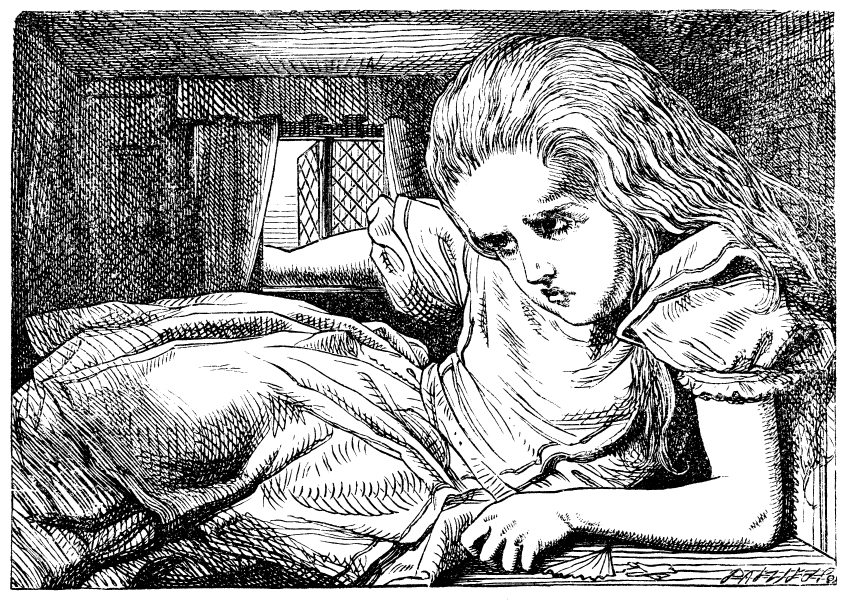
“we gotta get outta this place…”
By MICHAEL PERKINS
IN READING ALICE IN WONDERLAND as a child, I tried to imagine myself in the heroine’s place as she was buffeted about between strange creatures and bizarre environments. I wasn’t sure how I would react to a talking White Rabbit or an infant who turned into a pig at a moment’s notice, but I felt that, if I had to improvise while being alternatively enlarged and shrunk, as poor Alice was, that I would be ingenious enough to master my situation. All those “eat mes” and “drink mes” would have been tough to manage, for sure, but my natural explorer’s spirit would, I was confident, prevail in the end.
The current international cabin fever has made me think a lot of Alice lately, both Tiny Alice, being swept away in a torrent of her own tears, and Overgrown Alice, straining at the cramped limits of a house she has outgrown. You can see where I’m going with this. As photographers, we often are outwardly biased. The next great picture is somewhere “out there”. We are just one mile and a quick left turn from something stunning, and, in most cases, it’s beyond our own back yard (apologies here to Dorothy Gale as well). Add a forced quarantine into the formula, however, and we feel, at some point, like Overgrown Alice, thrusting a hand out the window of a micro-house. We fear there’s “nothing to shoot”. Our typically cheery disposish becomes dark and churlish. We start to watch daytime TV and bake.
Doing more with less un-shrinks the house.
Overgrown Alice’s constantly morphing dimensions made her constantly re-evaluate her world by the latest shifting data, with the very special challenge of being crushed by its shrinking confines. Photographers who are locked inside are likewise forced to re-think their relationships to objects in their environment…to re-contextualize everything. A flower under the macro lens becomes an entire botanical garden. Objects too familiar to be noticed under normal conditions become fascinating examples of design and pattern when seen from a different angle or distance. Anything and everything can become completely new because we have been forced, through either genius or boredom, to change our perceptions. A web search of the phrase cabin fever photography has become a major trender in recent months, and with good reason. We can’t go out to shoot as we’d prefer: we have to turn the camera further in. In so doing, we find ways to get more and more out of less and less. We discover, as we must regularly do as photograpers, that our relationship with the world must be as flexible as Alice in all her sizes, to guarantee perpetual refreshment of how we see. We gotta get curiouser and curiouser.
BARRIERS
By MICHAEL PERKINS
OBVIOUSLY, OUR CURRENT DILEMMA ISN’T THE FIRST TIME PHOTOGRAPHERS ACROSS THE WORLD have been fixated on walls. Wars, natural disasters, imprisonment, confinement of any kind present unique challenges of access and opportunity for shooters. Isolation is often the barrier between story and storyteller. If only we could see around, past, under, we could complete our narrative. But the Great Hibernation we are all undergoing at present is a little different. Separating inside from outside is one thing. Separating each of us from all of the rest of us is another kind of isolation altogether.
Our imaginations can fire fantasies about things we can, for the moment, not depict directly. When memory and speculation fail, those of us who are physically hemmed in head for the windows, those finite little tele-screens that open onto at least a portion of the greater world. What are the neighbors up to? Are the blossoms out? Is the mailman coming today? Does the world look, in any way, normal?
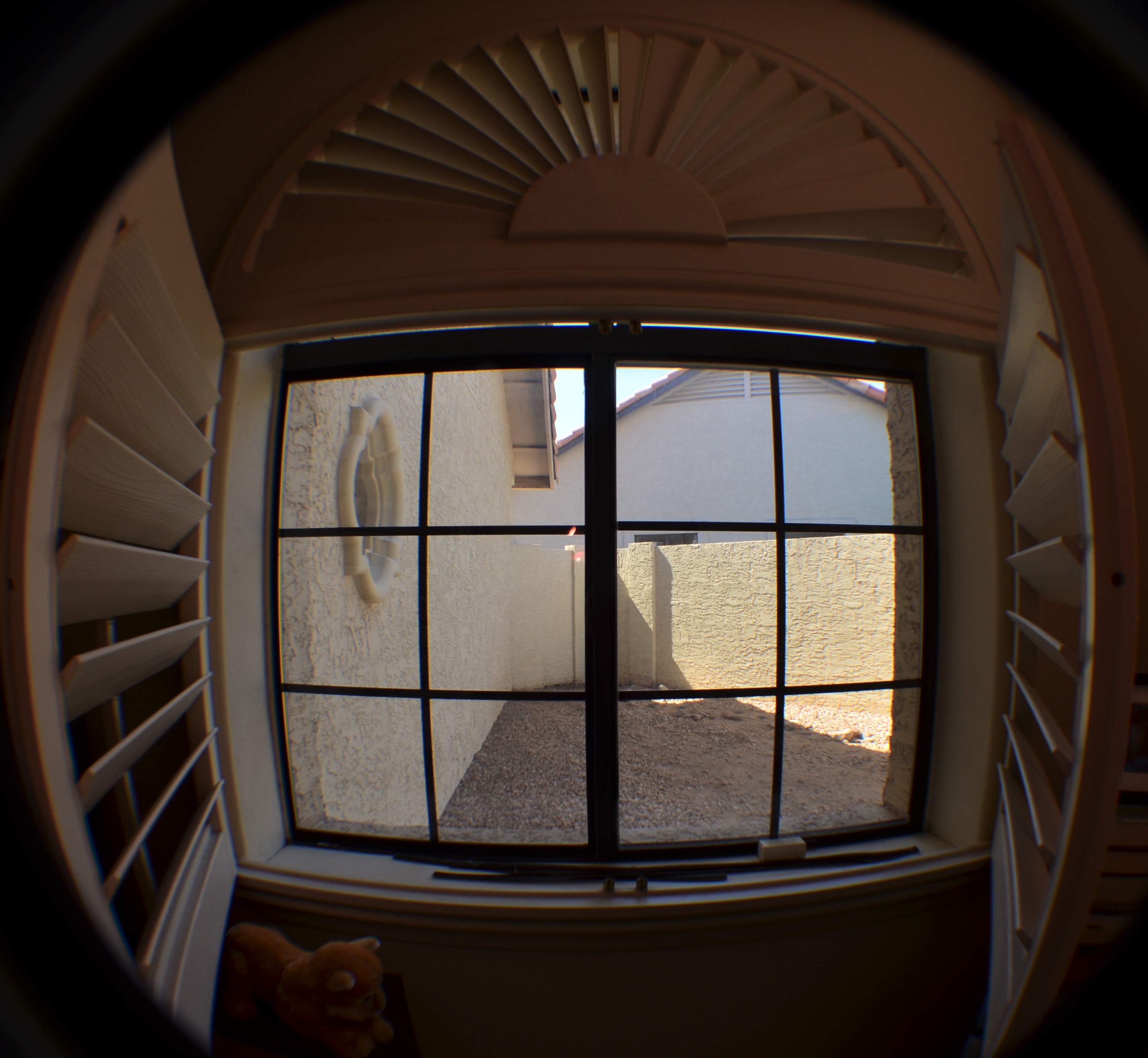
No Escape, April 2020
And then there are those windows that open to an airshaft, a blank wall, or alleys ( which are, themselves, windows of another kind). In my house, I have one such “dead” window, which, normally, is only used as a light filter, as it’s framed in thick louvers designed to let in illumination even as it keeps the midday Arizona heat out. The louvers only come wide open when additional light is needed for a room that acts as a default natural-light studio of sorts. Thus, most of the time, the fact that it delivers a particularly worthless view is simply forgotten.
But a few days ago, I wanted to see that view, to feel it as a metaphor or a link to everyone else for whom being able to see out their windows is, in some ways, worse than confinement. A tease. Information without value. Here in the southwest, many residential homes deliberately hide their side and back yards from view with masonry barriers. We are so wall-oriented that the things really become invisible. We learn not only not to care about what they conceal but about them as concealers. But that’s the way our world typically works.
Somehow, then, maybe out of an attempt at solidarity with all the other stranded wall-gazers in this Weird New World, I wanted to make a picture of what it feels like to look out upon nothing, to have the world walled in, and then walled in beyond that. The fisheye lens allowed me to frame the louvers and the sill in the same image in a way that made the opening narrow even as it was strangely wide. Barriers and photographers make lousy companions. We always want them all down, even they conspire to keep us ever within. Maybe that’s a kind of definition of art.
And maybe I’ve just been in the house too flaming long.
OTHER EYES, OTHER WINDOWS
By MICHAEL PERKINS
MOST OF THE FORMAL TRAINING IN PHOTOGRAPHIC PORTRAITURE rightly emphasizes the eyes, those so-called “windows of the soul”, and it’s hard to argue with their weight as indicators of the inner mind. But, in reality, every facial feature can be eloquent in conveying that which comprises the individual: love, fear, hate, happiness…whatever mix of outward cues that connote personality in a photograph. And it’s also true that, generally speaking, one’s face is a more reliable identifier of traits than, say, an arm or an ankle. However, portraits are loaded with information that occurs from the neck down as well, and a good deal of it can be mined for solid indicators of just who it is we’re looking at. And while we concede that most of us would never deliberately cut the top off a subject in everyday practice, (as seen here) doing so, at least for this exercise, illustrates just how much data can be left to work with when we, in a sense, lose our head.
Habit, 2019
Clothing, regalia, body language, even something as basic as color…all these come ripe with codes about the life of the individual under consideration, and can be as valuable in portraiture as the face itself. Now, the idea of recommending that you re-examine your favorite portraits without considering their facial information is not to convince you to choose someone’s suit or hand over their face, but to increase our consciousness of what besides the face can amplify and deepen our sense of the people we photograph. I have seen many images where the depth of field was so narrow that, from the eyes outward, most of the face is largely softened, with everything else outside that narrow radius so blurred as to yield virtually no information. And, yes, that approach works wonderfully in many instances. Still, I am the very last person to propose any ironclad rule that always works or never works, since I believe that absolutes have no place in art. Every case must be considered separately.
So long as people are much more than merely their faces, I believe that everyone who works in portraiture should cultivate the habit of looking at every subject as a unique mix of elements, resulting in a range of pictures where sometimes the face is everything, or is sometimes just a thing among others, and occasionally is of no importance at all. The eyes may be a vary reliable window to the soul, but there are always other kinds of eyes, other kinds of windows.
WIDE x HIGH x ACCIDENT
Brooklyn From Fulton Street, 2018. A faux pano cropped from a really large 24mm landscape master frame.
By MICHAEL PERKINS
I MAY NOT BE PHOTOGRAPHER ENOUGH TO FOOL THE HUMAN EYE, but on a good day, I can apparently con Photos for Mac. I know this because I caught the program using its own “logic” to arrange images into categories for which, truly, they don’t qualify. One such category is “panoramas”, a folder which Photos has chocked with pictures that were not made either with a true panoramic camera or a stitch-up phone app, but merely by cropping larger shots. The thing is, such clipped art work as panoramas because of what they ask of the viewer’s eye.
The original shot has too much unneeded visual information.
Most of my landscapes, in town or out in the country, are shot with a 24mm f/2.8 wide-angle, which is my go-to for urban work. It adds little in the way of barrel distortion if you aim it right, and allows for very inclusive framing when you’re in cramped quarters (lower Manhattan, I’m talking to you). It’s also as sharp as a diamond, and so, at its sweet spot of efficiency (around f/5.6) it’s a snap to focus manually. It’s a sophisticated lens that performs almost as easily as a point-and-shoot, and even though landscapes shot with it will result in a lot of excess detail, this one lens will do nearly 100% of what I need on an average day. And since there’ll often be way too much info in the landscapes, a-cropping I will go.
Panos are often tiresome because there simply aren’t a lot of linear subjects that are uniformly fascinating from left-to-right. I mean, if you’re bent on having all of General Grant’s 103rd regiment muster up in front of you, or if you’re trying to drink in all the delicious detail along the Cote D’Azur, it can be worth the extra effort. But this is me confessing that most of the shots that my Mac calls “panos” depict decisions made after the shutter snap, and only then because most of the useful visual info in the shot turned out to be linear in nature. I don’t intentionally head out of a morning to “do a pano”, and, in making landscape shots with other objectives in mind, I often don’t see, in the moment, the super-wide image lurking within the greater one. But on days when the camera gods are in a good mood, you find that, even in paring away half of your original, you’ve actually rescued something workable inside your master frame.
In the two examples seen here, the contrast is fairly obvious. The human activity, the line of the boats and, beyond, the skyline of the Brooklyn shore seem to be primarily inviting the eye into a left-to-right reading of the image, whereas crowding the frame with extraneous structures, more boardwalk lumber, or extra sky really saps the picture of any impact it might potentially have, and so, out come the scissors. I also believe that giving the eye more stuff to process means it will do some of it badly. Just as a portrait is usually made more effective by framing its subject mid-waist to head only, so do landscapes often benefit from cutting off their top and bottom thirds, depending on the image. I’m not one of those faux purists who believe you’ve “cheated” by cropping a picture after it’s made. I believe that resizing the frame is part of the making, albeit a part that takes place after the click.
So, yes, my trusty wide-angle is, in most cases, also my trusty makeshift pano lens. I’ve done the same thing with fisheyes, cropping them to highlight the super-wide center of a shot to the exclusion of the extreme bends at the edges. In many such cases, I am trending toward carrying less and less glass with me and getting more and more flexibility out of what I do take along, a development applauded by my aging neck and shoulders. It may be true that you need to suffer to be beautiful, but in the name of a healthy spine, I’m going to keep testing that theory.
INFORMATION AVENUES

Phytomorphology 623, 2020
By MICHAEL PERKINS
JUST AS THE TAKING OF A PHOTOGRAPH IS ACCOMPLISHED IN AN INSTANT, so too is the messaging that the resulting image conveys to the viewer. The impact of a picture is immediate, established within nanoseconds of the eye’s initial contact with it. Additional viewing and pondering may, certainly, reveal deeper truths about a photograph, but I firmly believe that the main love it /don’t get it choice about a photo is made by the brain at first glance.
That said, information must be arranged in such a way as to expedite this choice. That’s the art of composition. What stays in, what is excluded, where the frame hits, and what its limits imply. The nature of the information is determined by the impact of light, which shapes and defines. That is in turn aided by texture, which adds dimension and context in how new or old, rough, smooth, substantial or ethereal things appear in the image. And finally, mood and aesthetic are established in the range of color or tonal data.
All of these elements are created by a series of decisions on whether “to do” or “not do”. Which is to say that all photographs have an assembly process. Steps. Priorities. More of this, less of that. The fact that the best photographers learn how to navigate all these decisions instantaneously is really a kind of miracle. Take the truly fundamental choice of color, for example. Not only do a picture’s hues have to be conceived in the mind before they’re attempted in the camera: they must be refined enough for the shooter to choose how all the shaping elements described above work in conjunction with each other. Think of the graphic equalizers on our old stereos, each ‘band” or part of the hearable spectrum trimmed or maximized to get a “mix” most pleasing to the ear. In visual terms, color is a key choice because it is an element that can shape so many other elements in turn. In the above image, color can resonate with memory and emotion. It can render what we term “warmth”. It also aids in the perception of depth. Consider as well that color has only become the default option for our photography in about the last sixty years. Before that, due to technical challenges for film emulsions and printing processes, it was a luxury item, even a novelty for many.
Monochrome conversion.
“Going back” to monochrome, the original default option for all photography, means actively recognizing what kind of information is lost and what kind of impact is gained by eschewing color. Is the image strengthened or weakened with its removal? Is converting a color shot to b/w as an afterthought (as I’ve done here) less effective than intentionally shooting the original in mono? Are the remaining tones strong enough to convey your message? Is one tonal palette more reportorial or “authentic” than the other? And, above all, what if the choice you’ve made (color or no color) isn’t the choice your viewer makes (in the case of this pair, for example, my wife prefers the color version, although “they’re both nice”)? Photography is about making decisions and learning to live with them. Or just canning the entire thing and trying again.
“We must remember that a photograph can hold just as much as we put into it” Ansel Adams once wrote, “and no one has ever approached the full possibilities of the medium”. Which is a lot like God saying, “hey, don’t get hung up on making just one kind of tree”. The possibilities in making pictures are indeed endless, but each are rooted in our very purposeful choices.
OF SUBSTANCE AND SHADOW
Brooklyn Morning Constitutional, 2011. A typical HDR experiment from earlier in the closing decade.
By MICHAEL PERKINS
THE END OF A DECADE is often used as an arbitrarily mile marker to measure the effects of a particular parcel of time. The requisite lists of “bests” “biggests” and “top” accomplishments or events, trotted out in an attempt to define an era, are as irresistible as they are meaningless. The appeal is understandable: people, including photographers, love trying to make sense of something, especially their own work. But ranking one thing as better than another is not nearly as important as noting contrasts in one’s output over time. Simply put, we produce different work at different periods because we are actually different people.
Looking at my own stuff between 2009 and 2019, I can see several shifts in emphasis that have shaped the way I make pictures today. For example, over that period, I re-embraced prime, or single focal-length lenses, which had been a fundamental part of my film years but which temporarily got supplanted by the first kit lenses and moderate zooms of the digital era. I also came to greatly reduce my use of ultra-wide angle glass, settling on 24mm as about as wide a frame as I would ever shoot. Also, after flirting with auto and semi-auto shooting modes with my first DSLRs, I resumed another old school habit, that of shooting on full manual. Along with millions of others, I saw my work with cel phone cameras evolve from “just in case” or “emergency” shots to images that I would purposefully plan, preferring some of the results over those from my “real” cameras. And, overall, I tried to stop just short of a full-on minimalist approach to gear, trying to do more and more with less and less. That meant eschewing flash almost completely, and choosing in-camera technique over post-processing whenever possible. For me, the real magic still happens inside the box, one momentary impulse at a time.
The biggest change for me over the last ten years, however, was far more fundamental, as I seem to have completely reprioritized what I look for in an “acceptable” picture. As the decade began, aware as I was of the contrast limits of the first digital sensors, I sought a way to rescue every single iota of detail from the darker portions of my pictures, even as I accented sharpness and focus with near-religious zeal. That led me to work heavily with the HDR platform Photomatix, taking multiple exposures of single subjects which were then blended to amp up every grain of sand and woodgrain. The pictures looked dramatic in their “equalizing” of all tones, from dark to light, but which could often result in an over-cooked, glowing surreality. A slightly more restrained 2011 example of my HDR “period” is shown above.
By contrast, around the middle of the decade, I began to value subjects for a different kind of narrative impact, things that were allowed to be softer or even selectively underexposed. In a sense, I started to regard sharpness and focus as negotiable for certain pictures, not merely allowing backgrounds to fuzz out in contrast to foregrounds, but using Lensbaby and other “art” lenses to select things within a single foreground plane that could be softened in reference to others in that same plane…assigning additional focus priorities within the overall focus strategy. An example of this approach is seen here, in a crowded San Francisco street scene from earlier this year.
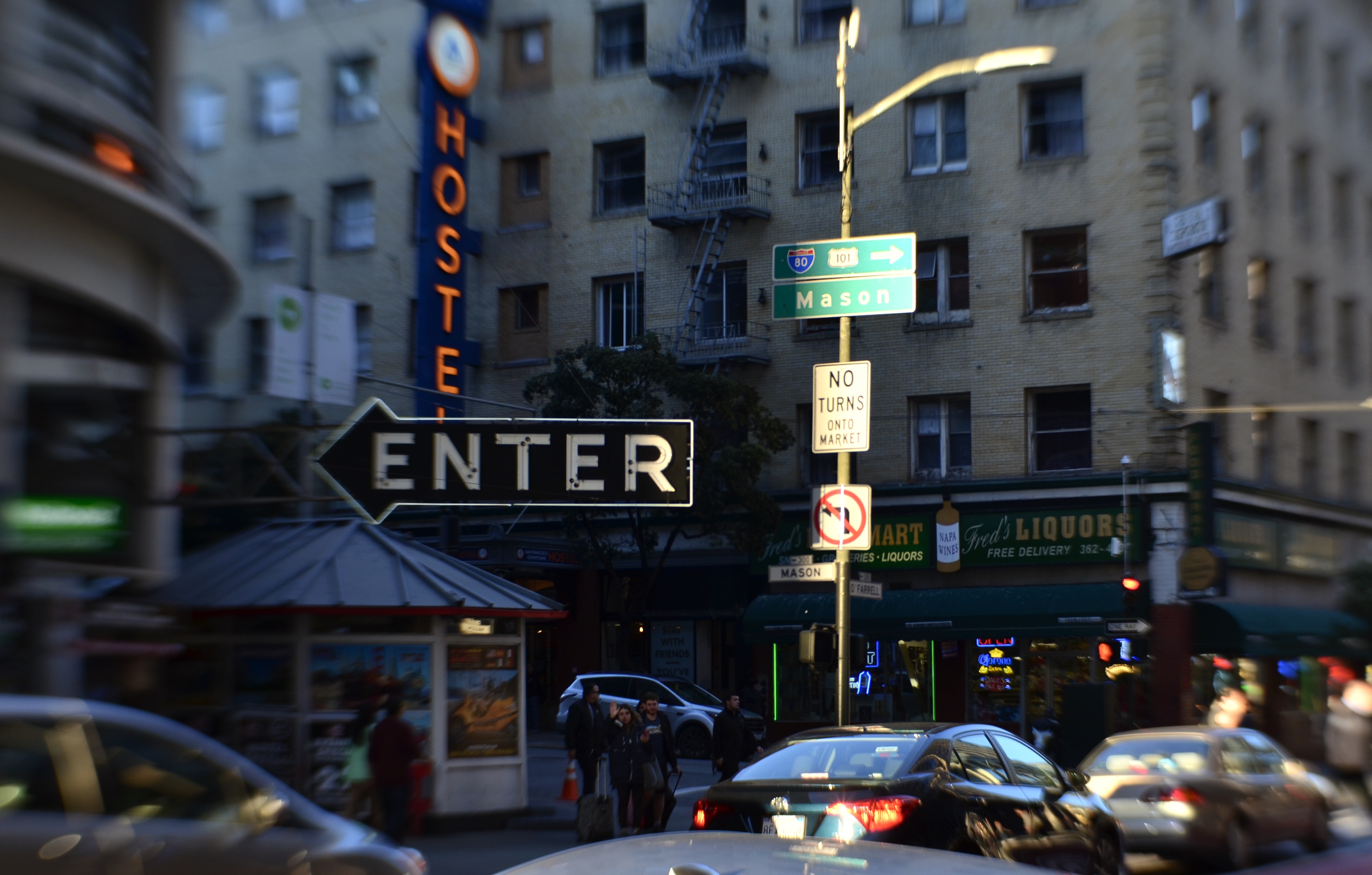
Hurtling Toward Everywhere, 2019. Shot with a Lensbaby Sweet 35 tilt-shift lens, which can place the focal “sweet spot” variably within the frame.
Over the last ten years, my images, especially the urban scenes, have gradually taken on a looser look, a more dreamy, if less “realistic” aspect. These new pictures are not just “captures” of things that pass in front of me, nor are sharpness and perfect exposure the only objective in photographing them. Instead, I like to hope that their non-specific quality will invite a more interpretive look from the viewer. Since everything isn’t spelled out or recorded in such photographs, there’s breathing room in them for anyone to supply his or her own detail (or not). I don’t always produce pictures like this now, but I am far more open to the idea of relinquishing control than I was ten years ago. Progress? Who knows? End-of-decade lists don’t really make a statement about “better” or “worse”. They are only reflections that, as the mind is always in flux, so, too, must any products of that mind be.
Happy New Year.
Happy New Pictures.
Happy New Adventures.
OPEN/CLOSED
No admittance. This means you. But what else does it mean?
By MICHAEL PERKINS
JUST AS NUMBERS AND LETTERS ARE SYMBOLIC OF THINGS LARGER THAN THEMSELVES, cues in photography act as a visual vocabulary, a kind of shorthand for more complex ideas. This way of showing ideas through a commonly recognized series of signals means we don’t always have to explain everything from scratch every time we create a picture. In order to convey the idea of a train, we don’t have to show the entire history or design of locomotives: a railroad crossing sign sells the concept immediately. And so, as storytellers. we use symbols to get to the point faster, and, nearly two centuries into our shared art, the shortcuts get more compact and more immediate with the passage of time.
One of the ideas that we convey in this way is the idea of limits or barriers, especially images that show confinement or limited admittance. Signs, lights, gates, traffic cones, warning signals, all convey a ton of information in a short space of time…everything from beware to keep out. These cues also allow a photograph to be all shorthand, to be about the limit or barrier. The image seen here adequately conveys the idea of a physical limit with a very meager amount of data. Even resolution itself has been relaxed, leaving just the suggestion of textures that are typically rendered in fine detail. There are no clearly readable signs, no clue to what the viewer is being kept from, no idea of whether the gate represents safety or repression. And while this symbol conveys a limit on our movement; everything else is open to interpretation. In some cases, not revealing what lies beyond the gate may make for a more intriguing image than if the photographer were to show everything in full. The beauty of this process is that most photographic ideas can be expressed with a very spare inventory of information, as our eyes have learned, over years, to see interpretively, enabling us to decode what the photographer as encoded. It’s a very intimate relationship.
All of which, I believe, argues for making your picture’s case in as few strokes as possible. We still pay more attention to framing, i.e., what fits in the rectangle, versus composition, or the arrangement and selection process within the borders of our pictures. We sometimes overcrowd and oversell messages which may be conveyed more effectively with much less information. Learning how to say more with less comes slowly; we need to build up a substantial log of attempts before we can begin to tweeze out the most effective amongst them. But that is the difference, as we often say, between taking a picture and making one, or the difference between pictures that are merely nice and those that are essential.
ON-PURPOSE ACCIDENTALS
By MICHAEL PERKINS
FOR PHOTOGRAPHERS, THE SOCIAL-MEDIA EQUIVALENT OF SMACKING SOMEONE ON THE BACK and saying “Attaboy” is affixing the remark “Great capture!” to your “like” of another person’s images. This is meant to be a compliment, but I think it is misapplied. Of course, on one level, I admit that carping about one little word constitutes world-class nitpicking on my part. On the other hand, I think we need to think critically about what happens in the making of an effective picture. It’s an active, rather than passive, process.
In one sense, a camera does, in fact, “capture” a scene, snatching a millionth of a minute from its place in the steady flow of time. But seldom does a golden moment or lovely subject present its best self to us, ready to be harvested, requiring only that we lower our butterfly net. Photography is a much more deliberate art than that. In fact, we often happen upon images of things that are not yet “ready for their close-up”, in that the first way we see them may not be the best way for us to show them to others. Long before the snap of the shutter, we select our angle, our composition, our light, and even reject all of those choices and make them all over again. We are carefully crafting the best way to reveal something….not merely happening by and passively recording it.
In this spirit, the word “capture” simply isn’t strong enough, as it implies little more than luck in the production of a great photograph. In fact it is really describing a snapshot, in which something very great may have been gathered, but without much in the way of effort. It’s like complimenting someone on catching a baseball no one was expected to catch, a celebration of good fortune rather than skill. Photographs aren’t made merely by grabbing whatever the camera is pointed at: they’re made by a selective process of saying “yes” to some elements by including them in the frame and then reaffirming those elements even further by saying “no” to many other elements that might otherwise clutter or complicate the communication between image and viewer.
Photographs are a visual checklist of what to see and what to ignore.
Ken Rockwell, a pro photographer whose www.kenrockwell,com site also functions as an online clearing house of technical information on the specs of various camera manufacturers, occasionally steps away from his role as Lord High Adjudicator of gear and reminds his readers of the true essentials of their art. In these random pep talks he will often insist that, in the end, nothing….no lens, no camera, no shiny new toy.. can supplant the human equation in the making of pictures. One of his best such sermons illustrates (far better than your humble author can), just what an “on purpose” process is afoot in the best pictures, as in this paragraph, where he discusses the difference between composition and the mere act of framing:
“Composition is the organization of elements within a frame that leads to the strongest, clearest, cleanest, simplest, most well-balanced and therefore best picture. The best composition is the strongest way of seeing a subject. Framing is what you do by zooming in and out, by moving the camera up and down and left and right, and by rotating it to any angle, including vertical and horizontal. Framing has almost nothing to do with composition, but sadly, few photographers realize this. Framing can’t do much of anything to change the relationships between objects. Framing is easy. One usually can frame a picture after it’s shot by cropping. Composition is very difficult. Composition is what makes or doesn’t make a picture. Composition is the organization of elements in the picture in relation to the other elements…..”
Nothing, of course, will ever eradicate all the “great capture” salutes from the interweb, and maybe we should just stipulate that a compliment is a compliment. But I love to emphasize, since it is so important, that what you all do in the creation of wonderful images is purposeful, not random, that great pictures seldom just jump into your camera. When a composition is eloquent, it is usually a photographer, and not a camera, who has given it voice.

SETTINGS
Fan Dance, 2020
By MICHAEL PERKINS
A PURELY TECHNICAL ANALYSIS OF A PHOTOGRAPH understandably centers upon the measurable aspects of their capture…..aperture, exposure rate, focus, et cetera. However, in any full understanding of why an image works (or fails to), the photographer him/herself has to be factored in, alongside any purely mechanical settings, because, when you change life for the photographer, everything else in the picture is changed as a consequence. That’s the most determinative factor for photography in this grotesque year. We have been altered in ways great and small, and that will have made all the difference in what we see, and what we say about it with a camera.
For me, as in the case of so many others, these months have meant the struggle to expand my own photographic strengths, even as the physical plane in which I operate has been increasingly restricted. Many of us who have never experienced the isolation of exile, imprisonment or war now have at least an inkling of how those events cut people off from each other, challenging us to glean more and more life experience from less and less sensory input. In the face of the ever-present need to keep shooting, there are the increasingly narrow choices of what to shoot, with many sites and subjects closed off, at least for the duration. We have all become experts on every nook and light change in our immediate environments, and have discovered that, yes, there may be a 35th different way of photographing a window, a door, or our own faces.
Looking over my own output for the year, I see a definite bent toward minimalism, an almost ruthless appetite for reducing compositions to their raw essences. I am shooting things closer, abstracting the contexts of familiar objects in an effort to see them anew. I have thrown off most standard approaches to exposure, shooting in the sparest light that I can; and I have re-imagined more and more shots as monochromes, seeing even color as an unneeded distraction in these spare times. Mostly, I have been faced, as have so many, with a nearly zen approach to things I have photographed many times over the years, searching for new secrets in old friends.
For one example; as a consequence of the pandemic, I find myself walking again and again through a few designated-safe gardens and parks, which means a lot of repeated shots of the kind of subjects I find most difficult to put my stamp on, which is landscape work. Give me a crowded, noisy metropolis and I’m right at home, whereas I have to emotionally educate myself to be at ease in a natural setting. Sad, I know, but there it is. And so, I experiment a lot with seeing patterns in plants, trees, terrain, in terms of raw design, such as in the agave plant seen here. Another fortunate corollary was the acquisition of a camera, early in the year, that finally enabled me to shoot birds with greater precision, which allows the winged wonders to become something of a substitute for traditional portrait work on humans. As I learn to read their feathered faces, I am somewhat consoled, even as I miss their human equivalents.
And so it goes. Change life for the photographer, and you change the photographs. And since this little small-town gazette has always been about intentions, rather than equipment, it’s important for us to do a skull, at year’s end, on how we’ve changed the way we approach using the Magic Light Boxes in our lives. We are different people now, and, if we’re honest and awake, amazing pictures will come about as a result.
Share this:
December 27, 2020 | Categories: Commentary, Composition | Tags: monochrome conversion, Under-exposure | Leave a comment