BURDEN OF PROOF
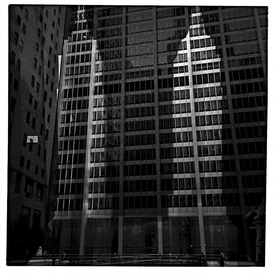
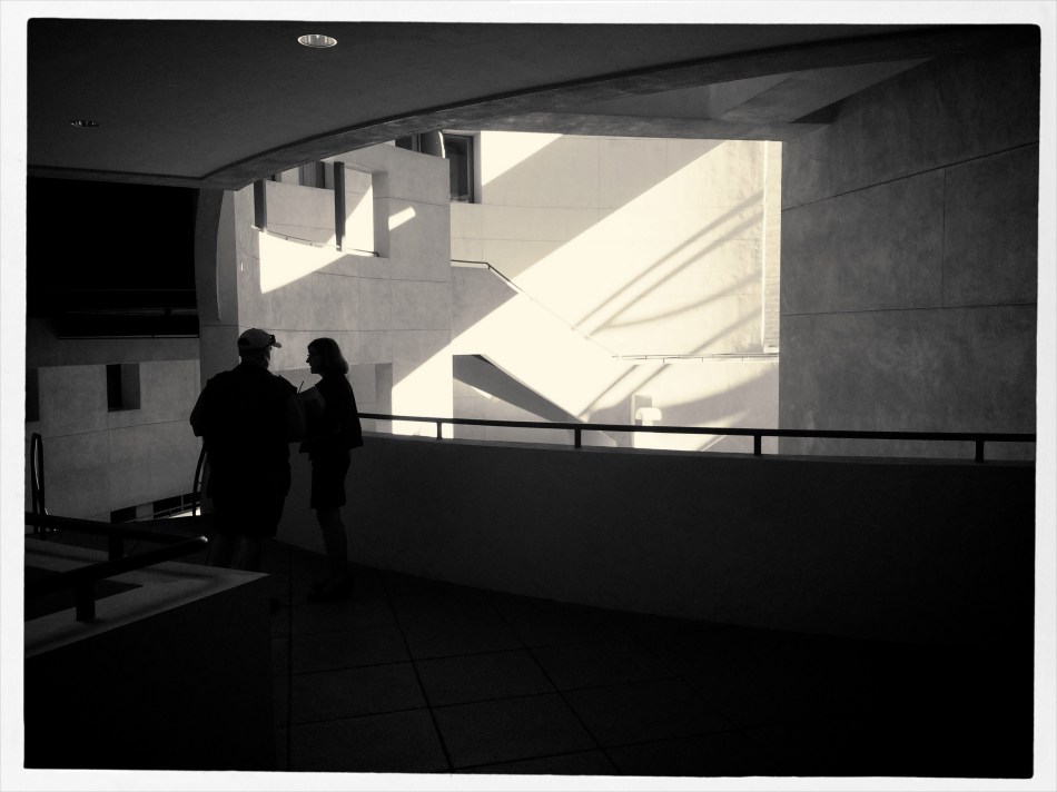
Reverse Shadows (2015) Originally conceived in color, later converted to black and white. Luckily, it worked out, but, shooting this image anew, I would execute it in monochrome from start to finish. Every story has its own tonal rules.
By MICHAEL PERKINS
THE WORLD OF PHOTOGRAPHY’S EMBRACE OF COLOR, which now seems instinctual and absolute, is actually a very recent thing. The arrival of color film stock targeted to the amateur market barely reaches back to the 1920’s, and its use in periodicals and advertising didn’t truly begin to outdistance color illustration until well after World War II. Color in so-called “serious” or “art” photography existed on the margins until half-way through the 1960’s, when hues, like every other element of the contemporary scene, gloriously exploded, creating a demand for color from everyone, amateur to pro. The ’60’s was also the first decade in which color film sales among snapshooters surpassed those of black and white.
Today, color indeed seems the default choice for the vast majority of shooters, with the “re-emergence” or “comeback” of black and white listed among each year’s top photo trend predictions. The ability to instantly retro-fit color images as monochrome (either in-camera or in-computer), has allowed nearly anyone to at least dabble in black & white, and the tidal wave of phone apps has made converting a picture to b&w an easy impulse to indulge.
And yet we seem to be constantly surprised that black & white has a purpose beyond momentary nostalgia or a “classic look”. We act as if monochrome is simply the absence of color, even though we see evidence every day that b/w has its own visual vocabulary, its own unique way of helping us convey or dramatize information. Long gone are the days when photographers regarded mono as authentic and color as a garish or vulgar over-statement. And maybe that means that we have to re-acquaint ourselves with b&w as a deliberate choice.
Certainly there has been amazing work created when a color shot was successfully edited as a mono shot, but I think it’s worth teaching one’s self to conceptualize b&w shots from the shot, intentionally as black and white, learning about its tonal relationships and how they add dimension or impact in a way separate from, but not better than, color. Rather than consistently shooting a master in color and then, later, making a mono copy, I think we need to evaluate, and plan, every shot based on what that shot needs.
Sometimes that will mean shooting black and white, period, with no color equivalent. Every photograph carries its own burden of proof. Only by choosing all the elements a picture requires, from color scheme to exposure basics, can we say we are intentionally making our images.
IF HUE GO AWAY
By MICHAEL PERKINS
IT SEEMS UNGRACIOUS FOR A PHOTOGRAPHER TO COMPLAIN ABOUT AN OVER-ABUNDANCE OF LIGHT, since that’s basically the currency we trade in. More typically we gripe about not being able to bring enough of the stuff into a shot. I mean, the entire history of the medium is one big let-there-be-more-light prayer. But that’s not to say that light can’t create annoyance when you’re in a place where there is glorious, radiant illumination of….acres of nothing.
I’m not talking about sunlight on endless expanses of starched plain. I refer here to subject matter that is so uninteresting that, even though a bumptious bounty of light is drenching everything in sight, there is nothing to make a photograph of. Nothing that compels, inspires, jars or even registers. I recently made my annual return to a festival that, due to my frequent farming of it over the years, has now bottomed out visually. There is nothing left to say about it, although all that “nothing” is stunningly lit at this time of year.
In fact, it’s only by shooting just abstracted shapes, shades and rays, rather than recognizable subjects, that I was able to create any composition even worth staying awake for, and then only by using extremely sharp contrast and eliminating color completely. To me, the only thing more pointless than lousy subject matter is beautiful looking lousy subject matter, saturated in golden hues, but signifying nothing. Kinda the George Hamilton of photos.
So the plan became, simply, to turn my back on the bright balloons, food booths, passing parade of people and spring scenery that, in earlier years, I would have been happy to capture, and instead render arrangements without any narrative meaning, just whatever impact could be seen using light as nearly the lone element. In the above picture, I did relent in keeping the silhouetted couple in the final picture, so that it’s not as “cold” as originally conceived, but otherwise it’s a pretty stark image. Photography without light is impossible, but we also have to refuse to take light “as is” from time to time, to do our best to orchestrate it, much as we would vary shadings with pencil or crayon. We know that the camera loves light, but it’s still our job to tell it where, and how, to look.
MAGICAL ORPHANS
By MICHAEL PERKINS
WE HAVE ALL EXPERIENCED THE SHOCK OF SEEING OURSELVES IN A CERTAIN KIND OF PHOTOGRAPH, a strange combination of framing, light or even history that makes us actually ask, “who is that?? before realizing the truth. Of course we always know, intellectually, that a photo is not an actual visual record of events but an abstraction, and still we find ourselves emotionally shocked when it’s capable of rendering very familiar things as mysteries. That odd gulf between what we know, and what we can get an image to show, is always exciting, and, occasionally, confounding.
Every once in a while, what comes out in a picture is so jarringly distant from what I envisioned that I want to doubt that I was even involved in capturing it. Such photographs are magical orphans, in that they are neither successes nor failures, neither correct or wrong, just…..some other thing. My first reaction to many of these kinds of shots is to toss them into the “reject” pile, as every photo editor before 1960 might have, but there are times when they will not be silenced, and I find myself giving them several additional looks, sometimes unable to make any final decision about them at all.
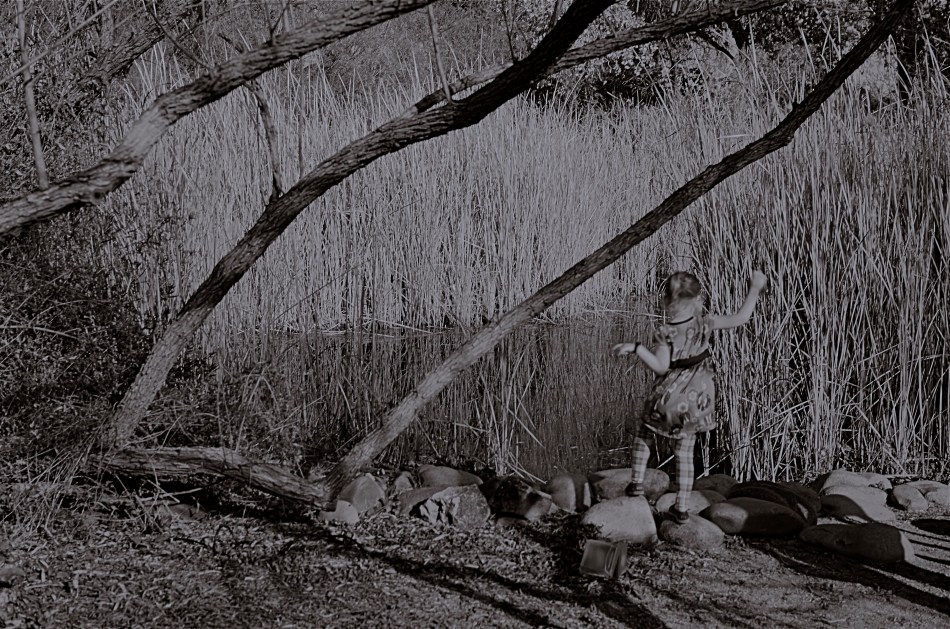
The above shot was taken on a day when I was really shooting for effect, as I was using both a polarizing filter to cut glare and a red 25 filter to render severe contrast in black and white. The scene was a reedy brook that I had shot plenty of times at Phoenix’ Desert Botanical Garden, but the shot was not planned in any way. As a matter of fact, I made the image in about a moment and a half, trying to snap just the shoreline before a boisterous little girl could get away from her parents and run into the frame. That’s all the forethought that went into it.
With all the extreme filtration up front of the lens, I was shooting slow, at about 1/30 of a second, and, eager to get to the pond, the child was just too fast for me. Not fast enough to be a total blur, but fast enough for my lens to render her softly, strangely. And since every element in a picture talks to every other element, the rendering of the reeds, which was rather murky, added even more strangeness to the little girl, her face forever turned away, her intent or presence destined to remain a secret.
I might like this picture, but I worry that wanting to like it is making me see something in it that isn’t there. Am I trying to wish some special quality into a simple botched shot, acting as a sort of self-indulgent curator in search of “art”?
Can’t tell. Too soon.
Check with me in another five years or so.
DOCUMENTARY OR DRAMA?
By MICHAEL PERKINS
I RECENTLY HEARD AN INTERESTING CRITIQUE OF A DRAMATIC CONTENDER for Best Film in the 2015 Oscar race. The critic in question complained that the film in question (Boyhood) was too realistic, too inclusive of banal, everyday events, and thus devoid of the dynamics that storytellers use to create entertainment. His bottom line: give us reality, sure, but, as the Brits say, with the boring bits left out.
If you’re a photographer, this argument rings resoundingly true. Shooters regularly choose between the factual documentation of a scene and a deliberate abstraction of it for dramatic effect. We all know that, beyond the technical achievement of exposure, some things that are real are also crashingly dull. Either they are subjects that have been photographed into meaninglessness (your Eiffel Towers, your Niagara Fallses) or they possess no storytelling magic when reproduced faithfully. That’s what processing is for, and, in the hands of a reliable narrator, photographs that remix reality can become so compelling that the results transcend reality, giving it additional emotive power.
This is why colors are garish in The Wizard Of Oz, why blurred shots can convey action better than “frozen” shots, and why cropping often delivers a bigger punch and more visual focus than can be seen in busier compositions. Drama is subject matter plus the invented contexts of color, contrast, and texture. It is the reassignment of values. Most importantly, it is a booster shot for subjects whose natural values under-deliver. It is not “cheating”, it is “realizing”, and digital technology offers a photographer more choices, more avenues for interpretation than at any other time in photo history.
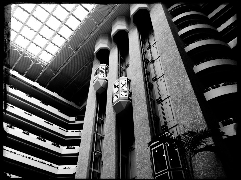
The photo at left was taken in a vast hotel atrium which has a lot going for it in terms of scope and sweep, but which loses some punch in its natural colors. There is also a bit too much visible detail in the shot for a really dramatic effect. Processing the color with some additional grain and grit, losing some detail in shadow, and amping the overall contrast help to boost the potential in the architecture to produce the shot you see at the top of this post. Mere documentation of some subjects can produce pretty but flaccid photos. Selectively re-prioritizing some tones and textures can create drama, and additional opportunity for engagement, in your images.
THE ROMANCE OF RUIN
By MICHAEL PERKINS
I TYPICALLY SHY AWAY FROM USING OR CREATING PHOTOGRAPHS as illustrations of work in another medium. Writers don’t try to caption my images, and I don’t presume, for the most part, to imagine visuals for their works. As both photographer and writer, I am sympathetic to the needs and limits of both graphic and written mediums. And still, there are rare times when a combination of events seem to imply a collaboration of sorts between the two means of storytelling. I made such an attempt a while back in these pages, in the grip of nostalgia for railroads, and so here goes with another similar experiment.
 Last week, during a blue mood, I sought out, as I often do, songs by Sinatra, since only Frank does lonely as if he invented the concept, conveying loss with an actor’s gift for universality. I stumbled across a particularly poignant track entitled A Cottage For Sale, which I sometimes can’t listen to, even when I need its quiet, desolate description of a dream gone wrong. So, that song was the first seed in my head.
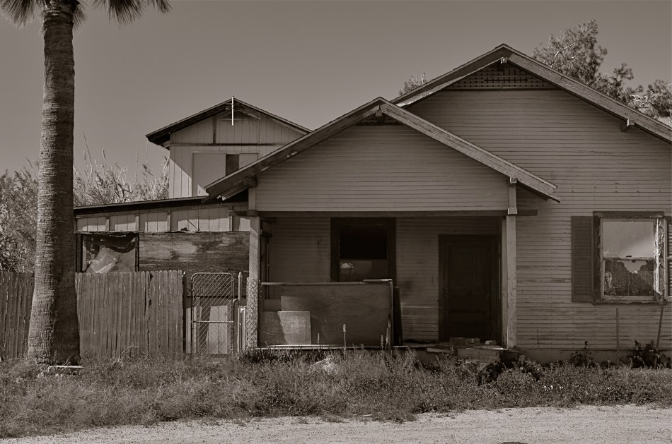
Seed two came a few days later, when I was shortcutting through one of those strange Phoenix streets where suburban and rural neighborhoods collide with each other, blurring the track of time and making the everyday unreal. I saw the house you see here, a place so soaked in despair that it seemed to cry out for the lyrics of Frank’s song. Again, I’m not trying to provide the illustration for the song, just one man’s variation. So, for what it’s worth:
Is lonely and silent, the shades are all drawn,
And my heart is heavy as I gaze upon
A cottage for sale
Where you planted roses,the weeds seem to say,
“A cottage for sale”.
But when I reach a window, there’s empty space.
But no one is waiting for me any more,
The end of the story is told on the door.
A cottage for sale.
A FORWARD STEP BACK
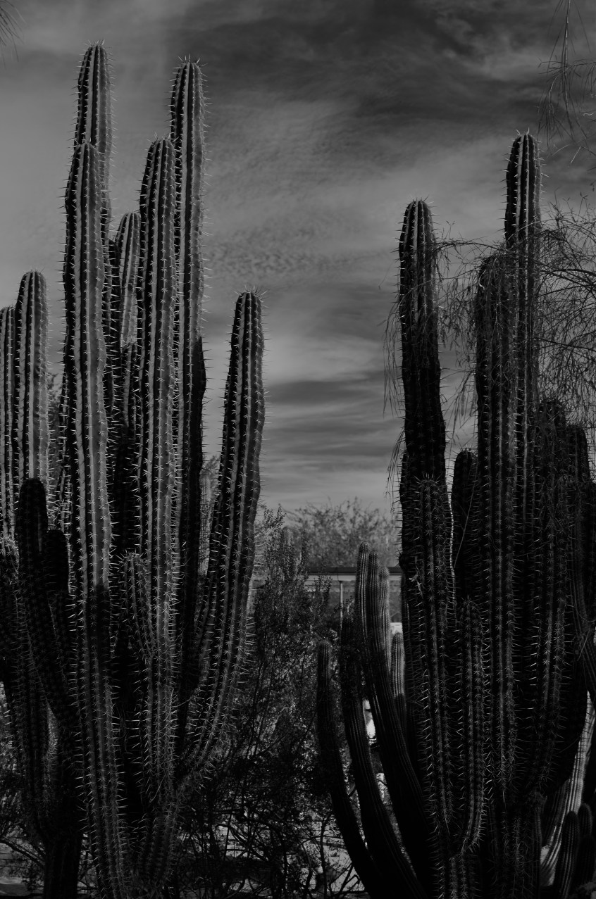
Skies which appear wispy in color can pick up some drama in black & white with the use of a red filter.
By MICHAEL PERKINS
SOME CHOICES IN LIFE ARE BINARY, EITHER YES OR NO. The light switch is either all “on” or all “off”. Photographic choices have never been binary, since there are only a few real rules about how to achieve the image you want and more than a million reasons why those rules have to be jettisoned, because they actually stand in the way of that image.
When digital photography arrived, there was a tendency to assert that everything associated with film photography was as obsolete as a roll of Kodachrome 64. In fact, the further we proceed into the digital age, the more we realize that there are many good practices from the days of emulsions and negatives that have solid application in the age of zeroes and ones. It would be ridiculous to say categorically that every tool of one era must be abandoned in the image-making of the next. Lenses, exposure, lighting basics, and many more elements of film-based creativity have equivalents in digital. None of them are good all the time, and none of them should be ruled out without exception.
The use of filters is one such element. Many film-based photogs worth their salt have used filters as a matter of course, and, despite the amazing in-camera and post-production fixes of the present day, these little bits of accent glass still produce dazzling effects with a minimum of investment, and help shooters maintain a close, hands-on control of their images in the moment. And one of my favorites here in the American southwest, land of endless, often blistering sun, is the red 25 filter.
Used to punch up contrast and accentuate detail for black and white, the red 25 renders even the lightest skies into near blackness, throwing foreground objects into bold relief and making shadows iron sharp. On a day when fluffy clouds seem to blend too much into the sky, the red 25 makes them pop, adding additional textural detail and a near-dimensional feel to your compositions. Additionally, the filter dramatically cuts haze, adding clear, even tones to the darkened skies. Caution here: the red 25 could cost you several stops of light, so adjust your technique accordingly.
Many whose style has developed in the digital age might prefer to shoot in color, then desaturate their shots later, simulating this look purely through software, but I prefer to make my own adjustments to the scene I’m shooting while I am shooting it. I wouldn’t paint a canvas in one place and then fix my choice of colors a week later, hundreds of miles away from my dream sunset. Filters are from a world where you conceive and shoot now. The immediate feedback of digital gives you the part of that equation that was absent in film days, that is, the ability to also fix it, now. Photography can’t afford to cut itself off from its own history by declaring tools from any part of that history obsolete. A forward step, back is often the deftest dance move.
TELLING THE TRUTH
By MICHAEL PERKINS
PICK ANY PHOTOGRAPHIC ERA YOU LIKE, and most of the available wisdom (or literature) will concentrate on honoring some arbitrary list of rules for “successful” pictures. On balance, however, relatively few tutorials mention the needful option of breaking said rules, of making a picture without strict adherence to whatever commandments the photo gods have handed down from the mountain. It’s my contention that an art form defined narrowly by mere obedience is bucking for obsolescence.
It’d be one thing if minding your manners and coloring inside the lines guaranteed amazing images. But it doesn’t, any more than the flawless use of grammar guarantees that you’ll churn out the great American novel. Photography was created by rebels and outlaws, not academics and accountants. Hew too close to the golden rules of focus, exposure, composition or subject, and you may inadvertently gut the medium of its real power, the power to capture and communicate some kind of visual verity.
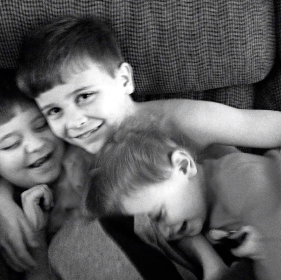
A photograph is a story, and when it’s told honestly, all the technical niceties of technique take a back seat to that story’s raw impact. The above shot is a great example of this, although the masters of pure form could take points off of it for one technical reason or another. My niece snapped this marvelous image of her three young sons, and it knocked me over to the point that I asked her permission to make it the centerpiece of this article. Here, in an instant, she has managed to seize what we all chase: joy, love, simplicity, and yes, truth. Her boys’ faces retain all the explosive energy of youth as they share something only the three of them understand, but which they also share with anyone who has ever been a boy. This image happens at the speed of life.
I’ve seen many a marvelous camera produce mundane pictures, and I’ve seen five-dollar cardboard FunSavers bring home shots that remind us all of why we love to do this. Some images are great because we obeyed all the laws. Some are great because we threw the rule book out the window for a moment and just concentrated on telling the truth.
You couldn’t make this picture more real with a thousand Leicas. And what else are we really trying to do?
YOU ARE PHOTOSHOP
By MICHAEL PERKINS
EVER SINCE THE ARRIVAL OF THE DIGITAL DARKROOM and its attendant legion of post-production fixes, the world of photography has been pretty evenly divided into “befores” and “afters”, those who prefer to do most of their picture making in-camera and those who prefer to “fix” things after the shutter clicks. Most amateur photography, in the film era, was heavily weighted in favor of the “befores”, since a lot of traditional touch-up technology was economically beyond the reach of many. In the Photoshop era, however, the economic barrier to post-production was shattered, resulting in a more even balance between the two philosophies.

Shoot your black and white images as black and white images, not color shots drained of hue after the fact.
I really see this quarrel as very sharply defined when it comes to black and white photography, with many shooters making most, if not all of their monochromes from shots that were originally color, then desaturated or otherwise manipulated as an afterthought. I prefer to shoot b&ws in-camera, however, for the very simple reason that it gets you thinking in black and white terms, from lighting to composition. It also allows you to benefit from digital’s immediate feedback/playback strengths to shape your shot in the moment. If you’ve worked in mono for a while, and especially if you’ve ever shot on b&w film stock, you are used to seeing the 50 shades of gray that subtly shape the power of an image. More importantly, you realize that black and white is much more than color with the hues sucked out. It’s not a novelty or a gimmick, but a distinct way of seeing.
When you conceive a shot in color, you are shooting according to what serves color well. That means that not all color shots will translate well into grayscale. Fans of the old Superman tv show will recall that, during the series’ early b&w days, George Reeves’ uniform had to be made in various shades of brown so it would “read” correctly in monochrome to viewers who “knew” the suit was red and blue. Cameramen had to plan what would happen when one set of values was used to suggest another. Tones that give a certain punch to an image may look absolutely dead flat if you simply desaturate for mock-mono from a color shot. And, anyway, there are plenty of ways to pre-program many cameras to adjust the contrast and intensity of a b&w master image, as well as the use of filters (polarizers for instance) that do 90% of the tasks you’d typically try to achieve in Photoshop anyway.
The mid-point compromise would seem to be to take both color and black and white shots of your subjects in-camera, allowing you the option of custom processing at least one image afterward. However, knowing what tonal impact you want before you click the shutter is just easier, and usually more productive. Do your shooting with purpose, on purpose. Making a b&w “version” of a color shot after the fact will likely bake up as half a loaf.
DON’T TAKE THAT TONE WITH ME
By MICHAEL PERKINS
I BELIEVE THAT THE SINGLE BIGGEST REASON FOR THE FAILURE OF A PHOTOGRAPHIC COMPOSITION may all boil down to the same problem. I call it “over-sampling”, or, more simply, the presence of too much visual information in a frame. It can be as simple as including too many trees in a landscape or framing to include crowded sky clutter in an urban scene, but it’s not always how many objects are crowded into an image. It can be something as basic as asking the eye to figure out where to look. And sometimes, the very fact that a picture is in color can diminish its ability to clearly say, here: look here.
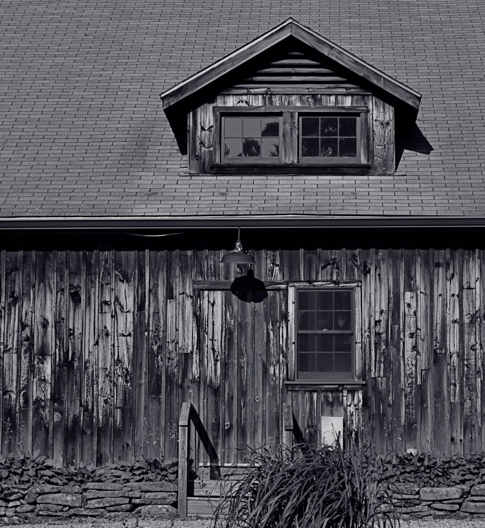
Color would have added nothing to this image. In fact, it would have detracted from its impact. 1/400 sec., f/5.6. ISO 100, 55mm.
Great photographs have their own gravitational pull and center. They draw people in and direct their gaze to specific places. This tends to be a single focus, because, the more there is to see in an image, the greater the tendency is in the viewer to wander around in it, to blunt the impact of the picture as the eye looks for a central nexus of interest. In my own experience, I find that the use of color in a photograph is justified by whether it helps keep things simple, creates readable signposts that lead the eye to the principal message of the image. Color, just like the objects in a frame, can explode with a ton of separate messages that defeat the main message, sending the viewer all over the place, trying to decode all that vivid information. Color itself can become clutter.
Sometimes the focus of an image is not an object, i.e., a building or a face, but an overall feel that is more emotionally immediate within a narrow range of blacks and greys. The kind of black and white makes a huge difference as well, and anyone who has spent a lot of time processing monochrome images knows that there is no one true black, no pure, simple white. As to actual shooting procedure, I will be so certain that only B&W will work for a given subject that I make the master shot itself in mono, but, more frequently, I shoot in color first and make a dupe file for comparison. This is another amazing advantage of digital imaging; you simply have more choices.
One of the by-products of color photography‘s adoption into mass culture through magazines and faster films in the mid-20th century was, for many people, a near-total abandonment of monochrome as somehow “limited” compared to those glorious, saturated Kodachromian hues. Thing is, both color and black and white have to be vetted before being used in a photograph. There can’t be a general rule about one being more “lifelike” or “natural”, as if that has anything to do with photography. Tools either justify their use or they don’t. You don’t drive a screw with a hammer.
A LITTLE R/R
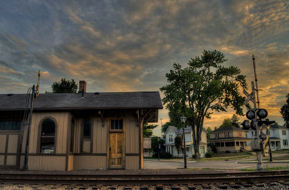
I CAME ACROSS SOME MENTAL BAGGAGE THE OTHER DAY DURING A SHOOT BENEATH AN OLD TRESTLE. The following song by the late Harry Nilsson churned back into my forebrain from a land far away. It wasn’t one of his bigger hits, but it has always struck a chord with me, at least the part of me that likes to make pictures:
When we got married back in 1944
We’d board that Silverliner below Baltimore
Trip to Virginia on a sunny honeymoon
Nobody cares about the railroads anymore
We’d tip the porter for a place of our own
Then send a postcard to your mom and dad back home
Woo-ee, woo-oo-oo-ee, woo-ee
Woo-ee, woo-oo-oo-ee, woo-ee
We had a daughter and you oughtta see her now
She has a boyfriend who looks just like my gal Sal
And when they’re married they won’t need us anymore
They’ll board an aeroplane and fly away from Baltimore
Woo-ee, woo-oo-oo-ee, woo-ee
Nobody cares about the railroads anymore
(lyrics copyright Warner-Chappell Music)
The ghosts are out there. So are the pictures.
All aboard.
THE ENVELOPE
By MICHAEL PERKINS
HAVING LIVED IN THE AMERICAN SOUTHWEST FOR OVER FIFTEEN YEARS, I HAVE NEGOTIATED MY OWN TERMS WITH THE BLAZING OVERKILL OF MIDDAY SUNLIGHT, and its resulting impact on photography. If you move to Arizona or New Mexico from calmer climates, you will find yourself quickly constricting into a severe squint from late breakfast to early evening, with your camera likewise shrinking from the sheer overabundance of harsh, white light. If you’re determined to shoot in midday, you will adjust your approach to just about everything in your exposure regimen.
Good news, however: if you prefer to shoot in the so-called “golden hour” just ahead of sunset, you will be rewarded with some of the most picturesque tones you’ve ever had the good luck to work with. As has been exhaustively explained by better minds than mine, sunlight lingers longer in the atmosphere during the pre-sunset period, which, in the southwest, can really last closer to two hours or more. Hues are saturated, warm: shadows are powerful and sharp. And, if that dramatic contrast works to your advantage in color, it really packs a punch in monochrome.
This time of day is what I call “the envelope”, which is to say that objects look completely different in this special light from how they register in any other part of the day, if you can make up your mind as to what to do in a hurry. Changes from minute to minute are fast and stark in their variance. Miss your moment, and you must wait another 24 hours for a re-do.
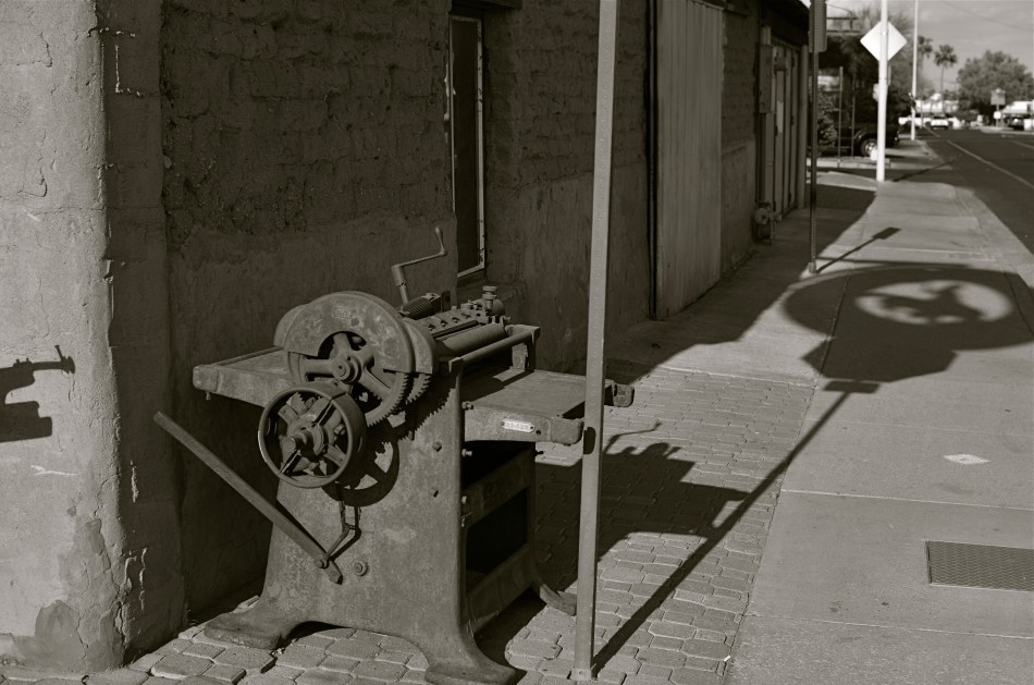
In the west, the best action actually happens after High Noon. Just before sunset in Scottsdale, AZ: 1/500 sec., f/4.5, ISO 100, 35mm.
The long shadow of an unseen sign visible in the above frame lasted about fifteen minutes on the day of the shoot. The sign itself is a metal cutout of a cowboy astride a bucking bronco, the symbol of Scottsdale, Arizona, “the most western town in the USA”. The shadow started as a short patch of black directly in front of the rusted bit of machine gear in the foreground, then elongated to an exaggerated duplicate of the sign, extending halfway down the block and becoming a sharper and more detailed silhouette.
A few minutes later, it grew softer and eventually dissolved as the sun crept closer to the western horizon. There would still be blazing illumination and harsh shadows for some objects, if you went about two stories high or higher, but, generally, sunset was well under way. Caught in time, the shadow became an active design element in the shot, an element strong enough to come through even in black and white.
If you are ever on holiday in the southwest, peek inside “the envelope”. There’s good stuff inside.
THE UNSEEN GEOMETRY
By MICHAEL PERKINS
THERE ARE MANY PHOTO SITES THAT SUGGEST SHOOTS CALLED “WALKABOUTS“, informal outings intended to force photographers to shoot whatever comes to hand with as fresh an eye as possible. Some walkabouts are severe, in that they are confined to the hyper-familiar surroundings of your own local neighborhood; others are about dropping yourself into a completely random location and making images out of either the nothing of the area or the something of what you can train yourself to see.
Walks can startle you or bore you to tears (both on some days), but they will sharpen your approach to picture-making, since what you do is far more important than what you’re pointing to. And the discipline is sound: you can’t hardly miss taking shots of cute cats or July 4 fireworks, but neither will you learn very much that is new. Forcing yourself to abandon flashier or more obvious subjects teaches you to imbue anything with meaning or impact, a skill which is, over a lifetime, beyond price.
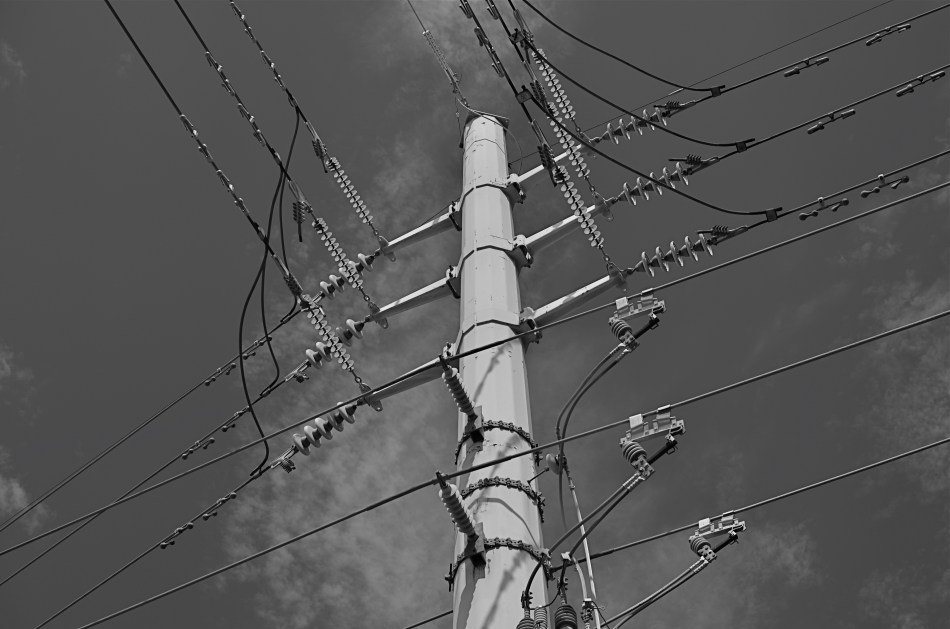
One of the things I try to keep in mind is how much of our everyday environment is designed to be “invisible”, or at least harder to see. Urban infrastructure is all around us, but its fixtures and connections tend to be what I call the unseen geometry, networks of service and connectivity to which we simply pay no attention, thus rendering them unseeable even to our photographer’s eye. And yet infrastructure has its own visual grammar, giving up patterns, even poetry when placed into a context of pure design.
The above power tower, located in a neighborhood which, trust me, is not brimming with beauty, gave me the look of an aerial superhighway, given the sheer intricacy of its connective grid. The daylight on the day I was shooting softened and prettied the rig to too great a degree, so I shot it in monochrome and applied a polarizing filter to make the tower pop a little bit from the sky behind it. A little contrast adjustment and a few experimental framing to increase the drama of the capture angle, and I was just about where I wanted to be.
I had to look up beyond eye (and street) level to recognize that something strong, even eloquent was just inches away from me. But that’s what a walkabout is for. Unseen geometry, untold stories.
RELATIONSHIPS
By MICHAEL PERKINS
DIGITAL PHOTOGRAPHY DOESN’T TRULY MAKE ARTISTIC CHOICES “POSSIBLE”. Those decisions were always available in the medium, albeit at some cost of materials, time and work. You could always get nearly any effect from film, providing you were willing to invest the sweat in wringing it out of the tools at hand. Instead, digital processes make choices easier to act upon, and, for people who have made the transition from a lifetime of film-based analog shooting to digital, the leap to light speed on the trip from desire to result is especially mind-ripping.
This speed of implementation makes real-time differences when considering whether a shot will have its best impact in color or b&w. Even standard DSLRs and compacts have in-camera modes that allow you to immediately shoot and compare alternate versions of a subject, and, with the expanding universe of apps available to the smartphone shooter, you can instantly crank out half a dozen or more readings of the kind of color or the type of monochrome you’re looking for. This is especially important in black & white, where the range of tones and contrast values can make or break a picture.
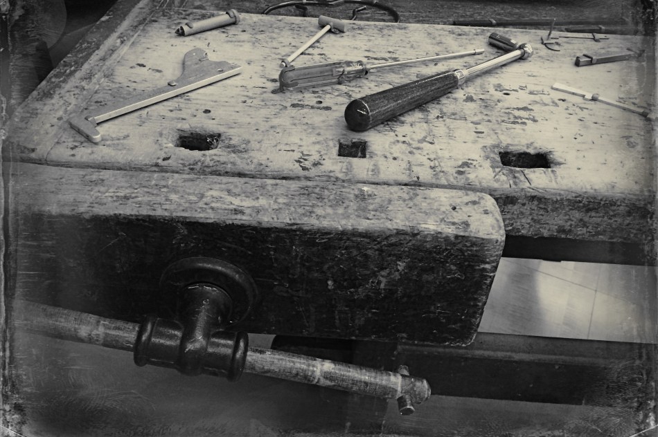
Black and white was the right choice here, but a decision about the kind of black and white was also crucial.
By basically simulating the subtle changes that a film processor could have made in the gradations between the various intensities of either black or white, apps allow you to make incremental judgments of how the values in the image work or don’t work to produce the “statement” you’re looking for. Best thing about this is the best overall thing about digital: how quickly you can act on your impulse, then check, adjust, and act again. The above image lacked impact in the color original. The old workbench simply came off too warm and charming. I was looking for something that matched the grit and wear of the weathered wood, and I was able to shop for about three different grades of monochrome before settling on what you see here. Most days, this is a game of inches.
The sheer number of images that you will be able to salvage while the scene is still in front of you, and the light is still how you want it…. that’s an amazing freedom, and no generation of photographers before ours has enjoyed anything like it before.
The take-home of all this is that you should not only shoot a lot but shoot a lot of variations on what you choose to shoot. And remember, every shot that you “blow” is one shot closer to the higher average of excellent work that will only come after thousands of failures. Best to speed up the clock and get past them while you’re still young.
THE RIGHT WAGON
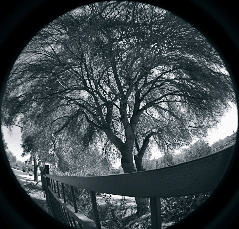
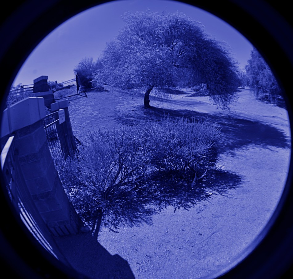
Cheap fisheye adaptors are a mixed bag optically, but they can convey a mood. 1/40 sec., f/11, ISO 100, 18mm.
By MICHAEL PERKINS
I ONCE HEARD AN OLD PHOTOGRAPHER SPEAK OF CREATIVE CHOICES AS “picking the right wagon to haul your goods to market”. By that, he meant that format, film, frame size, lens type or aperture were all just means to an end. If one wouldn’t take your wagon all the way to a finished picture, use another. He had no special sentiment or ironclad loyalty to any one tool, since there was, and is, only one real goal in any of photography: get the image you came to get.
It’s often hard to remember that simple rule, since we tend to associate the success of certain pictures with our pet camera, our sweet spot aperture, our favorite hunk of glass. But there’s also a knack to knowing when a particular tool that is wrong, wrong, wrong for almost anything might, for the project at hand, be just perfect.
I have one such tool, and, on rare occasions, the very properties that make me generally curse it as a cheap chunk of junk can make me praise it as just what the doctor ordered. It’s an Opteka 0.35, a screw-on lens adapter that simulates (to put it kindly) at least the dimensions of a true fisheye, without the enormous layout of dough, or, sadly, the optical precision of a true dedicated lens. It’s fuzzy at the edges, regardless of your aperture. It sprays chromatic shmears all over those edges, and so you can’t even dream of sharpness beyond the third of the image that’s in the dead center of the lens. It was, let’s be honest, a cheap toy bought by a cheap photographer (me) as a shortcut. For 99% of any ulta-wide imaging, it’s akin to taking a picture through a jellyfish bladder.
But.
Since the very essence of fisheye photography is as a distortion of reality, the Opteka can be a helping hand toward a fantasy look. Overall sharpness in a fisheye shot can certainly be a desired effect, but, given your subject matter, it need not be a deal breaker.
In the case of some recent monochrome studies of trees I’ve been undertaking, for example, the slightly supernatural effect I’m after isn’t dependent on a “real” look, and running the Opteka in black and white with a little detail boost on the back end gives me the unreal appearance that is right for what I want to convey about the elusive, even magical elements of trees. The attachment is all kinds of wrong for most other kinds of images, but, again, the idea is to get the feel you’re looking for…in that composition, on that day, under those circumstances.
I’ve love to get to the day when one lens will do everything in all instances, but I won’t live that long, and, chances are, neither will you. Meanwhile, I gotta get my goods to market, and for the slightly daft look of magickal trees, the Opteka is my Leica.
For now.
ON SECOND THOUGHT…OR THIRD
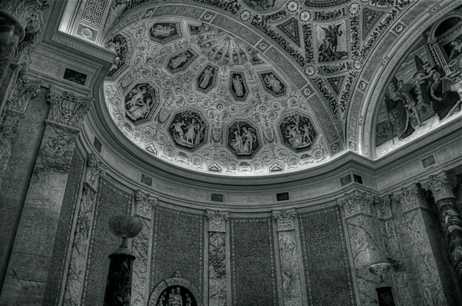
I really preferred this as the color shot it originally was. Until I didn’t. Changing my mind took seconds.
By MICHAEL PERKINS
ONE OF THE MOST AMAZING BY-PRODUCTS OF DIGITAL PHOTOGRAPHY, a trend still evolving across both amateur and professional ranks, is a kind of tidal return to black-and-white imaging. The sheer volume of processing choices, both in-and-out-of-camera, have made at least dabbling in monochrome all but inevitable for nearly everyone, reversing a global trend toward near exclusive use of color that was decades in the making. At one point, to be sure, we chose black and white out of necessity. Then we embraced color and relegated B&W to the dustbin of history. Now, we elect to use it again, and increasing numbers, simply because everything technical is within our reach, cheaply and easily.
Looking back, it’s amazing how long it took for color to take hold on a mass scale. Following decades of wildly uneven experimentation and dozens of processes from Victorian hand-tinting to the Autochromes of the early 1900’s, stable and affordable color film came to most of us by the end of the 1930’s. However, there was a reluctance, bearing on tantrum, among “serious” photographers to embrace it for several more decades. This article from the Life magazine Library of Photography, a history-tutorial series from the 1970’s, discusses what can only be called photography’s original anti-color bias:
Although publishers and advertisers enhanced their messages with pictures in color during the first few decades of the color era, most influential critics and museum curators persisted in regarding color photographs as “calendar art”. Color, they felt, was, at best, merely decorative, suitable, perhaps, for exotic or picturesque subjects, but a gaudy distraction in any work with “serious” artistic goals.
Of course, for years, color printing and processing was also unwieldy and expensive, scaring away even those few artists who wanted to take it on. Still, can you imagine, today, anyone holding the belief that any kind of processing was a “gaudy distraction” rather than just one more way to envision an image? Color was once seen by serious photographers as an element of the commercial world, therefore somehow..suspect. Fashion and celebrity photography had not yet been seen as legitimate members of the photo family, and their explosive use of color was almost thought of as a carnival effect. Cheap and vulgar.
Of course, once color became truly ubiquitous, sales of monochromatic film plummeted, and, for a time, black-and-white found itself on the bottom bunk, minimized as somehow less than color. In other words, we took the same blinkered blindness and just turned it on its head. Dumb times two.
Jump to today, where you can shoot, process and show images in nearly one continuous flow of energy. There are no daunting learning curves, no prohibitive expenses, no chemically charred fingertips to slow us down, or segregate one kind of photography from all others. What an amazing time to be jumping into this vast ocean of possibilities, when images get a second life, upon second thought.
Or third.
ATTRACTION / DISTRACTION
By MICHAEL PERKINS
PHOTOGRAPHERS ARE ADDICTED TO “INVISIBLE” STORYTELLING, to hinting at a context beyond what is actually shown in a given image. Sometimes our eyes arrive at a scene just seconds after something important has happened. Sometimes it’s just moments before. Sometimes we have to use emptiness to suggest how full something just was. And, most importantly, we need to determine if color will be a warm accompaniment to something magical, or an unwanted intruder in a scene where less is more.
Wonderfully, this choice has never been easier. Digital photography affords us the luxury of changing our strategy on the color of a shot from frame to frame in a way that film never could. It also allows us to delay the final choice of what works and what doesn’t, to live with an image for a while, and decide, further down the road, whether something needs to be re-ordered or altered, rendered either neutral or vivid. It is a great time to be a photographer. For those picking up a camera today, it must seem absurd that it was ever any other way. For those of us with a few more rings around the trunk, it can seem like a long promised miracle.
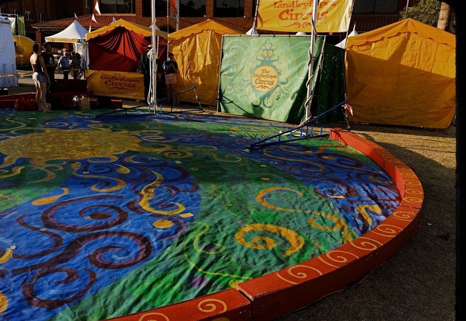
Color can be either addition or distraction to a shot, and usually you know, in an instant, whether to welcome or banish it for best effect. Two recent walk-bys afforded me the chance to see two extreme examples of this process. In the first, seen above, I am minutes too early to take in a small street circus, giving me nothing but the garish tones of the tents and staging areas to suggest the marvels that are to come. I need something beyond the props of people to say “circus” in a big way. Color must carry the message, maybe shouting at the top of its lungs. See what I mean? Easy call.
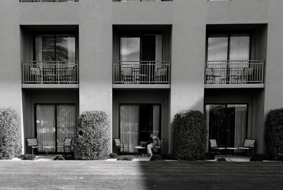
The isolation of the woman in the frame argues against the use of garish color. 1/700 sec., f/2.2, ISO 32, 18mm.
In the second image, which features a lone woman reading against a backdrop of largely featureless, uniform apartment cubes, I am off on an opposite errand. Here, I seem to be wondering why she is alone, who is waiting (or not waiting) for her, what her being in the picture means. The starkness of her isolation will never be served with anything “pretty” in the scene. The original frame, done in color, actually had the drama drained out of it by hues that were too warm. On a whim, I converted it to the look of an old red-sensitive black and white film. It gave me a sharp detailed edge on materials, enhanced contrast on shadows, and a coldness that I thought matched the feel of the image. In audio terms, I might compare it to preferring a punchy mono mix on a rock record to the open, more “airy” quality of stereo.
Dealer’s choice, but I think our photography gains a lot by weighing the color/no color choice a lot more frequently than we did in our film days. The choices are there.The technology could not be easier. Relative to earlier eras, we really do have wings now.
We just need to get used to flapping them more often.
HOW DARE HUE
By MICHAEL PERKINS
IT’S TRULY AMAZING TO CONSIDER THAT, AS RECENTLY AS THE LATE 1940’s, many serious photographers were, at best, indifferent to color, and at worst, antagonistic toward its use in their work. And we’re talking Edward Weston, Ansel Adams and many other big-shoulders guys, who regarded color with the same anxiety that movie producer experienced when silent segued to sound. We’re talking substantial blood pressure issues here.
Part of the problem was that black and white, since it was not a technical representation of the full range of hues in nature, was already assumed to be an interpretation, not a recording, of life. The terms between the artist and the audience were clear: what you are seeing is not real: it is our artistic comment on real. Color was thought, by contrast, to be “merely” real, that is to say limiting, since an apple must always be red and a blueberry must always be blue. In other words, for certain shooters, the party was over.
There were also technical arguments against color, or at least the look of color as seen in the printing processes of the early 20th century. Mass-appeal magazines like Look, Life, and National Geographic had made, in the view of their readers, massive strides in the fidelity of the color they put on newsstands. For Adams, these advances were baby steps, and pathetic ones at that, leading him and others to keep their color assignments to a bare minimum. In Adams’ case in particular, color jobs paid the bills that financed the black and white work he thought to be more important, so, if Kodak came calling, he reluctantly returned their calls. He then castigated his own color work as “aesthetically inconsequential but technically remarkable.”
Look where we are today, making color/not color choices in the moment, without changing films in mid-stream, deciding to convert or de-saturate shots in camera, in post processing, or even further down the road, based on our evolving view of our own work.
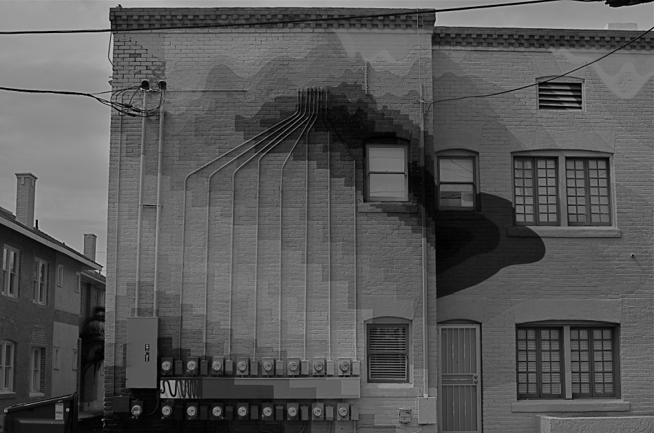
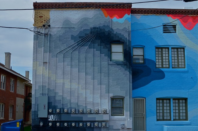
There are times when I still prefer monochrome as more “trustworthy” to convey a story with a bit more grit or to focus attention on textures instead of hues. In the above shot, I decided that the spare old building and its spidery network of power meters simply had more impact without the pretty colors from its creative makeover. However, one of my color frames was stronger compositionally than the black and white, so I desaturated it after the fact. Fortunately, I had shot with a polarizing filter, so at least the tonal range survived the transition.
The miracle of now is that we can make such microscopic tweaks in our original intention right on the spot. And that’s good, since, when it comes to color, nothing is ever black and white (sorry).
PASS GO, COLLECT $200
By MICHAEL PERKINS
BIRTHDAYS HAVE BECOME SOMETHING OF A CONUNDRUM AT MY AGE. The annual ritual of looking yourself over, and thereby taking some kind of critical inventory of personality debits and credits, has become a little like finding an old favorite shirt in a drawer. On one hand, it’s horribly out of fashion, and may not fit so well anymore. On the other hand, you had some great times in it, and it was really well made….I mean look at the quality in the fabric…….
And so, after a few loving looks, back in the drawer it goes.
There are so many yardsticks to apply to a life, so many ways to mark distance run. You can produce either smiles or sighs with any of them. Of course, I’d like to weigh less. Of course, I’d like to know more. And when it comes to photography, of course I’d like to be able to invoke a thirty-year mortality extension clause, in the hope that maybe, just maybe, I’d eventually learn to see as I should, before shuffling off to The Undiscovered Country.
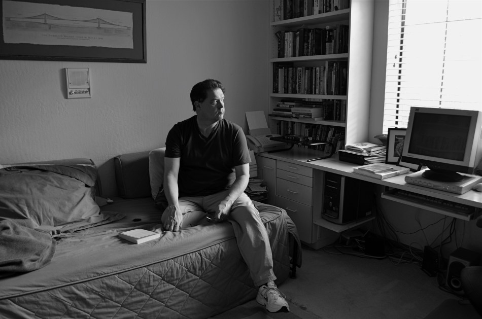
In recent years, I’ve used self-portraits as some kind of mile marker on myself, either as an index of technique, or maybe just a detailed document of wear and tear. It’s somewhat related to the annual torture that used to be School Picture Day, except that there’s no creepy guy to give me a lame nickname and hand me a plastic pocket comb. Another key difference is that I can keep shooting until my eyes are open and my cowlick behaves.
So, anyway, tomorrow, I’ll waddle my way past “GO” and collect my $200. Someone will once again stick something with a lit candle in front of me, and, once again, I will experience that all too human mix between gratitude and regret that makes humanity the ultimate sweet-and-sour entrée. I’ve been around from Brownies to Instamatics to Polaroids to iPhones, and it’s been a privilege to behold it all. And, if I’ve produced even one visual document to suggest to anyone else how marvelously grand the world is, then it’s been a pretty good run. It’s nice to be around.
Hey, did they take taxes out of this $200????
BLACK IS THE NEW QUIET
By MICHAEL PERKINS
PERHAPS IT’S MY FATHER’S LOVE OF THOREAU AND EMERSON. Maybe it’s a late-in-life turn toward the meditational. It most certainly is due, in part, to a life-long adoration of all things bookish. Whatever the exact mix, I regard library space as far more sacred than the confines of any church or chapel. Many find their faith flanked by stained glass; I get centered in the midst of bookshelves.
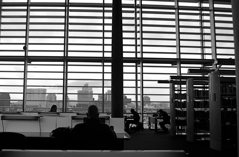
And if libraries are my churches, reading rooms are the sanctuaries, the places within which the mind can be channeled into infinite streams, and where, incidentally, perfect mental quiet can translate into visual quiet. And that, for me, means black and white images. Color can be too loud, proud, and garish, wherein monochrome is the language of privacy, intimacy, and a perfect kind of silence. You might say black is the new quiet.
Inside reading rooms, the faces and clothing of the patrons seems, well, irrelevant to the mood. They have all come seeking the same thing, so compositionally, they are, themselves, all alike, and seeing them in silhouette against the larger details of the room seems to enhance the feeling of reverent quiet. As for composing, letting the room’s massive window take up 3/4 of the frame kept the readers as a small understatement along the bottom baseline of the shot. And, since I was reluctant to ruin the atmosphere of the room, or risk my “invisibility” with more than one audible click to betray me, I chose to go for broke with a single black & white image. I exposed for the cityscape beyond the window, to guarantee that the readers would be rendered as shapes, and that was it.
Having successfully purloined a treasure from within the Church Of The Holy Book, I proceeded to beat it.
Quietly.
RE-FIXING THE FIX
By MICHAEL PERKINS
I CAN HEAR MY MOTHER NOW: “Don’t pick at it, you’ll get it infected”.
Okay, she usually was referring to a scab on a skinned knee. But often, when I can’t stop interfering needlessly with an image, I could swear she’s talking about photographs.
You know the ones I mean. The near misses that you would swear could be transformed into masterpieces with just one….more…tweak. Or maybe two. Or thirty. They are often the pictures we love most, like bad kids, simply because they had such potential, at least until we snapped the shutter. Then we stick them, flaws and all, on life support and start playing with things. Contrast. Color. Exotic filters. A spoonful of sugar. A pound and a half of good intentions.
And, sometimes, by getting our tweak on in a heavy-handed fashion, we make things worse. We render them garish, or glowing, or gooey, and still not what we intended. It’s like tutoring a kid that will never ever make the honor roll. It seems like we ought to be able to do something.
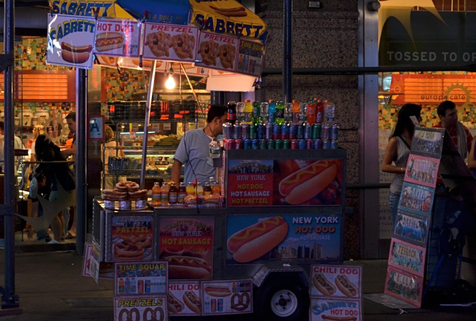
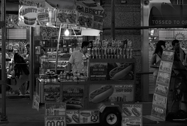
That’s the story of the above color street shot, taken just after sundown in Times Square. All the elements of a good picture are there, but the thing is just all right, nothing more, nothing less. At some point before I first posted it on Flickr, I got the brilliant notion that it would look more “authentic” if desaturated to black and white. Re-examining it more than a year later, I realized “authentic” was code for maybe I can distract people from the fact that I didn’t really bring it home in this shot. Once it was monochromed, the image was actually robbed of whatever minimal punch it might have originally had. All the zippy color of the signage and soda cans was banished, to replaced by….a really dull and narrow range of half-tones. All the depth and presence went out the same exit door as the color, but I went ahead and posted it anyway, trying to convince myself that I had made it much more “street”, when all I had really done was strip out the carnival hues that really said “Broadway”. I had worked against myself, and, worse, I had wasted time on a shot which should have gone in the reject pile from day one.
It’s not a miserable photo, and maybe that’s what really hard to accept. It might have been something. What I should have done, while I was there, was keep trying about ten more frames of this guy and maybe saving the concept. You know, try to get the photo right in the first place. Yeah, I know, how quaint. Thing is, once it was a mediocre picture inside the camera, all I could do was pick the scab.
And then it got infected.
Sorry, Mom.
