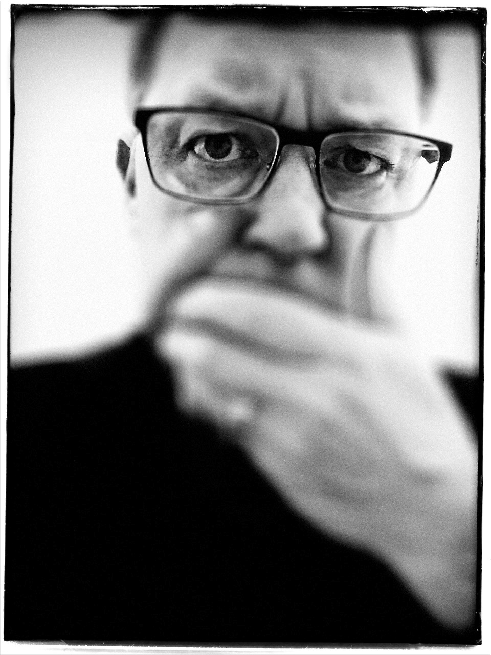
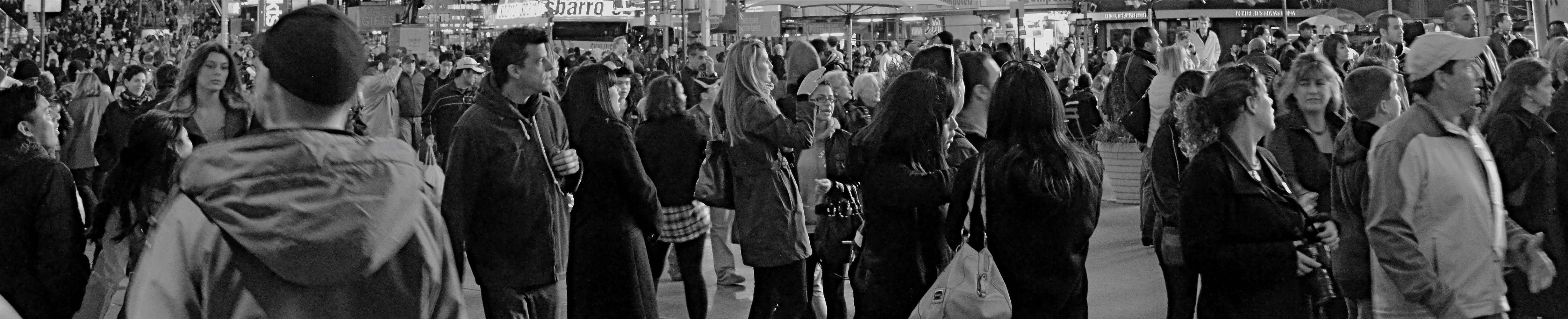
TEXTBOOK AND NO BOOK
Mon professeure.
By MICHAEL PERKINS
A FEW YEARS AGO, in trying to express what it felt like not to have a distinctly defined photographic style, I used the title of one of my favorite Van Morrison albums, No Guru, No Method, No Teacher, a phrase which even Van The Man may have lived to regret. The idea was that I couldn’t trace my own approach to making pictures directly to any particular mentor, not that I was so bloody original that I had never fallen under anyone’s influence. The problem in identifying my teachers, gurus and methods was certainly my own; I simply found it hard to draw a straight line from the examples of various photographers to elements of my own work. Now, I find that I can enumerate many profound professors, once I realized that the best of them are often not photographers at all.
That’s where my wife Marian comes in.
I have already spoken at length in these pages of her amazing value to me as a muse and model, but her ability to inspire me as a subject is separate and distinct from her role as a real and fundamental teacher. We’re not talking technical instruction here. This is a woman who has seldom even picked up a camera unless it was in the service of candid shots of friends and loved ones, or as a recording device to freeze the good times of a trip or vacation. Nonetheless she has taught me to see in very specific ways, expanding my idea of what should even be looked at. That ability resides in her love of the natural world, a place where she is a native and I am often a mere visitor. Her passion for birdwatching, for example, has helped me shoot anything, bird or object, with greater patience and deliberation, showing me the value of waiting for your moment. In her case, that might mean standing for fifteen minutes for a glimpse of the bright flicker on the wing of a flitting bluebird, while the equivalent for me might be the discipline to wait for light which, if I wait for an extra five minutes, will be perfect for exactly ten seconds.
Just as most of my other best photographic teachers are not shooters per se, Marian teaches by not trying to; her curiosity incites my own; her humility refines my own. I happily list her among the poets, illustrators, spiritualists and secular saints, from James Thurber to Emerson to Gibran, who have shown me things that no purely technical instruction ever could. Certainly among my heroes are listed many who are, in fact, actual photographers, but, since photography occurs in the eye and the soul long before it animates the hand, there are many people I love for the pictures that reside exclusively in their souls. Marian and I, like many millions of other couples, have spent three lifetimes together over the past year, and she has helped me go from caterpillar to butterfly in the metamorphosis of my camera work. That’s a gift beyond price, and a learning experience beyond the limiting titles of teacher, guru, or method.
And I am grateful.
EXALT, IN YOUR COPY
By MICHAEL PERKINS
I ONCE ASSEMBLED A SHORT BOOK CALLED “Juxtapositions” in which I flanked images of my own with quotations by great photographers on their craft. It was an amusing if inconsequential exercise, and helped me compile a miniature library of ruminations on why we do what we do. Some shooters were as eloquent in print as their pictures were, while others preferred to remark very briefly, content to let their images speak for them. I never thought, at the time, to seek out general philosophical treatises on creativity, to see the photographer’s motives discussed in general artistic terms. That now strikes me as short-sighted. It’s like doing a master thesis on breakfast and failing to consider eggs.
So let me make amends by pasting up the following passage and suggesting that it actually describes photography more perfectly than the words of any one shooter that I can recall. It doesn’t deal in the technical aspect of making a picture, since it actually predates the popularity of the medium, but perfectly describes what the photographer is seeking to do when he/she picks up a camera. From Ralph Waldo Emerson’s essay Art:
Much of the best in photography is, essentially, “based on a true story”.
“Because the soul is progressive, it never quite repeats itself, but in every act attempts the production of a new and fairer whole. This appears in works both of the useful and the fine arts, if we employ the popular distinction of works according to their aim, either at use or beauty. Thus in our fine arts, not imitation, but creation is the aim. In landscapes, the painter should give the suggestion of a fairer creation than we know. The details, the prose of nature he should omit, and give us only the spirit and splendor. He should know that the landscape has beauty for his eye, because it expresses a thought which is to him good: and this, because the same power which sees through his eyes, is seen in that spectacle; and he will come to value the expression of nature, and not nature itself, and so exalt in his copy, the features that please him. He will give the gloom of gloom, and the sunshine of sunshine. In a portrait, he must inscribe the character, and not the features, and must esteem the man who sits to him as himself only an imperfect picture or likeness of the aspiring original within.”
In making pictures, we craft compromises between what is visible and what our mind “sees”, between the mundane details of reality and the larger cues it feeds to our spirit. This is why the word “take”, in reference to the creation of a photograph, is so inadequate. We do certainly “take” something from the physical world, but we add personal intangibles to it, “making” an image out of a mix of both recordable and emotional information. As Emerson says so brilliantly, we “omit” the “prose of nature” and try to give “only the spirit and splendor.” If we’re lucky, we are not only faithful to our own vision, but instrumental in sharing something that another soul may recognize as familiar. That’s when a photograph has truly been “made”. It seems like magic because it is magic, as we exalt, in our copy, the features that please us.
UP, DOWN, LEFT, RIGHT
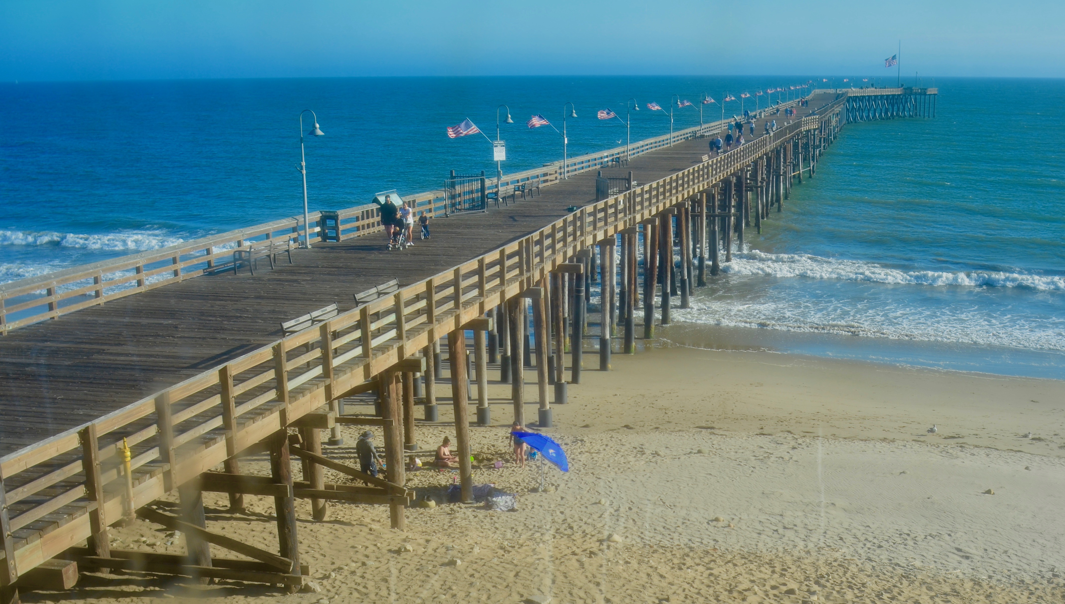
Over And Under, Ventura Beach, California, 2019
By MICHAEL PERKINS
COMPOSITION IN PHOTOGRAPHS IS NOT MERELY A MATTER of getting everything you want into the frame, whether your subject is crowded or stark. It’s about both the arrangement of objects or patterns in a given space and the relationships those things have with each other. It’s a process which often makes photography as frustrating as it is thrilling. Or maybe a more precise way to say it is, composition is the frustration you endure to get to the thrill.
Yeah, I like that a little better.
Part of the method of composition, in what is essentially a flat plane, is the arrangement of your subject in such a manner that it creates the illusion of depth, a kind of invitation to the eye to look further “in”. There have been entire libraries filled with references to these so-called “leading lines” such as the trail-off on the pier you see in this ocean view. Everyone mentions it because, well, goldarn it, for a cheap little trick, it works pretty well. This particular image is about as rudimentary an example of faux depth as you can find, but nailing it involves a lot of little things that are quite variable from one situation to another.
Ansel Adams once half-jokingly said photography was largely about knowing where to stand, and it’s still the best compositional advice I’ve ever heard. Certainly in the case of this photo, where I chose to stand (a decision I changed and re-changed across the space of several minutes) made a huge difference in how the depth effect displayed the picture’s information. I was originally walking toward the pier at beach level, at which angle the front-to-back view of the pier tended to emphasize the information most near at hand, with the rest of the pier dramatically foreshortened or “squished”, like the contracted bellows of an accordion, and objects at the far end of the pier greatly reduced in detail or prominence. Standing beside the pier rendered it as a long left-to-right line reminiscent of a snake or a train. Lots of detail but not much drama, and no practical way to show the entire structure.
Walking to the second-floor landing of a beach restaurant at the head of the pier, however, gave me a sensation of distance that appeared natural and yet was a little more dramatic, the lines of the pier converging as they reached the horizon, just like your ninth-grade mechanical drawing teacher taught you to do. But that’s the process of composition in a nutshell: a combined approach consisting of what to include and how to include it, or like Ansel says, knowing where to stand.
DISTORTION WITH DISTINCTION
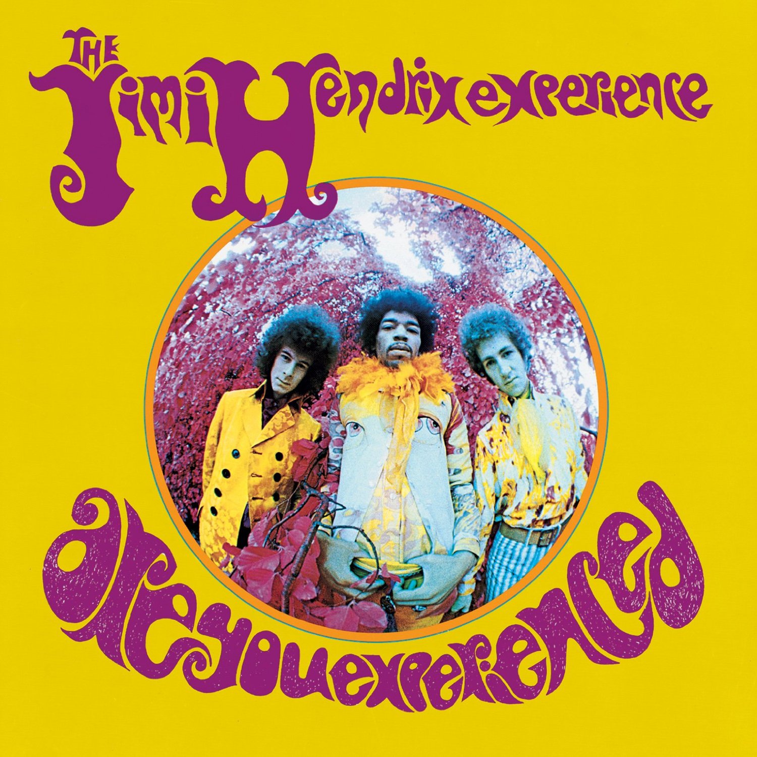
Perhaps the most famous “fisheye” image in pop culture.
By MICHAEL PERKINS
THE FISHEYE LENS, that ultra-wide hunk of glass whose images seem inscribed within a circle rather than a rectangle, have earned a bit of a bad rap among serious photographers over the years, perhaps because of either mis-use or over-use.
Let’s face it: of all the optical effects available to the average shooter, the fisheye shot is one of the most dramatic in its distortion of reality. It’s almost guaranteed to make your image about the look, which is where content starts to matter less than mere novelty.
Fisheye fever saw its peak in the swinging ’60’s, when such shots were intended to suggest a kind of sensory dislocation, the visual equivalent of a psychedelic state. The cover of Jim Hendrix’ Are You Experienced was perhaps the most popular example of such “weird-for-weird’s-sake” photography, with main subjects sitting at dead center, surrounded by severe barrel distortion that radiated out toward the edge of the circle, making even close objects seem distant as they softened into a haze of chromatic aberration at the extremes. Far out, man.
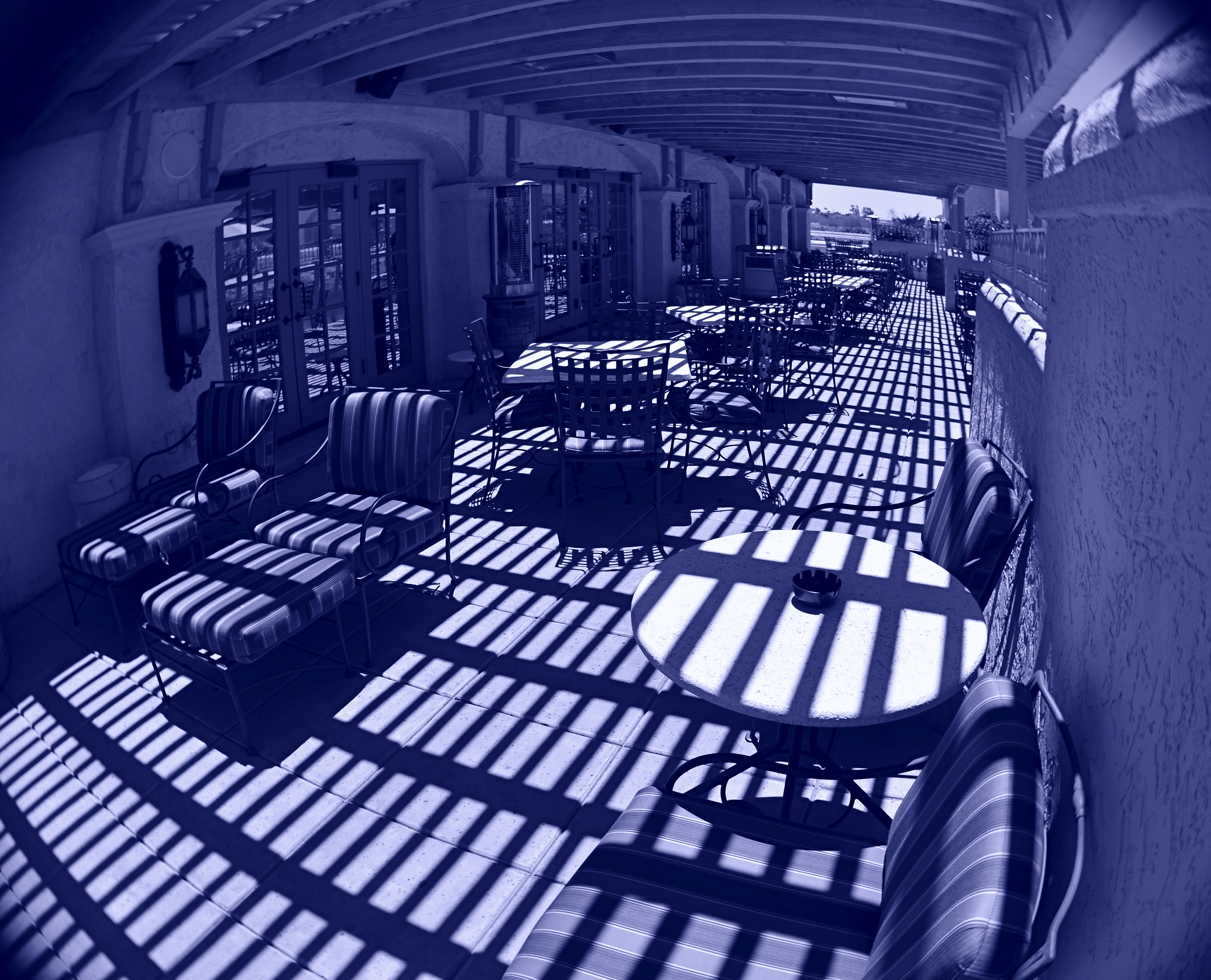
Cyan Veranda (2016). Curbing the extremes of the fisheye effect with composition and angle. This shot was made with a Lensbaby fisheye optic installed in a Lensbaby Composer Pro lens assembly, far less expensive than the classic “dedicated” fisheye.
These kaleidoscopic pictures tend to render such arbitrary boundaries as walls and horizon lines moot, and telegraph the photographer’s message that it’s all about getting your freak on. However, I think that fisheyes, when used like other wide-angles, can add graduated elements of distortion and distance exaggeration that need not be the only visual message in an image. Making a left or right edge the “center” of the shot, for example, can reduce the intense bending-in, while raising the camera up or down can render a horizon line almost normal, with a little tweaking for dramatic effect.
Ultra-wide images need not be all about the patented fisheye “look”, which can be, frankly, fatiguing, just as shooting in hazy focus or HDR might, were you to do nothing else. It’s the point at which an effect ceases to be a tool and starts to actually put barriers between your subject and your viewer, which is seldom good. What is good is that a “dedicated” fisheye (one which cannot deliver a standard image), still one of the most expensive pieces of glass available, is no longer a mandatory investment, since even lo-fi film cameras, entry-level art lenses and even phone apps can create the look cheaply and quickly, allowing one to dabble without adding on a second mortgage (beware the poor quality in the truly cheap ones, however). Optical tricks are, well, just that. Optical techniques can amplify, rather than disguise, your visual messages.
THE WHEN OF WHIMSY
Yes, We Deliver, 2016. Who ordered the blooms?
By MICHAEL PERKINS
For decades, the legendary Life magazine provided richly illustrated summaries of the week’s events, competing with other photo-laden national weeklies from Look to Fortune, Collier’s to Liberty for the eyeballs of generations of subscribers. The weekly giants perfected the photo-essay, laying out stories on elections, wars, fashions and the arts in serial narrative form from opening headline to closing paragraph. Life has even had a second “life” of sorts, ceasing weekly publication clear back in 1972, but still visible on newsstands to the present day in re-mixed, themed reissues of its iconic image archives.
One of my favorite features in Life over the years was the Miscellany page, tucked just inside the magazine’s back cover, and reserved almost exclusively for whimsy or fun. Freed from the journalistic constraints of the rest of Life, the Miscellany images ended the week on an up note with novelty and warmth providing relief from starker, sterner material. Nearly all of the photos were “human interest” in nature, featuring amusing interactions between people. Lovers. Kids. Day laborers. There was a true “caught in the act” flavor to the shots, and most looked like lucky candids rather than staged or manipulated images.
The feature informed my own brand of street photography, the snap that makes the mind speculate on the story that takes place both before and after the click. Sometimes people figure in my own moments of whimsy. Other times, as in the case of the image up top, an unusual arrangement of elements captures my imagination, making me wonder how these particular things got to this particular place. The idea of a single blooming flowerpot on a cart standing outside a very industrial loading dock caught my eye, as the two things don’t seem, at first glance, to belong to the same world. I almost spent too long thinking about it, too, since, several seconds after I snapped the picture, a worker came into frame and removed the vase, vaporizing my little tableau forever. Snooze you lose.
Miscellany appealed to my child’s sense of how to tell a story in pictures, not by what was shown but by what else is going on. There is a limited “when” for all whimsy, and, as the editors of Life realized so well, a time when one picture on the page is worth a thousand more in the mind.
THE EYE OF MEMORY
By MICHAEL PERKINS
PHOTOGRAPHY DEALS IN FEELINGS, those inexact sensations of the heart that we try to capture or evoke in our visual messaging. Some subjects, such as war or celebration, convey emotions with such immediacy that we are really only acting as recorders, with the associative power of our minds providing much of the detail. Pictures of loss or celebration, such as the aftermath of a disaster or the birth of a new life, can be fairly simple to convey. What you see is what the thing is. For subtler regions of the brain, however, photos must use, if you will, a different vocabulary.
Newbie photographers are trained, to a a great degree, to seek the sharp image, to master focus as a technical “must”, but, as we vary the kinds of messages we want to convey, we change our attitudes about not only sharpness but most of the other “musts” on the beginner’s list. We learn that we should always do a certain thing….except when we shouldn’t. It’s worth remembering that some of the most compelling photos ever published were, according to someone’s standard, “flawed” in some way.
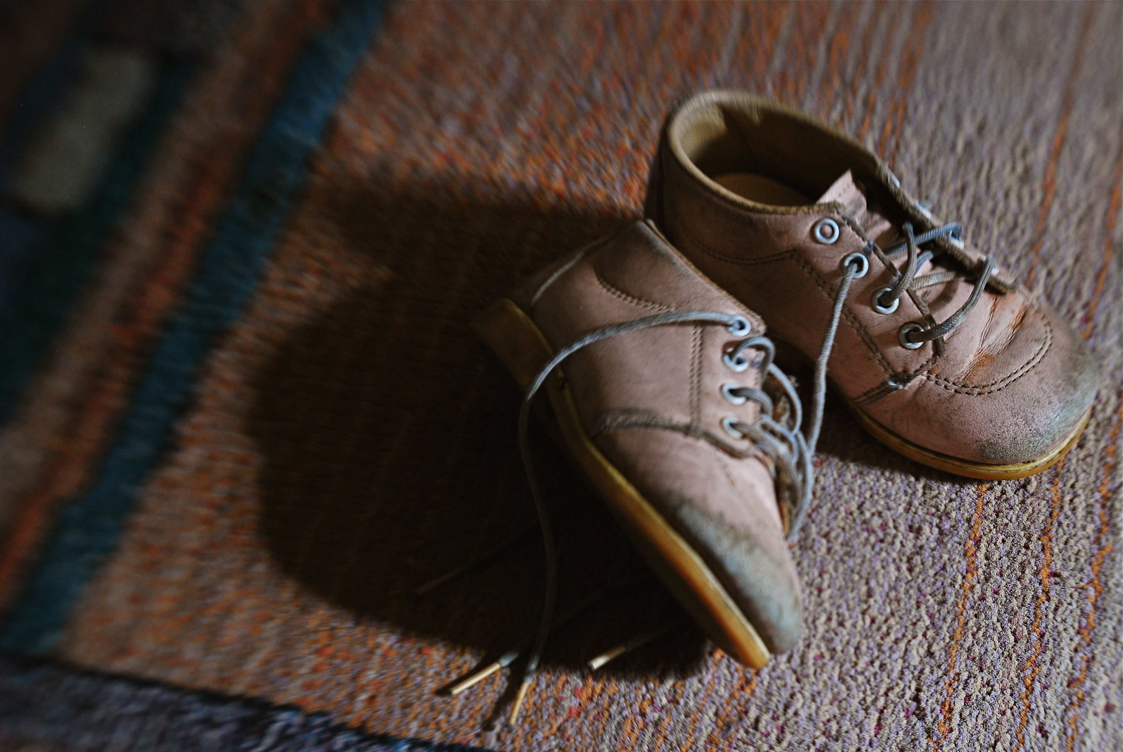
De-saturated color, soft focus. Items dealing with feelings, especially memory. are better served with less “realism”.
News shooters have long since learned that the emotional immediacy of a picture, along with its raw “news value”, outweighs mere technical precision by a country mile. The rules get bent or broken because, in their most perfect application, they may actually dull the impact of a given image. Thus, many a journalist has a Pulitzer on his wall for a picture that a beginner might regard as “wrong”. And the same goes for any picture we may want to make where an emotion simply must be conjured. Mere visual accuracy can and will be sacrificed to make the picture ring true.
Asa personal example, I find that images that plumb the mysteries of memory often must stray from the arbitrary standards of so-called “realism”. When you work in the realms of recall, nostalgia, regret, or simply fond remembrance, a certain fluid attitude toward the niceties of sharpness and exposure may actually sell the idea better. Memory is day-dreaming, after all, and, in a dream, as Alice found in Wonderland, things look a bit…off. Dimension, delineation, depth…all these properties, and more, morph with the needs of the desired image. “Real” sells some things superbly. Emotion, however, as earlier stated, demands a language of its own.
The baby shoes shown in the image above are shot in uneven sharpness to suggest the gauzy nature of the memories they may evoke. Likewise the color is a bit washed-out, almost pastel, since a full, vibrant range of hues may seem less dreamy, more rooted in reportorial reality…which we don’t want for a picture like this. Rule-breaking ensues simply because nothing, no rule, no standard, is as important as making the picture work. If it doesn’t speak to the viewer, then the fact that it’s technically superb means nothing.
As Mr. Ellington sez, it don’t mean a thing if it ain’t got that swing.
ADVENTURES IN INNER SPACE
By MICHAEL PERKINS
PHOTOGRAPHERS CHOOSE LENSES BASED ON LOTS OF CRITERIA, depending on what kind of “reality” they seek to visualize. In recent years, there has been a solid return to so-called “normal” or prime lenses, glass with focal lengths of 35-85mm which produce a perspective most like human vision, fairly free of the spatial distortion seen in ulta-wide lenses. At the same time, the use of ultra-wides in television and film, even for scenes in which a dramatic viewing angle is not particularly appropriate, is on the rise as well, and the widest consumer-level wides, including various types of fisheye lenses, are becoming sharper and cheaper than ever before.
I mention cinema here because it’s only after the emergence of 1950’s-era wide-screen processes like Panavision and Cinemascope that such lenses began to sell in larger numbers to amateur photographers, becoming an active part of the hobby. By the ’60’s, ultra-wides created stunning mutations of space in films like Stanley Kubrick’s Dr. Strangelove and Orson Welles’ The Trial, but, in such cases, the idea was still to deliberately distort reality for dramatic effect. Today, the most common “kit lens” accompanying a new DSLR is the 18-55mm, which at its widest, can make vertical lines bend inward in a way that is dramatic, but not a true measure of natural distance relationships. And, yes, they allow you to stand closer to your subject and “get it all in frame”, but, at that point, you’re also making a decision about whether your image is to be interpretive of reality, or reflective of it.
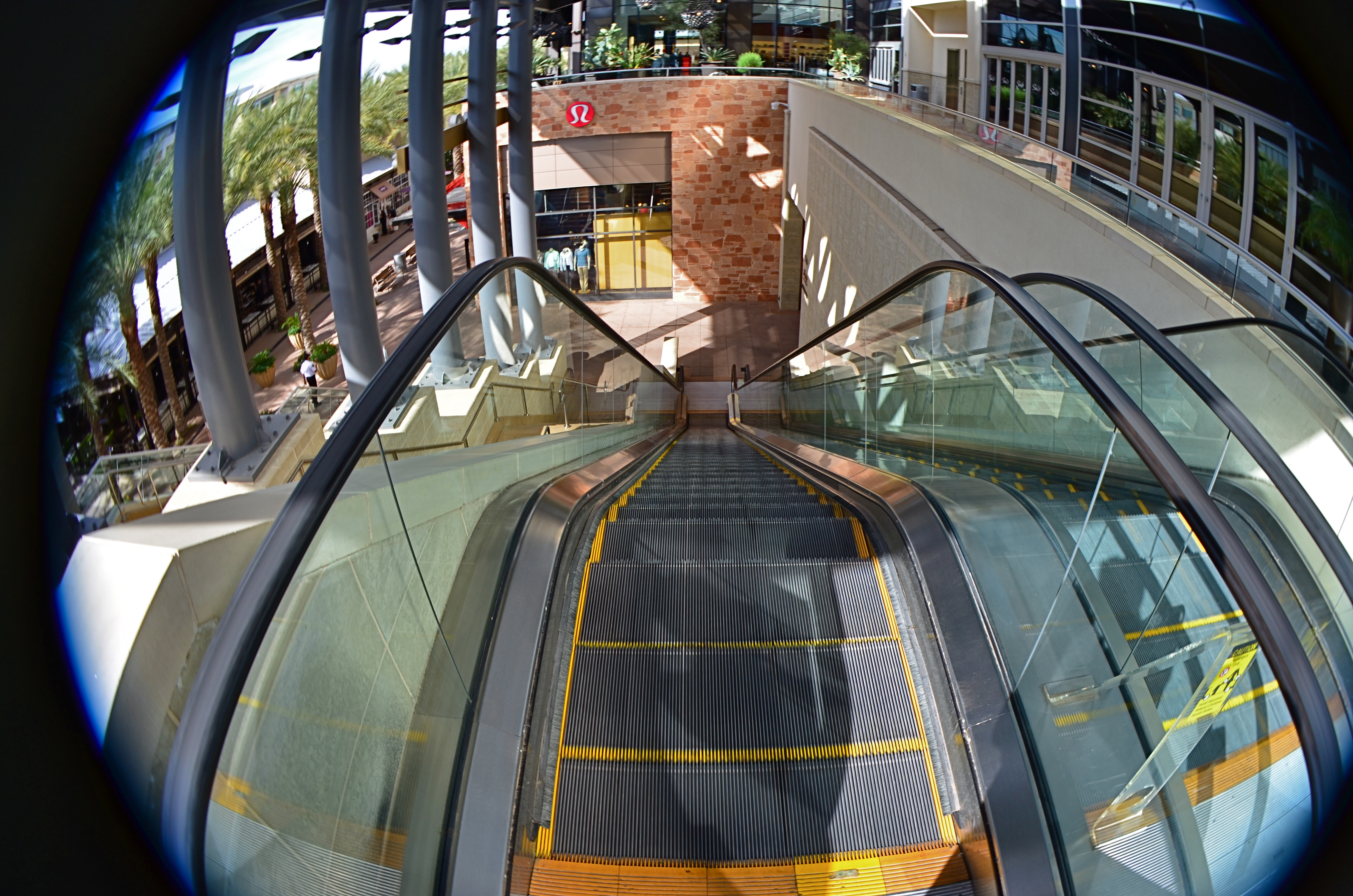
This mall escalator is nowhere near as high as a 13mm fisheye lens makes it appear.
Extreme wides, including fisheyes, can widen to 8 or 9mm, making the bending of lines so severe that the image elements seem to form a circle, with all lines arching sharply toward the center. And depending on what your image’s particular “reality” is to be, the distances of objects from front to back within the frame are also intensely exaggerated. Things which, in a “prime” lens image, appear just ten feet apart, can, in a fisheye shot, seem half a football field from each other. TV and film shooters exploit this big-time. If you’re shooting within a cramped interior and need to balloon its scope to suggest a larger scale, an ultra-wide really opens the place up. Medium-sized studios used in political debates now appear cavernous: ordinary city buildings shot wide for a crime drama take on intimidating height and depth, appearing to occupy entire blocks.
In the above image, if I want to make the viewer a little dizzy and daunted at the top of this rather modest escalator, I must use an ultra-wide to cheat, to trick the eye into concluding that it’s actually standing at the top of a sky-high ski jump. The tricky thing about ultra-wides, however, is that they mutate everything in the frame. And if part of that “everything” includes humans, your subjects can be taffy-twisted into some very alarming dimensions. Anything wider than about 24mm is downright uglifying for portraiture, unless a stylized effect is part of your interpretation. Lenses are not mere recording equipment. Their limits, biases, and faults can be exploited based on whatever kind of world you’re trying to conjure.
A TRIAL SEPARATION
Yeah, well, you see, the thing is, uh, what was the question?
By MICHAEL PERKINS
A PERSON’S RELATIONSHIP WITH PHOTOGRAPHY, MEASURED OVER A LIFETIME, can come to resemble a marriage, with all the occasional rifts, rumbles and repellents of living with anyone (or anything) nonstop ’til death. Just as any good golfer has thrown the odd club into the 7th hole lake, any shooter worth his emulsions/pixels will, at least once, consider pitching his gear into the nearest abyss, then setting a cheery bonfire of his accumulated work alight in the home driveway (after securing all necessary permits, of course). I dare you to deny it. We hate intensely because we have loved intensely, and fallen intensely short.
The fury eventually abates, however, and we resume the “on” portion of the on again/off again love of photography, not knowing when it next will toggle to “off”, or if switching back to “on” even has any prospect of success. The fact is, creative passion can generate emotional surges, microbursts of feeling so intense they could pop the top off a seismograph. This means answering “the questions” as they ring inside your skull:
Why did I ever start doing this?
What made me thing I’d ever be any good at it?
And where is that damned lens?????
In the interest of my own sanity, I never contemplate a total divorce from photography, but I avidly support the need for a trial separation from time to time. Every relief valve has to be opened and flushed out occasionally, and when the ideas, or the patience to execute them, seem to have gone south for the winter, you have to furlough the workers and shut down the plant. For a while. Hammering away at a problem with an image may eventually loosen what’s stuck, but it’s just as valuable to know when to lay down your tools and quit the scene. For a while. Once your brain is running on high-octane rage, all things beautiful and visionary will just be drowned out by all the screaming, so, really, I’m not kidding: accept the fact that occasionally you’ll announce to all your friends and family that you’re “over the whole photography thing”. And you will absolutely mean it.
For a while.
Here’s another thought: fake-quitting photography will provide the most severe test of how much you were into it in the first place. A trial separation is just that: a test to see if there was anything worth saving in the relationship. Scary process, but, if you come back, whether to a partner or a Nikon, you come back renewed and freshly committed to Make This Thing Work. All of a sudden, you’re bringing your Canon chocolates and roses, and arranging for a romantic candlelight dinner. And the work grows again.
For a while.
A CUT BY ANY OTHER NAME….

The first framing of this image included too much greenery on the right side, so it was cropped, then repositioned to make a “second” framing from the arched opening in the outer wall.
By MICHAEL PERKINS
THE WONDERFUL THING ABOUT COMPOSITION IN PHOTOGRAPHY is that you always, always, have a backup plan. What you don’t frame correctly in the actual shooting of an image can be corrected in post-editing cropping, the use of “framing” within the composition itself, or even how you finally matte the picture before hanging it on the wall. This is as it should be since many pictures are not so much born as re-imagined.
Once you frame a photo, you’re giving the viewer the first visual cue as to what to regard as important. If I included it, you should notice it. If I excluded it, it’s either to set loose your imagination on why I defined this world within these parameters, or because I, as the narrator, am telling you it just don’t matter. You can even further enhance the effectiveness of the frame by its shape. A rectangle might enforce the reading of information left-to-right, for example, while a square might force the eye toward dead center. The original framing is your own best call to action in a photograph.
And even after you’ve defined the frame, you can still add a second directive within it to hyper-focus attention in a very specific space. The use of arches, building overhangs, edges of windows, cliffs, shadows or other secondary “frames” provides even greater cues to the eye, and also adds an illusion of dimension and depth.
In the above shot, the old stone basilica is obviously the main feature of the image, and so was cropped from a wider original to eliminate distracting foreground shrubbery on the right. However, the arch through which the building is viewed was retained, to act as a “secondary frame” and as a way to illustrate scale. The first frame says what information is important, while the second frame makes sure we get to the heart of the image more efficiently.
Using all framing devices available in an image is like using caps, lower case and italicised letters in the same sentence. Composition is about yelling to get people over to your picture, then whispering, as you gently guide them toward its heart.
THE THIRD CHANNEL
In a square framing, this warehouse district seems self-contained, isolated from the greater city around it.
By MICHAEL PERKINS
OVER THE HISTORY OF PHOTOGRAPHY, OUR CHOICES OF HOW TO PRESENT A PICTURE has changed as well as the means by which we shoot it. Certainly in the film era, sizes and formats shifted from square to landscape to portrait, and those shapes were reflected in the dimensions of the final prints or slides. You know, shoot it wide, print it wide. Somewhere between the waning days of prints and the first waves of pixels, however, the square nearly winked out for a while, and, with it, a particular way of composing a shot. Luckily, it’s back in full force.
In the portrait-oriented original, extra buildings and street space dilute the impact of the cropped square.
It’s had help. Instagram and some retro-film cameras forced the square upon a new generation of shooters, and nearly all phones and phone apps readily offer it as a framing or editing choice. Strangely, manufacturers of DSLRs and other high-end cameras offer no option for shooting in square format, although they all include square cropping in their in-camera re-touch menus. This means that many photographers have to dream square but shoot otherwise, mentally composing the eventual square framing of their subjects in the moment, or even discovering, in edit sessions, that there is a decent square image inside their larger ones just waiting to be let out.
I have recently looked to deliberately edit in favor of the square, since I think that the format forces a kind of compact, centralized story-telling that might be diluted or weakened by wider or longer compositions. Looking at my initial landscape or portrait images, I ask myself if the entire force of the picture could be amped by squaring it off. Sometimes you think a shot calls for one orientation or the other, when the third channel of the square is actually a better tool. Hey, you can’t know everything at the moment of snap.
I do wish that DSLRs would routinely offer the chance to initially shoot in square, just as cheap hipster film cameras and phones already do. Not having every possible tool at your disposal seems wrong, somehow, and, with all the other gimmicks that are offered in higher-end cameras, from fake star twinkles to faux pencil-sketch effects, the inclusion of a third framing orientation just makes sense.
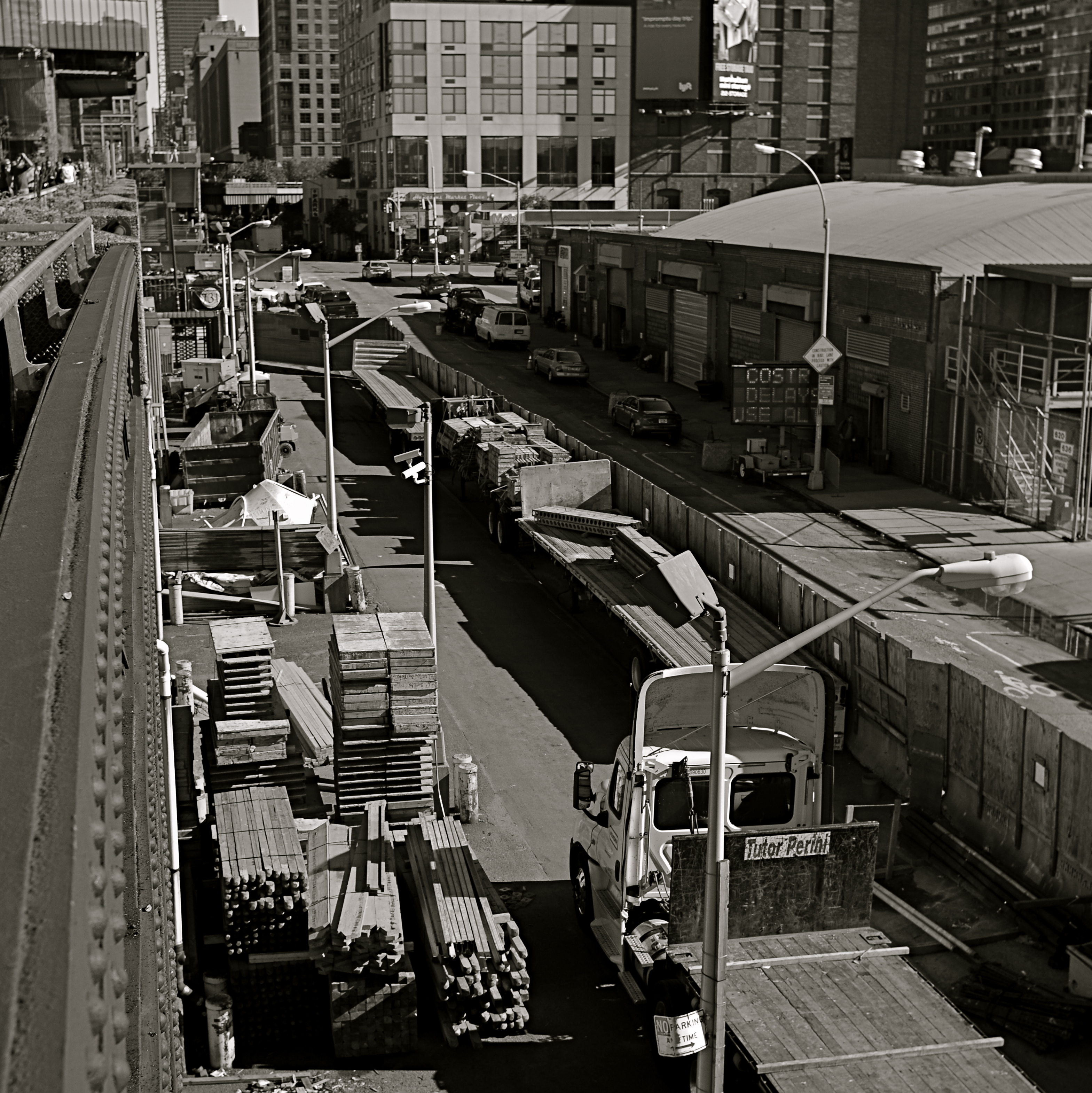
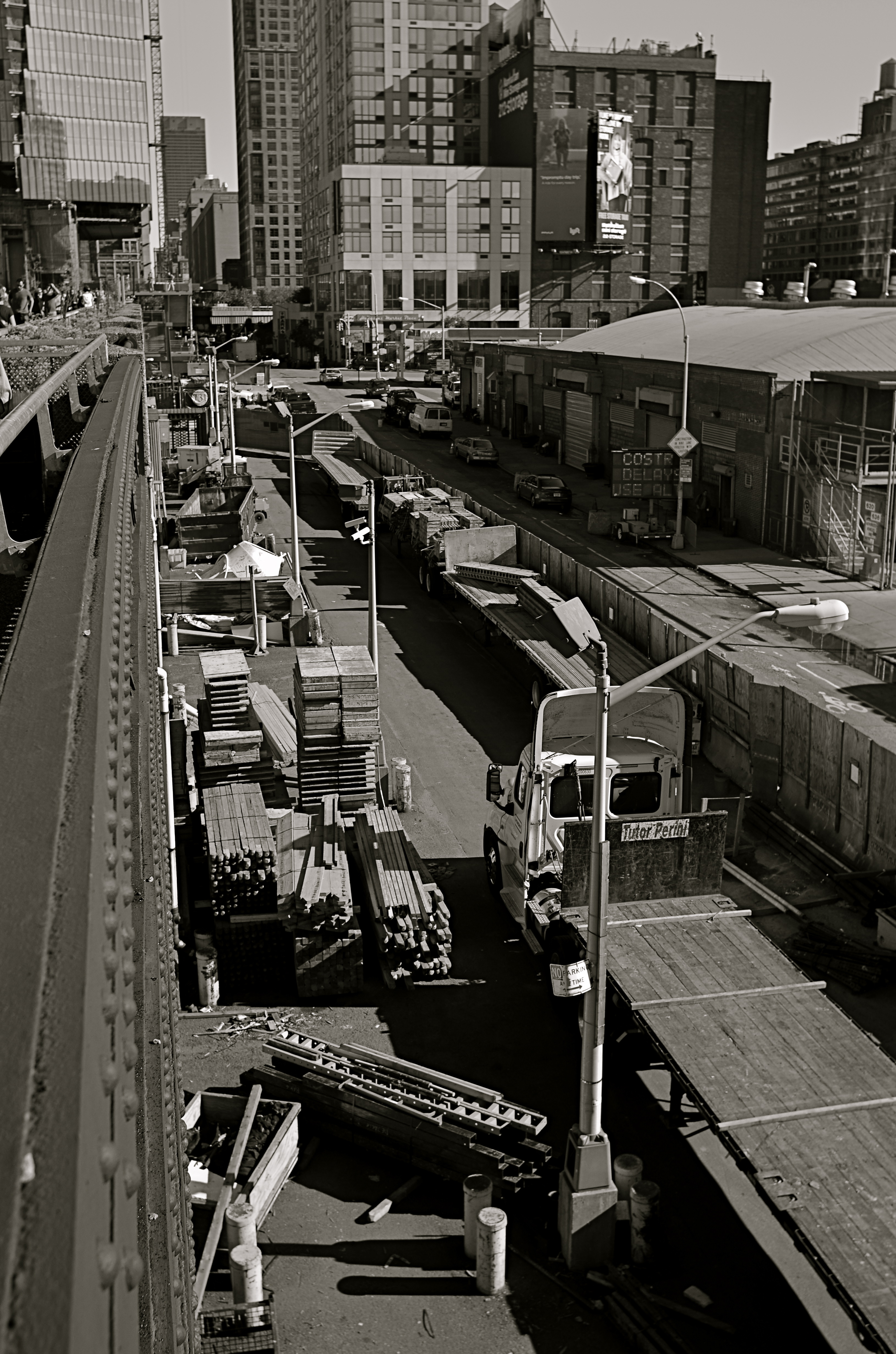
WIDE, WIDE WORLD(S)
Shooting from a low crouch with a 24mm ultra-wide jacked up the natural drama of this shot to a greater, almost excessive degree.
By MICHAEL PERKINS
ULTRA-WIDE LENSES HAVE ALMOST BECOME AN UNAVOIDABLE CLICHE for people shooting in the streets of large cities, both for the great things they allow and the uber-excesses that they enable. There is, of course, a real practical benefit in being able to create an amped-up sensation of front-to-back space or side-to-side expanse while you yourself are limited in where you can stand or move. For example, if your back is crimped against a building, so that you can’t dolly backward, having the lens provide the extra width you need is great. If you’re pointing up for emphasis, the lens’ distortion of straight lines can be dramatically abstract, depending on the look you’re going for. All to the good.
Of course, depending on your selection of angle, you can get things so bendy and bizarre that you can induce motion sickness in your viewing audience, with towers and spires inclining sideways as if they about to topple to the street. Again, you have to decide what look you want: it’s not just about tilting the frame until you can “get everything in”. That’s shoveling, not shooting.

Just inches away from the framing of the earlier shot, same 24mm lens. What’s different is the shooting angle.
The thing to remember about ultra-wides in the city is how little re-framing it takes to get both the drama you want and at least a semblance of normal proportions and angles. As with almost every other situation, the salvation is in shooting a lot of coverage of a subject. Attack it from all angles and sides. You can’t know in the moment exactly what will work best…you’re working too quickly in a crowded, active environment. So walk around, attack it from all sides, and sort out the keepers later.
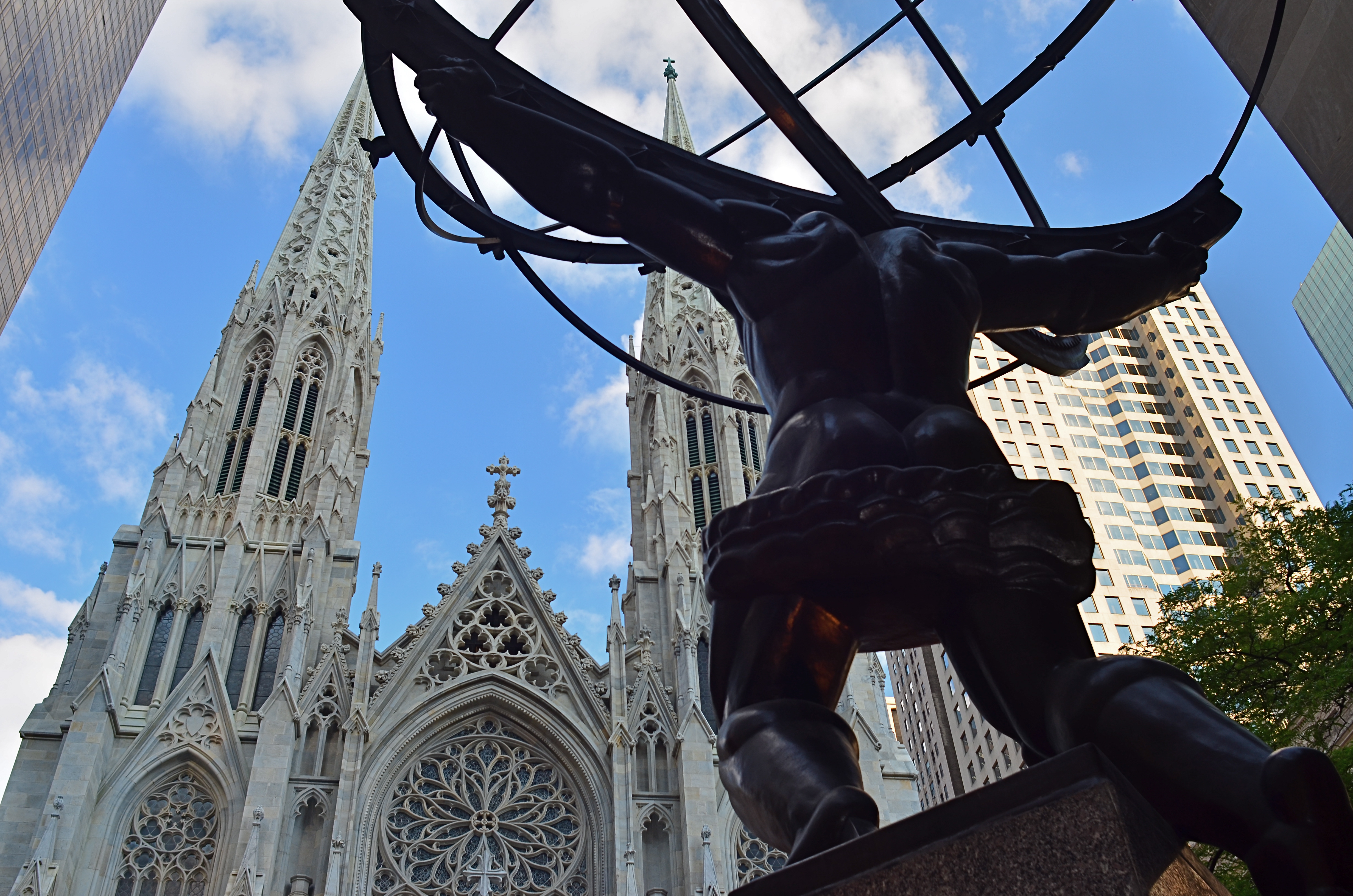
In the shot at the top of the page, I was interested in shooting Paul Manship’s magnificent “Atlas” sculpture, located along the Fifth Avenue edge of Rockefeller Center, from the rear, to accentuate the amazing musculature of the figure and get him in the same frame as the front of St. Patrick’s Cathedral. Now, there’s already plenty of drama in the statue’s pose as is, but in the first photo, I angled the lens further upward to get an even bigger arc of action. In the lower image, I simply changed the up-down angle of the same 24mm lens I was using to get angles that were a bit more normal. Two different effects, just inches away from each other in approach and angle, but markedly different in result. Which one’s the keeper? Not my argument and not my problem. However, if I don’t shoot both images, I don’t get to make the choice.
Once more, the advantage of digital is pronounced. You can now shoot everything you think you might need. We’re not counting “roll” exposures in our heads any more. We can’t “run out of film”, so click away. Shoot it all while you’ve got it in front of you and throw everything you know how to try at the problem at hand. The bad pictures will speed the arrival of the good ones.
WHEN TOY BECOMES TOOL
It’s possible to get a truly steady wide-angle image from iPhone’s in-camera pano tool. But it takes some real work, and not a little luck.
By MICHAEL PERKINS
EVERY TECHNICAL ADVANCEMENT IN THE HISTORY OF PHOTOGRAPHY has been a double-edge sword, creating either novel gimmickry or a wider array of serious technique, depending on who’s playing the game. The most popular tools available to the widest number of users, from fisheye lenses to phone app filters, illustrate this point again and again. Some people pick up these new features, play with them for a bit, then abandon them forever, while others use them as a way to expand their approach to visualizing an image.
I have written here before about iPhone’s in-camera panoramic tool, which I expect was originally included as a family-friendly option, perfect for making sure that everyone on the Little League team or the family reunion could be captured in one frame, the app instantly stitching a series of narrower photos taken in real time during a left-to-right pan. And, while it can certainly serve in that snapshot-y task, it creates its own set of technical problems. Nonetheless, I have become convinced, over the last few years, that it can lend additional ooomph to serious image making if (a) one is extremely selective in what is shot with it, and (b) the built-in shortcomings of the app can be worked around in the moment.
When people move through your iPhone pano panning sweep, they get kind of “scissored away”.
As with any other technical toy/tool, the results depend on how well you understand the strengths and weaknesses of iPhone’s pano app and plan your shots. Since you pan by pivoting your body (as if it’s the hub of a wheel), you can’t maintain the same distance from your entire subject as you move the camera left to right. That means that the center of that pivot, or what’s dead ahead of you, will tend to distort outward, like the center of a fisheye shot. Depending on what’s at the middle of your shot and how far you are from it, this can give you some unwanted funhouse results.
Also, in what is odd for a tool that’s designed to take pictures of lots of people, using the iPhone pano app to shoot a live, moving crowd is truly hit-or-miss. If a person moves through your picture as you are panning in the same space they occupy, they may be recorded as a slice or a piece of themselves, being caught partly in some of the picture’s vertical “tiles” but absent from the ones directly adjacent to it, causing them to register as a disembodied leg or a slivered torso floating in the air (see left).
In the shot at the top of this page, I was lucky that the street magician at left was standing still during the time I panned across him (once I’ve recorded his part of the frame, he can do what he likes, since the lens no longer “sees” that part of the picture). Likewise the crowd, enthralled by his performance, was remaining pretty static as I completed the pan across their part of the frame. The result has all the story-telling power of an ultra-wide shot, and, because of the composition, actually uses the fisheye-ish bulge to make the segmented pavement appear to be radiating outward from the performer.
And of course there is the subject itself, which has to benefit from all that left-right arrangement of information if you want to avoid just taking the picture for the sake of the effect alone. And there we have the balance between toy and tool that every photographer hopes to strike. Toys get cast aside once boredom sets in. Tools stay around and add to your work in very real ways.
WINDOW OF OPPORTUNITY
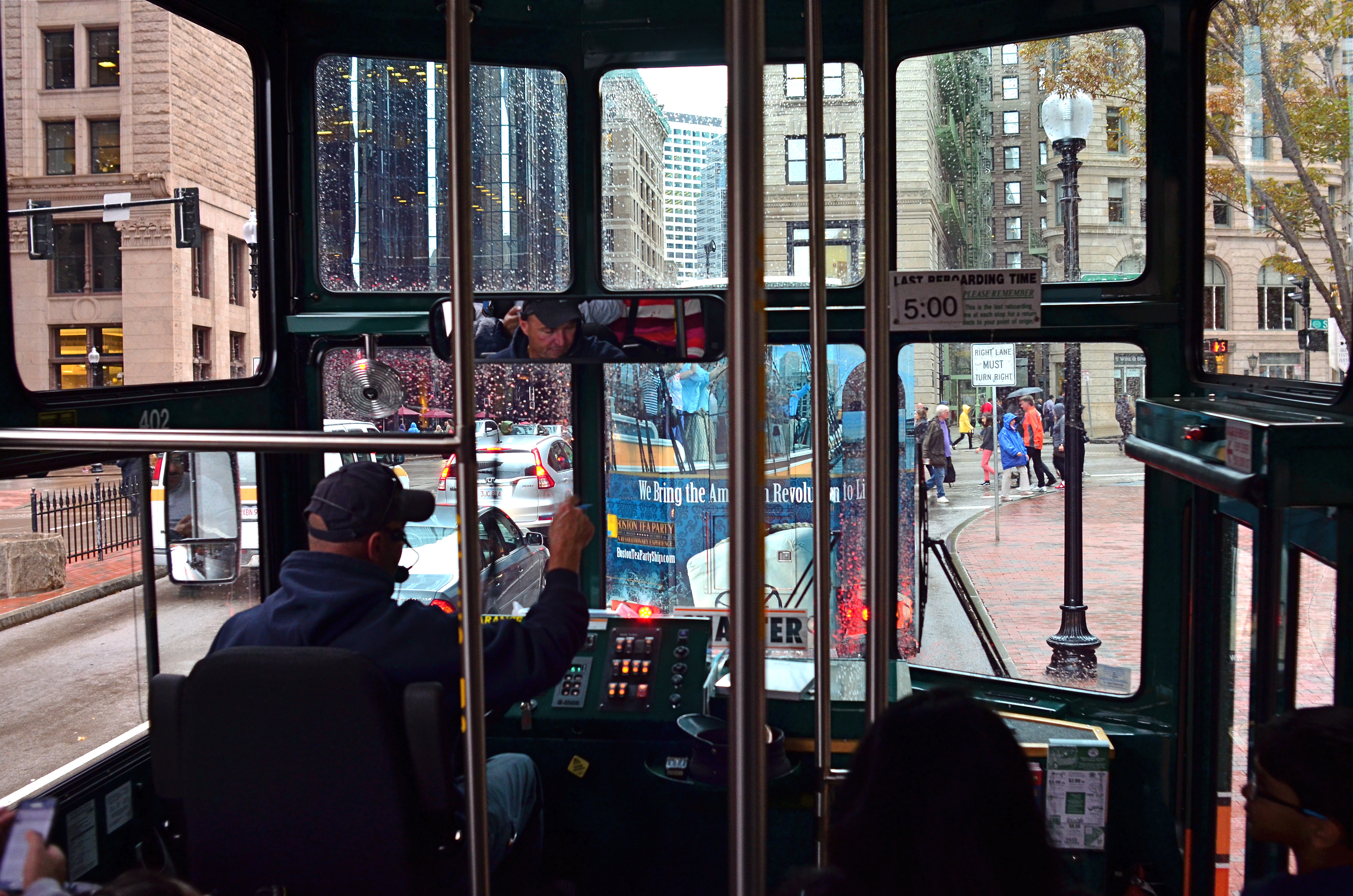
“…the driver on the bus says……” Sometimes a window is part of the story.
By MICHAEL PERKINS
PHOTOGRAPHERS’ FIRST USES OF FILTERS WERE AS THE TWIST-ON TOOLS designed to magnify, nullify or modify color or light at the front end of a lens. In the digital era, filtration is more frequently added after the shutter clicks, via apps or other post-production toys. You make your own choice of whether to add these optical layers as a forethought or a post-script. However, one of the simplest and oldest of filtering options costs no money and little time, and yet continues to shape many a great image: a window.
Early morning + tinted window=moody, right? Gettysburg from the tour bus.
No panes are optically identical, just as the lighting conditions that affect them are likewise completely unique, so the way that they shape pictures are constantly in flux, as are the results. It’s no surprise that the shoot-from-the-hip urban photographers who favor spontaneity over all pay little attention to whether shooting through a window “ruins” or “spoils” an image. Taking an ad-lib approach to all photographic technique, the hip shooters see the reflections and reflections of glass as just another random shaper of the work, and thus as welcome as uneven exposure, cameras that leak light, or cross-processed film: another welcome accidental that might produce something great.
Windows can soften, darken or recolor a scene, rendering something that might have been too strait-laced a little more informal. This quality alone isn’t enough to salvage a truly bad shot, but might add a little needed edge to it. The images seen here were both “what the hell” reactions to being imprisoned on tour buses, the kinds that don’t stop, don’t download their passengers for photo or bathroom breaks, or which are booked because I am tired of walking in the rain.
In the case of the tour driver’s cab, his inside command center and personal view are really part of the story, and may outrank what he’s really viewing. In the side-window shot of an early morning in Gettysburg, Pennsylvania, the tinted glass acted much in the way of a polarizing filter, making the resulting photo much moodier than raw reality would have been.
Which is the point of the exercise. When you feel yourself blocked from taking the picture you thought you wanted, try taking it the way you don’t think you want to. Or just think less.
Wait, what did he just say?
THE PUSH AND THE PULL
NYC: pictures of impressions of visions of dreams.
By MICHAEL PERKINS
NEW YORK CITY IS A VERY IRONIC CANVAS. Artists who set brush upon that canvas may think they are attempting to depict something outside themselves, but what they show actually reveals very personal things. There are more stories than all the storytellers in the world can ever hope to render…in paint, in print, or through the lens of a camera, and while some of us entertain the notion that we are adding this commentary objectively, that, plainly, is impossible.
From handheld luggage to emotional baggage, everyone brings something to New York, layering their own dreams and dreads onto the multi-story sandwich of human experience that makes it the world’s most unique social laboratory. Hard as it is on the artistic ego, one can’t make the statement that defines the city. Wiser minds from Walt Whitman to Langston Hughes to Bob Dylan have tried, and they have all contributed their versions….wonderful versions. But the story can never be completed. New York won’t be contained by mere words and images. It is, like the song says, a state of mind.
Still, trying to scale the mountain can be fun. So, with this post, The Normal Eye has added a new gallery tab at the top of the page to share a few recent takes on my own ongoing love affair with the Apple. The title, I’ll Take Manhattan, is hardly original, but it is easy to remember. I have done essays on NYC before, but, this time out, I strove to focus as much on the rhythm of people as on the staggering scope of the skyline. New York is, finally, its people, that perpetually fresh infusion of rigor, rage, talent and terror that adds ever-new coats of paint to the neighborhoods, and this batch of pictures tries, in 2015, to show the town as it is used, by its daily caretakers. The push. The pull. The gamut of sensations from sky to gutter.
So have a look if you will and weigh these impressions against those you’ve discovered through others or developed within yourself. Taking on a photographic task that can never be finished is either frustrating or freeing, depending on your artistic viewpoint. In the meantime, what a ride.
SPREADING OUT THE SPRAWL
By MICHAEL PERKINS
PANORAMIC PHOTOGRAPHY IS REGARDED BY MANY AS A BIT OF A GIMMICK, an effect confined to the same realm as 3-d, fisheye lenses and faked pictures of cats driving sports cars. As a result, it’s rare that a pano is used for anything serious beyond landscape views, and, although apps have allowed even modest phone cameras to produce a modified panoramic effect, the majority of shots are still of ultra-wide, scenic vistas….the view from the beach to the resort hotel two blocks inland, and so forth.
But panos can be used to convey both scope and scale on subjects that have nothing to do with mountains or shorelines, and it’s encouraging to see more new photographers using the recently evolved technology to take advantage of that storytelling option. To use one example, the whole concept of sprawl–congested cities, vast arrays of clutter, the aftermath of the industrial age—seems custom-made for the panoramic’s less limited space requirements. It can actually open up editorial angles on a whole new range of subject matter.
The Ponderous Pile, 2015. Some subjects benefit from this obvious distortion of perspective.
Panos are great for showing overabundance, the sensory overload of contemporary life. In the above photo, it’s used to show the bulging, burgeoning, out-of-control volume of stuff in a congested antiquarian bookstore. The composition is dictated by the ultra-wide format to a degree, but when it’s married to the right subject matter, the shots can have a singular impact.
As with any other effect, there has to be a bottom-line benefit to the tale you’re trying to tell. It’s not enough to elicit a reaction of “wow, that looks weird”. That just relegates what you’ve shot to mere novelty. The upfront question should be: why are you deciding to distort visual reality or amp up the drama on this particular occasion? The effect has to seem inevitable in the result, with your audience admitting that, certainly, that was the best way to approach the shot and get the story across.
Sometimes photographs are about both process and subject. Panoramics have their place in serious photography, but only in serious hands.
DIGGING OUT OF THE DRYS
Photography can turn you into a wanderer at times, and not a happy one, either.
By MICHAEL PERKINS
PHOTOGRAPHERS, IN THE NATURAL COURSE OF THEIR CONTINUING DEVELOPMENT, will, at one point or another, get hopelessly lost. Stuck. Stranded on a desert island. Fumbling for the way out of the scary forest. Artistically adrift. Call it a dead spot, a dry spell, or shooter’s cramp, but you can expect to hit a stretch of it at some time. The pictures won’t come. You can’t buy an idea. And, worst of all, you worry that it will last……like forever.
At such times it’s a great idea to turn yourself into a rabid researcher. The answer to how to get unstuck is, really, out there. In your pictures or in someone else’s. Let’s look at both resources.
Your own past photographs are a file folder of both successes and failures. Pore over both. There are specific reasons that some pictures worked, and other’s didn’t. Approach them with a fresh eye, as if a complete stranger had asked you to assess his portfolio. And be both generous and ruthless. You’re looking for truth here, not a security blanket.
Beyond your own stuff, start drilling down to the divinity of your heroes, those legends whose pictures amaze you, and who just might able to kick your butt a little. And, just so we’re being fair, don’t confine yourself to studying just the gold standard guys. Make yourself look at a whole bunch of bad upstarts and find something, even a small thing, that they are doing right that you’re not. Discover a newbie who shoots like an angel, or an Ansel. Empathize with someone who needs even more help than you do. Once you have mercy on someone else’s lack of perfection, it’s a lot easier to forgive it in yourself.
We “artistes” love to believe that all greatness happens in isolation, just our art and us and the great god Inspiration. But even when you shoot alone, you’re in a kind of phantom collaboration with everyone else who ever took a picture. And that’s as it should be. Slumps happen. But the magic will come back. You just need to know how to reboot your mojo.
And smile. It’s photography, after all.
WHAT’S THIS I SEE?
By MICHAEL PERKINS
AS PHOTOGRAPHERS, WE HAVE A LIFETIME OF HEART-TO-HEART TALKS with ourselves, seeking the answer to questions like “what’s this I see?”, or “what do I want to tell?” Tricky thing is, of course, that, as time progresses, you are talking with a variety of conversational partners. As we age, we re-engineer nearly every choice-making process or system of priority. I loved Chef-By-Ar-Dee as an eight-year-old, but the sight of the old boy would probably make me gag at 63. And so it goes with clothing, choice of good reads, and, of course photography.
So many ways for so many people to see.
One of the things it’s prudent to do over the years is to take the temperature of present-day You, to really differentiate what that person wants in an image, versus what seemed essential at other stages in your life. I know that, in my case, my favorite photographers of fifty years ago bear very little resemblance to the ones I see as signposts today.
As a boy, I was in love with technical perfection and a very literal form of storytelling. Coming up in an artist’s household, I saw photos as illustrations, that is, subservient to some kind of text. I chose books for their pictures, yes, but for how well they visualized the writing in those books. The house was chock full of the mass-appeal photo newsmagazines of that day, from Life to Look to National Geographic to the Saturday Evening Post, periodicals that chose pictures for how well they completed the stories they decorated. A picture-maker for me, then, basically a writer’s assistant.
It’s all about journeys, not destinations.
By my later school years, I began, slowly, to see photographs as statements unto themselves, something beyond language. They were no longer merely aids to understanding a writer’s position, but separate, complete entities, needing no intro, outro or context. The pictures didn’t have to be “about” anything, or if they were, it wasn’t a thing that was necessarily literal or narrative. Likewise, the kind of pictures I was interested in making seemed, increasingly, to be unanchored from reference points. Some people began to ask me, “why’d you make a picture of that?” or “why aren’t there any people in there?”
By this time in my life, I sometimes feel myself rebelling against having any kind of signature style at all, since I know that any such choice will eventually be shed like snake-skin in deference to some other thing I’ll deem important. For a while. What this all boils down to is that the journey has become more important than the destination, at least for my photography. What I learn is often more important than what I do about it.
And some days, I actually hope I never get where I’m going.
PRACTICE MAKES…?
We all start with light and a box. From then on, anything can happen.
By MICHAEL PERKINS
THE BEST SELLER LIST IS THE FASTEST WAY to cement a notion in the public’s mind as indisputable “fact”. We are great at quoting a concept captured in print, then re-quoting the quote, until the “truthfulness” of it becomes plausible. It’s basically a version of the statement, “everybody knows that..” followed by a maxim from whatever hardcover pundit is top in the rotation at a given moment. And it’s about as far from accuracy as you can get.
Ever since pop-psych guru Malcolm Gladwell’s hit book Outliers arrived on shelves a few years back, its main thesis, which is that you need 10,000 hours of practice to become excellent at something, has been trotted out a thousand times to remind everyone to just keep nose to grindstone and, well, practice will make perfect. Gladwell cites Bill Gates’ concentrated stretch of garage tinkering and the Beatles’ months of all-night stands in Hamburg as proof of this fact, and, heck, since it ought to be true, we assume it is.
However, it’s not so true as it is comfortable, and, when it comes to photography, I would never hint that someone could become an excellent artist just by putting in more time shooting than everyone else. If my method is wrong, if I never develop a vision of any kind, or if I merely replicate the same mistakes for the requisite practice period, then I am going to get to my goal older, but not wiser. Time spent, all by itself, is no indication of anything, except time spent. Evolving, constantly learning from negative feedback, and learning how to be your own worst critic are all better uses of the years than just filling out some kind of achievement-based time card.
The perfection of photography is about time, certainly, and you must invest a good deal of it to allow for the mistakes and failures that are inevitable with the acquiring of any skill. But, you must also stir insight, humility, curiosity and daring into the recipe or the end result is just mediocrity. Gladwell’s magical 10,000 hours, a quantity measurement, is only miraculous when coupled with an accompanying quality of work.
There are people who know how to express their soul on their first click of the shutter, just as there are those who slog away for decades and get no closer to imparting anything. It’s how well you learn, not how long you stay in school. It ain’t comforting, but it’s true.
GOING NEGATIVE
Negative space is your best friend when trying to establish scale.
By MICHAEL PERKINS
I got plenty of nothin’, and nothin’s plenty for me. —Ira Gershwin, Porgy and Bess
I BELIEVE THAT MANY PHOTOGRAPHS ARE IMPROVED BY THE SIMPLEST OF MATH OPERATIONS: addition and subtraction. Look at nearly any image you’ve created that “worked” and you can see that there is not one more thing in the image than there needs to be. Something told you to either supply or eliminate elements in the composition until the impact of the picture was maximized. Realizing the reverse effect is pretty easy as well, although not as much fun. If there is one tree too many or one object too few in the frame, you can sense the imbalance in your near-miss pictures. And man, does that hurt.
 We used to refer to open areas of a picture as “blank” space, and were often talked out of using it at all by various A-B-C composition tutorials that told us that large expanses of sky could kill a good landscape. Today, we refer to this unused real estate as “negative” space, but we are now more inclined to see it as well, a positive thing. The take-home from this is, simply, that no technique should be universally ruled out, or ruled in, for every image. Truth is, there are times when not filling the frame with stuff, or selectively making use of negative space boosts the wattage of what you’re trying to say.
Instead of “negative” space, I prefer the term “secondary space”, since what you’re really doing is mapping your pictures into zones of the things that should be of primary interest and those that should complement those things without competing with them. Landscapes are the easiest way to demonstrate this. In the image at left, I wanted to accentuate the distance between the foreground tree and the background mountain. Framing the two elements to merely overlap gave no sense of space, and, in color, actually made the photo busy and hard to read. There seemed to be no primary object in the frame. Composing so that some sky intervened to the right of the tree and the top of the mountain re-established the sense of distance and kept the textures of both objects from fighting with each other.
Secondary space need not be empty. It can take the form of a texture, be it a body of water, cloud formations, a flooring pattern, or a stone wall. The idea is to use the space to support, but never upstage the primary space. Sometimes what you need to complete an image is nothing. You just have to stick the nothing in the right place.
CHOOSE THE INCONVENIENT

The more of your hand that’s in a picture, the better it will be.
By MICHAEL PERKINS
MARKETING BEING WHAT IT IS, CAMERA MANUFACTURERS HAVE LONG TOLD US THEY ARE DOING ONE THING FOR US when they are actually doing something very different. Since the first furry, day-long exposures of the 1800’s gave us a taste of what an entirely new medium could do in the way of chronicling the world, we have been promised that, over succeeding generations of technical development, taking a picture would get easier. In fact, this is a little inaccurate, as what the wizards have mostly done is to make taking a picture faster.
If this sounds like I’m splitting a sub-atomic-sized hair, hear me out. Many of the refinements in camera design over the last century and a half have, of course, improved the sharpness of lenses, the absorbance quotient of recording media, and enhanced design. However, the lion’s share of reboots have been to require fewer steps in framing and shooting, through increasing auto-delegating of many functions to smarter and smarter cameras. But, what we basically gain by this process is speed. It certainly takes much less time to shoot and get an acceptable result as the years roll by. “Well”, you may well ask, “doesn’t that mean the whole process is also easier?”
Tricky question, as it turns out.
In that you can take technically better images with less effort the further we roll along, then yes, it’s “easier”. But the same speed which is part of the “easy” process also means that we spend less time planning a picture, seeing it in our minds and creating it with deliberate action…cause, you know, the camera will do it. This means that it’s also easy to miss things, to fail to visualize the best way to take a shot versus the most expedient way. Slowing down by adding steps into the creation of a photograph means taking back control, so it is, if you will, “harder”, but, with practice of the total process of photographing, the ease, and even the speed all comes back anyway.
I wanted the name of this blog to contain a subtitle about journeying from taking to making images because that is the trek that most photographers eventually set out on. We begin to wonder what it would be like to be more completely in charge of what kind of pictures we wind up with, even if it’s only to take a series of baby steps. It does take more time to take the process into your own hands. But it’s not that hard. Auto-settings save you time, but they may not save your shot. Choosing the inconvenient isn’t ignoring technology. It’s making it work your will with your pictures.
