STAX OF WAX
By MICHAEL PERKINS
PHOTOGRAPHERS WHO HAVE STRADDLED THE LINE BETWEEN DIGITAL AND ANALOG, doing most of their daily duty as dedicated pixel peepers but occasionally dipping their toe back into film, should certainly sympathize with those who, in recent years, have reverted to the comfort of dropping a needle onto a vinyl record, even if they themselves haven’t invested in a new turntable or a disc-washing device. Heading back to the happy land where experiences were a little more tactile can, indeed, be a lovely little side trip into comfort. For me, however, as a music lover who has long since divested himself of the bulk and maintenance of tangible tune storage, it’s not so much the worship of vinyl that interests me: it’s the places where the vinyl worshippers go.
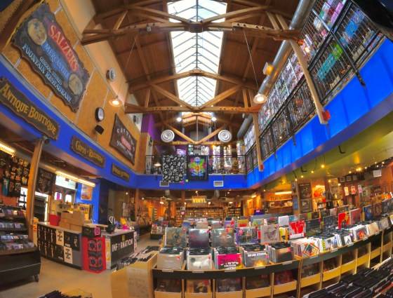
Salzer’s Records, est. 1966, Ventura, CA
One of the most welcome side benefits of the rebirth of records is a surge in dedicated record stores, not the measly music departments niched into Sears or Targets but places designed just to sell vinyl, and lots of it, along with bongs, t-shirts, and other headgear. The Sam Goodys and Licorice Pizzas and Peaches of the world may be long gone, but a new crop of repurposed shop spaces in re-gentrified neighborhoods is springing up in their place, alongside the few hardy survivors from the First Great Golden Age of Wax, such as San Francisco’s amazing Amoeba Records, Minneapolis’ Electric Fetus, and, as seen here Ventura, California’s Salzer’s Records, originally opened in 1966 and still so huge that, even using a fisheye lens, it’s impossible to show its entire two-story interior in a single shot.
Upon entering, you can smell the patchouli oil and incense, returning you either to your hippie roots or your favorite fantasy of what that era might have been like, depending on your age. Most remarkable from a photographic point of view is that the elder LP shops still exude the same energy as when we were all tender little flower children: the idea of music as but one component in a total immersion into creative energy, a tribal coming together of sounds, smells and sensations. Admittedly, it’s hard to capture all that in a camera, but, like blindly pulling out a random album from your library and slapping it on the turntable, you just drop the needle, and see what happens.
Far out, man….
THE VERY PICTURE OF….ANOTHER PICTURE
By MICHAEL PERKINS
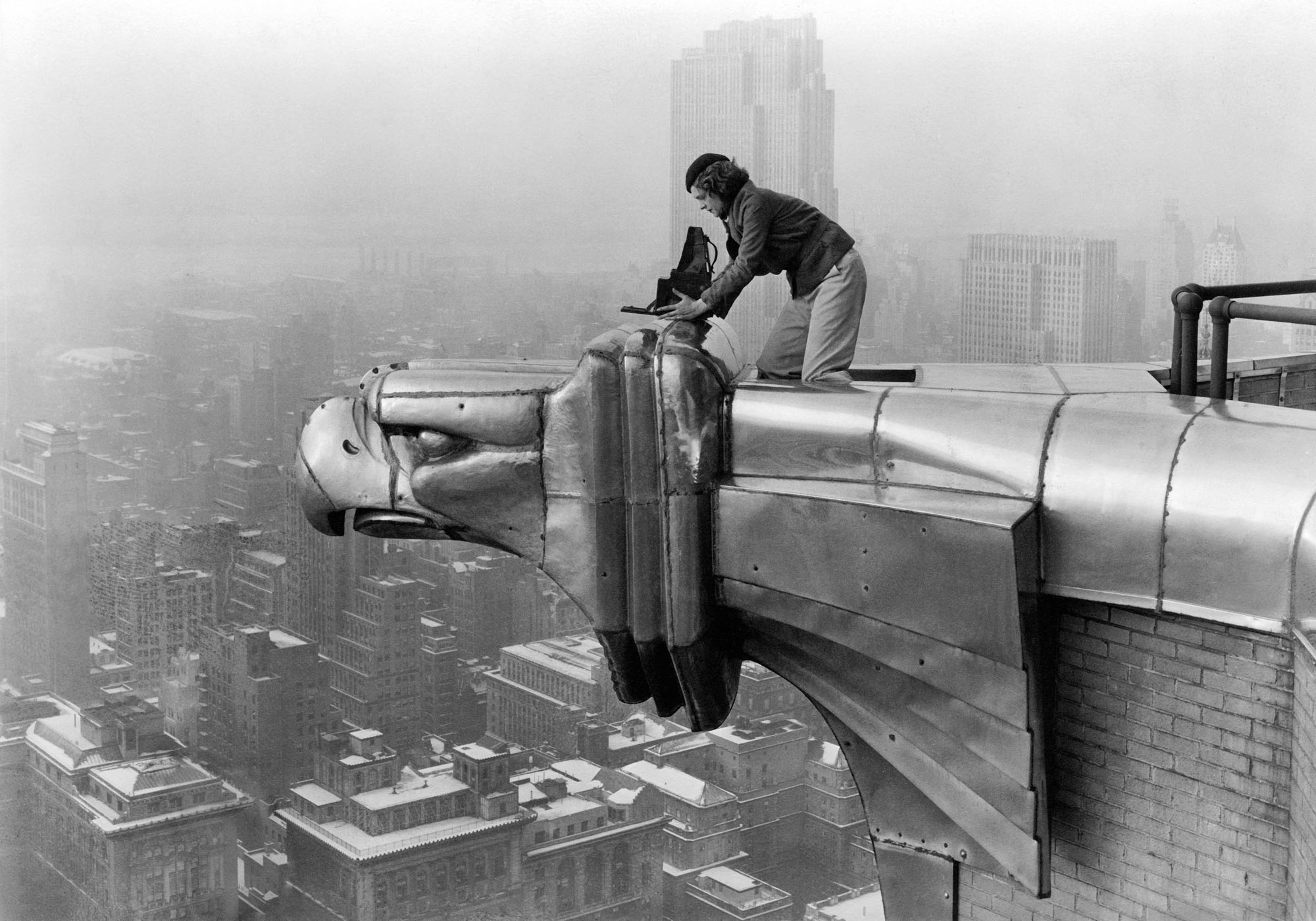
I CAN’T BE THE ONLY PERSON WHO HAS EVER SEEN this classic image of photographer Margaret Bourke-White peering over a stainless-steel projection near the top of the Chrysler Building and asked themself, “so who in heck is taking this picture?”
Oh sure, we know the basics of the story. In 1930, The skyscraper’s owners invited the already-renowned MBW to set up her wooden view camera on one of the structure’s eight gleaming eagle’s heads at the 61st floor, and take in what was then an extremely privileged view of Manhattan. The building, not yet quite completed, would eventually top out at 1,046 feet (77 stories) above the pavement, winning one of the city’s most celebrated “skyscraper wars”, cinching its right to Tallest stature by virtue of the gigantic steel spire that served as its crown. Bourke-White, whose studio was then located in Cleveland, had already considered moving to NYC to be nearer her employers at Fortune magazine, and once she ascended to take in the, er, eagle’s-eye view, she decided that the Chrysler itself should be her new HQ, all the better for her to be the two eagles on the corner where she shot, which she nicknamed “Min” and “Bill” after a popular movie of the time.
But who else made the ascent that day, to take a picture of her.. taking a picture?
Introducing the nearly-forgotten Oscar Graubner, Margaret’s full-time darkroom assistant and amateur snapper, who often traveled with Bourke-White on what was, by the early ’30’s, already a global trajectory, a career which would take her from the opening of hydroelectric dams (the first Life magazine cover ever) to photo-essays in the young Soviet Union to, eventually, every major theatre in the European war and the India-Pakistan schism. Graubner was part of what built MBW’s nickname of “Maggie The Indestructible”, and, by chance, snapped the best image of her at work. Strangely, his picture of her doing her thing from the top of the Chrysler has now been viewed many millions of times more than any pictures she actually made herself from up there. The history of photography may be peopled by giants, but it’s punctuated by those who toil in their immense shadows.
SELF-LEGENDS
By MICHAEL PERKINS
Let me kick my credentials.
Ice-T, Back On The Block
A HUNDRED YEARS AGO, THE WORD WAS “BALLYHOO“, a term for the most salient trait of Americans; self-promotion, the proud and loud announcement that we are here. Ballyhoo has assumed many forms, being at once proclamations about who we are; statements of who we hope to be; agendas for what we want you to think; claims about what we have to sell or bargain with; reminders about how much respect we demand; warnings about our boundaries; rules of engagement, for good or ill.
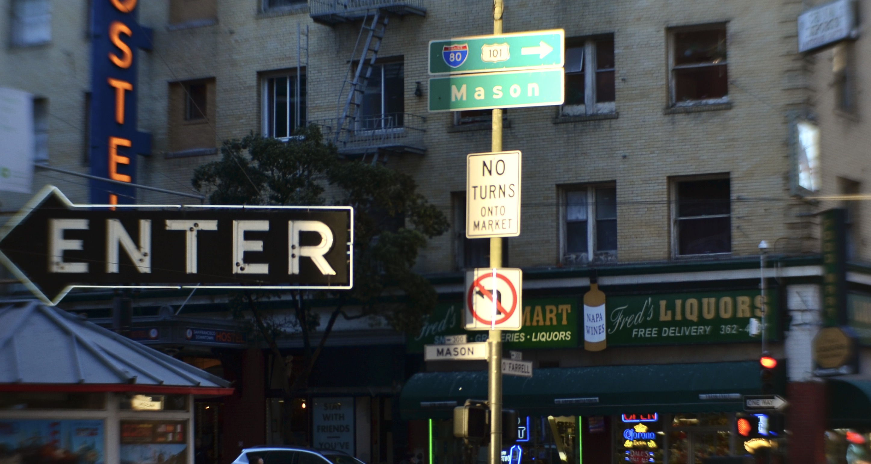
“Self-legending”, and how it makes its way into our every visual communication, is perhaps the most American of American qualities. We didn’t single-handedly invent mass communication or advertising, but we certainly promoted and perfected the fine art of ballyhoo in ways that are still modeled the world over. Photographs of our urban landscape are a blur of our various brags, boasts, promises, and promotions, along with the hard truth that, like it or not, you must deal with us. Americans are almost fatally allergic to being ignored, and so, simply announcing is never as good as shouting through a megaphone, or, in graphic terms, making the colors bolder and the letters bigger. We visually bellow at each other like barkers in a carnival or competing vendors in a street market.
In making their enduring images of life in this country in the twentieth century, masters like Robert Frank and Walker Evans often shot frames that were almost completely composed of signage. Today, those time freezes are a valuable resource for marking what our priorities were in bygone eras; the various announcements of merchandise, company names and prices anchor the pictures in specific dreams of specific times. Nearly one hundred years on, we use different tools to, in Ice-T’s phrase, “kick our credentials”, but the same urgent need to be noticed, to be heeded, goes on, albeit in new guises. I can never photographically take the measure of a city without trying to contrast old and new signage, original inscriptions and names along with the newest refits from a Starbucks or a McDonald’s. Photography is the first art in the history of the world that is equal parts reportage and interpretation, and trying to learn how to see humanity amidst all the ballyhoo will always make for legendary pictures.
WORKING UNDER (AND ON THE ) COVER
By MICHAEL PERKINS
OVER THE PAST TWO CENTURIES, MUCH OF PHOTO MANIPULATION has been akin to a magic trick, in that the creator wants to call attention to the effect rather than the technique. Indeed, photographic fakery is most often the art of not getting caught when distorting or reinventing reality. In the age of Photoshop, it has become tougher to detect where the wires are, even though more of us than ever are indulging in a little polite puppeteering. However, any historic discussion of altered images must include a man who did everything he could to let his audience in on the joke.
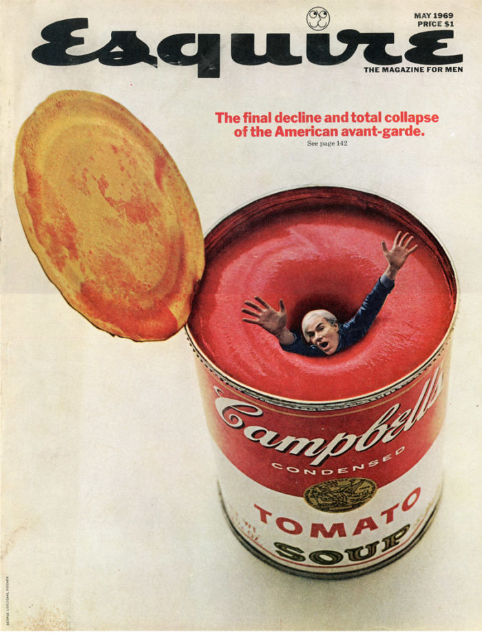
Advertising savant George Lois, who died in 2022 at the age of 92, saw his career peak during photography’s first true ascendancy in both marketing and advocacy. Beginning in the 1950’s, the technology for reliably printing color images coincided with the dominance of national news and art magazines,. The trend made Lois, one of the first of what are now called graphic designers, to become a superstar in his own right, developing an uncanny ability to snare eyeballs and change the cultural conversation, all the while decidedly ringing the cash register for his clients. In his snarky, satirical use of photographs in both ads and mag covers, he created national crazes and hip cocktail conversation by composing patently fake pictures with a wink to the audience that seemed to say, you know I’m doing this. These things never happened. We’re just seeing what it would look like if they had….
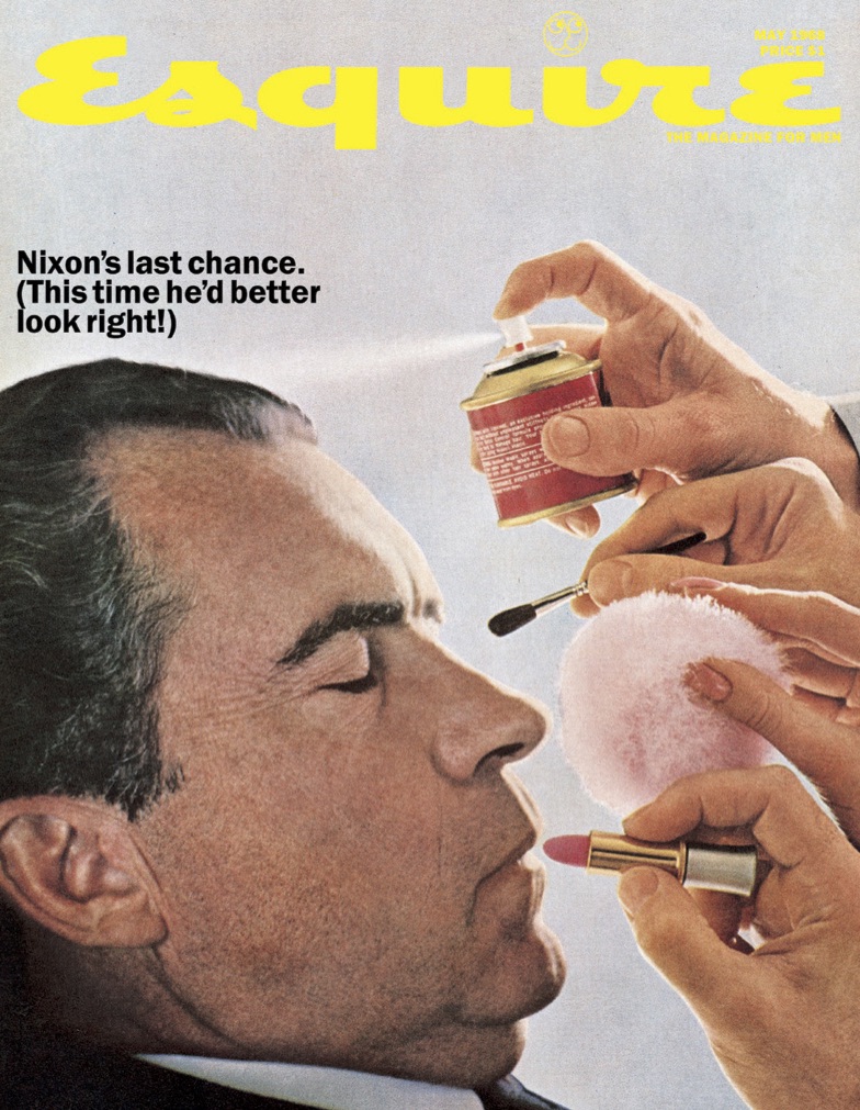
In nearly a hundred covers for Esquire magazine in the 1960’s, George Lois seized upon the hippest and most pivotal figures of the culture and counterculture, from Mohammed Ali to LBJ to McCarthy-era hitman Roy Cohn to Woody Allen, generating imaginative mashups of their actual images with impossible staging for editorial effect. For his Esquire covers, he cranked out fever dreams like Andy Warhol being sucked into a whirlpool inside a Campbell’s soup can (top), and Richard Nixon (whose presidential defeat in 1960 had been partly attributed to his on-camera appearance) sitting in a make-up chair getting ready for his big comeback (above). Lois, the man who had shaped campaigns for everyone from Xerox to Aunt Jemima to USA Today, and who would eventually have the world chanting, “I Want My MTV!”, delivered everything to his customers wrapped in a wry confession: Hey, we’re just selling stuff here. YOU get it, right? Instead of soap powder or toothpaste, Lois’ “product” was the editorial content inside the magazine. It seems insanely obvious now, but then, it was a revelation.
As a man who oversaw everything from concept to completion, Lois hated portrayals of his business like the Scotch-and-cigarette playboy Don Draper and all of his ilk on the Mad Men series, which made ad execs look like the driving force of the agencies instead of those who “worked full, exhausting, joyous days: pitching new business, creating ideas, “comping” them up, storyboarding them, selling them, photographing them, and directing commercials.” Years ahead of the digital revolution that now make fakery easy to conceal, Lois and his cohorts (capitalist hucksters all) showed us that the rabbit was not actually in the hat but tucked inside the table. In some very entertaining ways, he was more honest, in his swindling than many of his successors.
SHOULD AULD ACQUAINTANCE BE FORGOT…
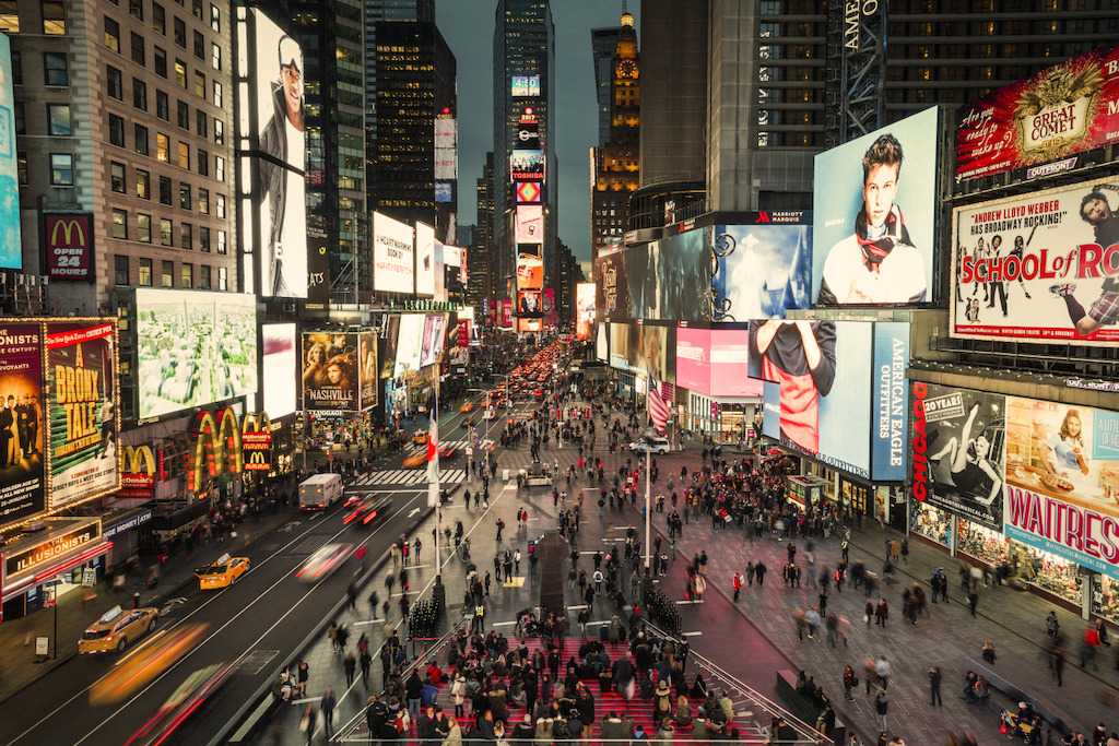
An experimental mix of pedestrian and auto space shows Times Square in transition, 2009.
By MICHAEL PERKINS
AS I WRITE THIS, in about the eleventh hour of the new year 2023, cleaning crews are still restoring Times Square to its regular state of controlled chaos, a steady rhythm of wretched excess that, every December 31st, erupts into an even more intense blizzard of litter and license, a national ritual marking the shift from one year to another. And along with the tons of confetti and collapsed Planet Fitness top hats that will be swept away, the square itself, like an endlessly re-sculpted shoreline, settles back into a shape that is totally the same and yet totally different.
It’s hard to believe that ’23 will only mark the ninth year since the conversion of the world’s most famous address to 100% pedestrian traffic. What began in 2009 as a partial experiment in accident control (following a tsunami of auto mishaps in the neighborhood) proved so popular that, by 2014, a permanent change was effected, making Times Square a total walking district/would-be park, or “public space” as we now call it. During the transition, native New Yawkers griped about the Square’s total surrender to the dreaded onslaught of tourists, and the area’s main architectural feature became five-story, perpetually-blazing billboards for Broadway shows, chain restaurants and soft drinks. Nearly a decade later, the jury’s still out on whether the changes produced a bright, cheery playland or a grotesque Sodom. The answer you get depends on who you ask.
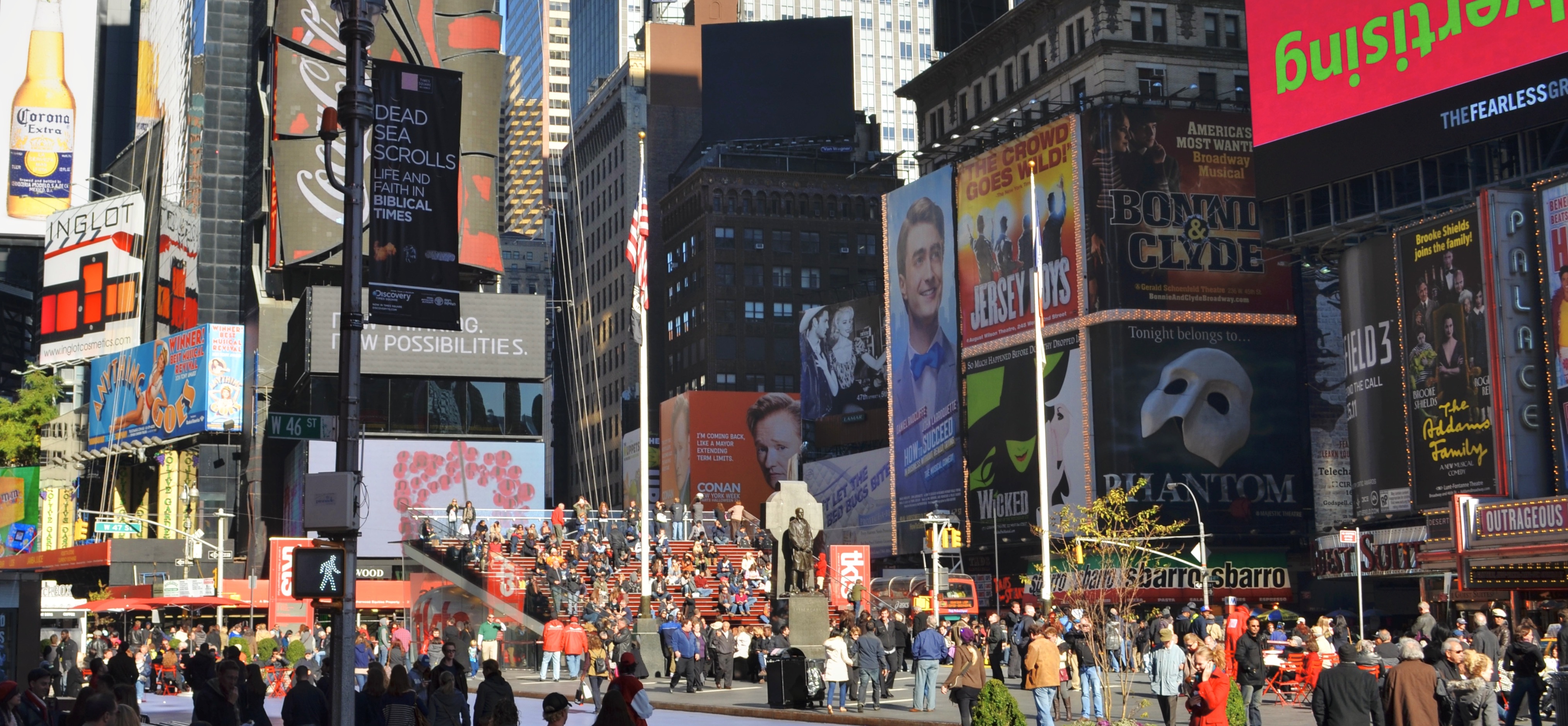
Just two years later, in 2011, the Square has been completely converted to 100% foot traffic. How Times (Square) change(s).
The take-away for photographers is that if, on any given day, you see a version of the Square that you like, preserve it, as I did in the above from a Sunday morning in November of 2011. Like all other images before it, this particular “Times Square” is now a frozen abstraction of a place that is just the same, only different. And it was ever thus: going back nearly a century to when the “new” Times building opened to literal explosions of dynamite to mark the incoming year, the neighborhood has served as a mercurial barometer of America’s quick, impatient transit. Perhaps it was the crossroads effect, the coming together of so many disparate motives, all colliding near the nexus of the popular press, show business, and loud, insistent commerce. Perhaps it is our worhip of the novel, the new. For whatever reason, the Square evolved from day-to-day like the subtle oscillations of a seismograph, taking a measure of the country’s cultural plates and how they scrape and grind against each other in the city’s inexorable tectonic ballet.
We all understand the concept that only change is permanent. After all, even the New York Times only occupied offices at “One Times Square” for eight years. Still, there are few places on Earth where that impermanence is evidenced in such undeniably visual detail. Life in New York at large is all, to a degree, arranged around the dictum of Do It Now. But in Times Square, the frames of film flicker by so very quickly that individual images, no longer distinguishable, rush into a blurry illusion of continuous motion….the ultimate movie. Small wonder that we treasure a few frozen frames as the parade crushes past us.
BACK TO THE BLUE PLATE
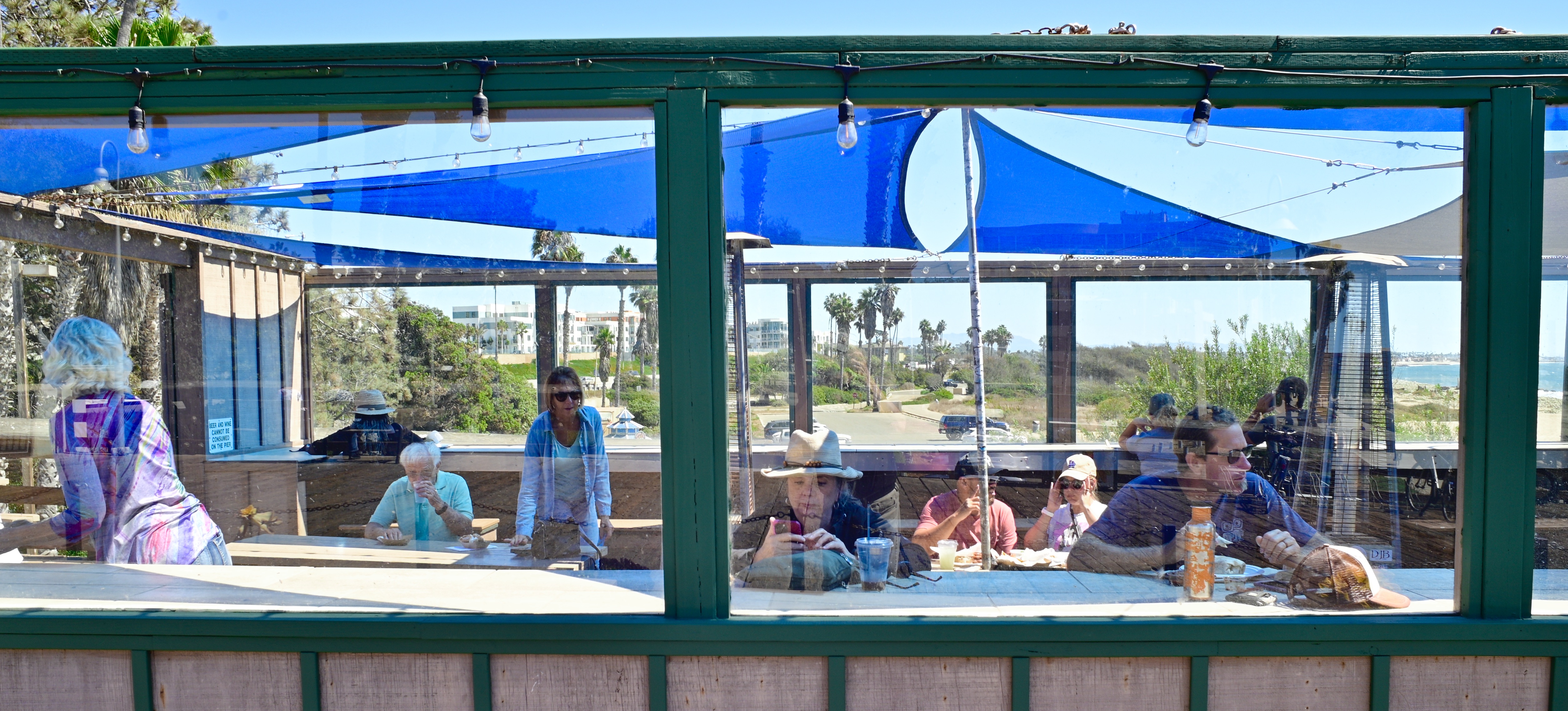
The lunch crowd at Beach House Tacos, Ventura, California, 2022
By MICHAEL PERKINS
THERE IS A KIND OF ROMANCE, CALL IT A CULT OF THE INDIVIDUAL, that informs our love of what can only be called The Great American Joint. We have a special affection for the one-location, one owner store or restaurant that outlasts global competitors. We revel in diners that celebrate “100 years at the same location” or burger stands that offer only one house specialty (no substitutions!) And it is altogether appropriate that Americans, in particular, should hold the Moms-and-Pops of the world dear. After all, we did everything we could to put them out of business.
The multiple-location business model was actually born in the U.K. in the 1700’s but really hit its stride in the States in the1860’s when a local New York tea shop owner opened multiple branches around the city. By 1900, The Great Atlantic & Pacific Tea Company (or the A&P to you) became the first true grocery chain, and from there, the chain movement exploded to include hardware and department stores, hotels, clothiers, drugstores and, most importantly, restaurants. Over a hundred years later, chains offer familiarity and reliability as we move from one golden arch to the next, but they also starve the landscape of variety and, worse for photographers, distinctive visual experiences.
That’s why I doggedly seek out joints when traveling and shooting. The food varies wildly in quality, and that’s just fine: one man’s uncertainty is another man’s adventure, if you like. Beyond that, joints offer the chance to celebrate the different, the odd, the innovative. Chains are all about guaranteed outcomes. With Bob’s Crab Shack or the Keep Portland Weird Cafe you never know what you’ll get, and, for the sake of the pictures, unpredictability is a strength. And, in terms of karmic balance, it’s only fair that the country that tried to un-invent the private business learn, in its maturity, how to nurture what’s left. And if that means occasionally eating at a place where we have only one kind of burger, made daily on the premises, and when we’re out we’re out.….well, then, save me a seat. I’ll be with you as soon as I switch lenses.
IT’S COMPLICATED
By MICHAEL PERKINS
THROUGHOUT HISTORY, MEMORIALS TENDED TO BE FAIRLY STATIC THINGS. A tomb or monument depicting a battle, celebrating a leader, or enshrining a belief was built, and it stood, for as long as time and fortune might allow. After the invention of photography, however, things tended to be not fully finished, especially tributes and honors. We track their context with pictures in real time: over consecutive eras, we document their rise and fall, and that of the societies that produced them.
The equestrian statue of Theodore Roosevelt, parked for 80 years at the entrance to New York’s American Museum of Natural History (which T.R.’s family riches helped establish) has, as of this writing, been removed, transferred to what historians hope will be a better teaching context. His mounted figure, flanked by depictions of both Native and African-American men on foot, had been problematic for the museum, passersby, and, indeed the Roosevelt family itself in recent years, given the 26th President’s troubling mix of views on race, eugenics, and colonialism, and so the removal came as little surprise. Now, however, as a consequence of the move, anyone taking a photograph of the work henceforth will be interpreting it through the “lens” of a completely different societal context.
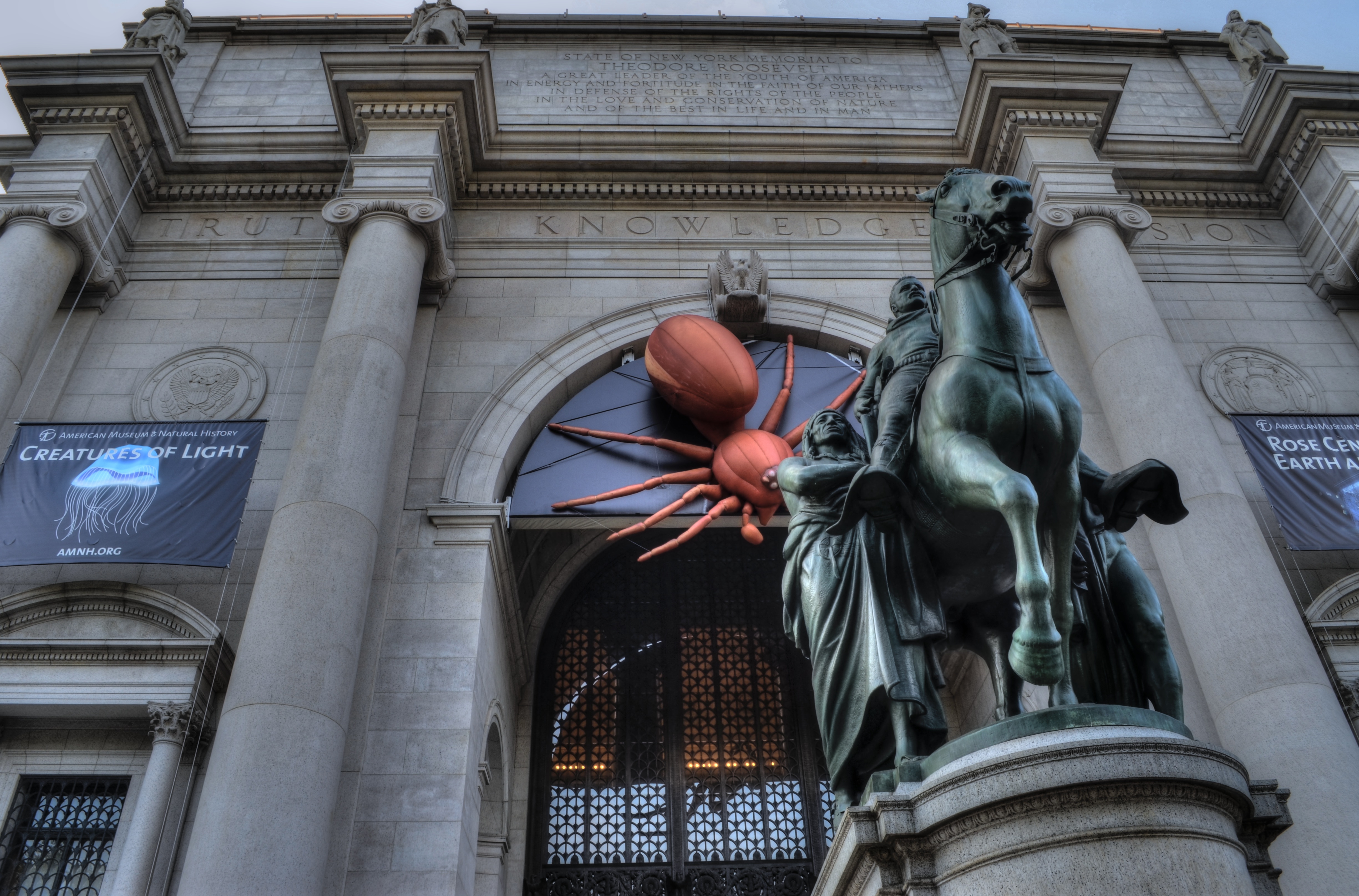
Now you see it, now you won’t: the recently removed Teddy Roosevelt statue, an 80-year fixture at the entrance to the American Museum of Natural History, as seen by the author in 2012.
When people change, the symbols they value, as well as the images they create of those symbols, change as well. Just as it’s odd now to see the Statue of Liberty’s disembodied torch hand in old photographs, the images makes sense once one realizes that the landmark originally came to American in stages, with the arm on display in Manhattan for a time in a push for funding to complete the memorial. Thus that picture, in its original time frame, makes perfect sense. It’s only that more familiar pictures have replaced that view, rendering its original reality strange.
It’s not for this author to try to climb into the mind of the original creators of the T.R. statue in question: it was a product of its time. Similarly, this image I made of it, from its chosen angle to its processing to the unsettling presence of an enormous red spider(!), is now locked away from all other moments on a single day in 2012. “The moving hand writes, and having writ, moves on”. Heroes, from generals to philosophers, are nuanced, complicated. Making pictures of our struggle with that complexity is part of our quest to tell our complete story.
Liberty Liberated
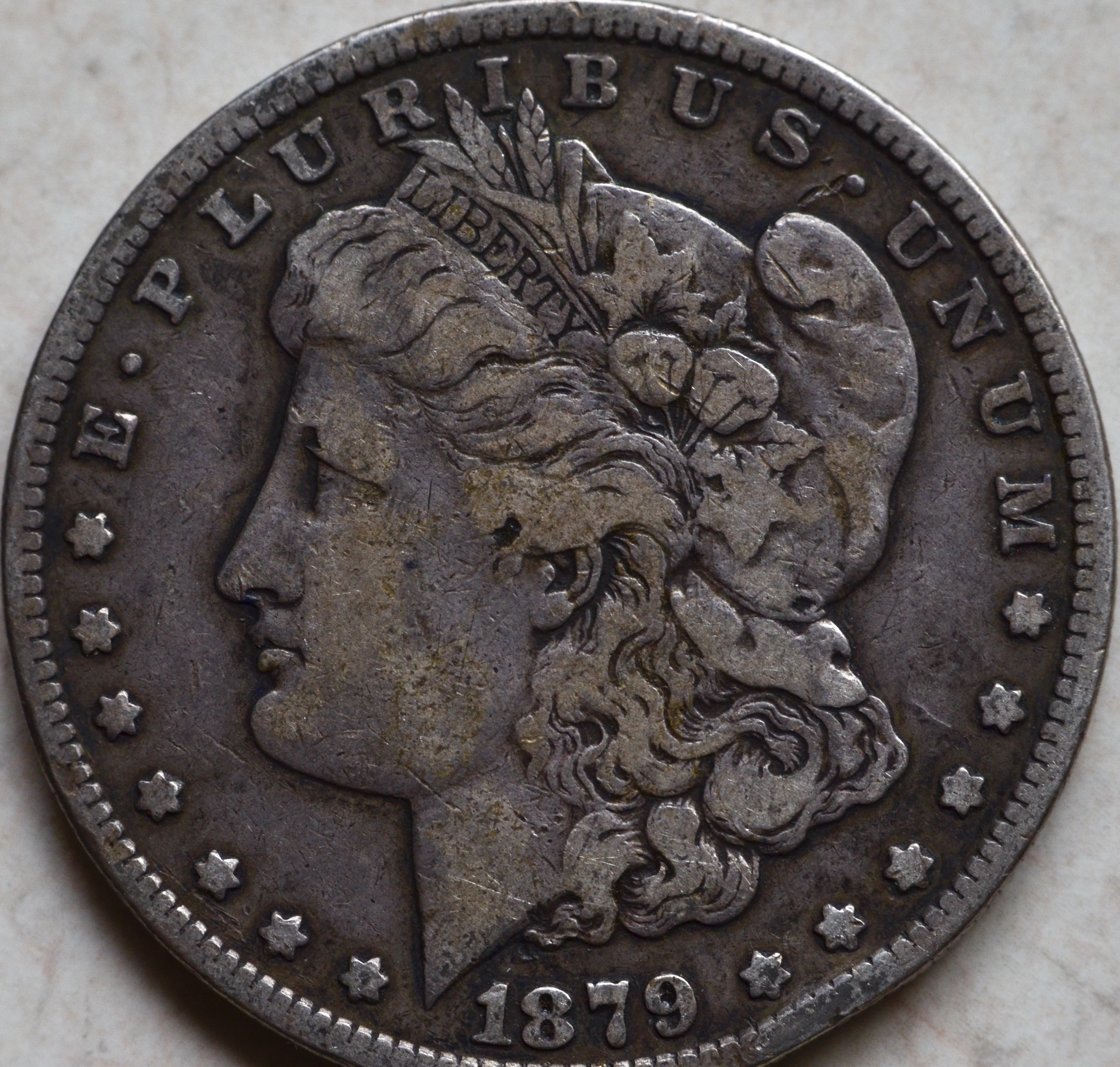
A rather cold, imperious rendition of “Liberty” as seen on this 1879 U.S. silver dollar.
By MICHAEL PERKINS
THE BEST WAY TO APPROACH A PHOTOGRAPHIC SUBJECT PURELY ON YOUR OWN TERMS is for the thing to be severed from its original context, torn free of any associations it once had with the world at large. Once these so-called “found objects” come into our hands, we can make pictures of them as only we see them, not as they were anchored to everyday use. They become, in this way, blank canvasses of sorts.
In recently looking over some old coins ranging from the 1880’s to the 1920’s, I became struck with how self-obliterating their history was. That is, they were all something so commonly used by the public as to be virtually invisible…and then became literally invisible as newer designs vanished them, yanking them from circulation to be replaced by versions more consistent with the fashions and priorities of new eras. One thing that seemed particularly fluid was the depiction of Liberty, each generation’s edition created to conform to our conceptions of the concept they personified.
On the 1887 silver dollar, seen at top, the lady is a rather classic goddess figure, austere, inscrutable, even muscular. She’s shown in a classic two-dimensional profile, very much in the tradition of Greek and Roman antiquity. She’s remote, above it all. In contrast, the rendition that replaced her on the 1921 “peace” design, seen below, is more contoured, and decidedly a woman of the troubled twentieth century. Her neck is slender. Her expression is expectant, even anxious, coming at the end of a decade of horrendous global slaughter. Her “peace” is more of an aspiration than a fact, her femininity borne of a personal, more mortal idea of hope. I wanted to make a picture that captured those qualities.
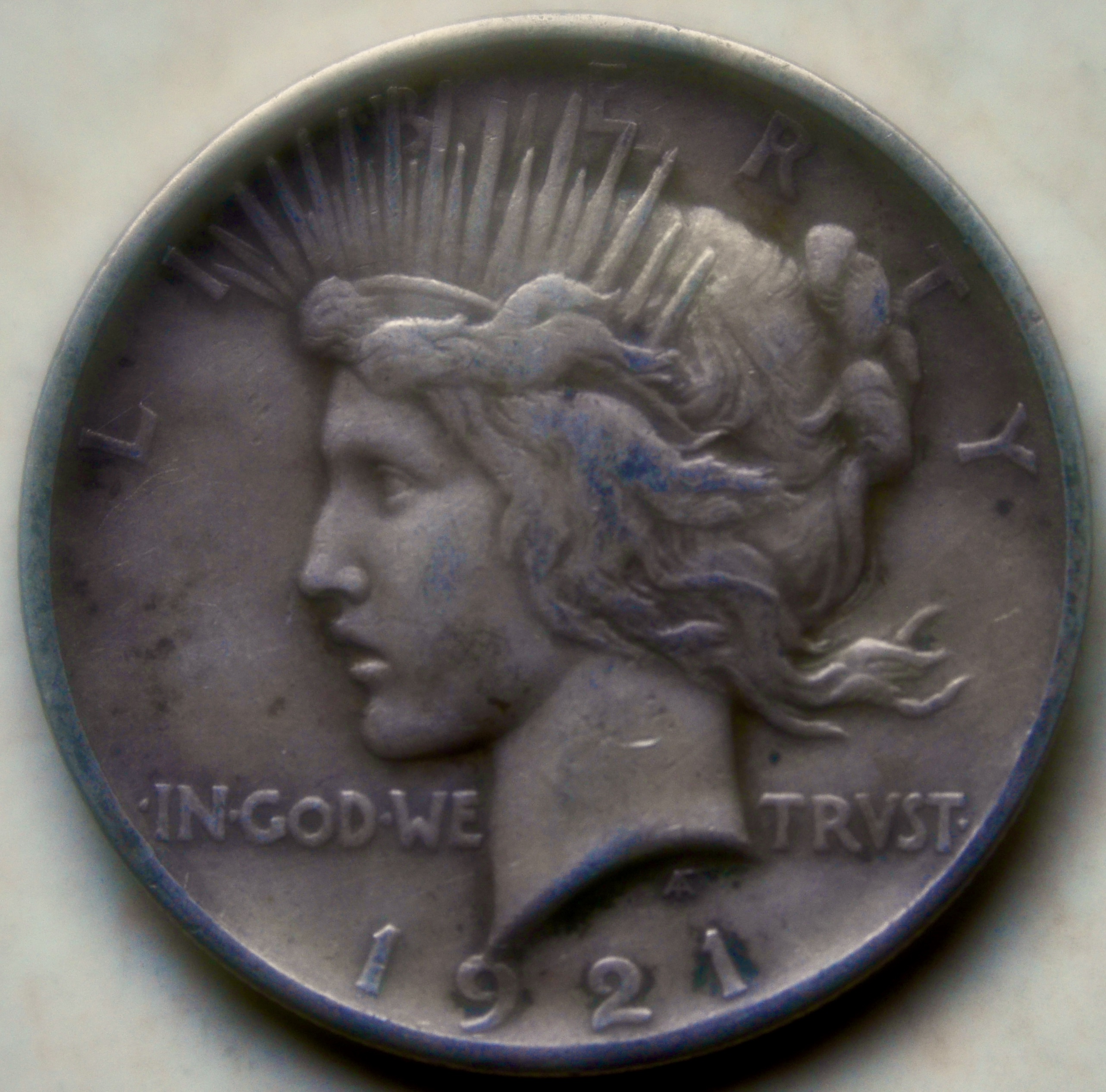
Liberty for a new age: the same ideal as envisioned on the U.S. “peace” dollar coin.
For “my” Liberty, then, the clinically stern crispness of a standard macro shot, i.e., hard evidence of the tough life of a widely circulated coin (scratches, dents, etc., in bold relief) had to, in photographs, gave way to an idealized, softened kind of aspect, or as close as I could come to a kind of dream state. I used a Lensbaby Velvet 56 lens, which is deliberately designed to create the spherical and chromatic aberrations that used to produce glowy, softer focus as an accidental artifact of older, more flawed lenses. In recent years, Canon, Pentax and Mamiya have also made glass that mimic that flaw, especially at wider apertures (this was shot at f/3).
Working to liberate “my Liberty” was creatively easier because the coin she graces has vanished from daily use, and, with it, all the associative ties to the world that it was created for. That allowed me to imagine her for myself, and every photograph I have ever truly cared about began under just such terms.
THE WOVEN THREAD
By MICHAEL PERKINS
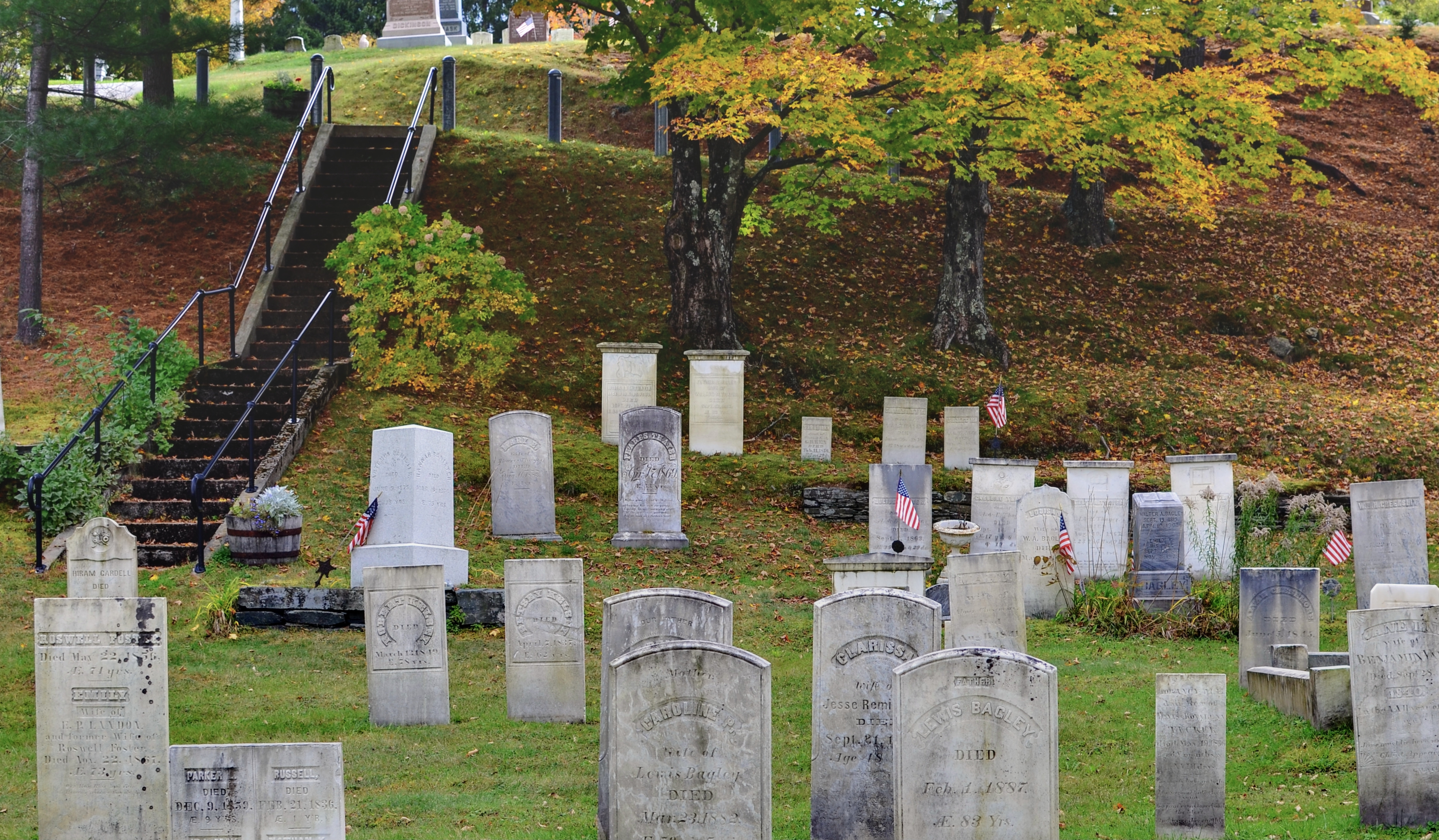
JUST AS WE DRAW A HARD MENTAL LINE BETWEEN LIFE AND DEATH, so do we place a physical boundary between the areas where life proceeds apace and the sites where we mark its cessation. Cemeteries are perhaps the most obvious marker of this line between sun and shadow, defined by iron gates, serene gardens, engraved tributes, contemplation. Out there, the world goes on. In here, remembrance, not substance, defines reality.
Take a camera across the country one small town at a time, however, and you will see how our relationship to the departed has changed…has been, in effect, geographically outsourced. Graveyards, once a component in daily town life, are increasingly out in the country, in a dedicated park, somewhere else. Prior to the 19th century, people were interred close to where they lived, the echoes of their journeys woven like a thread into the pattern of their native villages, just as naturally as a church or a general store. Over the years, however, something changed. Graveyards started to be deliberately designed, becoming some cities’ first de facto public parks, as well as their earliest conservatories or sculpted gardens. They began to be concentrated away from the centers of towns, the dead being less and less a daily visual reminder of the local history or continuity.
Places like this local graveyard in Vermont are gradually vanishing from the American scene. Markers decay and crumble: valuable in-town land is negotiated, litigated, re-purposed. As a consequence, fewer and fewer cities of any size still bear monuments from the 1800’s, along with the historically unique elements of their design and sentiments. When I come across one, I am keenly aware that I am seeing something that is going the way of the dodo, and I stop. Extinctions, either human or institutional, are fascinating things, and walks within these spaces feel a bit less commercial or industrial than in the sites’ present-day “shady acres” equivalents. In such cases, the camera is meant to be a registrar, rather than an intruder. Cameras are certainly for things that are happening right now. But they are also a way to hedge our bet a little against the things which will soon happen no more.
A SUPERIOR DAY
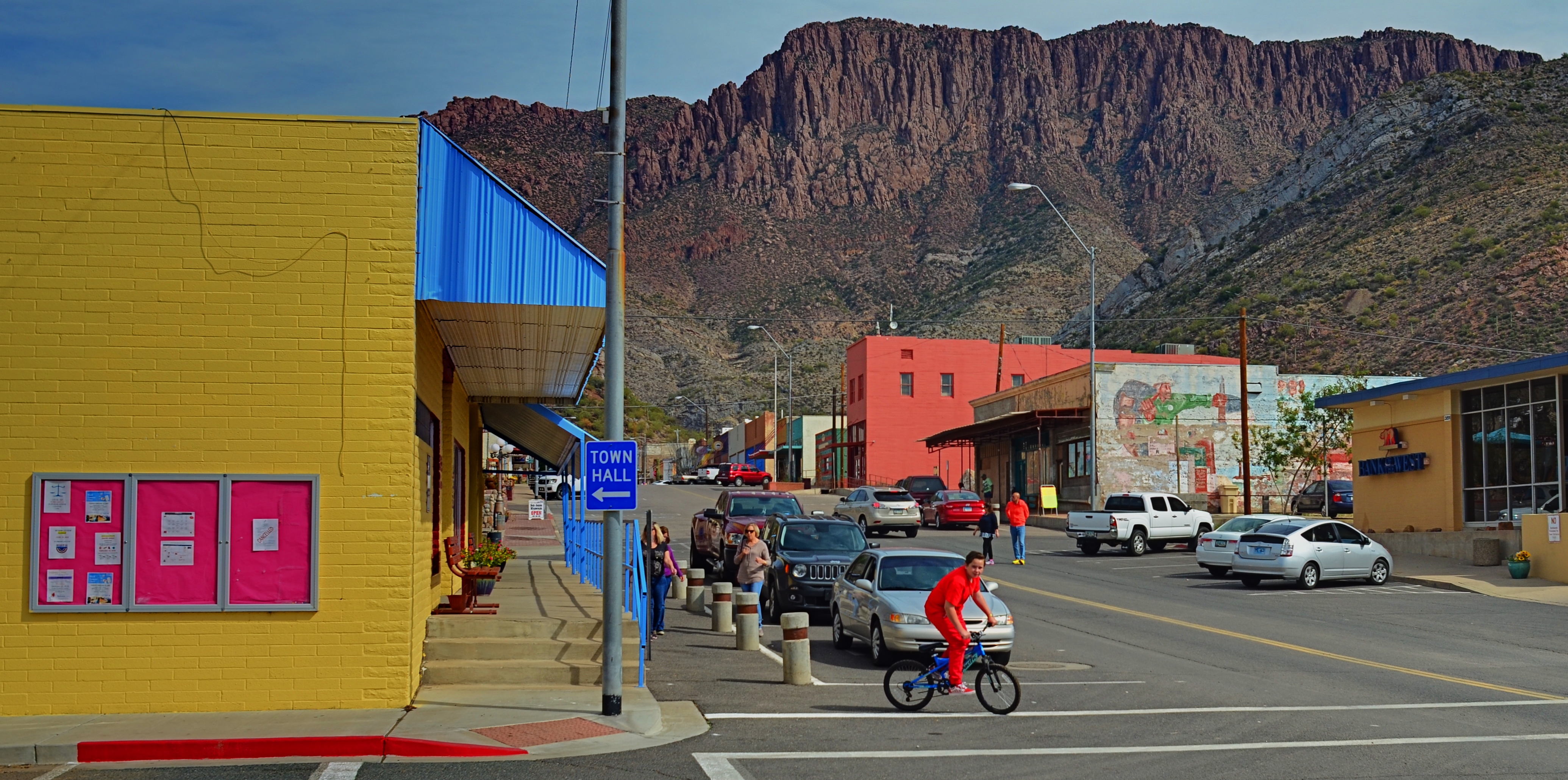
Downtown Superior, Arizona, February, 2018
By MICHAEL PERKINS
LIKE MANY TOWNS in the American southwest, Superior, Arizona sprung up in the nineteenth century primarily to get people close to something promising that Nature had already parked in the local dirt. So long as that something gushed up, flashed in a prospector’s pan or helped light or heat something, the towns flourished….. boomed, as the term goes.
Until they didn’t.
In the case of Superior (2010 census population 2,837), the silver that anchored the locals to the grim crags of the Superstitions mountain range tumbled in value when the metal lost its status as the backing for the American dollar in 1893. Fortunately, Superior had a second act, rebounding with the discovery of copper in the same area where silver had been mined. And then, of course, Hollywood came calling, seeking a visual taste of the Real Old West. Superior rose yet again, standing in for yesteryear in the films How The West Was Won, Blind Justice, and The Gauntlet, among many others. And the beat goes on; as recently as the 1990’s, yet another copper mining company hooked Superior up to yet one more source of life support. And how’s your hometown?
Saturday afternoon in Superior: everyone dance.
Even so, a photographer looking to take Superior’s pulse in the twenty-teens is well advised to look a little deeper than the shopworn storefronts of the main street, heavy with thrift shops and antique stores but also alive with hot pastels and the twang of Saturday afternoon dance music, complete with Stetsons and cold longnecks. The town is rusty and dusty down to its toenails, pressed up against gritty stone peaks, but it is still brave at the corners of its mouth. As a place that is “a fur piece” from Phoenix and a hoot and a holler from Globe, Superior is more mile marker than actual destination, but it is still standing, still smiling for the camera.
And, who knows, things could change.
They always have before….
YESTERGRUBBING
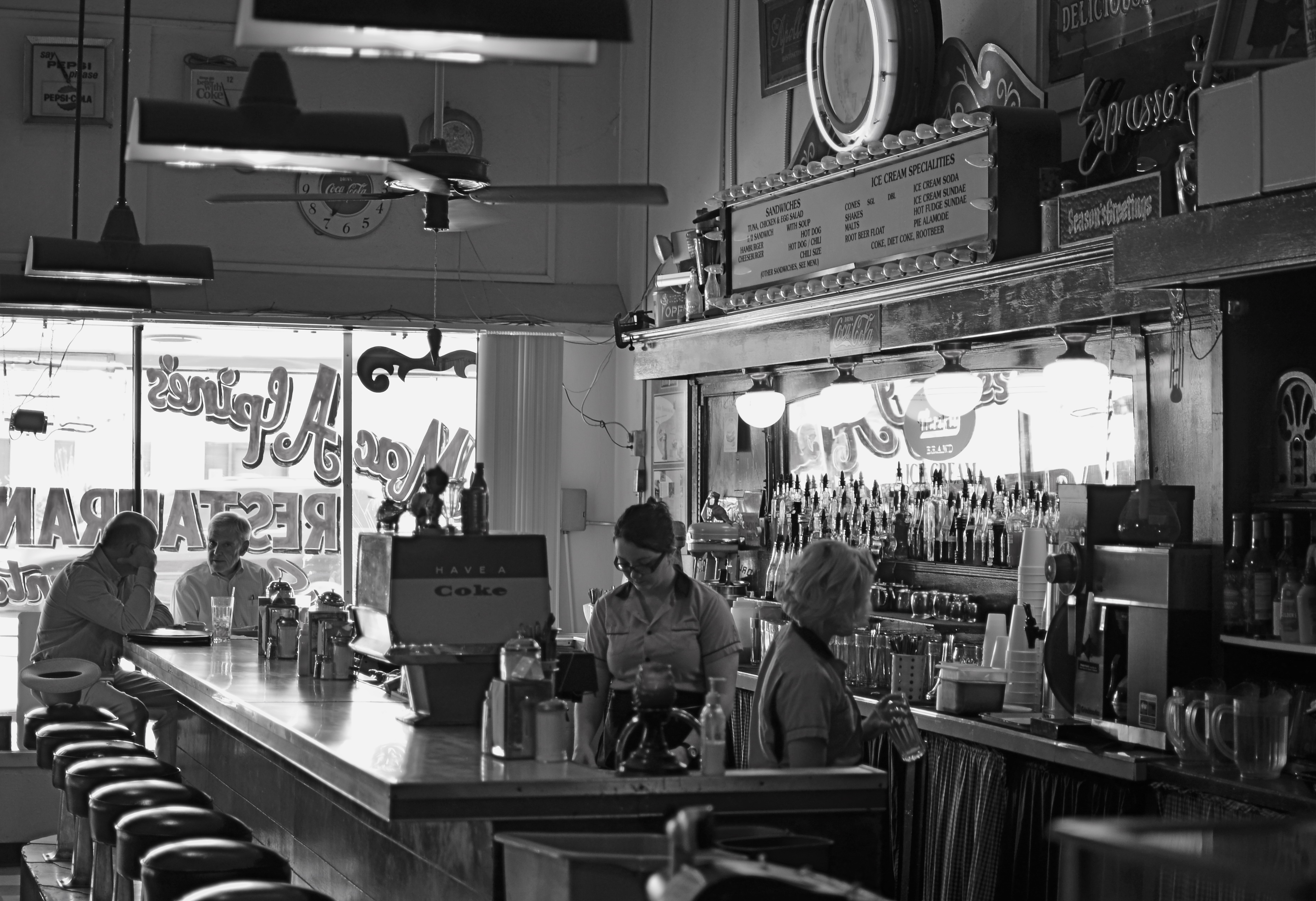
Remember when the heaviest decision of your day was what flavor syrup you wanted in your Coke?
By MICHAEL PERKINS
I ALWAYS SCRATCH MY HEAD WHEN I SEE AN EATERY sporting a sign that boasts “American Cuisine”, and often have to suppress an urge to step inside such joints to ask the proprietor to explain just what that is. If there is one thing about this sprawling broad nation that can’t be conveniently corralled and branded, it’s the act of eating. Riff through a short stack of Instagrams to see the immense variety of foodstuffs that make people say yum. And as for the places where we decide to stoke up….what they look like, how they serve us, how they feel….well, that’s a never-ending task, and joy, for the everyday photographer.
Eating is, of course, more than mere nourishment for the gut; it’s also a repast for the spirit, and, as such, it’s an ongoing human drama, constantly being shuffled and re-shuffled as we mix, mingle, disperse, adjourn and regroup in everything from white linen temples of taste to gutbucket cafes occupying speck of turf on endless highways. It’s odd that there’s been such an explosion of late in the photographing of food per se, when it’s the places where it’s plated up that hold the real stories. It’s all American, and it’s always a new story.
I particularly love to chronicle the diners and dives that are on the verge of winking out of existence, since they possess a very personalized history, especially when compared with the super-chains and cookie-cutter quick stops. I look for restaurants with “specialities of the house”, with furniture that’s so old that nobody on staff can remember when it wasn’t there. Click. I yearn for signage that calls from the dark vault of collective memory. Bring on the Dad’s Root Beer. Click. I relish places where the dominant light comes through grimy windows that give directly out onto the street. Click. I want to see what you can find to eat at the “last chance for food, next 25 mi.” Click. I listen for stories from ladies who still scratch your order down with a stubby pencil and a makeshift pad. Click. Click. Click.
In America, it’s never just “something to eat”. It’s “something to eat” along with all the non-food side dishes mixed in. And, sure, you might find a whiff of such visual adventure in Denny’s #4,658. Hey, it can happen. But some places serve up a smorgasbord of sensory information piping hot and ready to jump into your camera, and that’s the kind of gourmet trip I seek.
