CHOCK-A-BLOCK
Yes, you could find a more frustrating job than making city maps for Boston streets. But you’d have to look hard….
By MICHAEL PERKINS
WHEN WE THINK OF URBAN BLOCKS, IT’S NATURAL TO THINK of those blocks as regular rectangles, well-regulated, even streets that run at direct parallels or hard right angles to each other. And while there certainly are cities with such mathematically uniform grids, some of the most interesting cities in the world don’t conform to this dreamy ideal in any way. And that means opportunities for photographers.
We’ve all seen street scenes in which the left and right sides of the road vanish directly toward the horizons, like staring down the middle of a railroad bed. But for the sake of dramatic urban images, it’s more fun to seek out the twisty mutants of city design; the s-and-z curves, the sudden zigzags, the trapezoids and triangles which signify confusion to cabbies and pedestrians but which mean good times for photogs. Let’s face it; snapping pictures of orderly things gets old fast. The very nature that makes us idealize “rightness” also makes us want to photograph “wrongness.”
That’s why I love to shoot in towns where the city was laid out with all the logic of the Mad Hatter on speed, those streets that seem barely coherent enough to admit the successful conduct of trade. Cities where locals and visitors alike curse the names of the urban planners, if there ever had been planners, if there ever had been a plan. A grand collision of avenues and alleys that looks like a kid whose teeth are crowding together in a greedy orthodontist’s dream fantasy. In such cities, including Manhattan, Pittsburgh, San Francisco, Boston and many others, “order” is a relative term. There are precious few neat streets vanishing back to infinity, politely lined by cooperative structures queueing up parallel to the curb. And that’s my kind of living, breathing… chaos.
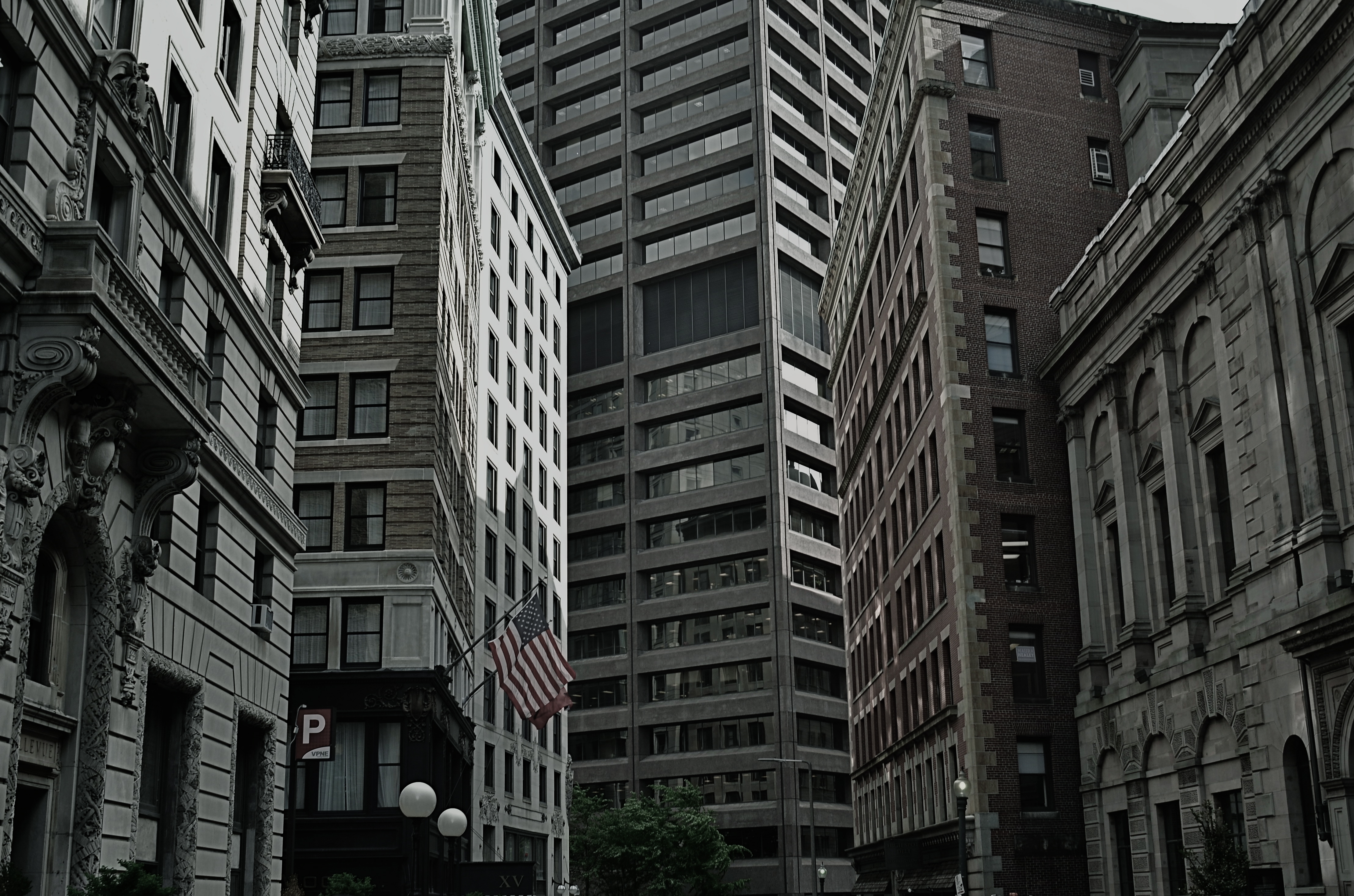
As a mild example, consider the Boston street shown above, on which nearly every building seems slightly askew from every other building, sitting on foundations that jut out at every conceivable angle and plane. It’s a grand, glorious mess, and a much more interesting way to show the contrasting styles that have sprouted in the neighborhood over the centuries. It’s reality that looks like an optical illusion, and I can’t get enough of it.
A straight line may be the shortest distance between two points, but it’s also the least interesting. Go find cities that make no sense, God bless ’em.
ON THE NOSE (AND OFF)
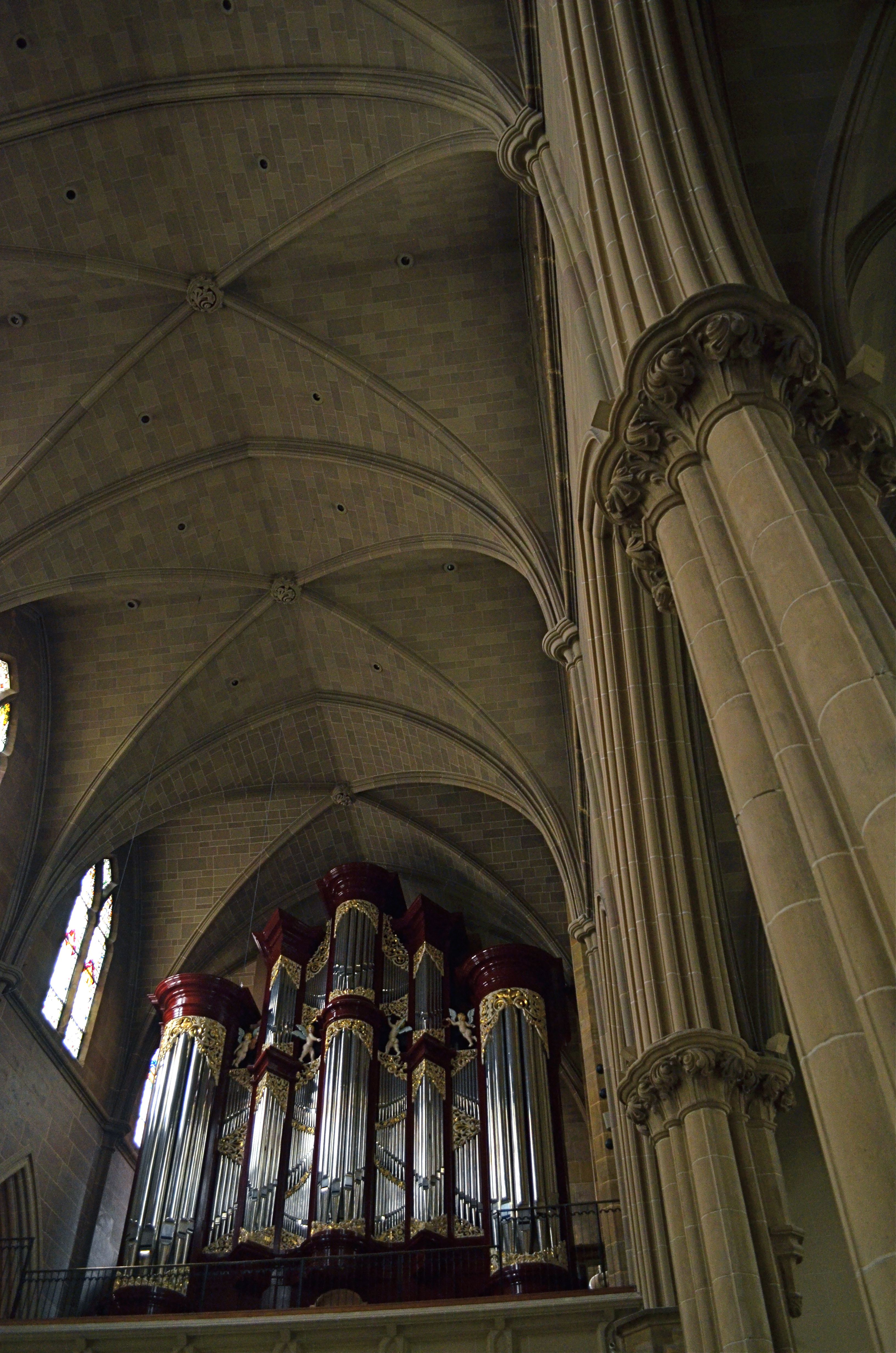
I had originally shot the organ loft at Columbus, Ohio’s St. Joseph Cathedral in a centered, “straight on” composition. I like this variation a little better. 1/40 sec., f/3.5, ISO 1000, 18mm.
By MICHAEL PERKINS
AMONG THE GROUPS INVITING FLICKR USERS TO POST PHOTOGRAPHS OF A CERTAIN THEME OR TYPE, there is a group called, “This Should Be A Postcard”, apparently composed of images that are so iconically average that they resemble mass-produced tourist views of scenic locales. The name of this group puzzles me. I mean, if you called it, “Perfectly Ordinary, Non-Offensive and Safe Pictures of Over-Visited Places”, people would write you off as a troll, but I’d at least give you points for accuracy. It’s hard to understand why any art would aspire to look like something that is almost deliberately artless.
And still, it is perceived as a compliment to one’s work to be told that it “looks just like a postcard”, and, I swear, when I hear that remark about one of my own images, my first reaction is to wipe said image from the face of the earth, since that phrase means that it is (a)average, (b) unambitious), (c) unimaginative, or (d) a mere act of “recording”. Look, here’s the famous place. It looks just like you expect it to, taken from the angle that you’re accustomed to, lit, composed and executed according to a pre-existing conception of what it’s “supposed” to be. How nice.
And how unlike anything photography is supposed to be about.
This conditioning we all have to render the “official” view of well-known subjects can only lead to mediocrity and risk aversion. After all, a postcard is tasteful, perfect, symmetrical, orderly. And eventually, dull. Thankfully, the infusion of millions of new photographers into the mainstream in recent years holds the potential cure for this bent. The young will simply not hold the same things (or ways to view them) in any particular awe, and so they won’t even want to create a postcard, or anyone else’s version of one. They will shudder at the very thought of being “on the nose”.
I rail against the postcard because, over a lifetime, I have so shamelessly aspired to it, and have only been able to let go of the fantasy after becoming disappointed with myself, then unwilling to keep recycling the same approach to subject matter even one more time. For me, it was a way of gradually growing past the really formalized methods I had as a child. And it’s not magic.Even a slight variation in approach to “big” subjects, as in the above image, can stamp at least a part of yourself onto the results, and so, it’s a good thing to get the official shot out of the way early on in a shoot, then try every other approach you can think of. Chances are, your keeper will be in one of the non-traditional approaches.
Postcards say of a location, wish you were here. Photographs, made by you personally, point to your mind and say, “consider being here.”
