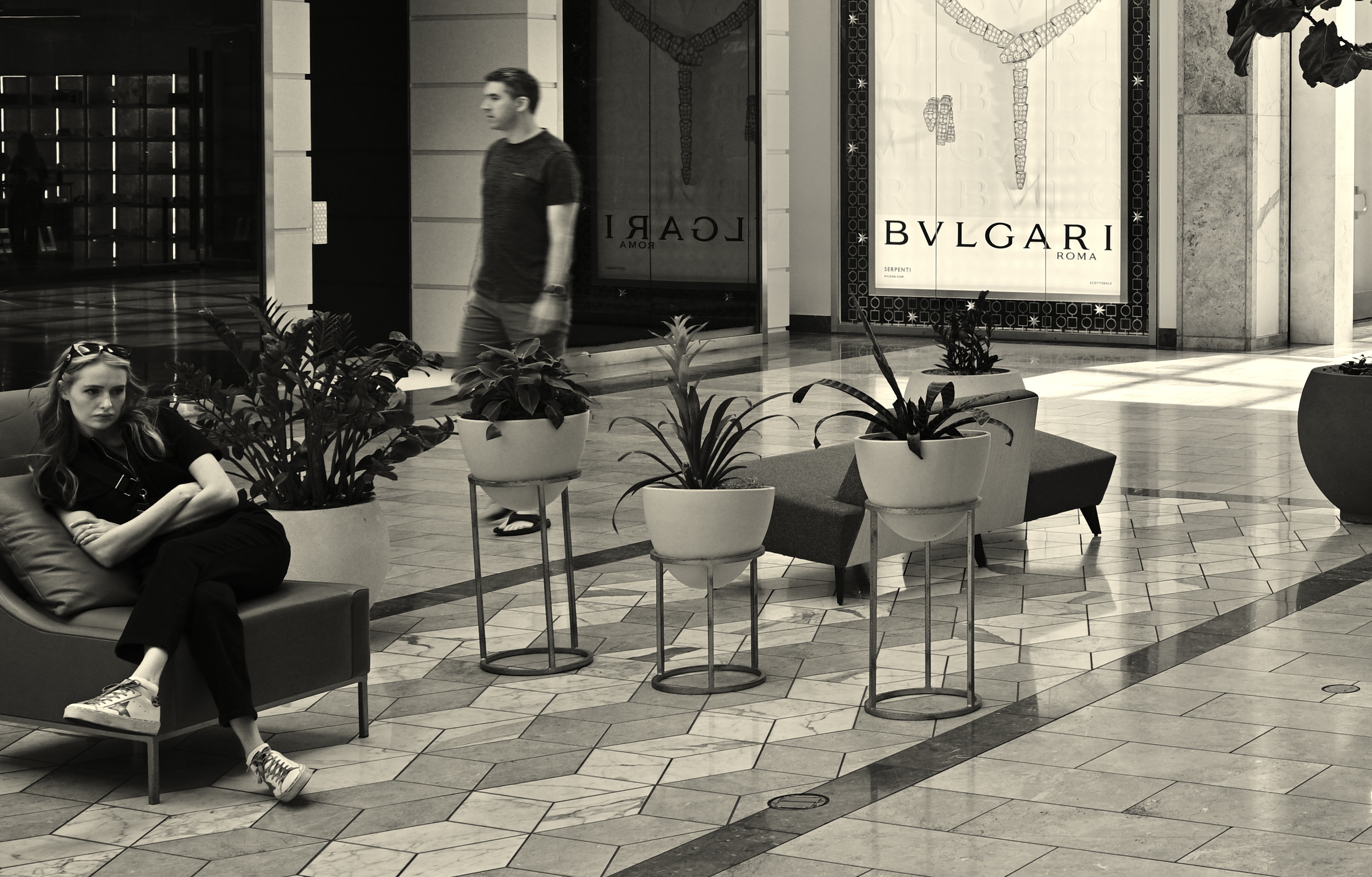
SIDE HUSTLE
By MICHAEL PERKINS
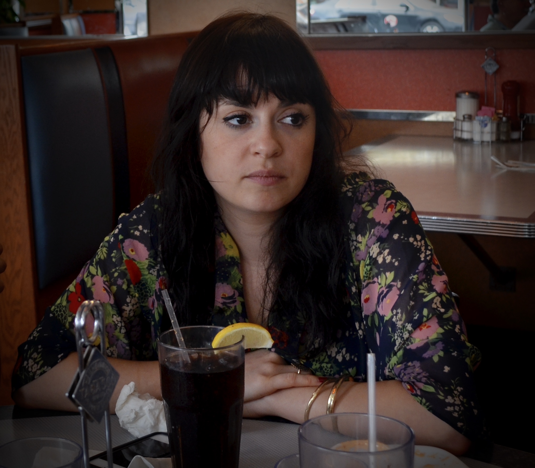
SHOULD I OUT-LIVE MY WIFE (don’t even want to go there, mentally), I have toyed with the idea of changing her epitaph to read, “DON’T TAKE MY PICTURE!”, as it is already miles ahead of any other utterance in terms of her signature phrases. I married a woman whose attitude toward being captured by a camera is on par with every other female in my family. I don’t know if this is down to false modesty (the real message being “PLEASE take my picture”?) or a raging epidemic of insecurity complexes. Bottom line; to catch Marian, I almost always need to catch her unawares.
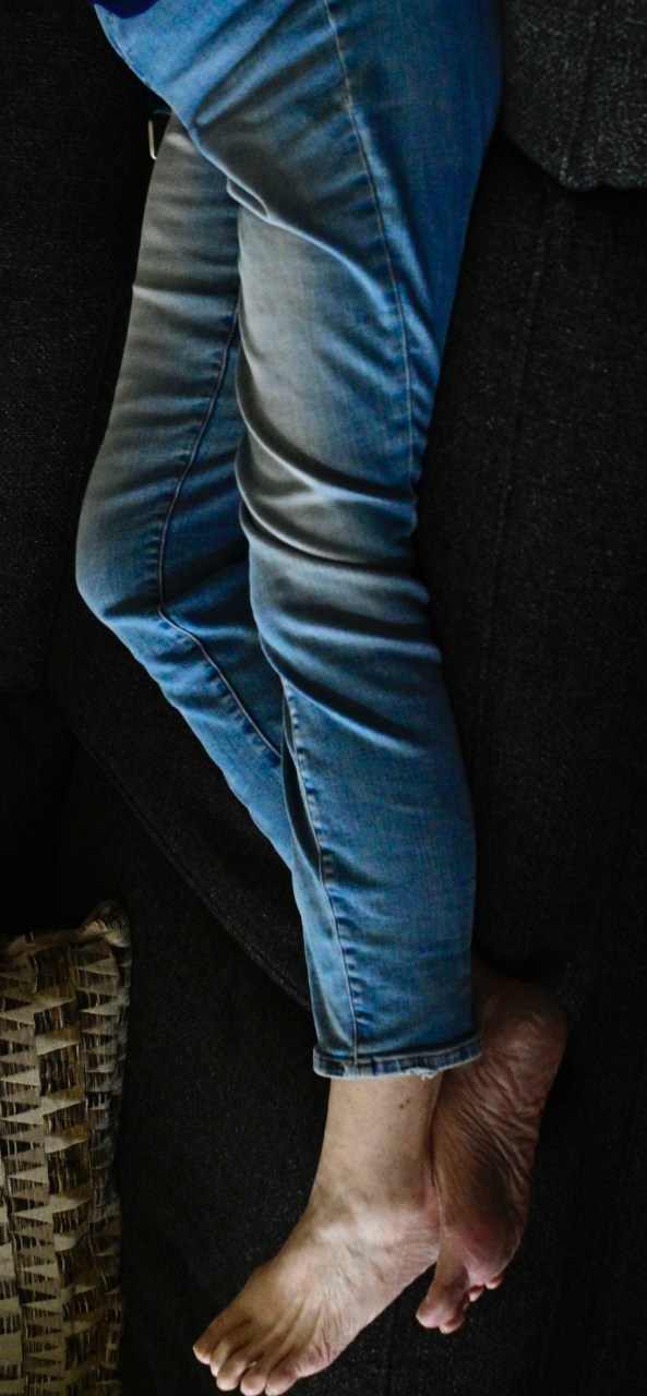
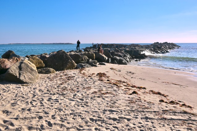
Jacy At The Rexall, 2026
A recent Saturday afternoon catnap seemed just the vehicle. No posing, no prep, no re-takes, just, boom, this is what she looks like, and I’ll hear no backtalk, thank you. I managed several frames, and was content that I would be the only purveyor of the results, as is many times the case. But the angle and sprawl of her long legs (best in the business) on the living room couch seemed to suggest something very different for the fate of the picture.
With her upper torso completely cropped out and the rest of her upended vertically, her legs and bare feet seemed to suggest something far more sensuous. Here was a woman relaxed in her skin, casual about her appeal, confident in her power to disrupt and attract attention. Thus, “Standing Marian”, in my mind’s eye, now recalled the easy allure of the character of Jacy Farrow, the small-town boy-torturer portrayed by Cybill Shepherd in The Last Picture Show. I could see her standing near the local drug store’s romance magazine, sipping on a bottle of Orange Nehi, all while the local lounge lizards hoped she would glance their way. Just once.
Often the initial purpose we envision for a picture turns out to be just a first draft. There seems to be an assertive energy about some images, such that they will themselves into their final form. If we listen well, we often reap surprises, in that the photo makes us look smarter than we really are. Creatively, it gives you a leg up.
Sorry.
OF SECOND THOUGHTS AND POSTSCRIPTS
By MICHAEL PERKINS
I WOULD LOVE TO BE ONE THE FEW MIRACULOUSLY GIFTED PHOTOGRAPHERS who can perfectly and consistently frame and expose an image S.O.O.C. (straight out of the camera). But I am not one of those people. I do my best to come as close to that ideal as possible, pre-planning shots and executing them as near to that vision as I can. I produce a great many usable pictures, first drafts if you will, to which I then apply the absolute minimum of monkeying after the fact. But, nearly always, my best pictures are collabs between what I shot and what I later discovered would best augment those shots. Thus the Holy Grail of S.O.O.C., a near religion for many, raises a lot of issues for me.
It doesn’t take long before the hope that one can shoot a picture that is so complete, so fully realized in its original conception, becomes the primary reason for making or judging a picture. This, to me, equates to a kid coloring perfectly within the lines, obeying all the rules about how to apply the right amount of crayon here or there. A certain sterility can set in, where the main object is merely to be able to boast that what you see is virginal, untouched by even well-intentioned human hands. That, in turn, can lead to mediocrity, or worse for a photographer, inflexibility.
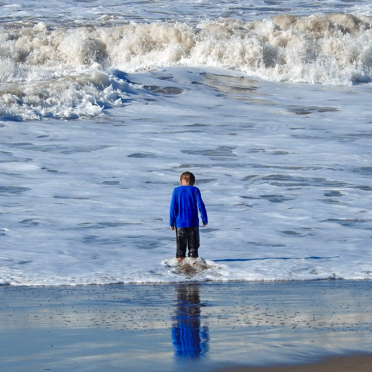
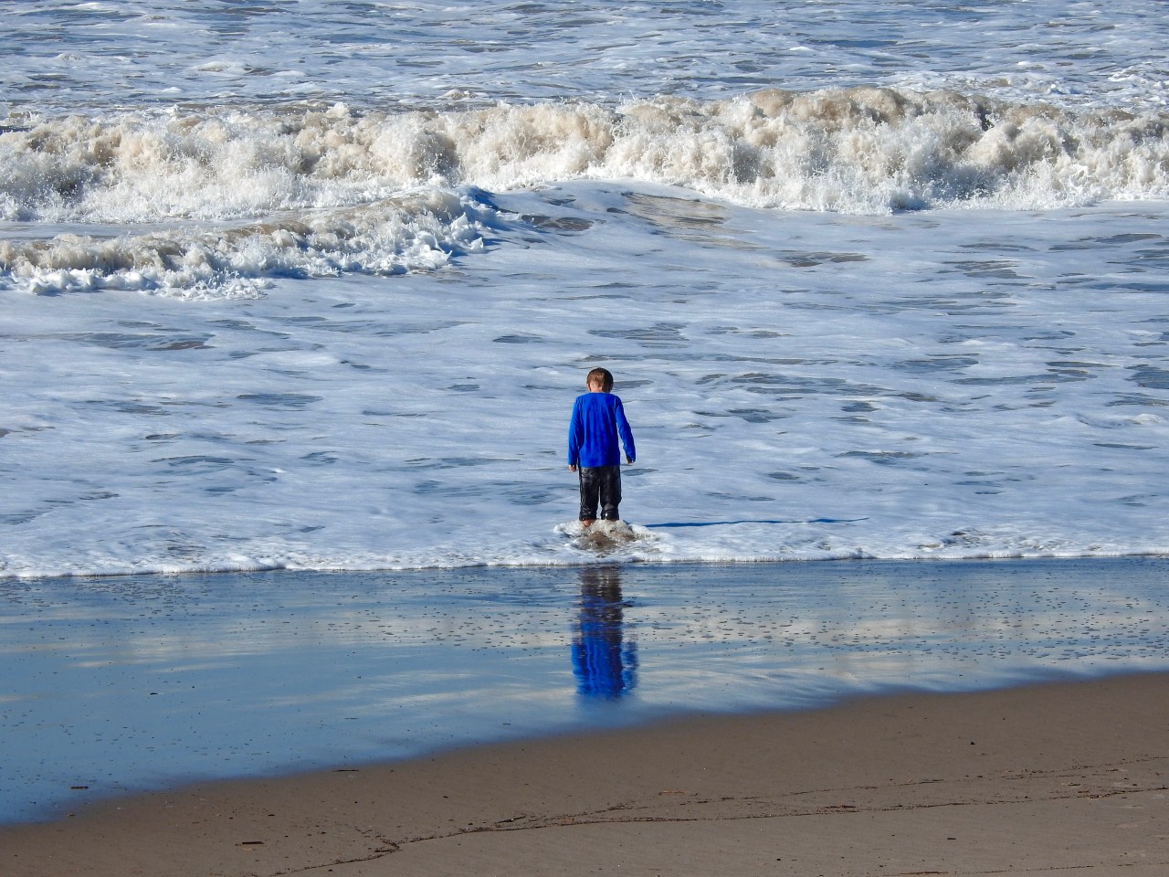
What one person might call a manipulation, i.e., an offense against purity, is, to others, merely the second or third phase of taking a generally usable photo and helping it become great…..in perfecting the composition, in boosting the dramatic power of something that was essentially delivered, but understated, in the original. The S.O.O.C. shot you see up top here is, for a quick snap, very close to what I saw in my mind’s eye. However, the simple crop shown above gives the surging surf above the boy more immediacy, tweaking up the tension between him and the sea. I also committed the additional desecration of amping the ocean’s blueness and the contrast in the boy’s reflection. Did I rescue the picture, or ruin it? And, bear in mind that I’ve described very fundamental interventions, even though all of them are enough to scandalize the S.O.O.C. crowd. Well, tough…..
Photography is a living thing, and hopefully our best results will also seem alive. But just as painters re-do entire sections of a canvas from a sunset to a profile on their way to a final masterpiece, shooters must be free to use a second (or third) pass on an image, rather than relying on the snap of the shutter to reliably deliver miracles on demand. A two-putt is not as spectacular as a hole-in-one, but it still looks pretty damned good on a scorecard.
OUT OF ONE, MANY

By MICHAEL PERKINS
SOME PHOTOGRAPHIC SUBJECTS ARE SO DENSE that they simply give the eye too much to decode or prioritize. When in the act of shooting immense or complicated compositions, I often fail to see that I am taking in enough information for two or more completely different images, and that wielding the scissors this way or that can drastically re-direct the intention of the picture. This is perhaps why shooting vast landscapes only works occasionally for me as wholes. I see the mountains and the neighboring farmlands and the barns and the babbling brook and am never certain if, in a single frame, I’m actually creating more confusion than clarity.
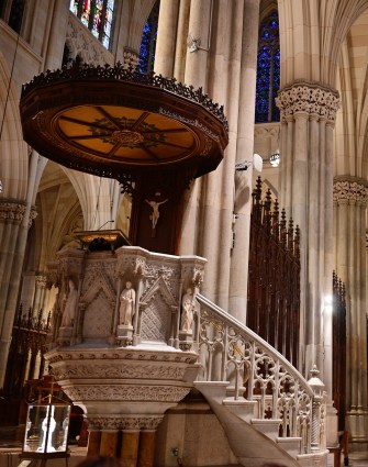
One recent example of my not being aware of this, at least not in the moment, happened last year as I stepped inside St. Patrick’s cathedral in midtown Manhattan. This massive space was devised in a time when going to church was a sensory experience that was designed to be overwhelming, to inspire awe, where even the cheap seats afforded complex, competing vistas. In taking a rapid series of snaps, however, I came away with a feeling of sensory overload, with many images containing more than enough information to be cropped by half, or even two thirds.

The original frame, seen up top, sends my eye looking into so many sub-stories at once that a general view is, well, too much of a good thing. A left-handed crop (middle image) make the picture about something, as attention is now centered on the beautifully ornate pulpit. Cropping to the right, we see a story that could be about worshippers on a journey; that is, heading from front to back in search of something, perhaps the devotional altar in the distance. All cropping is, of course, a creative act all its own, with its own dictates and designs, and sometimes a very busy image can be stunning (think a complex overhead skylight of concentric stained glass panels). However, many of the big canvasses we shoot could be, if you will, subdivided into even more effective individual parts rather than one stunning whole. Reviewing our old so-called “very good” pictures can often find a “wow” picture hiding within.
SNEAKING WITHOUT SPOOKING
By MICHAEL PERKINS
No zoom on hand, and yet I see a potential story happening at the center of a very wide frame. Take the shot anyway? Abso-photo-lutely.
THERE IS A DELICATE BALANCE TO STREET PHOTOGRAPHY, which is really spywork of a kind. Just as wildlife shooters tread carefully so as not to flush birds to flight or startle feeding fawns, street snappers must capture life “in the act” without inserting themselves into the scene or story. Quite simply, when it comes to capturing the real eddies and currents of everyday life, the most invisible we are, the better.
Part of the entire stealth trick is about making sure that we don’t interrupt the natural flow of activity in our subjects. If they sense our presence, their body language and behavior goes off in frequently unwanted directions. Undercover shooting being the aim, then, it’s worth mentioning that such work has been made immeasurably easier with cel phones, simply because they are so omnipresent that, ironically, they cease to be noticed. That, or perhaps the subjects regard them as less than “a real camera” or their user as less than threatening somehow. Who knows? The thing is, a certain kind of visible “gear presence” is bad for business. That said, telephotos can become attractive simply because, shooting from longer distances, they are easier to conceal. But is that the One Best Answer?

Same story, severely cropped, but with more than enough sharp detail to deliver the central idea.
To carry as little gear as possible as well as keep things simple, I mostly do “street” shots with a fixed wide-angle prime lens, meaning that I simply won’t have a telephoto as an option, nixing my ability to hang back from a great distance undetected. And yet I seldom feel handicapped in staying fairly far from my subject and just shooting a huge frame of what could be largely dispensable/ croppable information once I locate the narrative of the shot within it. In fact, shooting wide gives me the option to experiment later with a variety of crop-generated compositions, while shooting at smaller apertures like f/16 on a full-size sensor means that I will still have tons of resolution even if half of the shot gets pared away later.
Another consideration: besides being bulkier/easier to spot, telephotos have other downsides, such as loss of light with each succeeding f-stop of zoom, or having problems locking focus when fully extended. Your mileage may vary. The top shot here was taken with a 28mm prime. about a hundred feet away from the water’s edge, but the cropped version below still has plenty of clean, clear information in it, and it was shot at half the equipment weight and twice the operational ease. These things are all extraordinarily subjective, but on those occasions when I come out with a simpler, smaller lens, I don’t often feel as if I’ll be missing anything. For me, the first commandment of photography is “always be shooting”, or, more specifically, “always take the shot.”, which means that the best camera (or lens) is still the one you have with you.
MEANWHILE, OVER IN THE SAME PICTURE
Wide-angles give you the opportunity to tell big stories….
By MICHAEL PERKINS
FOR ME, THE PHRASE F.O.M.O. (Fear Of Missing Out) is a prescription for a wide focal length. In capturing a scene, I’d much rather choose a field of vision that includes too much information as too little.

Compact tales…
This ragtag little news sheet began nearly a dozen years ago when my go-to lens was more typically a 50mm prime, so much so that its ability to render objects like the “normal” function of the human eye inspired the blog’s name, The Normal Eye, along with a similarly titled photo collection. The belief was that the “nifty fifty” was the ideal street lens, and, given my preference for that kind of work at the time, it seemed like the signature glass for me. And so it was, for a while. However, increased work in the narrow streets of lower Manhattan and various densely crowded bazaars since then have given me fresh respect for fairly wide lenses, with a mid-1970’s-vintage Nikon 24mm f/2.8 as my present default, or as close to a “desert island” optic as I’m likely to get.

…and even micro-narratives.
In shooting really wide, I often start with a master shot, delivering a general, large story, and discover, upon later review, that there are actually several different stories lurking within that massive trove of information. In the topmost shot here, for example, I fell in love with a classic house and its surrounding grounds, and so wanted nearly all of that narrative in a single frame. And yet, because I had all that data from which to select, I also could see the wisdom in cropping to a higher front-of-house shot that excluded the woodsy atmosphere (the middle shot here) as well as much tighter emphasis on the guest room / office / enclosed porch on the side (the third image). The 24 had given me a master shot that was sharp and color-true from corner to corner, so that, not only was there lots of “stuff” in the frame, none of it was exaggerated in aspect or angle, but rather as “normal” looking as anything shot with a 35, 50 or 85. The wide-angle, in essence, had given me what the editor in me appreciated most: choices.
In reviewing this two-year-old shot this week, I was reminded that reaching an enhanced comfort level with a given tool in your kit is every bit as important as owning every lens in the catalog. We all learn to shoot with whatever we have on hand, but shooting with what you love, with what makes your work that much more reflexive or instinctual….well, it doesn’t get much better than that.
WITHIN THE WITHIN
Wide lenses can capture a lot of data. Sometimes too much.
By MICHAEL PERKINS
A FULL YEAR AFTER SWITCHING FROM CROP SENSORS TO FULL-FRAME SENSORS, I am still getting my bearings on some elements of composition, at least as I had grown used to them. To greatly over-simplify, the focal length of my lenses has, for more than ten years, been magnified by about 1.5x, so that, for example, a 35mm lens would “read” on a crop sensor as a 50mm. That determined what I’d would or wouldn’t see in the frame, with the biggest cramping occurring in wide-angle shots, where I live about half of the time.
The result was that my mid-70’s 24mm, a real- go-to for me, was actually delivering the aspect of a 35mm; still wide, but not really panoramic. This was no big deal, since I got used to composing and cropping for what my camera was seeing and shot accordingly, as we all do. The real difference is being felt now, when my 28mm on a full-frame is really 28mm, meaning that a whole lot more…..stuff is being included in my wide shots than before, stuff that I must police much more stringently than I might have done in the past.
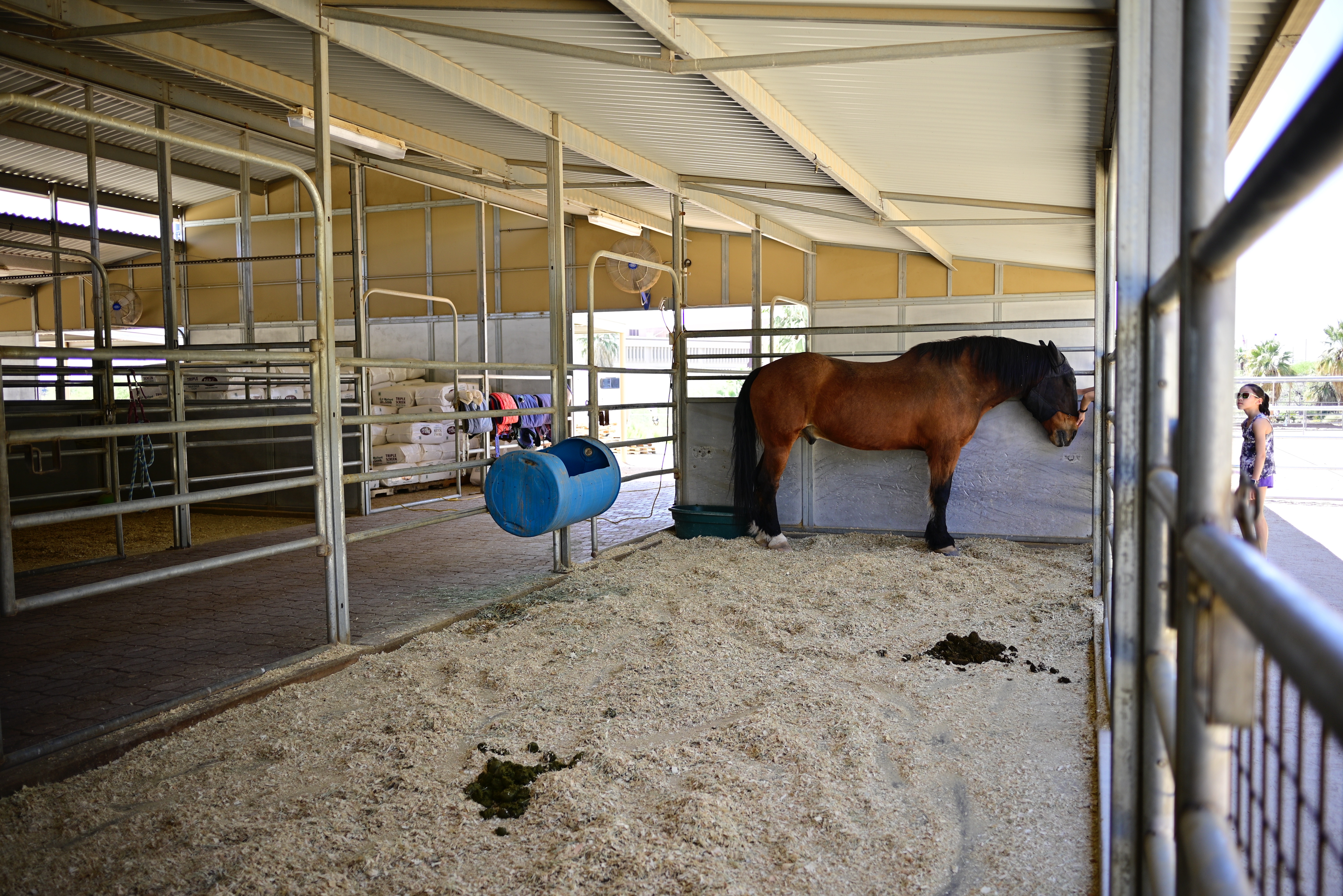
Take a look at the shot up top, taken inside a stable, empty except for a single horse. There is so much space within the frame, all chock-full of equipment, gravel (so much gravel) and other atmospheric elements that the purpose of the shot, right out of the camera, can easily be interpreted to be, aww…the poor horse is all alone in this huge building, as if that’s the “message” of the picture. Now, from my vantage point, I could not have framed any tighter; my location was dictated by barriers that held me back at quite a distance. And, since I’m shooting with a prime lens, I can’t zoom, so all compositional control defaults to how I will crop later.
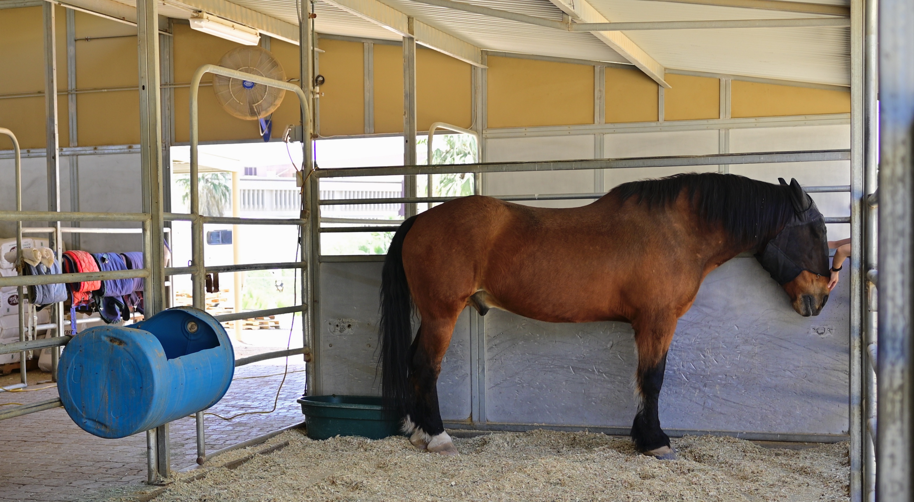
The horse, not where he lives, is the real story.
Turns out that it takes very little extra space around the horse to sell the idea that he’s “all alone”, so I can easily cut stalls, hay bales, and other filler off on both sides and still easily convey his “solitude”. But here’s the deal; once I started cropping, I began to observe a different story emerging in the picture, since now I was actually seeing the small arm that’s coming in from the right to pet the horse. Now the image is about He’s Not Alone, that, in fact, someone cares about him enough to stop and offer a bit of tenderness.
Wide-angle shots can sometimes keep us from getting into our pictures, and, if we change the way that we see what we shoot, such as the revision of “what is a frame” that I’ve been dealing with recently, our viewpoint can be modified in subtle ways. Shooting wide is a great tool, but only if we reserve the option, upon further thought, to think narrow as well.
THE DEVIL’S IN…
BY MICHAEL PERKINS
HOW LITTLE IS TOO MUCH?
By MICHAEL PERKINS
ROGER PRICE, THE CO-CREATOR OF MAD LIBS, the most popular party game on earth, was, ahead of all those famously incomplete one-page narratives, the best-selling cartoonist behind a slim volume entitled Droodles, a series of simple scribbles whose economy of line was the “set-up” of a joke, the punch line being supplied by the accompanying comic captions. The fun was in trying to decide what the picture was “about” before Price supplied the answer. One of his best is seen above, named Ship Arriving Too Late To Save A Drowning Witch. You get the idea.
Price inadvertently (or was it advertently?) demonstrated a skill essential for truly communicative photography, a talent I call Knowing What To Throw Out. It’s been my experience that, absent a few geniuses, most of us shoot too much. Not in the number of exposures we click off, but in the overload of visual information that we allow to remain in the final product. Recomposing and amplifying such shots with the most fundamental of tools, mere cropping, is an exercise in learning the answer to a nagging and constant question; in a picture, how little is too much?
In my case, one of the most revelatory exercises in reviewing old photo files is discovering that many frames I had initially written off as “failed” actually contained smaller sections within the overall image that would be perfectly strong if a major portion of the original were to hit the cutting room floor. Sometimes, of course, this method only reveals that, sharp, ruthless knife or no, there’s really no strong story in the picture at all, no matter how you slice it or pare it down. So it goes.
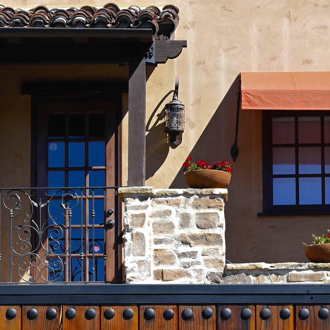
In the master shot of this multi-textured house, several strong structural elements have potential. The stucco, tile, wrought iron, masonry, fabric, wood, and glass all collide in a building that, overall, has a certain visual appeal. But, in cropping, we find that the closest intersection of all of these elements is where the compositional set point actually occurs. All the shot’s other visual information serves as nothing more than a distraction, since we really don’t need the entire structure to convey the idea of “house”. The various textures work best when they actively compete for attention, and a tight crop shows every flavor of a charming edifice with no fat and no fillers. As in Price’s cartoon, we don’t need to show the entire ocean around the rescue ship, or convey all of the back two-thirds of the vessel. Nor do we need to show the entire drowning witch; the hat is enough.
“Doing more with less” is such a hackneyed phrase that you can get shame arthritis in your fingers just typing it on the page. But pore over some of your own “almost” images sometime and see what happens. You may find that, imbedded within some of your most maddening misses, there lies a hit or two.
ABOUT FACE
By MICHAEL PERKINS
MANY PHOTOGRAPHS BEGIN AS ONE THING AND FINISH AS QUITE ANOTHER, there being many micro-phases, each mere parts of seconds in length, between conception and execution. We can be absolutely certain what we think we want at the start of the process, and just as certain, by the end of it, that we were wise to abandon our original plan.
The best test of whether we finally “got it right”, to my mind, is that the final image seems to be what I can only call inevitable; that is, once it’s been taken, it’s hard to imagine it having been done any other way. It’s similar to the reaction we sometimes get when we hear the original working title of a novel, or are told who else had been up for a key role in a now-classic movie…the “of course” moment.

Lots of visual information here. Too much, as it turns out…
The picture seen here was originally a story of scale, with the woman at left merely employed as a prop to help contextualize the sprawling space in a very wide shot, about 24mm. To be honest, I had originally taken almost no notice of her facial features (including the fact that she is quite strikingly beautiful), her body english, or any mood that she might be projecting. In fact, she is so much at the far end of the frame as to be Silly-Putty-stretched a bit by the lens. But at the time I was actually more interested in the play of light patterns playing through the ceiling and onto the tiles than the feelings she displayed.
With a radical crop, the woman’s more prominent placement makes the picture a better story.
Then I chimped the shot on my monitor and saw that face. A face suggesting a whole smorgasbord of feelings, from boredom to impatience to longing, to, well, you name it. Meaning that anything you could name is already suggested by that face: it’s what you bring to it, as well as what you can take from it that creates a bond between shooter and audience. Suddenly, the importance of everything else in the frame just fell away. The picture, from that point on, had to be about her. A severe crop gave me just enough context to her right to anchor her in time and space, but now she was the story, the reason for the frame. The final picture had become, in essence, inevitable.
Photography is a constant flow of critical choices, and none of the decisions I made for this picture in any way confers masterpiece status on it. But even in a medium-effective photo, there are ways to push the image toward a truer version of itself. It’s a game of inches.
THE KINDEST CUTS
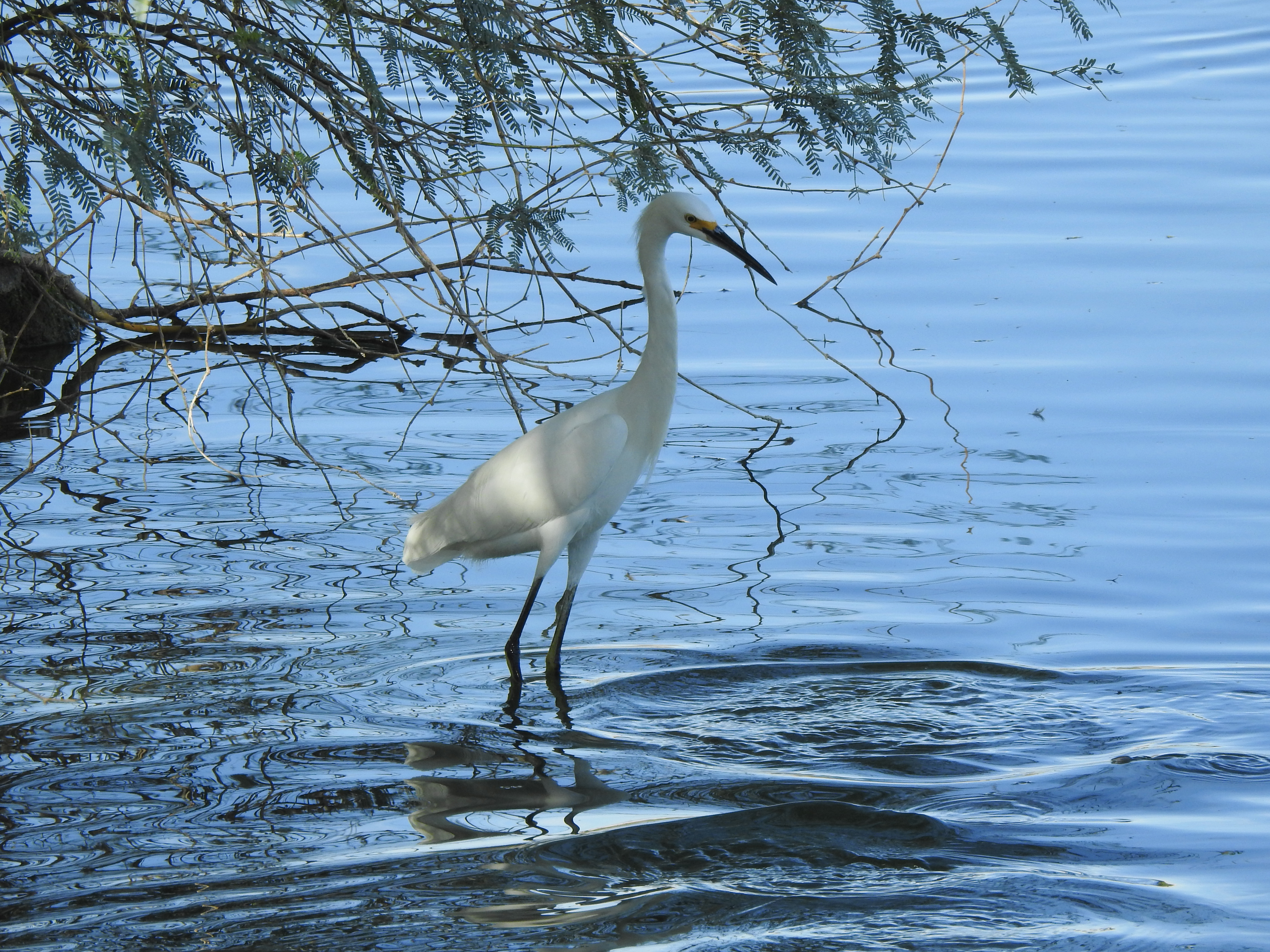
This master shot begins as a merely okay bird picture with a whole lot of empty real estate in it. Not bad, but…..
By MICHAEL PERKINS
LEGENDARY DIRECTOR FRANK CAPRA LIKED TO TELL THE STORY of how he pulled one of his classic films back from the brink of catastrophe, by heading back to his office after a disastrous preview and literally throwing the first two reels into the studio incinerator. The shortened movie, Lost Horizon, went on to become one of his greatest triumphs.
I recall that story every time I attempt to crop away the visual fat from a flawed image, inside of which I suspect there might be a usable picture. Sometimes all I get for my trouble is a worse flop, but occasionally, I will find that a frame is one third, or one fourth, or fifty percent redeemable if I just wield the scissors with complete abandon. The first shot you see here illustrates my point.
Having shot dozens of pictures of egrets in every conceivable setting, I found that this particular bird was not really earning his sizable part of the real estate. Was it the pose? The exposure? A comparison to better captures on other days? Whatever the reason, I found myself more interested in the near-shore waters he was walking in than in anything he himself was doing. The water wasn’t filled with dramatic splashes or tidal ebbs, but was instead a slow, undulating kind of roll that created playful, elliptical games with the light. At that point, the whole mission of the image changed.

Literally cutting the egret off at the knees makes this a completely different picture.
After a series of partial “bird-ectomies”, in which I attempted to keep various portions of the egret’s body in the frame, I just reduced him to a pair of legs, and let the water take over as the star of the show. Again, it was a case of a usable inner picture, eclipsed by being just one of many components in a larger scene, becoming liberated by slicing away all other distractions. The result is hardly a masterpiece, but I prefer the repurposed version over the mediocre original. Turns out that most photographs don’t veer all the way to the two extremes of Really Amazing or Really Appalling, existing somewhere between the two poles. Like Capra, you have to be willing to burn the first two reels to get right to the action.
NEED DICTATES USE

In most cases, my standard 18mm wide-angle could have captured all of this unusual art installation.
By MICHAEL PERKINS
I TEND TO LOOK MOST KINDLY ON THOSE LENSES that will perform the widest variety of tasks. Over time, photography can easily experience what the military call mission creep, with equipment escalating in both cost and complexity as the hobby sinks its roots into the bedrock of our little shooter’s souls. This can contribute to an ever-escalating array of specialized tools, or what I call more and more of things that do less and less. Over the decades, my aching back and wounded wallet have conspired to make me seek out optics that can handle macro, landscape, street and portrait work all by themselves, shrinking the number of instances in which I have to switch to hyper-dedicated gizmos, thus increasing how much I lug about with me. That said (don’t you hate sentences that begin this way?), there are times when you need a scalpel instead of a Swiss army knife.
A fisheye is the textbook example of an over-specialized lens, a hunk of glass that delivers a very distinctive, very controversial view of the world. To some, they are the gateway to innovation, to viewpoints beyond the power of the human eye. To others, they’re a gimmicky abomination. They’re really just ultra wide-angles that take in such a vast view (anywhere from 120 to 180 degrees or even wider) that they literally bend the field of vision, encompassing shots within an actual circle in full-frame cameras or what’s called a diagonal fisheye in cropped sensors. In both cases, the shot features dark vignettes at the corners in images where proportions are nearly normal at the center, then increasingly bowed-out closer to the edge of the shot. They are still in the minority as far as general lens use is concerned for a variety of reasons, including the rarity of cases in which they can be truly appropriate or effective, the heinous cost of the good ones, and the heinous artifacts in the cheap ones.
I happened to have lucked out with a fisheye that is fairly crisp and free of chroma flaring at f/16 or smaller, although the accompanying need for increased ISO bears watching. I shoot on a crop, so I don’t worry about maintaining the “encircled” look since I can’t get it anyway, allowing me to crop to wherever the frame is strongest. In the “before” shot of a strange but huge art installation at Phoenix’ Desert Botanical Garden (see above), you see what a standard 18mm wide-angle will do. Given that I had very limited space either behind or above me, there was no way to back up in order to include the entire scene, and so, out came the fisheye, shooting at about 12mm and taking in a 160mm field of view (see below).

Same vantage point, but shot with a 12mm fisheye instead. Now I can show the entire story.
Now, standing in exactly the same place, I could see where the “yellow wave” of straw-like fibers originated at the far end of the shot, while the distortion factor in the lens gave the flow of straws a kind of “S” curve as it made its way to the foreground. Other considerations: super-wides exaggerate the distance between front and back, making the whole installation seem more vast than it was in reality; and also, by keeping most of the crucial action in the center, I kept the image’s most radical distortion (like on the footbridge at upper left) confined to the outer edge of the composition.
Would I, for this shot, have resorted to the fisheye except out of desperation? Unlikely. It is not a “go to” tool in any real way, since like all gimmick glass tends to pull attention away from the subject and toward itself. However, even though I love to head out with “one lens to rule them all”, I find, like any good sawbones, that I will, occasionally, need that scalpel.
COMP RULE #1 (There is no #2)
Lots to see here. Maybe too much.
By MICHAEL PERKINS
IN BEGINNING FORMAL INSTRUCTION IN PHOTOGRAPHY, students are typically steeped in whole systems of procedure on the creation of a composition. In this pursuit, we’ve all trudged through swamps of techno-sludge, from “golden triangle” to “rule of thirds” to “leading lines”, along with dozens of other schemes for organizing visual information within the frame. Many of these credos are, in fact, valuable in training the eye to prioritize the data in their pictures and streamline their effectiveness, and I applaud their use. What irks the semanticist within me, however, is when these tips are referred to as rules. That’s when things wander into the weeds.
This is not mere finicky wordplay on my part; first, the idea of the word “rules” being applied to something as mutative as art makes no sense to me. It is in the defiance of accepted norms that art fully triumphs, and photography cannot breathe if it’s drowning in its own catechism. I understand that we humans love to list things, to map steps out in order of perceived importance. However, when it comes to arranging the photographic frame, I contend that all the approaches we learn about are merely that…approaches, and that, were I to grudgingly use the word rule in regard to composition, that there would only be one: engage the eye.
What else is there? Photographs begin as one person’s vision sent forth with the aspiration of becoming a shared experience. To that end, everything is about grabbing the viewer’s eye and effectively saying, here is where I want you to look; here is the order of importance among the things in this picture. All of the tricks taught about composition are merely a means to acheiving, by many roads, this one objective. Use whatever graphs, spirals, force perspectives or focus tricks you like, or mix them all together; if they don’t result in a conversation between you, the picture and the audience, then you have nothing except mere technical mastery. And just as there are paintings that are more expert in execution than in emotional effect, there are millions of wondrous exposures that communicate nothing.
In the inset above, the original of a street scene image is an attempt to express the size and energy of an urban neighborhood. There’s nothing technically wrong with the picture, but, after looking at it for several weeks, I decided that the energy of the shot lay not in the car traffic or even the height of the buildings, but in the conversation between the two men at left. In the cropped version of the shot, seen directly above, this relationship is pushed to the foreground, without losing the feel of the city’s busy energy or scope. Certainly, basic compositional rules might have pronounced the first shot “balanced”, but it’s the deliberate intervention taken to create the tighter version that is an act of composition. And, of course, this is not meant to hold my own work out as an example to be followed. It’s just an illustration of the point that rule-breaking is where pictures begin, not where they go to die. Even though a picture is mounted on a wall with the help of a hammer and nail, no one would argue that either the hammer or the nail is what makes the picture compelling. Engage the eye, and you will have faithfully executed the only compositional “rule” that matters.
SAY NO MORE
Huck Took The Shortcut, 2021
By MICHAEL PERKINS
THE ABILITY OF A PHOTOGRAPH TO PRETTY MUCH ILLUSTRATE EVERYTHING IN LIFE can tempt shooters to try to do exactly that; to pack a universe of stuff into every frame. In the minds of some of us, the camera is an information-gathering machine, and so, the more information, the better. But if we call to mind the photographs that have affected us most profoundly, we may see that there’s a hierarchy in the way information is presented in many of those uber-keeper photos. Everything in the world is not a number one priority; events and experiences are always ranked higher in importance than some and lower than others. And the photograph that shows too much may actually not communicate anything particularly well. Things need to be chosen and unchosen in order for a picture to breathe.
As a consequence, rather than showing four hundred trees of equal size and detail in a frame, we deputize one or several trees to stand for the entire forest. In any routine edit, we decide to crop out things which are part of the scene but which either don’t, narratively speaking, carry their weight, or, worse, act as distractions. It’s not only all right not to show everything, it’s a really important part of the covenant between artist and audience.
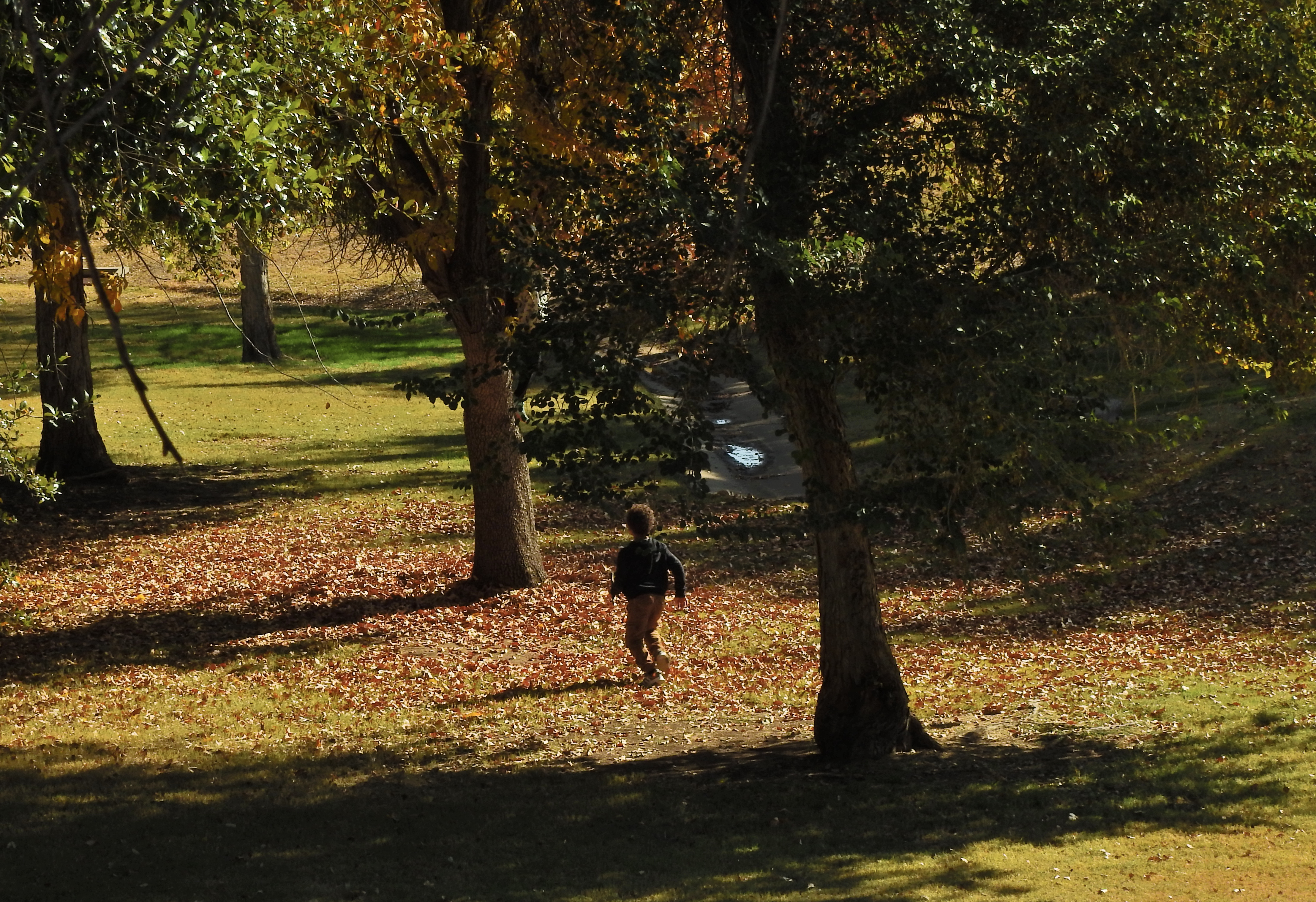
When you leave out some kinds of information, you’re respecting your viewer’s intelligence, since you’re recognizing that you both share a vast store of common experience, some of it so obvious that it can merely be implied and yet understood. As a very simple example, in the image seen here of a young boy running through the woods, his body language conveys all that’s needed for a complete understanding of the scene. Every part of his physical energy advertises the freedom and excitement he is experiencing, even though the picture provides little more than his silhouette and nothing whatever of his features. Would he be any more clearly delineated as a happy young boy if you were to show his smiling face? And as to the surrounding trees; they are, in life, rich in texture, but the prevailing shadow doesn’t keep them from being identified as trees, and so, really, how much better could that work, even if they were all in complete sunlight?
I’m only occasionally an advocate of minimalism for its own sake, mainly because in many cases it’s not the right approach. But over-delivering on information, while creating a thorough “document” of a scene, also has the potential for short-circuiting an image’s impact. As is often the cases, the best rules are the ones that come equipped with tons of exceptions.
PARING AWAY THE BROWN SPOTS
What was originally a general scene in a cafe cropped down to a decent candid.
By MICHAEL PERKINS
I’M A BIG FAN OF THE PRACTICE of distancing yourself from photographs that didn’t immediately connect with you. Some of our images just don’t register with us at first glance, however, in many cases, they can be approached with a fresh eye if you just shove them in a shoebox (digitally speaking) for a time, giving them a second hearing somewhere down the road.
Of course, once you get down that road, you may conclude that your first impression was correct, and that something in the picture was off, or just ineffective. But then there are the late-arriving miracles, the photographs that had to wait until your mind was right to reveal their best truths, eliciting some reaction like “that’s not so bad, after all.” In other words, the ones you’re now glad you didn’t delete in a fit of initial disappointment. The late bloomers.
Often I find that a simple cropping reveals that there really was a decent picture in there all the time, but that it was being eclipsed by all the extra dead space, props or distractions that were also captured in the moment. In such cases, the entire apple wasn’t rotten; it merely needed a few brown spots to be pared away. The trick is to think of cropping not as an admission of failure but as an opportunity.
Few of us have the chops to perfectly frame a great story in an instant. There are a few among us with that talent, and they are the ones enshrined in museums and textbooks. The rest of us can often capture a great picture within a larger picture, however, and in eliminating the fluff and filler we actually redeem it instead of writing it off as defective. One old-school photo editor was famous for telling his shooters to “crop ’til it hurts”, revealing his own belief that, if you kept wielding the scissors without mercy, good pictures would often be freed from the junk that surrounded them. Taking an understandable amount of ownership in our own work, we can often become overly attached to the first version of a project. We protect it like a young mother who cries the first time her baby gets his hair cut. But while great pictures are often “taken” (see earlier remark about the people in museums), many more are revealed by merely peeling away a few dead leaves.
The candid seen here retains less than 50% of the content that surrounded it, which originally included additional people and most of the interior of a good-sized cafe. Given the chance to add all that other clutter back in, I would issue a hard “no” and be grateful for having hacked at the task until I found the real essence of the picture. You have no doubt experienced the same Christmas-morning unwrapping thrill in your own pix. We need to remember that what comes out of the camera is often just the first draft of history, and that helping the best part of it be amplified is not cheating, or “making the best of a bad situation” but staging, directing our dramas for the audience’s best experience.
THE UNDERLOVED
By MICHAEL PERKINS
AS PHOTOGRAPHERS, WE ALL HAVE THEM, whether we parade them defiantly or sequester them in locked drawers. “They” are our Orphan Images, the photos that never quite made it to the finals. Our strange little camera creatures, the ones that fall outside every arbitrary category of success. Our guilty pleasures. Or, in most cases, concepts that Seemed Like A Good Idea At The Time.
We’ve written about these underloved ones before here in The Normal Eye, these pictures that may not even be technical failures but which somehow qualify as….odd. So. Very. Odd. And still I come back to the subject because there is something addictive about even our mistakes. Maybe especially our mistakes.
Many of them frustrate us. The compositions that didn’t quite sell our idea. The light that failed. The idea we didn’t take quite far enough. Did I mention bad light?
Strangely, we harbor a special warmth toward our orphans. We may even convince ourselves that they really are “great”. Or that they’re misunderstood, which means that they somehow failed to make themselves understood. Sometimes an idea that comes close, but still comes up short, inspires a bittersweet affection in us. They are the kids that got cut from Little League at the last second. We, or the pictures, tried so very hard. To be in the presence of greatness is breathtaking, while being in the presence of almost-greatness is often heartbreaking.
After you’ve been shooting for a while, you seldom take any picture without some kind of basic intention. And that means that the resulting image can’t really stand alone anymore. It’s always linked, and contrasted, with the thing we wish we had done. If we missed by a mile, we can accept that perfection is a journey and be a bit philosophical about the whole thing. Missing by inches…well, that’s another thing entirely.

Mommy Will Be Right Here, 2019
I don’t know why I like this picture. I mean, I understand completely the mix of components I was going for. And yet, I can’t defend it vigorously to anyone else. I know it’s…off. But not far enough off to land in the junk bin. Just off enough to drive me a little bit crazy.
Ella Fitzgerald once said that the only thing that’s better than singing is more singing. And I guess I feel the same about making pictures. Whatever’s wrong with your photos can, or might, be cured by your very next one. Or not. That’s the tantalizing, and maddening part of the photographic learning curve. It’s complicated further by the fact that you’re not merely trying to master your gear, but yourself. Seeing how very close you came to being the best you is tough. But most failures are not outright flops but qualified successes, and that little tweak in how we perceive our imperfect work is the only thing that also makes the whole deal worthwhile.
PARING AND SPARING
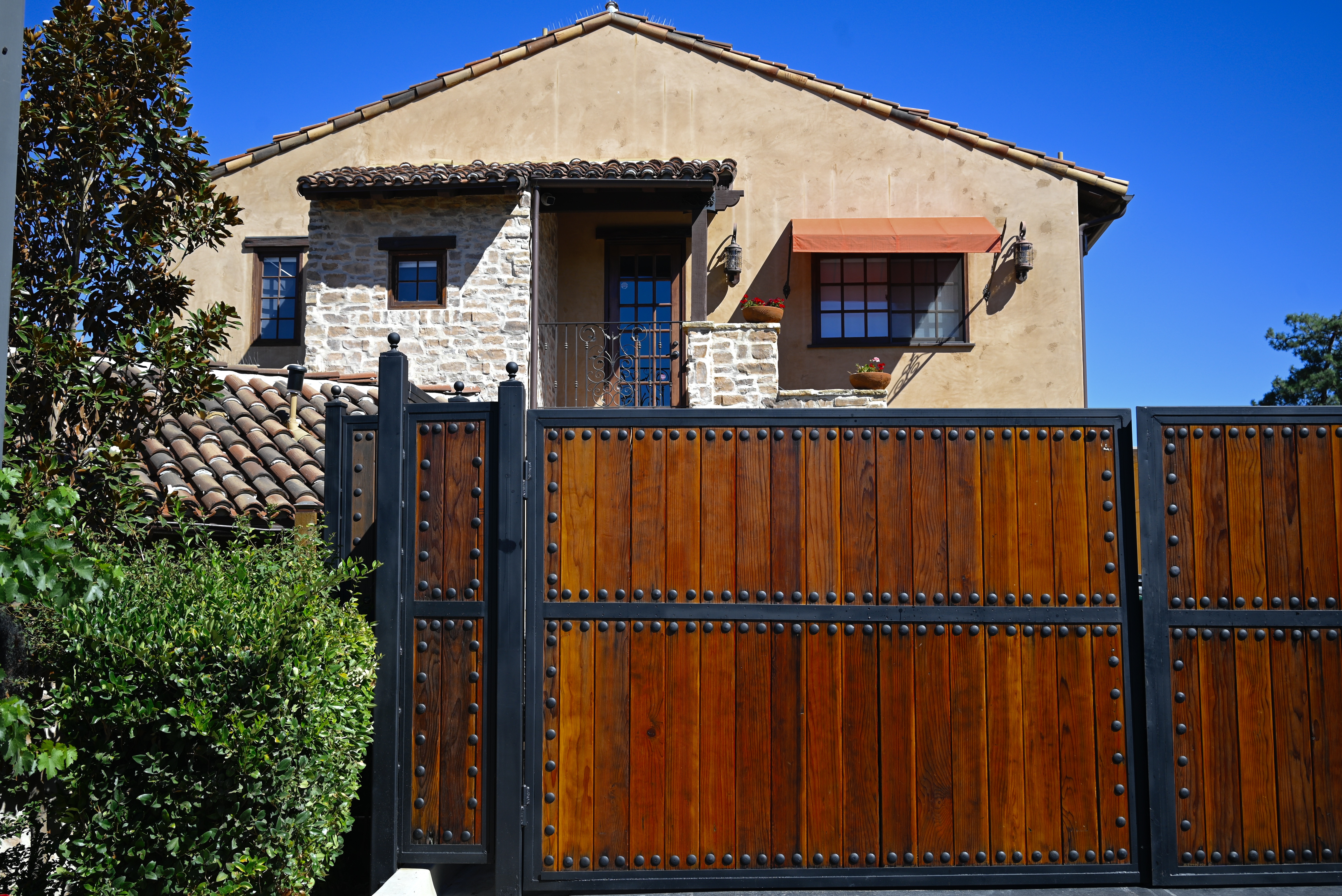
Standard landscape composition. Lots of….well, everything.
By MICHAEL PERKINS
ALL REAL ESTATE IN A PHOTOGRAPH IS PRIME REAL ESTATE.
Space within a composed frame must be earned. Every element that doesn’t strengthen or streamline a picture’s narrative power is detracting from it. Remembering this simple rule makes editing as easy as it is essential.
It’s usually true that you add something to an image by taking something away from it. This can seem counter-intuitive when shooting landscapes, epic-sized collections of scenic…stuff, where wide-angle lenses rule the roost and it seems to just make sense to crowbar as many trees, mountains, and waves as possible into the scene, as if more will automatically be better. However, the same thing is true of vast vistas that is true of smaller ones: there are few photographs which are uniformly strong from top to bottom, end to end. You have to find the strongest core within the larger picture and pare the rest away.
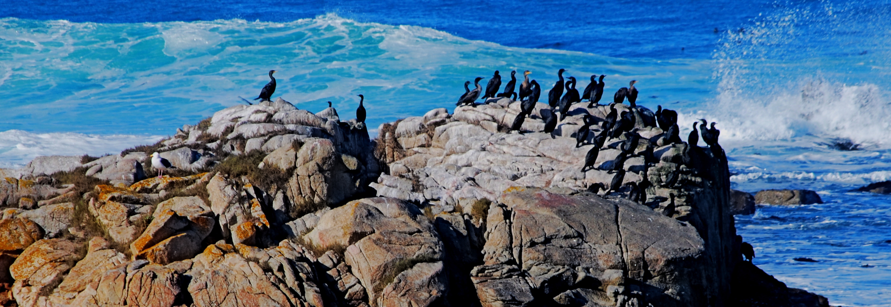
The tighter shot lurking within.
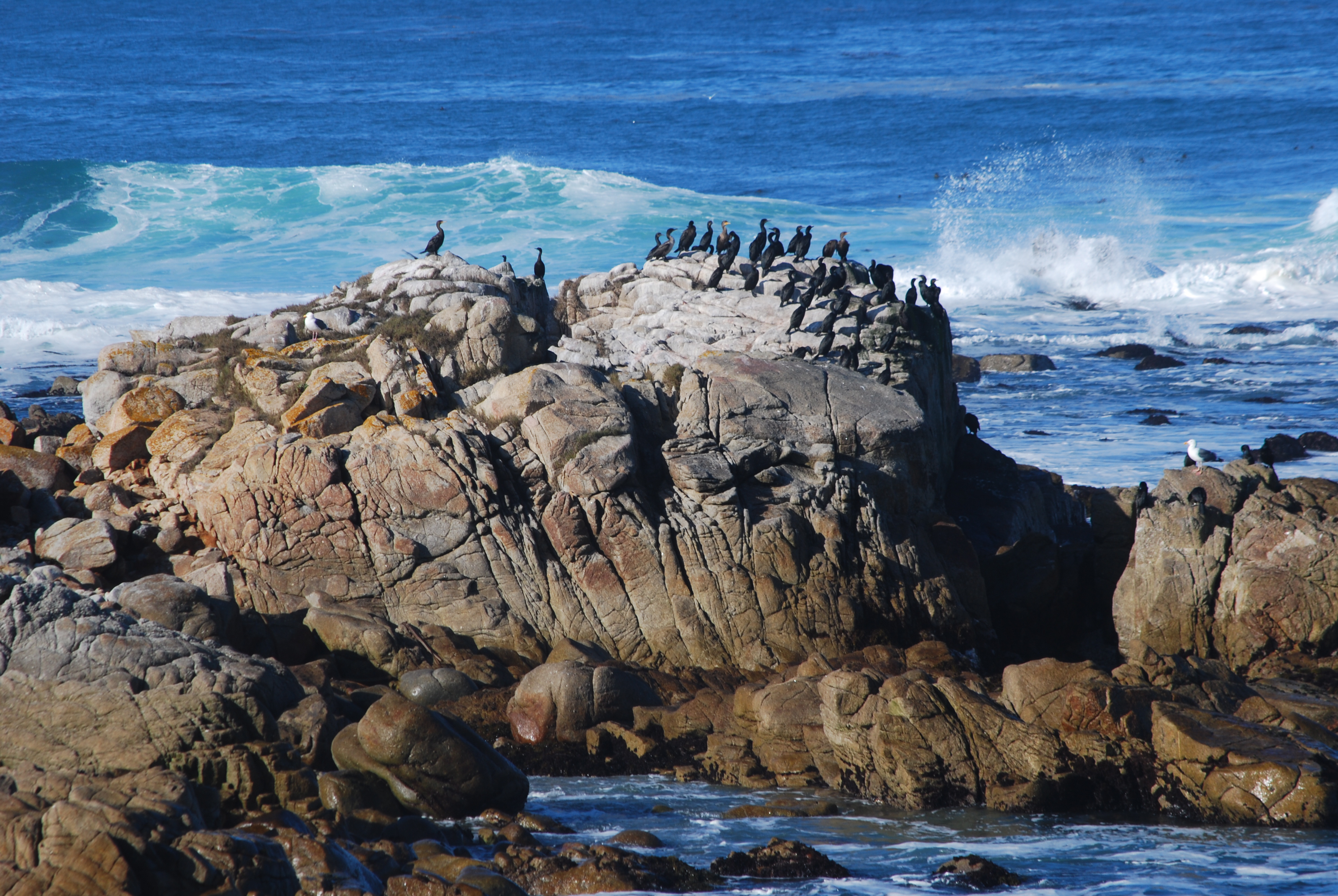
I call attention to this because, slow learner that I am, I can often spend years coming to the conclusion that one of my pictures has been weakened or held back by a hyper-abundance of information. The topmost shot, an original from a 2008 trip to Carmel, California, is a case in point. None of the visual elements are particularly wrong: it’s more like they are simply too plentiful. There’s just too much sky, sea, and stone…..that is, far more than is needed to sell the story.
Worse, the grouping of birds at the center of the frame, which is potentially strong enough to economically make smarter use of all those other elements, is being buried under all the surrounding… padding. The eye is being asked what to prioritize as it wanders its way through too much picture. By comparison, in the second shot, reframed as a mostly horizontal composition with the birds bumped up to prominence, the picture is now telling the eye what to see.
Which only serves to illustrate that what is left out of an image is just as important as what is left in it. Just like you can muck up a story with too many plot lines, you can get in a picture’s way by making its narrative take too many detours. Say what you have to say in the cleanest way possible, and then drop the mic.
FACE FRONT

By MICHAEL PERKINS
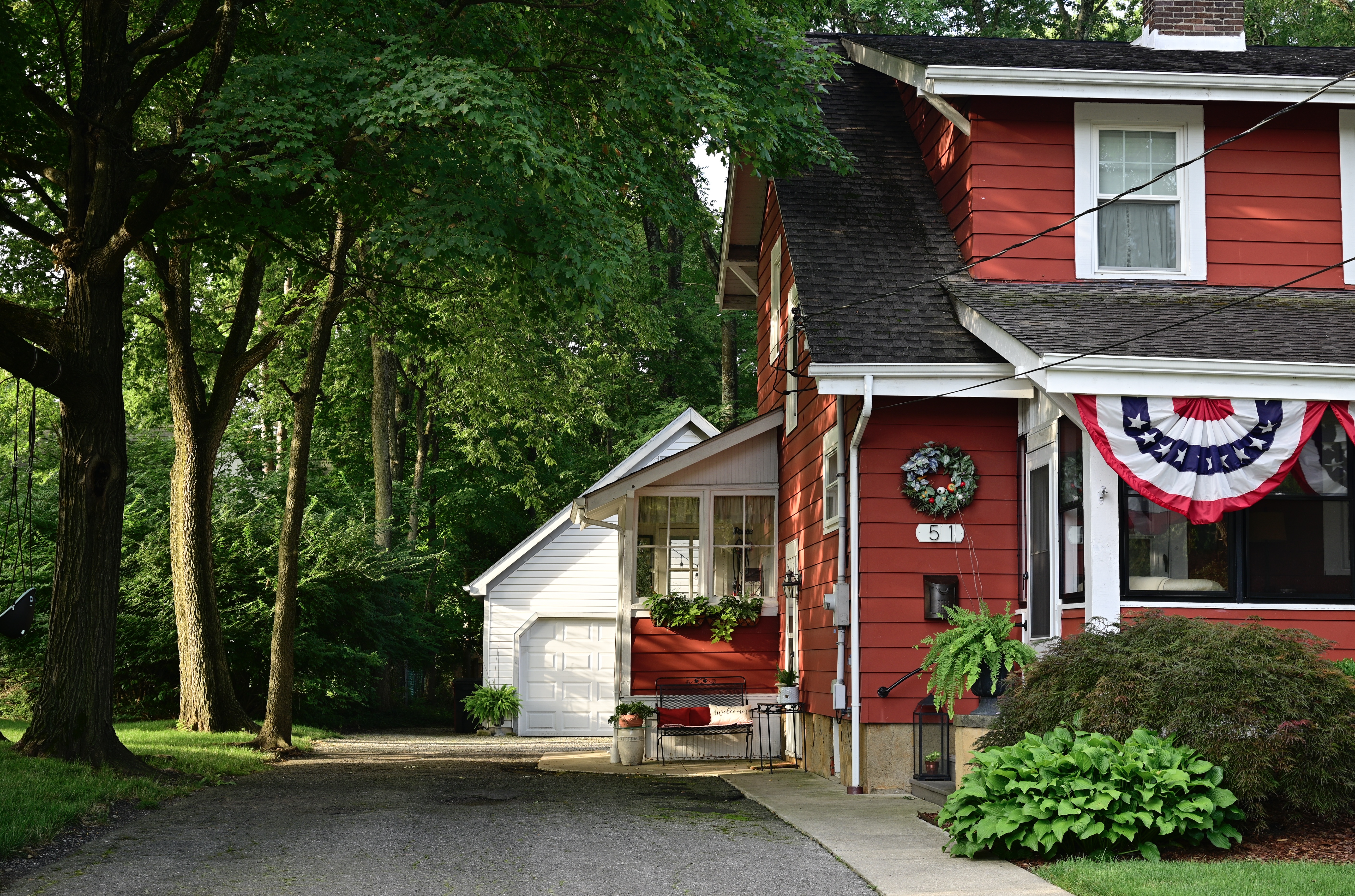
HUMANS HAVE A DEFINITE ANTHROPOMORPHIC BIAS when it comes to faces. From dancing Disney flowers to Pixar office lamps, we tend to project our features onto nearly every kind of object or entity. And, as a photographer, I fall prey to that selfsame bias, especially when it comes to making pictures of buildings.
It’s isn’t much of a stretch, really. Windows become eyes. Doors assume the role of both noses and mouths. Overhangs and pitched rooves take on the appearance of eyebrows. And so on. For a variety of reasons, I tend to position houses in the same way I might shoot the most basic human portrait. Eyes facing straight toward the camera, face centered in the shot. No arty angles, no three quarter views. As clinical as a mug shot, or, in architectural terms, the plainspoken exposition of Walker Evans’ studies of houses and businesses in days of the New Deal.
And, like the aforementioned mug shot, I tend to frame the picture as close as I dare without sacrificing either context or impact. Again, the human face is the template, with the same decisions to be made about cropping. Do you need the top of the hair, the width of both ears? Should the shot stop at the bottom of the chin? Below the shoulders? Does any surrounding information add to the selling of the picture?
Does the traditional rectangular framing of the house in the top shot feel roomy, or merely loose? Is the square re-cropping of the same image, seen just overhead, simplified, or cramped? If the front of a building truly has the same potential impact as that of a face, it would follow that a building study might benefit from the same compositional criteria. That means that, like a face, a building has to earn every inch it occupies within the frame.
FACTS NOT IN EVIDENCE
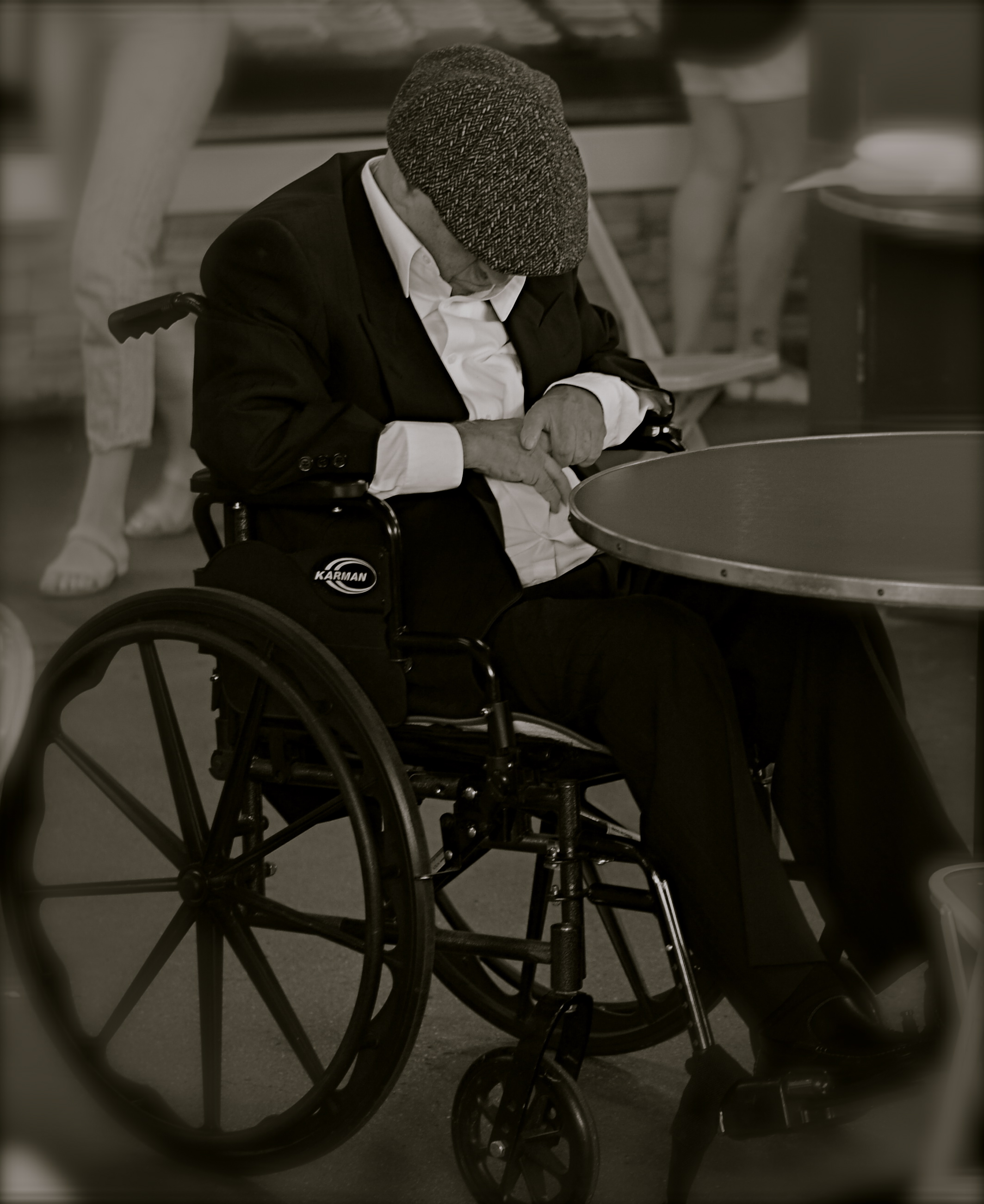
The more you study a picture like this, the more you can find wrong with it. Let me help you….
By MICHAEL PERKINS
IF A STREET PHOTOGRAPHER IS GOING TO ASK HIS AUDIENCE TO EXTRACT A STORY FROM AN IMAGE, then he must ensure that he is putting that same story into his pictures. Just suggesting a narrative, especially in a photograph, is not the same as conveying one. In legal terms, you are asking your viewers to “assume facts not in evidence.”
Do you have to spell everything out, like an S.O.S. in a bowl of alphabet soup? No, but just pointing your camera at just anything happening “on the street” doesn’t guarantee emotional impact, either. Nor does it imbue your pix with profundity, irony, or anything else that wasn’t happening through your eyes before it went through the lens. No street shot is guaranteed “authenticity” just because you were on the street when you pressed the shutter.
Look at the image at left, which I snapped rather accidentally while taking a lot of images of a crowded food market. I did not mean for the gentleman in the wheelchair to be the main appeal of this frame, but even though he’s been cropped to now be central to the shot, there is no clear narrative that “saves” this photo, or makes it compelling on its own terms.
Let’s dissect the picture to see why it fails. What it is, in raw terms, is a man in a wheelchair, sitting alone, wearing dark clothing, his face hidden.That is all that’s absolutely proven in the picture. Now, let’s assume that I was going for something poignant, a human “moment” if you will. Such moments are the heart and soul of great street shots, but this one is missing far too much vital information. If the man is “sad”, is it because he’s in a wheelchair? Why, and who am I to say so? After all, maybe he just had some restorative surgery which, after a month in the chair, will restore him to star-athlete status. Or maybe he is in the wheelchair for life and yet enjoys a richer existence than I do.
Let’s go farther. His face is hidden, but what story can I make the viewer believe is true about that? Is he catching a cat nap while his pile scores him a slice of pizza? Is he doing special exercises? Praying? Does his hat fit badly? Is he depressed, or actually a master of meditation who’s more connected to the cosmos than I can even dream of? And then there’s the monochrome. This picture began as a color shot, but I certainly didn’t increase its impact merely by sucking out the hues. That is, there isn’t some clear message that was being muffled by color which now speaks in a clear voice in mono. Finally, the cropping makes him the prominent feature in the photo without making him the dominant one. The background of the original was distracting, to be sure, but, as with the color, taking it away didn’t add to the picture’s force. If anything, it made it weaker. The man can’t be ironic or poignant since I’ve now cut him off from everything that provides context to his role in the picture.
You get the idea of the exercise. This shot, color or mono, cropped or wide, had nothing clear to say about the human condition. It was taken on the street but it ain’t “street” in effect. Try the same ruthless analysis with your own “near-miss” shots. It’s a humbling but educational process.
CUES AND CLUES
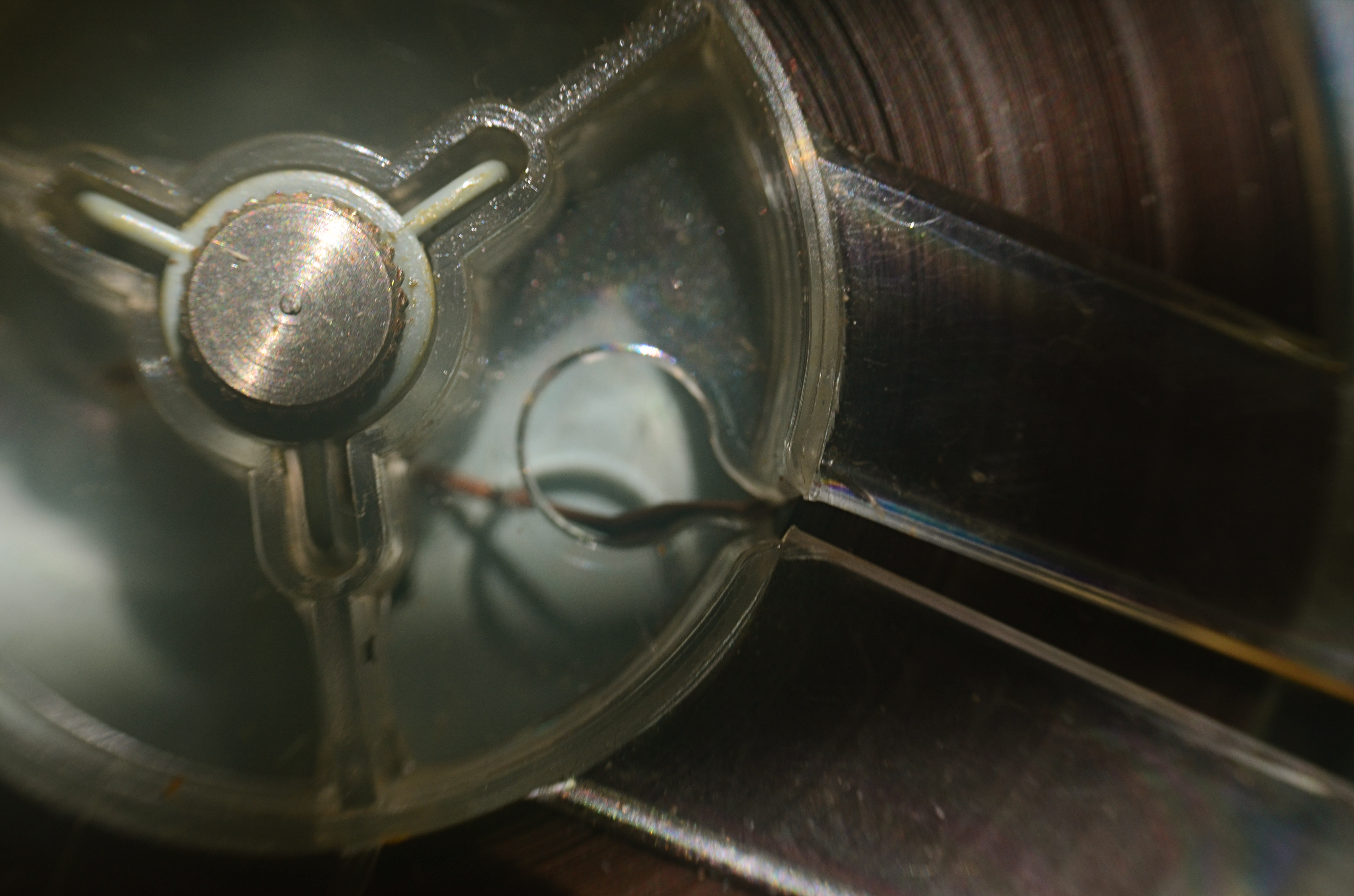
Good Morning, Mr. Phelps (2016). How little of a tape recorder need be shown to convey a sense of that object?
By MICHAEL PERKINS
SAY THE WORD “MINIMALISM” TO SOME PHOTOGRAPHERS, and you conjure visions of stark and spare compositions: random arrangements of light blobs, stray streaks of shadow, or scattered slivers of light, each conveying mood more than content. For some, these images are a kind of “pure” photography, while, for others, they are, to use a nice word, incoherent. Part of us always wants a picture to be, in some way, about something, and the word minimalism is charged, positively or negatively, depending on whether that “narrative thing” happens.
I actually associate minimalism with the formal storytelling process, but doing so with the fewest elements possible. It seems like a natural evolution to me, as I age, to make pictures talk louder with fewer parts. Simple cropping shows you how much more you can bring to an image by taking more of it away, and, with closeups and macro work, the message seems even clearer. Why show an entire machine when a cog carries the same impact? Why show everything when suggesting things, even leaving them out entirely, actually amps up the narrative power of a photograph?
Of course there are times when mere shape and shadow can be beautiful in themselves, and it doesn’t require a lot of windy theorizing to justify or rationalize that. Some things just are visually strong, even if they are non-objective. But minimalism based on our impressions or memory of very real objects, from a pocket watch to a piece of fruit, can allow us to tell a story with suggestions or highlights alone. If something is understood well enough, just showing a selectively framed slice of it, rather than the thing in its entirety, can be subtly effective and is worth exploring.
In the above image, you certainly understand the concept of a tape recorder well enough for me to excise the device’s chassis, controls, even half of its reel mechanism and still leave it “readable” as a tape recorder. You may find, upon looking at the picture, that I could have gone even farther in simplifying the story, and in your own work, you can almost certainly suggest vast ideas while using very small bits of visual information. Knowing the cultural cues and clues that we bring with us to the viewing process tells you how far you can stretch the concept.
FAILING TO SEE THE BIG PICTURE
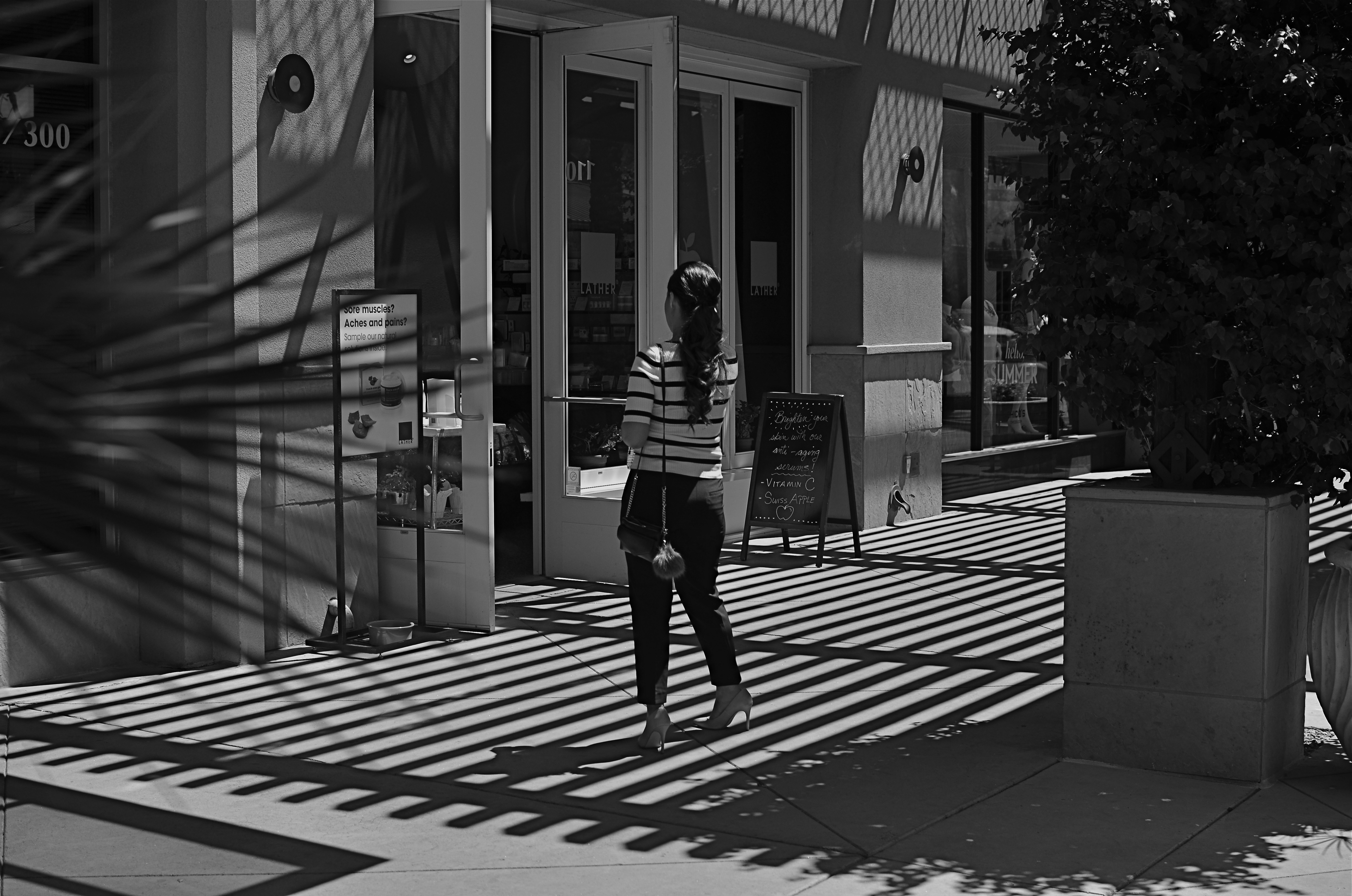
This image lingered in the “maybe” pile for a while. Then I started to see how much of it was expendable (see below).
By MICHAEL PERKINS
IT’S ENTIRELY POSSIBLE THAT MANY A WORKABLE PHOTOGRAPH HAS ONLY BEEN RENDERED SO BECAUSE OF SHEER BOREDOM. Face it: there are bound to be days when nothing fresh is flowing from one’s fingers, when, through lack of anything else to do, you find yourself revisiting shots that you 1) originally ignored, 2) originally rejected, or 3) were totally confounded by. Poring over yester-images can occasionally reveal something salvageable, either through processing or cropping, just as they can more often lead one to want to seal them up behind a wall. Even so, editing is a kind of retro-fitted variation on composition, and sometimes coming back around to a picture that was in conceptual limbo can yield a surprise or two.
I’m not suggesting that, if you stare long enough at an image, a little golden easter egg will routinely emerge from it. No, this is where luck, accident, and willpower usually converge to sometimes produce…..a hot mess, and nothing more. But leaving a picture for a while and returning to it makes you see with the eye of the outsider, and that can potentially prove valuable.
In the above shot, taken a few months go, I had all this wonderful gridded shadow texture presenting itself, shading what was otherwise a very ordinary stretch of sidewalk. A thought emerged that the stripes in the woman’s short might make an interesting contrast with the pattern of the shadows, but, after cranking off a frame or two, I abandoned the idea, just as I abandoned the shot, upon first review.
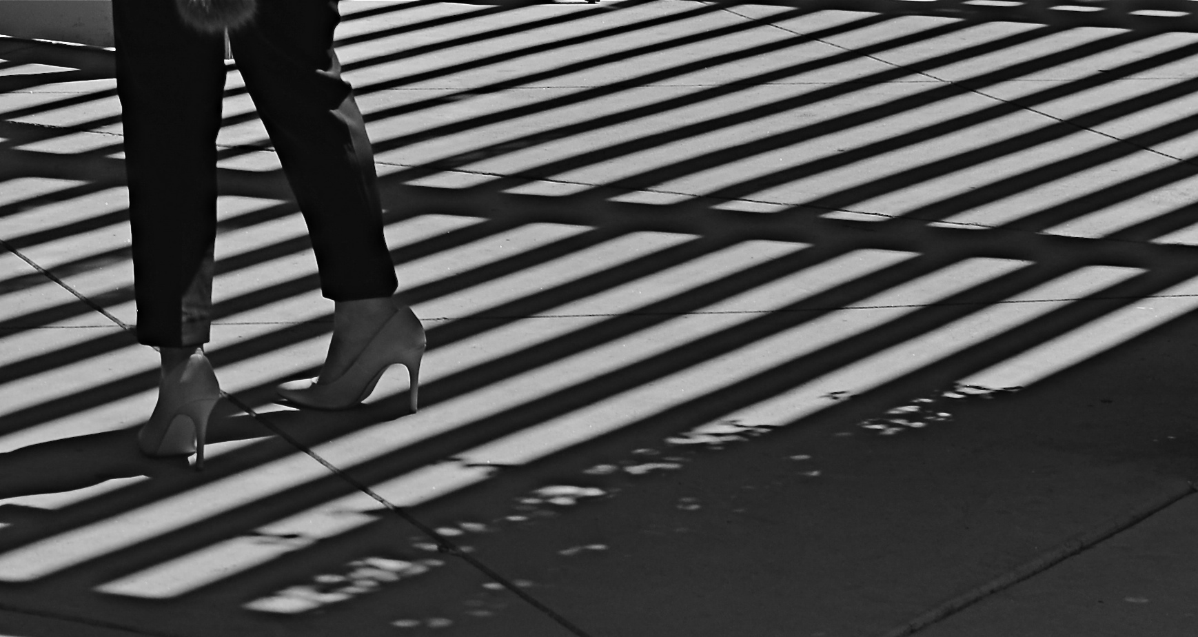
Several big bites of the scissors later…
Months later, I decided to try to re-frame the shot to create a composition of one force against another…..in this case, the verticality of the lady’s legs against the diagonal slant of the shadows. That meant paring about two-thirds of the image away. Originally I had cropped it to a square with her lower torso at dead center, but there seemed to be no directional flow, so I cropped again, this time to a shorter, wider frame with the woman’s form reduced to the lower half of her legs and re-positioned to the leftward edge of the picture. Creating this imbalance in the composition, which plays to the human habit of reading from left to right along horizontal lines, seemed to give her a sense of leaving the shadows behind her, kind of in her wake if you will. At least a little sense of movement had been introduced.
I felt that now, I had the tug of forces I had been seeking in contrasting her blouse to the opposing grid in the master shot. I’m still not sure whether this image qualifies as having been “rescued”, but it’s a lot less busy, and actually directs the eye in a specific way. It will never be a masterpiece, but with the second sight of latter-day editing, you can at least have a second swipe at making something happen.
