LIGHTNING IN A BOTTLE
In shooting children’s activities, you only have a nanosecond to find the central story.
By MICHAEL PERKINS
IF YOU WERE TO CONNECT THE ENERGY OF A ROOMFUL OF CHILDREN to a dynamo, you could power the eastern seaboard and have enough power left over to make all the marquees in Time Square blink “Happy Birthday”in Morse code. Making photographs of kids is just slightly less challenging than snapping images of summer lightning. They are dynamic, unpredictable, driven by whim, and poised on a knife’s-edge. And that’s their resting state.
For a photographer, shooting kids is both a treat and a trap. A treat, because, within seconds, you are presented with more visual information than you can use in a year, and a trap, because what you select or capture out of that flow can either be the very definition of storytelling or its dead opposite. Happening by when a flock of children are sharing an activity, with all the joy, risk and, yes, competition that’s on display (Mom! watch me!!), a photographer has to make insanely fast choices of what to scoop up and what to leave alone. With luck, he/she delivers a great narrative, a shot which contextualizes and explains itself in an instant, a document of the joy of being young. But, without luck (or judgement), the result is, well, a picture of kids playing.
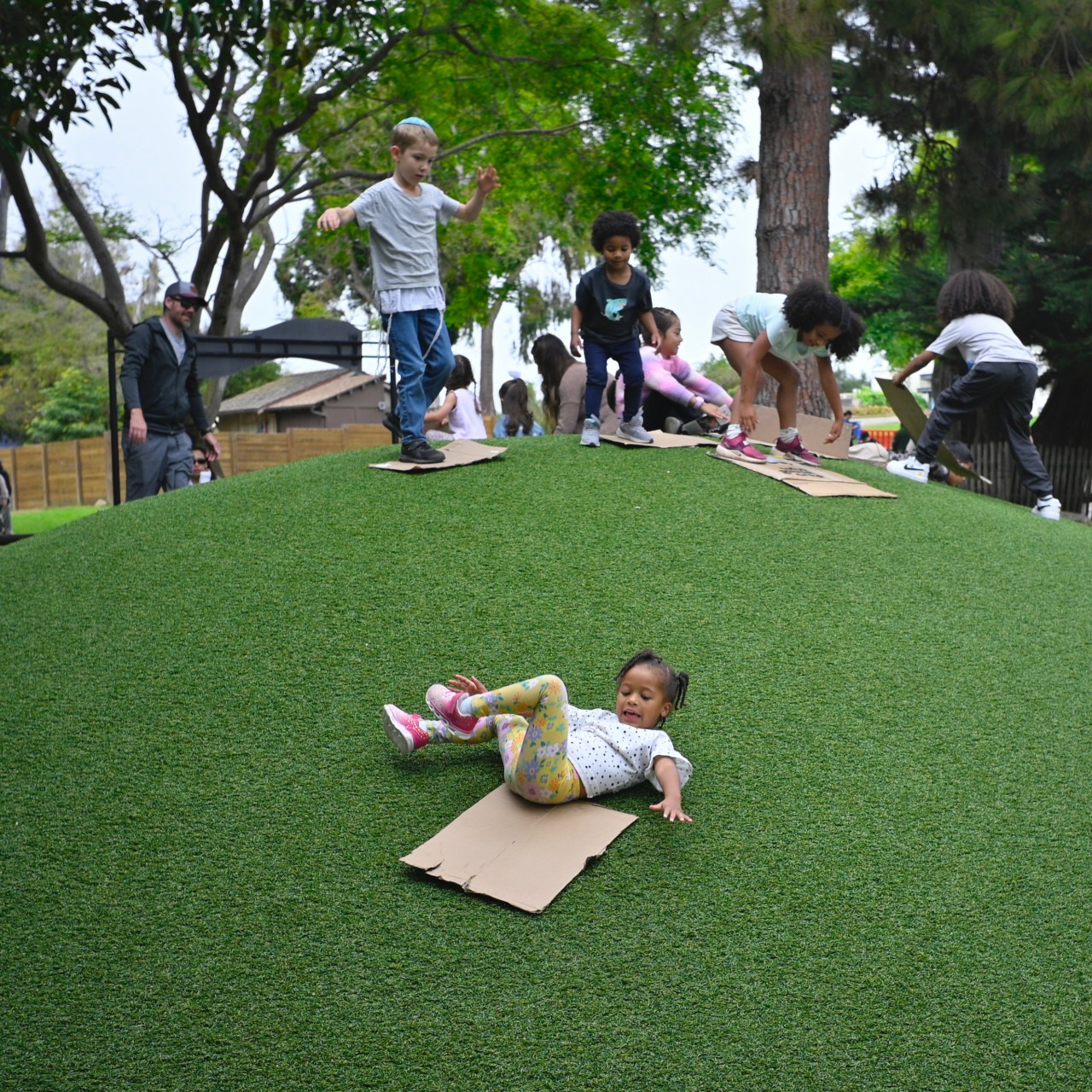
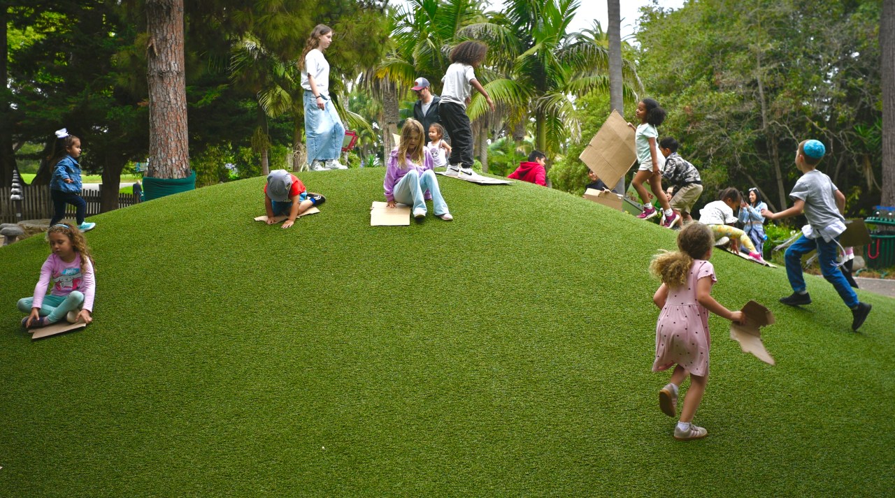
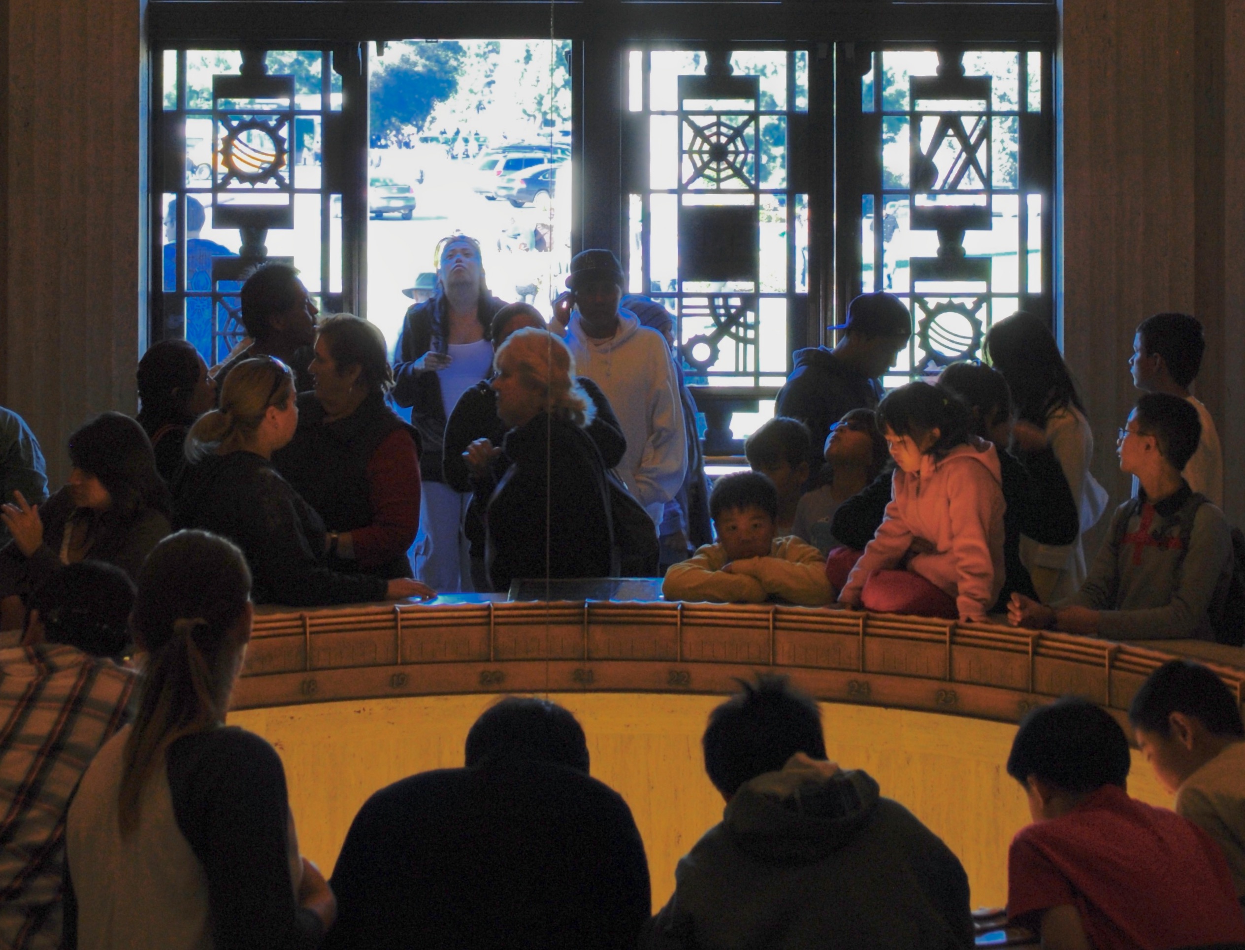
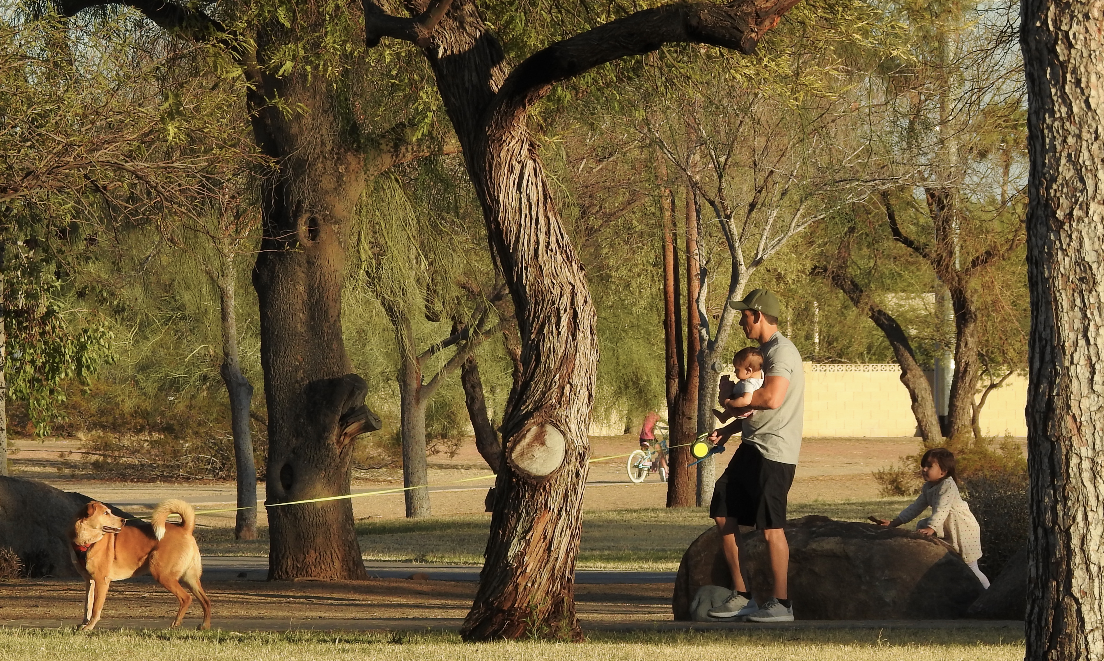
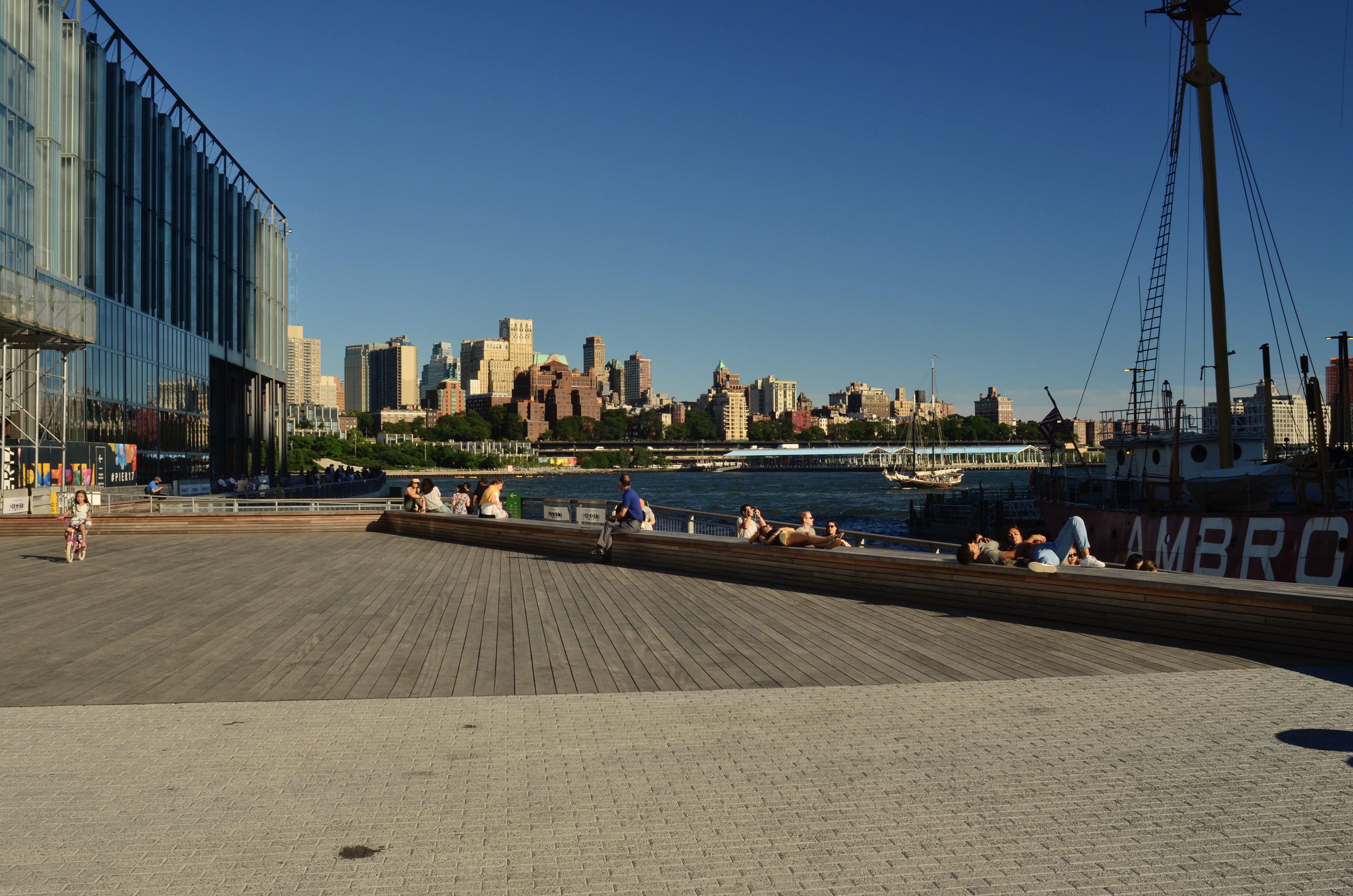
One slider, many background participants. But is this the story you’re seeking?
Of course, such moments cannot, dare not, be coached or posed, meaning that their importance must be weighed, then gathered or rejected, in an incredibly short amount of time. No one second can be repeated or replicated: it’s either caught or it escapes. If the overall story line of the two pictures shown here is “sliding down a hill”, that message can actually be muddled by the right mixture of visual information. For example: how many active sliders need to be shown in motion at one time, when getting the number wrong can potentially drag the eye all over the frame without asking it to focus on a central impact? If the emphasis is on the throng, then the top shot is an example of a potential keeper. However, if one child is all that’s needed to demonstrate the activity, with the other kids shown in various stages of preparation, then the second frame will deliver. Of course, in all candor, I’ve not shown, here, the other seven frames I originally took, where all these “missions” get even muddier or less organized. Child photography is true photography, in that the act of extracting an instant from the constant flow of time could not be clearer than in trying to isolate an ideal illustration of their play. Getting it right really is equivalent to capturing lightning in a bottle
RANDOM SHOTS FROM A BULLET TRAIN
By MICHAEL PERKINS
MANY OF MY PHOTOGRAPHER FRIENDS NOW SHARE STORIES WITH ME, not about the great shots they bagged or the selling points of this or that bit of kit, but of the physical costs of staying in the game. Now, of course, I should mention that most of these friends are also, like myself, getting pretty long in the tooth, and that the rigors of making images have become more pronounced with every new day. Cameras, no matter how compact or streamlined, still have to be lugged from one place to another, and since the shooting experience is crammed with variables, from topography to weather to one’s own mortal carapace, said lugging can exact a toll as time progresses. Many of my birding friends, for example, frequently suffer a muscular crunch known as “birder’s neck”, induced by too many skyward searches for titmice and flycatchers. Others get it in the shoulders because the only lens for a certain job is also the most likely to louse up one’s upper arm. And so forth.

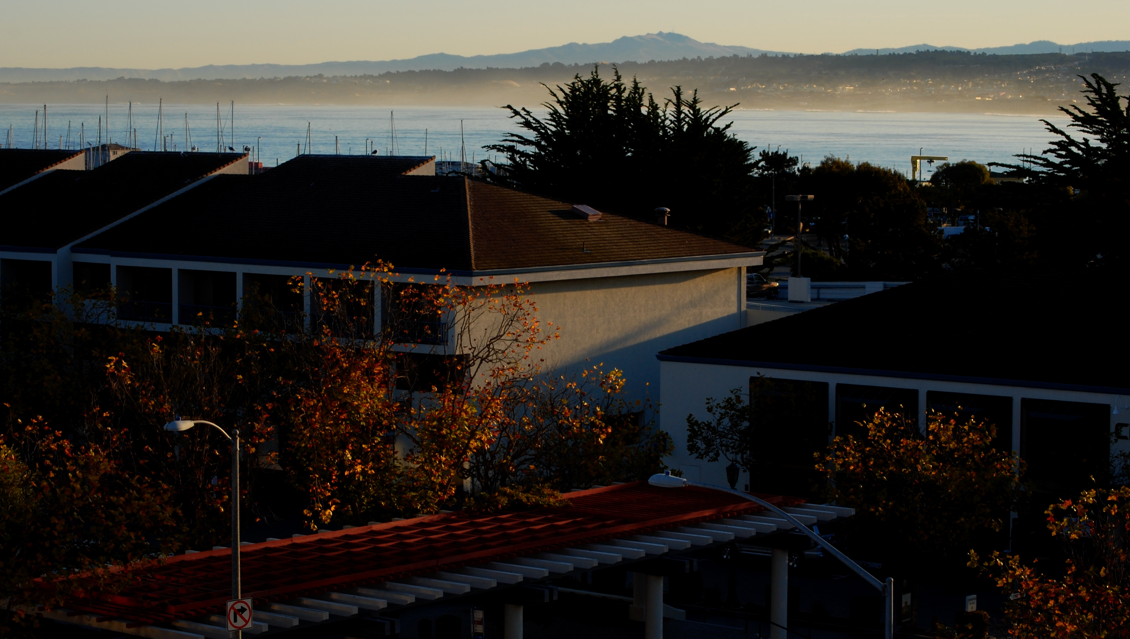
Cambria, California, September 6, 2025, 180mm, f/6.3, ISO 100, 1/640 sec.
It’s impossible to age without eventually fixating on how much the process seems to be speeding up, or, in photographic terms, how many shots we’re likely to be around to take. We are, suddenly, one backache, one misplaced step, or one out-of-warranty ailment from obsolescence, inducing the feeling that even our most considered frames are random shots from a bullet train. It’s as if dusk is approaching and we’re trying to squeeze in just one more somersault on the summer lawn before our dad calls us home. It thus becomes tricky to remain calm, to remind ourselves that, even were we to top the century mark, we could never see or shoot it all. We have to learn to be okay with limits. Because, simply, we have no choice.
And so we learn how to choose….our place, our time, our approach, our moments of abandon, our rhythm of patience. We become photo editors of the soul, posing the everlasting questions, what can be done? With these conditions? With this stretch of time? With how I feel right now? This is not despair, merely a recognition of the tools and time we have. It’s really the same calculation that all photographers have always had to make, except that time (or its imminent disappearance) has now rendered the choice more urgent. I keep hearing Adam West’s Batman rousing his partner to the chase with “QUICKLY, ROBIN! THERE’S NOT A MOMENT TO LOSE!” in that stentorian call to arms that was his melodramatic specialty. And so it is with the making of pictures. There is still time to play, along with more carefully adjusted and efficient ways to do it. The bullet train races on, but not everything out the window need be a blur.
MEANWHILE, OVER IN THE SAME PICTURE
Wide-angles give you the opportunity to tell big stories….
By MICHAEL PERKINS
FOR ME, THE PHRASE F.O.M.O. (Fear Of Missing Out) is a prescription for a wide focal length. In capturing a scene, I’d much rather choose a field of vision that includes too much information as too little.

Compact tales…
This ragtag little news sheet began nearly a dozen years ago when my go-to lens was more typically a 50mm prime, so much so that its ability to render objects like the “normal” function of the human eye inspired the blog’s name, The Normal Eye, along with a similarly titled photo collection. The belief was that the “nifty fifty” was the ideal street lens, and, given my preference for that kind of work at the time, it seemed like the signature glass for me. And so it was, for a while. However, increased work in the narrow streets of lower Manhattan and various densely crowded bazaars since then have given me fresh respect for fairly wide lenses, with a mid-1970’s-vintage Nikon 24mm f/2.8 as my present default, or as close to a “desert island” optic as I’m likely to get.

…and even micro-narratives.
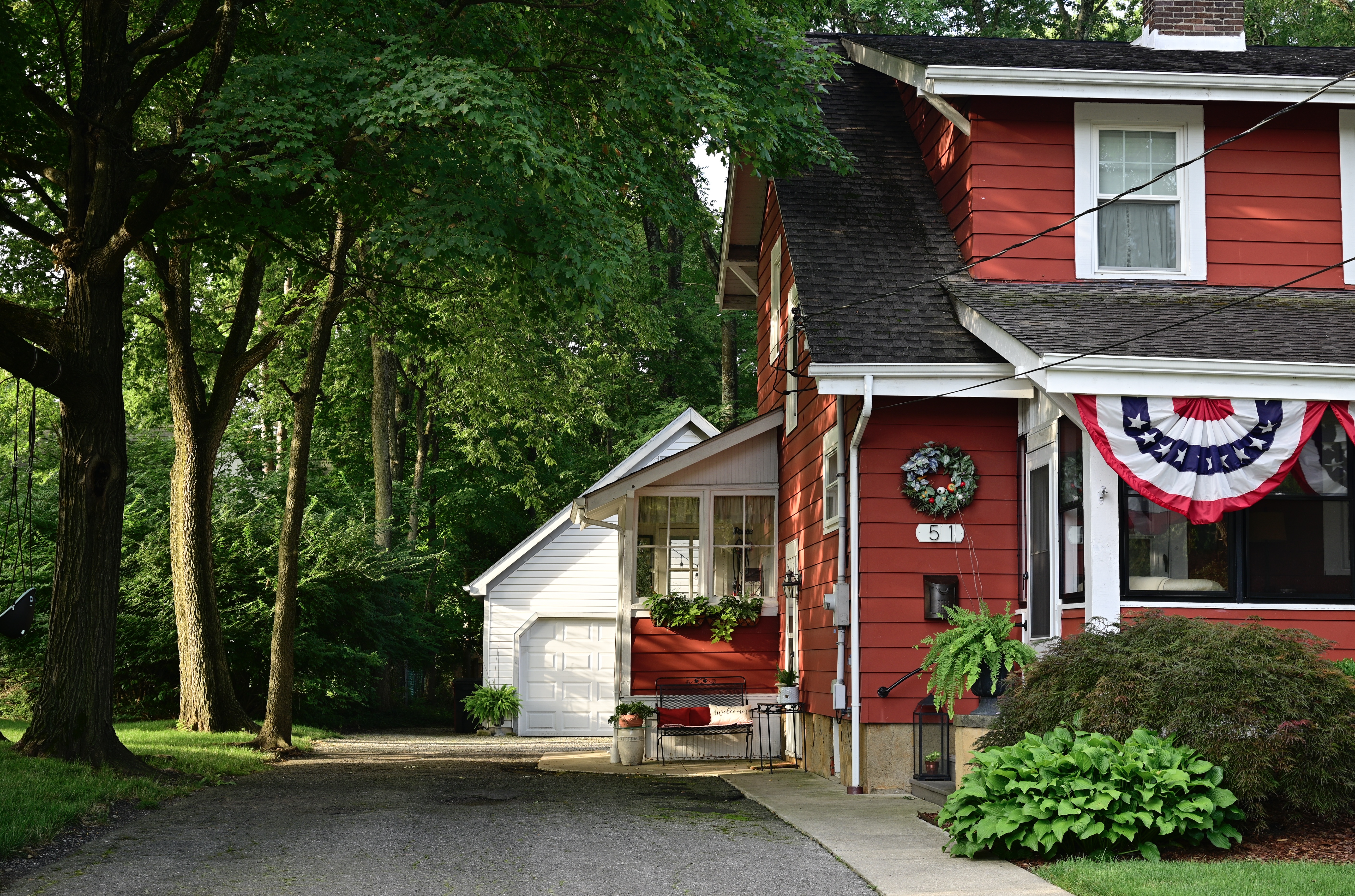
In shooting really wide, I often start with a master shot, delivering a general, large story, and discover, upon later review, that there are actually several different stories lurking within that massive trove of information. In the topmost shot here, for example, I fell in love with a classic house and its surrounding grounds, and so wanted nearly all of that narrative in a single frame. And yet, because I had all that data from which to select, I also could see the wisdom in cropping to a higher front-of-house shot that excluded the woodsy atmosphere (the middle shot here) as well as much tighter emphasis on the guest room / office / enclosed porch on the side (the third image). The 24 had given me a master shot that was sharp and color-true from corner to corner, so that, not only was there lots of “stuff” in the frame, none of it was exaggerated in aspect or angle, but rather as “normal” looking as anything shot with a 35, 50 or 85. The wide-angle, in essence, had given me what the editor in me appreciated most: choices.
In reviewing this two-year-old shot this week, I was reminded that reaching an enhanced comfort level with a given tool in your kit is every bit as important as owning every lens in the catalog. We all learn to shoot with whatever we have on hand, but shooting with what you love, with what makes your work that much more reflexive or instinctual….well, it doesn’t get much better than that.
SOOC / SOOB
By MICHAEL PERKINS
AFTER ALL THESE YEARS, ONE OF THE ONLY TIMES THAT I SHOOT AT FULL AUTO, that is, literally just pointing and delegating all of my upper brain functions to the camera, is when a brand-new lens comes into my life. Because just as I love the romance behind the idea of SOOC (or “straight out of the camera”, a state I aspire to but seldom attain), I also flirt with the concept that automatic focusing and exposure systems might eventually progress to the point where I could concentrate on nothing more than subject and composition. This second ideal I call shooting “SOOB”, or Straight Outta The Box. It’s a little like hoping that the four millionth horse you see in a corral will somehow, also, be a unicorn. And just as likely.
I admit it; I’m incurably curious about what a fresh piece of kit will do simply by being snapped in place and turned on, and I will usually spend a few days or even weeks after a new purchase taking a near hands-off approach to shooting with it. I know that technology is inching ever closer to intelligent machines that can nearly, nearly second-guess my intentions, that operate with their own pseudo-intuition. And yet, after this honeymoon period, I predictably revert back to my personal comfort zone, which is shooting on nearly 100% manual settings, minus the occasional crutching on auto-focus. Why is this?
Another new lens, another try at full auto shooting. Certainly acceptable, but I still feel the need to intervene…
It’s just a fact that a significant number of photographers the world over are perfectly fine with letting their cameras make nearly every exposure decision for them (as in the fully automatic exposure seen here), with millions more at least clicking on full auto and fixing the faults later, either in-camera or with software or apps. Most importantly, the manufacturers of cell phone cameras have staked their amazing success on making their devices sweat the details of making a picture so that users can sweat it that much less. The trend line over time in camera tech has always run toward easier execution, with each succeeding generation of features making it more and more tempting to let the camera assume greater control, all with the promise of better results.
But better according to whom? There is a line, in the minds of many photographers, between removing technical obstacles to acting on your picture-making instincts and relying on the tech to, in effect, execute those instincts for you without your active participation. SOOC still means that you are personally shaping your decisions, as best you can, ahead of the click, trying to get things so right that modifications after the fact can be minimal. SOOB, at least for me, is asking me to relinquish all creative control because a device can maybe guess what I would have wanted anyway, and I’m not ready to go there yet. Like anything else in this racket, it’s a matter of degree, a game of inches. But those inches matter more than anything in the pictures that emerges from the process.
HOW LITTLE IS TOO MUCH?
By MICHAEL PERKINS
ROGER PRICE, THE CO-CREATOR OF MAD LIBS, the most popular party game on earth, was, ahead of all those famously incomplete one-page narratives, the best-selling cartoonist behind a slim volume entitled Droodles, a series of simple scribbles whose economy of line was the “set-up” of a joke, the punch line being supplied by the accompanying comic captions. The fun was in trying to decide what the picture was “about” before Price supplied the answer. One of his best is seen above, named Ship Arriving Too Late To Save A Drowning Witch. You get the idea.
Price inadvertently (or was it advertently?) demonstrated a skill essential for truly communicative photography, a talent I call Knowing What To Throw Out. It’s been my experience that, absent a few geniuses, most of us shoot too much. Not in the number of exposures we click off, but in the overload of visual information that we allow to remain in the final product. Recomposing and amplifying such shots with the most fundamental of tools, mere cropping, is an exercise in learning the answer to a nagging and constant question; in a picture, how little is too much?

In my case, one of the most revelatory exercises in reviewing old photo files is discovering that many frames I had initially written off as “failed” actually contained smaller sections within the overall image that would be perfectly strong if a major portion of the original were to hit the cutting room floor. Sometimes, of course, this method only reveals that, sharp, ruthless knife or no, there’s really no strong story in the picture at all, no matter how you slice it or pare it down. So it goes.

In the master shot of this multi-textured house, several strong structural elements have potential. The stucco, tile, wrought iron, masonry, fabric, wood, and glass all collide in a building that, overall, has a certain visual appeal. But, in cropping, we find that the closest intersection of all of these elements is where the compositional set point actually occurs. All the shot’s other visual information serves as nothing more than a distraction, since we really don’t need the entire structure to convey the idea of “house”. The various textures work best when they actively compete for attention, and a tight crop shows every flavor of a charming edifice with no fat and no fillers. As in Price’s cartoon, we don’t need to show the entire ocean around the rescue ship, or convey all of the back two-thirds of the vessel. Nor do we need to show the entire drowning witch; the hat is enough.
“Doing more with less” is such a hackneyed phrase that you can get shame arthritis in your fingers just typing it on the page. But pore over some of your own “almost” images sometime and see what happens. You may find that, imbedded within some of your most maddening misses, there lies a hit or two.
INVENTORY OF EFFECTS
By MICHAEL PERKINS
IF IT’S JANUARY (as it is at this writing, the head end of 2023), then it’s time for rifling through endless old image files for two diametrically opposed searches: one for the pictures that I hastily conferred “keeper” status on, and the other for photographs that took a bit of time to win me over. In the case of the former, many a shot that initially seemed to be a hit reveals itself as a mishap of magical thinking, or of me wanting to believe that the pictures were better than they were. This comes from mistaking good intentions for actual achievement. In the latter case, I have done just the opposite, skirting over something that didn’t hit me in the gut at first glance but now strikes me as slightly more than passable. The first search is good for humility. The second is an exercise in joy.
In reviewing the pictures that were once faves but now seem “meh” to me, I find myself searching for answers to the question, “what was I thinking?”, each answer invaluable if I have the guts to face reality. In looking at the re-discovered gems, I struggle to define the common thread that courses through all of anyone’s pictures that really, really connect with me. A few key findings emerge:
First, only a handful of them were taken with amazing, or even decent cameras. Bad tools can make picture-making trickier, but even if you’re holding a non-responsive brick in your hands, love will find a way. Secondly, even when taken on decent equipment, a surprising number of the neo-keepers are quite technically imperfect. In fact, more than a few violate even basic rules of composition, exposure, and so on. Still other newly-adored pix were shots were the product of very fast decisions: that is, if they were planned at all, they are short on reaction time and long on raw instinct. In the case of the image shown above, for example,all three of the things that I have listed as compromising factors are in evidence. The picture was taken during an aggravating day on which one of my oldest DSLRs was actively dying on me, its exhausted shutter freezing on every other frame: it is not particularly sharp, and in fact contains a few radical blowouts (some of whom have been mercifully cropped): and, finally, I had about three seconds from “maybe this would work” to “a passing car has now obliterated half the scene”. I did not literally shoot this from my hip, but I might as well have.
Strangely, the final image appeals to me more than a few others taken before and after it, pictures where the camera was, you know, actually working. I shuffled past it with a grunt upon first viewing, and yet, over a year later, I see something in it that I wish I could do more purposefully at some other time. Maybe our self-grading on the curve is like the charitable comments many a teacher has scrawled on a kid’s mediocre report card: “shows potential”. Some days, viewing one’s work in a certain way, that assessment is even better than getting straight “A”‘s.
COLOR AS REAL ESTATE
By MICHAEL PERKINS
OCCASIONALLY YOU SEE ARTICLES PROCLAIMING THAT THE SELECTIVE DE-SATURATION OF COLOR IN PHOTOS is “finished”, that the process ran the entire gamut from novel to creative to “over it”, and that nothing fresh or new can be accomplished in what should now be considered a fad. I don’t know why some of us are perpetually in the pronouncement business, but I think it’s (a) short-sighted and (b) unhelpful to go around telling people what tools are or are not au courant. It’s also the opposite of the way art develops in the mind.
Just as the use or absence of color over an entire frame is a fundamental creative choice, so must the partial use of it. Rather than think of an image as having one color scheme that operates from end to end, I prefer to think of color as part of a multi-use piece of real estate, with multiple choices to be made as you walk the entire area. Color may be just what this lot needs, but not the yard next to this house. Every piece of visual real estate must be independently “developed”, whether in coordination with the overall picture or as a specialized visual traffic cop directing the eye for specific reasons.
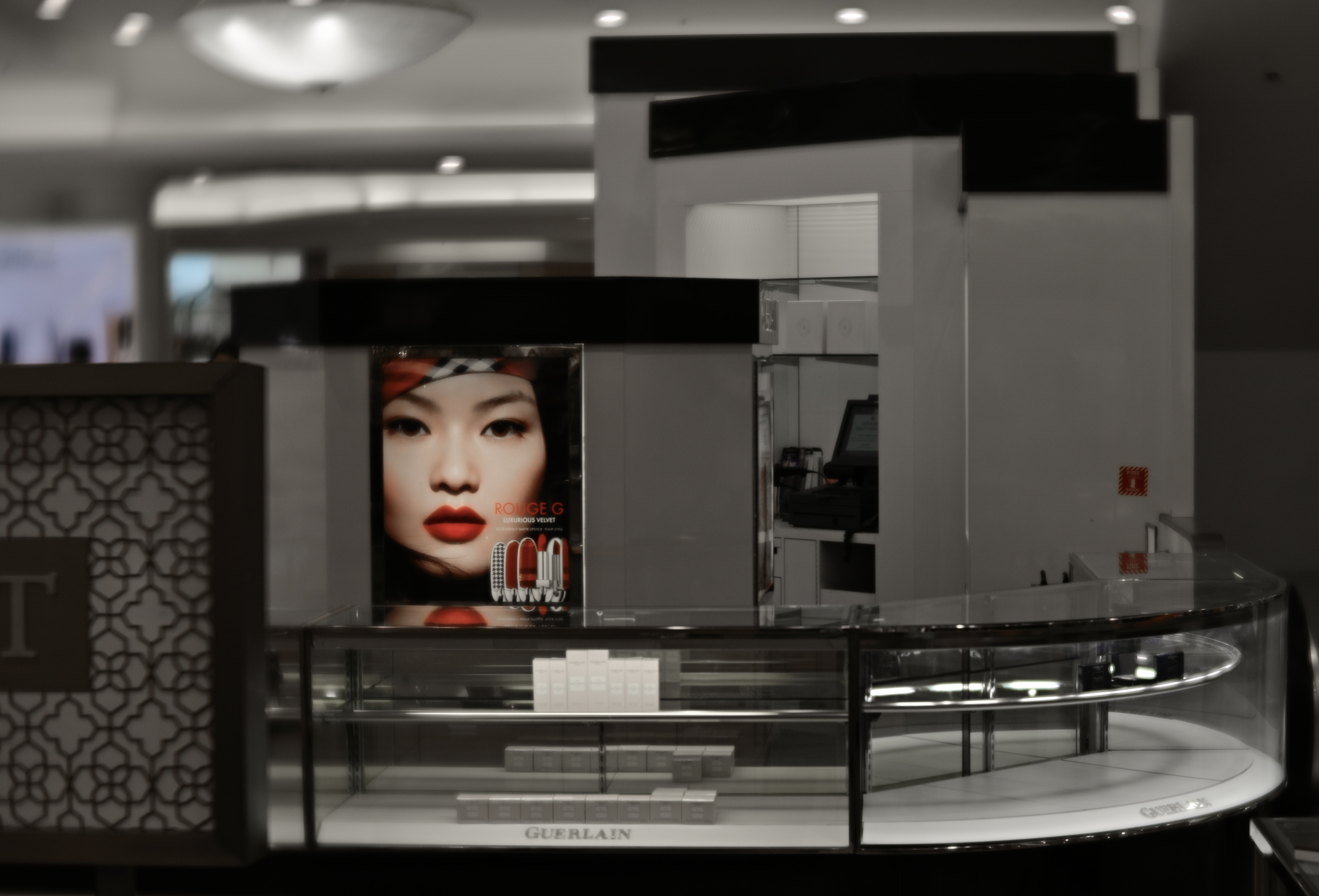
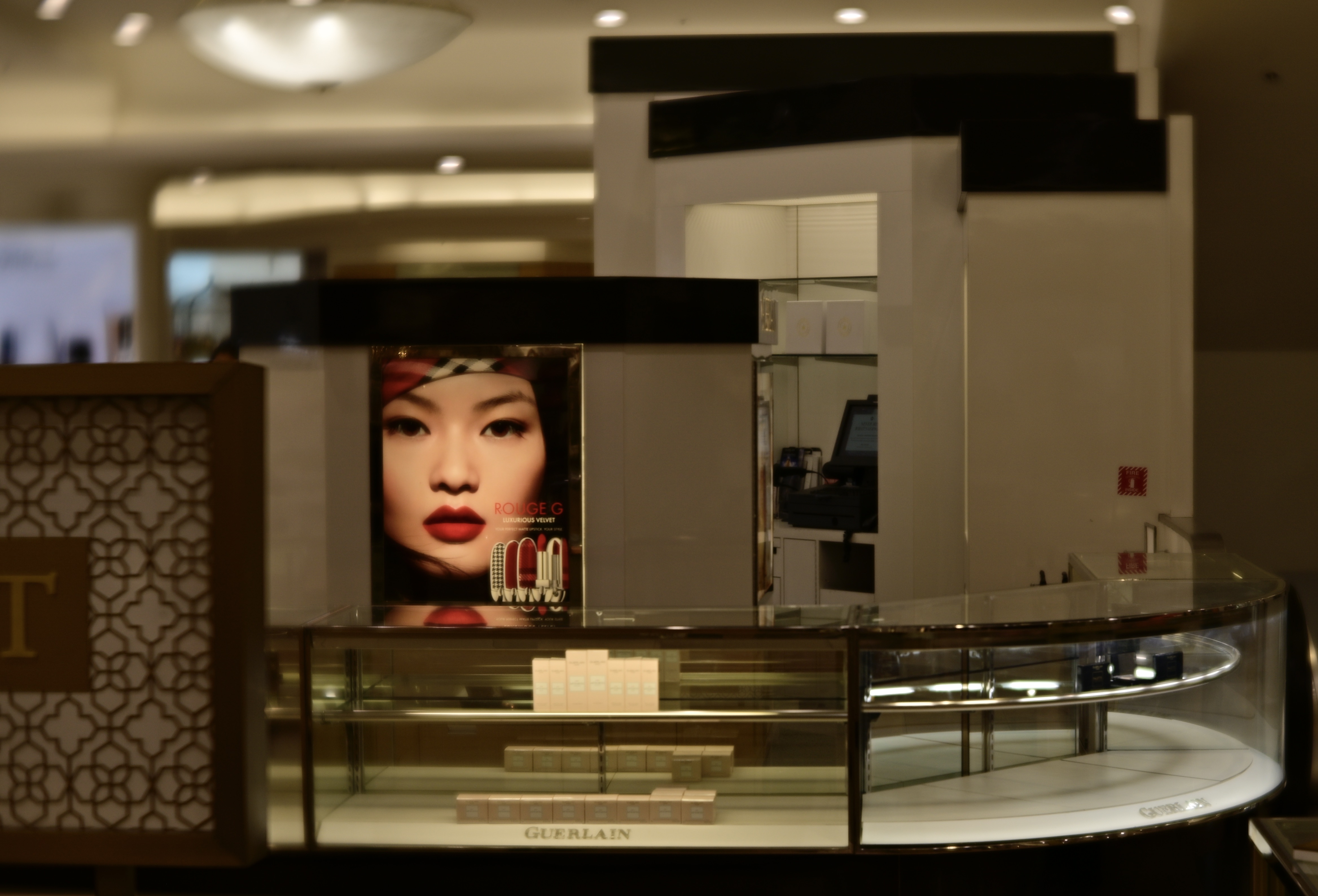
In the top image, the department store counter surrounding the advertisement is nearly empty, due to the area being almost totally closed down (stock situations, apparently). The exposure time was fast and the ISO was low and so the ambient color framing the ad was decidedly warm. Other than that, the color doesn’t serve much of a purpose as either narrative or atmosphere, so in the second version, all attention was centered on the model’s face, which carries more raw information than the rest of the frame. I think the picture is more immediate with the change, or at least more so than either a full-color or monochrome version would be.
Look, I get it. Photographers, no less than the writers of articles and op-eds, can get into the habit of seeing things in polar opposites. Still, anytime you refer to your method on a photo as “something I always do” or “something I never do“, you’re limiting yourself needlessly. And when it comes to making pictures, there are enough boundaries imposed on us naturally without our arbitrarily installing more.
MAYBE A CIGAR, ANYWAY
By MICHAEL PERKINS
A FACE ONLY A MOTHER COULD LOVE. That’s the standard cliche in describing someone so unlovable that he or she has, at best, a devoted audience of maybe one. The saying used to apply solely to physical beauty, but can, these days, define anyone or anything that is just this side of universally loathsome. Substitute the word picture for face and photographer for mother, and you’ve summed up what some of us feel for our rejected images, the ones we bitterly hate and desperately love at the same time.
The image see here is one of my own top five red-headed stepchildren, a picture that is so close to being exactly what I wanted of it, yet so technically flawed that any person of taste or perception would immediately consign it to the rubbish bin, and with good reason. And yet, year after year, doing my annual “rehab tour” of pictures that I somehow can’t permanently destroy, it pops up, begging for love or at least a little maternal forbearance. My attitude is not so much close, but no cigar as much as can I have just one hit off of YOUR cigar? For effort?
The shot was taken in the circular rotunda that acts as the initial vestibule of entry to Griffith Observatory, which sits like a gleaming Art Deco Sci-Fi castle atop a promontory that overlooks downtown Los Angeles. The Keck rotunda’s walls are rich with murals that celebrate the great celestial and scientific discoveries of the ages, and the Foucault pendulum, seen here as the recessed circle that several patrons are starting into, bathes faces in a warm uplight that makes them look like glowing participants in a Maxxfield Parrish painting. In this snap (and it was a “snap”, with no more planning or intention than the word implies) the random poses of the crowd, including the young woman doing an “oh, wow” as she enters through a door, look impossibly staged, something that endears it to me years later.
But, then there’s that total blowout of high blue and white light from the parking lot, taken in an attempt to capture the entrance’s unique metal grillework. I mean, the entire effect of the picture screams “preliminary sketch”, only I didn’t go back and do the technical work that would have corrected the contrast, color rendition or overall exposure. Never has so much raw material been presented with so little in the way of decent execution.
And therein lies the face “only a mother could love”. Like any mom, we love in spite of what our kids actually are, in spite of what they actually achieved. And we weep a little about what might have been, of what little more effort it might have taken to actually win the cigar.
THE KINDEST CUTS

This master shot begins as a merely okay bird picture with a whole lot of empty real estate in it. Not bad, but…..
By MICHAEL PERKINS
LEGENDARY DIRECTOR FRANK CAPRA LIKED TO TELL THE STORY of how he pulled one of his classic films back from the brink of catastrophe, by heading back to his office after a disastrous preview and literally throwing the first two reels into the studio incinerator. The shortened movie, Lost Horizon, went on to become one of his greatest triumphs.
I recall that story every time I attempt to crop away the visual fat from a flawed image, inside of which I suspect there might be a usable picture. Sometimes all I get for my trouble is a worse flop, but occasionally, I will find that a frame is one third, or one fourth, or fifty percent redeemable if I just wield the scissors with complete abandon. The first shot you see here illustrates my point.
Having shot dozens of pictures of egrets in every conceivable setting, I found that this particular bird was not really earning his sizable part of the real estate. Was it the pose? The exposure? A comparison to better captures on other days? Whatever the reason, I found myself more interested in the near-shore waters he was walking in than in anything he himself was doing. The water wasn’t filled with dramatic splashes or tidal ebbs, but was instead a slow, undulating kind of roll that created playful, elliptical games with the light. At that point, the whole mission of the image changed.

Literally cutting the egret off at the knees makes this a completely different picture.
After a series of partial “bird-ectomies”, in which I attempted to keep various portions of the egret’s body in the frame, I just reduced him to a pair of legs, and let the water take over as the star of the show. Again, it was a case of a usable inner picture, eclipsed by being just one of many components in a larger scene, becoming liberated by slicing away all other distractions. The result is hardly a masterpiece, but I prefer the repurposed version over the mediocre original. Turns out that most photographs don’t veer all the way to the two extremes of Really Amazing or Really Appalling, existing somewhere between the two poles. Like Capra, you have to be willing to burn the first two reels to get right to the action.
FALLING IN AND OUT OF LIKE
By MICHAEL PERKINS
THEY’RE LINE CALLS, COIN TOSSES between success and failure, those thousands of photographs we generate over a lifetime that never quite stray into complete wretchedness or float all the way up to Beloved status. They float languidly in the vast midrange between the delightful and the awful that makes up most of our pictorial output, earning faint praise like “pretty good”, “not bad” or my favorite, “yeah, that’s OK.” They are the pictures that we fall “in like” with.
Sometimes I find it easier to cope with my absolute garbage than with the massive mound of mediocrity that occupies the middle floors of my personal output. At least the photos I took while swinging wildly for the fences show commitment, however misguided. After all in even my worst failures, there is also a trace of my grandest dreams, whereas the thousands of “good enough” shots show neither the wild abandon of going for broke or the grand miracle of high art. They’re just….there. Somebody cue the poet with the line about faint heart n’er winning fair lady, or something high-toned like that.
There are those who might even regard the mushy mediocre middle of their total photographic portfolio as just as worthless as their Total Misses, but I maintain that the stuff in the gooey center of our work files is exactly half-good, as well as half-bad. In fact, that’s the maddening thing about “OK” pictures. They never get where they’re headed.
The image seen here is a prime example of a picture that’s suspended between the goal posts. It’s almost well-composed, as well as almost fluid in dynamic range, almost texturally rich, almost, well a lot of things. It isn’t quite a stinker, but it also certainly isn’t a stunner. And as meh as you see it here, the original, wider shot was even more indecisive, with hot blowouts of the shoreline that were later cropped away and just too much information for a coherent narrative. And yet, I have spent the better part of three weeks trying to remain “in like” with the shot, trying to convince myself that it’s more successful than it is.
Of course, just as is the case with an abject failure, this shot is worth keeping. Because every failure is instructive to some degree, and the fact that I’m able to diagnose what kept the image from being good means I’ve already mined it for any clues on where improvement is needed. It just doesn’t need to be paraded around, that’s all. Plus, if nothing else, middling shots hone our editorial skills, since we have no business posting or boasting every single time we click the shutter.
Speaking of clicks, I recently determined that there have been over 130,000 of them on the camera that took this shot. Where does the time go? I “shutter” to think how many of those snaps added shame fodder to my lifetime hit/miss average. But, oh well. I think of the farmers in the Great Plains in the days of the Dust Bowl, living harvest-to-harvest in an insane state of constant gamble, who, in describing how they summoned the hope to go on, nicknamed themselves the “Next Year People”. When will I deliver on the unrealized promise of all my most mediocre shots? Next year, people.
A HOME FOR ORPHANS
By MICHAEL PERKINS
THE DIRTY LITTLE SECRET ABOUT BEING A PARENT is that we all come to terms with the fact that, of course, even though you are not supposed to have a favorite child, you often sorta do. Maybe we don’t so much love one above all the others, but just struggle with the messy process of learning to love each child for very specific reasons. You can’t, officially speaking, choose one over all the rest, but you do ( but you don’t).
And, of course, in any field of artistic endeavor, we also parentally favor some of our works over others. Or, to return to my earlier point, we just love some of them differently. As photographers, we make very fast initial groupings of our images, sorting them quickly into grossly over-simplified “worked” and “didn’t work” piles, as if we were even capable of producing either spotless masterpieces or irredeemably flawed failures. Some of the zillions of pictures we generate never break out of these two polarized winner/loser silos, either being blessed with immediate approval or consigned to permanent dismissal. The fact is, our photographs can easily be broken into four, or eight, or dozens of piles that show a nuanced range from miracle to mire….pictures that almost worked “except for” some little something, or snaps that almost completely missed “except for this one part I really like.” We’d like to believe we live in a two-pile world, where even art is subjected to a nice, clean either/or judgement, but the truth is far more tricky than that.
I once categorized this image as a failure. I no longer feel that way. I cannot explain either reaction. I don’t have to.
Often, in reviewing or re-reviewing or re-re-reviewing the orphan images we originally stuck in the reject pile, we are struck by how foolish our original sorting process was. As with the picture you see here, we are struck, with the luxury of a little time distancing, to evaluate the things with fresh eyes. Shots that were utterly without merit may still be, generally speaking, misses rather than hits. But in finding them again after a prolonged absence, we lose some of the concept or animating spirit of the original concept: details of why we did it can fade a bit, and the picture will sometimes stand either straighter or crooked-er when forced to stand on its own. And in the light of this new viewing, some orphans will find a home, with even the still-bad shots imparting more wisdom about ourselves than they might have in the heat of battle.
The lonely part, for an artist, is when you love one of your “children” in a way that you can’t explain and in which the world can’t share. That love must be unconditional and absolute. You made the thing and you must own it, because you can see a little piece of yourself in it. The orphan gets a home because it needs one.
LOVE, IN SPITE
By MICHAEL PERKINS
PHOTOGRAPHERS GET A LOT OF PRACTICE HATING WHAT THEY HAVE SHOT, failure being, in our thinking, the necessary road to eventual success. As with any art, mastery is initially shaped by misfires, and so shooters spend a lot of time marinating in regret, longing to close the uncloseable gap between the vision of their eye and the fruit of their fingers. This, in turn, means that we are on very, very intimate terms with the pictures that merely “came close”.
But pining over what we believe we muffed, although it seems like the very heart of humility, is the wrong way to get to better pictures. Instead of thinking in terms of “keepers” and “klunkers”, we should realize that there is no completely wrong or right photograph. Even something we seem to have botched contains the germ of an idea we once loved, and even an imperfect execution shows that we were, after all, in search of something, well, worth searching for. Likewise, even our favorite images bear the same bruises as even the most succulent apple, in that there is always something we have left undone, or under-realized.

The Joy Dispenser, 2021
At the risk of sounding like I have attended too many post-graduate Zen classes, making a photographic image is, in itself, an essential good. It’s an act of faith….in our concepts, in our skills, in our evolving sense of truth and worth. In that light, we have many pictures which we claim that we don’t “love” which we should love…in spite. We begin making pictures by saying that some things in the ever-zipping parade of instants that make up our life deserve to be savored, preserved. We continue making them because that initial concept was true, and every salvageable frame that we produce after that starting point proves just how true it was.
And so, just as this image is a balance between what I wish I’d done better and what I actually manage to occasionally do perfectly, your best work is half-ripe, half-rotten fruit (the apple, remember?) We are all, as Cat Stevens wrote, On The Road To Findout. Stop trying to make the perfect picture and keep making the potential picture. Over the long haul, it’s a richer, more satisfying journey by far.
DANCING WITH A STRANGER
By MICHAEL PERKINS
I’VE BEEN ORGANIZING A GIFT FOR MY SON’S FORTIETH BIRTHDAY, which is an overview of a specific photographic theme spanning the last ten years. A decade is a nice round figure, a handy unit of time for evaluating one’s evolution in various enterprises, and so the exercise has led me to go back the same stretch across my online image postings, but, instead of looking at the entire span of ten years, I became obsessed with throwing out the clutter from exactly ten years ago. I’d like to say it was a pleasant trip down memory lane, but, in fact, I’ve done most of it with one eye closed, all the better to minimize my cringing.
It’s more than sobering to look at the stuff you felt happy enough about to throw onto the interweb just a decade ago, almost like trying to pull off an intimate dance with a total stranger, and not a very good looking one at that. I am not trying to lead the world championship in false modesty when I say that the old delete button was looking quite shopworn when the job was done, and, if anything, I feel that the large pile of photographic detritus at my feet represents me being generous in too many cases where my sentiment overrode my sense.
You are, of course, a little bit alienated from your old self every new time you pick up a camera. Get enough distance between yourself and what you once thought was your “good stuff” and the contrast can knock you off your pins. Chances are, the You of Today sees composition, narrative, exposure and subject matter with a completely different set of priorities than the You of Yesteryear. That is, if you’re lucky. If you still regard your work of ten years ago as “all killer, no filler”, you may have spent the last decade walking in circles. Or you may be the greatest genius in the history of photography, in which case I’d like to become the local chapter president of your fan club.
Me, I’m pledging to re-edit my portfolio with a lot more regularity in the future. It may not be much more pleasant, but I’d rather face several dozens of my biggest misses at a time than legions of the suckers. In the meantime, I have that gift book to finish, and I’d better hurry up about it. If I think about it too long, I might just reduce the tome to a pamphlet and send my kid a coupon for a Happy Meal.
LITTLE THINGS MEAN A LOT

By MICHAEL PERKINS
PHOTOGRAPHIC COMPOSITION MAY MATTER MORE than any other single aspect of technical mastery. The godlike power to decide what to include in the frame is the ultimate tool in the making of any photograph. It sets the terms of engagement, stating, merely by what’s been included, this is what we’re talking about today. That makes the photographer a narrator…a storyteller. The rest is all just measurements.
Macro photography, or, as we used to call it, “close-ups” are the purest exercise in compositional choice, because in getting nearer to our subject, we are forced to be aware, in the making of a picture, just how much of the rest of the world we are paring away…whether because it’s distracting, or too busy, or merely because it’s not what our picture is “about”. Macro work also shows, in the clearest possible terms, what happens when too much is left in the frame, and reinforces the same discipline that’s vital in composing a shot at any scale, i.e., including what communicates best, and snipping out the rest. It also becomes a useful introduction to “abstraction”, which is valuable even for people who think they hate that term.
When you abstract something, you are merely pulling it free of its normal contexts and associations. Once you are close enough to your subject, you are working more and more in terms of raw light, patterns, and texture, in a way that makes the familiar unfamiliar. You see compositional elements purely. For example, a piano, as a fully-sized object, registers in the mind as a quite particular thing, whereas magnified detail applied to the arrangement of its inner workings, is an exercise in mechanics, math, the pure arrangement of repetitive motifs. Composition in macro , then, is always great practice for composition in general. When you are zoomed in tight, you must make real choices as to what will make the cut for the final image, and these choices are obvious, and immediately understood. Pull back out for shots taken in the wider world, and that choice-making ability is now more instinctual. There’s a reason so many people say that, in the acquisition of a skill, you should start small. Because little things mean a lot, and the sooner that thinking gets into our pictures, the better tales we tell.
CHOREOGRAPHY IN THE PARK
By MICHAEL PERKINS
STREET PHOTOGRAPHY IS A UNIQUE MARRIAGE OF SETTING AND SUBJECTS, that delicate balance of locations and denizens that make streets into neighborhoods. The drama created in such studies is always a thrilling, moment-to-moment improvisation in which small things generate big effects. Incremental changes in the scenario, like waiting for the old man with the dog to walk directly under the deli sign, or framing the sullen teen right next to a reflective window, can be the difference between something that’s merely quaint and something that’s universal. And the more crowded with subjects the frame is in a street shot, the more options there are to weigh. Doing choreography for a lone dancer is not the same thing as blocking out space an entire troupe.
Streets shots are about weighing the importance of several things at once, in opposition to each other rather than as isolated elements. Tensions are set, tightened and released; motives are explored and exploited. In 2021’s cautious re-emergence from our respective quarantine caves, we are not only re-learning the flexing of our own muscles; we are also watching the equivalent adjustment in others. With or without a camera in hand, we are all more deliberate people watchers in this nervous re-entry phase. People are not, at least for right now, mere wallpaper, but active orbiting bodies in little constellations. We are a little more keenly aware, as we venture out, what their personal Great To Be Back moments are. Perhaps, in time, we will go back to our old habit of generally walking past each other, but now, in this careful new world, we are paying a little more attention. And those of us who, through photography, are in the habit of seeing with a little extra intensity will be in for a feast.
Dad’s Busy Day, 2021
As stated before, the more people you decide to include in a street shot, the more choreography there is to fuss over. In the “day-out-with-dad” scenario shown here, I had several stories that all wanted telling at the same time. In some frames shot over the space of a minute (about eight), various players were all contending for star status. In some shots, the father seemed to be guiding the kids and the dog. In a few, the dog’s personality as explorer-at-large seemed to place his energy in charge. In yet more, the young girl seemed to be trying to run things by standing atop the rock on which, in the selected frame, she’s seen leaning. Thus, in the final version, she’s a little more passive, Dad is trying to keep things in balance, and the dog is definitely on point as the overall leader of the expedition.
All versions of this scene had their elements of tension, warmth and humor, and so in choosing a single final rendition, I was neither right or wrong. The joy of the enterprise was in the element of spontaneous creation offered by what was happening upon the stage and amongst the players. I could write the ending so the guy gets the girl or where the cowboy just rides into the sunset, but that part is really unimportant. In street photography, the potential is the attraction. We are only able to extract a single instant to suggest a whole reality, and both the thrill and the terror of that choice, while it’s no walk in the park, is, for some, simply irresistible.
SAY NO MORE
Huck Took The Shortcut, 2021
By MICHAEL PERKINS
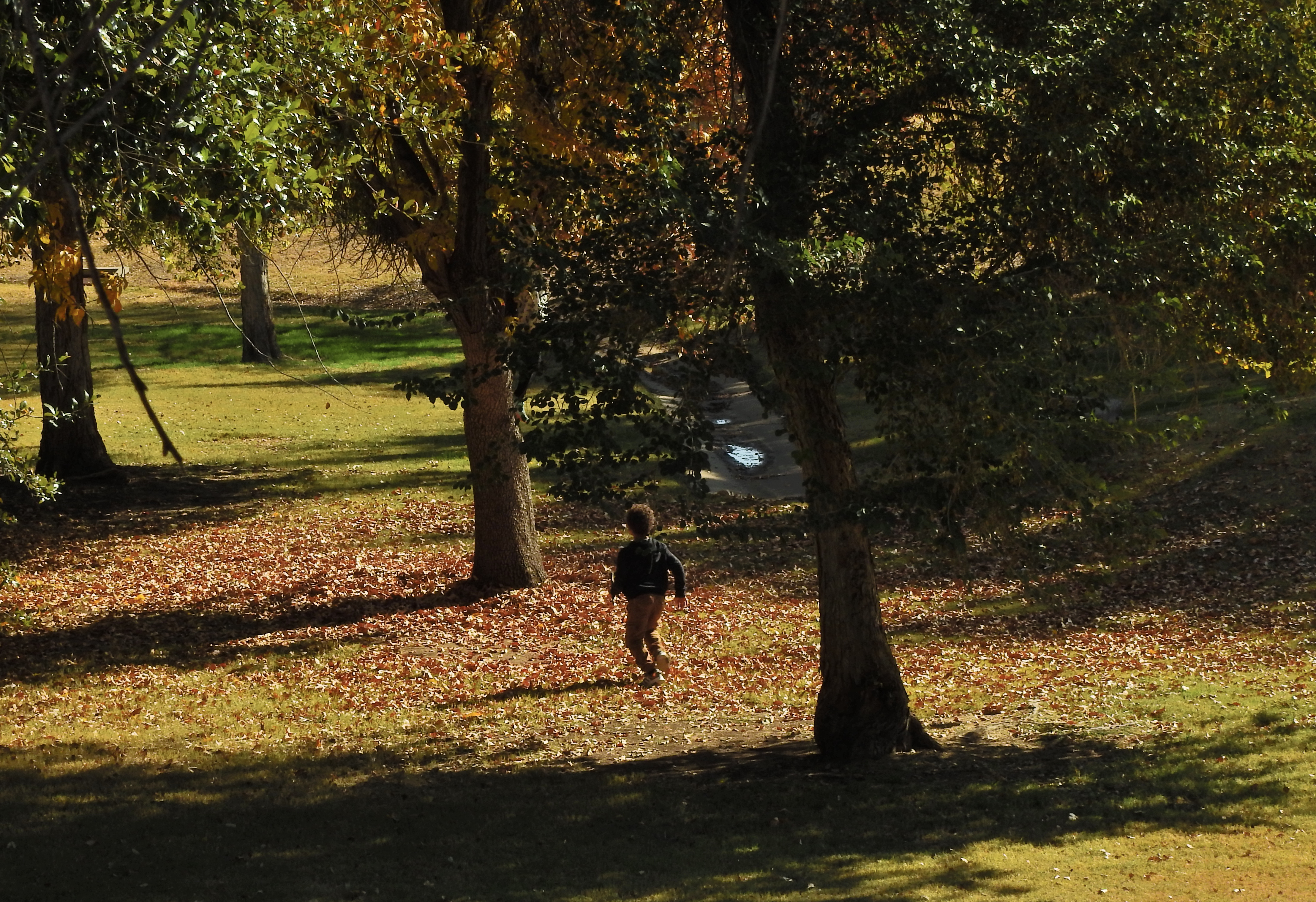
THE ABILITY OF A PHOTOGRAPH TO PRETTY MUCH ILLUSTRATE EVERYTHING IN LIFE can tempt shooters to try to do exactly that; to pack a universe of stuff into every frame. In the minds of some of us, the camera is an information-gathering machine, and so, the more information, the better. But if we call to mind the photographs that have affected us most profoundly, we may see that there’s a hierarchy in the way information is presented in many of those uber-keeper photos. Everything in the world is not a number one priority; events and experiences are always ranked higher in importance than some and lower than others. And the photograph that shows too much may actually not communicate anything particularly well. Things need to be chosen and unchosen in order for a picture to breathe.
As a consequence, rather than showing four hundred trees of equal size and detail in a frame, we deputize one or several trees to stand for the entire forest. In any routine edit, we decide to crop out things which are part of the scene but which either don’t, narratively speaking, carry their weight, or, worse, act as distractions. It’s not only all right not to show everything, it’s a really important part of the covenant between artist and audience.
When you leave out some kinds of information, you’re respecting your viewer’s intelligence, since you’re recognizing that you both share a vast store of common experience, some of it so obvious that it can merely be implied and yet understood. As a very simple example, in the image seen here of a young boy running through the woods, his body language conveys all that’s needed for a complete understanding of the scene. Every part of his physical energy advertises the freedom and excitement he is experiencing, even though the picture provides little more than his silhouette and nothing whatever of his features. Would he be any more clearly delineated as a happy young boy if you were to show his smiling face? And as to the surrounding trees; they are, in life, rich in texture, but the prevailing shadow doesn’t keep them from being identified as trees, and so, really, how much better could that work, even if they were all in complete sunlight?
I’m only occasionally an advocate of minimalism for its own sake, mainly because in many cases it’s not the right approach. But over-delivering on information, while creating a thorough “document” of a scene, also has the potential for short-circuiting an image’s impact. As is often the cases, the best rules are the ones that come equipped with tons of exceptions.
EITHER / OR, EITHER WAY

By MICHAEL PERKINS
CERTAINLY, PHOTOGRAPHY IS PARTLY ABOUT LIGHT, AND EQUIPMENT, AND TECHNICAL MASTERY. However, after all those means are applied, the only determinant of the ends of all our energies comes from human choices. Arguments within the mind of the photographer about what “belongs” in a picture. How to convince the viewer that it belongs. How to apply all the means to make that information compelling, or universal.
It’s knowing what to say “yes” to, but, just as crucially, it’s about being able to say no to every other option, and being prepared to live with your decision. Of course, deciding what to put in an image is not, literally, a matter of life and death, as a choice of career, mate, or philosophy might be, but it is a very visual demonstration of what choice entails. Because, when you choose something, in a picture or in a life path, you automatically unchoose everything else. There is no way, in art in life in general, to have it all.
But better voices, voices far wiser than mine, have already spoken brilliantly of this process. One, in particular, has been considered by many to be the final word on the subject, so today it serves as my own picture’s caption:
THE DIAL-BACK

Lover’s Point, Monterey, California, 2012, original HDR mix. Ugh.
By MICHAEL PERKINS
ONE OF THE BIGGEST BENEFITS I’ve derived by overseeing this forum over the past nine years has been the great gift of being able to distance myself from my earlier work, to get far enough away from techniques I once embraced to regard them with a mixture of bemusement and horror. The shorthand for this sensation is a variant on the phrase “what was I thinking?”
The important thing is not to either completely repudiate or uniformly defend earlier versions of one’s photographic output, but, in evaluating each piece separately, to find that some work shows a shift in perspective, an evolution in the way of doing things. Absolute consistency over years is not only unlikely but unhealthy. Art can’t breathe in a vacuum.
Lately, in reviewing some images shot within the last decade, I have run head-on into a huge clutch of pictures that, although they may have been pretty balanced in the master shots, were absolutely overwrought in post-processing. It wasn’t a case of putting lipstick on a pig, but of slathering it onto a fairly attractive woman, or maybe like the cartoonist who had the habit of ending the sentences in every one of his dialog balloons with TWO exclamation points, regardless of the content. In many of these shots I seemed on some kind of quest for the ultimate rendering of detail, coupled with a love of the most extreme contrasting and color saturation. HDR was where I committed my gravest sins but I was gooping up pictures in other processes as well. For some reason, I was proceeding as if there were no image that could not be “improved” simply by tinkering a little longer with it. The results were, shall we say, uneven.
Once more on the soft pedal. The sadder-but-wiser remix from 2020.
Look at the way I processed a simple coastal vista from a trip I made to Monterey, California in 2012 (see top image). Man, you can count every damn grain of sand on that beach, cantcha? And how about all that stone texture, eh? And then there are the clouds, which, in my heavy-handed treatment, were transformed from fluffy accents to signs of impending doom. Whole thing appears a bit grim, as if the apocalypse is definitely coming any second, and, golly ned, kids, you’d better run for it. The second, dialed-back version from this year allows for a slight tweak in color balances and luminescence, but then it’s hands off the steering wheel. Which place would you rather head to for a relaxing holiday? One scene actually appears somewhat inviting, while the other is like El Greco after an evening of far too much wine.
Sometimes I think that photography, rather than being labeled a “profession” or a “hobby”, should be referred to as a “practice”, since the constant addition and subtraction of skills and experience is similar to what a doctor tries to do. Fortunately, no one died as a result of my artistic malpractice, although I feel a little sick myself facing up to my shortcomings. But on we go. I may not, in fact, be able to tell you, years later, what I was thinking during earlier versions of myself. I only hope I was thinking at all, and that the needle has moved just a little, from there to here.
WIDE x HIGH x ACCIDENT
Brooklyn From Fulton Street, 2018. A faux pano cropped from a really large 24mm landscape master frame.
By MICHAEL PERKINS
I MAY NOT BE PHOTOGRAPHER ENOUGH TO FOOL THE HUMAN EYE, but on a good day, I can apparently con Photos for Mac. I know this because I caught the program using its own “logic” to arrange images into categories for which, truly, they don’t qualify. One such category is “panoramas”, a folder which Photos has chocked with pictures that were not made either with a true panoramic camera or a stitch-up phone app, but merely by cropping larger shots. The thing is, such clipped art work as panoramas because of what they ask of the viewer’s eye.
The original shot has too much unneeded visual information.
Most of my landscapes, in town or out in the country, are shot with a 24mm f/2.8 wide-angle, which is my go-to for urban work. It adds little in the way of barrel distortion if you aim it right, and allows for very inclusive framing when you’re in cramped quarters (lower Manhattan, I’m talking to you). It’s also as sharp as a diamond, and so, at its sweet spot of efficiency (around f/5.6) it’s a snap to focus manually. It’s a sophisticated lens that performs almost as easily as a point-and-shoot, and even though landscapes shot with it will result in a lot of excess detail, this one lens will do nearly 100% of what I need on an average day. And since there’ll often be way too much info in the landscapes, a-cropping I will go.
Panos are often tiresome because there simply aren’t a lot of linear subjects that are uniformly fascinating from left-to-right. I mean, if you’re bent on having all of General Grant’s 103rd regiment muster up in front of you, or if you’re trying to drink in all the delicious detail along the Cote D’Azur, it can be worth the extra effort. But this is me confessing that most of the shots that my Mac calls “panos” depict decisions made after the shutter snap, and only then because most of the useful visual info in the shot turned out to be linear in nature. I don’t intentionally head out of a morning to “do a pano”, and, in making landscape shots with other objectives in mind, I often don’t see, in the moment, the super-wide image lurking within the greater one. But on days when the camera gods are in a good mood, you find that, even in paring away half of your original, you’ve actually rescued something workable inside your master frame.
In the two examples seen here, the contrast is fairly obvious. The human activity, the line of the boats and, beyond, the skyline of the Brooklyn shore seem to be primarily inviting the eye into a left-to-right reading of the image, whereas crowding the frame with extraneous structures, more boardwalk lumber, or extra sky really saps the picture of any impact it might potentially have, and so, out come the scissors. I also believe that giving the eye more stuff to process means it will do some of it badly. Just as a portrait is usually made more effective by framing its subject mid-waist to head only, so do landscapes often benefit from cutting off their top and bottom thirds, depending on the image. I’m not one of those faux purists who believe you’ve “cheated” by cropping a picture after it’s made. I believe that resizing the frame is part of the making, albeit a part that takes place after the click.
So, yes, my trusty wide-angle is, in most cases, also my trusty makeshift pano lens. I’ve done the same thing with fisheyes, cropping them to highlight the super-wide center of a shot to the exclusion of the extreme bends at the edges. In many such cases, I am trending toward carrying less and less glass with me and getting more and more flexibility out of what I do take along, a development applauded by my aging neck and shoulders. It may be true that you need to suffer to be beautiful, but in the name of a healthy spine, I’m going to keep testing that theory.

PAST SIGHTS AND OTHER BLIGHTS
There was actually a time when I thought this image was “good”. That time has now passed.
By MICHAEL PERKINS
DURING MY CAREER IN RADIO, I lost count of how many times I heard people react to recordings of their voice with the remark, “that doesn’t even sound like me”. The statement is funny because it’s both true and false. As a series of stored electromagnetic signals that are a scientific record of sound, the tape certainly recreates the original noises we make: and yet our inner version of ourself seems distorted, as if we’re looking in a funhouse mirror. That can’t be us. Fact is, we’re often the world’s worst authority on what we are or are not, something that’s measured by the things we create.
Stay with me.
The current Great Hibernation that we’re all enduring is a great opportunity to clean house, to get to those dreaded “someday” lists that somehow always involve getting rid of things, of paring down. For photographers, this can involve finally curating old online images (not originals), a process which, like hearing our recorded voices, introduces us to versions of ourselves that we no longer recognize. Put enough distance between yourself and a picture you made a while ago and you can actually forget what it was about the thing that seemed a good idea at the time. And when you become estranged from an idea, it’s tough to love it enough to keep it around. Delete.
Of course, there are the other cases, in which you can clearly recall what you were after, and how, sadly, the result differs greatly from your “vision”. I don’t know which is worse, not recognizing your original intention or recognizing it all too well and wanting to distance yourself from it. Delete.
Some images are orphans. You posted them, you tagged them, you continued to love them, but no one else wanted to come to the party. “They” didn’t get it because….why? A million reasons. Whatever the missed connection was due to, these fatherless kiddos aren’t your best work. Delete.
There are also special circles of my own private hell for “lipstick on a pig” pictures. You know the ones. They’re inadequate or ill-conceived, but you are convinced that by torturing them into new versions of themselves with apps or software (see above, gulp), you can somehow make up for the fact that you blew the master image. That’s not just putting lipstick on a pig, that’s telling yourself that the pig is actually Sophia Loren. Delete.
There is actually an upside to this process. With all the chaff you will also review all the wheat, occasionally astonishing yourself at how lucky/persistent/prescient you were. This is truly an investment in hope, since, it stands to reason, if you could mine gold once, you might, just might be able to do it again. Taken in full, a healthy and brutal review of past sights and other blights is as valuable as going out today to shoot all new stuff. More valuable, actually, because everything you shoot today is a by-product of all the keepers and weepers that went before. Understanding who you were informs who you will be. And while it’s humbling to find that you’re not always perfect, it’s a genuine comfort to know that sometimes you ring the bell.
Share this:
June 10, 2020 | Categories: Commentary, Conception, Criticism | Tags: archiving, Editing | Leave a comment