AN EYE FOR AN EYE
By MICHAEL PERKINS
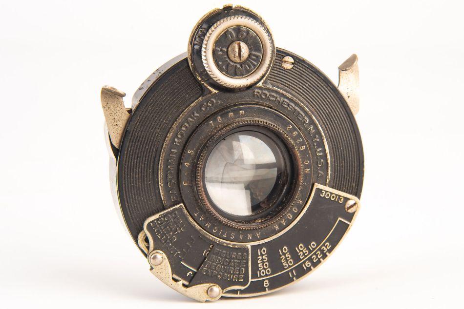
IT WAS NEARLY FIFTY YEARS AFTER THE ADVENT OF PHOTOGRAPHY that practical mechanical shutters ushered in the first era of fine control in the making of images. The lenses in the first cameras of the early 1800’s were always either “open” (lens cap or shield physically removed) or “closed” (cap back on). Exposure was a matter of experiment and guesswork. Once mass production entered the scene and shutters became a permanent part of every camera sold, photography passed from a tinkerer’s hobby to a mass pastime. Thousands of variations and refinements followed, but the mechanical shutter has remained an essential part of every image from snapshots to studio portraits for a century and a half.
At this writing, however, the evolution of the electronic shutter has reached something of a set point, making these byproducts of the digital age serious competitors for their mechanical counterparts, and, for more shooters than ever before, a superior option. Nikon and other manufacturers have, by early 2024, already released professional-level cameras that contain electronic shutters only, even as opinions pro and con on the two choices rage on among users. Some shooters see mechanical shutters as the biggest killers of cameras, since they are one of the only parts in new gear that can still wear out due to heavy use. Those of us who have sought bargains on the resale market are accustomed to seeking a “shutter count” on the unit we’re eyeing, so see what its remaining life span is likely to be. Electronic shutters, on the other hand, have no moving parts, capturing the image by reading exposure information directly from the digital sensor.
This can mean that ESes support a faster frame rate, allowing for shooting up to 20 frames per second, while also delivering exposures as quick as 1/2,000. On the other hand, fans of mechanical shutters say that they create fewer flash synch mishaps and avoid uneven exposures. Both camps agree that the virtual elimination of vibration from a mechanical shutter greatly reduces the chance of camera shake, and that electronic shutters are also completely silent, a valuable tool in stealth situations. And the debate rages on.
This article from Photography Life offers more factual fuel for both sides of the argument than can be summed up here. However, one thing seems clear: the lightning advance of today’s tech guarantees that the elimination of any practical flaws in electronic shutters is just a matter of time, with the mechanical shutter soon going the way of the physical film transport system, the light meter and other legacy tools that eventually are viewed as quaint but unwieldy obstacles between photographer and photograph.
THE NOTHING-TO-LOSE CLUB
By MICHAEL PERKINS
TAKE ENOUGH PHOTOGRAPHS AND YOU WILL FIND YOURSELF acting more deliberately, and thus less reflexively. Your snapshot mind, the scatter-shot, try-anything part of your brain that acts purely on impulse, is never completely eradicated, but is suppressed, tamed if you like, by a more careful and selective way of seeing things, a habit of taking additional time to size up a situation before you shoot. This evolution in style is to be expected, as you learn, over the years, that a few extra moments of mental prep can yield consistently better results than merely shooting from the hip.
And yet.
It’s not really healthy to let the prudent half of our brains win every argument. Likewise, we should never completely renounce our membership in the “Nothing To Lose” club, that proud aggregation of people who will always, always go for the shot, despite the realizations that I Brought The Wrong Lens, The Light’s Not Exactly Right, or It Probably Won’t Come Out. Don’t get me wrong: I love, love, love to think that my extra seconds of calculation and forethought will consistently give me better results. And, often, I am proven right. But shooting on instinct, in fact being comfortable with both randomness and uncertainty, can sometimes bring home the bacon as well. The only uniformly wise option is: always shoot something, or, as they say in politics, don’t let the perfect be the enemy of the good.
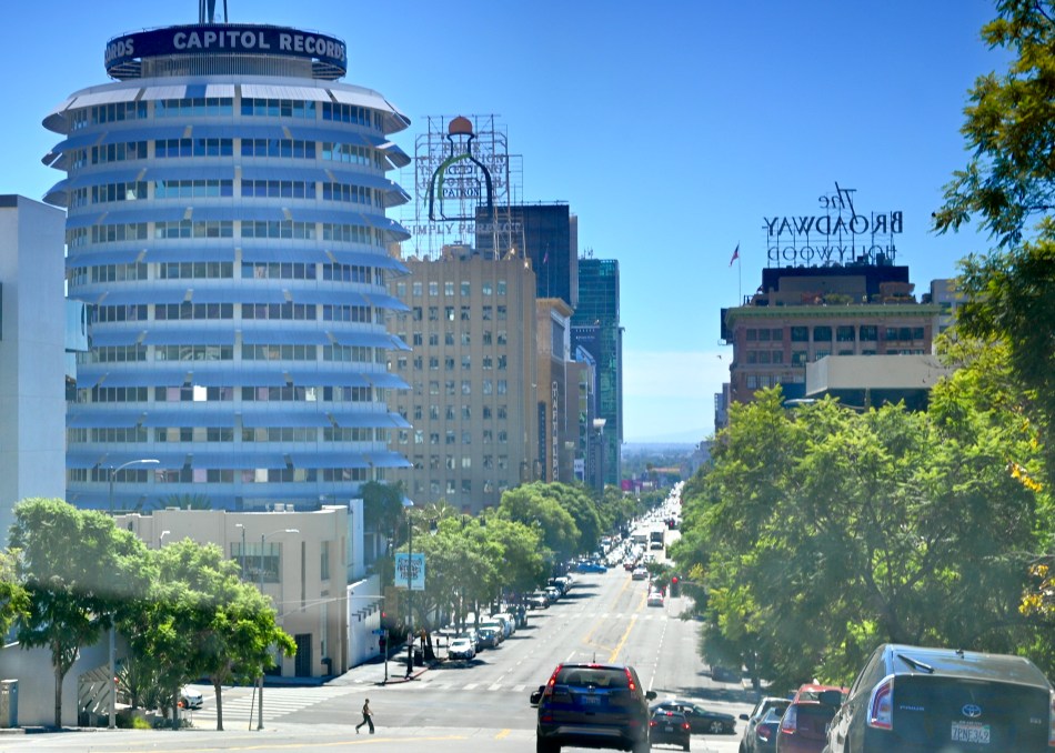
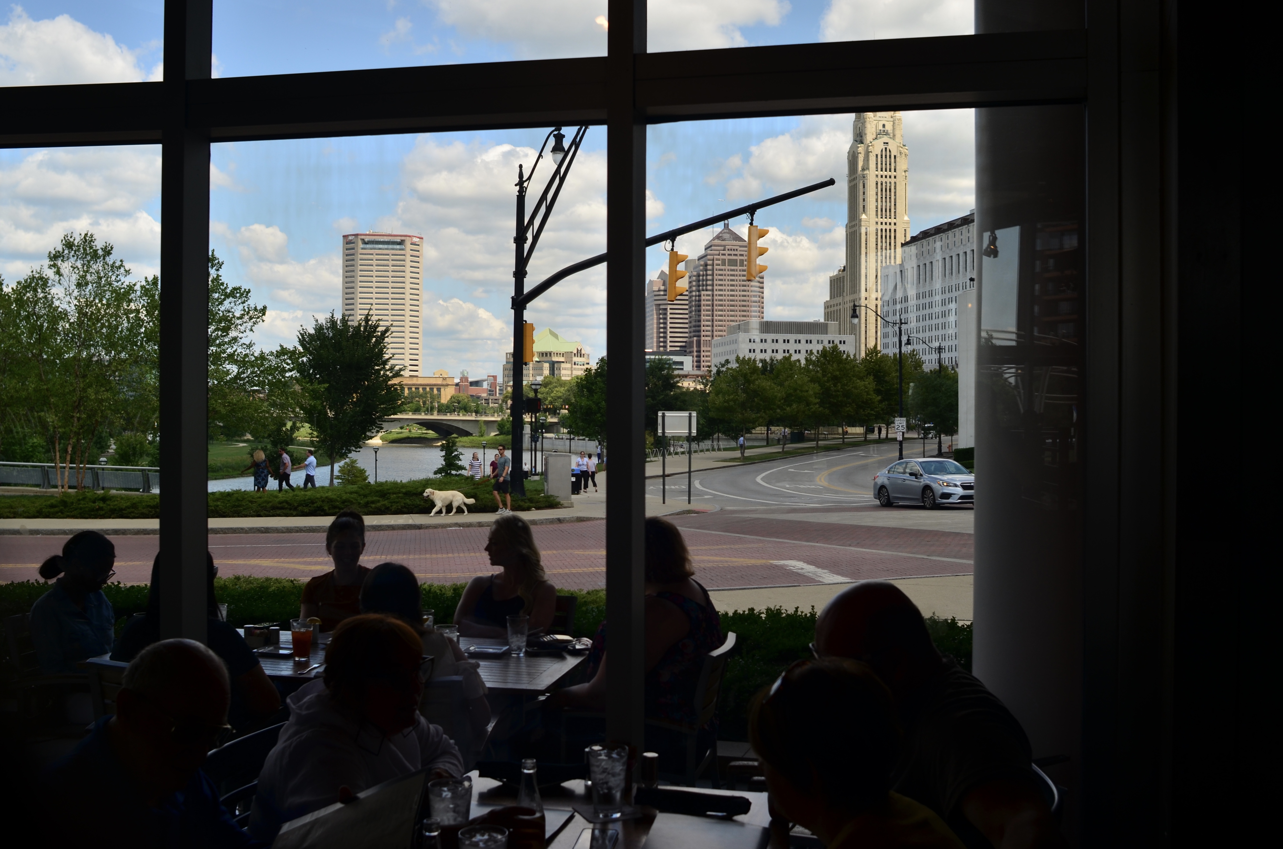
The Vibe On Vine, Los Angeles, September 2022
This windshield shot, taken on the fly during a recent ride down Vine Street in Hollywood, represents such a case. The car was not going to stop: it was not in our plans to get out, set up a formal composition of these iconic buildings, or take a walking tour through the neighborhood. And so I found myself, once again, a member in good standing of the Nothing-To-Lose club, and I got, well, what I got. And of course there are technical flaws galore in the shot, not the least of which is severe color imbalance caused by shooting through glare and factory window tinting, resulting in the loss of nearly a stop of light.
But I can live with the bruises on the peach because, generally speaking, I got to eat the peach. I may or may not be able to return to the scene in future to try for a four-star job, but, in the meantime, I can chalk this one up to what you might call a workable preliminary sketch, and stop stressing about it. Because, in the final analysis, by failing to at least try, I did have something to lose.
The fun of making a picture.
TRUTH VERSUS REALITY
By MICHAEL PERKINS
ORSON WELLES ONCE SAID OF JAMES CAGNEY that, while he was not a “realistic” actor per se, there had never been a single frame of film shot of him that was untrue. Something in the Yankee Doodle Dandy’s presence on screen was both more and less than real, and so, as a result, it registered with audiences as authentic, as if it ought to be true. Oddly, in making this observation, Welles may as well have been talking about two competing visions of photography, two disparate camps that choose either “truth” or “reality” in almost everything they create.
Many of us learn a formal definition of words like sharpness, tone, contrast, color, and many more of us learn that a certain combination of these elements equals a picture that is “like life”. This comes from the earliest years of photographic instruction, in which raw amateurs, who were necessarily outcome-oriented (i.e., wanting a return on their investment in gear and film) were given certain arbitrary rules for the making of a so-called “good” picture. But “good”, or “real”, or “authentic” according to whom? After reading all the “how-to” booklets, we have to spend the rest of our lives figuring out the answer to those questions.
In comparing these two renderings of a single landscape shot, what, in your mind, qualifies (or disqualifies) one version over the other in terms of its post-processing? Which reflects what I saw in the moment versus what I later re-sculpted in terms of tonal range, intensity, color? Which picture came first? (Spoiler: I’m not telling). Is one “realer”, or more naturalistic, than the other? Why or why not? And which one is, to your mind or eye, true?
More to the point, whatever your conclusion, how can it become the standard for my opinion, or his, or hers, or theirs? When we look at an image, are we actively weighing what was, at various stages, done to it, or do we merely judge the result (Spoiler Two: often we do both)? Cagney’s entire approach to acting was summarized in his advice to a beginner: “Plant your feet, look the other fellow in the eye, and tell the truth”. How that truth makes it from vision to result is anyone’s guess, and everyone’s decision. No manual, no set of rules, no formal class can teach that.
WHO’S IN CHARGE HERE? DEPENDS..
By MICHAEL PERKINS
THE OLD ADAGE ABOUT LIFE BEING WHAT HAPPENS WHILE YOU’RE BUSY MAKING PLANS also seems like a perfect fit for the act of photography. Certainly we love to take bows for our best work, and to let the myth persist that what’s hanging on the wall is exactly what we were going after in the first place. Well, I use the word “myth”. I actually mean “convenient lie”.
The scientist in us loves to keep alive the belief that we are in charge of our lives, that all our great results are the inevitable outcome of brilliant foresight and faultless planning. But the photographer side of us, the more instinctual half of our nature, knows how much luck and randomness figure into the mix. Yes, we came back with a great shot of C, but only after our “perfect” concepts of A and B fell flat.
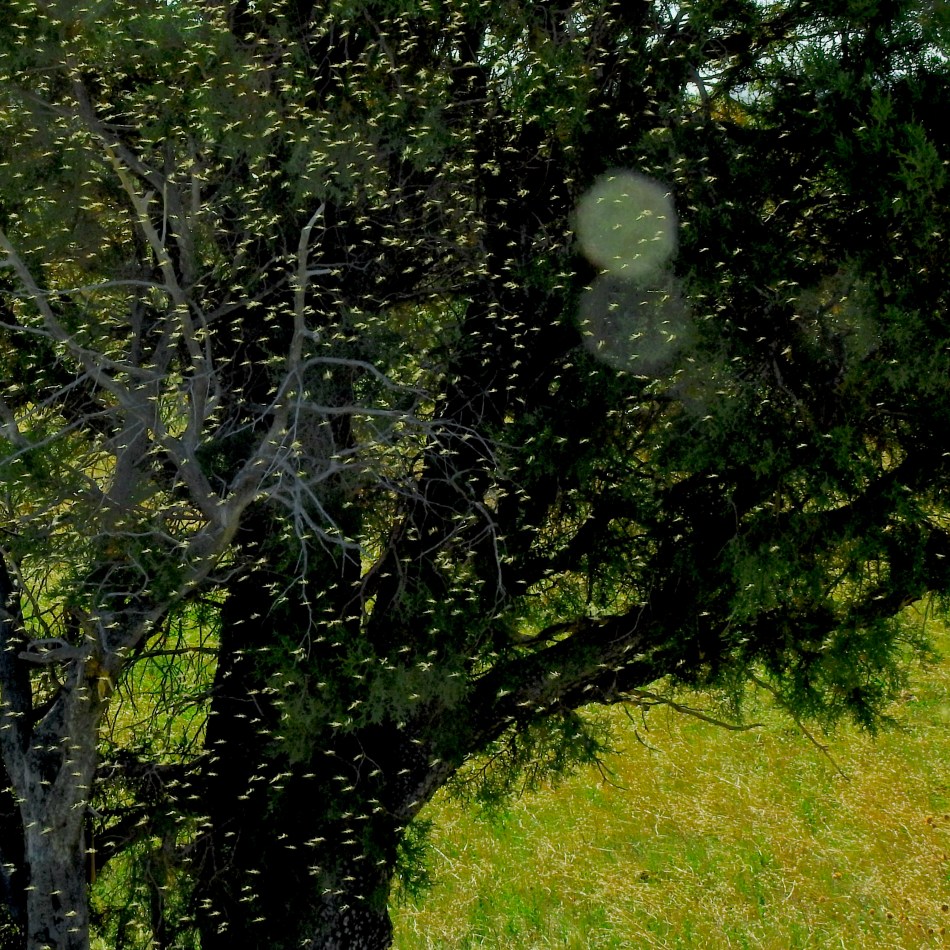
Several weeks ago, I went birding with a small group into a marshy area near Show Low, Arizona. The water was all part of a reclamation project that created the illusion of a large pond/small river in what is typically semi-desert, and the entire local landscape was transformed, because of the extra moisture, with reedy banks, plentiful supplies of yellow-headed and red-winged blackbirds, and, well, bugs. A bleeding swarm of infinitesimal insects which are a huge Happy meal for the flycatchers in the area, but which also fill the hair, eyes and mouths of any, well, non-birds in the area.
Which is where my plan A fell apart.
Yes, O logical side, we will, as expected, be taking pictures of shorebirds and the shores that host them. Easy call. But, oof, here comes the photographer side, the instinctual guy, who now wants to make a bug picture. But how? Everything is awash in early morning sun, which renders the swarm all but invisible. They are so thick that they may make even carefully focused pictures look soft, as if I had a diffusion filter attached to my lens. The only way, then, to at least suggest the look of the plague was to aim at the darkest thing I could find, which turned out to be a small copse of free-standing trees further inland from the water and standing in their own shade. At least I had enough of a picture to suggest my new, revised main message, to wit: man, there’s a &%$ton of bugs here.
And so it goes. Planner Me begins with a startup scheme. No-Plan Me eventually straggles with another viewpoint. And the eternal question of “who’s in charge here” for a given picture changes on a whim, or around whatever might be, sorry, bugging me at the moment.
HUE MONGOUS
By MICHAEL PERKINS
THE PHOTOGRAPHIC COMMANDMENT TO ALWAYS SHOOT IN BRIGHT LIGHT MAY NOT BE THE IRONCLAD RULE IT ONCE WAS (such are the advances of technology), but many generations were taught the habit as a “Photo 101” default. Especially back in the days of slower film emulsions, we were always told that brighter is better, with the more detailed how-to manuals explaining how to compensate for cloudy or overcast days. One of the reasons this “well, duh” rule made sense is how sunlight affects color.
As a consequence, light is always best regarded as a temporary, precious thing. There is only so much of it, and you’d better shoot while the shooting is good, and so forth. But just as temporary as the ways light shape color is how the changing state of things themselves can influence it. Like light itself, the condition of your subject will dictate what kind of color can be captured from it.

Take as an example the unfinished high-rise building seen here. The intensity of the sunlight affording us the ability to look clear through the empty structure, from one side to the other, is but one consideration in making this picture. Also to be factored in is how the lack of internal decor and furnishing will flavor the primarily bluish translucency of the tower. The exact same building shot three months later, in exactly the same light, but filled with desks and wall hangings, flesh tones, and a symphony of new shadows, will produce vastly different results, simply because the color relationships that the light illuminates in this shot will have been altered.
So, in addition to how much light we need, and what type of light we prefer it to be, we have to evaluate the things we are shooting and how their constituent colors play upon each other. With some subjects, a great seasonal or temporal shift will occur if we wait minutes, days, or months to make our attempts. Which goes back to the inherent complexity of making photographs, recognizing that there is no single way to “capture” or “fix” a thing in time. Whose time? Which reality? Which version of the truth?
PUTTING THE “O” IN ORACLE
By MICHAEL PERKINS
PHOTOGRAPHY IS NOT A PLACE TO ESCAPE THE FEELINGS OF UNCERTAINTY THAT COLOR nearly every human endeavor. If you’re looking for a sure thing, you’d best not ever pick up a camera. Like ever.
In a tsunami of tech-talk designed to assure and soothe the anxious snapper, perhaps we can only move forward by going back, in a return to the only universally recognized authority on how to conduct the affairs of man with clarity and surety.
I’m suggesting that we all dig into our toy chests and begin, once again, to trust the Magic 8-Ball.
Hey, if it was good enough to pronounce on whether that cute boy in Math likes you, or whether you’ll win a million dollars, it should be wise enough to help you make better pictures. Some of the Ball’s responses even seem to be custom-made for the modern photographic age.
Will my last good battery die just before the bride and groom cut the cake?
You may rely on it
Is this on-line equipment reviewer on the level, or is he just a corporate shill who gets his gear for free?
Better not tell you now
Will my new, cutting-edge have any manufacturer support from the manufacturer beyond, say, my next birthday?
Outlook not so good
Even in 2022, can I still manage to forget to remove my lens cap?
It is decidedly so
Will this editing software help me rescue my crappiest pictures?
Very doubtful
Should I perhaps share just one of the thirty-five frames I shot of my adorable cat in a Batwoman costume?
It is certain
Will more than one shot on a twenty-four exposure role of film from my plastic toy camera not make me cringe?
My sources say no
And, finally, should I just sell all my cameras and learn to paint? By the numbers, maybe?
Reply hazy, try again
Maybe trying to remove the risk from photography is the wrong approach (spoiler alert: it is). Maybe the uncertainty is not only the point, but the entire thrill. Perhaps pulling something organized and intentional out of randomness is why we do it in the first place. As to our chances for occasionally beating the odds and freezing something wonderful inside a box, the ball has the last word: outlook good.
MAYBE A CIGAR, ANYWAY
By MICHAEL PERKINS
A FACE ONLY A MOTHER COULD LOVE. That’s the standard cliche in describing someone so unlovable that he or she has, at best, a devoted audience of maybe one. The saying used to apply solely to physical beauty, but can, these days, define anyone or anything that is just this side of universally loathsome. Substitute the word picture for face and photographer for mother, and you’ve summed up what some of us feel for our rejected images, the ones we bitterly hate and desperately love at the same time.
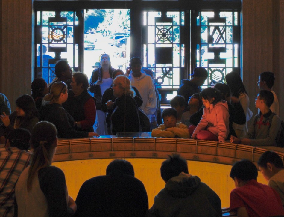
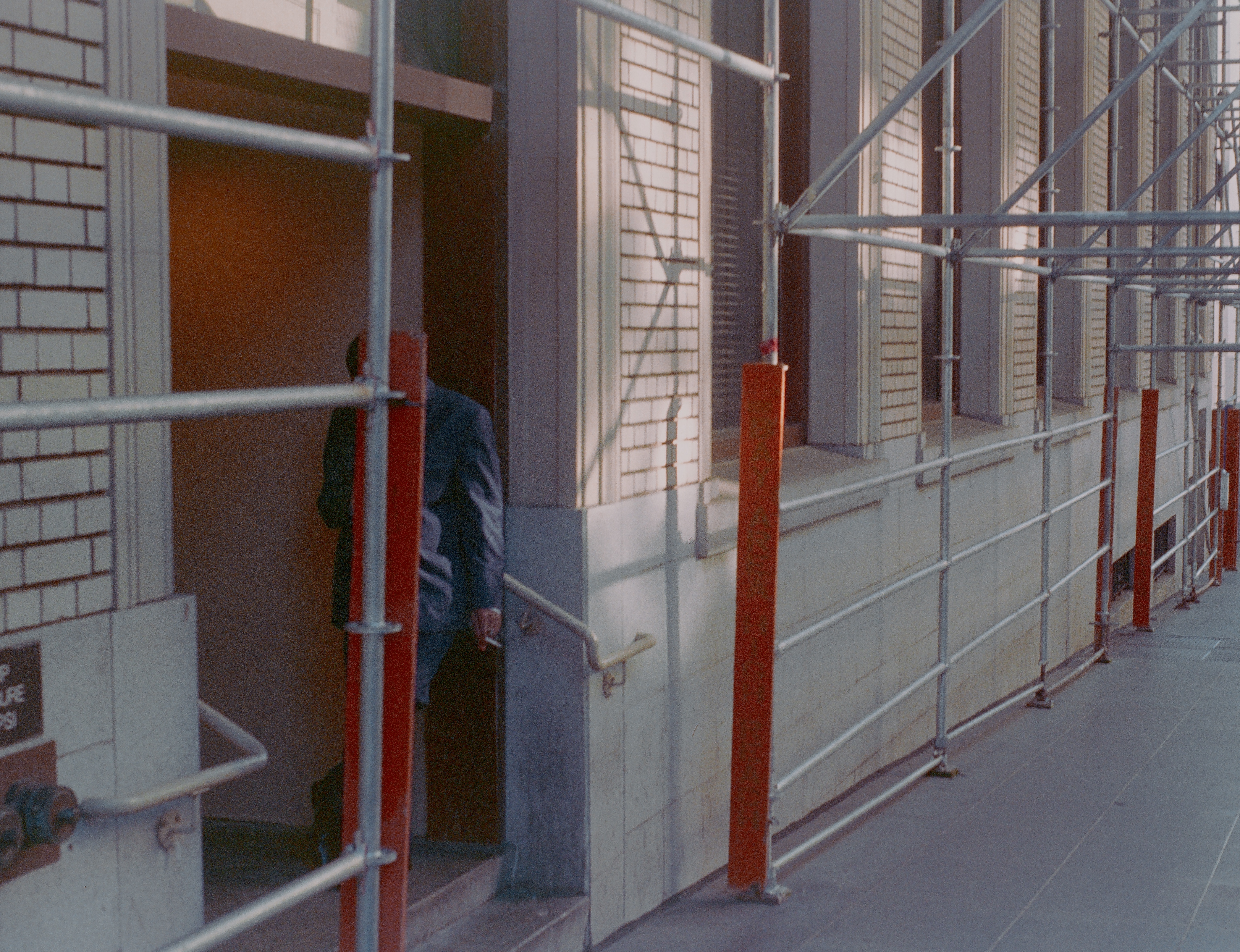
The image see here is one of my own top five red-headed stepchildren, a picture that is so close to being exactly what I wanted of it, yet so technically flawed that any person of taste or perception would immediately consign it to the rubbish bin, and with good reason. And yet, year after year, doing my annual “rehab tour” of pictures that I somehow can’t permanently destroy, it pops up, begging for love or at least a little maternal forbearance. My attitude is not so much close, but no cigar as much as can I have just one hit off of YOUR cigar? For effort?
The shot was taken in the circular rotunda that acts as the initial vestibule of entry to Griffith Observatory, which sits like a gleaming Art Deco Sci-Fi castle atop a promontory that overlooks downtown Los Angeles. The Keck rotunda’s walls are rich with murals that celebrate the great celestial and scientific discoveries of the ages, and the Foucault pendulum, seen here as the recessed circle that several patrons are starting into, bathes faces in a warm uplight that makes them look like glowing participants in a Maxxfield Parrish painting. In this snap (and it was a “snap”, with no more planning or intention than the word implies) the random poses of the crowd, including the young woman doing an “oh, wow” as she enters through a door, look impossibly staged, something that endears it to me years later.
But, then there’s that total blowout of high blue and white light from the parking lot, taken in an attempt to capture the entrance’s unique metal grillework. I mean, the entire effect of the picture screams “preliminary sketch”, only I didn’t go back and do the technical work that would have corrected the contrast, color rendition or overall exposure. Never has so much raw material been presented with so little in the way of decent execution.
And therein lies the face “only a mother could love”. Like any mom, we love in spite of what our kids actually are, in spite of what they actually achieved. And we weep a little about what might have been, of what little more effort it might have taken to actually win the cigar.
OWNING YOUR ORPHANS
By MICHAEL PERKINS
ONE THING THAT HAS GOTTEN HARDER, RATHER THAN EASIER, in the making of photographs in the present day, is dodging the answer to the question, “what’s wrong with this picture?” Yes, this picture. The one right here. The one you took. At its inception, the art of capturing an image was heavily weighted with obstacles to merely getting things done from a mechanical point of view. Now, several centuries on, the technical guarantees (what some might call idiot-proofing) of the process has taken more and more of those traditional alibis for making lousy photos off the table. What remains on the table: we either did or did not make the picture happen. We. Us. Me.
Over a lifetime, I have seen a slew of excuses for lousy images dissolve like sugar, from I had the wrong speed film and the flash bulb didn’t go off to I left the lens cap on, many of them obviated by succeeding improvements in gear and the ability of manufacturers to anticipate both our needs and, let’s face it, our incompetence. By now, however, with cameras nearly possessing their own artificial judgement-making ability, the list of reasons why a photo bombed has been reduced to things like I brought the wrong camera, this isn’t the right light/hour/day to try for a picture, and the sun got in my eye. More and more, there is one stubbornly persistent cause I find behind most of my muffed shots:
I don’t know how to make the picture.
Think about it: how many of your photos that you currently feel came up short are due to technical failure, equipment malfuction, or not having enough options to get the job done? A failure to realize one’s vision was once something where, between you and your gear, there was plenty of blame to go around. Now, there is still blame, but all arrows lead back into our own faces.
I don’t like this picture. And it really doesn’t matter that I can’t yet analyze just why it failed. The only thing that will allow me to eventually address its flaws is to admit that the fault lies with me. My vision. My poor choices. There is nothing technically wrong with this image. It was exposed properly by any general rule of thumb. And yet… it just lies there, like a lox. And the fault in such pix is even worse if the image was taken with fully manual settings, because I opted to make all the choices in the making of it, delegating nothing, certainly not responsibility, to the camera. And yet these are the only pictures that will ever teach me anything.
If my answer to a failed shot is, “jeez I don’t know what happened” (and assuming I’m not lying through my teeth), then that picture is worse than worthless, since I’ve consigned it to chance or lousy luck. In fact, my worst pictures are educational chiefly because the more I understand myself..my motives, my conceptions, and so forth…the more I can deliberately make something better. And this is certainly true for anyone. But first, you have to honestly, totally and lovingly own your orphans.
FALLING IN AND OUT OF LIKE
By MICHAEL PERKINS
THEY’RE LINE CALLS, COIN TOSSES between success and failure, those thousands of photographs we generate over a lifetime that never quite stray into complete wretchedness or float all the way up to Beloved status. They float languidly in the vast midrange between the delightful and the awful that makes up most of our pictorial output, earning faint praise like “pretty good”, “not bad” or my favorite, “yeah, that’s OK.” They are the pictures that we fall “in like” with.
Sometimes I find it easier to cope with my absolute garbage than with the massive mound of mediocrity that occupies the middle floors of my personal output. At least the photos I took while swinging wildly for the fences show commitment, however misguided. After all in even my worst failures, there is also a trace of my grandest dreams, whereas the thousands of “good enough” shots show neither the wild abandon of going for broke or the grand miracle of high art. They’re just….there. Somebody cue the poet with the line about faint heart n’er winning fair lady, or something high-toned like that.
There are those who might even regard the mushy mediocre middle of their total photographic portfolio as just as worthless as their Total Misses, but I maintain that the stuff in the gooey center of our work files is exactly half-good, as well as half-bad. In fact, that’s the maddening thing about “OK” pictures. They never get where they’re headed.

The image seen here is a prime example of a picture that’s suspended between the goal posts. It’s almost well-composed, as well as almost fluid in dynamic range, almost texturally rich, almost, well a lot of things. It isn’t quite a stinker, but it also certainly isn’t a stunner. And as meh as you see it here, the original, wider shot was even more indecisive, with hot blowouts of the shoreline that were later cropped away and just too much information for a coherent narrative. And yet, I have spent the better part of three weeks trying to remain “in like” with the shot, trying to convince myself that it’s more successful than it is.
Of course, just as is the case with an abject failure, this shot is worth keeping. Because every failure is instructive to some degree, and the fact that I’m able to diagnose what kept the image from being good means I’ve already mined it for any clues on where improvement is needed. It just doesn’t need to be paraded around, that’s all. Plus, if nothing else, middling shots hone our editorial skills, since we have no business posting or boasting every single time we click the shutter.
Speaking of clicks, I recently determined that there have been over 130,000 of them on the camera that took this shot. Where does the time go? I “shutter” to think how many of those snaps added shame fodder to my lifetime hit/miss average. But, oh well. I think of the farmers in the Great Plains in the days of the Dust Bowl, living harvest-to-harvest in an insane state of constant gamble, who, in describing how they summoned the hope to go on, nicknamed themselves the “Next Year People”. When will I deliver on the unrealized promise of all my most mediocre shots? Next year, people.
SAY NO MORE
Huck Took The Shortcut, 2021
By MICHAEL PERKINS
THE ABILITY OF A PHOTOGRAPH TO PRETTY MUCH ILLUSTRATE EVERYTHING IN LIFE can tempt shooters to try to do exactly that; to pack a universe of stuff into every frame. In the minds of some of us, the camera is an information-gathering machine, and so, the more information, the better. But if we call to mind the photographs that have affected us most profoundly, we may see that there’s a hierarchy in the way information is presented in many of those uber-keeper photos. Everything in the world is not a number one priority; events and experiences are always ranked higher in importance than some and lower than others. And the photograph that shows too much may actually not communicate anything particularly well. Things need to be chosen and unchosen in order for a picture to breathe.
As a consequence, rather than showing four hundred trees of equal size and detail in a frame, we deputize one or several trees to stand for the entire forest. In any routine edit, we decide to crop out things which are part of the scene but which either don’t, narratively speaking, carry their weight, or, worse, act as distractions. It’s not only all right not to show everything, it’s a really important part of the covenant between artist and audience.
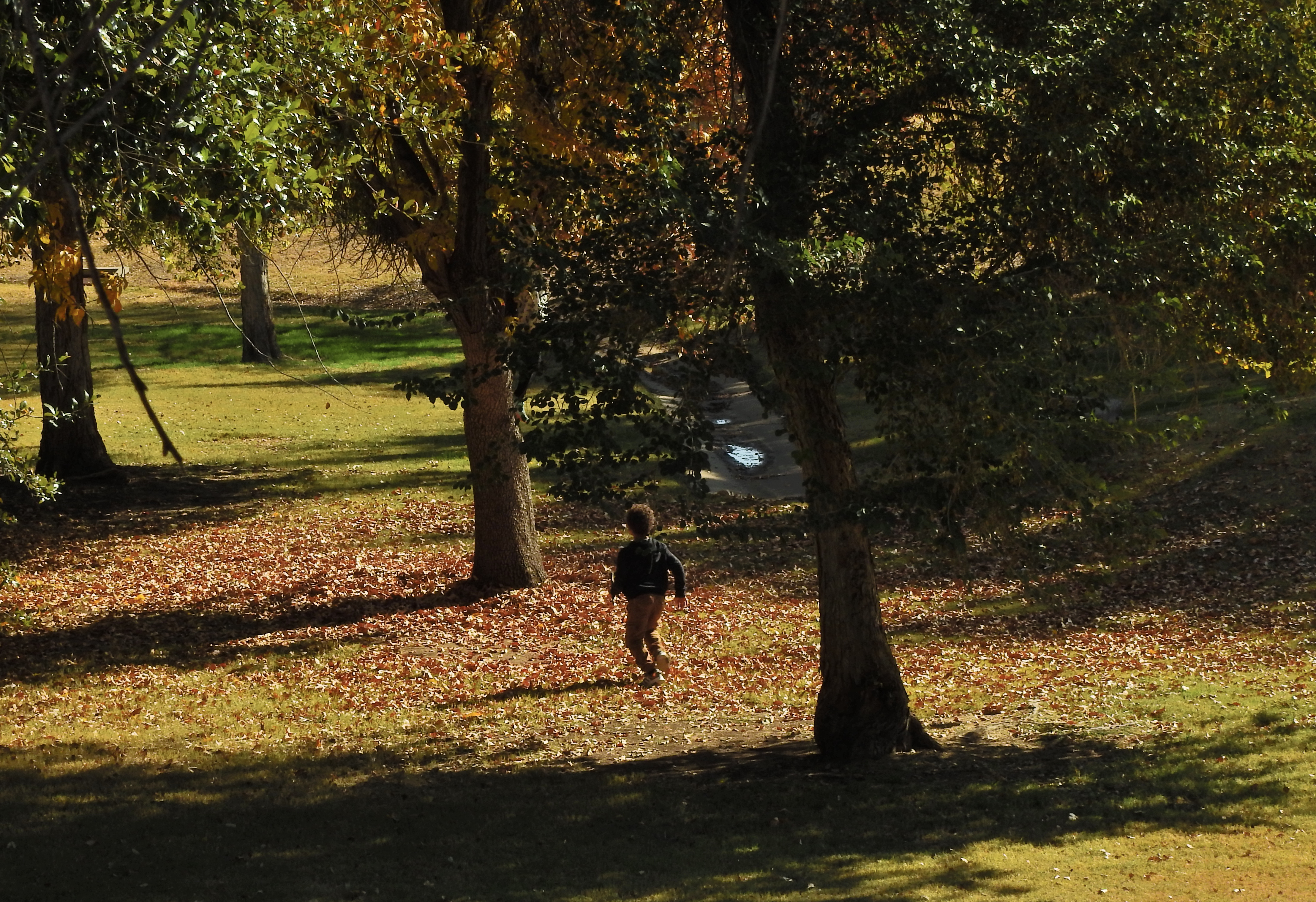
When you leave out some kinds of information, you’re respecting your viewer’s intelligence, since you’re recognizing that you both share a vast store of common experience, some of it so obvious that it can merely be implied and yet understood. As a very simple example, in the image seen here of a young boy running through the woods, his body language conveys all that’s needed for a complete understanding of the scene. Every part of his physical energy advertises the freedom and excitement he is experiencing, even though the picture provides little more than his silhouette and nothing whatever of his features. Would he be any more clearly delineated as a happy young boy if you were to show his smiling face? And as to the surrounding trees; they are, in life, rich in texture, but the prevailing shadow doesn’t keep them from being identified as trees, and so, really, how much better could that work, even if they were all in complete sunlight?
I’m only occasionally an advocate of minimalism for its own sake, mainly because in many cases it’s not the right approach. But over-delivering on information, while creating a thorough “document” of a scene, also has the potential for short-circuiting an image’s impact. As is often the cases, the best rules are the ones that come equipped with tons of exceptions.
THINK A, SHOOT D
Many of us don’t miss anything about analog photography except the discipline of it.
By MICHAEL PERKINS
2020’s GREAT HIBERNATION HAS FORCED US to add many arbitrary items to our “to do” lists, if for no other reason than to consume the mountains of newly available time with which we find ourselves encumbered. We know that a certain number of our new daily tasks are what bureaucrats call “make-work” projects, but the therapeutic value of adding real energy to even “fake” goals is indisputable. And for photographers, those projects can involve a return to things we used to do but came to consider ourselves as “done with.”
For me, that’s meant a revisitation of film, not so much for any superior aspect it might have over digital shooting, but as a refresher in the use of habits I’ve held longest as a photographer. First; it’s true that, given the technical advances and conveniences introduced over the years, there is nothing left in analog that I can’t do almost unilaterally better and faster in digital. Nothing. However, from a planning or sensibility viewpoint, there certainly are mindsets that analog photography confers upon your process. As a consequence, I try to balance the discipline of working with film with the ease of shooting in digital…to think A and shoot D, if you like.
In film, you were working with a finite work medium. Your camera could only take 24 or 36 images at a time without being hungry for more “fuel”. You paid for each new dose of that fuel, and then you paid again to have it processed, in order to see if you succeeded or failed. Worse, there were no “do-overs” built into the system, which meant that you paid real money even for your mistakes. This automatically slowed down your picture-taking process and taught you the habit of planning purposely for a set outcome. Anyone who is too young to have ever shot film has no direct experience with the extra steps in metering, measuring and composing that accompanied every shot. Everything took four moves or more. Additional lighting was cumbersome and often unreliable. Worse, some kinds of film were more unforgiving of mistakes than others, and they usually came at a premium price. And then there’s the risk of not even being able to get the camera to give you what you want. The analog frame seen here, for example, took me five full minutes to shoot, and I can still find about a dozen things wrong with it. But I can inform my digital work with the thought process it took me to make this imperfect analog image.
So far, I’m doing a great job of unselling everyone on analog for all time. But in an age in which there was no immediate results for your shots, the exercise of planning and waiting before shooting had a payoff. You seldom shot anything you didn’t care about. You were slower, more deliberate about shoots, and tended to pre-plan them, to engineer all the failure out of a picture well before you took it. You edited yourself in advance, because it cost too damned much to, as in the digital era, just crank off thirty variations of every subject and hope one of them worked out. Am I asking anyone to go out and buy a roll of film and load it into Grandpa’s Hasselblad? Not at all, and that’s not even the point. It’s far more important to shoot with analog’s special brand of intentionality, even within the comfy confines of digital. As I said earlier, think A and shoot D. Maybe an exercise in which you shoot your next, say, thirty-six images on 100% manual settings, with no re-takes on any of them and no allowing yourself to go beyond that arbitrary number of frames, might be valuable. Or not. We no longer need to put up with much of the drudgery of film, but we might be well served to observe some of the disciplines it imposed on our work.
YOU AS DEFAULT
By MICHAEL PERKINS
THERE IS AN ONGOING, BUT SELDOM HOSTILE, debate among photographers over whether manual or automatic focus is superior, or in which cases one or the other performs better. This forum is not an attempt to settle that issue, any more than I’d squeeze myself in between two auto aficionados to weigh in on either manual or automatic transmissions. Suffice it to say that nearly every shooter I know has a preference, if not an outright belief, on the subject. So be it. Peace, love, dove. Make pictures, not war. Anything in the following that sounds like a recommendation is merely a description of what works, or doesn’t work, for moi.
Autofocus systems are, in fact, an attempt by technology to make it easier to check off at least one box from your “before I can take the picture” list, making cameras a smidge more intuitive so that it’s easier to concentrate more on the why of making the image and less on the how. Of course, your mileage may vary on whether you regard this as a kindly assist or an untoward interference. Photographers of a certain age predate the autofocus era, and so had no choice but to master manual until the AF option was introduced. For those who started making pictures in the last thirty years or so, however, AF pretty much came with any toy you bought, and there may be little occasion to even read up on how to approach things manually. And then there are those, like myself, who lean in one direction (manual) while toggling the other way in special cases. I cal this the “me as default” system.
How to give an auto-focus system the nervous fits.
There are certainly times when the sheer speed of autofocus is bloody convenient, such as so-called “run and gun” situations where conditions on an event or person are in a constant state of flux (think little league baseball, bird watching), at which times I will gratefully lean on AF to avoid missing shots. However, I am often reminded how many things, from low light to the wrong combination of elements in a composition to time exposures, will absolute leave the autofocus searching, grabbing and blunder-blind. These will vary depending on the age of your camera, manufacturer, even the design bias of a particular lens. I have spent a long time trying to nail manual focus with less and less reaction time, and, to that end, I shoot for long stretches without changing lenses so as to become more instinctual about what a given chunk of glass will do. There’s also the idea of personal agency. In manual mode, I am not delegating to the AF the decision on what should be in focus: it’s my call completely. This, again, is a very personal decision, and there is no right or wrong choice. For me, being responsible for every major decision in making an exposure is the only way for me to feel as if it’s my picture. That said, I no longer mess around with a light meter or figure out flash settings with a slide rule and a sextant, so I can easily be called out for my hypocrisy. Still.
And then there’s the occasional oddball situation, like the above image, in which you can get a little playful with what either AF or manual can or can’t do. But as I said at the start, we are not here to settle this issue as we might decide the winner in a boxing match. If your pictures come out the way you want, then it matters little if you even had a lens on the camera. Both manual and AF shooting situations have their travails. I guess what I’m finally getting to is that both approaches will serve you in certain times. Find out what those occasions are, and master them, and yourself, in the process.
LAND OF NARROW SHADOWS
The narrow streets of Lower Manhattan can often be shrouded in shadow.
By MICHAEL PERKINS
IT’S A GIVEN THAT WALKING AROUND IN NEW YORK CITY IS A VASTLY DIFFERENT SENSATION depending upon where on Manhattan Island’s sprawling, kaleidoscopic grid you first plant your feet. The legendary contrasts from one neighborhood to another, as you journey from rich to poor, brassy to peaceful, are a key part of the collective character of the whole. Photographers, however, since they are necessarily fixated on variations in illumination, may have an additionally unique experience between the cramped streets of Lower Manhattan and those in any other part of the region.
Quite simply, there is a premium on the amount of light that reaches the pavement in Lower Manhattan, the legacy of a spurt of urban growth that, in the first grand era of the skyscraper, threatened to smother the city’s avenues in darkness. Before the historic “setback laws” of 1916, buildings tended to grow not only tall but also virtually straight up, occupying the full space of the owners’ property lines all the way out to the sidewalk. As a result, it only took a few years into the twentieth century before Lower Manhattan’s streets were cloaked in shadow, with many byways too cramped to allow sunlight to make it to the pavement at all. Zoning was thus revised to require future buildings to rise only so far (the precise formula varies with height) before they would have to “set back”, or recede, to a smaller section, then be allowed to rise again by another maximum percentage before setting back yet again, with the cycle repeating up to the top. The new laws created the template for what we consider the modern skyscraper, which, for decades would feature a wide base followed by tapering sections that ended in a capital, rather like an open telescope. Think of the Empire State Building as emblematic of the breed.
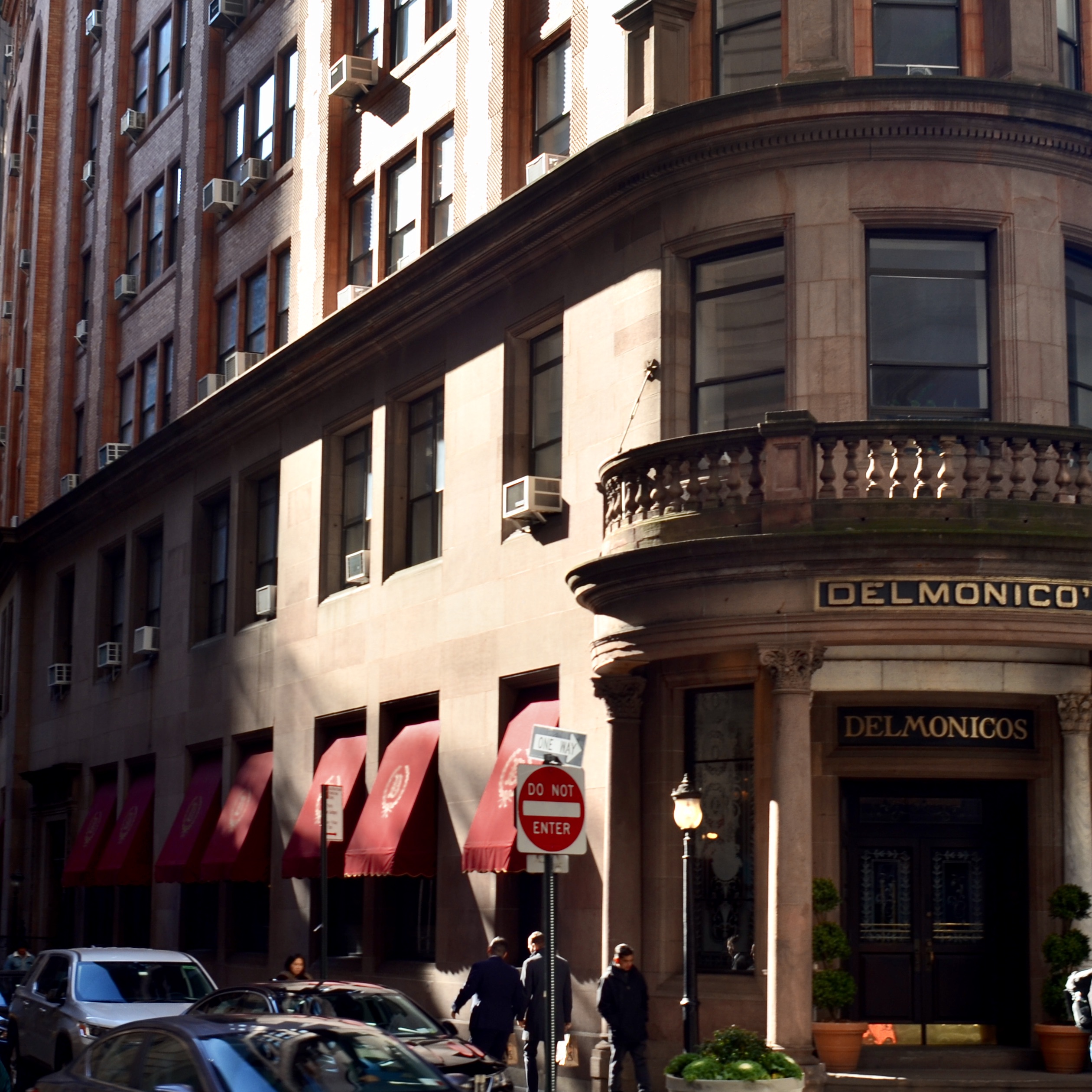
Of course, for the streets in Lower Manhattan, especially the old financial district around Wall Street, the dye, in 1916, was already cast, with sunlight only making the occasional angled crawl into the lower stories, something which can create interesting patterns that shift and scatter throughout the day, tinting colors with a moodier edge and causing the occasional under-exposed image. The effect is sometimes like being inside the studio of Rembrandt, or any other artist credited with the use of so-called “Dutch lighting”. The overall sensation, to me, at least, is one of warmth and comfort. My wife, a native New Yorker, spent years working near Trinity Church, and considers the area claustrophobic, even as her hayseed Midwesterner husband gives it a thumbs-up. Of course, the entire area is also dotted with scads of ornate old-growth icons of skyscraper lore, such as the bull-nosed building that houses the legendary Delmonico’s steakhouse (seen at left), buildings that further enhance the time-traveler feel.
Photographically, there’s no reason to settle for one kind of New York, as there are literally dozens of flavors of it on offer at any one time. Me, I like to make pictures where the light creeps in on little cat feet instead of thundering in like a megawatt marquee. You pays your money and you takes your cherce, er, choice.
ON-PURPOSE ACCIDENTALS
By MICHAEL PERKINS
FOR PHOTOGRAPHERS, THE SOCIAL-MEDIA EQUIVALENT OF SMACKING SOMEONE ON THE BACK and saying “Attaboy” is affixing the remark “Great capture!” to your “like” of another person’s images. This is meant to be a compliment, but I think it is misapplied. Of course, on one level, I admit that carping about one little word constitutes world-class nitpicking on my part. On the other hand, I think we need to think critically about what happens in the making of an effective picture. It’s an active, rather than passive, process.
In one sense, a camera does, in fact, “capture” a scene, snatching a millionth of a minute from its place in the steady flow of time. But seldom does a golden moment or lovely subject present its best self to us, ready to be harvested, requiring only that we lower our butterfly net. Photography is a much more deliberate art than that. In fact, we often happen upon images of things that are not yet “ready for their close-up”, in that the first way we see them may not be the best way for us to show them to others. Long before the snap of the shutter, we select our angle, our composition, our light, and even reject all of those choices and make them all over again. We are carefully crafting the best way to reveal something….not merely happening by and passively recording it.
In this spirit, the word “capture” simply isn’t strong enough, as it implies little more than luck in the production of a great photograph. In fact it is really describing a snapshot, in which something very great may have been gathered, but without much in the way of effort. It’s like complimenting someone on catching a baseball no one was expected to catch, a celebration of good fortune rather than skill. Photographs aren’t made merely by grabbing whatever the camera is pointed at: they’re made by a selective process of saying “yes” to some elements by including them in the frame and then reaffirming those elements even further by saying “no” to many other elements that might otherwise clutter or complicate the communication between image and viewer.
Photographs are a visual checklist of what to see and what to ignore.
Ken Rockwell, a pro photographer whose www.kenrockwell,com site also functions as an online clearing house of technical information on the specs of various camera manufacturers, occasionally steps away from his role as Lord High Adjudicator of gear and reminds his readers of the true essentials of their art. In these random pep talks he will often insist that, in the end, nothing….no lens, no camera, no shiny new toy.. can supplant the human equation in the making of pictures. One of his best such sermons illustrates (far better than your humble author can), just what an “on purpose” process is afoot in the best pictures, as in this paragraph, where he discusses the difference between composition and the mere act of framing:
“Composition is the organization of elements within a frame that leads to the strongest, clearest, cleanest, simplest, most well-balanced and therefore best picture. The best composition is the strongest way of seeing a subject. Framing is what you do by zooming in and out, by moving the camera up and down and left and right, and by rotating it to any angle, including vertical and horizontal. Framing has almost nothing to do with composition, but sadly, few photographers realize this. Framing can’t do much of anything to change the relationships between objects. Framing is easy. One usually can frame a picture after it’s shot by cropping. Composition is very difficult. Composition is what makes or doesn’t make a picture. Composition is the organization of elements in the picture in relation to the other elements…..”
Nothing, of course, will ever eradicate all the “great capture” salutes from the interweb, and maybe we should just stipulate that a compliment is a compliment. But I love to emphasize, since it is so important, that what you all do in the creation of wonderful images is purposeful, not random, that great pictures seldom just jump into your camera. When a composition is eloquent, it is usually a photographer, and not a camera, who has given it voice.
WHEN NOTHING TURNS OUT TO BE EVERYTHING
By MICHAEL PERKINS
EVER SINCE ADAM AND EVE BIT THAT DAMNED APPLE, humans have demonstrated that the thing they really want is the thing they are told they can’t have.
Stay with me here: this actually has a lot to do with photography.
Deny somebody something and they will long for it, lust after it, obsess about it. Consider the case of the Portugeuse, who, for a while, tried to run things in Mozambique, in order to harvest that African nation’s rubber, and who told the locals that their traditional ceremonial instrument, an early kind of xylophone called the mbila, would henceforth be forbidden as a cultural expression. As a result, an entire underground of information on how to play it was maintained by exiled miners, prisoners, and assorted other rebels. The result? Eventually the Portugeuse left: the mbila stayed. Today, the instrument is even featured on the local currency.
We can’t have it? Wanna bet?
Humans. Go figure.
But back to photography, where, similarly, the thing we are “told” we “can’t have”, at least in an image, is whatever is left out of the frame. Missing detail. People rendered in shadow. An activity that’s implied by the manner in which part of it is cropped. We love what the photographer shows but we hunger for what he leaves out.
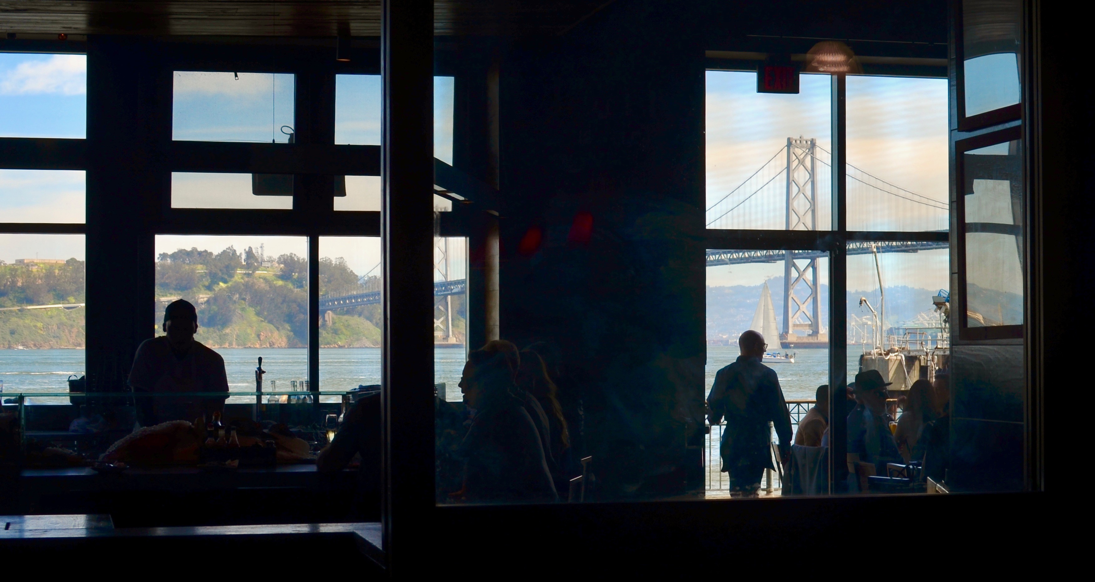
Subdued Baywatch, 2019
Out-the-window shots are a great source of this phenomenon, since shooters are usually forced to expose for either what is in front of said window or beyond it….but seldom both. The rise of HDR and tone mapping in recent years has tried to address this, rendering everything in the same degree of illumination, often with bracketed exposures, from light to dark, that are blended afterwords in software. But there’s a problem. Many HDR’s are simply over-processed, defying the mind’s knowledge of the proper relationships between light and dark. Everything’s visible but can easily be garish, unnatural. And so many of us go back to simply deciding what selected parts to illuminate in an image, and which to leave undefined. That means some darkness, which in turn means some things don’t get shown. And, if we’re lucky, those things that we don’t reveal can be more tantalizing than those that we do.
I was walking around the back of the old Terminal building in San Francisco, which is the place that all the city’s ferries used to dock and disembark before the Golden Gate Bridge was built, making many daily boat trips across the bay unnecessary. The building now houses eateries, produce stands, and an insane amount of tourist traffic, much of it crowded into restaurants such as the one seen here. The view out the back includes the Bay Bridge and the local ship traffic, as well as the occasional sailboat, such as the one seen here. I exposed for the scenery, leaving the restaurant’s patrons and workers in shadow. The scalloped, rather “peek-a-boo” view that resulted keeps the image from being a standard postcard shot, but while that “purity” is lost, what’s gained is a smidge of mystery about the shadowy folks in front. What are their conversations about? Why are they here?
I am just suggesting here that, instead of always regarding an image like this as a “blocked” or “obstructed” view of a scenic vista, you can choose to tantalize your viewer by providing a partial reveal of both foreground and background, since their inclination is already, like that of Adam and Eve, to obtain what they’re denied (in this case, by the exposure and the limits of the frame). Sometimes, in a photograph, a nothing can be a very important something. It all depends on who’s looking and what they themselves bring to the experience. In that way, they and the photographer are having a conversation. Which is kind of the idea.
ERRING ON THE YES SIDE
By MICHAEL PERKINS
EVERY ONCE IN A WHILE, IN THE VERY INSTANT THAT I COMPOSE AND SNAP A PHOTOGRAPH, it occurs to me that, in the past, there might have been circumstances under which I talked myself out of taking that very same shot. That is, there is something in the scene before me that, at some time, might have convinced me not to attempt the picture at all. I don’t know whether to interpret this feeling as proof of growth of any type, or whether it just demonstrates my utter lack of confidence. I just know that, on different days, I can be a very different kind of photographer.
As habitual users of The Normal Eye already know, this small-town newspaper is less about the mechanics of taking a picture and more about the motivations. If we don’t understand what compels us to click/not click in particular situations, it’s pretty hard for us to figure what the whole thing’s about. Photographs are chosen, not “taken”. So, let’s peel apart my inner conversation in the making of the image seen below.
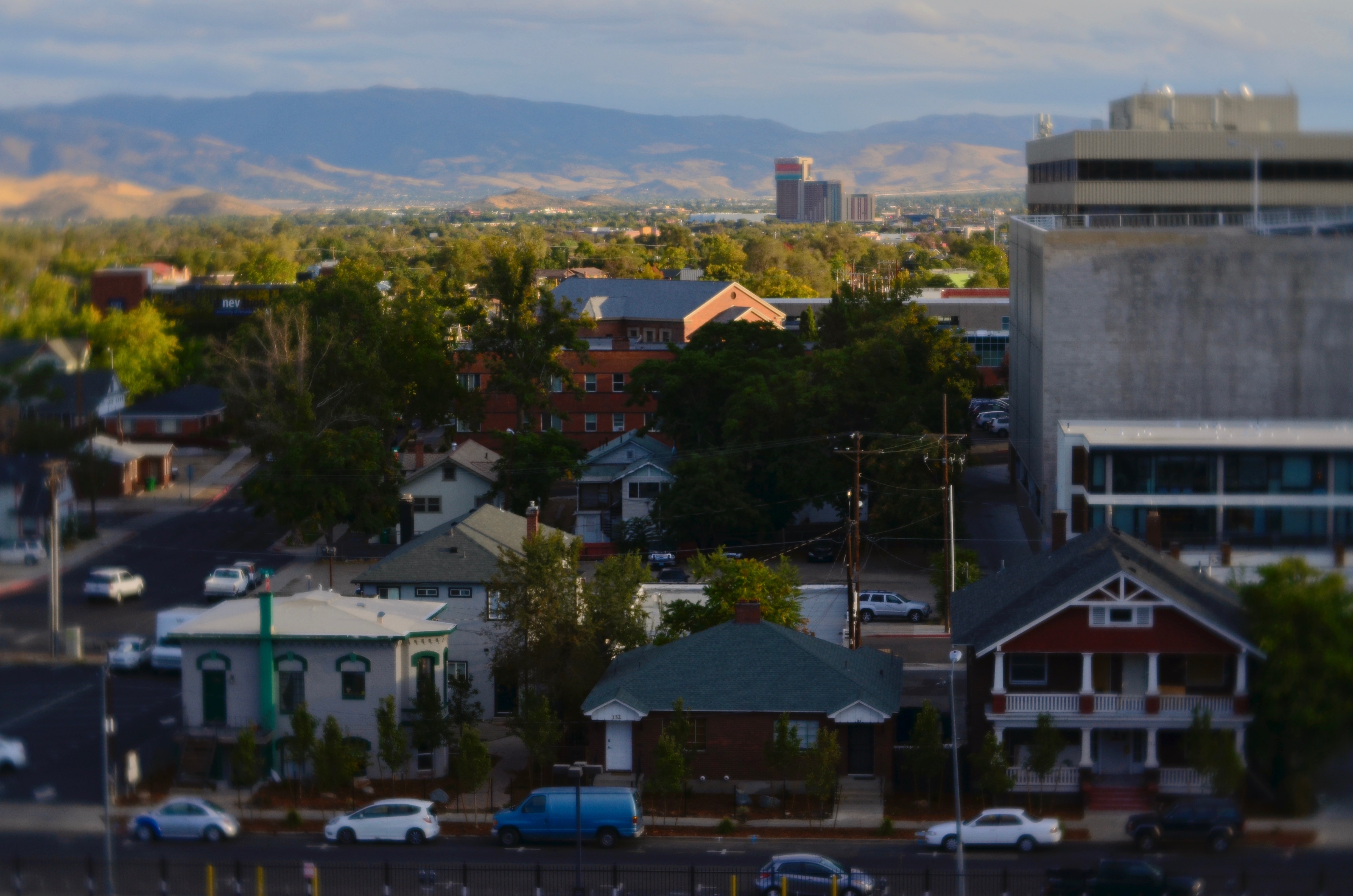
Small Town, Big Horizon, 2016
In looking at this scene from two years ago, in which some shadowy residential streets of Reno, Nevada are back-stopped by the Sierras, I could, through my own experience, easily rattle off a short grocery list of reasons not to attempt the picture. Among them:
There is too wide a contrast between the foreground and background (but is that a problem, really?).
I’m shooting through a window and therefore can’t absolutely suppress glare and reflection (but is that a deal breaker?).
There is, at first glimpse, no human story in evidence (or is there merely an absence of people in the frame? Aren’t the houses indicative of a “human story”?).
Okay, I’ll take the picture, but I’ll totally fix it later in “post”( fix it, or over-cook it and make it “ideal” rather than natural?).
……..and so on, with the additional inclusion of the most compelling “why not to” reason of them all:
the last time I tried something like this, it was a disaster.
*******
You can see where this can lead. The very experience that should be helping you make more, better informed choices can actually scare you into seeing certain shooting situations as fraught with risk, as something to be avoided. Since we know what didn’t work in the past, we tend to think we also know what won’t work in the future. In reality, though, every time we’re up to bat, some little thing is different from our last time. Huge stuff like a different camera or lens, small stuff like being tired or distracted and every other variant in between. We may think we’ve “been here before”, but that’s only generally true. The only real way to make a picture a success or failure is to try to shoot it. Guesswork, even guesswork based on real-life experience, can paralyze. Sift through what you know and what you’ve lived through. Re-live all your so-called “failed” pictures, and then get back on the horse. As Rudyard Kipling said, “meet with triumph and disaster, and treat those two imposters just the same.”
I don’t preach many absolutes here, but remember this one:
Always. Shoot. The. Picture.
WHO’S ZOOMIN’ WHO
By MICHAEL PERKINS
THE LONGER YOU’RE INVOLVED IN PHOTOGRAPHY, the greater chance there is that, at some point, you’ll at least wonder if a telephoto lens should be in your arsenal of gear. As with any other lens, I believe that, over time, the need for a zoom will become fairly obvious….either obviously needed or obviously superfluous. That is, your shooting will drive your technical needs and dictate what you deem as essential equipment.
That means not buying any lens, especially a zoom, before you find yourself in repeated situations where it might have made the difference in your work. The reason I deliberately state what should be a “duh”-type truth is that there are still some photographers who gear up with everything under the sun before they demonstrate their strengths or desires by the kind of images they pursue. This means that you don’t buy lenses and then try to find a use for them. Working that way all but guarantees that the things you never evolved a genuine need for wind up consigned to the top of the hall closet or on a yard sale table.
So let’s go back to the example of telephotos. It’s completely possible that your particular work will never indicate that you need one. I can cite many amazing photographers that seldom, if ever, use them. I myself have only one modest 55-300mm zoom, which I can safely is in use once, maybe twice a year. And that’s a net increase in its use, due to the fact that I now spend increasingly more time accompanying my wife on her birdwatching expeditions. Even at that, I seldom use the things for actually photographing birds. My eye is far too untrained to locate them in most cases, and I am just as content to use the 300mm for landscapes, macros and other wildlife. Were I bitten as hard by birding bug (bug?) as Marian, I may already have ponied up the dough for a more powerful version of what I use. But bitten I am not, and so I am stuck with my original biases against zooms…..that is, that they are generally too slow, too dark, too poor at color rendition, and supremely aggravating to focus on the fly. Am I grossly over-generalizing? Of course. But you judge these things on your own results (indifferent) and your own limits (considerable).

The Lord Of Little Things, 2019. 1/250 sec., f/10, ISO 500, 300mm.
In the view you see here, I am almost at the extreme limit of my 300’s usefulness, with my bullfrog quarry about thirty yards away, making him a medium-large speck in the viewfinder even when I’m fully zoomed out. This means that locking auto-focus on him will be strictly hit-or-miss, necessitating a shoot-check-shoot-check cycle in an effort to catch the toad before he can get bored and blow the scene. And that’s assuming that I can get auto-focus to lock at all. In many cases, going manual will keep me from issuing a verbal blast of mostly blasphemous bile in getting the shot, but even that is no guarantee when working hand-held. Are we having fun yet? My point is that, at least for me (notice the italics), zooms trade access for precision and speed. Sometimes, as in the marginally lucky result you see here, the trade-off is worthwhile. Other times….
So, to my earlier point. I could trade up to a more powerful zoom, if I were to demonstrate a need for one by the typical work I produce….. and if I decide to give up food and shelter to finance the thing. Again, the idea is….let what and how you shoot dictate what you’ll buy to shoot with. From where I stand, one frog a year still doesn’t scream ‘buy more glass”. As always, what makes some of us grin makes others of us grimace. And vice versa.
OF CLEARINGS AND COVER
By MICHAEL PERKINS
“LOST IN THE WOODS”. “DEEP IN THE FOREST”…conjure your own phrase for the sensation of entering, and being swallowed by, dark, mysterious places. Realms of shadow, primordial laboratories in which both dreams and nightmares are brewed. In other words, sites where photographers can wax poetic. Or crash and burn.
Forested areas are both challenge and opportunity for shooters, since they are seldom subject to the same laws of composition or exposure as subjects shot out in the open. Mastering light in woodsy settings can be a crusade in its own right: details can melt into dark murk or be completely blown out in sudden shafts of sunlight. I have produced more mushy, indecipherable messes with more cameras in more forests than I care to count, in pictures which inadvertently produce more mystery than they reveal, as in “what’s this supposed to be?”
I can come a lot closer to coherence when I work with partial clearings rather than dense woods, working with simpler compositions that suggest the feel of the forest from its near edge rather than its center. Exposure becomes a more streamlined process as well.
Also, since the emphasis in such a shot is on mood rather than detail, even the basics of focus can become, well, negotiable, as seen here. But then, almost anything in the making of a photograph is. Or should be. My point being that, when the taking of a picture fails, it can be because the photographer is trying to execute too many things at once. Eliminating some of those things until the image becomes manageable can be, like walking out of a dark forest, a profound relief.
THE SECOND PASS

Vancouver’s amazing Marine Building, a Deco freak’s feast, in early morning (flat) light.
By MICHAEL PERKINS
SOME VISUAL SUBJECTS ARE SO RICH IN POTENTIAL that they evolve from a few essential shots to what, for lack of a better term, passes for a photo “essay”. Such extended coverage of buildings, countries and people used to be common in the heyday of the picture magazine, with up to a dozen pages of images strung together with narrative links in the pages of Life, Look and their many imitators. It’s a great format to work in once you discover a worthy candidate. But, in practical terms, it can be a little like working a checklist.
I document a lot of Art Deco architecture, since it embodies history, abstraction, illustration, design, and fantasy, all in one big fat buffet. That means I spend a lot of time dodging passersby on sidewalks and lingering in lobbies long enough to make the security personnel twitchy. Deco is all about the splendor of detail, some of which can only be revealed by patiently moving from door to grille, elevator to stairway, entrance to entrance, and looking for light that will bring that detail into bold relief.
I used the word checklist a while back because you are often working one in your mind, ticking off the various items as you wander around the site. Gotta do the mezzanine. Need a shot of the ceiling. Did I catch those wall sconces? Thing is, we tend to think of those little check marks as meaning, I’m done here. Moving on….when, in terms of what changing light does to these buildings within a short span of time, we should be actually be thinking, okay, I’ve done the preliminary work. Should go back and check this again in a while. Deco, especially, is rife with reliefs and murals made from a wide variety of materials, many of which will register color and shadows very differently at different times of day. You have to think in terms of “Take One, Take Two”, rather than in the snapshot mentality of “nailed it.”
The same entrance just a few minutes later. The sun has climbed in the sky and created dramatic contrasts in all surfaces.
The images you see here, of the entrance to Vancouver’s magnificent Marine Building (read all about it here) were shot just twenty minutes apart. The top shot shows light landing on the door and its surrounding niche fairly flatly, almost sideways. However, within minutes, as seen in the second shot, the sun has climbed high enough in the sky to blast away at the center of the space, throwing the overhang of the arch into deep shadow. This change intensifies the contrast between raised and flat surfaces and makes the exterior terra-cotta (a material in which the colors are baked right in) more vivid. It also is projecting shadows like crazy. Which version is better? Not the point. It’s about editing choices and being reluctant to think that there is one “official” way to shoot something.
I could show similar changes to the lobby, with light softly entering the stained glass over the door, then crashing through it like a golden ray just minutes later. The point is, exposure is time plus light, and, when tackling a large essay-type project, it’s important to do more than one visualization on key elements. It’s the difference between grabbing a souvenir and creating a keepsake.

PERFECT VS RIGHT
By MICHAEL PERKINS
OUR VERY HUMAN DESIRE TO MAKE OUR PHOTOGRAPHY TECHNICALLY FLAWLESS can be observed in the results you can glean from a simple Google search of the words “perfect” and “photos”. Hundreds of tutorials and how-tos pop up on how to get “the perfect portrait”, “the perfect family picture”, “the perfect sunset”, and of course, “the perfect wedding shot”. The message is all too clear; when it comes to making pictures, we desperately want to get it right. But how to get it right…that’s a completely different discussion.
One of my favorite selfies, even though I can’t justify it by any technical standard.
Because if, by “perfect”, we means a seamless blend of accurate exposure, the ideal aperture, and the dream composition, then I think we are barking up a whole forest of wrong trees. Mere technical prowess in photography can certainly be taught, but does obeying all these rules result in a “perfect” picture?
If you stipulate that you can produce a shot that is both precise in technique and soulless and empty, then we should probably find a more reasonable understanding of perfection. Perfect is, to me, a word that should describe the emotional impact of the result, not the capital “S” science that went into its execution. That is, some images are so powerful that we forget to notice their technical shortcomings. And that brings us to the second part of this exercise.
Can a flawed image move us, rouse us to anger, turn us on, help us see and feel? Absolutely, and they do all the time. We may talk perfection, but we are deeply impressed with honesty. Of course, in two hundred years, we still haven’t shaken the mistaken notion that a photograph is “reality”. It is not, and never was, even though it has an optical resemblance to it. It became apparent pretty early in the game that photographs could not only record, but persuade, and, yes, lie. So whatever you shoot, no matter how great you are at setting your settings, is an abstraction. That means it’s already less than perfect, even before you add your own flaws and faults. So the game is already lost. Or, depending on our viewpoint, a lot more interesting.
Go for impact over perfect every time. You can control how much emotional wallop is packed into your pictures just as surely as you can master the technical stuff, and pictures that truly connect on a deep level will kick the keester of a flawless picture every single time. The perfect picture is the one that brings back what you sent it to do. The camera can’t breathe life into a static image. Only a photographer can do that.
Share this:
May 28, 2017 | Categories: Aperture, Focus, P.O.V., Technique | Tags: Commentary, Composition, exposure, process | Leave a comment