GO WES, YOUNG MAN
By MICHAEL PERKINS
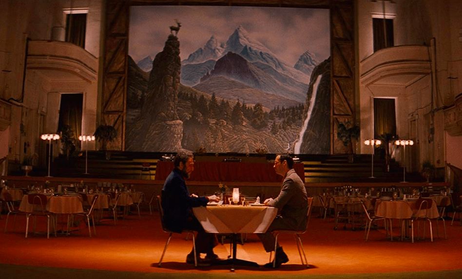
IF IMITATION IS THE SINCEREST FORM OF FLATTERY, then film director Wes Anderson (The Grand Budapest Hotel, Moonrise Kingdom, Fabulous Mr.Fox) must be blushing about five layers deep. His unique system of composition, even more than his overall cinematic style or subject matter, is currently the jumping-off point for a bumper crop of homages, parodies, websites and books, all celebrating the quirky look of the arcane locales he uses to stage his surreal and sweet comedies. As a result, there is now a recognizable signature image, a “Wes Anderson-like” shot, that occupies one of the more enjoyable wings in the Photo-Art gallery.
Anderson manipulates the real to appear unreal, by breaking certain accepted rules of composition, or, to be more precise, asking why they were accepted in the first place. For example, it’s typical for shooters to frame an object so that the illusion of depth is created…either by leading lines, side-angles, and off-center location in the frame. Wes frequently shoots what has been called flat space….that is, a head-on view of an object or scene (as in the above frame from The Grand Budapest Hotel) that is so nailed to the rear plane of the image that it could have been a 2-d poster pasted to a wall. There is no attempt to make the shot look “deep”, or to invite you eye inside it. Then there is the accepted no-no of placing the subject dead center in the frame, even allowing dead or open space around it. This isolates the subject, making it appear apart, alien, not of this world. Perfectly centered pictures of places with an obsessive amount of symmetrical detail (windows, ornamentation) are supposed to be boring, say all our teachers…except when they actually become hypnotic.
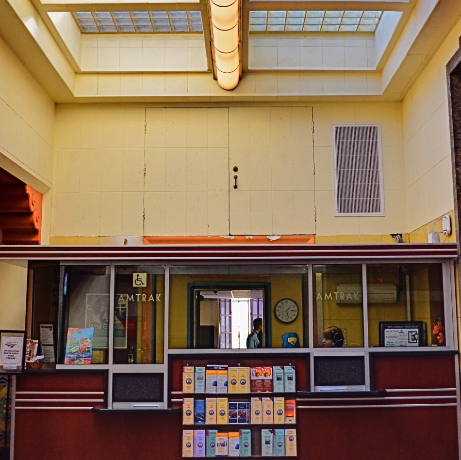
Anderson seeks the strange in his subject matter, design-wide and otherwise, and then amps up that strangeness with a saturation of primary colors and odd pastels. He makes real places look like table-top models (which he sometimes uses) and vice-versa. This assembly of techniques make his locales fairly scream “once upon a time” and, beyond his own work, have sparked admirers and imitators to see things in the same way, so that a Google search of “Wes Anderson look” yields thousands of pictures that he himself never actually made, such as my own shot of an old information booth at Los Angeles’ Union Station, seen above.
Old Hollywood dictated that directors have no discernible style or signature, while recent filmmakers insist on the dead opposite. In recent years, so many people were shooting their own “Wes Anderson” images that an entire Instagram feed, AccidentlyWesAnderson, began to attract a global fan base, recently resulting in Wally Koval’s sumptuous coffee-table book of the same name, a sampling of the best pictures from the feed, accompanied by detailed essays on locales new and old around the world that resemble the surrealistic perfection of Anderson’s own images. It’s art-imitating-life-imitating-art-imitating…?
Are all these images true tributes, artsy rip-offs, or an admission that photographic rules are meant to be broken? Can we even make pictures that are non-ironic or free of outside influence? Should we worry about it? While we sort all of that out, it’s just fun to try on Wes’ skin and walk around in it. Whatever we wind up with in our own work will, at least, come as a consequence of our observing, and questioning “how you’re supposed to do it.” Because in photography, tools matter less than what those tools eventually build.
THE TYRANNY OF, LIKE, LIKING
An image which was nobody’s “fave”, but it made my list. 1/50 sec., f/6.3, ISO 100,18mm.
By MICHAEL PERKINS
MY MOTHER WARNED ME FOR MY ENTIRE BOYHOOD THAT, IF I LIVED MY LIFE TO PLEASE OR GARNER THE APPROVAL OF OTHERS, I would spend it “following a little red wagon”. Now, I can’t paint my generation as being populated by the last of the rugged individualists (after all, we have to live down that whole “flower child” business), but, when it comes to current social networking, it seems like that little wagon is indeed speeding along at light speed, with the rest of us slavishly tailgating it in desperate search of one crucial word:
“like”.
Let me state categorically that I view sites like Instagram with an equal measure of hope and dread, since history has yet to rule on whether its billions of filter-soaked snaps advance photography or mire it in mediocrity. That said, I am certain of one two-part truth:
1. Photography is essential to social networking, and
2. Social networking is not essential to photography.
Simply stated, the hungry maw of social media needs an endless resource of fresh meat, with photos as vital a component as text. To keep this torrent of images rolling in, it bestows little training treats on the millions to motivate them to submit their works and keep the machinery oiled. This is what likes, retweets, and faves have become. A gold star on your spelling paper. A little extra beef on your mess kit tray. Good boy, Fido, here’s your “like”.
But here’s the thing. You cannot grow your personal art if you are bending the arc of it purely toward the goal of popular approval. Art is not about getting “likes”. On the contrary, it’s frequently about garnering “hates”, deaf ears, blind eyes, misunderstanding, antipathy, even shunning or banishment. Art needs to make people uncomfortable, to confound and distress. And, just as it is in leaving our personal comfort zones that we stretch as photographers, we need our audiences to leave theirs. Guess what: they will not do that willingly or happily.
If it does it for you, one more or less “like” will not change that. 1/400 sec., f/5.6, ISO 100, 35mm.
History provides easy evidence of this: cough up the names of your ten favorite “legendary” photographers and chances are that most of them were marginalized, despised, or otherwise shunted away during their best years. There is a reason for this.
“Likes” are seductive, but they are merely quantitative, not qualitative. The raw number of people who numbly click “like” on a photo tells you nothing of what they felt was right, or elegant, or beautiful, or awful in an image. Such little emotional check-offs may stoke our need to be seated at the cool kids’ table, but they do zilch to make us better shooters.
To be a great photographer, you cannot afford the luxury of whether anyone else “gets” what you do. Let’s stop settling for photo sites as popularity contests.
They need you. You do not need them.
RESOLVED
Los Angeles, California, November 22, 2013. 1/100 sec., f/1.8, ISO 160, 35mm.
By MICHAEL PERKINS
THERE IS A DECIDED BIAS IN THE CONCEPT OF THE NEW YEARS’ RESOLUTION TOWARD THE NEGATIVE. Since we often define ourselves in terms of what we haven’t yet perfected in ourselves, many resolutions revolve around losing something (weight), stopping something (binge-watching Ren & Stimpy) or rooting something icky out of our personality or habit structure (insert your own wish list here).
Fair enough. But, in order for us to grow, we also need to resolve to add, to enhance, to amplify the best part of ourselves. And, for photographers, I can’t think of a single more compelling resolution than the pledge to see better and develop our expressive vocabulary in the new year. We already have the toys, God knows. It has never been easier to get your hands on image-making gear or to disseminate the images that you manage to create. Photography has reached its all-time high-water mark for democratization, with 2013 showing us that gasp-inducing, heart-stopping pictures can and will be made by anyone, anywhere. There is no longer an artificial barrier between pro and amateur, just a subtler one between those of us who have practiced eyes and those of us (nearly all of us) that need to tone our seeing muscles a bit tighter.
1/250 sec., f/1.8, ISO 100, 35mm.
Photography can obscure or reveal, defining or defying clarity as we choose. A resolution to keep seeing, to open our eyes wider, is more important than resolving to “take more interesting pictures”, “do fewer self-indulgent selfies” or “try all the cool filters on Instagram”, since it goes to the heart of what this marvelous art can do better than any other in the history of mankind. What can be better than promising ourself to always be hungry, always be shooting, always be straining ourselves to the breaking point?
For me, a good year is when I can look back over my shoulder during the last waning moments of December 31st and see at least some small, measurable distance between where I’m standing and where I stood last January 1st. Sometimes the distance is measured in micro-inches, other years in feet or even yards. There are no guarantees, nor can there be: human experience, and what we draw forth from it, is variable, and there will be years of no crops as well as years of bumper harvests.
But let us resolve to see, and see as fearlessly as we can. The Normal Eye has always been about its stated journey from “taking” pictures to “making” them, acknowledging that it’s seldom a straight-line path to perfection, and, in fact, we learn more from our failures than our successes. Happy New Year.
NO CLEAR “BLACK AND WHITE” ANSWER
Hey, He’s just not that into you: In-camera monochrome, on a Nikon d5100: 1/200 sec., f/5.6, ISO 100, 35mm. Street photography sometimes benefits from a limited tonal range.
By MICHAEL PERKINS
SHOOTING IN BLACK AND WHITE, BEFORE THE DIGITAL ERA, WAS AN ACTIVE, RATHER THAN A PASSIVE CHOICE. You had to decide, before loading your camera, what an entire roll of film would be able to capture in terms of color/no color. There was no way to change your mind until that roll was completed and replaced. As you pre-chose film speed, light sensitivity, or special processing considerations, you also committed, before Frame One, to a single tonal option.
If you are really getting long in the tooth, you can remember when monochrome was the default choice for most of your film shoots. Economy was one factor, and, for certain shooters, including many of the pros, there was a lack of confidence that color films could render nature reliably. Giants like Adams, Edward Weston and others eschewed color throughout most of their careers, since they feared that either garish emulsions or the limits of extant printing processes would betray them in a way that black and white would not. And of course, in a world in which post-processing meant the skillful manipulation of a negative and the mastery of print-making, monochrome was simply an easier beast to tame.
Wow, are we ever in a different place.
Today, we can change our “film speed”, light sensitivity, and every kind of color emphasis frame-by-frame, and for many of us, color is our first choice, with many monochrome images post-processed from shots that were originally multi-hued. Photoshop and countless other programs allow us to have it all, with endless nuanced permutations from a single capture. Black and white is now often an “effect”, an after-thought derived later rather than sooner in our thought process. Oh, look what happens when I push this button. Cool.

Shot in color, de-saturated in post. A boring shot in color becomes super-bland when rendered in monochrome. Blame the shooter, not the mode.
Most users’ manuals for today’s cameras, especially DSLRs, actually advise converting color images to b&w in “post” rather than enabling the camera’s picture controls to shoot monochrome in the first place. The prevailing opinion seems to be that results will be better this way, since processing offers finer-tuned controls and choices, but I take issue with that, since I believe that color/no color as a choice is best made ahead of the shutter click, no less than choices about aperture or DOF. You need to be thinking about what black & white can bring to your shot (if anything) as part of your pre-shoot visualization. The tonal story in a picture is simply too important for you not to be planning it beforehand.
The quality of in-camera monochrome modes for both Nikon and Canon are both perfectly adequate to give you a workable image versus converting the shot later with software, and that’s good, because getting the shot right in the moment is better for the result than infinite knob-twiddling after the fact. Monochrome is a tool for telling a story or setting a mood. It makes sense that its use be tied to what you are trying to achieve as you are planning it….not slathering it on later as an oh-this’ll-be-keen novelty. That’s Instagram technique, not photographic technique.
One great habit to retain from the days of film: anticipate your need, and shoot according to that need. Plan ahead. “Fix it in the lab” only works for shots with slight imperfections, frames in which the concept was sound enough to warrant painting away a few flaws. Going to black and white to save an iffy shot is a Hail Mary pass at best.
As as we all know, you don’t always get what you pray for.
That’s the truth. In black and white.
Follow Michael Perkins on Twitter @MPnormaleye.
Related articles
- Capturing Texture in Black & White Photography (jdgilchristphotography.wordpress.com)
- Black and White used like Color (atmtxphoto.com)
SEVEN MORE WONDERS OF THE WORLD
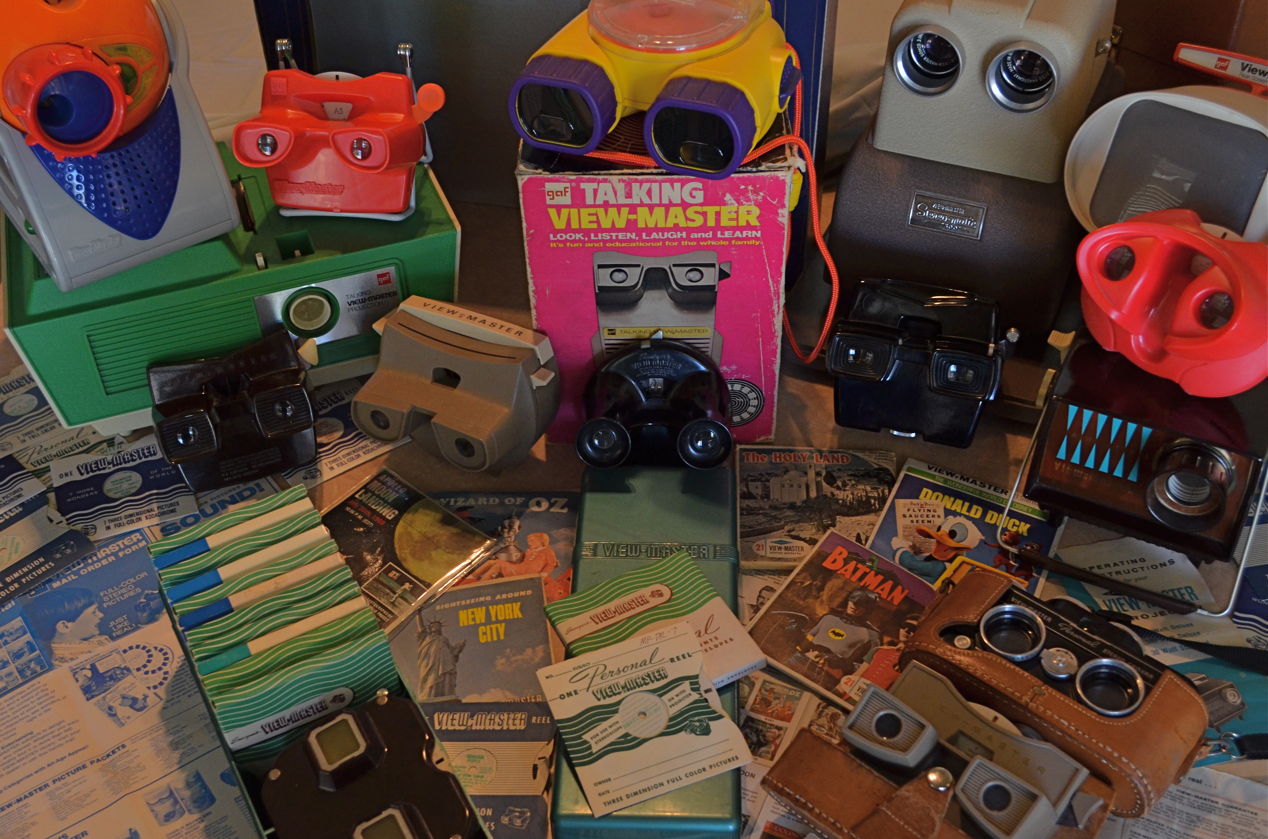
Class Picture: A small sampling of the massive product line from over sixty-four years of View-Master. 1/80 sec., f/5.6, ISO 640, 24mm.
By MICHAEL PERKINS
I’LL NEVER KNOW THE NAMES OF MANY OF THE PHOTOGRAPHERS THAT HAD THE GREATEST ROLES IN SHAPING MY EARLY WAY OF SEEING. The most important primary influences on my visual style in childhood weren’t the guys who received billing in the very public credits of Life, Look, or National Geographic, but the nameless freelancers whose work popped out of the small 3-d Kodachrome squares mounted in white cardboard View-Master reels. To this day, I can directly link the way I visualize images to VM’s crew of uncredited shooters, with their full-color highlight tours of everything from Yosemite to Notre Dame. Truly, from the first brown bakelite Model “D” viewer I received as a boy, through endless model variations over the next fifty years, I framed my own method for telling a picture story after the scenes in those little blue envelopes which bore the portentous legend, Seven More Wonders Of The World.
If you’ve been out of short pants for a while, you might not know that these little middle-tech stereoscopic beauties are still around, although just barely. View-Master has provided diversion and delight for three generations of devotees the world over, but the ride, billions of reels and zillions of memories later, might finally be crawling to a halt. More on that in a moment.
The co-invention of a photographer/tinker and a postcard salesman, View-Master cranked out its first rudimentary viewers and travel titles in 1939, more or less growing out of its appearance at the New York World’s Fair, where its souvenir views of “The World Of Tomorrow” made their debut. One of the earliest VM subjects was the then-new Boulder (later Hoover) Dam, setting the tone for the format’s explanatory “texts”, image descriptions short enough to make Tweets look encyclopedic, all crammed to fit inside the tiny caption window resting between your eyes. View-Master was largely an adult amusement for its first decade, catering to the armchair traveler with an endless catalogue of national parks, castles, cathedrals, and natural wonders, selling through a network of dealerships at camera shops and the souvenir stands at various travel attractions. Many of the format’s contributing scenic photographers also made some side money as VM sales agents, criss-crossing the country by car, shooting a little here, selling a little there.
By the early 50’s, View-Master grew from single-subject reels to three-reel packets and from travel images to its first children’s titles. Entering into a contract with Walt Disney studios, the VM format made a seismic shift toward youth fare with cartoon and TV shows, movies, even their own original fairy tale and nursery titles, shot with tiny clay figures arranged in their own miniature tabletop dioramas. And of course “the scenics”, as they were called, rolled on to chronicle many more World’s Fairs, canyons, mountains, parks, even NASA flights.
Depending on when you first encountered the format, View-Master was made either by Sawyers, GAF, Tyco, Fisher-Price, or Mattel, and the classic viewer was joined by projectors (2-D and 3-d), stereo cameras for making your own reels, “talking” viewers with internal phonographs to announce the captions, home “theatre” sets, storage cases and a slew of other short-and-long-term products.Now for the inevitable “passage of time” part: by the start of the 21st century, View-Master’s ancestral factory in Portland, Oregon closed its doors and production was moved to Mexico. And in 2013, there is, after sixty-four years, the clear possibility that the View-Master division of Mattel will be leased to a separate company, spun off like a despised stepchild, if not discontinued altogether.
Why the nostalgia? Because my whole orientation toward trying to tell a compelling, simple story in pictures, nurtured later by more famous photographers, cut its baby teeth on View-Master images: the composition, the angle, the way of leading the viewer’s eye into a frame and nailing it there….that’s all part of the “reel” world of my early, baby-sized eyes. There is no wasted space, no cute artiness in a View-Master image. It is all practical information, all shorthand communication. And even though the kiddie titles have long dominated the format’s output, there are, amazingly, still artists who create everything from complete tours of the Lewis & Clark expedition to edgy art exhibits with View-Master. And in a world that still embraces lo-tech imaging artifacts like plastic toy cameras and artificial “retro” platforms like Instagram, it seems that VM could still be an instrument for at least some kinds of photo expression.
Or, as with our tearful farewell to Kodachrome a few years back, we might, at least, cast a fond backward glance at the little box that gave us the world.
Seven wonders at a time.
THE OTHER 50%
By MICHAEL PERKINS

The American Dream, Pacific Grove, California, 2012. A three-exposure HDR with shutter speeds ranging from 1/100 to 1/160, all three shots at f/8, ISO 100, 32mm.
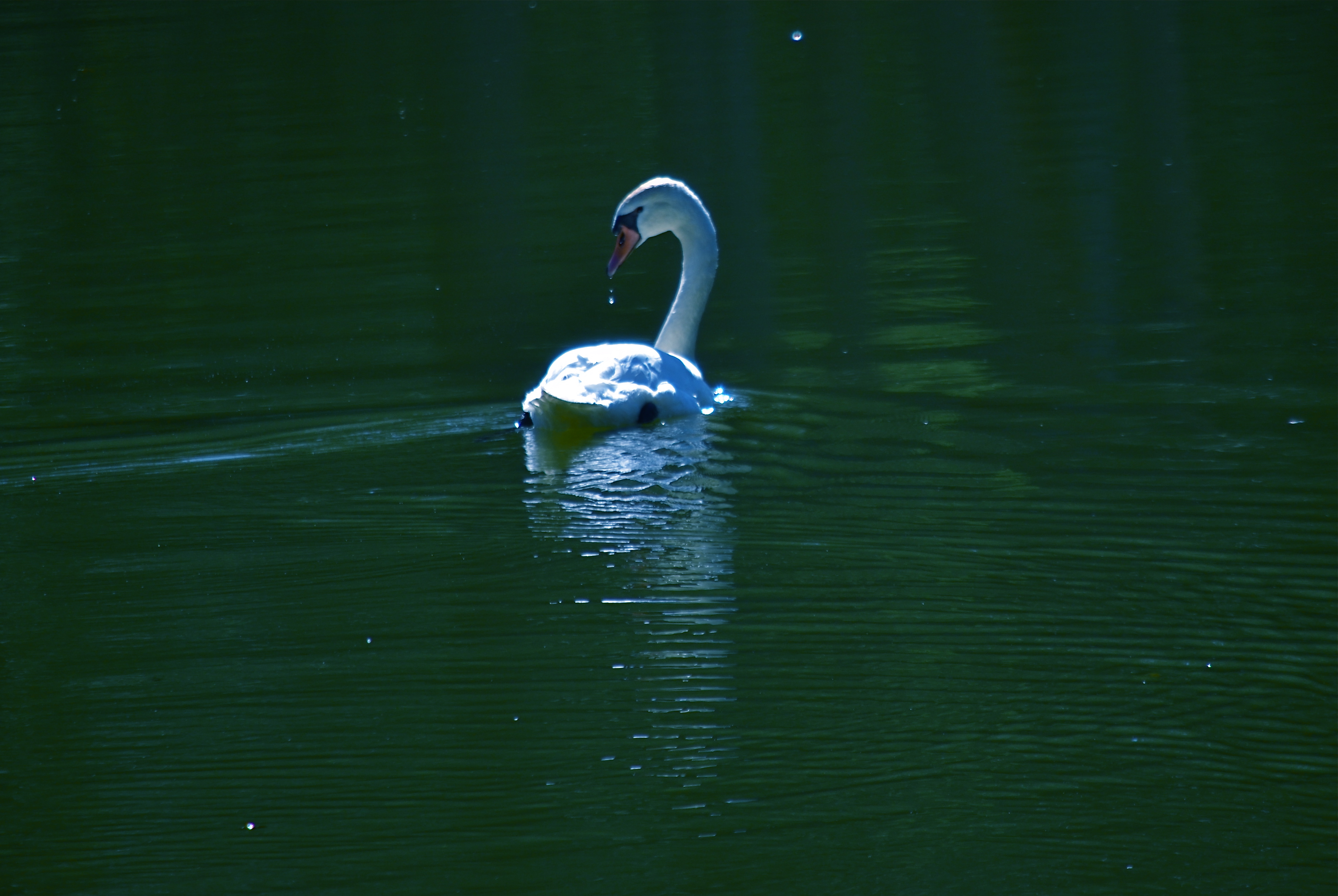
Serene On Green, near Yosemite National Park, 2012. 1/640 sec., f/5.6, ISO 100, 300mm.
THE LAST SUNDAY EDITION OF THE NEW YORK TIMES FOR 2012 features its annual review of the year’s most essential news images, a parade of glory, challenge, misery and deliverance that in some ways shows all the colors of the human struggle. Plenty of material to choose from, given the planet’s proud display of fury in Hurricane Sandy, the full scope of evil on display in Syria, and the mad marathon of American politics in an electoral year. But photography is only half about recording, or framing, history. The other half of the equation is always about creating worlds as well as commenting on them, on generating something true that doesn’t originate in a battlefield or legislative chamber. That deserves a year-end tribute of its own, and we all have images in our own files that fulfill the other 50% of photography’s promise.
This year, for example, we saw a certain soulfulness, even artistry, breathed into Instagram and, by extension, all mobile app imaging. Time ran a front cover image of Sandy’s ravages taken from a pool of Instagramers, in what was both a great reportorial photo and an interpretive shot whose impact goes far beyond the limits of a news event. Time and again this year, I saw still lifes, candids, whimsical dreams and general wonderments of the most personal type flooding the social media with shots that, suddenly, weren’t just snaps of the sandwich you had for lunch today saturated with fun filters. It was a very strong year for something personal, for the generation of complete other worlds within a frame.

Dragonfly Globes, Tempe, Arizona, 2012. 1/200 sec., f/5.6, ISO 100, 55mm.
I love broad vistas and sweeping visual themes so much that I have to struggle constantly to re-anchor myself to smaller things, closer things, things that aren’t just scenic postcards on steroids, although that will always be a strong draw for me. Perhaps you have experienced the same pull on yourself…that feeling that, whatever you are shooting, you need to remember to also shoot…..something else. It is that reminder that, in addition to recording, we are also re-ordering our spaces, assembling a custom selection of visual elements within the frame. Our vision. Our version. Our “other 50%.”
My wife and I crammed an unusual amount of travel into 2012, providing me with no dearth of “big game” to capture…from bridges and skyscrapers to the breathlessly vast arrays of nature. But always I need to snap back to center….to learn to address the beauty of detail, the allure of little composed universes. Those are the images I agonize over the most at years’ end, as if I am poring over thumbnails to see a little piece of myself , not just in the mountains and broad vistas, but also in the grains of sand, the drops of dew, the minutes within the hours.
Year-end reviews are, truly, about the big stories. But in photography, we are uniquely able to tell the little ones as well. And how well we tell them is how well we mark that we were here, not just as observers, but as participants.
It’s not so much how well you play the game, but that you play.
Happy New Year, and many thanks for your attention, commentary, and courtesy in 2012.
Related articles
- 10 social mobile photography trends for 2013 (davidsmcnamara.typepad.com)
- Old-Timer Joins Instagram, Schools Everyone With Poignant Flood Photos (wired.com)
TO THINE OWN SELF BE TRUE

This image may not be a masterpiece, but it’s mine….unless I willingly give it away. Why should we help dig a grave for authorship of our photos? 1/80 sec., f/8, ISO 100, 55mm.
By MICHAEL PERKINS
THE CONUNDRUM OF AUTHORSHIP, OR WHAT WE NOW TERM “INTELLECTUAL PROPERTY” RUNS ON A PARALLEL TRACK with the history of photography. Being a mechanical process of printing and reproduction, imaging has, from the first, proven more vulnerable to theft than anything created by the painters’ hand. Indeed, the very means by which photographs became reproducible in mass media such as newspapers and magazines became the first access afforded to thieves of what we ourselves had crafted. It became an unholy bargain. To be seen and discussed, our work had to employ these methods of distribution, and, at the same time, render ourselves vulnerable to those who would spirit away and claim as their own that which they did not create.
Which brings me to the recent brouhaha over Instagram, and its latest user agreement, going into effect in mid-January 2013, which allows the site to redistribute, lease or allocate use of members’ images with no obligation to inform or compensate the creators of those images. This is not my “representation” or “interpretation”. The language of the agreement is so brazenly clear that it’s breathtaking.
Read it.
Reality check: it can easily be argued that our best efforts to certify our claim to our images, through copyright laws, watermarks, terms of service, contracts, etc., still leave us as exposed to harm as a naked mountain climber on a blustery day. But, dear God, that is no reason to help the thieves, or, worse yet, to put ourselves in jeopardy by willingly consigning our work to websites whose stated purpose is to financially benefit by the exploitation of our work.
Instagram has millions of subscribers around the world. Do not ask me why, since I have never seen the benefit of taking mostly mediocre snapshots and rendering them murkier, darker, dirtier or more flawed by the post-application of “fun” filters. I spent my childhood longing for cameras beyond the scope of the cheap plastic boxes affordable to a 12-year-old. Light leaks, color streaks, vignetted corners and lousy chroma were the chains I was longing to break free of, not the post-ironic posturings I thought would render me hip. Toy cameras made bad pictures compared to the cameras grown-ups were using.
Period.
However, while personally writing off Instagram as a harmless toy (even one which has yielded some superior images, by the way), I never saw it as a threat to the sanctity of authorship. Until now. The digital imaging age has encouraged all of us to “give it away” just to get our work noticed (that unholy bargain from Paragraph One), encouraging us to do insane things like send our “on the spot” photos of events (unpaid..!) for use on-air by local TV stations too cheap to put their own photographers in the field. How nice that we have volunteered to be their uncompensated photog team. What a feeling of community, of belonging. Ick.
It should be noted that, following a crap-storm of anger over their announced new user agreement (as of 12/18/12), Instagram has sought to “clarify” their intent, claiming that the agreement’s “language” may have caused consternation.
No duh.
We’ll see what happens, but as of this writing, throngs of tweeters and others have announced their intention to bail, like the jilted lovers they feel themselves to be.
Like I said at the top, it is our need to have our work seen that has often made us shake hands with the devil. With the Instagram debacle, however,we are also fixing him a hot lunch, offering him wine and cigars afterward, and finishing up with a deep tissue message so he can digest properly.
If we sign up for this swindle, it’s on us.
Thoughts?
Related articles
- Why I Quit Instagram And Am Moving To Flickr (readwrite.com)
- Instagram backtracks after user privacy revolt (wtvr.com)

THE SNARE OF CHEAP REWARD
By MICHAEL PERKINS
SOCIAL NETWORKS HAVE PRODUCED TWO PROFOUND EFFECTS in the world of photography, one essentially beneficial, one essentially harmful. Certainly the ease with which photographs are instantly publishable on every conceivable distribution platform is a boon to communication and art. In one sense, every photographer has the potential to have his/her work seen: the world is now a gallery. However, that very same effortless global forum has the potential to flood the world with images that are ill-conceived, trite, lazy, or just plain banal. The world’s shooters are fully woke, for sure, but the world’s editors have joined the ranks of Rip Van Winkle.
Photographers before the web era were hemmed in by more stringent parameters of quality than is typical of the digital age. In professional circles, editors rejected 90% of a shooter’s work to select the small number of shots that would pass through the narrow neck of available publication platforms. At the same time, cost and technical barriers kept the total number of people who could even be photographers artificially low. The result was an exclusive club limited to only the best people and their best work.
As for the amateur market, people’s good and bad personal pictures had no practical publication platform beyond albums, slide trays and shoeboxes. Good and bad pictures alike seldom traveled beyond one’s own inner circle. Now consider the present landscape: no picture needs remain private or unpublished. Taking pictures is cheap, fast, and technically effortless, as is the kick of instant gratification as we click to make our images the world’s instantaneous and universal property. Equally fast counter-clicks deliver the drug of instant approval through reflexive “likes”, keeping us addicted to the entire feedback loop.
However, just making pictures available does not guarantee that anyone will actually see them. In fact, much of what we’e done on social media is create a vast dumping ground for nearly everything we shoot, a belt of data bits girding the earth like an orbiting loop of space garbage. Art is not improved merely through the generation of tonnage. More is usually less, and even our best work may be hidden in plain sight.
The lifelong perfecting of our own seeing eye, along with a fiercely developed and objective editor’s sensibility, is the only thing that can produce great photographs in an age where excellence and mediocrity are rewarded exactly the same. Social media will continue to snare us with the promise of cheap reward regardless of the quality of our work. The only cure for this slouching toward sloppiness is in ourselves. We need to love ourselves a lot less and love true excellence a lot more.
Share this:
September 10, 2018 | Categories: Commentary, editing, Opinion, P.O.V., Uncategorized | Tags: Flickr, Instagram, Social Media | Leave a comment