AS LOUD AS A WHISPER
By MICHAEL PERKINS
THE GRAPHIC ARTIST CHARLEY HARPER was dead and buried some twenty years or more before his balletic interpretations of the natural world were “discovered”, even though, during his lifetime, his commercial work was published in the world’s most popular magazines and generations of school kids viewed the illustrations he created for their nature and science books. What happened to make Charley a newly “found” treasure was twofold: first, over a lifetime, he steadily streamlined and simplified his style to convey animals, insects and the elements in fewer and fewer lines, constantly learning how to put an idea across without excess ornamentation; and secondly, and perhaps equally important, his audience, which had always accepted Charley’s eye as a natural way of seeing the world, came to realize just how difficult it was for him to make it all look so effortless.

Photography, never a final product but a lifetime process, works the same way. The first versions of our visions can be cluttered, busy, an audition for attention (or “likes”, if you prefer) as the artist struggles for acceptance. We tend to throw everything into the soup. We initially regard words like “minimalism” with suspicion, as if the work done under that term is somehow incomplete. However, if we are lucky, we come to see mere compiling of detail as occasionally unnecessary for the task at hand, which is to convey an idea.
I don’t always have the discipline to shoot with the bare essentials in mind. I defer to sharpness; I become fixated not with the bridge but with the billion bolts holding the bridge together. Pulling stuff out, doing more with less, is never instinctual to me. If I were a small child making a drawing of a sunset, such as the one seen here, I would likely make it about simple shapes, basic colors and a direct message. Unfortunately, I grew into an adult and started gilding the lily. In terms of writing, same same. This blog tends to bloat in its first drafts, whereas the posts I re-write the most somehow become shorter and clearer. In viewing our images, especially those from earlier versions of ourselves, it’s worth asking whether we could have upped our impact by turning down the distractions.
Sometimes we use our cameras to shout. Sometimes, a whisper will suffice. Charley Harper knew that he was in a partnership, a conversation, with his audience. He was thus free to use his simplified style as an opening remark, waiting for others to jump in and supply the rest of the thought. When we conform that kind of relationship with our photographs, connections with our viewers become truer.
Stronger.
AIR THROUGH A REED
By MICHAEL PERKINS
MERE HOURS AFTER MY NINETY-FOUR-YEAR-OLD FATHER and I shared a recent conversation on the creative process, I found myself staring at the computer screen in amazement. Both Dad and I have been photographers, musicians and writers over our lifetimes, and we have long marveled over the miracle of creation, and how it tends to happens not by us, but through us. The old metaphor of air whistling through a hollow reed to make music is not lost on us. We know that, when the muse is on us to any serious degree, it, not us, is in charge. And so, looking through my day’s shots a little after our conversation, I could not fail to be struck when I finally got around to reviewing this image:

I took this with about three seconds of forethought. The light, the color, the spareness of the composition, all coalesced very quickly, as did my belief that the entire inspiration had been my own. Following my talk with Dad, however, it struck me as merely my re-channeling of things I already “knew” from the work of other photographers, things that were operating on me far beyond the limits of mere influence. And, in looking at this random shot of a food truck at sunset, I searched my memory for what I believed to be the true genesis of the appeal of the shot. It didn’t take long.
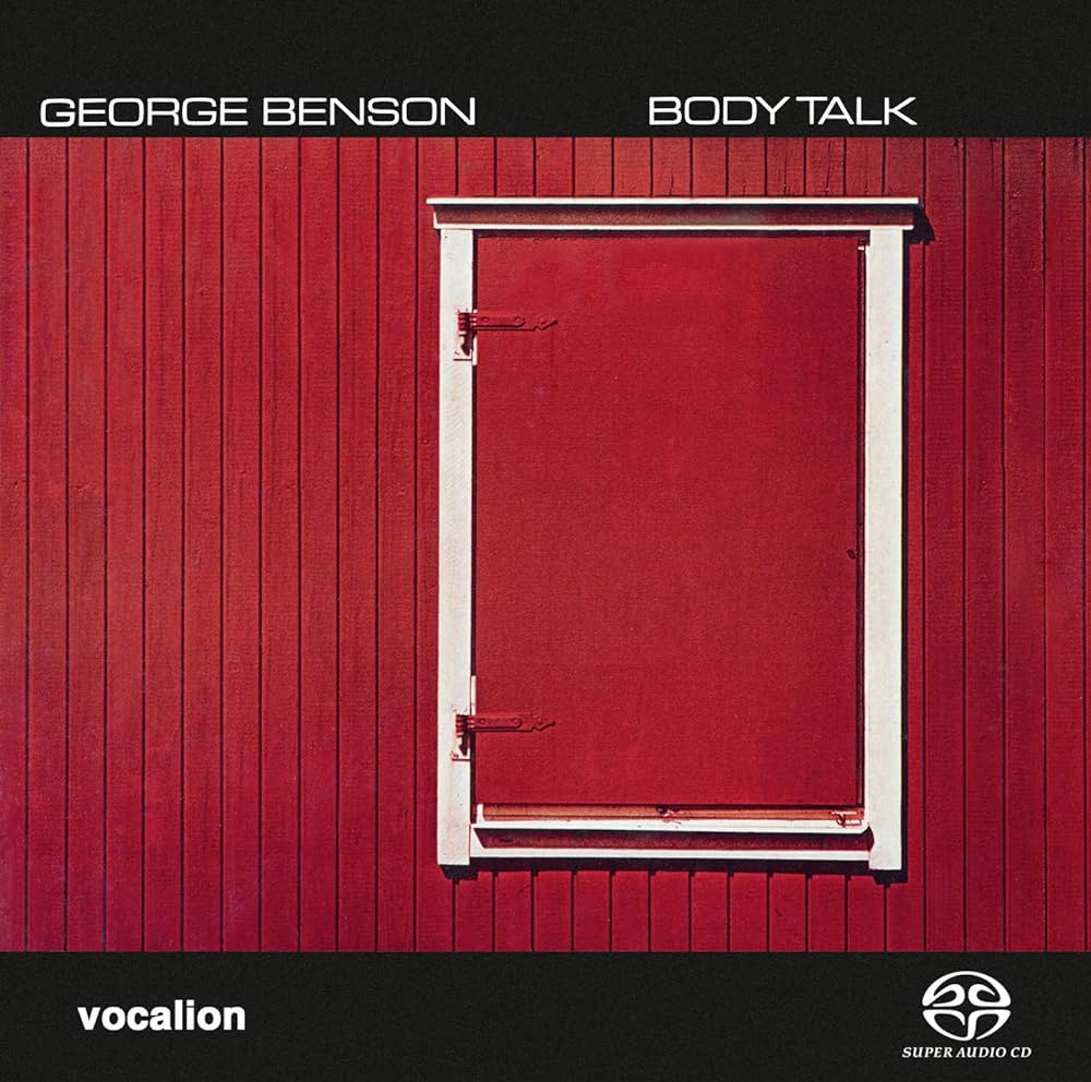
Pete Turner (1934-2017) was not, for the most part, a photographer who was commissioned to create album covers from scratch. In fact, many images from his existing body of work were often chosen by art directors at various record labels who just liked the pictures for their own sake. His photographs were not, then, “about” the featured artist or album title: they were just, as photographs, purely themselves. His cover here, for the George Benson album Body Talk, is typical, and, like many of the other covers I owned by him, it stunned me in its simplicity and directness. Years later (last week), I was not trying to “copy” Pete, nor create an homage to this shot; it simply bubbled up in some form in a way that was both unwilled and uncontrollable.
Photographers who fret too much about establishing their own “style” need not be dismayed when fragments of other artists come to the surface in their own work. No one can undertake the creative process without someone else’s hand on their shoulder. The trick is to celebrate what perhaps someone else has celebrated before you. The fact that you weren’t the first to enjoy smelling a rose does not make it smell less sweet. Let the air flow through you, and sing.
THE WAY IT USED TO COULDA MIGHTA OUGHTA
By MICHAEL PERKINS
COMBINE A NEW SERIES OF MOVES TO GENERATE AN EFFECT, and you are likely making art. Reduce the making of that same effect to a predictable rote series of steps with a uniform outcome, and you are likely making craft. Photography is a series of calculations: a certain adherence to rules will give you a solid framework in which to create. Slavish service to those same rules will make that framework a cage and imprison your vision within the confines of mere habit.
The comedian Lenny Bruce was famous for saying, “If I do something more than once, it’s a bit”, meaning a routine, to merely be recreated or played back, on demand….the opposite of creativity. I make mention of this because I fear that my own satisfaction with routines…how reliably they work, how comfortingly familiar they are…..can creep into my photography and replace all the vital blood in its veins with concrete. It’s an insidious trap. Repetition can act as a kind of sedative. Feels great in the moment, but soon you’re sleepwalking through the process. Photos become mere product. You can actually feel when all of your picture-making habits start morphing from a protective roof to a crushing winepress.
Fan Dancer, 2022
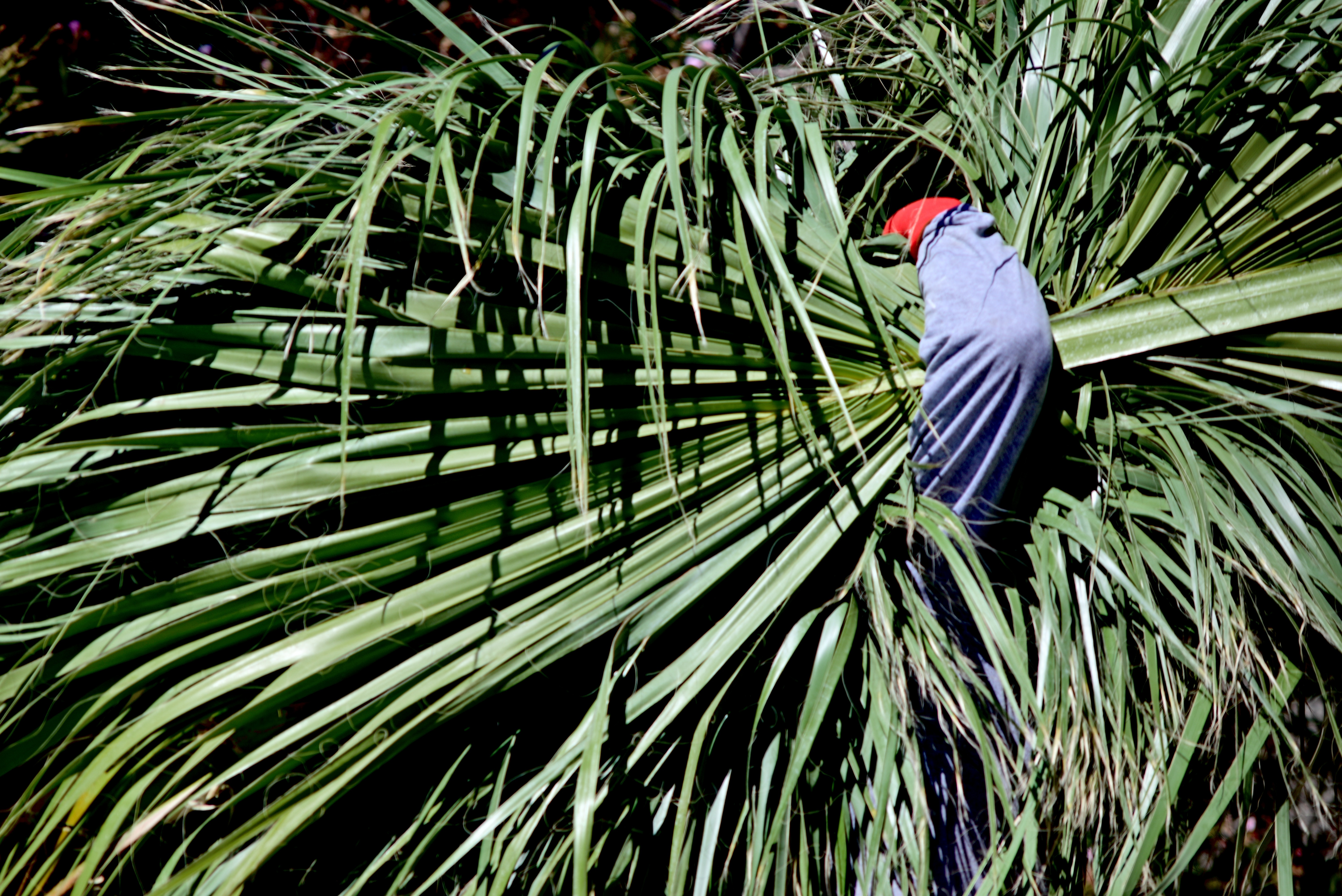
One remedy I try, to shake things up in these moments of torpor, is changing out gear to something, anything that I don’t think will work at all, or which may at least force me, through partial misuse of it, to think less habitually. Think of it as the difference between lighting a fire with a match or witching one up out of damp sticks. In the picture seen here, one of dozens I’ve made over time of the steeplejack daredevils who climb up and trim super-high palm trees in the southwest, I was actually forced to use a 300mm manual focus telephoto that was attached to the only camera I could reach in time for a shot. The nearest “appropriate” alternative was half a house away, and, meanwhile, this guy was hauling away the debris from his job at a good, er, clip. That meant making an attempt with something that was zoomed in way too far in relation to the distance between him and me. It meant focusing on the fly with a 1970’s lens barrel that is not exactly greased lighting. Oh, and to make things interesting, I could go no further open than f/4.5, so there would also be shutter speed fiddling to factor in. None of it should have worked.
Oddly, the minimal information forced on me by the close-at-hand framing, which now had eliminated all other context of size or place, actually made the worker’s crooked arm counter-balance the frond fan in an almost Asian fashion. A shy little Geisha gardener? I liked it. Could I do it again, on purpose? Not the point, really. What made me alert enough to maximize my opportunity in this case was the sheer uncertainty of the whole attempt. Now, all I have to do in future is resist saying, in the future, “whenever I shoot this kind of image, I always, always….”
Or else, in Lenny’s words, I’m just doing a bit….
WHEN MORE IS, WELL, MORE
By MICHAEL PERKINS
I AM CERTAINLY GUILTY, in these pages, of frequently harping on the need for economy in the composition of a photograph, of working purposely to say the most with the least. I’ve rhapsodized about how clutter and crowding can ruin a picture’s ability to communicate cleanly, and how best to streamline one’s vision with repeated layers of editing and cropping, in an attempt to pare away any extraneous junk that gets between a photo and its audience’s eye.
And in many cases, I still feel I am right.
Except when I am completely wrong.
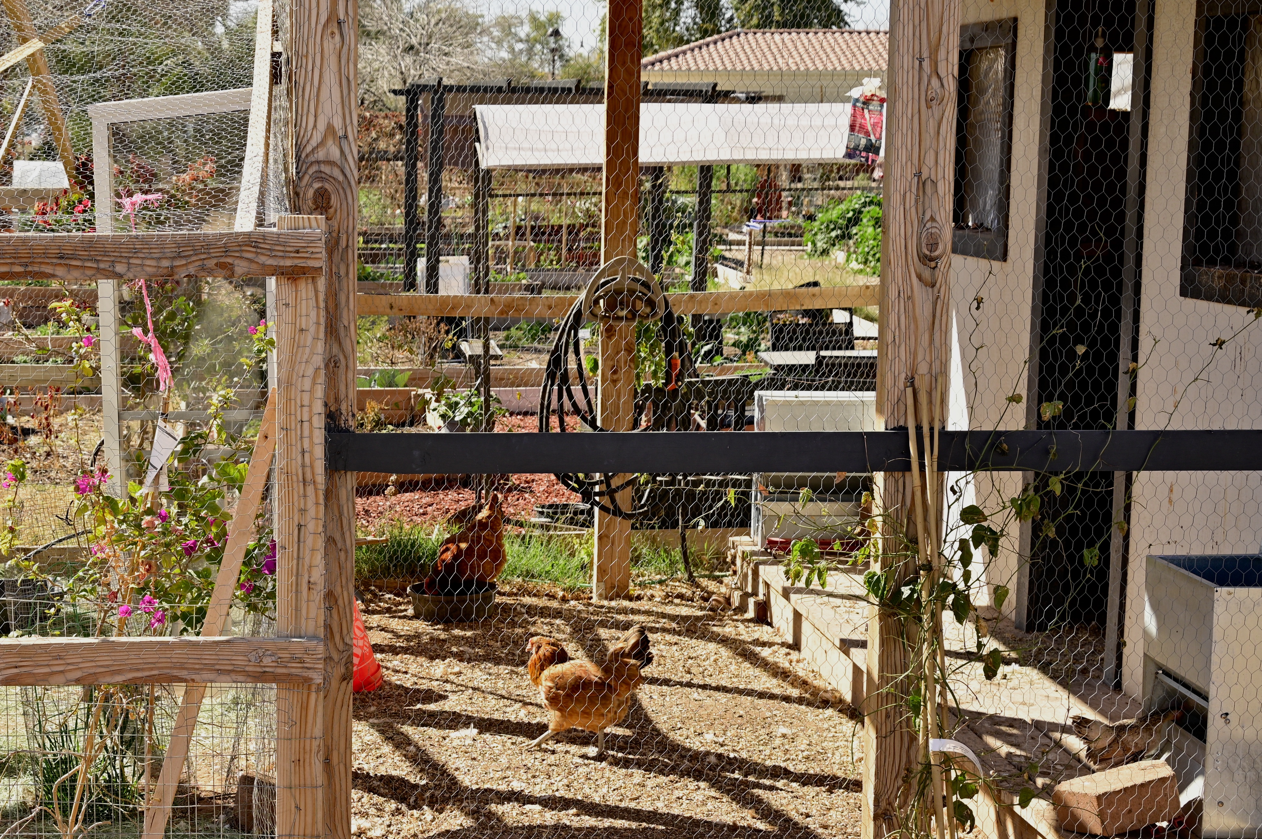
Clutter & Buck, 2022
Occasionally, we’re faced with trying to capture a subject whose very complexity or density is not in the way of the point, but is the point. Intricate gears in a machine. A teeming crowd filling the frame with conflicting destinations and motivations. Or here, a rustic chicken coop that is all about noise, crowding, clutter, randomness. Certainly it would be possible to frame a picture of this subject with minimal elements, limited textures, going “clean” in a ruthless way. But that would result in a completely different image than what I wanted from this photo.
And so this is a kind of mess, this picture, and yet I am so sure that it’s the only true thing I could have made under the circumstances. In musical terms, composition is a deliberate arrangement of elements, and can be either richly layered or spare. The composer, wielding either a pen or a camera, must decide how best to get the music out. Photography proceeds from a given set of rules, but in breaking those rules, we decide whether they should have been written in the first place. I still love spare subject matter for many of my pictures, but sometimes, just sometimes, a song is best played fortissimo, with all the instruments blaring at once.
THE LAND I LEFT BEHIND ME
By MICHAEL PERKINS
LANDSCAPES, AS I HAVE CONFESSED SEVERAL TIMES IN THESE PAGES, are not the lead arrow in my photographic quiver. Given an urban setting exploding with human activity, I will typically forsake a serene seacoast or majestic mountain range as shooting fodder, not because I necessarily disdain them, but because I often find myself unable to bring anything profoundly personal to them. Perhaps shooters with a more naturalist bent are inspired to new heights of expression when framing up scenery. I certainly value nature as a foundation for certain kinds of pictures, a backdrop for my “lead” components, if you will, but I find myself flummoxed in trying to depict them as the main attraction, as nature for its own sake. Why?
Of course, I have shot literally thousands of landscapes, and, under certain circumstances, such as the past year’s Great Hibernation, I have been forced to embrace more open spaces not only as refuge but as default subject matter. I simply am stuck miles from where I prefer to shoot, and so I have tried to capitalize on the surplus practice time to, at long last, be “better” at landscapes. This time, I have tried to plow into fresh ground by changing the way I depict such scenes, with the traditional sharpness and detail of the postcard giving way to understatement and atmosphere. And I’m finding that the resulting minimalism is comforting, that the idea of trying to say more things through mere suggestion might finally be my sweet spot.
Once the baseline information of a landscape needed for identification has been established…that is, once enough visual cues have been provided to attest to its being a picture of a boulder, shoreline, forest, etc., what really needs to be included that has any additional narrative power? I totally get the fact that detail and texture can be a story in themselves, as in the granite grandeur of Ansel Adams’ Yosemite giants, but I believe that landscapes rendered in paintings, for example, often reduce those details to their essence, especially in the work of impressionists. Why does the photograph have to be faithfully “graphic” or documentary in depicting those details?
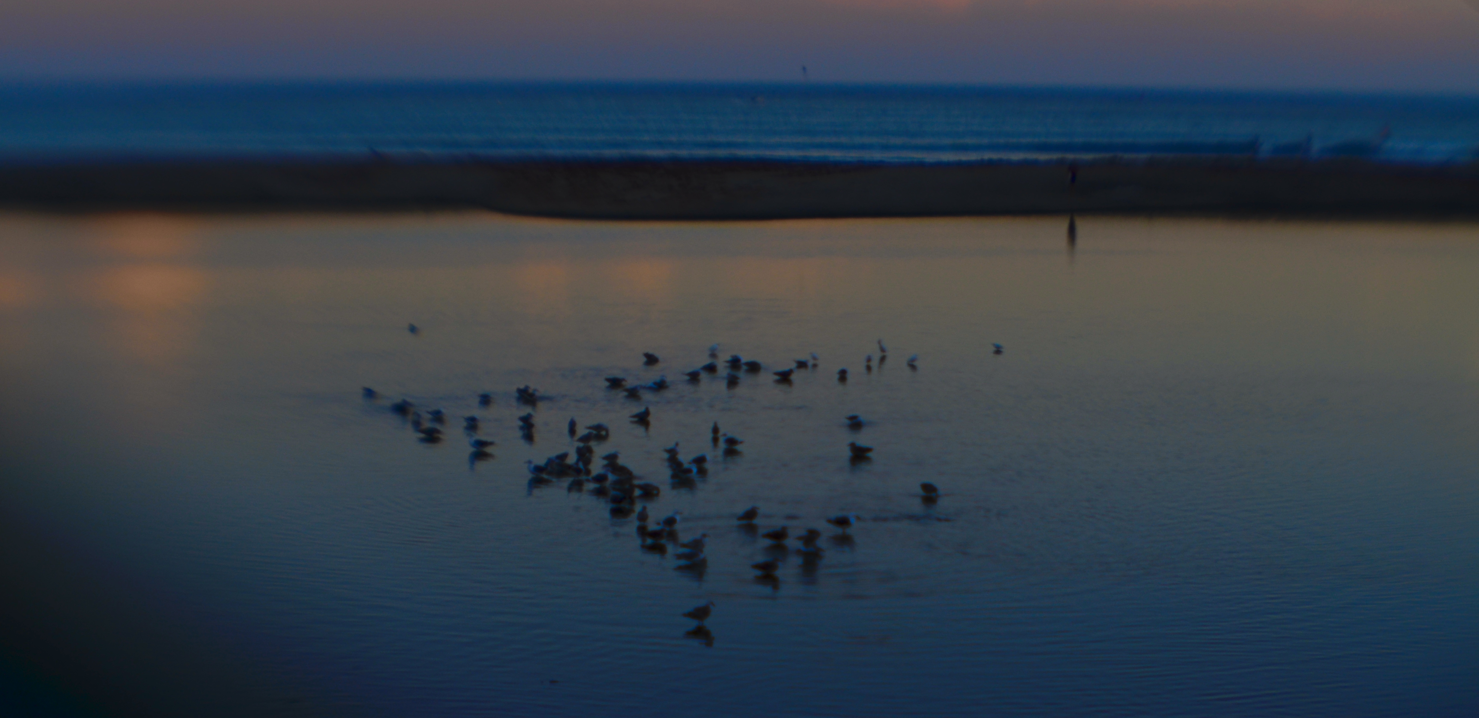
The image shown here certainly contains enough data to be perceived as a night shot of a beach with birds. Would a further rendering of every grain of sand and every ripple of ocean make the picture “work” any better, or can the piece just succeed as a hint of reality in which your heart or mind fill in the blanks, a picture in which the openness of the thing allows more individual interpretation on the part of the viewer? I understand that, to a certain audience, this is a blurry mess, while, for others, it might be the beginning of something that originates in the picture and finishes in the mind. What I’m starting to learn, finally, as a landscape photographer, is how to show just enough of the story I see to convey it to another person, but to rein myself in before I just produce a document that is technically accurate but emotionally threadbare.
NEARLY NAKED
By MICHAEL PERKINS

No One Knew What Lay Within, 2021.
ONE OF THE BY-PRODUCTS OF PROLONGED ISOLATION is the re-training of the artist’s eye, as more and more information is gleaned from fewer and fewer sources. The lifer convict thus knows more about masonry than the non-prisoner, simply because he is forced to stare at it longer. Or, to put it another way, as a person’s physical world contracts, as it has for many in the present era, things that are repeatedly re-seen can reveal more data than those that are quickly glimpsed. Notice that I am into my fourth sentence before uttering the dread word minimalism. And yet here we are.
I almost never deliberately seek out minimal compositions, at least not as part of some aesthetic religion; that is, I don’t set set out to make pictures that are, as I call them, “nearly naked”, stripped of all decoration or ornament. However, during the various stages of the creation of an image, I often decide that simpler is better, and re-set my course accordingly. And, as the worldwide Forced Hibernation has dragged on, I have found that a certain streamlining of many of my pictures is kicking in organically. Some of it occurs because I am forced to work with the same limited subject matter again and again, since traveling to a wider numbers of locations is presently off the menu. That can mean doing more than one “pass” on some pictures, and discovering. in that process, that I can, indeed, say more with less.
Those who already possessed sage wisdom or a certain Zen zeal might remark here that I should always have been on this journey, this growing sense of how to go about de-cluttering my vision. And to that, I would answer a resounding “maybe”. The image you see here is so simple a composition that I always would have approached it without the need for passing airplanes, utility poles, the surrounding parking lot, etc. However, where, before, I might have favored more detailed tableaux, I am finding, in a newly compelling way, that increasingly simpler pictures are calling to me these days. Likewise the rendering of excess detail or texture, which you’ll see is fairly absent from this picture. Does this mean I am growing as a person? Let’s not get ahead of ourselves. I am making pictures in a different creative environment for the moment, albeit with no guarantees that my technique will be fundamentally altered once I’m allowed out of the house more often (this site is three miles from my home). Still.
“There are two ways to be rich” children’s author Jackie French Koller wrote in 1948. “One is by acquiring much, and the other is by desiring little”. So, while I’m looking more intently at the masonry within my cell these days anyway, I might as well find out if that richer way of seeing will follow me once I’m sprung. In the words of another sage, Chuck Berry, “C’est la vie, say the old folks, it goes to show you never can tell…”
CHROMEDOMES
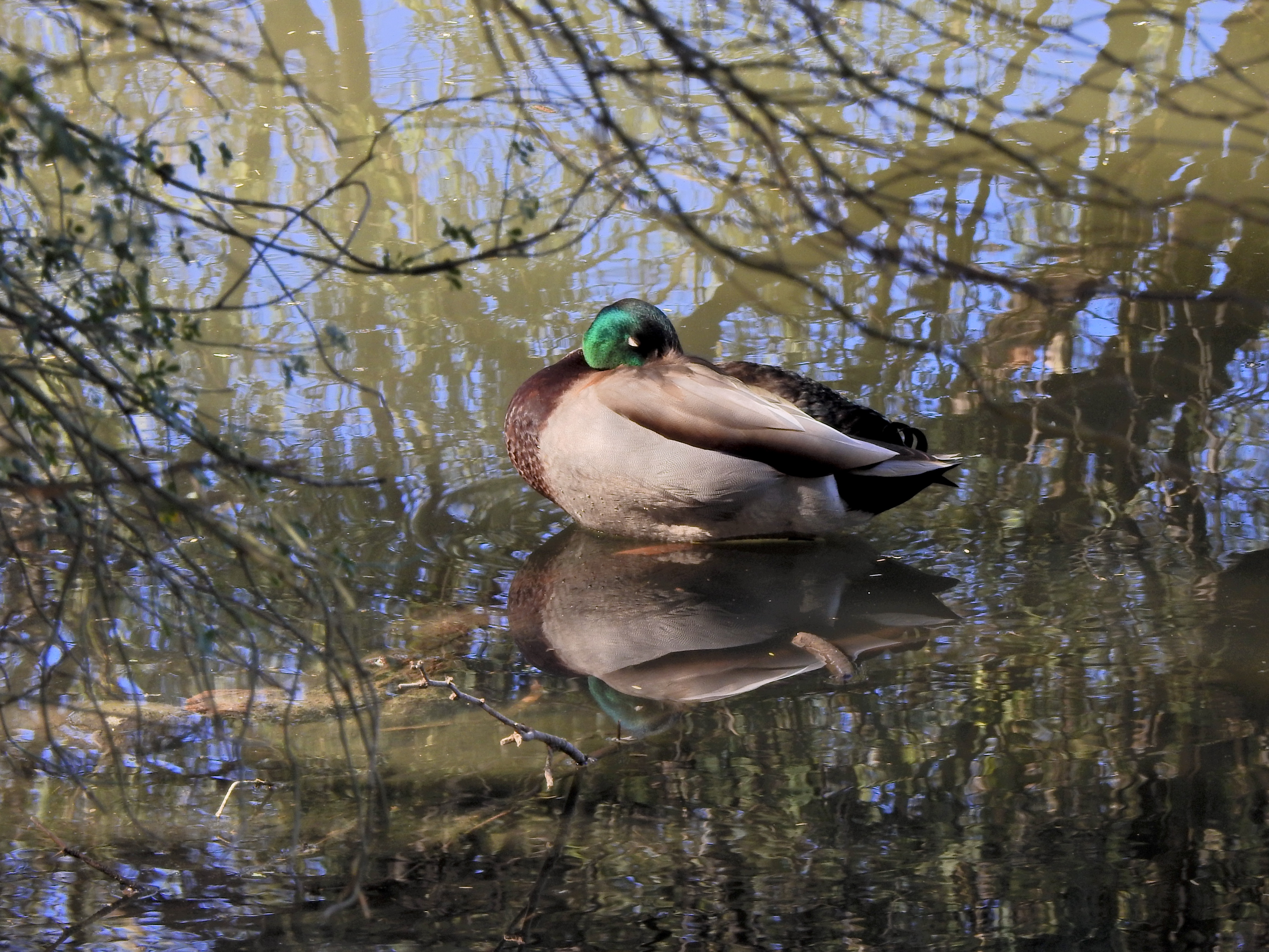
This color original is lovely, but the multiple hues on the water seem to fight with the duck for attention.
By MICHAEL PERKINS
THERE IS FAIRLY SOLID CONSENSUS, among those who teach the basics of photographic composition, that the path to success lies in reducing a picture to its simplest terms. Removal of extraneous distraction, proper placement of a subject within a frame, depth-of-field calculations…all these techniques work toward a common goal; to help the eye engage the photo efficiently, to lock onto its essential story without being confused or deflected toward something less important. Often a cleaner composition is just a matter of cropping, or merely limiting the number of elements contending for the viewer’s attention.
But there is one approach to basic composition that may not be instinctive to us all, and that’s the role that color plays in our pictures.
Color is the current instinctive default for most of our photos. It took a long time for it to be technically capable of taking that mantle from monochrome, which was, by necessity, the palette that shooters painted on for over a century. Color is seductive, and seems like a more “realistic” medium for our very personal universes of family and friends. However, in the composition of any picture, it must be reckoned with as another object in the frame, no less than a tree or a cloud. It is one more thing in there that demands our notice, and, for many images, it certainly earns that attention. However, color can become the message of a picture, not just the way the picture is rendered, drawing off the viewer’s eye in exactly the same way as extra props, extraneous scenery or other clutter can.
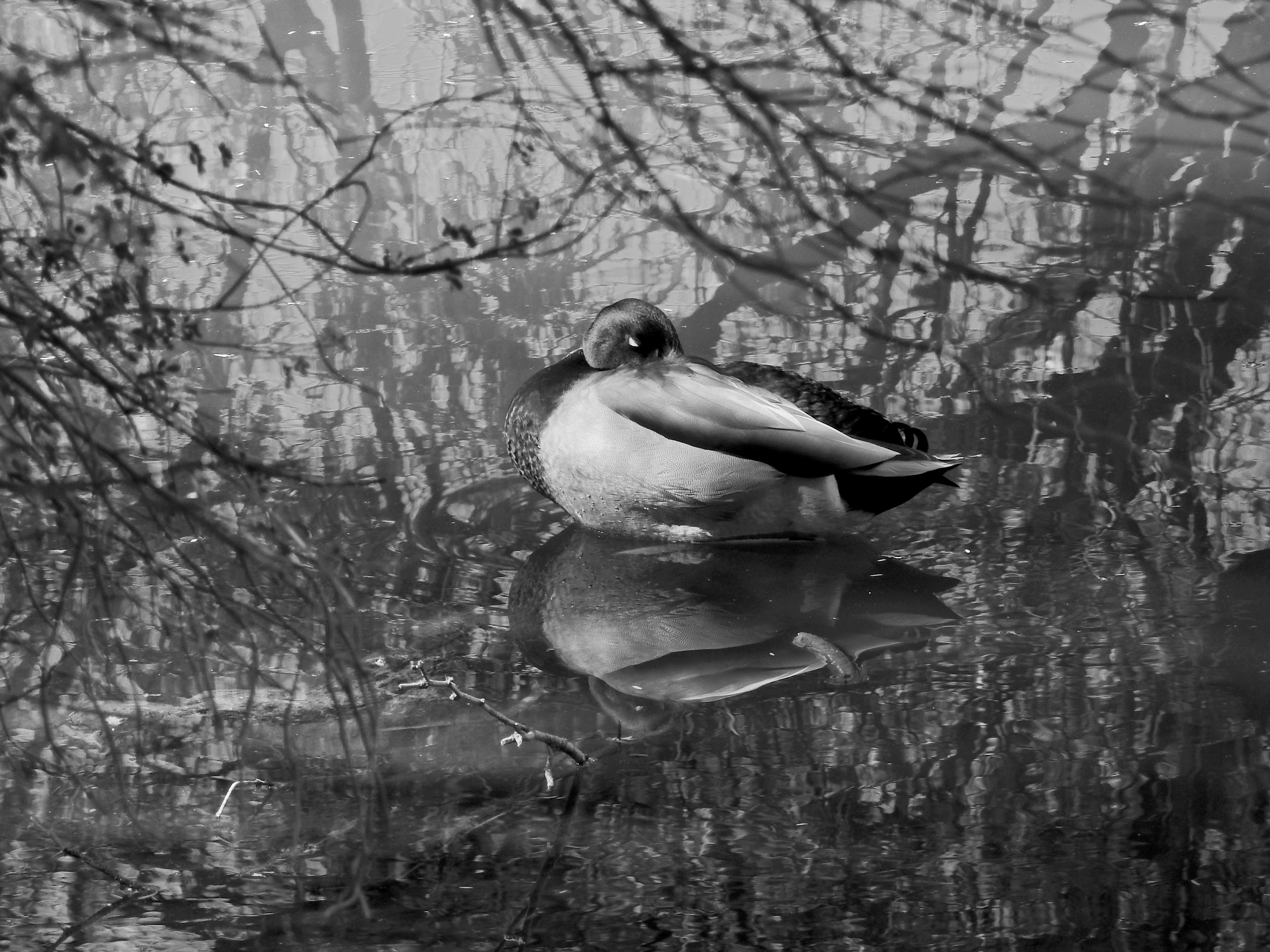
Neutralizing the reflective hues on the water can make the center subject a bit more prominent.
Some would argue that black and white is more nuanced and subtle in the rendering of emotional directness, or texture, or contrast when compared to color, and yet some of us think of monochrome as somehow incomplete or unfinished. Try telling that to several dozen Pulitzer winners, some of whom, admittedly, worked before color was practical (and therefore not a real option), along with others who continued to choose b&w even after it became the minority medium. And this is not about unilaterally choosing sides, forever pitting the Kodak Tr-X crowd in a pitched battle against the Fuji Velvia cadre. It’s only about choosing the right tool for every picture, and not getting so locked into the global color default that you refuse to peer into the opposite camp. I continue to master every shot in color to this day, but a full fifth of my final output consists of mono conversions, with modern post-processing giving me every bit as much control over the results as in the old darkroom days (as seen in the illustrations). The best course, I believe, is to form the habit of looking at all your pictures both ways. Often, you will just stick with the color original, because it works. And other times you will play in the other playground because, for some pictures, that works.
Color is an object within your pictures, no less than a mountain or a chair. Think of it as another piece of visual furniture fighting for dominance in the frame, and deal with it accordingly. Monochrome is not photography’s simpler, poorer step-kid. Sometimes, it can be the pride of the family.
DOING WITHOUT
By MICHAEL PERKINS
PHOTOGRAPHIC STYLE IS REFLECTIVE of the human aging process. You often make pictures differently in different phases of your life. Many of my favorite shooters have, over their careers, evolved on two parallel tracks, both toward simplicity. That is to say that their picture-taking process, i.e., equipment and gear, becomes more streamlined as they age, even as their approach to composition becomes simpler. In every way possible, the best photographers tend to learn, over time, how to do more and more with less and less.
Going into battle with a single camera that’ll do 98% of what you need in any situation is highly desirable, but it takes time to learn how to do that, to resist the temptation to carry every gizmo under heaven on your shoulder at once. But the struggle is worth it; knowing every single feature and quirk of a camera that’s ergonomically solid and functionally streamlined allows you to work fast and instinctively. As for composition, I found that, at least for me, I had to either learn to simplify or just give up on things like landscape work, where everything I shot was crammed with clouds, trees, trickling streams, flocks of birds, and, who knows, the Barnum & Bailey circus. I was making picture after picture where, if the human eye was asking, “where do I look?” my answer was likely to be, “It’s a smorgasbord! Pick anything!” The truth was that I had to go simpler as I aged if I was ever to be effective at all in conveying visual ideas.
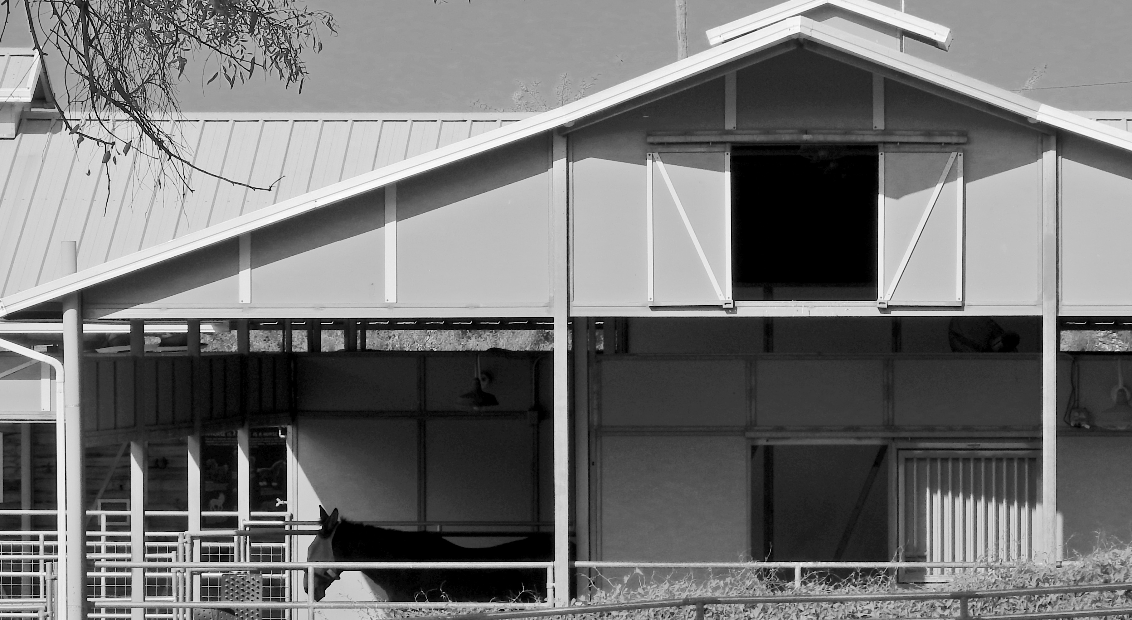
Simplicity is the final step in a photograher’s development….or at least in mine.
Twenty years ago, this image would have taken up twice the area you see here, because, even today, its master frame included, along with the barn and stable, a side building, some empty blue sky, and a few small piles of farm implements….enough distractive information for five pictures. Zeroing out all the color and cropping to keep the entire picture to a basic series of rectangles and triangles (plus their multiplied shadows) turned out much better; all I had to do was develop the courage to cut, decisively, in search of a less cluttered picture. I only select this example because it’s a very clear illustration of the process that I now go through for composing nearly every shot, in that I try to pre-visualize how little information I need to convey my concept. Yes, how little.
This is an ongoing struggle for any photographer, because it’s easy and alluring to do more of everything…more stuff to carry, more stuff to cram in the frame, more things to draw energy away from your primary vision. I am nowhere near where I need to be in this journey, but I can track a little progress, and, amidst all the distractions of, well, living, that’s at least something.
(FIAT LUX, Michael Perkins’ latest collection of images, is now available from NormalEye Books.)
TILES
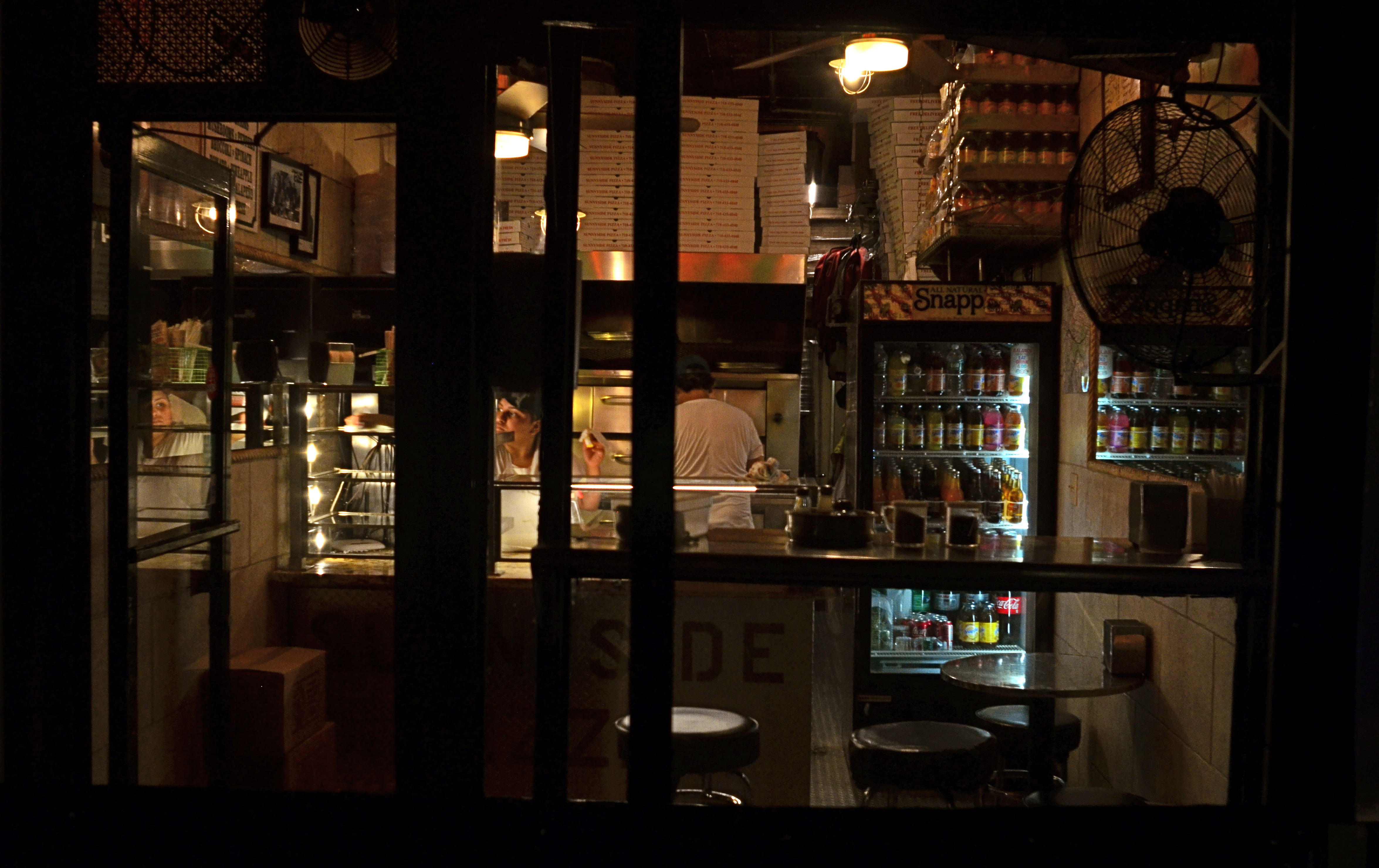
Carry Out (2017). 1/50 sec., f/4, ISO 640, 24mm.
By MICHAEL PERKINS
EVERY TIME I SEE SOMEONE working on a jigsaw puzzle, I can’t help but think that they’re missing all the fun. The idea of the project is, of course, to assemble enough pieces of a scene that it becomes recognizable. 200 pieces in: some kind of structure. 400 pieces in: looks like it’s made of iron, triangular maybe. 600 pieces in: oh, yeah, the Eiffel Tower!
But, whereas a picture puzzle is solved when the image looks complete enough, my favorite kind of photography centers on how few pieces of the puzzle can be supplied and still have the image communicate to the viewer. Formalists might call this minimalism: art curators might label it cubism: holy men in flowing robes might use the term zen. I just think of it as reducing pictures to the smallest number of components needed to convey ideas.
In fact, many photographic subjects actually present themselves in a kind of broken pattern right out of the gate, challenging us to create images from the spotty data they let through. For example, views through partially blocked windows, such as the one at the top of this page, in which what remains readable behind the darkened door and window framings, is more than enough to sell the message pizza shoppe.
For me, having everything spelled out to the Nth degree in a photograph is beyond boring. It’s much more interesting to engage the viewer in a kind of partnership in which he is looking on purpose and I am trying to maximize the power of my pitch, going as far beyond the obvious as I can while not letting the picture fly apart. The first minute I’ve snapped enough pieces into the puzzle to suggest the Eiffel Tower, I’m ready to leave the last 300 pieces in the box.
TWILIGHT TIME
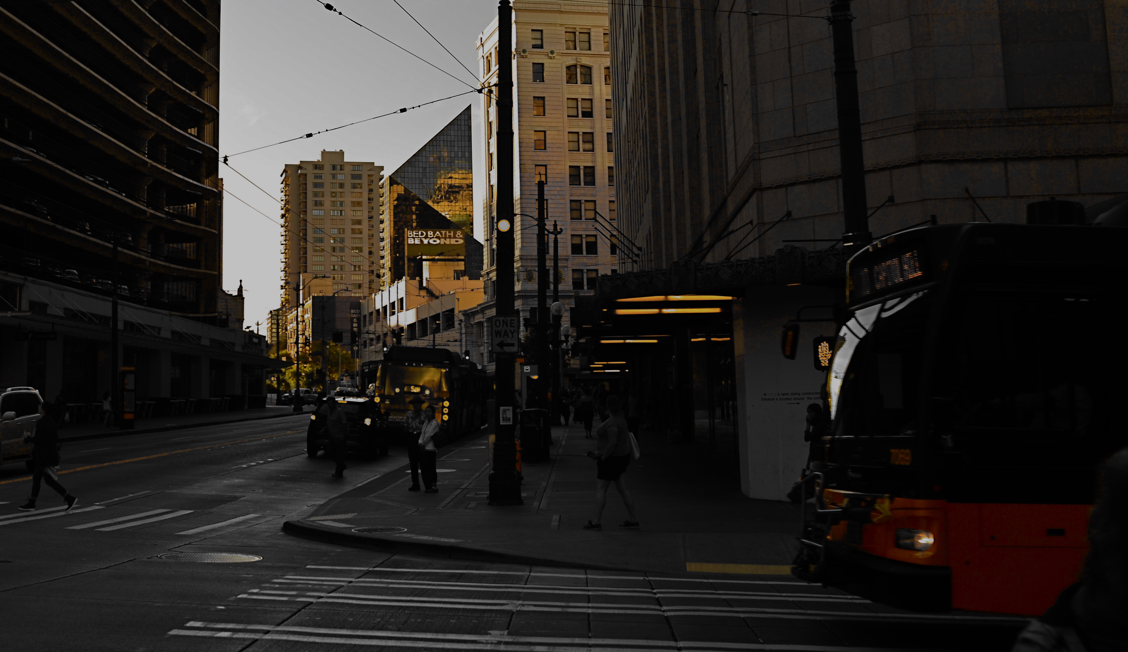
By MICHAEL PERKINS
I HAVE STRUGGLED OVER A LIFETIME to tell photographic stories with as few elements as possible. It’s not unlike confining your culinary craft to four-ingredient recipes, assuming you can actually generate something edible from such basic tools. The idea, after all, is whether they’ll eat what you’ve cooked.
With images, I’ve had to learn (and re-learn) just how easy it is to lard extra slop onto a picture, how effortlessly you can complicate it with surplus distractions, props, people, and general clutter. Streamlining the visual language of a picture takes a lot of practice. More masterpieces are cropped to perfection than conceived that way.
The super-salesman Bruce Barton once said that the most important things in life can be reduced to a single word: hope, love, heart, home, family, etc. And so it is with photographs: images gain narrative power when you learn to stop sending audiences scampering around inside the frame, chasing competing story lines. Some of my favorite pictures are not really stories at all, but single-topic expressions of feeling. You can merely relate a sensation to viewers, at which point they themselves will supply the story.
As an example, the above image supplies no storyline, nor was it meant to. The only reason for the photo is the golden light of a Seattle sunset threading its way through the darkening city streets, and I have decided that, for this particular picture, that’s enough. I have even darkened the frame to amp up the golds and minimize building detail, which can tend to “un-sell” the effect. And yet, as simple as this picture is, I’m pretty sure I could not have taken it (or perhaps might not even have attempted it) as a younger man. I hope I live long enough to teach myself the potential openness that can evolve in a picture if the shooter will Just. Stop. Talking.
ISLANDS IN THE SHADOWS
By MICHAEL PERKINS
FIFTY-PLUS YEARS INTO MY LOVE AFFAIR WITH PHOTOGRAPHY, I now regard my earliest concept of a “good picture” as I regard other ideas of my youth….that is, seeing how I viewed the world given the limited scope of my own experience. When I first started making my own pictures, my models were drawn from the pages of the then-dominant photo magazines, like Life, Look, and National Geographic. Thus, for me, “good” photographs served either the reportorial functions of a news assignment or the color-saturated visions of landscape lovers. And that, for me, back then, was more than enough.
Both these kinds of images favored a fairly literal translation from the actual into the photographed: interpretation and abstraction was not anything I gave serious thought to, since I wanted my simple box-camera creations to look like “real photographs”. Art photography certainly existed, but very much at the edges of the culture. Most museums, by the early 1960’s, had still not mounted their own photographic exhibitions. Most popular photography, shaped by a large middle-class consumer culture (think Kodak Instamatic), was candid and personal in nature. Most people wanted Grandma to look like Grandma, unfiltered through any Warholian irony, commentary or experimentation. It was still a compliment for someone to say of your pictures that they “looked like a photograph”.
Would more light, more detail, convey the story any better in this image? 1/10 sec., f/2.8, ISO 2000, 24mm.
Strangely, one of the things that revised my thinking on what was “good” was an increased awareness of the works of some of the first photographers, pioneers who sweated mightily to wrangle the infant media into something like reliable performance. In their work with ever-changing combinations of plates, media, lenses and emulsions, the first photogs’ breakthrough photographs often failed from a purely technical viewpoint, producing irregular patches of light appearing randomly like islands in a sea of shadows.
But what these wizards’ first attempts often achieved, almost by accident, was the first real abstraction in photography: pieces of reality, rather than its totality: hints of the truth which invited speculation, examination. New questions were posed: what was missing, and did it matter if it wasn’t there? Could a photographer, in fact, deliberately extract parts of the “whole” picture, letting the minimum speak for everything that was left out? I gradually began to wander in search of answers to these questions.
There are times when a picture speaks louder the less it says. My original orientation to “good” images, seeing them as the most faithful translation of the literal onto film, expanded gradually to include whatever visual language communicates best in a given picture. Sometimes, in some very key instances, it helps to think like the first practitioners, who discovered, however haphazardly, that mere reality sometimes comes up short.
EXQUISITE CORPSES

Phytomorphology 2 (2017). Macrophotography helps alter the memory context of familiar objects.
By MICHAEL PERKINS
AS A BOY, THEODORE ROOSEVELT TAUGHT HIMSELF THE ANATOMY OF BIRDS that same way James Audubon did, by studying birds he himself had killed. Although this coldly clinical approach may strike us as cruel today, it was accepted practice for a young naturalist in the late 1800’s, a time when even eminent surgeons, faced with a shortfall of cadavers for academic study, occasionally hired freelancers to raid graves in search of, er, manpower. And so it goes.
At decidedly less risk, photographers have also made still-life studies of dead things, from game kills to seed pods, trying to appreciate structure, design, and function in a controlled environment. But there is more to their pokings than the grand advancement of science, given that death changes things in a way that transforms their aspect, altering their usefulness as visual subjects. Objects that have gone from living to non-living reflect light differently; textures and patterns are re-shaped; in short, the thing becomes an abstraction of itself.
Add magnification to the mix, and a thing becomes completely untethered from our usual conception of it, since, among other things, we are used to viewing it from a distance of feet or inches rather than millimeters. Just as where you stand affects the impact of a landscape, the place where you park a macro lens on an object dictates a completely different story with just the smallest variation.
There is a renewed fascination in the photographic world with minimalist abstraction, in which an object is changed so much in magnification and composition as to become a completely new thing, or…if the photographer so desires, a whole new nothing, a subject with which the viewer has no prior associations, functioning as pure pattern or design. For me, that’s the appeal of macro work…..to take the familiar and render it neutral in meaning, allowing me to re-assign it visually, to ask the viewer to, in effect, regard it as a foreign object, one that can take on whatever significance he sees fit.
Photography is primarily about what to see but it often provides cues as to how to see as well. Viewpoint is verification, and things impart different truths to our eyes, depending on how we approach them.
ARRIVALS
By MICHAEL PERKINS
PHOTOGRAPHERS PROBABLY HAVE TO HAVE AT LEAST SOME IDEA OF WHERE THEY’RE HEADED in pursuit of an image, or else basic issues like, Where To Point The Car or Which Path To Take can’t be settled. And there is, even for the instinctual process of creation, something to be said for a basic plan. However, every photographer has experienced the wonder of finding oneself arrived at a great picture-making opportunity when, in fact, you were headed someplace completely different. It’s in such moments, places where Plan A becomes Plan B, C, or D, that the excitement happens.
After you capture an image that essentially works, your mind naturally comes to take ownership of it, just as if that picture were your original intention. But this seldom occurs. Pictures aren’t like Grab-And-Go sandwiches, and very few are just waiting there, fully formed, until you wander by and imprison them in your box. Our final choices for photographs are often the destination in a ride with many stops along the way. We might have come to do this, but we wound up modifying, even abandoning our first instinct to get this instead.

Ocotillo Outpost (2016) 1/640 sec., F/4, ISO 100, 56mm.
The above image is a textbook example of this process. The gorgeous sunset clouds seen here were originally to be the entire composition. The general rule is that skies, by themselves, are usually not sufficiently interesting to be the solo star in a photo, but the light and texture of this particular dusk had convinced me that a minimalist shot might just be possible. However, one of my first framings caught an octotillo shrub in its lower right corner, and that new information sent the picture off in a different direction.
Re-framing to bring the shrub into the entire lower half of the shot and silhouetting it against the sky gave the framing both a sense of scale and depth, and I began to convince myself (moving on to Plan B) that this now two-element picture would be The One. Then a single starling made a landing at the upper right corner of the ocotillo, creating a more obvious initial point of contact for the eye. The viewer would engage the most familiar part of the picture, the bird’s body, then travel leftward to the ocotillo’s jagged tangles, and backwards to the textured sky. Final Plan: C….a three-element image in which the individual parts seemed, at least, to talking with one another.
In the pages of The Normal Eye I keep coming back to this idea of “planned accidents”, or shots that start in one direction and end in another, because the process, once you allow yourself to go with it, can lead to images which, eventually, seem inevitable, as if they never could have been any other way. And those are the ones you keep.
CUES AND CLUES
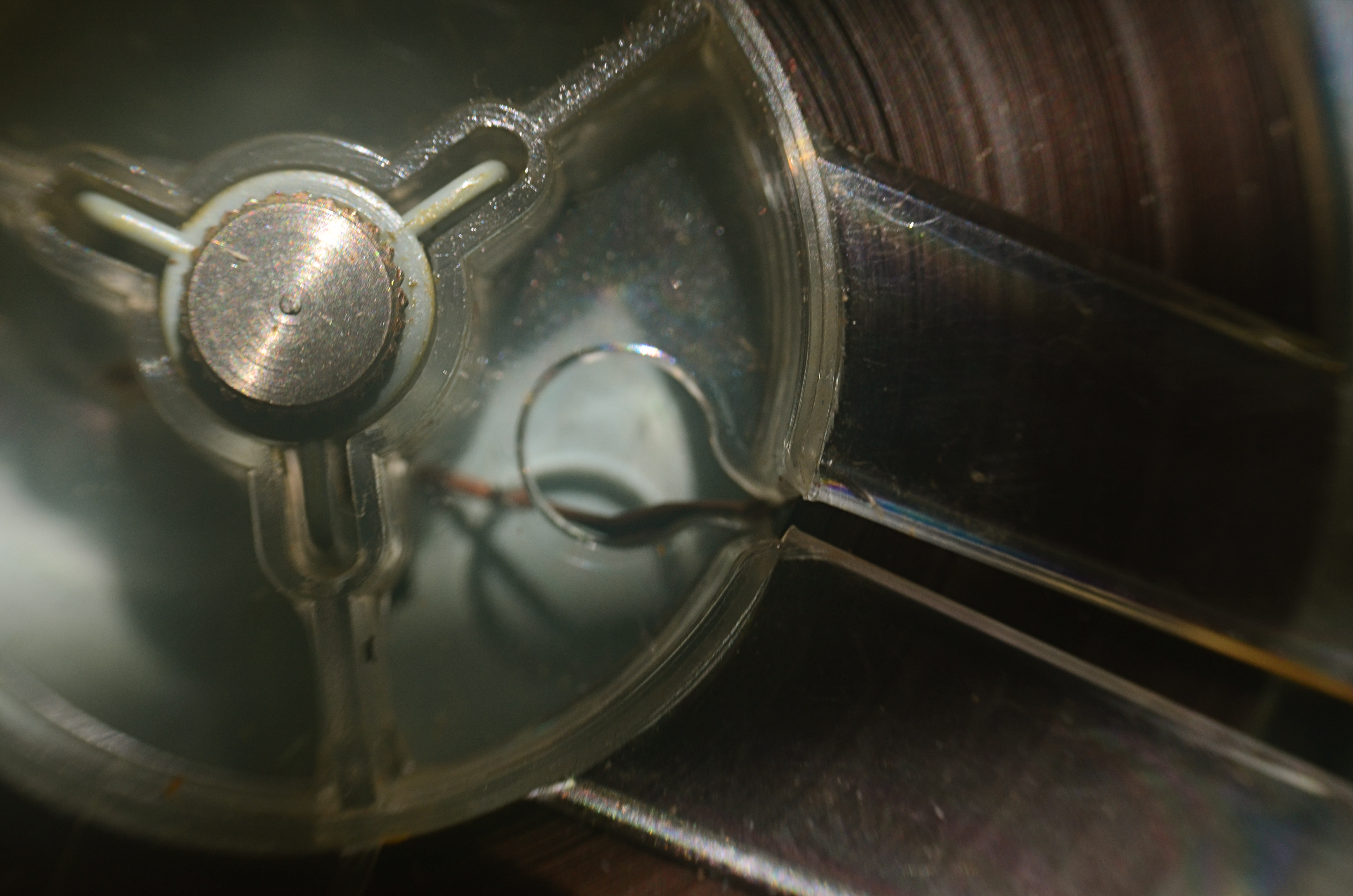
Good Morning, Mr. Phelps (2016). How little of a tape recorder need be shown to convey a sense of that object?
By MICHAEL PERKINS
SAY THE WORD “MINIMALISM” TO SOME PHOTOGRAPHERS, and you conjure visions of stark and spare compositions: random arrangements of light blobs, stray streaks of shadow, or scattered slivers of light, each conveying mood more than content. For some, these images are a kind of “pure” photography, while, for others, they are, to use a nice word, incoherent. Part of us always wants a picture to be, in some way, about something, and the word minimalism is charged, positively or negatively, depending on whether that “narrative thing” happens.
I actually associate minimalism with the formal storytelling process, but doing so with the fewest elements possible. It seems like a natural evolution to me, as I age, to make pictures talk louder with fewer parts. Simple cropping shows you how much more you can bring to an image by taking more of it away, and, with closeups and macro work, the message seems even clearer. Why show an entire machine when a cog carries the same impact? Why show everything when suggesting things, even leaving them out entirely, actually amps up the narrative power of a photograph?
Of course there are times when mere shape and shadow can be beautiful in themselves, and it doesn’t require a lot of windy theorizing to justify or rationalize that. Some things just are visually strong, even if they are non-objective. But minimalism based on our impressions or memory of very real objects, from a pocket watch to a piece of fruit, can allow us to tell a story with suggestions or highlights alone. If something is understood well enough, just showing a selectively framed slice of it, rather than the thing in its entirety, can be subtly effective and is worth exploring.
In the above image, you certainly understand the concept of a tape recorder well enough for me to excise the device’s chassis, controls, even half of its reel mechanism and still leave it “readable” as a tape recorder. You may find, upon looking at the picture, that I could have gone even farther in simplifying the story, and in your own work, you can almost certainly suggest vast ideas while using very small bits of visual information. Knowing the cultural cues and clues that we bring with us to the viewing process tells you how far you can stretch the concept.
LOOKS LIKE IT WORKS
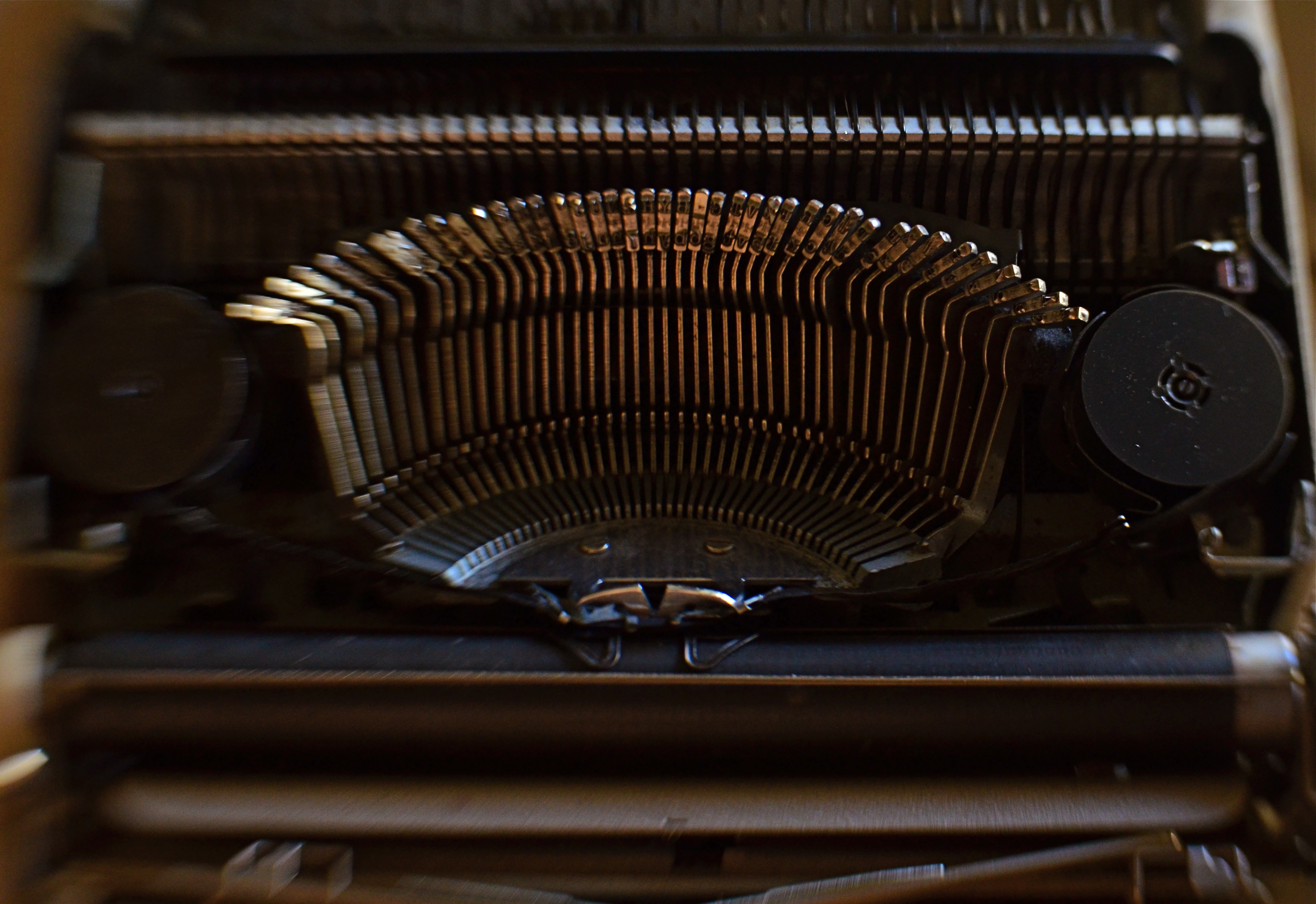
Ghost Writer In Disguise, 2016
By MICHAEL PERKINS
PHOTOGRAPHY OFTEN RE-DEFINES OUR PERCEPTION OF THE FAMILIAR, re-contextualizing everyday objects in ways that force us to see them differently. Nowhere is this more effective than in close-up and macro photography, where we deliberately isolate or magnify details of things so that they lose their typical associations. Indeed, using the camera to cast subjects in unfamiliar ways is one of the most delightful challenges of the art.
Product developers are comfortable with the idea that “form follows function”, that how we use a thing will usually dictate how it must be designed. The shapes and contours of the objects in our world are arrived at only as we tailor the look of a thing to what it does. That’s why we don’t have square wheels. The problem with familiar objects is that, as long as they do what they were designed to do, we think less and less about the elegance of their physical design. Photographers can take things out of this chain of the mundane, and, in showcasing them, force us to see them in purely visual terms. They stop playing the piano, and instead look under the lid at the elegant machine within. They strip off the service panel of the printer and show us the ballet of circuitry underneath.
It’s even easier to do this, and yields more dramatic results, as we begin to re-investigate those things that have almost completely passed from daily use. To our 21st-century eyes, a 1910 stock ticker might as well be an alien spaceship, so far removed is it from typical experience. I recently viewed a permanent wave machine from a beauty parlor of the 1930’s, sitting on a forgotten table at a flea market. It took me two full minutes to figure out what I was even looking at. Did I snap it? You betcha.
The study of bygone function is also a magical mystery tour of design innovation. You start to suss out why the Edisons of the world needed this shape, these materials, arranged in precisely this way, to make these things work. Zooming in for a tighter look, as in the case of the typewriter in the above image, forces a certain viewpoint, creating compositions of absolute shapes, free to be whatever we need them to be. Form becomes our function.
The same transformation can happen when you have seemingly exhausted a familiar subject, or shot away at it until your brain freezes and no new truth seems to be coming forth. Walking away from the project for a while, even a few hours, often reboots your attitude towards it, and the image begins to emerge. As Yogi Berra said, you can observe a lot just by watching.
RELIEF OF PAINFUL G.A.S.
Eight years and three cameras ago. 1/125 sec., f/7.1, ISO 100, 13.7mm.
By MICHAEL PERKINS
HE’S YOUR DAD, YOUR UNCLE, YOUR WACKY SITCOM NEIGHBOR: the guy who has every ratchet,widget and wrench in the Sears Craftsman catalogue, yet who is, strangely, incompetent at any task more complex than the replacement of a light bulb. If he could just get that table saw, that router, he could finally tackle that pet project with real zest. But heck, he explains, I don’t have the right extender, the extra power supply, the magical whatsit that just came out this year. In reality, this guy is not a handyman, he’s an actor playing the part of a handyman. He’s Batman with a utility belt big enough to spill over a city block. He’s a gadget addict.
Now, transfer all that imagery from fix-it toys to optical toys, and you can understand the disease that photographers call G.A.S—-Gear Acquisition Syndrome.
There is no vaccine or twelve-step program for some types of shooters for whom the next lens, the up-and-coming accessory will make all the difference, and catapult their photography from mundane to miraculous. And none of us, even the most rigidly discipline, is completely immune to the siren song of the bright and shiny plaything. Sadly, G.A.S. often sidetracks us for months or even years, taking us off the path of practice and hard work with the tools we have as we wait for the toys we want. It doesn’t seem to impress us that people are making extraordinary pictures with cameras that are, basically, crap. Similarly, It doesn’t seem to faze us to know that people lugging around fifty pounds of lens changes and thousands of dollars in Leica-like bodies are often coming home with a portfolio of poop to show for their efforts. G.A.S., once its fever envelops our tiny minds, creates the hallucination that photography is about equipment. Sure, and Mark Twain wrote better after he graduated from notepads to a typewriter.
It’s almost too simple a truth that practice makes perfect, practice with limited lenses and sad little cameras, practice with nothing to focus on but how well we can teach ourselves to see. G.A.S. fogs up our thinking, making photography a destination (oh, once I get that German glass!) instead of a journey (wonder what I can make happen with what I have). It’s magical thinking. The camera becomes a talisman, a magic monkey’s paw, Harry Potter’s wand. Real, serious development is delayed while we wait for machines to appear and deliver us.
Oddly, looking backwards can often help us move forwards. Now, follow me here a moment. Ever go through the ghostly Shoebox of Shoots Past to find that you actually nailed a biggie on the day that you had bad weather, a lousy subject and a disposable $10 camera? Of course you have. But, wait….how could you take a good picture with all the wrong gear? Because something in you knew how to make that picture, with or without the ease and convenience conferred by better equipment. And the more you developed your eye, the more often you could make a picture that good, on purpose, time after time. As an example, the image at left is eight years and three cameras ago for me. I could certainly shoot it better today, but, even with more primitive machinery, I got most of what I wanted with what I had on hand that day. You have pictures just like this. Yes, you do.
I’m not saying that tools aren’t great, but if your shelves are overfilled (and your wallet is over-depleted) due to Gear Acquisition Syndrome, it’s best to ask how much in the way of toys you really need. None of it can take a great picture unless your mind and your eye are on the steering committee. Ansel Adams’ claim that the most important part of a camera was “the twelve inches behind it” is gospel. Get religion and become a believer, o my brothers.
THE MOST FROM THE LEAST
Reaching a comfort zone with your equipment means fewer barriers between you and the picture you want to get. 1/80 sec., f/4.5, ISO 100, 18mm.
By MICHAEL PERKINS
PHOTOGRAPHY IS ONLY PARTLY ABOUT TAKING AND VIEWING IMAGES. Truly, one of the most instructive (and humbling) elements of becoming a photographer is listening to the recitation of other photographers’ sins, something for which the internet era is particularly well suited. The web will deliver as many confessions, sermons, warnings and Monday-morning quarterbacks as you can gobble at a sitting, and, for some reason, these tales of creative woe resonate more strongly with me than tales of success. I like to read a good “how I did it” tutorial on a great picture, but I love, love, love to read a lurid “how I totally blew it” post-mortem. Gives me hope that I’m not the only lame-o lumbering around in the darkness.
One of the richest gold fields of confession for shooters are entries about how they got seduced into buying mounds of photographic toys in the hope that the next bit of gear would be the decisive moment that insured greatness. We have all (sing it with me, brothers and sisters!) succumbed to the lure of the lens, the attachment, the bracket, the golden Willy Wonka ticket that would transform us overnight from hack to hero. It might have been the shiny logo on the Nikon. It might have been the seductive curve on the flash unit. Whatever the particular Apple to our private Eden was, we believed it belonged in our kit bags, no less than plasma in a medic’s satchel. And, all too often, it turned out to be about as valuable as water wings on a whale. He who dies with the most toys probably has perished from exhaustion from having to haul them all around from shot to shot, feeding the aftermarket’s bottom line instead of nourishing his art.
My favorite photographers have always been those who have delivered the most from the least: street poet Henri Cartier-Bresson with his simple Leica, news hound Weegee with his Speed Graphic perpetually locked to f/16 and a shutter speed of 1/200. Of course, shooters who use only essential equipment are going to appeal to my working-class bias, since peeling off the green for a treasure house of toys was never in the cards for me, anyway. If I had been the youthful ward of Bruce Wayne, perhaps I would have viewed the whole thing differently, but we are who we are.
I truly believe that the more equipment you have to master, the less possible true mastery of any one part of that mound of gizmos becomes. And as I grow gray, I seem to be trying to do even more and more with less and less. I’m not quite to the point of out-and-out minimalism, but I do proceed under the principle that the feel of the shot outranks every other technical consideration, and some dark patches or soft edges can be sacrificed if my eye’s heart was in the right place.
Of course, I haven’t checked the mail today. The new B&H catalogue might be in there, in which case, cancel my appointments for the rest of the week.
Sigh.
