OPEN/CLOSED
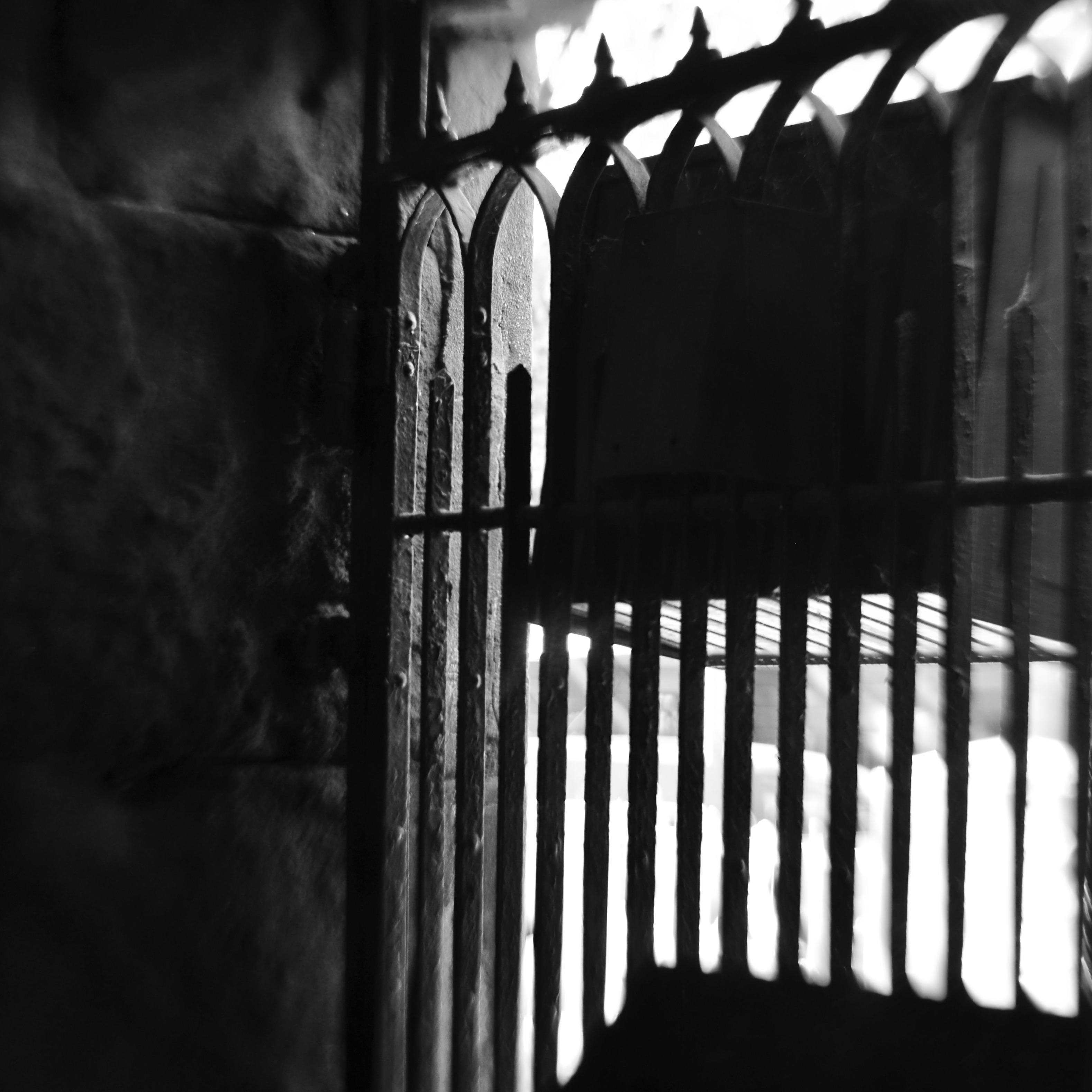
No admittance. This means you. But what else does it mean?
By MICHAEL PERKINS
JUST AS NUMBERS AND LETTERS ARE SYMBOLIC OF THINGS LARGER THAN THEMSELVES, cues in photography act as a visual vocabulary, a kind of shorthand for more complex ideas. This way of showing ideas through a commonly recognized series of signals means we don’t always have to explain everything from scratch every time we create a picture. In order to convey the idea of a train, we don’t have to show the entire history or design of locomotives: a railroad crossing sign sells the concept immediately. And so, as storytellers. we use symbols to get to the point faster, and, nearly two centuries into our shared art, the shortcuts get more compact and more immediate with the passage of time.
One of the ideas that we convey in this way is the idea of limits or barriers, especially images that show confinement or limited admittance. Signs, lights, gates, traffic cones, warning signals, all convey a ton of information in a short space of time…everything from beware to keep out. These cues also allow a photograph to be all shorthand, to be about the limit or barrier. The image seen here adequately conveys the idea of a physical limit with a very meager amount of data. Even resolution itself has been relaxed, leaving just the suggestion of textures that are typically rendered in fine detail. There are no clearly readable signs, no clue to what the viewer is being kept from, no idea of whether the gate represents safety or repression. And while this symbol conveys a limit on our movement; everything else is open to interpretation. In some cases, not revealing what lies beyond the gate may make for a more intriguing image than if the photographer were to show everything in full. The beauty of this process is that most photographic ideas can be expressed with a very spare inventory of information, as our eyes have learned, over years, to see interpretively, enabling us to decode what the photographer as encoded. It’s a very intimate relationship.
All of which, I believe, argues for making your picture’s case in as few strokes as possible. We still pay more attention to framing, i.e., what fits in the rectangle, versus composition, or the arrangement and selection process within the borders of our pictures. We sometimes overcrowd and oversell messages which may be conveyed more effectively with much less information. Learning how to say more with less comes slowly; we need to build up a substantial log of attempts before we can begin to tweeze out the most effective amongst them. But that is the difference, as we often say, between taking a picture and making one, or the difference between pictures that are merely nice and those that are essential.
SQUARING UP YOUR SHOT
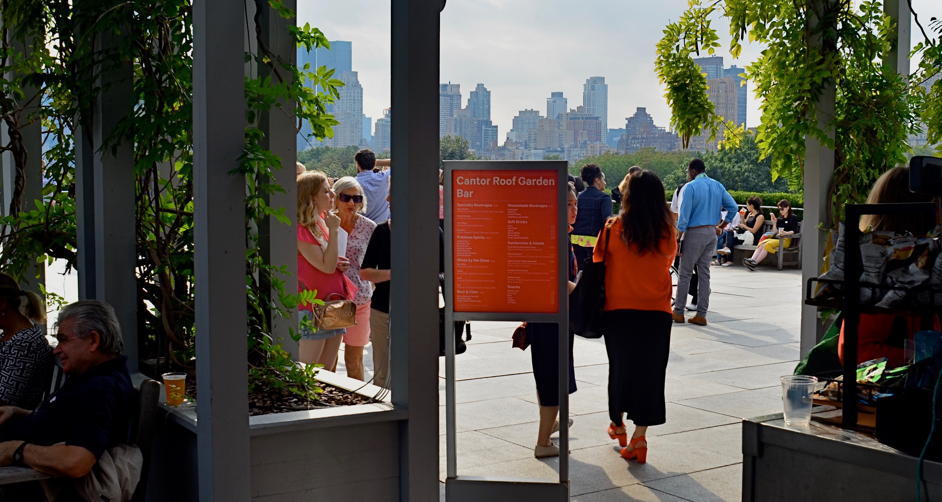
Master shot, taken at the entry to a roof garden atop the Met museum in Manhattan.
By MICHAEL PERKINS
IN THE PRESENT PHOTOGRAPHIC ERA, the default frame for composition is, with some notable exceptions, a rectangle, the 3-to-2 ratio that is the descendant of Oscar Barnack’s first 35mm Leicas of the late 1920’s. Most of us have been taught to automatically compose in this format, a hard-wired habit that informs our entire concept of how to fill a frame. The “notable exceptions” I refer to are the square films that have accompanied the return of instant photography, the lomography movement with its square-framed analog film formats, and, by virtue of a built-in app choice, the mobile phone. Strangely, some of the most sophisticated cameras on the market do not allow you to shoot an original square image: the shot must be captured in a 35mm equivalent and cropped later. But that’s a rant for another day.
The thing is, if you don’t typically investigate square composition, you are robbing yourself of an important tool, or, more specifically, you are allowing yourself to always see subjects in the same “frame” of mind. There are distinct advantages to creating a square composition, not the least of which is that it forces the viewer to take in your picture’s information in a distinct way. While shots that are wider than tall are marvelous for any number of reasons, they do, in effect, invite the viewer to scan an image linearly, that is, to look left to right and back again. By contrast, the square reinforces its equal dimensions, almost forcing the eye into a continuously circular sweep of the contents. I hear people complain that a square just “doesn’t give me enough room to get everything in”: however, I would counter that argument by contending that, in many 3/2 compositions, there is a wealth of visual information that not only is not needed, but actively distracts the eye from the most interesting parts of the photograph. Think of a glass of ice tea that, over time, actually has more volume in it, due to melted ice, than was originally poured into the glass. More liquid, but a greatly diluted flavor.
The problem is not that many square images aren’t being made…far from it. It’s that they are, in many cases, being re-made from rectangular originals, in the editing process. We have to shoot wide and edit square. But therein may lie the best way for us to start seeing what a square composition can do, not merely to define the space of a picture, but to invite the viewer into it more efficiently. And it’s easy and cheap to do it.
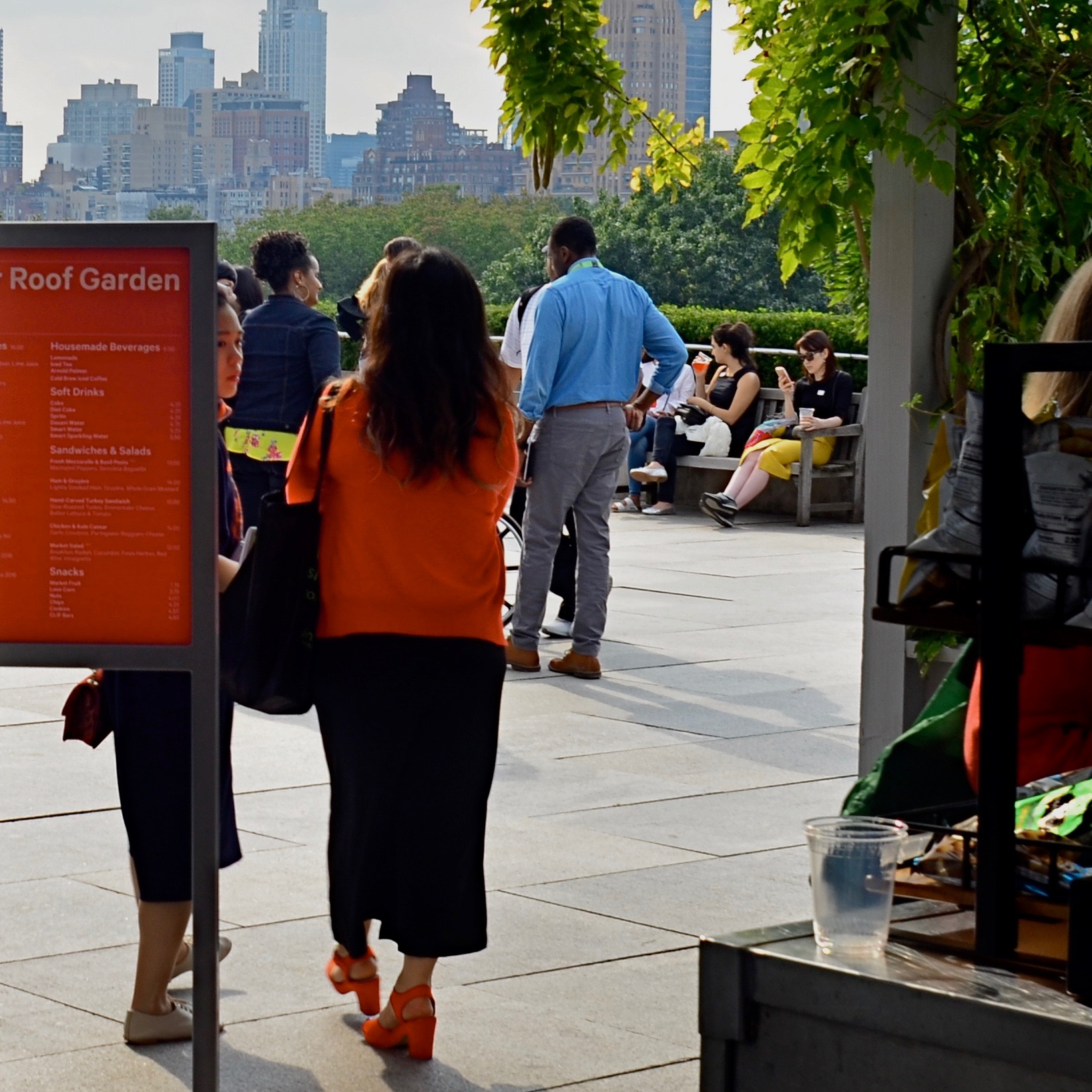
The above image recomposed as a square shot. Net loss or net gain?
Try this: select a series of wide master shots that you feel fairly strongly about, dupe work copies of them, and then crop new compositions within the copies. Junk the ones that don’t work and do as many re-takes as you see fit. Did any of the cropped images emerge as stronger without all that extra stuff you originally felt you had to include? And even if they did not, that’s also a good thing. The mere fact that you’ve begun to intentionally look for pictures within pictures means you’ve entered a new phase of your vision as a photographer. We’re certainly used to thinking of pictures that “came out pretty good’ as final or complete, but it’s a good thing to think of them instead as workable drafts. In the wider shot seen ay top, I successfully conveyed that people were stepping onto the roof of the Met museum in NYC, but I also got a lot of things in the shot that aren’t necessary to the telling of that story. The main tellers in the picture are the two women, who, like us, have just arrived. They are our surrogates or guides. Cropping actually makes the red of the sign in front of one of the women cry for your attention, guiding you to the women even as it partly conceals one of them. Additionally, the same top to bottom space that they occupy also shows part of the skyline that borders Central Park. The front to back scale of the shot says “on the roof, in the city”, at some distance.”
So judge for yourselves, as you would with your own pictures. Did anything I took away in cropping diminish the impact of the picture? Does the lower frame now feel open, cramped, or, in Goldilocks fashion, about right? Is there an appropriate emotional distance from the subject, or a welcome intimacy with it? Is there, in short, an overall net gain for the narrative power of the image once it’s been cropped? And most importantly, even if this experiment fails (with the wider picture still being stronger), haven’t I already begun to see every picture in at least two fundamentally different ways? New ways of seeing are among the most powerful tools in a photographer’s kit. The world of cameras may indeed default to a rectangle, but that doesn’t mean our brains need to follow suit.
PARING AND SPARING
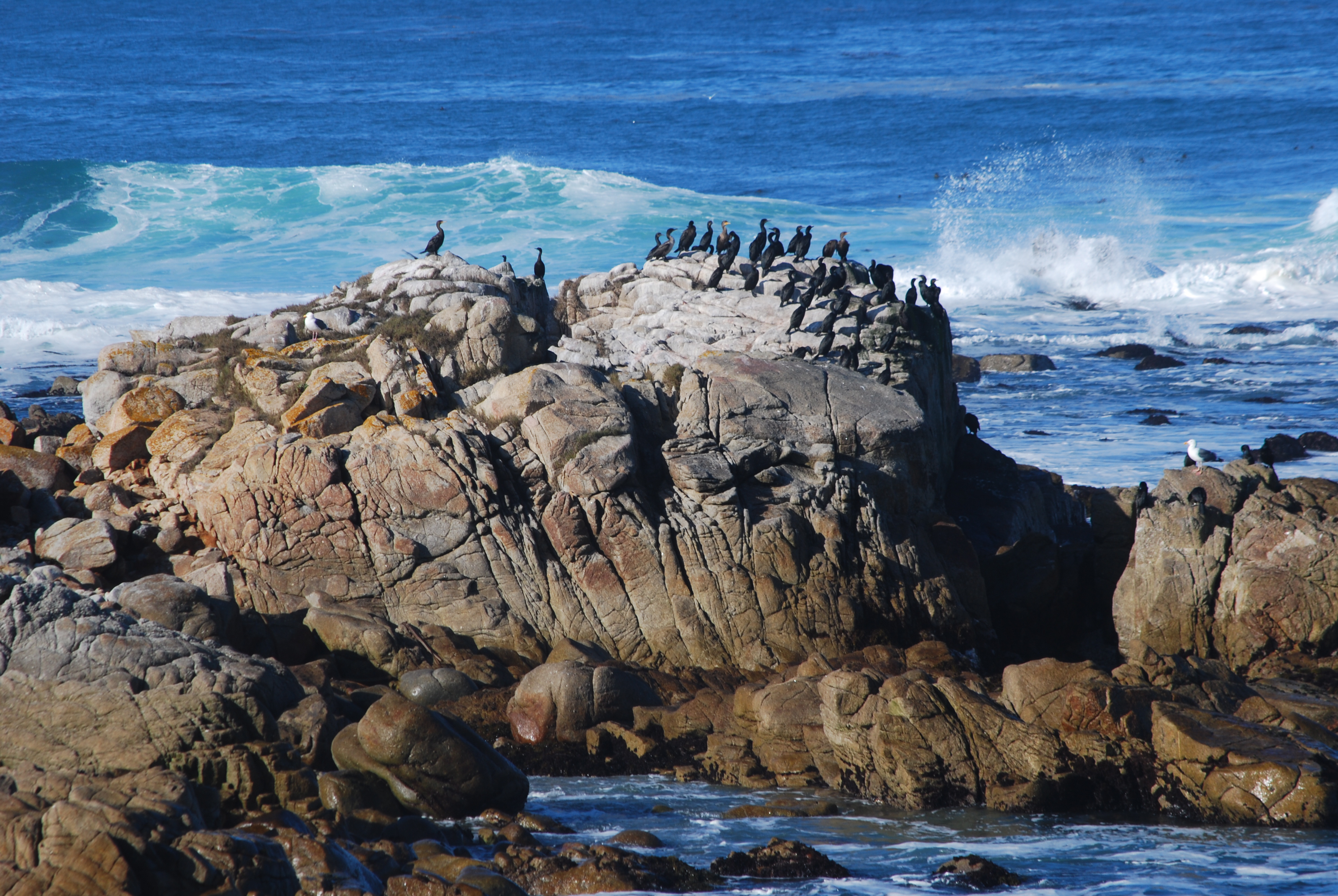
Standard landscape composition. Lots of….well, everything.
By MICHAEL PERKINS
ALL REAL ESTATE IN A PHOTOGRAPH IS PRIME REAL ESTATE.
Space within a composed frame must be earned. Every element that doesn’t strengthen or streamline a picture’s narrative power is detracting from it. Remembering this simple rule makes editing as easy as it is essential.
It’s usually true that you add something to an image by taking something away from it. This can seem counter-intuitive when shooting landscapes, epic-sized collections of scenic…stuff, where wide-angle lenses rule the roost and it seems to just make sense to crowbar as many trees, mountains, and waves as possible into the scene, as if more will automatically be better. However, the same thing is true of vast vistas that is true of smaller ones: there are few photographs which are uniformly strong from top to bottom, end to end. You have to find the strongest core within the larger picture and pare the rest away.
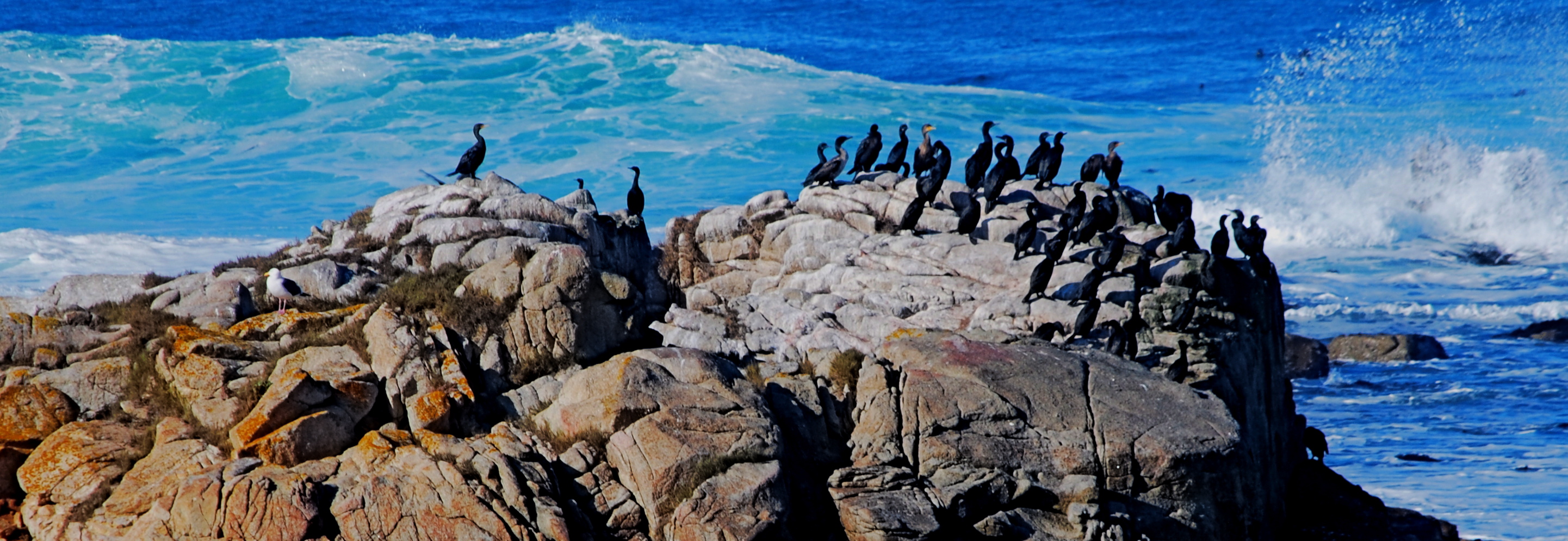
The tighter shot lurking within.
I call attention to this because, slow learner that I am, I can often spend years coming to the conclusion that one of my pictures has been weakened or held back by a hyper-abundance of information. The topmost shot, an original from a 2008 trip to Carmel, California, is a case in point. None of the visual elements are particularly wrong: it’s more like they are simply too plentiful. There’s just too much sky, sea, and stone…..that is, far more than is needed to sell the story.
Worse, the grouping of birds at the center of the frame, which is potentially strong enough to economically make smarter use of all those other elements, is being buried under all the surrounding… padding. The eye is being asked what to prioritize as it wanders its way through too much picture. By comparison, in the second shot, reframed as a mostly horizontal composition with the birds bumped up to prominence, the picture is now telling the eye what to see.
Which only serves to illustrate that what is left out of an image is just as important as what is left in it. Just like you can muck up a story with too many plot lines, you can get in a picture’s way by making its narrative take too many detours. Say what you have to say in the cleanest way possible, and then drop the mic.
THE FLEXIBLE FREEZE
By MICHAEL PERKINS
PHOTOGRAPHERS ACROSS THE LAST TWO CENTURIES HAVE CAPITALIZED ON ONE OF THEIR MEDIUM’S BEST TRICKS, the ability to freeze time, the sensation of carving out micro-seconds of reality and preserving them, like ancient scarabs trapped in amber. The thing known as “now”, with the aid of the camera, became something called “forever”, as things which were, by nature, fleeting were granted a kind of immortality. Events became exhibits, things to be studied or re-lived at our whim.
And yet, even as we extract these frozen moments, we mess around the edge of the illusion a bit, making still pictures also convey a sense of motion. Focus is a prime example of this retro-fitting of technique. No sooner had photography evolved the technical means to render sharp images than shooters began to put a little soft imprecision back into their pictures, by a variety of means: slow shutter speeds, time exposures, manual shaking, delayed flashes, and selective focus. Of all these techniques, at least for me, selective focus has proven to be the hardest to master.
….and two more lattes, 2016, shots on a Lensbaby Composer Pro, which allows a sweet spot of sharp focus to be moved anywhere in the frame the shooter desires.
Changing the messaging of a photographic story by using focus to isolate some elements and downplay others has always called for real practical knowledge of the workings of lenses and how they create focus as an effect. Recently, digital manipulation has allowed shooters to re-order the focal priorities of a shot after it’s taken, and in just the past few years, commercially available specialty lenses have allowed photographers to pre-select where and when focus will occur in an image, using it as interpretively as color or exposure.
I like to use the Lensbaby family of variable-focus lenses for what I call “flexible freeze” situations, times when focus can be massaged to create the illusion of speed. In the above shot, taken in a high-volume cafe, the small center of tight focus fans out to a near streaky quality at the outer edges of the picture. No one person is rendered sharp enough for features to register, or matter. What’s important here is the sensation of a busy lunch rush, which actually would be diminished if everything was in uniform focus.
Sharpness is certainly desirable in most cases for a strict re-creation of literal reality, but photography has never merely been a recording process. Focus can produce useful abstractions or atmospheres in a shot, so long as the effect serves the story. If it doesn’t help the image speak better, even a flexible freeze can quickly become a tiresome gimmick. Matching tools to goals is what good photography does best.

TWO WORLDS, ONE WALL
By MICHAEL PERKINS
PHOTOGRAPHS BEGAN AS A SIMPLE HEAD–ON ENGAGEMENT. The viewpoint of the camera was essentially that of an audience member viewing a stage play, or reading a page of text, with all visual information reading from left to right. People stood in front of the lens in one flat plane, giving the appearance, as they posed before offices or stores, that they themselves were components in a two-dimensional painting. Everyone stared straight ahead as if in military formation or a class portrait, producing fairly stiff results.
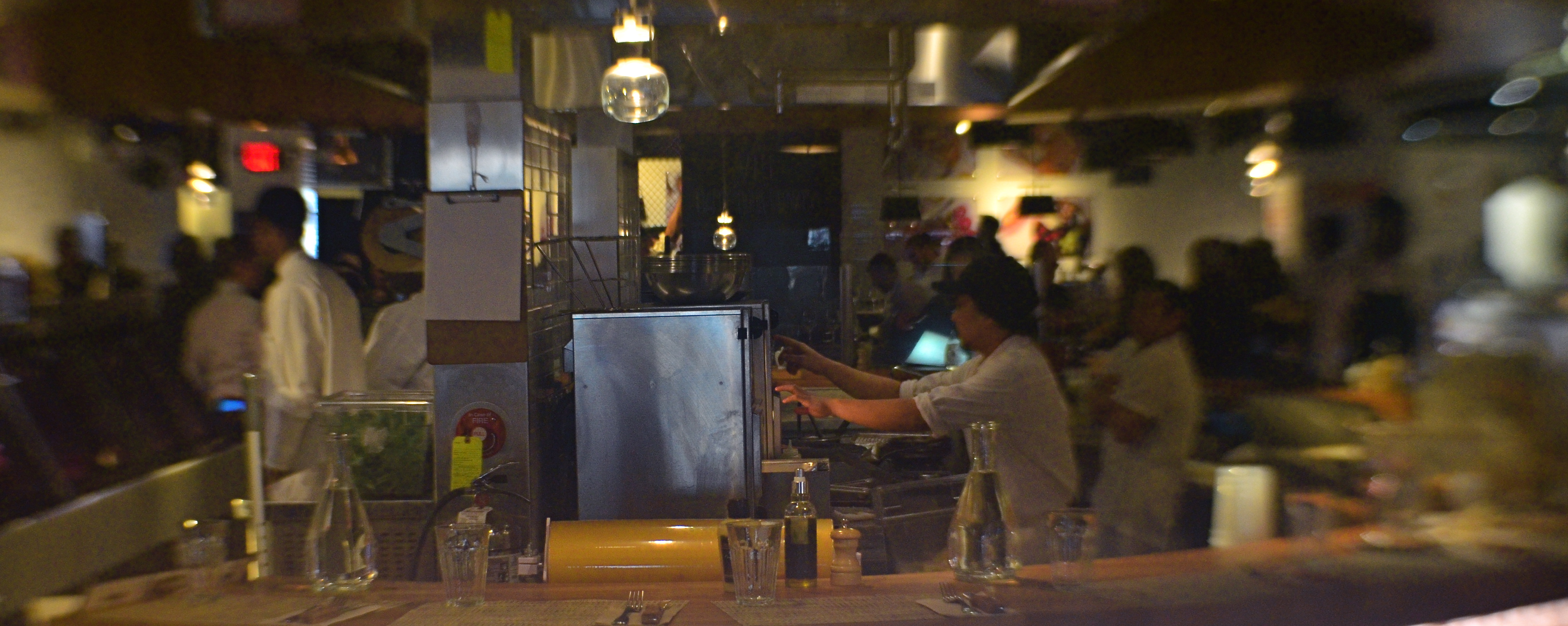
We started photography by placing people in front of walls, then learned, like good stage managers, that selectively positioning or moving those walls could help image-makers manage the techniques of conceal/reveal. Now you see it, now you don’t. Photography no longer takes place in one plane: barriers shift to show this, or to hide that. They are part of the system of composition. Control of viewing angle does this most efficiently, as in the above image, where just standing in the right place lets me view both the front and back activities of the restaurant at the same time.
Of course, generations after the rigid formality of photography’s first framing so, we do this unconsciously. Adjusting where walls occur to help amplify our pictures’ narratives just seems instinctive. However, it can be helpful to pull back from these automatic processes from time to time, to understand why we use them, the better to keep honing our ability to direct the viewer’s eye and control the story.
Share this:
July 23, 2017 | Categories: Commentary, Composition, Conception | Tags: Composition, e, Framing, narrative effect | Leave a comment