FUZZY LOGIC
By MICHAEL PERKINS
When I use a word, it means just what I choose it to mean—neither more nor less”
Lewis Carroll, Alice’s Adventures In Wonderland
PHOTOGRAPHERS DISAGREE ABOUT NEARLY EVERYTHING. That’s to be expected, given that we are, as artists, all on such very individual trajectories. How can we reach consensus on what makes a picture “work”? Or what constitutes a “composition”? Or “realism”? Sometimes we cannot even find common ground on what very common terms about photography even mean.
Take the terms focus and sharpness, both of which can be used to define the resolution in an image. Both words are an attempt to measure something, but exactly what? And in whose view are these terms either final or arbitrary, anyhow? I make a very simple distinction between the two, and it helps me to keep my own thinking more organized. For me, the word focus is less about definition than it is about where I want the eye to be directed within a frame. In fact, most dictionaries’ first definition of the word is “the center of interest or activity.”, which to me means the place where the story should be happening. By comparison, sharpness, to me, speaks mostly of the distinction of fine details in a photo. Focus can mean sharpness, but, in my workflow, these contrasting connotations are helpful.
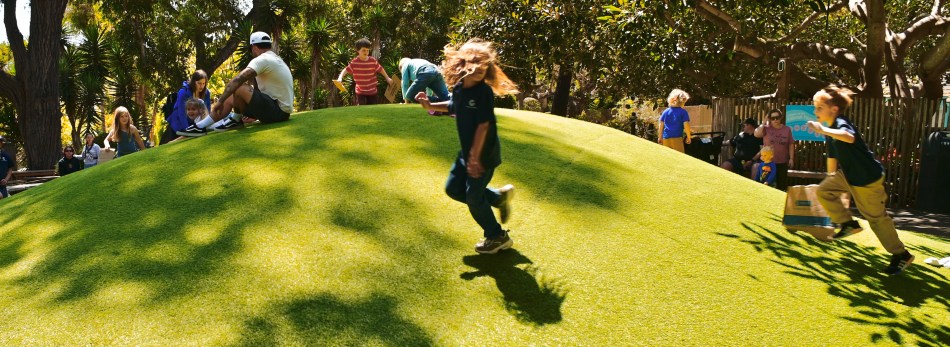
Thinking of the two terms as complementary to each other gives me a fairly consistent way of prioritizing them in a photograph. Focus, then, speaks of where I want to direct the viewer’s attention, while sharpness refers to how detailed I want that focal object to be rendered. In the image above, the focus of the narrative is obviously the two blurry children running into the frame. I could have made the adjustments necessary to make them as sharp as the figures in the background, but recording their speed seemed important to me, and so I anchored the general picture in sharpness to enhance the kids’ role as the picture’s focus. Make sense?
Doesn’t actually matter. You will define terms as befits your own approach to your own work. How can you do anything else? The take-home: don’t let anyone tell you that there is something like a fixed rule in photography. Of course we’ll disagree. Of course we’ll argue. But what takes us beyond argument is whether the results validate our approaches. The rest is noise.
SOFT AROUND THE MEMORIES
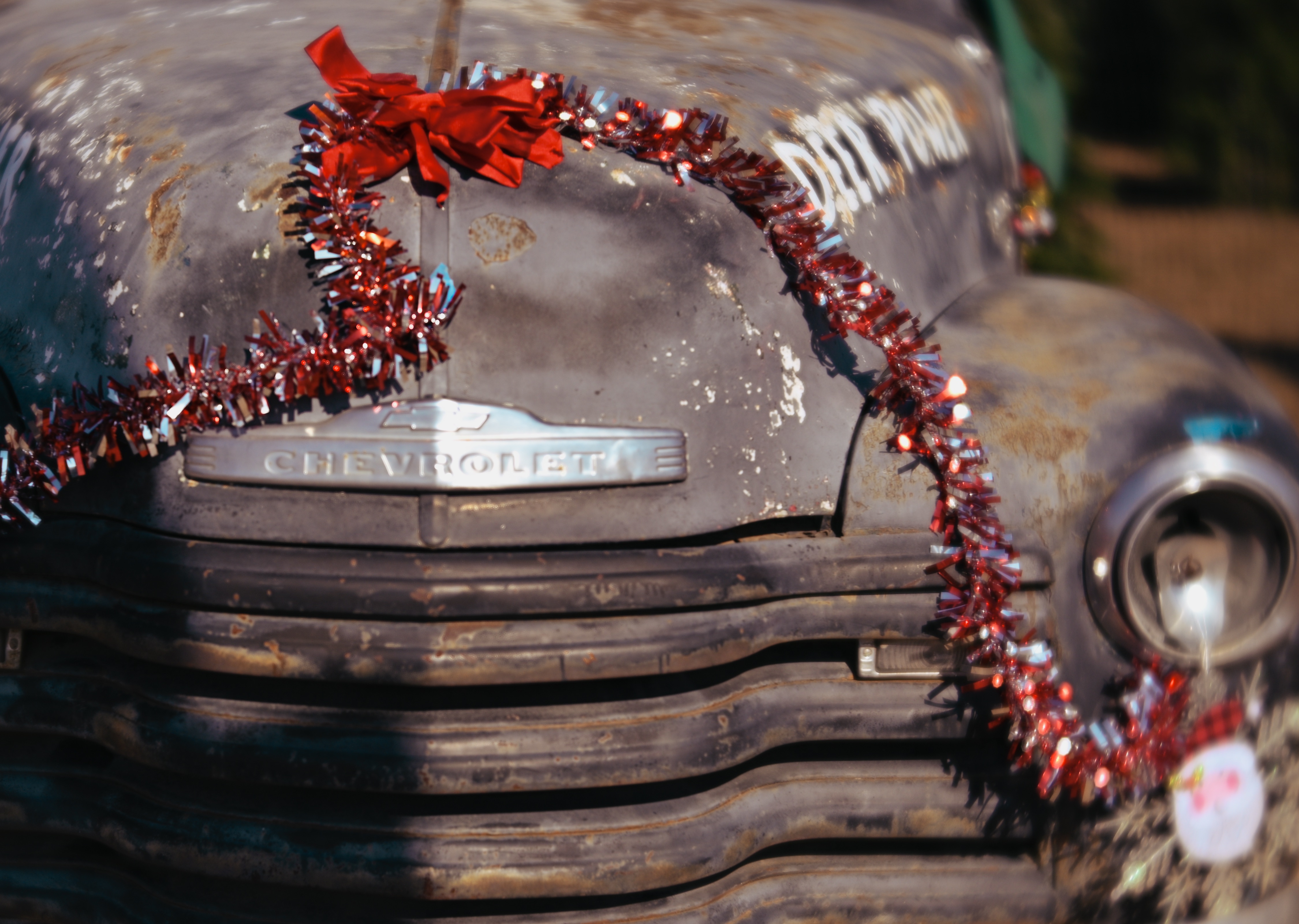
I originally thought a soft, glow-y look would “sell” the vintage look of this truck. Not so sure now…
By MICHAEL PERKINS
I’M A BIG BELIEVER IN SECOND DRAFTS. Part of this comes from my work in commercial copywriting, a field that has only two truths: (A) the customer is always right, and (B) the customer will almost never accept your first effort without changes. Another part of my comfort with re-do’s is my background as an illustrator, a craft that teaches you that your vision seldom comes straight out of the pencil in its fullest or final form. Both professions thrive on negative feedback, and being cool with that can reduce the number of heartaches you’ll face in other imperfect endeavors, such as being a photographer.
Factors like time, travel and opportunity can certainly force shooters to accept their first attempt at an image, simply because getting on a flight or meeting someone for lunch or dodging the rain can mean they have no choice but to accept the one try they’re going to get on a given subject. But even within a narrow time span, digital gear makes it much easier for for us to shoot-and-check-and-shoot-again quickly, resulting in more saves and keepers. But these are all technical considerations, which still ignore the biggest, and most crucial factor in getting the picture right. And that’s us.
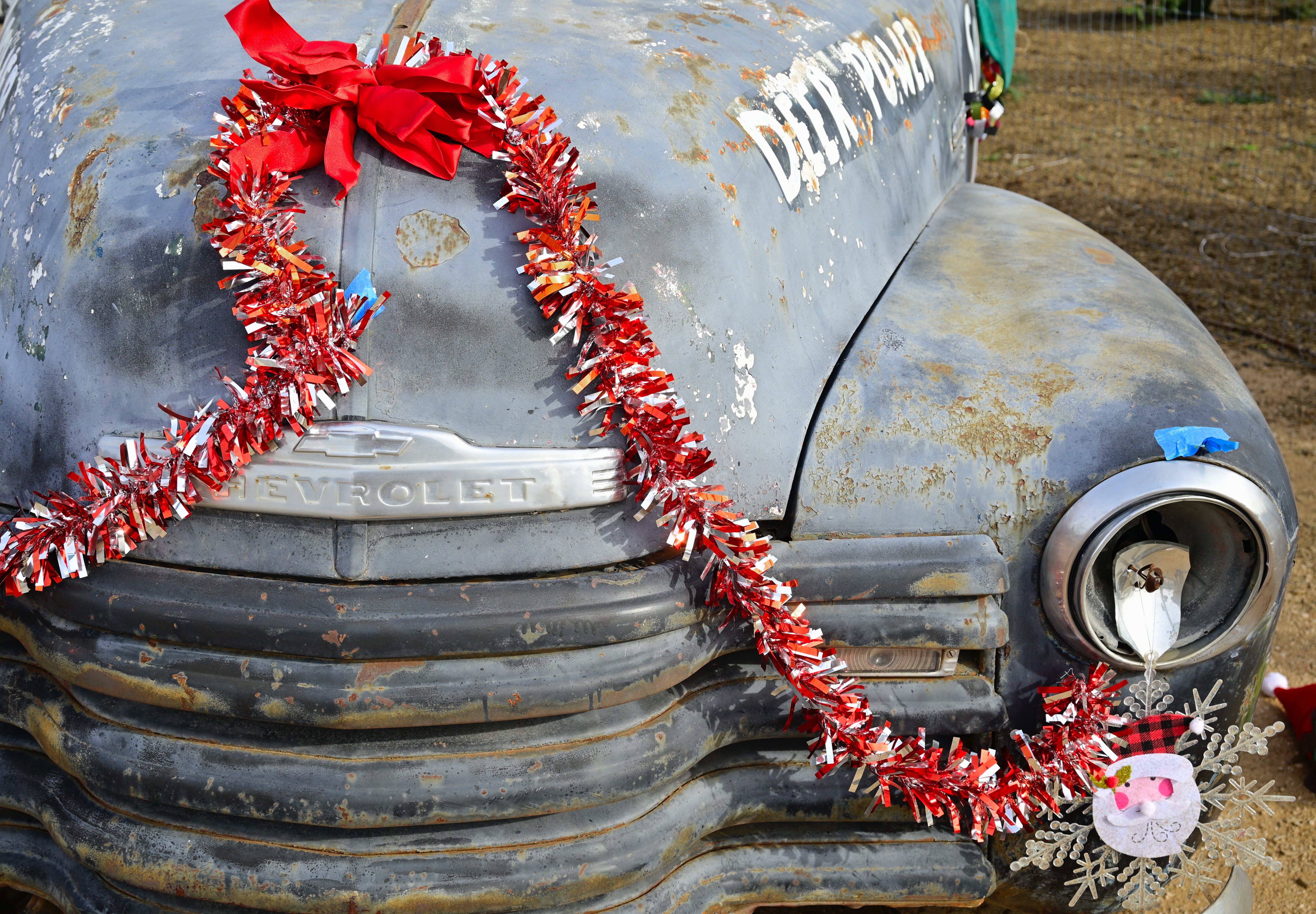
Take Two, several days (and several degrees of sharpness) later….
Sometimes we leave a shoot satisfied that we nailed it, only to find, back home, that we were nowhere near the nail and didn’t know how to use the hammer. We didn’t choose the right glass, or the right angle, or, most importantly, the right conception of what would make the image speak. If we’re lucky, we are geographically close enough to the original site that we can go back for a retry. And if we’re really lucky, the time span between first and second draft has shown us what needs to change.
In the two shots of a rusted truck seen here, I was certain, at first, that merely suggesting the wear and tear on the old wreck with a hazy, soft look, would sell a certain nostalgic mood, whereas, once I returned home, my masterpiece just looked like a mess. There’s a red line between soft focus and mush, and I had truly stumbled across it. Fortunately, I was close enough to the truck to drive back and try again with a conventionally sharp image, which I think actually works better overall, at least for me. Fortunately, the time between my first and follow-up attempts was enough to let my approach evolve, and, luckily, I wasn’t blocked from giving it a second go because of time, travel or opportunity. Point is, there is sometimes real value in being forced to wait, to delay the instant gratification that our tech tells us should be our default. Sometimes, we come closer to the mark when we are forced to hurry up and wait.
MITIGATING FACTORS
By MICHAEL PERKINS
IN LEARNING HOW TO MAKE PICTURES, we progress from the general to the particular, in that we initially learn formalized rules that apply in many or most situations, and then develop our own, shorter list of more rubbery regulations that most precisely fit our own approach to creativity. We learn from rigid do’s and don’ts, “always” and “nevers” that gradually bend or dissolve in deference to our fully realized style.
That means that, in photography, all standards are negotiable, even disposable. Think what freedom that sentence implies. In architecture, such a thing is not possible, since a building either has support or doesn’t. In math, such leeway is nigh unto unthinkable, because the specs in a space vehicle are either in tolerance (people survive) or out (people don’t survive). However, in a visual art, things work when they work, whether they adhere to a formal technique or not.
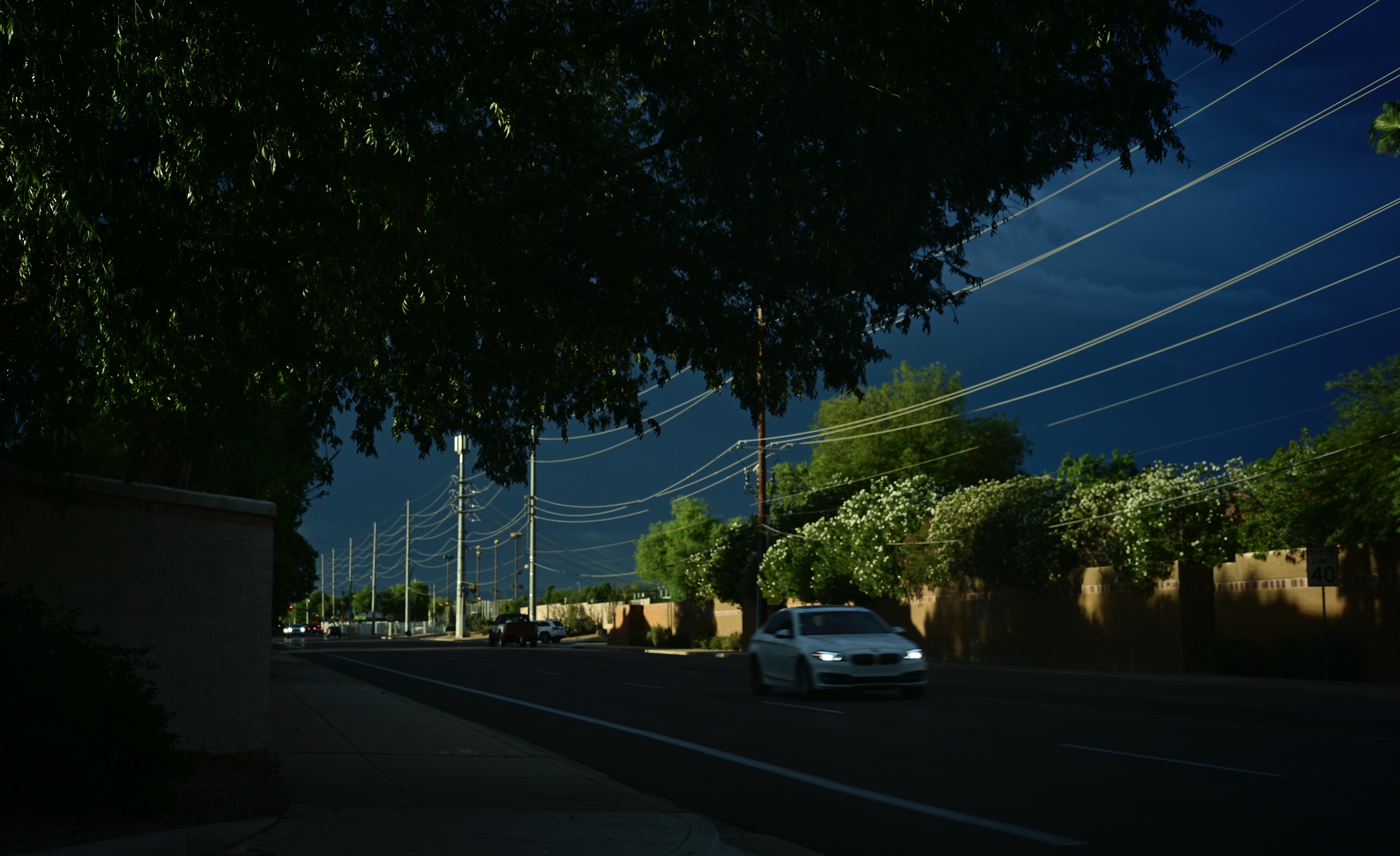
Because of its fairly soft focus, this picture, according to some who may view it, is imperfect, flawed, or what might term a bad photograph. It had to be grabbed in a second of impulse because everything in it was perishable. Things like the approaching auto, because it was needed for scale, composition, and a sense of urgency: the storm, which was refracting the dying sunlight of a late afternoon in amazing, but fleeting contrast: even my car, since I was shooting out my driver’s side window and would soon have to move on to avoid snarling traffic. It is not a precise picture, but instead it is an image of an opportunity. I might, with an additional second or two, have guaranteed the sharpness that, for some, disqualifies this shot, but I was shooting one-handed, and on full manual, and the oh-what-the-hell rule trumped everything else.
But for me, everything else except the lack of sharpness works powerfully enough to “sell” the picture, to convey what I felt when snapping it. Crispness might have been an additional plus for the final image, but I will never know. I do know how rotten I would have felt if I hadn’t had a go at it. Emotions can often carry a photograph where mere technical precision can never reach, and you’ll know when the time is right to choose one or the other.
NEGOTIABLE
By MICHAEL PERKINS
ONE OF THE FIRST “COMMANDMENTS” that were once sacrosanct to newbie photographers was the concept of sharpness. We were taught to worship the resolution quotients of all lenses and to choose them based on arcane charts and bench tests that professed to certify perfection. Such data made us look askance at the glass we currently owned and to slobber over the newer, crisper glass that shone forth from the catalogues (or websites). Many of us broke the bank in this pursuit, abandoning perfectly fine lenses that didn’t live up to someone else’s holy absolute, chasing the little red wagon of sharpness right down the street to bankruptcy court.
Escape, 2020
But as it turns out, sharpness is only a must for some kinds of photographs, and (listen closely), only if we say so. Museums around the world are bursting with life-changing images that fall far below that arbitrary high water mark for resolution set by God-knows-what-secret-society, and, if you examine the whole range of images you personally regard as your “keepers” there will be compelling pictures within that stack that don’t pass the sharpness fantasy…..and yet work, and make their arguments powerfully and elegantly. Leaning too hard on any one commandment in photography, whether it be sharpness or exposure or composition, leads you away from spontaneity and into stultification. Work that has only to meet some arbitrary technical standard to be qualified as art can, of course, never aspire to be art at all.
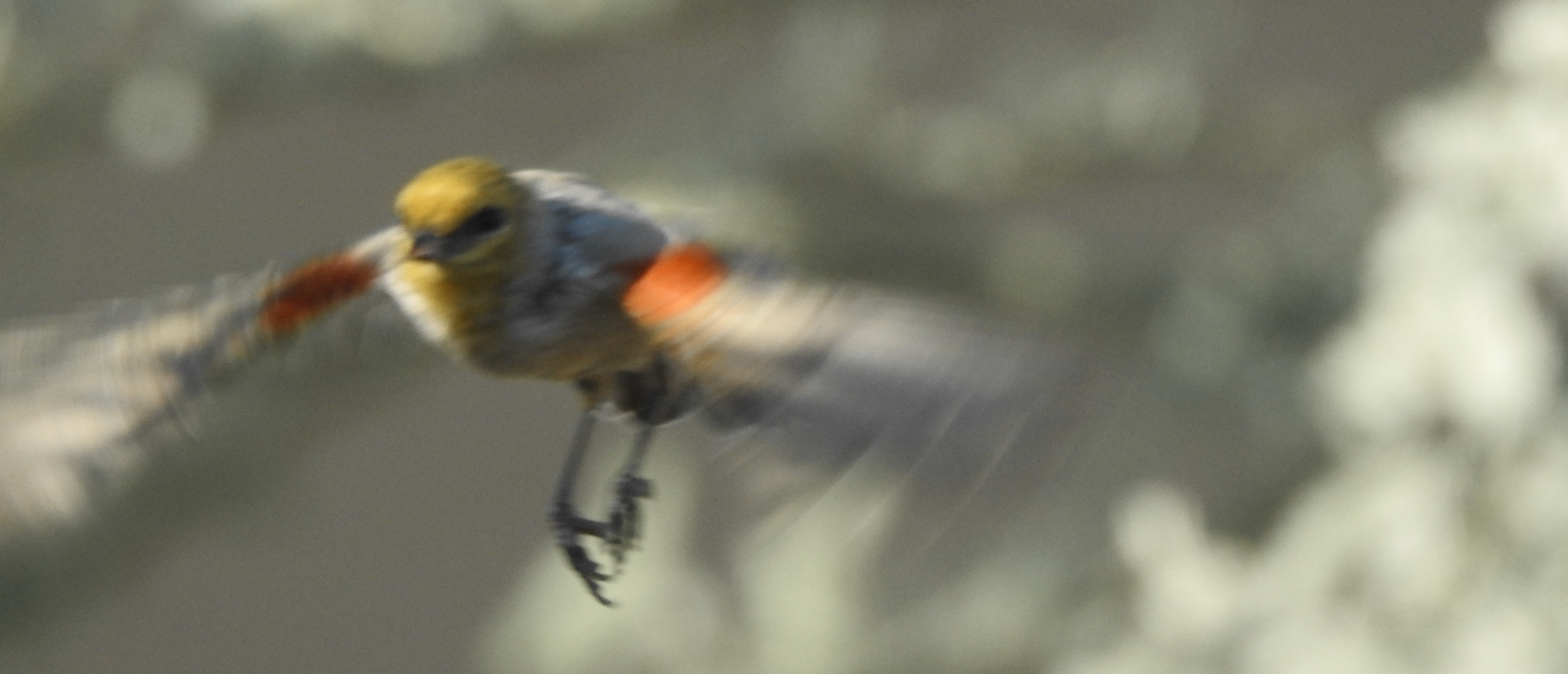
The best path to satisfying photographs is to trust yourself in the moment, to hear the voice that says that it’s time to snap the shutter and go for broke, damn the results and the critics. The shot you see here is, yes, technically “imperfect”, as it was shot a bit slow for the speedy little bird’s sudden departure. My original plan was to cook up something poetic as he placidly sat on a perch, obligingly posing for my convenience. But he is a bird, and has a bird’s priorities and doesn’t give a ripe damn about mine, and so off he went. Now, I could waste a lot of space here rationalizing the whole result and saying that, of course, I planned it all along, only I didn’t. Like some of my other favorites pictures, it contains a generous kiss of good luck from the camera gods, and that’s okay. I could fret over the fact that if I’d had a faster, sharper lens, the bird’s body would be frozen in perfect register, but I’m not going to. I love it when a plan works out, but I also love it when something just happens.
Today’s emerging photographers have a much more relaxed attitude toward “rules” than we older shooters, and that, on balance, is a welcome change. It explains the entire “low-fi” and lomography movements which value shooting from the hip and the heart with minimal forethought, something that consciously chooses emotional verity over technical imperfection. And why not? What harm to bring more kinds of voices into the conversation? As I get older, I am more grateful for the choices that are negotiable, more likely to be labeled as “sometimes try” rather than “never do”. For a guy who can’t even manage to eat two consecutive hot dogs with the exact same condiments, I find that it’s a better way to, er, fly….
OPEN AND SHUT CASE
By MICHAEL PERKINS
ANYTIME I HEAR A PHOTOGRAPHER EXPLAIN HIS TECHNIQUE in sentences that start with “I always”, my hackles raise…just a little.
You’ve heard people point to stylistic routines that they never break, as if that rigidity were itself a guarantee of consistent excellence. I always shoot in natural light. I always shoot RAW. I always use a red filter…. you get the idea. Let’s agree that there is no gear or procedure which works wonderfully all the time. Every choice we make as photographers means, well, unchoosing other choices. Sometimes that’s a winning strategy. Sometimes it just bespeaks our insecurity or inflexibility.
One of the “always” boasts that’s prominent among users of very fast lenses is, “I always shoot wide open” (at the largest possible aperture), as if that’s some miracle prescription. In terms of exposure range, If you’re shooting at around f/2 (or wider, if you’ve laid out a small fortune), you’ve certainly elected to suck in as much light as your lens will allow, and often, that can give you a tremendous advantage over slower lenses. But it comes at a cost.

Distant subjects shot at the widest apertures will be decidedly softer.
At widest apertures, your depth of field, the area of sharpest focus, will be extremely shallow. Now, if you are shooting a portrait at close range and are okay with your background registering as a blur, this can be great, but if the mountain in the background is as important as the girl in the foreground, f/2 will not get that done. Another thing to factor into a shallow DOF shot is manual focusing (in case your autofocus throws a hissy fit). That will require even more time and patience to nail the shot…..which is okay in a casual setting but impractical in fast-moving situations, like street work or sports.
But let’s talk upside. Like mountain ranges? Wide open at F/2, our theoretical lens will, at around 250 feet from the nearest part of a landscape subject, be effectively sharp to infinity. However the result will be measurably softer than, for example, a telephoto shooting at f/8 or slower. One last caveat: using f/2 for everything could also generate additional chromatic aberration or color fringing, in case either of those are deal breakers for you.
The point here is that no setting, no lens, no trick can cover every situation with equal results. If that were true, someone would have already devised a universal high-end point-and-shoot that we could all buy, and the golden age of Gear Wars would end. Till that day, all we have is judgement….creative decisions weighed against all available options.
It means making pictures on purpose, an intention that is the dead opposite of “I always…..”
CUES
By MICHAEL PERKINS
PHOTOGRAPHIC COMPOSITION is never the mere geographic assignment of elements within a frame. Certainly, mapping out what is to go up, down, left, or right in a picture is a vital part of the process, but you have to do more than rearrange the deck chairs. You also have to make real decisions about where the ship is sailing.
Aperture, focus, the use of light…..make up your own list of contributing factors… the assembly of a composition is about setting the terms of engagement between your vision and the eyes of the audience. It is never merely about the limits or contents within the frame. This means that a picture that you would shoot in a certain way today may seem completely out of synch with your thinking a year from now, because your idea of composition will (and should) be in constant flux.
The Clearing (2016)
In my own case, I have spent a lot of the last five years re-evaluating focus, deciding in many more cases to use it selectively, where, previously, I might have applied it more evenly. This is an exploratory journey, and I am not sure where it will wind up. I don’t really feel as if I’m abandoning sharpness per se, just trying to decide how much of it I need in a given situation, making its use a lot more intentional choice than it has historically been for me.
Focus is a way of prioritizing the visual elements in a picture. It cues the audience as to what information there is and how hard to look to retrieve it. It also tells if there is no object or “mission” in a picture, as in a totally abstract arrangement. Photographer Uta Barth, describing why practically all of her work is deliberately refocused, notes that “the question, for me, is how I can make you more aware of your activity of looking. I value confusion…”
Indeed, placing incomplete information before a viewer, about focus or anything else in a photograph, is inviting him/her into an interaction…..with all parties having a conversation about what a picture means. For the viewer, it means exercising more control: for the photographer, who no longer has to spell everything out, it can be freeing.
2016: THE YEAR OF SEEING DIFFERENTLY

Isoceles’ Greatest Hits (2016). Our idea of what a photograph “is” must be constantly in play.
By MICHAEL PERKINS
IF YOU SPEND ENOUGH YEARS MAKING PICTURES, you will see, looking back over your shoulder, several visible mile markers indicating when something fundamental changed in how you went about the pursuit of the capture. It can be a simple time line from one camera or lens to the next, or a sequence of shifts in style or emphasis.
For some, it’s the leap from film to digital. For others, the moment when it seemed important to commit anew to monochrome, or the day when one’s work flow took on decidedly new features. For me, it’s always been those events or people who have allowed me to dramatically re-evaluate the process of seeing.
Poring over various things I attempted to do in 2016, I seem to be standing in a niche between how I have traditionally visualized subjects and how I’m aspiring to, marking a more dramatic evolution than I’ve experienced for a while. This change can be simply expressed as a different view of what’s “real” in a picture, brought on by my work with lenses that allowed focus to be more selectively manipulated within an image.
Some of this can be seen in images seen in the new page 20 for 16, clickable at the top of this one. Like other year-end summaries, it tries to cite examples of every type of photograph I attempted over the space of a year, from portraits to still lifes and everything in between. However, unlike most other years, the images have what I might call an evolving view of the role of sharpness; how it features in a composition, how much of it is essential, whether it is even needed at all, given the right conditions.
Some of these explorations in variable sharpness involved embracing a new crop of specialized lenses which either evoke the softer look of vintage glass or allow the shooter to place focus anywhere in the frame, and to any degree desired. However, at least one picture is the product of post-production apps applied to smart phone images, showing, if nothing else, that it’s probably the destination that matters more than the journey. Or not.
As an essential component in all photography, focus is a major determinant in that we think of as a “photograph”, and, in turn, what makes that photograph “real”. However, photography is not merely the recording of the actual but a visualization of the possible. It bridges the gap between tangible and potential. Merely unchaining sharpness, by itself, guarantees nothing in the way of order, and might merely produce chaos. Still, the moment when a particular choice can either enhance or enchant…. that’s we live for; that’s what we reach for.
Thank you again for your kind attention, your advice, and your enthusiasm….and Happy New Year.
THE EYES HAVE IT

How soft is too soft? Shot with a Lensbaby Sweet 35 optic at 1/30 sec., F/4, ISO 400, 35mm.
By MICHAEL PERKINS
WINDOW TO THE SOUL: that’s the romantic concept of the human eye, both in establishing our emotional bonds with each other and, in photography, revealing something profound in portraiture. The concept is so strong that it is one of the only direct links between painting (the way the world used to record emotional phenomena) and photography, which has either imitated or augmented that art for two full centuries. Lock onto the eyes, we say, and you’ve nailed the essence of the person.
So let’s do a simple comparison experiment. In recent years, I’ve begun to experiment more and more with selective-focus optics such as the Lensbaby family of art lenses. Lensbabies are unabashedly “flawed” in that they are not designed to deliver uniform focus, but, in fact, use the same aberrations that we used to design out of lenses to isolate some subjects in intensely sharp areas ( so-called “sweet spots”) surrounded by gradually increasing softness.
As a great additional feature, this softness can even occur in the same focal plane as a sharply rendered object. That means that object “A”, five feet away from the camera, can be quite blurry, while object “B”, located just inches to the side of “A”, and also five feet from the camera, can register with near-perfect focus. Thus, Lensbaby lenses don’t record “reality”: they interpret mood, creating supremely subjective and personal “reads” on what kind of reality you prefer.
Exact same settings as the prior example, but with a slightly tighter focus of the Lensbaby’s central “sweep spot”.
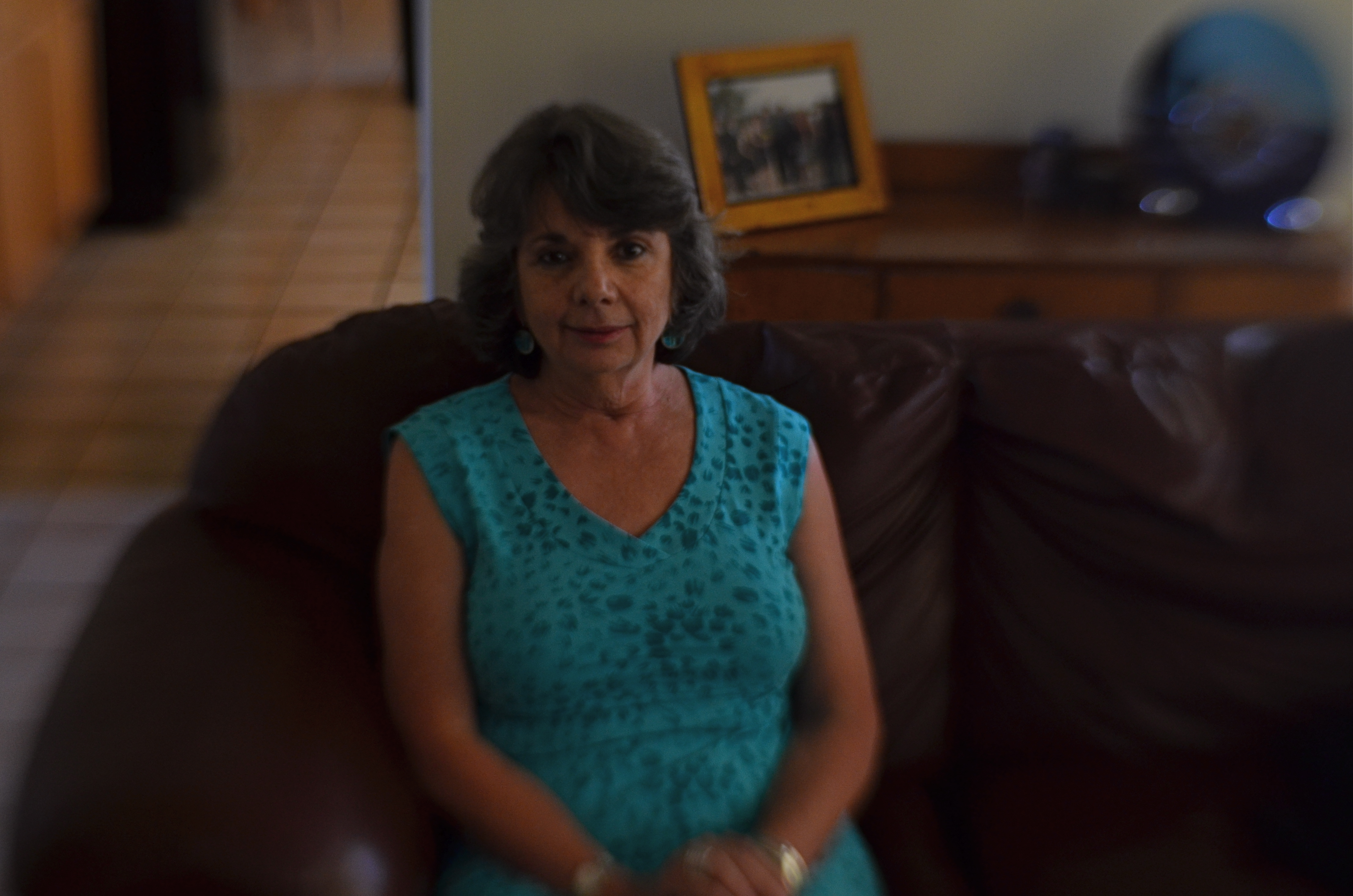
Art lenses can accentuate what we already know about faces, and specifically, eyes…that is, that they remain vital to the conveyance of the personality in a portrait. In the first sample, Marian’s entire face takes on the general softness of the entire frame, which is taken with a Lensbaby Sweet 35 lens at f/4 but is not sharply focused in the central sweet spot. In the second sample, under the same exposure conditions, there is a conscious effort to sharpen the center of her face, then feather toward softness as you radiate out from there.
The first exposure is big on mood, with Marian serving as just another “still life” object, but it may not succeed as a portrait. The second shot uses ambient softness to keep the overall intimacy of the image, but her face still acts as a very definite anchor. You “experience” the picture first in her features, and then move to the data that is of, let’s say, a lower priority.
Focus is negotiated in many different ways within a photograph, and there is no empirically correct approach to it. However, in portrait work, it’s hard to deny that the eyes have it, whatever “it” may be.
Windows to the soul?
More like main clue to the mystery.
IT’S ALL WRONG BUT IT’S ALL RIGHT
I decided in the moment to go soft with this nature scene. Maybe I overdid it. Maybe it’s okay. Or not.
By MICHAEL PERKINS
ONE OF THE ONLY CONSTANTS OVER THE HISTORY OF PHOTOGRAPHY has been the flood tide of tutorial materials covering every aspect of exposure, composition, and light. The development of the early science of capturing images in the 19th century was accompanied, from the first, by a staggering load of “how to” literature, as the practice moved quickly from the tinkering of rich hobbyists to one of the most democratic of all the art forms. In little more than a generation, photography went from a wizard’s trick to a series of simple steps that nearly anyone could be taught.
In calling these pages the “photoshooter’s journey from taking to making”, we have made, with The Normal Eye, a deliberate choice not to add to the mountainous load of technical instruction that continues to be available in a variety of classroom settings, but to emphasize why we make photographs. This is not to say that we don’t refer to the so-called “rules” that govern the basics of creating an image, but that we believe the motives, the visions behind our attempts are even more important than just checking items off a list of techniques in the name of doing something “right”. There are many technically adept pictures which fail to engage on an emotional or aesthetic level, so the mission of The Normal Eye, then, is to start discussions on the “other stuff”, those indefinable things that make a picture “work” for our hearts and minds.
The idea of what a “good picture” is, has, over time, drifted far and wide, from photographs that mimic reality, to those that distort and fracture it, to images that are both a comment and a comment on a comment. It’s like any other long-term relationship: complicated. Like everyone else, I occasionally produce what I call a “fence-sitter” photo like the one above, which I can both excuse and condemn at the same time.
In raw technical terms, I have obviously violated a key rule with the abject softness of the image…..unless……unless it can be said to work within the context of the other things I was seeking in this subject. I was trying to stretch the envelope on how soft I could make the mix of dark foliage and hazy water in the scene, and, while I may have gone a bit too far, I still like some of what that near-blur contributes to the saturated color and lower exposure, the overall quiet tone I was trying for. Still, as of this moment, I’m still not sure whether this one is a hit or a miss. It might be on the way to something, but I just can’t say.
But that’s what the journey is about. It can’t be confined to mere technical criteria. You have to make the picture speak in your own language.
GLASS DISTINCTIONS
It went “zip” when it moved and “bop” when it stopped,
And “whirr” when it stood still.
I never knew just what it was and I guess I never will.
Tom Paxton, The Marvelous Toy
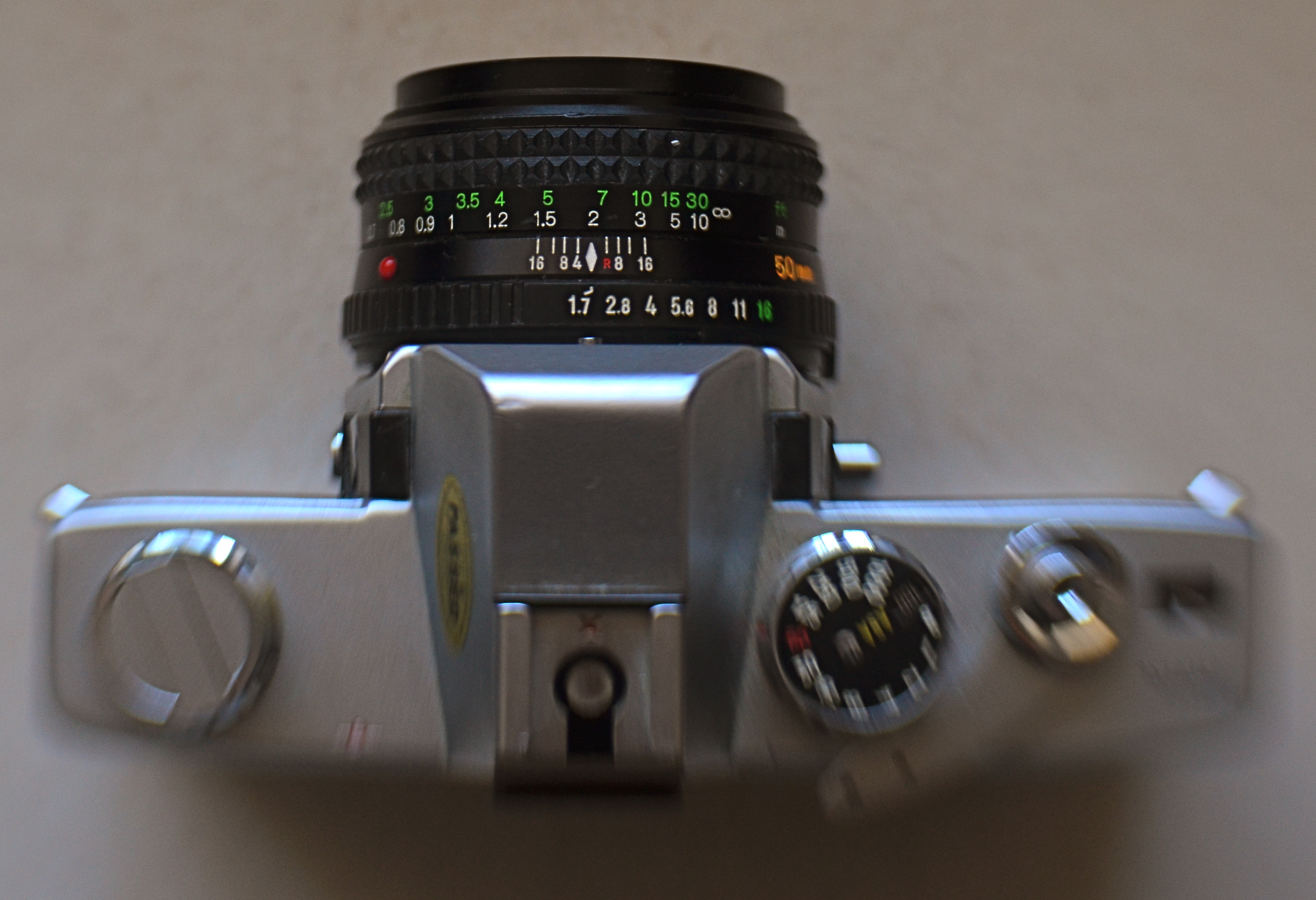
My antedeluvian Minolta SRT-500 camera body, crowned by its original f/1.7 50mm prime kit lens. Guess which part is worth its weight in gold?
By MICHAEL PERKINS
THERE ARE MORE OLD LENSES THAN THERE ARE OLD CAMERAS. There’s a reason for this. Bodies come and go like spring and fall dress collections. Lenses are the solid, reliable blue jeans that never go out of style. Lenses hold their value for decades, often selling for (or even above) their original asking prices. Bodies become landfill.
Many times, when people believe they have outgrown their cameras, they are actually just in need of glass that performs better. The importance of selecting a lens is as important in the digital age as it was in the film era. The eye through which you visualize your dreams has to be clear and precise, and so does the thinking that goes into its selection. That process, for me, breaks down into three main phases.
First, before you buy anything, raise a prayer of thanks for the Holy Internet. There is, now, not only no need, but also no excuse to buy the wrong lens. Read the manufacturer’s press releases. The reviews from both pros and amateurs nearest your own skill level. And be ecumenical about it. Read articles by people who hate the lens you think you love. Hey, better to ID a problem child before he’s living under your roof. Watch the Youtube videos on basics, like how to unpack the thing, how many parts it has, how to rotate the geetus located to the left of the whatsit to turn it on. Find out how light efficient it is, because the freer you are of flash units and tripods, the better for your photography. And, at this early shopping stage, as with all other stages, keep asking yourself the tough questions. Do I really need another lens, or do I just need to be better with what I already own (which is cheaper)? Will it allow me to make pictures that I can’t currently make? Most importantly, in six months, will it be my “go-to”, or another wondrous toy sleeping in my sock drawer?
Assuming that you actually do buy a new lens after all that due diligence, nail it onto your camera and force yourself to use it exclusively for a concentrated period. Take it on every kind of shoot and force it to make every kind of picture, especially the ones that seem counter-intuitive. Is it a great zoom? Well, hey, it might make an acceptable macro lens as well. But you’ll never know unless you try. You can’t even say what the limits of a given piece of glass are until you attempt to exceed them. Find out how well it performs at every aperture, every distance, every f/stop. Each lens has a sweet spot of optimum focus, and while that may be the standard two stops above wide open, don’t assume that. Take lots of bad pictures with the lens (this part is really easy, especially at the beginning). They will teach you more than the luck-outs.
Final phase: boot camp for you personally. Now that you have this bright shiny new plaything, rise to the level of what it offers. Prove that you needed it by making the best pictures of your life with it. Change how you see, plan, execute, edit, process, and story-tell. See if the lens can be stretched to do the work of several of your other lenses, the better to slim down your profile, reduce the junk hanging around your neck, and speed up your reaction time to changing conditions.
Work it until you can’t imagine how you ever got along without it.
SAVING FACE
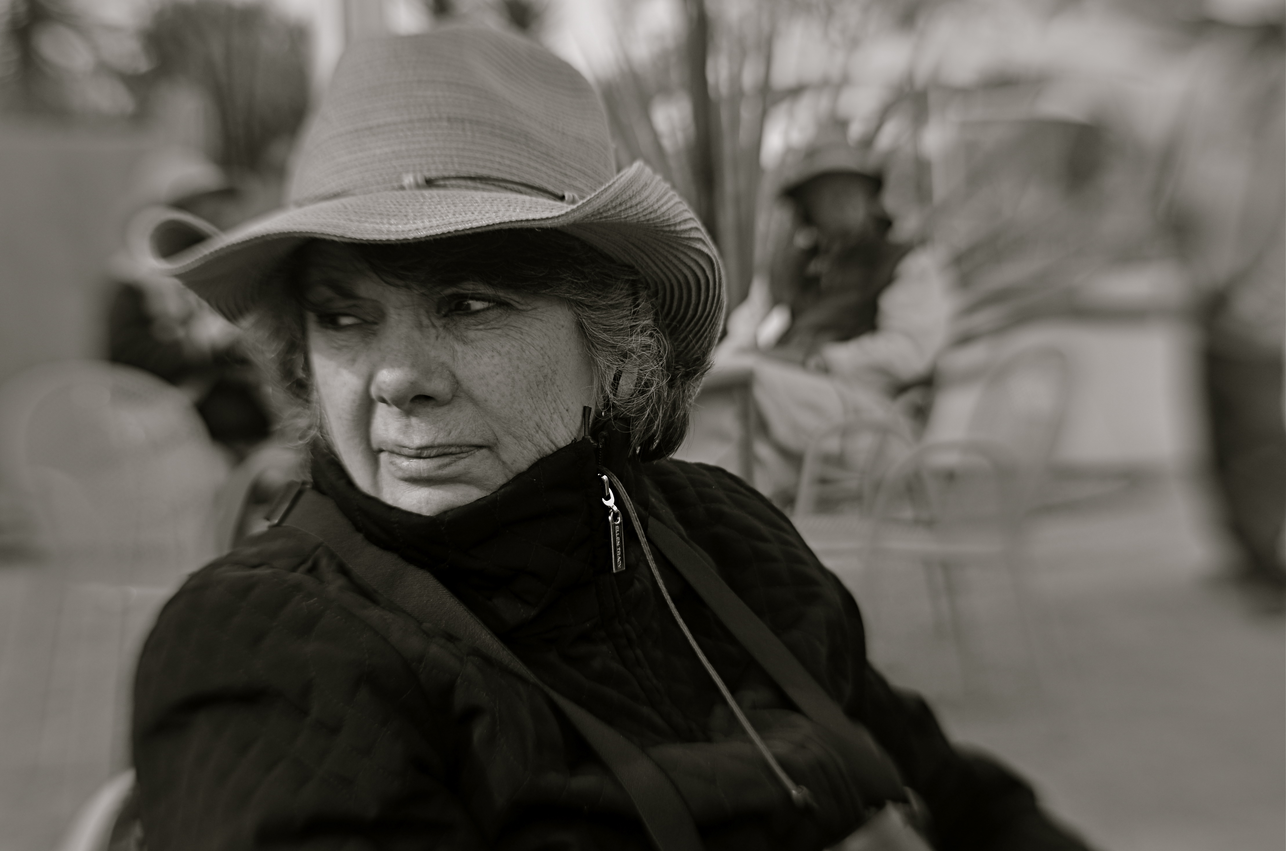
Looking West, 2016. A portrait shot with a Lensbaby Composer Pro, an effects lens with a moveable “sweet spot” of selective focus.
By MICHAEL PERKINS
THE CREATIVE USE OF SHARPNESS is one of the key techniques in photography. From the beginning of the medium, it’s been more or less conceded that not everything in an image needs to register at the same level of focus, that it can be manipulated to direct attention to the essence of a photograph. It’s always about telling the viewer to look here, ignore this, regard this as important.
This selective use of focus applies to the human face no less than to any other element in a composition. It’s strange that photography drew so strongly on painting in its early years without following the painter’s approach to portraits…..that is, that individual parts of a face can register in different degrees of sharpness, just like anything else in the frame. From the earliest days of photo-portraiture, there seems to have been an effort to show the entire face in very tight focus, de-emphasizing backgrounds by hazing them into a soft blur. It took a while before photography saw itself as a separate art, and thus this “always” rule only became a “sometimes” rule over a protracted period of time.
The Pictorialism fetish of the early 20th century, which avidly imitated the look of paintings, went completely the other direction, generating portraits that were almost uniformly soft, as if shot through gauze, or, you guessed it, painted on canvas. In recent years, shooters have begun a new turn toward a kind of middle stance, with the selective use of sharpness in specific parts of a face, say an eye or a mouth. It’s more subtle than the uniform crispness of olden days, and affords shooters a wider range of expression in portraits.
Some of this has been driven by technology, as in the case of the Lensbaby lenses, which often have a tack-sharp “sweet spot” at their center, with everything else in the frame fanning outward to a feathery blur. Additionally, certain Lensbabies, like the Composer Pro, are mounted on a kind of ball turret, allowing the user to rotate the center of the lens to place the sweet spot wherever in the image he/she wants. This makes it possible, as in the above shot, for parts of objects that are all in the same focal plane to be captured at varying degrees of sharpness. Note that, while all of the woman’s face is the same distance from the camera, only her eyes and the right side of her face are truly sharp. This dreamlike quality has become popular with a new breed of portraitists, and, indeed, there are already wedding photographers who advertise that they do entire events exclusively with these kinds of lenses.
The face is a composition element, and, as such, benefits from a flexible approach to focus. One man’s blur is another man’s beautification.
RAZOR’S EDGE
Sharpness should be achieved in your intial shot by use of contrast and color, not “dialed up” in post-editing. 1/160 sec., f/8, ISO 100, 22mm.
By MICHAEL PERKINS
THE AVAILABILITY OF PHOTO PROCESSING TOOLS, TO ARTIST AND BEGINNER ALIKE, in the digital era, has created a kind of unfortunate slingshot effect, as all suddenly achieved freedoms tend to. Once it became possible for Everyman to tweak images in a way that was once exclusively the province of the professional, there followed a trend toward twisting every dial in the tool box to, let’s be honest, rescue a lot of marginal shots. Raise your hand if you’ve ever tried to glam up a dud. Now raise your hand if you inadvertently made a bad picture worse by slathering on the tech goo.
Welcome to the phenomenon known as over-correction.
It’s human nature, really. Look at Hollywood. Suddenly freed from the confines of the old motion picture production code in the 1960’s, directors, understandably, took a few years to make up for decades of artistic construction by pumping out a nude scene and/or a gore fest in everything from romantic comedies to Pink Panther cartoons. Several seasons of adolescent X-rated frolics later, movies settled down to a new normal. The over-correction gave way to a more mature, even restrained style of film making.
Am I joining the ranks of anti-Photoshop trolls? Not exactly, but I am noting that, as we grow as photographers, we will put more energy into planning the best picture (all energy centered before the snap of the shutter), and less energy into “fixing it in post”. If you shoot long enough and work hard enough, that shift will just happen. More correctly designed in-camera images equals fewer pix that need to be dredged from Dudland.
Look at the simple idea of sharpening. That slithery slider is available to everyone, and we all race after it like a kid chasing the Good Humor truck. And yet, it is a wider range of color and contrast, which we can totally control in the picture-taking process, which will result in more natural sharpness than the Slider Of Joy can even dream of. As a matter of fact, test my argument with your own shots. Increase your control of contrast or color and see if it doesn’t help wean you off the sharpen tool. Or expose your shots more carefully in-camera rather than removing shadows and rolling off highlights later. Or any other experiment. Your goals, your homework.
The point being that more mindful picture-making will eliminate the need for many crutch-like editing tweaks after the fact. And if that also makes you a better shooter overall, isn’t that pretty much the quest?
RETURN OF THE POD PEOPLE
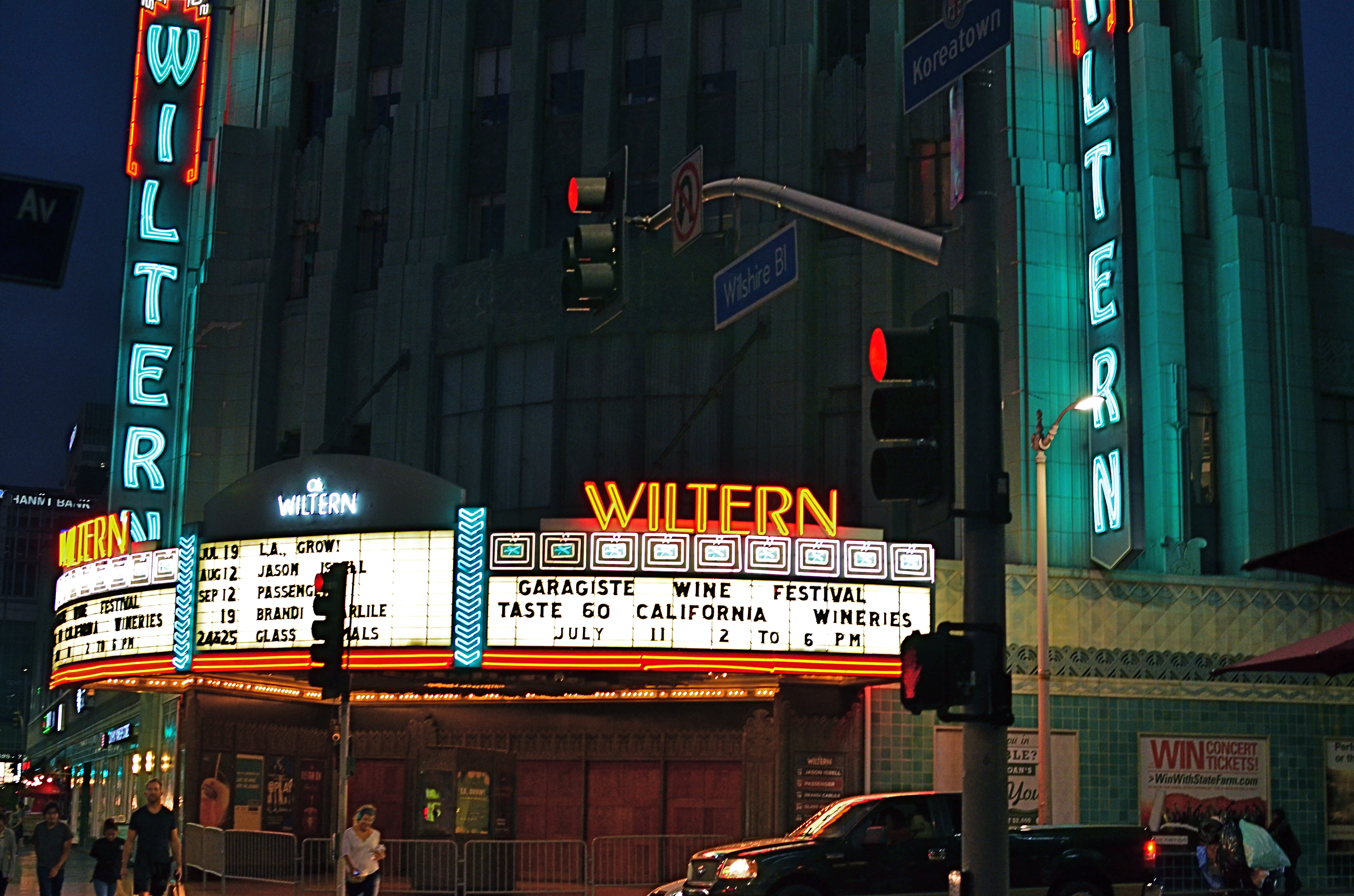
Wiltern On Wilshire, 2015. At f/3.5 and an ISO of 1000, this is an acceptably sharp hand-held exposure. Want the lights to be sharper? Might have to go tripod.
By MICHAEL PERKINS
I HAVE OCCASIONALLY SOUNDED WHAT, I ADMIT, IS A PREMATURE FUNERAL DIRGE for the lowly tripod, that balky, bulky, creaky throwback to the 19th century that continues to linger as an occasional, if fading, tool of the 21st. Part of this stems from the pure aggravation involved in trucking the things around, getting them locked and level, and praying that nothing from a stiff wind to an enraged gopher to a power-tripping mall cop will intervene to undo the entire rickety works. Hey, I’m not a hater, just a very reluctant fan.
One of the reasons I’ve mostly weaned myself from the pod is the ever-evolving speed of lenses and sensors in the digital era. This means scenes with less and less light can be captured with greater sharpness in short, hand-held exposures, albeit with a little more visual noise or grain. You can now shoot on a dark street at night, if your lens opens wide enough to keep your ISO as low as possible and if you can maintain a rock-steady grip on your camera at shutter speeds around 1/20 or so. And, for many cases, the results from this setup will be quite satisfactory.
However, we ain’t just about being satisfied, are we, mmmm?
Problem with a wide exposure and bright highlights (like the theatre marquee in the above shot) is that those elements will burn in and become diffuse, even in fast exposures, especially since your ISO setting is instructing your sensor to suck light like a maniac. As a result, instead of being sharp pinpoints of light, they will often turn soft and globby. If you can live with that, then go in peace and sin no more, my son.
However, if you really need to get those lights as sharp as you see them with your own eye, you might try doing a longer exposure at a smaller aperture, and that can mean dragging the pod down from the attic and doing it old-school. Good news is that you can now crank your ISO back down to minimum, so, yay, no noise atall, atall. You also might pick up some more contrast and detail within bright objects, like the horizontal lines on the above marquee. Bad news is, duh, you’re using a tripod. Hey, is that a mall cop I see running over here?
SWEETER, SHARPER
By MICHAEL PERKINS
AS SOME PHOTOGRAPHERS AGE, THERE IS A STRONG TEMPTATION to do more and more with less and less. For many, this manifests itself as a kind of divestiture, a relinquishing of toys. Maybe it’s just muscle fatigue, but, at some point in a shooter’s life, he or she makes a conscious decision to carry fewer hunks of gear into battle. Your approach to the work gets more complex, and, paradoxically, the mechanical doing of it gets more streamlined.
This is where the idea of a “go to” lens comes from, with photogs deciding that, yes, they can do nearly everything with the same hunk of glass. It becomes a bragging point: I shoot everything with a 24mm prime. I always use a 35. I don’t carry a big bag of stuff around anymore. But here’s the great thing: even a single lens is actually several lenses at once, since its optical properties change dramatically depending on aperture. That’s why, if you’re trying to take more kinds of pictures with fewer lenses, it’s important to do some homework on all the different ways they see.

Everyone has an “go-to” aperture that they use more than any other. For me, it’s f/5.6.
One of the things it’s best to know about your lens is where its “sweet spot”, or optimum sharpness occurs across the aperture range. Turn on your trusty Google machine and you will find more opinions on how to determine this than there are recipes for apple pie, and that’s the tricky part. Optics are a science, to be sure, but they are also somewhat subjective. Translation: if it looks good to you, it’s good. So publishing a table that proves your argument on what “sharp” is to your satisfaction just picks a scab for someone else. You have to get away from the charts and do the field work. Shoot. Look. Compare.
The chart people believe, for example, that the sweet spot for a lens is always two f-stops less light than your maximum wide-open aperture, meaning that, say an f/1.8 prime would hit its sweet spot somewhere around f/3.5. However, on my own 35mm f/1.8, I get the most uniform sharpness, from center to corners, another stop beyond that, so my “go to” aperture on my “go to” lens is more like f/5.6. I know this is true, because I have set up a tripod and shot the same subject from the same distance through the entire range of apertures and visually compared them. You know, the real-world, old-fashioned way….observation.
The better you know every property of your lens, the closer you will get to one that does most of what you want, most of the time. More pictures with fewer toys, with time and labor saved as well.
DETAILS, DETAILS
Moody, but still a bit too tidy. Black and white by itself wasn’t enough to create the atmosphere I wanted.
By MICHAEL PERKINS
EVEN THOUGH MOST GREAT PHOTOGRAPHERS PROCLAIM that any “rules” in their medium exist only to be broken, it’s often tough to chuck out regulations that have served you well over a lifetime of work. Once you get used to producing decent images through the repetition of habit, it takes extra nerve to take yourself outside your comfort zone, even if it means adding impact to your shots. You tend not to think of rules as arbitrary or confining, but as structural pillars that keep the roof from falling in.
That’s why it’s a good exercise to force yourself to do something that you feel is a bad fit for your style, lest your approach to everything go from being solid to, well, fossilized. If you hate black and white, make yourself shoot only monochrome for a week. If you feel cramped by square framing, make yourself work exclusively in that compositional format, as if your camera were incapable of landscape or portrait orientations. In my own case, I have to pry my brain away from an instinctual reliance on pinsharp focus, something which part of me fears will lead to chaos in my images. However, as I occasionally force myself to admit, sharp ain’t everything, and there may even be some times when it will kill, or at least dull, a picture.

Sharpness just where it’s needed, and nowhere else.
With post-processing such an instantaneous, cheap, and largely effortless option these days, there really isn’t any reason to not at least try various modes of partial focus just to see where it will lead. Take what you believe will work in terms of the original shot, and experiment with alternate ways of interpreting what you started with.
In the shot at the top of this post, I tried to create mood in a uniquely shaped fish house with monochrome and a dour exposure on a nearly colorless day. Thing is, the image carried too much detail to be effectively atmospheric. The place still looked like a fairly new, fairly spiffy eatery located in an open-air shopping district. I wanted it to look like a worn, weathered joint, a marginal hangout that haunted the wharf that its seafood theme and design suggested. I needed to add more mood and mystery to it, and merely shooting in black & white wasn’t going to get me there, so I ran the shot through an app that created a tilt-shift focus effect, localizing the sharpness to the rooftop sign only and letting the rest of the structure melt into murk.
It shouldn’t be hard to skate around a rule in search of an image that comes closer to what you see in your mind, and yet it can require a leap of faith. Hard to say why trying new things spikes the blood pressure. We’re not heart surgeons, after all, and no one dies if we make a mistake.Anyway, you are never more than one click away from your next best picture.
DEPTH OF FEELING
By MICHAEL PERKINS
OFTEN, THERE ARE ONLY SCANT MOMENTS TO DETERMINE HOW TO “USE” PEOPLE IN YOUR PHOTOGRAPHS. The decision as to how prominently a person figures in the overall scheme of a given image is frequently made on the fly, and your result will reflect whether that person is an element of the picture or a select feature.
Of course, you can wind up with wonderful photos either way, which is one of the most attractive aspects of picture making. This is all multiple choice, and there is no wrong answer. Also, if the answer was right for you, chances are that it will be so judged by others. Your conviction carries the picture to its desired audience, if you will.
This October, I fell into a virtual pot of gold on a trip to visit friends in rural New Mexico, since the entire countryside was awash in a gilded flood of yellow with the turn of the leaves. You could literally point the camera at a trash can, and, if it was next to a cottonwood tree, the thing became a palace. As a midwestern kid who has spent nearly fifteen years in the Arizona desert, I was long overdue for the richness of the autumnal palette, and I got a little drunk on it all. I wanted to immortalize every tree, shooting generally at small apertures to get as much sharp detail as possible.
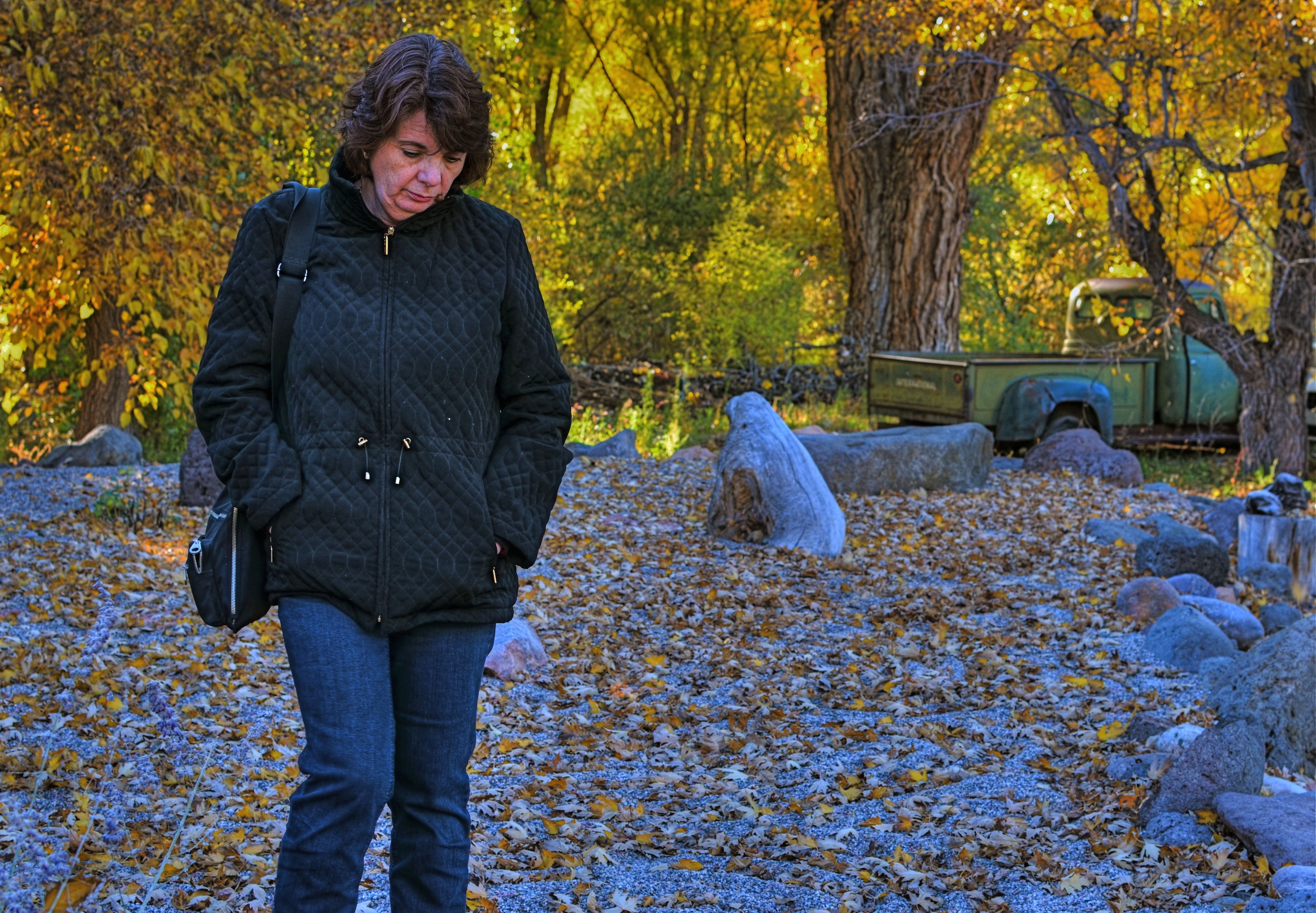
1/80 sec., f/5.6, ISO 100, 35mm.
That’s what I was doing in the side yard of a roadside gallery when my wife Marian wandered outside for a brief walk, so the first few frames I shot showed her and the background in about the same focus. Just for variety, I re-focused on mostly her at f/5.6, slightly softening the foliage beyond so it wouldn’t fight with her for the viewer’s attention. In that one frame, she morphed from element to feature, and all that color was put at her service, so to speak. As an afterthought, I made a dupe of the image, lightened it by about a third, then blended the two in Photomatix, since HDR processing also accentuates detail, giving me an even sharper contrast between her sharpness and the softer background. It wasn’t a big bump, processing-wise, just the bow on the box.
Experimental “light field” cameras, once perfected, may make such planning moot, since images taken with this very different technology allows the photographer to redo the depth of field on an image after it has been taken. For now, however, it’s a decision of the moment.
Again, part of the fun.
Related articles
- Depth of Field (mariatobon.wordpress.com)
