HEY, LOOKA ME
By MICHAEL PERKINS
ONE OF THE MOST PREDICTABLE PHOTOGRAPHIC CLICHES OF CONTEMPORARY TELEVISION consists of the “establishing shot” used in many drama shows, depicting a particularly important locale wherein the action of the show will take place, be it a corporate HQ, a cop station, a courtroom. The site, whatever its purpose to the story, is shot in the widest angle possible, drastically distorting all sight lines and perspectives, as if to get the viewer’s attention in a visual shorthand that announces that something important is about to happen here. And, consistently, the first scene inside these places, shown immediately after, is shot with a much narrower, or, if you will, “normal” focal length. It’s a one-two combination that has become part of the visual grammar of storytelling.
Drama, as it’s artificially created by visual camera optics, can certainly be an effective narrative tool, but it can also become an effect for effect’s sake, a crutch used to juice up a subject that doesn’t deliver enough impact without it. And of course, the use of tech to dress up an essentially weak image is always a temptation, especially since more and more shortcuts than ever before afford the chance to enhance and tweak. And like many giddy sensations, it can evolve into an addiction.
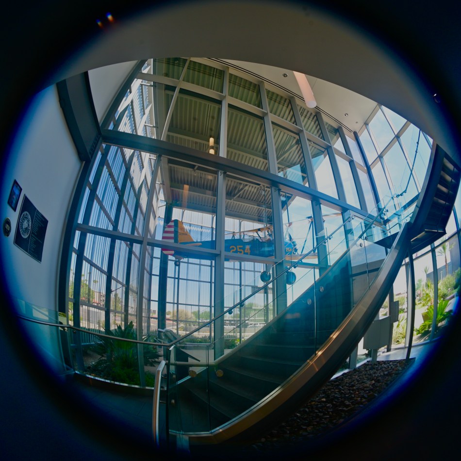
I have been trying to get “THE shot” of this classic biplane for years, trying to tie into its history and mystery by switching lenses, taking different angles and approaches, shooting in both full natural and completely unnatural light, the works. In this image, I’ve resorted, like many TV directors, to photography’s big go-to for instant drama….an ultra wide. Just as in courtroom and cop shows, the distortion, the unreality of this 12mm fisheye is used to give the subject more power than it might have in standard perspective. The nearly 180-degree coverage of the lens also allows me to get the entire plane in one shot, something that’s proved difficult because of the tight glass “hangar” in which it’s displayed. Here, I have tried to render the plane itself in nearly normal aspect, choosing instead to distort the showroom it’s encased in. As always with wide-angles, it’s not totally about getting everything into the middle of the shot, but getting yourself deeper into the middle of everything that you frame. If that sounds like double-talk, well, welcome to the wonderful world of counter-intuitive photography.
I might have fallen in love with distortion at an early age since I was raised on comic books, where cartoonists freely violated perspectives in the service of a story. Comics are by nature gross exaggerations of reality that pass themselves off as plausible substitutes for it. My camera eye may still want to linger in that playland. Sometimes we just want our pictures to shout, hey looka me, and we’re fairly shameless at going for those eyeballs.
NIGHT OF DARK SHADOWS
By MICHAEL PERKINS
THE FIRST DAYS OF PHOTOGRAPHY MUST HAVE SEEMED LIKE A REALM OF CONJURED DREAMS, as technology first enabled man to snatch instants from the flowing continuum of time. This grabbing and freezing process, the notion of stopping history and imprisoning it on a plate, involved a great deal of experimentation, as the very rules of exposure were being drafted on the fly. At first, both optics and recording media were slow to drink in light, meaning that calculating the precise duration for which to uncap the lens was, in the period before mechanical shutters, largely a matter of guesswork. Thus was born the world’s first photographic “aritifacts”, the blurred smears of things or people that kept moving during prolonged exposures. The Reverend H.J.Morton, writing for the Philadelphia Photographer in 1865, summed up the surreal experience of finding ghosts lurking in an otherwise frozen scene:
A beautiful picture lies smiling before the lens, when a cow gets up slowly and walks away deliberately, giving us a fine landscape with a continuous cow of many heads, much body, and centipedian legs.
Cinema Inverite, 2015
Today, with the lightning-fast response that is built into even the simplest cameras, that cow can only be summoned in a deliberate time exposure, typically with the camera mounted on a tripod. It’s fair to say that our motives for making these kind of images has changed over the years, again, mostly due to technological advances, including vibration suppression, wider ISO ranges, and enhanced noise reduction (which works hand-in-glove to clean up high-ISO pictures). Fact is, there are fewer instances than ever before in which long exposures are needed, unless we utilize them to generate the very artifacts that we used to wish we could eliminate. As one example, everyone eventually creates at least one “light trail” photo, letting cars zoom through a long exposure largely unseen while leaving the glowing paths of their headlamps hanging mystically in the air. And there are certain collapsed studies of long durations which can only be appreciated by prying the lens open for a few extra beats. In the case of the above image, I was photographing the final night before the closure of a local art cinema, which would soon be razed to make room for a bigger cineplex with more screens, more room, and far less charm. I felt as if a lot of Spirits Of Cinema Past were in attendance, and so mounted a tripod to turn the customers themselves into passing shadows, just like the many spectres that had flickered across the theatre’s screens over the decades. And that’s the strange time-travel feature of photography: one era’s annoyance is another era’s cherished effect.
I seldom use my tripods any more, but having recently inherited one from a departed friend, I find myself recalling the days when it was my near-constant companion, a reverie which, in turn, sent me searching back for the theatre images. Making pictures is about harnessing the light with whatever lasso we have handy. As we grow, we learn to do more with less, creating in seconds what used to require elaborate forethought. But all that really means is that, as we improve, we are freer to focus on the picture, rather than the mechanics of making one. That means choices….and yes, even the choice to do conjure ghosts if the fancy strikes us.
A WORLD BOTH WIDE AND DEEP
By MICHAEL PERKINS
PHOTOGRAPHIC TECHNIQUES CAN BE THOUGHT OF as both active and passive. Some of the tools used to tell a visual story silently move narratives along without loudness or fuss, while others deliberately call attention as much to themselves as to the tales they tell. You can make pictures that betray very little of “how’d they do that?” or you can trumpet your tricks very loudly.
Or, of course, you can do both.
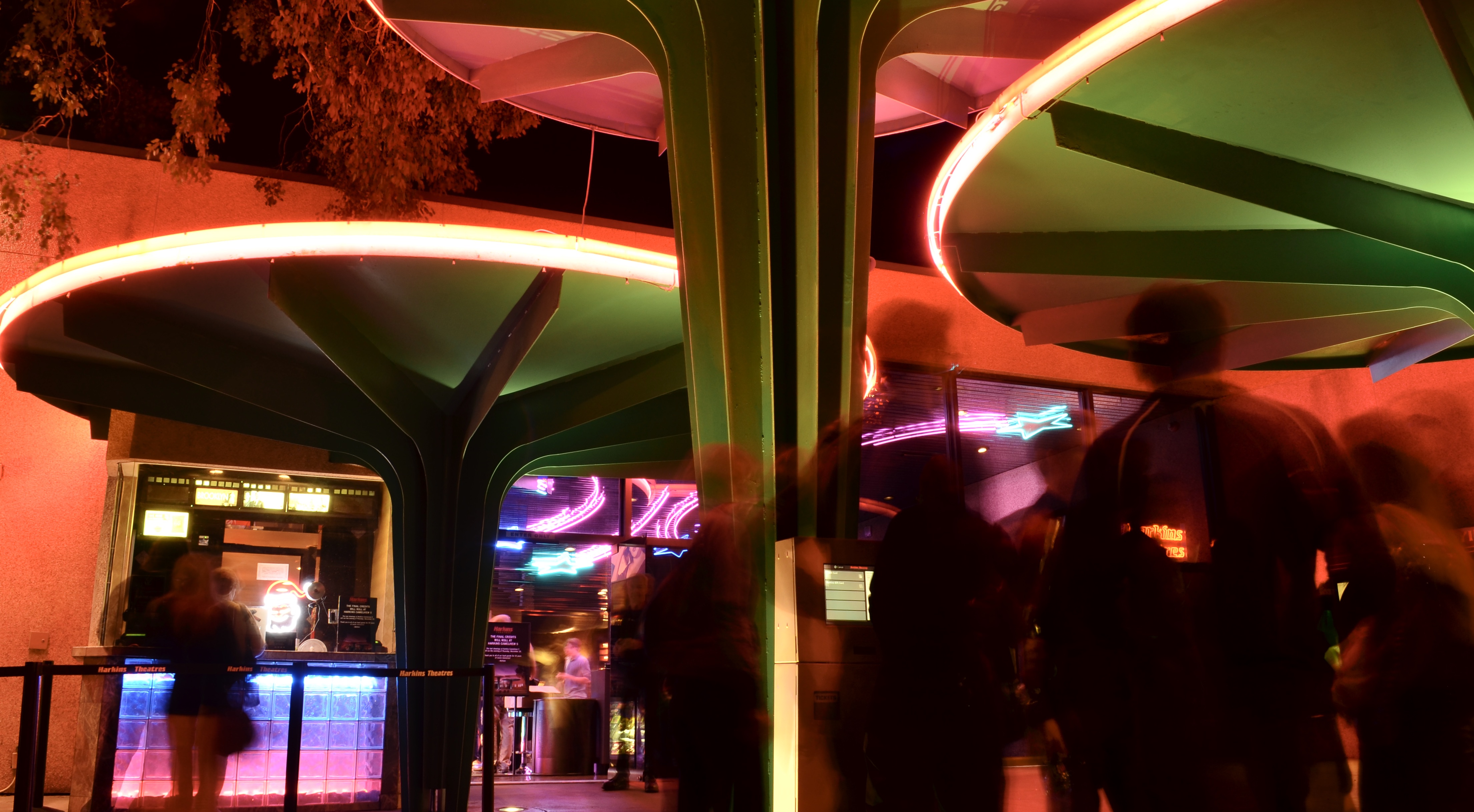
As a case study, consider one of 2018’s Oscar contenders, The Favourite, which tells a surreal tale of eighteenth-century castle intrigue with camera work that fairly screams to be noticed, mixing standard widescreen shots with ultra-wide and even fisheye compositions, shuffled together in jarring transitions, as if the director needs to remind us how twisted and nightmarish the story it by keeping us visually off-kilter for the entire length of the movie. Contrast this with most films that try to render their photographic tricks invisibly, in keeping with established Hollywood tradition. Is it a case of The Favorite’s director merely showing off his technical cleverness?
Creative lenses such as fisheyes dictate a photograph’s terms of engagement.
Well, yes and no. Various lenses convey vastly different concepts of space, of the width and depth of rooms, of the relationships between man and nature. Using an extreme tool like, say, a fisheye, changes the rules of engagement for the viewer, even when applied to a conventional subject. The photographer is, in effect, saying “composition is what I say it is, not what you’ve been led to expect.” Of course, when you drastically distort how a scene or object is presented, you risk your picture being “about” the visual effect, eclipsing your message instead of amplifying it.
The characters in The Favourite are in a constant state of moral disequilibrium, with everyone jostling for position or advantage, so an unsettling shift between various lenses reflects their uncertainty, the unreality of their situation, actually enhancing the nightmare quality for the audience. Does your picture call for a technique that, in turn, calls attention to itself? Flamboyant or not, the answer must, occasionally be yes.
Just because you’re showing off doesn’t mean you’re wrong.
YOU’VE HAD AN EFFECT ON ME
By MICHAEL PERKINS
“FULL–FUNCTION” CAMERAS (I try not to call them “real”) have made several concessions to the invasion of the mobiles over the last decade, adding features that tweak or sweeten images after they are taken, in the manner of cel-camera apps. The most commonly used functions, like cropping or straightening, have been joined over the years by monochrome converters, fisheye-like distorters, and selective color effects, which allow the user to desaturate discrete parts of a picture for a part-color, part B&W composite. Occasional use of these DSLR tweaks, as with those in App World, can yield interesting results. Their over-use, however, can erase the thin wall between tool and gimmick.
Effects oftimes go beyond merely enhancing a shot to loudly calling attention to themselves, and thus upstaging said shot completely. Of course, if you want to establish a personal style that always expresses itself in sepia tone or double exposures, by all means rock and roll and Godspeed. Generally speaking, though, special effects have the greatest impact when they are the spice, and not the meat in the recipe.
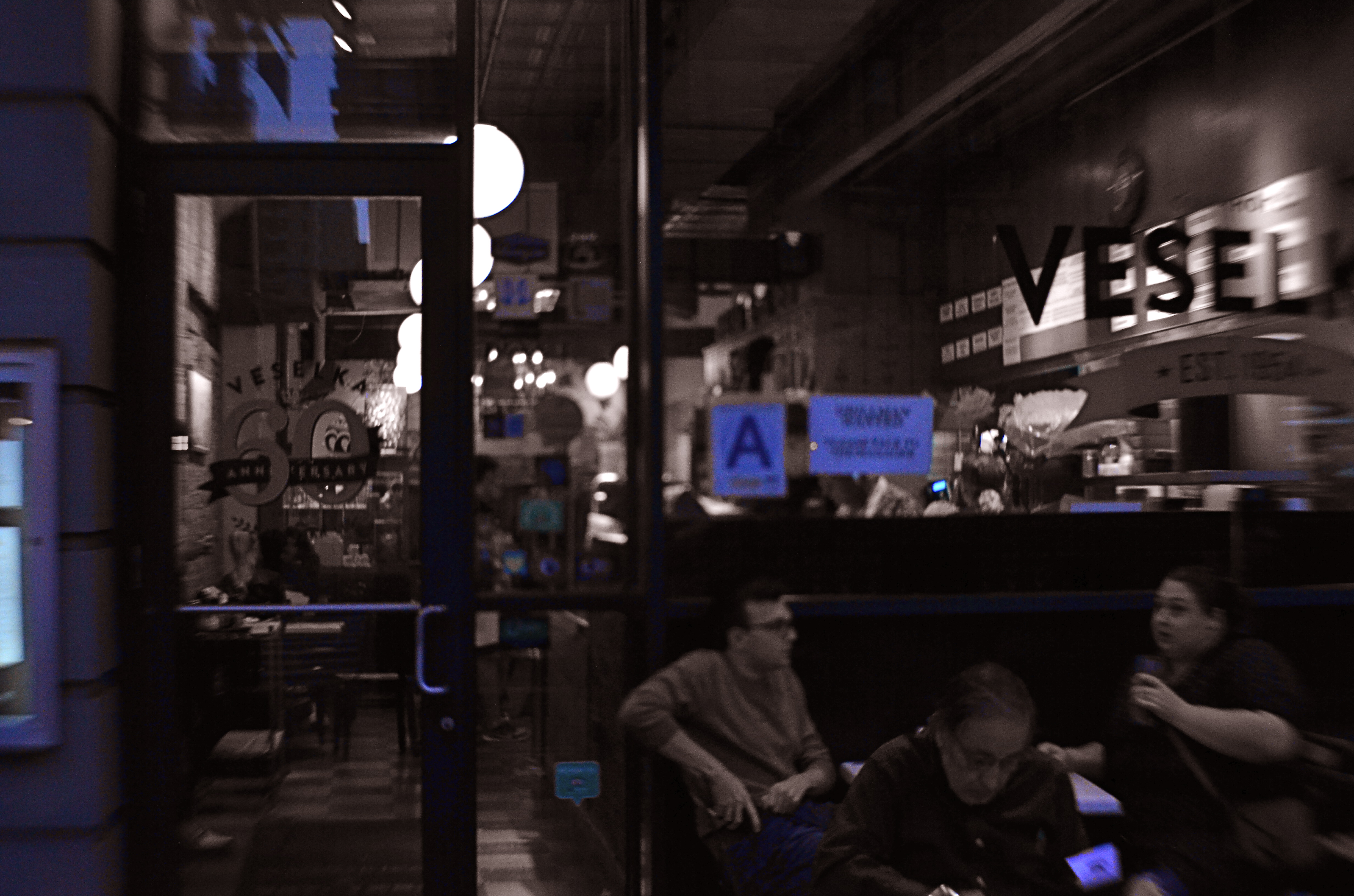
Later, At Veselka’s, 2018
One that I keep playing with, trying to decide if it’s truly useful, is the aforementioned selective color. Desaturating only parts of an image is tricky, because the monochrome elements must work in at least some way with the remaining chroma, lest the color/no color ratio be jarring. Remember, you merely want your viewer to get the impression that something has been subtly improved in the picture, not drastically rehauled.
In the restaurant scene shown here, night had already rendered most of the darkened areas as nearly grey already, so converting that to b/w wasn’t a stretch. I took out the reds from various neon signs and the ambers and yellows caused by my camera’s misreading of the light temperature, and elected to keep the blues, in an attempt to use them as an extension of the blacks and grays. Whether I think I succeeded depends on which day I view the result, but my intention was to add just a flavor of mood to a photograph that was essentially mono.
I think the best way to avoid going wrong with the use of a post-processed effect is to begin with a picture that’s already 99% of what you were going for……using the tools to give a “pretty good” image a nudge, rather than a shove. As in photography in general, it’s a game of inches.
TRUTH VS. REALITY
By MICHAEL PERKINS
ASKED IN 1974 BY AN INTERVIEWER ABOUT THE LEGACY OF THE ACTOR JAMES CAGNEY, director Orson Welles replied that while Jimmy “broke every rule”, “there’s not a fake moment” in any of his movies. He further explained that the star of Public Enemy, White Heat and Yankee Doodle Dandy worked counter to all the conventions of what was supposed to be “realism”, and yet created roles which were absolutely authentic. Cagney, in effect, bypassed the real and told the truth.
As do many photographers, it turns out.
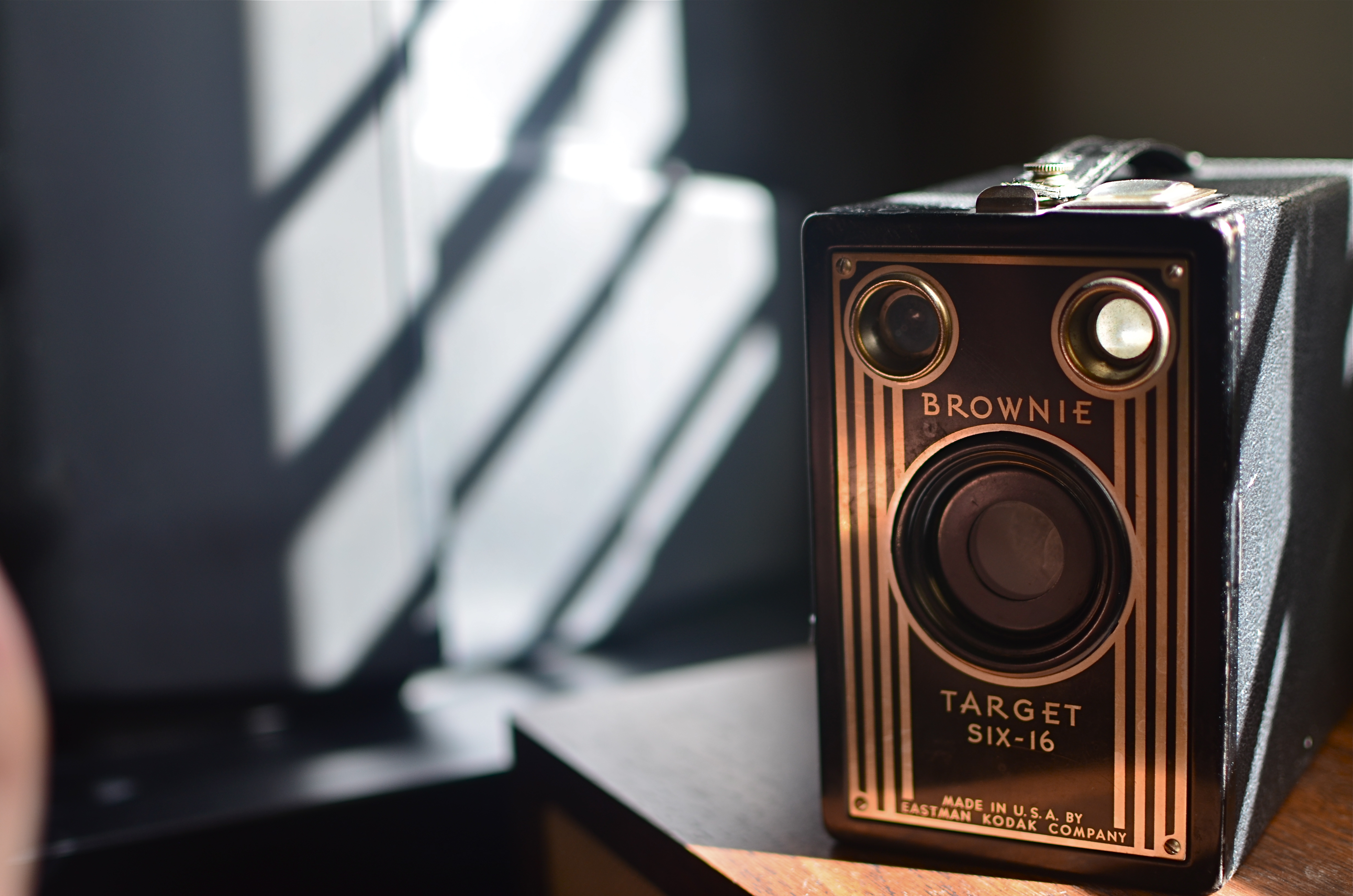
Fake sunlight on the front of this camera courtesy of sunlight bouncing off my hand.
We all have inherited a series of technical skills which were evolved in an attempt to capture the real world faithfully inside a box, and we still fail, at times, to realize that what makes in image genuine to the viewer must often be achieved by ignoring what is “real”. Like Cagney, we break the rules, and, if we are lucky, we make the argument that what we’ve presented ought to be considered the truth, even though the viewer must ignore what he knows in order to believe that. Even when we are not trying to create a so-called special effect, that is, a deliberate trick designed to conspicuously wow the audience, we are pulling off little cheats to make it seem that we played absolutely fair.
The first time we experiment with lighting, we dabble in this trickery, since the idea of lighting an object is to make a good-looking picture, rather than to mimic what happens in natural light. If we are crafty about it, the lie we have put forth seems like it ought to be the truth, and we are praised for how “realistic” a shot appears. The eye likes the look we created, whether it bears any resemblance to the real world or not, just as we applaud a young actor made up to look like an old man, even though we “know” he isn’t typically bald, wrinkled, and bent over a cane.
In the image above, you see a simple example of this. The antique Kodak really does have its back to a sunlit window, and the shadows etched along its body really do come from the slatted shutters upon that window. However, the decorative front of the camera, which would be fun to see, is facing away from the light source. That means that, in reality, it would not glow gold as seen in the final image. And, since reality alone will not give us that radiance, a second light source has to be added from the front.
In this case, it’s the most primitive source available: my left hand, which is ever so slightly visible at the lower left edge of the shot. It’s acting as a crude reflector of the sunlight at right, but is also adding some warmer color as the flesh tones of my skin tint the light with a little gold on its way back to the front of the camera. Result: an unrealistic, yet realistic-seeming shot.
There’s a number of names for this kind of technique: fakery, jiggery-pokery, flimflam, manipulation, etc., etc.
And some simply call it photography.
THIS MUST BE / MIGHT BE THE PLACE
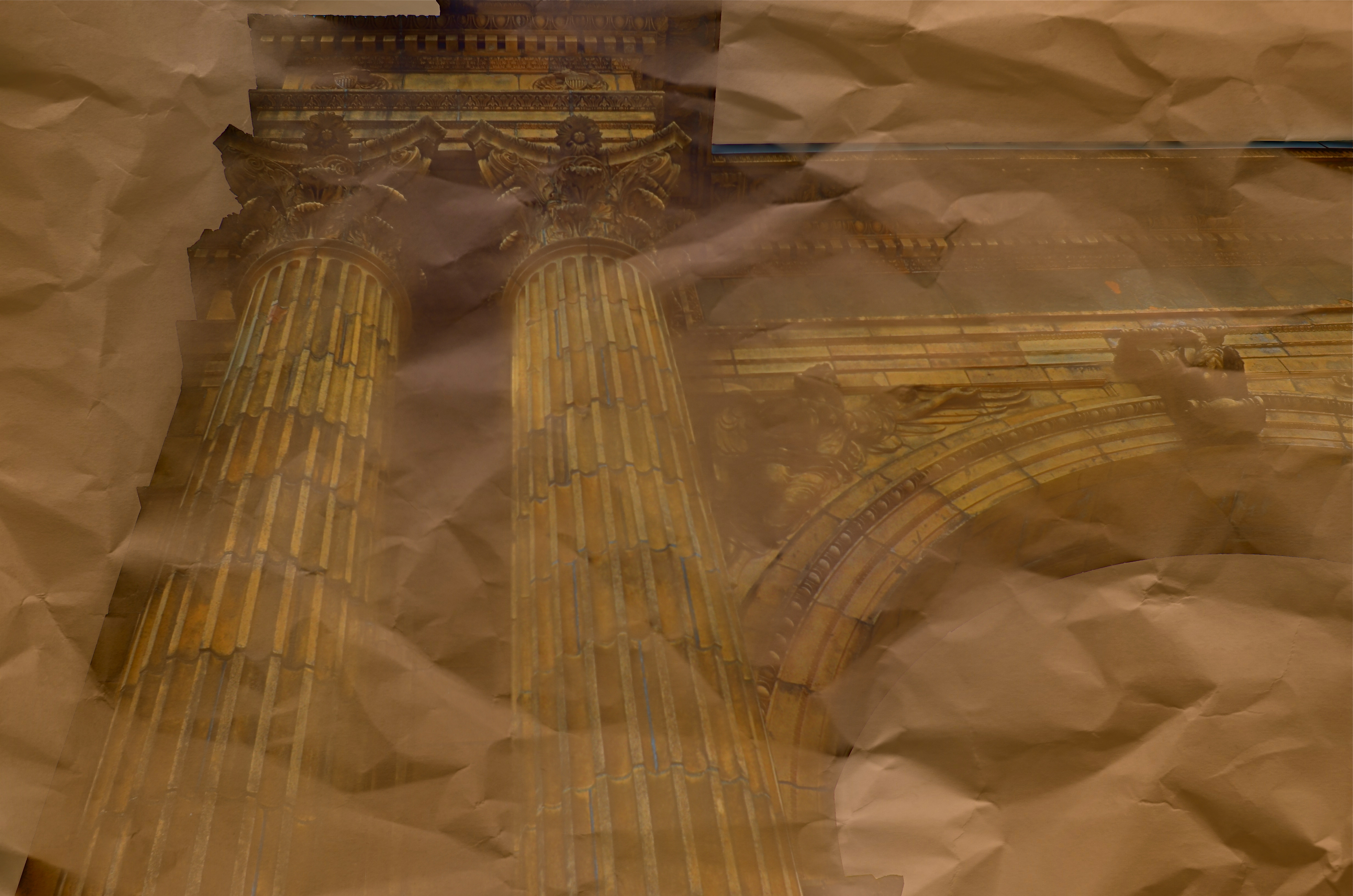
Dream Parchment, 2016.
By MICHAEL PERKINS
URBAN PHOTOGRAPHERS ACT IN MUCH THE SAME WAY AS ARCHAEOLOGISTS in that they must try to supply context for objects, backstories that have been either altered or erased. Cities are collections of things created by humans for specific motives, be it profit, shelter, play, or worship. Often, the visual headstones of these dreams, that is, the buildings, survive beyond the people that called them into being. Photographers have to imply the part of the story that’s crumbled to dust. Like the archaeologist, we try to look at shards and imagine vases, or see an entire temple in a chunk of wall.
During the dreaded “urban renewal” period in the mid-twentieth century, my home town of Columbus, Ohio duplicated the destruction seen in cities across the country in the wanton devastation of neighborhoods, landmarks and linkages in the name of Progress. Today’s urban planners thumb sadly through vast volumes of ill-considered “improvements” wrought upon history from that period, with New York’s Penn Station, Pittsburgh’s Forbes Field, and Columbus’ Union Station surviving today only as misty symbols of fashion gone amok.
In the case of Columbus’ grand old railroad station, there is at least a fragment of the original structure, its beaux-arts entry arch, left standing, serving as either stately souvenir or cautionary tale, depending on your viewpoint. The arch has been moved several times since the demolition of its matching complex, and presently graces the city’s humming new hockey and entertainment district, itself a wondrous blend of new and repurposed architecture. Better late than never.
Thus, the Union arch has, by default, become one of the most photographed objects in town, giving new generations of artists permission to widely interpret it, freed, as it is, of its original context. Amateur archaeologists all, they show it as not only what it is, but also what it was and might have been. It has become abstracted to the point where anyone can project anything onto it, adding their own spin to something whose original purpose has been obliterated by time.
I have taken a few runs at the subject myself over the years, and find that partial views work better than views of the entire arch, which is crowded in with plenty of apartment buildings, parklands and foot traffic, making a straight-on photo of the structure busy and mundane. For the above image, I imagined that I had recovered just an old image of the arch….on a piece of ancient parchment, a map, perhaps an original artist’s rendering. I shot straight up on a cloudy day, rendering the sky empty and white. Then I provided a faux texture to it by taking separate a sepia-toned photo of a crumpled piece of copier paper and fusing the two exposures (the HDR software Photomatix’ “exposure fusion” feature does this easily). Letting the detail of the arch image bleed randomly through the crumpled paper picture created a reasonable illusion of a lost document, and I could easily tweak the blend back and forth until I liked the overall effect.
Cities are treasure hunts for photographers, but not everything we find has to be photographed at, let’s say, face value. Reality, like fantasy, sometimes benefits from a little push.
WHEN TOY BECOMES TOOL
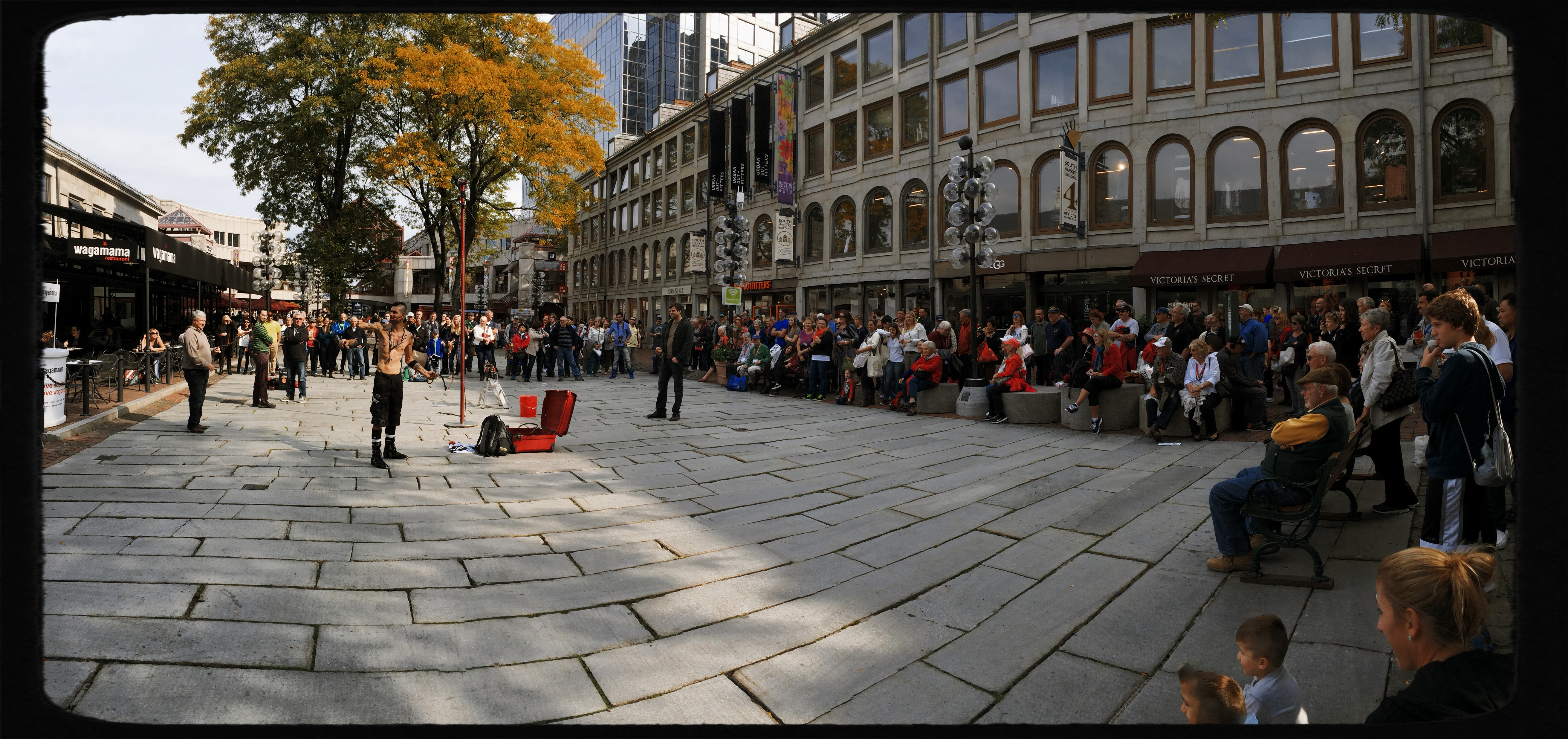
It’s possible to get a truly steady wide-angle image from iPhone’s in-camera pano tool. But it takes some real work, and not a little luck.
By MICHAEL PERKINS
EVERY TECHNICAL ADVANCEMENT IN THE HISTORY OF PHOTOGRAPHY has been a double-edge sword, creating either novel gimmickry or a wider array of serious technique, depending on who’s playing the game. The most popular tools available to the widest number of users, from fisheye lenses to phone app filters, illustrate this point again and again. Some people pick up these new features, play with them for a bit, then abandon them forever, while others use them as a way to expand their approach to visualizing an image.
I have written here before about iPhone’s in-camera panoramic tool, which I expect was originally included as a family-friendly option, perfect for making sure that everyone on the Little League team or the family reunion could be captured in one frame, the app instantly stitching a series of narrower photos taken in real time during a left-to-right pan. And, while it can certainly serve in that snapshot-y task, it creates its own set of technical problems. Nonetheless, I have become convinced, over the last few years, that it can lend additional ooomph to serious image making if (a) one is extremely selective in what is shot with it, and (b) the built-in shortcomings of the app can be worked around in the moment.
When people move through your iPhone pano panning sweep, they get kind of “scissored away”.
As with any other technical toy/tool, the results depend on how well you understand the strengths and weaknesses of iPhone’s pano app and plan your shots. Since you pan by pivoting your body (as if it’s the hub of a wheel), you can’t maintain the same distance from your entire subject as you move the camera left to right. That means that the center of that pivot, or what’s dead ahead of you, will tend to distort outward, like the center of a fisheye shot. Depending on what’s at the middle of your shot and how far you are from it, this can give you some unwanted funhouse results.
Also, in what is odd for a tool that’s designed to take pictures of lots of people, using the iPhone pano app to shoot a live, moving crowd is truly hit-or-miss. If a person moves through your picture as you are panning in the same space they occupy, they may be recorded as a slice or a piece of themselves, being caught partly in some of the picture’s vertical “tiles” but absent from the ones directly adjacent to it, causing them to register as a disembodied leg or a slivered torso floating in the air (see left).
In the shot at the top of this page, I was lucky that the street magician at left was standing still during the time I panned across him (once I’ve recorded his part of the frame, he can do what he likes, since the lens no longer “sees” that part of the picture). Likewise the crowd, enthralled by his performance, was remaining pretty static as I completed the pan across their part of the frame. The result has all the story-telling power of an ultra-wide shot, and, because of the composition, actually uses the fisheye-ish bulge to make the segmented pavement appear to be radiating outward from the performer.
And of course there is the subject itself, which has to benefit from all that left-right arrangement of information if you want to avoid just taking the picture for the sake of the effect alone. And there we have the balance between toy and tool that every photographer hopes to strike. Toys get cast aside once boredom sets in. Tools stay around and add to your work in very real ways.
NIGHT GALLERY
By MICHAEL PERKINS
I RECENTLY READ AN INTRIGUING STATEMENT ON THE DIFFERENCE BETWEEN PAINTING AND PHOTOGRAPHY to the effect that painters start with nothing, and add information until the image is created, whereas photographers start with total information and work to selectively remove things until their pictures are made. Of course, there are times when both artists borrow the approach of the other, and the practice of “light painting” is one place where photogs can actually wield a kind of brush, beginning in pure darkness and then adding illumination, literally by hand, until a picture, layer by layer, emerges.
Bascially, you’re going down two potential paths with light painting. One is the depiction of fantasy, a custom light creation that is the central subject of the image, rather than an augmentation of something else. Visit the tutorial link below to view some of these visions, as they are truly fascinating (not to mention work-intensive): the flaming fireball dancing across the lake, the geometric noodlings hanging in mid-air, the angel wings growing out of your girlfriend’s back, and so on. The other approach is to amplify the impact of a subject which has either no illumination at night or a lighting scheme that is counter to the mood you’re going for. In this case, your flashlight, LED or light coil is creating the visual reality that you wish existed. It’s “reality-plus”, rather than a complete fantasy. This is the avenue I have tended to favor.
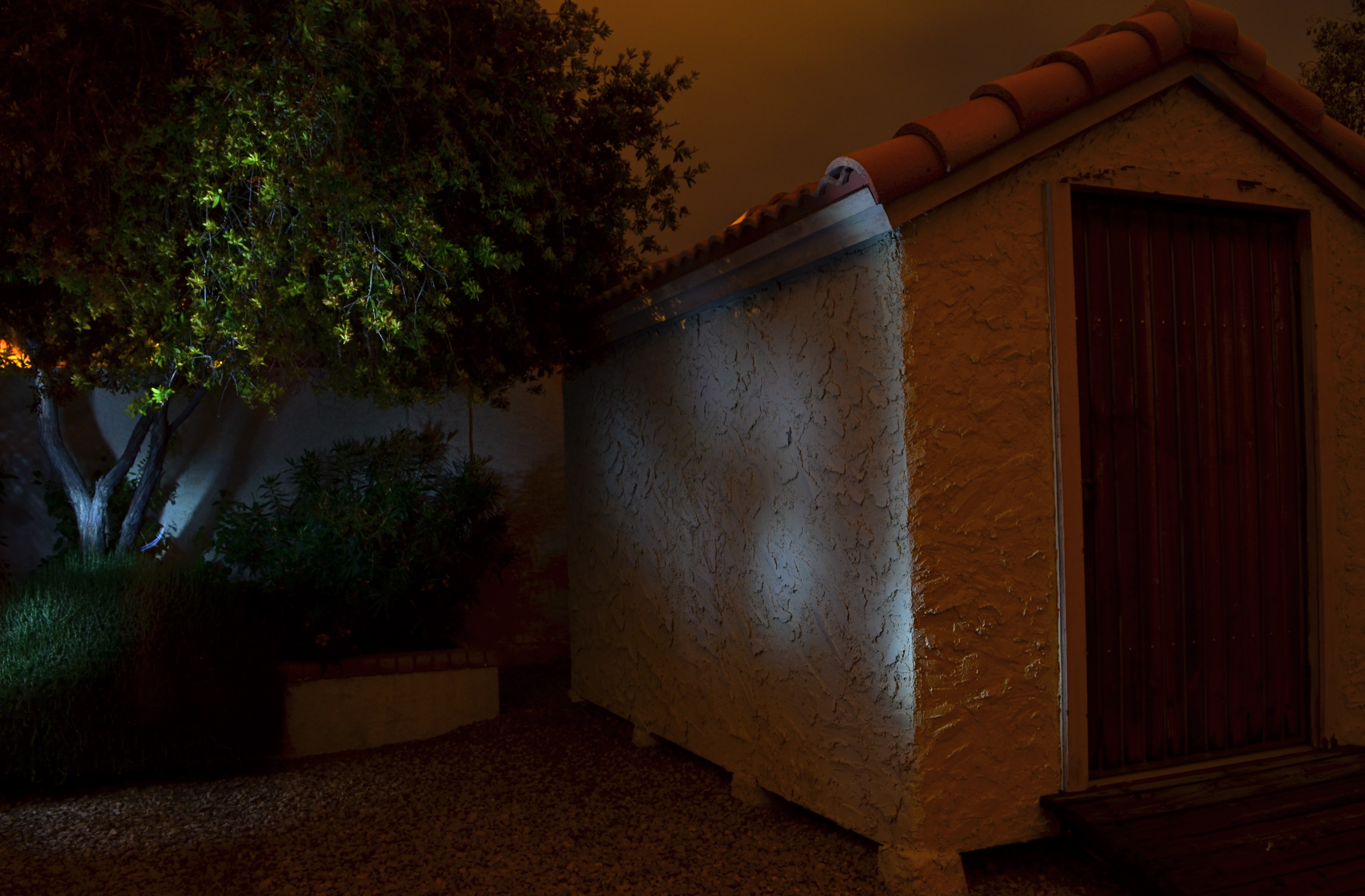
No lighting in the back yard, unless you “paint” it on: 30 sec., f/8, ISO 100, 18mm.
After a year away from light painting, I have started to slink back into it, moving from tabletop arrangements, where control is less of an issue, to exterior locales, which are, frankly, the very definition of trial-and-error.With the camera locked onto its tripod and with a pre-determined exposure and aperture, the responsibility for whether the magic happens is literally in your hands, hands that need real-world training in this technique.
As for lighting: these days, even dollar-store LEDs provide a pretty intense white light in darkness but they don’t throw it very far, and they are also pretty narrowly focused, so, if you want to paint the side of, say, a barn, it’s really hard to do so evenly. Best thing is to avoid the bargain lights: get yourself a powerful torch with a variable focus, something that can shoot both soft and wide. It’ll save you lots of time trying to guess about coverage on larger surfaces. Also, within a single exposure, you can still change off to the pencil-thin lights for special detailing, since, in complete darkness, your shutter will be open long enough for you to switch lights on and off, change position, and touch things up.
The above image was done in a yard with no landscape lighting on hand, other than the light I am applying during a thirty-second exposure. Not a perfect execution, but a quick example of how you can impart night mood to objects that are duller than dishwater in daylight. Lighting is all about setting the terms of view, and hand-painting the light allows you to control that mood, almost as completely as you would with oil, brush or canvas.
More to look at:
