WHAT ARE WE SELLING HERE?
By MICHAEL PERKINS
PHOTOGRAPHERS WHO ARE ALSO BABY BOOMERS learned their craft in a unique pocket of time, a period that saw an astounding series of breakthroughs in the art and science of picture-making. I could make a day of just ticking off aspects of the art that have been revolutionized, miniaturized, re-formatted, re-invented and re-tooled in my lifetime, which tracks from 1952 onward. However, just to zero in on one fundamental change, there is the transition from the last days of the complete dominance of monochrome to the global default to color. It was like learning to chew with baby teeth and then doing your serious, growed-up eating with your “keeper” teeth.

I shot this rusty door in both color and monochrome. In this particular case, mono “sold” the worn texture a little better. It’s all about choices….
When I first picked up a camera, many amateurs had not yet made the jump to color, mostly for economic reasons. B/W was just cheaper. For others, home developing largely involved mono, while color processing tended to be the domain of labs. Black and White was more hands-on, with its various steps and stages serving as a part of an immersive, complete sequence of creativity. And then there was the distrust of color by creatives at the level of an Ansel Adams, who grudgingly worked in color but embraced monochrome, given that, in his opinion, the reproduction science for color work in print had not yet been perfected, and while he could easily control (and predict) the results of his mono images. Given these factors and several others, I, like many others in Boomerville, cut my particular set of baby teeth learning to make acceptable pictures in black and white. My dad, who had an actual job, and thus a little more disposable income to play with, shot in color.
And so, for me, to have lived long enough to enter a third phase, in which black and white has made it through the unofficial runner-up status conferred on it when color first hit its stride…to come out the other side of that time tunnel, newly empowered, newly valued as just one of many valid ways to make a picture…well, it’s exciting. When I shoot now, I frequently toggle between pre-programmed settings profiles for both color and mono, taking several different tonal versions of nearly everything. I can then make a determination, later on, on the major questions in photographic narrative: what are we selling here? What tools get the storytelling most effectively done? What tone, what texture, what range of value will convey what I’m seeking? And, most importantly, can I be open when something I was not seeking comes through by happy chance? I was born a mono kid who became a color shooter as an adult and then came to embrace everything, everyday, all at once as a senior. Lucky.
Did this post hit your sweet spot? Like, Share, Subscribe!
EITHER/ OR / EITHER

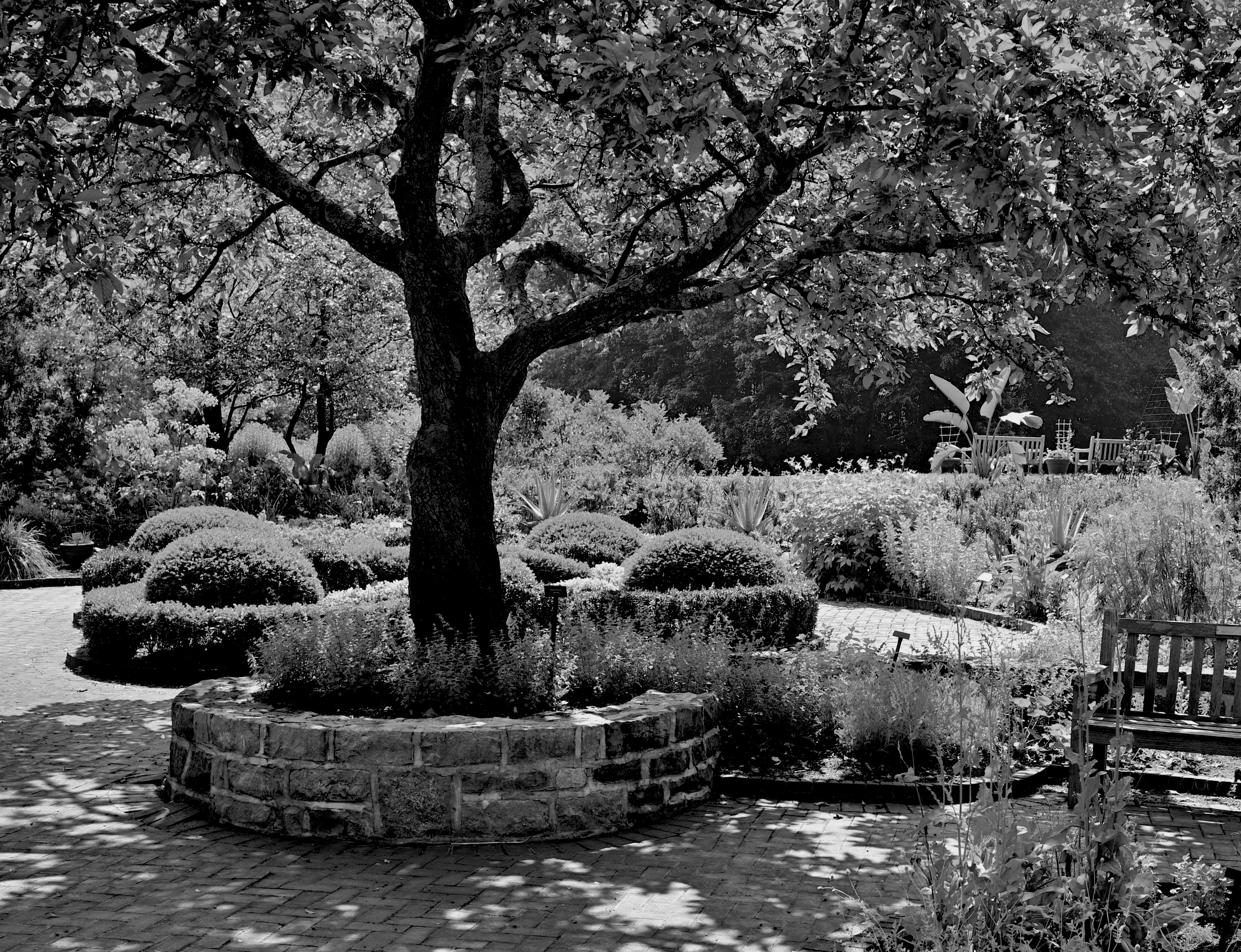
Inniswood Gardens, Westerville, Ohio, color original, 2023
By MICHAEL PERKINS
I GREW UP DURING THE MASSIVE CONSUMER SHIFT that saw most photographers, both amateur and pro, fully embrace color film, giving it real market dominance over black and white. The wind-up to the change took most of the first half of the twentieth century, given the substantial barriers that blocked quality reproduction of color in both processing and printing, problems that kept giants like Ansel Adams openly disdaining brightly saturated hues in favor of a range of tones that either seemed more objective and documentary, or at least more manageable. Color remained, until the 1950’s, the devil you don’t know, and mono was so dominant until after WWII that several boomer kids seriously asked their parents if the world was actually in black and white until well after they were born.
I was not unique at the time in that the first rolls of film I shot were Kodak Verichrome Pan. It was plentiful, everyone processed it cheaply, and newspapers and magazines still defaulted to it to a great degree. I only made the leap to Ektachrome reversal film after my father graduated prints to slides and I came to regard color as more “realistic” while gradually demoting mono to inferior status. It wasn’t until well after my teenage daughter began using Ilford roll film in a 70’s-vintage Minolta that I truly began to value the accumulated legacy of b&w, adopting Edward Steichen, Walker Evans, Margaret Bourke-White and others as honorary godparents and re-learning how less could actually be more.
Mono conversion of above image.
Today, I create about 20% of my shots as mono originals, although I am strongly drawn to convert most b&ws from color masters, giving myself the most options possible. The shots that begin as mono are more numerous now because in-camera pre-sets are increasingly able to simulate the tonal range and contrast of mono films, and are therefore nuanced enough that nothing seems “lost” in the absence of color. However, I still have a few hundred mental debates per year on instances where either version might be considered satisfactory, depending on your intent and mood. Some of those debates I settle: the rest are slapped back and forth like a lazy tennis volley on slow, rainy afternoons. At the very least, the ambivalence reminds me not to get complacent about when a picture’s “finished” or “good enough”, and that may actually bode well for what I’ll shoot tomorrow.
TRUTH VERSUS REALITY
By MICHAEL PERKINS
ORSON WELLES ONCE SAID OF JAMES CAGNEY that, while he was not a “realistic” actor per se, there had never been a single frame of film shot of him that was untrue. Something in the Yankee Doodle Dandy’s presence on screen was both more and less than real, and so, as a result, it registered with audiences as authentic, as if it ought to be true. Oddly, in making this observation, Welles may as well have been talking about two competing visions of photography, two disparate camps that choose either “truth” or “reality” in almost everything they create.
Many of us learn a formal definition of words like sharpness, tone, contrast, color, and many more of us learn that a certain combination of these elements equals a picture that is “like life”. This comes from the earliest years of photographic instruction, in which raw amateurs, who were necessarily outcome-oriented (i.e., wanting a return on their investment in gear and film) were given certain arbitrary rules for the making of a so-called “good” picture. But “good”, or “real”, or “authentic” according to whom? After reading all the “how-to” booklets, we have to spend the rest of our lives figuring out the answer to those questions.
In comparing these two renderings of a single landscape shot, what, in your mind, qualifies (or disqualifies) one version over the other in terms of its post-processing? Which reflects what I saw in the moment versus what I later re-sculpted in terms of tonal range, intensity, color? Which picture came first? (Spoiler: I’m not telling). Is one “realer”, or more naturalistic, than the other? Why or why not? And which one is, to your mind or eye, true?
More to the point, whatever your conclusion, how can it become the standard for my opinion, or his, or hers, or theirs? When we look at an image, are we actively weighing what was, at various stages, done to it, or do we merely judge the result (Spoiler Two: often we do both)? Cagney’s entire approach to acting was summarized in his advice to a beginner: “Plant your feet, look the other fellow in the eye, and tell the truth”. How that truth makes it from vision to result is anyone’s guess, and everyone’s decision. No manual, no set of rules, no formal class can teach that.
INFORMATION AVENUES

Phytomorphology 623, 2020
By MICHAEL PERKINS
JUST AS THE TAKING OF A PHOTOGRAPH IS ACCOMPLISHED IN AN INSTANT, so too is the messaging that the resulting image conveys to the viewer. The impact of a picture is immediate, established within nanoseconds of the eye’s initial contact with it. Additional viewing and pondering may, certainly, reveal deeper truths about a photograph, but I firmly believe that the main love it /don’t get it choice about a photo is made by the brain at first glance.
That said, information must be arranged in such a way as to expedite this choice. That’s the art of composition. What stays in, what is excluded, where the frame hits, and what its limits imply. The nature of the information is determined by the impact of light, which shapes and defines. That is in turn aided by texture, which adds dimension and context in how new or old, rough, smooth, substantial or ethereal things appear in the image. And finally, mood and aesthetic are established in the range of color or tonal data.
All of these elements are created by a series of decisions on whether “to do” or “not do”. Which is to say that all photographs have an assembly process. Steps. Priorities. More of this, less of that. The fact that the best photographers learn how to navigate all these decisions instantaneously is really a kind of miracle. Take the truly fundamental choice of color, for example. Not only do a picture’s hues have to be conceived in the mind before they’re attempted in the camera: they must be refined enough for the shooter to choose how all the shaping elements described above work in conjunction with each other. Think of the graphic equalizers on our old stereos, each ‘band” or part of the hearable spectrum trimmed or maximized to get a “mix” most pleasing to the ear. In visual terms, color is a key choice because it is an element that can shape so many other elements in turn. In the above image, color can resonate with memory and emotion. It can render what we term “warmth”. It also aids in the perception of depth. Consider as well that color has only become the default option for our photography in about the last sixty years. Before that, due to technical challenges for film emulsions and printing processes, it was a luxury item, even a novelty for many.

Monochrome conversion.
“Going back” to monochrome, the original default option for all photography, means actively recognizing what kind of information is lost and what kind of impact is gained by eschewing color. Is the image strengthened or weakened with its removal? Is converting a color shot to b/w as an afterthought (as I’ve done here) less effective than intentionally shooting the original in mono? Are the remaining tones strong enough to convey your message? Is one tonal palette more reportorial or “authentic” than the other? And, above all, what if the choice you’ve made (color or no color) isn’t the choice your viewer makes (in the case of this pair, for example, my wife prefers the color version, although “they’re both nice”)? Photography is about making decisions and learning to live with them. Or just canning the entire thing and trying again.
“We must remember that a photograph can hold just as much as we put into it” Ansel Adams once wrote, “and no one has ever approached the full possibilities of the medium”. Which is a lot like God saying, “hey, don’t get hung up on making just one kind of tree”. The possibilities in making pictures are indeed endless, but each are rooted in our very purposeful choices.
ANSEL’S ANGST (AND OURS)
 By MICHAEL PERKINS
THERE IS SO MUCH HUMANITY TO LOVE IN ANSEL ADAMS: his spectacular inventiveness: his infinite patience: his unquenchable curiosity….the sum total of traits that produced one of the most amazing bodies of work in the history of any creative medium. But being fully human, or, more accurately, fully a human artist, consists not merely in one’s strengths, not even for the man who, for most people, defines the very idea of photography. It also lies in the very human emotion of doubt….something Ansel knew about, and thought about, over the wide expanse of his astonishing career.
Adams filled a good-sized library shelf with scholarly works on how he did what he did, much of it as scientifically exquisite as anything from the pen of a Newton or a DaVinci. He knew more about the physics of picture-making than nearly any man alive. But he also wrote and taught about the things he didn’t know, the things that danced teasingly just beyond the edge of his skills. In journals, letters to friends, and interviews over decades, Ansel Adams returned to the subject he saw as his own Achilles heel, a mystery that haunted him until his dying day…the challenge of color photography.
“My own reaction to color photography is a mixed one”, Adams wrote in a 1957 article for Image magazine. “I accept its importance as a medium of communication and information. (But) I have yet to see….much less produce…a color photograph that fulfills my concepts of the objectives of art. It never seems to achieve that happy blend of perception and realization which we observe in the greatest black-and-white photography…”
Of course, Ansel certainly didn’t shy away from the challenge of color work, having made over 3,500 such images in addition to his prodigious output in monochrome. But while he knew the values and tonal gradations of black and white like he knew his ABCs, it was color that seemed to him somehow less “real”, or, to look at it another way, presented more of a challenge in getting the reality right. “Black and white is accepted as a stylized medium”, he wrote in an article on the emergence of Polaroid color film in 1962. “Values are intentionally accented or subdued….there is little or no “reality” in either the informational or expressive black-and-white image, and yet we have learned to interpret these values as meaningful and “real“.
Adams tended to disdain his color work, such as this view of Banner Peak, Colorado
Strangely, as his own career began to run in parallel with the emergence of the great national magazines of the mid-twentieth century, it was his color work which was in increasing demand, paying the bills and funding the projects in which he was more personally invested. More and more, Adams’s commissions for Eastman Kodak, the Land Corporation and other manufacturers was to act as a strong second stream of income, helping to bolster his reputation in the mass market even as he believed that color was distracting him from his serious work. Part of his ongoing disappointment was not so much in his own execution of color but in the loss of accuracy that seemed inevitable once he handed his images off to the decidedly limited printing technology of the 30’s, 40’s, and 50’s. Angry at the final results on the printed page, Ansel kept most of his color images out of circulation during his lifetime, always referring to them with a mixture of frustration and regret, or seeing them as mere economic means to an end. But that, too, is a very human thing for an artist to do, as is the doubt that drives those feelings.
Doubt is a test of faith, a challenge to lazy or easy habit. Feeling that even your best efforts have come up short is the petrol that fuels a creative mind, at least until you plunge into depression a la Van Gogh and start hacking your ears off. I never trust a creative person who hasn’t been tempted, at least once, to take his entire life’s work and toss it in the garbage. The fact that he doesn’t is where the genius part comes in, and Ansel Adams never was derailed by the fact that his reach was always going to exceed his grasp. And that is not only instructive but inspirational, more inspiring, even, than his photographs themselves. Because this thing we do is a journey and not a destination. If we’re hungry, if we’re honest, we have to realize that we’ll never get where we’re going. Ansel Adams, the photographer that made more people want to become photographers than perhaps any other person in history, wrote, near the end of his life that, although he had hidden most of his color images away, “I feel the urge now, and only wish I were sixty years younger!” Indeed, for any of us who’ve ever clicked a shutter, the doubts persist. But the spirit does, as well.
WHEN COLOR IS ALL

By MICHAEL PERKINS
JUST A LITTLE SCROLL STROLL THROUGH GOOGLE will show just how long and how intensely the debate over color has raged in the photographic world……that is to say, whether color should be used at all, or whether, indeed, it was the spawn of Satan, turning the art of imaging into a crude carnival trick. Today, we routinely concede that both monochrome and color have distinct uses in the making of images, each bringing singular strengths to the process. But it was not that long ago that the two camps went at it like Hatfields and McCoys.
Many still feel that color should only be called on to help complete or “sell” a picture, a finishing touch of sorts. “In black and white you suggest”, wrote Paul Outerbridge in Modern Photography. “In color, you state.” Others, like myself, believe that there are times when color is content, complete in itself, regardless of the “official” subject of the image. Or, as Alex Webb writes, “Color is very much about atmosphere and emotion and the feel of a place.”
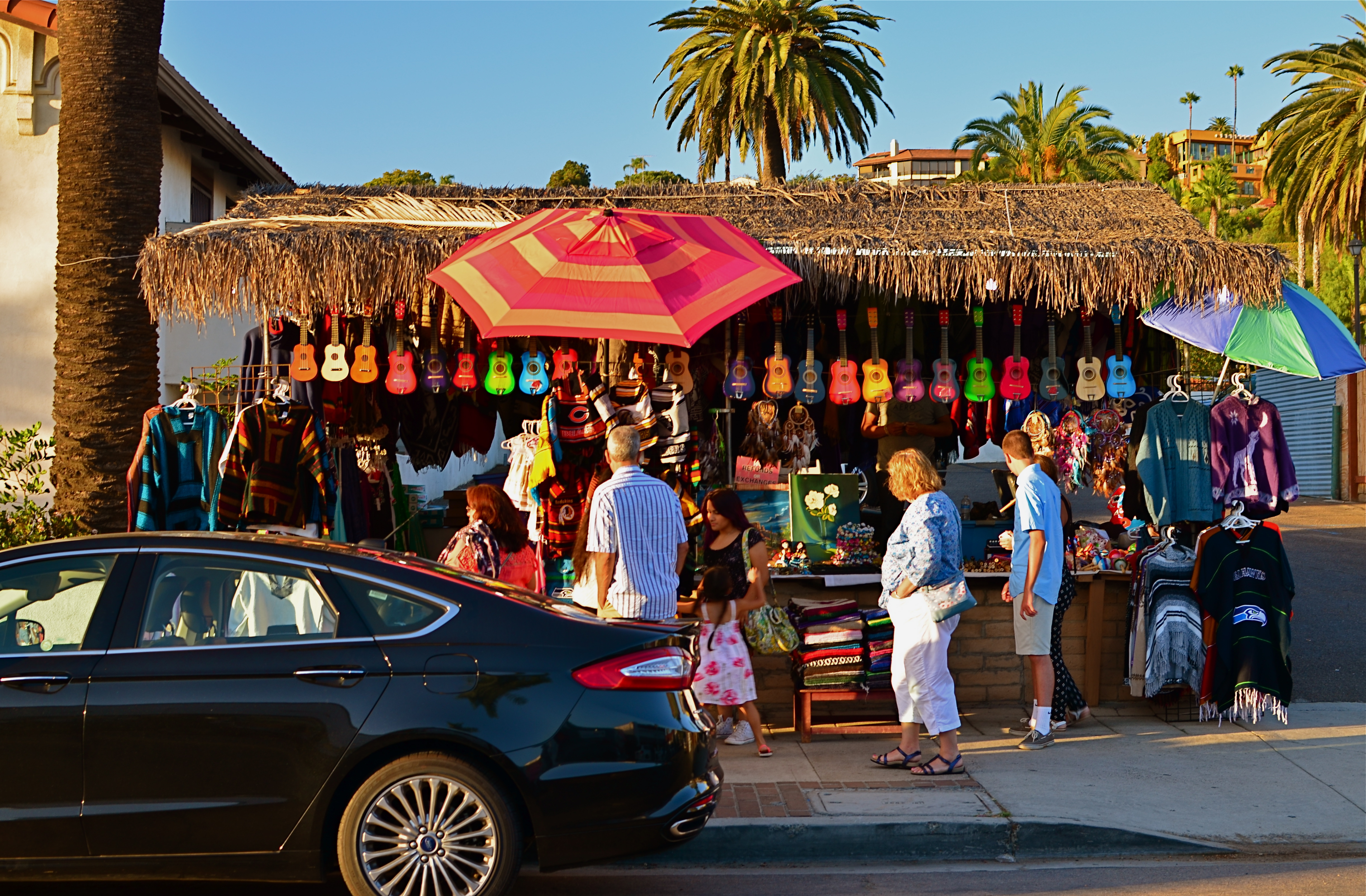
The photos seen here show how, if color is a compelling enough messenger, most of the visual information in a picture can be pared away to let that color message breathe. The master shot of a street vendor at sundown (seen at directly above) might have worked out if I had done one or two things better, but upon later examination, I realized that the long horizontal string of neon-hued ukuleles at the top of the shot could work if cropped loose from the less effective uber-shot (as seen at top). Better still, the color in the cropped shot is not actually about “ukuleles”, since a string of tropical fruits or a rack of hats with the same tonal palette would sell the image just as well. This is truly a case of color “just because”, conveying Alex Webb’s “emotion and feel” without assistance.
A lot of the photo world’s resistance to color, which ended barely more than a generation ago, stemmed in part from a loathing for the limited printing processes which made it harder to predict or control results compared to monochrome. But there was also the fear that untalented shooters would use it as a sensational crutch to boost mediocre work. Now it seems clear that color, like any other technical element, lives or dies based on what it is called upon to do, and how well the individual artist makes his argument.
OFF-WHITES AND NEAR COLORS

Warmer than reality: A sunset processed through Nikon’s in-camera “shade” white balance setting.
By MICHAEL PERKINS
ONE OF THE MOST GRAPHIC DEMONSTRATIONS OF THE DIFFERENCE BETWEEN YOUR EYE AND A CAMERA’S occurs by accident for most photographers, with variations in the reading of white balance that make the colors in an image look “wrong”. While our own vision looks at everything in the world from light blues to medium greys and instantly converts them all to “white”, the camera makes looks at all those variants and makes what can be called its best guess.
All light has a temperature, not a measure of heat but an index of which colors combine to deliver hues of a certain intensity and range, and white balance helps photographers manage color more effectively. Film shooters, especially those using sophisticated flash technology, eventually develop an instinct as to which kind of light will deliver the hues they seek, but, as the digital era tracks onward, many more of us simply rely on our camera’s auto settings to deliver a white that strikes us as “correct”. And when auto white balance fails to deliver the goods, we can override it and select other settings that compensate for incandescent light, shade, cloudy skies, and so forth. We can also create a completely custom white balance with little fuss. Think Dad looks better with a green face, like the true extra-terrestrial that he is? It’s at your fingertips.

Same scene using Nikon’s fluourescent white balance setting.
The fun starts when you use white balance to depart from what is “real” in the name of interpretation. WB settings are a fast and easy way to create dramatic or surreal effects, and, when you have enough time in a shoot to experiment, you may find that reality can be improved upon, depending on what look you want. In the top image, taken during a long, lingering sunset at sea, I had plenty of time to see what my camera’s custom WB settings might create, so I bypassed standard auto WB, then amped up the reds in the sky by clicking over to a shade setting, resulting in a deep and warm look.
For the second shot of the same scene, I wanted to simulate the look of a sky just after sunset, when the blues of early evening might take over for the vanished sunlight, even providing a little radiance from a pale moon. One click to the setting and you see the result. Now, of course, I’ve just switched from one simulation of reality to another, but playing with WB in a variety of lighting situations can help you tweak your way to fantasy land with no muss or fuss.
Tweaking white balance is basically lying to your camera, telling it that it is not seeing what it think’s it’s seeing but what you want it to think it sees. You’re the grown-up, you’re in charge. “White” is what you say it is. Or isn’t.
BURDEN OF PROOF
Reverse Shadows (2015) Originally conceived in color, later converted to black and white. Luckily, it worked out, but, shooting this image anew, I would execute it in monochrome from start to finish. Every story has its own tonal rules.
By MICHAEL PERKINS
THE WORLD OF PHOTOGRAPHY’S EMBRACE OF COLOR, which now seems instinctual and absolute, is actually a very recent thing. The arrival of color film stock targeted to the amateur market barely reaches back to the 1920’s, and its use in periodicals and advertising didn’t truly begin to outdistance color illustration until well after World War II. Color in so-called “serious” or “art” photography existed on the margins until half-way through the 1960’s, when hues, like every other element of the contemporary scene, gloriously exploded, creating a demand for color from everyone, amateur to pro. The ’60’s was also the first decade in which color film sales among snapshooters surpassed those of black and white.
Today, color indeed seems the default choice for the vast majority of shooters, with the “re-emergence” or “comeback” of black and white listed among each year’s top photo trend predictions. The ability to instantly retro-fit color images as monochrome (either in-camera or in-computer), has allowed nearly anyone to at least dabble in black & white, and the tidal wave of phone apps has made converting a picture to b&w an easy impulse to indulge.
And yet we seem to be constantly surprised that black & white has a purpose beyond momentary nostalgia or a “classic look”. We act as if monochrome is simply the absence of color, even though we see evidence every day that b/w has its own visual vocabulary, its own unique way of helping us convey or dramatize information. Long gone are the days when photographers regarded mono as authentic and color as a garish or vulgar over-statement. And maybe that means that we have to re-acquaint ourselves with b&w as a deliberate choice.
Certainly there has been amazing work created when a color shot was successfully edited as a mono shot, but I think it’s worth teaching one’s self to conceptualize b&w shots from the shot, intentionally as black and white, learning about its tonal relationships and how they add dimension or impact in a way separate from, but not better than, color. Rather than consistently shooting a master in color and then, later, making a mono copy, I think we need to evaluate, and plan, every shot based on what that shot needs.
Sometimes that will mean shooting black and white, period, with no color equivalent. Every photograph carries its own burden of proof. Only by choosing all the elements a picture requires, from color scheme to exposure basics, can we say we are intentionally making our images.
SOFTER AND QUIETER
By MICHAEL PERKINS
THE MEANING OF THE WORD NOISE HAS, IN RECENT YEARS, been expanded beyond its familiar role as an audio term, extending its usage into our visual vocabulary as well. A key shift in photo terminology, as film converted to digital, has been the re-purposing of the word to denote a degradation in quality, with noise replacing grain as the way to describe a less-than-pristine image. Same idea, different wording.
And now, in recent years, I have heard the word used even more widely to denote weaknesses in a composition, describing a picture with too much information or distraction as “noisy”. In a recent post on the blog PhotographyMad.com, you find the following citation:
Often a photo will lack impact because the main subject is so small it becomes lost among the clutter of its surroundings. By cropping tight around the subject you eliminate the background “noise”, ensuring the subject gets the viewer’s undivided attention.
I personally would extend this metaphor to include not only the subject matter within a frame but its color range as well. That means, simply, that too many colors in an image might dilute the effect of a shot as much as the density of its elements, and extends the idea of noise to encompass anything that lessens the communicative power it has for the viewer.

Deflowered (2016). 1/50 sec., f/4, ISO 100, 35mm.
In the above shot, the idea of the composition was to convey the bits of orange peel as some kind of spent or withered flower. I didn’t decide, in advance, to eat an orange in a yellow bowl, but I believe that the same peels in a red bowl might have hardened the look of the shot by calling attention to contrast instead of content. Keeping the entire composition to a two-tone color range (along with a decidedly shallow depth-of-field to reduce the texture detail) rendered it nice and soft. Of course there are a million ways to conceive this image; I just chose this way.
Noise is not merely a technical registration of visual or audio distortion. I think the word has real value if you’re looking to streamline your images. Just think noise=clutter.
Then turn down the volume.
WHEN AND WHERE FOR WHAT AND WHY
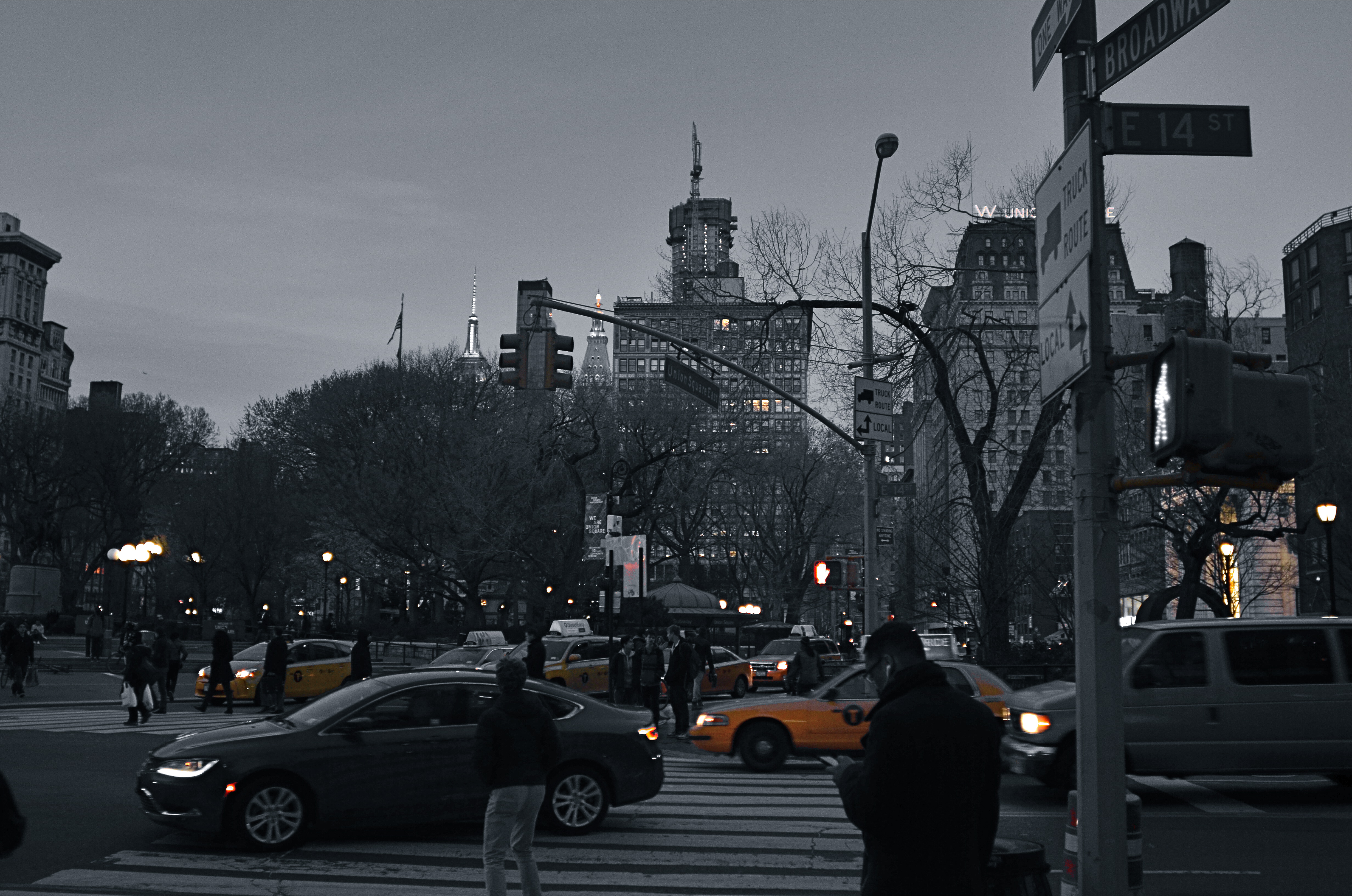
Manhattan yellow cabs in a grey street scene. A classic selective desaturation effect.
By MICHAEL PERKINS
THE SHEER NUMBER OF PHOTOGRAPHERS IN THE WORLD pretty much insures that not too many of us are artistically, um, unique. If there was ever a time in the history of the medium when it was nearly impossible to develop a style free of influence (good or bad), it’s now.
That doesn’t make originality impossible. But it does mean that, when one of us evolves a new way of doing things, the speed of adoption means there’s about a half a global second before innovation becomes cliche. And the worldwide online community likewise switches its evaluation of an idea from “brilliant!!” to “hackneyed” within an ever shorter cycle.
One of the tricks that only really came to the fore in the early days of digital editing is the look of selective de-saturation of color. The technique was originally met with great enthusiasm, but to hear the wags that whine and howl around the web, you should now sooner be caught dead rather than use it.
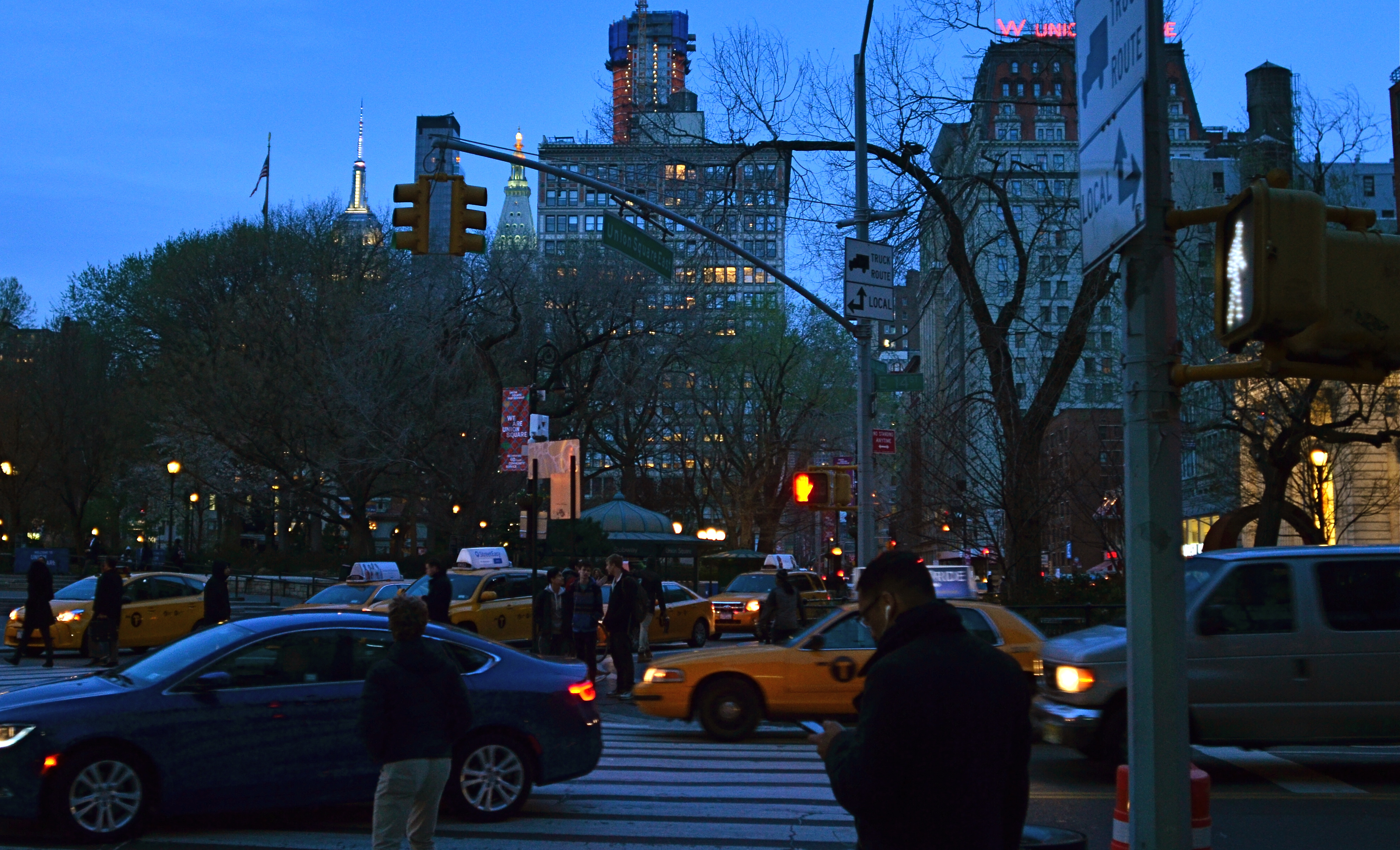
Same scene as above, in natural color. Which version sells the story the best?
Only, it’s not a given technique, per se, that becomes a drag, only its over-use or abuse. Think of canvas art for a moment. No one ever complains that “everybody uses oils to paint!” because it ain’t the pigment that separates the greats from the grunts. It’s what you do once you pick up that brush.
I steer away from partially desaturated shots because, while they can be real attention -getters, I myself don’t encounter many instances where I feel that they will actually help one of my pictures work better. The choice between monochrome and full color is, itself, fraught with a lot of mental measurement, meaning that you have a 50/50 chance in the making of an image to choose the wrong way to make it. Then there are color to b&w conversions, some of which really destroy the power of a photo. All this is before we get into the rather exotic decision of whether to make a picture “part” color.
Let’s say that there’s something to be gained by killing off all but the signature Manhattan cab yellow, as seen in the top image of NYC’s Union Square. Okay. It’s certainly technically easy to bring that off, but first you have to get beyond the initial “hey, that’s cool” sensation and ask, very critically, “what else am I giving away to nearly eliminate all the color in this image? Is the color of the dusky sky worth anything? How about the red glow of neon, the amber of lit windows, the darkening skin and fabric tones of passersby?
Lots of techniques fall or rise on whether they add or subtract from the image’s overall selling power. You have to learn when and where to do what…and to know why.
UNTRUE-TO-LIFE
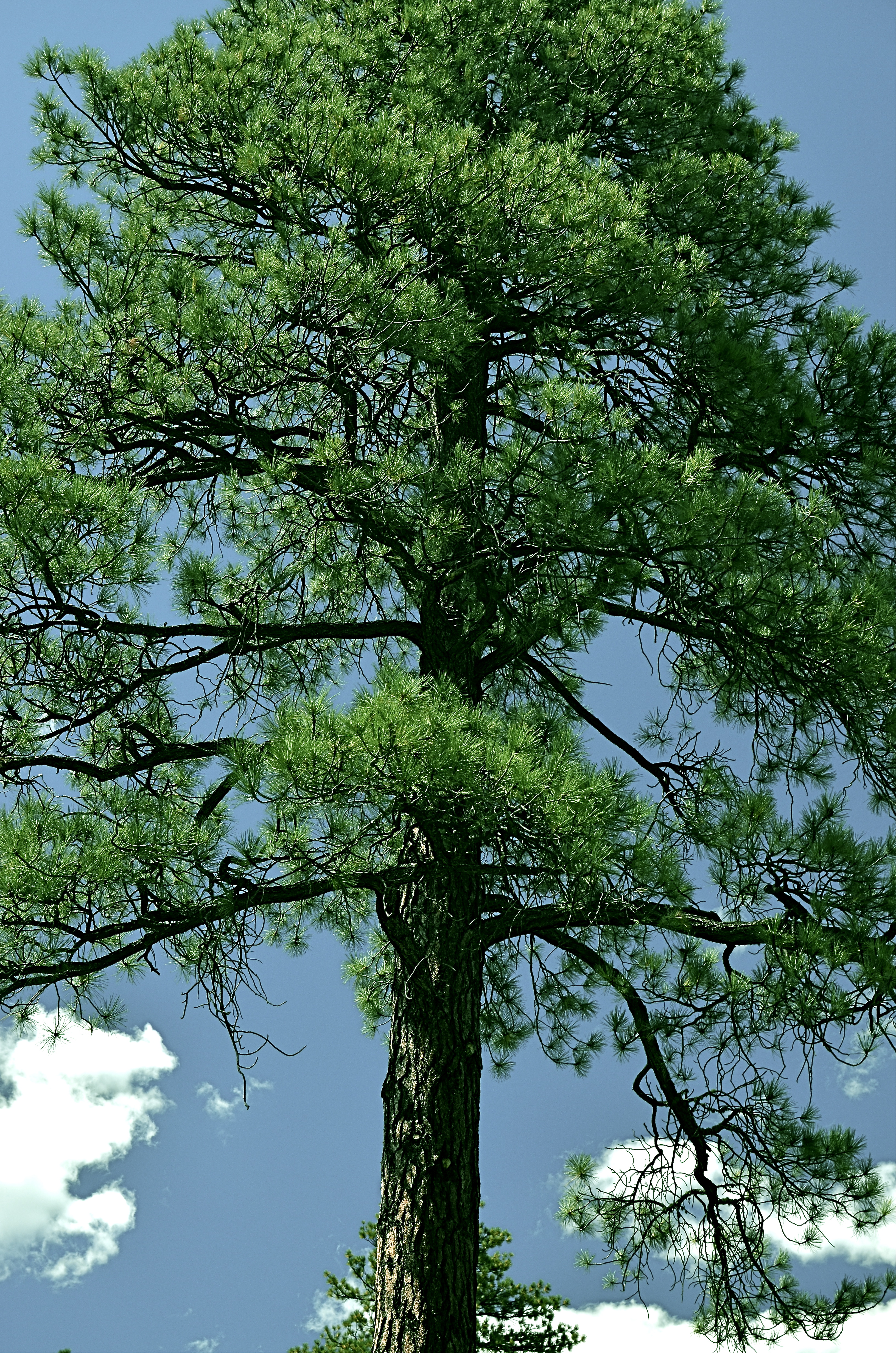
Go Green: A Flagstaff pine with all the brown values tuned out.
By MICHAEL PERKINS
I VOLUNTEER AT A MUSEUM WHICH SERVES, IN LARGE PART, SCHOOL TOURS. And, in trying to explain the color choices made by varying cultures on the depiction of everything, from flowers to animals, I frequently ask my groups if anyone has ever colored something with a “different” crayon. Not “the wrong color”, just a different crayon, a choice resulting in a purple squirrel or a brown rose. I usually get at least a few “yeses” on the question, and, when I probe further as to what went into their decision, I almost always get one child who says, simply, “I just like it that way.”
At this point, I realize that at least one person in every mob will always be thinking of color as a choice, rather than as a right/wrong answer. In my early school days, teacher often handed out the same mimeographed picture to all thirty of us, expecting all thirty to produce precisely the same results: green grass, blue skies, yellow honeybees. Strangely, we kind of expected the same of ourselves. It was comforting to hand in a “correct” piece of art, something guaranteed to please, a safe shortcut to a gold star.
In photography, we start as witnesses to color, but should never remain slaves to it. The present generation of shooters, born and bred in iPhone Land, know that changing your mind and your thinking on color is just an app away, and why not? The same force that has finally democratized photography worldwide is also legitimizing any and every kind of artistic choice. With billions of uploads each day, uniformity of style is worse than a lifelong gig as a worker ant, and as uninteresting.
Color is as big a determinant in interpretation as any other choice that a photographer makes, and can result in subtle shaping of the mood of your work. The above tree was originally captured in natural color, but I thought the overall design of the tree was served by one tone fewer, so I reworked everything into three values….blue, green, and black. I believe that the central trunk hits with more impact as light and dark shades of emerald, and the conversion of the pine needles to a more severe shade gives me some of the directness of monochrome. Of course, you might reach a completely different conclusion, but we’re beyond right or wrong here, aren’t we?
The mimeograph is dead, and with it, solid notions of color assignment. Fewer rules means fewer obvious signposts, but that’s why there’s more than one crayon in the box, innit?
DON’T MESS WITH MR. IN-BETWEEN

The light on this railroad depot was not as harsh or contrasty as seen here: I merely liked it better that way.
By MICHAEL PERKINS
PHOTOGRAPHY ALWAYS SEEMS TO BE ABOUT TWO THINGS THAT ARE POLAR OPPOSITES. On one hand, we have labored mightily for nearly two hundred years to make our little boxes reproduce as full a representation of the range of tone in nature as possible, to ape the eye to a clinical certainty. On the other hand, we love to distort that reality for specific purposes…..call it abstraction, minimalism, or your own favorite buzz word. We extol the natural look and revere the unnatural in nearly the same breath.
Originally, there wasn’t much in the way of attenuation between light and dark in photographs. Black was blackblackblack and white was whitewhitewhite (yes, I read a lot of e.e. cummings as a child). Better films eventually led to a greater variance in shades and nuances, and pioneering work by Uncle Ansel and other Big Saints produced exhaustive studies on precisely how many shades of grey could be delivered in a carefully crafted photograph. But even as we can now easily produce images with great variances in light and dark, some pictures are still served better by going back to clean, simple boundaries for values.
Hard, high-contrast blacks and whites are killers of texture but they are great modelers of dimension. A cube with stark differences between its light and dark sides takes on the more tangible feel of a solid object occupying space, and that extra degree of dimensionality helps in the success of certain compositions.
The above image was originally far more nuanced than the altered version you see here, but, as a very basic arrangement of shapes in space, I like the picture better without too much midrange value. It helps the faux nostalgia feel of the subject matter as well, even though it might be altogether wrong for a million other subjects. The unscientific answer is, you know it when you see it.
One thing is for sure. Even when we look for the ring of truth in our images, turn out that there’s more than one ring tone. Decide what you need for a specific image. Maximized selection of tools is the most single important part of making a picture.
NO CLEAR “BLACK AND WHITE” ANSWER
Hey, He’s just not that into you: In-camera monochrome, on a Nikon d5100: 1/200 sec., f/5.6, ISO 100, 35mm. Street photography sometimes benefits from a limited tonal range.
By MICHAEL PERKINS
SHOOTING IN BLACK AND WHITE, BEFORE THE DIGITAL ERA, WAS AN ACTIVE, RATHER THAN A PASSIVE CHOICE. You had to decide, before loading your camera, what an entire roll of film would be able to capture in terms of color/no color. There was no way to change your mind until that roll was completed and replaced. As you pre-chose film speed, light sensitivity, or special processing considerations, you also committed, before Frame One, to a single tonal option.
If you are really getting long in the tooth, you can remember when monochrome was the default choice for most of your film shoots. Economy was one factor, and, for certain shooters, including many of the pros, there was a lack of confidence that color films could render nature reliably. Giants like Adams, Edward Weston and others eschewed color throughout most of their careers, since they feared that either garish emulsions or the limits of extant printing processes would betray them in a way that black and white would not. And of course, in a world in which post-processing meant the skillful manipulation of a negative and the mastery of print-making, monochrome was simply an easier beast to tame.
Wow, are we ever in a different place.
Today, we can change our “film speed”, light sensitivity, and every kind of color emphasis frame-by-frame, and for many of us, color is our first choice, with many monochrome images post-processed from shots that were originally multi-hued. Photoshop and countless other programs allow us to have it all, with endless nuanced permutations from a single capture. Black and white is now often an “effect”, an after-thought derived later rather than sooner in our thought process. Oh, look what happens when I push this button. Cool.
Shot in color, de-saturated in post. A boring shot in color becomes super-bland when rendered in monochrome. Blame the shooter, not the mode.
Most users’ manuals for today’s cameras, especially DSLRs, actually advise converting color images to b&w in “post” rather than enabling the camera’s picture controls to shoot monochrome in the first place. The prevailing opinion seems to be that results will be better this way, since processing offers finer-tuned controls and choices, but I take issue with that, since I believe that color/no color as a choice is best made ahead of the shutter click, no less than choices about aperture or DOF. You need to be thinking about what black & white can bring to your shot (if anything) as part of your pre-shoot visualization. The tonal story in a picture is simply too important for you not to be planning it beforehand.
The quality of in-camera monochrome modes for both Nikon and Canon are both perfectly adequate to give you a workable image versus converting the shot later with software, and that’s good, because getting the shot right in the moment is better for the result than infinite knob-twiddling after the fact. Monochrome is a tool for telling a story or setting a mood. It makes sense that its use be tied to what you are trying to achieve as you are planning it….not slathering it on later as an oh-this’ll-be-keen novelty. That’s Instagram technique, not photographic technique.
One great habit to retain from the days of film: anticipate your need, and shoot according to that need. Plan ahead. “Fix it in the lab” only works for shots with slight imperfections, frames in which the concept was sound enough to warrant painting away a few flaws. Going to black and white to save an iffy shot is a Hail Mary pass at best.
As as we all know, you don’t always get what you pray for.
That’s the truth. In black and white.
Follow Michael Perkins on Twitter @MPnormaleye.
Related articles
- Capturing Texture in Black & White Photography (jdgilchristphotography.wordpress.com)
- Black and White used like Color (atmtxphoto.com)
