THE CASE FOR REINCARNATION
By MICHAEL PERKINS
ONE OF THE HALLMARKS OF A MATURE SOCIETY is a healthy respect for its own history. When a nation is busy a-borning, doing anything “for the ages”, from physical infrastructure to laws to philosophy, can get lost in the blur of just…becoming. The dust of Now is just swirling too madly to get a good view of what can, or should, be made to last. Change is so rapid that it becomes its own religion. Preserving, protecting, salvaging things….that comes later.
American, a country that has always surged forward too quickly to allow ourselves much of a backwards glance, was always more about building than keeping. Things that became outmoded or obsolete were quickly consigned to the national scrapheap. As a result, we only recently have begun to place a premium on conservation, on re-purposing our past. And nowhere is that more evident than our cities, where signs that read “soon, on this site” usually mean that something old must first be destroyed. We have taken a long time learning to give things second lives. Including ourselves.
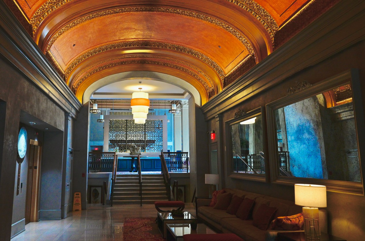
The foyer of the restored Citizens Building, a 1917 bank-turned-condo community in Columbus, Ohio.
I have a special affection for the urban spaces that get “saved”, that are lucky enough to survive the wrecking ball and shine forth anew, escaping the fate of so many things we mistakenly label “improvements”. Not everything old is immortal, certainly, but not everything new is magical, either. I love to take my camera to renovations, grand re-openings, conversions. It is a great privilege to see, in a place’s original design or materials, what its creators did. In the case of the above image, taken inside a 1917 bank in Columbus, Ohio that’s been recently reborn as luxury urban condominiums, one sees many original features that brought beauty and elegance to a financial institution that work perfectly well, thank you very much, as features in a residential building. I document these small victories because they are still too rare. I long to demonstrate, for as many eyes as I can, that “past” need not mean “dead”. As our country, or any young country, grows up, it’s easier to see what seemed invisible when we were young and in a hurry. That’s true of ourselves no less than of our creations.
REDEMPTION, ARRIVING ON TRACK 11
In the old time, you arrived at Pennsylvania Station at the train platform. You went up the stairs to heaven. Make that Manhattan. And we shall have it again. Praise All.
Senator Daniel Patrick Moynihan
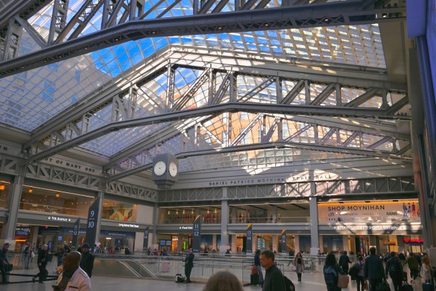
Main concourse, Moynihan Train Hall, New York City
By MICHAEL PERKINS
FOR THOSE WHO LIVE OUTSIDE NEW YORK CITY, it is hard to express the sense of loss that’s is still felt locally over the 1963 demolition of the old Penn Station railroad terminal. Crumbling from age and neglect, it was one of hundreds of landmarks that fell to the wrecking ball in an age where so-called “urban renewal” reigned supreme, and its end has continued to haunt urban planners ever since, as the very definition of a wasted opportunity. Today, classic buildings are more typically salvaged and repurposed, allowing their storied legacies to write new chapters for succeeding generations. Penn Station’s death was the Original Sin of a more careless age.
But sins can sometimes be redeemed.
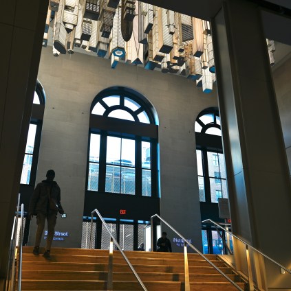
“The Hive” , a dramatic art installation inside the 21st Street entrance to Moynihan Train Hall.
Around 2000, Senator Daniel Patrick Moynihan, who, years before, had worked as a shoeshine boy inside the first Penn Station (which was “replaced” by a grim dungeon in the ’60’s on its original site), began to float the idea of augmenting rail access to Amtrak and other carriers by recreating the majesty of the old building in the most obvious place; across the street. Turns out that the terminal had a near-twin, just beyond the crosswalk on Eighth Avenue in New York’s old main post office, which, like the train station, was designed by the legendary firm of McKim, Mead & White. By the start of the 21st century, the post office, by then known as the James Farley building, had already begun to move many of its operations to other facilities, heading for white elephant status in one of the city’s most expensive neighborhoods. By the senator’s death in 2003, funding for what many locals were already calling the Moynihan Train Hall went through years of fiscal stop-and-start, careening like a foster child through the hands of half a dozen different potential sponsors. Construction finally began in 2017, with special care taken to preserve and restore the post office’s massive colonnade entrance, which was, itself, protected with landmark status.
On January 1, 2021, almost as a symbol of New York’s resurrection following its year-long struggle as the first epicenter of the Covid pandemic, the completed Moynihan Train Hall was finally dedicated by New York governor Andrew Cuomo. My photographs of the site now join those of millions of others as testimony to the power of the human imagination, as do the Hall’s waiting-room murals, which illustrate the grandeur of the terminal’s long-vanished predecessor, poignant reminders of the new building’s purpose in redeeming the sin of letting the old one be lost. Among the mural captions are the words of Daniel Patrick Moynihan himself, celebrating the town’s unique trove of tradition and talent:
Where else but in New York could you tear down a beautiful beaux-arts building and find another one across the street?
Amen. Praise all.
THE HOUSE I LIVE IN
By MICHAEL PERKINS
FRANK LLOYD WRIGHT OFTEN EXPRESSED THE BELIEF THAT, in architecture, “form and function are one”, that, in the best designs, what a thing is used for will generally dictate its appearance. And while it does seem to hold true that sports stadiums do look like places where sports are played, or that churches look like places where people worship, I’m not always sure, as a photographer, that I agree with FLLW that the form/function rule applies in all structures. I have a lifelong love for images of personal dwellings, places that, all too often, look ill-suited to house humans at all, as if, indeed, there was no conscious link between form and function. In many cases, we live in basic containers that just are, with how we live in them dictating their form almost as an afterthought or improvisation, draped as they are with the stuff we’ve accumulated over a lifetime.
Indeed, it’s how the infinitely adaptable human retrofits his house from the inside out that makes it look like somebody actually lives there, rather like a window looks more window-ish once someone hangs drapes in it. Urban living is littered with enclosures that will, sadly, never look like anyone’s domicile, and it’s only the personal things that spill outward from within that give them any visual identity or distinction at all. Thus, when I’m walking through a neighborhood, I pay less attention to the well-tailored or manicured houses and more attention to the littered ones, the ones where things are randomly hung or hammered into place, the houses where makeshift repairs or ill-performed additions are in evidence. Houses that otherwise seem as if they were extruded from a Play-Doh Fun Factory can become personalized by what is strewn in front of them, left in the yard, tacked on as a footnote. It is that randomness, that refusal to conform, that makes houses human, and thus ripe for picture-making.
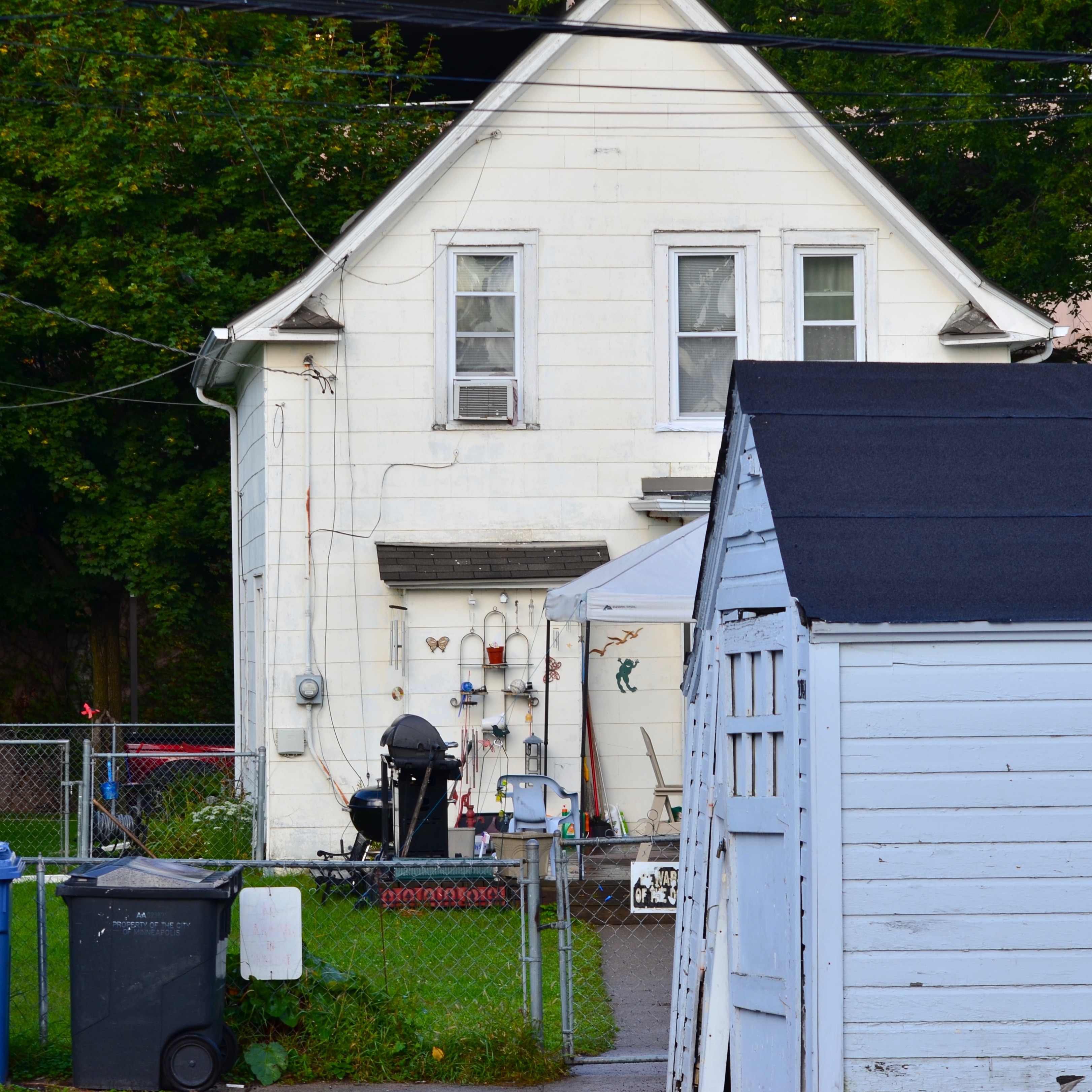
We Call It Home, 2019
In the image you see here, the house speaks eloquently about the most important things in its owners’ lives. It’s an outward barometer of their hobbies, pastimes, daily chores. The structure itself might never have struck anyone, from the architect to the builder, as unique, but as its true identity has been assembled, layered over it, its messages are all clear and direct. Wright was correct that buildings should reflect the purpose for which they were built. However, when they fail that task, design-wise, the way they are actually used will explode out of them, in a million different cues and clues over a million billion neighborhoods, in a visual shorthand that photographers will forever delight in decoding.
THE SHOW STARTS AT THE CURB
By MICHAEL PERKINS
URBAN ARCHITECTURE IN THE EARLY 20th CENTURY convulsed our sense of what a “proper” building should be, with a seismic shift in aesthetics from the staid and respectable design of the Victorian age. It’s no coincidence that this revolution occurred at the very same time that the age of mass media washed over the world, as the dictates of print advertising were supplemented with the promotional energies of movies, radio, and, eventually, television. Cities whose businesses were born in this loud, aggressive crucible of modern advertising would drastically change the way those businesses competed for our attention. Structures from the 19th century sometimes bore advertisements on their exteriors, from signs to posters. Structures in the emerging 20th century were advertisements….their design screaming out their intentions with neon, explosions of color and extremes of design. In a real way, whatever show was inside the stores truly began at the sidewalk.
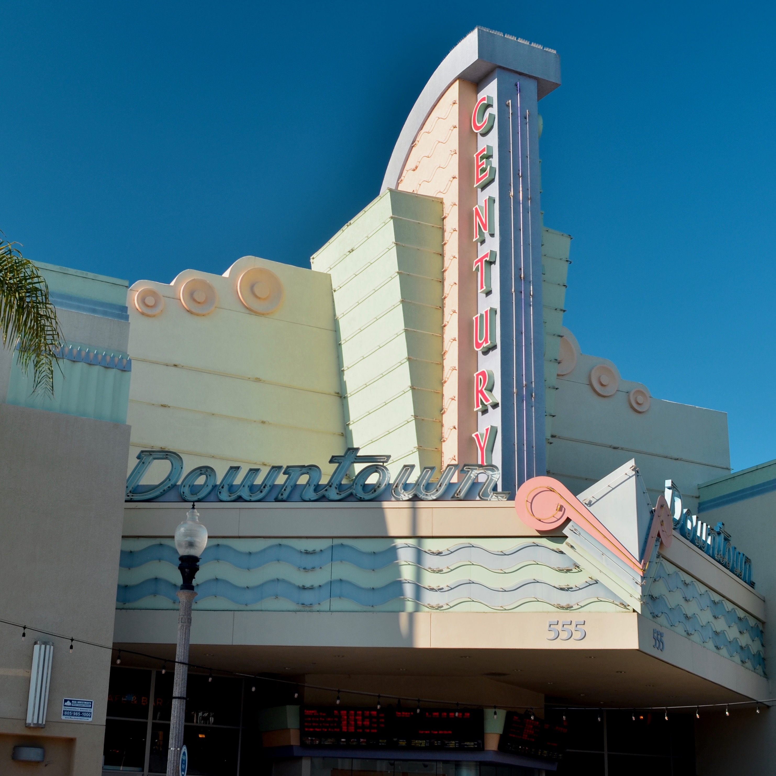
It’s show time. Again.
Photographers are still scrambling to chronicle the vanishing echoes of this design surge, which was most vividly expressed in the streamline, moderne, and Art Deco movements. Function dictated form: a boutique selling hats might actually look like a hat: a photo shop might design its storefront to resemble an enormous camera. Even banks went from the quietly dignified Doric columns and Romanesque scrolls of the Gilded Age to the bizarre Aztec-meets-Moorish-meets-Hollywood mishmashes of the the Jazz Age, with every place of business screaming for your eye. All of this proves catnip to photographers, who now experience pangs of nostalgia for the bold and brassy looks that predate their own lifetimes. Give me a blinking, blaring mass of zigzags and chevrons and I am in some kind of Busby Berkeley fever dream. Especially with theatres.
Many of the world’s old neighborhood bijous have gone down to dust, others converted to street corner churches, antique shops or themed cafes. And of those that do survive, some still actively celebrate their original functions, and thus are among my favorite things to shoot. The image seen here is of downtown Ventura, California’s Century theatre. The structure is particularly delightful, its soft pastels dreamily gleaming in the warm light of this charming seaside town. California as a whole, perhaps because of its direct connection to the film industry, has seemed to have salvaged a greater number of these little jewel boxes than is typical for other parts of the USA, although they, too, have seen many such houses crushed under the heel of what passes for progress. In any event, I can be counted upon to stop, stare, drool and shoot when encountering one of these picture palaces. Because the old theatre program billings, in which features were preceded by cartoons, newsreels, shorts or travelogues, left out an important first step….that “show” that starts at the curb.
ONE BRICK AT A TIME
The devil…. or the delight…is in the details in urban architecture.
By MICHAEL PERKINS
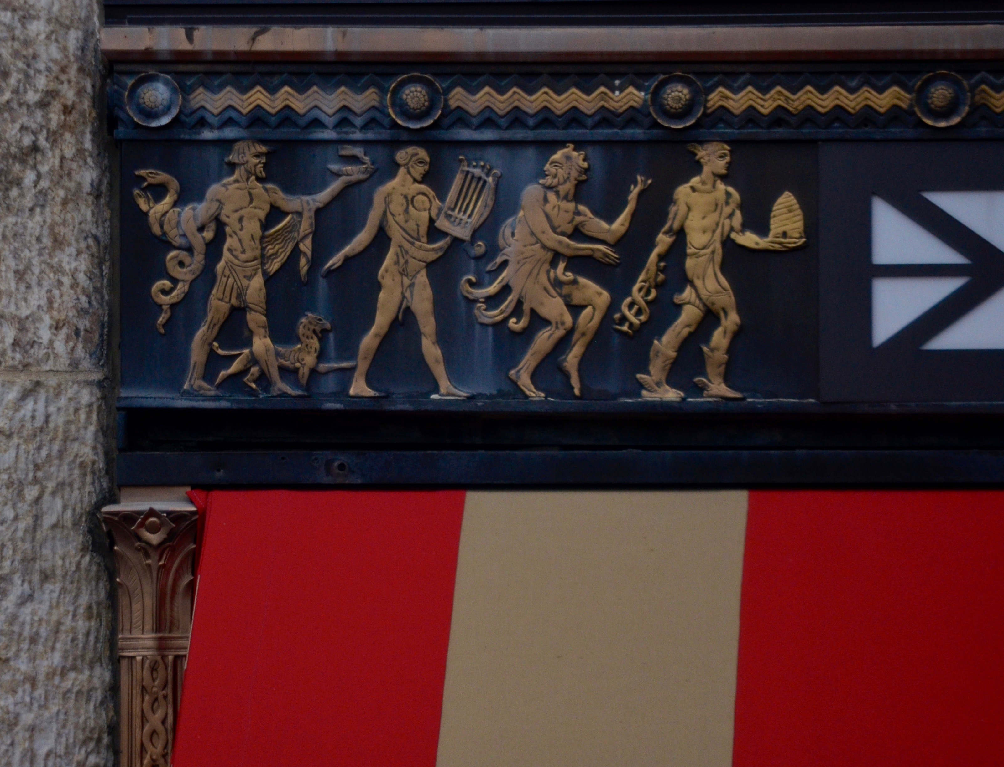
MANY URBAN BUILDINGS FROM THE EARLY 20th CENTURY CAN BE OPEN SECRETS, objects that we walk or drive past with such frequency (and speed) that their most telling elements are often underseen. Certainly, we visually record their larger contours…the block or the spear or the obelisk or the faux cathedral or the Romanesque monument, those general features that figure prominently in long-distance skylines and postcard views. But what remains virtually invisible are what musicians might call the grace notes, the smaller accents and textures that, upon closer inspection, reveal as much, or even more, about the intentions of their makers. And seeking close encounters with these elements can yield great subjects for photography.
More so than with the taciturn minimalism of the post-WWII years, buildings from the 20’s, 30’s, and 40’s were often personal headstones for men who piled up great fortunes, captains of industry who wanted to invest every inch of their towers and spires with references to their beliefs as well as their bank accounts. Lintels, door frames, spandrels, arches, vestibules and cornerstones all bore testimony to company mottoes, symbols of both the modern and ancient worlds, and the idealization of public service. Some lobby mailboxes were invested with more design than a forest-ful of the icy glass boxes of the International period that followed. Often, the founders of a building had a small army of independent artists, from muralists to sculptors, working various sections of the the interiors and exteriors, each with their own unique contribution. Thus, a quick drive-by of a tower in one’s city “that’s been there forever” may not reveal the myriad messages imbedded in areas no bigger than a few square inches, while a dedicated trip for slow-walking and scout work may reward the photographer with a generous dose of time travel. Wonderfully, this can happen in layers, with repeated trips to a building that you thought you’d already “done” yielding additional treasures.
The relief you see in the image at top is repeated over every minor first-floor frame and street entrance of Columbus’ Ohio’s Leveque Tower, which, upon its completion in 1927, briefly enjoyed the distinction of being the fifth tallest building in the world. The property has been generally “preserved” in the current era, but that doesn’t mean it’s come into its second century unscathed, many important exterior and interior features having been removed or lost by owners with a somewhat less than curatorial bent. Ironically, it is the smaller touches on the tower which have remained most intact over the years, including this window frame and its depiction of various virtues of the ideal citizen, including, left to right, healing, the arts, storytelling, and industry. My point is that 99% of every photograph taken of this icon of midwestern design are shot from hundreds, even thousands of feet away, while a stroll past the entrance conjures something far deeper for even the most casual shooter.
Photographing great places is an enormous delight, but also a tremendous responsibility, since our recent history have shown us that nothing made by man will stand forever. That puts us back in the role of chroniclers and archivists, and if we make our pictures carefully, at least the essence of the stories we once told a brick at a time may outlast the dust.
FACES WITHOUT FEATURES
The Tube Hangar (2016)
By MICHAEL PERKINS
SOME OF MY URBAN PHOTOGRAPHY COULD POTENTIALLY STRIKE THE AVERAGE VIEWER as somewhat remote, even a bit cold. It flies in the face of some of the universally held “truths” about so-called street photography. Sometimes it doesn’t even have a face. Or faces.
If the best street shooters are thought to reveal truth in the features of the denizens of all those boulevards, then I might really be at a disadvantage, since many of my images are not about faces.
They are, however, about people.
I tend to use passersby, in city pictures, to several ends. beyond the regular kind of unposed portraiture that is standard “street” orthodoxy. One is scale, that is, how they dominate or are diminished by the sheer size or scope of their surroundings. Some cities seem to swallow people, reducing them to anti-sized props in an architect’s tabletop diorama. I try to show that effect, since, as a city dweller, it affects me visually. Other times, I show people completely silhouetted or swaddled in shadow. This is not because their faces aren’t important, but because I’m trying to accurately show their roles as components in an overall choreography of light, as I would a mailbox or a car. Again, the idea is not to avoid or conceal the stories that may reside in their faces, but to also accentuate their body language, how they occupy a space, and, yes, as abstract design elements in a large still life (okay, that sounds a bit clinical).
I certainly bow to the masters whose controlled ambushes of strangers have captured, in candid facial shots, harrowing, inspiring, or amusing emotions that deepen our understanding of each other. You could rattle off their names as easily as I. But using people in pictures isn’t only a miniature invasion into their features, and certainly isn’t the only way to depict their intentions or dreams.
And then there is the other problem for the street portraitist, in that some faces will remain ciphers, resisting the photographer’s probe, explaining or revealing nothing. In those cases, a face poses more questions than it answers. As usual, the argument is made by the individual picture.
OF DISTANCES AND DOMAINS
Designed by humans? Certainly. Designed for humans? Well….?
By MICHAEL PERKINS
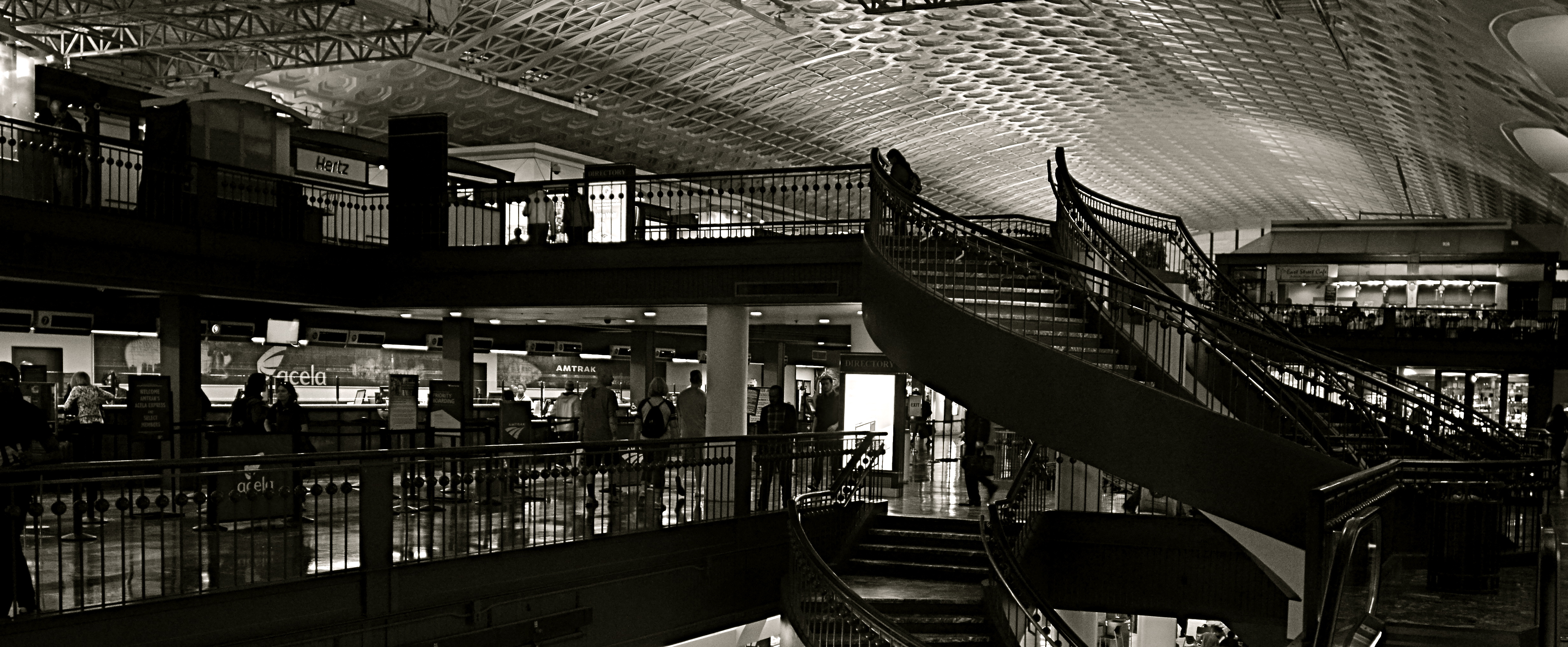
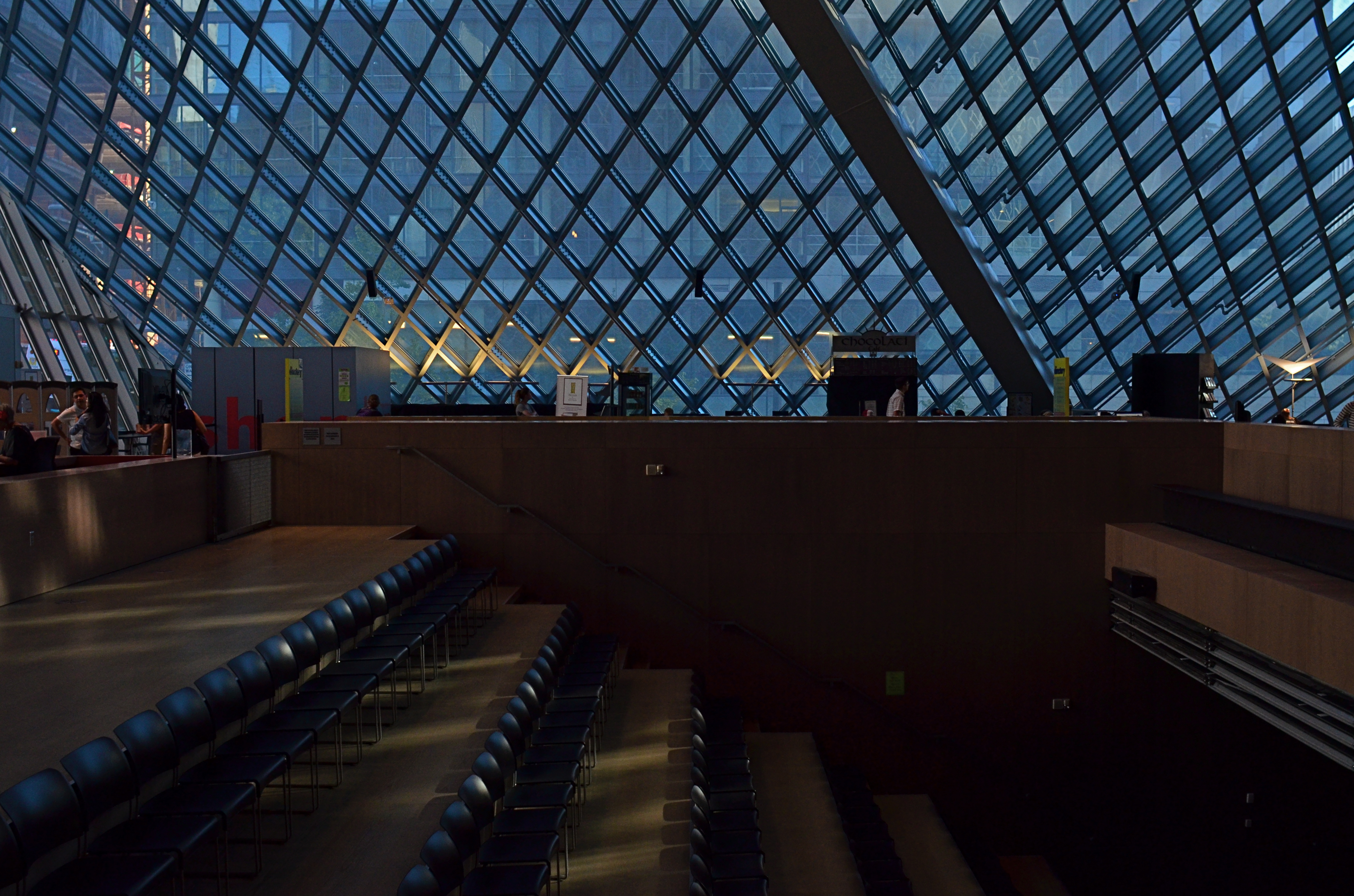
PHOTOGRAPHY IS AN EFFECTIVE WAY TO MEASURE MAN’S RELATIONSHIP to his physical environment, giving us the distance we need to see these arrangements from a more objective distance. People design places in which other people are to live and work, but once these plans get off the drawing board, it can become unclear what people’s place in the whole puzzle was intended to be.
More to the point, there is real picture-making potential in the occasional mis-match between what we design and how we fit into it. Some things that seem terrific to the people on the planning board seem cold or intimidating to regular users once they’re actually built. Seeing us try to find our place in things that are really inhospitable can be visually interesting because it makes us look and feel somewhat alien. We can become oddly placed props in our own projects, as the places made to house our dreams look more like warehouses for our nightmares.
Of course, one man’s horror is another man’s heaven, a rule that has certainly been constant over the history of innovation. That means, artistically, that we can wind up, inevitably, making images that start arguments, which is, I believe, the perfect function for art anyway. It’s one thing to smear a daub of paint on a canvas and lacerate someone’s vision with it. After all, you can abandon the painting, leave the gallery, etc. But if the building that was meant to be the gallery seems like a bad fit for you as a human being, that’s something else entirely.
The right compositions with the right lenses deliver stark visual messages about how we slot ourselves into the world we’ve created. Sometimes we make a statement for the ages. Sometimes we erect mouse mazes. Either way, there’s a picture in the process.
