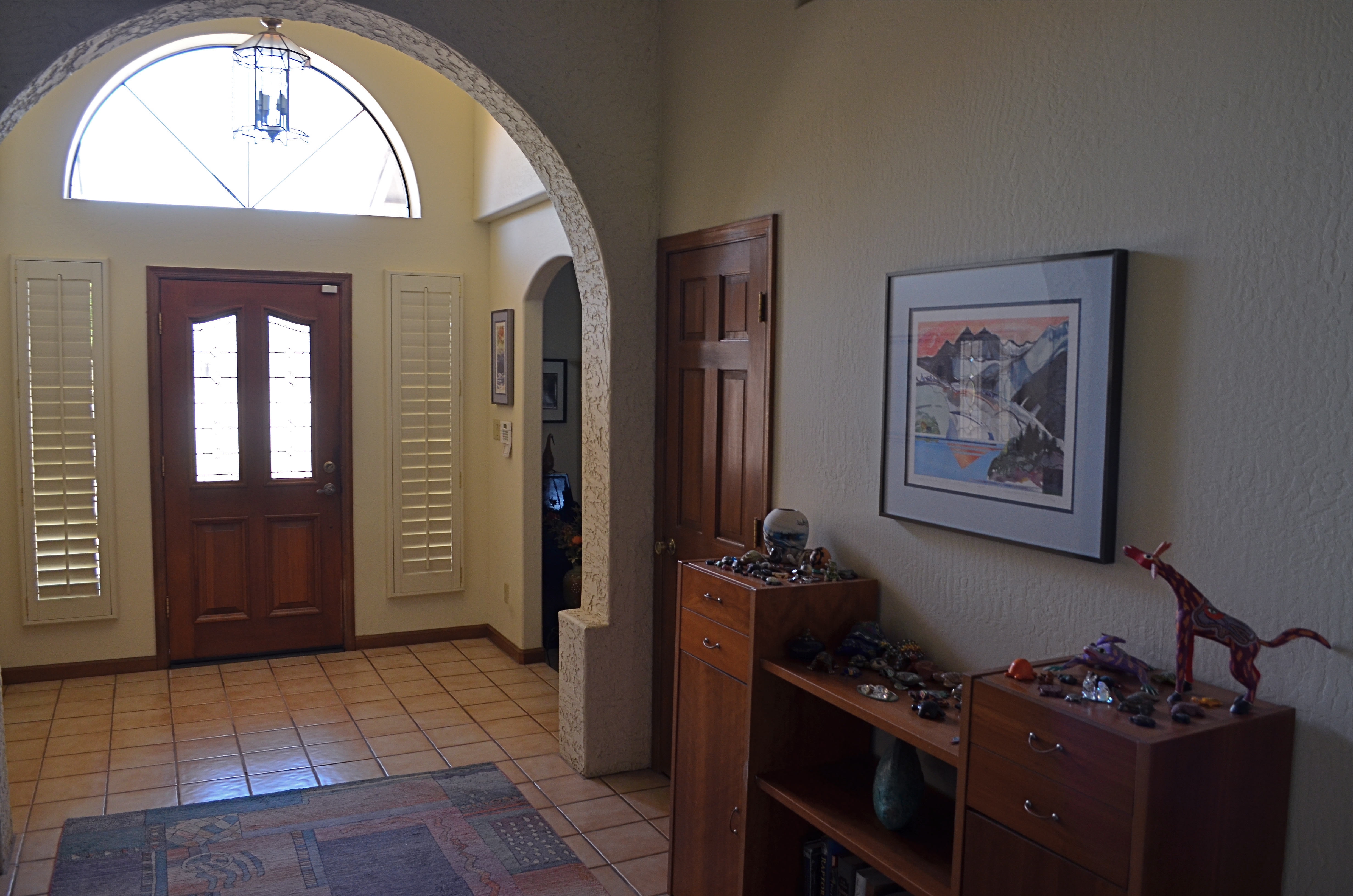
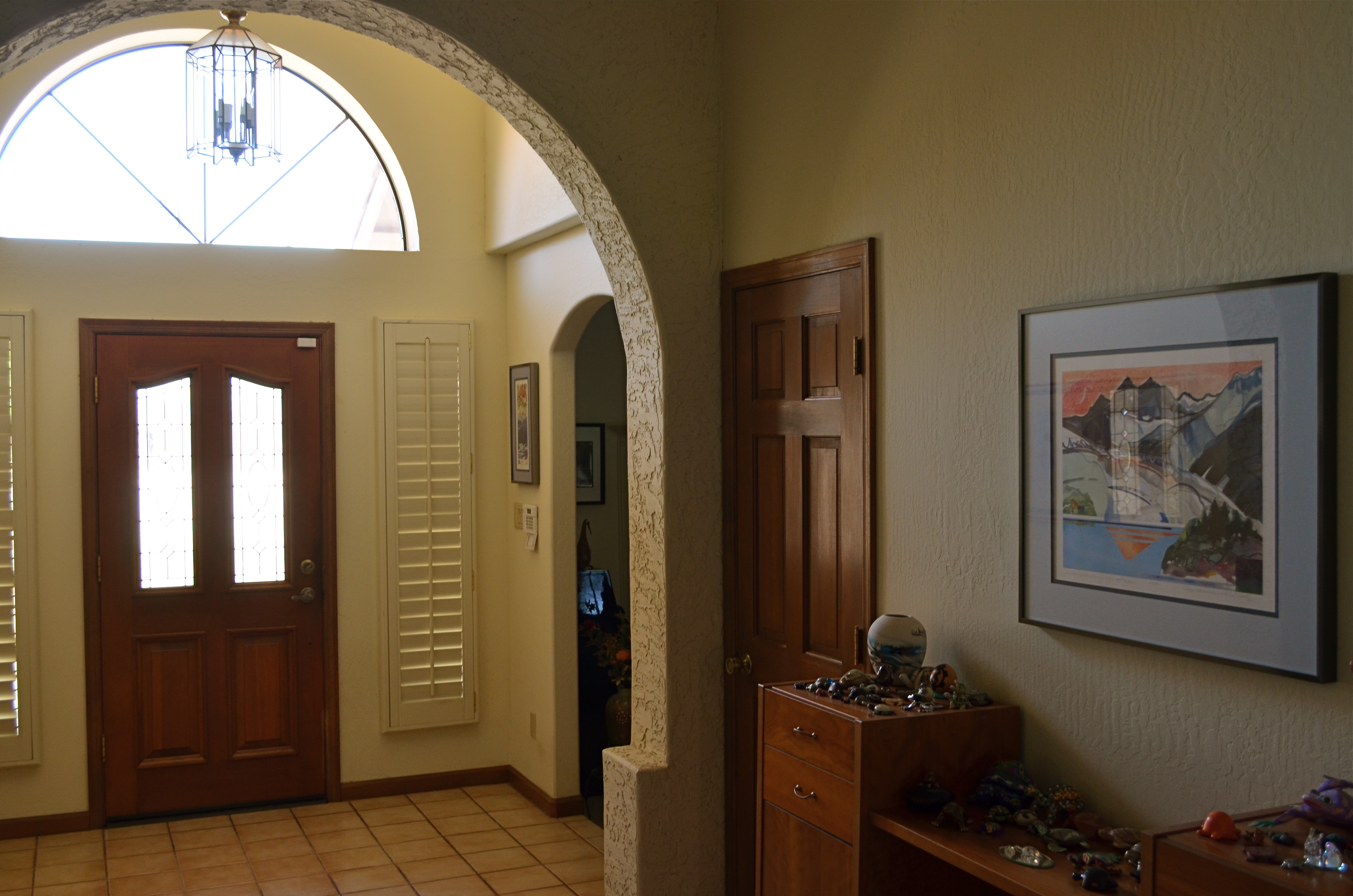
EYES WIDE OPEN
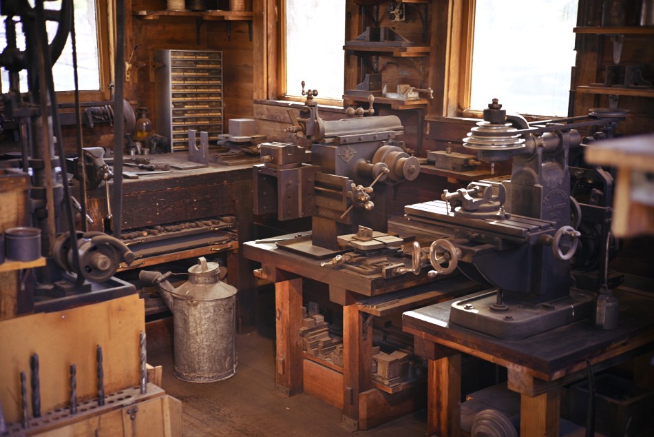
A quaint old workshop, but it’s inside a room that is too small for everything in it to be shown with a standard focal length.
By MICHAEL PERKINS
I DUNNO. IT MAY BE BECAUSE WE ASSOCIATE WIDE-ANGLES LENSES WITH LANDSCAPES. You know the kind of images I mean: vast canvasses of sprawling geography that seem to draw our eye enormous distances between left and right sides of the frame, enforcing an idea that we have to “get everything in” when composing our image. Perfect solution: Wiiiiiiide-angle! No cropping of a cool mountain or a winding river needed! Hey, all you trees, crowd in together, willya?
In reality, I almost never use a wide-angle lens for exposition of big subjects. The lens can magnify distances, especially front-to-back distances, that I don’t particularly need to magnify, and so I use a normal focal length and just stand farther away from the scene. I believe that wide-angles are not designed to “get everything in” your picture. They are best used when they put you, yourself, farther inside a scene. Most wide shots fail because they are taken from too far away, when the feeling of “being there”, of having yourself immersed in a scene, is only accomplished the closer you are to the action. Or if you think of it in sonic terms, consider how more immersive stereo feels if you create the illusion that you are amongst the musicians instead of across from them.
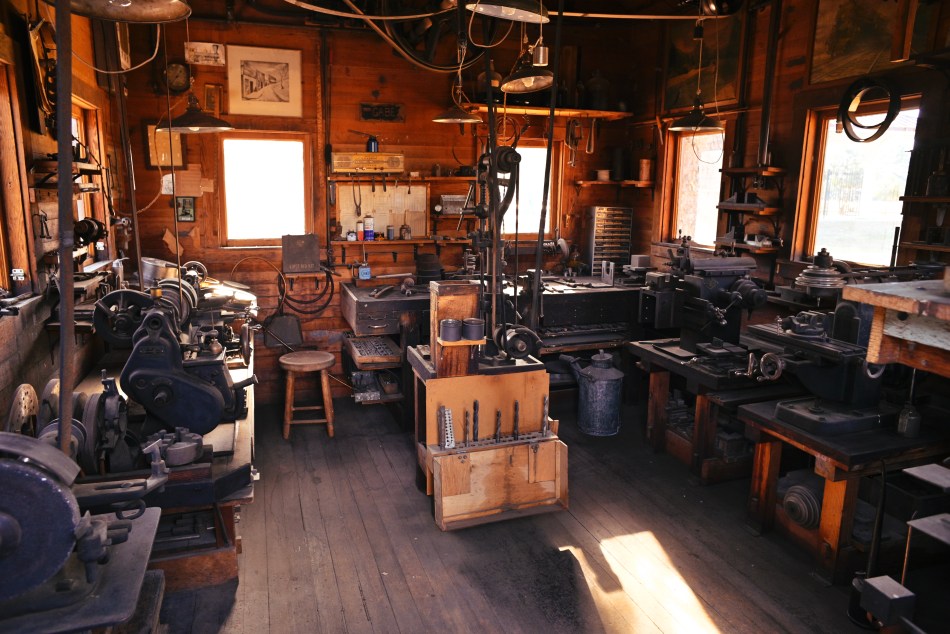
Same room, now shown completely by moving in closer and using a 24mm wide-angle.
With this in mind, I think that wide-angles are absolutely essential when you find yourself in a cramped space, whereas using a normal 50mm width in such a situation, as seen at the top of this page, heightens the feeling of claustrophobia. More than half the detail in the medium-sized workshop in the image is simply lost, including the space’s entire left side and ceiling, both of which are loaded with interesting information. Snap on a 24mm wide-angle, however, as I did in the second view, and the room opens up, even though I am leaning physically farther into the room’s doorway than I did when using the 50. Instead of using a wide-angle to back up and “get everything in” (what? the door frame? the outside of the tool shack?) I placed myself further into the scene and let it, if you like, wrap around me.
Composition is part instinct, part inspiration and part calculation. Focal lengths can operate counter-intuitively in some situations, but ahead of the right tool comes the right idea. When both arrive at the scene together, the good stuff happens.
DEM DARN DONT’S
By MICHAEL PERKINS
THE GLIB REMARK THAT YOU HAVE TO LEARN ALL THE RULES IN LIFE BEFORE YOU CAN BREAK THEM is maddeningly true, at least for me. Early on in my foto-fiddling, I was eager to commit all the world’s accumulated photographic do’s and don’ts to memory, like a biblical scholar nailing scripture passages, and shooting as if to enshrine those stone-written truths in art. I used words like always and never to describe how to make pictures in a given situation. I kept the faith.
And then, when I suddenly didn’t, my stuff stopped being pictures and started being photographs. Absolutes of technique are good starting places but they usually aren’t the best places to stick and stay for life. And at this point in my personal trek (seventh-inning stretch), I feel the shadow of all those do’s and don’ts swirling about like little guardian angels, but I worry first and foremost about what makes a given image work.
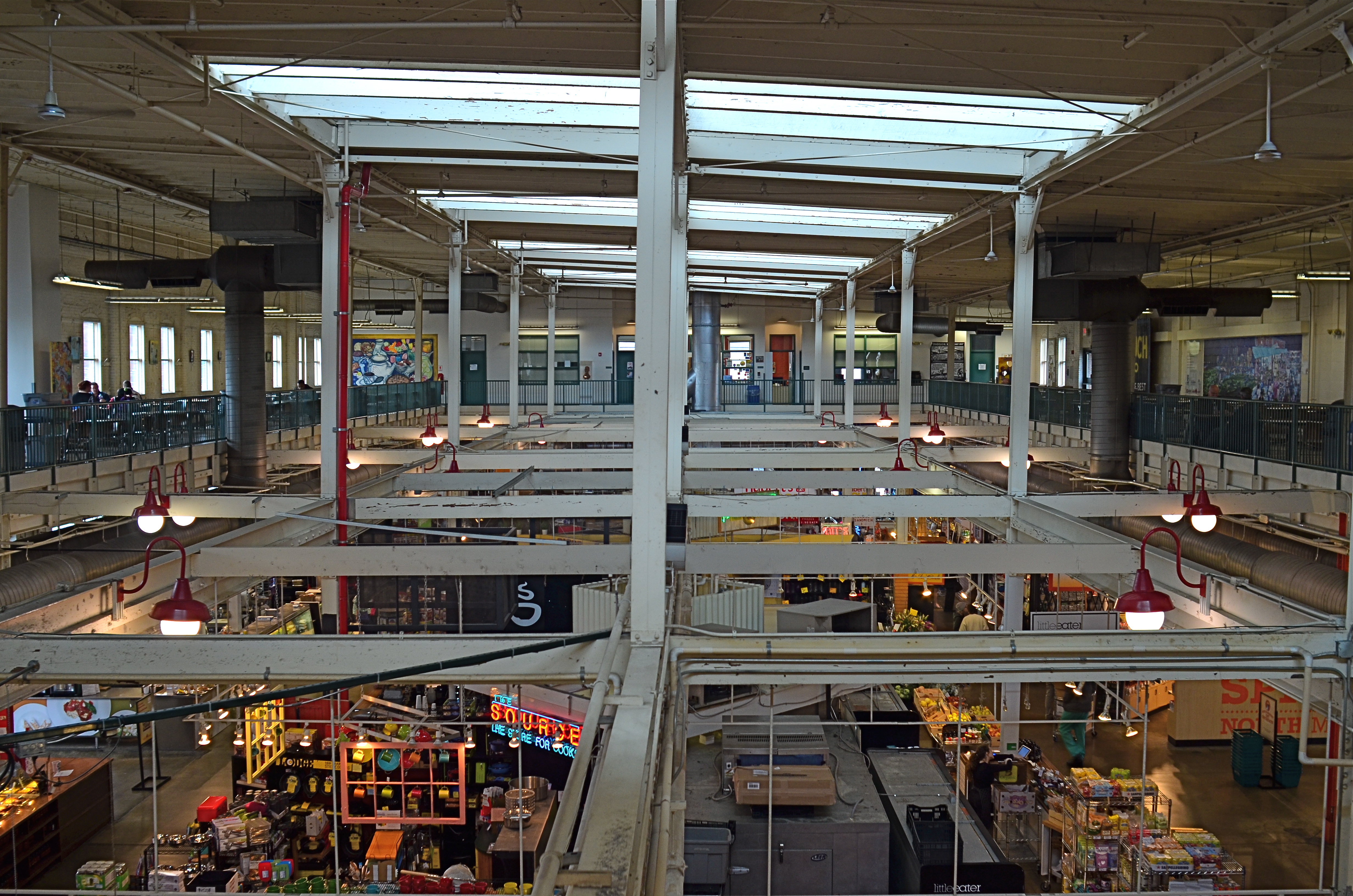
North Market, 2016. Straight out of the camera at 1/40 sec., f/5.6, ISO 200, 24mm.
You no doubt have many pictures you’ve made which you simply like, despite the fact that they flaut, or even fracture, the rules. The above image, shot earlier this week at a multi-floor urban marketplace/eatery, struck me for two reasons. First, because of how many basic rules of “proper” composition it clearly violates; and secondly, just how much I don’t care, because I like what it does. To illustrate my point, I’ve provided citations from an article titled Principles Of Composition to cite specific ways that the photo is, well, wrong.
Have A Strong point of interest. Well, there isn’t any particular one, is there? Lots of conflicting stuff going on, but that’s the natural rhythm of this place. It’s a beehive. One man’s clutter is another man’s full “pulse of life”, and all that.
Don’t place the horizon line, or any strong vertical or horizontal lines, right in the middle of a picture. And make sure the lines aren’t tilted. Okay, well, since there is a distinct difference between the “level-ness” of the crossbeams over the lower floor and the slanted lines of the skylight above, there really isn’t a way to make the entire picture adhere to the same horizontal plane. However, the off-kilter sagginess of the old building actually lends it a little charm , unless I’m just drunk.
Keep compositions simple, avoiding busy backgrounds that distract from your subject. Granted, there are about five different sub-pictures I could have made into separate framings within this larger one, but that would defeat the object of overall bustle and sprawl that I experienced looking out over the entire scene. Sure, some compositions get so busy that they look like a page out of Where’s Waldo?, but certain chaotic scenes, from Grand Central Terminal to Picadilly, actually reward longer, deeper viewing.
Place a subject slightly off-center rather than in the middle of a photo. Yeah, well, that’s where that “strong point of interest” rule might have helped. Sorry.
Do these deviations mean the image was wrong, or wrong for certain circumstances? Every viewer has to call that one as he sees it. Me, I am glad I decided to shoot this scene largely as I found it. It needed to work with natural light, it needed to be shot wide and deep, and it needed to show a lot of dispirate activity. Done done and done. I heard all the rules in my head and chose the road not taken.
Or taken. I forget which.
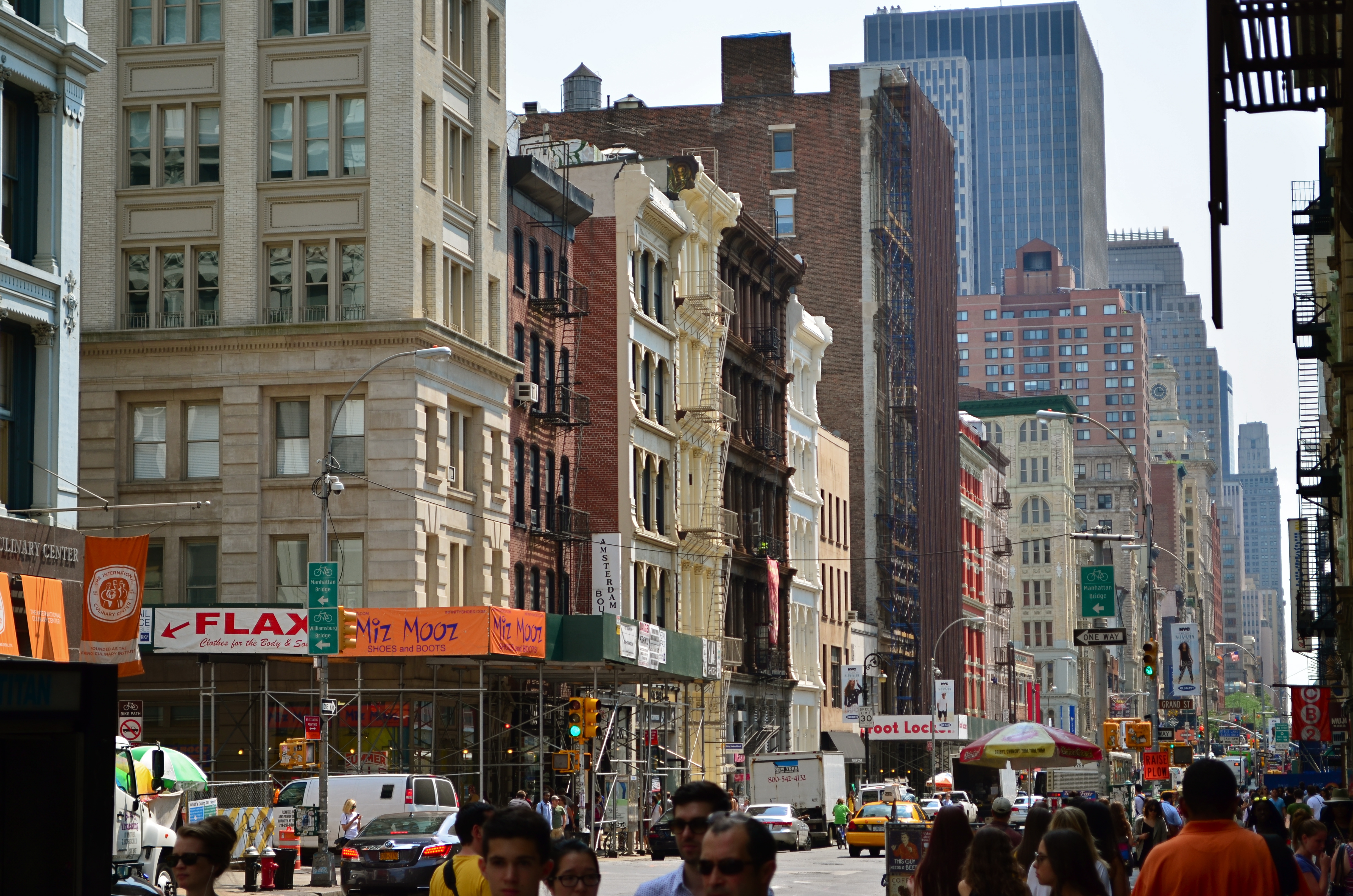
CHOCK-A-BLOCK
Yes, you could find a more frustrating job than making city maps for Boston streets. But you’d have to look hard….
By MICHAEL PERKINS
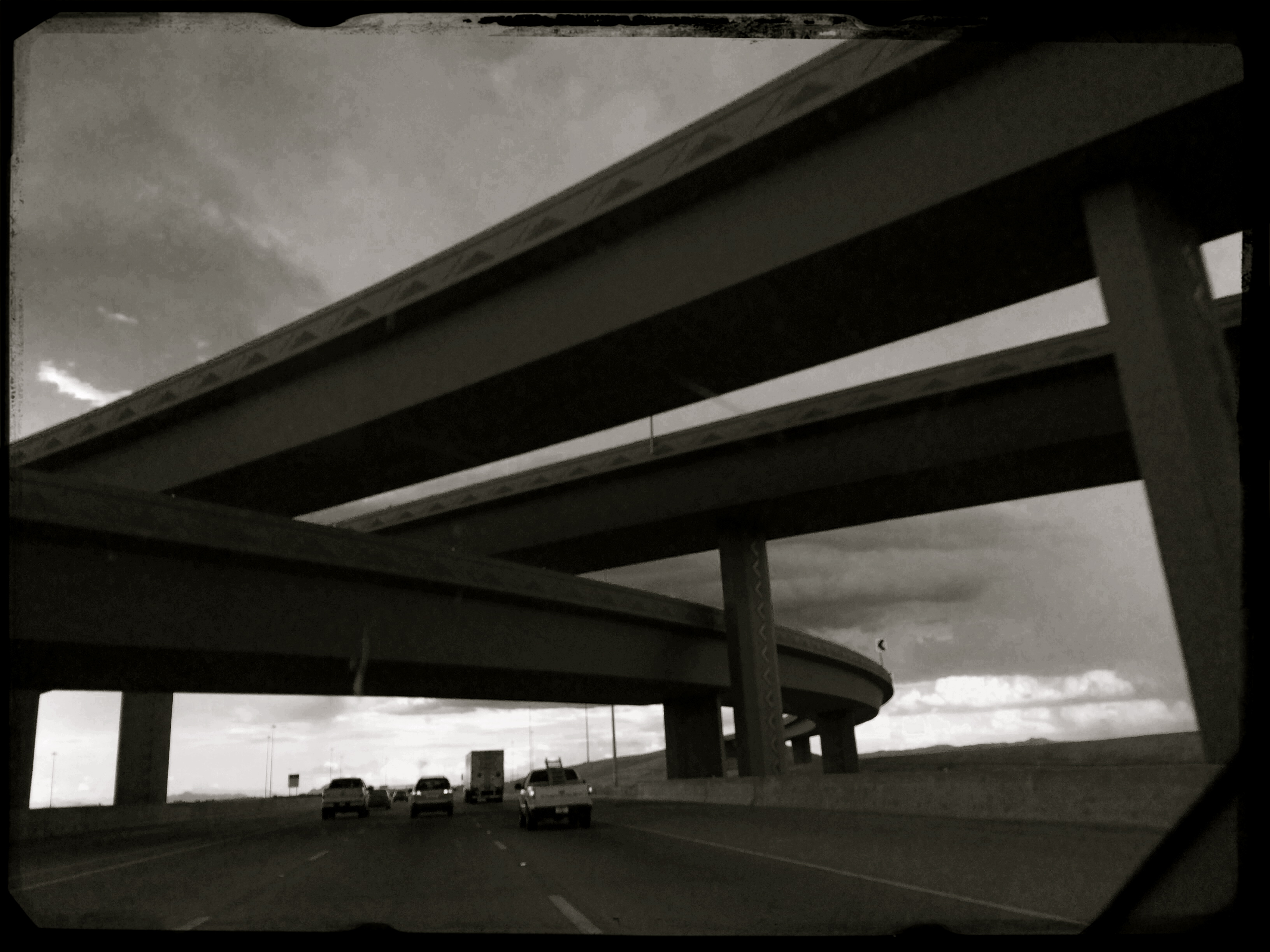
WHEN WE THINK OF URBAN BLOCKS, IT’S NATURAL TO THINK of those blocks as regular rectangles, well-regulated, even streets that run at direct parallels or hard right angles to each other. And while there certainly are cities with such mathematically uniform grids, some of the most interesting cities in the world don’t conform to this dreamy ideal in any way. And that means opportunities for photographers.
We’ve all seen street scenes in which the left and right sides of the road vanish directly toward the horizons, like staring down the middle of a railroad bed. But for the sake of dramatic urban images, it’s more fun to seek out the twisty mutants of city design; the s-and-z curves, the sudden zigzags, the trapezoids and triangles which signify confusion to cabbies and pedestrians but which mean good times for photogs. Let’s face it; snapping pictures of orderly things gets old fast. The very nature that makes us idealize “rightness” also makes us want to photograph “wrongness.”
That’s why I love to shoot in towns where the city was laid out with all the logic of the Mad Hatter on speed, those streets that seem barely coherent enough to admit the successful conduct of trade. Cities where locals and visitors alike curse the names of the urban planners, if there ever had been planners, if there ever had been a plan. A grand collision of avenues and alleys that looks like a kid whose teeth are crowding together in a greedy orthodontist’s dream fantasy. In such cities, including Manhattan, Pittsburgh, San Francisco, Boston and many others, “order” is a relative term. There are precious few neat streets vanishing back to infinity, politely lined by cooperative structures queueing up parallel to the curb. And that’s my kind of living, breathing… chaos.
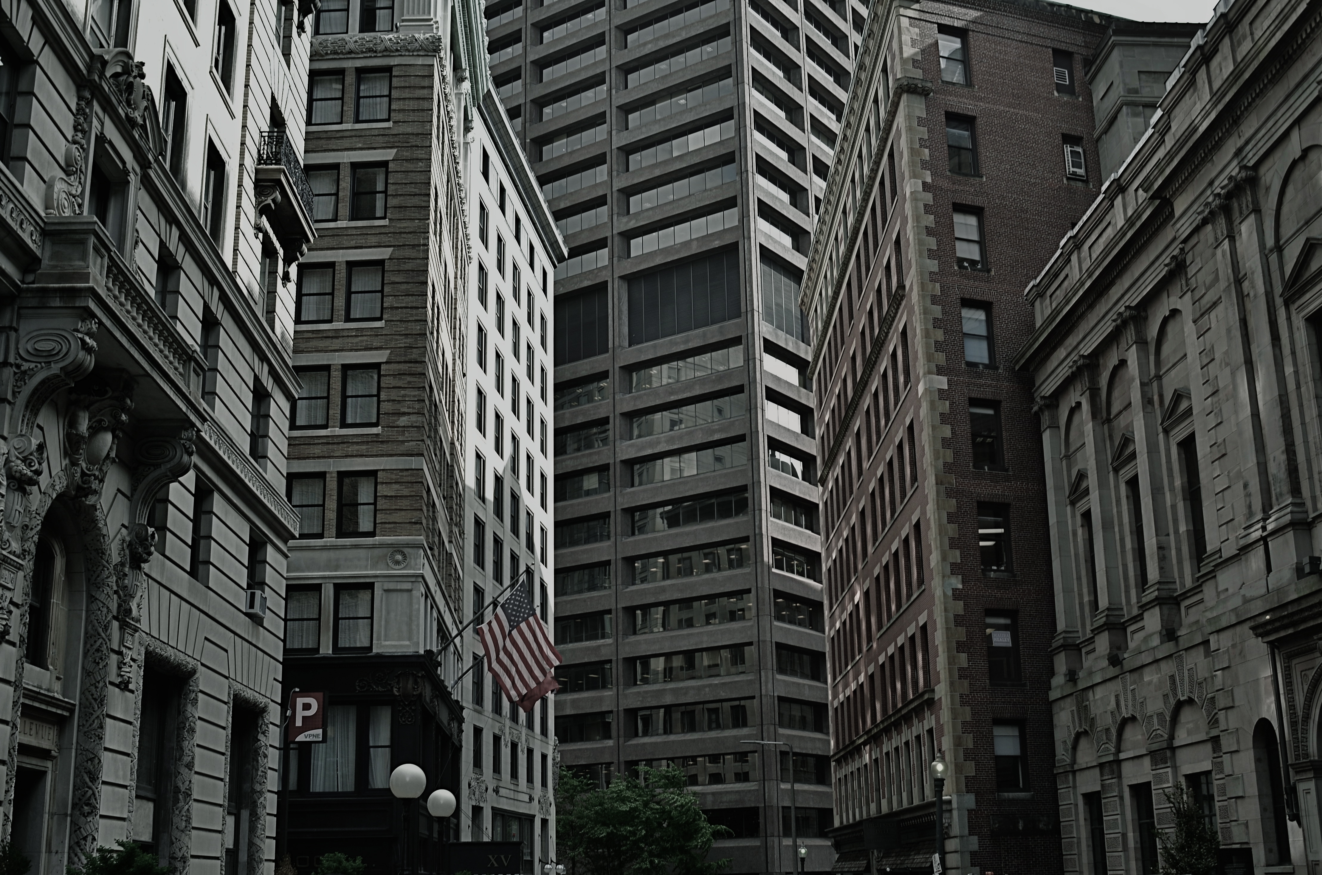
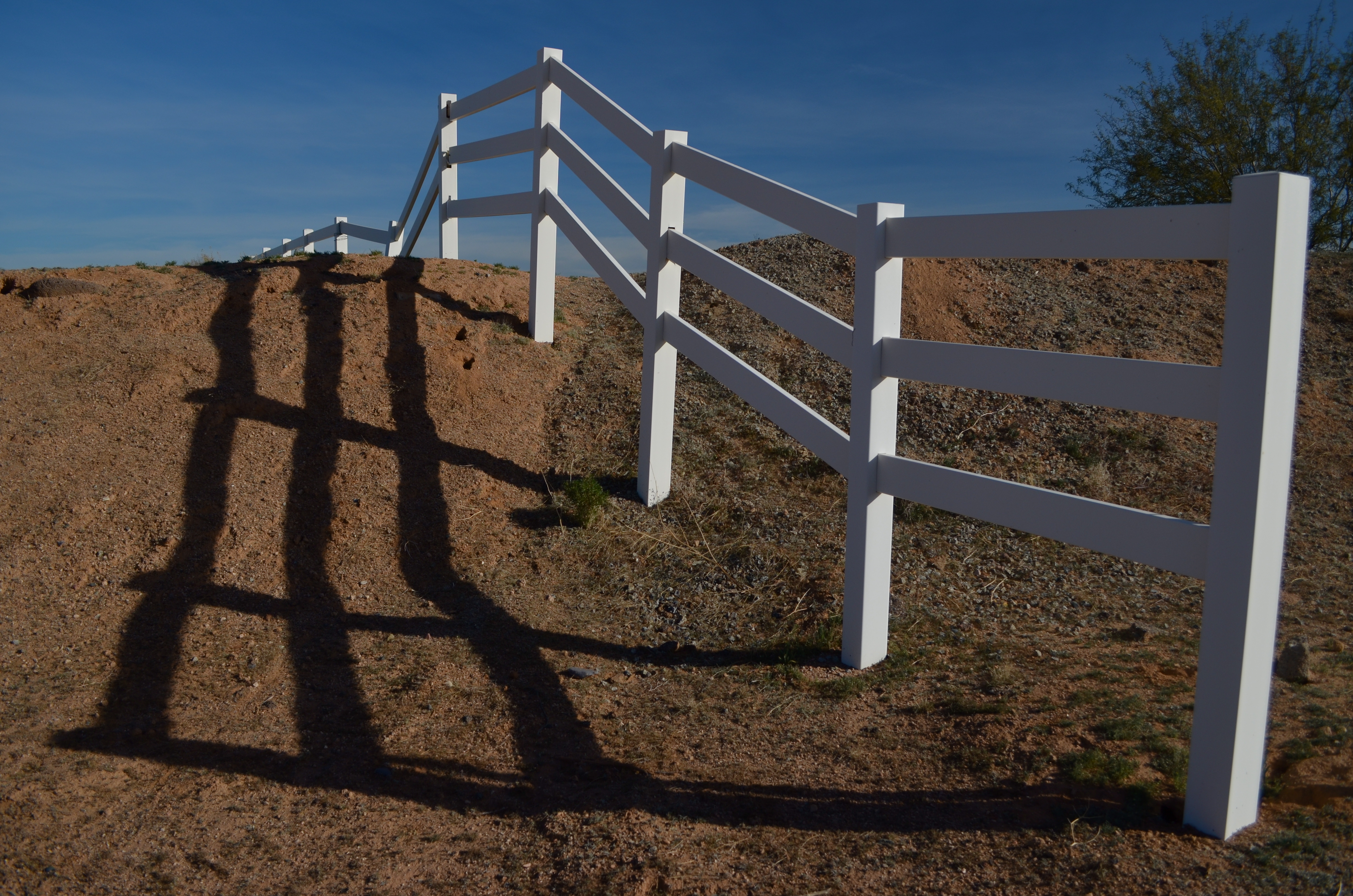
As a mild example, consider the Boston street shown above, on which nearly every building seems slightly askew from every other building, sitting on foundations that jut out at every conceivable angle and plane. It’s a grand, glorious mess, and a much more interesting way to show the contrasting styles that have sprouted in the neighborhood over the centuries. It’s reality that looks like an optical illusion, and I can’t get enough of it.
A straight line may be the shortest distance between two points, but it’s also the least interesting. Go find cities that make no sense, God bless ’em.
WHERE THE RUBBER MEETS THE ROAD
Convergences, 2015. A through-the-window iPhone quickie. Grainy, noisy, fun.
By MICHAEL PERKINS
MY WIFE AND I HAVE REACHED A REASONABLE DIVISION OF LABOR as regards road trips, with her taking on the nation’s freeways like an original cast member of The Road Warrior and me decoding various navigational vectors, from AAA maps to iPhones, as well as uber-producing the in-car tune mix. Everybody to their strengths and all that. This arrangement also frees me up to pursue the mythical goal of Immortal Photograph I Shot Out A Car Window, which will also be the title of my Pulitzer Prize acceptance speech.
Any day now.
Most of these potential world-beater images have been attempted through the front windshield, where it is at least a little easier to control blur, even glass reflection. Additionally, the majority of them, more and more, are done on mobile phones, which is not the greatest for resolution, but gives you that nice exaggeration on dimensions and depth that comes with a default wide-angle lens, which, in some cases, shoots broader vistas than even the kit lens on your “real” camera.
If you find yourself doing the same thing, you have no doubt noticed that you must get really, really close to your subject before even mountains look like molehills, as the lens dramatically stretches the front-to-back distances. You might also practice a bit to avoid having 10,000 shots that feature your dashboard and that somewhat embarassing Deadhead sticker you slapped on the windshield in 1985.
So, to recap: Shoot looking forward. Use a mobile for that nice cheap arty widescreen look. Frame so your dash-mounted hula girl is not included in your vistas (okay, she does set off that volcano nicely..). And wait until you’re almost on top of (or directly underneath) the object of your affection.
And keep an ear out for important travel inquries from your partner, such as: “are you gonna play this entire Smiths CD?”
Sorry, my dear. Joan Baez coming right up.
POINTERS
A traditional wide-angle approach to the suggestion of depth.
By MICHAEL PERKINS
WE ALL WENT THROUGH THAT OLD PERSPECTIVE EXERCISE IN ART 101. You know, the one where we draw the train tracks trailing away to an imaginary horizon, compressing the distance between the tracks as they “recede” to suggest depth, or a simulation of the way our eyes perceive it. It’s a lesson that dances somewhere back in our lizard brain whenever we compose a shot to suggest three dimensions on a flat plane (film or sensor) that only possesses two. Ongoing challenge, etc., etc.
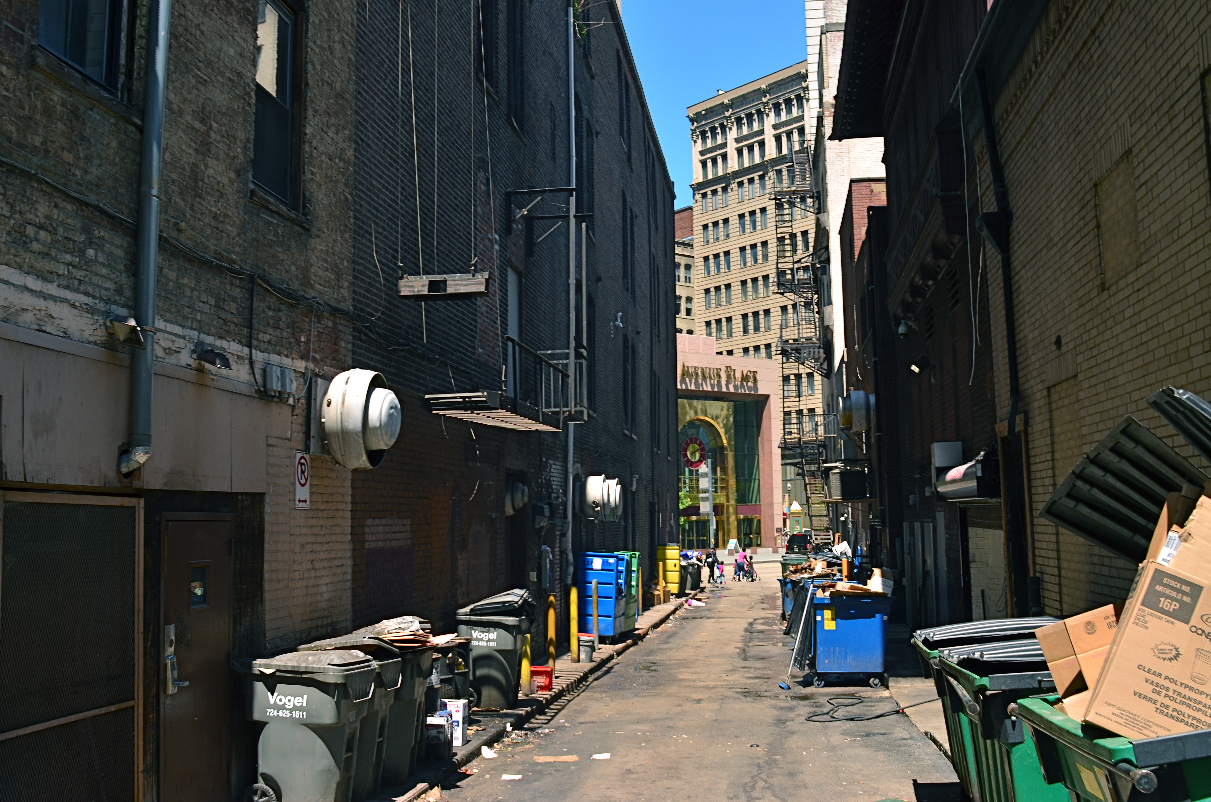
In composing a photograph, it’s pretty easy to decide which factors in the picture actually aid that illusion, creating a big fat neon arrow to the thing we’re want to draw attention to. And some ways are better than others at selling that idea. One of the strong myths about these kinds of shots is that you need a wide-angle to make the argument for depth. Of course, that’s like a lot of “rules” in photography. It’s always true, except in those cases when it’s kinda…not.
In the top image, shot with a 24mm lens, the building at the back of the shot is lit better than the two alley walls that lead to it….a basic no-brainer of a composition. Moving left or right a bit can put the major emphasis on one wall or the other to be the arrow pointing to that object, or you can make the shot even more compact, although no less effective, in the cropping process.
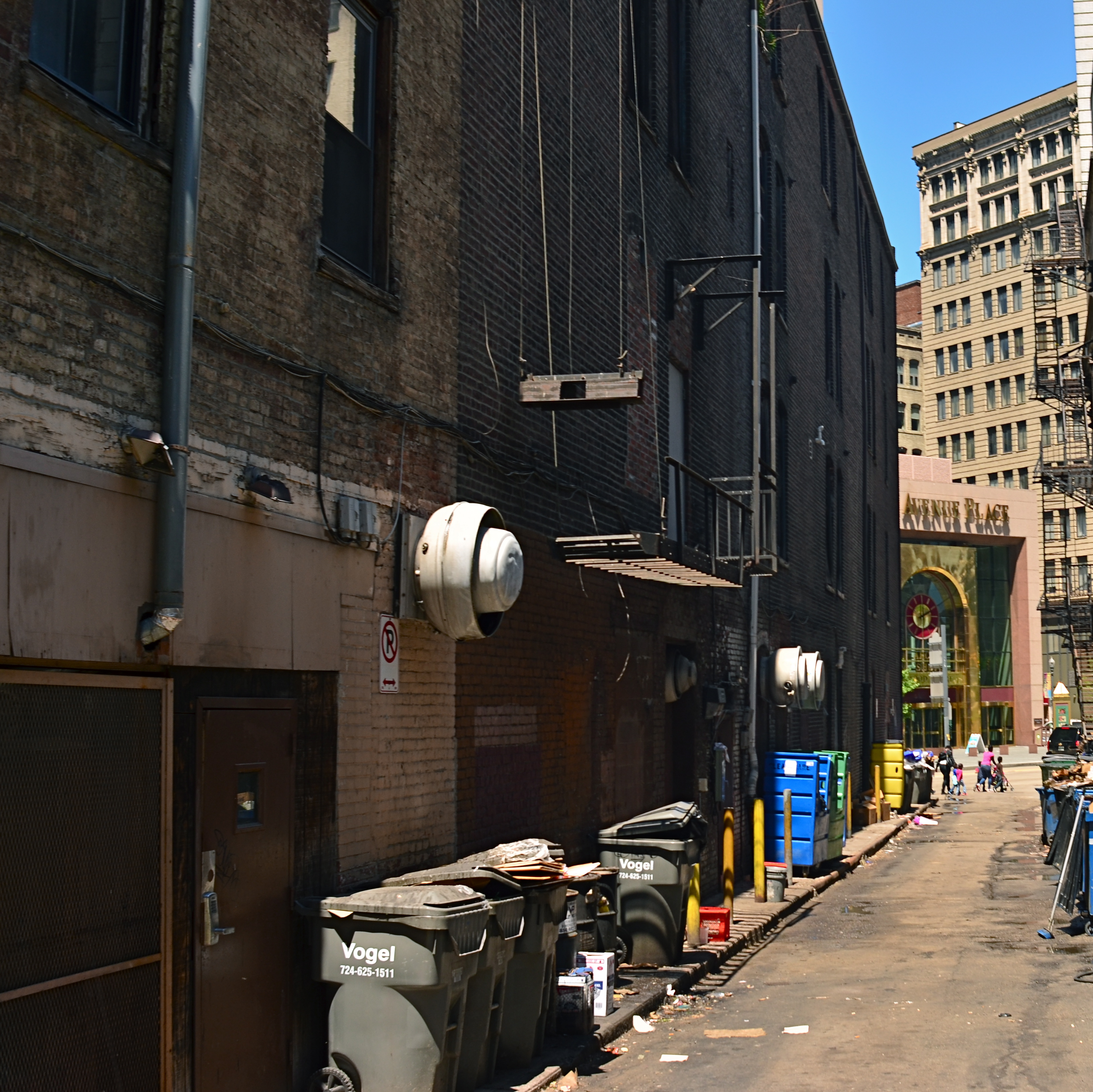
Instead of two leading lines heading for the building at the back, let’s try just one.
Of the two walls, the rows of trash cans and receding lines of windows on the left seem, at least to me, to lead more powerfully to the back building than the right, where detail is darker and objects that could act as a leading line are a little more angled and compressed. Just for kicks, I cropped the shot to a square you see just above, reframing the back building as the end of a straight, single diagonal along the left wall, making the instruction to the eye a lot more streamlined.
It’s not that the fuller frame is “wrong” per se, but I always believe that inside many shots just might be a better shot waiting to get out. Some photographs are full-born in-camera, while others emerge during what I call the “on second thought” phase.
Now to try this idea out at a railroad crossing….
CHANGE YOUR ATTITUDE
By MICHAEL PERKINS
PHOTOGRAPHY IS OFTEN A GAME OF INCHES, a struggle in which outcomes vary wildly based on small, rather than large issues. Early photographers learned this the hard way, since their limited gear forced them to innovate composition and exposure with tiny tweaks that slowly but gradually added more refined skill to their work and better performance from their equipment. Ernest Haas’ great quote that a wide-angle lens is just as close as taking three steps backward still holds true. What has changed is that we have a greater tendency to think that we need more tech to make better pictures. That concept, simply, is poppycock.
For years, the option of a zoom lens was out of the question for the average photographer. The consumer-level zooms that existed were often optically inferior to standard or wide-angle glass (as testified to by Annie Leibowitz and other heavyweights), and so composition was acquired by physically closing or widening the actual distance between yourself and your subject. This is not to say that zooms didn’t eventually prove amazing tools, because they have. However, they demonstrate and instance in which tech has automated, and thus eliminated, an extra step of mindful concentration that used to reside solely in the photographer’s brain. This can lead, over time to an over-reliance on the gear to bring everything home, something it cannot ever do.
Learning to simply maximize the effect of whatever you have up front of the shutter is the easiest, and yet most overlooked aspect of many people’s work. We’d spend a lot less time lugging and swapping lenses if we knew how far we could push whatever we’ve got attached at the moment, and, indeed, masters like Scott Kelby, author of the best-selling Digital Photography Book series, has several “why change lenses? hunks of glass like the 18-200mm that can get him through an entire day without a swap. This works because he works a little harder at exploiting everything his gear can do.
Wide-angle lenses deliver a variety of effects beyond just width.
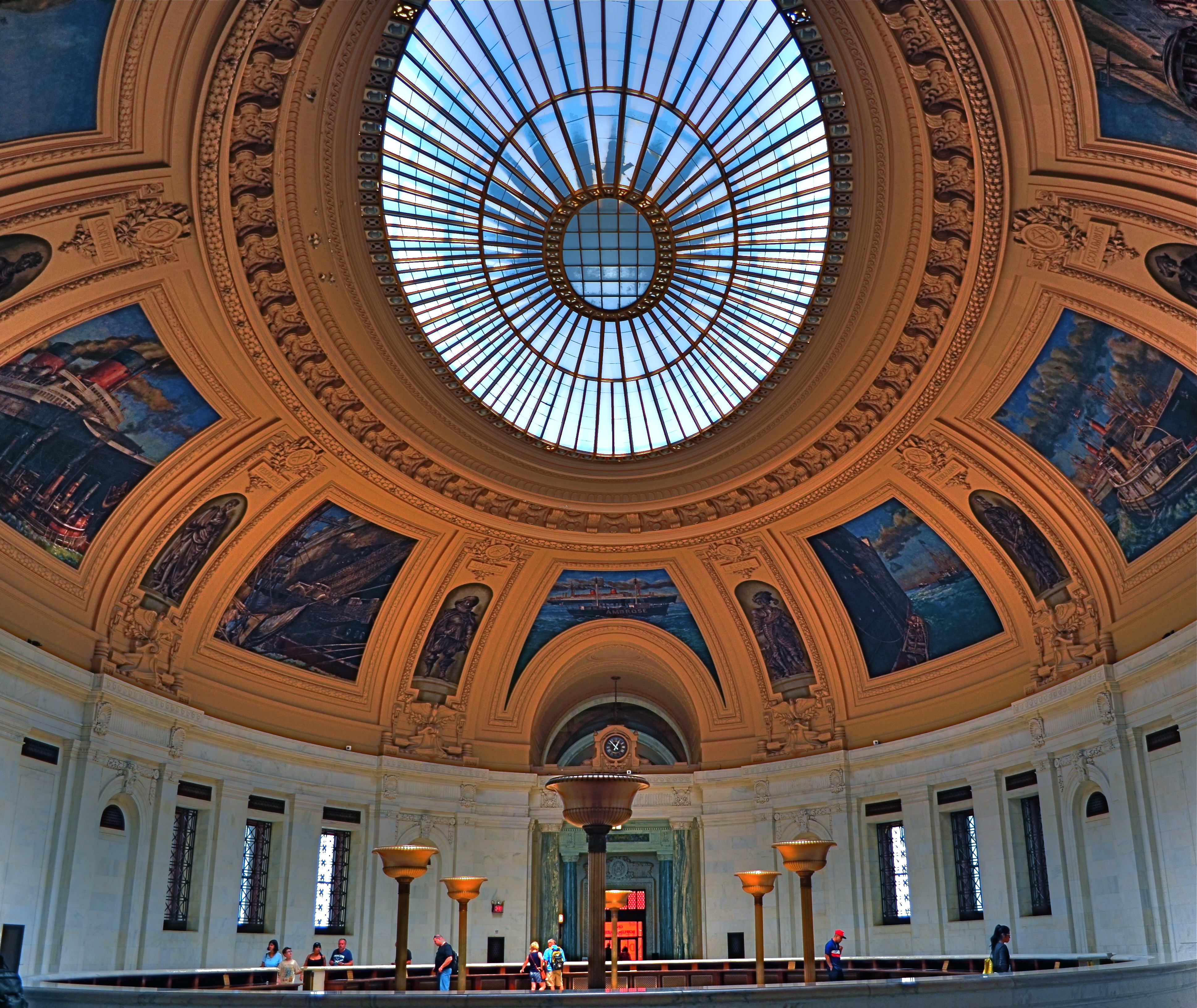
Consider the above image. It’s taken at 18mm, but, because I arched the shot upwards, instead of maintaining a level horizon line, I forced the lens to do a little more of what it was originally designed to do….exaggerate dimensions and distances. The development of wide-angle lenses was, after all, pursued by shooters who wanted an enhancement, an interpretation, and not a recording, of reality. As such, the wide-angle in this shot over-accentuates the most prominent feature of this room within the old U.S. Customs building in Manhattan…its amazing murals. It also creates an illusion of vastness, front-to-back, in a room that is already pretty huge. And this is all done by pivoting my head upward about 30 degrees.
The game of inches is the great equalizer in photography between pro and amateur, because it gives the advantage to those who plan the best, see the most, and think the widest. And you don’t need a closet full of geegaws to do that.
THE LONG AND SHORT OF IT
This original frame was just, um, all right, and I kept wanting to go back and find something more effective within it.
By MICHAEL PERKINS
THE INTRODUCTION OF THE FIRST PANORAMIC CAMERAS in the 1840’s can be seen as a freeing-up of the camera frame, a way to more accurately depict the entire field of view open to the human eye. And, of course that’s true. However, the first panos were also an early attempt by photographers to deliberately direct and orchestrate not only what you see, but how they want you to see it. Let’s concede that the western mind tends to absorb information in linear fashion. We read from left to right, we scan the horizon, and so forth. So making a photograph that instructs you to interpret horizontally is fairly natural.
So the first panos seem like a fairly modest extension of our visual bias. But think about the fundamental change that represented. Suddenly, photographers were saying, there are no rules except the rules I dictate. I decide what a frame is. I arrange not only the information inside the frame, but the frame itself. By re-shaping the box, I re-shape what you are to think about what’s in the box. That’s revolutionary, and today’s shooters would be wise to be mindful of that wonderful power.
I am fond of making what I will generously call “carved” panoramics, shots that began as standard framings but which I have cropped to force a feel of left-to-right linearity. Unlike standard panoramics, the shots were conceived and made with a very different compositional strategy, not necessarily trying to tell a horizontal story. However, on review, some stories-within-stories contain enough strong information to allow them to stand as new, tighter compositions in which the new instruction to the viewer’s eye is quite different from that in the original.
Change the frame, change the message.
The full shot seen at the top of this page may or may not succeed as a typical “urban jungle” snap, in part because it contains both horizontal and vertical indices that can pull the eye all over the place. Since I wasn’t amazed by the shot itself, I decided to select a horizontal framing from its middle real estate that purposely directed the eye to laterally compare the facades of several different buildings stacked tightly down the street. Full disclosure: I also re-contrasted the shot to make the varying colors pop away from each other.
The result still may not be a world-beater, but the very act of cutting has re-directed the sight lines of the picture. For better or worse, I’ve changed the rules of engagement for the photograph. When such surgeries work, you at least fix the problem of extraneous clutter in your pictures, making them easier to read. Then it’s down to whether it was a good read or a beach read.
Hey, the box can’t fix everything.
NOT AS ULTRA
At its widest (18mm) setting, an 18-55 lens exaggerates front-to-back distances and slightly distorts the shapes of objects.
By MICHAEL PERKINS
SINCE THE 1990’s, THE MOST COMMON BASIC HUNK OF PHOTOGRAPHIC GLASS for new DSLRs has been the 18-55mm wide-angle, dubbed the “kit lens”. It allows beginners to move from landscape-friendly wides to moderate zooms without switching lenses. Depending on how much a given shooter experiments, the kit can allow for a lot of nuanced compositional options between the lens’ range.
If you find yourself shooting at the widest angle most of the time, then you are really using an effects lens, since, at 18mm, the lens is more than wide enough to distort angles and distances in ways that, while dramatic, don’t reflect the way your eyes actually see. This makes for expansive vistas in crowded urban streets and a little extra elbow room for mountain views, but is substantially more exaggerated than focal ranges from 35-50mm, which produce proportions more like human eyesight. However, the focal length you eventually choose has to be dictated by what you care to create; there can’t be any yardstick than that, all people’s opinions off to the side.
The same scene, taken from the same location at 24mm. Still plenty wide but displaying more normal space and perspective.
I have found a personal sweet spot by going a tad narrower, back to 24mm, and I also work with a dedicated prime lens that will only work at that exact focal length. By trimming back from 18mm, I find the distances from front to back in an image are a little more natural to my eye, and that I still have a yard of room from side to side without ushering in that Batman-type bending of perspective.
For comparison, I have re-shot subjects that I’d photographed at 18mm and found, at 24, no loss in impact. In the images in this post you can see the difference in how the two settings frame up. The composition in the 24 is a little tighter, but, if that’s not wide enough for you, you can simply step back a bit and there’s the same composition you saw in the 18, albeit with a little more normal proportion.
The most important thing with a variable focal length lens is to give yourself the flexibility of being able to get good results all through the focal range, simply to avoid getting too comfortable, i.e., sliding into a rut from always doing everything in the same way. Putting yourself into unfamiliar territory is always a good route to growth, and playing with your gear long enough to know everything it has to give you is the best way to periodically refresh your enjoyment.
When Grandma serves broccoli, you don’t gotta eat and pound-and-a-half of it, but heck, try it. You might like it.
PRIME OPPORTUNITY
It’s wide. It’s sharp.Its proportions are natural. What else do I need in this image, shot with a 35mm prime lens, that dictates shooting it with a wideangle zoom?
By MICHAEL PERKINS
SOMEWHERE BETWEEN THE END OF THE FILM ERA AND THE DAWN OF THE DIGITAL AGE IN PHOTOGRAPHY, there was a profound change in what camera manufacturers defined as a “starter” lens for new owners. Many shooters, including your humble scribbler, have wondered just why an 18-55 “kit lens” zoom became the glass that was included with the purchase of a digital SLR, when the baseline lens for film shooters had most typically been a 35mm prime. This is especially puzzling since the kit lenses sold by many makers are optically inferior to a prime in several key respects.
Primes, or “normal” lenses, have one focal length only, and so cannot zoom at all, but they out-perform many of today’s zooms on sharpness, clarity, speed, aesthetic blur (or “bokeh”), and portability. Their proportions are more similar to those seen by the human eye (thus the “normal” tag) and so do not create distortion at, say 24mm, a range at which some banding creeps into a zoom at the same focal length. They also will not exaggerate front-to-back distances as seen in a super wide-angle, meaning that an 8×10 room does not resemble a bowling alley.
So what does a wide-angle zoom bring to the party? Not much, beyond the convenience afforded by zooming out with the twist of a barrel, filling your frame in seconds but, ironically, making you less mindful of the composition of your shot. The few extra seconds needed to compose on a lens that can’t zoom means that you act more purposefully, more consciously in the making of an image. You, and not the lens, are responsible for what’s included or cut.
But let’s assume that you want the kit lens for its wide-angle. This is also no problem for a prime lens. Yes, it’s as wide as it will ever be at a single focal length, but you can change what it sees by just stepping backwards. A 35mm prime is plenty wide depending on where you stand. It’s not like you can’t capture a large field of view from left to right. Just place yourself in the right place and shoot.
Yes, there are times when physical restrictions dictate “jumping the fence” by using your zoom to take you where your legs won’t go, but you can count those occasions on half the toes of a frostbitten foot. Look at the above shot. What else do you need in the shot that would require a wide-angle zoom to capture? And if the zoom can only open to f/3.5 at its widest aperture, why not use the prime and gain the ability to go all the way to f/1.8 if needed?
Here’s the deal: if you can walk to your shot and use a better, less expensive piece of glass once you get there, why use a zoom? If you can avail yourself of remarkable sharpness and fill your frame with everything you need, free of distortion, and gain extra speed, why use the wideangle? Huh? Huh? Riddle me that, Batman.
WHAT SIZE STORY?
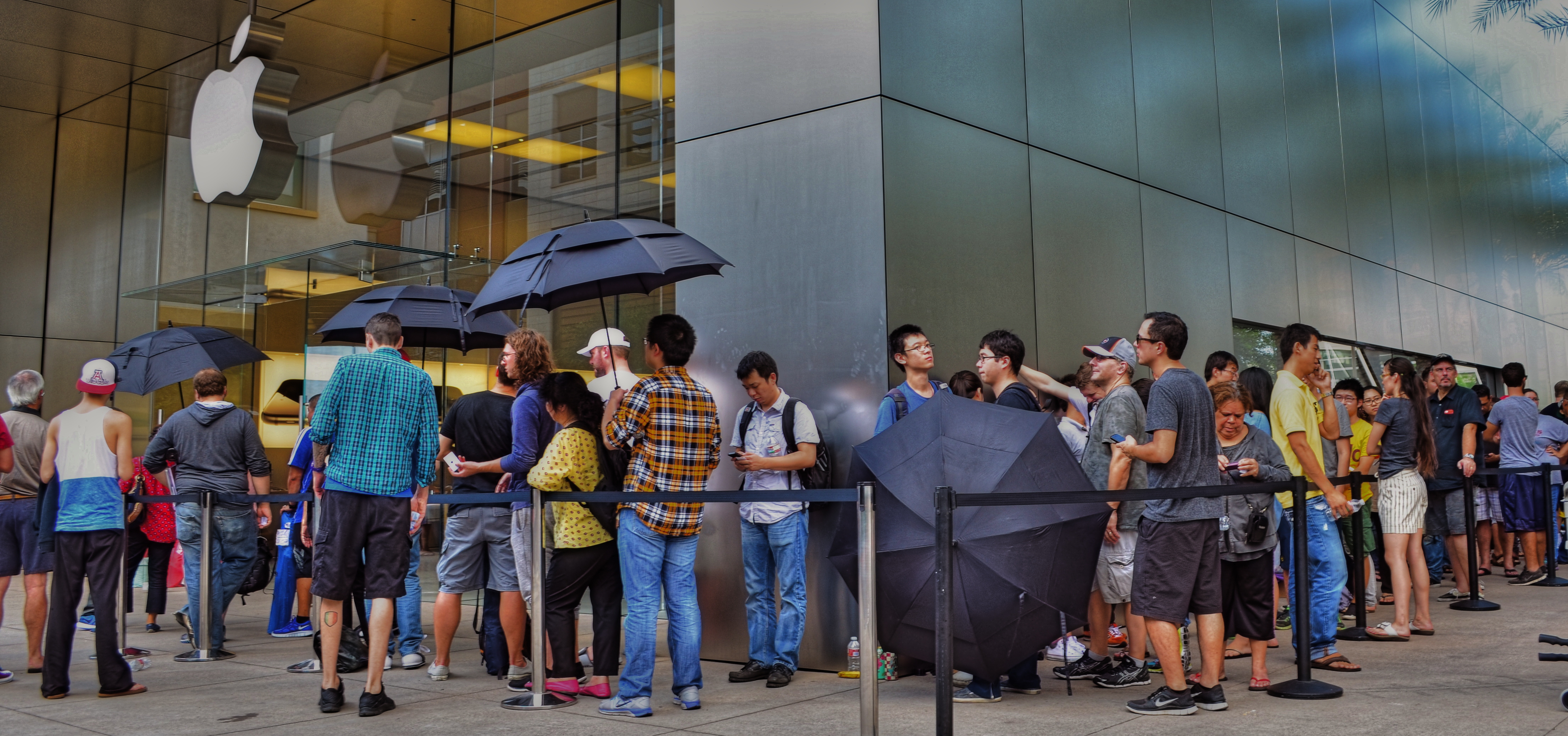
iPhone 6 debut at Apple Store in Scottsdale, Arizona, September 19, 2014. Sometimes the story is “the crowd…”
By MICHAEL PERKINS
IN THE EARLY 1950’s, AS TELEVISION FIRST BLINKED INTO LIFE ACROSS AMERICA, storytelling in film began to divide into two very clearly defined camps. In theatres, desperate to retain some of the rats who were deserting their sinking ships to bathe in cathode rays at home, movie studios went for stories that were too big to be contained by the little screen, and almost too big for theatres. You remember the wider-than-thou days of Cinemascope, VistaVision, Todd-Ao, Cinerama and Super-Panavision, as well as the red-green cardboard glasses of 3-D’s first big surge, and the eye-poking wonders of House Of Wax, Creature From The Black Lagoon and Bwana Devil. Theatres were Smell-O-Vision, True Stereophonic Reproduction and bright choruses of Let’s Go Out To The Lobby sung by dancing hot dogs and gaily tripping soda cups. Theatres was Big.
The other stories, the TV stories, were small, intimate, personal, compact enough to cram into our 9-inch Philcos. Tight two-shots of actors’ heads and cardboard sets in live studios. It was Playhouse 90 and Sylvania Theatre and The Hallmark Hall Of Fame. Minus the 3,000 Roman extras and chariot races, we got Marty, Requiem For A Heavyweight, and On The Waterfront. Little stories of “nobodies” with big impact. Life, zoomed in.
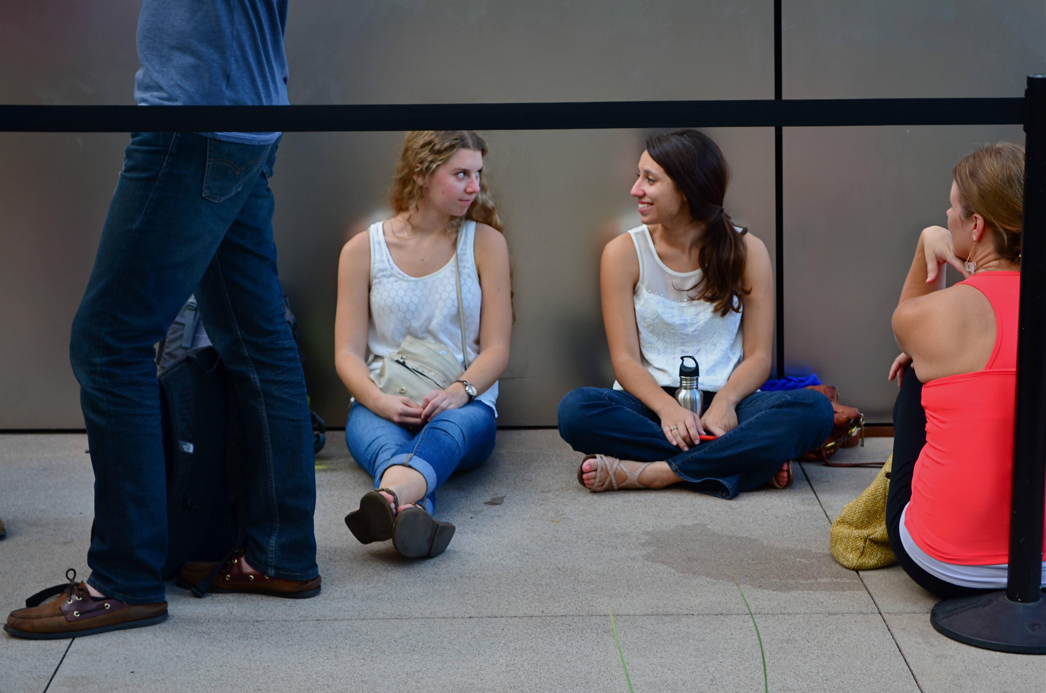
…but, within that crowd, there are “little” stories.
For photographers, pro or no, many stories can be told either in wide-angle or tight shot. Overall effect or personal impact. You can write your own book on whether the entire building ablaze is more compelling than the little girl on the sidewalk hoping her dog got out all right. Immense loads of dead trees have been expended to explore, in print, where the framing should happen in a story to produce shock, awe or a quick smile. I like to shoot everything every way I can think of, especially if the event readily presents more than one angle to me.
The release of the new iPhone 6, which dropped worldwide today, is a big story, of course, but it consists of a lot of little ones strung together. Walk the line of the faithful waiting to show their golden Wonka ticket to gain admission to the Church of Steve and you see a cross-section of humankind represented in the ranks. Big things do that to us; rallies, riots, parties, flashmobs, funerals….the big story happens once a lot of little stories cluster in to comprise it.
Simply pick the story you like.
Remember, just like the phone, they come in two sizes.
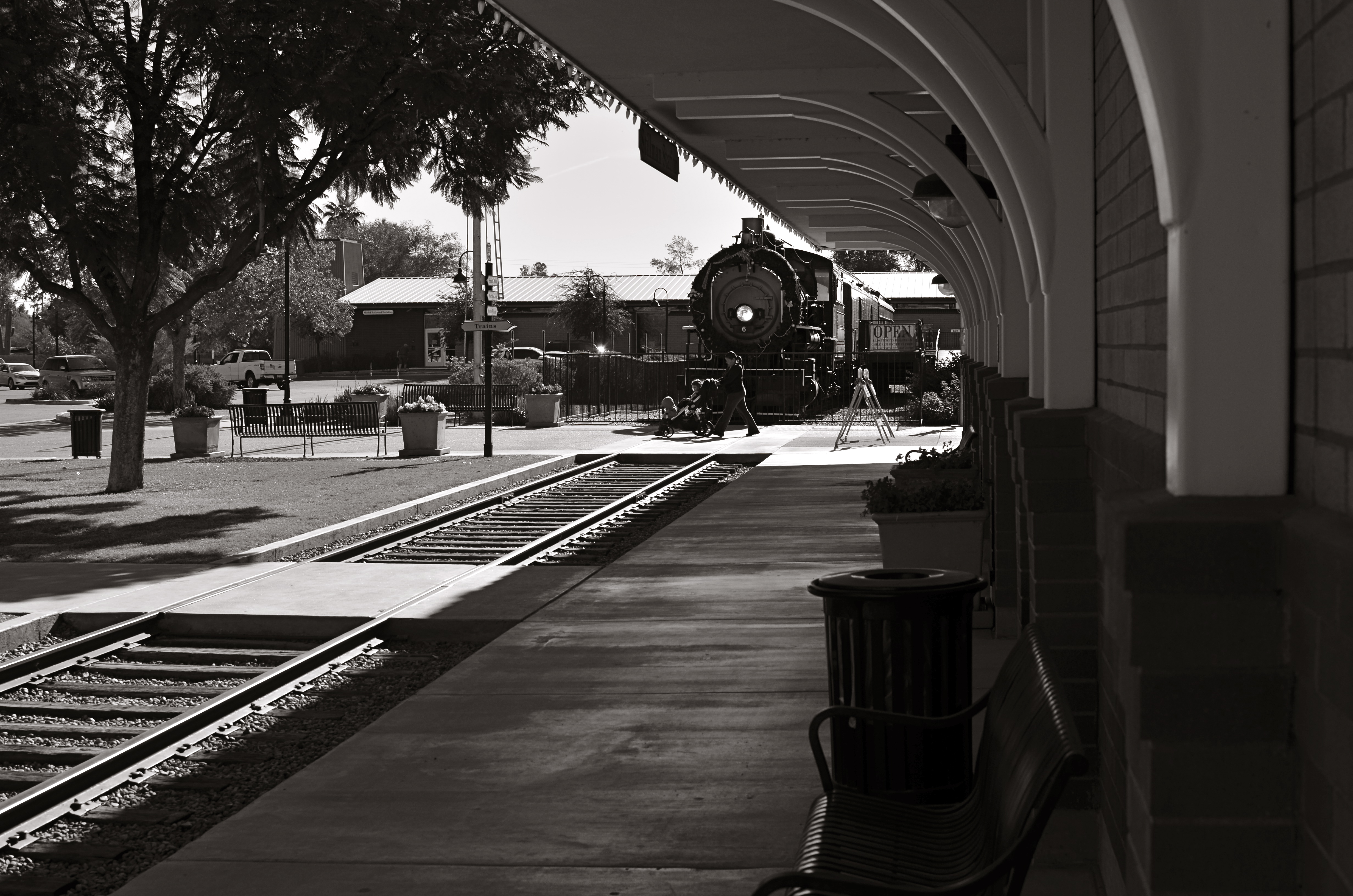
ON THE STRAIGHT AND NARROW
New & Beaver, 2014. 1/200 sec., f/5.6, ISO 100, 18mm.
By MICHAEL PERKINS
THE NARROW STREETS OF LOWER MANHATTAN WERE NEVER DESIGNED TO ACCOMMODATE the claustrophobic jam of commerce, foot traffic and skyscrapers that have characterized the neighborhood since the early 20th century. I should back that up and acknowledge that, for some locals, the streets of lower Manhattan were never designed,period. New York’s growth has always come in rangy spurts and jolts, much like a gangly adolescent that shoots upward and outward overnight without any apparent plan, and yet, those unruly explosions are also what delight the photographer’s eye and make the city an inexhaustible laboratory for technique.
Shooting down the slits that pass for side streets and alleys in lower Manhattan is enough to make even the most seasoned native feel like he or she is being shut up in a tomb, but I am drawn to going even further, and over-emphasizing the extreme dimensions peculiar to the area. That, for me, means shooting with as wide a lens as I have handy, distortion be damned. Actually, it’s distortion be welcomed, since I think that the horizontal lines of the buildings create a much more dramatic lead-in for the eye as they race far away from the foreground. And since ultra-wide magnify front-to-back distances, the bigness and closeness of the city is jacked into a real exaggeration, but one that serves my purpose.
It helps to crouch down and tilt up when composing the shot, and to make sure that you don’t crop passersby out of the shot, since they will add to the drama even more as indications of scale. I have certainly gone too far more than once and rendered rectangular buildings into futuristic trapezoids, but the aim of each image will dictate what you’re going for. Also, in many of these shots, I decide, after much dithering, to choose monochrome over color, but I always shoot the originals in color, since they respond better to re-contrasting once they’re desaturated.
The magic about Manhattan is that no camera can ever tame her or show all her beauty and/or ugliness. It’s somthing of a fool’s errand to try to take the picture of NYC. Better to take a picture you like and add it to the ongoing story.
ON THE NOSE (AND OFF)
I had originally shot the organ loft at Columbus, Ohio’s St. Joseph Cathedral in a centered, “straight on” composition. I like this variation a little better. 1/40 sec., f/3.5, ISO 1000, 18mm.
By MICHAEL PERKINS
AMONG THE GROUPS INVITING FLICKR USERS TO POST PHOTOGRAPHS OF A CERTAIN THEME OR TYPE, there is a group called, “This Should Be A Postcard”, apparently composed of images that are so iconically average that they resemble mass-produced tourist views of scenic locales. The name of this group puzzles me. I mean, if you called it, “Perfectly Ordinary, Non-Offensive and Safe Pictures of Over-Visited Places”, people would write you off as a troll, but I’d at least give you points for accuracy. It’s hard to understand why any art would aspire to look like something that is almost deliberately artless.
And still, it is perceived as a compliment to one’s work to be told that it “looks just like a postcard”, and, I swear, when I hear that remark about one of my own images, my first reaction is to wipe said image from the face of the earth, since that phrase means that it is (a)average, (b) unambitious), (c) unimaginative, or (d) a mere act of “recording”. Look, here’s the famous place. It looks just like you expect it to, taken from the angle that you’re accustomed to, lit, composed and executed according to a pre-existing conception of what it’s “supposed” to be. How nice.
And how unlike anything photography is supposed to be about.
This conditioning we all have to render the “official” view of well-known subjects can only lead to mediocrity and risk aversion. After all, a postcard is tasteful, perfect, symmetrical, orderly. And eventually, dull. Thankfully, the infusion of millions of new photographers into the mainstream in recent years holds the potential cure for this bent. The young will simply not hold the same things (or ways to view them) in any particular awe, and so they won’t even want to create a postcard, or anyone else’s version of one. They will shudder at the very thought of being “on the nose”.
I rail against the postcard because, over a lifetime, I have so shamelessly aspired to it, and have only been able to let go of the fantasy after becoming disappointed with myself, then unwilling to keep recycling the same approach to subject matter even one more time. For me, it was a way of gradually growing past the really formalized methods I had as a child. And it’s not magic.Even a slight variation in approach to “big” subjects, as in the above image, can stamp at least a part of yourself onto the results, and so, it’s a good thing to get the official shot out of the way early on in a shoot, then try every other approach you can think of. Chances are, your keeper will be in one of the non-traditional approaches.
Postcards say of a location, wish you were here. Photographs, made by you personally, point to your mind and say, “consider being here.”
OH, IT’S HIDEOUS. I LOVE IT.
By MICHAEL PERKINS
THERE MAY BE NO RULES LEFT TO BREAK IN PHOTOGRAPHY, in that everybody is comfortable doing absolutely anything….compositionally, conceptually, technologically…to get the picture they want. Maybe that’s always the way it’s been, seeing as the art of image-making, like the science of breeding apple trees, has always grown faster and stronger through cloning and grafting. Hacks. Improvisations. “Gee-What-If”s.
Shots in the dark.
Not a bad starting point, but either too pretty, or not ugly enough…or something.
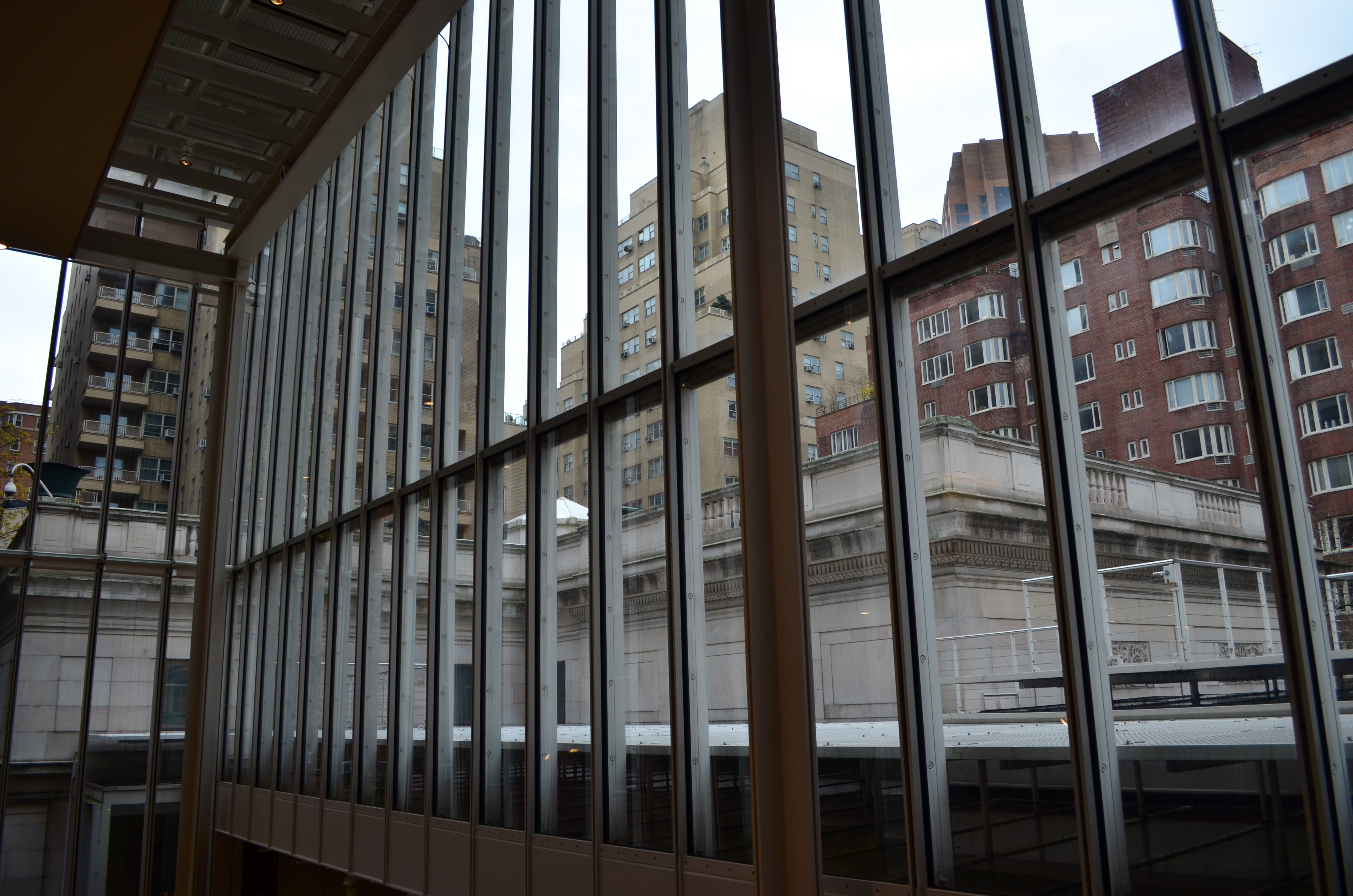
Recently I walked out into the gigantic atrium that connects all of the original buildings of the Morgan Library complex in NYC to get a good look at the surrounding neighborhood of big-shouldered buildings. I was fascinated by the way my wide-angle lens seemed to line up the horizontal grid lines of the atrium with the receding lines of the towers and boxes down the block. Only one thing bothered me about the result: the color, or rather, the measly quality of it.
A rainy day in Manhattan is perhaps the final word on rainy days. Some colors, like the patented screaming yellow of a New York cab, or the loud neon reds of bodegas, are intensified into a romantic wash when the drops start. This view, however, was just a bland mash of near-color. If the neighborhood was going to look dour anyway, I wanted it to be dour-plus-one. Thing is, I made this, ahem, “artistic” decision after I had already traveled 3,000 miles back home. In the words of Rick Perry, whoops.
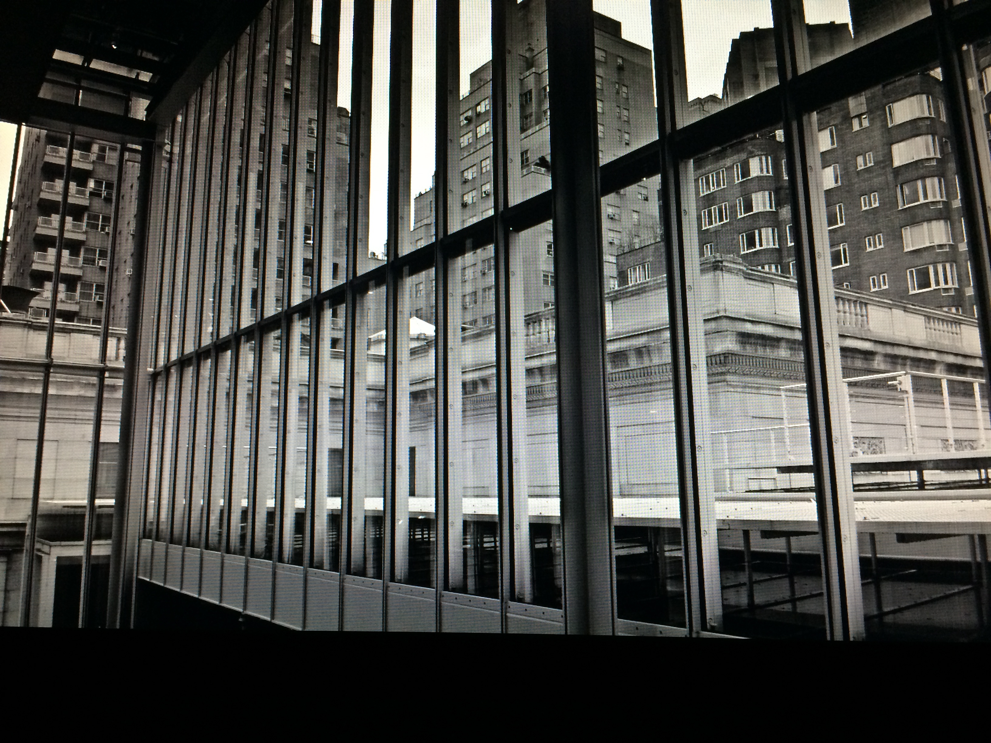
Time to hack my way to freedom. I remembered liking the look of old Agfa AP-X film in a filter on my iPhone, so I filled the screen of my Mac with the bland-o image, shot the screen with the phone, applied the filter, uploaded the result back into the Mac again, and twisted the knobs on the new cheese-grater texture I had gained along the way. At least now it looked like an ugly day….but ugly on my terms. Now I had the kind of rain-soaked grayscale newspaper tones I wanted, and the overall effect helped to better meld the geometry of the atrium and the skyline.
No rules? Sure, there’s still at least one.
Get the shot.
TURN THE PAGE
By MICHAEL PERKINS
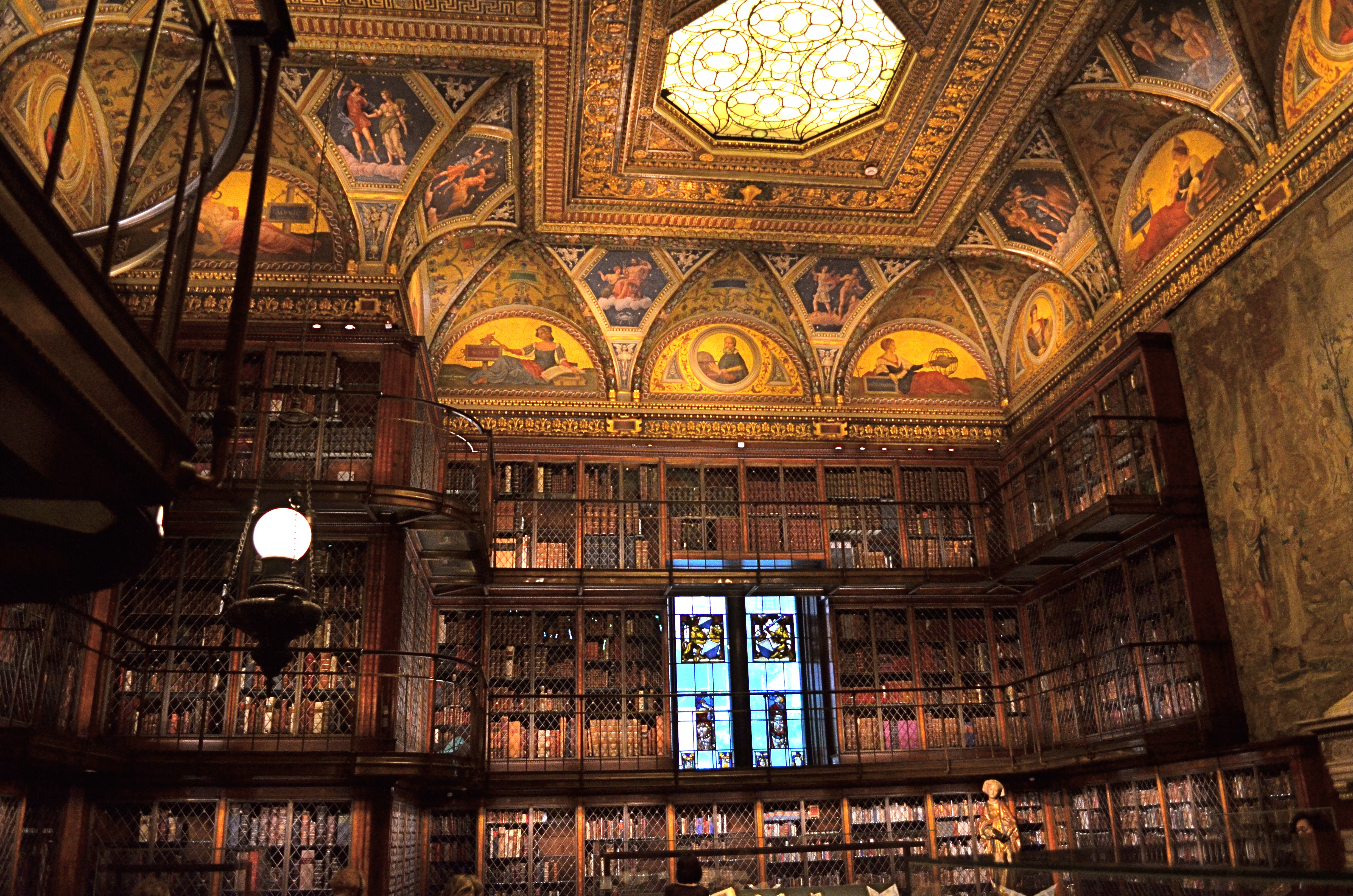
I’M VERY ACCUSTOMED TO BEING STOPPED IN MY TRACKS AT A PHOTOGRAPH THAT EVOKES A BYGONE ERA: we’ve all rifled through archives and been astounded by a vintage image that, all by itself, recovers a lost time.
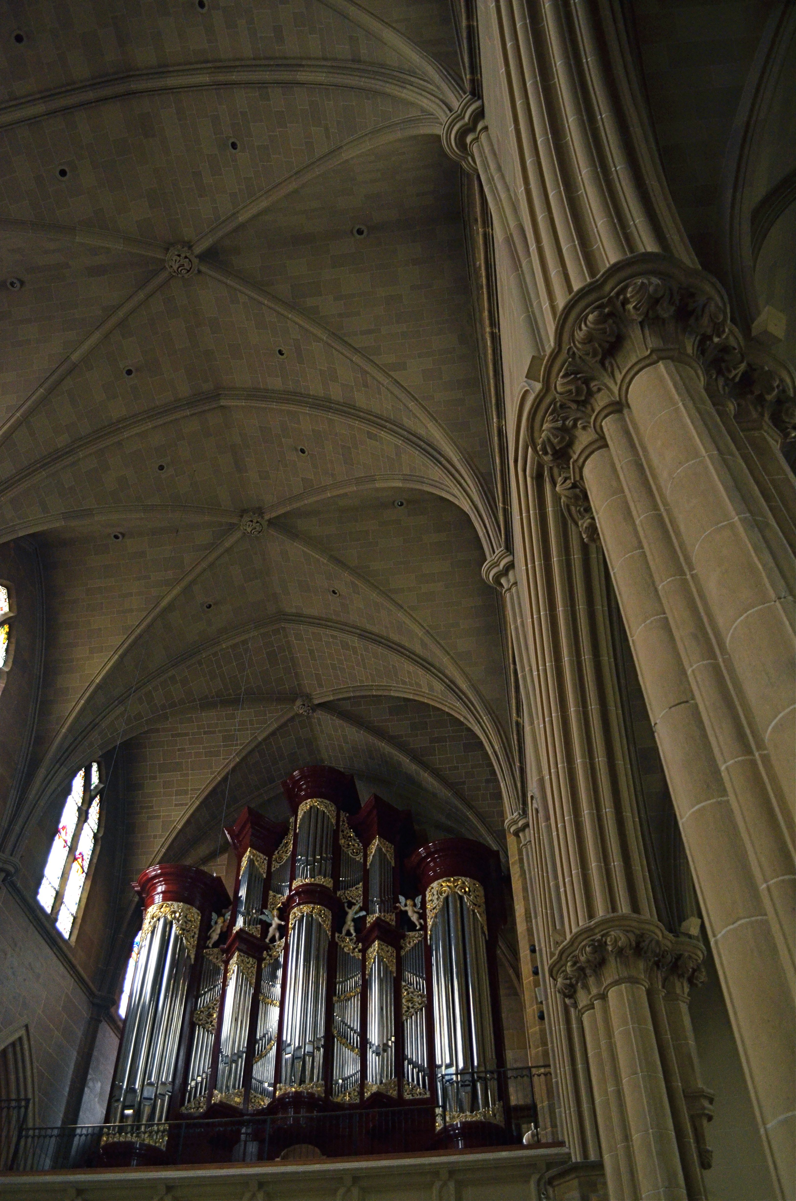
It’s a little more unsettling when you experience that sense of time travel in a photo that you just snapped. That’s what I felt several weeks ago inside the main book trove at the Morgan Library in New York. The library itself is a tumble through the time barrier, recalling a period when robber barons spent millions praising themselves for having made millions. A time of extravagant, even vulgar displays of success, the visual chest-thumping of the Self-Made Man.
The private castles of Morgan, Carnegie, Hearst and other larger-than-life industrialists and bankers now stand as frozen evidence of their energy, ingenuity, and avarice. Most of them have passed into public hands. Many are intact mementos of their creators, available for view by anyone, anywhere. So being able to photograph them is not, in itself, remarkable.
A little light reading for your friendly neighborhood billionaire. Inside the Morgan Library in NYC.
No, it’s my appreciation of the fact that, today,unlike any previous era in photography, it’s possible to take an incredibly detailed, low-light subject like this and accurately render it in a hand-held, non-flash image. This, to a person whose life has spanned several generations of failed attempts at these kinds of subjects, many of them due to technical limits of either cameras, film, or me, is simply amazing. A shot that previously would have required a tripod, long exposures, and a ton of technical tinkering in the darkroom is just there, now, ready for nearly anyone to step up and capture it. Believe me, I don’t dispense a lot of “wows” at my age, over anything. But this kind of freedom, this kind of access, qualifies for one.
This was taken with my basic 18-55mm kit lens, as wide as possible to at least allow me to shoot at f/3.5. I can actually hand-hold fairly steady at even 1/15 sec., but decided to play it safe at 1/40 and boost the ISO to 1000. The skylight and vertical stained-glass panels near the rear are WINOS (“windows in name only”), but that actually might have helped me avoid a blowout and a tougher overall exposure. So, really, thanks for nothing.
On of my favorite Twilight Zone episodes, the one about Burgess Meredith inheriting all the books in the world after a nuclear war, with sufficient leisure to read his life away, was entitled “Time Enough At Last”. For the amazing blessings of the digital age in photography, I would amend that title by one word:
Light Enough…At Last.
GOING (GENTLY) OFF-ROAD
By MICHAEL PERKINS
WHEN YOU’RE BEHIND THE WHEEL, SOME PHOTOGRAPHS NAG THEIR WAY INTO YOUR CAMERA. They will not be denied, and they will not be silenced, fairly glowing at you from the sides of roads, inches away from intersections, in unexplored corners near stop signs, inches from your car. Take two seconds and grab me, they insist, or, if you’re inside my head, it sounds more like, whatya need, an engraved invitation? Indeed, these images-in-waiting can create a violent itch, a rage to be resolved. Park the car already and take it.
Relief is just a shutter away, so to speak.
Wait too long and the light will break: 1/800 sec., f/5.6, ISO 100, 18mm.
The vanishing upward arc and sinuous mid-morning shadows of this bit of rural fencing has been needling me for weeks, but its one optimal daily balance of light and shadow was so brief that, after first seeing the effect in its perfection, I drove past the scene another half dozen times when everything was too bright, too soft, too dim, too harsh, etc., etc. There was always a rational reason to drive on.
Until this morning.
It’s nothing but pure form; that is, there is nothing special about this fence in this place except how light carves a design around it, so I wanted to eliminate all extraneous context and scenery. I shot wide and moved in close to ensure that nothing else made it into the frame. At 18mm, the backward “fade” of the fence is further dramatized, artificially distorting the sense of front-to-back distance. I shot with a polarizing filter to boost the sky and make the white in the wood pop a little, then also shot it in monochrome, still with the filter, but this time to render the sky with a little more mood. In either case, the filter helped deliver the hard, clear shadows, whose wavy quality contrasts sharply with the hard, straight angles of the fence boards.
I had finally scratched the itch.
For the moment….
CAUGHT IN THE CROSSFIRE
The jogger that saved my shot, albeit unwittingly. 1/250 sec., f/5.6, ISO 100, 18mm.
By MICHAEL PERKINS
THERE HAS BEEN A LOT OF MENTION, OF LATE, OF THE PHENOMENON KNOWN AS “PHOTOBOMBING“, the accidental or intentioned spoiling of our perfect Kodak moments by persons inserted into the frame at a crucial instant. Whether they block the bride’s face, eclipse Grandma’s beloved puppy, or merely pop up annoyingly behind the cute couple, they, and the images they ruin, are one of the hottest posting sources along the photo-internet galaxy right about now.
But fate photobombs us every day, and often drops a gift out of the sky, and into our pictures. The two-fold trick is to (a) be ready to improvise and (b) be grateful for the chance for something altogether different from what we originally conceived.
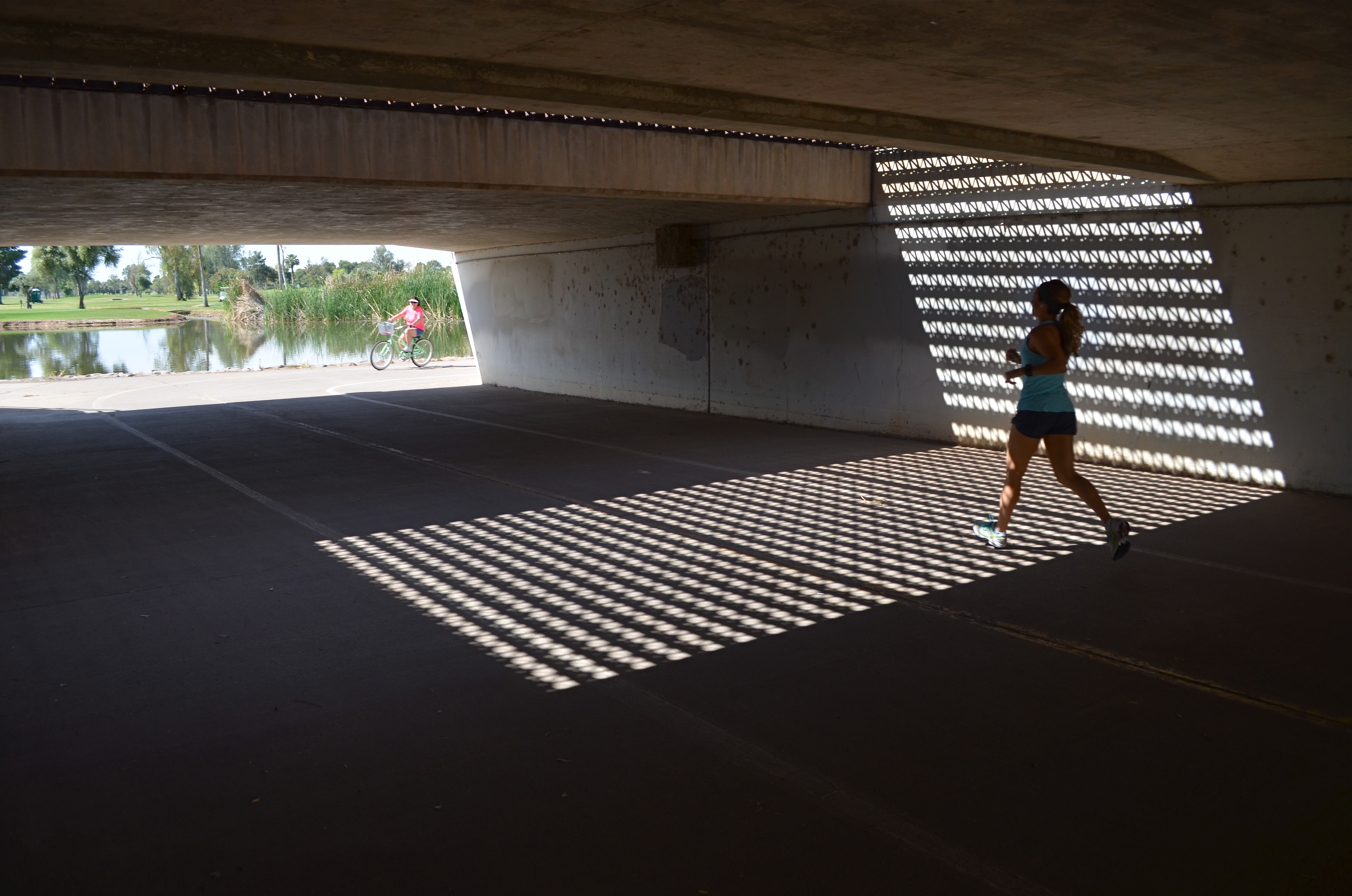
Happened to me several weeks ago. Total accident, since the thing I shot in the moment was not what I had started out for at all. Real simple situation:an underground walkway from one low-lying section of a city park to another, the sidewalk taking a short cut under a bridge. Overhead, six lanes of unheeding street-level traffic. Below, a concrete tunnel of sorts, with sunlight from the park illuminating either open end.
Oh, and the grate. Should mention that a section of the street overhead was, instead of solid roadbed, an open-pattern, structural steel grid, with dappled geometrics of light throwing a three-sided pattern of latticed shadows onto the side walls and floor of the tunnel below. Nice geometry. Now, I wasn’t looking to shoot anything down here at all. Like the chicken, I just wanted to get to the other side. But I had my wide-angle on, and a free light pattern is a free light pattern. One frame. A second, and then the bomb: a jogger, much more acquainted with this under-the-road shortcut than me, crossing from over my right shoulder and into my shot. Almost instinctively, I got her in frame, and relatively sharp as well.
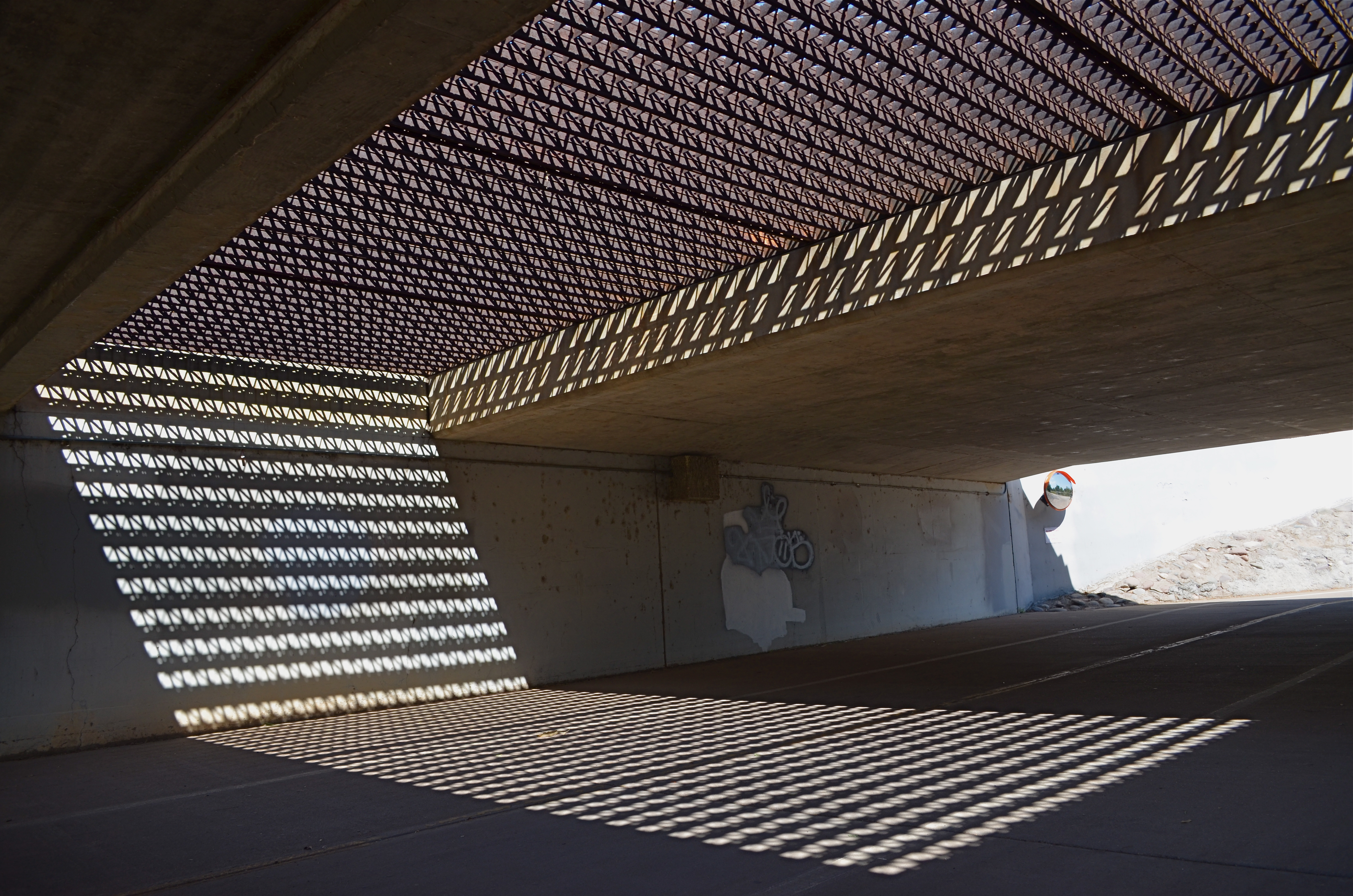
Same settings as in the “jogger” frame, but a little colder minus the human element. A matter of taste.
Not content to have caught the big fish of the day, I took the opposite angle and tried again to recoup my “ideal shot”, minus the human element. But something had changed. Even so, I still needed a gentle nudge from Fate to accept that I had already done as well as I was going to do.
My battery died.
I limped home, then, during my upload, found that what I had been willing to reject had become essential. I wish it was the first time I’ve had to be taught this lesson.
But I’d be lying.
Photobombed by circumstance.
And grateful for it.
follow Michael Perkins on Twitter @MPnormaleye.
