TOGGLING BETWEEN TRUTHS
By MICHAEL PERKINS
If you can’t do it right, do it in color.——-Ansel Adams
THE MAN MANY REGARD AS THE JEDI MASTER OF PHOTOGRAPHY could be said to have had a sizable blind spot when it came to his preference for monochrome over the course of his long career. Part of his distrust of color came from the fact that black and white afforded him a degree of fine technical control that emerging color systems of his time could not yet rival. Another part of his bias stemmed from the fact that he accepted that mono was a departure from reality, a separate realness that he could manipulate and interpret. In his time, color was closer to mere recording; garish, obvious, and, for him, the opposite of art.
By contrast, the world we live in has been dominated by color images for so long that we can easily develop our own prejudice regarding its opposite….that is, to see monochrome as less than, as if, by choosing not to use color, we are somehow shortchanging our art, performing with one hand tied behind our backs, doing more with less. Of course, black and white photography is in no immediate danger of dying out, proving that it has a distinct and definable purpose as a storytelling medium. Further, mono can, in fact, engender its own counter-snobbery, as if certain kinds of work are more “authentic” because we purposely limit our tonal palette, like writing a minimalist melody. Both views, when taken to extremes, can cause creative paralysis, since there is no way to prove or disprove either argument’s rightness or wrongness. There is only the pictures.
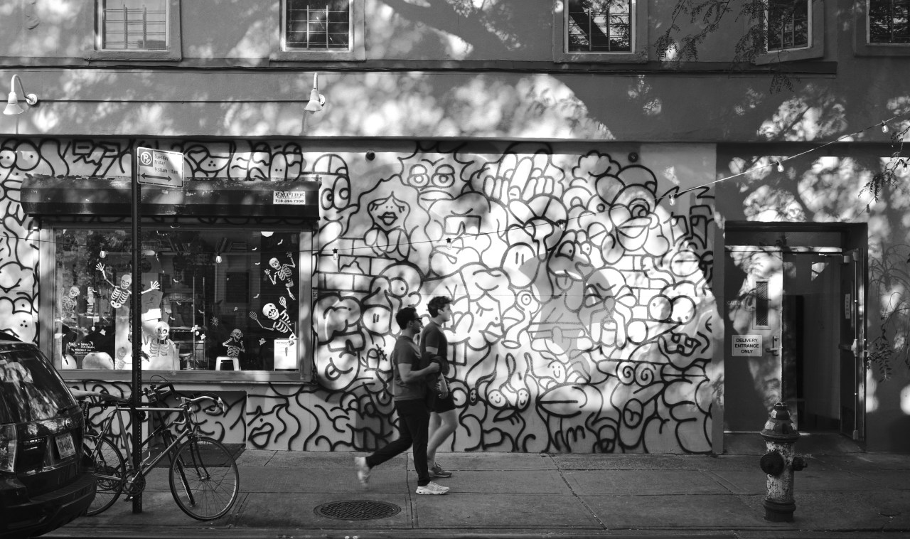
Mono image taken as one of three rapidly snapped frames, each one using a different pre-assigned preset in real time.
Over the past few years, I, like many, have tried to provide myself with several choices when capturing an image in real time. With a number of different film emulations pre-assigned to my camera, it’s easy to erase risk by just clicking from one such custom setting after another, taking the same scene in, for example, a faux Fuji transparency style, a simulated Kodachrome look-alike, and a custom monochrome profile reminiscent of classic Tri-X film. I don’t always elect to do this much coverage on a shot, but there are times when I worry about whether I’m making the right decision in the moment, and so I find the extra coverage reassuring, as if I’m improving the odds that something will work out. There is plenty of room in the photographic world to accommodate more than one kind of visual “truth”, and the most creative of us must be willing to toggle between them with flexibility and ease.

Leave a comment