WEATHER OR NOT

Instant rainy day: an in-camera white balance tweak designed to simulate shooting under florescent light
By MICHAEL PERKINS
NO SOONER DID PHOTOGRAPHERS SUCCEED in their earliest attempts at trapping light inside a box than they set about to see what kind of light they might prefer on any given day. From the very start, shooters have tried to shape the color and tonal range of their subjects rather than just record the prevailing conditions. To cite one f’rinstance: when I was a youngster, riding my pet bronto to the classroom cave, all sophisticated cameras came with instructions on how to achieve an ideal white balance, the better to either correct for nature’s shortcomings in a certain situation, or sculpt your own look for effect. Half a century later, it’s amazing just how easy such manipulations have become in the digital age.

Same scene, mere seconds beforehand, shot on an “natural light auto” white balance.
Now white balance is simply another dial-up operation, something that can be as easily selected as an aperture or a shutter speed. Suddenly all those screw-on filters and charts are just so much junk in a drawer. It’s amazing how baked-in this kind of convenience has become, removing what used to be a time-consuming calculation not only making it completely instinctual but virtually instantaneous. We are now capable of, if you like, making our own weather ahead of the click.
Like everything else that used to be a pain about photography, the streamlining of white balance has joined many other operations that were obstacles between envisioning and executing a shot. That means greater and greater emphasis on training one’s eye and less time wasted on “I wonder if it will work out?”. All cameras are being designed to anticipate most of the problems involved in making a picture, so that it’s harder every day to take a bad one (although I stubbornly manage to do it, and often). Creating tools which take things like white balance and light metering inside the camera streamlines the entire process of photography. Fewer steps, fewer chances for error, more time for selecting and grabbing your vision.
WHEN COLOR IS ALL

By MICHAEL PERKINS
JUST A LITTLE SCROLL STROLL THROUGH GOOGLE will show just how long and how intensely the debate over color has raged in the photographic world……that is to say, whether color should be used at all, or whether, indeed, it was the spawn of Satan, turning the art of imaging into a crude carnival trick. Today, we routinely concede that both monochrome and color have distinct uses in the making of images, each bringing singular strengths to the process. But it was not that long ago that the two camps went at it like Hatfields and McCoys.
Many still feel that color should only be called on to help complete or “sell” a picture, a finishing touch of sorts. “In black and white you suggest”, wrote Paul Outerbridge in Modern Photography. “In color, you state.” Others, like myself, believe that there are times when color is content, complete in itself, regardless of the “official” subject of the image. Or, as Alex Webb writes, “Color is very much about atmosphere and emotion and the feel of a place.”
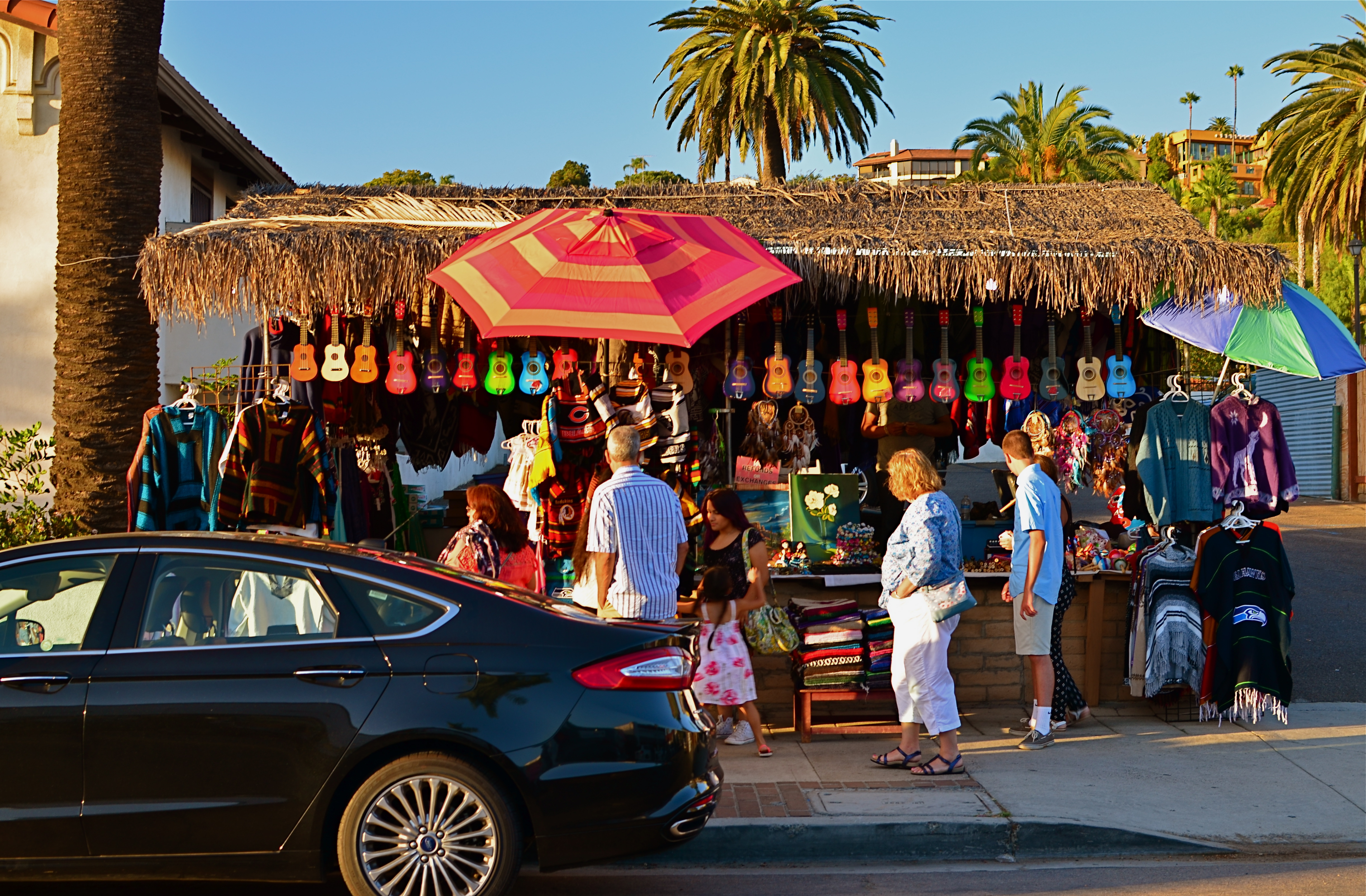
The photos seen here show how, if color is a compelling enough messenger, most of the visual information in a picture can be pared away to let that color message breathe. The master shot of a street vendor at sundown (seen at directly above) might have worked out if I had done one or two things better, but upon later examination, I realized that the long horizontal string of neon-hued ukuleles at the top of the shot could work if cropped loose from the less effective uber-shot (as seen at top). Better still, the color in the cropped shot is not actually about “ukuleles”, since a string of tropical fruits or a rack of hats with the same tonal palette would sell the image just as well. This is truly a case of color “just because”, conveying Alex Webb’s “emotion and feel” without assistance.
A lot of the photo world’s resistance to color, which ended barely more than a generation ago, stemmed in part from a loathing for the limited printing processes which made it harder to predict or control results compared to monochrome. But there was also the fear that untalented shooters would use it as a sensational crutch to boost mediocre work. Now it seems clear that color, like any other technical element, lives or dies based on what it is called upon to do, and how well the individual artist makes his argument.
