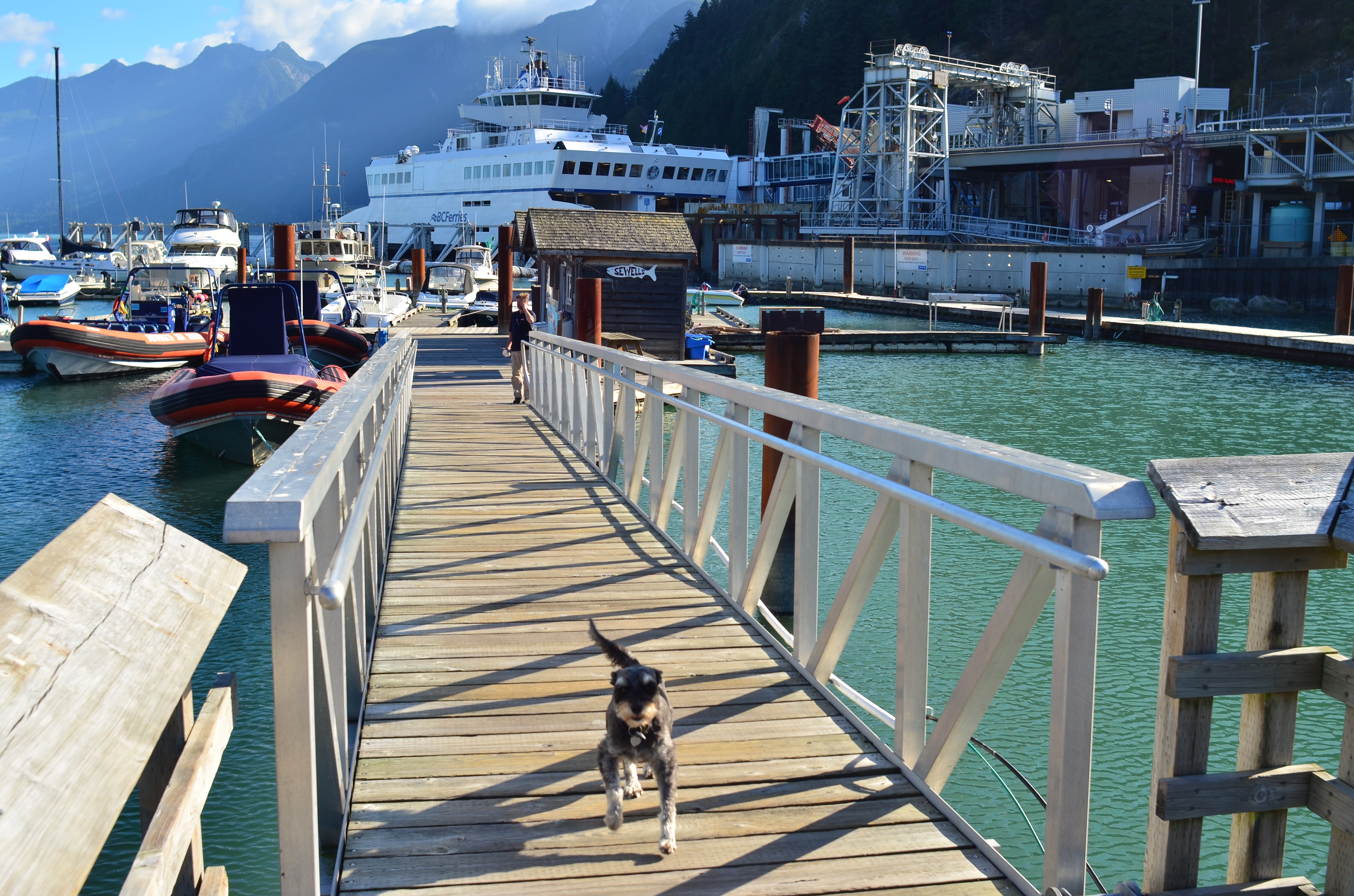
SIZE MATTERS (SOMETIMES)
 By MICHAEL PERKINS
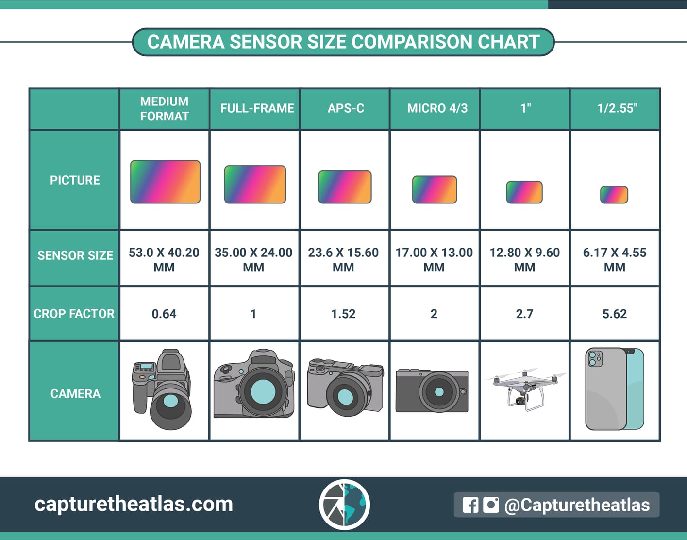
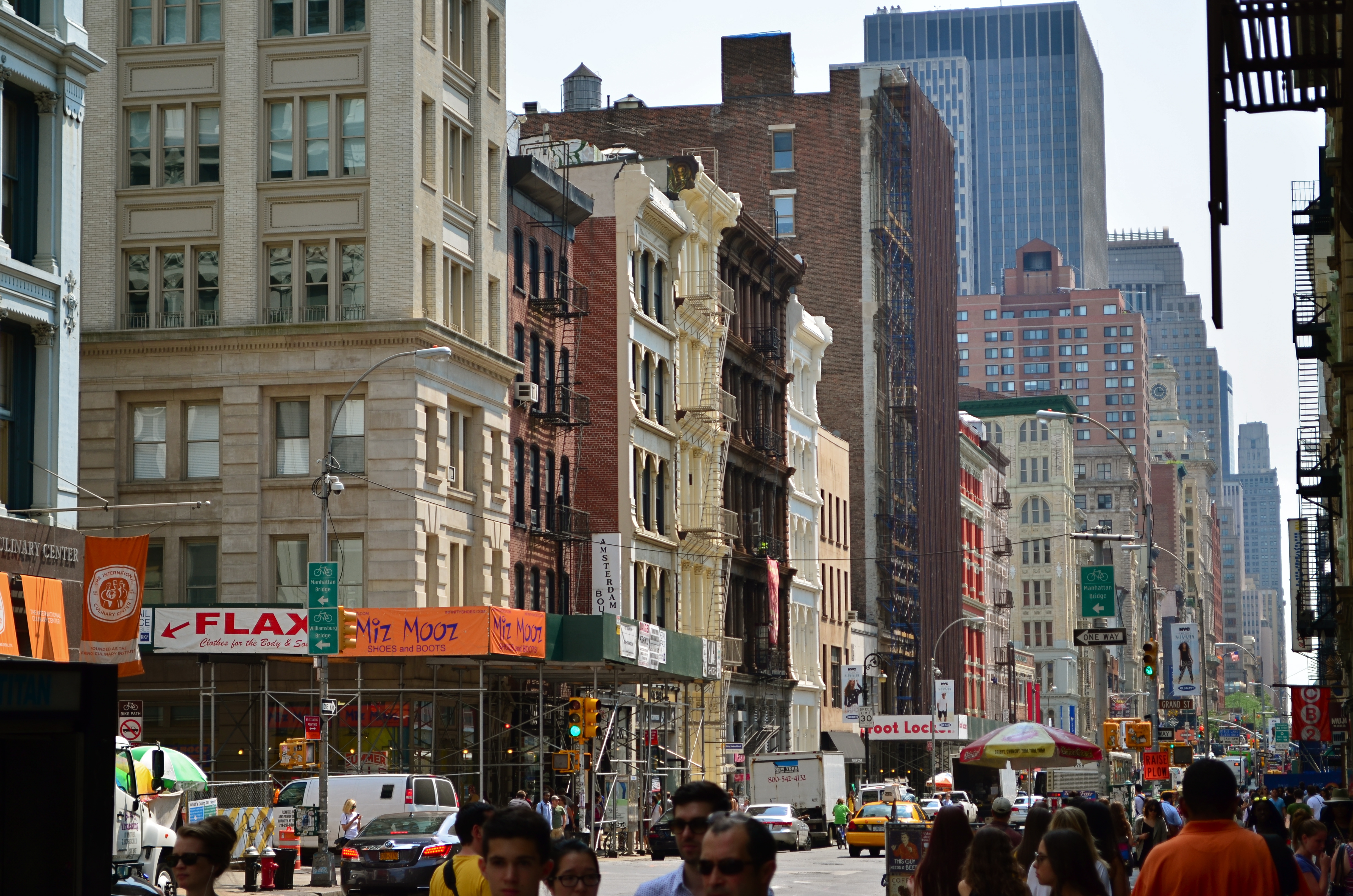
IF YOU’VE SHOPPED FOR A CAMERA OVER THE PAST TWENTY-FIVE YEARS OR SO, there’s a good chance that you’ve seen a chart similar to the one shown here, which compares the dimensions of variously sized digital camera sensors. Across the history of photography, there have always been a selection of frame shapes and sizes on offer, many passing in and out of existence based on technical advancements or the changing needs of shooters. In the digital era, however, there are more formats existing side-by-side than ever before, each grappling for their chunk of the overall marketplace.
The longest-lasting such configuration is the “full-frame” format, which carries over the basic dimensions of the old 35mm film frame. When introduced in the 1920’s by Oskar Barnack, it sped his development of the Leica and the introduction of hand-held or “miniature” cameras, which freed amateurs from the bulkier “medium format” cameras of the period. With many popular consumer films like Kodachrome created specifically for it, 35mm remained pretty close to a universal format until the 21st century, when early digital cameras began to offer the convenience of ever-smaller sensors. Of these, the APS-C, or “crop” sensor became the new standard of use for DSLRS, compacts and “bridge’ cameras. The crop, as its name implies, delivers a smaller frame area (and fewer pixels) than an FF, changing a larger image’s focal length by a multiplier (or “crop factor”on the chart) of roughly 1.5x. Your lens may say that it’s a 50mm, but, with the multiplier, on your crop sensor camera, your focal length is effectively 75mm.
And so things progress across the chart as you move further to the right on the chart. Each smaller-sized format has its own listed crop factor, with each higher number giving you a smaller percentage of the framing area in a full-frame format. Trends in the camera market have shifted back and forth a lot in the digital age, but none of the listed formats has managed to eclipse the rest to become a truly universal standard. Full-frame is still a factor, but has become increasingly expensive since fewer models are offered than was the case just a few years ago . 4/3rds has its fans, both for convenience and compactness, but, as is generally true of smaller sensors with fewer pixels, it can perform poorly in low light. Cellphone cameras, some of the smallest sensors available, began their run at a definite disadvantage when it came to resolution, with even more image loss once their pictures were translated through apps. However, each new iteration of the technology deals more effectively with these problems, and cels can no longer be dismissed as “not real cameras”. Just depends what you need and what you are willing to pay for/do without/put up with/settle for.
Size discussions off to the side, sensors rise or fall on how efficiently they process light. Some bitty ones do a bang-up job, while some larger ones are flat horrible. Overall they are a miraculous improvement over even great film because their sensitivity and performance can be customized in-camera and on-the-fly. That’s a consistent truth in photography: anything that gets out from between you and the easy making of pictures is a good thing.
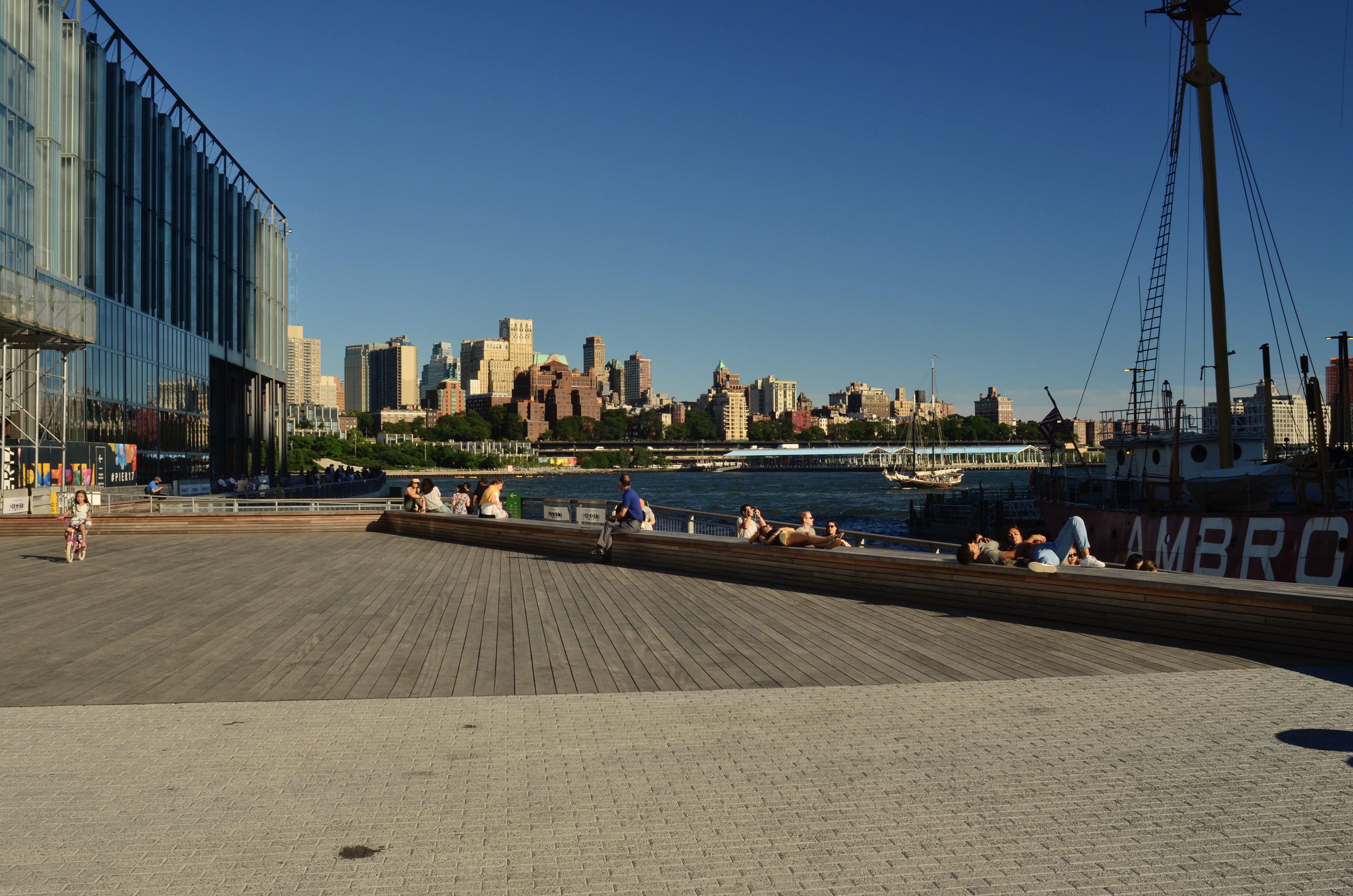
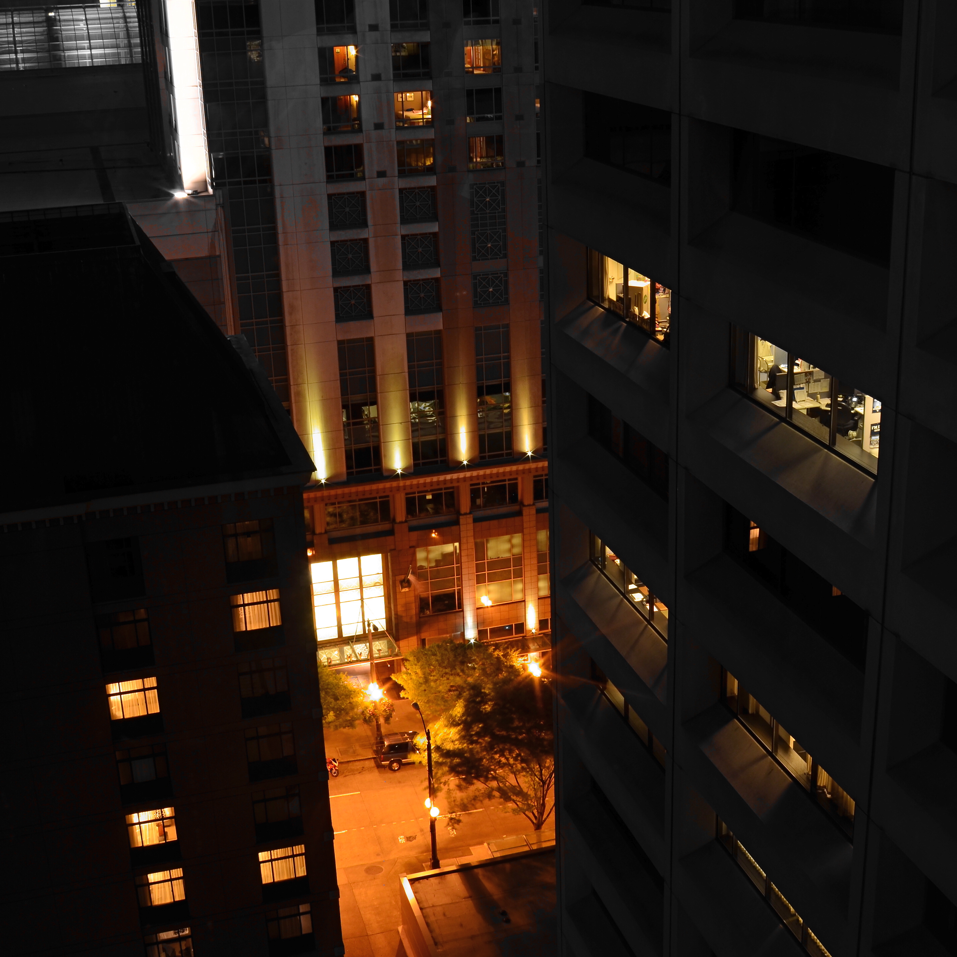
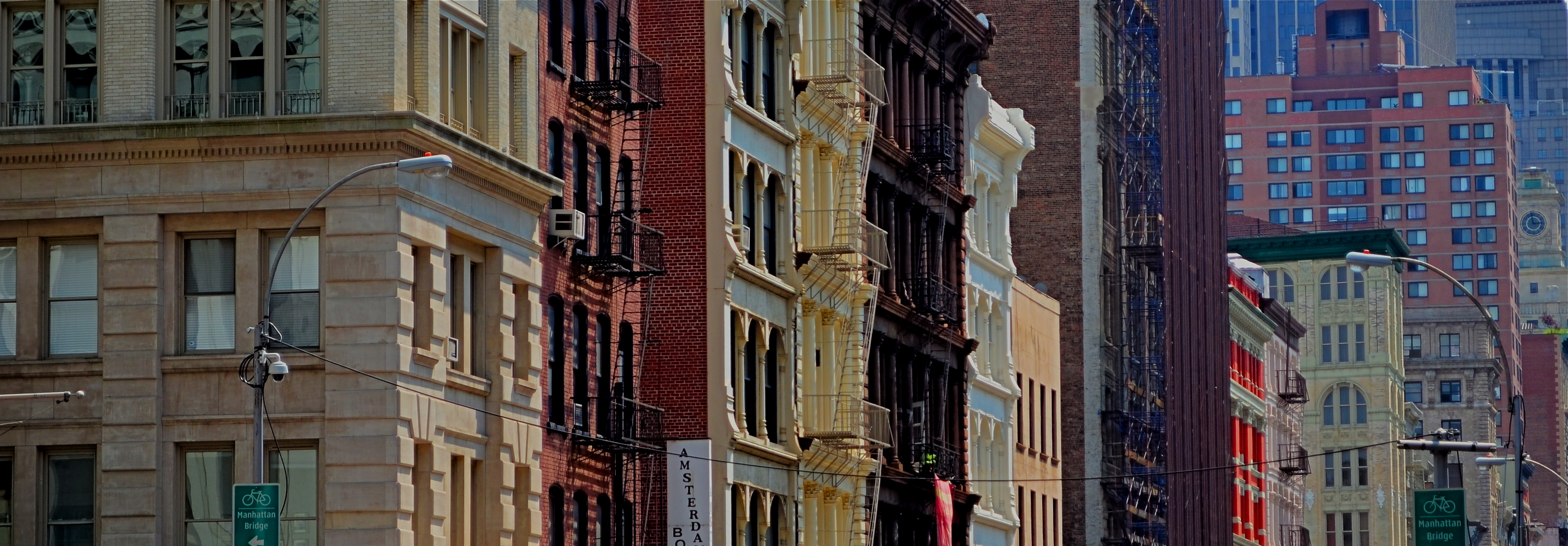
WIDE x HIGH x ACCIDENT
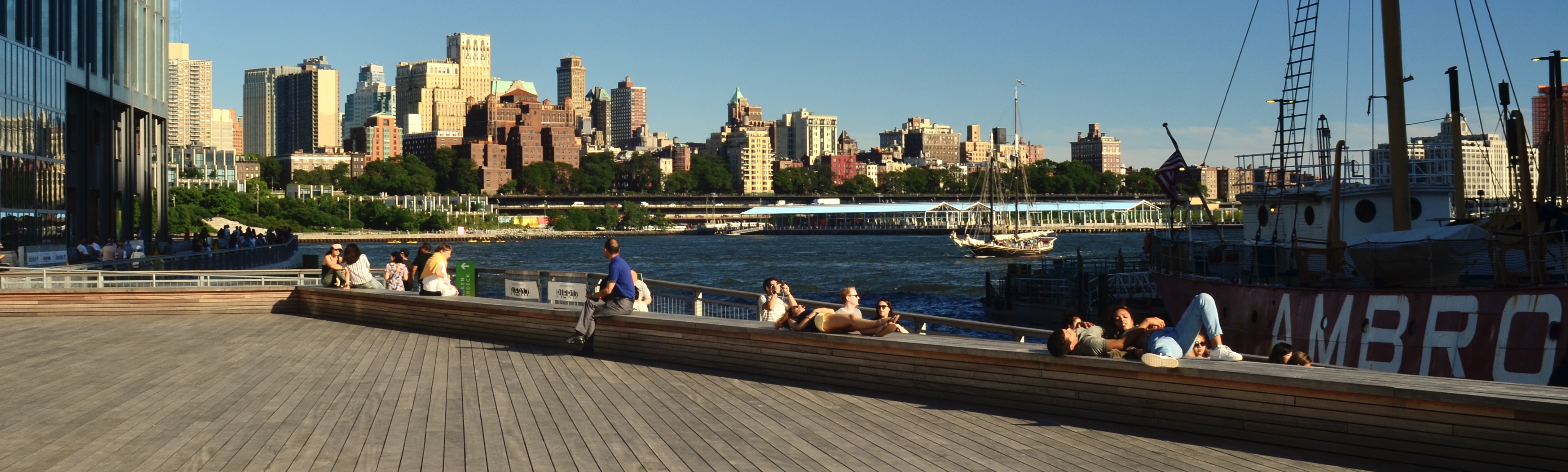
Brooklyn From Fulton Street, 2018. A faux pano cropped from a really large 24mm landscape master frame.
By MICHAEL PERKINS
I MAY NOT BE PHOTOGRAPHER ENOUGH TO FOOL THE HUMAN EYE, but on a good day, I can apparently con Photos for Mac. I know this because I caught the program using its own “logic” to arrange images into categories for which, truly, they don’t qualify. One such category is “panoramas”, a folder which Photos has chocked with pictures that were not made either with a true panoramic camera or a stitch-up phone app, but merely by cropping larger shots. The thing is, such clipped art work as panoramas because of what they ask of the viewer’s eye.
The original shot has too much unneeded visual information.
Most of my landscapes, in town or out in the country, are shot with a 24mm f/2.8 wide-angle, which is my go-to for urban work. It adds little in the way of barrel distortion if you aim it right, and allows for very inclusive framing when you’re in cramped quarters (lower Manhattan, I’m talking to you). It’s also as sharp as a diamond, and so, at its sweet spot of efficiency (around f/5.6) it’s a snap to focus manually. It’s a sophisticated lens that performs almost as easily as a point-and-shoot, and even though landscapes shot with it will result in a lot of excess detail, this one lens will do nearly 100% of what I need on an average day. And since there’ll often be way too much info in the landscapes, a-cropping I will go.
Panos are often tiresome because there simply aren’t a lot of linear subjects that are uniformly fascinating from left-to-right. I mean, if you’re bent on having all of General Grant’s 103rd regiment muster up in front of you, or if you’re trying to drink in all the delicious detail along the Cote D’Azur, it can be worth the extra effort. But this is me confessing that most of the shots that my Mac calls “panos” depict decisions made after the shutter snap, and only then because most of the useful visual info in the shot turned out to be linear in nature. I don’t intentionally head out of a morning to “do a pano”, and, in making landscape shots with other objectives in mind, I often don’t see, in the moment, the super-wide image lurking within the greater one. But on days when the camera gods are in a good mood, you find that, even in paring away half of your original, you’ve actually rescued something workable inside your master frame.
In the two examples seen here, the contrast is fairly obvious. The human activity, the line of the boats and, beyond, the skyline of the Brooklyn shore seem to be primarily inviting the eye into a left-to-right reading of the image, whereas crowding the frame with extraneous structures, more boardwalk lumber, or extra sky really saps the picture of any impact it might potentially have, and so, out come the scissors. I also believe that giving the eye more stuff to process means it will do some of it badly. Just as a portrait is usually made more effective by framing its subject mid-waist to head only, so do landscapes often benefit from cutting off their top and bottom thirds, depending on the image. I’m not one of those faux purists who believe you’ve “cheated” by cropping a picture after it’s made. I believe that resizing the frame is part of the making, albeit a part that takes place after the click.
So, yes, my trusty wide-angle is, in most cases, also my trusty makeshift pano lens. I’ve done the same thing with fisheyes, cropping them to highlight the super-wide center of a shot to the exclusion of the extreme bends at the edges. In many such cases, I am trending toward carrying less and less glass with me and getting more and more flexibility out of what I do take along, a development applauded by my aging neck and shoulders. It may be true that you need to suffer to be beautiful, but in the name of a healthy spine, I’m going to keep testing that theory.
SETTING THE TERMS
By MICHAEL PERKINS
FOR NARRATIVE PHOTOGRAPHY, THE MOST COMPLETE CONTROL IN AN IMAGE can never consist merely in the mastery of technical factors like aperture or exposure. Depending on what kind of storytelling your pictures are about, those elements are certainly important, but, to my mind, Job One is always about control of the frame. The selection of what’s in or out of that space is the first step toward setting terms of engagement for a given picture. It is your audience’s cue sheet for what’s important to look at, the main argument for your message. Own the frame and you own the viewer’s eye, as well as whether it focuses precisely or meanders all over.
The word “frame” is, itself, a little vague in this context. Photographs are not only framed by the physical confines of the viewing area, say an 8 x 10 print. There are many ways to subdivide the space within the image to create frames within frames. Frames can be any line or demarcation in the photograph which isolate or amplify information. Framing does what you might do if you were verbally narrating or captioning your message, only it acts in a purely visual manner. Of course the physical limits of your final photo create mystery or mood merely by themselves, as the eye will naturally ask what is happening beyond the limits of the physical confines of the picture. But even inside the “hard” edges that are printed or projected, data can be revealed or concealed by what surrounds or delineates it.
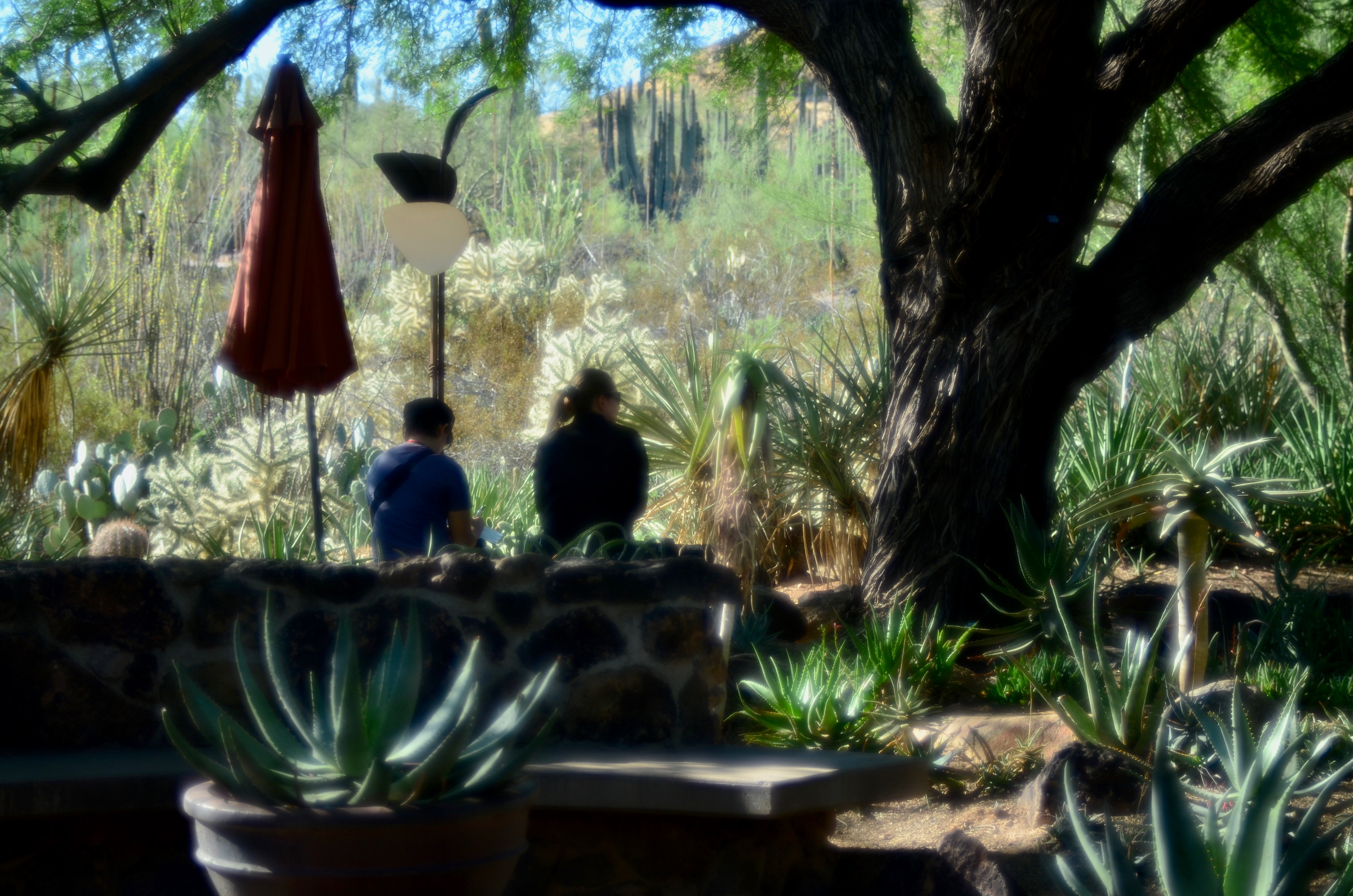
Even in a flat medium, framing can create an illusion of depth.
Framing is a little like capitalizing a letter at the head of a new sentence. As seen in the above picture, with some help from either selective focus or silhouetting, it can also create a perceptible distance between foreground and background, a kind of faux 3d that imitates the way actual stereo photographers are taught to compose to maximize the effect in a flat medium. In this specific case, the mother and son are separated by interior framing from the greater part of the composition, held in place between the tree at right at the stone wall beneath them. This acts as a dividing line between light and dark, major information and minor decor. Framing is a way of dividing your image into active and passive information, or prioritizing its components. What data gets left out, then, is as important as what gets left in, since both decisions can spark speculation in the viewer. A frame is like a proscenium where the audience both concentrates on what’s in front of the curtain and speculates about what’s behind it. The frame is the terms of engagement for a photograph. The clearer those terms, the more immediate your picture’s impact.
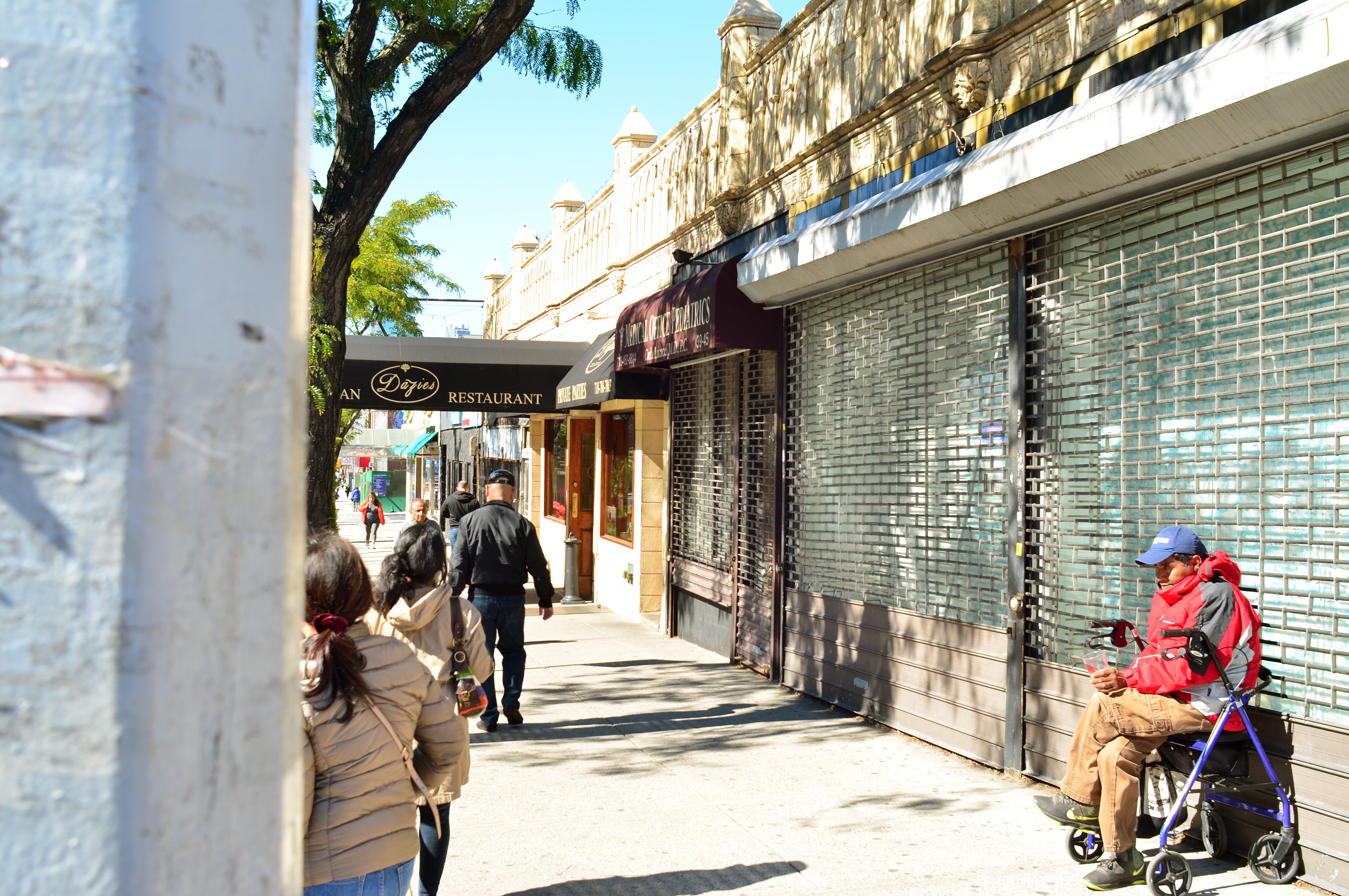
CUTTING YOUR LOSSES (BUT NOT TOO MUCH)
Ground-level snap of the SOL.
By MICHAEL PERKINS
I BELIEVE THAT PHOTOGRAPHERS HAVE A NUMBER OF INTENTIONS that can be set for their images, with only one of them being the raw product of original shots. Certainly we all hope that we’ll hit a perfect storm of equipment, conditions and executions when first we click the shutter, but we have all also learned to set a number of later intentions for those same pictures, strategies that are hatched long after they are in the can. That’s the all-too-human gap between what we meant to do and what we actually achieved, which sets us looking to re-frame our projects from “rescue” missions to “salvage” missions, otherwise known as There Must Be A Usable Picture In Here Somewhere. One man’s afterthought is another man’s Photoshop, and so forth.
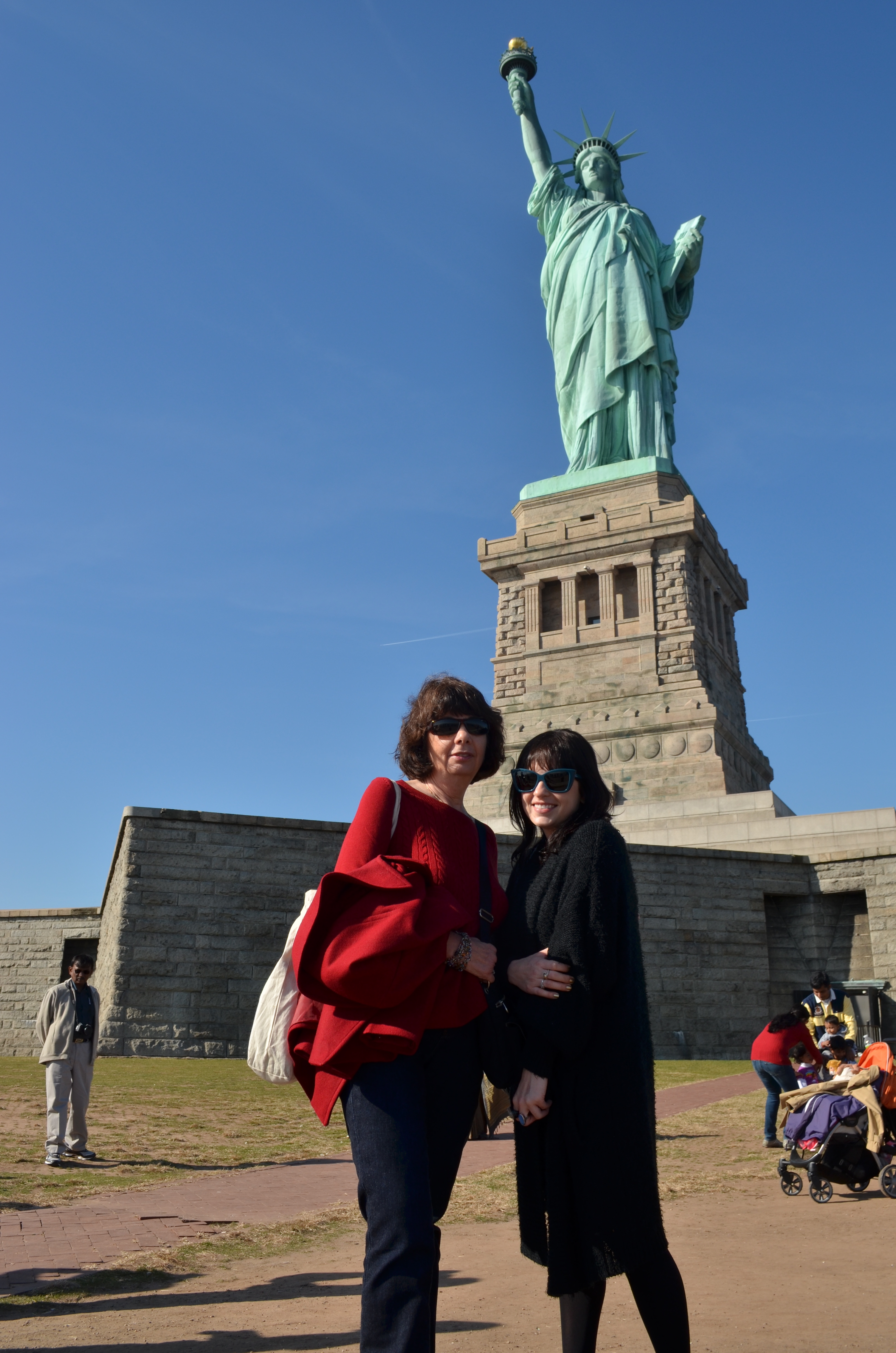
Suppose for example, you’re in the position of your humble author, who, several years ago, started his day in Manhattan with an 18-55 kit lens…..ideal for getting wide compositions in close quarters and such. You suddenly decide to add a side-trip to Liberty Island, a completely different shooting situation that may, in fact, distance you from your main subject. Yes, a truly wide lens certainly shows lots of touristy “stuff”, including Lady Liberty herself, her pedestal, all the visitors in the area, the occasional tree or building….a lot of everything. But even “zoomed in” to 55mm, the statue will not seem close at hand or, if you like, intimate. You didn’t know beforehand that you’d need a telephoto and so you don’t have one. However, being here isn’t part of your daily, or even yearly ritual, so you will likely be going for broke, finding the real core images later, through cropping. Your in-the-moment control has been compromised, so your revised plan is to recompose all the shots later. And hope.
Cropping can become a source of photo-snobbery in some circles, since, of course, true geniuses know instinctively how to compose a perfect frame every time, a notion which, romantically, is appealing, but pragmatically, is poppycock. Paring away non-essential parts of an image to amplify what’s left is not a sign of weakness, since the final edit must, eventually rise or fall on its own merits. In this exercise, it’s pretty obvious that the statue is the main headline, no disrespect to hot dog stands or strollers full of infants. So the first cropping decisions are easy, unless you specifically came to snap pictures of grass or sidewalks. But now, within that new work regimen, what parts of the statue are needed most? Is the bottom half as dramatic, or as revelatory, as the top half? How do you want the viewer’s eye to travel, horizontally or vertically? If you had been equipped with a zoom, what would your most instinctual composition? Is the statue to be paired with other elements to demonstrate perspective or scale, or does it pack more punch in isolation?
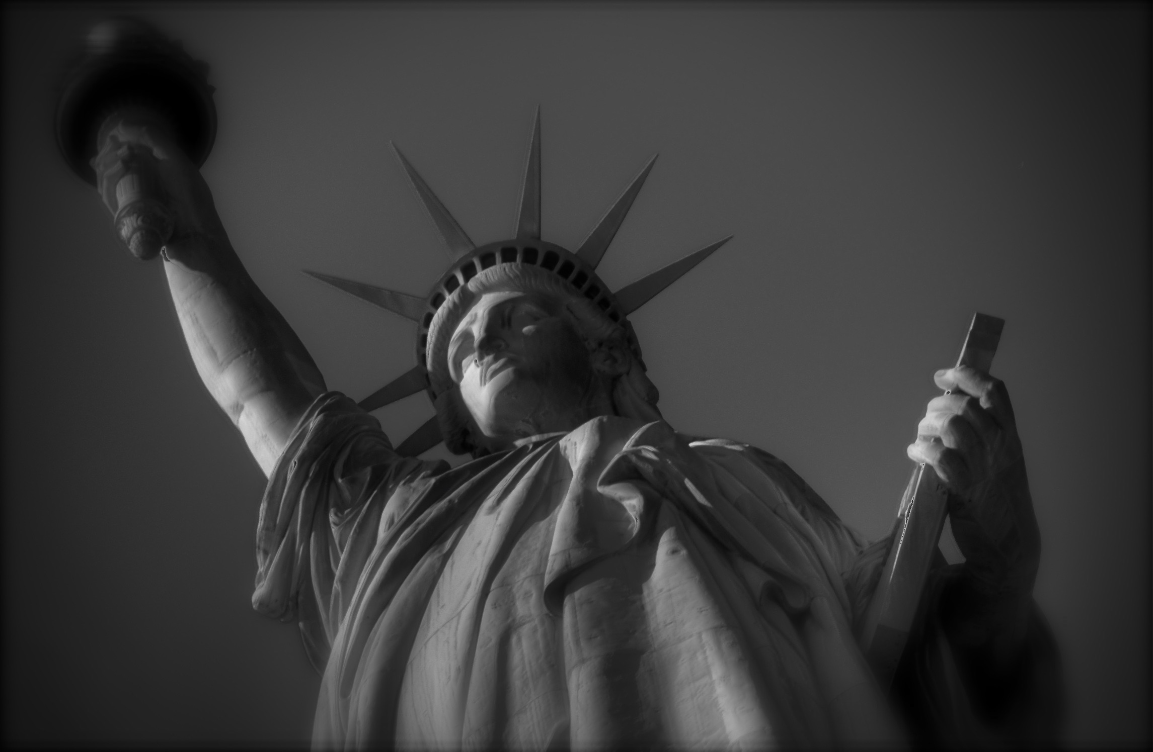
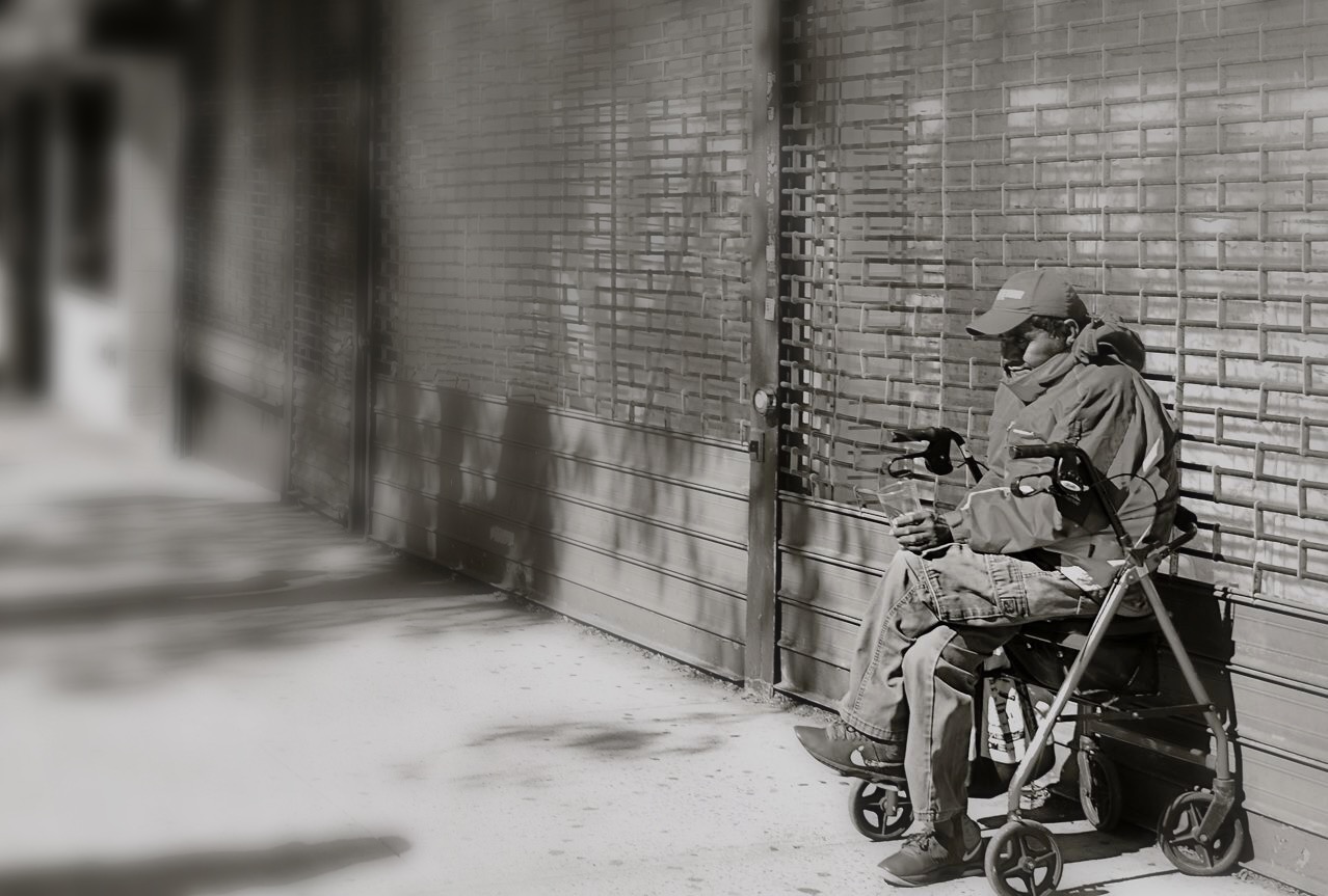
A drastically cropped reworking of one of my original ultra-wide ground-level snaps.
The cropped monochrome shot seen here is also, incidentally, an argument for shooting at the widest, most dense file size you can, so that image integrity is preserved, even with a dramatic loss of data. On this occasion, my “master” shots, seen at upper left and taken at ground level, were 3264 x 4928 pixels in size, whereas the drastically cut b&w version is still fairly solid at 2291 x 1496. A little processing was also used to cosmetically disguise the minor quality loss. The reason I am beating this particular drum is not to say that, with this stunt, I pulled some kind of rabbit out of my hat, saving a formerly useless picture. These particular images are not “keepers” per se, but can serve to remind me that the intention of a picture is not determined solely in the camera. Sometimes your best ideas for an image mean using imperfect first takes and seeing if they’ve missed the mark by millimeters or miles. It can mean either happy accidents or tragic misfires, but both outcomes afford you education, and that’s not nothing.
SQUARING UP YOUR SHOT
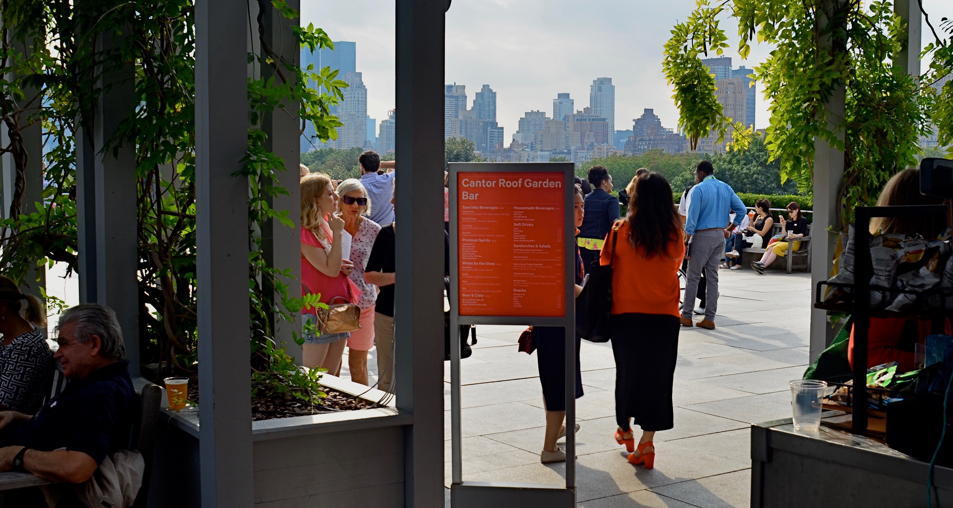
Master shot, taken at the entry to a roof garden atop the Met museum in Manhattan.
By MICHAEL PERKINS
IN THE PRESENT PHOTOGRAPHIC ERA, the default frame for composition is, with some notable exceptions, a rectangle, the 3-to-2 ratio that is the descendant of Oscar Barnack’s first 35mm Leicas of the late 1920’s. Most of us have been taught to automatically compose in this format, a hard-wired habit that informs our entire concept of how to fill a frame. The “notable exceptions” I refer to are the square films that have accompanied the return of instant photography, the lomography movement with its square-framed analog film formats, and, by virtue of a built-in app choice, the mobile phone. Strangely, some of the most sophisticated cameras on the market do not allow you to shoot an original square image: the shot must be captured in a 35mm equivalent and cropped later. But that’s a rant for another day.
The thing is, if you don’t typically investigate square composition, you are robbing yourself of an important tool, or, more specifically, you are allowing yourself to always see subjects in the same “frame” of mind. There are distinct advantages to creating a square composition, not the least of which is that it forces the viewer to take in your picture’s information in a distinct way. While shots that are wider than tall are marvelous for any number of reasons, they do, in effect, invite the viewer to scan an image linearly, that is, to look left to right and back again. By contrast, the square reinforces its equal dimensions, almost forcing the eye into a continuously circular sweep of the contents. I hear people complain that a square just “doesn’t give me enough room to get everything in”: however, I would counter that argument by contending that, in many 3/2 compositions, there is a wealth of visual information that not only is not needed, but actively distracts the eye from the most interesting parts of the photograph. Think of a glass of ice tea that, over time, actually has more volume in it, due to melted ice, than was originally poured into the glass. More liquid, but a greatly diluted flavor.
The problem is not that many square images aren’t being made…far from it. It’s that they are, in many cases, being re-made from rectangular originals, in the editing process. We have to shoot wide and edit square. But therein may lie the best way for us to start seeing what a square composition can do, not merely to define the space of a picture, but to invite the viewer into it more efficiently. And it’s easy and cheap to do it.
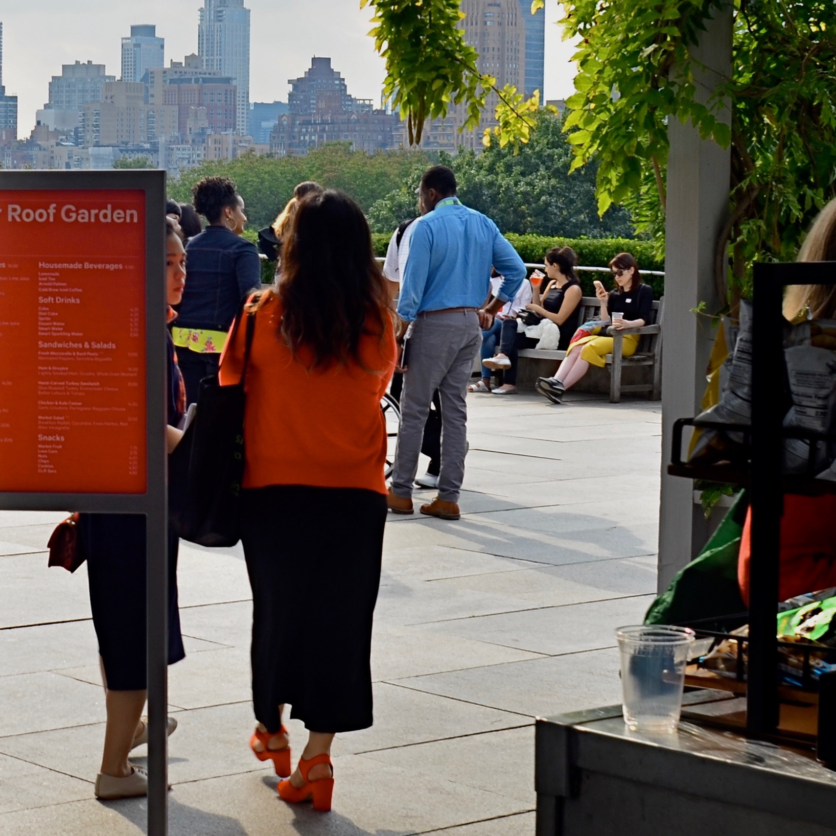
The above image recomposed as a square shot. Net loss or net gain?
Try this: select a series of wide master shots that you feel fairly strongly about, dupe work copies of them, and then crop new compositions within the copies. Junk the ones that don’t work and do as many re-takes as you see fit. Did any of the cropped images emerge as stronger without all that extra stuff you originally felt you had to include? And even if they did not, that’s also a good thing. The mere fact that you’ve begun to intentionally look for pictures within pictures means you’ve entered a new phase of your vision as a photographer. We’re certainly used to thinking of pictures that “came out pretty good’ as final or complete, but it’s a good thing to think of them instead as workable drafts. In the wider shot seen ay top, I successfully conveyed that people were stepping onto the roof of the Met museum in NYC, but I also got a lot of things in the shot that aren’t necessary to the telling of that story. The main tellers in the picture are the two women, who, like us, have just arrived. They are our surrogates or guides. Cropping actually makes the red of the sign in front of one of the women cry for your attention, guiding you to the women even as it partly conceals one of them. Additionally, the same top to bottom space that they occupy also shows part of the skyline that borders Central Park. The front to back scale of the shot says “on the roof, in the city”, at some distance.”
So judge for yourselves, as you would with your own pictures. Did anything I took away in cropping diminish the impact of the picture? Does the lower frame now feel open, cramped, or, in Goldilocks fashion, about right? Is there an appropriate emotional distance from the subject, or a welcome intimacy with it? Is there, in short, an overall net gain for the narrative power of the image once it’s been cropped? And most importantly, even if this experiment fails (with the wider picture still being stronger), haven’t I already begun to see every picture in at least two fundamentally different ways? New ways of seeing are among the most powerful tools in a photographer’s kit. The world of cameras may indeed default to a rectangle, but that doesn’t mean our brains need to follow suit.
SUBDIVISIONS
By MICHAEL PERKINS
VAN LINES USED TO GIVE OUT SMALL GRIDDED PAPER SQUARES that prospective customers could use as room diagrams for the planning of their next homes. The fancier versions even came with pre-cut geometric shapes that you could place on the squares, to see if the couch would look good next to the settee, or whether the piano should go along the north wall. It was like paper dolls for easy chairs and coffee tables.
I recall those squares whenever I’m trying to photographically visualize the optimum composition of large spaces, especially if I’m lucky enough to do so from an elevated spot. Immense rooms start to look like rectangles within rectangles, squares butted up against other squares. Dividing lines between action and dead space begin to appear. Cropping parameters suggest one scheme, then argue for another. With enough time, a kind of strategy emerges for what should go where, much like those intricate battle maps used to illustrate the engagements in Ken Burns’ The Civil War.
One square, or an assembly of squares?
The balance of “live” and “dead” space in public gathering places (like the museum seen here) has to carefully organized, since both kinds of space have their own special narrative power, and can intrude on each other if not orchestrated. In the above image, it’s almost as if the active roles by the tourists on the right ought to be contained, in order to avoid disturbing the abstract patterns on the left. A different method might also see the entire outer frame as a series of smaller squares and rectangles, just as a chessboard is a square composed of an infinite number of lesser squares. Depends on your eye.
Composition, if done at leisure rather than haste, is a negotiation, a bargaining session in which every inch of photographic real estate must earn its place in the final picture. It’d be glib to merely say “there’s no right answer”, but, if you look at images resulting from certain choices, it becomes apparent that such a statement cannot be true. Right will feel right. Wrong will always feel like you put the piano in front of the picture window. Not horrible… but not correct, either.
WHEN COLOR IS ALL
By MICHAEL PERKINS
JUST A LITTLE SCROLL STROLL THROUGH GOOGLE will show just how long and how intensely the debate over color has raged in the photographic world……that is to say, whether color should be used at all, or whether, indeed, it was the spawn of Satan, turning the art of imaging into a crude carnival trick. Today, we routinely concede that both monochrome and color have distinct uses in the making of images, each bringing singular strengths to the process. But it was not that long ago that the two camps went at it like Hatfields and McCoys.
Many still feel that color should only be called on to help complete or “sell” a picture, a finishing touch of sorts. “In black and white you suggest”, wrote Paul Outerbridge in Modern Photography. “In color, you state.” Others, like myself, believe that there are times when color is content, complete in itself, regardless of the “official” subject of the image. Or, as Alex Webb writes, “Color is very much about atmosphere and emotion and the feel of a place.”
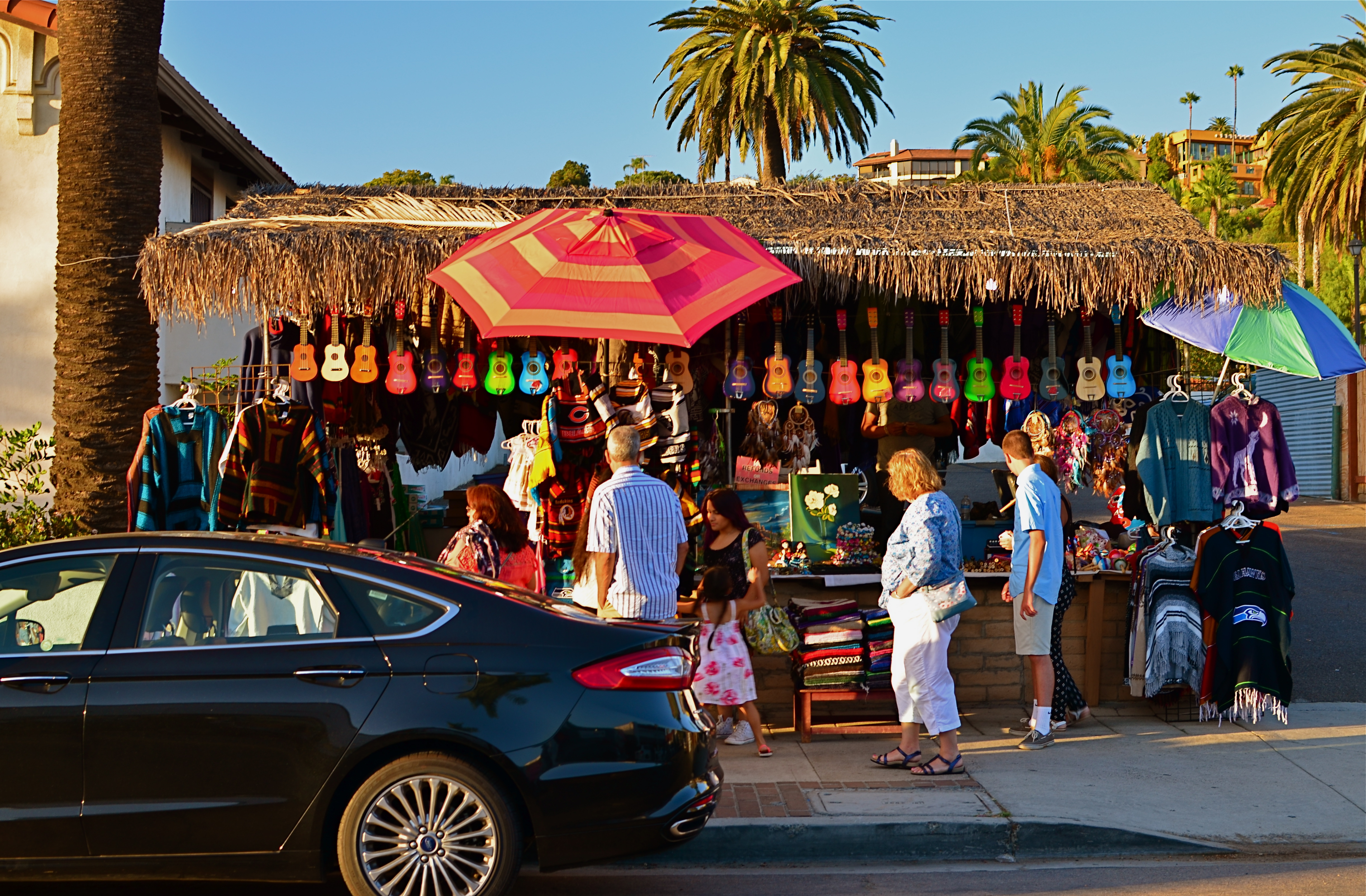
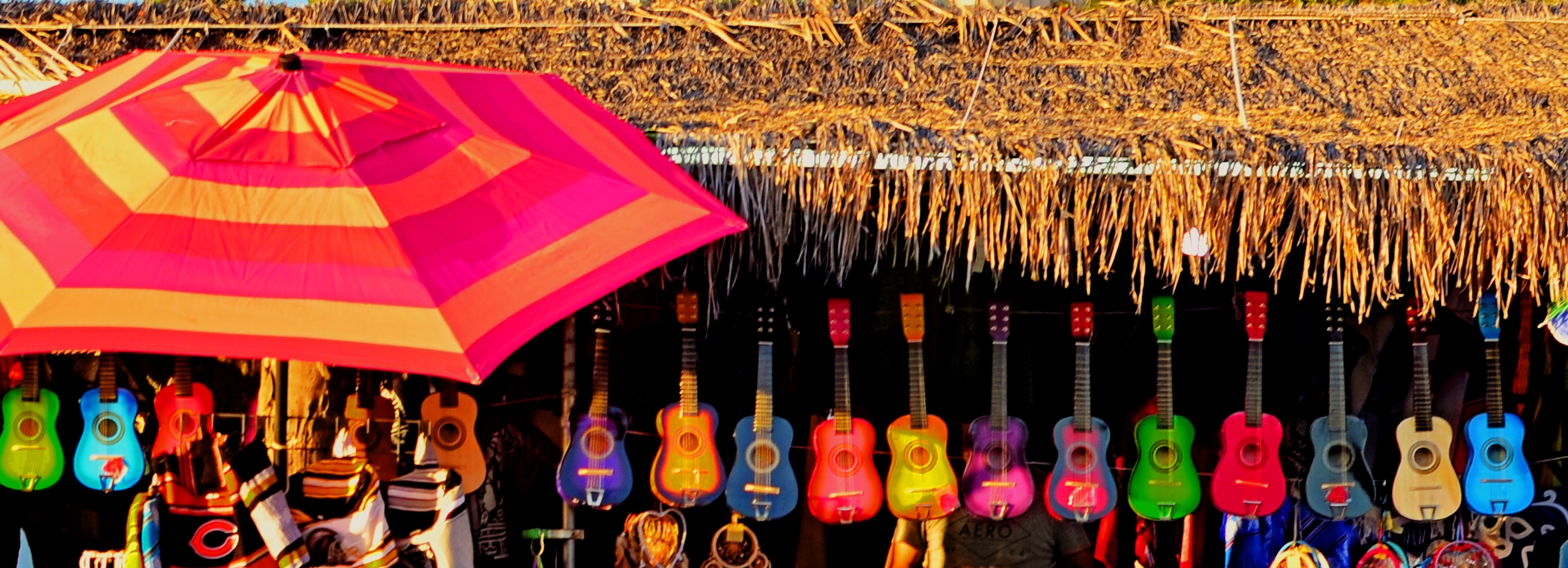
The photos seen here show how, if color is a compelling enough messenger, most of the visual information in a picture can be pared away to let that color message breathe. The master shot of a street vendor at sundown (seen at directly above) might have worked out if I had done one or two things better, but upon later examination, I realized that the long horizontal string of neon-hued ukuleles at the top of the shot could work if cropped loose from the less effective uber-shot (as seen at top). Better still, the color in the cropped shot is not actually about “ukuleles”, since a string of tropical fruits or a rack of hats with the same tonal palette would sell the image just as well. This is truly a case of color “just because”, conveying Alex Webb’s “emotion and feel” without assistance.
A lot of the photo world’s resistance to color, which ended barely more than a generation ago, stemmed in part from a loathing for the limited printing processes which made it harder to predict or control results compared to monochrome. But there was also the fear that untalented shooters would use it as a sensational crutch to boost mediocre work. Now it seems clear that color, like any other technical element, lives or dies based on what it is called upon to do, and how well the individual artist makes his argument.
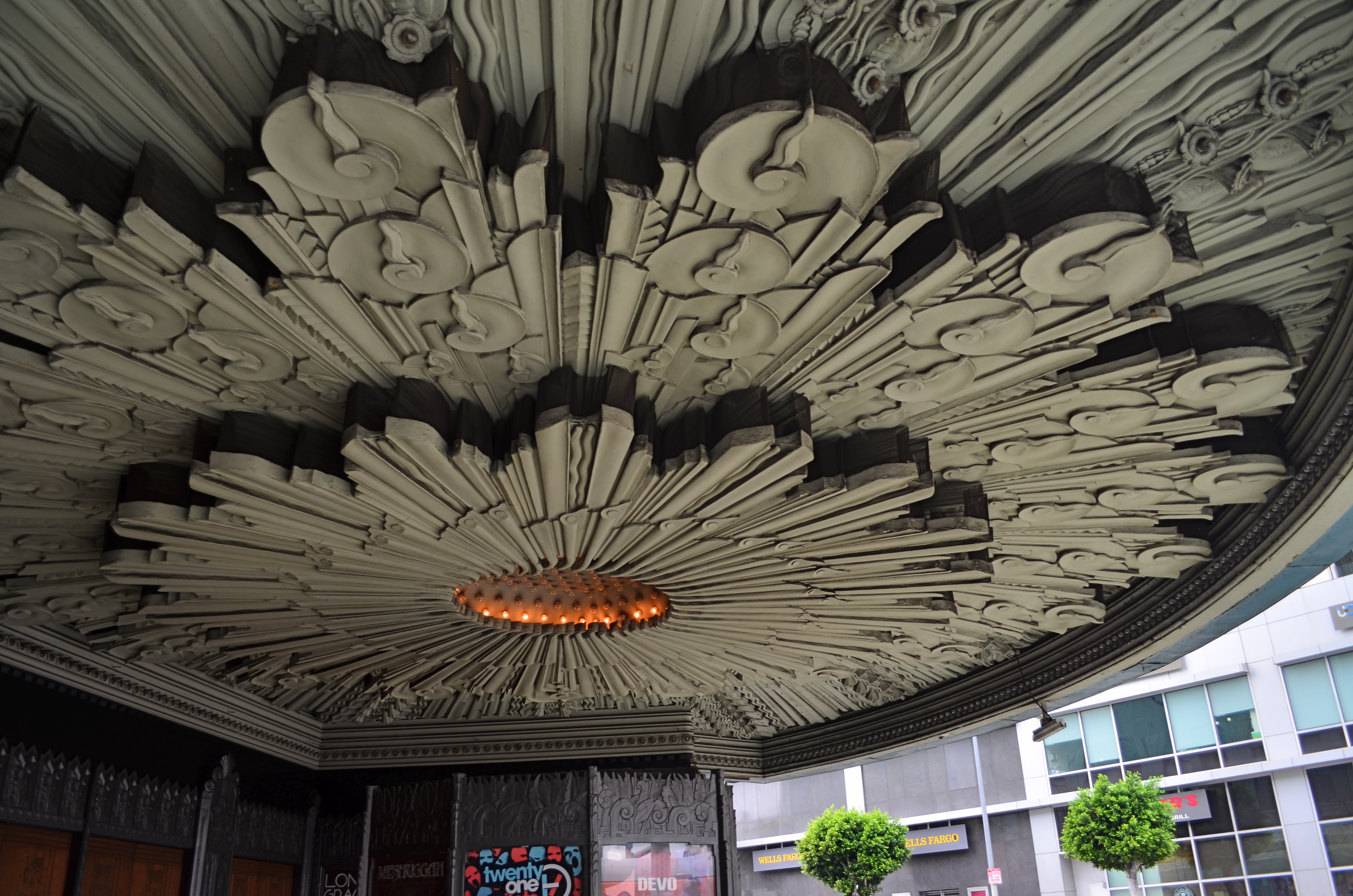
A SMALLER PIECE OF CAKE

Molder plaster designs line the underside of the marquee of Los Angeles’ Deco masterpiece, The Wiltern Theatre.
By MICHAEL PERKINS
IN A HOUSE CRAMMED WITH LUXURIANT COFFEE TABLE BOOKS ON PHOTOGRAPHY, my most lovingly thumbed volumes seem to center on studies of Art Deco architecture, a subject which provides me with endless enjoyment. Some books touch on overall moderne design, but most are specific reference works on the zigzags, chevrons, whorls and curves of buildings, clad in this seductive, streamlined celebration of style. Similarly, my travel plans over the years involve sticking pins in the globe to indicate the fattest troves of these buildings, mapping my strategies for someday capturing them inside a box. It’s a bucket list, if buckets had been designed by Walter Dorwin Teague or Norman bel Geddes.
The original framing of the above shot, complete with other distracting details.
Shooting Deco buildings can humble one, since the sheer volume of decorative accents in a single skyscraper could consume a coffee table book all its own. Deco may use fewer details or lines to suggest an idea compared to earlier eras, but it is still undeniably busy. Some truly extreme edifices, such as Los Angeles’ Pantages Theatre, can nearly give you claustrophobia. These places were certainly meant to be looked at, but, to our contemporary eye, trying to take them “all in” is a little like sending your eye on a three-day bender. This also means that, for photographers, trying to tell a complete story in a single image is pert nigh impossible.
To that thought, I have spent several years going over shoots of Deco buildings that originally involved, say, thirty to forty images, only to find that, even when I was trying to break these giant birthday cakes into smaller slices, there was still enough going on, even in the edited shots, to warrant a second, third, or even fourth “sub-cropping”. One such place, also in L.A., is the giant faux-jade tower known as the Wiltern Theatre, so named because it occupies a corner at the intersection of WILshire Boulevard and WesTERN Avenue. The place was originally the Hollywood capstone of the Warner Brothers theatre chain, and survives today as a live performance space (think alt-rock meets emo). Point a camera anywhere, and you’ll harvest a click-ton of exuberant, exploding ornamentation.
The large shot seen at the top of the page is but one section of the glorious molded plaster overhang beneath the Wiltern’s marquee. The inset image at left is the larger master shot, in which I originally thought I was keeping it simple by limiting the frame to the lower part of the front right corner of the building. Turns out that even this “tighter” composition was too busy, hence the more radical crop to a smaller part of the pattern. On the way to the final edit, I also flipped the design upside down to make it splay out more dramatically and converted the dull gun-metal green to blue for a little extra romance.
All of which seems to be yet another re-hash of the old “less is more” argument. Simplify, simplify, grab the stone from my hand, grasshopper, etc., etc. Art Deco is a style in which the devil (the delight?) is most definitely in the details. Some are so incredible that it seems a sin to have them vanish into large, comprehensive uber-shots of big buildings, rather than being given the loving attention they deserve. And certainly, for photographers, there are other such visual birthday cakes that are more appetizing if you simply cut yourself a smaller slice.
DO MESS WITH MR. IN-BETWEEN
Slot Canyon (2016)
By MICHAEL PERKINS
JOHANNES GUTTENBURG, THE MAN WHO DEVELOPED THE FIRST PRACTICAL SYSTEM FOR MOVABLE TYPE, is also said to have invented a kind of periscope, the better to peer over the teeming throngs at the local virgintennial festival. And while there is no record of what he was trying to see (or, more importantly, if he actually did see it), the longing to extend one’s vision around blind corners is one of the tantalizing mysteries of photography. The fact that we can’t make that 45-degree turn infuses many an image with a delicious kind of suspense.
Often when we compose a photo we imply the existence of a certain hidden something that the still image will forever shield from our detection. We photograph shadows that have no progenitors, streets that are halfway concealed by our shooting angle, and, always, the continuation of patterns and dramas that continue outside the boundaries of the frame. That frame has to be drawn somewhere, after all, and no matter how complete we attempt to make our stories within it, the imagination wants to stray toward whatever was “composed out” of the final product.
And therein lies one of the superb teases of our art. We can select scenes that deliberately torture the eye by denying access to What’s Over That Way or Where Does That Lead. We can abruptly rob the eye of the visual payoff for a conundrum that we ourselves have created. We can lie, cheat and steal. That is, I mean, who says you have to play fair with your viewer? Oh, you want me to tell you everything about this picture? Nuts. Figure it out yourself. Was it Colonel Mustard with a candlestick in the study, or….?
The master shot of the above image was a fairly typical out-the-window view from a hotel room, and originally ran a lot wider. Then it occurred to me that I could almost see something between the two buildings, and I re-cropped to make that “almost” the main part of the picture. Remaking the landscape view into a square introduced a little claustrophobia into the process, forcing the view exactly where I wanted it to hit. And finally, I desaturated all the colors in the shot except the orange of the sodium street lamps to amp up the glow in the aperture between the buildings.
I’m not suggesting that you intentionally make pictures with the sole purpose of messing with people’s minds. But, hee hee, you totally can. What’s around the corner? What’s up the street, beyond the curtain, just out of frame? Your picture, your game, your intentions. Take your audience’s eyes where you want them, and leave them there….between one choice and another.
FIXES ON THE FLY
Original DSLR shot with too much color, too much information, and no effective way to isolate the seated man within the frame.
By MICHAEL PERKINS
ONE UNDENIABLE ADVANTAGE MOBILE OR PHONE CAMERAS HAVE OVER THEIR DSLR FOREBEARS is the ability to combine easy shooting and easy editing in the same small package. This adds convenience on top of convenience, allowing mobile pictures to be captured and refined in the field, with DSLR’s more generally tethered to PCs for their post-production editing.
Even more frustrating is that many basic phone cameras have a wider variety of processing options, even without the use of after-market apps, than come in a DSLR’s “retouch” menu, creating a greater disconnect between the “deliberate” editing of the late-film/early digital camera and the “instinctual” editing of phono-photography.
Recently, DSLRs have made it easier to wirelessly send their images to phones’ email inboxes, but, across several manufacturers, the process is far from sleek. But when you can send images taken with the superior lenses and larger file sizes of a DSLR to your phone, you can easily send those emailed items on to your favorite in-phone app for tweaks that can be done on the fly, with more tricks than your “real” camera allows. It also permits you to do radical re-mixes of yesteryear’s shots with today’s tech. Old photos can get a facelift with a lot less bother than if they go through a Photoshop-type workflow.
To illustrate: the top shot, a DSLR original, was way too busy. Jutting walls, extra people, over-bright colors…plenty to remove if the seated man at the front was to draw any central interest. Cropping and de-saturating in my Mac’s editing program was easy enough, but I wanted to further isolate him from the monotonous textured wall behind him.
The same DSLR image with selective focus added via a phone-based app.
The lens I used in the original wasn’t equipped to render different levels of sharpness within the same focal plane, but my phone had a handy app that did precisely that, and that’s where we went next.
Emailing the image to my phone was fast, as was forwarding the picture in the email to be saved as a camera roll image. From there, I sent the picture to an app called Analog Cam, which included a partial diffuser tool, allowing me to gradually blur everything in the focal plane except the man, as you see in the lower frame. Finally came a transfer from the app to a posting on Flickr. Thus with a few extra steps, I gained the flexibility I didn’t have when I shot the original, allowing me to save, salvage and send from one location.
The emphasis for mobile cameras is much more on post-shutter fixing than is the case with a standard camera. That said, there’s no reason why you can’t shoot on one and use the convenience of the other to get the result you want.
TIED FOR FIRST PLACE
By MICHAEL PERKINS
EVERY PHOTOGRAPH IS DISCUSSED LONG BEFORE IT IS VIEWED, with an inner dialogue between shooter and subject that is held, however briefly, ahead of the shutter click. Sometimes, at a fortuitous intersection of talent and luck, that is the end of the discussion; other times, there will be additional chats between the first version of an image and its maker, a talk that can be endlessly debated in the processing and editing phases. And, of course, based on those results, photographs finally make their arguments to the world at large.
The bulk of those discussions focus on what the center, or the essence of a picture should be. Were all elements in balance right out of the camera…in which case, frame it and hang it, case closed? Or (and what is far more likely), did we find that essence at all? Was it compromised, watered down, by faulty composition? Did we make a weak lighting choice here or there? Did execution weaken the effect?
Usually, there is a clear component within a photograph that cries here I am a little louder than all the other parts of it. But sometimes, there are two or more pieces which feed on each other, boost each other’s effectiveness. In such cases, instead of one primary piece and a lot of secondary or extra pieces, you find two things in the photo that are basically tied for first place. When one thing in a picture feels diminished without interacting with another, both elements deserve to stay.
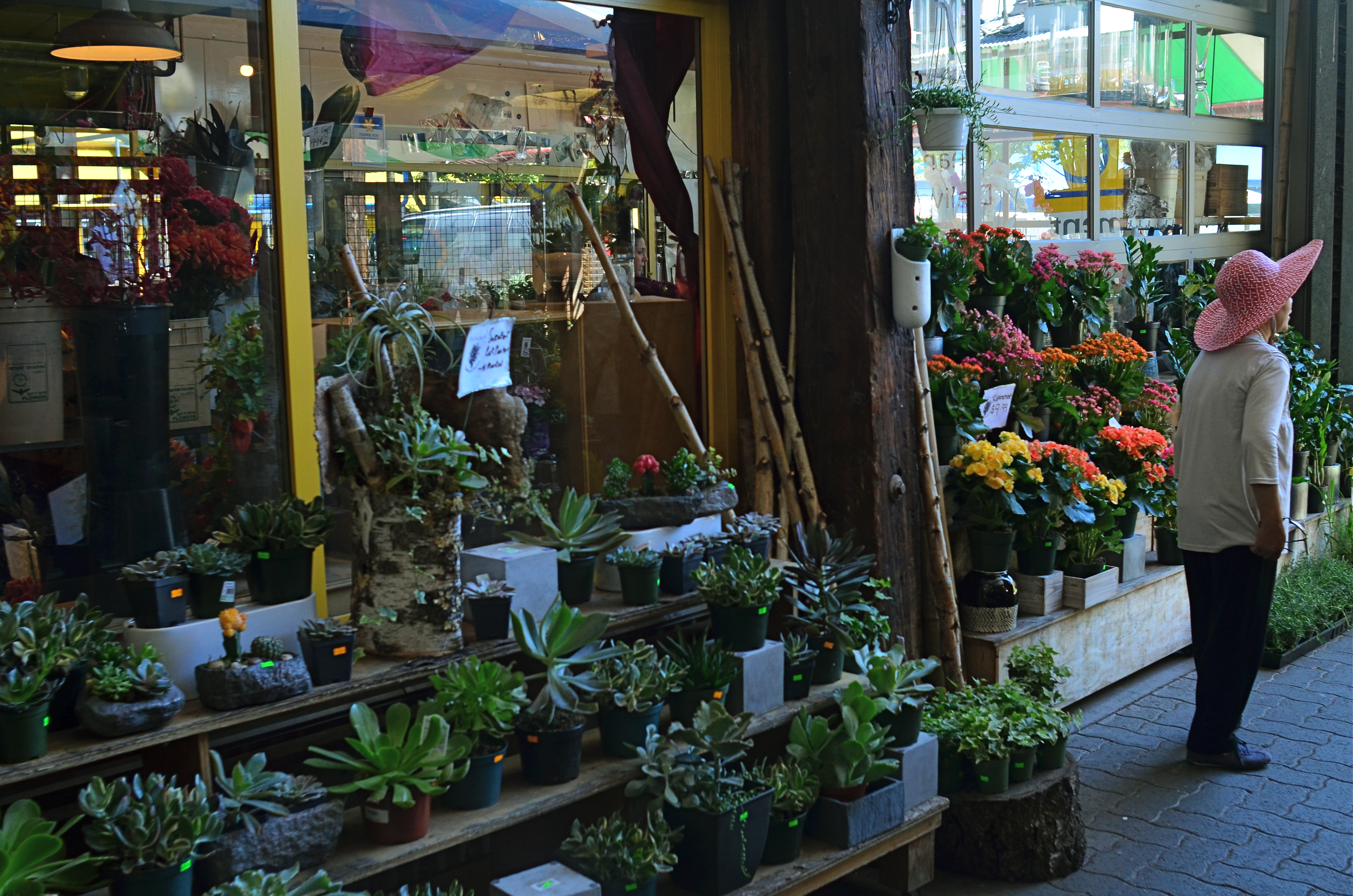
Mrs. Lin’s Summer Bonnet (2016)
The picture at the top seems, to me, to be just such a case. The floral shop and its faceless proprietor seem somehow married to each other, two halves of a whole. And, while I can conceive of making two separate pictures from the master shot in which either the shop’s inventory or the saleslady are in solo starring roles, they truly do seem interdependent, so I declare a tie, and they both go to the finals.
Thus the discussion on what to include in the picture has gone on for at least two layers, with layer one being the planning of the photo, and layer two being the editorial decision to keep both flowers and florist on equal footing in the final image. Look over your own pictures and you will no doubt find several of these “tied for first place” compositions. It can seem counter-intuitive to have more than one main point in an image. But the image itself will tell you, unmistakably, when that actually make the most sense.
THE RIGHT PICTURE IN THE RIGHT FRAME
Horseshoe Bay, BC. The standard “post-card” scenic viewpoint.
By MICHAEL PERKINS
COMPOSITION IN PHOTOGRAPHY, FOR MANY OF US, CAN OFTEN INVOLVE NOTHING MORE than finding a thing we want to capture and getting it all in the frame. Click and done. It’s only later that we sometimes realize that we should have, shall we say, shopped around for the best way, from angle to exposure, to get our quarry in frame. Or even look for a better frame.
The same scene as viewed from a shop window, cropped to classic “View-Master” format.
One of the first tricks I learned in travel photography was from the old scenic shooters who created the travel titles for View-Master Reels, who always thought in terms of framing to maximize the image’s 3-d effect. For a start, since they were working in square format, they automatically had less real estate in which to compose. Secondly, they had to shoot in “layers”, since the idea was to have subject matter in multiple planes, for example, overhanging shade tree right at the front, a tourist midway into the shot, and Mount Rushmore at the back. They also learned to position things just inside the frame’s edge, what was called the “stereo window” to accentuate the sensation of looking into the photograph.
Thing is, all of these compositional techniques work exactly the same in a flat image, and can draw the viewer’s eye deeper into a picture, if used creatively. Certainly you can’t go wrong with a great exposure of a beautiful view. But experiment as well with things that force your audience to peer intently into that view. The image at the top is standard post-card, and works well enough. However, in the shot at left, in taking ten seconds to slip inside a gift shop that also looks out on the same view, I’ve tried to show how you can get an atmospheric framing that both accentuates depth and provides a bit more of a sense of destination. It all depends on what you’re looking to do, of course….but it makes sense to develop the habit of asking yourself how many different ways are available to tell the same story.
Editing a solid portfolio of shots can only begin with lots of choices. Hey, you’re there, anyway, so develop the habit of envisioning multiple versions of each picture, and weed out what doesn’t work. Remember again that the only picture that absolutely fails is the one you didn’t try to make.
(LESS THAN) PRIME OPPORTUNITY
To Susan On The West Coast Waiting (2016). Shot from over 50 feet away with a 24mm wide-angle prime, then cropped nearly 70% from the original frame.
By MICHAEL PERKINS
EVERY DAY-LONG SESSION OF TRAVEL PHOTOGRAPHY dictates its own distinct rules of engagement. You can predict, to some degree, the general trend of the weather of the place where you’ll be staying/playing. You can pre-study the local attractions and map out at least a start-up list of things you might like to shoot. And you can choose, based on all your other prep, the equipment that will work best in the majority of situations, which keeps you from carting around every scrap of gear you own, saving reaction time, and, possibly, your marriage.
All well and good. However, even assuming that you make tremendously efficient choices about what lens you’ll most likely need on walkabout, there will be the occasional shot that is outside the comfort zone of said lens, something that it won’t do readily or easily. In such cases, the lens that would be perfect for that shot is likely forty miles away, back at your hotel. And here’s the place where you can pretty much predict what I advise.
Take the shot anyway.
The original composition.
I tend to work with a 24mm prime f/2.8 lens when walking through urban areas. It just captures a wider field within crowded streets, allowing me to grab most vistas without standing in the path of onrushing traffic (a plus) or spending a ton of time re-framing before each shot (a pain). This particular 24 was made in the ’70’s and is both lightning fast and spectacularly sharp, which, being a manual lens, also saves time and prevents mishaps.
24mm, to me, produces a more natural image than the wide end of the more popular 18-55 kit lenses being sold today, since there is less perspective distortion (straight lines remain straight lines). However, since it is a wide-angle, front-to-back distances will appear greater than they are in reality, so that things that are already in the distance seem even more so. And, since it is also a prime, there is no zooming. In the case at left, I wanted the girl’s bonnet, dress and presence on those rocks, but, if I was going to get any picture at all, plenty of other junk that I didn’t need would have to come along for the ride.
You deal with the terms in front of you at the time. Without a zoom, I either had to take the shot, with the idea of later cropping away the excess, or lose it altogether. There are times when you just have to visualize the final composition in your mind and extract it when it’s more convenient. Simply capture what you truly need within a bigger frame of stuff you don’t need, and fix it later. It’s a cornball cliché, but the only shot you are guaranteed not to get is the one you don’t go for. And this is also a good time to remember that it’s always smart to shoot at the biggest file size you can, allowing for plenty of pixel density even in the aftermath of a severe crop.
You can’t pre-plan all the potential pitfalls out of a photo vacation. Can’t be done. Come as close as you can, and trust your eye to help you rescue the outliers down the road.
But take the shot.
TWO FOR LUNCH
And Then I Told Her… (2016) 1/40 sec., F/5.6, ISO 100, 24mm.
By MICHAEL PERKINS
PHOTOGRAPHS DON’T HAVE TO BE ORGANIZED AROUND SYMMETRY, or even have a discernible “center” to them. However, the eye seems to find comfort in quickly settling on a “starting point” in an image, a place from which to proceed, or to be led to deeper discoveries.Designers for everything from magazine articles to websites toss around terms like visual weight and bottom-up processing to float various theories about how to direct the eye, with each system boasting top efficiency. A balanced pattern near the middle of the picture is thus not necessarily a “must-have”, just a fairly reliable “feels-right”.
By way of demonstration, a photographic center that consists of two people facing each other, talking, is a fairly easy anchor around which to build a straight narrative in an image. As the two heads arc left and right, a rough set of parentheses establish a very basic symmetry, and can help ensure that the middle of the picture engages the eye first. Based on architecture and surroundings, other things in the frame can either enhance or contrast with the symmetry in the middle, and that’s all a matter of taste for the photographer.
Many times a lunch counter or a restaurant gives me the talkers I need, so I tend to be on heightened alert when I enter such places. However, many of the photos I’ve made like this did not originally begin with the two people as the central emphasis: that happened in the cropping process.
In the above image, there actually was enough supportive symmetry from the background so centering the talkers and resizing the photo as a square seemed to be a good overall strategy. Of course, there is no hard and fast rule for these kinds of choices. All than can be said is that, for this picture, in this case, with these elements to work with, centering the conversationalists and placing them at the center of a square made sense. There is an entirely separate case to be made for selective use of the square as a compositional boost, and we’ll deal with than at another time.
Meanwhile, dropping in on two folks for lunch can act as a springboard for a certain kind of picture.
ALONE AGAIN, UNNATURALLY
Lunch For One, 2011. Your choices as a photographer will determine if the woman in the cafeteria is alone…or lonely.
By MICHAEL PERKINS
PEOPLE ARE ONE OF THE MOST COMPLICATED ELEMENTS in a photographic composition. Unlike furniture, foliage or flotsam, humans are the one “prop” in an image which convey associations and meanings that render a photo complex, troubling, intriguing. Put a person in your picture and you have changed the terms upon which you engage the audience.
At the very least, you have posed a series of questions which color the viewer’s reaction to your work. What is that person doing there? What does he wish for, or intend? What are his dreams, his goals? Is she merely in the picture, or in some way a commentary on her context within it? You can move things around in the name of composition alone, but move a person and you have started a conversation.
The original framing for the above shot.
The placement of people in a frame creates speculation about the motives and origins of those people before they were in the frame. A man shown standing at the platform at a train station could be eagerly awaiting an arrival, sneaking out of town, or merely wandering around. The mind starts to supply his backstory, if you like, his actions before appearing in the finite world of the frame. Put two people side by side, and you have, according to your viewer’s whim, a rendezvous, a goodbye, a conspiracy, a reunion, a chance meeting. People change the perceived intention of a photograph as a storyboard, either in the original framing or in the cropping afterwards.
The above image is the final crop of what was, originally, a scenic overview, taken at a large campus of museum buildings on a hillside. The image, as first conceived, was an overall “postcard” with the restaurant in only the lower right quarter of the frame. Later, I became aware that a single woman was visible in the cafe. Now, it’s not that she was actually the only person inside, but the photograph could be cropped to make her seem like it, meanwhile accentuating the emptiness in her immediate area.
As a consequence, instead of a lady who is merely alone, the image can make her seem “lonely”. Or perhaps you disagree. The point is that, by changing the human information in the frame (note that, in the original of the cropped shot, there is also a man standing outside the restaurant), we’ve re-drawn its narrative.
What gets left out of a picture, then, sparks speculation by the viewer, based on what has been left in.
CASTING
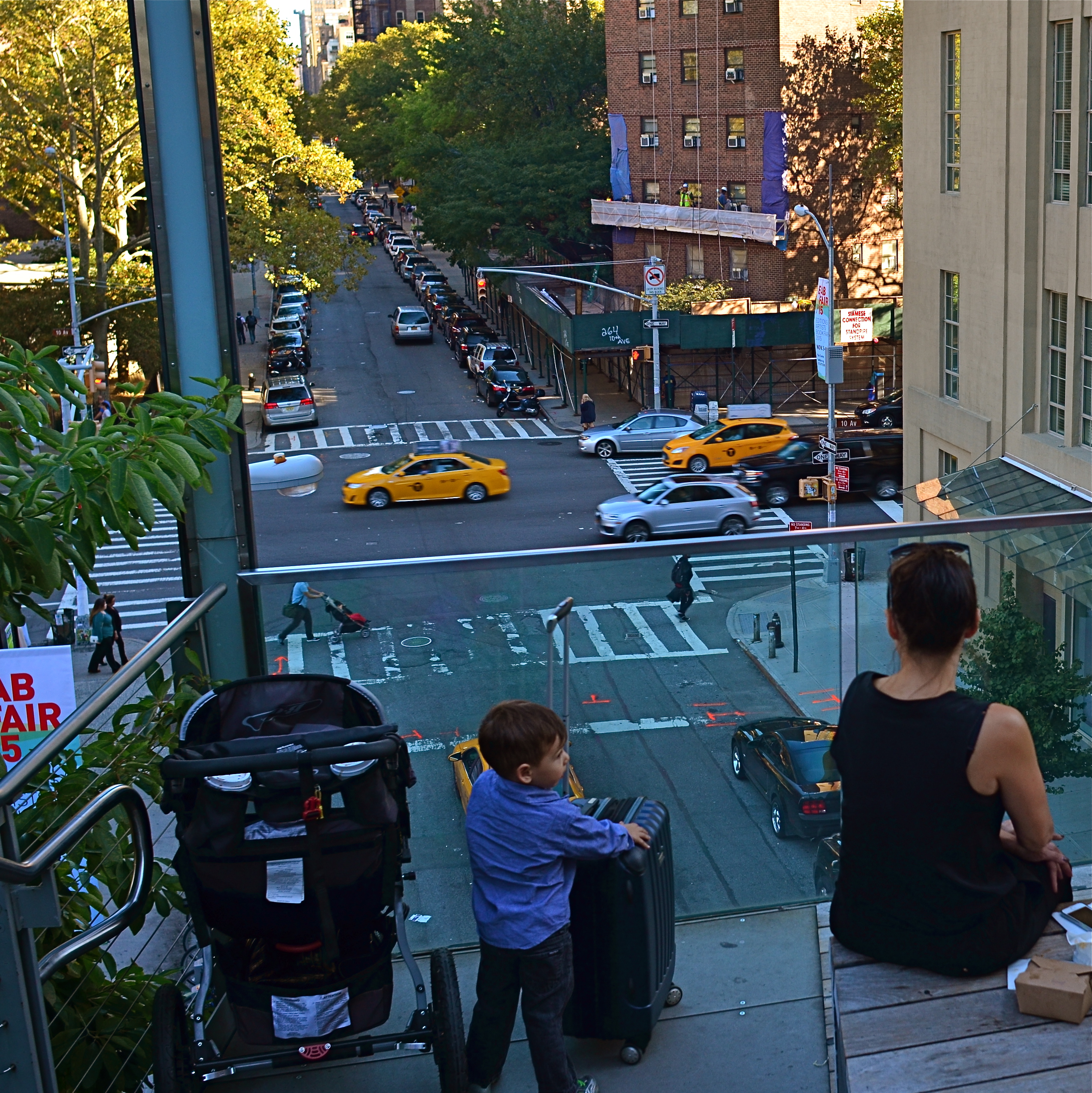
Do the woman and the child constitute a “family” in the narrative of this image?
By MICHAEL PERKINS
MORE COMPOSITIONS IN PHOTOGRAPHY ARE CRAFTED AFTER THE SNAP than naturally spring forward, fully formed, out of the camera. Frame as carefully as you may, you often find that something needs to change to help your image’s story fully emerge. This usually means taking something away, cleaning things up…and that means cropping. I think it’s fair to say that, more often than not, we start with pictures that contain too much and carve out the core picture that deserves to survive, to be pushed to the front.
Sometimes a proportionate tightening is all that a picture needs, so that a large, busy rectangle becomes a streamlined, smaller rectangle. This can clear away extraneous objects like phone poles, wires, extra buildings, any distracting junk that pulls the eye away from the important stuff. But it isn’t always things: it can also be people, surplus bodies which, like extraneous elements of any kind, change the narrative, or keep it from connecting. Think of the picture as a theatrical production and yourself as the casting director. Anyone on the set who doesn’t move the story forward is not playing a part that we need. See the girl at the office for your check, so long.
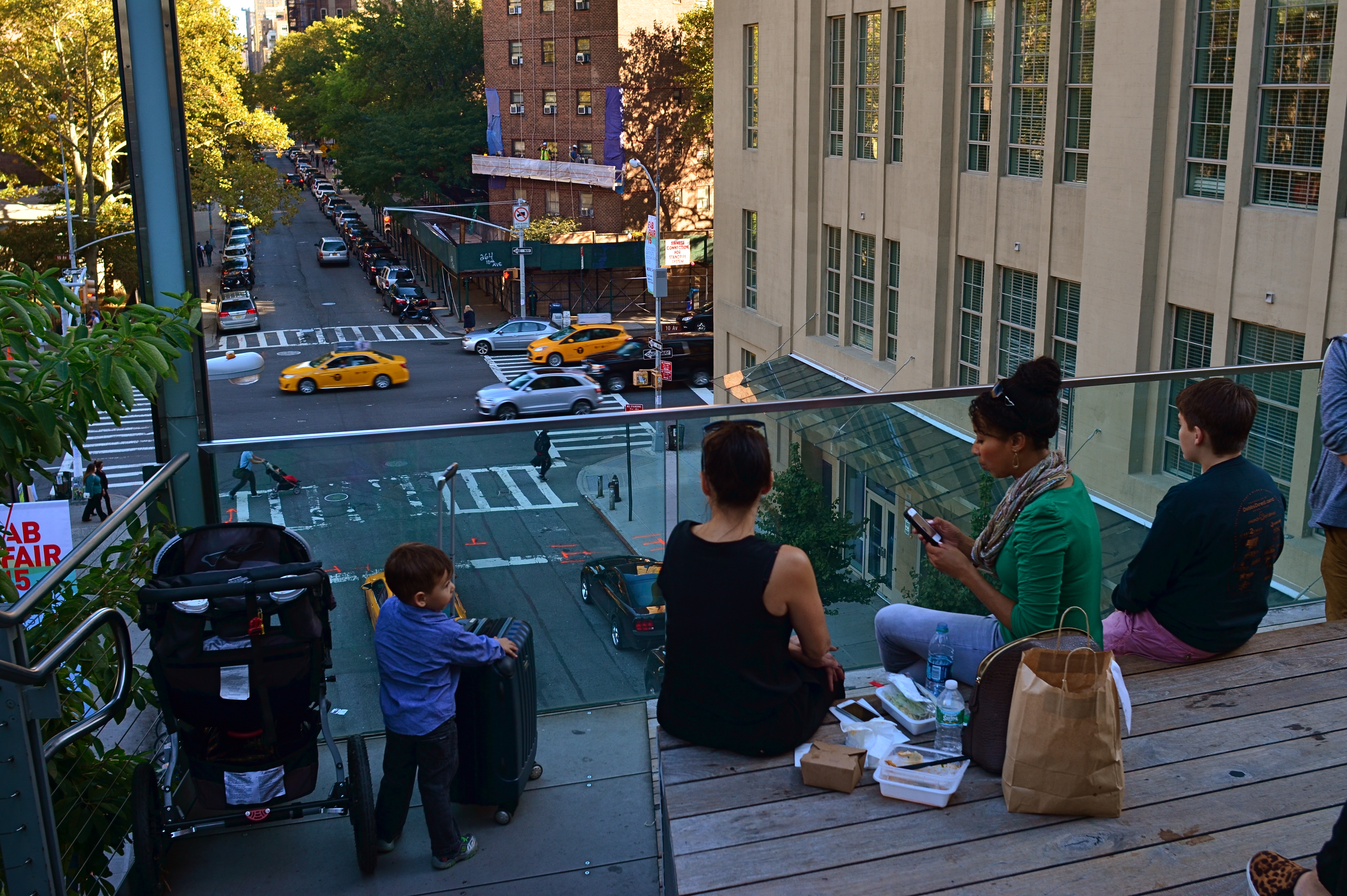
Does the removal of the extra people compromise or complete the photo’s story?
In the picture above, the cropping seems to create the story of a mother and her children taking in the view from New York’s Highline Park onto a city street below. In the original shot, seen at left, she seems less like a mother and more like just another bystander. The crop has suggested a relationship or a role for her. The woman to her right (in the original), unlike the “mother” figure, is not acting as our surrogate, seemingly looking with us at the scene. She is on her cel phone, and therefore registers as more detached than her neighbor, whose face, since it’s invisible to us, could contain anything we want it to. To the right of the cel user, we see additional people who don’t subtract from the picture, but also don’t add anything. They are extras that we, the director, have decided we don’t need to cast.
Also, structurally speaking, the “mother” is arranged so that the diagonal line from the foreground building to her right seems to proceed into the picture from around the area of her right shoulder, so that she sort of anchors the leading line and sends your eye along it to the street below. None of this, mind you, was obvious in the shooting of the original shot, which is not terrible as a composition, only compromised by the inclusion of information that simply doesn’t advance the logic of the picture. I only use it as an example of how I was able to question the “casting” of the original frame and make a conscious decision to cut away things that slowed everything down.
If you can tell a story with two people better than you can with four or five, ask yourself if you really need them. Cropping isn’t an admission that you made a bad photograph. It’s confirmation that your first draft is worth taking to a second one.
ON THE LEVEL
With the amount of repair time it took to straighten and resharpen this shot, I could have made ten pictures that were done correctly in-camera.
By MICHAEL PERKINS
IT’S NOW QUITE EASY TO HAVE YOUR CAMERA OR EDITING SOFTWARE correct for things you should have done before the image was made. Most of the times, these fixes cure more than curse, some of them genuinely helping a shooter extend his skills or fine-tune his control. However, in the case of one of the most common post-pic fixes, the “straighten” slider, you’re potentially messing with picture quality, to fix a problem that, quite honestly, shouldn’t have existed in the first place.
Consult every, and I mean every basic camera tutorial going back a hundred years or more. Many timely tips in such books have vanished or evolved over time, but the simple admonition to keep your shot level has remained unchanged since the dawn of photo time. So why do cameras and software even offer straightening as an option?
If you take the cynical view, the existence of this fix suggests that camera manufacturers assume that enough people will routinely take crooked pictures that, of course, they need something to tilt their images back to normal. Because, if that’s not true, then why does the fix even exist?
Here’s the critical point about straightening: it does not maintain sharpness like simply cropping a photo to a smaller size does. To restore your image to a rectangular shape after you’ve rotated it left or right to level it, your camera (or software; both do it the same way) must trim part of the picture and resize it, producing a lower total number of pixels in the “corrected” photo but within the same space as the original one. And there’s just no way to do that without degrading the sharpness.
Some straightenings, if conservative, may not fuzz up your photo as much as some more extreme adjustments. The above image was shot literally on the run during a tour, but it needed just slight adjustment, and so retained most of its sharpness after I ran it though a second editing program. However, you really have to love a shot to go to those extremes to save it.
Thing is, you can bypass this entire problem simply by shooting a level picture. Now, I won’t bore you with a list of just how many really easy ways there are to ensure this. But since sharpness makes at least the top five list of things that most people want from a picture, why not take a pass on all the post-mortem fixes by doing one of the simplest possible things in photography more often?
POINTERS
A traditional wide-angle approach to the suggestion of depth.
By MICHAEL PERKINS
WE ALL WENT THROUGH THAT OLD PERSPECTIVE EXERCISE IN ART 101. You know, the one where we draw the train tracks trailing away to an imaginary horizon, compressing the distance between the tracks as they “recede” to suggest depth, or a simulation of the way our eyes perceive it. It’s a lesson that dances somewhere back in our lizard brain whenever we compose a shot to suggest three dimensions on a flat plane (film or sensor) that only possesses two. Ongoing challenge, etc., etc.
In composing a photograph, it’s pretty easy to decide which factors in the picture actually aid that illusion, creating a big fat neon arrow to the thing we’re want to draw attention to. And some ways are better than others at selling that idea. One of the strong myths about these kinds of shots is that you need a wide-angle to make the argument for depth. Of course, that’s like a lot of “rules” in photography. It’s always true, except in those cases when it’s kinda…not.
In the top image, shot with a 24mm lens, the building at the back of the shot is lit better than the two alley walls that lead to it….a basic no-brainer of a composition. Moving left or right a bit can put the major emphasis on one wall or the other to be the arrow pointing to that object, or you can make the shot even more compact, although no less effective, in the cropping process.
Instead of two leading lines heading for the building at the back, let’s try just one.
Of the two walls, the rows of trash cans and receding lines of windows on the left seem, at least to me, to lead more powerfully to the back building than the right, where detail is darker and objects that could act as a leading line are a little more angled and compressed. Just for kicks, I cropped the shot to a square you see just above, reframing the back building as the end of a straight, single diagonal along the left wall, making the instruction to the eye a lot more streamlined.
It’s not that the fuller frame is “wrong” per se, but I always believe that inside many shots just might be a better shot waiting to get out. Some photographs are full-born in-camera, while others emerge during what I call the “on second thought” phase.
Now to try this idea out at a railroad crossing….
THE LONG AND SHORT OF IT
This original frame was just, um, all right, and I kept wanting to go back and find something more effective within it.
By MICHAEL PERKINS
THE INTRODUCTION OF THE FIRST PANORAMIC CAMERAS in the 1840’s can be seen as a freeing-up of the camera frame, a way to more accurately depict the entire field of view open to the human eye. And, of course that’s true. However, the first panos were also an early attempt by photographers to deliberately direct and orchestrate not only what you see, but how they want you to see it. Let’s concede that the western mind tends to absorb information in linear fashion. We read from left to right, we scan the horizon, and so forth. So making a photograph that instructs you to interpret horizontally is fairly natural.
So the first panos seem like a fairly modest extension of our visual bias. But think about the fundamental change that represented. Suddenly, photographers were saying, there are no rules except the rules I dictate. I decide what a frame is. I arrange not only the information inside the frame, but the frame itself. By re-shaping the box, I re-shape what you are to think about what’s in the box. That’s revolutionary, and today’s shooters would be wise to be mindful of that wonderful power.
I am fond of making what I will generously call “carved” panoramics, shots that began as standard framings but which I have cropped to force a feel of left-to-right linearity. Unlike standard panoramics, the shots were conceived and made with a very different compositional strategy, not necessarily trying to tell a horizontal story. However, on review, some stories-within-stories contain enough strong information to allow them to stand as new, tighter compositions in which the new instruction to the viewer’s eye is quite different from that in the original.
Change the frame, change the message.
The full shot seen at the top of this page may or may not succeed as a typical “urban jungle” snap, in part because it contains both horizontal and vertical indices that can pull the eye all over the place. Since I wasn’t amazed by the shot itself, I decided to select a horizontal framing from its middle real estate that purposely directed the eye to laterally compare the facades of several different buildings stacked tightly down the street. Full disclosure: I also re-contrasted the shot to make the varying colors pop away from each other.
The result still may not be a world-beater, but the very act of cutting has re-directed the sight lines of the picture. For better or worse, I’ve changed the rules of engagement for the photograph. When such surgeries work, you at least fix the problem of extraneous clutter in your pictures, making them easier to read. Then it’s down to whether it was a good read or a beach read.
Hey, the box can’t fix everything.
PARAMETERS
By MICHAEL PERKINS
A PHOTOGRAPHER’S IMPACT IS ONLY PARTIALLY CREATED BY WHAT HE CHOOSES TO RECORD. That is, whatever his subject, be it banal or magnificent, his choice of what to shoot is only, at best, half of what makes or breaks his picture.
The other half of the miracle comes not from mastery of light, aperture, gear or conditions. It is in the frame, and what he includes or excludes from it. Landscape mode, portrait mode, big crop or little crop, the frame is the final determinant of how well the image argues for itself. The legendary director of photography for the New York Museum Of Modern Art, John Szarkowksi, expresses this idea for all time in his wonderful book The Photographer’s Eye:
To quote out of context is the essence of the photographer’s craft. The photograph’s edge defines content. The photographer edits the meanings and patterns of the world through an imaginary frame. This frame is the beginning of his picture’s geometry.
Consider, for a moment, the most vital, most inspiring images you’ve ever seen. Now imagine them cropped two inches wider, four inches to the left, five inches higher. The visual terms of engagement would be completely re-ordered. And what would be the result? Would you draw different conclusions, make different assumptions, experience a diminished ( or enhanced) sense of mystery?
The frame, and the choices the photographer makes in its design, is more decisive in the success of a picture than any other single factor. Technically imperfect photos become world-beaters every day simply because the frame is eloquent. And it also follows that a well-crafted bit of exposure can be dulled or blunted by a frame that is carelessly drawn.
The above image represents a choice, the drawing of a visual boundary. The top of the flowers and the objects surrounding the bucket aren’t missing because I shot too close, they’re deliberately excised because I made a deliberate decision that they didn’t add anything to the story I was trying to tell. You can disagree about whether I made the correct choice, but the making of that choice was as important (actually more important) than the subject itself.
Photographs have visual parameters, since we can’t make images big enough to include all of our experience. There are limits on the dimensions of what we show, and intelligent use of those boundaries can transform our work in marvelous ways.
