THE BLUE AND THE GREY
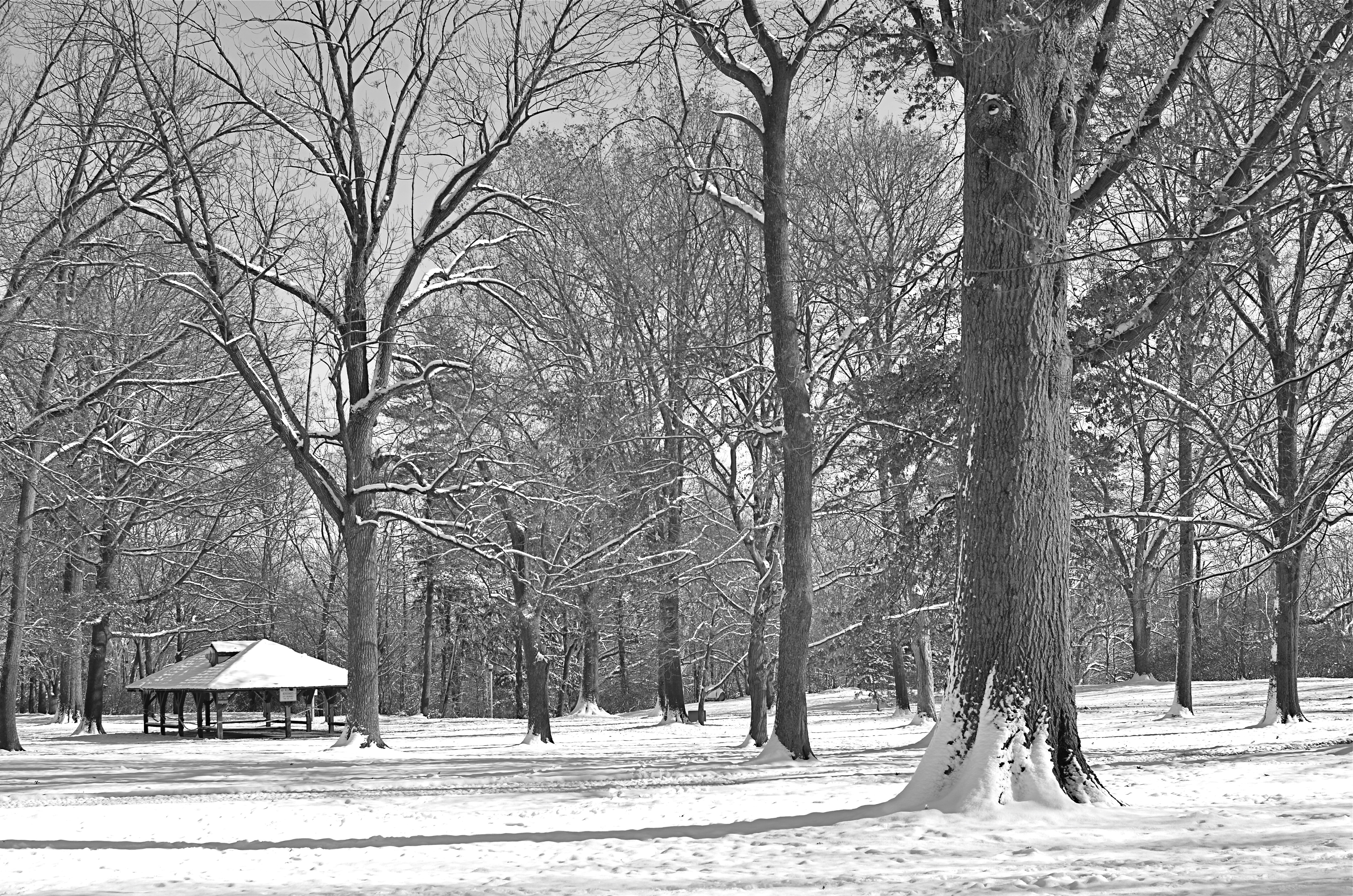
A decent winter scene, a bit too charming in its full color original, converted in-camera to straight monochrome. Now, however, it’s too bland.
By MICHAEL PERKINS
ONE OF THE GREAT BENEFITS OF DIGITAL PHOTOGRAPHY, other than its ease and affordability, is the speed at which it allows you to make comparative value judgements on images in the field. Even as digital darkrooms make it ever easier to change or modify your vision after the fact, today’s cameras also allow you to choose between several versions of a photograph while its subject is right at hand. This is an amazing mental and artistic economy, and it’s another reason why this is the absolute best time in history to be making pictures.
Many of us who made the transition from film have a lifelong habit of “bracketing”, taking multiples of the same image over a range of exposure rates to ensure that we are “covered” with at least one keeper in the batch. Others have already adopted the equivalent habit of taking several different frames with a sampling of varying white balances. I also find it helpful to use today’s in-camera filters to instantly convert color shots to three other monochrome “takes”….straight black and white, sepia and cyanotype. It’s a way to see if certain low-color subject matter will actually benefit from being reworked as duotone, and knowing that fact extra fast.
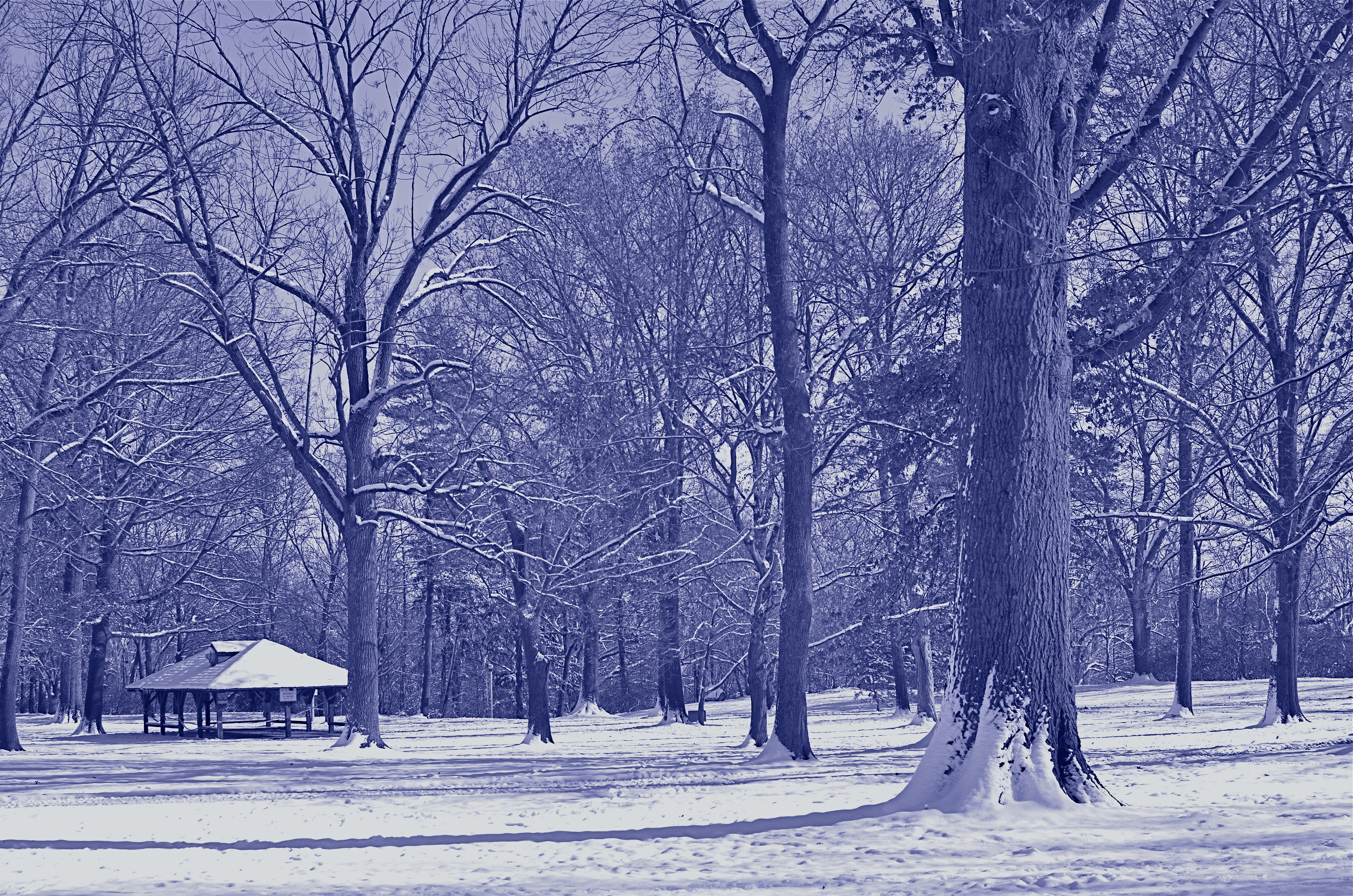
Another in-camera conversion, this time to cyanotype. This one says “winter” to me. 1/320 sec, f/5.6, ISO 100, 35mm.
Color or its selective elimination is one of the easiest tools to wield in photography. In the case of the series shown in this post, I decided that the winter scene was a little too warm and cheery in full color, a little flat in straight B&W, but properly evocative of winter’s severity in cyan. The choice was quick, and I still had the color master shot that I could choose to massage later on.
Shooting fast, that is, at the speed of your mood or whim, is a remarkable luxury, and exploiting it to the max is easy with even the most elementary camera. And anything that converts more “maybe” shots to “yes” is my idea of a good time.
I’ll have a Blue Christmas, thank you.
Related articles
- 5 Good Photography Habits to Start Today (digital-photography-school.com)
BLUE ON THIRD AVENUE
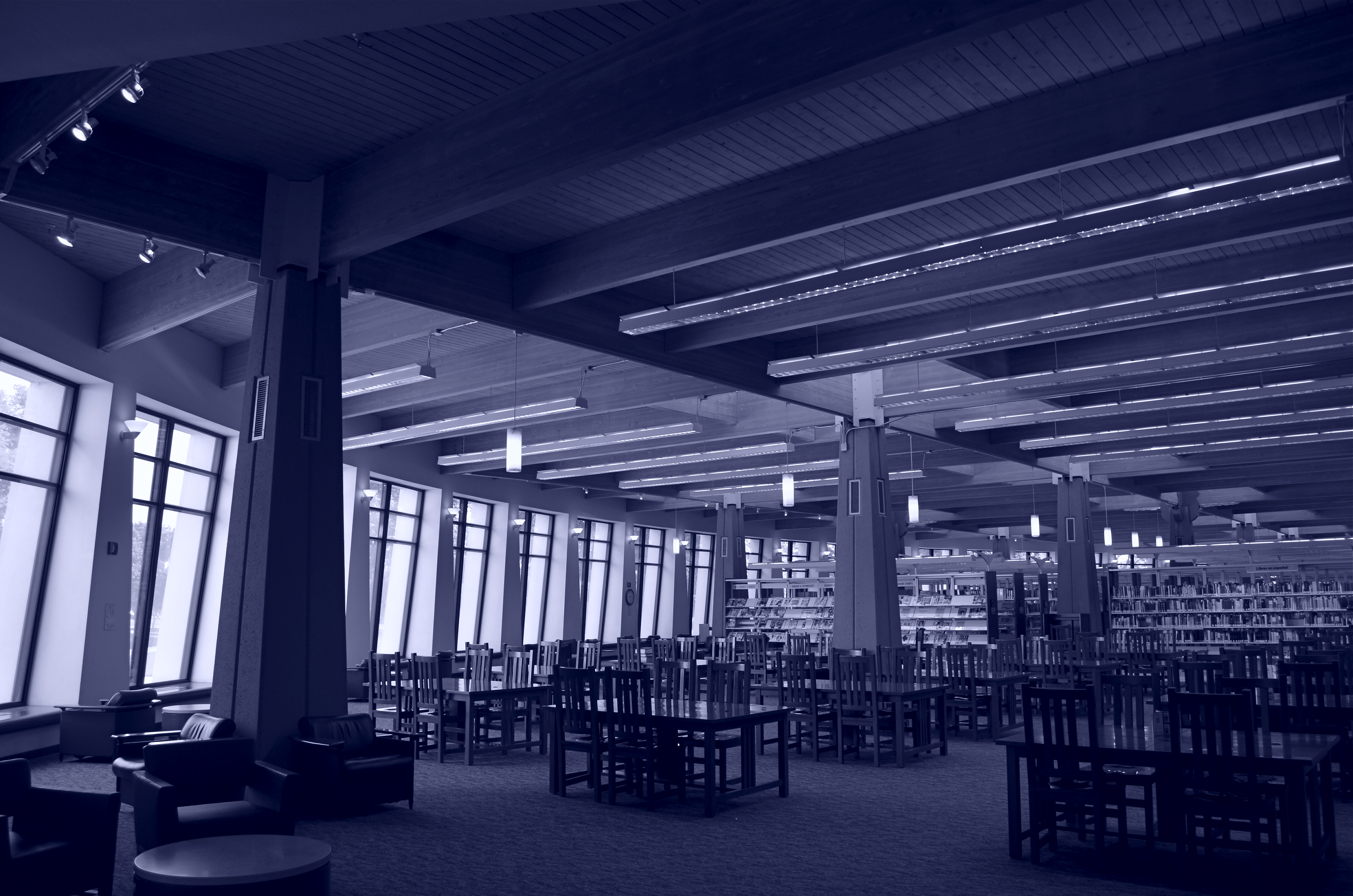
The cyanotype option in Nikon’s monochrome posting menu makes this in-camera conversion from color easy. 1/80 sec., f/5.6, ISO 160, 18mm.
By MICHAEL PERKINS
COLOR IS LIKE ANY OTHER COMPONENT IN LIGHT COLLECTION AND ARRANGEMENT, which is, really, what we are doing. Seen as a tool instead of an absolute, it’s easy to see that it’s only appropriate for some photographs. Since the explosion of color imaging for the masses seen in the coming of Kodachrome and other early consumer films in the 1930’s, the average snapper has hardly looked back. Family shots, landscapes, still life arrangements….full color or go home, right?
Well….
Oddly, professional shooters of the early 20th century were reluctant to commit to the new multi-hued media, fearing that, for some novelty-oriented photographers, the message would be the color, instead of the color aiding in the conveying of the message. Even old Ansel Adams once said of magazine editors, that, when in doubt, they “just make it red”, indicating that he thought color could become a gimmick, the same way we often regard 3-d.
In the digital age, by comparison, the color/no color decision is almost always an afterthought. There are no special chemicals, films or paper to invest in before the shutter clicks, and plenty of ways to render a color shot colorless after the fact. And now, even the post-processing steps involved in creating a monochrome image need not include an investment in Photoshop or other software. For the average shooter, monochrome post-processing is in-camera, at the touch of a button. Straight B/W and sepia and even what I call the “third avenue”, the blue duotone or cyanotype, as I’ve used above.Do such quickie options worsen the risk of gimmick-for-gimmick’s sake more than ever? As Governor Palin would say, “you betcha”. Google “over-indulgence”, or just about half of every Instagram ever taken, as evidence.
Hundreds of technical breakthroughs later, it still comes down to the original image itself. If it was conceived properly, color won’t lessen it. If it was a bad idea to start with, monochrome won’t deliver the mood or the tone changes needed to redeem it. Imagine the right image, then select the best way to deliver the message. Having quick fixes in-camera aren’t, initially, a guarantee of anything but the convenient ability to view alternatives. In the photo above, my subject was just too warm, too pretty in natural color. I thought the building itself evoked a certain starkness, a cold, sterile kind of architecture, that cyanotype could deliver far better. The shadows are also a bit more mysteriously rendered.
At bottom, the shot is just a study, since I will be using it to take far more crucial pictures of far more intriguing subjects. But the in-camera fix allows you to analyze on the fly. And, since I got into this racket to shoot pictures, and not to be a chemist, I occasionally like a fast thumbs-up, thumbs-down verdict on something I’ve decided to try in the moment.
Giving yourself the blues can be a good thing.
(follow Michael Perkins on Twitter @ mpnormaleye)
Related articles
- Toning my Cyanotype with Haritaki (altlab2011.wordpress.com)
- Beyond Color (piaffephotos.wordpress.com)
