LATE-BURNING CANDLES
By MICHAEL PERKINS
DAYTIME PHOTOGRAPHS OF BUILDING EXTERIORS present the interior contents of apartments, stores and offices in a very muted fashion. Glare, sunlight, and plain old dirty glass, along with the limited scope of some camera sensors, render inside space in a somewhat flattened manner. Fortunately, night shots of the same spaces reveal something completely different, hints of the lives of the people who have locked up and headed home for the evening.
Like a picture framed in a black matte or displayed on a bed of velvet, night images of building interiors, taken from outside those buildings, benefit from that contrasty “punching up” between dark and light. More to the point is how people decide to stage their work space when they clock out. Do they leave a single lamp on to illuminate their desk? Is the room largely dark, but partially painted with ambient light from the cleaning person down the hall? Are certain displays, logos, personal effects altered by the overall reduction in illumination? And, for the photographer, does something different emerge in the feel of the room that seems invisible by day?
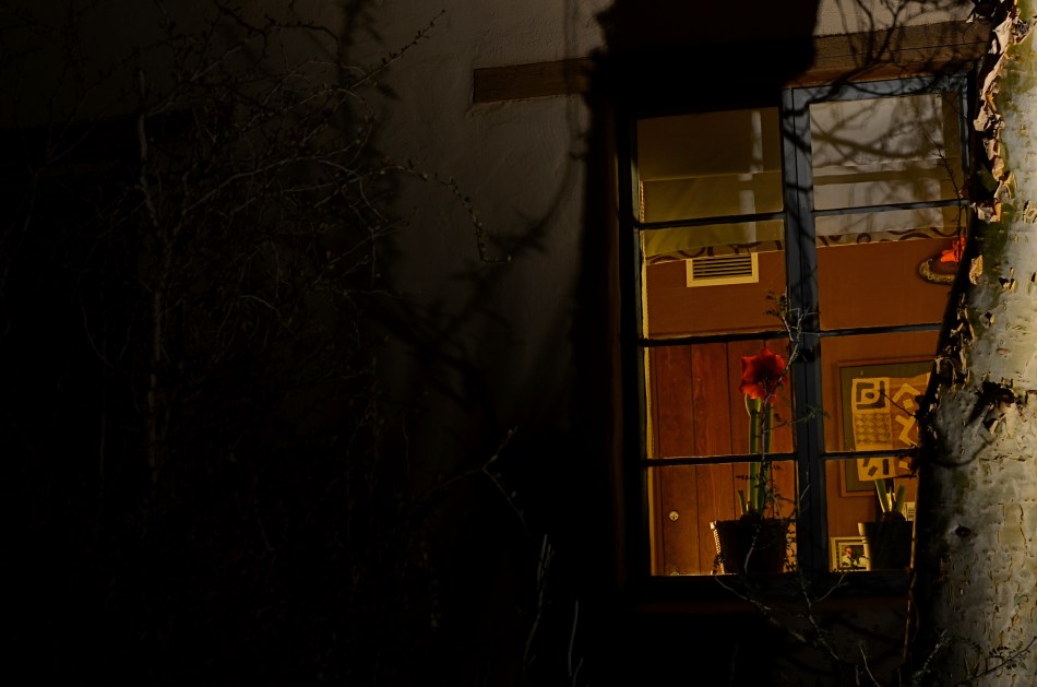
I recently walked around a large museum campus, taking medium-distance time exposures of several buildings whose exterior lighting scheme seemed altered at night, when I saw the office window you see above. The overall scheme of light in the room was warm. The gorgeous amaryllis plant arching over someone’s desk not only worked that slightly orange room light, but was made especially seductive with the deepening of its own colors. Here was a workspace where someone drew rest, beauty, and solace from the inclusion of just one extra humanizing item. And, after dark, it glowed like a coal to passersby. I had to have it, at least inside my camera.
I’m not saying that all peeks through all windows yield treasures to the photographer’s eye. But the sheer volume of visual information on a city street during the day is cut by half after sundown, and occasionally, you find a late-burning candle that has spent the daylight hours hiding in plain sight.
STAKES IN THE GROUND
By MICHAEL PERKINS
NO DOUBT YOU KNOW WHAT IT FEELS LIKE TO SEE A PICTURE IN YOUR MIND that, for some reason, doesn’t make it into the camera.
It’s maddening. That fumbling few inches between success and failure that cannot always even be sensed during the taking of an image, but which, somehow, is as wide as a river gorge once the picture comes out. Dammit, you saw it. More importantly, you felt it. But something in perhaps a technically perfect photograph fails to engage, and the thing just can’t close the sale.
Going further with the metaphor of salesmanship for a moment, there are pictures which, in a manner of speaking, don’t “ask for the order”. They don’t effectively say, here is the main point of interest. Look here, then there. The best photos are triptychs in that they have a sense of inevitable direction. Your eye senses where to travel with the frame.
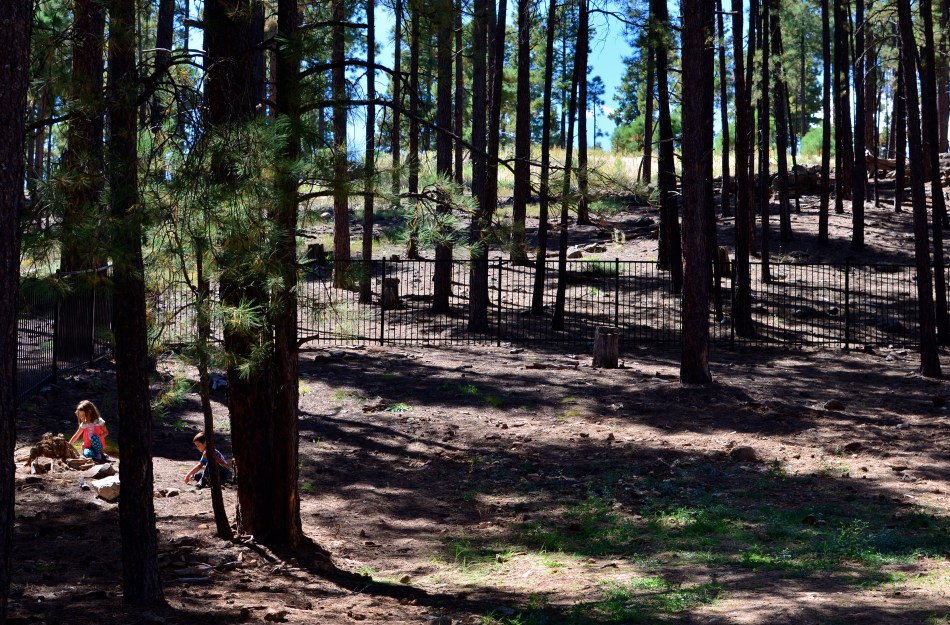
In the above forest scene, I nearly failed to provide that impetus because, in my first few shots, I was overly centered on getting the contrasty elements of the picture from fighting each other. Some trees came out like silhouettes. Some parts of the forest floor were way too bright. Somewhere along the line, I had decided that the picture was about solving those purely technical problems. Check those items off, I thought, and you’d have a real nice nature scene, or so it seemed at the time. Only one lucky thing intervened to change my mind and save the picture.
This comes under my general belief that most of the things you need to fix a composition are mere inches away from where you’re already standing. In this case, I moved a bit to the left of several trees and two small children swung into view, both of them representing a dynamic dollop of color in an overly bland palette of shades. Suddenly the picture was about these kids stealing away, inhabiting a quiet, separate world, their size dwarfed by the pines while giving measurable scale to the entire woods. They had found a complete reality away from everyone, and it would be easy to show that. Cropping to have them enter the frame at the bottom left corner helped direct the eye where I needed it to go first. Start here, and then look beyond.
It’s helpful to regularly dissect the pictures that almost had enough story to sell themselves. What stakes could I have pounded into the ground to mark the outline of the idea? Where did I fail to lay out the territory of the story?
It’s all about getting that image from your mind into the camera. That’s everything. That is, ever and always, the problem to be solved.
MAKING LIGHT OF THE SITUATION
BY MICHAEL PERKINS
IN PORTRAITS, PHOTOGRAPHERS SOMETIMES HAVE TO SUBSTITUTE INTIMACY FOR TECHNICAL PERFECTION. We understandably want to come as near as possible to meticulously modulated light in telling the story of a face, and so we try to ride the line between natural, if inadequate light, and light which is shaped so much that we dull the naturalness of the moment.
It’s a maddening tug of war. If we don’t intervene, we might make an image which is less than flattering, or, worse, unfit for publication. If we nib in too much, we get a result whose beauty can border on the sterile. I find that, more often than not, I lean toward the technically limited side, choosing to err in favor of a studied snapshot rather than a polished studio look. If the face I’m shooting is giving me something real, I worry more about throwing a rock into that perfect pond with extra tinkering.
If my subject is personally close to me, I find it harder, not easier, to direct them, lest the quality I’m seeing in their natural state be replaced by a distancing self-consciousness. It puts me in the strange position of having to wait until the situation all but gifts me with the picture, as adding even one more technical element can endanger the feel of the thing. It’s times like this that I’m jammed nose-up against the limits of my own technical ability, and I feel that a less challenged shooter would preserve the delicacy of the situation and still bring home a better photograph.
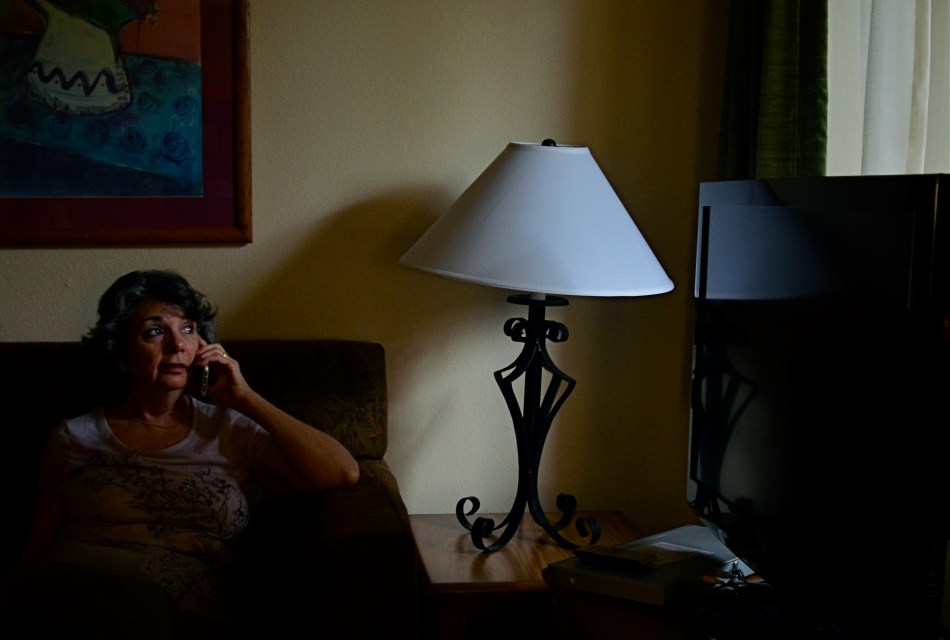
In the above frame, the window light is strong enough to saturate the central part of my wife’s face, dumping over three-fourths of her into deep shadow. But it’s a portrait. How much more do I need? Would a second source of light, and the additional detail it would deliver on the left side of her head be more “telling” or merely be brighter? I’m lucky enough in this instance for the angle of the window light to create a little twinkle in her eye, anchoring attention in the right place, but, even at a very wide aperture, I still have to crank ISO so far that the shot is grainy, with noise reduction just making the tones flatter. It’s the old trade-off. I’m getting the feel that I’m after, but I have to take the hit on the technical side.
Then there was the problem that Marian hates to have her picture taken. If she hadn’t been on the phone, she would already have been too aware of me, and then there goes the unguarded quality that I want. I can ask a model to “just give me one more” or earn her hourly rate by waiting while I experiment. With the Mrs., not so much.
Here’s what it comes down to: sometimes, you just have to shoot the damned thing.
UNKNOWN KNOWNS
By MICHAEL PERKINS
ALFRED HITCHCOCK’S CLASSIC REAR WINDOW IS THE ULTIMATE GUILTY PLEASURE, and not just because the Master of Suspense is at the peak of his edge-of-your-seat powers in the telling of its thrilling murder story. No, the massive, full-sized set of James Stewart’s Manhattan neighborhood, with all its apartment-dwellers’ secrets open to the most casual snoop, is the creepy, giddy candy at the center of this cinematic confection. In making it temporarily okay to be, in effect, peeping toms, Hitchcock is making us complicit in his hero’s unsavory curiosity. All these dramas. All these secrets that we have no right in knowing. And, of course, we can’t look away.
Photographing the intersection of living spaces in city settings is far often more subtle than Hitch’s feat of shaving the back wall off an entire community, and that makes for a lot more mystery, most of us beyond solution. Look too little, and a slab of brick is more like a beehive than a collection of stories. Look too deeply, and the truths you unearth can feel stolen, like an invasion done purely for prurient entertainment. What’s most interesting is to imply much but reveal little, and hitting that balance is tough.
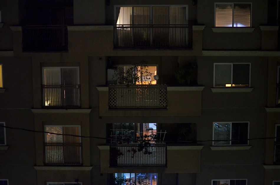
I recently killed off the last fifteen minutes of a generally unproductive night of street shooting by gazing out the window of my nondescript hotel at an equally nondescript apartment building across the way. The last vestiges of dusk offered scant details on the outside wall, and the warm yellow hum of electrical light had already begun to flicker on in the various cubicles. I thought of Rear Window and how you could look at the fully visible doings of people, yet still know virtually nothing of their lives. Here the lighting was random, undefined, with little real information on the life throbbing within the individual spaces….the dead opposite of Hitchcock’s deliberate staging.
I couldn’t see a face, a hand, an activity. All I had was the mere suggestion of human presence. What were they reading, watching, wishing, enduring, enjoying, hating? I couldn’t know and I couldn’t show it, but I could show the mystery itself. I could share, if you will, the sensation of not being able to know. And so I made a photograph of that lack of information.
Some photographs are about things, obvious things that you’re able to freeze in time. Other images are about the idea of something, a kind of unsatisfied anticipation. Both kinds of pictures have their own narrative code, and learning how to manage these special languages is great practice for the idea, and the mind back of it.
EAVES-EDITING
by MICHAEL PERKINS
ONE OF THE SIDE BENEFITS OF PHOTOGRAPHY is that you don’t always have to pick your own subject. Sometimes someone else’s idea of a potentially good image can be yours as well. You simply camp yourself right next to where they’re working and pick off your own shots of their project. Assuming that everyone’s polite and there are no issues of neighborly nibbing, it can work. Just ask anyone who’s clicked away at a presidential press conference or the sudden exit of a celebrity through a side entrance.
Of course, when literally dozens of cameras are trained on a single event, its likely that everyone will come away with the same photos, or very nearly. The moment the prime minister points to drive home his main point, click. The instant when the judges place the tiara on the winning Miss Tomato Paste candidate, click. Sometimes, however, you can kind of “eaves-edit” on just one other shooter’s set-up and edit the shots a different way than he does. You’re not running the session, but you could come away with a better result than he does, based on your choices.
I recently came upon a man shooting a girl in the streets of a kind of faux-village retail environment in Sedona, Arizona. Obviously, the main feature was the lady’s infectious and natural smile. As I came quietly upon them, however, Mr. Cameraman was having a problem keeping that smile from exploding into a full-blown laughing fit. Ms. Subject, in short, had the mad giggles.
Now, from that point onward, I have no idea of what he went home with in the way of a final result, as I had decided that the crack-ups would make better pictures than a merely sweet set of candids. It just seemed more human to me, so I only shot the moments in which she couldn’t compose herself, and took off from there.
I didn’t want to overstay my welcome, so I snapped my little chunk of Mr. Cameraman’s moment and sneaked off, like fast. As I slinked away, I could still hear Ms. Subject telling him, through fits of laughter, “I am so sorry.” She may have been, but I wasn’t.
DISTINCTION WITHOUT A DIFFERENCE
By MICHAEL PERKINS
PHOTOGRAPHY IS ONLY PARTLY ABOUT A STRING OF TECHNICAL DEVELOPMENTS AND BREAKTHROUGHS. It is also the chronicle of what those advances have done to democratize the art, moving it from the domain of rich tinkerers and elites to an arena in which nearly anyone can participate and compete. From the first box camera to Instagram, it is about breaking down barriers. This is not something that is open to debate. It just is.
That’s why it’s time to re-think the words professional and amateur as they apply to the making of images. This is the kind of topic where everybody tends to throw down passionately on one side or the other, with few straddlers or fence-sitters.
Those shooters whose toil is literally their bread and butter are, understandably, a little resentful of the newbie whose low-fi snap of a trending topic tops a million likes on Twitter, all without said snapper’s having mastered the technical ten commandments of exposure or composition. And those whose work is honest, earnest and sincere, yet formally uncertified, hate being thought of as less Authentic, Genuine, or Real simply because no one has printed their output in the approved channels of accepted craft, be it magazines like Nat Geo or the cover of the New York Times.
Okay, I get it. From your personal perspective, you don’t get no respect. But you know what? Get over yourself.
Do we really need to trot out the names of those who never got paid a penny for their work, mostly because their entire output consisted of inane selfies or dramatic lo-fi still lifes of their latest latte? Is it helpful to point out the people within the “official” photographic brotherhood whose work is lazy or derivative? Nope. It is beyond pointless for the two sides to get into an endless loop of So’s Your Mom.
So let’s go another way.
The words professional and amateur are, increasingly, distinctions without difference, at least as ways to attest to the quality of the end product: the photograph. When you pick up a magazine featuring a compelling image, do you ever, ever ask yourself whether it was taken by someone who got paid for it, or do you, in fact, either react to it or ignore it based on its power, its emotional impact, the curiosity and daring of the shooter? The fact is, photography has, from day one, been moved forward by both hobbyist and expert, and, in today’s world, the only thing that makes a shot “professional” is the talent and passion with which it’s been rendered. Anything else is just jaw music.
PHOTOSHOP THE MOMENT
By MICHAEL PERKINS
IT’S BEYOND POINTLESS TO PREACH OF “PURITY” when it comes to photographic technique, although the argument springs up whenever the idea of manipulation comes up. It’s not even a new squabble. No sooner had science given the world a way to record reality with a machine than artists began tweaking, twisting, and torturing effects out of the camera that could only be done by deliberate intervention. So much for reality. In fact, photography’s first half-century boasts a rainbow of spectacular effects, undertaken precisely to undermine or improve upon the real world.
No, it’s about a century and a half too late to worry about whether people will alter their photographs and high time we explored what kind of manipulations are best for the overall impact of an image. I personally prefer to “photoshop the moment”, or to calculate what I need in a picture during the taking of it. I truly feel that, in most post-shutter tweaking, you lose an intangible something that might have made real magic if factored into the same-time making of the picture. The best thing about planning is, it gets easier to get better effects from simpler things, things that seem to work better for the picture if you design them into the shot rather than adding them later.
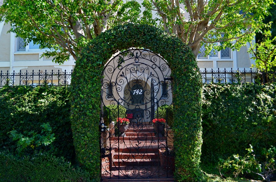
Take the ridiculously obvious tweak done in the above picture. 90% of the final photo here is in the composition of the shot, framing the entrance of this wonderful old house in the arch of its outer gate. The sunlight is perfect for the back two-thirds of the picture, but, given the position of the sun in late afternoon on that particular street, my first shot tended to render the arched topiary very dark, nearly a silhouette. Thing is, I really wanted the entire image to have a kind of fairy tale quality. I needed an intervention.
Easy fix. I walked back a few steps to make sure that my flash was just powerful enough to pop a hot green into the arch, yet too faint to illuminate anything else. As a result, the color you see here is not goosed up after the fact. I exposed for the house in the background and the fill flash made the foreground hues as bright as the stuff in back. Again, as planning goes, thus wasn’t the D-Day invasion. I just needed to make one simple change to solve my problem, and the fact that I did it during the original making of the picture made me feel like I was in charge of the project to a greater degree.
MAGICAL ORPHANS
By MICHAEL PERKINS
WE HAVE ALL EXPERIENCED THE SHOCK OF SEEING OURSELVES IN A CERTAIN KIND OF PHOTOGRAPH, a strange combination of framing, light or even history that makes us actually ask, “who is that?? before realizing the truth. Of course we always know, intellectually, that a photo is not an actual visual record of events but an abstraction, and still we find ourselves emotionally shocked when it’s capable of rendering very familiar things as mysteries. That odd gulf between what we know, and what we can get an image to show, is always exciting, and, occasionally, confounding.
Every once in a while, what comes out in a picture is so jarringly distant from what I envisioned that I want to doubt that I was even involved in capturing it. Such photographs are magical orphans, in that they are neither successes nor failures, neither correct or wrong, just…..some other thing. My first reaction to many of these kinds of shots is to toss them into the “reject” pile, as every photo editor before 1960 might have, but there are times when they will not be silenced, and I find myself giving them several additional looks, sometimes unable to make any final decision about them at all.
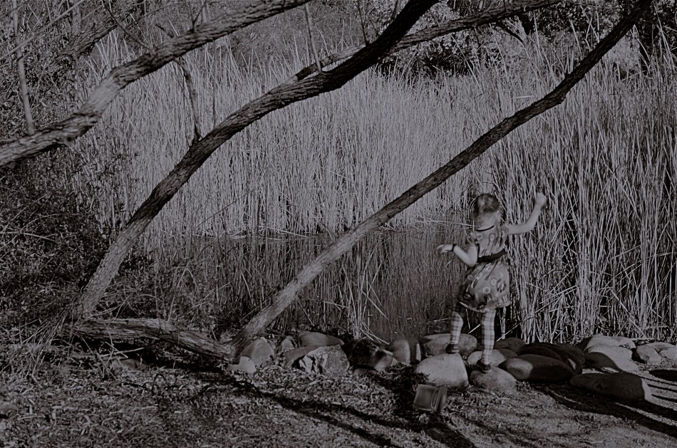
The above shot was taken on a day when I was really shooting for effect, as I was using both a polarizing filter to cut glare and a red 25 filter to render severe contrast in black and white. The scene was a reedy brook that I had shot plenty of times at Phoenix’ Desert Botanical Garden, but the shot was not planned in any way. As a matter of fact, I made the image in about a moment and a half, trying to snap just the shoreline before a boisterous little girl could get away from her parents and run into the frame. That’s all the forethought that went into it.
With all the extreme filtration up front of the lens, I was shooting slow, at about 1/30 of a second, and, eager to get to the pond, the child was just too fast for me. Not fast enough to be a total blur, but fast enough for my lens to render her softly, strangely. And since every element in a picture talks to every other element, the rendering of the reeds, which was rather murky, added even more strangeness to the little girl, her face forever turned away, her intent or presence destined to remain a secret.
I might like this picture, but I worry that wanting to like it is making me see something in it that isn’t there. Am I trying to wish some special quality into a simple botched shot, acting as a sort of self-indulgent curator in search of “art”?
Can’t tell. Too soon.
Check with me in another five years or so.
(DON’T) WATCH THIS SPACE
By MICHAEL PERKINS
CALL IT “EYE-HERDING”, if you will, the art of channeling the viewer’s attention to specific parts of the photographic frame. It’s the first thing we learn about composition, and we address it with a variety of techniques, from depth-of-field to color manipulation to one of my favorites, the prioritizing of light. Light values in any image do have a hierarchy, from loud to soft, prominent to subordinate. Very few photos with uniform tone across the frame achieve maximum impact. You need to orchestrate and capitalize on contrast, telling your viewers, in effect, don’t watch this space. Watch this other space instead.
In many cases, the best natural ebb and flow of light will be there already, in which case you simply go click, thank the photo gods, and head home for a cold one. In fact, it may be that “ready to eat” quality that lured you to stop and shoot the thing in the first place. In many other cases, you must take the light values you have and make the case for your picture by tweaking them about a bit.
I have written before of the Hollywood fakery known as “day for night”, in which cinematographers played around with either exposure or processing on shots made in daylight to simulate night…a budgetary shortcut which is still used today. It can be done fairly easily with still images as well with a variety of approaches, and sometimes it can help you accentuate a light value that adds better balance to your shots.
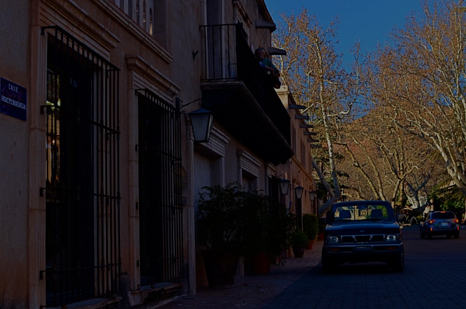
The image at the top of this page was made in late afternoon, with pretty full sun hitting nearly everything in the frame. There was some slightly darker tone to the walls in the street, but nothing as deep as you see here. Thing is, I wanted a sunset “feel” without actually waiting around for sunset, so I deepened the overall color and simulated a lower exposure. As a result, the sky, cliffs and dogwood trees at the far end of the shot got an extra richness, and the shop walls receded into deeper values, thus calling extra attention to the “opening” at the horizon line. The shot also benefits from a strong front-to-back diagonal leading line. I liked the original shot, but with just a small change, I was asking the viewer to look here a little more effectively.
Light is a compositional element no less important than what it illuminates. Change light and you change where people’s eyes enter the picture, as well as where they eventually land.
FREEZING GOODBYE
By MICHAEL PERKINS
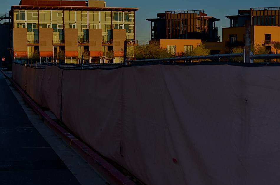
PHOTOGRAPHERS HAVE A CERTAIN LOVE FOR LIVING AT THE EXTREMES, in seeing how far we can stretch the limits of light, or at least our ability to harness it. It’s strange: we have plenty of the stuff available to us during the meat of the day, but it’s where night and day perform a kind of “changing of the guard” where we really like to go stealing those renegade rays of near-dark and almost-bright. We love to go trapping along the seams of light, chronicling the nether territory where night and day get spliced together.
Lately I seem to have been lucky enough to do what I call “chasing” light, standing in deep shadow as the last rays of gold fade just ahead of me. There’s an expectant quality to it, a preciousness. Suddenly it’s undeniable that something unique is dying, that another measure of our mortality is about to be checked off the list, to be irretrievably gone. It’s only the promise of another day that makes this bearable…that, and our small attempts to, if you will, freeze the goodbye.
The contrast between light and shadow at this time of day is profound, and it’s easy to either blow out the highlights or lose a ton of narrative detail in the darkness, or both. There is also incredible minute-to-minute change in the balance between dark and light, making every frame you take a kind of all-or-nothing proposition. Seconds after you’ve tried a picture, you’re actually now after a completely different picture, and so the wonderful shoot-adjust-reshoot cycle made possible by digital is an even more amazing tool.
There are amazing opportunities for image-making in both pure day and pure night. But treat yourself to the nether world between the two, and freeze a goodbye or two, if you can.
It’s wondrous out here on the borderline.
SWEETER, SHARPER
By MICHAEL PERKINS
AS SOME PHOTOGRAPHERS AGE, THERE IS A STRONG TEMPTATION to do more and more with less and less. For many, this manifests itself as a kind of divestiture, a relinquishing of toys. Maybe it’s just muscle fatigue, but, at some point in a shooter’s life, he or she makes a conscious decision to carry fewer hunks of gear into battle. Your approach to the work gets more complex, and, paradoxically, the mechanical doing of it gets more streamlined.
This is where the idea of a “go to” lens comes from, with photogs deciding that, yes, they can do nearly everything with the same hunk of glass. It becomes a bragging point: I shoot everything with a 24mm prime. I always use a 35. I don’t carry a big bag of stuff around anymore. But here’s the great thing: even a single lens is actually several lenses at once, since its optical properties change dramatically depending on aperture. That’s why, if you’re trying to take more kinds of pictures with fewer lenses, it’s important to do some homework on all the different ways they see.
One of the things it’s best to know about your lens is where its “sweet spot”, or optimum sharpness occurs across the aperture range. Turn on your trusty Google machine and you will find more opinions on how to determine this than there are recipes for apple pie, and that’s the tricky part. Optics are a science, to be sure, but they are also somewhat subjective. Translation: if it looks good to you, it’s good. So publishing a table that proves your argument on what “sharp” is to your satisfaction just picks a scab for someone else. You have to get away from the charts and do the field work. Shoot. Look. Compare.
The chart people believe, for example, that the sweet spot for a lens is always two f-stops less light than your maximum wide-open aperture, meaning that, say an f/1.8 prime would hit its sweet spot somewhere around f/3.5. However, on my own 35mm f/1.8, I get the most uniform sharpness, from center to corners, another stop beyond that, so my “go to” aperture on my “go to” lens is more like f/5.6. I know this is true, because I have set up a tripod and shot the same subject from the same distance through the entire range of apertures and visually compared them. You know, the real-world, old-fashioned way….observation.
The better you know every property of your lens, the closer you will get to one that does most of what you want, most of the time. More pictures with fewer toys, with time and labor saved as well.
PRECISION C, FEELING A
By MICHAEL PERKINS
IF YOU TRAVEL ENOUGH, YOU’LL DISCOVER THAT, OF ALL THE TIMES YOU WANT to take a photograph, there are only a few times in which acceptable picture-making conditions are actually present. For all too many subjects that you experience on the fly, only a small percentage of them allow you the time, light, information or opportunity to do your best. And yet…you do what you must, and trust to instinct and chance for the rest.
Immediately upon arrival in a new town, my mind goes to one task, and one task only: sticking anyone else with the driving, so I can take potshots out the car window as I see fit. I have no need to head the posse or lead the expedition. You be in charge, big man. Get me to the hotel and leave me to make as many attempts as possible to put something worthwhile inside my camera.
Of course, this means that I have to pay at least some attention to how insanely you drive…shortcuts, rapid swerves, jolts and all. And, hey, couldn’t you have lingered a millisecond longer after the light went green, since I was just about to create an immortal piece of street art, instead of the muscular spasm I now have frozen forever on my memory card?
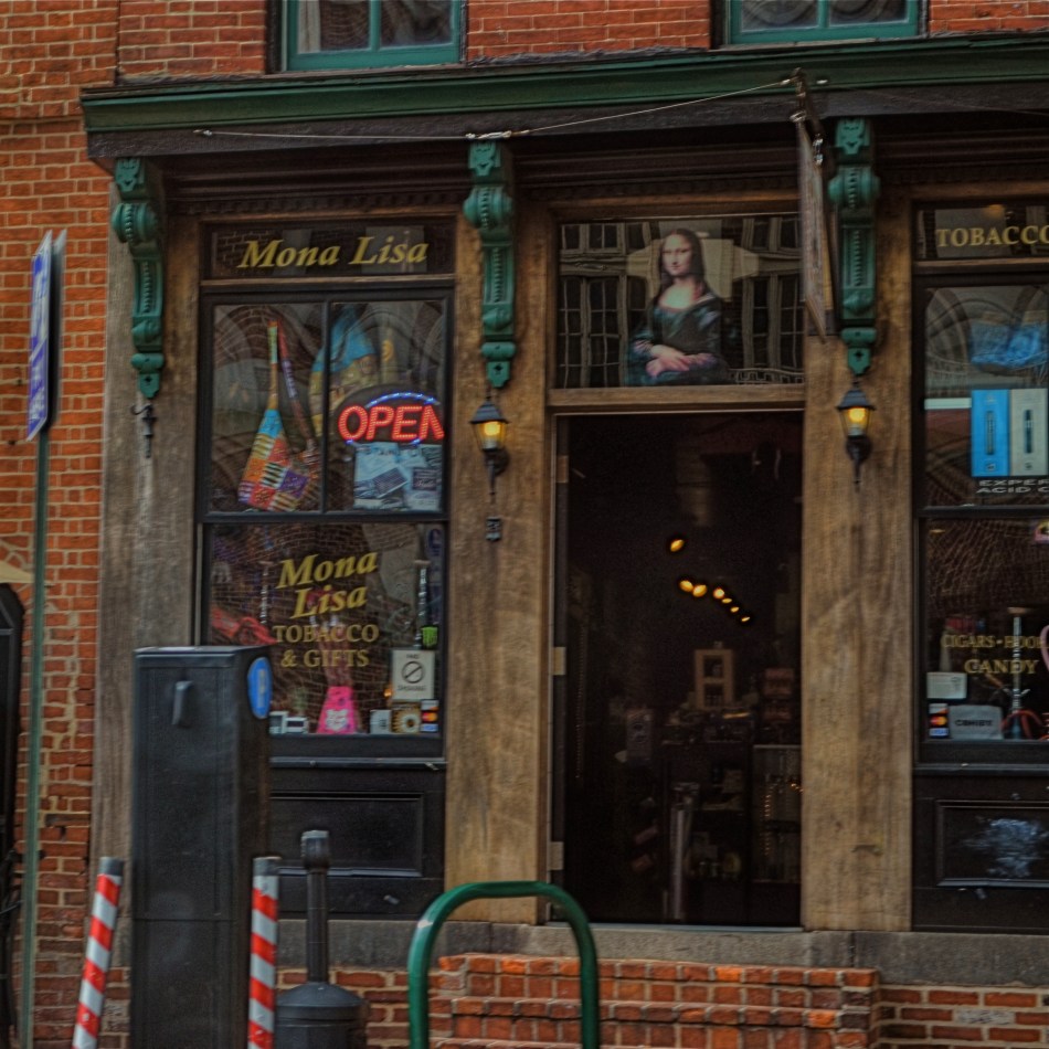
When shooting from a car, there are lots of things that go out the window (sorry), among them composition, exposure, stability, and, most generally, focus. En route to L’Enfant Plaza in Washington D.C. a few years ago, I fell in love with the funky little tobacco shop you see here. The colors, the woodwork, the look of yesteryear, it all spoke to me, and I had to have it. So I shot it at 1/250 sec, more than fast enough to freeze nearly anything in focus, unless by “nearly anything” you mean something that you’re not careening past at the pace of the average Tijuana taxicab. Result? Well, I didn’t wind up with unspeakable blur, but it’s certainly softer than I wanted. Of course, I could have offered an acceptable alibi for the shot, something based on some variant like, “of course, I meant to do that”, that is, until I outed myself in this post, just now.
But we try. Sometimes it’s the fleeting nature of things seen from car windows that make the attempt even more appealing than the potential result. In that instant, it seems like nothing’s more important than trying to take a picture. That picture. I won’t get ’em all. But as long as I live, I hope I never lose that mad, what-the-hell urge to just go for it.
So okay, seeing as this is a photo of a tobacco shop, this is where one of you cashes in the “close, but no cigar” gag line.
Go ahead, I’ll give you that one.
JOY GENERATORS
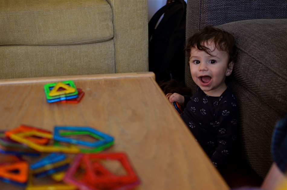
I could pose this rascal all day long, but I can’t create what he can freely give me. 1/40 sec., f/3.2, ISO 500, 35mm.
By MICHAEL PERKINS
IT’S A TITANIC CLICHE, BUT RESOUNDINGLY TRUE: if you want a child to reveal himself to you photographically, get out of his way.
The highly profitable field of child portrait photography is being turned on its head, or more precisely, turned out of the traditional portrait studio, by the democratization of image making. As technical and monetary barriers that once separated the masses from the elite few are vanishing from photography, every aspect of formal studio sittings is being re-examined. And that means that the $7.99 quickie K-Mart kiddie package is going the way of the dodo. And it’s about bloody time.
Making the subject fit the setting, that is, molding someone to the props, lighting or poses that are most convenient to the portraitist seems increasingly ridiculous. Thing is, the “pros” who do portrait work at the highest levels of the photo industry have long since abandoned these polite prisons, with Edward Steichen posing authors, politicians and film stars in real-life settings (including their own homes) as early as the 1920’s, and Richard Avedon pulling models out of the studio and into the street by the late 1940’s. So it’s not the best photographers who insist on perpetuating the restrictive environment of the studio shoot.
No, it’s the mills, the department and discount stores who still wrangle the kiddies into pre-fab backdrops and watch-the-birdie toys, cranking out one bland, safe image after another, and veering the photograph further and further from any genuine document of the child’s true personality. This is what has to change, and what will eventually result in something altogether different when it comes to kid portraiture.
Children cannot convey anything real about themselves if they are taken out of their comfort zones, the real places that they play and explore. I have seen stunning stuff done with kids in their native environment that dwarfs anything the mills can produce, but the old ways die hard, especially since we still think in terms of “official” portraits, as if it’s 1850 and we have a single opportunity to record our existence for posterity. There really need be no “official” portrait of your child. He isn’t U.S. Grant posing for Matthew Brady. He is a living, pulsating creature bent on joy, and guess what? You know more about who and what he is than the hourly clown at Sears.
I believe that, just as adult portraiture has long since moved out of the studio, children need also to be released from the land of balloons and plush toys. You have the ability to work almost endlessly on getting the shots of your children that you want, and better equipment for even basic candids than have existed at any other period in history. Trust yourself, and experiment. Stop saying “cheese”, and get rid of that damned birdie. Don’t pose, place, or position your kids. Witness these little joy generators in the act of living. They’ll give you everything else you need.
SHADOWS AS STAGERS
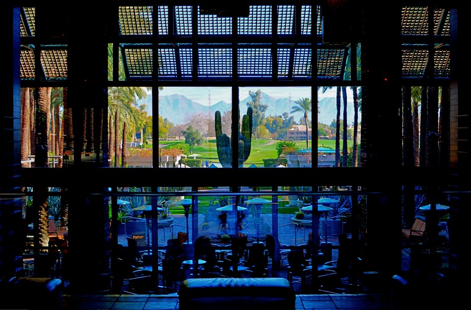
The idea of this image is to highlight what lies beyond the window framing, not the objects in front of it. Lighting should serve that end.
By MICHAEL PERKINS
THOSE WHO ADHERE TO THE CLASSIC “RULE OF THIRDS” system of composition often suggest that you imagine your frame with a nine-space grid super-imposed over it, the better to help you place your subject in the greatest place of visual interest. This place is usually at the intersection of several of these grid lines, and, whether or not you strictly adhere to the “thirds” system, it’s useful to compose your shots purposefully, and the grid does give you a kind of subliminal habit of doing just that.
Sometimes, however, I find that the invisible grid can be rendered briefly visible to become a real part of your composition. That is to say, framing through silhouetted patterns can add a little dimension to an otherwise flat image. Leaving some foreground elements deliberately underlit is kind of a double win, in that it eliminates detail that might read as clutter, and helps hem in the parts of the background items you want to most highlight.
These days, with HDR and other facile post-production fixes multiplying like rabbits on Viagra, the trend has been to recover as much detail from darker elements as possible. However, this effect of everything being magically “lit” at one even level can be a little jarring since it clearly runs counter to the way we truly see. It’s great for novel or fantasy shots, but the good old-fashioned silhouette is the most elemental way to add the perception of depth to a scene as well as steering attention wherever you need it. Shadows can set the stage for certain images in a dramatic fashion.
Cheap. Fast. Easy. Repeat.
THE ROMANCE OF RUIN
By MICHAEL PERKINS
I TYPICALLY SHY AWAY FROM USING OR CREATING PHOTOGRAPHS as illustrations of work in another medium. Writers don’t try to caption my images, and I don’t presume, for the most part, to imagine visuals for their works. As both photographer and writer, I am sympathetic to the needs and limits of both graphic and written mediums. And still, there are rare times when a combination of events seem to imply a collaboration of sorts between the two means of storytelling. I made such an attempt a while back in these pages, in the grip of nostalgia for railroads, and so here goes with another similar experiment.
 Last week, during a blue mood, I sought out, as I often do, songs by Sinatra, since only Frank does lonely as if he invented the concept, conveying loss with an actor’s gift for universality. I stumbled across a particularly poignant track entitled A Cottage For Sale, which I sometimes can’t listen to, even when I need its quiet, desolate description of a dream gone wrong. So, that song was the first seed in my head.
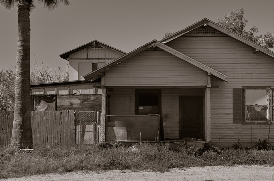
Seed two came a few days later, when I was shortcutting through one of those strange Phoenix streets where suburban and rural neighborhoods collide with each other, blurring the track of time and making the everyday unreal. I saw the house you see here, a place so soaked in despair that it seemed to cry out for the lyrics of Frank’s song. Again, I’m not trying to provide the illustration for the song, just one man’s variation. So, for what it’s worth:
Is lonely and silent, the shades are all drawn,
And my heart is heavy as I gaze upon
A cottage for sale
Where you planted roses,the weeds seem to say,
“A cottage for sale”.
But when I reach a window, there’s empty space.
But no one is waiting for me any more,
The end of the story is told on the door.
A cottage for sale.
COME EARLY / STAY LATE
By MICHAEL PERKINS
PUBLIC SPACES OFTEN LOSE THEIR POWER AS GRAND DESIGNS once they actually are occupied by the public. If you have ever leafed through books of architectural renderings, the original drawings for squares, plazas, office buildings or other mass gathering places, the elegance of their patterns is apparent in a way that they cease to be, once they are teeming with commuters or customers.
This doesn’t mean that humans “spoil” the art of architecture, however, the overlay of drama and tension created by the presence of huge hordes of people definitely distracts from an appreciation of the beauty that is so clean and clear in a place’s sketch phase. Photographically, people as design objects tend to steal the scene, if you will, making public settings less dramatic in some ways. That’s why I like to make images of such locales when they are essentially empty, since it forces the eye to see design as the dominant story in the picture. I suppose that I’m channeling the great designers and illustrators that influenced me as a young would-be comic book artist. It’s a matter of emphasis. While other kids worked on rendering their superheroes’ muscles and capes correctly, I wanted to draw Metropolis right.
I recently began driving to various mega-resorts in the Phoenix, Arizona area to capture scenes in either early morning or late afternoon. Some are grand in their ambition, and more than a few are plain over-the-top vulgar, but sometimes I find that just working with the buildings and landscaping as a designer might have originally imagined them can be surprising. Taking places which were meant to accommodate large gatherings of people, then extracting said people, forces the eye to align itself with the original designer’s idea without compromise. Try it, and you may also find that coming early or staying late at a public area gives you a different photographic perspective on a site. At any rate, it’s another exercise in re-seeing, or forcing yourself to visualize a familiar thing eccentrically.
TAKING YOUR TEMPERATURE
By MICHAEL PERKINS
AMERICANS LOVE TO CELEBRATE A WINNER, and they also like to clearly identify who most definitely did not win. We score-keep on everything from fantasy football to number of days on the job without accidental amputations, and we love, love, love to declare someone the champ…in anything. This either/or, winner/loser habit of the western mind, when applied to photography, leads people to argue over which is better…traditional cameras or those imbedded in mobiles, as if such a judgement is possible. Or as if it matters. So, as you rifle through these humble pages, I hope I make it abundantly clear that, from my standpoint, it’s all about the pictures.
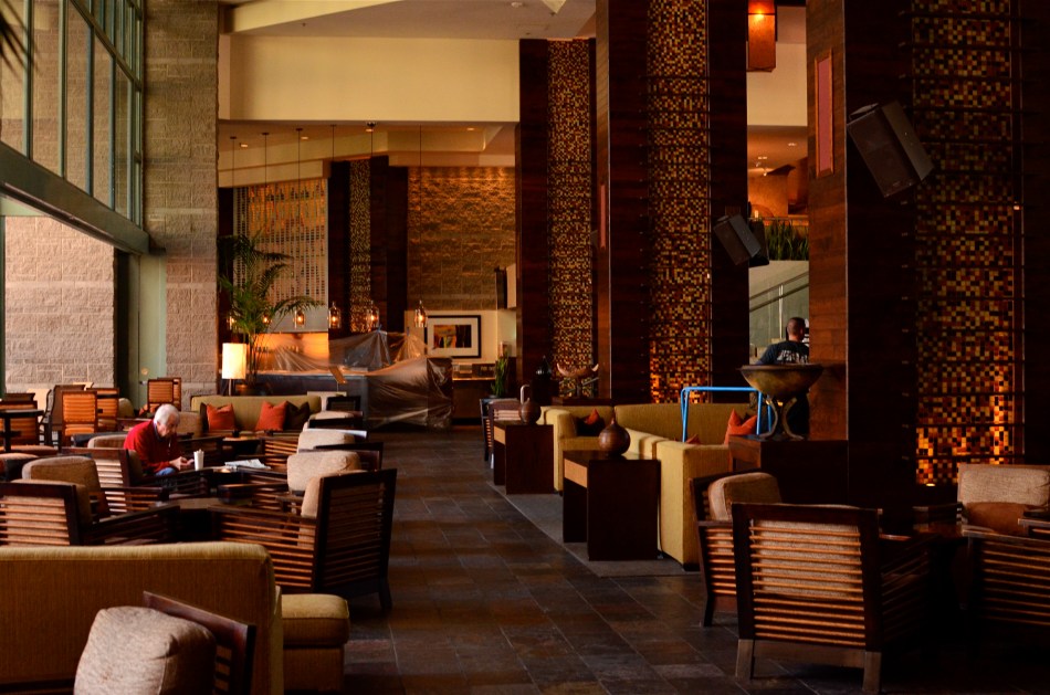
Changing the white balance from auto to shade warmed up the colors in this nearly-outdoor shot. 1/25 sec., f/5.6, ISO 800, 35mm.
The principle difference between, say, DSLRs and phone cameras, to me, is one of method, or how they approach the job of making an image. In full-function cameras, the emphasis can be on how to use the device’s controls and settings to set the terms of your picture before the click. In cellphone cameras, it’s all about how you can massage what the camera was able to give you after the fact, be it with in-phone apps or computer software. You simply can’t impose your will on an iPhone camera until after the picture is taken, and that’s an important distinction. Notice that I did not say better/worse, great/horrible. You just have to decide what’s important to you in a given situation.
Take a very simple choice that is available in even basic point-and-shoot “camera-cameras”, like white balance. Your camera has the option of deciding, for you, how colors should register based on the temperature of the light, or you can over-ride that function and customize it to your heart’s delight, something that, at this point in time, cannot be done on a cellphone camera. Even easier, menus reduce all your white balance options to visual icons (sunburst, house in shade, electric light bulb, etc) depending on how warm you want your pictures. You can even tweak for the precise kind of artificial light you’re working with, from incandescent to flourescent.
As an example, in the above shot, the morning light in the hotel lobby was, on automatic white balance, coming off blue, especially in the shadows. The entire effect of the golden period just after sunrise was being subverted by the camera. Easy fix: just dial it up for a shade setting, bump up the exposure a tad (slower shutter, higher ISO), and the warmth came back, but not so deep that everything went bad-suntan-bronze. And, yes, I could have got this shot with an iPhone, but the adjustment would have had to have been made after I got the shot wrong, then searched around for a fix. Again, there’s no good or bad.
You just have take your own temperature and decide what treatment you need.
THE CENTER HOLDS
By MICHAEL PERKINS
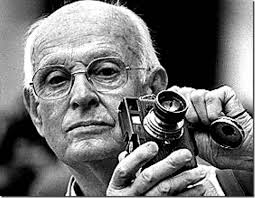
ONE OF THE MOST FASCINATING PARTS OF THE LEGEND of Henri Cartier-Bresson, the artist who is the world’s model for street photography, is the oft-repeated story that he never cropped a shot over the many decades of his remarkable career. Thus the man who originated the phrase “the decisive moment” to indicate that there was but one ideal instant to capture something perfectly in the camera is also credited with creating flawless on-the-spot compositions, image after image, year after year. Yeah, well….
I love HCB, and I personally can’t find a single one of his images that I could improve upon, no matter where I was to wield my magic scissors. But just as the writer in me believes that great novels aren’t written, but re-written, I believe that many great photo compositions emerge after much additional consideration, long after the shutter snaps. It’s not that one shouldn’t strive to get things as perfect as possible in the moment. In fact, there is overwhelming evidence that many photographers do exactly that, nearly all the time.
It’s that “nearly”, however, that describes most photos, something which might be converted to “definitely” in the cropping process. In fact, I am starting to feel that the very first thing to be done with a picture in post-production is to just start paring away, only stopping when the center of the idea has been reached. It’s gut-wrenching, since we usually fall in love with our pictures at first sight (and in their first versions). But even if God decided to make one of us, say Cartier-Bresson, the messenger of his divine eye, he certainly didn’t make that trait as common as, say, green eyes or freckles. For most of us, most of the time, we need to eliminate everything that diverts the eye anywhere but where the main message is. As an example, the hammock image above is the result of cutting away nearly 2/3 of the original photograph.
There are a few times when an image comes full-born out of the camera, all muscle and no fat. However, in the digital age, re-thinking one’s realization of a concept is easier than it’s ever been, and there is no downside to doing so. If there is a narrative ground-zero to your photo, don’t worry. The center will hold.
EATS
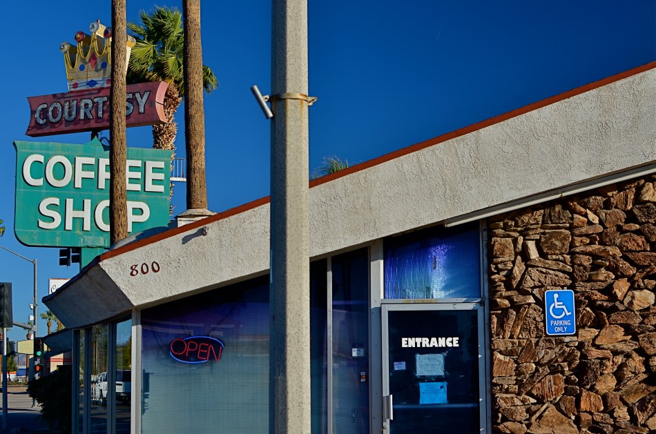
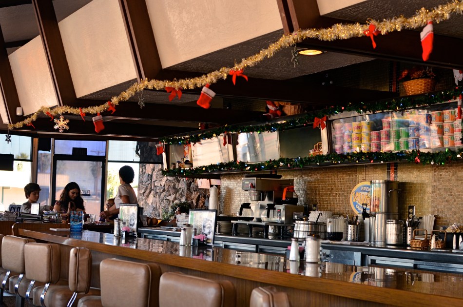
You want fries with that? Blythe, California’s Courtesy Coffee Shop. 1/320 sec., f/5.6, ISO 100, 35mm.
By MICHAEL PERKINS
IN HIS WONDERFUL 1960 ROAD JOURNAL, TRAVELS WITH CHARLEY, John Steinbeck, author of The Grapes Of Wrath, Of Mice And Men and other essential American novels, laments the passing of a kind of America in much the same way that a roving photographer might. “I wonder”, he wrote as he motored through one vanishing frontier after another, “why progress looks so much like destruction.” That’s a sentiment that many a shooter has experienced as he pans his viewfinder over the various fading scenes of a constantly changing nation. Steinbeck sang his ode to these vaporized hopes on the printed page. We freeze their vanishings in a box.
However, capturing changes in a rambling big hulk of a country encompasses more than merely mourning the loss of a forest or the paving of a paradise. Photographic testimony needs to be made on the evolution of even the America we feel is vulgar, or ugly, or strange, as well as on the disappearance of the buffalo. There can be a visual poignancy in seeing even our strangest, most misbegotten features dissolving away, and great picture opportunities exist in both the beautiful and the tawdry.
One of the strangest visual cultures that we see cracking and peeling away across the USA is the culture of eating. The last hundred years have seen the first marriage between just taking a meal and deliberately creating architecture that is aimed at marketing that process. Neon signs, giant Big Boys shouldering burgers, garish arrows pointing the way to the drive-through….it’s crude and strange and wonderful, all at the same time, and even more so as its various icons start to fall by the wayside.
The Courtesy Coffee Shop, baking in the desert sun just beyond the Arizona border in Blythe, California, is one such odd rest stop. Its mid-century design, so edgy at the start of space ships and family station wagons, creaks now with age, a museum to cheeseburgers and onion rings of yesteryear. Its waitresses look like refugees from an episode of Alice. It recalls the glory days of flagstone and formica. And they’ve been doing the bottomless coffee cup thing there since the Eisenhower administration.
Steinbeck, were he on the road again today, might not give a jot about the passing of the Courtesy into history, but restaurants can be interesting mile markers on the history trail just as much as mountains and lakes. Besides, when’s the last time a mountain whipped up a Denver omelet for you?
FRAGMENTS AND SHARDS
By MICHAEL PERKINS
GLASS SURFACES REPRESENT A SERIES OF CHOICES FOR PHOTOGRAPHERS, an endless variety of effects based on the fact that they are both windows and mirrors, bouncing, amplifying or channeling light no less than any other subject in your frame. No two shooters approach the use (or avoidance) of glass as a compositional component in quite the same way. To some, it’s a barrier that they have to get past to present a clear view of their subject. To others, its fragments and shards of angle and light are part of the picture, adding their own commentary or irony.
I usually judge glass’ value in a photograph by two basic qualifiers: context and structure. First, context: suppose you are focused on something that lies just beyond a storefront window. What visual information is outside the scope of the viewer, say something over your shoulder or across the street, that might provide additional impact or context if reflected in the glass that is in direct view? It goes without saying that all reflections are not equal, so automatically factoring them into your photo may add dimension, or merely clutter things up.
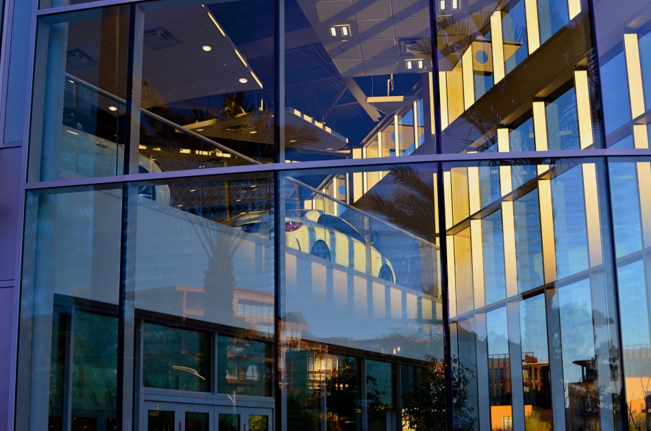
The other qualifier is the structure of the glass itself. How does the glass break up, distort, or re-color light within an enclosure? In the above image, for example, I was fascinated by the complex patterns of glass in an auto showroom, especially in the way it reassigned hues once the sun began to set. I had a lot of golden light fighting for dominance with the darker colors of the lit surfaces within the building, making for a kind of cubist effect. No color was trustworthy or natural , and yet everything could be rendered “as is” and regarded by the eye as “real”. The glass was part of the composition, in this instance, and at this precise moment. Midday or morning light would render a completely different effect, perhaps an unwelcome one.
Great artists from Eugene Atget to Robert Frank have created compelling images using glass as a kind character actor in their shots. It’s an easy way to deepen the impact of your shots. Let the shards and fragments act like tiles to assemble your own mosaics.
