RADICAL RE-ASSIGNMENT
By MICHAEL PERKINS
YEARS AGO, A BROAD STUDY ON HOW OUR BRAINS INTERPRET COLOR included an experiment in which the familiar hue “cues” stored in our brains were upended, much to the dismay of selected test audiences. In one such experiment, an assortment of familiar foods had their native colors radically reassigned, resulting in green beef, pink peas, turquoise potatoes, and so forth. In many cases, the test group found that the meal, which they had been informed had been prepared from highest-quality ingredients, was simple inedible. Merely changing the color of something “known” had rendered it alien.
 Almost immediately after mastering the accurate rendering of color, which took decades, photographers began deliberately toying with “wrong” representations of color in various film, and later, digital processes, the object being to challenge how we digest what we see, and to re-imagine the familiar as the strange. One such method which has survived to the present day is infrared photography, in which, through either filters or re-engineered sensors or both, we reconfigure cameras to “see” the light wavelengths that are typically invisible to the naked eye. The results, which can reverse the object-shadow relationship and freakishly re-color skies and landscapes, are the stuff of dreams.
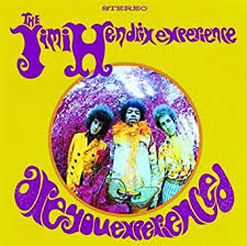
One of the best-known infrared images (which is also shot with a fisheye lens, for double freakiness) is the cover of the classic Are You Experienced? album by Jim Hendrix (see insert at left). The average DSLR can be rigged to shoot infrared, and the web is a-slosh with tutorials on how to shortcut and/or cheat if you don’t want to do costly camera conversions or arcane calculations.
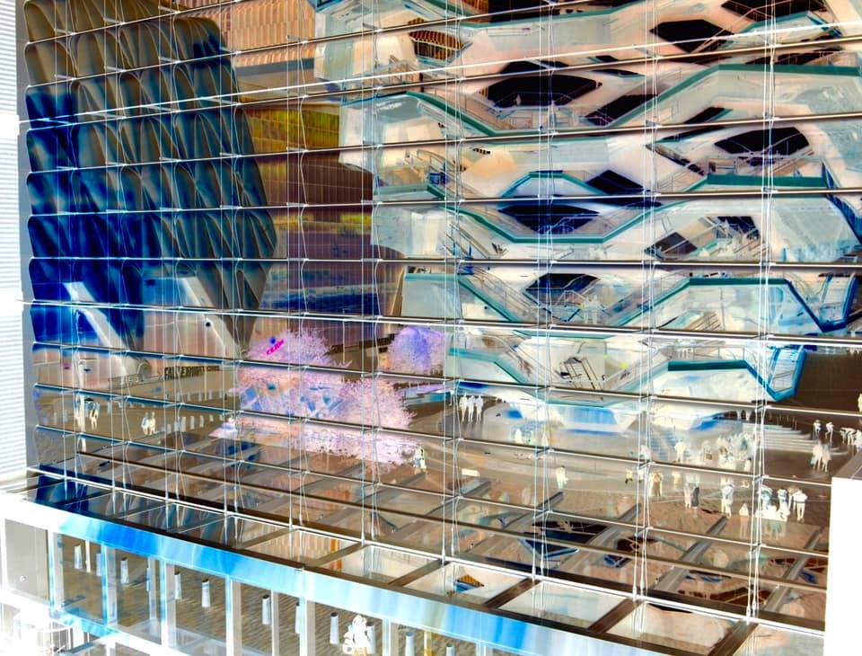
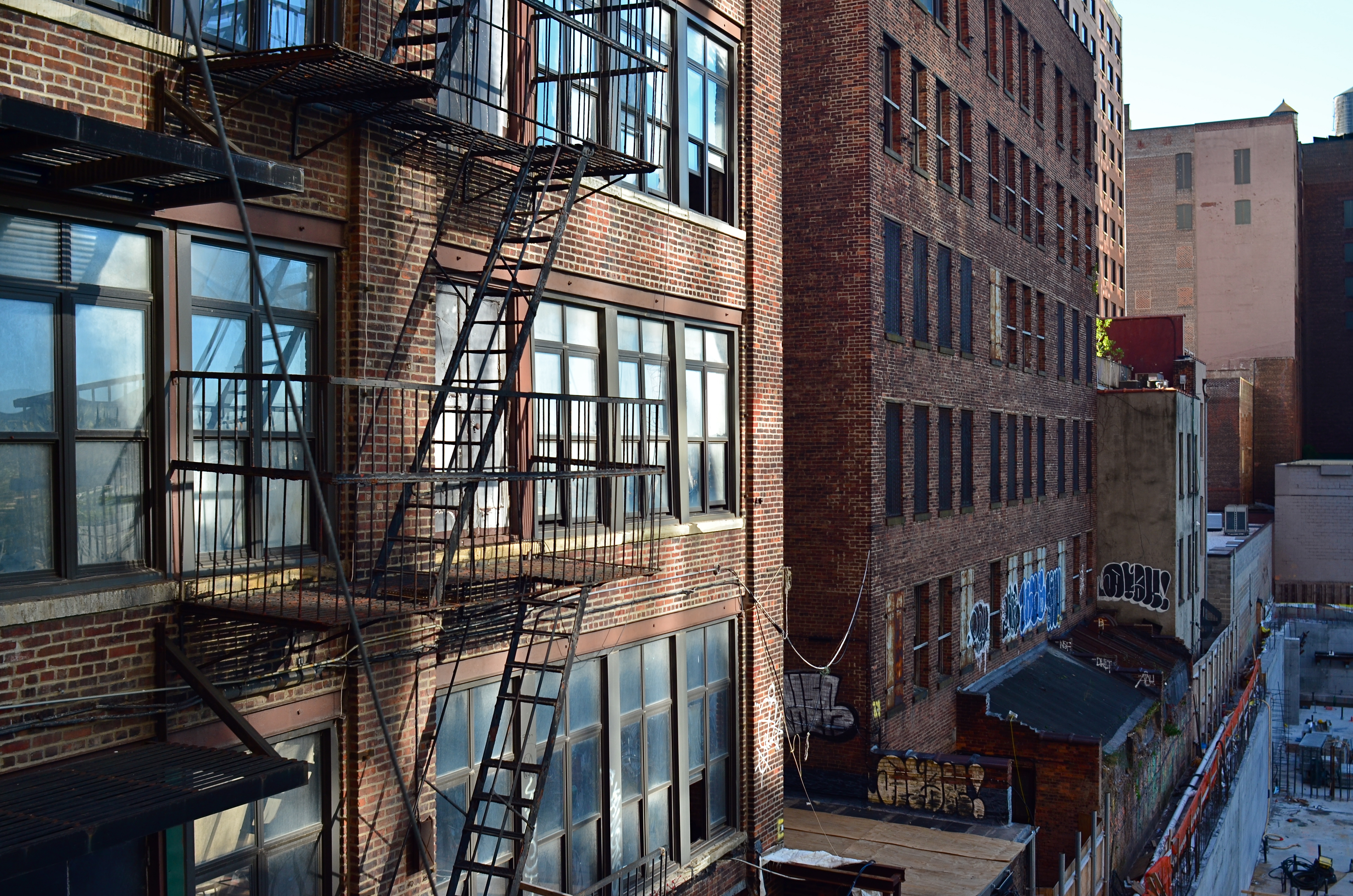
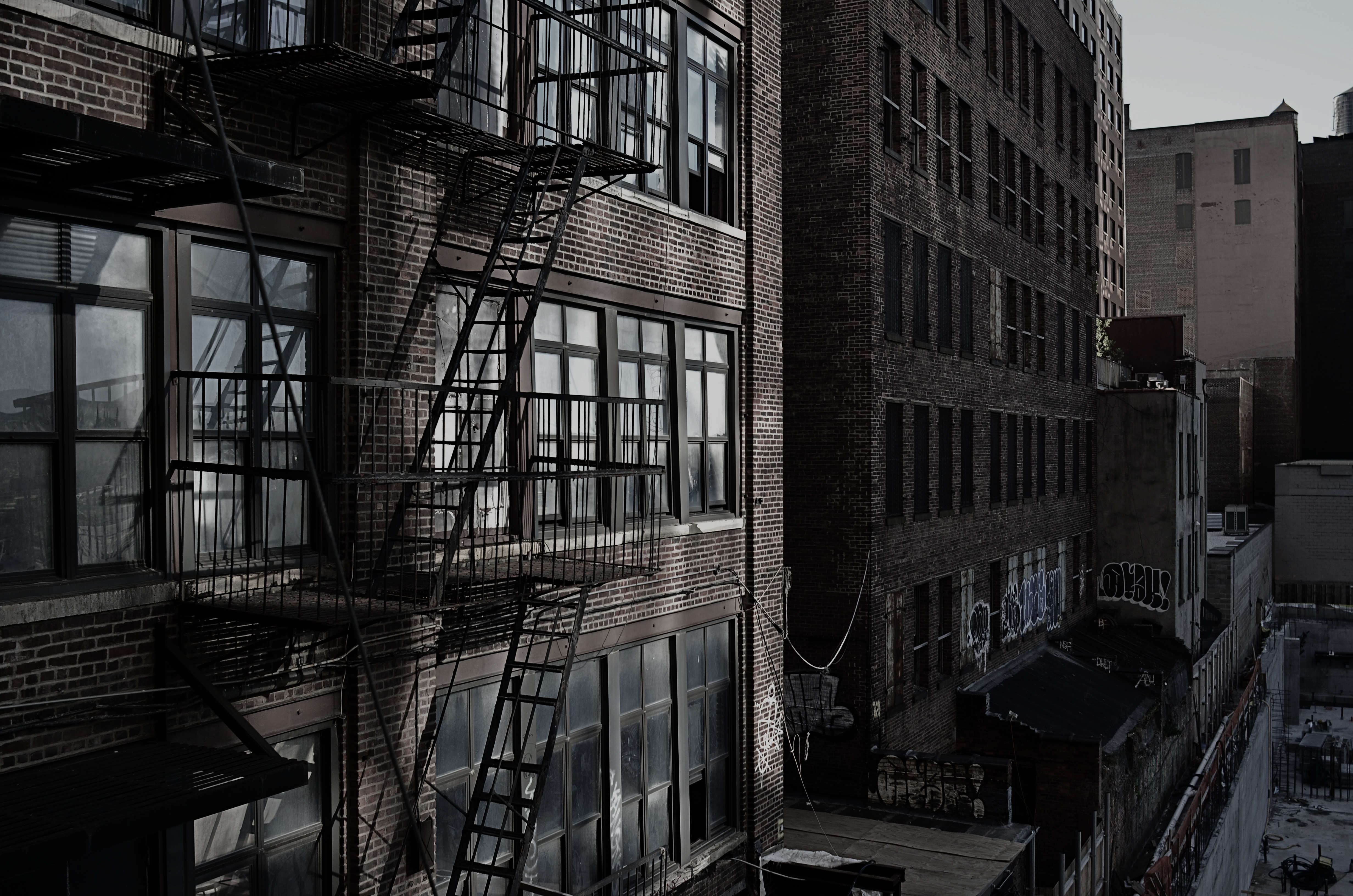
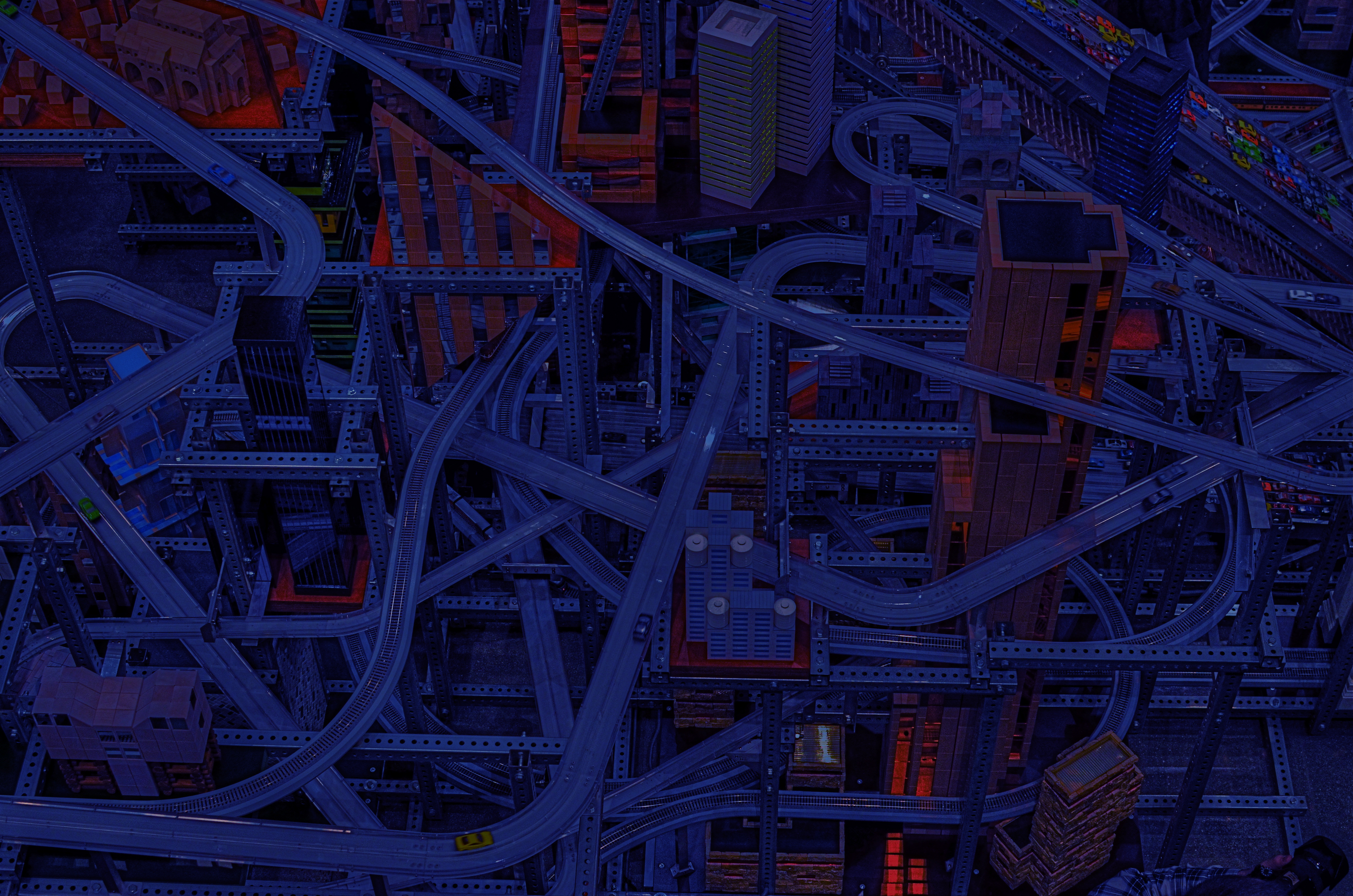
Hudson Yards And Vessel, 2019. A fake infrared created with the free phone app Negative Me.
My own cheapo-cheapo alternative to true infrared has been in the use of phone apps like Negative Me, which renders a fake negative of any image shoved through it. This achieves the first part of infrared, in that it reverses the relationship between an object and its shadows or textures. Sending that image back to your phone allows for all the color tweaking and contrast enhancement you’d use for any image, depending on how deranged/extreme you want the result to be, aping another aspect of true infrared. There are people who love the look of monochrome infrared, and, for those folks, I’d recommend skipping the phone adjustment of the negative image completely just sending it back to your main suite of processing software to either re-color or convert to mono, since that seems to preserve sharpness and allow for finer-tuning. As with many app-PC-laptop conversions, the fewer copies of copies of copies you can avoid, the better. For the record, the image seen here was master-shot on a DSLR, sent to my phone, sent to Negative Me, sent back to my phone image file, tweaked, sent to Facebook, then sent back to Photos for Mac. A long way around the horn, admittedly, and yet it’s still passable, in that it doesn’t look any more unreal than you’d expect.
As with the green steaks, you may decide that you don’t have a lot of, um, appetite for the infrared look at all. Even better: doing a quickie mock-up of what a real infrared might look like could save you time, trouble and dough on a pricey experiment. Or, like me, you might decide that you use this kind of effect just enough to justify doing a “not bad” version of it for cheap. In any event, just have fun.
And remember, no dessert until you finish your pink peas.
FROM CUSTOM TO STANDARD

Just a few clicks ago in time, I might have made multiple exposures of this scene, blending them later in HDR software for increased dynamic range. Now I do it all in-camera.
By MICHAEL PERKINS
DIGITAL PHOTOGRAPHY’S EXPLOSION IN THIS STILL-FRESH CENTURY has shown itself not to be about a single, big revolution but an ongoing cascade of small ones. As more and more shooters have shifted their emphasis away from film technology….itself, admittedly a fundamental earthquake of change, they have also had to constantly adapt to a continuous flow of refinements and reinventions in the digital realm. Nothing is static and nothing will ever again be in its final form. Things that were considered cumbersome and clumsy just a few seconds ago now are accomplished effortlessly. We move from custom to standard in the wink of an eye.
A prime example of this phenomenon is the rise and not-quite-complete fall of HDR, or High Dynamic Range photography, the practice of shooting several different exposures of the same subject and melding the best of all of them into one seamless composite through software. The need for such a solution arose from the inefficiency of early digital sensors, which caused light and dark extremes in an image to be either blown out or smothered in shadow. HDR was devised as a way to imitate how quickly the human eye can adjust to allow us to see everything in about the same degree of contrast. It doesn’t actually do that, but instead presents a ton of images of varying contrast to our brains so quickly that we imagine that we actually always see everything in balance. Early renditions of Photoshop did not address this problem, nor did the earliest cell phone cameras, and even traditional manufacturers like Nikon and Canon were years away from including HDR-like modes in their DSLRs, and so editing platforms like Photomatix, HDR Efx Pro, and Aurora HDR were created in the early 2000’s to specifically blend and tweak anywhere from two exposures on upward in a work flow that came to be known as “tone mapping”. The apps sold well and addressed a real niche within the photographic world. Transitions between light and dark seemed more elastic, and textures, from beach sand to wood grain, seemed to be rendered with greater emphasis.
HDR drew both praise and poison from the start, with some photographers subtly enhancing their work while others “over-cooked” the effect, delivering surreal palettes of day-glo color and gooey skin textures surrounded by strange halos and other unwanted artifacts. The result, as is occurring with greater and greater speed in the digital-web complex, was that, just as a revolution/solution for a real problem hit the market, others began almost immediately to concoct an antidote for the wonder drug…a fix for the fix. A few scant years later, manufacturers of both standard and phone-based cameras have their own HDR-like modes, which are both more limited in precision and hellishly convenient: digital camera sensors themselves are already in their second generation, with greater dynamic range already designed in: and uber-tools like Photoshop and Lightroom have become more supple in the quick adjustment of even single batches of images. Thus HDR has gone the regular developmental route seen that all tech has across history, from balky and bulky to sleek and instinctive. We learn to do more with less, and what was once custom equipment (like radios once were in automobiles) becomes standard (like seat belts in automobiles) but with even greater immediacy in the digital era. In my own work, after years of HDR love writ large, I now tend to solve 95% of the problems that used to dictate the use of HDR with simple in-camera moves, some of them as basic as exposing for the highlights and recovering the detail in the dark areas in post editing (as seen in the image above).
I was recently toying with an old Canon A1 SLR from the late ’70’s and marveling at the fact that its owners initially had to special-order (at considerable expense) a screw-on battery motor drive that had no other function except to assist forgetful users by winding the film on to the next frame. Obviously the winder unit was only in production for a few years until the same challenge was met with less hardware, fewer steps, and a lot less cash. And so it goes. All of which goes to say, as we frequently do in these funny papers, that gear is not the primary determinant in the creation of great photographs. If equipment does not currently exist to produce the results we want, we find a way to fake it until the lab boys make it. Technology follows inspiration. Art cannot happen if things go the other way.
HIP TO BE SQUARE
 By MICHAEL PERKINS
I HAVE NEVER BEEN ABLE TO FIGURE OUT WHY MANY HIGH-END CAMERAS lack a feature which is native to many of the most basic cel and film cameras….that is, the option to compose and shoot a square frame. The simple 1-1 format, which was, for decades, the default mode for cameras in every price range, is, for many contemporary photogs, a nostalgic novelty. Why?
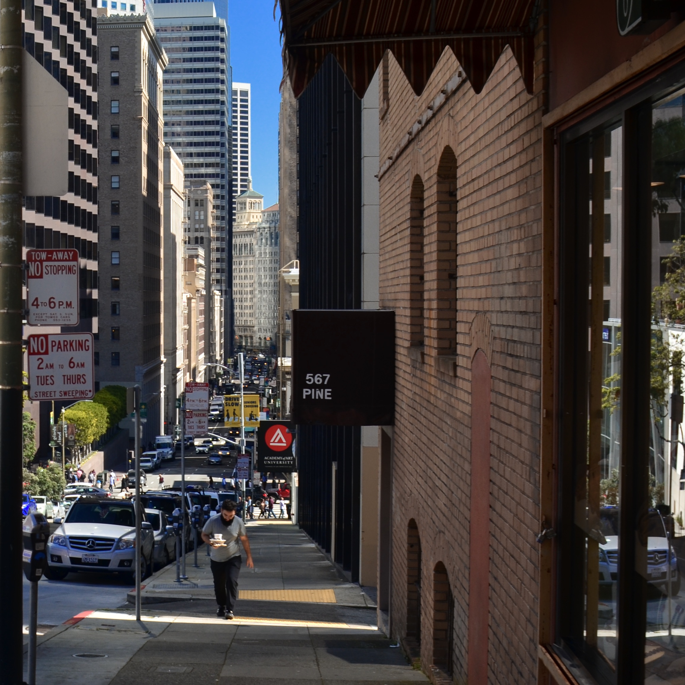
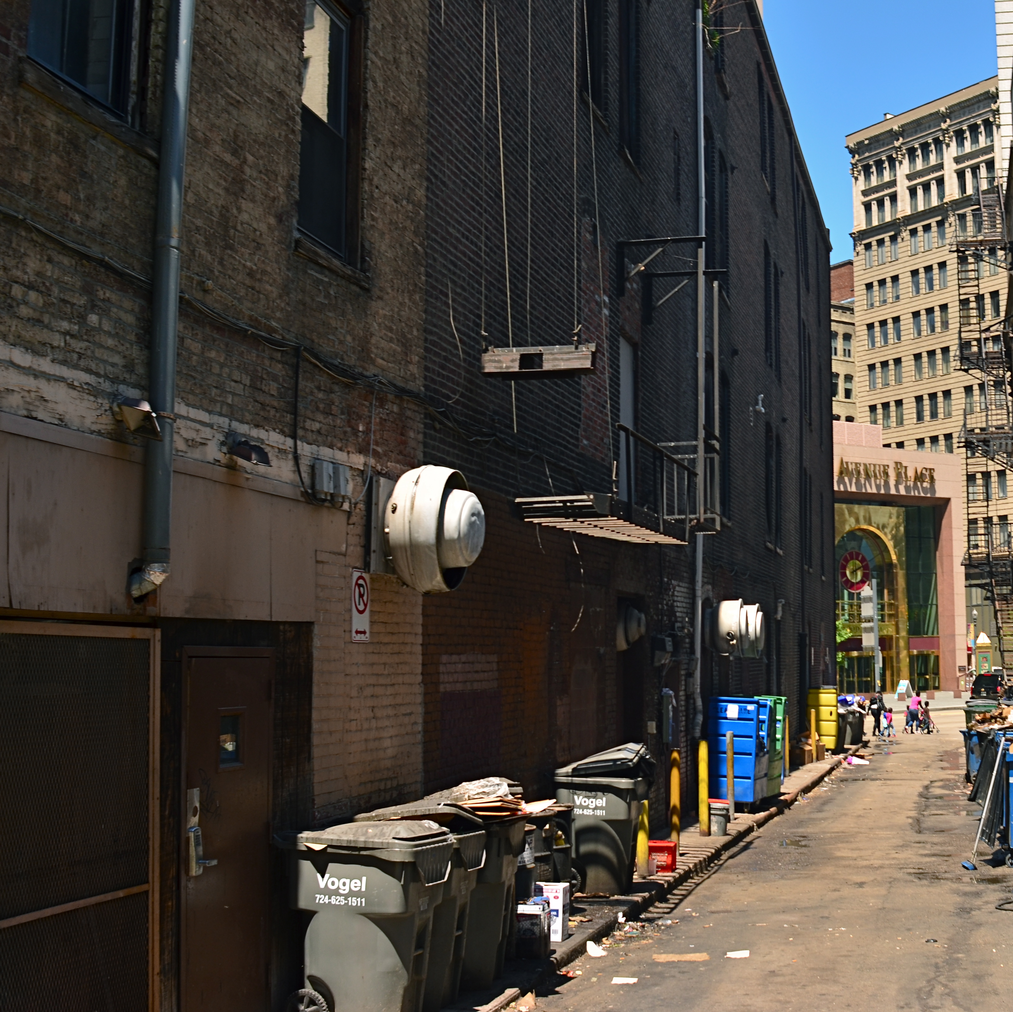
And, yes, I know how astoundingly easy it is to reframe an image as a square in a gazillion common post-processing platforms. That’s not the point. There are times when the ability to concretely see (rather than imagine) a composition within a square can lead to a superior image. If I modify a rectangular picture to capitalize on the “inner square” of strong impact within the frame, I’m really retrofitting a picture that worked out less than well when I shot it. To compose and shoot in a square, I have to be constantly mindful of how space is placed and balanced…that is, I have to be doing nearly everything on purpose, based on what’s in front of me at the moment. That is not the same thing as salvaging a usable square from within a composition that I originally planned in a completely different way. The image you see at left was shot in a particularly narrow side street in San Francisco and was originally rectangular. In editing, I immediately saw that its main power was in a square extracted from its center, but had I been doing the master shot as a square, my intent for it would have been measurably different. Different by mere Inches, maybe, but different.
Or picture it this way: Let’s say I go out purposefully looking to bag a creel full of sea bass, versus fishing lazily off the pier and accidentally reeling in a rubber boot that has a sea bass inside it. Either way, I get sea bass. Makes no difference to you? Well, it does to me.
For those good with their hands, the WeberNet is filled with tons of workarounds to pre-mask or otherwise rig a square frame in cameras that were not created to offer it as an option, but I don’t really relish whipping up a craft project just to take a picture. That, to me, says the camera was designed without the features I wanted, so I have to be a kind of sub-contracted re-designer to make the thing work the way I need it to. Again, this clearly does not bother certain people, but it rankles me that what I want in my high-end camera is already included in a $50 low-fi plastic box camera like the Diana or, well, um, every cel-phone camera ever made. So-called “real” cameras have been weighted in favor of rectangular framing since the first days of 35mm film, but I think that such an exclusive bias has robbed photographers of a potentially powerful tool. And while, even as I write this, I can hear an everlasting chorus chanting, “but you can fix it later”, I’d rather sing my own tune, in my own key. Equipment is about abetting intent, and without intent, all our best photographs are just happy accidents.
OUT OF MY WAY, ME
 BY MICHAEL PERKINS
THE FIRST TIME I READ CHASE JARVIS‘ The Best Camera Is The One That’s With You was some six years after its 2010 publication date, a short time in years, but a century in the development of mobile camera technology. After dashing through what was one of the first books ever compiled solely of phone camera images, I was furious at myself for investing, albeit in a Half Price Books store, in what I first saw as a pile of technically inferior, self-indulgent mush. The images were soft, hyper-saturated, low-contrast shots of, well, anything that caught Jarvis’ fancy as he jetted around the planet doing what I thought of as his “real” work. Shot in those heady first days of iPhone novelty at a mere two megapixels per frame, TBCITOTWY seemed a work of complete impulse. The pictures had no plan, no premeditation.
It took several days for me to realize that Chase wasn’t shooting “like a pro”. He was shooting like an artist.
In the post just previous to this one I had explained that it was the new kind of photographer, borne of the cell phone era, that had influenced me in learning to let go of a few, if not all formalist rules in my own work. Chase Jarvis had no way of knowing, nine years ago, that mobile cameras would re-introduce a kind of instinctual shooting into the mainstream, a sudden, relaxed see-it-shoot-it attitude based on desire and not calculation. The first cel cameras were certainly limited, lo-fi toys, but they embodied the same what-the-hell spirit that had typified old Polaroid users and, in the digital realm, the back-to-film Lomography hipsters with their plastic light-leaking Soviet-era snap cams. Cels had reignited the desire to take a chance on a picture, to indulge a whim. If the result was great art, cool. If instead you got a weird mess, even cooler.
This was all made possible by being absolutely comfortable with a camera that was good enough to at least give you something every time. The designers put a little computer in everyone’s hand that almost never failed completely. This was faster than film, and your absolute clunkers could be vaporized and tried again immediately. This same freedom had already come to digital cameras in general, but the sheer gobsmacking convenience of making pretty good pictures with almost no forethought or planning was beyond revolutionary. As with every other technical advance in the history of photography, it was democratically empowering.
The cameras are better now. So very much better, in fact, that they have freed people up even more to shoot a lot, enjoy it a lot, and speed up their learning curves. So much better that I can knock off a shot like the one seen here in less time than it would have taken to spool film into my camera just a generation ago. “I feel more free with (this) little camera than I have with any other”, wrote Chase Jarvis in the introduction to The Best Camera. “I somehow recovered an innocence I’d lost. I was able to see the world again for what it is: a beautiful, funny, sad, honest, simple, bizarre, and honest place”. I am still not ready to completely toss my photographic rule book, but the revolution in the world’s way of seeing has swept a part of me up, and my work reflects that. I love my own journey, but I am happy to sneak a peek at everyone else’s, too. To be surprised, in any art, at any age, is a blessing.
PLAN “D”
By MICHAEL PERKINS
ANYONE THAT IS NOT BORN AN OCTOPUS figures out early that photography is often about living with the consequences of unforseen choices. Perhaps creatures born with eight arms might actually be able to produce the best images, since they’d be equipped with the means to carry every piece of equipment they possessed into the field for a shoot. As for the rest of us, results rise or fall on the strength of our planning…..and resiliency.
To be clear, the word planning is meant to denote all of your process, not merely the first preference you imagined when anticipating a shoot. That “version” we label “Plan “A”, which might also be entitled “do everything the way you first envisioned it with precisely the gear you originally selected”, an outcome roughly equivalent to Marrying The Prom Queen And Retiring To Tahiti. Let’s face it: shoot enough pictures and you’ll be struck by how seldom you were able to simply step up, click, and go hang a golden trophy on your mantel. In most cases, Plan “A” is usually just a point of departure, a preliminary sketch.
So let’s assume your photo shoot has proceeded to Plan “B”, which might be named “rejecting your original conception”. At this stage, you’ve begun to question everything from composition to gear to even the strength of your initial subject. Based on how many alternate equipment choices may be available, several tough decisions can be made at this juncture, including my favorite, Doing The Best You Can (the path of least resistance), otherwise known as Shoot It Anyway. Assuming this doesn’t work out, you move briskly on to:

Plan “C”, in which you have new strategies forced on you by either the technical limits of your gear, or the boundaries of your skill level with it. This assumes that, not only did you bring the wrong lens for the job, but also that the right lens is four acres away in the parking lot. Let’s also stipulate, for purposes of this exercise, that everyone around you is getting (a) impatient, (b) tired, or (c) hungry, just to add to the pressure. Hey, pal, no rush, but take the picture already, willya? But have no fear… there’s always:
Plan “D”, in which a change in your entire approach to the image is unavoidable, but suddenly and strangely…..alluring. Being stuck with gear that won’t absolutely deliver your original vision no matter what you do, you begin to embrace the idea of experimenting, otherwise known as the What The Hell or Weary Resignation option. Hey, you grabbed a fisheye lens for the inside of the conservatory building…..but maybe you can also make it work as a standard ultra-wide (see above result). Cue up Kiss’ Nothing To Lose…
All of which is to say, in a very roundabout fashion, that it pays to be as flexible as, say, an octopus.
With one-fourth the arms.
POST STARTS NOW
By MICHAEL PERKINS
THE POST–PROCESSING REVOLUTION wrought by the introduction of Photoshop in 1988 has so profoundly influenced the act of picture-making that many shooters think of the program as half of a complete two-step process of photography. In Step One, you shoot the image. In Step Two, you fix it.
However, being conversant with more of the menu options built in to nearly every level of camera in use today can mean solving most “post” dilemmas without resorting to Photoshop’s full suite of solutions. Just as you change lenses less the more you understand what lenses can be stretched to achieve, you can avoid the extra step of computer-based tweaking the more you understand what’s already available while your subject, your shooting conditions and your mental presence are all in play. Some would argue that such adjustments would be more finely attenuated working with a RAW file in Photoshop than by fixing flaws in-camera with a JPEG, and you have to decide where you come down in that debate.
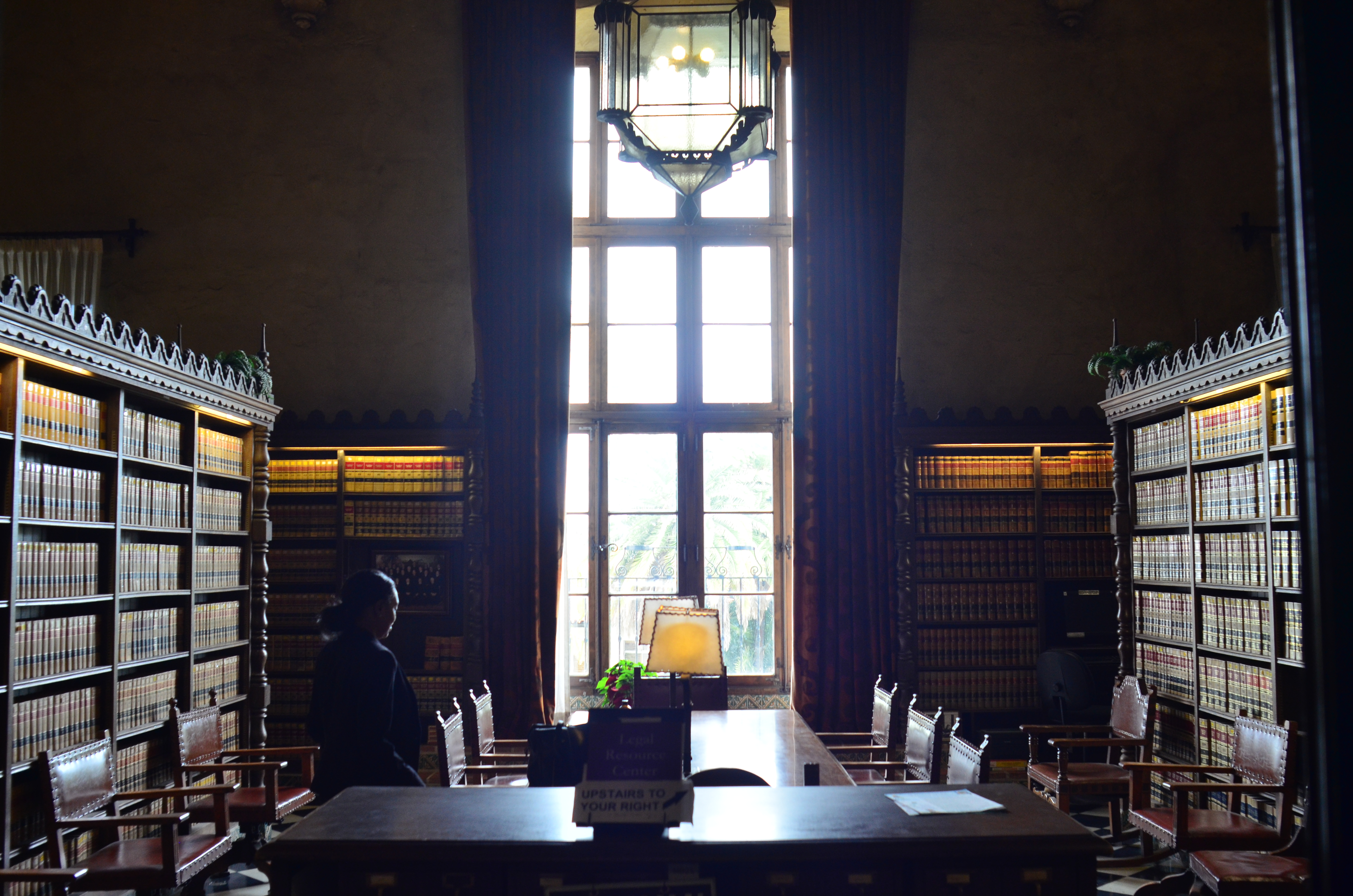
The original shot suffers from the “blues“.
Let’s take color as one example. A great many photographs with off-kilter values are corrected in Photoshoppish apps, yet can be quite satisfactorily fixed in-camera. White balance settings allow you to pre-program a number of light temperature pre-sets that make your camera “see” colors as if they are occurring in sunshine, shade, or a variety of artificial light sources. But even if you shoot everything on the “auto” white balance setting and get the wrong colors occasionally, there is still a way to repair the damage without resorting to Photoshop. What Nikon and Canon both call color balance allows fairly fine-tuned adjustments to get the hues to look either (a) more like you saw it, or (b) the way you wish it had looked.
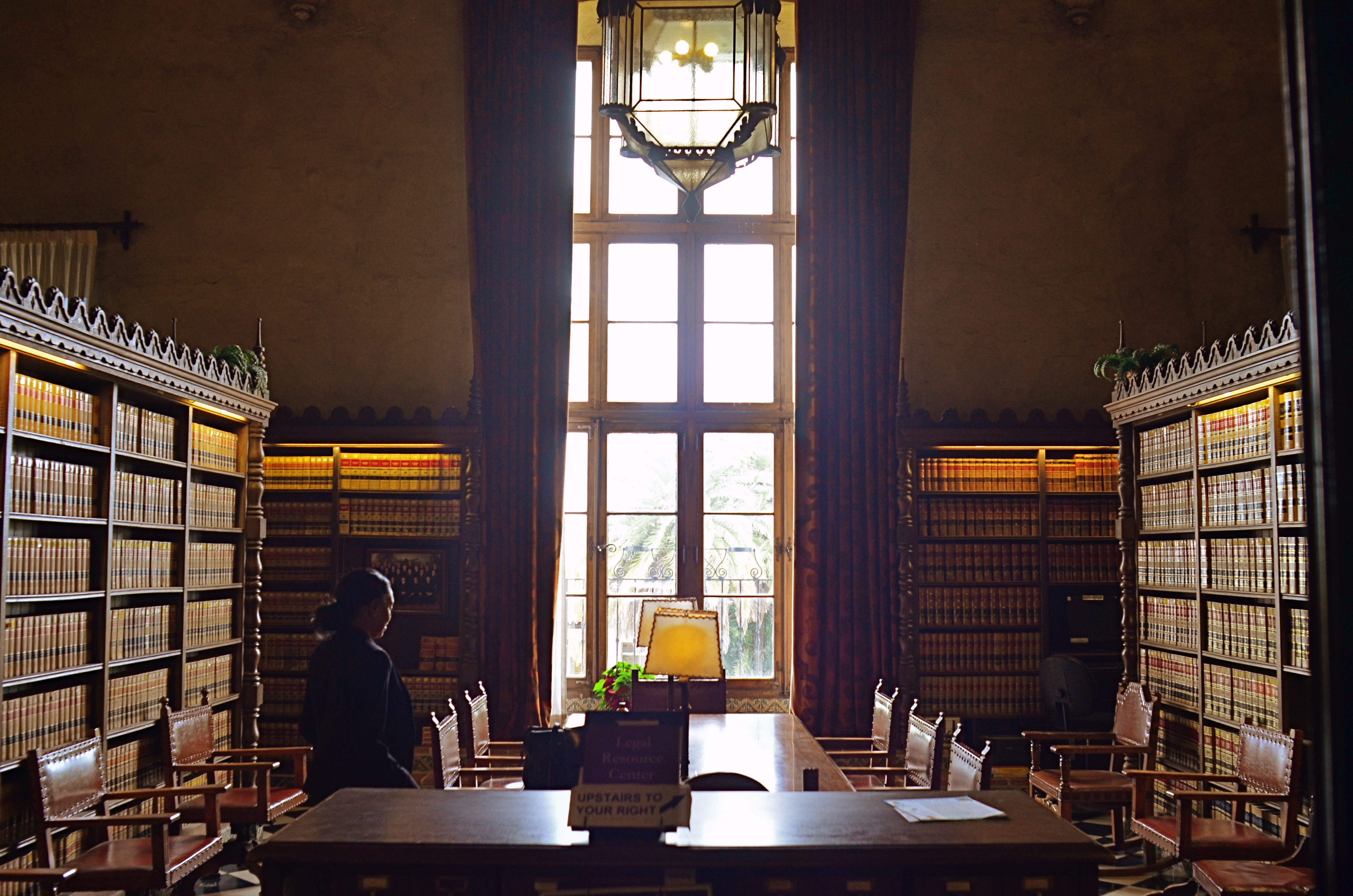
The shot at top, adjusted with Nikon’s color balance option, produced the warmer look in the bookshelves that would have resulted if the light coming through the window had been warmer. In the original image, taken with an auto white balance setting, the camera, far from “guessing wrong”, actually recorded the room light as it appeared in reality, since the sky was severely cloudy and was a little blue in cast. However, with the in-camera color balance tweak, no Photoshop intervention was required. Moreover, I could check my work while in the moment, a handy thing, since tours were moving in and out of the room all day, meaning that, if I wanted to shoot the room (nearly) empty, I had to work fast.
Digital photography’s original bragging point over film was the ability to shoot, fix, and shoot again rather than rely on the darkroom to rescue tragically few of our miscalculations. Working our in-camera menus for all they’re worth helps deliver on that promise.
INSTANT VELVET

A portrait straight from my camera, with no prior filtration.
By MICHAEL PERKINS
THERE WERE, IN THE DAYS OF FILM, two main ways to create the velvety glow of uniformly soft focus so prized by portrait subjects. The more expensive route lay in purchasing a dedicated portrait lens that achieved more or less of the effect, depending mainly on aperture. The other, cheaper way was to screw-on a softening filter, making any lens adaptable to the look. Now, in the digital era, those two options have been joined by softening apps for phone cameras and in-camera “filters”, which add the effect after the photograph has been snapped.
That’s the beauty of where we are in the history of photography, where every problem has a half-dozen different solutions, offered at different levels of complexity, ease, and affordability. In the golden days of Hollywood, cinematographers achieved the soft look with some Vaseline smeared over the lens, or by attaching different gauges of gauze to the glass. Both tricks made yesterday’s matinee idols look like today’s ingenues, and now, anyone with a reasonably sophisticated camera can achieve the same success with half the bother.

The same image after the application of Nikon’s in-camera “soft” filter.
I myself prefer to shoot soft focus “live”, that is, in the moment, with either a dedicated lens or a filter, but you aren’t always in the same frame of mind when you shoot something as when you review it later. In-camera processing, while offering less fine control (tweaking pictures that have already been shot), can at least give you another comparative “version” of your image at literally no trouble or cost. With Nikon, you simply select the “Retouch” menu, dial down to “Filters”, select “Soft” and scroll to the image you want to modify. For Canon cameras, go to the “Playback” menu, select “Creative Filters”, scroll to “Soft” and pick your pic. The image at left shows the result of Nikon’s retouch filter, applied to the above picture.
One personal note: I have tried several phone app softeners as post-click fixes, and find that they generally degrade the quality of the original image, almost as if you were viewing the shot through a soup strainer. Your mileage may vary, but for my money, the app versions of soft focus are not ready for prime time yet. Best news is, the soft-focus effect is so popular that eventually all solutions will be generally equal, regardless of platform, since the marketplace always works in favor of the greatest number of people making pictures. Always has, always will.
All things considered, we got it pretty soft.
DON’T EVER ALWAYS DO ANYTHING
This shot, as the one below, is taken at 1/60 sec,, f/2.2, ISO 250, 35mm. The difference between the two images is the white balance setting.
By MICHAEL PERKINS
IF YOU’VE EVER GLANCED AT THE NORMAL EYE’S HOME PAGE MISSION STATEMENT, you might come away with the impression that I am unilaterally opposed to automodes, those dandy little pre-sets that do their best to predict your needs when making a photo. The truth is that I am against doing anything “all the time”, and thus caution against the universal use of automodes as a way of idiot-proofing your shoots. They can be amazing time-savers, sometimes. They are reliable shortcuts, sometimes. Just like I sometimes like bacon on a burger. There are no universal fixes.
I meet many people who, like myself, prefer to shoot on manual most of the time, eschewing the Auto, Program, Aperture Priority and Shutter Priority modes completely. Oddly, many of these same people almost never take their white balance off its default auto setting, which strikes me as a little odd, since the key to color photography is getting the colors to register as naturally as possible. Auto WB is remarkably good at guessing what whites (and in turn, other hues) ought to look like in a pretty wide variety of situations, but it does make some bad guesses, many of them hard to predict.
A gross-oversimplification of white balance is that it reads the temperature of light from cold to warm. Colder temp light runs bluer. Warmer temp light reads more orange. Auto WB tries to render things as naturally as it can, but your camera also has other customizable WB settings for specific situations, and it’s worth clicking through them to see how easy it is to produce subtle variations.
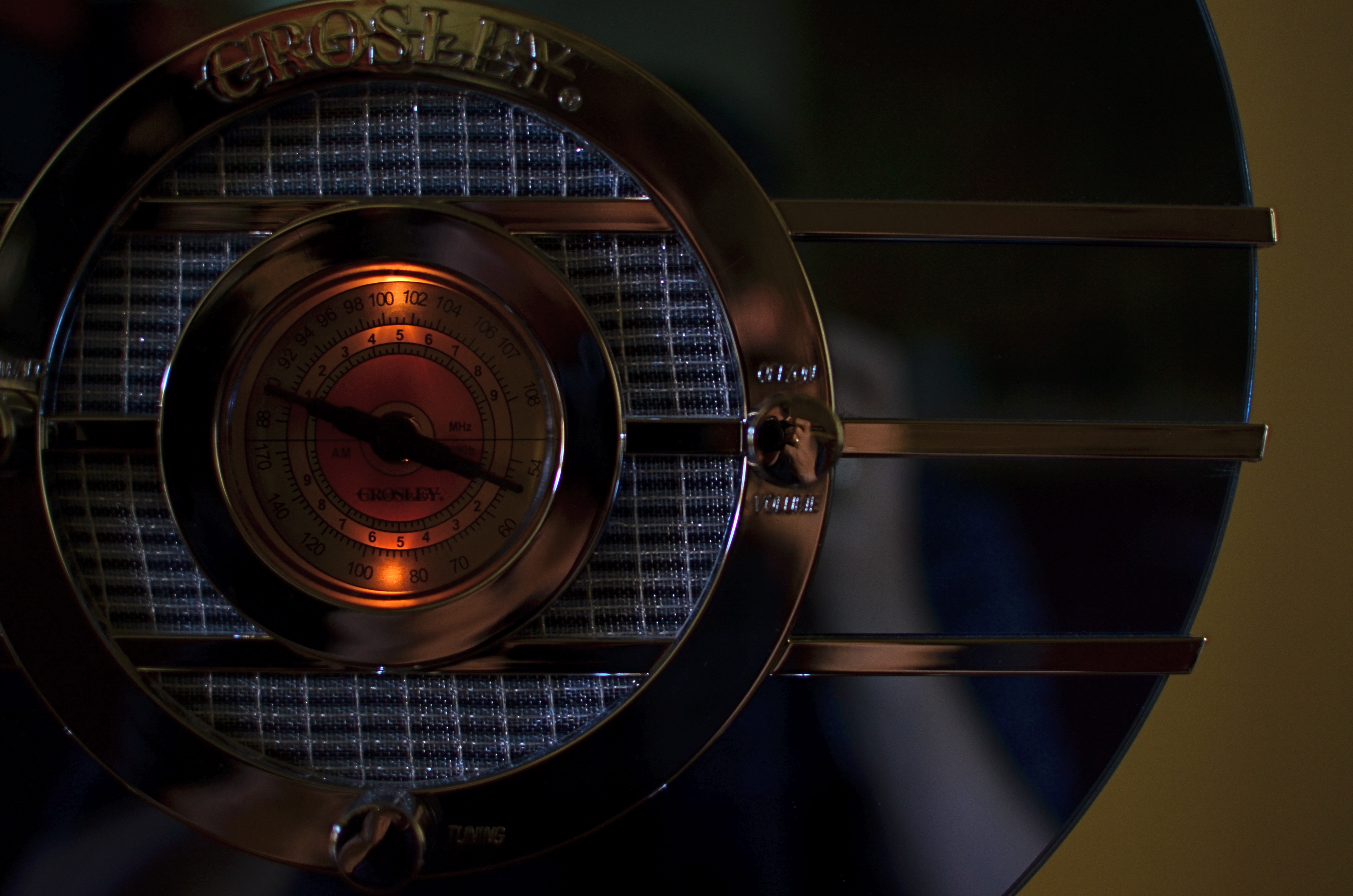
In the picture in the upper left corner, I’m taking a picture indoors, in deep shade, of a reproduction 1930’s Bluebird Sparton radio, a wondrous Art Deco beauty featuring a blue-tinted mirror trimmed in bands of chrome. To emphasize: blue is the dominant color of this item, especially in shade. Shade, being “colder” light, should, in Auto White Balance mode, have registered all that blue just fine, but, in this case, the chrome trim is completely (and unnaturally) painted in the same orange glow. As for the blue values, they’re well, kind of popsicle-y . That’s because, when it’s all said and done, Auto White Balance is your camera’s educated guess, and it sometimes guesses wrong. If you always use it, you will occasionally have to eat a bad picture, unless you take action.
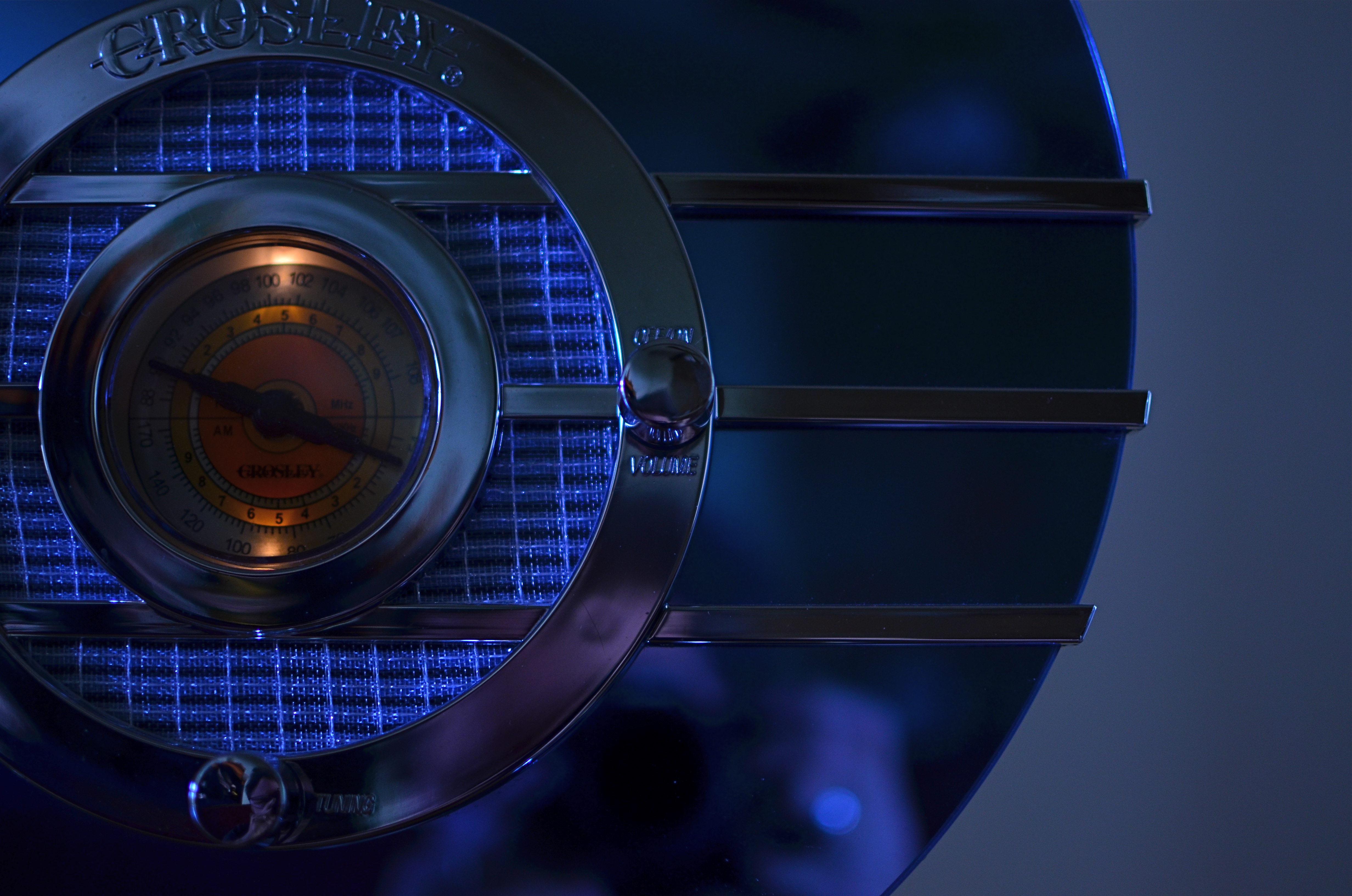
I get blue when I listen to the radio, or when I dial up the appropriate white balance.
For the above image, I want the dial to be nice and orange, but just the dial. To try to get the blues back to normal on the rest of the radio, I switch to the Tungsten white balance setting (symbolized by a light bulb, since they burn, yes, tungsten filaments), something I normally wouldn’t do in either daylight or shade, but hey, this is an experiment anyway, right? To make it even weirder, Tungsten might read neutrally in some kinds of indoor night settings…but it also doesn’t behave the same way in all cases. In this case, I caught a break: the orange in the radio dial registers pretty true and all the metals are back to shades of silver or blue.
Notice how both white balance settings, in this strange case, both performed counter to the way they are supposed to. One misbehaviour created my problem and another misbehaviour solved it. Hey, that’s show business.
Hence the strange but appropriate title of this post. Don’t ever “always” do…anything. If you want the shot you want (huh?) then pull an intervention and make the camera give it to you. Automode in white balance is just as fraught with risk as any other automatic setting. It works great until it doesn’t. Then you have to step in.
A DIFFERENT BRAND OF DARK
A texturally rich subject, but its natural color is too Disney.
By MICHAEL PERKINS
ONE PHOTOGRAPHER’S LAB ACCIDENT IS, OCCASIONALLY, ANOTHER PHOTOGRAPHER’S EUREKA MOMENT. Take the case of a visual effect that, in the film era, may have originated with an error in darkroom technique, and which is now being sought after by movie directors and amateurs alike as a look that they actively desire. Recent use of this effect ranges from the gritty, muted color and high-contrast of films like Steven Spielberg’s Saving Private Ryan, to lab-less shortcuts in Photoshop and even shorter shortcuts in ready-to-eat iPhone apps. The look is called Bleach Bypass and it’s worth a look for certain moods and subjects.
The term derives its name from one of the steps used in film processing color film in which bleach is used to rinse away silver nitrate. By skipping this step, the silver is retained in the emulsion along with the color dyes. The result is a black-and-white image over a color image…kind of a photo sandwich. The resulting composite is lighter in hue but packs more extreme contrast and graininess in the monochrome values…an intense, “dirty” look.
The same shot with a simulated bleach bypass effect, done in Photomatix.
Now, for those of you that don’t have a traditional darkroom handy, creating a bleach bypass “look” is easy in nearly any basic editing software suite. Check out the basic steps for Photoshop here. In most cases, you duplicate your original shot, desaturate it slightly, and convert the dupe shot to complete monochrome. The mono copy must also be manipulated for ultimate contrast, and the two shots must be layered in software to give you the desired blend. I tend to use Photomatix more often than Photoshop, since I work a lot with various kinds of tone-mapping for HDR, so I processed the “after” shot you see here in that program’s “exposure fusion” tab. However, as I say, lots of programs can do this with virtually no sweat.
Another path: an iPhone image with the AltPhoto app’s Bleach Bypass filter applied.
The third image in this article (at left) was produced with a click and some swipes with the Bleach Bypass simulator in the AltPhoto app, which also mimics the look of antique film stocks from Kodachrome to Tri-X. As with many phone apps, it doesn’t offer much in the way of fine control, but if you do all your shooting and/or retouching in your mobile, it’s a pretty good quickie fix.
Once again, in the digital era, what was once (a) messy and troublesome becomes (b) no fuss, no muss, and therefore, (c) something that will be adopted and used by many, many more shooters. Democracy in technology does not, of course, guarantee equality of results. You just have more tools to serve you when the ideas come.
POINTERS
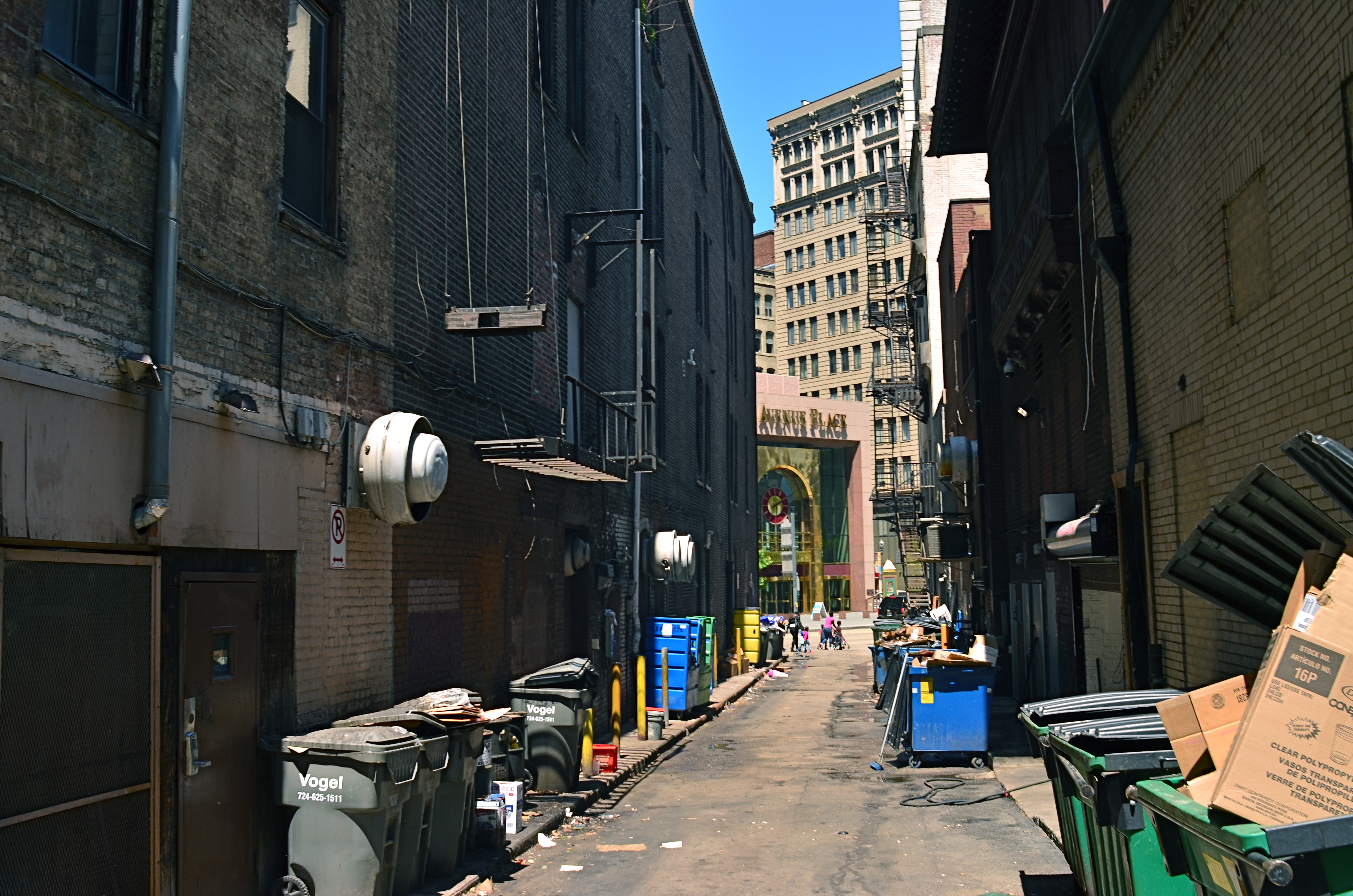
A traditional wide-angle approach to the suggestion of depth.
By MICHAEL PERKINS
WE ALL WENT THROUGH THAT OLD PERSPECTIVE EXERCISE IN ART 101. You know, the one where we draw the train tracks trailing away to an imaginary horizon, compressing the distance between the tracks as they “recede” to suggest depth, or a simulation of the way our eyes perceive it. It’s a lesson that dances somewhere back in our lizard brain whenever we compose a shot to suggest three dimensions on a flat plane (film or sensor) that only possesses two. Ongoing challenge, etc., etc.
In composing a photograph, it’s pretty easy to decide which factors in the picture actually aid that illusion, creating a big fat neon arrow to the thing we’re want to draw attention to. And some ways are better than others at selling that idea. One of the strong myths about these kinds of shots is that you need a wide-angle to make the argument for depth. Of course, that’s like a lot of “rules” in photography. It’s always true, except in those cases when it’s kinda…not.
In the top image, shot with a 24mm lens, the building at the back of the shot is lit better than the two alley walls that lead to it….a basic no-brainer of a composition. Moving left or right a bit can put the major emphasis on one wall or the other to be the arrow pointing to that object, or you can make the shot even more compact, although no less effective, in the cropping process.
Instead of two leading lines heading for the building at the back, let’s try just one.
Of the two walls, the rows of trash cans and receding lines of windows on the left seem, at least to me, to lead more powerfully to the back building than the right, where detail is darker and objects that could act as a leading line are a little more angled and compressed. Just for kicks, I cropped the shot to a square you see just above, reframing the back building as the end of a straight, single diagonal along the left wall, making the instruction to the eye a lot more streamlined.
It’s not that the fuller frame is “wrong” per se, but I always believe that inside many shots just might be a better shot waiting to get out. Some photographs are full-born in-camera, while others emerge during what I call the “on second thought” phase.
Now to try this idea out at a railroad crossing….
SEISMOGRAPHY
Symphonie Kinetique, 2015. Handheld in-camera manipulation, in real time, of the iPhone’s on-board pano app.
By MICHAEL PERKINS
I THINK THAT, FOR YOUNG AND EMERGING PHOTOGRAPHERS, there’s a greater natural comfort in coloring outside the lines, bending or breaking rules of the medium just to see what happens, regardless of the warnings of user’s manuals or procedurals. This is completely normal, and is, in fact, healthy for the art overall, as every age’s young turks shake the process up and keep us more hidebound shooters from imprisoning photography in a crust of habit.
Phone-based apps play directly to this “what the hell, let’s try it” tendency in the newbie. By their very nature, apps allow people to achieve in a second what used to take years of formal training and painstaking darkroom effort to achieve. This creates the feeling that anything is possible, and that, with the instantaneous feedback loop of digital, there is nothing to be risked or lost by trying.
Whenever I get a new app, I try to figure out what it can produce when used completely counter-intuitively, that is, by going in the direct opposite of its “correct” use. Call it a procedural hack if you will, taking one of the most available effects, the iPhone’s on-board panorama app, as a prime example. Now we all know how the app is supposed to work. You pan evenly and slowly from left to right across a scene and a lot of separate vertical “planks”, all of which are individual exposures, are stitched together by the software to give the appearance of a continuous image. You are instructed by the app when to slow down, and given a guide arrow as you pan that keeps you pretty much on an even horizon. And that’s all you’re supposed to be able to do.
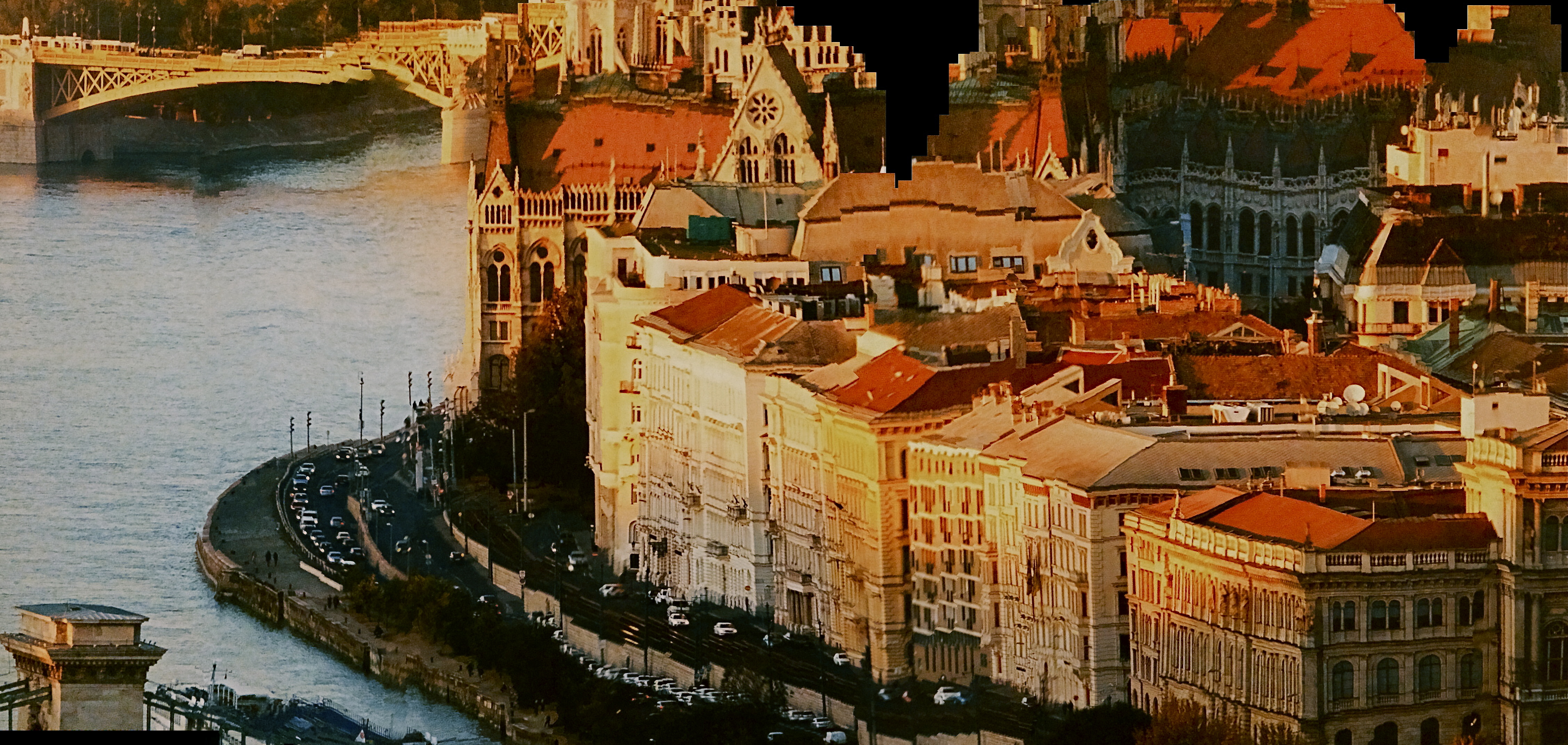
The Fall Of Europe, 2015. Same technique applied to a wall-mounted photo mural.
Of course things can go wrong, and watching how they go wrong is what started me on an experiment. If, for example, someone walks through your shot while you are panning, he may appear in only a few of the “planks”, as a warped, disembodied sliver of his leg or arm, or be stretched like taffy across part of the frame. Thing is, this gives you a neat interpretational option for panos that you want to appear surreal. The idea is to deliberately throw those individual planks out of alignment.
Here’s how it works: as you pan, shift your up-down axis either side of that arrow’s horizon guideline. Go gently if you want things to undulate in a smooth wave. Jerk it around a bit of you want to create a seismographic effect, with sharp high-low spikes in your subject. I should note here that this requires a lot of experimentation to get the overall look that you want.
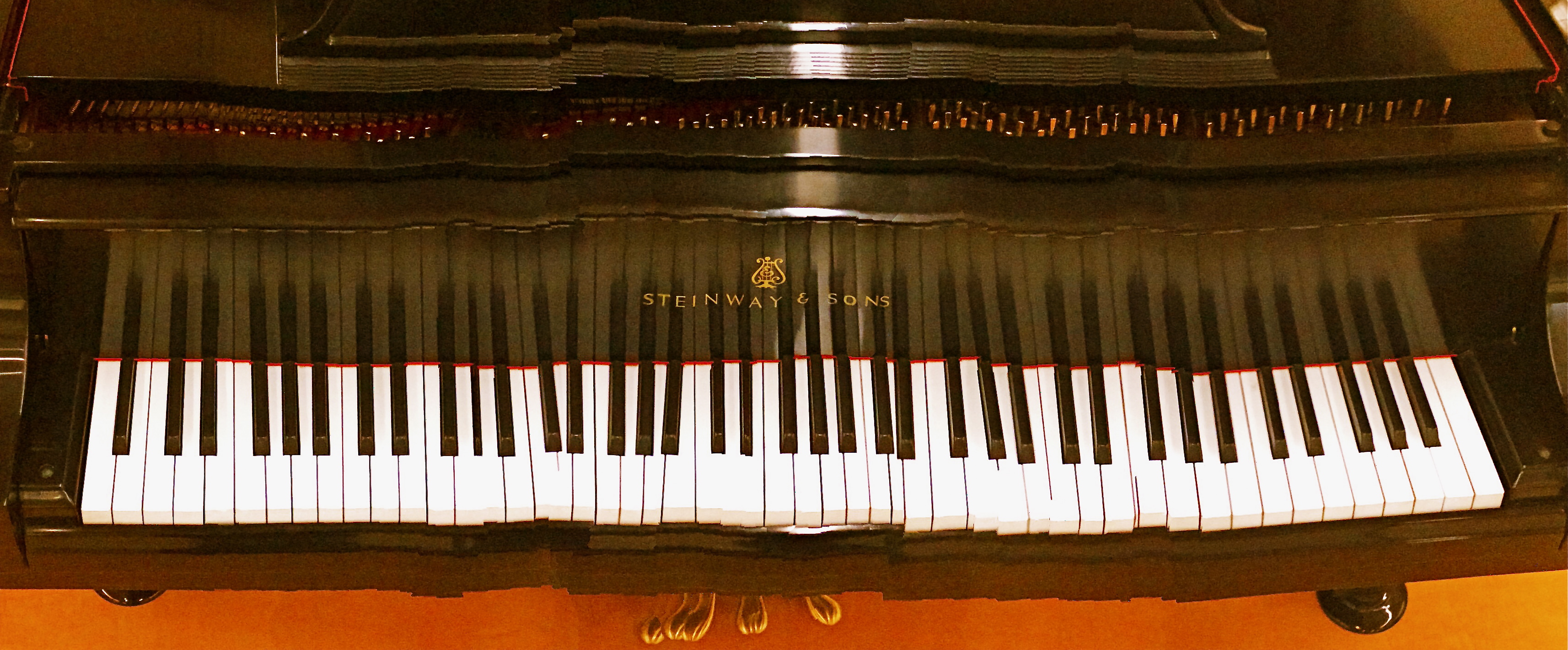
In the top image, I wanted to suggest the kinetic energy of musical dynamics in a static image, so I warped the piano keys out of alignment with each other, as if Salvador Dali had painted the keyboard. In the second image, I used the camera to scan a mounted mall mural, allowing me to work with a still image that I could tweak to suggest a collapsing building or an earthquake. Either of these images are easy to do with nothing more than your iPhone’s pano tool, and the effects can be dramatic. So love your apps, but love them enough to imagine what fun it can be to make them misbehave.
OPEN ALL NIGHT
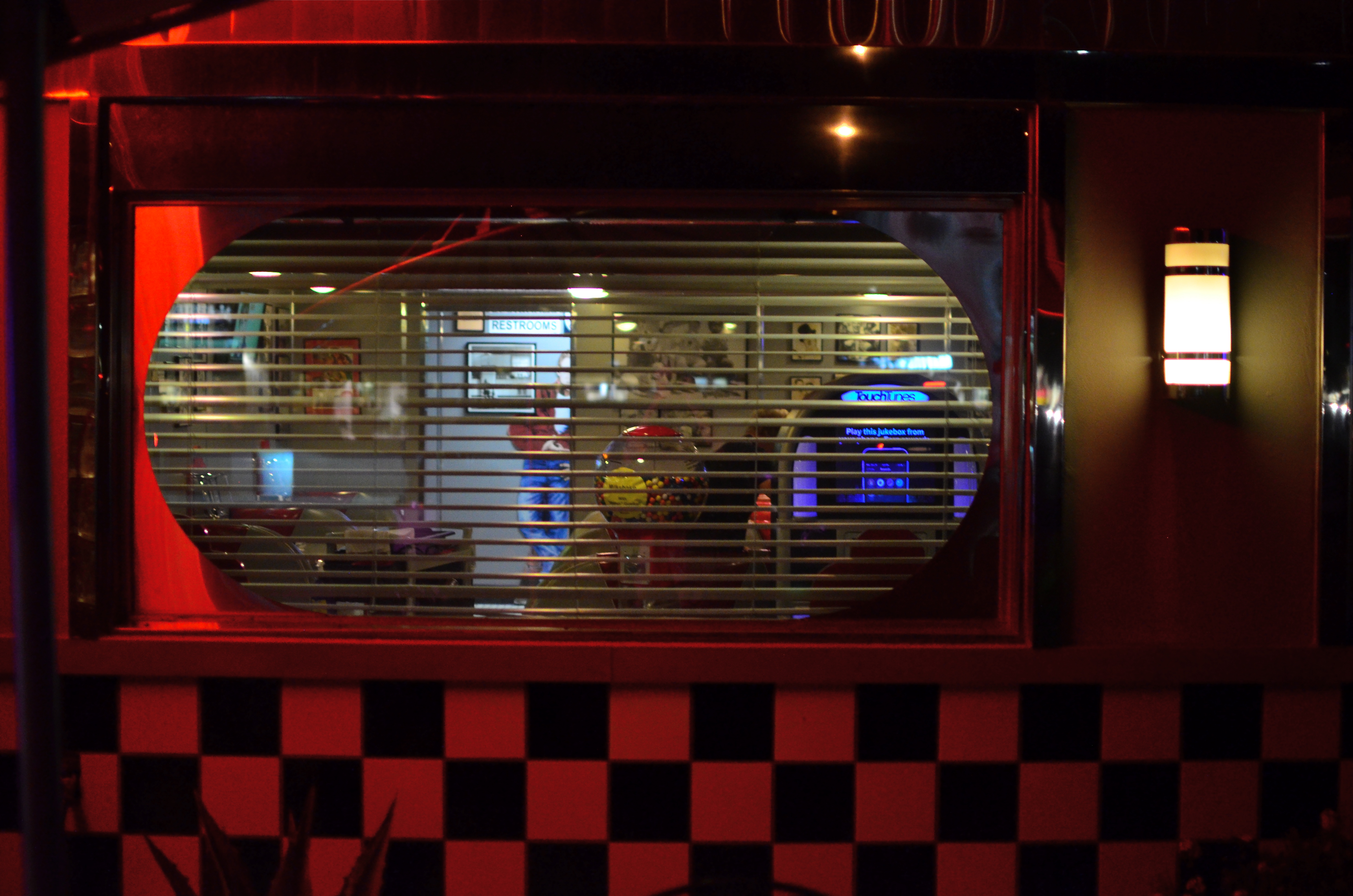
Diner-Vision, 2015.
By MICHAEL PERKINS
WHICHEVER SHIFT YOU WORK, YOU ARE FOREVER A STRANGER TO THOSE who work the other side of the workday. And while the majority of us generally fit into the standard 9 to 5 job template, millions of us have our body clocks regularly flipped upside down, our days cloaked in darkness, our brains awake while the city at large sleeps. That means that at any moment, half of us have little comprehension of how the other half lives. There’s a story in that.
And stories need pictures.
Pictorially speaking there has always been a bit of a black market mindset about the night-time, a nether world for some, a regular hangout for others. And with good reason: photography, in its infancy, had to ply its trade largely in sunlight, avoiding scenes which required either too much time, too much prep, or too much patience with slow recording media. But now we live in a very different world, armed with digital computers that look suspiciously(!) like cameras, but which react to light with an efficiency unseen in the entire history of photography.
Capturing the night is no longer a rare technical achievement, and we are really only at the front end of a steadily rising curve of technical enhancement in the area of light sensitivity, with no end in sight. Finally, darkness is something that uniquely colors and reveals reality instead of cloaking it in mystery. There is no longer an end to the shooting day. The image above is by no means an exceptional one, shot with a prime lens open to f/1.8 and a sensor that can deliver manageably low noise even at ISO 1250. More importantly, it is a handheld snap, shot at 1/30 sec…..all but unthinkable just a dozen years ago.
The new golden age of night photography is already apprehended by the youngest generation of shooters, since many of them can’t recall a time when it was a barrier to their expression. And, for those of us longer of tooth and grayer of beard, there is the sensation of being free to wander into areas which used to be sealed off to us. Sun up, sun down, it’s always time to take a picture.
Suddenly your eye is like a great downtown deli.
We’re open all night folks. We never close.
OF FOOLS AND TOOLS
There are many roads to a final image, but only one destination.
By MICHAEL PERKINS
PHOTOGRAPHERS LOVE TO BICKER ENDLESSLY ABOUT WHICH IS THE BEST ROAD TO TRAVEL en route to the making of a picture. I mean they flat-out love it. Here we are entering the third century of a global art that has amply demonstrated that vision, not hardware, is the determinant of excellence, and we are still splitting into warring factions on which camera does this, or which lens or process does that. It’s discouraging because it is wasteful. Put in another context, it’s like arguing whether your marinara won first prize because you stirred it with a spoon instead of a fork.
This ongoing us/them battle over which is the “purer” approach to photography is presently centered on traditional cameras versus mobile devices. Each side calls its star witnesses to testify on a variety of qualifying or disqualifying factors, as if anything matters but the pictures. Can I play that game? Sure, and I’d be lying through my teeth if I said that I had never hurled a bomb or two toward both sides in the skirmish. But when I do that, I’m only serving my own ego….not photography.
I make a distinction between cel phone and conventional cameras based simply on what I want to do in the moment, but such distinctions are never recommended as a universal yardstick. Very generally speaking, if I want the widest number of creative choices before the picture is made, I prefer a DSLR. If I can safely trust my instinct for the greatest part of the picture, adding creative tweaks after the shutter clicks, I am comfortable with a cel. Simple as that. I have made very satisfying images with both kinds of cameras, but my results are purely my own. And that’s really as much as any of us can swear to.
The manufacturers of both kinds of cameras know that different people approach picture-making with priorities, and that’s why they make cameras that have different approaches. Why should this be surprising? Is a Cadillac a better car than a Fiat? Who says so and why? Don’t both accomplish the same baseline task of propelling you from point A to point B? Then they’re, um, cars.
Many pro photographers worship gear the way high priests dig incense and robes, so it’s no wonder that newbies catch the same fever. Looking at their worst pictures, they hate on their gear instead of questioning how they see. You’ve heard the if-only mantras. Maybe you’re mumbled them yourself. If only I had the Big Mama 3000 lens. If only I had a Lightning Bolt BX3 body with a Zeiss diamond cutter attachment! Boy, howdy, then you’d see some pictures. Yeah, well, bull hockey. Develop your eye and your pictures will come out better, whatever kind of camera they come out of. Choose to put yourself on an eternally accelerating learning curve. You’re the real camera, anyway.
Anything else is just a spoon or fork. Stir the pot with what’s at hand and start cooking.
TAKING YOUR TEMPERATURE
By MICHAEL PERKINS
AMERICANS LOVE TO CELEBRATE A WINNER, and they also like to clearly identify who most definitely did not win. We score-keep on everything from fantasy football to number of days on the job without accidental amputations, and we love, love, love to declare someone the champ…in anything. This either/or, winner/loser habit of the western mind, when applied to photography, leads people to argue over which is better…traditional cameras or those imbedded in mobiles, as if such a judgement is possible. Or as if it matters. So, as you rifle through these humble pages, I hope I make it abundantly clear that, from my standpoint, it’s all about the pictures.

Changing the white balance from auto to shade warmed up the colors in this nearly-outdoor shot. 1/25 sec., f/5.6, ISO 800, 35mm.
The principle difference between, say, DSLRs and phone cameras, to me, is one of method, or how they approach the job of making an image. In full-function cameras, the emphasis can be on how to use the device’s controls and settings to set the terms of your picture before the click. In cellphone cameras, it’s all about how you can massage what the camera was able to give you after the fact, be it with in-phone apps or computer software. You simply can’t impose your will on an iPhone camera until after the picture is taken, and that’s an important distinction. Notice that I did not say better/worse, great/horrible. You just have to decide what’s important to you in a given situation.
Take a very simple choice that is available in even basic point-and-shoot “camera-cameras”, like white balance. Your camera has the option of deciding, for you, how colors should register based on the temperature of the light, or you can over-ride that function and customize it to your heart’s delight, something that, at this point in time, cannot be done on a cellphone camera. Even easier, menus reduce all your white balance options to visual icons (sunburst, house in shade, electric light bulb, etc) depending on how warm you want your pictures. You can even tweak for the precise kind of artificial light you’re working with, from incandescent to flourescent.
As an example, in the above shot, the morning light in the hotel lobby was, on automatic white balance, coming off blue, especially in the shadows. The entire effect of the golden period just after sunrise was being subverted by the camera. Easy fix: just dial it up for a shade setting, bump up the exposure a tad (slower shutter, higher ISO), and the warmth came back, but not so deep that everything went bad-suntan-bronze. And, yes, I could have got this shot with an iPhone, but the adjustment would have had to have been made after I got the shot wrong, then searched around for a fix. Again, there’s no good or bad.
You just have take your own temperature and decide what treatment you need.
A FORWARD STEP BACK

Skies which appear wispy in color can pick up some drama in black & white with the use of a red filter.
By MICHAEL PERKINS
SOME CHOICES IN LIFE ARE BINARY, EITHER YES OR NO. The light switch is either all “on” or all “off”. Photographic choices have never been binary, since there are only a few real rules about how to achieve the image you want and more than a million reasons why those rules have to be jettisoned, because they actually stand in the way of that image.
When digital photography arrived, there was a tendency to assert that everything associated with film photography was as obsolete as a roll of Kodachrome 64. In fact, the further we proceed into the digital age, the more we realize that there are many good practices from the days of emulsions and negatives that have solid application in the age of zeroes and ones. It would be ridiculous to say categorically that every tool of one era must be abandoned in the image-making of the next. Lenses, exposure, lighting basics, and many more elements of film-based creativity have equivalents in digital. None of them are good all the time, and none of them should be ruled out without exception.
The use of filters is one such element. Many film-based photogs worth their salt have used filters as a matter of course, and, despite the amazing in-camera and post-production fixes of the present day, these little bits of accent glass still produce dazzling effects with a minimum of investment, and help shooters maintain a close, hands-on control of their images in the moment. And one of my favorites here in the American southwest, land of endless, often blistering sun, is the red 25 filter.
Used to punch up contrast and accentuate detail for black and white, the red 25 renders even the lightest skies into near blackness, throwing foreground objects into bold relief and making shadows iron sharp. On a day when fluffy clouds seem to blend too much into the sky, the red 25 makes them pop, adding additional textural detail and a near-dimensional feel to your compositions. Additionally, the filter dramatically cuts haze, adding clear, even tones to the darkened skies. Caution here: the red 25 could cost you several stops of light, so adjust your technique accordingly.
Many whose style has developed in the digital age might prefer to shoot in color, then desaturate their shots later, simulating this look purely through software, but I prefer to make my own adjustments to the scene I’m shooting while I am shooting it. I wouldn’t paint a canvas in one place and then fix my choice of colors a week later, hundreds of miles away from my dream sunset. Filters are from a world where you conceive and shoot now. The immediate feedback of digital gives you the part of that equation that was absent in film days, that is, the ability to also fix it, now. Photography can’t afford to cut itself off from its own history by declaring tools from any part of that history obsolete. A forward step, back is often the deftest dance move.
UNBOUND BY REALITY

It’s A Mall World, After All: iPhone panoramics make good design tools, but they ain’t about realism.
By MICHAEL PERKINS
PANORAMAS WERE DEVELOPED IN PAINTING, AND LATER IN PHOTOGRAPHY, to alter, not capture, reality. This is one of those man-over-nature struggles that thrilled 19th-century brainiacs. Consider: both mediums are hemmed in by physical limits. The frame can only be so big. The wall can only go so wide. Sadder still, there are limits to the width of human vision, which is why our neck swivels from side to side, giving us the ability to tilt our head attentively when our wives whisper something pertinent to us during the third act of The Barber Of Seville.
So, panos were a fascinating fakery from the start, an attempt to compensate for our limited senses and the cramped confines of the frame, providing no less a warp of reality than a kaleidoscope or 3-d. They were great for showing the broad sweep of the Battle of Gettyburg or the entire breadth of the Coney Island Boardwalk, but the emphasis, historically, was always on closely simulating reality, in that objects were photographed in their natural proportions from left to right and focus was always pinsharp from near objects to the horizon. In other words, “real” phoniness instead of exaggerated phoniness (huh?).
Old school: a panoramic plate camera from the 1800’s.
Now, however, with self-stitching panoramic software in phone cameras, we have a process that actually accentuates unreality, and that can be interesting. Ideally, to take a pano, you must sweep the camera slowly from left to right during the exposure. Now, this would result in a “realistic” perspective, if you could maintain constantly smooth motion and a uniform distance from your subject all the way across, which is impossible unless you’re seated on a dolly and being pushed along a track by four of your friends. So much for reality.
So, what you’re forced to do instead is to twist your body left, remain standing in one place, and be the central pivot point while you pan across yourself until you get all the way to the right. Imagine your body to be a hinge and your arms to be a swinging gate.This creates a crazy amount of spatial distortion not unlike a fisheye effect, and that is my point. Play to that weakness and make it a strength. Leave reality behind and look for patterns, your own abstract designs, in other words, improvements on reality. Panoramas aren’t tools for map-makers. You’re not going to hang your images like tapestries across the east wall of the capitol rotunda. So have some fun doing what reality won’t allow.
ROLL PLAYING
By MICHAEL PERKINS
I RECENTLY CAME ACROSS AN ARTICLE IN WHICH A PHOTOGRAPHER BEMOANED the insane volume of images being shot in the digital era. His point was that, while we used to be tightly disciplined in the “budgeting” of shots back in the days of film (in which we had a fixed limit on our shots of 24 or 36 frames), we crank away an infinite number of shots today in short order, many of them near duplicates of each other, flooding the universe with a torrent of (mostly) bad pictures. Apparently, he posits, it is because we can shoot and re-shoot without fear of failure that we make so many mediocre images.
He takes it further, proposing that, as a means of being more mindful in the making of our photos, that we buy a separate memory card and shoot a total of, say, two “rolls” of pics, or 72 total images, forcing ourselves to keep every image, without deletions or retakes, and live with the results for good or ill. I have all kinds of problems with this romantic but basically ill-conceived stunt.
Our illustrious writer and I live on different sides of the street. He seems to believe that the ability to shoot tons of images leads to less mindful technique. I believe the exact opposite.
Not the hardest shot in the world, but in the film era, I might never have guessed how best to nail it. In digital, I was free to approach the right solution over a series of practice shots.
When you are free, via digital photography, to experiment, to correct your errors on the fly, you suddenly have the ability to save more shots, simply because you can close in on the best method for those shots much faster, and at a fraction of the cost, of film. You collapse a learning curve that used to take decades into the space of a few years. One of the things that used to separate great photographers from average ones was the great shooters’ freedom, usually from a financial standpoint, to take more bad (or evolving) images than the average guys could afford to. Of course, really bad photographers can go for years merely continuing to take more and more lousy shots, but the fact is, in most cases, taking more photos means learning more, and, often, eventually making better pictures.
Apparently, our illustrious writer believes that you can only be photographically self-aware if you are constantly reminded how few total frames you’re going to be able to shoot. I truly appreciate the goal of self-reliant, experience-based photography he wants to promote. But I contend that it’s not that we make too many pictures, but that we keep too many. It’s the skill of editing, that unemotional, ice-cold logic in deciding how few of our pictures are “keepers”, that is needed, not some nostalgic longing for the strictures of film.
Hey, of course we over-share too many near-identical frames of our latest ham sandwich. Of course Instagram is as clogged as a sink trap fulla hair with millions of pictures that should never see the light of day. But that’s not because we can shoot pictures too easily. It’s because we don’t grade our output on a stern enough curve. As it gets easier to shoot, it should get tougher to meet muster.
WORK DIGITAL, THINK ANALOG
By MICHAEL PERKINS
I’M BIG ON CELEBRATING THE FACT THAT DIGITAL TECHNOLOGY HAS REMOVED THE LAST FEW BARRIERS to photography being truly democratic. Just as the introduction of the Kodak Brownie in 1900 moved picture-making out of the salons of the privileged few and into the hands of John Q. Everyman, digital has been another quantum leap toward a level playing field, putting cameras almost literally into everyone’s hand. This, as with all mass movements, has both its pluses and minuses.
Digital photography has actually improved one democracy (everyone can afford to shoot) and created a second one (everyone can afford to fix what they shoot). For nearly the entire film era, processing after the shutter click was, for many of us, a luxury item. For initial developing, we defaulted to the guy at the regional Kodak plant or the corner Rexall. True hobbyists and professionals wielded most of the tools available for drastic makeovers of images, with most of us merely accepting what we got. Our near misses simply went into the loss column, while others‘ near misses could sometimes be revamped into acceptable, even exceptional photos. The titans of the photographic world (Ansel Adams and others) were renowned for their ability to creatively manipulate negatives into prints of rare art. Most of the rest of us clutched our Instamatics tightly and hoped for the best.
Shoot as if you’ll have to live with the results forever, with no “fixing it later”. 1/320 sec., f/8, ISO 100, 35mm.
Unfortunately, digital has over-corrected a bit in giving Everyman the chance to salvage more shots. Instead of developing habits that are, say, 75% good shooting and 25% good processing, we have instead veered toward the opposite, with more time than ever spent “fixing” shots that were ill-conceived in the first place. Moreover, many of these fixes, mounted on apps, are general, one-click options that deny us the finely tuned control that a good film era darkroom rat would have acquired. We have gained access to the information highway, but we still drive like teenagers. We are all over the road.
I see more professionals advocating a return,not to the format of film, but the shooting discipline of film. How differently would we shoot, for example, if it were still true that we wouldn’t have a lot of options for fixing our shots later? What strategies would develop if we had to make or break our shots in the camera, without any opportunity for tweaking them thereafter? Most importantly, which of our images could stand alone as straight out of the camera executions, as products of real, hard-earned skill rather than the comfort in knowing we could probably crop, resize, re-color or repair almost anything?
Now, I am not suggesting we all go back to making our furniture out of pine logs. I am not the last guy in town to trade in my horse for a Model A. I merely think that we need to re-introduce self-reliance into the picture-making process, to shoot as if it’s all on us, as if no Tech Avenger will ride to the rescue if we blow the shot in-camera. In fact, I am arguing for what I always argue for….personal responsibility for getting the shot right in the moment. Frame it, conceive it, expose it right the first time. It teaches us better habits, it increases our actual knowledge of what we’re doing, and it speeds our advancement as nothing else can.
Digital is a fabulous box of paints. Now we need to re-learn how to hold the brush.
MIDDLEHUES

Surety And Security, 2014. Image made using Nikon’s in-camera “selective color” effect, programmed to highlight blue and gold hues only. Note the bluish undertones that show up in the “white” building.
By MICHAEL PERKINS
I FIND IT AMUSING THAT THERE IS SO MUCH PRISSY FRETTING, in the present photographic age, about the manipulation of images, as if there is, or has ever been, a “pure” photography that comes full-born from the camera like Athena sprang from Zeus’ forehead. This is, of course, nonsense.
There never was a time when photographers simply pressed the button and settled for whatever dropped into their laps by chance. The history of the medium is a clearly traceable timeline of the very interpretive technique and, yes, manipulation that tracks, like this blog, the journey from taking a picture to making one.
It’s not what you apply to an image, it’s whether the application is the entire point of the picture. Does your conception have solid, original value, over which you then impose a supplementary effect or a boost in emphasis? Or are you merely popping apps and pushing buttons in order to disguise the lack of essence in picture, to whitewash a rotten fence if you will?

The original full-color image.
The reason I raise all this again is that an in-camera effect usually called “selective color”, now available on many DSLRs, has reminded me of the first days of color photography, which of course was no color at all, except that which was applied through tinting and painting after a monochrome image had been made. Depending on the individual artisan, the hues in these pictures tended to be either a soft wash of faint pastel or a raging rouge of rosy reds, but, most frequently, only selected parts of the image were colored at all, perhaps an attempt to dramatize particular elements of the composition. It was anything but natural, but, in advance of the development of actual color film, it produced some interesting results.
Jump to today’s cameras and the selective color option. You shoot your original image, select it, then zoom in on parts of it to both locate and choose up to three colors that will be featured in a copy of the image. All other tones will be desaturated, leaving you with a part monochrome, part color version of your original, which remains unchanged in a separate file. The effect, as in the past, can dramatize and isolate key parts of your picture, even giving a strange dimensional feel to the photo, but it can take some practice to get the result that you want.
For example, selecting the red of a single car on a crowded street will also catch the same red in other cars’ tail lights, the corner traffic signal, and a neon sign in a building at the end of the block, so be sure you can live with all of that. Also, in some seemingly “white” buildings, shadows or reflected light (as well as aging impurities in some materials) will show some faint shades of color in this process, so that the blue that you said okay to for the corner mailbox will also pick up slight bluish casts in the marble of the bank next door. In the above image, I also made a second, darker copy of the altered image, then blended the two copies in a tone compressing program, to further accentuate the building textures and contrasts.
Bottom line: there is black and white, there is full color, and there is the uber-cool playland in what you could call the middlehues. It’s not cheating to enhance a good picture. It’s only cheating when you use effects to mask the fact that you didn’t take the picture right in the first place.
RELATIONSHIPS
By MICHAEL PERKINS
DIGITAL PHOTOGRAPHY DOESN’T TRULY MAKE ARTISTIC CHOICES “POSSIBLE”. Those decisions were always available in the medium, albeit at some cost of materials, time and work. You could always get nearly any effect from film, providing you were willing to invest the sweat in wringing it out of the tools at hand. Instead, digital processes make choices easier to act upon, and, for people who have made the transition from a lifetime of film-based analog shooting to digital, the leap to light speed on the trip from desire to result is especially mind-ripping.
This speed of implementation makes real-time differences when considering whether a shot will have its best impact in color or b&w. Even standard DSLRs and compacts have in-camera modes that allow you to immediately shoot and compare alternate versions of a subject, and, with the expanding universe of apps available to the smartphone shooter, you can instantly crank out half a dozen or more readings of the kind of color or the type of monochrome you’re looking for. This is especially important in black & white, where the range of tones and contrast values can make or break a picture.
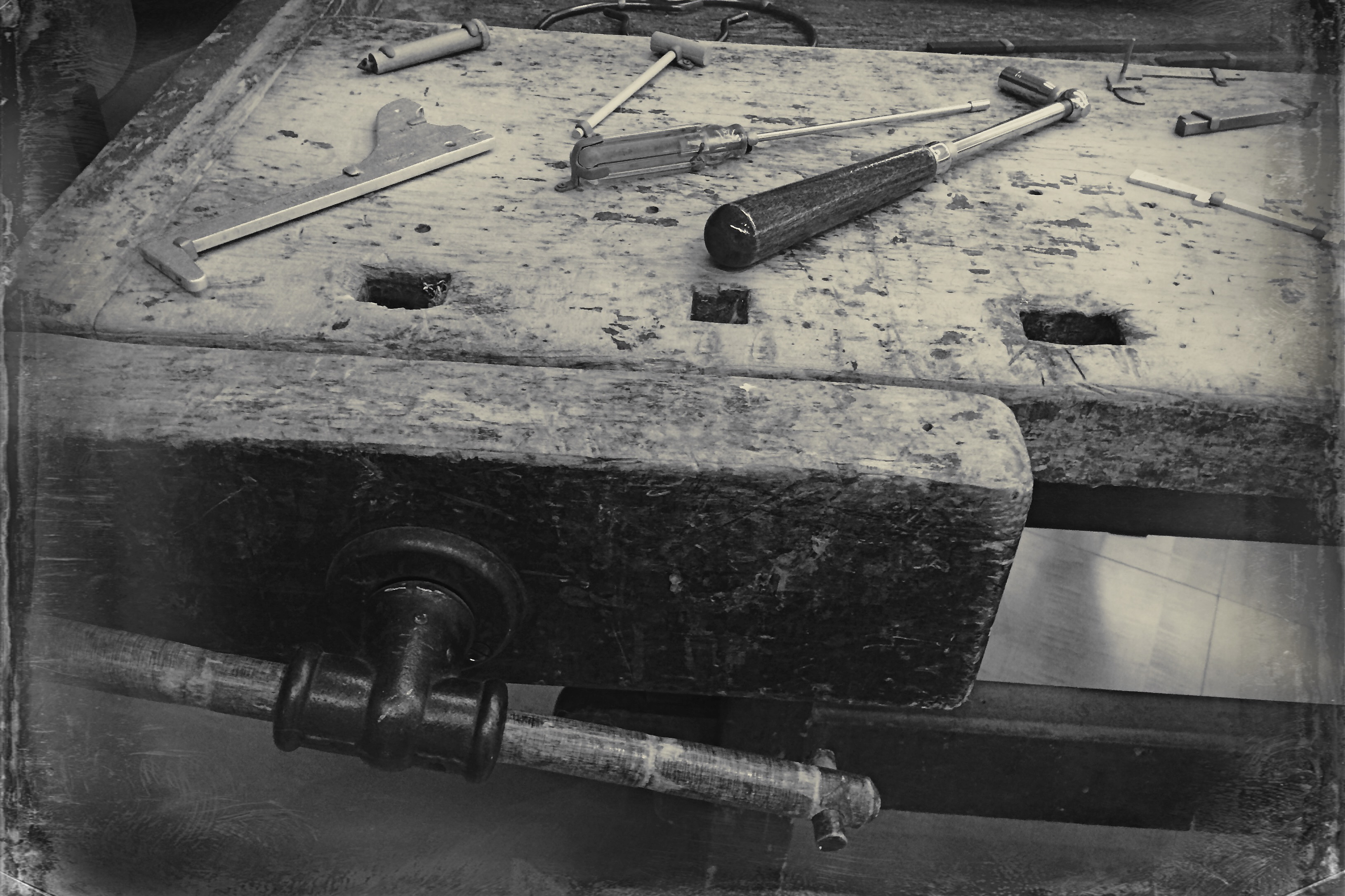
Black and white was the right choice here, but a decision about the kind of black and white was also crucial.
By basically simulating the subtle changes that a film processor could have made in the gradations between the various intensities of either black or white, apps allow you to make incremental judgments of how the values in the image work or don’t work to produce the “statement” you’re looking for. Best thing about this is the best overall thing about digital: how quickly you can act on your impulse, then check, adjust, and act again. The above image lacked impact in the color original. The old workbench simply came off too warm and charming. I was looking for something that matched the grit and wear of the weathered wood, and I was able to shop for about three different grades of monochrome before settling on what you see here. Most days, this is a game of inches.
The sheer number of images that you will be able to salvage while the scene is still in front of you, and the light is still how you want it…. that’s an amazing freedom, and no generation of photographers before ours has enjoyed anything like it before.
The take-home of all this is that you should not only shoot a lot but shoot a lot of variations on what you choose to shoot. And remember, every shot that you “blow” is one shot closer to the higher average of excellent work that will only come after thousands of failures. Best to speed up the clock and get past them while you’re still young.
