OF SECOND THOUGHTS AND POSTSCRIPTS
By MICHAEL PERKINS
I WOULD LOVE TO BE ONE THE FEW MIRACULOUSLY GIFTED PHOTOGRAPHERS who can perfectly and consistently frame and expose an image S.O.O.C. (straight out of the camera). But I am not one of those people. I do my best to come as close to that ideal as possible, pre-planning shots and executing them as near to that vision as I can. I produce a great many usable pictures, first drafts if you will, to which I then apply the absolute minimum of monkeying after the fact. But, nearly always, my best pictures are collabs between what I shot and what I later discovered would best augment those shots. Thus the Holy Grail of S.O.O.C., a near religion for many, raises a lot of issues for me.
It doesn’t take long before the hope that one can shoot a picture that is so complete, so fully realized in its original conception, becomes the primary reason for making or judging a picture. This, to me, equates to a kid coloring perfectly within the lines, obeying all the rules about how to apply the right amount of crayon here or there. A certain sterility can set in, where the main object is merely to be able to boast that what you see is virginal, untouched by even well-intentioned human hands. That, in turn, can lead to mediocrity, or worse for a photographer, inflexibility.
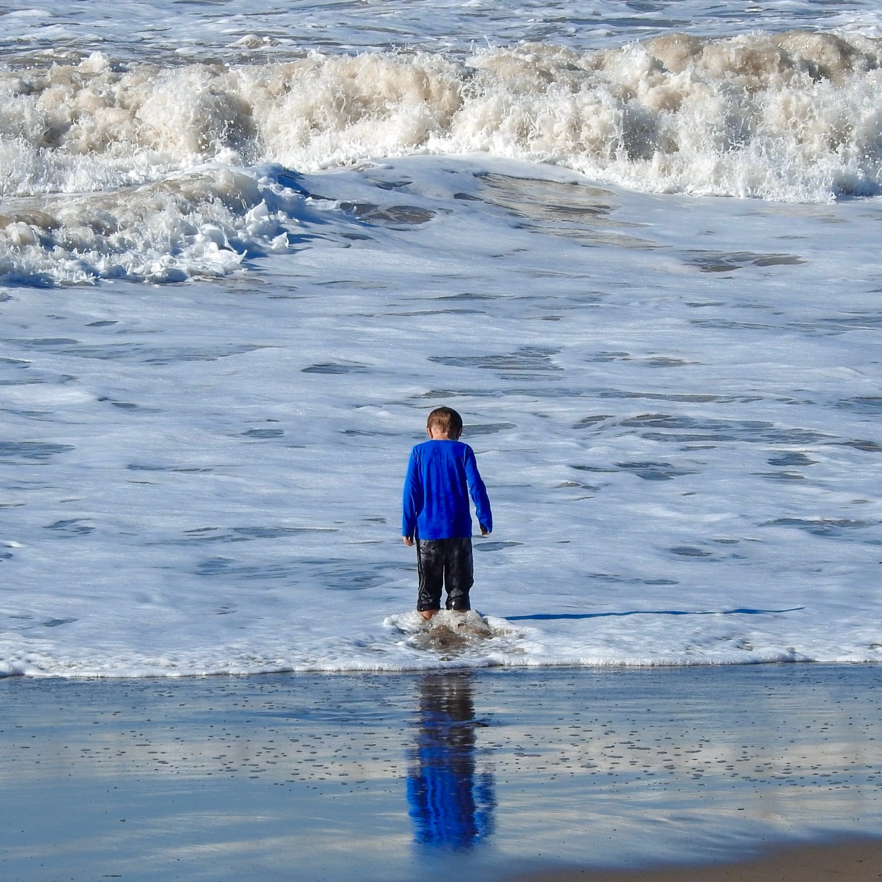
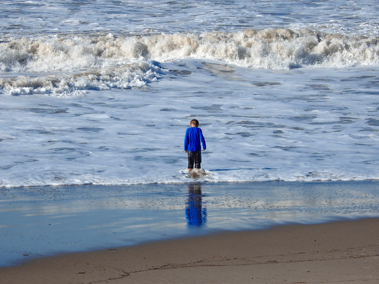
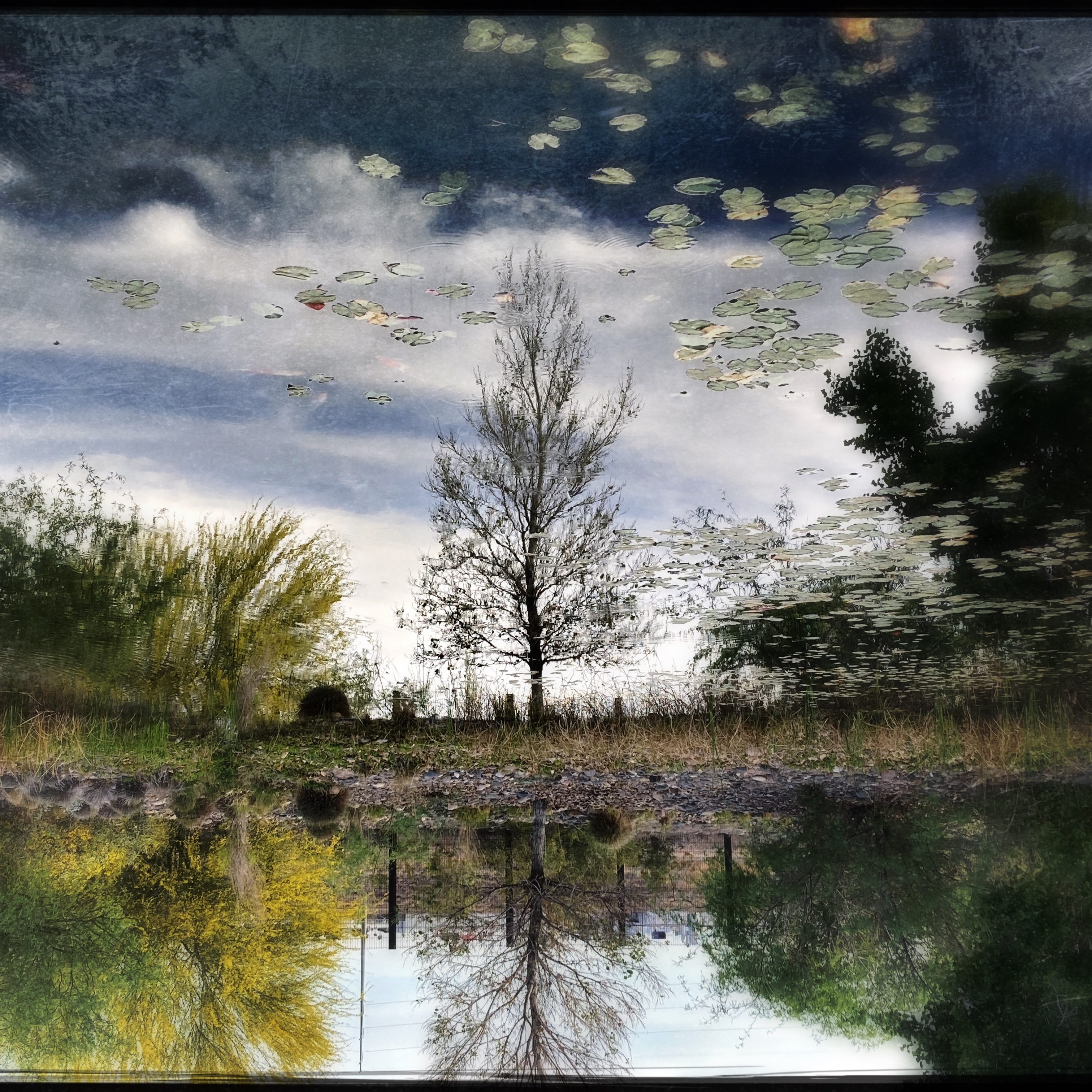
What one person might call a manipulation, i.e., an offense against purity, is, to others, merely the second or third phase of taking a generally usable photo and helping it become great…..in perfecting the composition, in boosting the dramatic power of something that was essentially delivered, but understated, in the original. The S.O.O.C. shot you see up top here is, for a quick snap, very close to what I saw in my mind’s eye. However, the simple crop shown above gives the surging surf above the boy more immediacy, tweaking up the tension between him and the sea. I also committed the additional desecration of amping the ocean’s blueness and the contrast in the boy’s reflection. Did I rescue the picture, or ruin it? And, bear in mind that I’ve described very fundamental interventions, even though all of them are enough to scandalize the S.O.O.C. crowd. Well, tough…..
Photography is a living thing, and hopefully our best results will also seem alive. But just as painters re-do entire sections of a canvas from a sunset to a profile on their way to a final masterpiece, shooters must be free to use a second (or third) pass on an image, rather than relying on the snap of the shutter to reliably deliver miracles on demand. A two-putt is not as spectacular as a hole-in-one, but it still looks pretty damned good on a scorecard.
GO WES, YOUNG MAN
Straight out of the camera at f/8, 28mm, ISO 100, and 1/400 sec. Standard exposure scheme.
By MICHAEL PERKINS
SEVERAL YEARS AGO, WHEN WES ANDERSON FEVER was tearing across the popular culture, there was a mad race among photographers to simulate the director’s hyper-saturated, deliberately unreal color schema, partly as a tribute and partly as a technical challenge for those of us who love tinkering almost as much as we like shooting. Like many such fevers, the mania to be more Wes-like exploded into processing shortcuts and on-line recipes for in-camera sims of scenes from films like Asteroid City, a movie which transforms the starched American Desert into a mega-pastel postcard from the 1950’s. Entire books, like the Accidentally Wes Anderson series of travel images, were created to basically allow anyone to try faking what WA had created organically. We went a little nuts.
Same image “Wes Anderson-ized” with substantial reduction in contrast and a bump in vibrance. Not complicated.
The thing that occurred to me during all this here’s-how-you-do-it mania was how overcomplicated people were making the entire fakery-cum-tribute project. To me, it was not supremely technical to get the “Wes look”, although it did induce me to rethink how to alternatively “mix” things I’d already captured beforehand. To me, most of the effect came down to merely moving left on the contrast slider and moving right on the vibrance one. No major strain, as James Cagney used to say of acting.
Of course, one man’s cool effect is another man’s useless gimmick, and there are many strong opinions about the so-called “flatness” of low-contrast photography, no matter who it intends to salute. That may be why the Just-Like-Wes movement burned out so quickly; it was treating a technique as if it were, by itself, a message. There’s a reason why we stopped going to fairs and carnivals to have ourselves snapped as fake daguerreotypes as we once did in the ’70’s. It’s because a photograph has to be about something beyond just the technique required to make it. Shooting for the effect alone is craft, with no art to flesh it out or deepen it. Your camera, your vision, your choice.
NEVER SAY ALWAYS SAY NEVER
A texture and feel beyond the real: An iPhone snap rendered through the Love 81 film emulator within the Hipstamatic app.
By MICHAEL PERKINS
TALKING ABOUT “TRENDS” IN PHOTOGRAPHY, AS IF THEY SIGNIFY ANYTHING, is like standing near the ocean and commenting on individual waves, as if any one of them will be the standard for all waves forever going forward. More than any other of the graphic arts, picture-making is not so much a strict canon of laws but a seismic measure of our most mercurial moods in a given moment.
As an example, as of this writing (May 2023, in case you wind up reading this in archive), it seems that there has been a recent turn away from the realism of formal photography, once again swinging the pendulum toward apps and software that deliberately muck up precision, processes that celebrate flaws (even artificially created ones), rip pictures free of specific time-era “looks” and otherwise make them sloppier or more random in their result. We are, at the moment, looking for the total effect of an image, including everything that is formally “wrong” about it. Maybe because there is something wrong about it.
The iPhone-bred Hipstamatic alternative to a “serious” picture of the same scene I had taken with my “real” camera.
I am looking at this phenomenon through somewhat fresher eyes these days, even though I have been a long-time user of the ubiquitous and long-running Hipstamatic platform, which has been offering lo-fi tweaks to shooters almost since the dawn of the cell phone era. Problem is, the uneven, customized look of the pictures I created with it have often been categorized in my brain as “something I just do for fun with my phone” versus making “actual” pictures with my “real” cameras. The result was that, over the past ten years, I built up an enormous folder of orphan Hipstamatic images, pictures that I seldom shared and almost never published because I regarded them as cheats, gimmicks, or “just screwing around”….in other words, unworthy of consideration in the same arena as the product of, say, a DSLR.
Which is to say that I have wasted a lot of time trying to arbitrarily disqualify a lot of photos that, upon recent review, really ain’t so bad.
The specific “film” emulator within Hipstamatic that I prefer, a filter effect called Love 81, has emerged over all others as having the proper blend of weathered texture, selective focus, and hyper-saturation that looks both like specific eras or none at all, depending on how it’s applied. And I guess that’s its big strength; the ability to make certain shots come unstuck in time, or to at least suggest times that are unavailable to those of us anchored in the present. Sometimes, like any process, it can ruin what began as a basically okay image, and, also like any process, it can’t make a great picture out of a lousy one. Thing is, our present era is really the best era ever, a world in which photographers can permanently float between disciplines, blithely floating from Never to Always and back to Never at our whim. What could be more human, and more like a photograph?
STUMBLING IN

Nice house, decent shot, but not quite the fantasy look I wanted for this subject. So, into the Nikon “retouch” menu we go (see next image).
By MICHAEL PERKINS
JUST AS SOME PAINTERS PRIDE THEMSELVES on producing works that “look just like a photograph” there are photographers who love it when someone tells them their image “looks just like a painting.” Both arts borrow strongly from each other, each envies what the other does, and, in pages such as this one, spend altogether too much time worrying about it. Still, if your foot is predominantly in one camp, it’s fun to occasionally dip a toe into the other, just to see what it feels like.

The “pencil sketch” effect created in-camera, via Nikon’s retouch menu. Cool, but now a little too much like a drawing. Almost there (go to next image)……
In trying to use photos to idealize certain subjects, to, in effect, make them better visually than they may be in mere reality, I’ve tried lots of tricks, many of them just novelty effects and some of them useful tools. You have to judge their effectiveness one picture at a time. Recently I went back to an in-camera look that most Nikons have contained in their “retouch” menus for years, mostly because it never seemed to deliver quite what I wanted. In the “color sketch” mode, you make a second copy of a master shot that is mostly just the outlines of the objects and people within, losing a lot of interior detail within the image and making it look as if you whipped it up with, yeah, okay, a set of colored pencils. I had created occasional copies with the effect over the years but never fell in love with it. Please forgive me, but the word sketchy is the only one that applies, and not in a groovy way. Over the years, I mostly forgot that the effect existed, along with several others that Nikon gave me without asking me if I wanted them (!)
Recently, however, I have been reworking several pictures of homes I considered to be nearly in a fantasy category, old designs so fanciful and fussy that they’d look at home in a fairy tale or a Hobbit community. I wanted some extra quality of unreality mixed into their post processing, and so was taking multiple exposures of the same house and tweaking them in exposure fusion programs like Photomatix, which allows you to blend a custom mix of both pictures together with sliders, almost like working on a movie dissolve that’s frozen in the middle. I found that mixing a pencil-sketch tweak with the original shot it was derived from made for an interesting look. A controlled amount of detail, a lot of color patches that looked as if they were washed on by a brush, and a super-sharpening of the peripheral lines. I had stumbled into something useful.

Final composite of original and sketch images, hand-mixed as an “exposure fusion” in Photomatix.
The result is part photo, part painting, and controllably surreal. It almost recalls those lovely artist renderings that architects used to produce as previews for investors in the early days of acrylics…the kinds of “coming soon” illustrations you saw in sales brochures. And, even though it’s certainly like birthday cake, in that a little of it is more than plenty, it’s fun to just make some pictures that are solely about process, not to try to hide a lousy picture, but to explore what happens when you kick Papa Reality out of the room and just get down on the floor with the other kids and play.
THE UNDERLOVED
By MICHAEL PERKINS
AS PHOTOGRAPHERS, WE ALL HAVE THEM, whether we parade them defiantly or sequester them in locked drawers. “They” are our Orphan Images, the photos that never quite made it to the finals. Our strange little camera creatures, the ones that fall outside every arbitrary category of success. Our guilty pleasures. Or, in most cases, concepts that Seemed Like A Good Idea At The Time.
We’ve written about these underloved ones before here in The Normal Eye, these pictures that may not even be technical failures but which somehow qualify as….odd. So. Very. Odd. And still I come back to the subject because there is something addictive about even our mistakes. Maybe especially our mistakes.
Many of them frustrate us. The compositions that didn’t quite sell our idea. The light that failed. The idea we didn’t take quite far enough. Did I mention bad light?
Strangely, we harbor a special warmth toward our orphans. We may even convince ourselves that they really are “great”. Or that they’re misunderstood, which means that they somehow failed to make themselves understood. Sometimes an idea that comes close, but still comes up short, inspires a bittersweet affection in us. They are the kids that got cut from Little League at the last second. We, or the pictures, tried so very hard. To be in the presence of greatness is breathtaking, while being in the presence of almost-greatness is often heartbreaking.
After you’ve been shooting for a while, you seldom take any picture without some kind of basic intention. And that means that the resulting image can’t really stand alone anymore. It’s always linked, and contrasted, with the thing we wish we had done. If we missed by a mile, we can accept that perfection is a journey and be a bit philosophical about the whole thing. Missing by inches…well, that’s another thing entirely.

Mommy Will Be Right Here, 2019
I don’t know why I like this picture. I mean, I understand completely the mix of components I was going for. And yet, I can’t defend it vigorously to anyone else. I know it’s…off. But not far enough off to land in the junk bin. Just off enough to drive me a little bit crazy.
Ella Fitzgerald once said that the only thing that’s better than singing is more singing. And I guess I feel the same about making pictures. Whatever’s wrong with your photos can, or might, be cured by your very next one. Or not. That’s the tantalizing, and maddening part of the photographic learning curve. It’s complicated further by the fact that you’re not merely trying to master your gear, but yourself. Seeing how very close you came to being the best you is tough. But most failures are not outright flops but qualified successes, and that little tweak in how we perceive our imperfect work is the only thing that also makes the whole deal worthwhile.
WHAT DID I MEAN BY THAT?

A “night” conversion of a shot originally shot in bright midday light.
By MICHAEL PERKINS
YOGA TEACHERS, AT THE START OF CLASS, often invite their students to “set their intention” for the session, making at least part of what is largely a physical effort a partially mental one as well. Said intention need not be the achievement of world peace or the eradication of disease, of course. Often, just deciding that you’re going to exit the hour with a clearer brain than you entered it is plenty. The idea is chiefly to form the habit of pre-planning the experience, of asking yourself “what do I expect from this?” It’s also the best kind of mental conditioning for the making (rather than the taking) of photographs.

An original daylit image from the same shoot.
Even in the most casual snapshot, there is at least an instant in which “intention” is set and a plan is executed. There is, truly, no such thing as a pure photographic accident. Certainly, you may not have sufficient time or technique to make a shot work out, but just because you weren’t able to get what you set out to get, your intention was established. Some instantaneous judgement call that “this might make a good picture” is in operation, always.
The trick over time for improving one’s success rate is thus twofold: first, to close the gap between what you envision and what you can deliver, and, second, developing the means to, through processing and editing, rescue or even re-set your intention for a given picture. In normal-people circles, this process is called “changing your mind”. Seriously, what is post-processing in most cases but a renegotiation of your original intention? What photographer willingly accepts the ideal of “straight out of the camera” if it means that his/her vision actually goes straight into the sewer? When Ansel Adams called the photographic negative “the score” and the print “the performance”, he was, in fact, asserting that exactly half of a photograph’s destiny is decided after the click of the shutter, something that, thankfully, is a more universally embraced belief in the digital era, which, not incidentally, has placed more control within the reach and budget of billions of users, a control that means choices. Let’s be clear, however: this is not about “saving” bad pictures. It’s about polishing the gems.
One of the simplest ways I myself re-juggle the intention of a shot is in the light relationships. The image you see in the thumbnail here is an original from a series of shots I took on a gorgeous Saturday morning in spring of 2015, conditions which perfectly served the picture of the church as I first envisioned it. The sunlit version emphasizes detail and a very light color scheme. By comparison, the reprocessed version (above) is practically what movie folks used to call “day for night”…that is, shooting during the day in such a way that resembles night, but preserves discernible information in a way that true night shooting obscures. The color scheme is very deep, and nearly all detail is sacrificed except that of the front of the building, which is made to appear as if it were illuminated by the warm light of a setting sun. The shift of the intention exchanges the effect of all that fine detail for the impact of understatement. More to the point, I don’t need to show the grit of every stone or the grain of every slab of wood to make the picture work, and so what is paramount in a day-lit shot becomes expendable, even excessive, in the nighttime version.
Again, even in the most reactive of snaps, all photographers know what they are going for. If they get some of it ahead of the click, with the rest of it recoverable through processing, why are those tweaks any less of a “setting” than the shooter’s original choices of aperture or shutter speed? Can the precious purity of SOOC (straight out of the camera) actually make us abandon pictures that might, with a little encouragement, make the finals? And why should that be?
ACCIDENTALLY ON PURPOSE
By MICHAEL PERKINS
THE IMAGE SHARING GROUP UTATA, which operates within Flickr, has been, for this boy snapper, a daily touch of Christmas. It expands upon the rather pointless online quest for mere “likes” and is, instead, a genuine dialogue with other like-minded strange-o’s who want to push the boundaries of at least their own eyes and commiserate with others who long to do the same. The administrators keep Utatans united with periodic, deadline-based homework assignments organized along a a variety of seriously unconventional themes. Some require serious thought. Some can be created almost completely on impulse. And many more fall somewhere in between.
One of the nice bits of insta-fame conferred upon Utatans is having their work occasionally plugged onto the utata.org welcome page. Even better, head honcho Greg Fallis and his fellow guardians of the Utata universe will often provide new captions, poems, or essays of their own for the images, as if to tangibly demonstrate that, just as there is more than one way to see, there are a million ways to be seen. Upon recently conferring home-page status on a rather hurried celphone image I’d posted, Greg also managed to perfectly crystallize thoughts I’ve mulled over recent years:
A quick impulse, a thing of no importance. And that, in itself, may be important.
See, here’s the thing about shooting photographs with your cell phone: it’s not a serious camera. That means you can relax. Try stuff. Shoot something different. Shoot something familiar in a different way. Shoot something different in a familiar way. It’s liberating because it’s “just” your cell phone.
In fact, the image was made in a very short space of time, shorter by far than if I’d made it with my “real” cameras. The original phone selfie was fed through an app designed to mimic both the strengths and weaknesses of antique portrait lenses, and, since I liked the ethereal quality it delivered, I decided to stop. Just stop. Stop fooling, fretting and fixing. Stop, and publish.
So, have I gotten to the point, at least some of the time, when I’m really living that old saw that “the best camera is the one you have with you?” Am I more spontaneous, more open to experiment, higher up the “wot the hell” scale when armed with a cel? Dunno. Really. Not being coy. I definitely still feel that umbilical-cord connection to my trad gear. But I dig immediate gratification as well, at least the gratification of shortening the gap between “wonder what would happen” and “hmm, that kind of worked.”
Is my conventional gear more “real”than my iPhone? Well, how do you define real? Obviously, there is an almost infinite number of post-processing tools available to compensate for whatever shortcomings the cameras themselves might possess. So, if I do advance prep in a DSLR before the shutter snap to ensure a good picture, does it disqualify an image if I snap it first and then enhance it afterwards in a cel? What is a darkroom? What is a workflow?
Big questions. And I don’t always get the same answers when I ask them.
ROLL-PLAYING
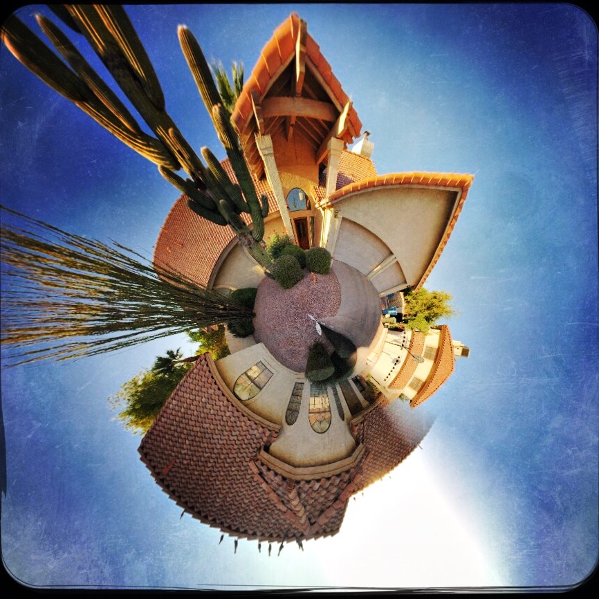
A typical “small planet” effect created in the phone app Rollworld.
By MICHAEL PERKINS
MANY OF THE APPS BEING PEDDLED as post-production fixes for mobile photographs are one-trick ponies, limited in their range. This is less so than it once was, with new apps adding progressively more features, but there are still tons of single-purpose processes out there, gobbling up phone storage with apps that perform one task well. Want a second task? Download another app.
The fun part for me is to discover that, while a given app may have been created to solve a particular problem, it can also be used creatively to do something completely different. Take the example of the now-cliched creation of so-called “small planet” pictures, in which a standard landscape is spiraled into a ball shape, with its various tree and buildings now looking like features on a self-contained world, rather like the illustrations in The Little Prince. This process was once a somewhat complicated one, but, like almost everything else in the digital world, it’s been shorthanded to a few clicks and sliders in apps like Rollworld, which is not only cheap but insanely simple to use.
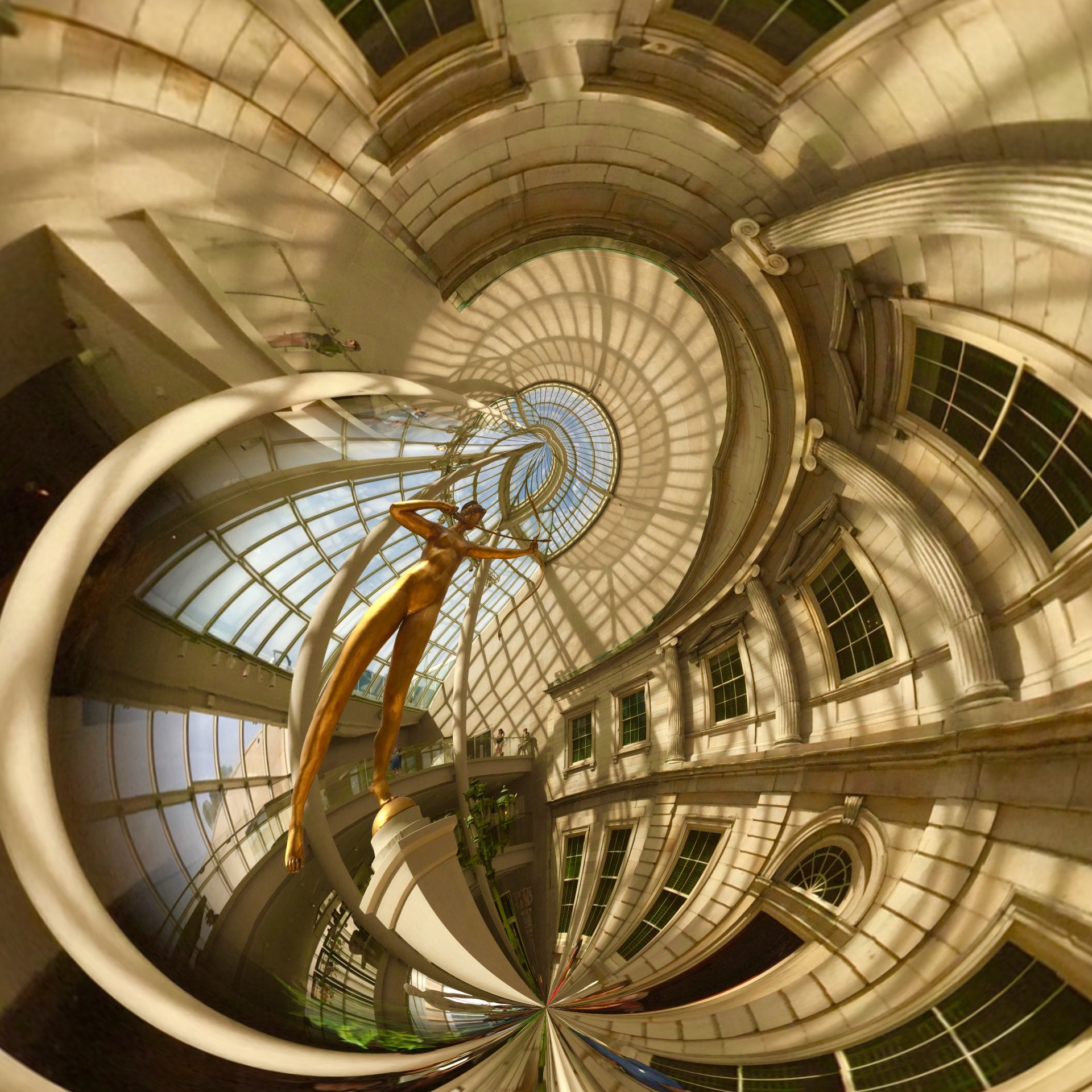
A DSLR image uploaded into a celphone and remixed in the Rollworld app.
If you approach the use of such a specialized app in the simplest way, you’ll produce your five or ten little planet images (see photo at upper left corner), get the novelty boiled out of your blood, and then move on to something newer and shinier. However, Rollworld and programs like it can be a nice creative tool beyond their most obvious trick. The various sliders in RW let you not only roll your original linear image but control how it rolls, allowing a kind of folding-in, folding-out distortion. You can thus completely abstract even the most mundane cityscape into a symmetric pattern of textures, maximizing small things or relegating prominent features to the background. Other Rollworld sliders allow you to determine the tightness or looseness of the roll, to control the angle of the pitch, even swipe features from one part of the image across parts of the others to mirror or multiply specific items into a better symmetry. Call it Kaleidoscope-in-a-box.
I even import some of my standard DSLR images from various websites like Flickr (see above right) into my phone so they can be processed by the app as well. One problem: You want to save your end product at the highest possible file size. Even at that, some of them will only display well on monitors or the web, and may be too small for good resolution when printed out. This is a major problem with phone images in general: they are still designed, for the most part, to be outputted to other phones and screens.
The idea here is that many apps are capable of giving you more than the advertised effect if you play a little. It takes so little time and effort to experiment that you quickly build experimentation into your typical workflow. And that can only help you grow faster as a photographer.
POST STARTS NOW
By MICHAEL PERKINS
THE POST–PROCESSING REVOLUTION wrought by the introduction of Photoshop in 1988 has so profoundly influenced the act of picture-making that many shooters think of the program as half of a complete two-step process of photography. In Step One, you shoot the image. In Step Two, you fix it.
However, being conversant with more of the menu options built in to nearly every level of camera in use today can mean solving most “post” dilemmas without resorting to Photoshop’s full suite of solutions. Just as you change lenses less the more you understand what lenses can be stretched to achieve, you can avoid the extra step of computer-based tweaking the more you understand what’s already available while your subject, your shooting conditions and your mental presence are all in play. Some would argue that such adjustments would be more finely attenuated working with a RAW file in Photoshop than by fixing flaws in-camera with a JPEG, and you have to decide where you come down in that debate.

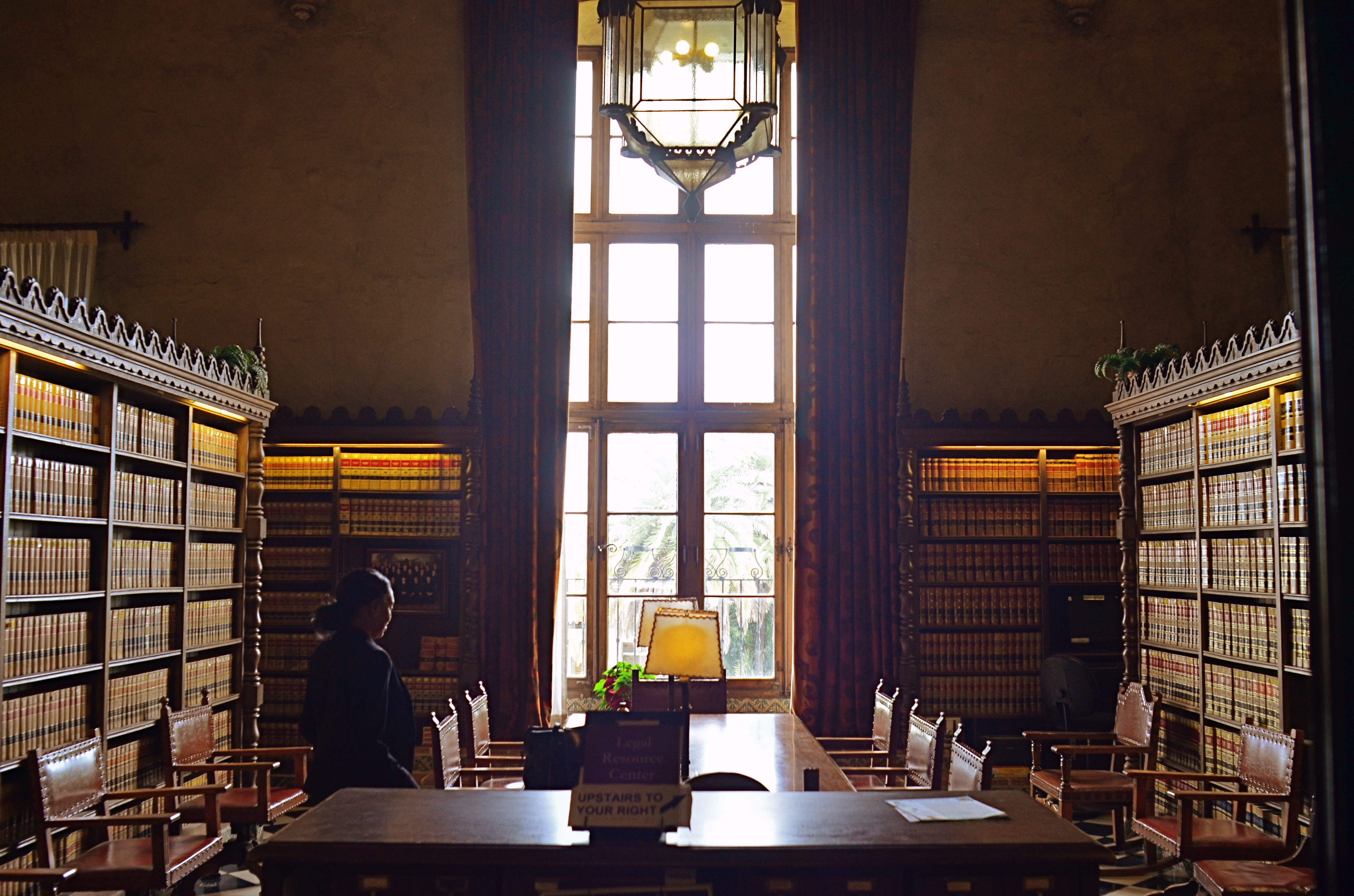
The original shot suffers from the “blues“.
Let’s take color as one example. A great many photographs with off-kilter values are corrected in Photoshoppish apps, yet can be quite satisfactorily fixed in-camera. White balance settings allow you to pre-program a number of light temperature pre-sets that make your camera “see” colors as if they are occurring in sunshine, shade, or a variety of artificial light sources. But even if you shoot everything on the “auto” white balance setting and get the wrong colors occasionally, there is still a way to repair the damage without resorting to Photoshop. What Nikon and Canon both call color balance allows fairly fine-tuned adjustments to get the hues to look either (a) more like you saw it, or (b) the way you wish it had looked.
The shot at top, adjusted with Nikon’s color balance option, produced the warmer look in the bookshelves that would have resulted if the light coming through the window had been warmer. In the original image, taken with an auto white balance setting, the camera, far from “guessing wrong”, actually recorded the room light as it appeared in reality, since the sky was severely cloudy and was a little blue in cast. However, with the in-camera color balance tweak, no Photoshop intervention was required. Moreover, I could check my work while in the moment, a handy thing, since tours were moving in and out of the room all day, meaning that, if I wanted to shoot the room (nearly) empty, I had to work fast.
Digital photography’s original bragging point over film was the ability to shoot, fix, and shoot again rather than rely on the darkroom to rescue tragically few of our miscalculations. Working our in-camera menus for all they’re worth helps deliver on that promise.
THE THIRD CHANNEL
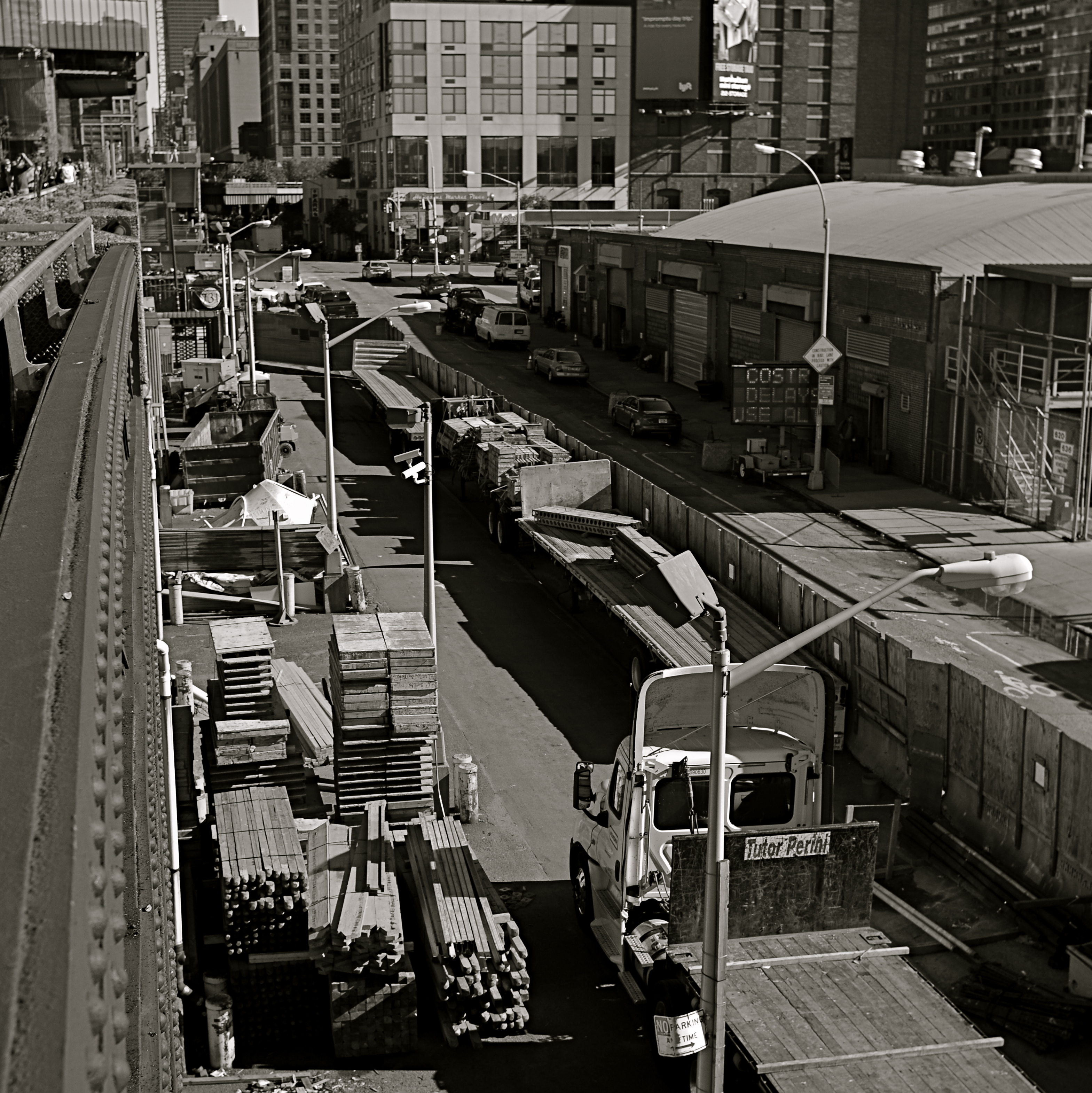
In a square framing, this warehouse district seems self-contained, isolated from the greater city around it.
By MICHAEL PERKINS
OVER THE HISTORY OF PHOTOGRAPHY, OUR CHOICES OF HOW TO PRESENT A PICTURE has changed as well as the means by which we shoot it. Certainly in the film era, sizes and formats shifted from square to landscape to portrait, and those shapes were reflected in the dimensions of the final prints or slides. You know, shoot it wide, print it wide. Somewhere between the waning days of prints and the first waves of pixels, however, the square nearly winked out for a while, and, with it, a particular way of composing a shot. Luckily, it’s back in full force.
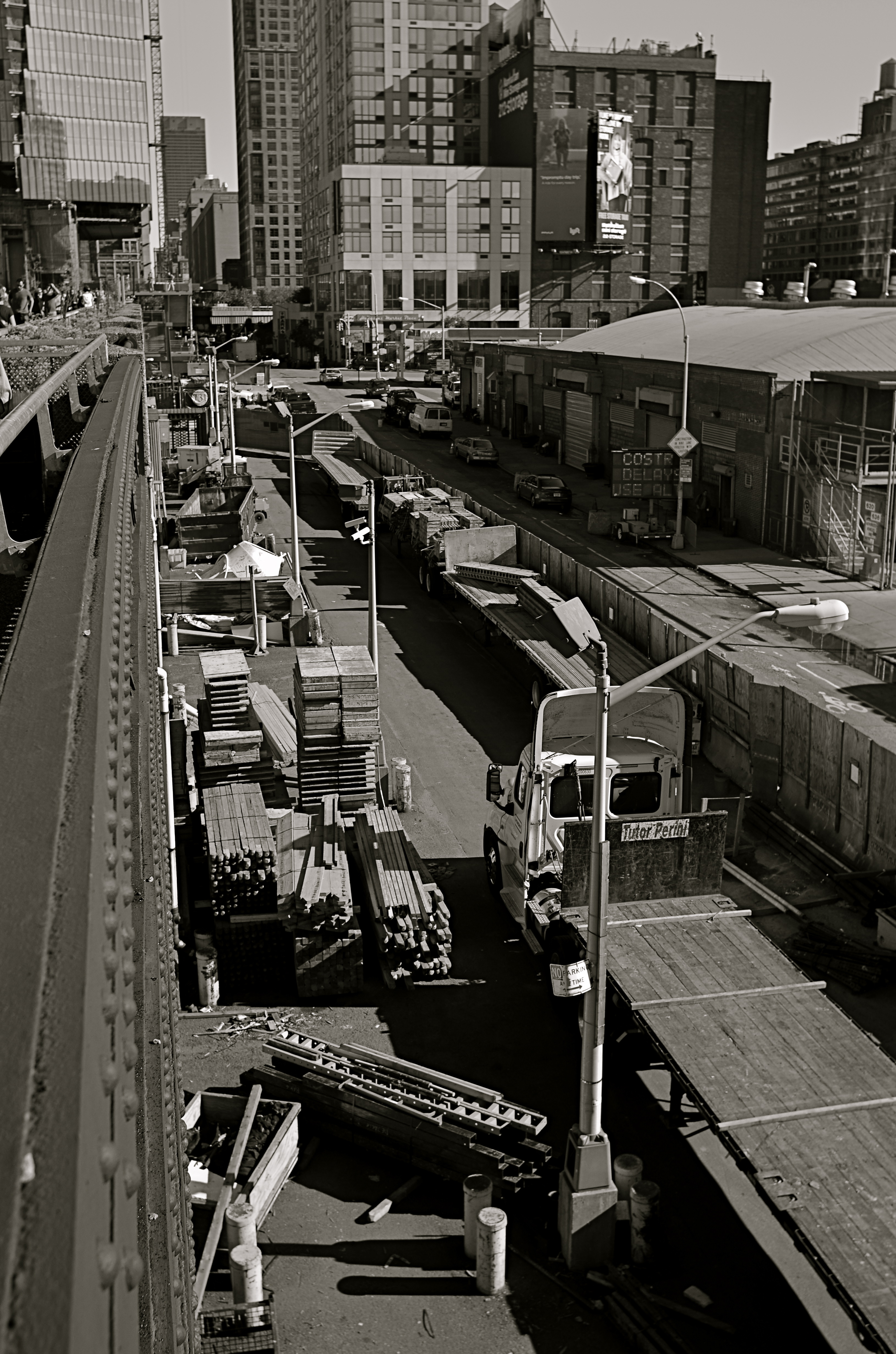
In the portrait-oriented original, extra buildings and street space dilute the impact of the cropped square.
It’s had help. Instagram and some retro-film cameras forced the square upon a new generation of shooters, and nearly all phones and phone apps readily offer it as a framing or editing choice. Strangely, manufacturers of DSLRs and other high-end cameras offer no option for shooting in square format, although they all include square cropping in their in-camera re-touch menus. This means that many photographers have to dream square but shoot otherwise, mentally composing the eventual square framing of their subjects in the moment, or even discovering, in edit sessions, that there is a decent square image inside their larger ones just waiting to be let out.
I have recently looked to deliberately edit in favor of the square, since I think that the format forces a kind of compact, centralized story-telling that might be diluted or weakened by wider or longer compositions. Looking at my initial landscape or portrait images, I ask myself if the entire force of the picture could be amped by squaring it off. Sometimes you think a shot calls for one orientation or the other, when the third channel of the square is actually a better tool. Hey, you can’t know everything at the moment of snap.
I do wish that DSLRs would routinely offer the chance to initially shoot in square, just as cheap hipster film cameras and phones already do. Not having every possible tool at your disposal seems wrong, somehow, and, with all the other gimmicks that are offered in higher-end cameras, from fake star twinkles to faux pencil-sketch effects, the inclusion of a third framing orientation just makes sense.
THE LAST OF MANY GOODBYES
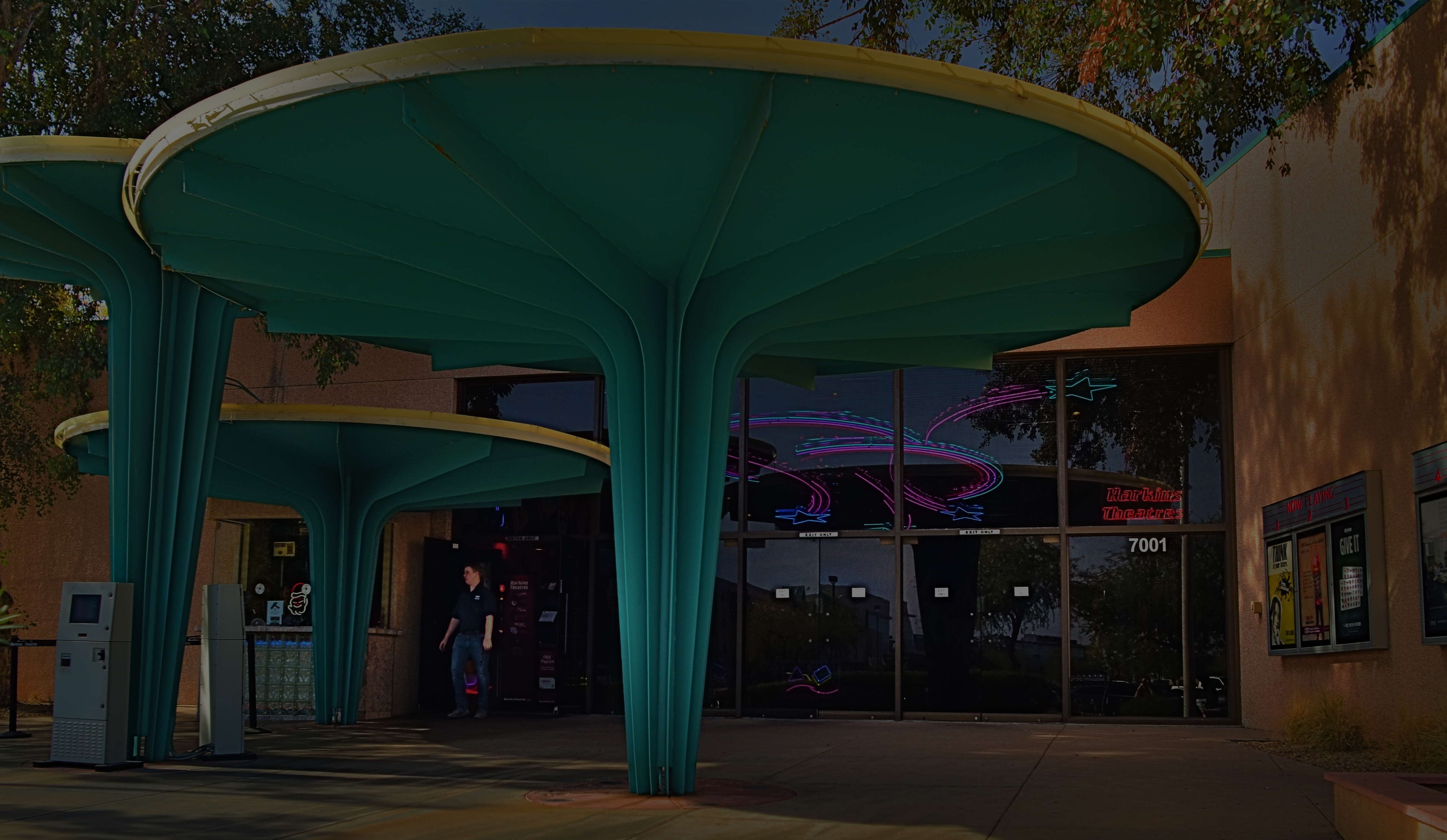
Scottsdale, Arizona’s gorgeous little art-house complex, the Camelview Theatre, on the afternoon of its final day, December 10, 2015.
By MICHAEL PERKINS
ON THE SPOCK SIDE OF OUR BRAINS, OF COURSE WE KNOW that there is nothing particularly magical about buildings per se. Stone and steel cannot, after all, generate memory or experience; they merely house the people who do. Still and all, the loss of certain edifices engenders a purely emotional response in us, perhaps because special things can no longer happen there, and the physical proof that any of it happened at all is being rendered, at least physically, into dust. That puts us in the realm of dreams, and that’s where great photographs are born.
When a place that is special to us is about to wink out of existence, everyone who used that place stamps it with their own stories. We went to school here. This is where I proposed to your mother. The bandstand was here, along this wall. So personal a process is this that our farewell photographs of these places can take on as many different flavors as the number of people who walked their halls. And, as a result, it’s often interesting to compare the final snaps of important places as filtered through the disparate experiences of all who come to reflect, and click, in the shadow of the wrecking ball.
I have attended many an opening at theatres, but I always make a point to attend their closings. Not the end of a certain film or engagement, but the final curtain on the theatres themselves. How best to see their final acts? As a quiet, gentle sunsetting, as with the above image of Scottsdale, Arizona’s Camelview theatre, shuttering in deference to a bigger, newer version of itself at the end of 2015? Or, in the colorful confusion of the venue’s final night, with crowds of well-wishers, local dignitaries and well-wishers crowding into the final screening?

Later that same day: the Camelview’s last neon-lit night of glamour.
Each view projects my own feelings onto the resulting images, whether it be a golden dusk or a frenetic, neon-drenched, tomorrow-we-die send-off, complete with champagne and cheers. The introspective daytime shot has no teeming crowds or fanfare. The night, with its ghostly guest blurs (a result of the longer exposure) features people who are as fleeting as the theatre’s own finite run. Both are real, and neither is real. But they are both mine.
Buildings vanish. Styles change. Neighborhoods evolve. And photographic goodbyes to all these processes are never as simple as a one-size-fits-all souvenir snap. People, and memories, are too customized for that. As with movies themselves, there is always more than one way to get to the final fadeout.
YA BIG SOFTIE
These uber-cupcakes didn’t look nearly seductive enough in reality, so I added a gauzy layer in SoftFocus and a faux Technicolor filter in AltPhoto.
By MICHAEL PERKINS
ONE OF THE MOST FREEING THINGS about digital photography, especially in the celphone era, has been the artificial synthesis, through aftermarket apps, of processes that used to require lengthy and intricate manipulation. Much has been written about various apps’ ability to render the look of a bygone film stock, an antique lens, or a retro effect with just a click or swipe. The resulting savings in time (and technical trial and error) is obvious in its benefit, as more people shoot more kinds of images in which the shooter’s vision can be realized faster, perhaps even more precisely, than in the days of analog darkrooms.
Okay, now that the sound of traditionalists’ heads exploding subsides, on to the next heresy:
The creation of the so-called Orton technique by Michael Orton in the 1980’s was a great refinement in effects photography. The idea was simple: take two images of a subject that are identical in every spec except focus, then blend them in processing to create a composite that retains rich detail (from the sharp image) and a gauzy, fairy-tale glow (from the softer one). The result, nicknamed the “slide sandwich”, was easy to achieve, even for darkroom under-achievers. The most exacting part was using a tripod to guarantee the stability of the source images. Looked nice, felt nice.
Early on in digital, editing suites like Photomatix, designed to create HDR chiefly, also featured an option called Exposure Fusion, which allowed you to upload the source images, then tweak sliders for the best blend of sharp/no sharp. And finally, here come the soft-focus phone apps like Adobe Photoshop Express, Cool Face Beauty, Camera Keys, and yes, Soft Focus, allowing you to take just one normally focused shot and add degrees of softness to it.
Caveat emptor footnote: not all these apps (and there are many more not cited here) allow you to begin at a “zero effect” start point, that is, from no softening to some softening. They start soft and get softer. Also, most allow basic tweaks like brightening and saturation, but that’s about it. If you want to add contrast or something sexier, you may have to head back to the PC.
The important thing about softening apps are: (1) they save time and trouble in the taking of the source image, of which you only need one (which can be handheld now), and (2) they don’t so much as soften the master image as layer a gauzy glow over top of it.You either like this or you don’t, so, as Smokey says, you better shop around. Gee-whiz factor aside, the old rule for gimmicks still applies: tools are only tools if you like and use them
VIRTUAL SHOPLIFTING
Thrift shop still-life: a mobile phone close-up of an antique camera flash pan, negatized in post-editing.
By MICHAEL PERKINS
ONE OF THE EMERGING OPPORTUNITIES FOR PHOTOGRAPHERS is the newly accepted way not to look like a photographer, a kind of invisibility based on strange public perceptions. This has only become possible with the arrival of the smartphone, and, although insane logically, it affords a new freedom to street photographers.
It’s simple, if crazy: carry an actual camera inside a phone, just as many millions of others do, and you’re somehow “safe” or trustworthy, not one of predatory, intrusive “professionals” with obvious cameras who are out to trick you, track you, capture your soul in their satanic box. Now, how we explain away the fact that the phone camera is far more stealthy, far more insidious and far more omnipresent than, say, a Canon or Nikon is anybody’s guess. But, dopey or not, this new code is now hard-wired into people’s brains as it regards street work. So little camera=harmless. Big camera=end of the world as we (or over-zealous mall cops)know it. You figure it out.
So, when it comes to grabbing quick snaps in stolen moments, it’s becoming harder not to embrace the crazy and just use a smartphone as your default street tool. I’m not completely there yet, but when I’m surrounded by things that I will either never see again, or have never seen before, it’s tempting to play spy shooter with the little clicker.
Some of the greatest sources of still life material, for example, are the dense shelves of flea markets, antique shops and thrift stores. You don’t want to buy this stuff, since (a) you can’t afford it and (b) the Mrs. will send both it and you to Goodwill, but the occasional odd item might just make a decent abstract bit of design. Camera gear from yesteryear is always an easy sell, and I was ecstatic to do a virtual shoplift on the ancient flash attachment you see above as a fun way of re-purposing an object through selective framing and processing.
It’s frustrating to find more and more places where it’s easier to negotiate a nuclear treaty than get an okay for regular photography, so it’s no shock that more and more inroads are being made for mobile cameras and the access that no one feels like denying them. And they say I’m nuts.
SHOOT (AND THINK) BIG
The Nexus Of Resurrection, 2015. Image cropped from 4928 x 3264 pixels to 3550 x 1477, leaving enough density for a printable enlargement.
By MICHAEL PERKINS
BY NOW MOST OF US PROBABLY REALIZE THAT THERE IS NO REAL ADVANTAGE to “budgeting” shots in digital media the way we used to do in film. Harking back to the time of 24-exposure limits on one’s photographic fun, shooters maintained a running total in their heads of shots taken versus shots remaining, a cautious way of allocating frames on the fly, the idea being to finish the film roll and your tour stops at about the same time. Some kept notebooks; some doled out shots on a priority basis (one image of the waterfall, three of the ruins, four of the kids on the rides), and some, I suppose, were tempted to count on their fingers and/or toes. You had to be careful not to run out of frames.
Jump to the digital now, where we realize that, in all but the rarest cases, our shutter finger will crack and fall off before we “run out” of shots on even the most meager memory card. However, I still run into people who believe they are being prudent and providential by taking images at lower resolutions to “save space”, a false economy that is not only needless, but actually limits your options in the later process of editing.
Big files mean image density (lots o’ pixels) and therefore higher resolution. High resolution, in turn, means that you can crop substantial parts of a photo as needed and still have enough density for the image to hang together, even when printed out. Now, if you look at your work solely on a computer screen, protecting the integrity of a cropped image is less crucial, but if you’re lucky enough to create something you want to enlarge and frame, then you should begin with the fattest file you can get.
Review a few of your images that were, let’s say, less than compositionally sublime coming right out of the camera. Look at the pixel count on the same images after they were cropped to your liking. You’ll arrive at your own preference on what minimum resolution you’ll accept from the cropped versions. Thing is, the bigger you start, the more wiggle room you’ll have in editing.
As I say, most people already shoot at the largest file size possible. I merely send along this note to remind us all that we do it because it makes sense, and affords us real flexibility. It’s one of the amazing by-products of digital; we can, generally, shoot as much as we want for as long as we want.
TELL YOU WHAT’S BETTER….
Photo processing should be a surgically precise tool, not a blunt instrument.
By MICHAEL PERKINS
THE AIM OF PHOTOGRAPHIC PROCESSING has shifted drastically in the post-digital age, and not necessarily in a good direction. Those of us old enough to remember mastadons, horse-drawn carriages and analog film were certainly aware that images could be edited or enhanced after the fact, conjuring up, say, memories of airbrush artists smoothing away chicken-pox scars from the shoulders of Miss January. We knew some of the magic happened in the lab.
Likewise, we knew that even the top masters did lots of tweaking in the darkroom prior to publication. The emphasis, however, was largely on perfecting an essentially strong picture, to make a good thing better/great. However, that emphasis is now placed, far too often, on trying to “save” images that were executed poorly in the first place, bringing marginal work up to some kind of baseline par of acceptability. That’s like the difference between polishing a Steinway and repainting a toy piano.
So, here’s my plea to those laboring to rescue their misbegotten babies in editing programs: Don’t repair. Re-shoot.
A good deal of the quick-fix buttons on editing programs should be marked with glowing red asterisks, with the following disclaimer at the bottom of the screen: WARNING: By using this change, you will fix your first proplem and create a different one somewhere else within your photograph. Let’s face it, no corrective action in editing happens in isolation. It must create a ripple effect, major or minor, in the final look of the image.
Use the “straighten” button for your misaligned shots, and they will lose sharpness. Suck out the darker shadows and your picture could lose dynamic range. Oversharpen your pictures and they will look harsh, with an unnatural transition between light and dark values. Reduce the noise in the image and it may appear flat, like pastel paint slathered on blotting paper.
Or here’s a radical notion: do all your thinking and planning before the shutter snaps. Yes, I know, I sound like some old schoolmarm scold, but please, can we at least consider the idea that there are no true shortcuts, that there can be no magical substitute for knowing your gear, developing an eye, and putting in the practice time required to make a photograph?
We once believed that patience was a virtue, that skill and mastery were more important than instant gratification. Know what? All of the greatest photographers still believe those things. And their work shows it.
ONE STORY AT A TIME
Capital Capitol, 2015. A re-cropped and post-processed remix of a casual 2007 snapshot.
By MICHAEL PERKINS
BEING A MULTI-TASKER IS NO LONGER A MATTER OF CHOICE. We love to pretend that we’re adept at turning off selective parts of the hurricane of sensory input that comprises the whole of our daily life, but, fact is, we cannnot. You might be able to do as few as three things at a time in this world, but only if you struggle against a constant cacophony of sensations.
Unfortunately, creating art sometimes requires quiet, clarity, the ability to edit out unwanted sights and sounds in order to find a clear path toward a coherent vision. And this impacts photography as well as any other creative enterprise.
The 2007 original, taken from a NYC Circle Line tour boat.
Urban life presents an especially big challenge to this urge to “get clear”, to untangle conflicting stories and draw out clean, direct messages for our images. Major cities are like 24-hour whistle factories, with thousands of things screaming for our attention. Thing is, there just isn’t enough attention to go around. Often, in poring over old projects, we find that a fourth, a third, even half of the information in a picture can be extracted in the editing process and still leave more than enough data to get our point across. And herein lies a problem.
If it’s getting harder and harder to edit in the moment to boil a photograph down to its essence, the editing phase becomes more crucial than ever before. You either get the best picture in the taking or in the remaking. It can be argued that practice helps the photographer learn to quickly ferret out simple stories within a mass of visual noise, and, of course, the more you shoot, the more you learn what not to shoot. But it seems inevitable that editing, and re-editing, will become a bigger part of the overall task of making pictures.
If the weakest of your photographic skills is post-processing, you might strongly consider upping that particular part of your game. The world isn’t slowing down anytime soon. It’s great to know, in an instant, how to make a strong image. But, as my dad always said, that’s why God put erasers on pencils. Editing can be where acceptable pictures buff up into contenders.
THE CENTER HOLDS

Do you need either the entire tree or the entire hammock to sell the idea in this picture?
By MICHAEL PERKINS
ONE OF THE MOST FASCINATING PARTS OF THE LEGEND of Henri Cartier-Bresson, the artist who is the world’s model for street photography, is the oft-repeated story that he never cropped a shot over the many decades of his remarkable career. Thus the man who originated the phrase “the decisive moment” to indicate that there was but one ideal instant to capture something perfectly in the camera is also credited with creating flawless on-the-spot compositions, image after image, year after year. Yeah, well….
I love HCB, and I personally can’t find a single one of his images that I could improve upon, no matter where I was to wield my magic scissors. But just as the writer in me believes that great novels aren’t written, but re-written, I believe that many great photo compositions emerge after much additional consideration, long after the shutter snaps. It’s not that one shouldn’t strive to get things as perfect as possible in the moment. In fact, there is overwhelming evidence that many photographers do exactly that, nearly all the time.
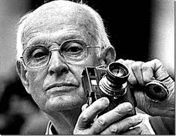
The Maestro.
It’s that “nearly”, however, that describes most photos, something which might be converted to “definitely” in the cropping process. In fact, I am starting to feel that the very first thing to be done with a picture in post-production is to just start paring away, only stopping when the center of the idea has been reached. It’s gut-wrenching, since we usually fall in love with our pictures at first sight (and in their first versions). But even if God decided to make one of us, say Cartier-Bresson, the messenger of his divine eye, he certainly didn’t make that trait as common as, say, green eyes or freckles. For most of us, most of the time, we need to eliminate everything that diverts the eye anywhere but where the main message is. As an example, the hammock image above is the result of cutting away nearly 2/3 of the original photograph.
There are a few times when an image comes full-born out of the camera, all muscle and no fat. However, in the digital age, re-thinking one’s realization of a concept is easier than it’s ever been, and there is no downside to doing so. If there is a narrative ground-zero to your photo, don’t worry. The center will hold.
NORMALEYE GALLERY UPDATE: HOME, HOME ON THE “RANGE”
A two-exposure HDR image with more emphasis on content than processing.
By MICHAEL PERKINS
HISTORY BUFFS WHO HAVE EXHAUSTIVELY RESEARCHED THE HELLISH ANIMOSITY OF THE AMERICAN CIVIL WAR, a conflict which sowed seeds of resentment that bear bitter fruit to this very day, may have some small grasp of the vitriolic divide between those who espouse High Dynamic Range (HDR) photography and those who believe its practitioners are in league with Beelzebub. Pro-HDR factions believe those who resist this magical art should be forced to declare themselves Amish on the spot, while the opposite camp believes that all cameras that shoot HDR should be pulverized and used as landfill in Hades. We’re talking irreconcilable differences here.
When HDR first came to my attention, I welcomed it, as many others did, as a way to get around a long-standing problem in exposure….how to modulate between blackout and whiteout in extremely contrasty situations in which a single exposure would either blow out the sky through the window or bury the corners of an interior in blackness. My first attempts with it were exciting, as I tried to shoot frames bracketed across a three or five shot range of exposures, then smooth out the drastic differences between light and dark in the final image. The idea of using HDR for a sci-fi look or a painterly effect never appealed to me. I was really trying to use it to make my pictures replicate more closely the adjustment between light and dark that the eye makes instantaneously.
Over the last five years, however, as I review images I’ve made with HDR software. First, I use the program less with each passing year, and second, I no longer use it to retrieve “lost” tones in dark or light areas of an image. The program I have used since day one, Photomatix, has two main choices, Detail Enhancement and Tonal Compression, and, at first, I worked almost exclusively with the former. For wood grain, stone texture, botanical detail and cloud contrast, it’s remarkably effective. However, it’s also easy to produce images which are too dark overall, and accentuate noise in the individual images. Overcook it even a little and it looks like a finger painting done with hot lava. It thus actually works against the original “looks more like reality” objective.
On the other hand, producing the blended image in the Tonal Compression mode retains most of the sharp detail you get in Detail Enhancement without the gooey consistency. It has fewer attenuating controls, but as I go along, I find I am using it more because it simply calls less attention to itself. In either mode, I have made a conscious effort to throttle the heck back and under-process as much as I can. I’m just getting sick of shots that announce “hey, here comes an HDR photo!” two blocks ahead of its arrival.
I’m also in the middle of a back-to-basics phase based on getting things right, in-camera, in a single frame, and learning to be more accepting of dark and light patches rather than artificially mixed goose-ups of rebalanced tones. Anyway, as of this posting, I’ve taken down the original selection of images that was in the HDR gallery tab at the top of this page and loaded in a new batch that, while certainly not a “final” word on anything, shows, I think, that I’m still wrestling with the problem of how best to use this technology. Give them a look if you can, and let me know your thoughts on the use of HDR in your own work. We all have to figure out our own way to be home, home on “the range”.
THE TORQUOISE TIME TRAVELER
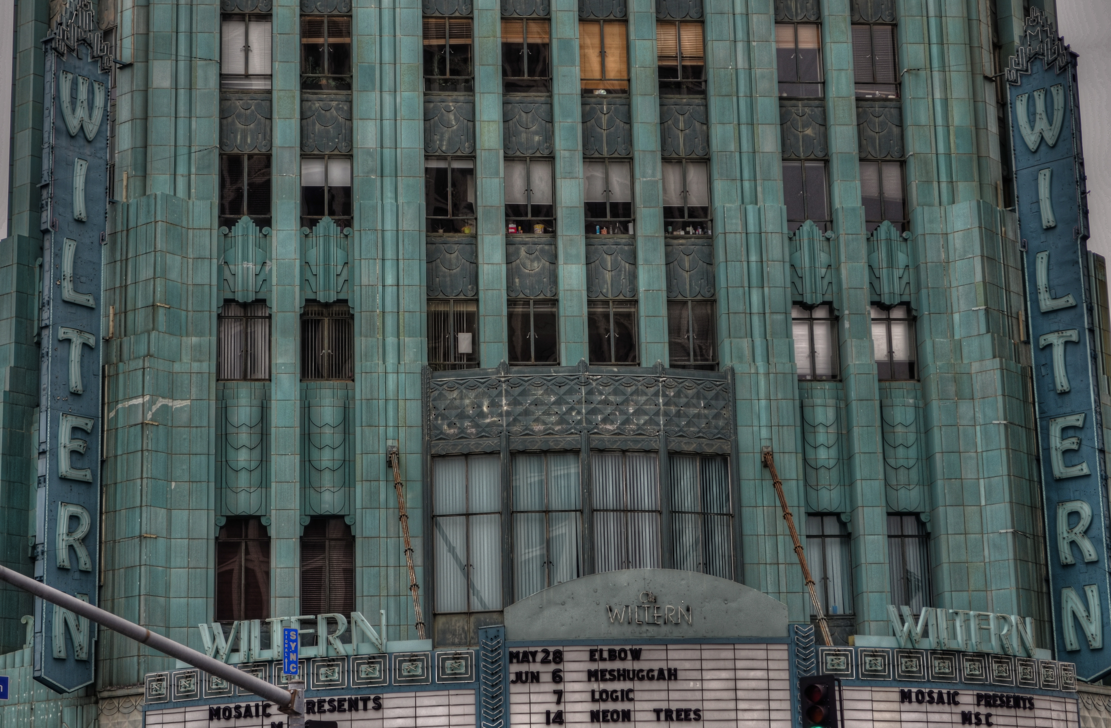
The wondrous Wiltern Theatre in Los Angeles. A three-exposure HDR to amplify time’s toll on the building’s exterior.
by MICHAEL PERKINS
SHE HAS WITHSTOOD THE GREAT DEPRESSION, A WORLD WAR, DECADES OF ECONOMIC UPS & DOWNS, and half a dozen owners (some visionaries and some bums), and still, the sleek green/blue terra-cotta wedge that is the Wiltern Theatre is one of the most arresting sights in midtown Los Angeles. From her 83-year old perch at the intersection of Western Avenue and Wilshire Boulevard, the jewel in the lower half of the old Pelissier building still commands attention, and, for lovers of live music, a kind of creaky respect. The old girl isn’t what she used to be, but she is still standing, as the same house that once hosted film premieres in the days of Cagney and Bogart now hosts alternative and edge, with pride.
And she still makes a pretty picture, lined face and all.
Opened in 1931 as a combination vaudeville house and flagship for Warner Brothers’ national chain of film theatres, The Warner Western, as it was originally named, folded up within a few years, re-opening in mid-Depression L.A. as the Wiltern (for Wilshire and Western) operating virtually non-stop until about 1956. As a vintage movie house, it had been equipped with one of the most elegant pipe organs in town, and enthusiasts of the instrument built a small following for the place for a while with recitals featuring the instrument. By the 1970’s, however, economies for larger-than-life flicker palaces were at an all-time low, and the Wiltern’s owners tried twice themselves to apply for permission to blow her down. Preservationists got mad, then got busy.

The Wiltern’s ticket kiosk sits under a plaster canopy of Deco sunrays. 1/40 sec., f/3.5, ISO 100, 18mm.
Restoration began in the 1980’s on the Pelissier building in general, but the Wiltern, with its ornate plaster reliefs and murals, had been so neglected over the years that its turnaround was slower. It was finally reborn in 1985 as a live performance theatre, losing some seat room but newly able to stage everything from brain-blaster garage rock to Broadway road productions and ballet.
I shot the Wiltern with three HDR frame, all f/5.6, with exposure times of 1/60, 1/100. and 1/160, and blended the final image in Photomatix to really show the wear and tear on the exterior. HDR is great for amplifying every flaw in building materials, as well as highlighting the uneven color that is an artifact of time and weather. I wanted to show the theatre as a stubborn survivor rather than a flawless fantasy, and the process also helped call attention to the building’s French Deco zigzags and chevrons. For an extra angle, I also made some studies of the glorious sunburst plaster ceiling over the outside ticket kiosk. It was great to meet the old girl at last, and on her own terms.

BUPKIS
By MICHAEL PERKINS
A Failed Harvest.
The Fish That Got Away.
I Had It, But I Lost It.
Mistakes Were Made.
Bupkis.
However you term episodes of photographic failure…..I mean, complete, utter freaking camera-borne defeat, two things are true.
It does happen.
And it will happen to you.
Not that many of us want to admit it, mind you. In an age in which, on any given photo day, we almost always bring back some kind of technically complete image, it’s easy to confuse any product with a successful one. Yeah, it’s a picture. But that doesn’t make it a good picture.
The product of a three-hour walk, a stunning image of…..??…you got me.
In the old days, there were was a more dramatic line between success and failure, since failure usually meant no picture at all. Underexposed, unrecognizable blobs. Masses of color that, coherence-wise, added up to nothing. Not so in our current era, in which it’s much more likely that the resulting image is, for lack of a better term, usable. Factor in increasingly facile repair tools and editing processes, and that number of “acceptables” climbs even further.
But you know when a picture has what it takes, and to what extent you’ve bent the rules of editorial judegment with one, even going so far as to talking yourself into thinking it’s better than it really is. That’s the seductive power of digital, in that it brings even our worst work close to the passable mark, making it harder to disown our “kids” than it was in the day when a lousy picture was more irretrievably bad, that is, beyond intervention. But it’s our very ability to intervene that can convince us that the shot was worth intervening over, and that’s frequently just not true.
And so there will be bupkis days. We walk out boldly. We are equipped. We are artistically hungry. We are experienced and trained. We know what we want.
And yet we bring back nothing.
Never forget that the ability to know that you missed the mark (even mightily) is the most valuable skill you will ever develop as a photographer. The strength to say “no” to yourself evolves slowly. In some of us, it never evolves at all. But we should thank Camera God for it, and, by extension, thank the same God for the demonstrably bad photos we are likely to make from time to time. Because if we can’t tell excellent from excrement in our own work, the game really is up. That’s why I am always banging on about loving your mistakes, because finally, they are your best teachers. It ain’t fun to be around them, but, then again, as you recall your most astute mentors, how many of them were a groove to hang with? Whatever. For photography’s sake, we all need to become comfortable with dumping the occasional day’s work in the garbage. Because nothing converts garbage into gorgeous other than hard, unsentimental work. There never has been any other shortcut and there never will be. Or to frame it in food terms (and eventually I always do), consider software and such as sauce. It’s tasty, but it ain’t no substitute for steak.
Share this:
May 26, 2019 | Categories: Commentary, Conception, Essay | Tags: Composition, Editing, post-processing | Leave a comment