HOW LITTLE IS TOO MUCH?
By MICHAEL PERKINS
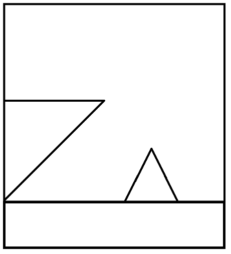
ROGER PRICE, THE CO-CREATOR OF MAD LIBS, the most popular party game on earth, was, ahead of all those famously incomplete one-page narratives, the best-selling cartoonist behind a slim volume entitled Droodles, a series of simple scribbles whose economy of line was the “set-up” of a joke, the punch line being supplied by the accompanying comic captions. The fun was in trying to decide what the picture was “about” before Price supplied the answer. One of his best is seen above, named Ship Arriving Too Late To Save A Drowning Witch. You get the idea.
Price inadvertently (or was it advertently?) demonstrated a skill essential for truly communicative photography, a talent I call Knowing What To Throw Out. It’s been my experience that, absent a few geniuses, most of us shoot too much. Not in the number of exposures we click off, but in the overload of visual information that we allow to remain in the final product. Recomposing and amplifying such shots with the most fundamental of tools, mere cropping, is an exercise in learning the answer to a nagging and constant question; in a picture, how little is too much?
In my case, one of the most revelatory exercises in reviewing old photo files is discovering that many frames I had initially written off as “failed” actually contained smaller sections within the overall image that would be perfectly strong if a major portion of the original were to hit the cutting room floor. Sometimes, of course, this method only reveals that, sharp, ruthless knife or no, there’s really no strong story in the picture at all, no matter how you slice it or pare it down. So it goes.
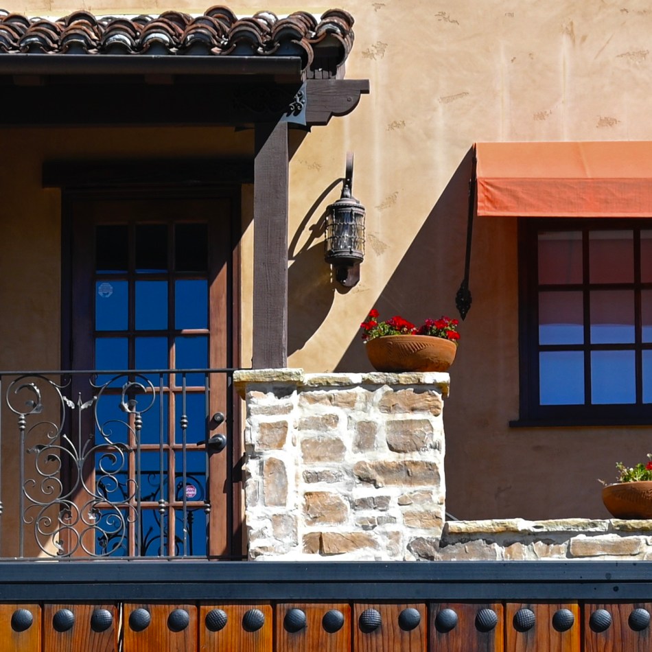
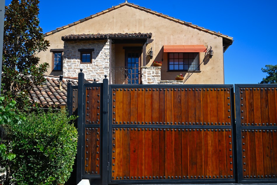
In the master shot of this multi-textured house, several strong structural elements have potential. The stucco, tile, wrought iron, masonry, fabric, wood, and glass all collide in a building that, overall, has a certain visual appeal. But, in cropping, we find that the closest intersection of all of these elements is where the compositional set point actually occurs. All the shot’s other visual information serves as nothing more than a distraction, since we really don’t need the entire structure to convey the idea of “house”. The various textures work best when they actively compete for attention, and a tight crop shows every flavor of a charming edifice with no fat and no fillers. As in Price’s cartoon, we don’t need to show the entire ocean around the rescue ship, or convey all of the back two-thirds of the vessel. Nor do we need to show the entire drowning witch; the hat is enough.
“Doing more with less” is such a hackneyed phrase that you can get shame arthritis in your fingers just typing it on the page. But pore over some of your own “almost” images sometime and see what happens. You may find that, imbedded within some of your most maddening misses, there lies a hit or two.

Leave a comment