COMPETING WORLDS
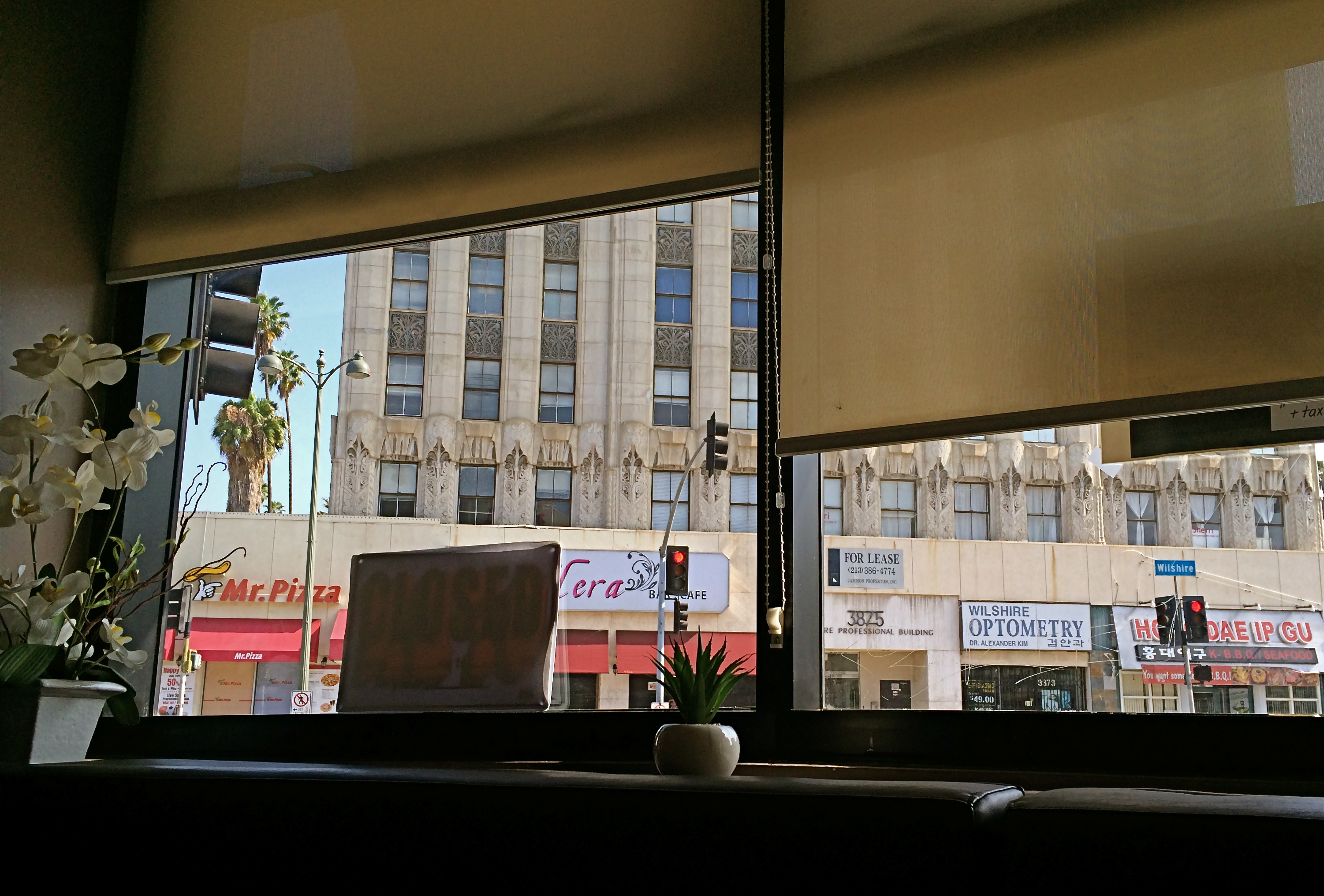
Using interior details as a customized “frame” for your shots of outside subjects can make your pictures less “pre-cropped”.
By MICHAEL PERKINS
I HAVE ALWAYS LIKED THE PHOTOGRAPHIC HIGH-WIRE ACT THAT RESULTS when shooters try to create balances between interior and exterior detail. It’s easy to shoot through a window, either looking in or looking out. And, in composing our subject, we often try to eliminate the framing created by the window itself, thinking of this as extraneous information, a natural cropping guide. Trim, if you will. And sometimes that is the best possible decision.
However, there are situations when a framing that melds inside and outside elements actually makes the shot, and the fun comes when you decide to compose a shot comprised of both kinds of information. Evenness of exposure becomes a significant problem, since there is usually a strong contrast between the two planes. Looking out a window, you have no big sweat exposing for the back yard, but, if you are also going to include the children looking longingly out at that yard from inside a room, challenges will arise.
In recent years, HDR has allowed photographers to shoot a bracketed series of shots with different exposure rates, blending them into a composite that at least allows detail and natural color in all areas of the frame. The look can quickly veer into surreal fantasy, however, so, if your goal is not to call attention to your technique (that is, appear as if you did nothing special at all) you may have to craft another solution.
If the contrasts between your inside world and your outside world are not too severe, you may be amazed at how automode shots on DSLRs and mobiles will deliver a fairly balanced exposure. This allows for more saved “on the fly” photos shot in the moment. If you have more advance time to prepare, you can invent your own lighting scheme and tweak things further. The thing to consider combining the competing worlds of in and out. It allows you to further customize the viewing experience, getting a fuller sense of a total scene, or even programming in some selective mystery.
And, hey, push comes to shove, you can always crop it later.
TERRA INCOGNITA
By MICHAEL PERKINS RANDOMNESS HAS STUBBORNLY ASSERTED ITSELF AS ONE OF THE MOST DECISIVE FORCES IN ALL OF PHOTOGRAPHY.One of the eternal struggles in our craft has been between our intense attempts to reduce the recording of light to a predictable science, and nature’s insistent pushback, allowing things that just happen to shape our results. I think most of our work as individuals is a constant wrestling between these two forces. One moment we fancy ourselves mastering all the variables that create images, and in the next we celebrate the wilding potential of just letting go, and actually celebrating the random effect. I find myself careening between the comfort of all the techniques I have accumulated over a lifetime, the so-called “guarantees” that I’ll capture what I’m looking for, and the giddy discovery that accidentals, or artifacts, somehow found themselves in my pictures despite my best efforts. The problem, for me, is learning to celebrate something wonderful that happened without my consciously causing it.
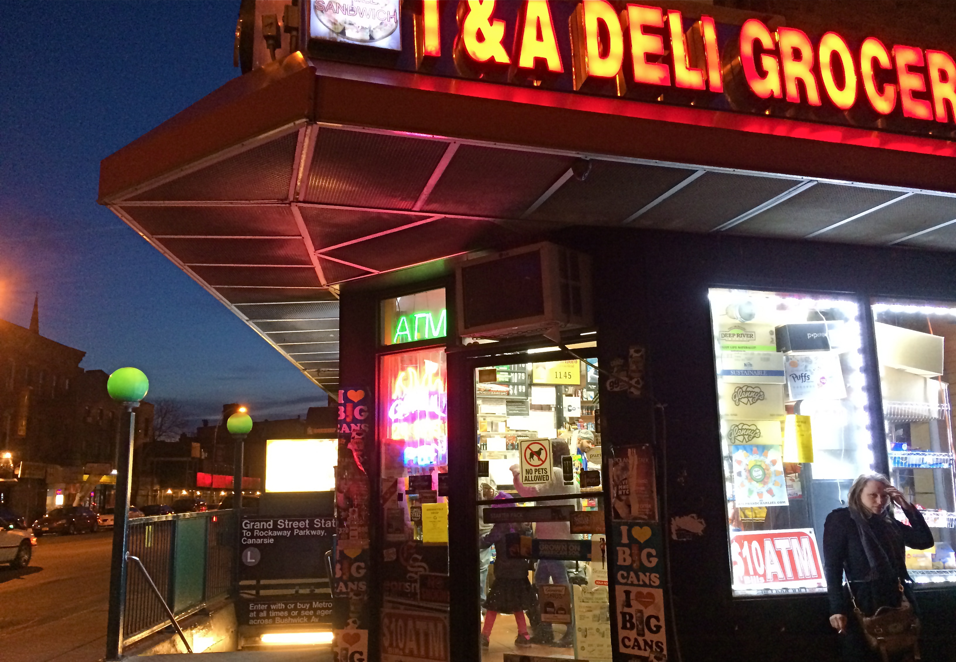
Brooklyn Bodega, 2014.
Phone cameras are forcing me to accept a little less control, since, even at their best, they can’t be managed in the way that standard DSLRs can. That leaves a certain number of results to chance, or, more exactly, to a display of the camera’s limits. One one hand, I’m grateful for the shots that I can “save” by using a mobile, since there will always be times that other types camera will be blocked, forbidden, or inconvenient. On the other hand, the results always make me wonder what else might have been possible if I had been completely at the helm in the making of the images. Some of the things I get “on the fly” with a phone camera are actually a bit magical, so that I actually love the things that are “wrong” with the picture. I’m sure this is part of the enjoyment that the lomography crowd derive from working with plastic toy cameras which create totally unpredictable results purely as a result of the camera’s shortcomings. In the above image, the garish register of nearly every color by my iPhone works well with the bizarre collision of dusk, neon, urban textures, even the overblown mystery of what’s going on inside the crazed little bodega shown here. The extreme wide-angle bias of the iPhone also has stretched things into exotic exaggerations of perspective, and the camera’s auto-boosted ISO produces a high level of noise. Does it all work? Yeah, pretty much. I don’t surrender control easily, but I’ve seen enough of the fortunate accidents of photographers from all over the world not to welcome nature’s interventions. I mean, after all, the idea that we’re actually in control is, at best, a pleasant illusion. We don’t really understand lightning, and yet, somehow, we’ve been given the ability to capture it in a box. Strange.
CHECK, CHECK, AND CHECK
By MICHAEL PERKINS
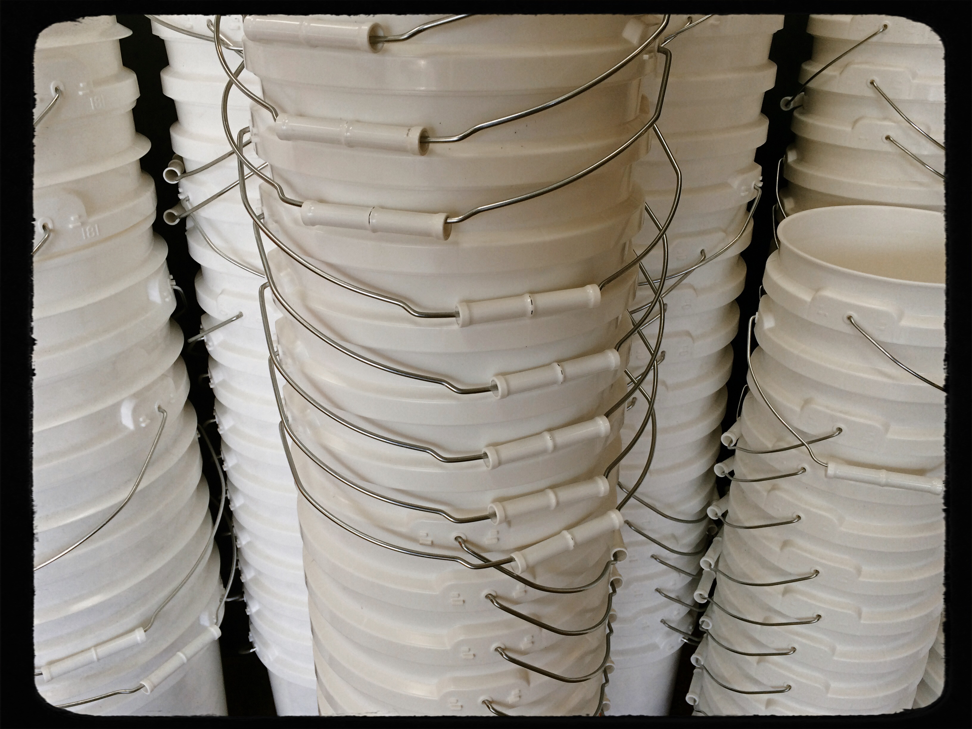
MOST OF US HAVE A MENTAL ROSTER OF UNFINISHED TASKS, a rolling inventory of things not yet achieved. The popular film featuring Jack Nicholson and Morgan Freeman as a pair of terminally ill men who devote their remaining time to their “someday” projects illustrates that we all have items, big or small, that we need to check off. However, when it comes to photographers, the roster gets a little more focused, since we all have dozens of unshot shots, if you will, swimming around in our heads. And the images we have yet to make are, let’s say, a little obsessively detailed in our minds. In that spirit, here’s what you might find in the notebooks of your favorite shutterbug, on any given day….to wit, a literal
BUCKET LIST
Points to consider for shoot
1. What kind of bucket? Zinc? Plastic?
2. Would adding a mop and brush make a stronger composition?
3. The light is hitting the left side of the bucket a little hot. Underexpose by a third of a stop.
4. What does the bucket say about us all as human beings? That we’re empty? All wet?
5. Patina vs. rust: make a decision.
6. Won’t be able to shoot the bucket in France as planned. Just shoot it on a cracked sidewalk in a rainstorm instead.
7. Just found out Steichen did a series on pails in 1937. Dammit!
8. If the bucket has bait in it, should I shoot the bait in RAW (sorry, it’s late)??
9. Just saw the first 400 frames. 83 and 367 are okay. The rest just look like pictures of a bucket.
10.Funny, my front door key doesn’t seem to work. Probably should call my wife…..
Of course, if the bucket deal works out, there’s another project I’ve always wanted to try. How about a photo essay on all of my “things to get at the grocery store” notes from over the years?
That’s right, a “list” list.
Say goodnight, Gracie.
FRAMES WITHIN FRAMES

Two people, two towers. Do you visually need anything else in this image?
By MICHAEL PERKINS
PHOTOGRAPHY AND PAINTING STILL HAVE ONE ESSENTIAL ELEMENT IN COMMON: that of the frame, the arbitrary perimeter that describes a special, limited universe of information. Everything within the frame is understood to be essential, special. Everything outside the frame is likewise understood to be irrelevant. If anything else were important, we argue, it would already be in the frame. If it is not in the frame, it does not matter.
This is the rule of engagement for photographers, and, as composers of our images, we wield the most important editor’s scissors in all of art. Through cropping and selecting, we decide what qualifies as the finalists for that frame, which elements we will trust to tell our story. You could make the argument that great pictures are not made, they are re-made, and, over a lifetime, we often rescue or reject images based on what we can exclude from them.
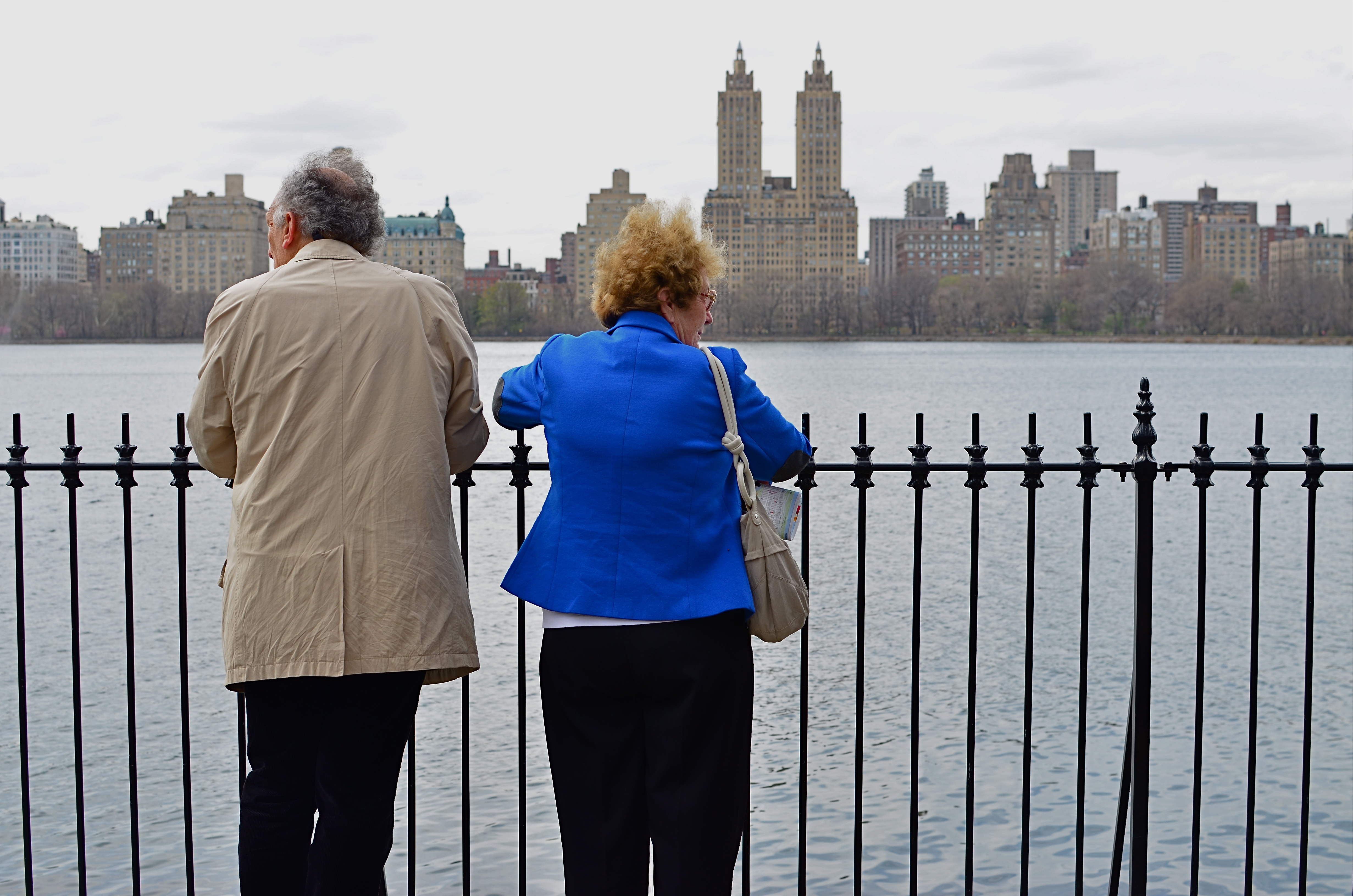
The above image before cropping. See anything here that you can’t live without?
Paring away unneeded information from a photograph allows its true voice to be heard. Things that were minor players in the larger composition are, snip, suddenly promoted to lead actors in the scene. Sometimes, of course, this process reveals that the picture was doomed to start with, since it’s obvious when you are cutting to the essence of, well, junk. Other times, however, we miraculously unveil a rose. Strangely, editing can occasionally become more important that exposure, aperture, or any other basic technical factor.
The edited image at the top of this page occupies less than half the
space of the original, yet, for all that loss, look how much has been gained. We now force a relationship between the two people and the two towers, as well as their relationship with each other. The distraction created by the wider skyline is now gone, and we are free to better direct how the image’s story will be seen and judged. Neither shot is a candidate for a Pulitzer, but we have actually done more by choosing less.
TRI, TRI AGAIN
By MICHAEL PERKINS
WHILE MANY “FILTER” APPS FOR SMARTPHONE CAMERAS MERELY ADD CARNIVAL EFFECTS TO PHOTOS, faking everything from poor processing to light leaks, some really intriguing work has been done by programmers who create “emulsion emulations”. That’s geek-talk for simulating the look and texture of certain old film stocks, making it possible to make a new-old picture freed from the film era’s messy chemicals and wizardly calculations. These instant touch-ups are still limited in scope, but in a real time shooting situation, they do offer you a wide variety of looks that may enable a good shot to graduate to a great one.

Straight out of the camera color original of a Manhattan street scene.
One such emulation, found on the excellent Alt-Photo app for iPhones, gives a great imitation of the look of the world’s most successful black & white film, Kodak’s beloved Tri-X. Introduced in the 1940’s as sheet film purely for professionals at about 200 ASA (ISO), Tri-X was adapted to popular camera sizes like 35mm and 120 in the ’50’s, and was amazingly popular with pros and ams alike, mostly because of what, by Eisenhower-era standards, was its blindingly fast speed. Consider that Kodachrome of the time was rated at a lowly 25 ASA and you can see why newshounds and magazine shooters flocked to Tri-X, as it made it possible to shoot in extremely low light with handheld settings. Fewer tripods and flash meant more mobility and versatility. Home run.
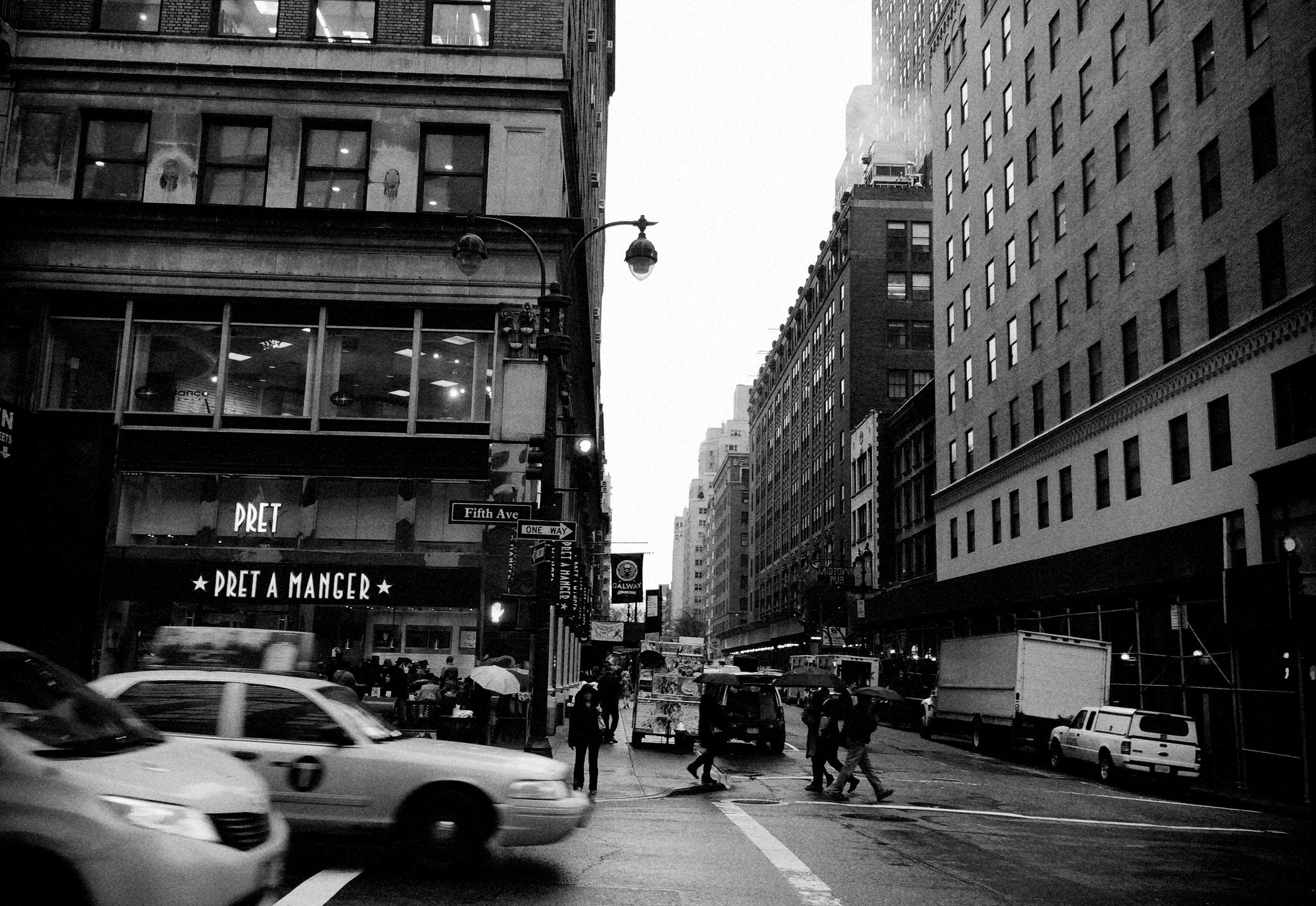
Same shot as above with the Alt-Photo app’s Tri-X filter.
By the 60’s, Tri-X went to 400 ASA, and many labs were able to offer “push” processing to over 3000, expanding its range even farther. As the film became nearly universal, so did its signature grain, a by-product of its light-hungry formula. Today, Tri-X is once again a mostly professional film, and the creators of phone apps are happy to offer a fairly good facsimile of its contrast and grain as a post-processing filter. I have begun to dabble in it for street subjects, particularly ones that appear too warm or welcoming in color. As with any of these effects, the Tri-X look is only right for certain shots. If the image itself is not strong or compelling to begin with, dabbing on the retro won’t bring forth a miracle.
But you knew that.
PEELING BACK THE LAYERS
By MICHAEL PERKINS
FAMOUS PLACES DEFY CREATIVE PHOTOGRAPHY. Google an image search for “Eiffel Tower” sometime and marvel at how consistent most of the resulting images of this global landmark seem. Witness how very formalized our visual language for these familiar objects is, how uniform and narrow our images of them have become. Their legendary status, their lore has been nailed into place for generations, sometimes centuries, and airing out these hallowed spaces to let new ideas blow through is tough going indeed. The only novel way to imbue them with any mystery or wonder seems to be in breaking them up into manageable fragments.
Think about it: what is sacred about these spaces? Why do we always have to capture the same floor-to-ceiling recording of them, when, by tightening in on selected floors, doors, windows, or sections of them, we might actually render them new again, freed from their historic context? Now, do a search for the brave photos that show shooters doing exactly this, in photographing the anti-Empire State, or the un-colliseum.
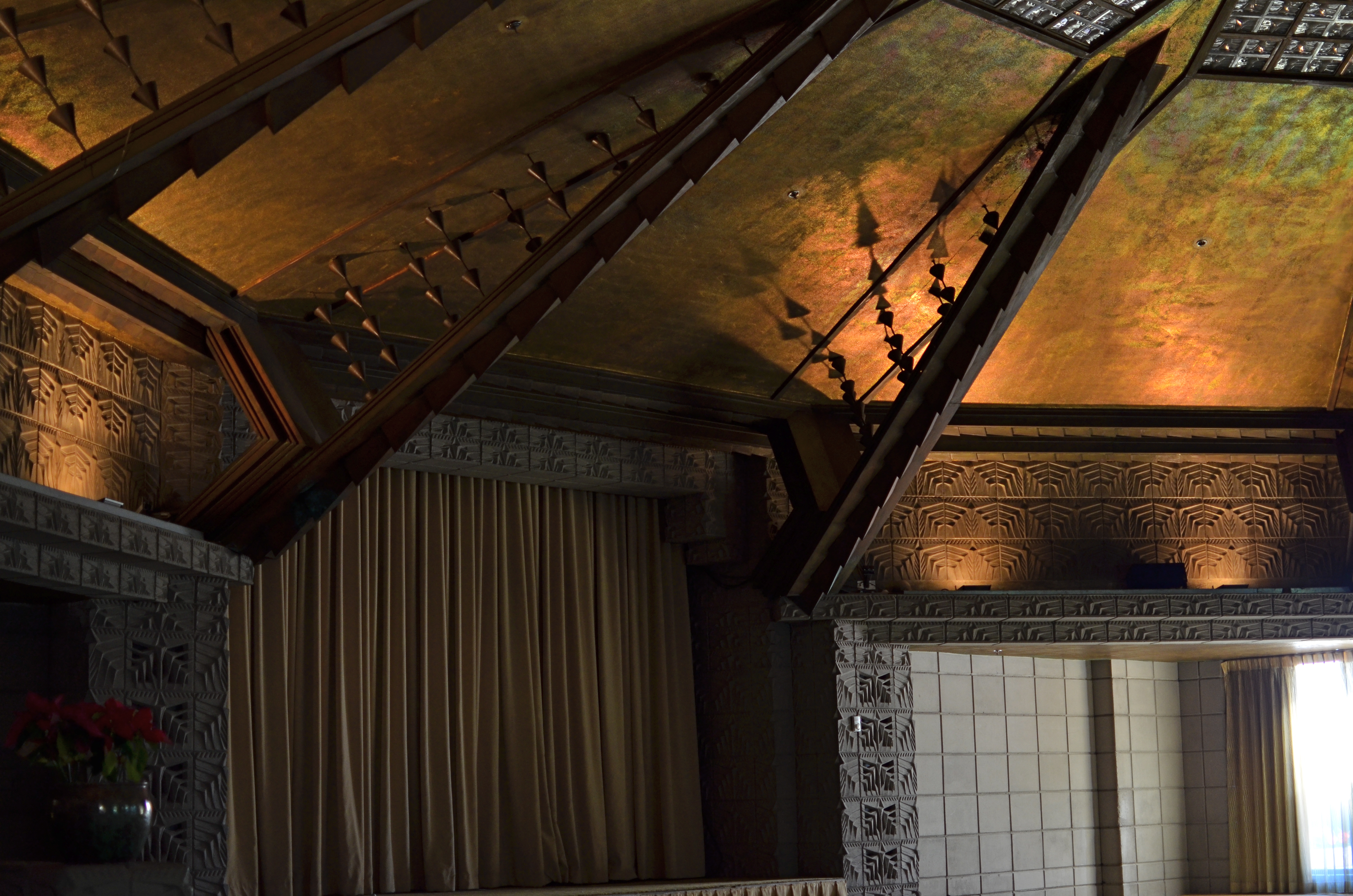
Staging, 2013. 1/80 sec., f/1.8, ISO 320, 35mm.
One thing I love to do is find neglected rooms, closed wings, or unused floors in famous buildings and shoot them as if they are completely unknown objects, as if they have no relation to their renowned hosts. The image shown here is inside one of the most celebrated of “must-see” destinations in all of Phoenix, the Frank Lloyd Wright-influenced Arizona Biltmore resort. Its entrances, lobbies, back yard and restaurants are among the most familiar sights for thousands of annual visitors, but, in fact, there are entire sections of the place that are under-used or dark through most of the year. At any point these “forgotten” spaces might ber pressed into occasional service for a banquet or reception, but, on a daily basis, they are as removed from the Biltmore persona as the gas station down the block. And that makes them interesting.
There was no light in the room in the above frame on the day I happened along, except ambient glow from gauzy window drapes, but that was just fine with me, as every detail was side-lit and sharpened by the prevailing semi-darkness. Suddenly this over-shot landmark had served up a new space, one with no legend or associations attached to it.
I think there are great photographs to be made in many under-loved parts of the places we were sure we knew. Sorting them out is one of the best ways to move beyond tourist snaps, and maybe even see what the designers saw, or dreamed.
To peel back some layers, and see anew.
RE-SETTING THE CONVERSATION
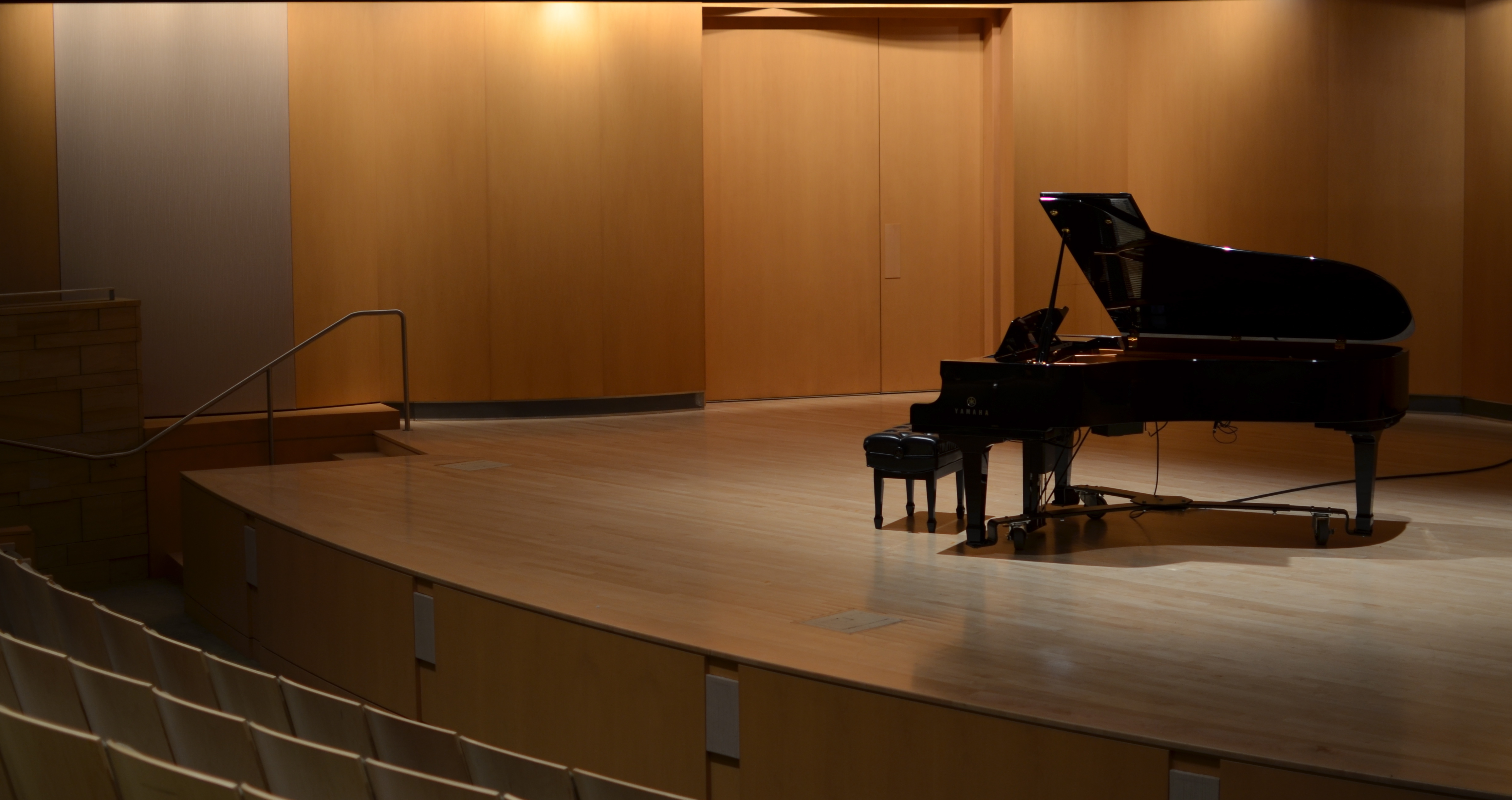
Performance theatre at Phoenix’ Musical Instrument Theatre. See below for another way to go with color and texture in this composition. 1/40 sec., f/1.8, ISO 100, 35mm
By MICHAEL PERKINS
THERE WILL ALWAYS BE THE TEMPTATION TO USE PROCESSING TO AMPLIFY THE POWER OF MEDIOCRE IMAGES. Let’s just acknowledge that. In the digital age, when you produce something that is merely okay, there are lots of places, from apps to processing hardware, where you can take that measly morsel of an image, and hang a Christmas ball on it, drown it in gravy, or slap on a decal of fake hipster irony. Somehow, though, you always know if you were dressing up a monkey in a silk suit and trying to pass it off as Colin Firth. As Old Lodge Skins says in Little Big Man, “sometimes the magic works and sometimes it doesn’t.”
A few weeks back I was shooting in the larger open spaces at Phoenix’ magnificent Musical Instrument Museum, trying to take the simplest images possible in terms of tone and texture. This is the only way, in my opinion, to match the streamlined, quiet way that the “MIM” cradles its exhibits. The gently curving lines and wall-height windows of this desert flower stand in stark contrast to older museums back east, which, with their stony gravitas and grandiloquent design, can threaten, at times, to shout down the treasures that they are supposed to be showcasing.
So, again, the mission was, keep this simple.
The MIM’s performance theatre is, like the rest of the museum, trim and clean to the eye, almost like a private recital hall. No garish private boxes, no Graeco-Roman splendor, just simple space arranged modestly. I loved having a private shot at the bare stage adorned only by the house piano, but my first shots were giving me too much for the eye to do. Wood grain, the physical details of the piano and seats, different shades of light from orange to gold to beige to off-white…I felt the whole thing needed to be turned down somehow. However, by the time I came to this decision, I was back home.

Same specs as the above image, but tweaked with tint and temperature, then softened with noise reduction. Once again, 1/40 sec., f/1.8, ISO 100, 35mm.
Took the fastest way out. First, manipulate temperature and tint to convert all the competing tones in the house lighting to a uniform, deep crimson. Then, although the image was shot at f/1.8, and ISO 100, and thus fairly free of noise, I elected to add more noise reduction to soften everything and kill off some detail that the image simply didn’t need. Minus the harder edges, I got a simple two-tone composition. The piano’s shape was enough to sell the whole thing, and, although the shot will never be my magnum opus, it’s graduated to slightly better than okay as a mood piece.
Was this cheating, or merely finishing what I started in the original frame. And what is “cheating” in this context anyway?
And you thought there would be no philosophy on the test……
(Follow Michael Perkins on Twitter @mpnormaleye)
WHILE THE PATTERNS COME

No reason for this picture to be taken, except that it was time for it to be. 1/125 sec., f/5.6, ISO 100, 35mm.
By MICHAEL PERKINS
(birthday boy blows out the candles, clears his throat, raises his glass, and begins..)
I DONT, AS A RULE, GET EITHER GIDDY, OR MELANCHOLY, ON BIRTHDAYS. I tend, as I age, to regard them as the equivalent of the “Free Parking” space on the Monopoly board. No gain. No risk. A breather. Change your socks, comb your hair, and head back out on stage.
There are a few things that make me pause longer than others, however, and my passion for photography is one of them……simply because I wish I could stick around long enough to really learn something about it. Something core beyond the pleasant little monkey tricks that bring me amusement as I stumble my way through life’s gallery. Sixty-one years on, I still feel at times like the kid who just learned that finger-painting is fun, whether you wind up with anything of value or not. Surely, I must be somewhat beyond that stage, I tell myself, a conviction which dissolves like wet sugar once I see who else is out there messing with the finger paints, since (a) their stuff looks like the work of, you know, grown-ups, and (b) my stuff looks like it came from inside a state institution.
What keeps me crawling forward is that what I call “the patterns” keep jumping up in front of me. Try to get this right, they say. We’re just here for an instant.
Click.
Wow, where did that come from?
*************
Some of my favorite things in the world are images that can’t explain themselves. There is no “reason” for them to exist, except their need to. The patterns jump up in front of us all, and, to the degree that we try to grab them, photography grows. That’s why it’s never old, why we are all like kid on Christmas morning when we go out early in the morning, clueless as the day we were born, and, through a fortuitous marriage of light and luck, come home with a diamond in our backpack. It’s such a delicious sensation, such an undeserved miracle, such a privilege to be the thing through which the magic shoots, that it’s scary. Being mortal is scary. Getting older is scary……because all this, all of our turn at this, will go away.
Birthdays are a rest period, a time to pull back, a time to re-gird ourselves for the battle.
And I want to keep clicking as long as the patterns come.
Or, as Dylan Thomas so poignantly states it: rage, rage against the dying of the light.
D.O.F., 1-2-3
By MICHAEL PERKINS
IF YOU ARE EVEN HALF AS LAZY AS I AM, you welcome practical shortcuts to the kind of calculations and measurements that used to consume about half our time as shooters. Looking back at the light exposure graphs, aperture conversions, and flash charts of the camera tutorials of just a generation ago is enough to remind you of every time you ever hooked math class or paid someone else to take your quiz on the periodic table. Some of us photomaniacs were born with the combined skills of Ansel Adams, Pythagoras and Ptolemy, and the rest of us just take pictures as best we can.
I believe in getting on with things, and I’m not proud about consulting books with the word dummies in the title. So, I most strongly suggest, that, if you do not yet have a smartphone app that acts as an instantaneous depth-of-field calculator, that you download one as fast as your little text-weary digits will allow. They are generally free, and are offered by literally dozens of vendors. They are fast. They work. And they help minimize the amount of blasphemy uttered by your humble author. Mostly.
The apps are very simple. You dial in the lens you’re using, the f-stop you want, and an approximation of the camera-to-subject distance, and hit “calculate”. The app tells you in feet (or metres) where the near and far focus point for your subject occurs, and how many total feet of sharpness that equates to. This kind of thing is extremely handy to jog your thinking out of traditional mode, as in the picture below.

A wide-open 35mm prime lens allows a sharp handheld shot with short exposure time. 1/30 sec., f/1.8, ISO 200.
In the above image, I wanted to shoot the interior lights of the back of my house and their reflection on our pool. The two normal ways to do this:
1) get on a tripod, dial up an aperture of about 6.3, use a remote release and click off a 10-15 second exposure depending on how much deep detail you need. That takes setup time and precludes your shooting on a whim or in the moment, but it allows you to go noise-free, since for a time exposure, you can stay at ISO 100. I also could opt for:
2) An instant shot with the ISO cranked to 600-1000, again at a medium focal distance, but with the chance that noise is going to be more noticeable.
The DOF app let me quickly figure out a third way. Since I was using a 35mm prime lens, I was going to open up all the way to f/1.8 and suck light like a demon, facilitating a quick exposure and the ability to stay at low ISO. Shooting that particular lens wide open guarantees a shallower depth of field than in the other two methods, but, while DOF for a macro image, shot about a foot away at 1.8, is very shallow, shooting at far objects with the same aperture can give you plenty of room to work in. Dialing my coordinates into the app, I could see that sharpness would kick in at about 20 feet (just beyond where the pool decking bricks meet the edge of the pool) and stay solid till well past 32 feet. The twelve feet of usable sharpness would be more than enough to capture what I wanted, since anything ahead of (or behind) my “sweet spot” would be shrouded in darkness.
If I wanted to show additional detail in the surrounding yard, play up the texture of the pool decking, or give an overall glow to the shot, I could still shoot it on a tripod and just lengthen out the exposure, but for this specific set of data, the 35mm prime, wide open, would give me the look I wanted. The DOF app was just a way to get a quick calculation without fumbling with my slide rule in the dark, and to check my thinking in the moment.
For a near zero investment, you can’t find a better friend out in the field. And if you’re a really avid photographer, you can use all the friends you can get.
Especially one who’s more gooder at math than you are.
SIMPLE GIFTS
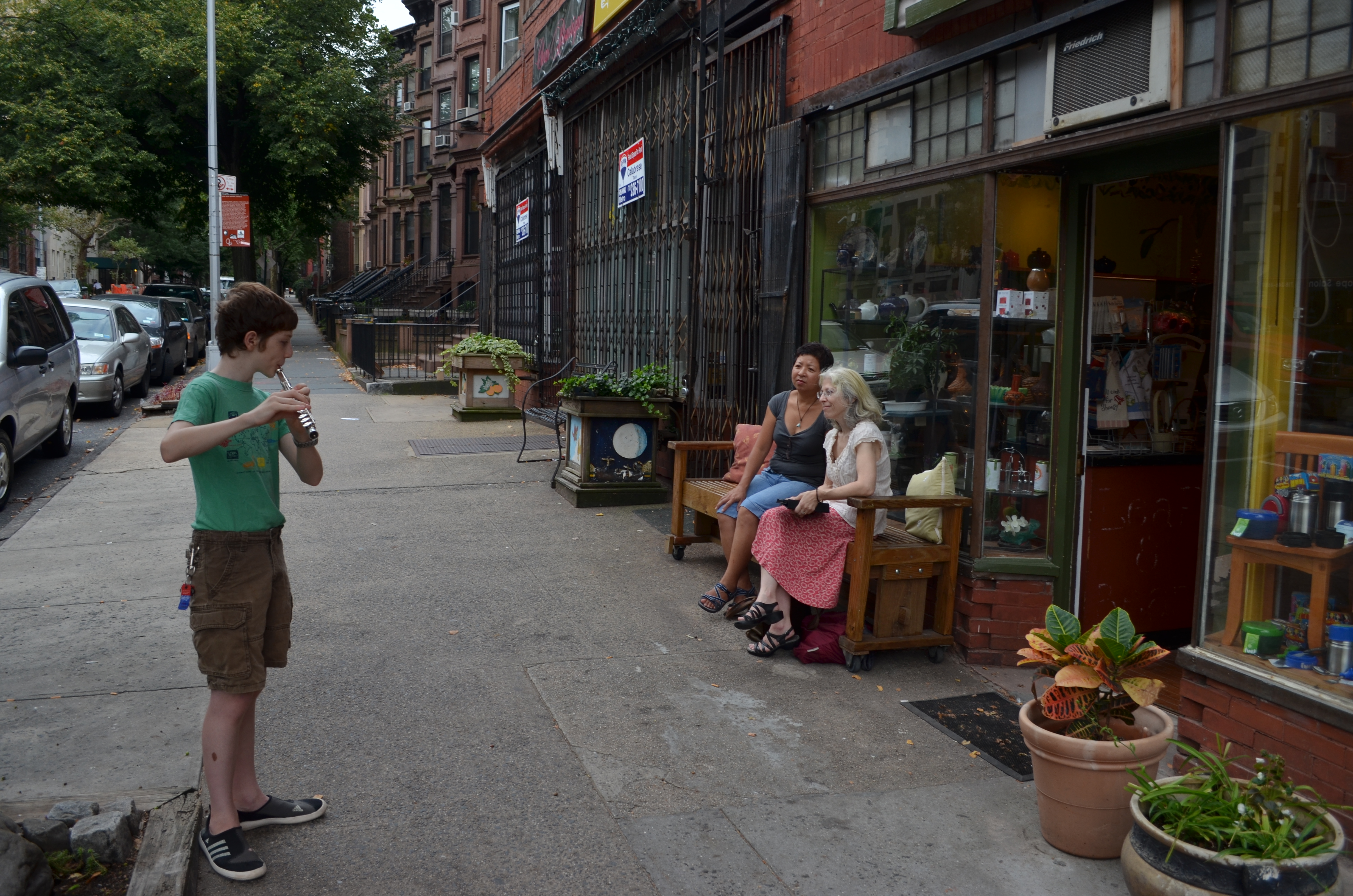
Portrait of the artist as a young man: Park Slope, Brooklyn, August 2012.1/160 sec., f/6.3, ISO 100, 20mm.
By MICHAEL PERKINS
ONE OF MY FAVORITE SONGS from my college days is Joni Mitchell’s elegant For Free. If you’re not familiar, the lyrics involve a woman who has gained some commercial success as a musician, and who observes an unknown (and unsung) player giving a simple, gratis concert on the street. The narrator is struck by what a generous gift this is for the passersby in the city, many of whom, sadly, do not apprehend the value of this modest little moment. She even experiences a bit of embarrassment that the anonymous artist is giving away what she herself only dispenses when paid:
And I play if you have the money/ or if you’re a friend to me/but the one-man band by the quick-lunch stand/ he was playing real good, for free…
Last week in the Park Slope neighborhood in Brooklyn, as I was half-heartedly wandering through a series of local shops, I heard a clear, clean line of melody curling around the corner from the place where I was standing. It was the slow, sweet, and yet slightly l0nely sound of a flute, and I assumed, for a moment,that it belonged to one of the ad hoc buskers that decorate New York-area streets from Broadway to the Bronx, the usual thanks-for-your-support appeal for a quick quarter dropped into the instrument case, the music itself usually generic and detached.
This, however, was different. Upon heading down a side street from Fifth Avenue, I discovered that the musician was a young boy, perhaps no older than twelve. His audience was not the crowd at large, but two elderly women, apparently the proprietors of a small boutique store, who had stepped in front of their shop and sat down to focus, with great absorption, on his efforts. His face contained everything that youth should…..belief, earnestness, a quite passion for excellence. Theirs showed a pride that seemed to go beyond friendship or casual interest. Friends of the family? Surprised strangers charmed into true believers? Surrogate parents or “aunts”? It didn’t matter.
Only two things mattered. One, that I listened for as long as this young master felt like playing, and, Two, that I try to freeze some of his magic in my camera. I approached the women, as if they were somehow his caretakers, or at least his sponsors.
Please, may I take a picture of the player? He’s doing so well.
Yes, of course, thank you, thank you.
Three quick frames. One over-exposed, one framed too tight, and.. yes, this will be the one. Got it.
The narrator in Mitchell’s song almost drops the wall between her “professional” music and the street player’s honest, simple jams, thinking for just a moment to go over and “ask for a song, maybe put on a harmony”. In the end, however, she thinks better of it, and simply walks on. The moment it lost.
Playing real good for free, the young master made me want to try to up my own game….maybe my own attempt to “put on a harmony”. The best music, the best art, always does that.
Every trip to New York is a battle for me to maintain balance between the subjects that are bigger than life, and the smaller stories, that are life. It’s nice to have one handed to you, wafting on the wings of melody.
Simple gifts are best.

