YOU ARE PHOTOSHOP
By MICHAEL PERKINS
EVER SINCE THE ARRIVAL OF THE DIGITAL DARKROOM and its attendant legion of post-production fixes, the world of photography has been pretty evenly divided into “befores” and “afters”, those who prefer to do most of their picture making in-camera and those who prefer to “fix” things after the shutter clicks. Most amateur photography, in the film era, was heavily weighted in favor of the “befores”, since a lot of traditional touch-up technology was economically beyond the reach of many. In the Photoshop era, however, the economic barrier to post-production was shattered, resulting in a more even balance between the two philosophies.

Shoot your black and white images as black and white images, not color shots drained of hue after the fact.
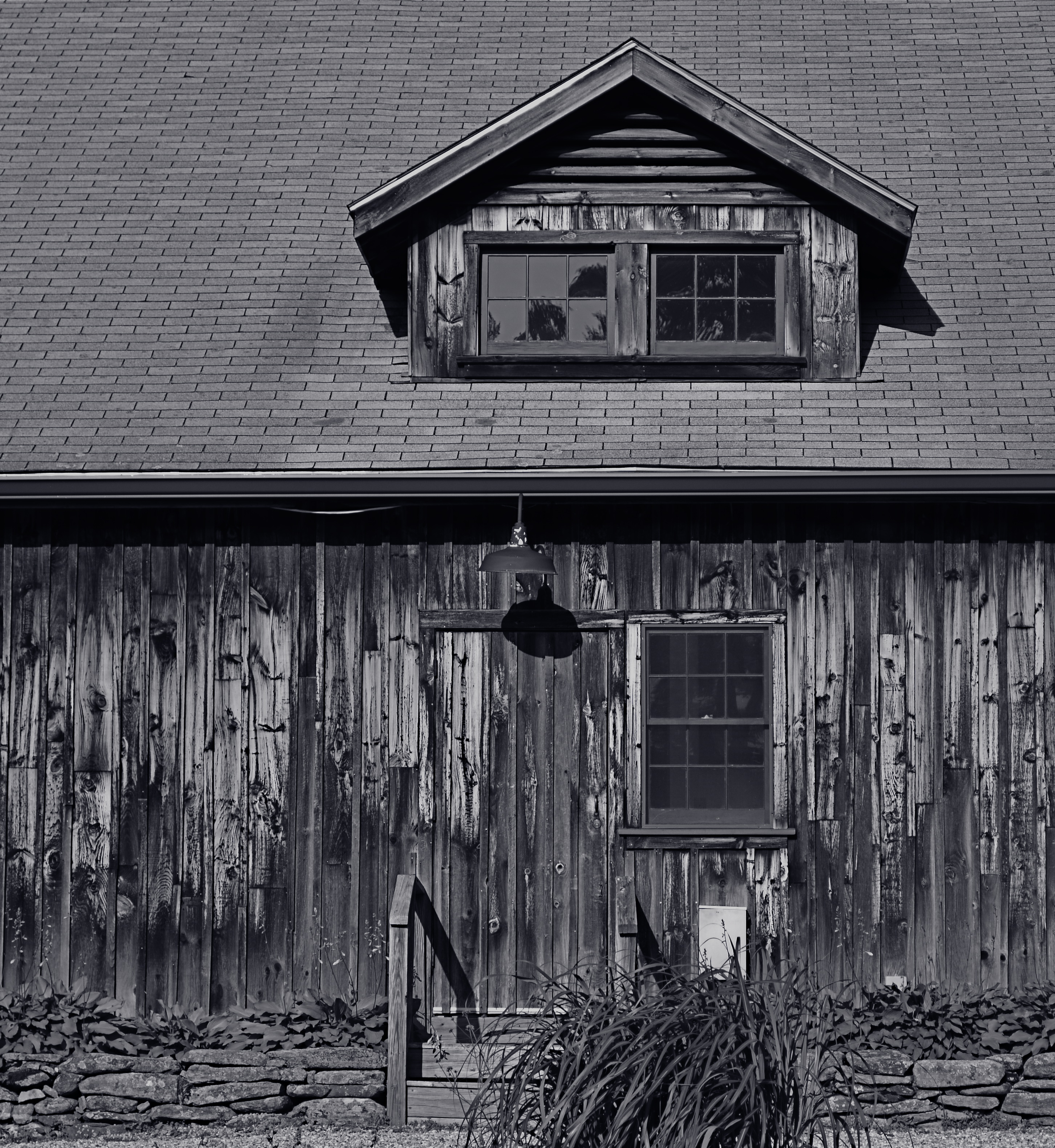
I really see this quarrel as very sharply defined when it comes to black and white photography, with many shooters making most, if not all of their monochromes from shots that were originally color, then desaturated or otherwise manipulated as an afterthought. I prefer to shoot b&ws in-camera, however, for the very simple reason that it gets you thinking in black and white terms, from lighting to composition. It also allows you to benefit from digital’s immediate feedback/playback strengths to shape your shot in the moment. If you’ve worked in mono for a while, and especially if you’ve ever shot on b&w film stock, you are used to seeing the 50 shades of gray that subtly shape the power of an image. More importantly, you realize that black and white is much more than color with the hues sucked out. It’s not a novelty or a gimmick, but a distinct way of seeing.
When you conceive a shot in color, you are shooting according to what serves color well. That means that not all color shots will translate well into grayscale. Fans of the old Superman tv show will recall that, during the series’ early b&w days, George Reeves’ uniform had to be made in various shades of brown so it would “read” correctly in monochrome to viewers who “knew” the suit was red and blue. Cameramen had to plan what would happen when one set of values was used to suggest another. Tones that give a certain punch to an image may look absolutely dead flat if you simply desaturate for mock-mono from a color shot. And, anyway, there are plenty of ways to pre-program many cameras to adjust the contrast and intensity of a b&w master image, as well as the use of filters (polarizers for instance) that do 90% of the tasks you’d typically try to achieve in Photoshop anyway.
The mid-point compromise would seem to be to take both color and black and white shots of your subjects in-camera, allowing you the option of custom processing at least one image afterward. However, knowing what tonal impact you want before you click the shutter is just easier, and usually more productive. Do your shooting with purpose, on purpose. Making a b&w “version” of a color shot after the fact will likely bake up as half a loaf.
DON’T TAKE THAT TONE WITH ME
By MICHAEL PERKINS
I BELIEVE THAT THE SINGLE BIGGEST REASON FOR THE FAILURE OF A PHOTOGRAPHIC COMPOSITION may all boil down to the same problem. I call it “over-sampling”, or, more simply, the presence of too much visual information in a frame. It can be as simple as including too many trees in a landscape or framing to include crowded sky clutter in an urban scene, but it’s not always how many objects are crowded into an image. It can be something as basic as asking the eye to figure out where to look. And sometimes, the very fact that a picture is in color can diminish its ability to clearly say, here: look here.
Color would have added nothing to this image. In fact, it would have detracted from its impact. 1/400 sec., f/5.6. ISO 100, 55mm.
Great photographs have their own gravitational pull and center. They draw people in and direct their gaze to specific places. This tends to be a single focus, because, the more there is to see in an image, the greater the tendency is in the viewer to wander around in it, to blunt the impact of the picture as the eye looks for a central nexus of interest. In my own experience, I find that the use of color in a photograph is justified by whether it helps keep things simple, creates readable signposts that lead the eye to the principal message of the image. Color, just like the objects in a frame, can explode with a ton of separate messages that defeat the main message, sending the viewer all over the place, trying to decode all that vivid information. Color itself can become clutter.
Sometimes the focus of an image is not an object, i.e., a building or a face, but an overall feel that is more emotionally immediate within a narrow range of blacks and greys. The kind of black and white makes a huge difference as well, and anyone who has spent a lot of time processing monochrome images knows that there is no one true black, no pure, simple white. As to actual shooting procedure, I will be so certain that only B&W will work for a given subject that I make the master shot itself in mono, but, more frequently, I shoot in color first and make a dupe file for comparison. This is another amazing advantage of digital imaging; you simply have more choices.
One of the by-products of color photography‘s adoption into mass culture through magazines and faster films in the mid-20th century was, for many people, a near-total abandonment of monochrome as somehow “limited” compared to those glorious, saturated Kodachromian hues. Thing is, both color and black and white have to be vetted before being used in a photograph. There can’t be a general rule about one being more “lifelike” or “natural”, as if that has anything to do with photography. Tools either justify their use or they don’t. You don’t drive a screw with a hammer.
