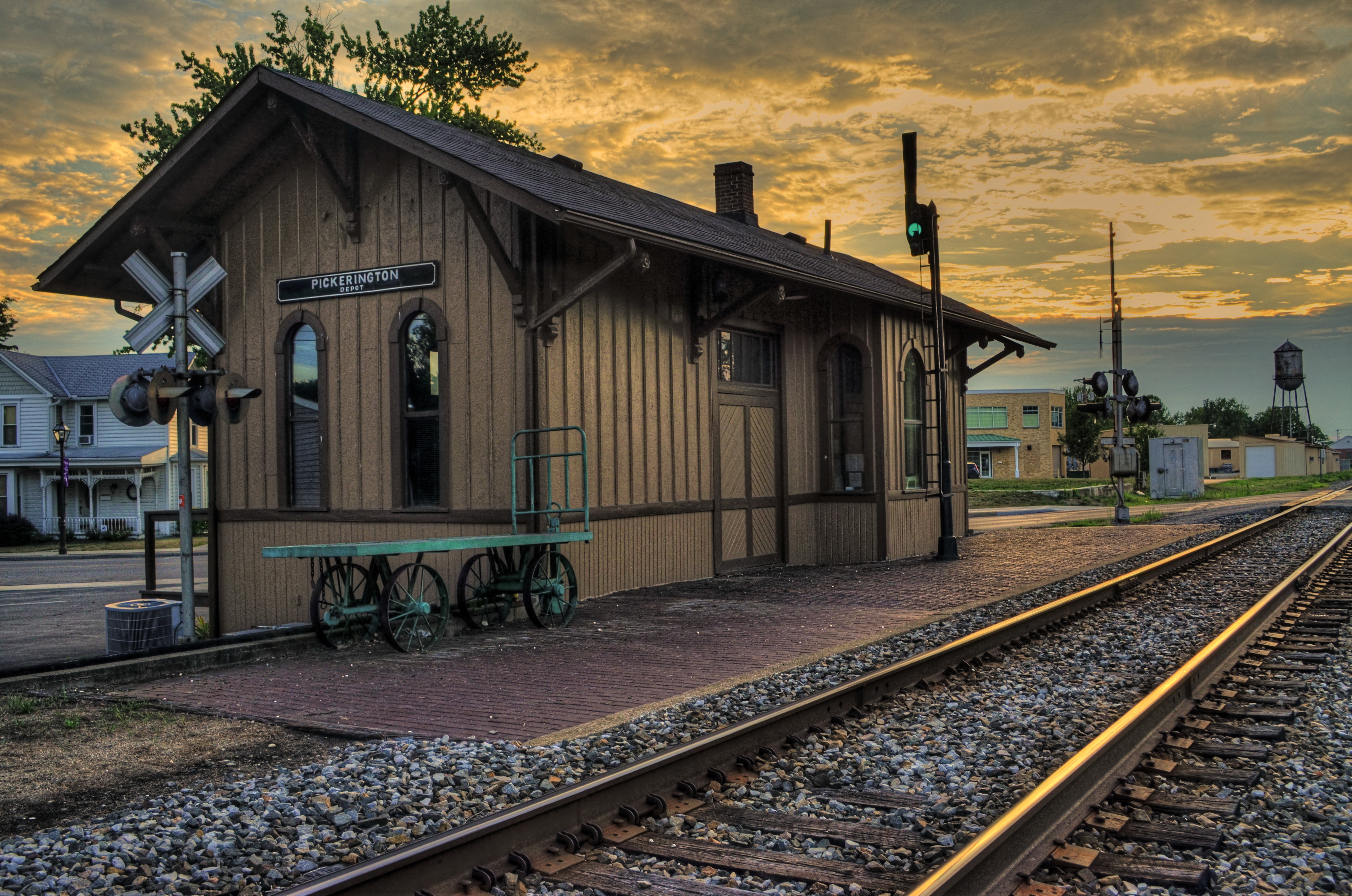
THE FEEL OF REAL
By MICHAEL PERKINS
MUCH OF OUR INHERITED SENSE OF TEXTURE IN PHOTOGRAPHY was shaped early on by what the earliest camera images could practically deliver. We experience historic images of Lincoln, Twain, and the great generals of the Civil War through the very rough “tooth” of the processes that almost exclusively recorded them, chemical and technical methods that rendered features, clothing and skin in a certain limited fashion. And over time, those methods dictate our concept of how the skin and features of those people should look, forever, even as they define for us what words like tough, stern, brave, frightening or serious ought to mean in terms of how smooth or how coarse a mood we’d pursuing.
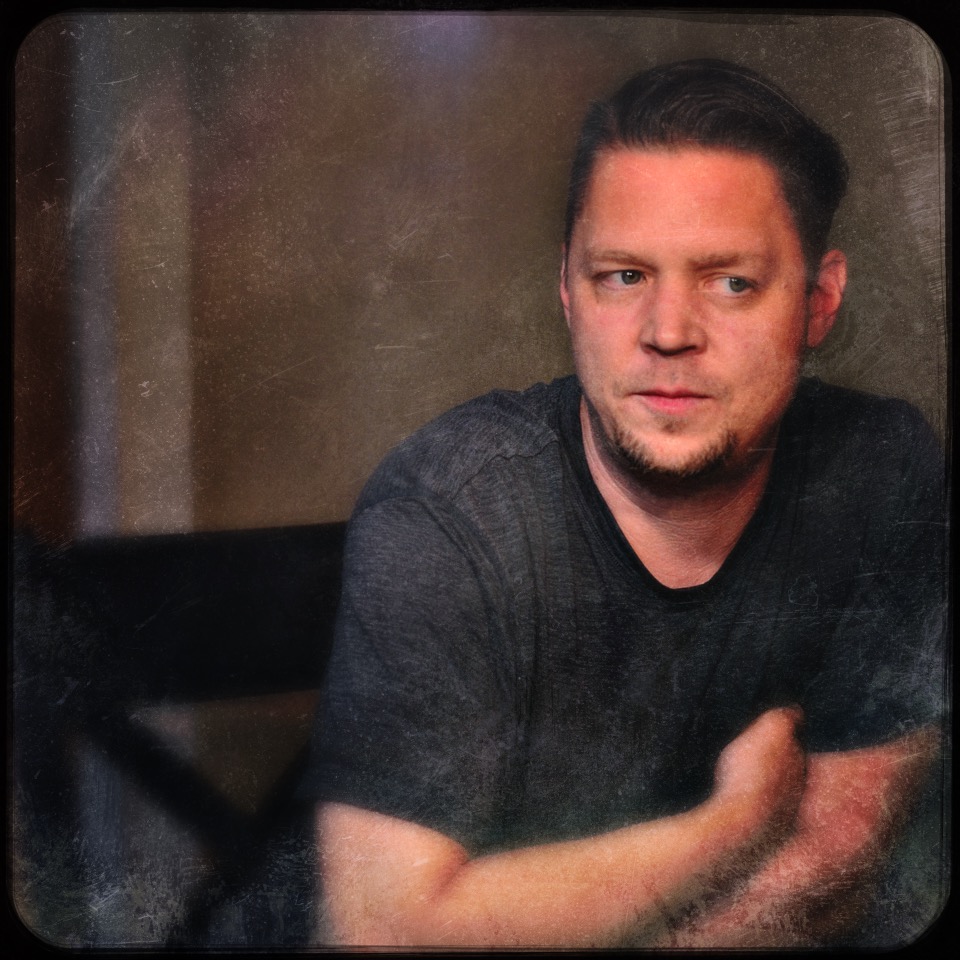
Ryan Michael Perkins, Columbus, Ohio, 2017
And it’s not merely historic; a big part of the recent retro movement toward analog imaging even a rec-creation of it on digital platforms, lies in in aping or recreating the textures we saw of people as they were depicted in previous eras. What we collectively call a “film look” is, in fact, many different looks, depending on whether you’re recalling an 1850 daguerreotype or a 1975 Kodachrome slide, with special emphasis on the degree of grit or silkiness appropriate for different time frames. In some circles, this emphasis on texture has risen to the same level of importance as such fundamental pillars as color and exposure.
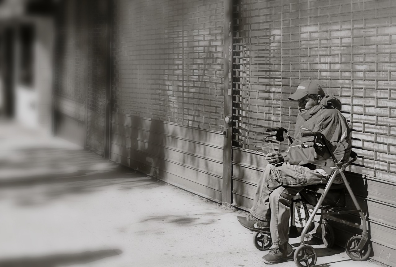
I myself will often assign an older texture to selected portrait subjects, based on what elements of their personalities I wish to suggest, as in this image of my oldest son Ryan. It’s safe to say that, over his nearly fifty years of life, he has veered far closer to rough times than serene ones. A perfectly-lit or balanced image of him seems as ill-fitting as a pair of jeans that’s two sizes too small. He doesn’t do “easy”, and so my favorite pictures of him attempt to capture that fact, calling, in this case for example, a kind of sandy, friction-rubbed aging to the final frame. I don’t embrace all of the “just like film” movement, but there are moments when even the freshest faces should have a little acid-washed quality to them, as if to suggest all that time has etched into their features. “Real” and “feel” are subjective words, and they are likely, for photographers, to remain ever thus.
SPITTING BACK THE CANDY
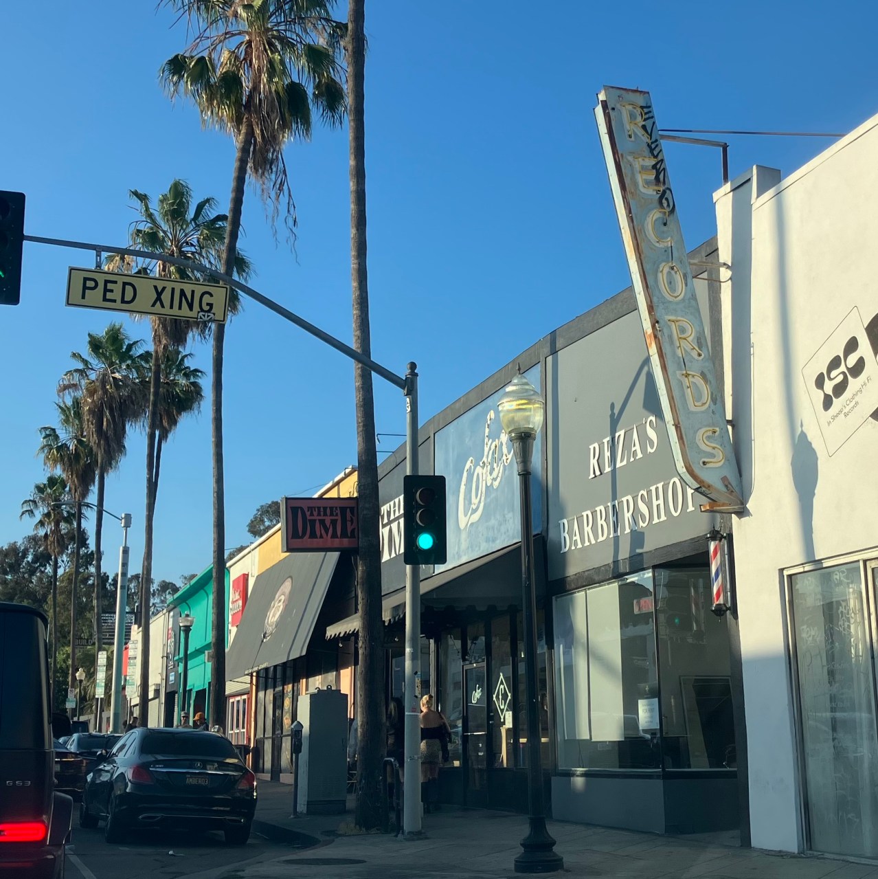
A straght-out-of-the-iPhone shot. Not remarkable, but not bad, and all my own.
By MICHAEL PERKINS
IT HAS TAKEN ME SOME TIME TO SORT OUT MY FEELINGS about the onrushing tsunami of interaction between photography and artificial intelligence. I have tried to see this tech wave as a bounty of new, useful tools, or a step toward greater efficiency. I really have tried. But I can’t get there, and now I fully understand why.
Creativity is often a collaboration, but it is a human function, and so, even collaborators in any creative act should be aligned in their common humanity. Humans have a distinct way of viewing problems, assessing results, and making executive decisions about where a given piece of art is born and where it arrives. Any process in which humans delegate this authority to non-human entities ceases to be creativity, since it surrenders the agency of the creator.
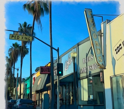
The same image, fed through a faux-painting A.I. generator app called Oilbrush.
And then there is the problem of authorship, which is called into question the very instant that a photographer makes use of an A.I. generator. In the image above, my original photo from the top of the page has been fed into an app called Oilbrush, which, as its name suggests, simulates the tonal and textural feel of a painting. In an instant, it samples billions of pictures from millions of artists, simulating their approach, technique, and, yes, even the type of brushstroke they used in an endless random mix of elements. When I click a tab in the app, I have no idea whose ideas I am compromising, or stealing outright, to enhance my own. I have traded any pretense at originality or honesty for instant gratification. Efficient as hell, and soulless.
I love playing with all these toys, but having spent some time in the their strange playroom. I do not wish to present work as “mine” when I can’t even have a conversation with my “collaborators”. I am not obligated by career pressures to fold this revolution into my own photography, and so I am free to make pictures in the way that I trust….that is, of myself, by myself. The tech treats offered these days are indeed tasty. However, after the first flavorful burst of sweetness, some of us will choose to spit back the candy.
TOWARD A MESSIER MOI
By MICHAEL PERKINS
I SPENT THE FIRST TEN YEARS OF MY PHOTOGRAPHIC LIFE in a more or less constant state of frustration, given that I had not mastered the mechanical basics of the art, measuring the “success” of my pictures only in that light. The “if only’s” ruled my thoughts; if only I had a better camera; if only I could get more even results; if only I could make my subjects look more “realistic”. Everything in those early years….personal emotion, vision, impact….was subordinated to a worshipful pursuit of technical precision. I shot like I was recording illustrations for a travel brochure.
Miraculously, the digital age has eliminated a lot of the risk that used to confound me and other shooters. In such an era, we, more often than not, get some kind of usable picture, freer than ever before from technical defects. In this way, our cameras protect us from our messier selves. But that, in turn, can lead us to another kind of failure, one in which we neglect the unpredictable but potentially exciting irregularities that stamp our personalities onto our images. In recent years, almost as a kind of correction or recoil, photogs in the Age Of Guaranteed Outcome have sought to retro-fit photographs with the feeling that this is not a perfect process. This shift has been seen in several trends: the re-introduction of lo-fi film cameras, which actively seek the accident or the tech fail; post-processing apps which aim not merely to evoke the look of other eras, but to illustrate that uncertainty and imprecision are key parts of memory; and art glass and instant photography that romanticize the random.
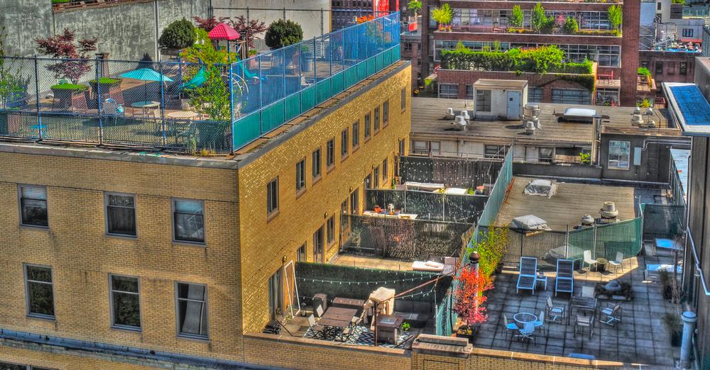
I have come full circle in these times, opting occasionally to overrule reality in pursuit of feeling. The master shot of the above image, taken at some distance, originally smoothed out the rougher textures of the urban rooftops, or at least those that I saw in my mind. The un-retouched “reality” of the subject was too pretty, if you will, straight out of the camera. A quick HDR conversion, however, brought every brick and stone into gritty relief; meaning that I had to deliberately re-flaw the image to make it truer, saying a polite “no thanks” to the “actual” look delivered by my advance device. I needed some wrongness to be put back in the scene to make it right.
When we express ourselves with a minimum of even well-meaning interference between initial vision and final result, we produce a really inconsistent mix of correct and incorrect execution, making our hits nearly as mysterious as our misses. But this personal autographing of our images is important, more so than ever before, especially as we peer into the dark, spooky cave of A.I. and wonder how to keep our work truly ours. One thing is sure; authorship, properly asserted, cannot be counterfeited or aped, and photographs can never merely be about a mixtures of processes. It’s in the sloppy soup of the actual human brain that anything pretending to true “art” resides, and that unique product can never be assimilated or simulated.
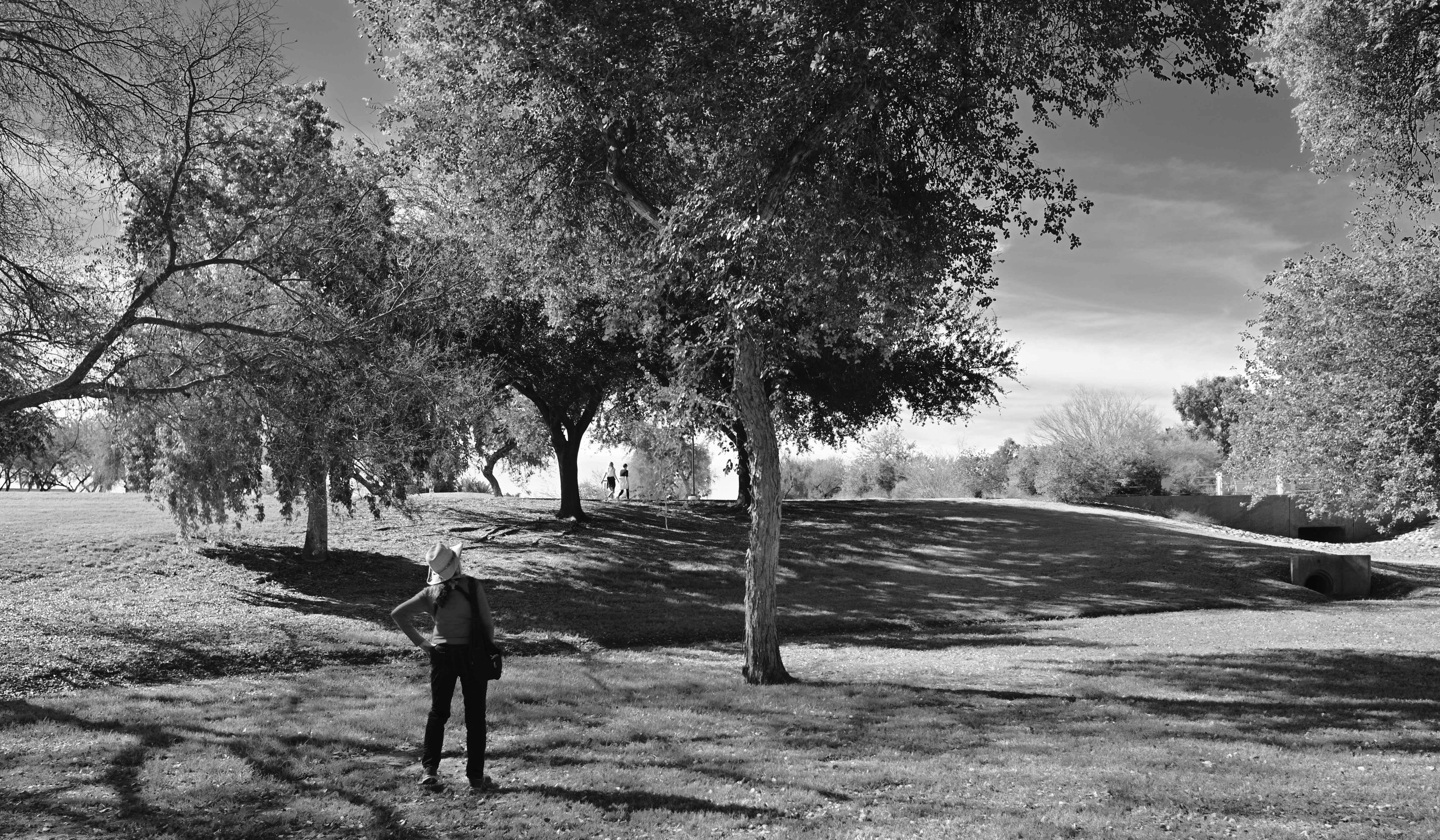
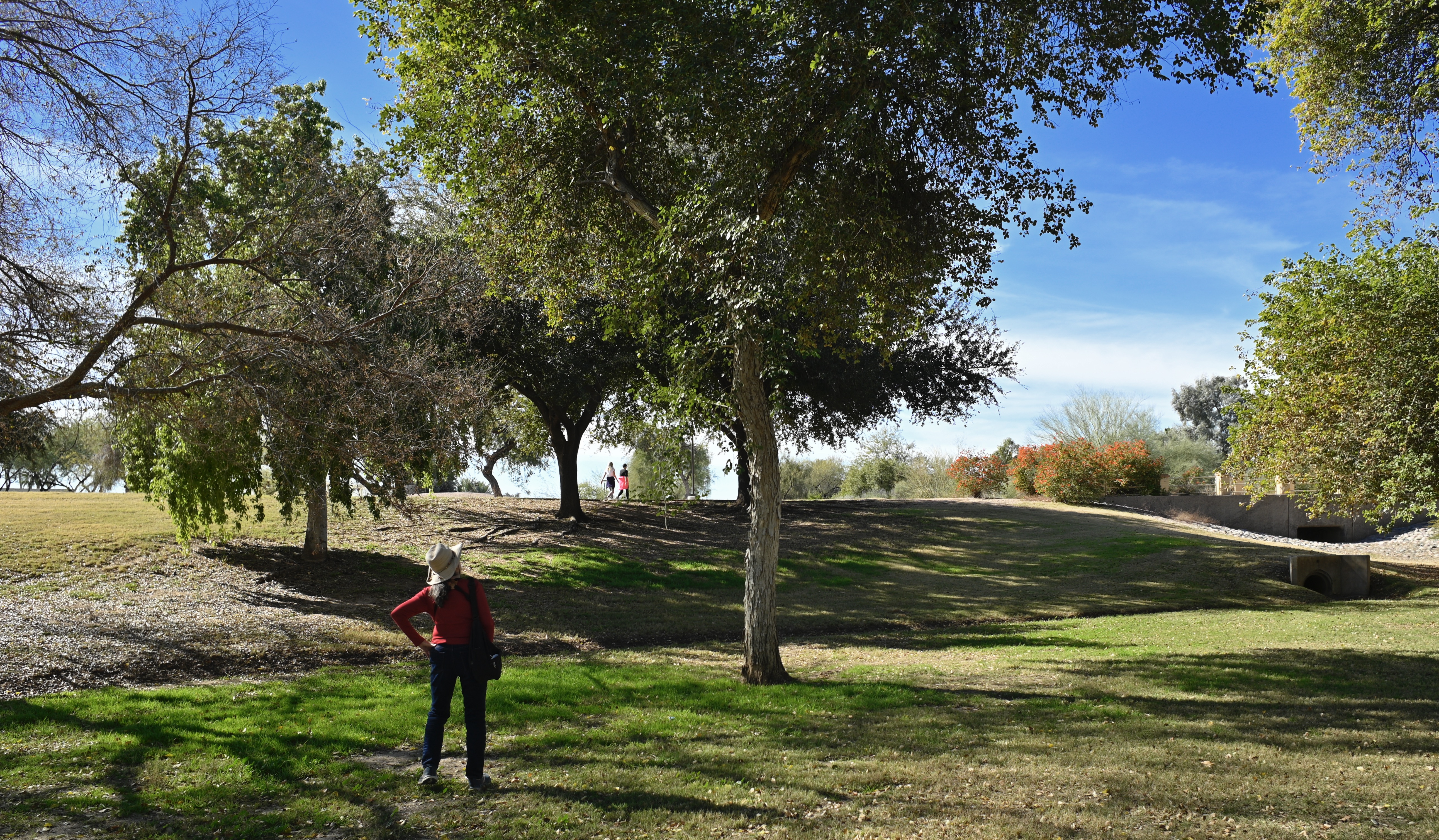
TRUTH VERSUS REALITY
By MICHAEL PERKINS
ORSON WELLES ONCE SAID OF JAMES CAGNEY that, while he was not a “realistic” actor per se, there had never been a single frame of film shot of him that was untrue. Something in the Yankee Doodle Dandy’s presence on screen was both more and less than real, and so, as a result, it registered with audiences as authentic, as if it ought to be true. Oddly, in making this observation, Welles may as well have been talking about two competing visions of photography, two disparate camps that choose either “truth” or “reality” in almost everything they create.
Many of us learn a formal definition of words like sharpness, tone, contrast, color, and many more of us learn that a certain combination of these elements equals a picture that is “like life”. This comes from the earliest years of photographic instruction, in which raw amateurs, who were necessarily outcome-oriented (i.e., wanting a return on their investment in gear and film) were given certain arbitrary rules for the making of a so-called “good” picture. But “good”, or “real”, or “authentic” according to whom? After reading all the “how-to” booklets, we have to spend the rest of our lives figuring out the answer to those questions.
In comparing these two renderings of a single landscape shot, what, in your mind, qualifies (or disqualifies) one version over the other in terms of its post-processing? Which reflects what I saw in the moment versus what I later re-sculpted in terms of tonal range, intensity, color? Which picture came first? (Spoiler: I’m not telling). Is one “realer”, or more naturalistic, than the other? Why or why not? And which one is, to your mind or eye, true?
More to the point, whatever your conclusion, how can it become the standard for my opinion, or his, or hers, or theirs? When we look at an image, are we actively weighing what was, at various stages, done to it, or do we merely judge the result (Spoiler Two: often we do both)? Cagney’s entire approach to acting was summarized in his advice to a beginner: “Plant your feet, look the other fellow in the eye, and tell the truth”. How that truth makes it from vision to result is anyone’s guess, and everyone’s decision. No manual, no set of rules, no formal class can teach that.
SKETCHPAD PSYCH

A 2012 HDR mix of five bracketed exposures, my attempt to rescue additional detail from the dark areas.
By MICHAEL PERKINS
HAVING BEEN AN ILLUSTRATOR LONGER THAN I HAVE BEEN A PHOTOGRAPHER, I have long since learned to live with “the gap”, that unbridgeable space in the arc of creation between conception and execution. We’d love our art to be a closed loop, with an unbroken line from our original idea to our final product, but that gap, that realm of uncertainty and unrealized dreams, is stubborn, and keeps the circle from completely closing. In pencilling a notion on a sketchpad, I had to become resigned to the fact that, once I began inking the pencil lines, something indefinable would be lost in translation.
Being okay with the gap has kept me sane in the making of photographs.
Regardless of our training, practice, equipment or eye, we can never deliver images that fulfill 100% of our dreams. We work like mad over a lifetime to make the gap smaller, and in our best moments we nearly manage it. Ironically, it’s the pictures with the bigger gaps that really get our attention and sharpen our perception. The raw, gnawing irritation of knowing exactly how we failed is the only road to better images. Like an illustrator, we enter into a lifetime “sketchpad psych”, an acceptance that the devices we use to extend our senses (brushes, cameras, etc.) will never perform to perfection. Some of this is because, maddeningly, our internal conception of our own original ideas is never actually “finished”.

Same five images, remixed in 2022 with an exposure fusion process.
These two images, both blended from five bracketed exposures, from super-dark to super-bright, were “mixed” a decade apart. Now, beyond the fact that, given modern tech’s more sophisticated ability to record wild swings in contrast, I probably would not even approach the master shot in the same way today, it’s sobering to realize how much my conception of “correct” processing has shifted in a mere ten years. The top take is classic HDR, very heavy on the details, along with the slightly garish color palette and overall brassiness of that process. The bottom version is done with the same software, but using exposure fusion. A lighter tone over all, one that’s absent the micro-fine particles of things like woodgrain or wall texture. The first process changes everything in the picture all at once, while the second gives you a bit more control over individual elements, along with the option of understatement.
Both versions have their points, but in classic sketchpad psych, neither is a complete rendering of what I saw in the moment, but rather, an artfully constructed compromise. Some days, close is as close as you can get. The only cure is to turn over the page on the sketchpad and start drawing again. Here the graphic artist and the photographer can agree on the same two-word mantra: next time.
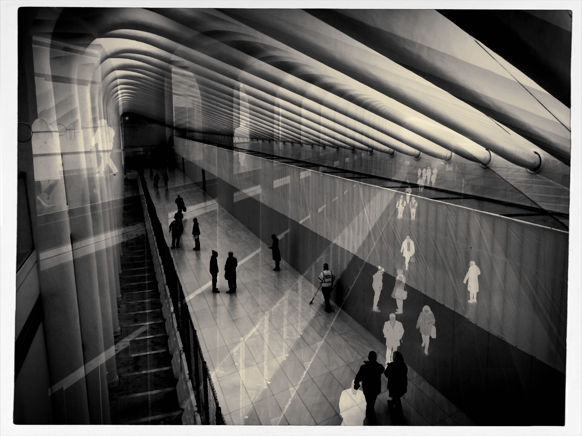
MAYBE A CIGAR, ANYWAY
By MICHAEL PERKINS
A FACE ONLY A MOTHER COULD LOVE. That’s the standard cliche in describing someone so unlovable that he or she has, at best, a devoted audience of maybe one. The saying used to apply solely to physical beauty, but can, these days, define anyone or anything that is just this side of universally loathsome. Substitute the word picture for face and photographer for mother, and you’ve summed up what some of us feel for our rejected images, the ones we bitterly hate and desperately love at the same time.
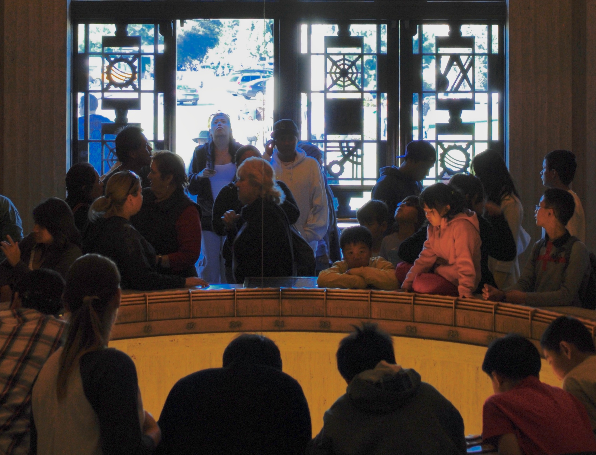
The image see here is one of my own top five red-headed stepchildren, a picture that is so close to being exactly what I wanted of it, yet so technically flawed that any person of taste or perception would immediately consign it to the rubbish bin, and with good reason. And yet, year after year, doing my annual “rehab tour” of pictures that I somehow can’t permanently destroy, it pops up, begging for love or at least a little maternal forbearance. My attitude is not so much close, but no cigar as much as can I have just one hit off of YOUR cigar? For effort?
The shot was taken in the circular rotunda that acts as the initial vestibule of entry to Griffith Observatory, which sits like a gleaming Art Deco Sci-Fi castle atop a promontory that overlooks downtown Los Angeles. The Keck rotunda’s walls are rich with murals that celebrate the great celestial and scientific discoveries of the ages, and the Foucault pendulum, seen here as the recessed circle that several patrons are starting into, bathes faces in a warm uplight that makes them look like glowing participants in a Maxxfield Parrish painting. In this snap (and it was a “snap”, with no more planning or intention than the word implies) the random poses of the crowd, including the young woman doing an “oh, wow” as she enters through a door, look impossibly staged, something that endears it to me years later.
But, then there’s that total blowout of high blue and white light from the parking lot, taken in an attempt to capture the entrance’s unique metal grillework. I mean, the entire effect of the picture screams “preliminary sketch”, only I didn’t go back and do the technical work that would have corrected the contrast, color rendition or overall exposure. Never has so much raw material been presented with so little in the way of decent execution.
And therein lies the face “only a mother could love”. Like any mom, we love in spite of what our kids actually are, in spite of what they actually achieved. And we weep a little about what might have been, of what little more effort it might have taken to actually win the cigar.
KEEPIN’ IT (FROM BEING) REAL
By MICHAEL PERKINS
ONE OF THE KEYS TO UNDERSTANDING WHERE PHOTOGRAPHY IS lies in studying where it started from. If you place the camera amongst the other technical marvels of the nineteenth century, from trains to telegraphs to telephones to electrification, you see a steady stream of mechanical/scientific means of quantifying or measuring things, with the Magic Box That Imprisons Light being seen as one more device to help us master or harness nature. This got the invention off on a certain foot, in an origin story that we still struggle with.
We got used to thinking of photographs as recordings of reality. We wuz wrong.
Unlike painting, which was natively seen as an emotional / interpretative means of commenting on the world, the camera began life being regarded as a scientific instrument. An official recorder of reality…its dimensions, its contrasts, its events. The real record. But since, from the very beginning, one could manipulate the results, whether with recording medium (glass plates, film, etc.), exposure, processing, and so forth, each photographer had it within his power to also apply his/her own idea of what “the truth” was. Fakery appeared early on, and of course, both the choice to go with the default tonal palette of monochrome or the whim to deliberately engineer one’s one tonal schema (hand coloring, for example). This meant that, from the start, reality was not a final destination for photographs. It was a point of departure.
That’s why I don’t understand the backhanded compliment that something/anything is appealing because it “looks like a photograph”. My reflexive answer is, “whose photograph?” Walker Evans? Many Ray? Annie Liebovitz? Granny at the birthday party? Photographers may use “reality” as raw material, but none of the best of them, to my taste, are satisfied with reality as a final message. The image seen here, for example, is the product of manipulation, and, if I’m lucky, that fiddling will seem logical, or invisible, or, if I’m really careful, inevitable, as if my result could not be any other way. But real? God, don’t anchor me, or photography with the anvil of mere reality. The world as it is will never be as fascinating to artists as the world that might have been, or may yet be.
PLAYING IN THE RIGHT KEYS
Listening For The Lark, 2022. A monochrome conversion from a color master shot.
By MICHAEL PERKINS
SOME OF OUR PHOTOGRAPHS CERTIFY THEMSELVES TO US AS “RIGHT” OR “WRONG” over time, not registering instantly as either keepers or pitchers, but slowly making the case for their final disposition. These are the truly tricky shots, the ones whose success or failure is not readily apparent upon first, or second, or even fifth glance. Such images go in and out of the workflow bin again and again, sometimes over years, while we decide whether we recognize them as our own offspring.
Sometimes it means we partially embrace a shot, loving it in spite of a slight technical miscalculation or a composition that’s slightly off. Other times, we trust/mistrust our original intention, which is French for “what was I thinking?”. In recent years, as I’ve returned to the tonal range of my first days as a shooter, I often stick pictures in the “still under consideration” pile over the choice of whether to re-render them in monochrome. I often think of color and b/w as two different arrangements of the same theme, or maybe a song played in one of two very distinct keys.
The color original.
Since mono was the default of my earliest days, I naturally learned to shoot in it first. Once color became the go-to for most photography, I deferred to that. I don’t intentionally shoot my master shots in mono because it means pre-empting a choice that I might want to exercise later. You can easily go from color to no color, but,…. well you know the argument, and so that seems to mark me as a conversion person. Black and white is a choice, but not if you had no other choice in the first place, right? Mono has its own tonal vocabulary and creates a separate mood or priority of light than color. And for that reason, as well as the need to weigh and re-weigh my options pretty much forever, many of the pictures I can’t decide to love or hate hinge on the strengths and weaknesses or the two tonal “keys”.
Is color more bold, or can a more dramatic statement be made in its absence? Does monochrome tantalize, tease the appetite for more information, stimulate the imagination, and does it do so more effectively than a garish explosion of hue? Which of the two modes is, for me, in this particular instance, more “authentic”? And is that what I even want in the first place?
There are lots of images which cry out to be completed, to have their case file marked “closed” with a final determination of their value. But if art is about forcing flexibility where some would favor rigidity, then it’s probably a desirable thing for us not to rush to judgement on some of our pictures. Maybe they came into the world fully formed, and maybe not. But maybe, after all, it’s us who need to become more complete, in a variety of ways.
TAKING THINGS FOR GRANT-ed
By MICHAEL PERKINS
“PHOTOGRAPHERS, ESPECIALLY AMATEUR PHOTOGRAPHERS, WILL TELL YOU that the camera cannot lie” wrote a columnist for Lincoln, Nebraska’s Evening News in 1895. “This only proves that photographers, especially amateur photographers, can…for the dry plate can fib as badly as the canvas, on occasion.” All of which is to restate the obvious, that the manipulation of images is as old as images themselves, and that, even when a picture does actually tell the truth, the healthy skepticism persists that tomfoolery, if not actually perpetrated in this particular case, lurks ever nearby.
Faked photos emerged in the nineteenth century as soon as photography itself was out of the cradle, and by the time the world was rounding the corner into the 1900’s, successful hoaxes were perpetrated along two main tracks: profit and propaganda. The very fact that people regarded the camera as an objective machine with no particular axe to grind, a mere recording instrument, if you like, gave credence to outright lies created with a growing variety of tweaking techniques. Propaganda proved an obvious growth medium, as governments attempted to massage the historical record to win hearts and minds, a practice brought to the level of art by both Hitler and Madison Avenue in the century that followed. Likewise, profit loomed large, as companies marketed images that the public wished were real, blurring the line between dreams and documents in the service of sentiment or fantasy.
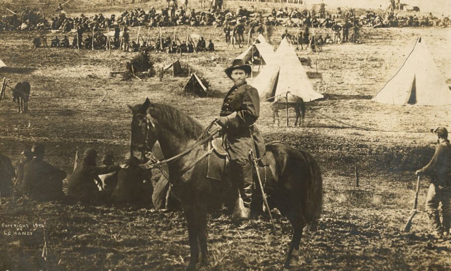
Both the motive to influence and the desire to cash in converge in this image, one of the best-selling photos of the late 1800’s, which purports to show General U.S. Grant heroically astride his horse surveying a roundup of Confederate prisoners at City Point near Richmond in 1864. Following the death of the pioneering Civil War photographer Matthew Brady, his nephew L.C. Handy came into possession of most of his uncle’s negative masters, and began reproducing them to the custom order of many who had, just a short time before, served in the conflict. The picture is striking, mythic, and an unmitigated fake. In fact, it is not a single picture at all, but a composite that combines Grant’s head (from an original Brady portrait), the body of Major General Alexander McCook, and a third image of the prisoners, who were actually photographed at a separate battle that took place hundreds of miles away from City Point. Handy copyrighted the composite and made a small fortune marketing it.
It took decades for the fraud to be detected, after sleuths discerned that, among other inconsistencies, the officer’s body is that of a one-star general (Grant was a three-star by that time) and that the body markings on his horse do not match those of Cincinnati, Grant’s favored mount in 1864. The point is that today’s photographers certainly have no fewer scruples than did the old masters when it comes to fakery, and that, at least today, we are aware of the tools that can be employed to stretch or scar the truth, and accept photography as an interpretative art, for good or ill, rather than merely a means of documenting events. Caveat emptor.
A HOME FOR ORPHANS
By MICHAEL PERKINS
THE DIRTY LITTLE SECRET ABOUT BEING A PARENT is that we all come to terms with the fact that, of course, even though you are not supposed to have a favorite child, you often sorta do. Maybe we don’t so much love one above all the others, but just struggle with the messy process of learning to love each child for very specific reasons. You can’t, officially speaking, choose one over all the rest, but you do ( but you don’t).
And, of course, in any field of artistic endeavor, we also parentally favor some of our works over others. Or, to return to my earlier point, we just love some of them differently. As photographers, we make very fast initial groupings of our images, sorting them quickly into grossly over-simplified “worked” and “didn’t work” piles, as if we were even capable of producing either spotless masterpieces or irredeemably flawed failures. Some of the zillions of pictures we generate never break out of these two polarized winner/loser silos, either being blessed with immediate approval or consigned to permanent dismissal. The fact is, our photographs can easily be broken into four, or eight, or dozens of piles that show a nuanced range from miracle to mire….pictures that almost worked “except for” some little something, or snaps that almost completely missed “except for this one part I really like.” We’d like to believe we live in a two-pile world, where even art is subjected to a nice, clean either/or judgement, but the truth is far more tricky than that.
I once categorized this image as a failure. I no longer feel that way. I cannot explain either reaction. I don’t have to.
Often, in reviewing or re-reviewing or re-re-reviewing the orphan images we originally stuck in the reject pile, we are struck by how foolish our original sorting process was. As with the picture you see here, we are struck, with the luxury of a little time distancing, to evaluate the things with fresh eyes. Shots that were utterly without merit may still be, generally speaking, misses rather than hits. But in finding them again after a prolonged absence, we lose some of the concept or animating spirit of the original concept: details of why we did it can fade a bit, and the picture will sometimes stand either straighter or crooked-er when forced to stand on its own. And in the light of this new viewing, some orphans will find a home, with even the still-bad shots imparting more wisdom about ourselves than they might have in the heat of battle.
The lonely part, for an artist, is when you love one of your “children” in a way that you can’t explain and in which the world can’t share. That love must be unconditional and absolute. You made the thing and you must own it, because you can see a little piece of yourself in it. The orphan gets a home because it needs one.
TAKING ONE FROM THE TEAM
By MICHAEL PERKINS
THERE IS A CERTAIN DIVINE IMMUNITY attached to photographers who are lucky enough to remain amateurs, or, for those who do turn pro, the ability to remember how to shoot with an amateur brain. There used to be a cleanly defined line between people who had to make pictures for a living (under deadline, enslaved to editors, for the marketplace) and those who could never dream of doing so, but who might work every bit as hard just pleasing themselves. However, social media, with its ability to suddenly confer ( or cruelly withhold )sudden celebrity, has recently blurred this line between the careerists and the tinkerers. Now, even when we are making pictures for “no one”, we seem to be making pictures for everyone, anyway.
It’s getting harder to create a photograph in a feedback vacuum, to shoot without even a thought of how well a picture will be received. The tyranny of the new “like” and “fave” marketplace can riddle a photographer with doubt, gently bending his/her work to what might meet with the most approving eyes. In many ways, this new world is even more unforgiving, for amateurs, than the dreaded editing desk was for the professionals.

It’s more of a challenge than it used to be, these days, to allow oneself to make a picture like this one. The subject isn’t startling, or even especially unique, except to me. The composition is deliberately formalized, and so can’t qualify as avant-garde. The final shot, the product of a double exposure and some minimal color and contrast tweaking, is neither purely realistic nor challengingly abstract. In short, this picture is nothing in particular, except that it’s mine, made my way, for my own approval. I don’t have to worry that, as Frank Zappa would say, it suffers from N.C.P. (No Commercial Potential).
Any artist that is forced to produce for the popular market has two struggles: to achieve his vision and to package it for consumption by others. It’s THE tightrope act of a lifetime for photographers, with the amateurs envious of the pros’ access and the pros jealous of the casual snapper’s freedom. I have made my daily bread by a number of means over a lifetime, mostly under the gun of deadlines and editors in the print or electronic media, and so, while I have seldom earned a paycheck specifically with a camera, I have empathy for those who do.
There are things about working as a paid shooter that I will never have to endure, or suffer, and I know that. However, in the 21st century, even being an amateur is beginning to take on the haggard hassle that only used to accrue to the Guy Doing It For A Living. That is why the bigger fight in becoming a photographer is the mastery over one’s self rather than the perfection of mere technique. Sports and every other fun pursuit in our world has shown what happens when everything gets too serious and the meaningful meaninglessness goes out of something. In our art, we are being forced, more and more, to do everything for social reasons, to “take one for the team”. However, it is the pictures that you take from the team that truly remain your own, and that you will treasure the most over a lifetime.
PALLBEARING FOR HDR
HDR processing, initially touted as a more “real” look, is actually anything but.
By MICHAEL PERKINS
MANY OF THE TECHNOLOGICAL ADVANCES IN PHOTOGRAPHY, over the centuries, have been made as specific remedies to the limits of either cameras or recording media. Lenses and films were made faster, sharper, or more accurate because photographers were thwarted by the cramped parameters of the media. Such a cycle of malady-and-cure creates temporary and manic convulsions, fads if you like, along with solid, permanent improvements. Sometimes, as in the case of the now declining technique known as High Dynamic Range, or HDR, it’s easy to confuse a quick fix for a permanent one.
To review, HDR was an attempt to compensate for the limited range of light recorded by first-generation digital sensors, which effectively “read” extreme highlights or shadows, but were spotty in the mid-ranges, delivering only a portion of what the eye could detect. The solution was to take a bracket of anywhere from three to seven frames over a wide exposure range (grab your tripod, kids), then blend them, via software, to more consistently even out all values for a “balanced” or “natural” view. The other side-benefit of the process was a drastic amplification in detail.
HDR was immediately praised as having helped the photographer hurdle the last remaining barrier between the camera and real life. It quickly muscled its way into everything from amateur landscapes to commercial real estate, conferring prophet (profit?) status on authors like Trey Radcliffe, who soared to best-selling fame with books brimming with hyperbolic color and iridescent textures, every hobnail and brick in his goth HDR cathedrals registering the same, loud detail.
And that sameness, eventually, became the problem. Every part of every picture was now shouting. In the hands of many, HDR did not make images evenly modest: it made them uniformly garish. Too many HDR pictures were overripe, overcooked, as if the world were awash in day-glo gravy. Worse, the technique couldn’t work with live subjects or hand-held shots. Worse yet, in-camera HDR simulators in DSLRs and phone apps were virtually useless. Finally, if you actually liked photographing, you know, actual people, HDR made human flesh look like wet liver inside a tanning booth.
In the end, the problem HDR was created to address actually resolved itself, with second-gen camera sensors finally performing better along a wider range of light, delivering more even exposures right out of the camera. More importantly, photographers fell back in love with shadow, understatement, and mystery, satisfied that you don’t have to show everything to see everything. So, rest in peace, HDR. There now are better ways to keep it real.
I’M LOOKING THROUGH YOU
A double–exposure generated in Photomatix‘ “exposure fusion” mode, usually used to blend multiple exposures of the same subject, like the blending done in HDR programs.
By MICHAEL PERKINS
THERE IS A GROWING DEBATE OVER THE RECENT EMERGENCE of a process called exposure fusion, which has been touted as an alternative , if not a replacement for, High Dynamic Range or HDR processing. Which camp you fall into depends greatly upon what look you want in your final image, and both processes can be generated within a popular program call Photomatix.
So, first, a bit of review: HDR blends multiple frames of the same subject, shot at differing degrees of exposure, basically deepening the lighter values and rescuing detail in the darker ones. This means that you can potentially create a composite photo which “sees” the entire range of values in the same intensity, somewhat like your own eye (the ultimate camera) sees them.
Photomatix’ other main flavor, exposure fusion, takes the same multiple exposures and weighs every pixel in each of them for its value, letting some pixels from all exposures ” show through” in the final composite. The range of tones from light to dark is far less dramatic than in HDR, producing an image that strikes some as more natural. It’s worth noting that exposure fusion processes faster and easier than HDR and produces none of its annoying “halo” around the periphery of objects.
One additional fun aspect of exposure fusion, for me, is in its ease of use in creating montage, or controlled double-exposures, as well as same-subject composites. In the above shot, you’ll see a particularly clean amount of transparency between the musicians at a museum and a shot of part of a sign advertising its theme statement. Moreover, exposure fusion operates with several supple contrast and compression slider switches that make very minute adjustments in a snap.
The current HDR / Exposure Fusion “face-off” can only be resolved by actual users’ results, the only thing that matters in photography. Hey, if you made a piece of cowhide light-sensitive with a mix of lemonade and Lestoil and found a way to make a print with it, then mazel tov and God bless.
It’s always, and only, about the pictures.
EMBRACING THE DARK, AND OTHER FLAVORS
By MICHAEL PERKINS
THERE IS A WHOLE SEPARATE WING OF THE PHOTOGRAPHIC ESTATE that values dark almost more than light. It’s a photography of near-night, work that suggests only the merest intrusion of illumination into a palette of black. An almost-nothing. A bleary, evanescent glimpse, a suggestion. Minimalism taken to the maximum.
Or, in other words, the dead opposite of the mindset of the majority of photographs made over time.
Phytomorphology 3 (2016). I could labor to make this image 100% accurate as to biologic detail, but do I need to?
For most of us, the camera was expected to get better and better at registering accurate detail in less and less light, giving us a reasonably balanced record of color and depth, a kind of realism, or at least documentation. This is the photography of the consumer, who was taught to want pictures in which everything is spelled out, obvious, apparent. Sunny Days, Natural Flesh Tones, Life As We Know It. The advance of the science of recording things with cameras seemed to suggest that well-lit meant well-realized, that we would eliminate murk and shadow in the name of clarity. We decided that those things which dealt in the dark basement of tones were “bad” pictures, defective in some basic way.
The development of art photography has often taken the opposite approach, with some artists going so far as to revive “dead” technologies like daguerrotyping, serigraphing, deliberate under-exposure, even purposeful degrading of the image (dragging negatives over ground glass, dancing on them, soaking them in bodily fluids) to get the look they desire, actually eliminating information from their pictures. Even the recent fad of lomography, which worships faulty cameras and errant processing, is indicative of the “dark” school. It doesn’t have to be in focus. It doesn’t have to be a picture “of” anything. And who made up these rules for composition, anyway?
Photography, as always, will not be reduced to a set of standards. Consumer products still try to steer customers toward predictable images, with most “how tos” listing simple steps for uniform results, or pictures that “look like photographs”. The dark worshippers, by contrast, are asking us to train our eyes to see what is not presented, as well as what is. Alright, they concede, we didn’t show everything. But you can supply the rest.
Finally, the camera remains essentially a mere servant, subject to the whims of its user. We cannot truly mechanize and regulate what comes from the eye or the soul. True art can never remain static, and any kind of creativity that doesn’t frequently threaten to break down into chaos may not be worth the effort.
FIXES ON THE FLY
Original DSLR shot with too much color, too much information, and no effective way to isolate the seated man within the frame.
By MICHAEL PERKINS
ONE UNDENIABLE ADVANTAGE MOBILE OR PHONE CAMERAS HAVE OVER THEIR DSLR FOREBEARS is the ability to combine easy shooting and easy editing in the same small package. This adds convenience on top of convenience, allowing mobile pictures to be captured and refined in the field, with DSLR’s more generally tethered to PCs for their post-production editing.
Even more frustrating is that many basic phone cameras have a wider variety of processing options, even without the use of after-market apps, than come in a DSLR’s “retouch” menu, creating a greater disconnect between the “deliberate” editing of the late-film/early digital camera and the “instinctual” editing of phono-photography.
Recently, DSLRs have made it easier to wirelessly send their images to phones’ email inboxes, but, across several manufacturers, the process is far from sleek. But when you can send images taken with the superior lenses and larger file sizes of a DSLR to your phone, you can easily send those emailed items on to your favorite in-phone app for tweaks that can be done on the fly, with more tricks than your “real” camera allows. It also permits you to do radical re-mixes of yesteryear’s shots with today’s tech. Old photos can get a facelift with a lot less bother than if they go through a Photoshop-type workflow.
To illustrate: the top shot, a DSLR original, was way too busy. Jutting walls, extra people, over-bright colors…plenty to remove if the seated man at the front was to draw any central interest. Cropping and de-saturating in my Mac’s editing program was easy enough, but I wanted to further isolate him from the monotonous textured wall behind him.
The same DSLR image with selective focus added via a phone-based app.
The lens I used in the original wasn’t equipped to render different levels of sharpness within the same focal plane, but my phone had a handy app that did precisely that, and that’s where we went next.
Emailing the image to my phone was fast, as was forwarding the picture in the email to be saved as a camera roll image. From there, I sent the picture to an app called Analog Cam, which included a partial diffuser tool, allowing me to gradually blur everything in the focal plane except the man, as you see in the lower frame. Finally came a transfer from the app to a posting on Flickr. Thus with a few extra steps, I gained the flexibility I didn’t have when I shot the original, allowing me to save, salvage and send from one location.
The emphasis for mobile cameras is much more on post-shutter fixing than is the case with a standard camera. That said, there’s no reason why you can’t shoot on one and use the convenience of the other to get the result you want.
APPEARS TO BE…..
Stylistically, I can say, without fear of refutation, that this is, um…a photograph. Ain’t it?
By MICHAEL PERKINS
I RECALL, MANY YEARS AGO, WHEN THE JUICIEST COMPLIMENT I COULD IMAGINE SNAGGING for a photograph was that “it looks just like a postcard”. That is to say, “the picture you’ve made looks like another picture someone else made while trying to make something look like…. a picture”.
Or something like that.
Seems that an incredible amount of photography’s time on earth has been spent trying to make images not so much be something as to be like something else. The number of effects we go for when making an image, in the twenty-first century, is a list of the inherited techniques and processes that have waxed and waned, and waxed again, over the entire timeline of the art’s history. We are now so marinated in all the things that photographs have been that we find ourselves folding the old tricks into new pictures, without self-consciousness or irony. Consider this partial roster of the things we have tried, over time, to make images look like:
Paintings Etchings Drawings Daguerreotypes Tintypes Cyanotypes Expired film Cross-Processed Film Kodachrome Sepiatone Toy Cameras Macro Lenses Badly-focused, Damaged and Flawed Lenses Obsolete Film Stock Daytime Night-Time Negatives Postcards Antique Printing Processes Dreams, Hallucinations, and Fantasies “Reality”
We not only manipulate photographs to make them more reflective of reality but to mock or distort it as well. We make pictures that pretend that we still have primitive equipment, or that we have much better equipment than we can afford. We utilize tools that make pictures look tampered with, that accentuate how much they’ve been tweaked. We make good pictures look bad and bad pictures look passable.
This post is turning out to be the evil twin of a recent article in which I emphasized how little we know about making “realistic” images. The more I turn it over in my mind, however, the more I realize that, in many cases, we are trying to make new photographs look like photographs that someone else took, in a different time, with different limits, with different motives. We steal not only from others but also from what they themselves were stealing.
All of a sudden my head hurts.
FAILING TO SEE THE BIG PICTURE
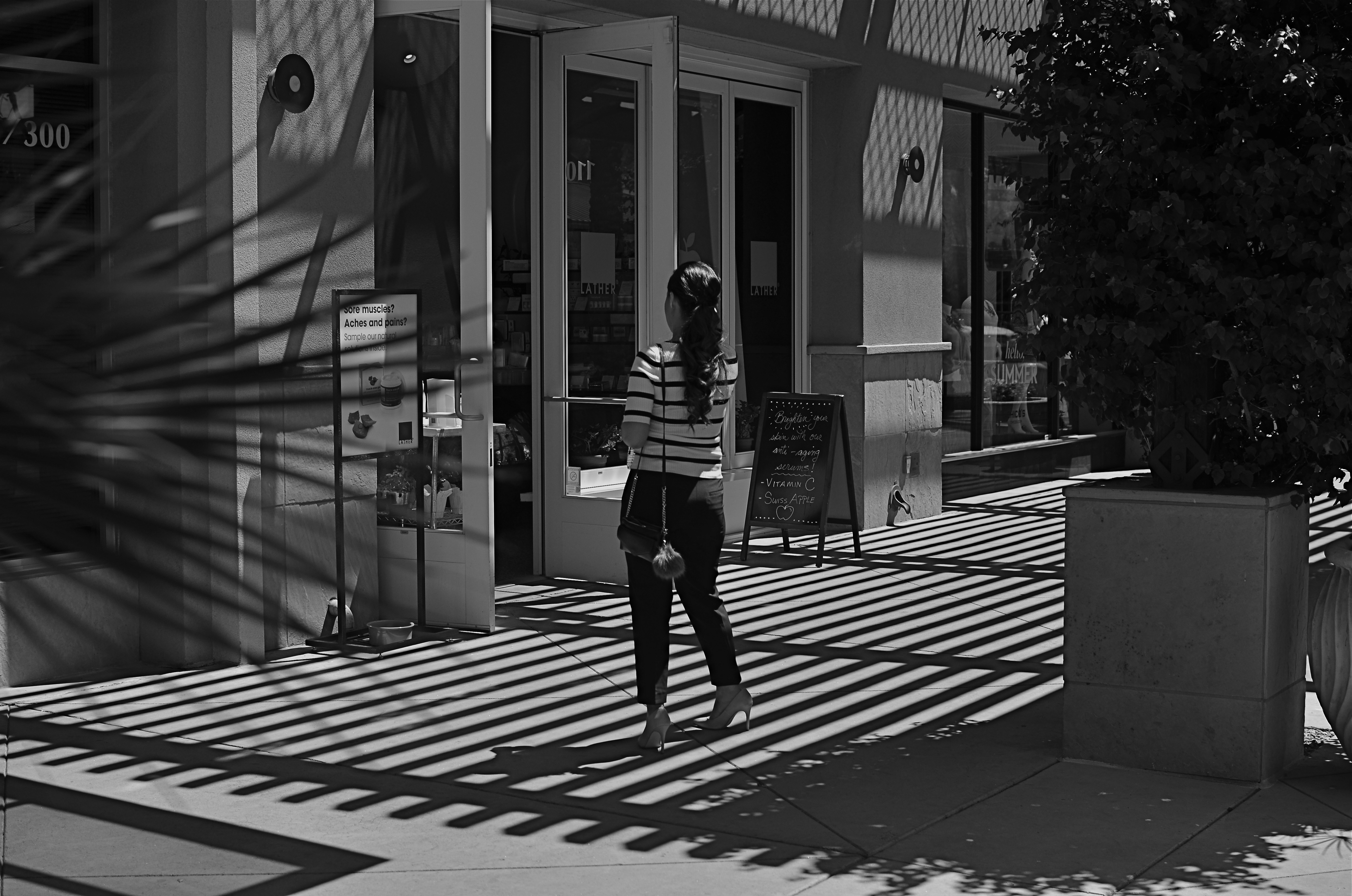
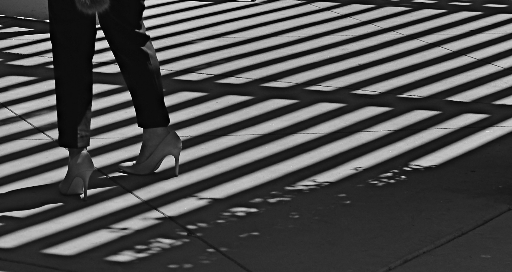
This image lingered in the “maybe” pile for a while. Then I started to see how much of it was expendable (see below).
By MICHAEL PERKINS
IT’S ENTIRELY POSSIBLE THAT MANY A WORKABLE PHOTOGRAPH HAS ONLY BEEN RENDERED SO BECAUSE OF SHEER BOREDOM. Face it: there are bound to be days when nothing fresh is flowing from one’s fingers, when, through lack of anything else to do, you find yourself revisiting shots that you 1) originally ignored, 2) originally rejected, or 3) were totally confounded by. Poring over yester-images can occasionally reveal something salvageable, either through processing or cropping, just as they can more often lead one to want to seal them up behind a wall. Even so, editing is a kind of retro-fitted variation on composition, and sometimes coming back around to a picture that was in conceptual limbo can yield a surprise or two.
I’m not suggesting that, if you stare long enough at an image, a little golden easter egg will routinely emerge from it. No, this is where luck, accident, and willpower usually converge to sometimes produce…..a hot mess, and nothing more. But leaving a picture for a while and returning to it makes you see with the eye of the outsider, and that can potentially prove valuable.
In the above shot, taken a few months go, I had all this wonderful gridded shadow texture presenting itself, shading what was otherwise a very ordinary stretch of sidewalk. A thought emerged that the stripes in the woman’s short might make an interesting contrast with the pattern of the shadows, but, after cranking off a frame or two, I abandoned the idea, just as I abandoned the shot, upon first review.
Several big bites of the scissors later…
Months later, I decided to try to re-frame the shot to create a composition of one force against another…..in this case, the verticality of the lady’s legs against the diagonal slant of the shadows. That meant paring about two-thirds of the image away. Originally I had cropped it to a square with her lower torso at dead center, but there seemed to be no directional flow, so I cropped again, this time to a shorter, wider frame with the woman’s form reduced to the lower half of her legs and re-positioned to the leftward edge of the picture. Creating this imbalance in the composition, which plays to the human habit of reading from left to right along horizontal lines, seemed to give her a sense of leaving the shadows behind her, kind of in her wake if you will. At least a little sense of movement had been introduced.
I felt that now, I had the tug of forces I had been seeking in contrasting her blouse to the opposing grid in the master shot. I’m still not sure whether this image qualifies as having been “rescued”, but it’s a lot less busy, and actually directs the eye in a specific way. It will never be a masterpiece, but with the second sight of latter-day editing, you can at least have a second swipe at making something happen.
POCKET MASH-UPS
Cross-Purposes (2016)
By MICHAEL PERKINS
IT’S TRICKY TRYING TO TRACK THE HISTORIC ORIGINS OF PHOTOMONTAGE, or to even isolate great early practitioners of the technique. Suffice it to say that, ever since the development of the glass negative, people have wondered what it would look like if you stacked one of them on top of the other and printed the result. Opinions vary wildly as to whether the results of such experiments constitute madness or miracle…it’s a taste thing. One thing is clear, however: the mobile age presents easier means than ever before for diving in to the montage pool and creating fast experiments at a fraction of the hassle experienced in film days.
(Now is the part where you decide whether that’s a good thing…..)
One of the top benefits of phone-based cameras is the huge number of highly responsive apps targeted at the tinkerer, the guy who wants to try just one more filter, one more effect, or a grand mash-up of everything together. Unlike the days of lab-based development and printing, digital montages are almost an immediate thrill. Better still, they can be re-imagined and re-done with the same short turnaround time inherent in all digital processes. That means that certain types of shots that would have priced themselves out of many a film shooter’s budget or know-how in Film-World are now just givens in Digital World.
(Now is the part where you decide how you feel about that…..)
Immersive Experience (2016)
If the same tools for experimentation or interpretation are in everyone’s hand, then such effects are no longer judged as wonderful just because they are rare, or novel, but for how well they are employed. In fact, a gimmick like photomontage can quickly become tiresome if over-used or under-inspired. The sample shots in this post are two-image composites processed on an app called Fused, which allows two photos at a time to be overlaid and custom-blended for a variety of contrast and color tweaks. Sometimes the effect can help pictures which are totally dissimilar find some common bond, but, at least for me, about 90% of the blends I try are kinda meh and are sent to the Phantom Zone faster than you can say “well, that didn’t work”. You can’t force the linkage just to be arty (well, of course you can, but..).
Pocket mash-ups are just one more way to untether photography from “reality” (whatever that is), and channel it into a personal form of abstract expression. That means it’s all about you. So what’s not to like?
TONAL RECALL

Desert still-life, take one. High contrast, simple color scheme.
By MICHAEL PERKINS
IF YOU WANT TO GET ALL MYSTICAL AND OOKY-SPOOKY ABOUT PHOTOGRAPHY, you can almost talk yourself into the idea that pictures kind of force their way past you on the way to their eventual best form. And, yes, I can hear your eyes rolling back in your head at the notion that an image is somehow destined to be created, that it emerges from your process almost despite you, like a rock that is pushed up through the earth by shifting tectonic plates. However, I have taken a handful of such pictures over a lifetime, as, no doubt, have you yourself, pictures that seemed to keep coming forth even beyond your first false steps until they reached their fullest expression.
Gee, is that incense I smell? Ommmmmm….
What I’m fumbling for here is a shared experience, and I do think that every photographer has had a semi-magical instance in which a photo almost taunts you to figure out how to make it work. Even in the best shots, there are moments of aching regret, maybe years down the path, that, had one or more things gone differently in the picture, it might have been eloquent or consequential. I truly believe that this very “so near, yet so far” quality is what keeps us in the hunt. After all, for the hunter, it’s the tiger he hasn’t been able to bag that calls louder than the ones already mounted over the mantel. So with photos. We are always singing the blues about the one that got away.
A monochrome re-mix from months after the original was snapped.
That’s why I’m a big believer in thinking of images as never really finished. They are, at best, preliminary studies for something else, picture that we still need to grow in order to complete. We lay them down, dissect them, re-shoot, re-imagine, and re-edit them. If you bend your thinking around, you can become comfortable with the fact that everything is a dress rehearsal for something that hasn’t arrived yet.
One of the starkest demonstrations of this fact is shots that were originally conceived as color images but which were later re-thought in monochrome. Nothing accentuates or streamlines your choices like shaving your tonal palette to the bare minimum. And, in the same vein, nothing makes you surer (or more unsure) about an image than reducing it to its simplest terms.
I think that, even as we are constantly expanding our arsenal of visual techniques, seeing them as growing, living things, so too we must think of our images as points on an evolutionary line, rather than final product.
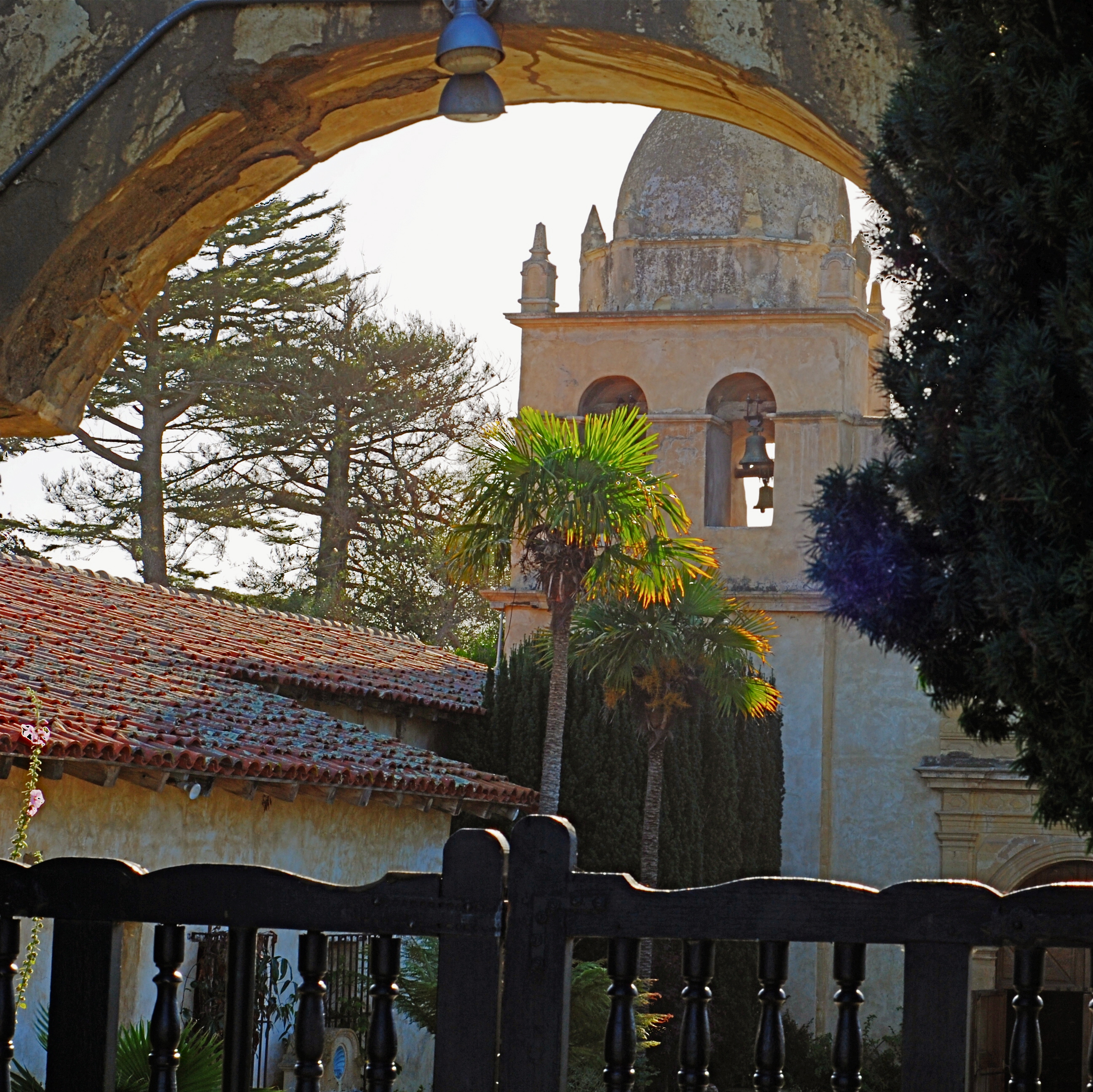
A CUT BY ANY OTHER NAME….
The first framing of this image included too much greenery on the right side, so it was cropped, then repositioned to make a “second” framing from the arched opening in the outer wall.
By MICHAEL PERKINS
THE WONDERFUL THING ABOUT COMPOSITION IN PHOTOGRAPHY is that you always, always, have a backup plan. What you don’t frame correctly in the actual shooting of an image can be corrected in post-editing cropping, the use of “framing” within the composition itself, or even how you finally matte the picture before hanging it on the wall. This is as it should be since many pictures are not so much born as re-imagined.
Once you frame a photo, you’re giving the viewer the first visual cue as to what to regard as important. If I included it, you should notice it. If I excluded it, it’s either to set loose your imagination on why I defined this world within these parameters, or because I, as the narrator, am telling you it just don’t matter. You can even further enhance the effectiveness of the frame by its shape. A rectangle might enforce the reading of information left-to-right, for example, while a square might force the eye toward dead center. The original framing is your own best call to action in a photograph.
And even after you’ve defined the frame, you can still add a second directive within it to hyper-focus attention in a very specific space. The use of arches, building overhangs, edges of windows, cliffs, shadows or other secondary “frames” provides even greater cues to the eye, and also adds an illusion of dimension and depth.
In the above shot, the old stone basilica is obviously the main feature of the image, and so was cropped from a wider original to eliminate distracting foreground shrubbery on the right. However, the arch through which the building is viewed was retained, to act as a “secondary frame” and as a way to illustrate scale. The first frame says what information is important, while the second frame makes sure we get to the heart of the image more efficiently.
Using all framing devices available in an image is like using caps, lower case and italicised letters in the same sentence. Composition is about yelling to get people over to your picture, then whispering, as you gently guide them toward its heart.
