OUT OF ONE, MANY
By MICHAEL PERKINS
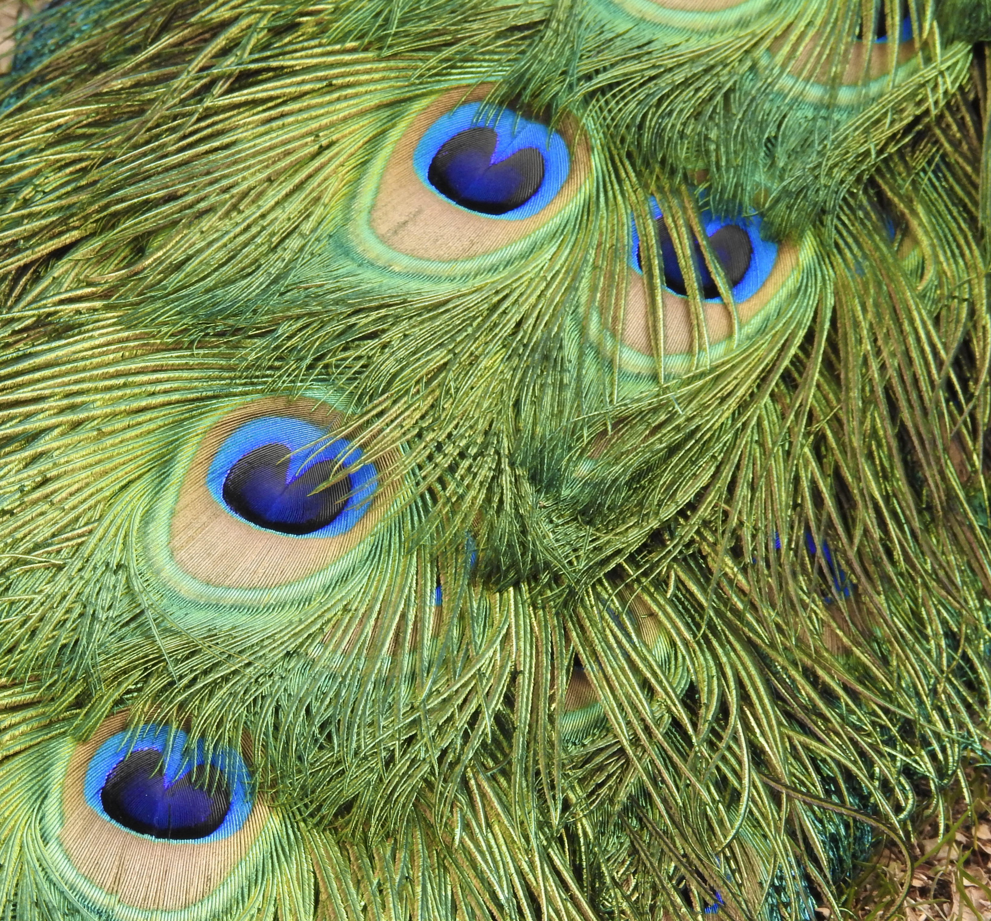
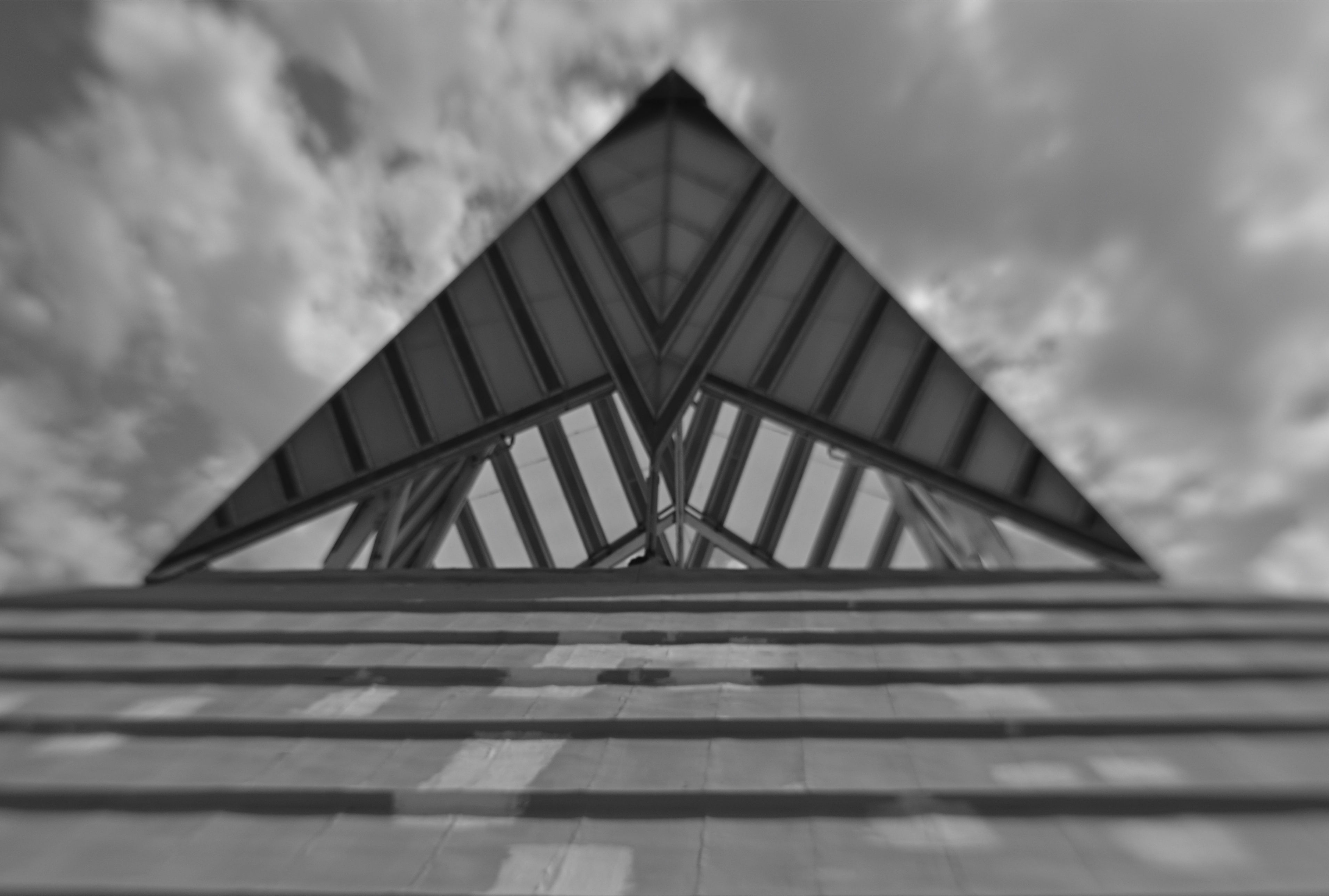
SOME PHOTOGRAPHIC SUBJECTS ARE SO DENSE that they simply give the eye too much to decode or prioritize. When in the act of shooting immense or complicated compositions, I often fail to see that I am taking in enough information for two or more completely different images, and that wielding the scissors this way or that can drastically re-direct the intention of the picture. This is perhaps why shooting vast landscapes only works occasionally for me as wholes. I see the mountains and the neighboring farmlands and the barns and the babbling brook and am never certain if, in a single frame, I’m actually creating more confusion than clarity.
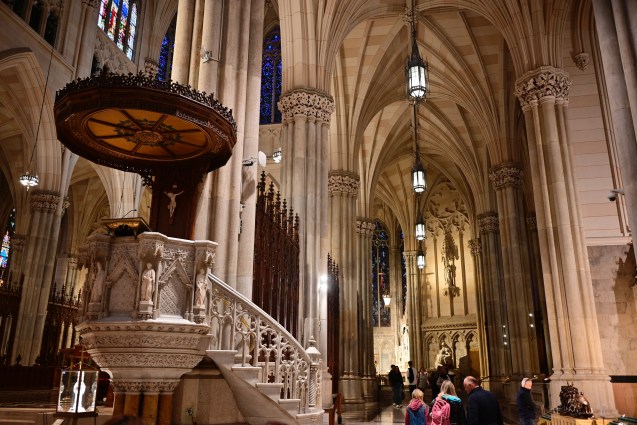
One recent example of my not being aware of this, at least not in the moment, happened last year as I stepped inside St. Patrick’s cathedral in midtown Manhattan. This massive space was devised in a time when going to church was a sensory experience that was designed to be overwhelming, to inspire awe, where even the cheap seats afforded complex, competing vistas. In taking a rapid series of snaps, however, I came away with a feeling of sensory overload, with many images containing more than enough information to be cropped by half, or even two thirds.
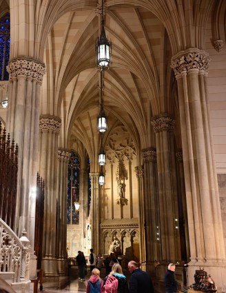
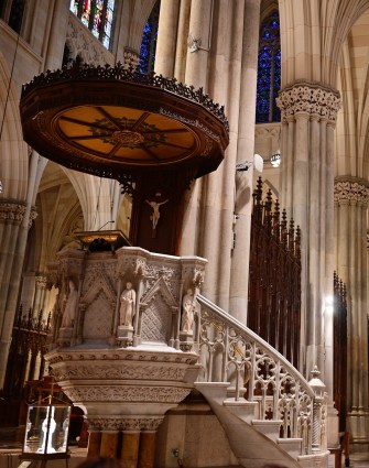
The original frame, seen up top, sends my eye looking into so many sub-stories at once that a general view is, well, too much of a good thing. A left-handed crop (middle image) make the picture about something, as attention is now centered on the beautifully ornate pulpit. Cropping to the right, we see a story that could be about worshippers on a journey; that is, heading from front to back in search of something, perhaps the devotional altar in the distance. All cropping is, of course, a creative act all its own, with its own dictates and designs, and sometimes a very busy image can be stunning (think a complex overhead skylight of concentric stained glass panels). However, many of the big canvasses we shoot could be, if you will, subdivided into even more effective individual parts rather than one stunning whole. Reviewing our old so-called “very good” pictures can often find a “wow” picture hiding within.
PRODUCTION FOR (RE) USE
By MICHAEL PERKINS
PHOTOGRAPHERS TOGGLE BETWEEN TWO APPROACHES TO SUBJECTS, two very distinctive ways of justifying something’s place in a picture. The first, which almost exclusively defined the first age of the young art, was largely about documentation, creating the first visual chronicle of human experience. This surge of reportage resulted in a huge spike in tourism and travel in the 1800’s, immortalized in the billions of post cards and stereo views that “covered” the entire world. We mapped the globe to give everyone their first look at what was going on in the lives of everyone else, with magic lantern presentations and illustrated lectures on the pyramids, the Parthenon, a real, live Indian elephant. We catalogued.
The other approach to subject matter is far more abstract and interpretive. We mechanically capture an object in the same way, but we gentle massage composition, light and lenses to suggest all of the things that it might be, not merely what it is in nature. In this kind of picture-making, we ask the viewer to suspend their instinctual judgement of what they’re looking at and share in the shooter’s idea of all the things that it suggests. In such a situation, to know what a subject actually was designed to be, or do, is actually rather, well, dull, compared to what the mind, freeing itself, will allow it to become. If I were to open up a discussion, for example, on what the true use of the structure shown in the above frame was, just given what’s shown in the image, I’d likely open up a pretty rangy chat, whereas, if I were to photograph the same thing in the context of its intended purpose, it would serve as a document, but not as a point of departure.
Both approaches to material, either the prosaic and the poetic, can make for compelling photographs. As is usually the case, the photog sets the terms of engagement, and decides what kind of conversation he wants to start.
*********
( Note: THE NORMAL EYE is an archive of every article posted on this blog over its first twelve years. To search for posts from any month or year clear back to 2012, just scroll to the very bottom of any page and click on “Post Timeline”. )
THE DEVIL’S IN…
BY MICHAEL PERKINS
THE WAY IT USED TO COULDA MIGHTA OUGHTA
By MICHAEL PERKINS
COMBINE A NEW SERIES OF MOVES TO GENERATE AN EFFECT, and you are likely making art. Reduce the making of that same effect to a predictable rote series of steps with a uniform outcome, and you are likely making craft. Photography is a series of calculations: a certain adherence to rules will give you a solid framework in which to create. Slavish service to those same rules will make that framework a cage and imprison your vision within the confines of mere habit.
The comedian Lenny Bruce was famous for saying, “If I do something more than once, it’s a bit”, meaning a routine, to merely be recreated or played back, on demand….the opposite of creativity. I make mention of this because I fear that my own satisfaction with routines…how reliably they work, how comfortingly familiar they are…..can creep into my photography and replace all the vital blood in its veins with concrete. It’s an insidious trap. Repetition can act as a kind of sedative. Feels great in the moment, but soon you’re sleepwalking through the process. Photos become mere product. You can actually feel when all of your picture-making habits start morphing from a protective roof to a crushing winepress.
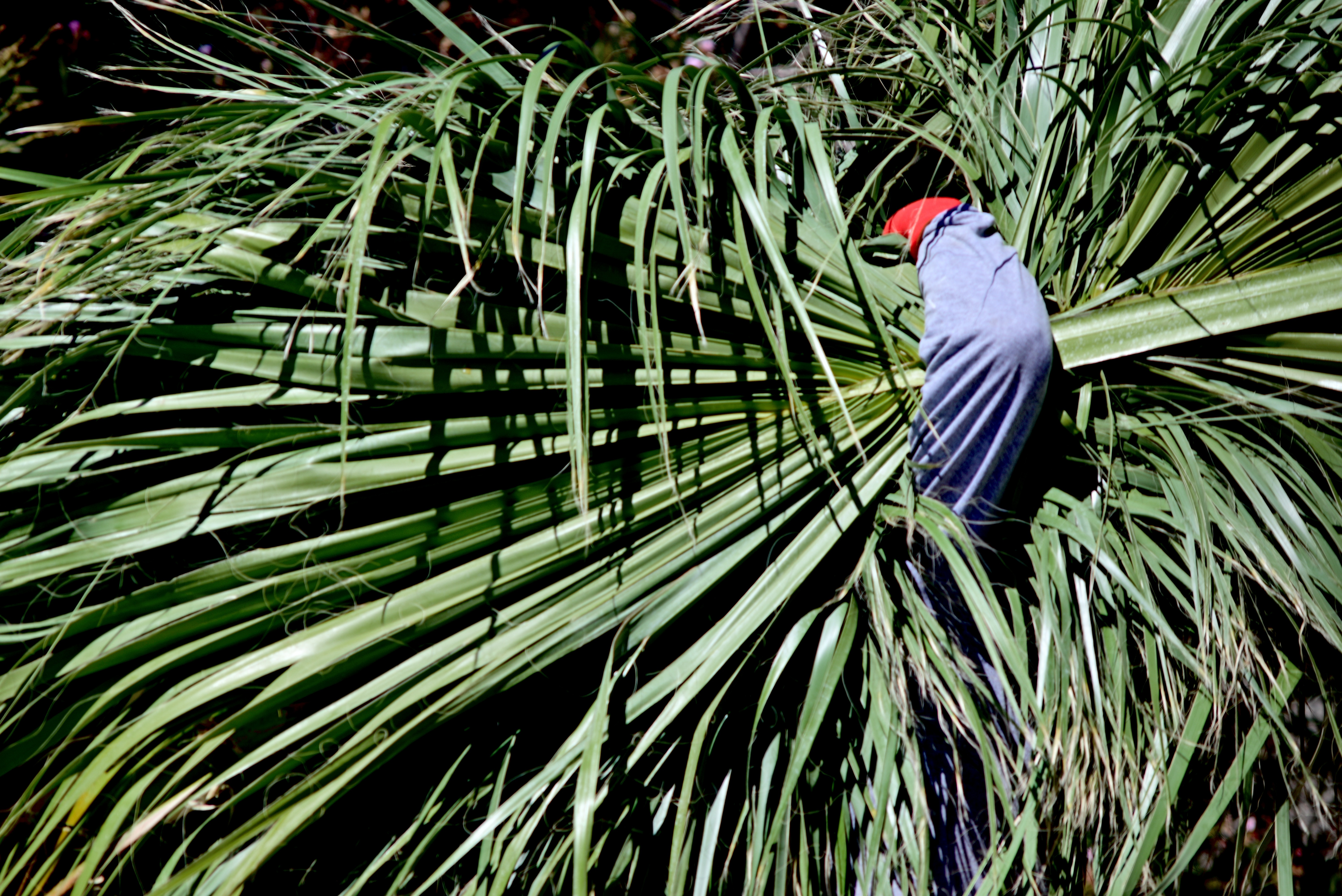
Fan Dancer, 2022
One remedy I try, to shake things up in these moments of torpor, is changing out gear to something, anything that I don’t think will work at all, or which may at least force me, through partial misuse of it, to think less habitually. Think of it as the difference between lighting a fire with a match or witching one up out of damp sticks. In the picture seen here, one of dozens I’ve made over time of the steeplejack daredevils who climb up and trim super-high palm trees in the southwest, I was actually forced to use a 300mm manual focus telephoto that was attached to the only camera I could reach in time for a shot. The nearest “appropriate” alternative was half a house away, and, meanwhile, this guy was hauling away the debris from his job at a good, er, clip. That meant making an attempt with something that was zoomed in way too far in relation to the distance between him and me. It meant focusing on the fly with a 1970’s lens barrel that is not exactly greased lighting. Oh, and to make things interesting, I could go no further open than f/4.5, so there would also be shutter speed fiddling to factor in. None of it should have worked.
Oddly, the minimal information forced on me by the close-at-hand framing, which now had eliminated all other context of size or place, actually made the worker’s crooked arm counter-balance the frond fan in an almost Asian fashion. A shy little Geisha gardener? I liked it. Could I do it again, on purpose? Not the point, really. What made me alert enough to maximize my opportunity in this case was the sheer uncertainty of the whole attempt. Now, all I have to do in future is resist saying, in the future, “whenever I shoot this kind of image, I always, always….”
Or else, in Lenny’s words, I’m just doing a bit….
OTHER EYES, OTHER WINDOWS
By MICHAEL PERKINS
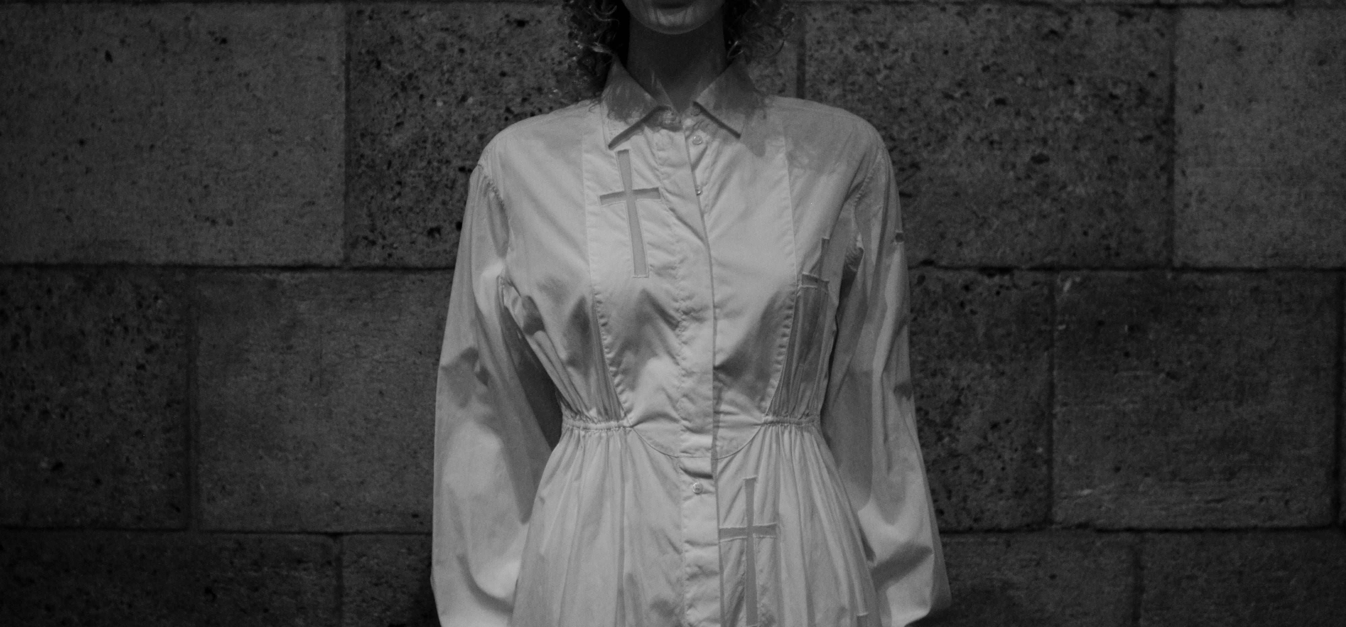
MOST OF THE FORMAL TRAINING IN PHOTOGRAPHIC PORTRAITURE rightly emphasizes the eyes, those so-called “windows of the soul”, and it’s hard to argue with their weight as indicators of the inner mind. But, in reality, every facial feature can be eloquent in conveying that which comprises the individual: love, fear, hate, happiness…whatever mix of outward cues that connote personality in a photograph. And it’s also true that, generally speaking, one’s face is a more reliable identifier of traits than, say, an arm or an ankle. However, portraits are loaded with information that occurs from the neck down as well, and a good deal of it can be mined for solid indicators of just who it is we’re looking at. And while we concede that most of us would never deliberately cut the top off a subject in everyday practice, (as seen here) doing so, at least for this exercise, illustrates just how much data can be left to work with when we, in a sense, lose our head.
Habit, 2019
Clothing, regalia, body language, even something as basic as color…all these come ripe with codes about the life of the individual under consideration, and can be as valuable in portraiture as the face itself. Now, the idea of recommending that you re-examine your favorite portraits without considering their facial information is not to convince you to choose someone’s suit or hand over their face, but to increase our consciousness of what besides the face can amplify and deepen our sense of the people we photograph. I have seen many images where the depth of field was so narrow that, from the eyes outward, most of the face is largely softened, with everything else outside that narrow radius so blurred as to yield virtually no information. And, yes, that approach works wonderfully in many instances. Still, I am the very last person to propose any ironclad rule that always works or never works, since I believe that absolutes have no place in art. Every case must be considered separately.
So long as people are much more than merely their faces, I believe that everyone who works in portraiture should cultivate the habit of looking at every subject as a unique mix of elements, resulting in a range of pictures where sometimes the face is everything, or is sometimes just a thing among others, and occasionally is of no importance at all. The eyes may be a vary reliable window to the soul, but there are always other kinds of eyes, other kinds of windows.
OPEN/CLOSED
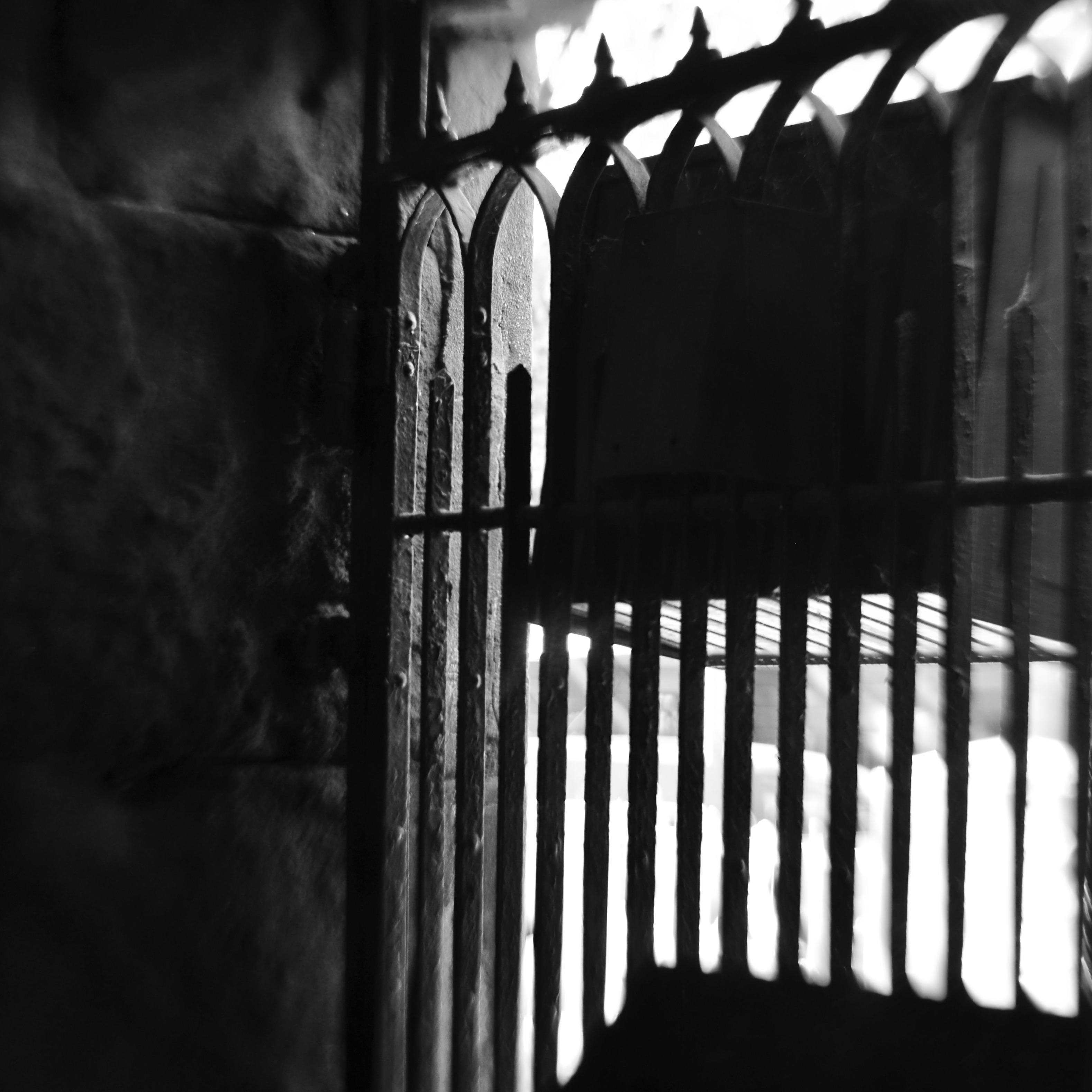
No admittance. This means you. But what else does it mean?
By MICHAEL PERKINS
JUST AS NUMBERS AND LETTERS ARE SYMBOLIC OF THINGS LARGER THAN THEMSELVES, cues in photography act as a visual vocabulary, a kind of shorthand for more complex ideas. This way of showing ideas through a commonly recognized series of signals means we don’t always have to explain everything from scratch every time we create a picture. In order to convey the idea of a train, we don’t have to show the entire history or design of locomotives: a railroad crossing sign sells the concept immediately. And so, as storytellers. we use symbols to get to the point faster, and, nearly two centuries into our shared art, the shortcuts get more compact and more immediate with the passage of time.
One of the ideas that we convey in this way is the idea of limits or barriers, especially images that show confinement or limited admittance. Signs, lights, gates, traffic cones, warning signals, all convey a ton of information in a short space of time…everything from beware to keep out. These cues also allow a photograph to be all shorthand, to be about the limit or barrier. The image seen here adequately conveys the idea of a physical limit with a very meager amount of data. Even resolution itself has been relaxed, leaving just the suggestion of textures that are typically rendered in fine detail. There are no clearly readable signs, no clue to what the viewer is being kept from, no idea of whether the gate represents safety or repression. And while this symbol conveys a limit on our movement; everything else is open to interpretation. In some cases, not revealing what lies beyond the gate may make for a more intriguing image than if the photographer were to show everything in full. The beauty of this process is that most photographic ideas can be expressed with a very spare inventory of information, as our eyes have learned, over years, to see interpretively, enabling us to decode what the photographer as encoded. It’s a very intimate relationship.
All of which, I believe, argues for making your picture’s case in as few strokes as possible. We still pay more attention to framing, i.e., what fits in the rectangle, versus composition, or the arrangement and selection process within the borders of our pictures. We sometimes overcrowd and oversell messages which may be conveyed more effectively with much less information. Learning how to say more with less comes slowly; we need to build up a substantial log of attempts before we can begin to tweeze out the most effective amongst them. But that is the difference, as we often say, between taking a picture and making one, or the difference between pictures that are merely nice and those that are essential.
SQUARING UP YOUR SHOT
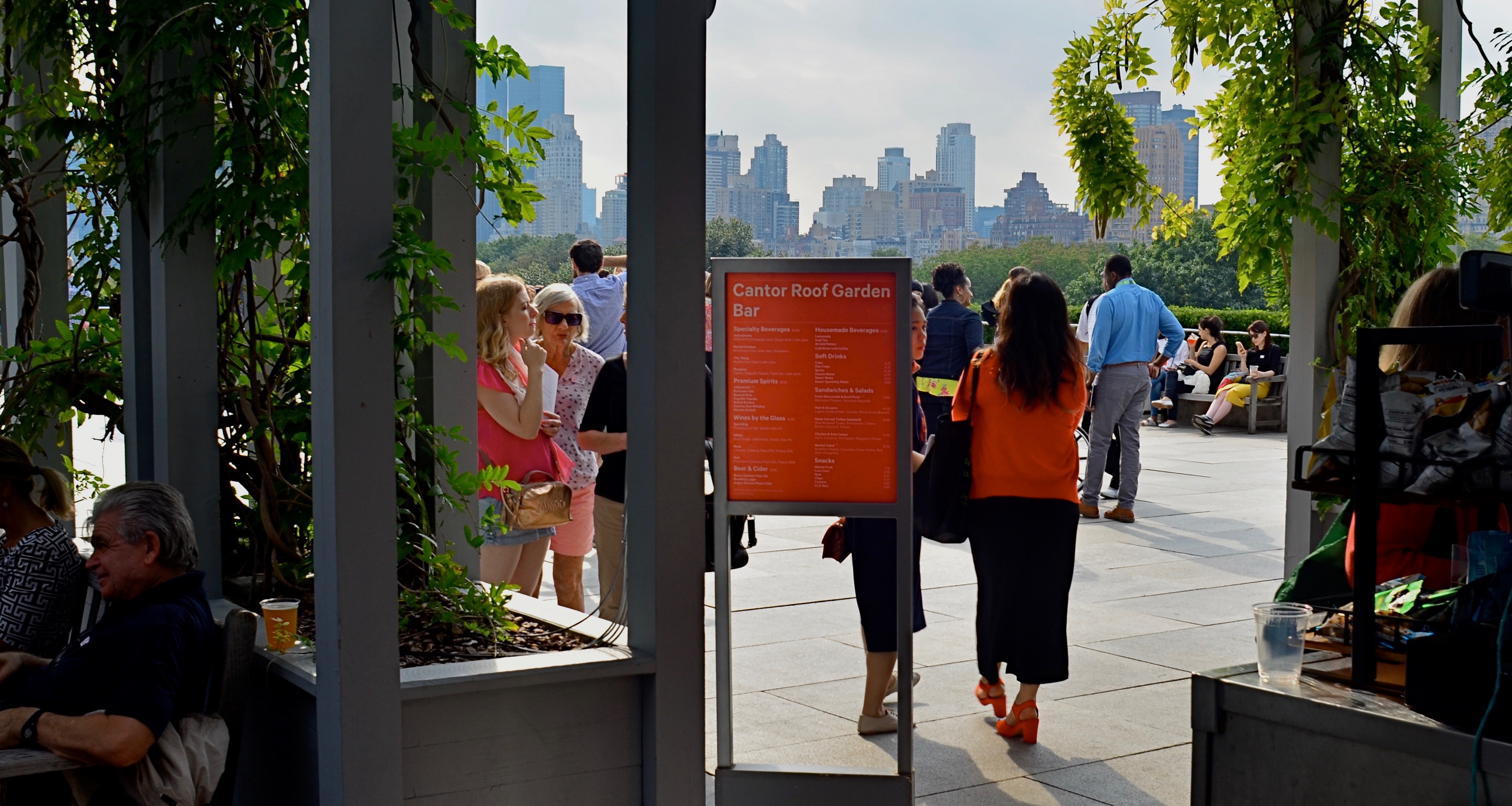
Master shot, taken at the entry to a roof garden atop the Met museum in Manhattan.
By MICHAEL PERKINS
IN THE PRESENT PHOTOGRAPHIC ERA, the default frame for composition is, with some notable exceptions, a rectangle, the 3-to-2 ratio that is the descendant of Oscar Barnack’s first 35mm Leicas of the late 1920’s. Most of us have been taught to automatically compose in this format, a hard-wired habit that informs our entire concept of how to fill a frame. The “notable exceptions” I refer to are the square films that have accompanied the return of instant photography, the lomography movement with its square-framed analog film formats, and, by virtue of a built-in app choice, the mobile phone. Strangely, some of the most sophisticated cameras on the market do not allow you to shoot an original square image: the shot must be captured in a 35mm equivalent and cropped later. But that’s a rant for another day.
The thing is, if you don’t typically investigate square composition, you are robbing yourself of an important tool, or, more specifically, you are allowing yourself to always see subjects in the same “frame” of mind. There are distinct advantages to creating a square composition, not the least of which is that it forces the viewer to take in your picture’s information in a distinct way. While shots that are wider than tall are marvelous for any number of reasons, they do, in effect, invite the viewer to scan an image linearly, that is, to look left to right and back again. By contrast, the square reinforces its equal dimensions, almost forcing the eye into a continuously circular sweep of the contents. I hear people complain that a square just “doesn’t give me enough room to get everything in”: however, I would counter that argument by contending that, in many 3/2 compositions, there is a wealth of visual information that not only is not needed, but actively distracts the eye from the most interesting parts of the photograph. Think of a glass of ice tea that, over time, actually has more volume in it, due to melted ice, than was originally poured into the glass. More liquid, but a greatly diluted flavor.
The problem is not that many square images aren’t being made…far from it. It’s that they are, in many cases, being re-made from rectangular originals, in the editing process. We have to shoot wide and edit square. But therein may lie the best way for us to start seeing what a square composition can do, not merely to define the space of a picture, but to invite the viewer into it more efficiently. And it’s easy and cheap to do it.
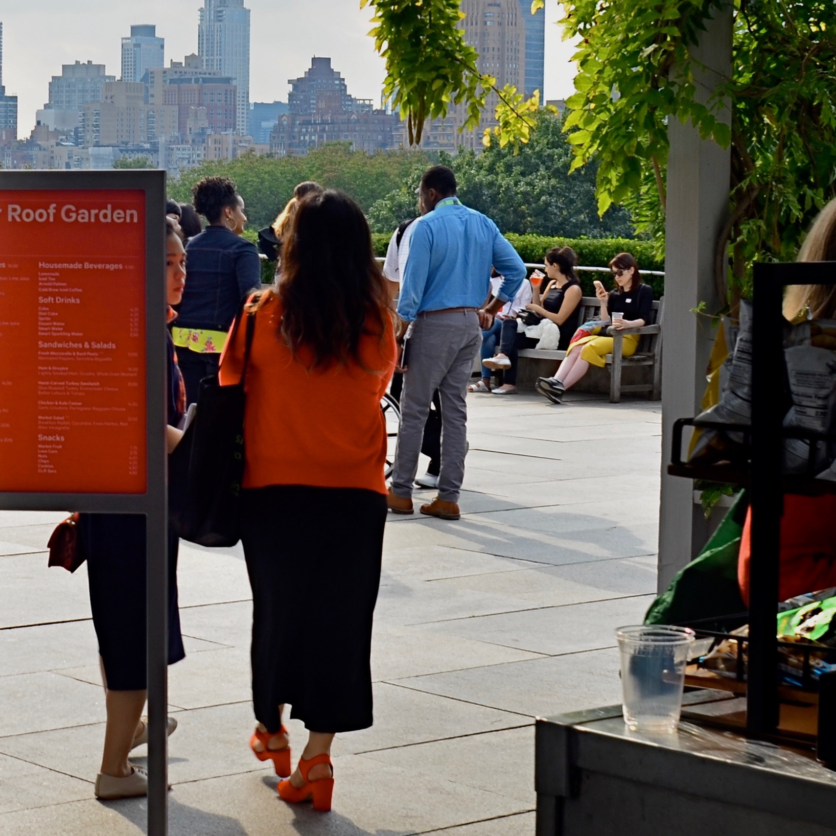
The above image recomposed as a square shot. Net loss or net gain?
Try this: select a series of wide master shots that you feel fairly strongly about, dupe work copies of them, and then crop new compositions within the copies. Junk the ones that don’t work and do as many re-takes as you see fit. Did any of the cropped images emerge as stronger without all that extra stuff you originally felt you had to include? And even if they did not, that’s also a good thing. The mere fact that you’ve begun to intentionally look for pictures within pictures means you’ve entered a new phase of your vision as a photographer. We’re certainly used to thinking of pictures that “came out pretty good’ as final or complete, but it’s a good thing to think of them instead as workable drafts. In the wider shot seen ay top, I successfully conveyed that people were stepping onto the roof of the Met museum in NYC, but I also got a lot of things in the shot that aren’t necessary to the telling of that story. The main tellers in the picture are the two women, who, like us, have just arrived. They are our surrogates or guides. Cropping actually makes the red of the sign in front of one of the women cry for your attention, guiding you to the women even as it partly conceals one of them. Additionally, the same top to bottom space that they occupy also shows part of the skyline that borders Central Park. The front to back scale of the shot says “on the roof, in the city”, at some distance.”
So judge for yourselves, as you would with your own pictures. Did anything I took away in cropping diminish the impact of the picture? Does the lower frame now feel open, cramped, or, in Goldilocks fashion, about right? Is there an appropriate emotional distance from the subject, or a welcome intimacy with it? Is there, in short, an overall net gain for the narrative power of the image once it’s been cropped? And most importantly, even if this experiment fails (with the wider picture still being stronger), haven’t I already begun to see every picture in at least two fundamentally different ways? New ways of seeing are among the most powerful tools in a photographer’s kit. The world of cameras may indeed default to a rectangle, but that doesn’t mean our brains need to follow suit.
WHEN NOTHING TURNS OUT TO BE EVERYTHING
By MICHAEL PERKINS
EVER SINCE ADAM AND EVE BIT THAT DAMNED APPLE, humans have demonstrated that the thing they really want is the thing they are told they can’t have.
Stay with me here: this actually has a lot to do with photography.
Deny somebody something and they will long for it, lust after it, obsess about it. Consider the case of the Portugeuse, who, for a while, tried to run things in Mozambique, in order to harvest that African nation’s rubber, and who told the locals that their traditional ceremonial instrument, an early kind of xylophone called the mbila, would henceforth be forbidden as a cultural expression. As a result, an entire underground of information on how to play it was maintained by exiled miners, prisoners, and assorted other rebels. The result? Eventually the Portugeuse left: the mbila stayed. Today, the instrument is even featured on the local currency.
We can’t have it? Wanna bet?
Humans. Go figure.
But back to photography, where, similarly, the thing we are “told” we “can’t have”, at least in an image, is whatever is left out of the frame. Missing detail. People rendered in shadow. An activity that’s implied by the manner in which part of it is cropped. We love what the photographer shows but we hunger for what he leaves out.
Subdued Baywatch, 2019
Out-the-window shots are a great source of this phenomenon, since shooters are usually forced to expose for either what is in front of said window or beyond it….but seldom both. The rise of HDR and tone mapping in recent years has tried to address this, rendering everything in the same degree of illumination, often with bracketed exposures, from light to dark, that are blended afterwords in software. But there’s a problem. Many HDR’s are simply over-processed, defying the mind’s knowledge of the proper relationships between light and dark. Everything’s visible but can easily be garish, unnatural. And so many of us go back to simply deciding what selected parts to illuminate in an image, and which to leave undefined. That means some darkness, which in turn means some things don’t get shown. And, if we’re lucky, those things that we don’t reveal can be more tantalizing than those that we do.
I was walking around the back of the old Terminal building in San Francisco, which is the place that all the city’s ferries used to dock and disembark before the Golden Gate Bridge was built, making many daily boat trips across the bay unnecessary. The building now houses eateries, produce stands, and an insane amount of tourist traffic, much of it crowded into restaurants such as the one seen here. The view out the back includes the Bay Bridge and the local ship traffic, as well as the occasional sailboat, such as the one seen here. I exposed for the scenery, leaving the restaurant’s patrons and workers in shadow. The scalloped, rather “peek-a-boo” view that resulted keeps the image from being a standard postcard shot, but while that “purity” is lost, what’s gained is a smidge of mystery about the shadowy folks in front. What are their conversations about? Why are they here?
I am just suggesting here that, instead of always regarding an image like this as a “blocked” or “obstructed” view of a scenic vista, you can choose to tantalize your viewer by providing a partial reveal of both foreground and background, since their inclination is already, like that of Adam and Eve, to obtain what they’re denied (in this case, by the exposure and the limits of the frame). Sometimes, in a photograph, a nothing can be a very important something. It all depends on who’s looking and what they themselves bring to the experience. In that way, they and the photographer are having a conversation. Which is kind of the idea.
LEADING THE WITNESS
 By MICHAEL PERKINS
“MEN ARE NOT INTERESTED“, said Jerry Seinfeld, “in what’s on tv. Men are interested in what else is on tv.”
The joke conjures up an image of some remote-happy goof in a man-cave endlessly clicking through channels in search of something ever better than what he already has. And it’s true, which makes it all the funnier. It also speaks to how all humans, both men and “not men”, view photographs, and how shooters can play to that propensity.
All photos, sliced as they are out of the continual flow of time, come with an implied sense of what went before the click and what’s to come after it. Trying to use the information from a stilled moment of time to mentally supply those two temporal bookends is an ever-fascinating game between photographer and viewer. What happened just before this? What will happen next?
In composing a frame, the photographer uses all the tools at his command to influence his audience’s assessment, including the simple device of leading lines, which can be used to direct the viewer’s eye wherever the artist wants it to go. LLs are usually effective in drawing you deeper “into” a picture that obviously only has two dimensions. Think train tracks at the front of the picture, receding toward the horizon. These lines tell you that you are being asked to go somewhere, and that you should be curious about what’s waiting for you there.
Leading lines can also go from what is shown in the picture to what is implied, asking you to speculate, as in the case of the above frame, what’s around the next bend, or, in Seinfeldian terms, “what else is on tv”. It’s a strange fact that, no wonder what may be shown within a photo, the most fascinating thing to the viewer’s mind, at least, may be the stuff that was left out of it. We all want what we can’t have, and knowing that very human thing can empower a photographer to much more effectively control the frame.
BOOKENDING
By MICHAEL PERKINS
THE HUMAN EYE HAS A SOFT SPOT FOR SYMMETRY, for countervailing energies that face off against each other in a composition. Design elements that pit left against right, top against bottom, even corner vs. corner appeal to a certain Math-Bach sense of balance in the universe. And, as does every other kind of visual art, photography builds strong images by “book-ending” elements in opposition, eye cues both tug toward the center and pull toward the edges.
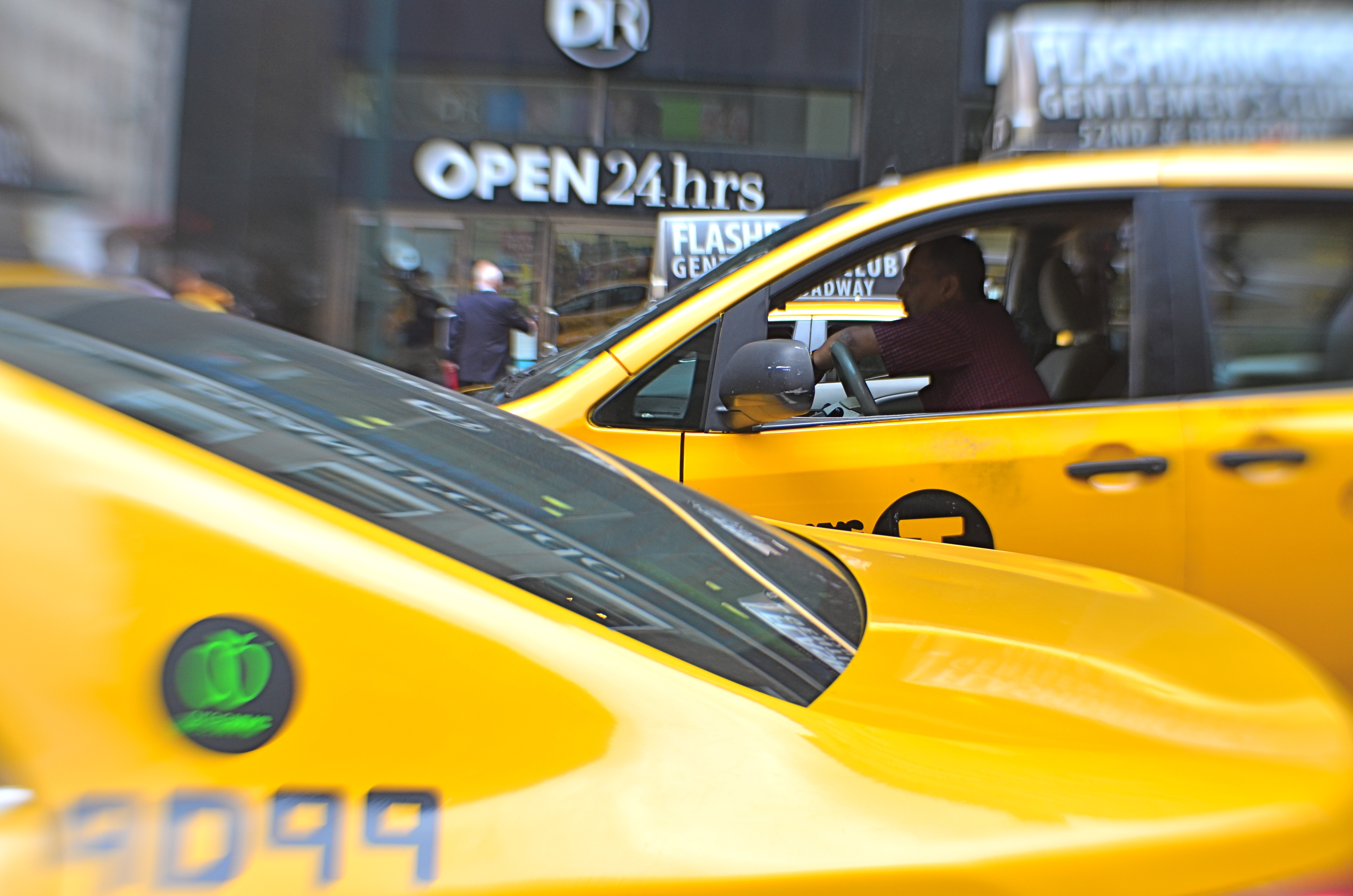
Pictures benefit from this tension, this dynamic argument over what’s more dominant, or, more correctly, what’s dominant in this moment. Book-ending between extremes or contrasting forces is a visual kind of debate, a photographic arm-wrestling match. Sometimes shapes or things occupy opposing spaces in the frame are not, literally, fighting with each other, as in the two overlapping taxicabs seen above. Even so, the two yellow wedges at bottom left and top right in the frame are in a kind of balancing act with each other: call it a conversation.
In your own work, you’ve no doubt observed this visual tension occurring organically or even deliberately built it into a composition. An old building next to a new one: a tragic mask alongside a comic one: a kumquat facing off against a tomato. It doesn’t have to be dramatic to be effective. The bookends can be ornate Greek warriors or abstract slabs: it’s the opposition in the frame that starts the process of yin/yang, and lends a photograph extra heft.
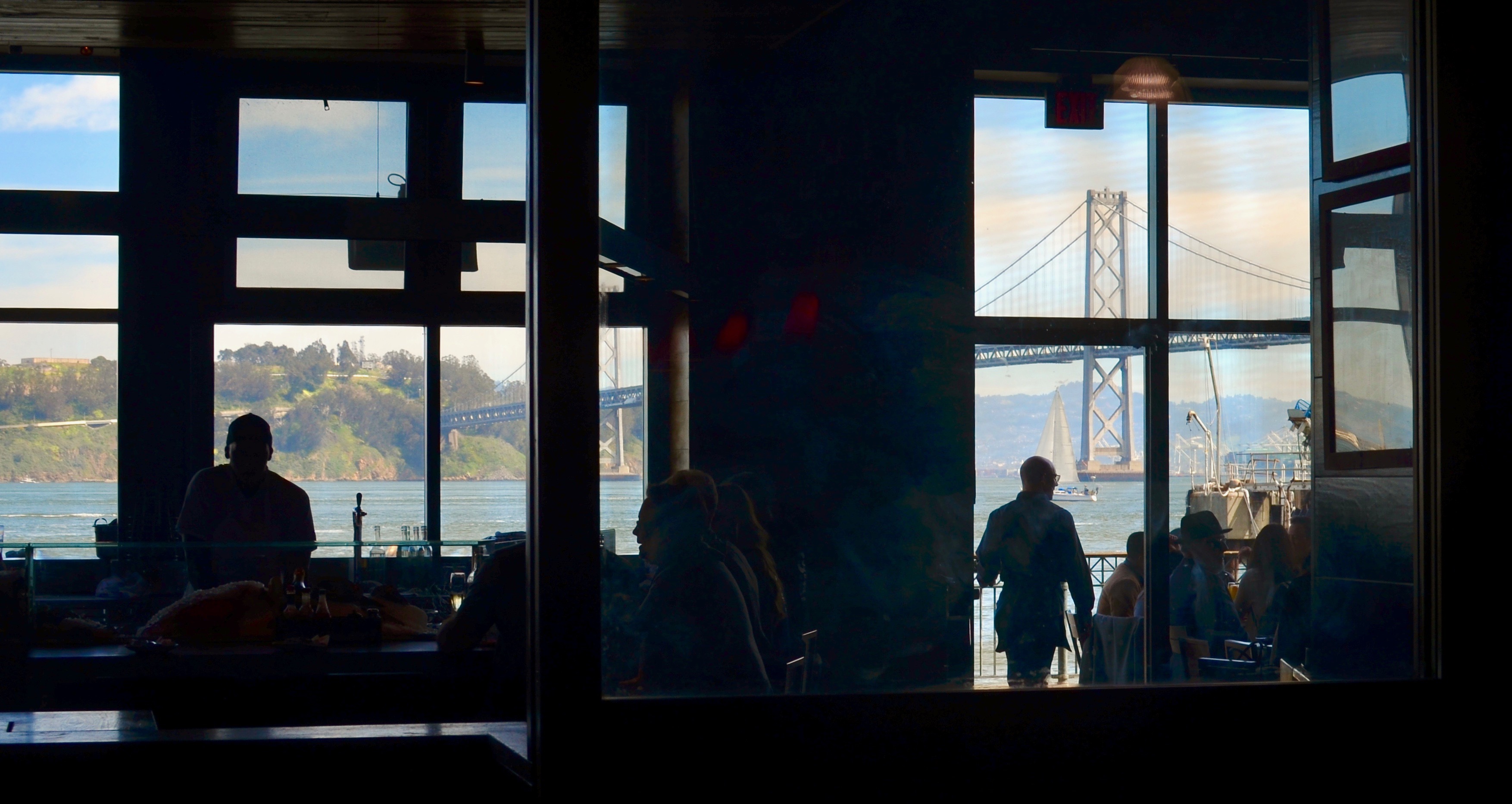
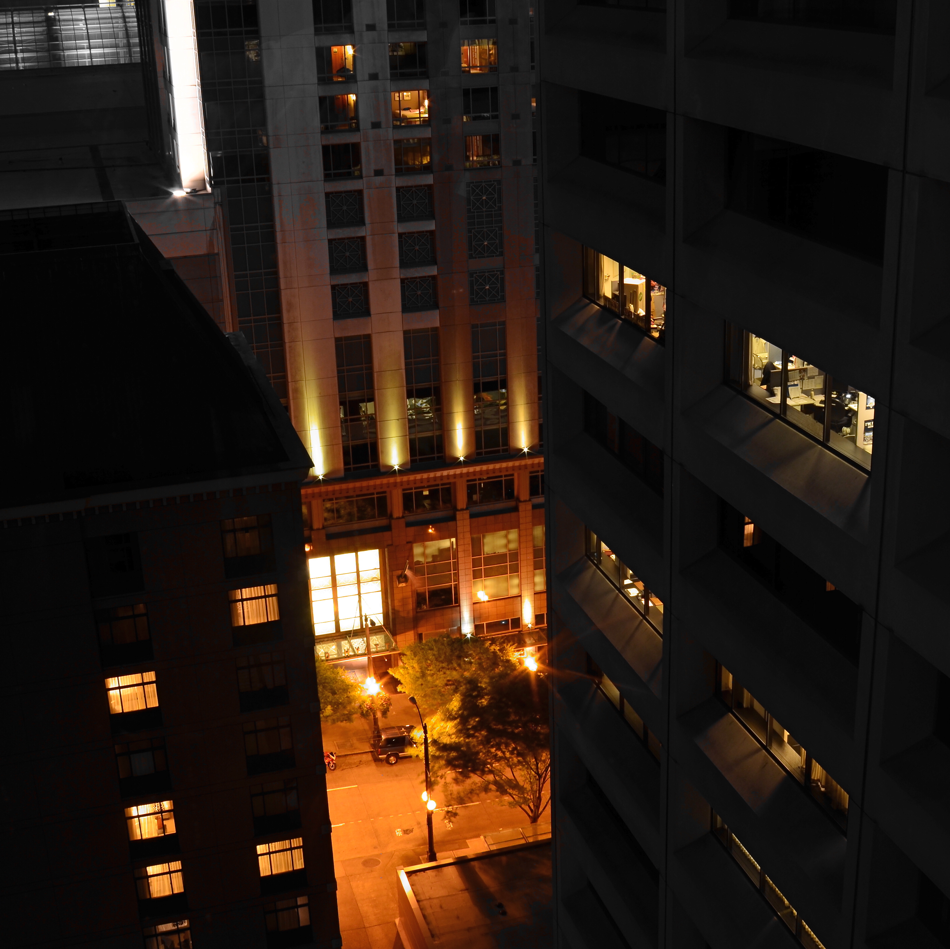
TWO WORLDS, ONE WALL
By MICHAEL PERKINS
PHOTOGRAPHS BEGAN AS A SIMPLE HEAD–ON ENGAGEMENT. The viewpoint of the camera was essentially that of an audience member viewing a stage play, or reading a page of text, with all visual information reading from left to right. People stood in front of the lens in one flat plane, giving the appearance, as they posed before offices or stores, that they themselves were components in a two-dimensional painting. Everyone stared straight ahead as if in military formation or a class portrait, producing fairly stiff results.
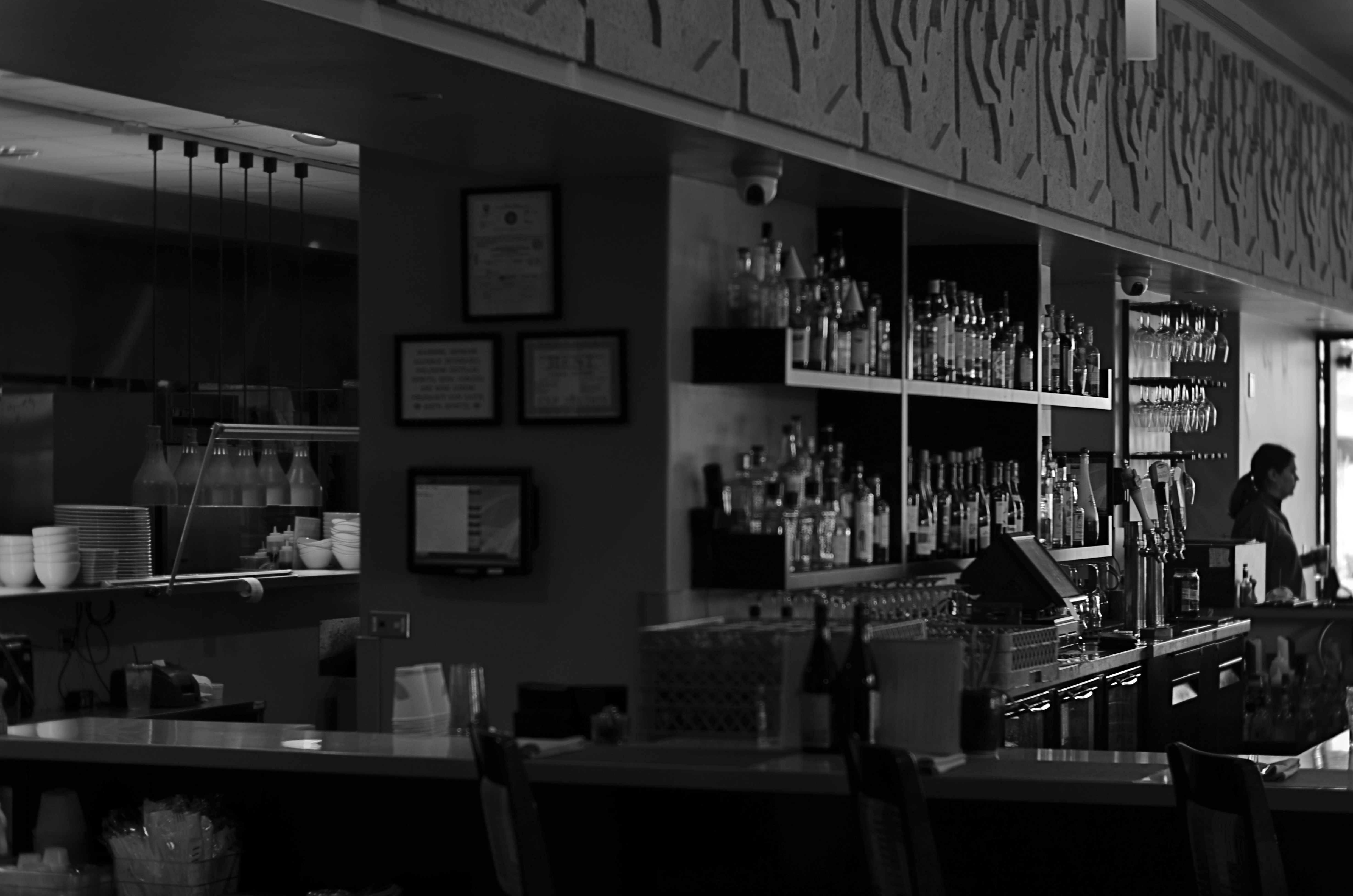
We started photography by placing people in front of walls, then learned, like good stage managers, that selectively positioning or moving those walls could help image-makers manage the techniques of conceal/reveal. Now you see it, now you don’t. Photography no longer takes place in one plane: barriers shift to show this, or to hide that. They are part of the system of composition. Control of viewing angle does this most efficiently, as in the above image, where just standing in the right place lets me view both the front and back activities of the restaurant at the same time.
Of course, generations after the rigid formality of photography’s first framing so, we do this unconsciously. Adjusting where walls occur to help amplify our pictures’ narratives just seems instinctive. However, it can be helpful to pull back from these automatic processes from time to time, to understand why we use them, the better to keep honing our ability to direct the viewer’s eye and control the story.
SLAGIATT
Lighting A, Concept D…
By MICHAEL PERKINS
I CALL IT NO–FUNDAY, the painful exercise of poring over photographs that I once considered “keepers” and now must reluctantly re-classify as “obviously, I’m an idiot.” For any photographer, self-editing one’s output is just the kind of humiliation one needs to keep on shooting, if only to put greater distance between one’s self and one’s yester-duds.
To make the shame of disowning my photographic spawn even worse, I find that, more often than not, technical failure is usually not the reason I’m lunging for the delete button: it’s the weakness of the conception, a basic lifelessness or lack of impact that far outweighs any errors in exposure, lighting, even composition. In other words, my worst pictures are, by and large, bad because they are well-executed renditions of measly ideas.
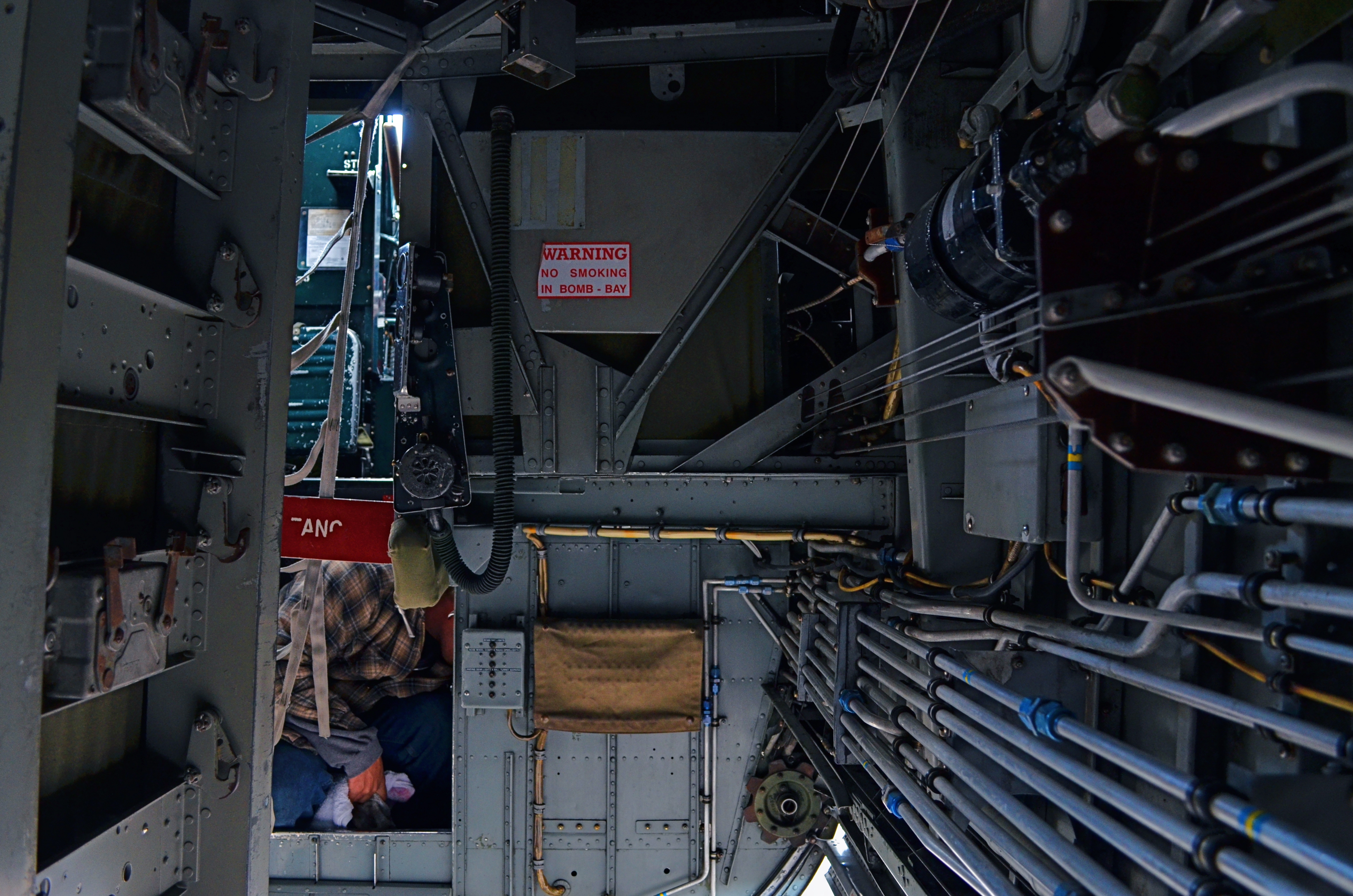
In my mental filing cabinet, I refer to these images under the acronym SLIGIATT, or Seemed Like A Good Idea At The Time. The image above is a perfect example. This shot, taken inside the underbelly of a WWII bomber, presented a ton of lighting challenges, but I spent so much time tweaking this aspect of it that I neglected to notice that there just isn’t a picture here. It tells no story. It explains nothing. It’s just an incomprehensible jumble of old equipment which lets the eye wander all over the frame, only to land on…..well, what exactly? But, boy howdy, it is well-lit.
SLIGIATT photos are, of course, necessary. You have to take all the wrong pictures to teach yourself how to create the good ones. And mere technical prowess can, for a time, resemble quality of a sort. But technique is merely craft, and can be had rather easily. The art part comes in when you’re lucky enough to also build a soul into a machine. As Frankenstein figured out, that’s the difference between being God and playing God.
SHATTERING THE FRAME
Which piece of the puzzle should be prominent?
By MICHAEL PERKINS
ONE OF THE MOST REVOLUTIONARY ACTS a photographer can commit is the thwarting of expectation, a deliberate subverting of what the viewer assumes will happen next. Composition-wise, this means not just deciding what information makes it into the frame, but, indeed, whether there will even be a frame at all.
Any demarcation or line within an image can be used to direct attention to a given location. Whether including or excluding, pointing toward or pointing away from, the photographer has pretty much limited authority on how he’ll direct traffic within a composition. And so we shoot through holes, slats, panes, and skylights. We observe borders marked by cast shadows: we cut spaces in half to make two rooms out of one: we reveal facts in parts of reflections while obscuring the objects they reflect.
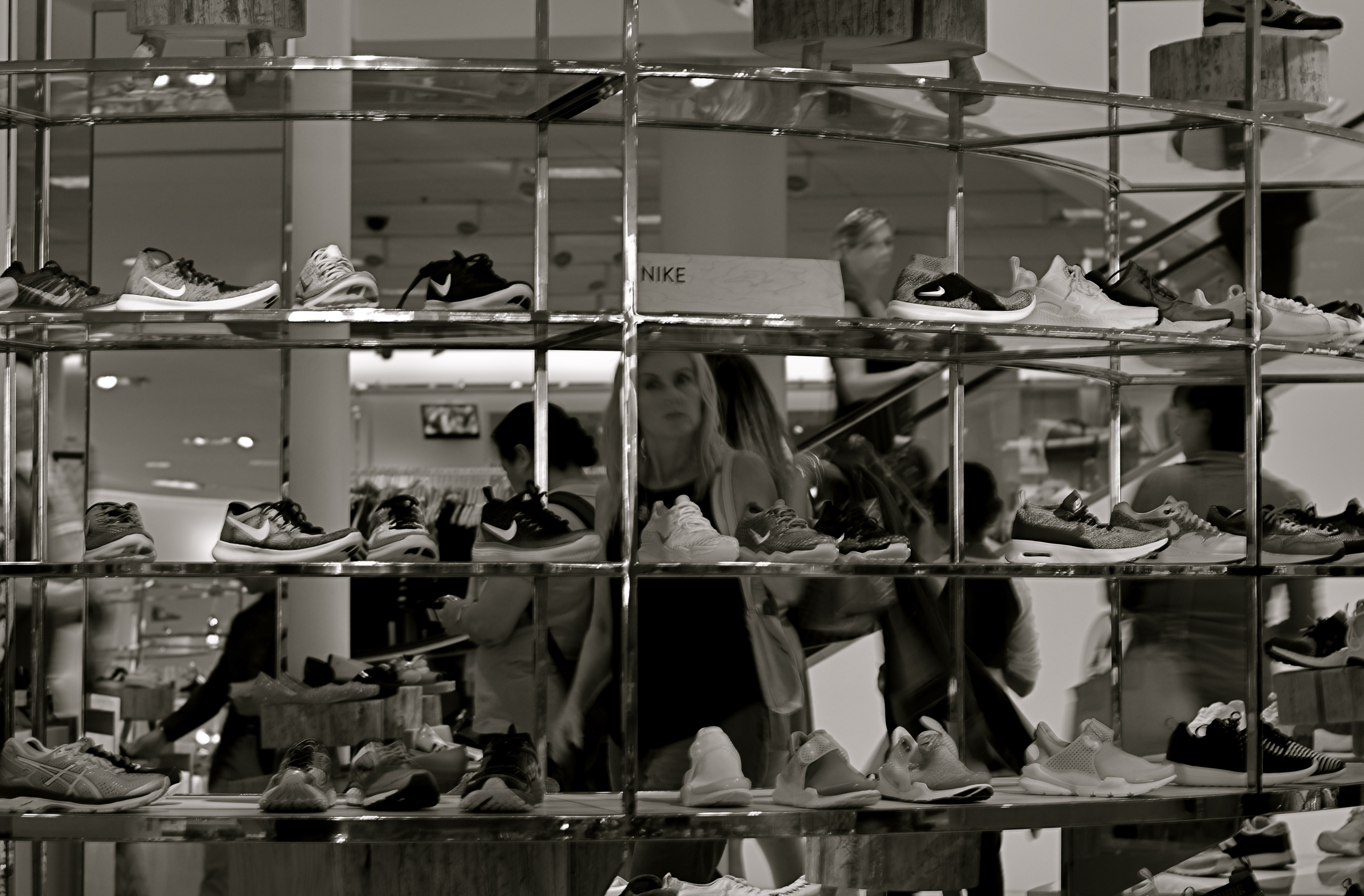
In the above image, I saw the subdivisions of the department store display unit like a wall of little tv’s, each screen showing its own distinct mini-drama. Is the woman seen eyeing the merchandise the most prominent “screen star”, or are we just seeing an arbitrary mosaic of the larger scene behind the display? Or is it both?
Framing within the larger frame of a composition can isolate and boost whatever message we’ve chosen to convey, and it’s perhaps the most total control a photographer can wield, more so in its way than even exposure or lighting.
TWILIGHT TIME
By MICHAEL PERKINS
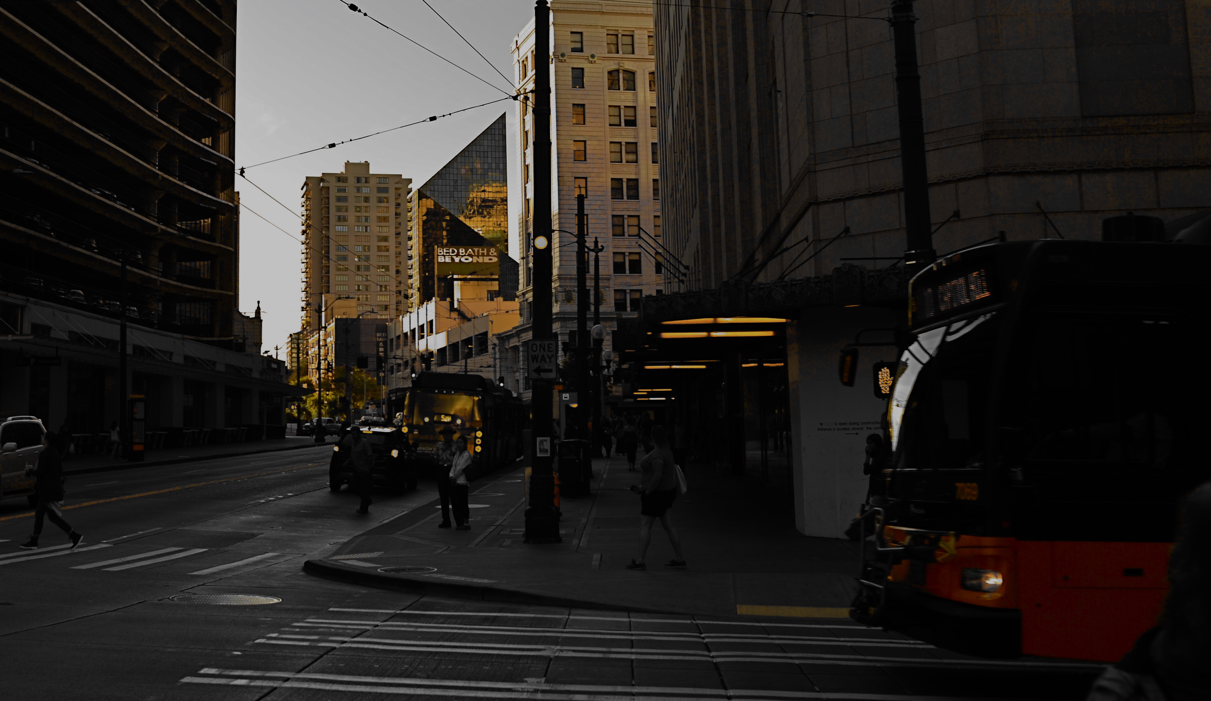
I HAVE STRUGGLED OVER A LIFETIME to tell photographic stories with as few elements as possible. It’s not unlike confining your culinary craft to four-ingredient recipes, assuming you can actually generate something edible from such basic tools. The idea, after all, is whether they’ll eat what you’ve cooked.
With images, I’ve had to learn (and re-learn) just how easy it is to lard extra slop onto a picture, how effortlessly you can complicate it with surplus distractions, props, people, and general clutter. Streamlining the visual language of a picture takes a lot of practice. More masterpieces are cropped to perfection than conceived that way.
The super-salesman Bruce Barton once said that the most important things in life can be reduced to a single word: hope, love, heart, home, family, etc. And so it is with photographs: images gain narrative power when you learn to stop sending audiences scampering around inside the frame, chasing competing story lines. Some of my favorite pictures are not really stories at all, but single-topic expressions of feeling. You can merely relate a sensation to viewers, at which point they themselves will supply the story.
As an example, the above image supplies no storyline, nor was it meant to. The only reason for the photo is the golden light of a Seattle sunset threading its way through the darkening city streets, and I have decided that, for this particular picture, that’s enough. I have even darkened the frame to amp up the golds and minimize building detail, which can tend to “un-sell” the effect. And yet, as simple as this picture is, I’m pretty sure I could not have taken it (or perhaps might not even have attempted it) as a younger man. I hope I live long enough to teach myself the potential openness that can evolve in a picture if the shooter will Just. Stop. Talking.
SERVING UP SOME NUTS

The Haves And The Have-Nots (2017)
By MICHAEL PERKINS
COMPOSITION IN PHOTOGRAPHY WOULD BE A SNAP (sorry) if the camera actually possessed not just an eye, but also a brain. But that’s where you come in.
When the human eye takes in a scene, the brain automatically ranks all the information within it, basically making a composition of priority. We “see” some things and “don’t see” others, based on how our grey matter ranks the importance of everything in our field of vision. A camera cannot make these fine decisions: it merely makes a light record of what it’s pointed at. That accounts for the fact that our “perfect” landscape, the one we ourselves recalled from the first day of vacation, comes back, in a mere photo, complete with electrical wires, distracting signs, junk near the beach, and any other number of things our brains filtered out of the original viewing experience.
Last Man Standing (2017)
Composition is thus a matter of our deliberately arranging things by priority, making an argument for our audience to Look Here First, Only Look Here, Give Greater Weight To This Over That, or any other messaging we desire. In sales terms, it’s what pitchmen call Asking For The Order. Simply, composing a photograph means setting the terms of engagement for the viewer’s eye.
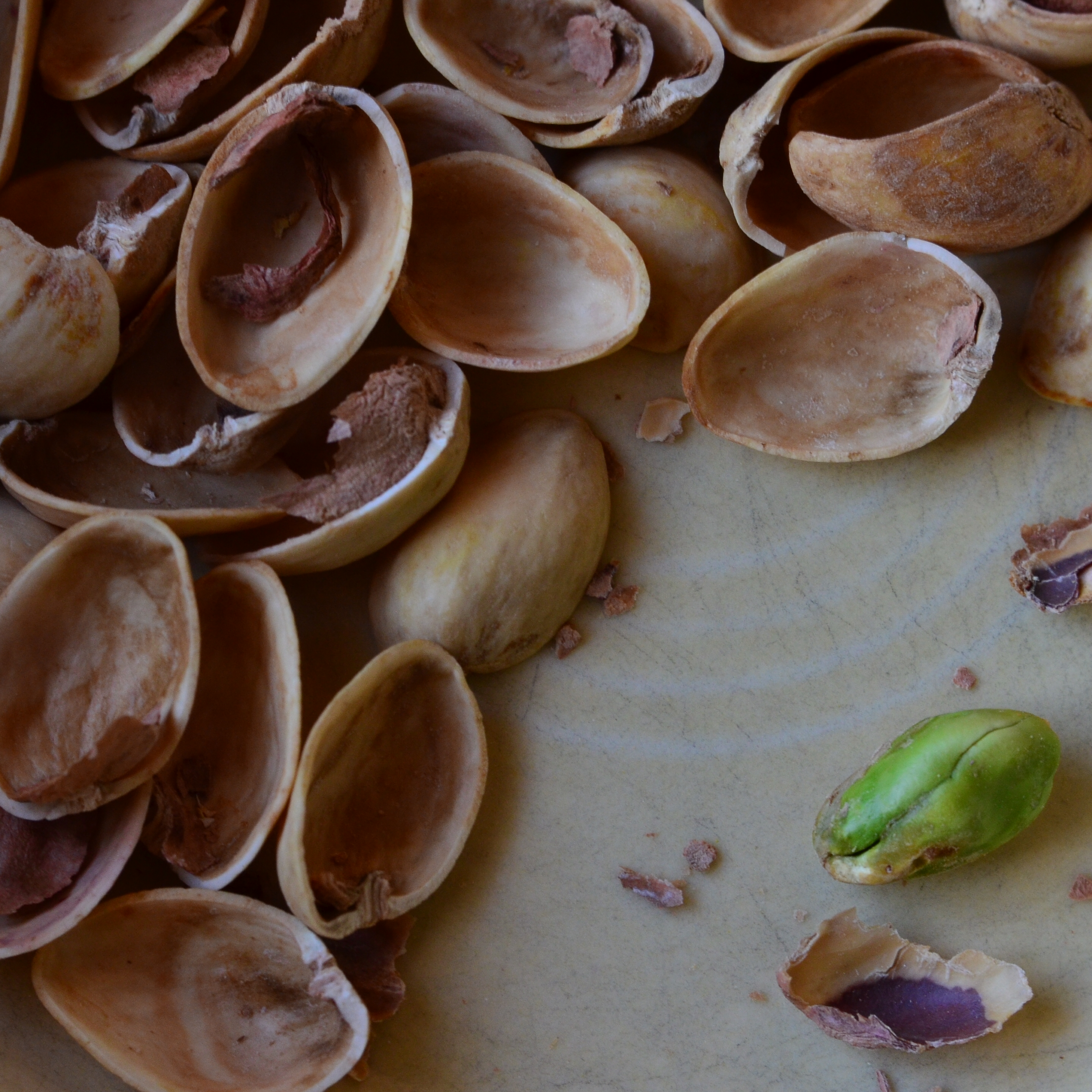
With still-life photographs, the shooter has the greatest degree of control and responsibility. After all, our subject is stationary, easily moved and arranged to our whim. You pretty much are lord of your domain. That being said, it’s wise to use this luxury of time and control to envision as many ways as possible to convey your message. The image at the top of this page, for example, is crowded, but the nut shells and the unshelled nuts are a study in textural contrast. There’s lots of color and detail, with one side being somewhat blanched while the other is rough and complex. That’s one way of making the image.
For comparison, in the second frame, the terms of engagement are completely different. The pile of shells at left is more sharply contrasted with the single nut at right. The nut carries the only vivid color in the image; it’s an outlier, a misfit…maybe the last man/nut standing? The simplification of the composition lets it breathe a little, allowing the viewer to speculate, invent. Are the shells symbolic of a mound of nuts that have already been polished off in some grand snacking orgy? Why was one lone nut left to tell the tale? And so on.
Change the arrangement of subjects in a scene and you’ve changed the terms of narration, or even insisted that there is no narration, just patterns, light, or abstraction. Whichever path you choose, no composition comes to the camera “ready to eat”, as it were. You have to tell your camera’s mechanical eye what to see, and how to see it.
DO MESS WITH MR. IN-BETWEEN
Slot Canyon (2016)
By MICHAEL PERKINS
JOHANNES GUTTENBURG, THE MAN WHO DEVELOPED THE FIRST PRACTICAL SYSTEM FOR MOVABLE TYPE, is also said to have invented a kind of periscope, the better to peer over the teeming throngs at the local virgintennial festival. And while there is no record of what he was trying to see (or, more importantly, if he actually did see it), the longing to extend one’s vision around blind corners is one of the tantalizing mysteries of photography. The fact that we can’t make that 45-degree turn infuses many an image with a delicious kind of suspense.
Often when we compose a photo we imply the existence of a certain hidden something that the still image will forever shield from our detection. We photograph shadows that have no progenitors, streets that are halfway concealed by our shooting angle, and, always, the continuation of patterns and dramas that continue outside the boundaries of the frame. That frame has to be drawn somewhere, after all, and no matter how complete we attempt to make our stories within it, the imagination wants to stray toward whatever was “composed out” of the final product.
And therein lies one of the superb teases of our art. We can select scenes that deliberately torture the eye by denying access to What’s Over That Way or Where Does That Lead. We can abruptly rob the eye of the visual payoff for a conundrum that we ourselves have created. We can lie, cheat and steal. That is, I mean, who says you have to play fair with your viewer? Oh, you want me to tell you everything about this picture? Nuts. Figure it out yourself. Was it Colonel Mustard with a candlestick in the study, or….?
The master shot of the above image was a fairly typical out-the-window view from a hotel room, and originally ran a lot wider. Then it occurred to me that I could almost see something between the two buildings, and I re-cropped to make that “almost” the main part of the picture. Remaking the landscape view into a square introduced a little claustrophobia into the process, forcing the view exactly where I wanted it to hit. And finally, I desaturated all the colors in the shot except the orange of the sodium street lamps to amp up the glow in the aperture between the buildings.
I’m not suggesting that you intentionally make pictures with the sole purpose of messing with people’s minds. But, hee hee, you totally can. What’s around the corner? What’s up the street, beyond the curtain, just out of frame? Your picture, your game, your intentions. Take your audience’s eyes where you want them, and leave them there….between one choice and another.
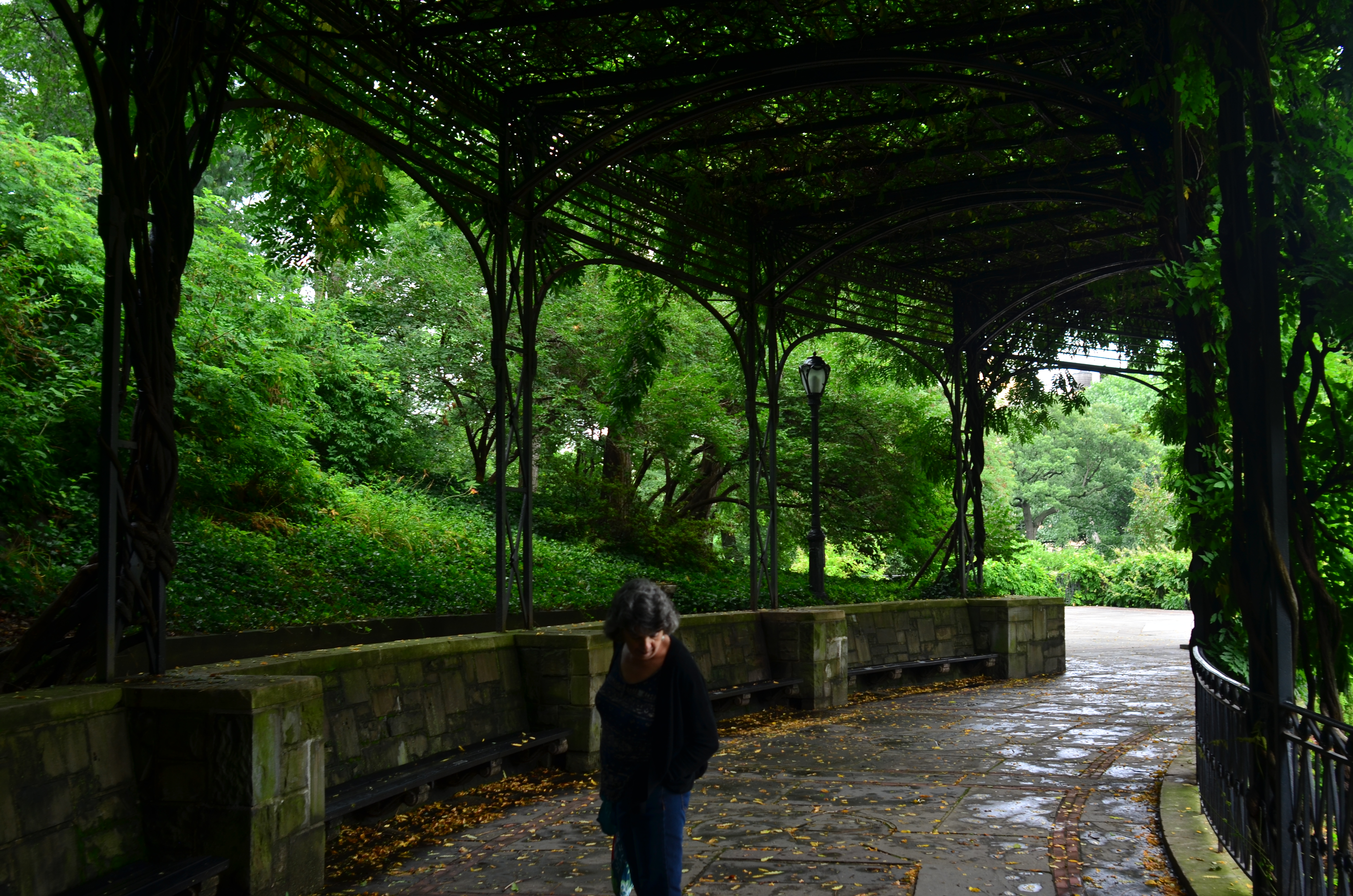
COMPOSING ON THE RUN
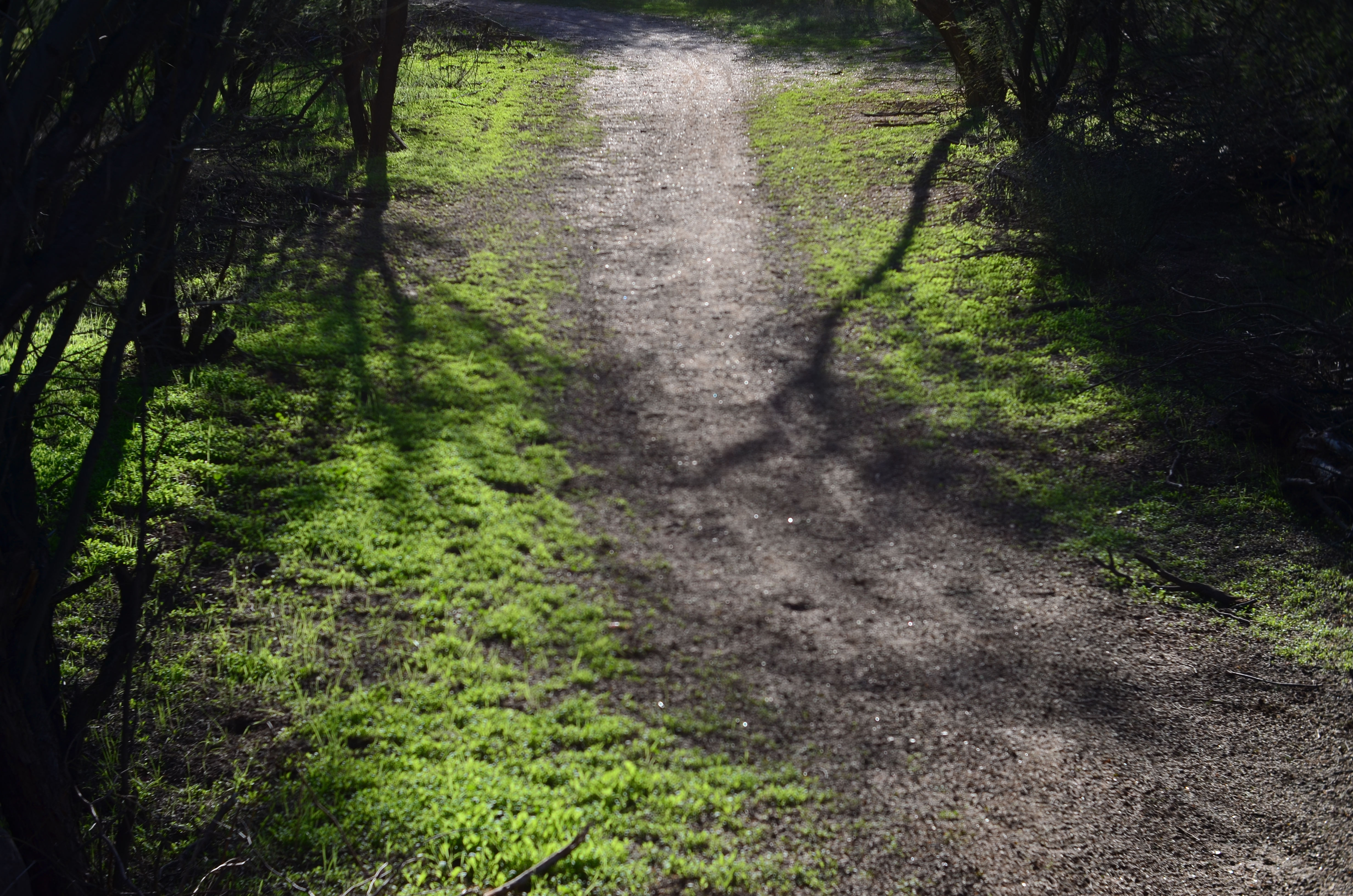
An instinctual snap: sunset light on a forest path. And that’s that….or is it?
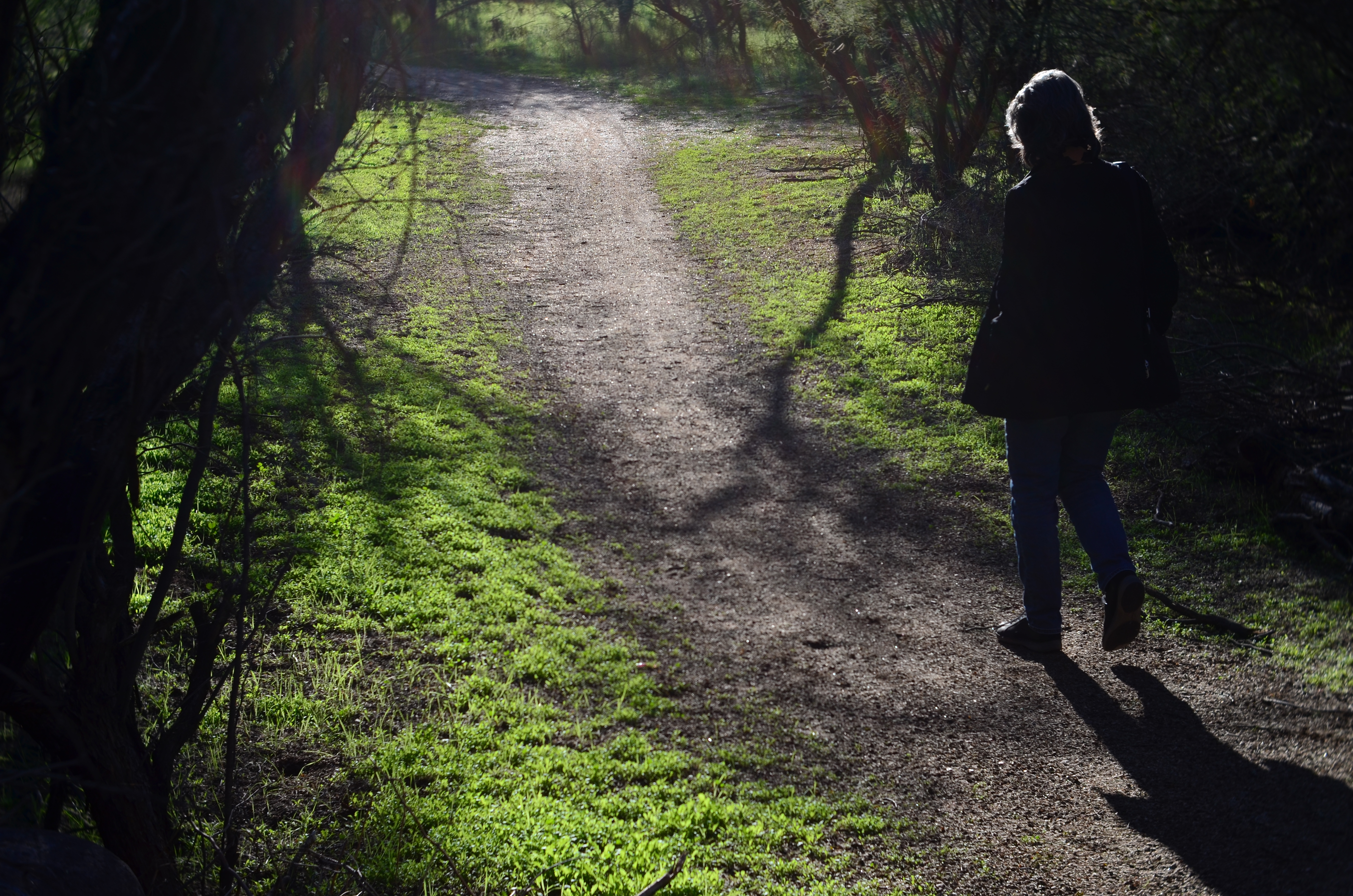
My wife enters the frame a second later.
By MICHAEL PERKINS
LOTS OF OUR BEST PHOTOGRAPHS ARE, EXCUSE THE EXPRESSION, snap judgements. Sometimes a composition simply seems to come fully formed, ready to jump intact into the camera, with no reasonable way to improve on a shot that is 99% pure impulse. Some of these gift moments are so seductive that we may not think to keep shooting beyond what we’ve perceived as the ideal moment. But more shooting may be just what we need.
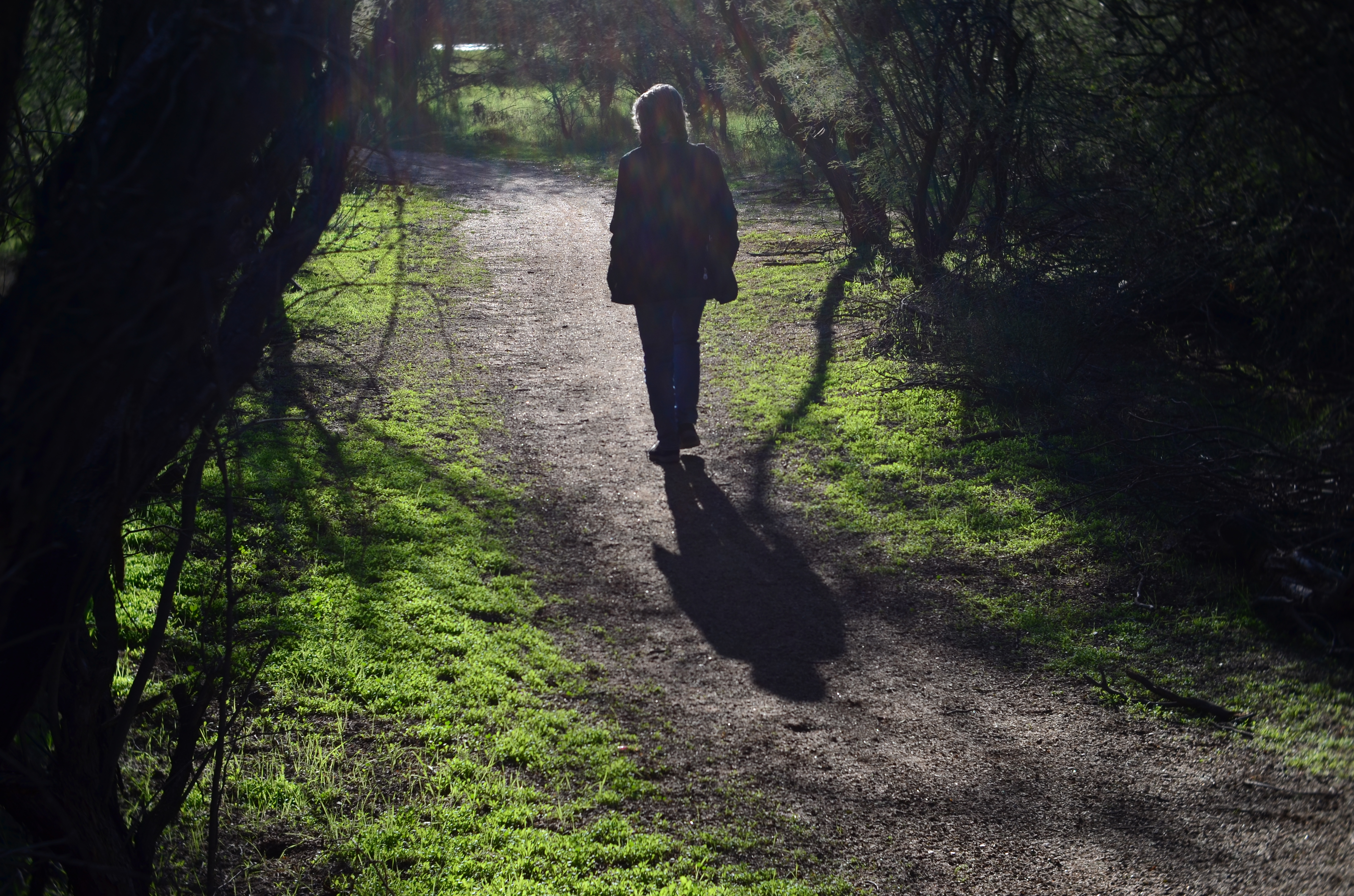
She walks to the upper center of the image..
Images that involve very fast-moving events may only have one key instant where the real storytelling power of the shot comes to a climax, with everything after seen as progressively less dramatic. The second after a baseball is hit: the relaxed smile after the birthday candles are blown out. Think, if you will, of a straight news or journalism image. Every second after the Hindenburg explodes is less and less intense.
But many images can be re-imagined second-by-second, with additional takes offering the photographer vastly different outcomes and choices. In the series shown here, I originally fell in love with the look of sunset on a wooded trail. My first instinct was that the receding path was everything I needed, and I shot the first frame not thinking there would even be a second. My wife, however, decided to walk into the space unexpectedly, and I decided to click additional frames every few seconds as she walked toward the shot’s horizon. She starts off in the lower right corner and walks gently left as she climbs the slight rise in the path, causing her hair to catch a sun flare in the second shot, and placing her in central importance in the composition. By the last shot, however, she is a complete silhouette at the top of the frame, taking her far enough “up” to restore the path to its original prominence with her as a mere accent.
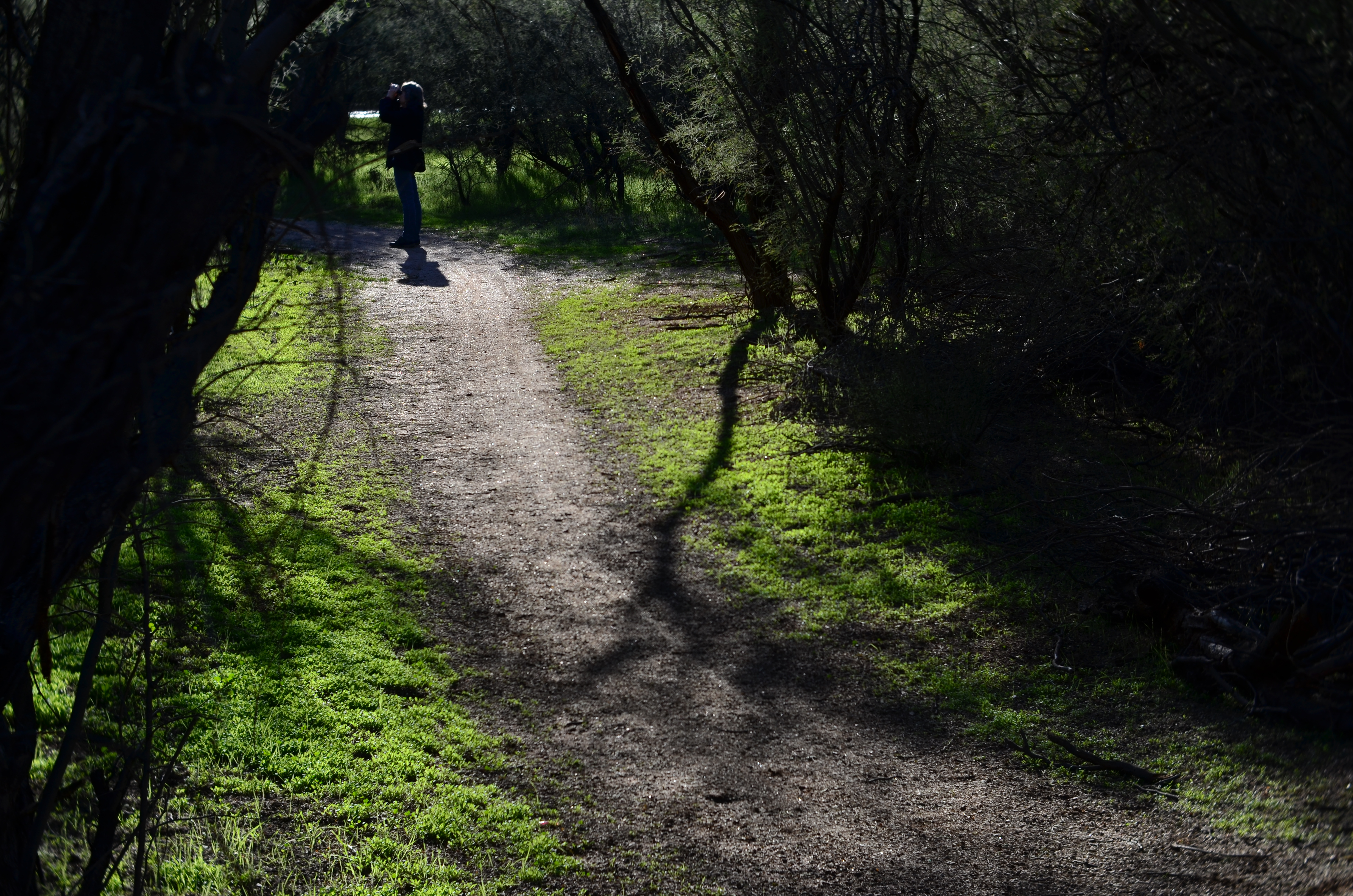
and finally comes to rest as a mere decorative accent/ The trail is now nearly empty once again.
Which shot to take? Anyone’s call, but the point here is that, by continuing to shoot, I had four images to choose from, all with very individualized dynamics, none of which would have been available to me if I’d just decided that my first shot was my best and settled. There will be times when the fullest storytelling power of a photograph is all present right there in your first instinctive snap. When you have time, however, learning to compose on the run can force you to keep re-visualizing your way to lots of other possibilities.
TIED FOR FIRST PLACE
By MICHAEL PERKINS
EVERY PHOTOGRAPH IS DISCUSSED LONG BEFORE IT IS VIEWED, with an inner dialogue between shooter and subject that is held, however briefly, ahead of the shutter click. Sometimes, at a fortuitous intersection of talent and luck, that is the end of the discussion; other times, there will be additional chats between the first version of an image and its maker, a talk that can be endlessly debated in the processing and editing phases. And, of course, based on those results, photographs finally make their arguments to the world at large.
The bulk of those discussions focus on what the center, or the essence of a picture should be. Were all elements in balance right out of the camera…in which case, frame it and hang it, case closed? Or (and what is far more likely), did we find that essence at all? Was it compromised, watered down, by faulty composition? Did we make a weak lighting choice here or there? Did execution weaken the effect?
Usually, there is a clear component within a photograph that cries here I am a little louder than all the other parts of it. But sometimes, there are two or more pieces which feed on each other, boost each other’s effectiveness. In such cases, instead of one primary piece and a lot of secondary or extra pieces, you find two things in the photo that are basically tied for first place. When one thing in a picture feels diminished without interacting with another, both elements deserve to stay.
Mrs. Lin’s Summer Bonnet (2016)
The picture at the top seems, to me, to be just such a case. The floral shop and its faceless proprietor seem somehow married to each other, two halves of a whole. And, while I can conceive of making two separate pictures from the master shot in which either the shop’s inventory or the saleslady are in solo starring roles, they truly do seem interdependent, so I declare a tie, and they both go to the finals.
Thus the discussion on what to include in the picture has gone on for at least two layers, with layer one being the planning of the photo, and layer two being the editorial decision to keep both flowers and florist on equal footing in the final image. Look over your own pictures and you will no doubt find several of these “tied for first place” compositions. It can seem counter-intuitive to have more than one main point in an image. But the image itself will tell you, unmistakably, when that actually make the most sense.
MAKE IT SO
I’ve been photographing this for years, and I still don’t know what I think about it. Needs more work….
By MICHAEL PERKINS
WHEN PHOTOGRAPHY IS PURELY REPORTORIAL, as it is in journalism or documentation, it sticks pretty close to the accepted state of the world. It tries to depict things plainly and without comment; it delineates and defines; it shows us the true dimensions of events.
But when the same technology is used interpretively, there is no absolute “real”, no pure authenticity, other than what we choose to show. It is in re-purposing the world visually, shaping and framing it as we choose, that we can confer meaning on it pretty much at our whim. That’s where the “art” part comes into what would otherwise be a merely technical measurement of light. We not only choose our subject….we set the conversation about it. Simply stated, what you shoot is about whatever you decide it’s about.
Even with hyper-familiar objects, things seen and re-seen to the point that they are iconic (think Empire State Building) images can re-set the way we take those objects in. And, in the case of what I like to call “found objects”, such as the image seen at the top, the photographer is completely unfettered. If your viewer’s eye has no prior mental association with something, you’re writing on a blank sheet of paper. You can completely dictate the terms of engagement, imbuing it with either clarity or mystery, simplicity or symbolism.
I have always been flat-out floored by photographs that take me on a journey. Those who can conjure such adventures are the true magicians of the craft. And that’s what I chose to play in this arena over a lifetime. Because, when photography liberates itself from mere reality, it soars like no other art.

(ALMOST) NO ADMITTANCE
By MICHAEL PERKINS
DOORS PRESENT A MOST INTRIGUING PARADOX for the photographer. They are both invitations and barriers, the threshhold of opportunity and the end of it. Entrances and exits create a two-way traffic, with people either vanishing into or emerging from mystery either behind or in front of them. In either case, there are questions to be answered. And while the camera is certainly no x-ray, it does set the terms of the discussion…an endless discussion… about secrets.
Think of those fateful doors beyond which we know something portentous or crucial occurs. Ten Downing Street. The portal to an execution chamber. A confessional. An organization open to “Members Only”. Doors are like red meat to the photographer because they mean everything and nothing at once. Like the children of Pandora, we inherit the insatiable curiosity to know what’s back of that thing. Who’s there? Who’s not there? What does the great Oz look like? What’s going on inside that doesn’t invite me, doesn’t want me?
All barriers seem wrong, even cruel to us, on some level. “Something there is that doesn’t love a wall, that wants it down” writes Robert Frost in the poem Mending-Wall, and it seems like a reasonable sentiment. I can’t walk past a door, forbidding or friendly, without wanting my camera to go back and ask, knock, knock, who’s there? As an example the above image came to me unbidden, on a night in which my wife and I had walked along Queens Boulevard in New York in search of an all-night diner. Having succeeded in securing sustenance, we were walking home when a brief glimpse of a rather substantial iron gate became visible down a side street during the few scant moments it took us to skip through an intersection. I knew two things at once: I would never know what lay beyond that grand facade, and I would, still, have to make time to come back, on another night, to have my camera ask “the question.”
Photography can be about The Big Reveal, and often traffics in the solving of puzzles. But just picturing the puzzle is all right too. We don’t have to know whether the lady or the tiger is behind that door. We just have to use our magic boxes to knock on it.
Share this:
November 23, 2017 | Categories: Commentary, Composition, Conception | Tags: Framing, Point Of View | Leave a comment