CHROMEDOMES
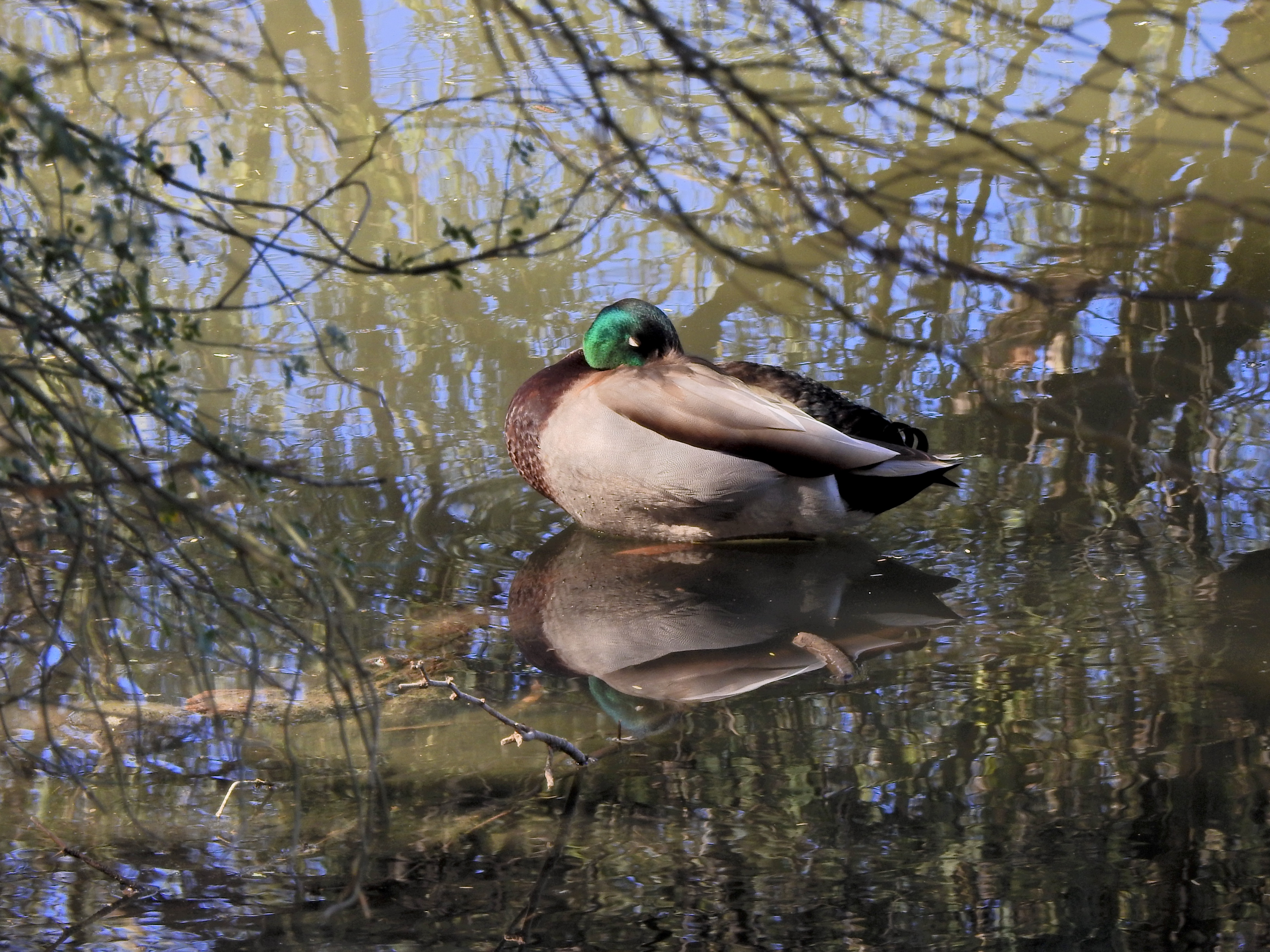
This color original is lovely, but the multiple hues on the water seem to fight with the duck for attention.
By MICHAEL PERKINS
THERE IS FAIRLY SOLID CONSENSUS, among those who teach the basics of photographic composition, that the path to success lies in reducing a picture to its simplest terms. Removal of extraneous distraction, proper placement of a subject within a frame, depth-of-field calculations…all these techniques work toward a common goal; to help the eye engage the photo efficiently, to lock onto its essential story without being confused or deflected toward something less important. Often a cleaner composition is just a matter of cropping, or merely limiting the number of elements contending for the viewer’s attention.
But there is one approach to basic composition that may not be instinctive to us all, and that’s the role that color plays in our pictures.
Color is the current instinctive default for most of our photos. It took a long time for it to be technically capable of taking that mantle from monochrome, which was, by necessity, the palette that shooters painted on for over a century. Color is seductive, and seems like a more “realistic” medium for our very personal universes of family and friends. However, in the composition of any picture, it must be reckoned with as another object in the frame, no less than a tree or a cloud. It is one more thing in there that demands our notice, and, for many images, it certainly earns that attention. However, color can become the message of a picture, not just the way the picture is rendered, drawing off the viewer’s eye in exactly the same way as extra props, extraneous scenery or other clutter can.
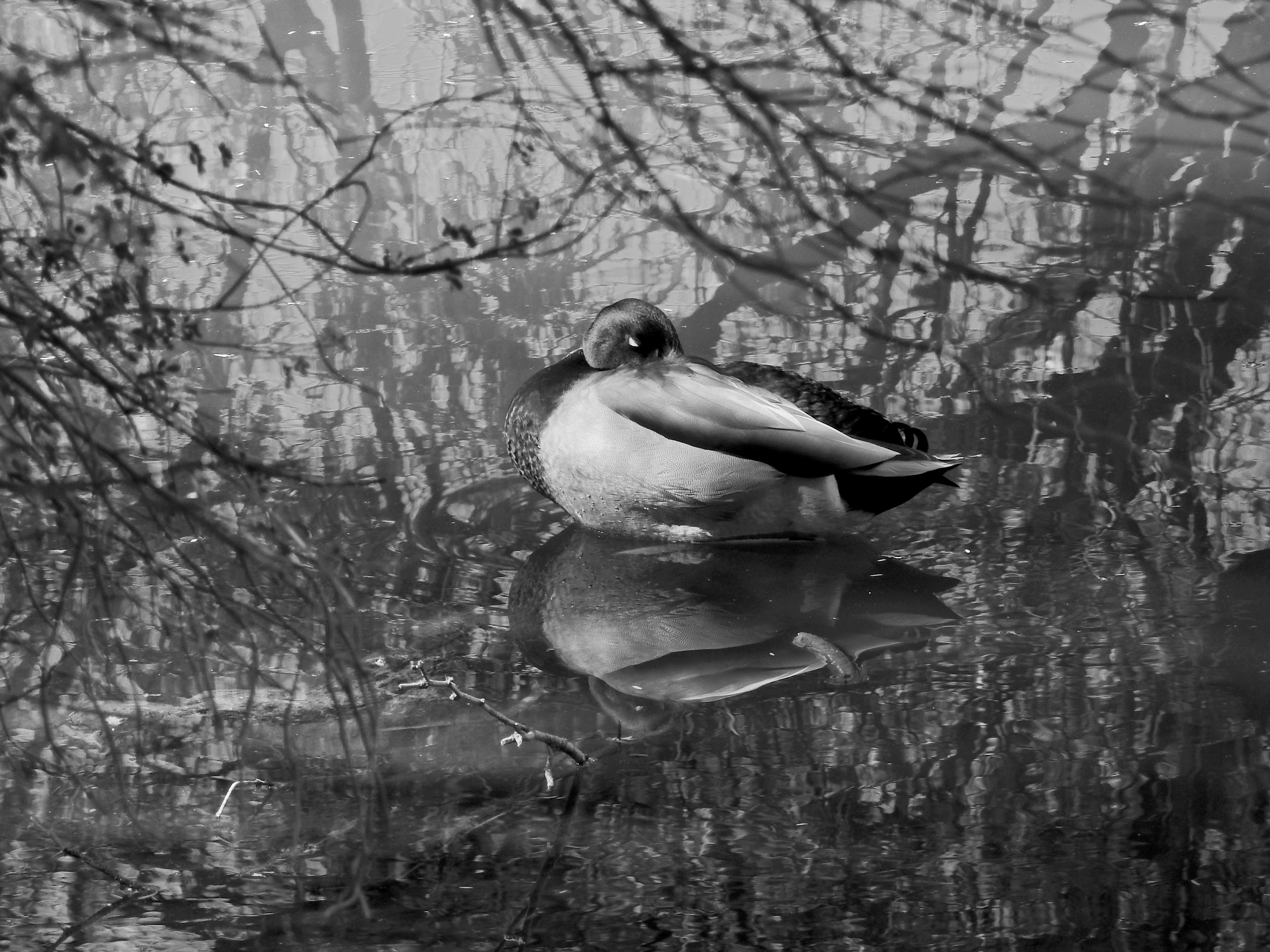
Neutralizing the reflective hues on the water can make the center subject a bit more prominent.
Some would argue that black and white is more nuanced and subtle in the rendering of emotional directness, or texture, or contrast when compared to color, and yet some of us think of monochrome as somehow incomplete or unfinished. Try telling that to several dozen Pulitzer winners, some of whom, admittedly, worked before color was practical (and therefore not a real option), along with others who continued to choose b&w even after it became the minority medium. And this is not about unilaterally choosing sides, forever pitting the Kodak Tr-X crowd in a pitched battle against the Fuji Velvia cadre. It’s only about choosing the right tool for every picture, and not getting so locked into the global color default that you refuse to peer into the opposite camp. I continue to master every shot in color to this day, but a full fifth of my final output consists of mono conversions, with modern post-processing giving me every bit as much control over the results as in the old darkroom days (as seen in the illustrations). The best course, I believe, is to form the habit of looking at all your pictures both ways. Often, you will just stick with the color original, because it works. And other times you will play in the other playground because, for some pictures, that works.
Color is an object within your pictures, no less than a mountain or a chair. Think of it as another piece of visual furniture fighting for dominance in the frame, and deal with it accordingly. Monochrome is not photography’s simpler, poorer step-kid. Sometimes, it can be the pride of the family.
DOING WITHOUT
By MICHAEL PERKINS
PHOTOGRAPHIC STYLE IS REFLECTIVE of the human aging process. You often make pictures differently in different phases of your life. Many of my favorite shooters have, over their careers, evolved on two parallel tracks, both toward simplicity. That is to say that their picture-taking process, i.e., equipment and gear, becomes more streamlined as they age, even as their approach to composition becomes simpler. In every way possible, the best photographers tend to learn, over time, how to do more and more with less and less.
Going into battle with a single camera that’ll do 98% of what you need in any situation is highly desirable, but it takes time to learn how to do that, to resist the temptation to carry every gizmo under heaven on your shoulder at once. But the struggle is worth it; knowing every single feature and quirk of a camera that’s ergonomically solid and functionally streamlined allows you to work fast and instinctively. As for composition, I found that, at least for me, I had to either learn to simplify or just give up on things like landscape work, where everything I shot was crammed with clouds, trees, trickling streams, flocks of birds, and, who knows, the Barnum & Bailey circus. I was making picture after picture where, if the human eye was asking, “where do I look?” my answer was likely to be, “It’s a smorgasbord! Pick anything!” The truth was that I had to go simpler as I aged if I was ever to be effective at all in conveying visual ideas.
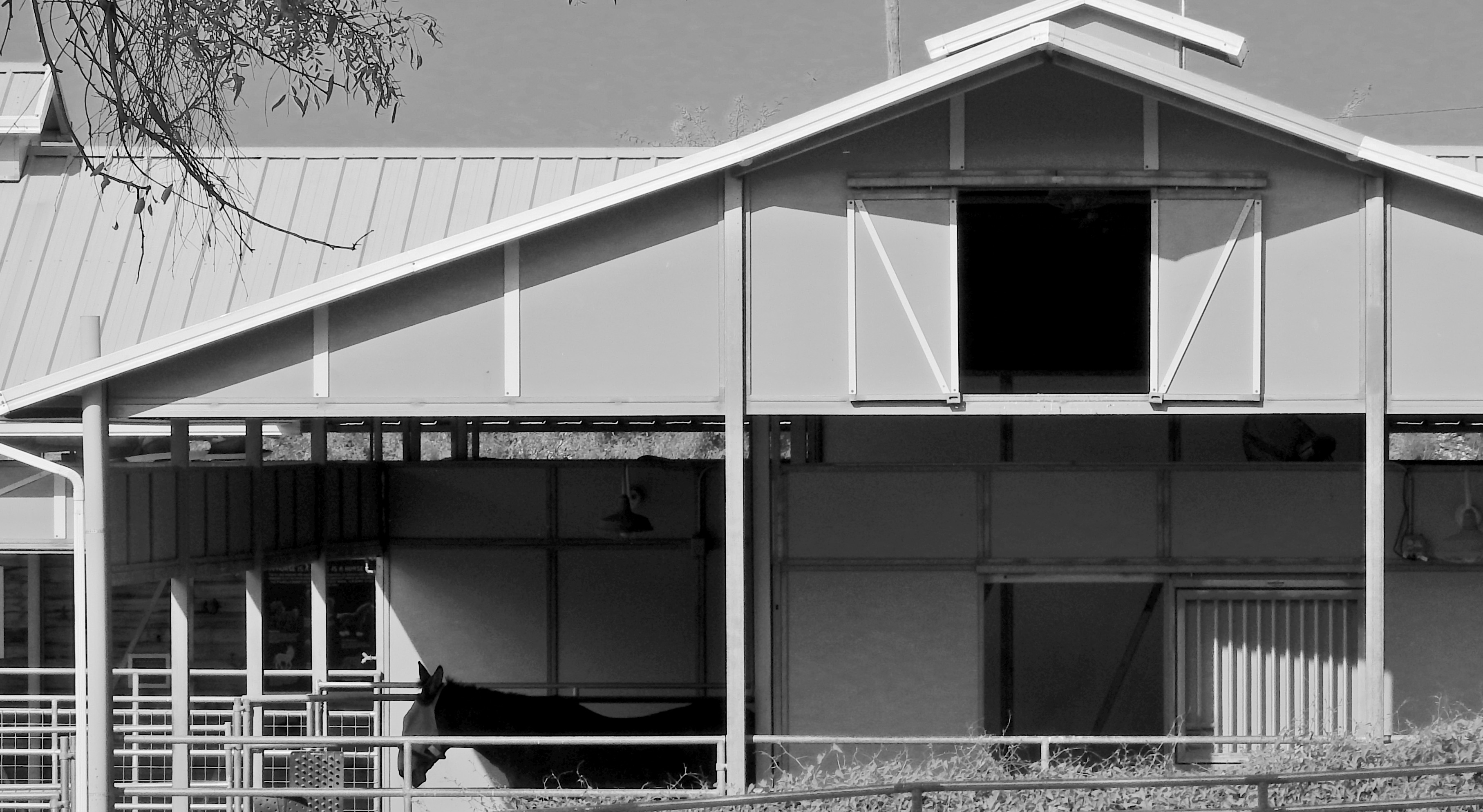
Simplicity is the final step in a photograher’s development….or at least in mine.
Twenty years ago, this image would have taken up twice the area you see here, because, even today, its master frame included, along with the barn and stable, a side building, some empty blue sky, and a few small piles of farm implements….enough distractive information for five pictures. Zeroing out all the color and cropping to keep the entire picture to a basic series of rectangles and triangles (plus their multiplied shadows) turned out much better; all I had to do was develop the courage to cut, decisively, in search of a less cluttered picture. I only select this example because it’s a very clear illustration of the process that I now go through for composing nearly every shot, in that I try to pre-visualize how little information I need to convey my concept. Yes, how little.
This is an ongoing struggle for any photographer, because it’s easy and alluring to do more of everything…more stuff to carry, more stuff to cram in the frame, more things to draw energy away from your primary vision. I am nowhere near where I need to be in this journey, but I can track a little progress, and, amidst all the distractions of, well, living, that’s at least something.
(FIAT LUX, Michael Perkins’ latest collection of images, is now available from NormalEye Books.)
INFORMATION AVENUES
Phytomorphology 623, 2020
By MICHAEL PERKINS
JUST AS THE TAKING OF A PHOTOGRAPH IS ACCOMPLISHED IN AN INSTANT, so too is the messaging that the resulting image conveys to the viewer. The impact of a picture is immediate, established within nanoseconds of the eye’s initial contact with it. Additional viewing and pondering may, certainly, reveal deeper truths about a photograph, but I firmly believe that the main love it /don’t get it choice about a photo is made by the brain at first glance.
That said, information must be arranged in such a way as to expedite this choice. That’s the art of composition. What stays in, what is excluded, where the frame hits, and what its limits imply. The nature of the information is determined by the impact of light, which shapes and defines. That is in turn aided by texture, which adds dimension and context in how new or old, rough, smooth, substantial or ethereal things appear in the image. And finally, mood and aesthetic are established in the range of color or tonal data.
All of these elements are created by a series of decisions on whether “to do” or “not do”. Which is to say that all photographs have an assembly process. Steps. Priorities. More of this, less of that. The fact that the best photographers learn how to navigate all these decisions instantaneously is really a kind of miracle. Take the truly fundamental choice of color, for example. Not only do a picture’s hues have to be conceived in the mind before they’re attempted in the camera: they must be refined enough for the shooter to choose how all the shaping elements described above work in conjunction with each other. Think of the graphic equalizers on our old stereos, each ‘band” or part of the hearable spectrum trimmed or maximized to get a “mix” most pleasing to the ear. In visual terms, color is a key choice because it is an element that can shape so many other elements in turn. In the above image, color can resonate with memory and emotion. It can render what we term “warmth”. It also aids in the perception of depth. Consider as well that color has only become the default option for our photography in about the last sixty years. Before that, due to technical challenges for film emulsions and printing processes, it was a luxury item, even a novelty for many.
Monochrome conversion.
“Going back” to monochrome, the original default option for all photography, means actively recognizing what kind of information is lost and what kind of impact is gained by eschewing color. Is the image strengthened or weakened with its removal? Is converting a color shot to b/w as an afterthought (as I’ve done here) less effective than intentionally shooting the original in mono? Are the remaining tones strong enough to convey your message? Is one tonal palette more reportorial or “authentic” than the other? And, above all, what if the choice you’ve made (color or no color) isn’t the choice your viewer makes (in the case of this pair, for example, my wife prefers the color version, although “they’re both nice”)? Photography is about making decisions and learning to live with them. Or just canning the entire thing and trying again.
“We must remember that a photograph can hold just as much as we put into it” Ansel Adams once wrote, “and no one has ever approached the full possibilities of the medium”. Which is a lot like God saying, “hey, don’t get hung up on making just one kind of tree”. The possibilities in making pictures are indeed endless, but each are rooted in our very purposeful choices.
OPEN/CLOSED
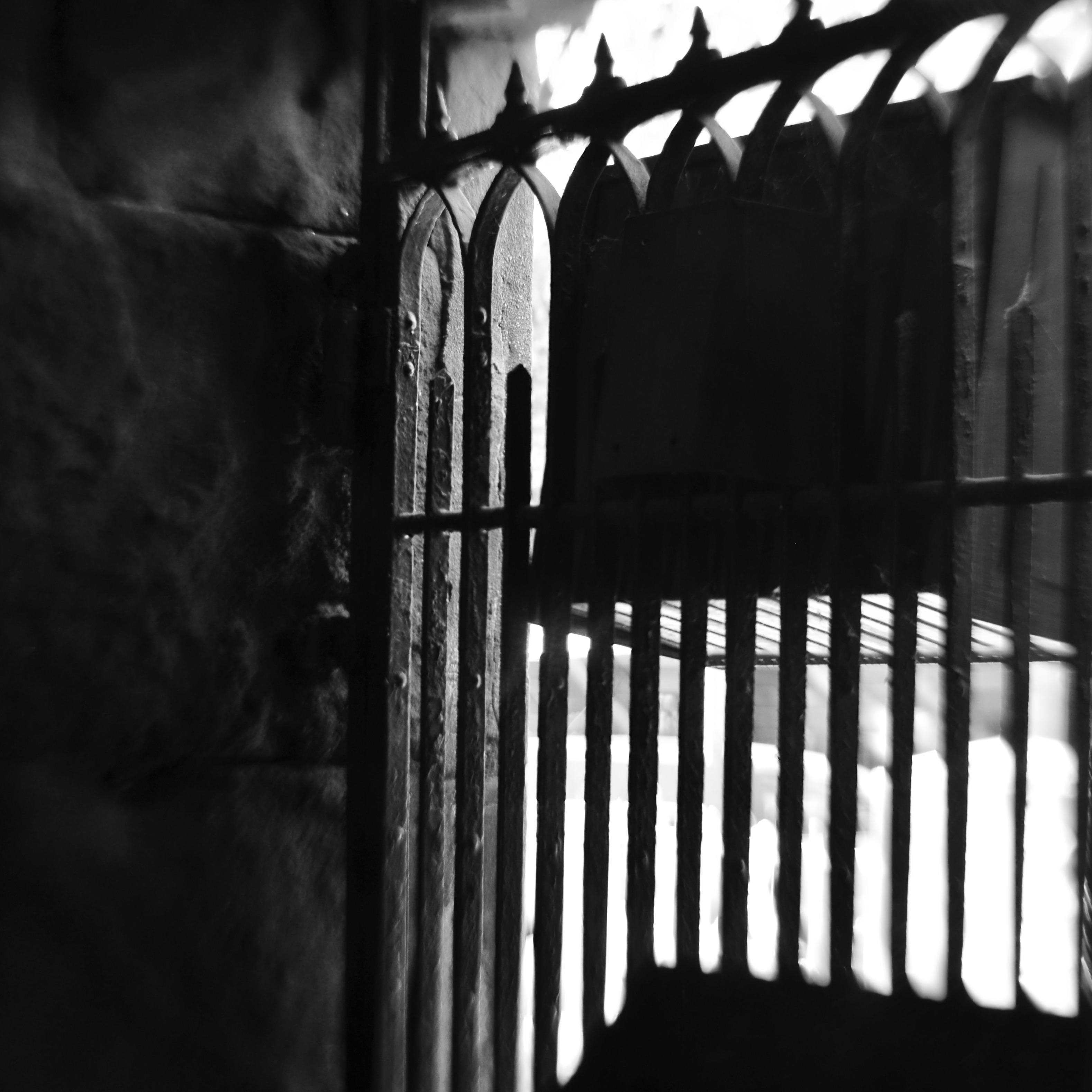
No admittance. This means you. But what else does it mean?
By MICHAEL PERKINS
JUST AS NUMBERS AND LETTERS ARE SYMBOLIC OF THINGS LARGER THAN THEMSELVES, cues in photography act as a visual vocabulary, a kind of shorthand for more complex ideas. This way of showing ideas through a commonly recognized series of signals means we don’t always have to explain everything from scratch every time we create a picture. In order to convey the idea of a train, we don’t have to show the entire history or design of locomotives: a railroad crossing sign sells the concept immediately. And so, as storytellers. we use symbols to get to the point faster, and, nearly two centuries into our shared art, the shortcuts get more compact and more immediate with the passage of time.
One of the ideas that we convey in this way is the idea of limits or barriers, especially images that show confinement or limited admittance. Signs, lights, gates, traffic cones, warning signals, all convey a ton of information in a short space of time…everything from beware to keep out. These cues also allow a photograph to be all shorthand, to be about the limit or barrier. The image seen here adequately conveys the idea of a physical limit with a very meager amount of data. Even resolution itself has been relaxed, leaving just the suggestion of textures that are typically rendered in fine detail. There are no clearly readable signs, no clue to what the viewer is being kept from, no idea of whether the gate represents safety or repression. And while this symbol conveys a limit on our movement; everything else is open to interpretation. In some cases, not revealing what lies beyond the gate may make for a more intriguing image than if the photographer were to show everything in full. The beauty of this process is that most photographic ideas can be expressed with a very spare inventory of information, as our eyes have learned, over years, to see interpretively, enabling us to decode what the photographer as encoded. It’s a very intimate relationship.
All of which, I believe, argues for making your picture’s case in as few strokes as possible. We still pay more attention to framing, i.e., what fits in the rectangle, versus composition, or the arrangement and selection process within the borders of our pictures. We sometimes overcrowd and oversell messages which may be conveyed more effectively with much less information. Learning how to say more with less comes slowly; we need to build up a substantial log of attempts before we can begin to tweeze out the most effective amongst them. But that is the difference, as we often say, between taking a picture and making one, or the difference between pictures that are merely nice and those that are essential.
HOLDING BACK
“There’s Something Happening Here….What It Is Ain’t Exactly Clear..”
By MICHAEL PERKINS
PHOTOGRAPHERS ARE NATURALLY DRAWN TO TRY TO SOLVE MYSTERIES, with many pictures providing sufficient data to reveal or imply a complete story. The still image can feel confining, though, since its space and time limits are strict and unforgiving, and so, narration-wise, we ask a lot of a single frame, and, in turn, we also ask a lot of our target audiences, expecting them to infer what isn’t stated, supply in their minds what goes beyond the things we’ve chosen to show. The tension between what a photographer tries to relate and what a viewer manages to extract is strong, so strong that it can often exceed our talents. We are always trying to lock down all aspects of the tale, and sometimes we don’t succeed.
And then there is the opposite drive, the urge to remove important information from a picture, asking even more of the viewer as we purposely hold back clues. Some photographs can almost seem to starve the eye, a strange effect indeed in a visual medium. What happened before we came to this place? Who are these people? What are they here for? What happens next? Good photographers know how to amass enough information to tell a story. Great photographers can pare away so much information that their pictures become a deliberately constructed puzzle. And as for the creative process, sometimes photographers get a subject or scene in view and don’t know, ourselves, what it really is we’re seeing. Instinct pushes us ahead to click the shutter anyway, convincing us that this incomplete story may have something more to give in future.
The picture seen here is an example of something I felt was intriguing in the moment, and yet, looking at it afterwards, I’m unsure whether it works or not. There are no clear hints of what the people in it are doing. Are they mere passersby, or engaged in some special mission? Does the light create a mood of anticipation? Of concern or dread? Does the shot’s conversion to monochrome help its overall mood, or does it just make it tougher to decode? Perhaps I just reacted to the composition or the light, and nothing more. And what could someone else would bring to the picture by looking at it? The frustrating part of these kinds of inner dialogue is that there is no final answer, because I didn’t select or set up this scene with the idea of conveying anything specific. I wasn’t working with intention. As with thousands of pictures over a shooter’s life, this is an instance in which I just reacted in the moment, and the results may or may not be of any value.
Narratives are strange things. We are often not in complete control of stories as they come forth, even though we would like to believe that we always act under some kind of plan. Sometimes pictures just happen. We are either open to that success/failure coin toss or we aren’t, but our attitude will color the kinds of pictures we’re willing to make.
CUTTING YOUR LOSSES (BUT NOT TOO MUCH)
Ground-level snap of the SOL.
By MICHAEL PERKINS
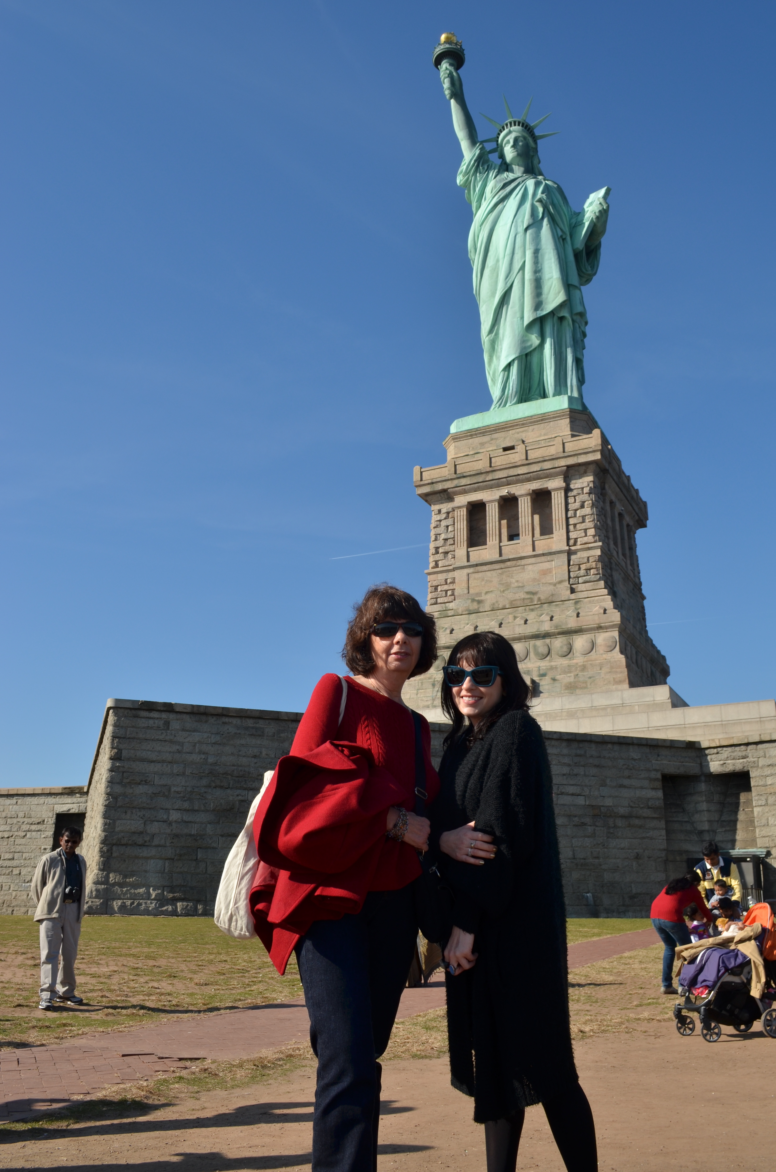
I BELIEVE THAT PHOTOGRAPHERS HAVE A NUMBER OF INTENTIONS that can be set for their images, with only one of them being the raw product of original shots. Certainly we all hope that we’ll hit a perfect storm of equipment, conditions and executions when first we click the shutter, but we have all also learned to set a number of later intentions for those same pictures, strategies that are hatched long after they are in the can. That’s the all-too-human gap between what we meant to do and what we actually achieved, which sets us looking to re-frame our projects from “rescue” missions to “salvage” missions, otherwise known as There Must Be A Usable Picture In Here Somewhere. One man’s afterthought is another man’s Photoshop, and so forth.
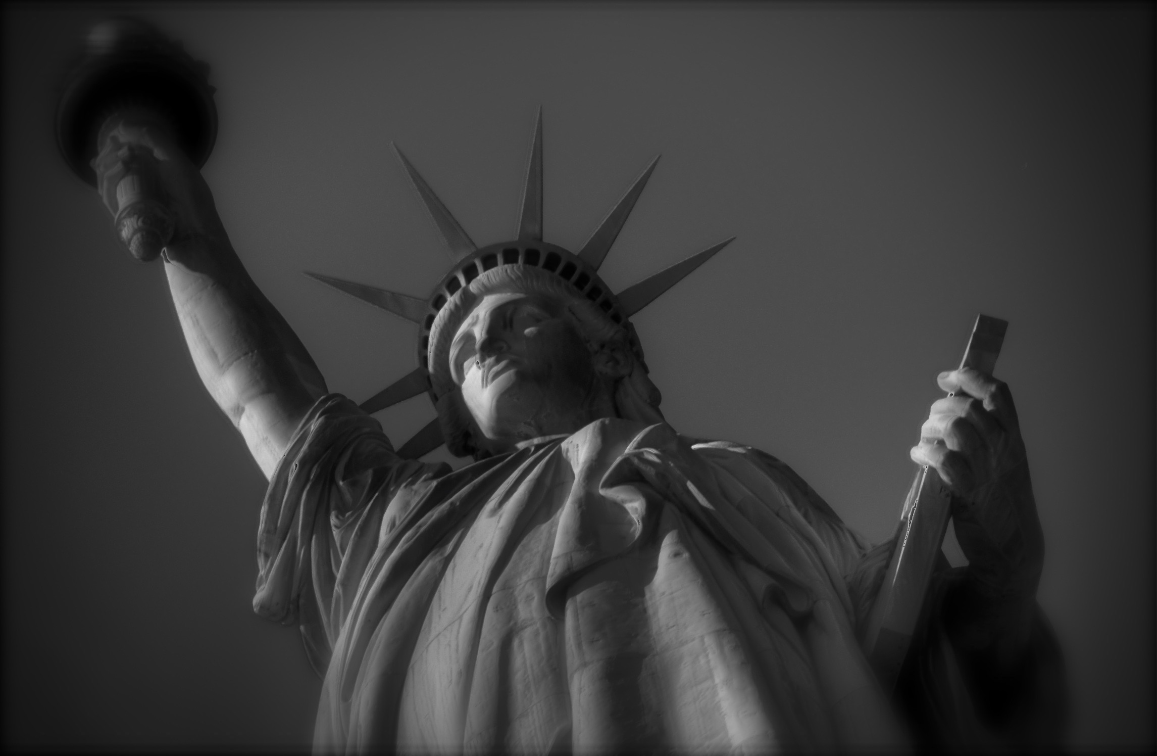
Suppose for example, you’re in the position of your humble author, who, several years ago, started his day in Manhattan with an 18-55 kit lens…..ideal for getting wide compositions in close quarters and such. You suddenly decide to add a side-trip to Liberty Island, a completely different shooting situation that may, in fact, distance you from your main subject. Yes, a truly wide lens certainly shows lots of touristy “stuff”, including Lady Liberty herself, her pedestal, all the visitors in the area, the occasional tree or building….a lot of everything. But even “zoomed in” to 55mm, the statue will not seem close at hand or, if you like, intimate. You didn’t know beforehand that you’d need a telephoto and so you don’t have one. However, being here isn’t part of your daily, or even yearly ritual, so you will likely be going for broke, finding the real core images later, through cropping. Your in-the-moment control has been compromised, so your revised plan is to recompose all the shots later. And hope.
Cropping can become a source of photo-snobbery in some circles, since, of course, true geniuses know instinctively how to compose a perfect frame every time, a notion which, romantically, is appealing, but pragmatically, is poppycock. Paring away non-essential parts of an image to amplify what’s left is not a sign of weakness, since the final edit must, eventually rise or fall on its own merits. In this exercise, it’s pretty obvious that the statue is the main headline, no disrespect to hot dog stands or strollers full of infants. So the first cropping decisions are easy, unless you specifically came to snap pictures of grass or sidewalks. But now, within that new work regimen, what parts of the statue are needed most? Is the bottom half as dramatic, or as revelatory, as the top half? How do you want the viewer’s eye to travel, horizontally or vertically? If you had been equipped with a zoom, what would your most instinctual composition? Is the statue to be paired with other elements to demonstrate perspective or scale, or does it pack more punch in isolation?
A drastically cropped reworking of one of my original ultra-wide ground-level snaps.
The cropped monochrome shot seen here is also, incidentally, an argument for shooting at the widest, most dense file size you can, so that image integrity is preserved, even with a dramatic loss of data. On this occasion, my “master” shots, seen at upper left and taken at ground level, were 3264 x 4928 pixels in size, whereas the drastically cut b&w version is still fairly solid at 2291 x 1496. A little processing was also used to cosmetically disguise the minor quality loss. The reason I am beating this particular drum is not to say that, with this stunt, I pulled some kind of rabbit out of my hat, saving a formerly useless picture. These particular images are not “keepers” per se, but can serve to remind me that the intention of a picture is not determined solely in the camera. Sometimes your best ideas for an image mean using imperfect first takes and seeing if they’ve missed the mark by millimeters or miles. It can mean either happy accidents or tragic misfires, but both outcomes afford you education, and that’s not nothing.
THE ENTREPRENEUR
They’re going fast, folks.
By MICHAEL PERKINS
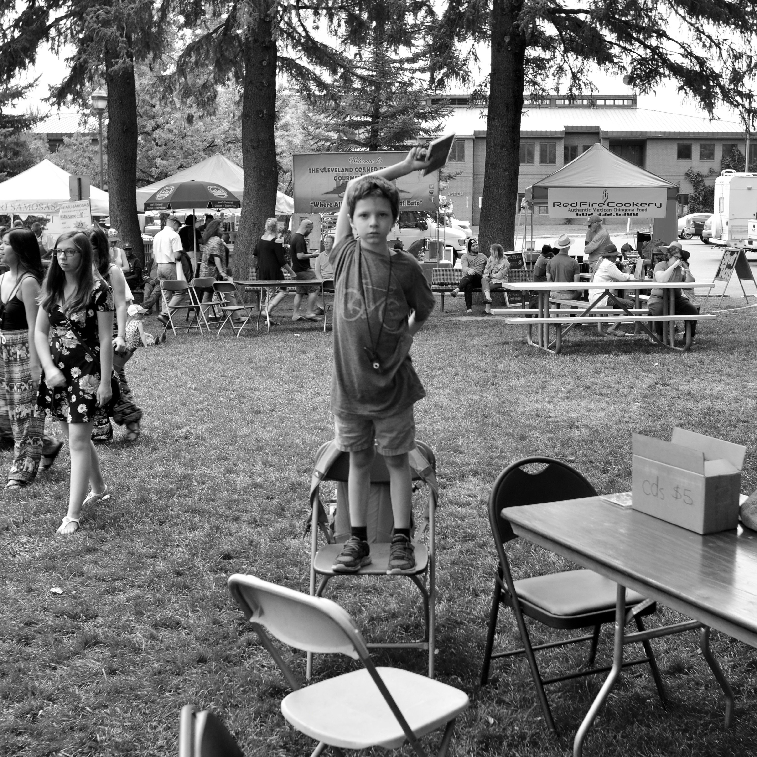
WE’VE ALL ENDURED ONE: a brave gig by a solitary volunteer musician, solemnly squeezing out a song set on a threadbare recreation-department stage, providing aural filler near the picnic tables at an art festival/neighborhood fair/neighborhood rally. Crowds are sparse to the point of threadbare: enthusiasm is restricted to a few anemic claps between tunes: stage announcements mostly involve updates on the change in location for the caramel corn tent. For the artist, the whole performance is the musical equivalent of a game of solitaire.
But, hey, my son has copies of my CD at the table over there.
Now that’s optimism.
On the day this image of a doggedly dedicated young pitchman was taken, his mother was smiling and slogging her way through a hot Labor Day afternoon on a nearby platform while he ran the store. The budding entrepreneur was referenced on mic several times, responding to the plug by pivoting, pirouetting, and punching the air with a $5 disc held aloft. His energy waxed and waned, now calming to a mild wave, now heating up to a wild flailing of arms, spinning on the ground, and, at the moment I snapped him, conducting from the height of a folding chair. As he spots me, his gaze is a mixture of caution, determination, and businesslike focus, as he tries to assess whether I am a fan, or a threat, or even his shot at the fame for which he is so earnestly striving. The sum of all these feelings is a perfect storm of childhood, and I scoop it up gratefully.
His dedication also earns a small cash dividend, as he manages to actually sell a few pieces, mostly to women who are hosting the art tents near him. Hey, I have a son of my own. Good boy.
Good indeed. He has given me a gift as well. Time to knock off, as I’m not going to find this kind of luck for the rest of the day. Now, where were they selling those corn dogs?
LET’S SEE WHAT SHE’LL DO…
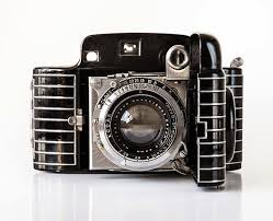
The Kodak Bantam Special.
By MICHAEL PERKINS
COMBINE THE ANTICIPATION OF CHRISTMAS with a severe lesson in humility and you’ve described the process involved in exposing a roll of film in an old camera that may or may not operate properly. The “Christmas” part, that deliciously torturous anticipation that came, in analog days, from sending one’s film away to a lab, for up to a week before reviewing your results, is something that everyone of a certain, ahem, age can relate to. The humility (humiliation?) part comes when the package of finished prints arrives in the mail and your dreams crash up against the Great Wall Of Reality…delineating that ugly gap between what you saw and what you managed to capture.
I always collect older cameras that are at least technically “operational”. They click and clack the way they’re supposed to. Frequently, they spend their time as lovely museum pieces, but, on occasion, I will invest a little money to see if they are truly functional and if I can make them make pictures of any degree of quality. It’s a fairly costly operation, since older film sizes can be expensive (if they can be found at all) , and the list of qualified practitioners of the filmic lab arts is shorter with every passing year. As to how I evaluate the results, that can depend on the camera. If it’s an old Brownie and the images aren’t too good, I can’t really fault myself, since there wasn’t a lot of control I could bring to the process of a one-button box. In the most recent case, however, I was testing a Kodak Bantam Special, a fairly deluxe device that cost nearly $90 dollars in 1936 and featured a rangefinder, widely variable shutter speeds and a fairly fast f/2 lens. So in shoving a roll of extremely scarce 828 film (a bygone size with a negative slightly larger than 35mm) through the works, there were two things to determine: whether I could master the camera with a test base of only eight exposures and whether the camera was still able to perform.
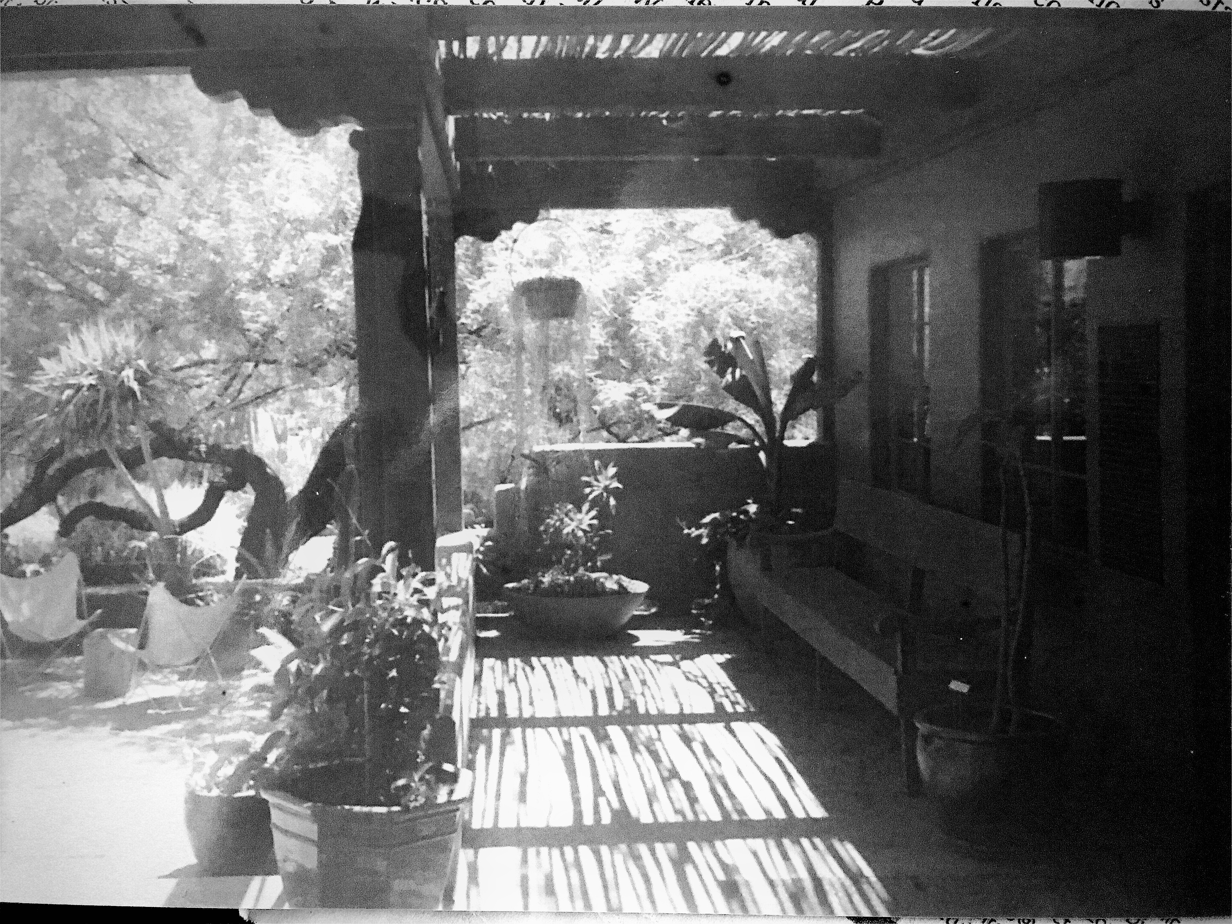
A frame from a Bantam test roll, adjusted, let us say, liberally.
One of the dozens of designs created by Walter Dorwin Teague during his time with Eastman Kodak, the Bantam Special has been called by many the most beautiful camera ever made. Now, while that may be aesthetically true, it’s an ergonomic nightmare, with controls jammed very, very close together, making it easy for ham-fisted users like me to fumble, lose their grip, even adjust one control when they think they’re working on another. In the case of this particular Bantam, most of the test roll revealed that the collapsible bellows on the camera leaks light like a sieve, producing wispy streaks across most of the frames. In other good news, the color rendition was very low contrast, with most hues having a decidedly bluish cast. Underexposure was also extremely easy, even with 400 speed film and wider apertures. And while that’s probably a mixture of old mechanics and my own poor calculation, the only way I could make the frame at left (one of the “keepers”) passable was to artificially tweak the contrast and convert it to monochrome after the fact. And that, again, is the “humility” part of our program, innit?
Moral of the story: If you ever find yourself getting cocky with the utterly cheap comfort of the digital age, take a time trip to the era when even the best laid-plans of mice and men often resulted in “what the hell?” pictures. Maybe the most enjoyable thing about shooting film, at this stage of the game, is knowing you can stop shooting film any time you want to.
ALL THERE IN BLACK AND WHITE(?)
By MICHAEL PERKINS
YOUR CONCEPT OF “STREET” PHOTOGRAPHY, assuming it interests you at all, is shaped by a variety of influences, including your idea of appropriate subject matter, biases in style or equipment, even your technical limits. But from my own particular perch, I think that the era into which I was born may be one of the strongest determinants of my preferences in street work, at least when it comes to the choice between black and white and color. To me, this kind of reportorial photography is vastly different either side of a key time line, with one side, say the world up to about 1955, weighted toward monochrome, and the other, the years that follow that mark and track forward up to the present day, being the more “color” era.
Before the mid-50’s, nearly all “important” photography was still being rendered in monochrome, much of it of a journalistic or editorial nature. From the crash of the Hindenburg to the New Deal’s chronicling of the impact of the Great Depression through endless newsreel and magazine essays, the pictures of record, of the stuff that mattered, was black and white. Consumer photography generally followed suit. Early color films were available from the 1930’s on, but the overarching curve of Everyman hobbyist work did not immediately flip to general use. Color was largely for commercial work, for selling things in a hyper-saturated advertising spread or brochure. Seminal black and white essays like Robert Frank’s The Americans or Henri Cartier-Bresson’s The Decisive Moment seemed to reinforce the idea of monochrome as the messenger of realism, authenticity, grit. Ugly, sad, tragic, important things happened in black and white. Color was for kids’ parties.
What “color” is your reality?
By the 1960’s, faster consumer color films changed candid photography virtually overnight as amateurs opted for more “lifelike” images. Color print, slide and movie film sales soared, and, while magazine and newspaper “documentarians” continued to emphasize mono as the “official” tonal language of street work, younger photographers began to reframe the argument as to what constituted a fit format for commentary. In the present day, both approaches live comfortably side by side, and many shooters are not exclusively in the ‘either” or “or” camp, deciding one frame at a time whether a narrow or wide palette is right for a given image. Even the shooters who embraced color as young photographers may, today, toggle back to monochrome for a singular impact or even a nostalgic evocation of the past. Fashion historians can easily lose count: we’ve zoomed past ironic, post-ironic, post-post-ironic, and back to innocence again, spinning through both unconscious and super-self-conscious styles like the blades of a pinwheel. Beneficiaries of technologies that abett and invite multiple ways to rendering the same subject, we shoot in all eras and influences at once. Everything about photography is a la carte.
For me, black and white isn’t a signature, but then again, neither is color. I find them both adequate for the candid work that encompasses “street”, and I reserve the right to make the choice between the two at a moment’s notice. Tonal properties, after all, should be as improvisational as the decision to make a given picture. We are freer than ever to worry less about the how of a photograph, and focus on the why.
HAPPY-EN-STANCE
By MICHAEL PERKINS
IT’S FAIR TO SAY that photographers are occasionally the worst possible judges of what will save or spoil a picture. Try as we may to judiciously assemble the perfect composition, there are random forces afoot in the cosmos that make our vaunted “concepts” look like nothing more than lucky guesses. And that’s just the images that actually worked out.
All great public places have within them common spaces in which the shooter can safely trust to such luck, areas where the general cross-traffic of humanity guarantees at least a fatter crop of opportunity for happy marriages between passersby and props. At Boston’s elegant Isabella Stewart Gardner Museum, the surrounding walls of the central court are the main public collecting point, with hundreds of visitors framed daily by the arched windows and the architectural splendor of a re-imagined 15th-century Venetian palace. The couple seen here are but one of many pairings observable in a typical day.
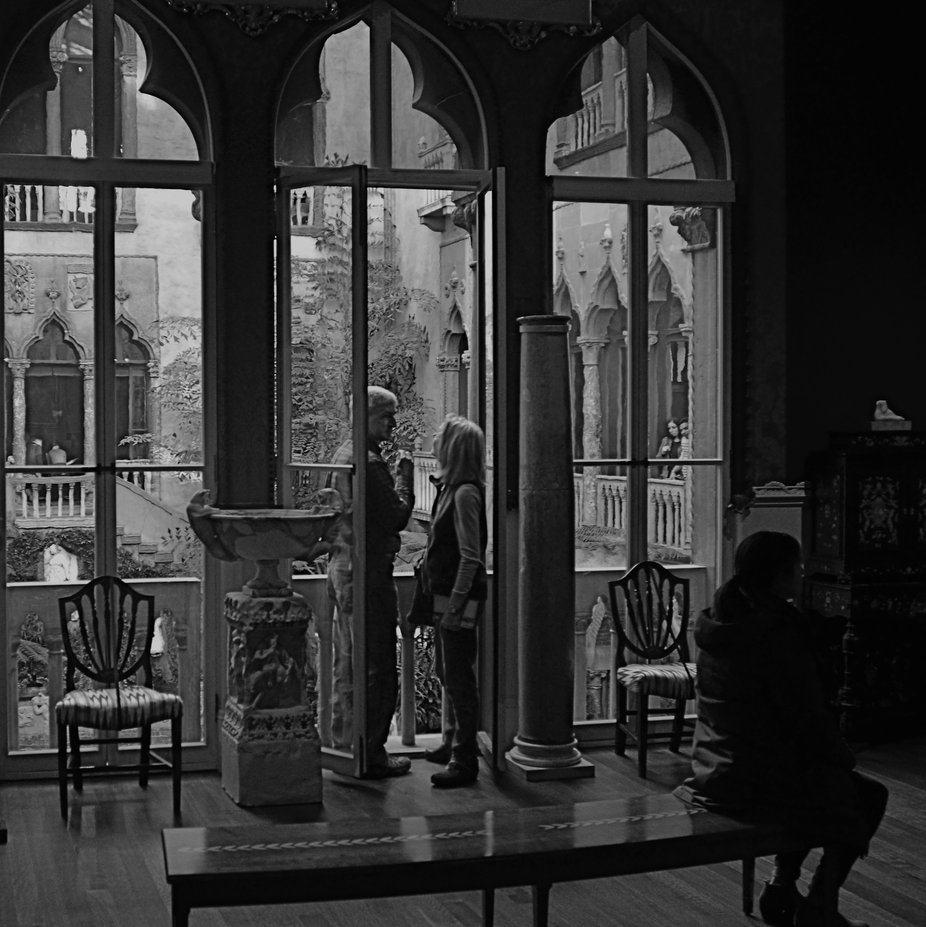
The pair just happens to come ready-made, with enough decent luck assembled in one frame for almost anyone to come away with a half-decent picture. The size contrast between the man and the woman, their face-to-face gaze, their balanced location in the middle arch of the window, and their harmony with the overall verticality of the frame seem to say “mission accomplished”. I don’t need to know their agenda: they could be reciting lines of Gibrhan to each other or discussing mortgage rates: visually, it doesn’t matter. At the last instant, however, the seated woman, in shadow just right of them, presents some mystery. Is she extraneous, i.e., a spoiler, or does she provide a subplot? In short, story-wise, do I need her?
I decide that I do. Just as it’s uncertain what the couple is discussing, it’s impossible to know if she’s overhearing something intimate and juicy, or just sitting taking a rest. And I like leaving all those questions open, so, in the picture she stays. Thus, what you see here is exactly one out of one frame(s) taken for the hell of it. Nothing was changed in post-production except a conversion to monochrome. Turns out that even the possibility of budding romance can’t survive the distraction of Mrs. Gardner’s amazing legacy seen in full color, and the mystery woman is even more tantalizing in B&W. Easy call.
As we said at the beginning, working with my own formal rules of composition, I could easily have concluded that my picture would be “ruined” by my shadowy extra. And, I believe now, I would have been wrong. As photographers, we try to look out for our own good, but may actually know next to nothing about what that truly is.
And then the fun begins….
IRVING’S CURTAIN
By MICHAEL PERKINS
BY THE TIME IRVING PENN (1917–2008) WAS ESTABLISHED as a portraitist without equal for Vogue magazine, he had chalked off clear parameters for his style. Natural over artificial light: large format, high-resolution monochromes: a patient talent for extracting the essence of even the most reluctant subject: and an almost lucky-charm devotion to the worn and stained curtain he would use, almost exclusively, as his backdrop for the length and breadth of his legendary career.
Salvaging the curtain from a Paris theatre in 1950, Penn used it as the great equalizer in all his portrait work, staging everything from Picasso’s puckish gaze to Audrey Hepburn’s gamine charm in front of its collection of stains, spills and discolorations. The curtain was as essential to a Penn shoot as the great man’s lenses, and where he went, from remote African villages to literary salons, it went also. And finally, eight years after his death, it traveled one more time to New York, for a supporting role in an Instagram near you.
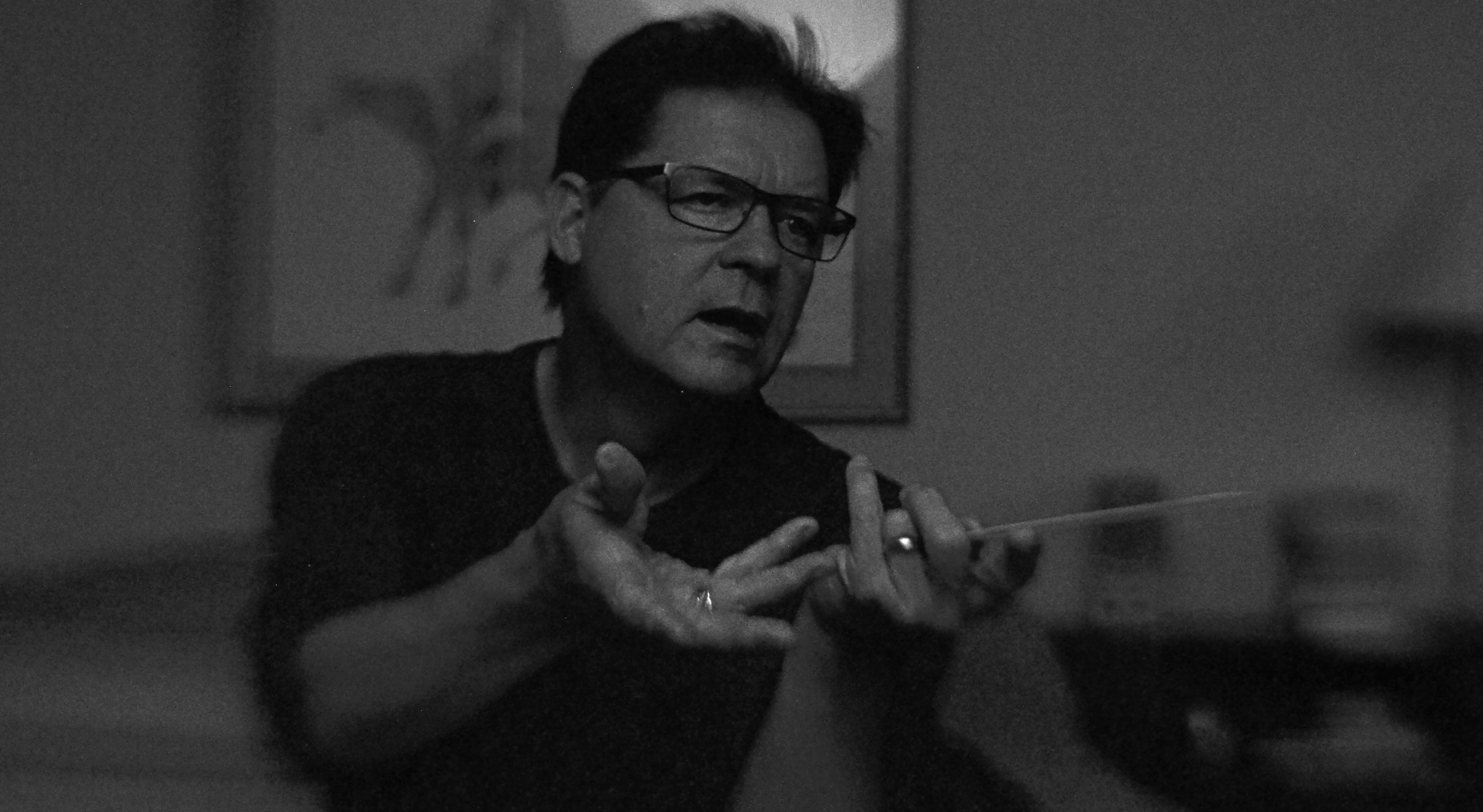
As part of the Metropolitan Museum Of Art’s centennial celebration of Penn’s work for 2017, the curtain was installed in a room chocked with shots of the famous people with which it had co-starred. Studio-style, it was mounted on a curved panel to avoid hot spots from glare, and visitors were invited to pose themselves in front of it, fore-lit by a well-placed fashion light. The message was seductively mis-leading. If the cloth is magic, maybe it’s transferable! Maybe it is that black crow’s feather that makes Dumbo fly…..
The Met’s true genius in installing this Penn-it-yourself feature in its exhibit became obvious once you took the bait. That is, there’s nothing better to teach you that his work was great than allowing you to take very bad pictures under some of the same circumstances. I certainly got the point after clicking off a seriously flawed candid of my wife, seen here. I mean, other than blowing the focus, the metering, and the placement of light and shadow, the shot’s perfect, right?
Of course, the Penn curtain challenge had a kind of theme-park appeal, sort of like when you stick your face through a hole in the back of a cartoon cutout at Coney Island to have your picture taken as a “strongman”…and just about as convincing. Because art isn’t gear: genius isn’t mere tools. And you can’t be Rembrandt just by picking up Rembrandt’s brush.
FAKING YESTERDAY (AND LOVING IT)
By MICHAEL PERKINS
PHOTOGRAPHS ARE POWERFUL ALLIES when it comes to wish fulfillment. One of the medium’s first great artists, Julia Margaret Cameron (1815-1879) not only preserved the faces of Charles Darwin, Alfred Lord Tennyson and Robert Browning for posterity, but also went the extra step into fantasy by draping her subjects in historical costumes and posing them in illustrations from Shakespeare and Arthurian legend. Her stars masqueraded as legends, their features made dreamy and ethereal with her soft, long exposures on collodion-coated glass plates.
Everyone deserves at least one such photo fantasy, the chance to effectively leap into a treasured era while also creating the look that would have been common in that time. For a kid in baby-boom Ohio, daydreaming about standing up in front of a world-class orchestra, a kid who never played air guitar but who exhausted himself playing “air baton”, my photographic era of choice was that of Columbia Masterworks’ 30th Street recording studio in the Manhattan of the early 1960’s.
At the insistence of the label’s classical producer Goddard Lieberson, chief photographer Don Hunstein shot the greats not in starched, formal portraits, but in the very act of creation, immortalizing maestros from Leonard Bernstein and Pierre Boulez to George Szell and Igor Stravinsky. In terms of the “feel” of the images, most photo illustrations for album jackets from the period were still in black-and-white, lending Hunstein’s shots a gritty realism, as did the slower, higher-grain film emulsions and softer portrait lenses of the time.
Enter my self-generated conductor fantasy, shooting myself with a remote shutter release in a nearly dark room, just about half an hour after sunset at 1/40 of a second to allow me to hold a fake “caught in the action” pose with just a small amount of manually tweaked de-focusing for softness at f/4 and an ISO of 1250 to simulate the old Kodak Tri-X grain.
Vain beyond belief? You bet. More fun than my five best Halloweens combined? Indeed. “Alright everyone. Let’s take it from bar 124…”
FACTS NOT IN EVIDENCE
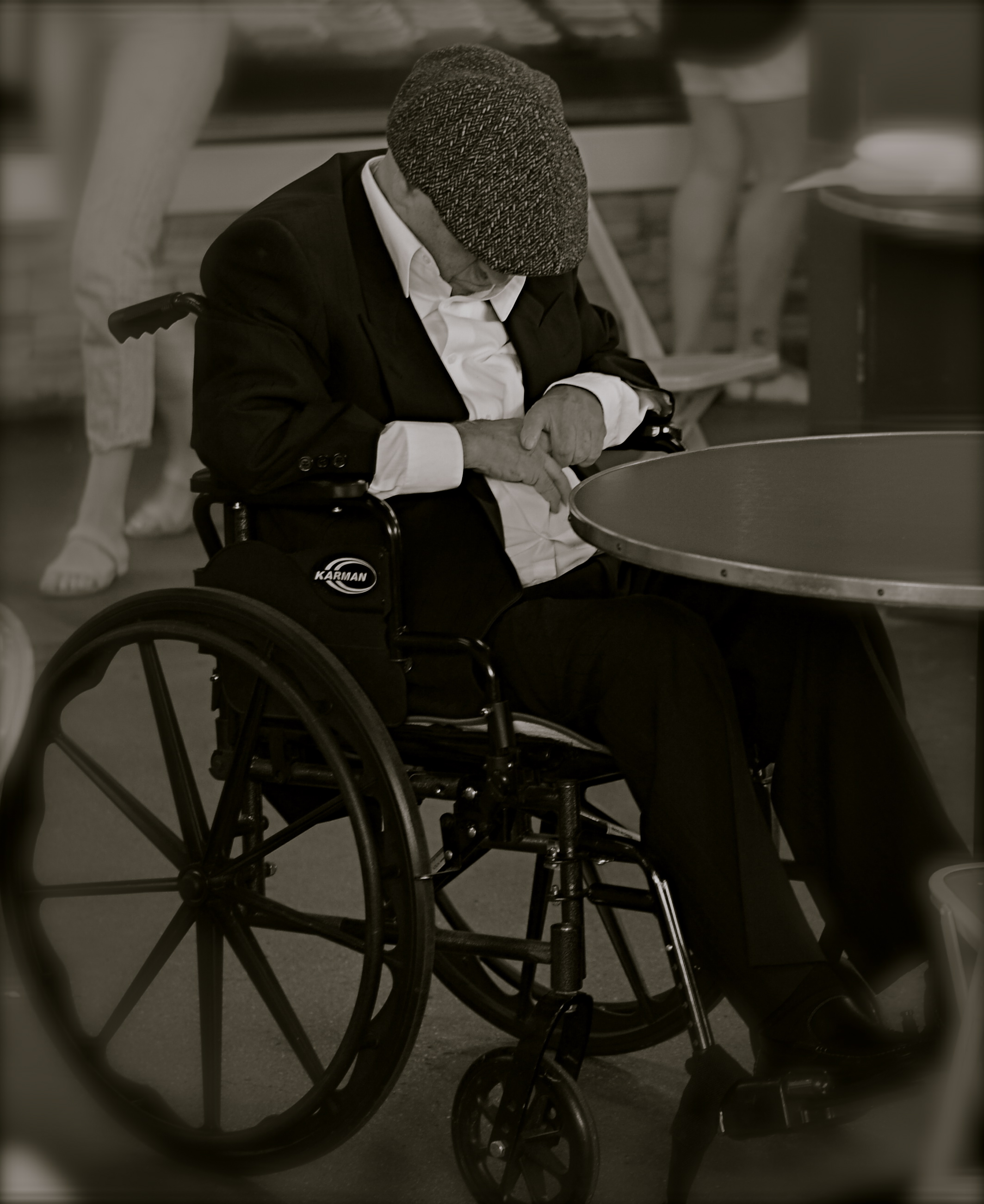
The more you study a picture like this, the more you can find wrong with it. Let me help you….
By MICHAEL PERKINS
IF A STREET PHOTOGRAPHER IS GOING TO ASK HIS AUDIENCE TO EXTRACT A STORY FROM AN IMAGE, then he must ensure that he is putting that same story into his pictures. Just suggesting a narrative, especially in a photograph, is not the same as conveying one. In legal terms, you are asking your viewers to “assume facts not in evidence.”
Do you have to spell everything out, like an S.O.S. in a bowl of alphabet soup? No, but just pointing your camera at just anything happening “on the street” doesn’t guarantee emotional impact, either. Nor does it imbue your pix with profundity, irony, or anything else that wasn’t happening through your eyes before it went through the lens. No street shot is guaranteed “authenticity” just because you were on the street when you pressed the shutter.
Look at the image at left, which I snapped rather accidentally while taking a lot of images of a crowded food market. I did not mean for the gentleman in the wheelchair to be the main appeal of this frame, but even though he’s been cropped to now be central to the shot, there is no clear narrative that “saves” this photo, or makes it compelling on its own terms.
Let’s dissect the picture to see why it fails. What it is, in raw terms, is a man in a wheelchair, sitting alone, wearing dark clothing, his face hidden.That is all that’s absolutely proven in the picture. Now, let’s assume that I was going for something poignant, a human “moment” if you will. Such moments are the heart and soul of great street shots, but this one is missing far too much vital information. If the man is “sad”, is it because he’s in a wheelchair? Why, and who am I to say so? After all, maybe he just had some restorative surgery which, after a month in the chair, will restore him to star-athlete status. Or maybe he is in the wheelchair for life and yet enjoys a richer existence than I do.
Let’s go farther. His face is hidden, but what story can I make the viewer believe is true about that? Is he catching a cat nap while his pile scores him a slice of pizza? Is he doing special exercises? Praying? Does his hat fit badly? Is he depressed, or actually a master of meditation who’s more connected to the cosmos than I can even dream of? And then there’s the monochrome. This picture began as a color shot, but I certainly didn’t increase its impact merely by sucking out the hues. That is, there isn’t some clear message that was being muffled by color which now speaks in a clear voice in mono. Finally, the cropping makes him the prominent feature in the photo without making him the dominant one. The background of the original was distracting, to be sure, but, as with the color, taking it away didn’t add to the picture’s force. If anything, it made it weaker. The man can’t be ironic or poignant since I’ve now cut him off from everything that provides context to his role in the picture.
You get the idea of the exercise. This shot, color or mono, cropped or wide, had nothing clear to say about the human condition. It was taken on the street but it ain’t “street” in effect. Try the same ruthless analysis with your own “near-miss” shots. It’s a humbling but educational process.
JUMPING OFF THE TOUR
By MICHAEL PERKINS
VISITOR ATTRACTIONS CREATE THEIR OWN KIND OF PECULIAR GRAVITY, in that many of them develop an “official” way to take in their delights, pulling you toward what they believe to be the center of things. From the creation of tourist maps to the arrangement of signs on paths, many famous “places to see” evolve systems for how to “do” parks, recreation areas, even ancient ruins. Some hot spots have even been so obvious as to mount signage right next to the “Kodak moment” view that, of course, you will want to to snap, since everybody does. And from here, folks, you can clearly see the royal castle, the original temple, the stunning mountain vista, etc., etc.
But predictability, or an approved way of seeing a particular thing, is the death of spontaneity, and certainly a danger signal for any kind of creativity. Photography is the visual measure of our subjective experience. It’s supposed to be biased toward our individual way of taking a thing in. Grading our reactions to visual stimuli on the curve, taking us all down the same path of recommended enjoyment, actually obviates the need for a camera. Just freeze the “correct” view on the gift store’s postcard assortment, and, presto, we can all have the same level of enjoyment. Or the same low point of banality.
About To Be (2016) 1/200 sec., F/5.6, ISO 100, 24mm.
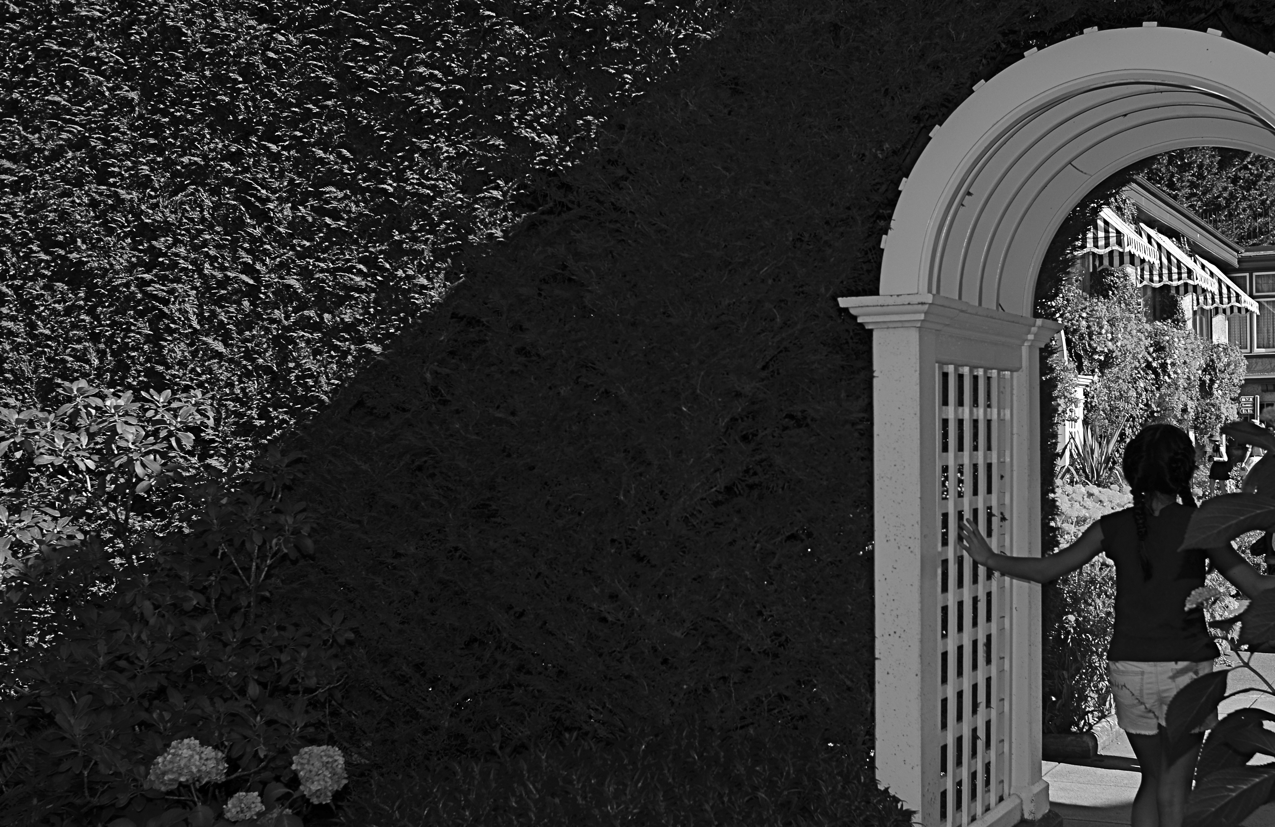
Recently I visited the amazing Butchart Gardens, a botanical bonanza on the island of Victoria in British Columbia. If ever there was a place where you’d be tempted to tick off “the sights” on a mental checklist, this cornucopia of topiary choreography is it, and you will find it truly tempting not to attempt your “take” on its most photographed features. But an experience is not a triptych, and I found my favorite moments were near the fringes or niches of the property, many of which are as stunning as the most traveled wonders along the approved paths.
To my great surprise, my favorite shot from the tour wasn’t one of the major sites or even a color image, but a quick glimpse of a young girl hesitating in the narrow, arched portal that separated one side of an enormous hedge from the other. She only hesitated for a few seconds before walking into the more traveled courtyard just adjacent, which is, itself, recorded thousands of times a day. But that brief pause was enough. She had become, to me, Alice, dawdling on the edge of a new Wonderland. The arch became all mystery to me, but the picture needed to be simplified to amplify that feeling, relegating the bright hues to secondary status. And while it indeed seems counterintuitive to take a black and white image in the midst of one of the world’s great explosions of color, I gladly chose the mono version once I had the chance to compare it to the original. Some things just work.
One thing that never works is trying to make your personal photographs conform with what the designer of a public place has recommended as the essential features of that place. Your camera is just that….your camera. Shoot with someone else’s eye, and you might as well just frame the brochure.
GRAVEYARD SHIFT
By MICHAEL PERKINS
THERE IS, ALMOST CERTAINLY, A STORY BEHIND THE PHOTOGRAPH BELOW. Unfortunately, I don’t know what it is. And probably never will.
Images often state or at least imply a narrative, allowing the photographer to relate a dimensional story within the confines of a flat, static frame. It’s kind of a miracle when that happens, but there are also those pictures in which, although part of a story has been captured in mid-flight, the whole of the tale will never be revealed. Sometimes it’s because I flat-out don’t possess the skill to tell it properly. Sometimes it’s because, although I set out to tell something in a coherent fashion, I mucked it up in execution. And, in the most interesting/frustrating of cases, it’s because the photo simply contains too little content or context to make a story emerge.
Yet, these are the images that, perversely, I find myself returning to, as if staring at them multiple times will somehow solve the puzzle. It usually doesn’t, but that’s okay, since these “quandary” pictures also become some of my favorites. Maybe it’s because they’re orphans. Maybe I actually like that they defy explanation. It’s like reading Ulysses. I don’t get it, But then again, nobody else does, either.
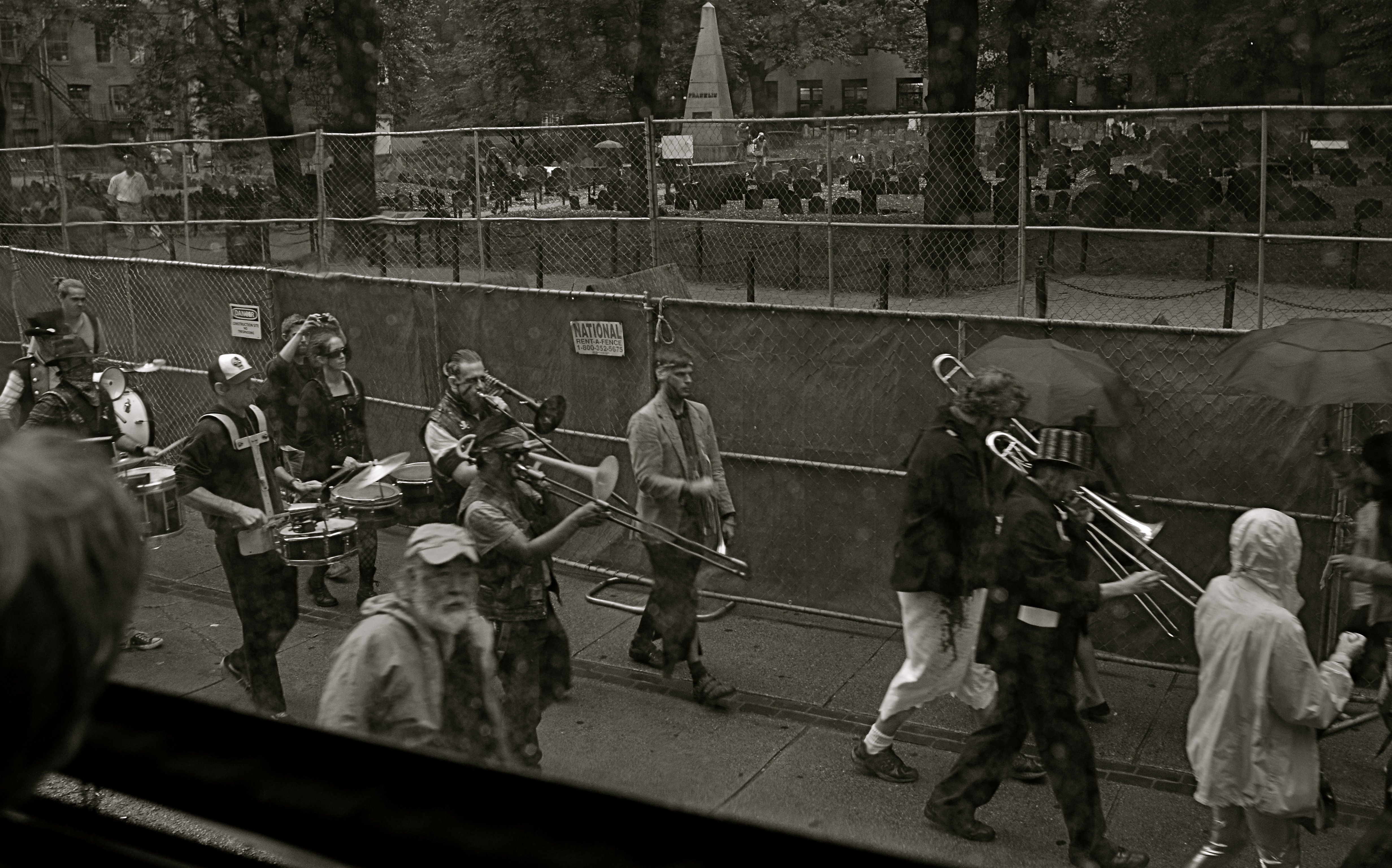
All Together, Now, With Gusto.
This particular question mark of a picture was snapped in Boston on a day soaked in enough rain to chase my wife and myself off a local walking tour around the Commons, trading squishy sneakers for butt lumps on a bus that spent 10% of its voyage hipping us to the local scene and 90% gridlocked in Beantown traffic, which is about average, as I understand it. There was, as a consequence, plenty of time to snap things out of the windows, even though the rain played serious hell with both focus and resolution. After a while, however,even the doomed task of trying to shoot anything usable became a kind of pastime all its own, especially after the driver was forced to retrace the same circle of traffic hell for a second or third go-round.
The scene you see here is in front of a historic graveyard right in the heart of the commons, a “who’s who” of honored dead, where, so say the locals, you can sit in a bar drinking a cold Sam Adams, and gaze out the window at (say it with me) a cold Sam Adams. What inspired the ragtag orchestra you see marching in front of the illustrious headstones, sans any insignia, uniforms, or sense of self-preservation is, and will remain, beyond me. What they were marching for, who their intended audience or cause might be….all of it is forever a befuddled “huh?”. Bonus round: what with the light being so meager amidst the downpour, I had dialed down to a pretty slow shutter speed, so even basic sharpness was DOA for this particular frame.
Somehow, however, I love this picture, even more than if it made any actual sense. Unmoored from reality, I can make up a dozen might-be scenarios that explain it, and so it actually has more entertainment value than many of my so-called “successful” photographs. Or maybe I just like sitting in a pew at the Church of Weird every once in a while. And, on particularly dreamy days, I can stare at this band of gypsies and wish I could take up a tuba and head their direction for a bit.
After all, they know where they’re going…
BREAKING THE GEOMETRY
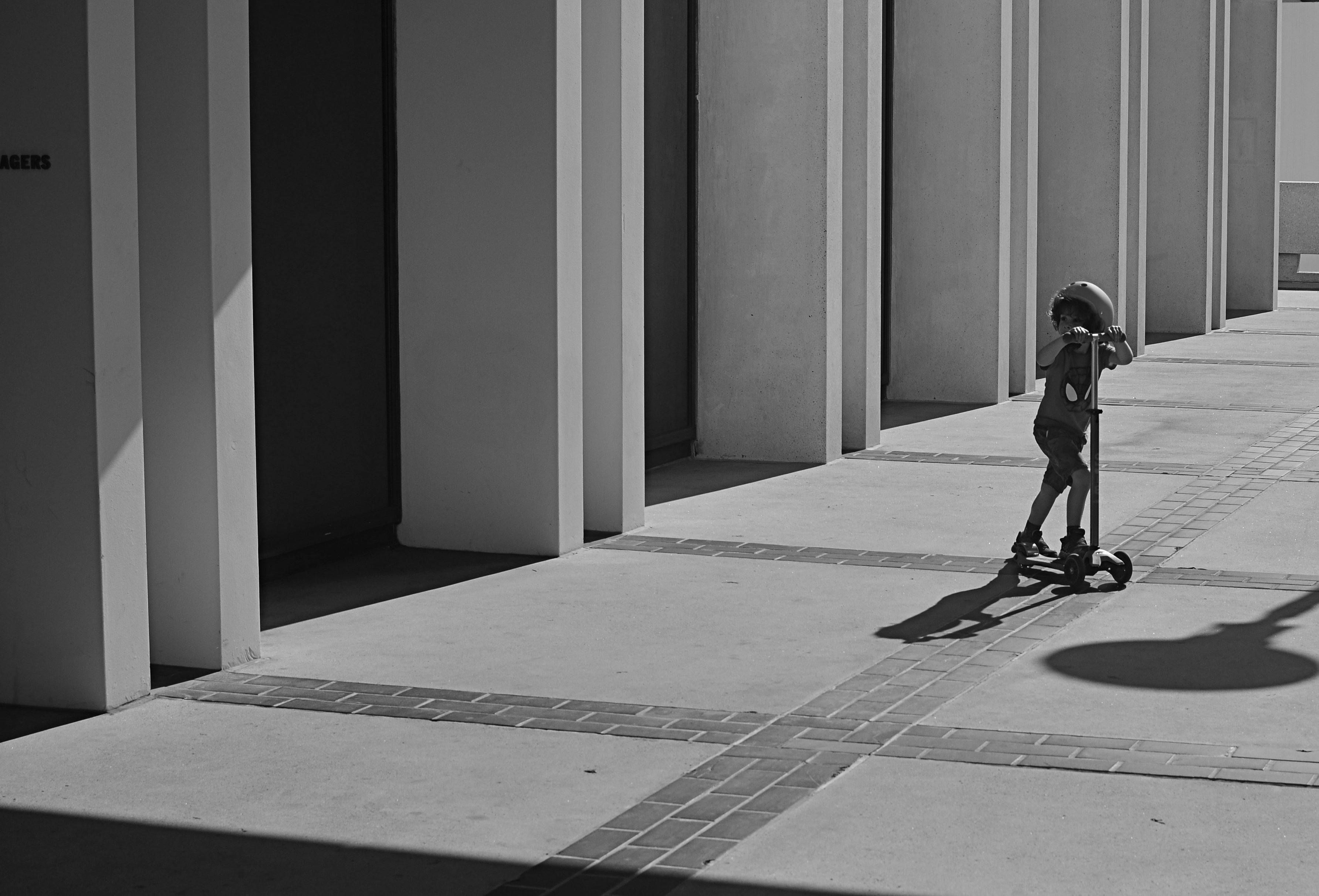
Zoom (2016)
By MICHAEL PERKINS
CONTRAST IN PHOTOGRAPHY IS NOT JUST ABOUT A COMPARISON BETWEEN DARK AND LIGHT VALUES. The word contrast also applies to things placed next to each other in a composition that fight for dominance. Happy faces next to sad. Images of wealth and opulence juxtaposed with poverty and misery. Some of it can be a kind of forced irony, and, as such, can produce pictures that get a little preachy, or appear deliberately staged.
I love urban architecture because many of its design elements are enough to create a compelling image all by themselves….that is, without the larger context of what’s around them. They don’t have to be about anything; they just are. Contrast isn’t needed in many cases, because I’m not trying to show mankind’s place versus the space of a building…..I’m just seeking absolute patterns. No comment, no message.
Occasionally, however, it’s great to invade all those clinical lines and angles with a bit of humanity, to break the geometry and inject something warm or whimsical. It doesn’t have to be deliberate and it doesn’t have to be amped up with busy staging. The best contrast shots between disparate elements are the ones that you simply witness.
In the above image, the boy on the scooter is neither a “bad” nor “good” subject, but he gains a little amplitude because of his odd placement amongst the more antiseptic surrounding textures. The shot also worked a little better in monochrome because, in the original shot, the boy’s shirt was so vivid that it drew too much attention to that part of the picture.
Photographers benefit from a million tiny collisions between seemingly opposed subjects every single day. Learning which ones to isolate and massage into pictures can be an enjoyable detective game.
ON ITS OWN TERMS
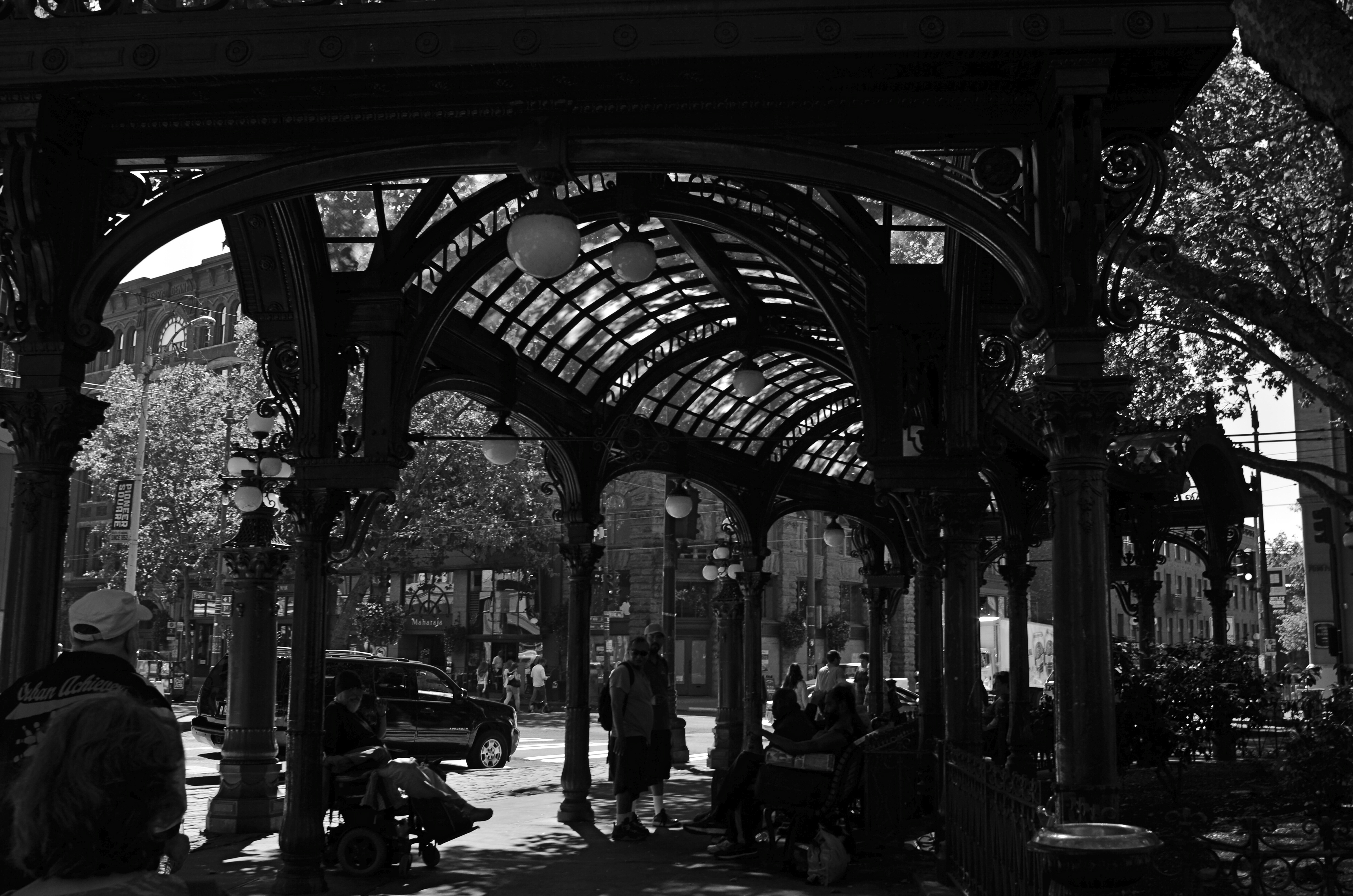
Gaslight Reverie (2016). Local characters convene under an aging arch in downtown Seattle.
By MICHAEL PERKINS
ONE OF THE FIRST EDITORIAL TRUTHS THAT PHOTOGRAPHERS LEARN is that just pointing and recording is not photography. The marvelous device which was designed to arrest time in its flight and imprison it for future reference is truly effective for setting down the facts of a scene….details, textures, dimensions, etc. But, once the shooter is bent upon making any kind of statement…amplifying, clarifying, commenting….then the unadorned data of reality may prove to be a set of chains holding him earthbound. Every picture has it own terms, its own rules of engagement. And sometimes that means moving mere reality to the second chair.
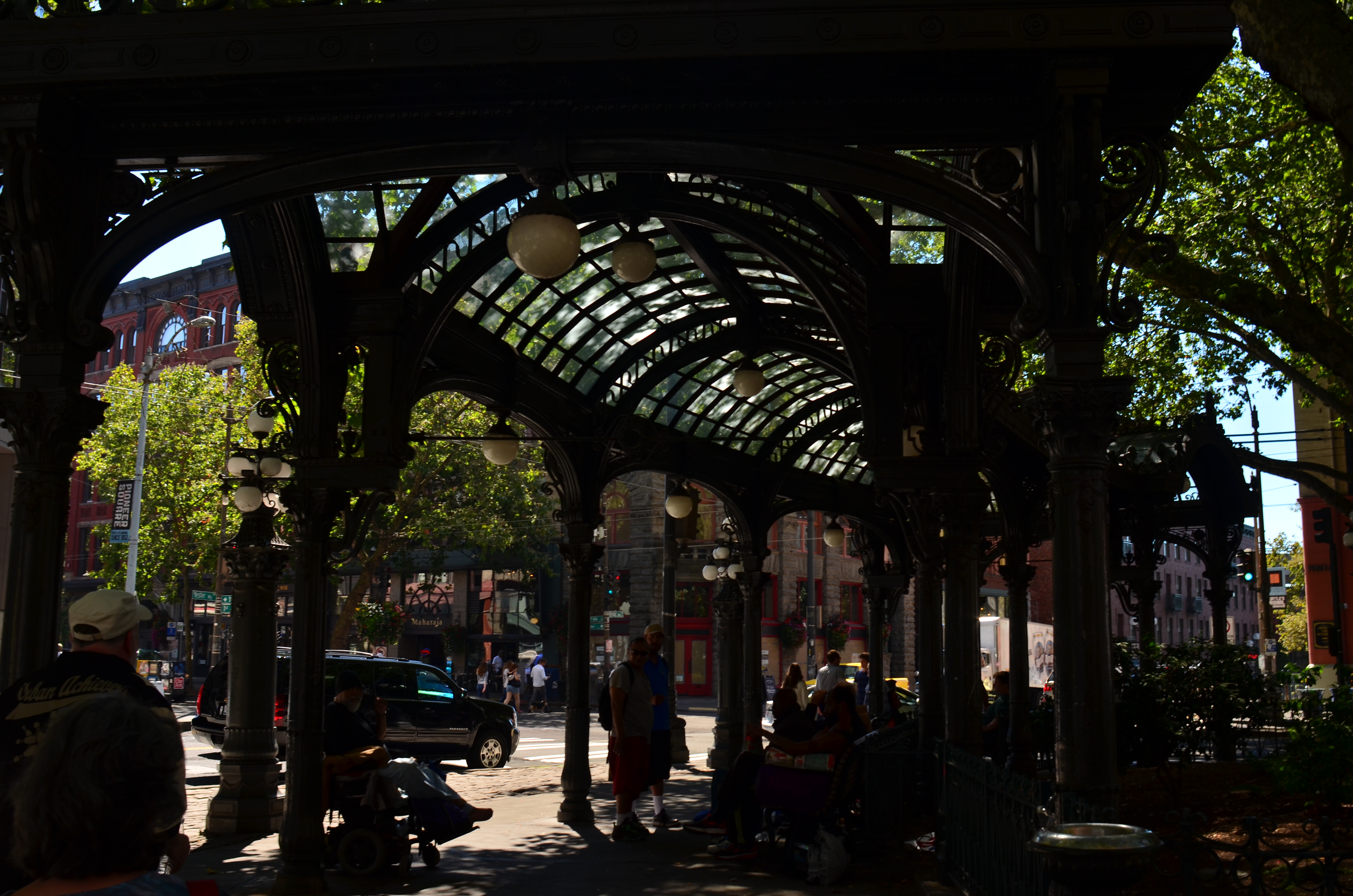
The same shot in color is a bit too charming.
Things that are only recorded are, to a degree, raw, in that they contain important information and extraneous data that might keep an image from being, well, a photograph. A deliberate act. Consider the purest form of “factual” photography, a reconnaissance flyover photo. Seen in its basic “real” state, the colllection of shapes, shades, and wiggles makes little sense to the observer. It needs the help of an interpreter to ferret out the pertinent narrative. Yes, this squiggle is a river. This grey smear is the warehouse. These scratchy cross-hatches are railroad lines. Photographs need to shaped so they can be interpreted. Sometimes this means, for lack of a more grammatical phrase, “including something out.”
There are many ways to achieve this, but, in the interest of brevity, I often find that a simple switch from color to monochrome goes a long way toward streamlining an image. Hues can be distractions, slowing the eye in its pursuit of a picture’s best impact. It prettifies. It luxuriates in tonal shifts, details, textures. Black and white can cut the busier parts of an image in half and convey a starkness (at least in some settings) that color can find problematic. Amping up the contrasts in black & white, eliminating many middle tones, can purify the image even further.
In the above comparison, a neighborhood in Seattle which is, in effect, its local Skid Row, is far more charming, far less gritty in the color rendering than in the mono version. Of course, the choice between the two approaches is made based on what you want to achieve. The same evaluation in a different situation dictates a different choice. Maybe.
Photography is not reality, and, if it were, it would never have flowered into an art, because reality is essentially dull. To make a picture, you have to determine the specific terms for that picture….what weight it wants to carry. Then it starts to become a photograph.
BURDEN OF PROOF
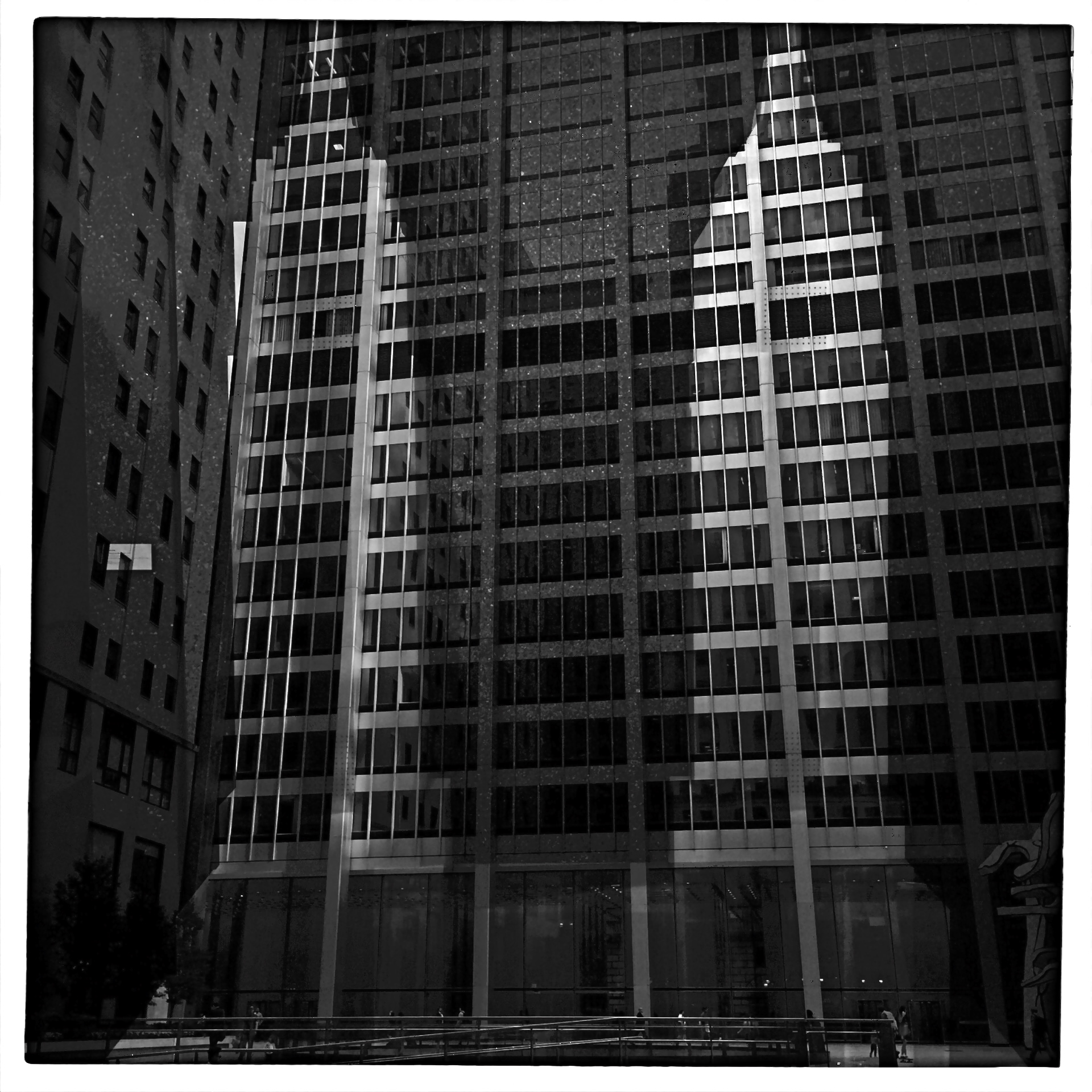
Reverse Shadows (2015) Originally conceived in color, later converted to black and white. Luckily, it worked out, but, shooting this image anew, I would execute it in monochrome from start to finish. Every story has its own tonal rules.
By MICHAEL PERKINS
THE WORLD OF PHOTOGRAPHY’S EMBRACE OF COLOR, which now seems instinctual and absolute, is actually a very recent thing. The arrival of color film stock targeted to the amateur market barely reaches back to the 1920’s, and its use in periodicals and advertising didn’t truly begin to outdistance color illustration until well after World War II. Color in so-called “serious” or “art” photography existed on the margins until half-way through the 1960’s, when hues, like every other element of the contemporary scene, gloriously exploded, creating a demand for color from everyone, amateur to pro. The ’60’s was also the first decade in which color film sales among snapshooters surpassed those of black and white.
Today, color indeed seems the default choice for the vast majority of shooters, with the “re-emergence” or “comeback” of black and white listed among each year’s top photo trend predictions. The ability to instantly retro-fit color images as monochrome (either in-camera or in-computer), has allowed nearly anyone to at least dabble in black & white, and the tidal wave of phone apps has made converting a picture to b&w an easy impulse to indulge.
And yet we seem to be constantly surprised that black & white has a purpose beyond momentary nostalgia or a “classic look”. We act as if monochrome is simply the absence of color, even though we see evidence every day that b/w has its own visual vocabulary, its own unique way of helping us convey or dramatize information. Long gone are the days when photographers regarded mono as authentic and color as a garish or vulgar over-statement. And maybe that means that we have to re-acquaint ourselves with b&w as a deliberate choice.
Certainly there has been amazing work created when a color shot was successfully edited as a mono shot, but I think it’s worth teaching one’s self to conceptualize b&w shots from the shot, intentionally as black and white, learning about its tonal relationships and how they add dimension or impact in a way separate from, but not better than, color. Rather than consistently shooting a master in color and then, later, making a mono copy, I think we need to evaluate, and plan, every shot based on what that shot needs.
Sometimes that will mean shooting black and white, period, with no color equivalent. Every photograph carries its own burden of proof. Only by choosing all the elements a picture requires, from color scheme to exposure basics, can we say we are intentionally making our images.
FAILING TO SEE THE BIG PICTURE
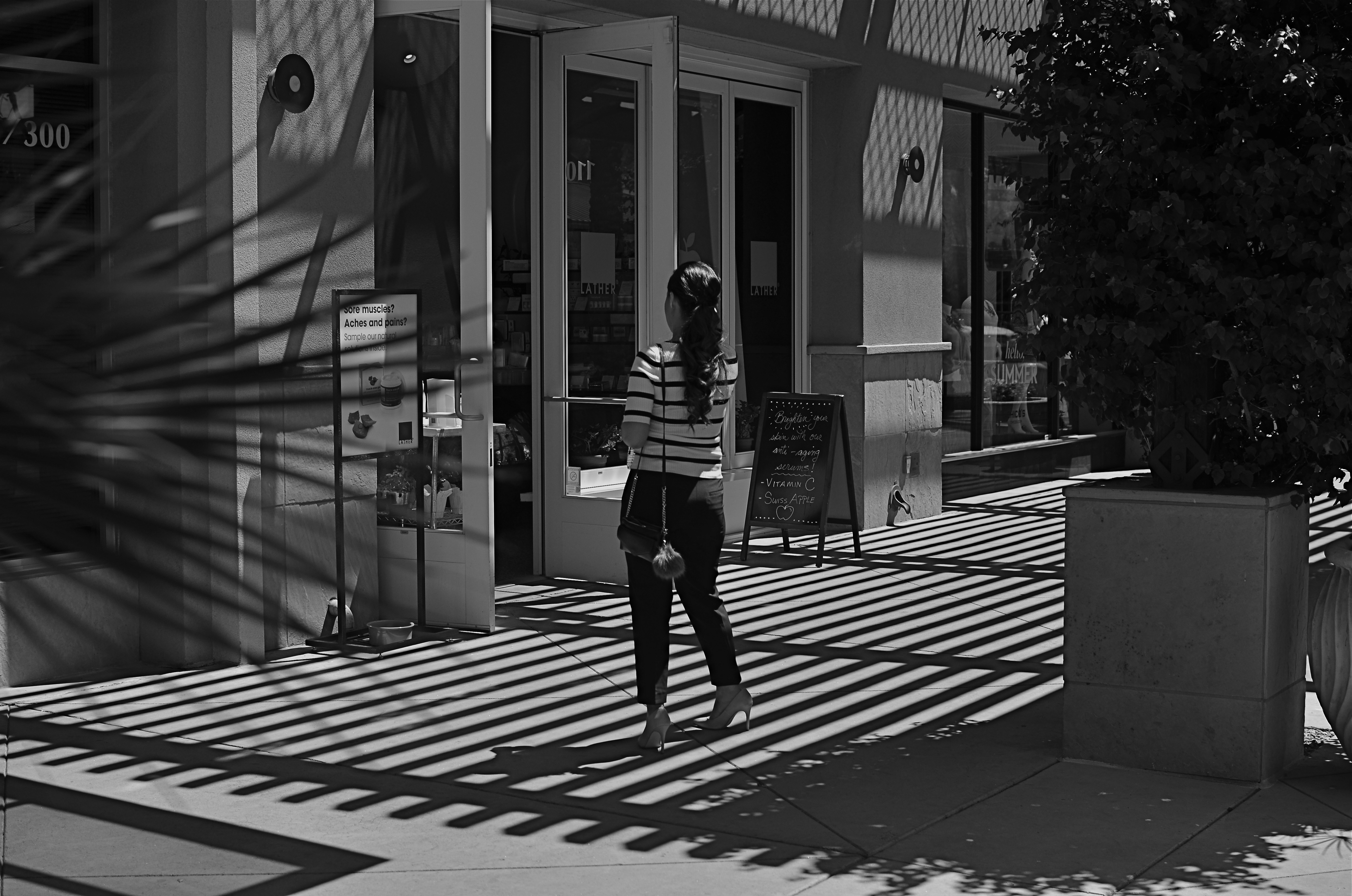
This image lingered in the “maybe” pile for a while. Then I started to see how much of it was expendable (see below).
By MICHAEL PERKINS
IT’S ENTIRELY POSSIBLE THAT MANY A WORKABLE PHOTOGRAPH HAS ONLY BEEN RENDERED SO BECAUSE OF SHEER BOREDOM. Face it: there are bound to be days when nothing fresh is flowing from one’s fingers, when, through lack of anything else to do, you find yourself revisiting shots that you 1) originally ignored, 2) originally rejected, or 3) were totally confounded by. Poring over yester-images can occasionally reveal something salvageable, either through processing or cropping, just as they can more often lead one to want to seal them up behind a wall. Even so, editing is a kind of retro-fitted variation on composition, and sometimes coming back around to a picture that was in conceptual limbo can yield a surprise or two.
I’m not suggesting that, if you stare long enough at an image, a little golden easter egg will routinely emerge from it. No, this is where luck, accident, and willpower usually converge to sometimes produce…..a hot mess, and nothing more. But leaving a picture for a while and returning to it makes you see with the eye of the outsider, and that can potentially prove valuable.
In the above shot, taken a few months go, I had all this wonderful gridded shadow texture presenting itself, shading what was otherwise a very ordinary stretch of sidewalk. A thought emerged that the stripes in the woman’s short might make an interesting contrast with the pattern of the shadows, but, after cranking off a frame or two, I abandoned the idea, just as I abandoned the shot, upon first review.
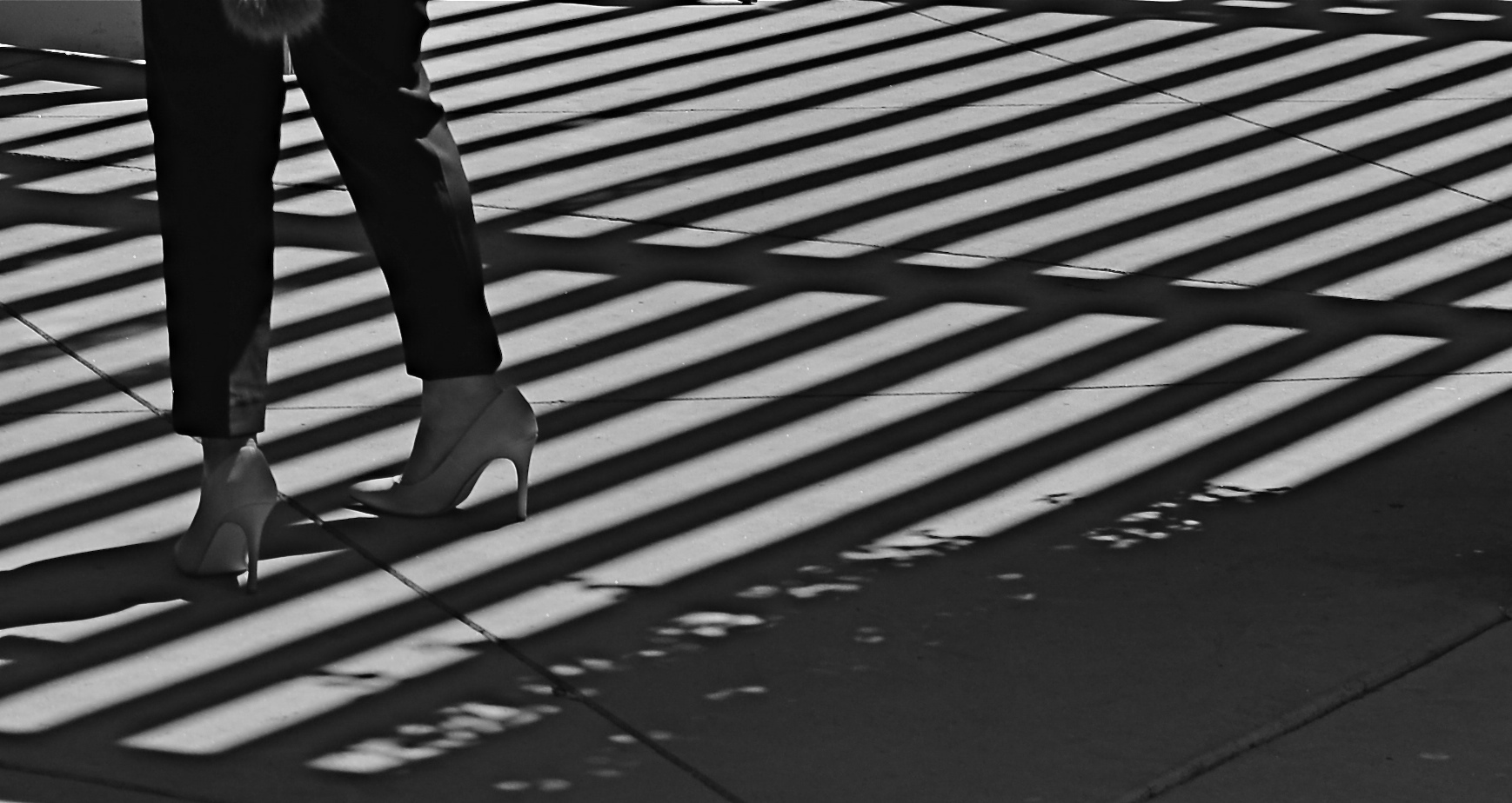
Several big bites of the scissors later…
Months later, I decided to try to re-frame the shot to create a composition of one force against another…..in this case, the verticality of the lady’s legs against the diagonal slant of the shadows. That meant paring about two-thirds of the image away. Originally I had cropped it to a square with her lower torso at dead center, but there seemed to be no directional flow, so I cropped again, this time to a shorter, wider frame with the woman’s form reduced to the lower half of her legs and re-positioned to the leftward edge of the picture. Creating this imbalance in the composition, which plays to the human habit of reading from left to right along horizontal lines, seemed to give her a sense of leaving the shadows behind her, kind of in her wake if you will. At least a little sense of movement had been introduced.
I felt that now, I had the tug of forces I had been seeking in contrasting her blouse to the opposing grid in the master shot. I’m still not sure whether this image qualifies as having been “rescued”, but it’s a lot less busy, and actually directs the eye in a specific way. It will never be a masterpiece, but with the second sight of latter-day editing, you can at least have a second swipe at making something happen.

THE YEAR OF UPHILL WALKING
By MICHAEL PERKINS
LIKE MANY, I WOULD HAVE A HARD TIME pinpointing the first photograph I shot after formally going into the Great Hibernation of 2020. The designated do-or-die date for heading ourselves into the bunker was fairly elastic, person-to-person, with some of us taking cover early in the spring, while others were forced to stay in-pattern for longer. I can determine, from the very type of pictures I took in this strange year, which were shot After The Before Times, but it would be mere guesswork to say that this image or the other was the first “confinement” photo per se.
But I can detect a change in the subject matter and viewpoint of those first days. I will always recall the realization that, as my world proceeded to shrink, my photography would become more introspective. This meant that my reaction to the sudden flood of spare time was, at least on good days, to luxuriate in the freedom it gave me; the leisure to select, to plan, to choose in the process of making pictures. As a consequence, in reviewing the year’s photographic yield, I find myself not so much choosing “favorites” or “bests” from the thousands of snaps I took in quarantine, but instead looking for the truest depictions of where my head was, and still is. This is all to say that I resisted getting in a year-to-year contest of some sort with myself over technique or skill and tried to concentrate on emotional accuracy.
Running Up That Hill, March, 2020
This picture is not technically distinctive by any measure, nor is it particularly original, but it is true to where I was when I made it. In what could be called The Year Of Uphill Walking, it projects that struggle to just keep climbing, across rocky, barren terrain, in anxious anticipation of what may lie over the next horizon, and without the blandishment or warmth of color. No destination is sure, or even promised; no arrival time is predicted; only the journey itself exists. If I had to deliberately try to show what 2020 felt like, I couldn’t have found a more appropriate visual metaphor than this picture. This is not me being a superb planner of shots. This is me, months after the fact, marveling that some measure of this madness somehow organically made it into my camera. I never went out formally looking for a way to give expression for my feelings; I merely let the process happen through me, to be a barometer of what I thought it important to see and record.
Maybe that’s the way I should always make pictures. Sometimes I think I understand my process and other times I feel like it’s leading me around by the nose. I hope to re-discover genuine hope in 2021, but, if I…we, have to settle for less, I pray that I’ll at least find a way to tell stories about how that felt. And I hope I’ll remember how to put one foot in front of the other.
Share this:
December 30, 2020 | Categories: Black & White, Commentary, Conception, Uncategorized | Tags: Monochrome, square format | 2 Comments