SIZE MATTERS (SOMETIMES)
 By MICHAEL PERKINS
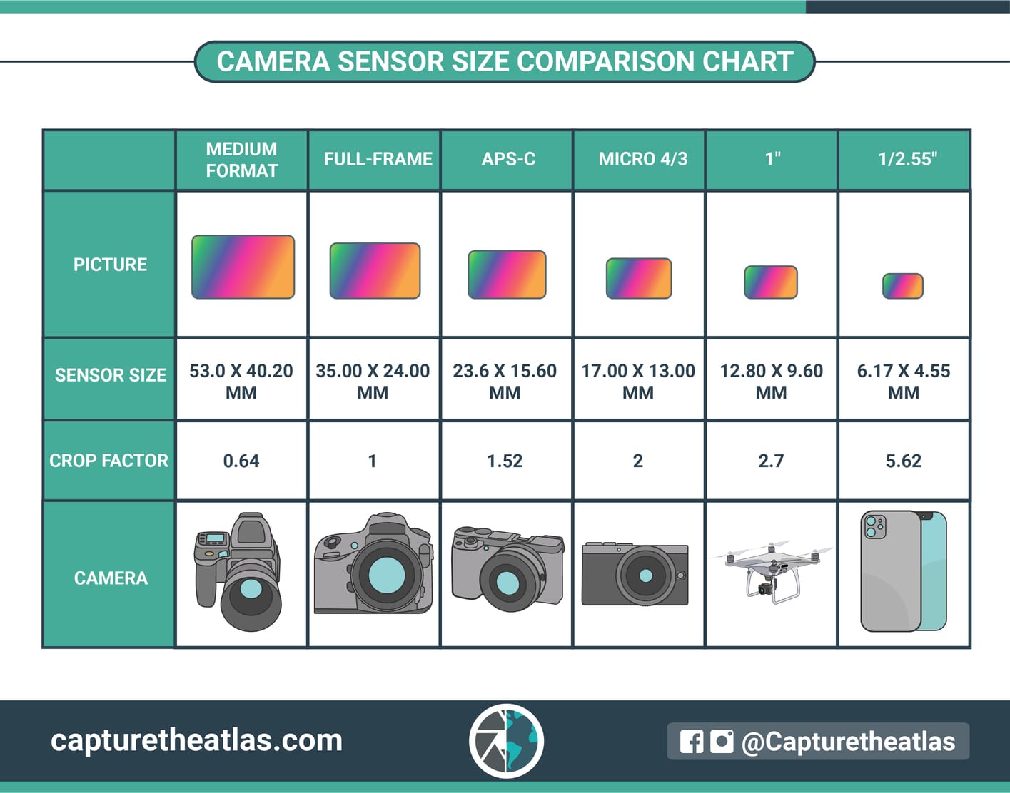
IF YOU’VE SHOPPED FOR A CAMERA OVER THE PAST TWENTY-FIVE YEARS OR SO, there’s a good chance that you’ve seen a chart similar to the one shown here, which compares the dimensions of variously sized digital camera sensors. Across the history of photography, there have always been a selection of frame shapes and sizes on offer, many passing in and out of existence based on technical advancements or the changing needs of shooters. In the digital era, however, there are more formats existing side-by-side than ever before, each grappling for their chunk of the overall marketplace.
The longest-lasting such configuration is the “full-frame” format, which carries over the basic dimensions of the old 35mm film frame. When introduced in the 1920’s by Oskar Barnack, it sped his development of the Leica and the introduction of hand-held or “miniature” cameras, which freed amateurs from the bulkier “medium format” cameras of the period. With many popular consumer films like Kodachrome created specifically for it, 35mm remained pretty close to a universal format until the 21st century, when early digital cameras began to offer the convenience of ever-smaller sensors. Of these, the APS-C, or “crop” sensor became the new standard of use for DSLRS, compacts and “bridge’ cameras. The crop, as its name implies, delivers a smaller frame area (and fewer pixels) than an FF, changing a larger image’s focal length by a multiplier (or “crop factor”on the chart) of roughly 1.5x. Your lens may say that it’s a 50mm, but, with the multiplier, on your crop sensor camera, your focal length is effectively 75mm.
And so things progress across the chart as you move further to the right on the chart. Each smaller-sized format has its own listed crop factor, with each higher number giving you a smaller percentage of the framing area in a full-frame format. Trends in the camera market have shifted back and forth a lot in the digital age, but none of the listed formats has managed to eclipse the rest to become a truly universal standard. Full-frame is still a factor, but has become increasingly expensive since fewer models are offered than was the case just a few years ago . 4/3rds has its fans, both for convenience and compactness, but, as is generally true of smaller sensors with fewer pixels, it can perform poorly in low light. Cellphone cameras, some of the smallest sensors available, began their run at a definite disadvantage when it came to resolution, with even more image loss once their pictures were translated through apps. However, each new iteration of the technology deals more effectively with these problems, and cels can no longer be dismissed as “not real cameras”. Just depends what you need and what you are willing to pay for/do without/put up with/settle for.
Size discussions off to the side, sensors rise or fall on how efficiently they process light. Some bitty ones do a bang-up job, while some larger ones are flat horrible. Overall they are a miraculous improvement over even great film because their sensitivity and performance can be customized in-camera and on-the-fly. That’s a consistent truth in photography: anything that gets out from between you and the easy making of pictures is a good thing.
SAY NO MORE
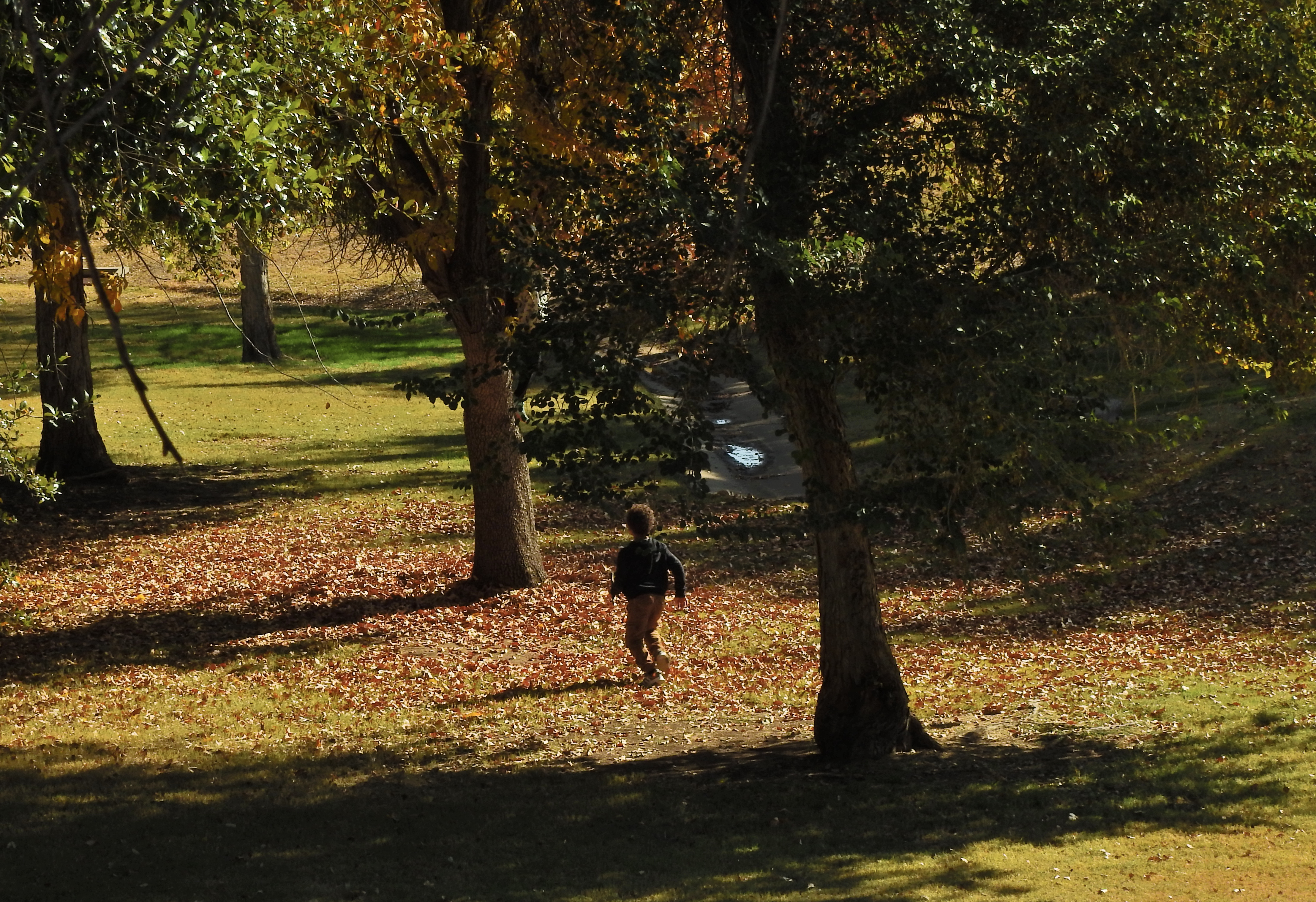
Huck Took The Shortcut, 2021
By MICHAEL PERKINS
THE ABILITY OF A PHOTOGRAPH TO PRETTY MUCH ILLUSTRATE EVERYTHING IN LIFE can tempt shooters to try to do exactly that; to pack a universe of stuff into every frame. In the minds of some of us, the camera is an information-gathering machine, and so, the more information, the better. But if we call to mind the photographs that have affected us most profoundly, we may see that there’s a hierarchy in the way information is presented in many of those uber-keeper photos. Everything in the world is not a number one priority; events and experiences are always ranked higher in importance than some and lower than others. And the photograph that shows too much may actually not communicate anything particularly well. Things need to be chosen and unchosen in order for a picture to breathe.
As a consequence, rather than showing four hundred trees of equal size and detail in a frame, we deputize one or several trees to stand for the entire forest. In any routine edit, we decide to crop out things which are part of the scene but which either don’t, narratively speaking, carry their weight, or, worse, act as distractions. It’s not only all right not to show everything, it’s a really important part of the covenant between artist and audience.
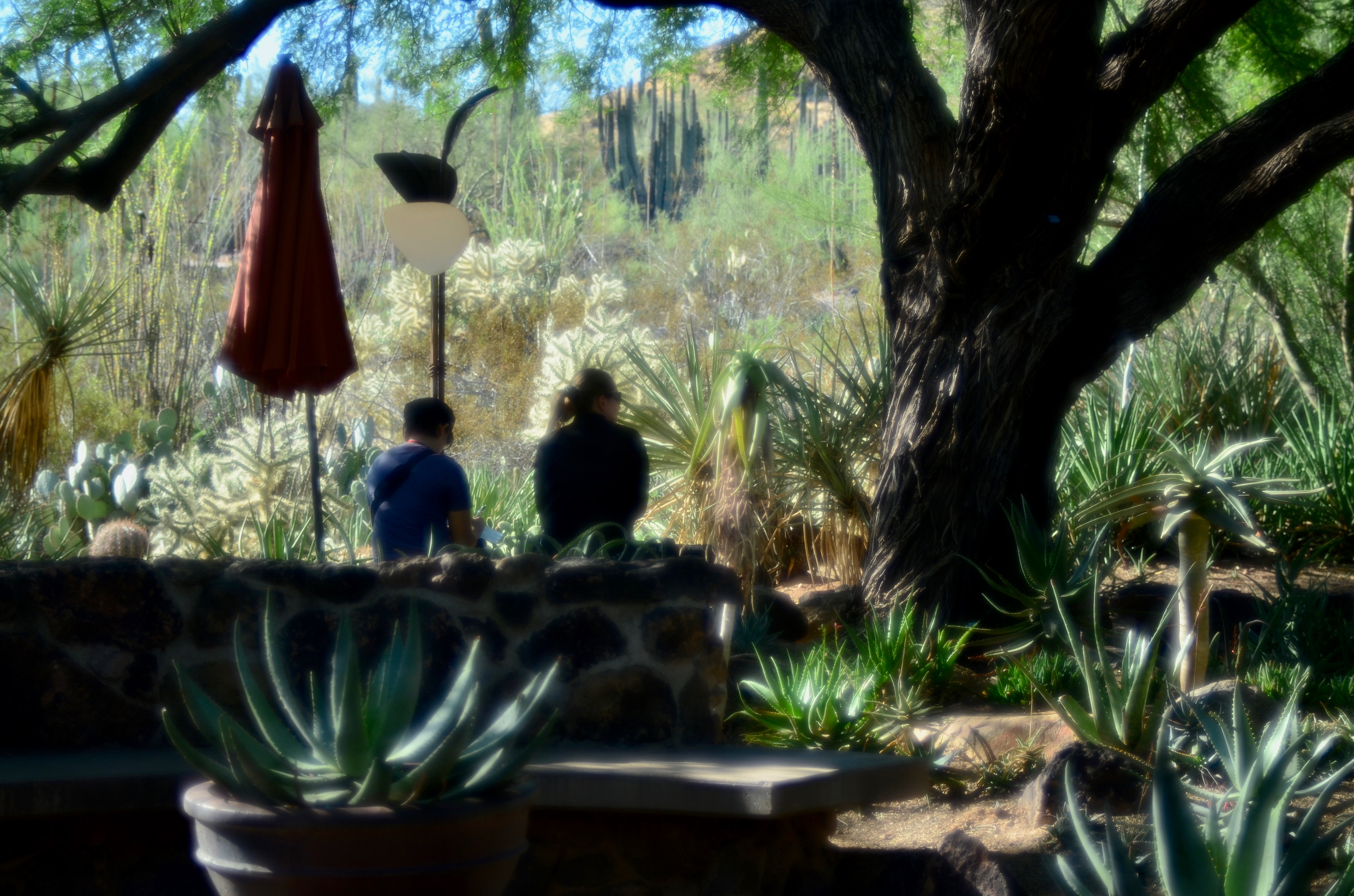
When you leave out some kinds of information, you’re respecting your viewer’s intelligence, since you’re recognizing that you both share a vast store of common experience, some of it so obvious that it can merely be implied and yet understood. As a very simple example, in the image seen here of a young boy running through the woods, his body language conveys all that’s needed for a complete understanding of the scene. Every part of his physical energy advertises the freedom and excitement he is experiencing, even though the picture provides little more than his silhouette and nothing whatever of his features. Would he be any more clearly delineated as a happy young boy if you were to show his smiling face? And as to the surrounding trees; they are, in life, rich in texture, but the prevailing shadow doesn’t keep them from being identified as trees, and so, really, how much better could that work, even if they were all in complete sunlight?
I’m only occasionally an advocate of minimalism for its own sake, mainly because in many cases it’s not the right approach. But over-delivering on information, while creating a thorough “document” of a scene, also has the potential for short-circuiting an image’s impact. As is often the cases, the best rules are the ones that come equipped with tons of exceptions.
TRANSFERENCE
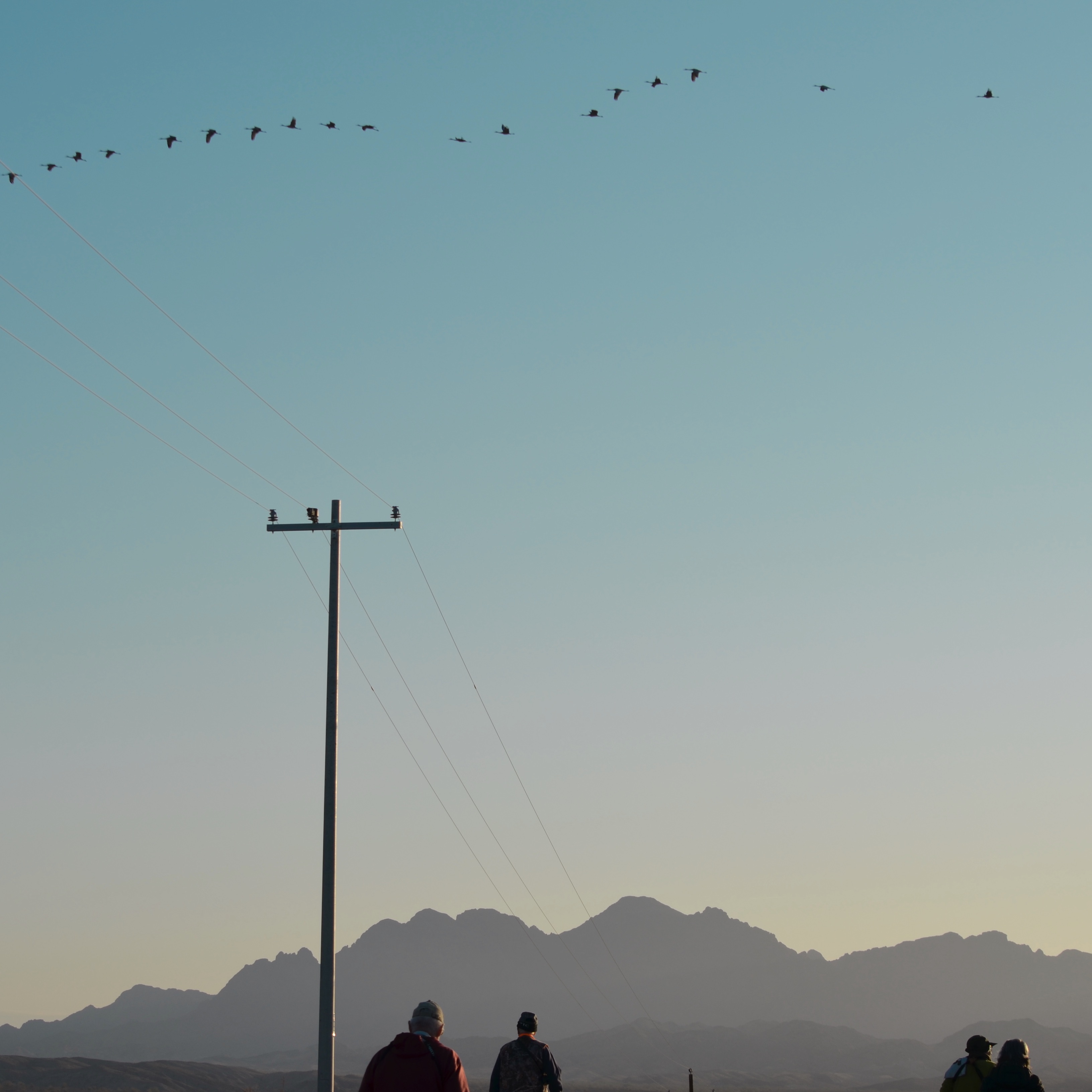
Flyover Country, 2020
By MICHAEL PERKINS
AS PHOTOGRAPHERS, WE PROVIDE THE PROGRAM WHICH CAMERAS ARE INSTRUCTED TO PERFORM. The actual box itself, like many other tools, is really a dumb thing, fueled not by its own ideas but instructed to carry out the whims of its owner. The camera thus does not really “see”, but merely follows the direction of those who can.
If they can.
The frustrating part of photography’s learning curve is that, over time, we all come to think of our most enlightened ideas as, well, primitive. The things we regard as obvious in our present incarnation as picture-makers were once invisible to us. And it follows that our present blind spots may, in a future version of ourselves, be the source of our greatest accuity. We are thus learning photography on several planes. There is the merely technical level, in which the mastery of aperture and focus is the primary mission. Then there is learning to see, as we begin to recognize patterns, themes or compositions. Finally there is the ability to evaluate what we see, to place different emphases on things depending on how we ourselves have evolved. This transference can take a pictorial element from the status of an object to that of a subject. We notice a thing differently and thus we photograph it differently.
I find myself in the process of such a shift at the time of this writing, mostly because I have recently made new friends within the birdwatching community, mostly due to my wife’s passion for the hobby. Now, of course, I have taken my share of bird photos over a lifetime, but most of them could be classified as opportunistic accidents (one landed next to where I was sitting) or as props within a composition, something to add scale, balance or flavor to, let’s say a landscape. That is to say that birds, for me, have been objects in my pictures, not, for the most part, subjects. Lately, however, I can see a subtle shift in my own prioritization of them.
Part of my pedestrian attitude toward them is borne of my own technical limits, as I have never owned the kind of superzooms that are required to make a detailed study of them. If I can’t afford to bring them into close view and sharp detail, it’s just easier to represent them as dots, flecks or shadows, as you see in the image at left. This, in turn, connects to my admittedly jaundiced view of telephoto images in general, since I think the gear required to capture them invites as many problems as it solves. I prefer prime lenses for their simplicity, clarity, efficiency of light use and, let’s face it, affordability. I realize now that all those biases are under review: I am, for better or worse, revising how I see the natural world, or, more specifically, the living things within it. Much of this is thanks to Marian, who sees the earth as a kind of game preserve with we bipeds charged with its responsible curation. The influence of her good example has been amplified further by my rage against the corporate titans who would lay waste to the last unicorn if it lined their pockets, and the fact that, at this juncture, their side seems to have the upper hand.
And so as both a photographer and a person, I can’t really relegate birds, or bison, or duck-billed platypuses to the background of my work any more. I may never become a great nature photographer, but that’s not the point. Fact is, the journey involved in sharpening our eye is always a staircase. Each step is important, but the upward journey itself is the main thing. Any photographer lucky enough to have his/her seeing powers challenged, even changed, is blessed indeed.
I know this is true. A little bird told me.
ON-PURPOSE ACCIDENTALS
By MICHAEL PERKINS
FOR PHOTOGRAPHERS, THE SOCIAL-MEDIA EQUIVALENT OF SMACKING SOMEONE ON THE BACK and saying “Attaboy” is affixing the remark “Great capture!” to your “like” of another person’s images. This is meant to be a compliment, but I think it is misapplied. Of course, on one level, I admit that carping about one little word constitutes world-class nitpicking on my part. On the other hand, I think we need to think critically about what happens in the making of an effective picture. It’s an active, rather than passive, process.
In one sense, a camera does, in fact, “capture” a scene, snatching a millionth of a minute from its place in the steady flow of time. But seldom does a golden moment or lovely subject present its best self to us, ready to be harvested, requiring only that we lower our butterfly net. Photography is a much more deliberate art than that. In fact, we often happen upon images of things that are not yet “ready for their close-up”, in that the first way we see them may not be the best way for us to show them to others. Long before the snap of the shutter, we select our angle, our composition, our light, and even reject all of those choices and make them all over again. We are carefully crafting the best way to reveal something….not merely happening by and passively recording it.
In this spirit, the word “capture” simply isn’t strong enough, as it implies little more than luck in the production of a great photograph. In fact it is really describing a snapshot, in which something very great may have been gathered, but without much in the way of effort. It’s like complimenting someone on catching a baseball no one was expected to catch, a celebration of good fortune rather than skill. Photographs aren’t made merely by grabbing whatever the camera is pointed at: they’re made by a selective process of saying “yes” to some elements by including them in the frame and then reaffirming those elements even further by saying “no” to many other elements that might otherwise clutter or complicate the communication between image and viewer.
Photographs are a visual checklist of what to see and what to ignore.
Ken Rockwell, a pro photographer whose www.kenrockwell,com site also functions as an online clearing house of technical information on the specs of various camera manufacturers, occasionally steps away from his role as Lord High Adjudicator of gear and reminds his readers of the true essentials of their art. In these random pep talks he will often insist that, in the end, nothing….no lens, no camera, no shiny new toy.. can supplant the human equation in the making of pictures. One of his best such sermons illustrates (far better than your humble author can), just what an “on purpose” process is afoot in the best pictures, as in this paragraph, where he discusses the difference between composition and the mere act of framing:
“Composition is the organization of elements within a frame that leads to the strongest, clearest, cleanest, simplest, most well-balanced and therefore best picture. The best composition is the strongest way of seeing a subject. Framing is what you do by zooming in and out, by moving the camera up and down and left and right, and by rotating it to any angle, including vertical and horizontal. Framing has almost nothing to do with composition, but sadly, few photographers realize this. Framing can’t do much of anything to change the relationships between objects. Framing is easy. One usually can frame a picture after it’s shot by cropping. Composition is very difficult. Composition is what makes or doesn’t make a picture. Composition is the organization of elements in the picture in relation to the other elements…..”
Nothing, of course, will ever eradicate all the “great capture” salutes from the interweb, and maybe we should just stipulate that a compliment is a compliment. But I love to emphasize, since it is so important, that what you all do in the creation of wonderful images is purposeful, not random, that great pictures seldom just jump into your camera. When a composition is eloquent, it is usually a photographer, and not a camera, who has given it voice.
HIP TO BE SQUARE
 By MICHAEL PERKINS
I HAVE NEVER BEEN ABLE TO FIGURE OUT WHY MANY HIGH-END CAMERAS lack a feature which is native to many of the most basic cel and film cameras….that is, the option to compose and shoot a square frame. The simple 1-1 format, which was, for decades, the default mode for cameras in every price range, is, for many contemporary photogs, a nostalgic novelty. Why?
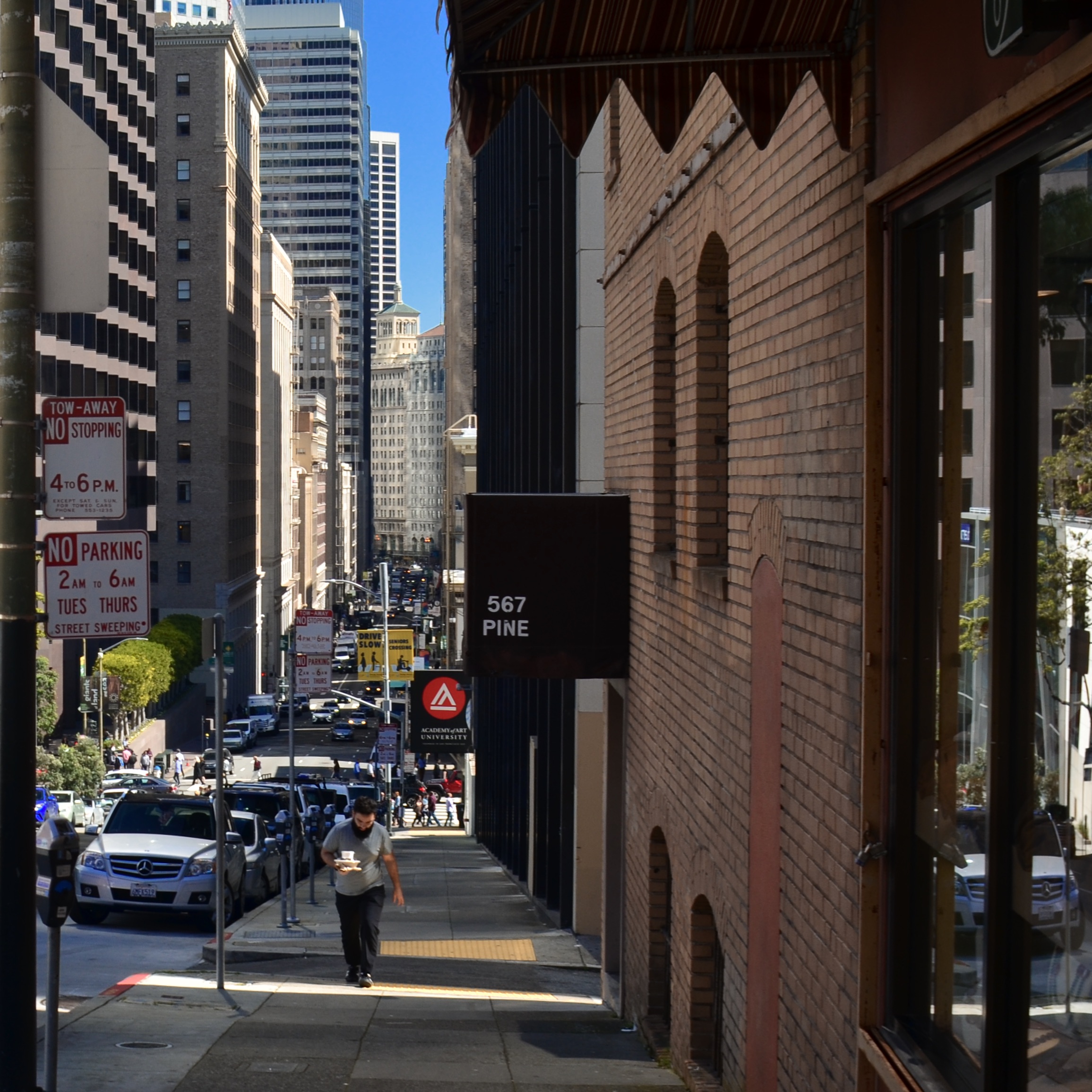
And, yes, I know how astoundingly easy it is to reframe an image as a square in a gazillion common post-processing platforms. That’s not the point. There are times when the ability to concretely see (rather than imagine) a composition within a square can lead to a superior image. If I modify a rectangular picture to capitalize on the “inner square” of strong impact within the frame, I’m really retrofitting a picture that worked out less than well when I shot it. To compose and shoot in a square, I have to be constantly mindful of how space is placed and balanced…that is, I have to be doing nearly everything on purpose, based on what’s in front of me at the moment. That is not the same thing as salvaging a usable square from within a composition that I originally planned in a completely different way. The image you see at left was shot in a particularly narrow side street in San Francisco and was originally rectangular. In editing, I immediately saw that its main power was in a square extracted from its center, but had I been doing the master shot as a square, my intent for it would have been measurably different. Different by mere Inches, maybe, but different.
Or picture it this way: Let’s say I go out purposefully looking to bag a creel full of sea bass, versus fishing lazily off the pier and accidentally reeling in a rubber boot that has a sea bass inside it. Either way, I get sea bass. Makes no difference to you? Well, it does to me.
For those good with their hands, the WeberNet is filled with tons of workarounds to pre-mask or otherwise rig a square frame in cameras that were not created to offer it as an option, but I don’t really relish whipping up a craft project just to take a picture. That, to me, says the camera was designed without the features I wanted, so I have to be a kind of sub-contracted re-designer to make the thing work the way I need it to. Again, this clearly does not bother certain people, but it rankles me that what I want in my high-end camera is already included in a $50 low-fi plastic box camera like the Diana or, well, um, every cel-phone camera ever made. So-called “real” cameras have been weighted in favor of rectangular framing since the first days of 35mm film, but I think that such an exclusive bias has robbed photographers of a potentially powerful tool. And while, even as I write this, I can hear an everlasting chorus chanting, “but you can fix it later”, I’d rather sing my own tune, in my own key. Equipment is about abetting intent, and without intent, all our best photographs are just happy accidents.
SETTING THE TERMS
By MICHAEL PERKINS
FOR NARRATIVE PHOTOGRAPHY, THE MOST COMPLETE CONTROL IN AN IMAGE can never consist merely in the mastery of technical factors like aperture or exposure. Depending on what kind of storytelling your pictures are about, those elements are certainly important, but, to my mind, Job One is always about control of the frame. The selection of what’s in or out of that space is the first step toward setting terms of engagement for a given picture. It is your audience’s cue sheet for what’s important to look at, the main argument for your message. Own the frame and you own the viewer’s eye, as well as whether it focuses precisely or meanders all over.
The word “frame” is, itself, a little vague in this context. Photographs are not only framed by the physical confines of the viewing area, say an 8 x 10 print. There are many ways to subdivide the space within the image to create frames within frames. Frames can be any line or demarcation in the photograph which isolate or amplify information. Framing does what you might do if you were verbally narrating or captioning your message, only it acts in a purely visual manner. Of course the physical limits of your final photo create mystery or mood merely by themselves, as the eye will naturally ask what is happening beyond the limits of the physical confines of the picture. But even inside the “hard” edges that are printed or projected, data can be revealed or concealed by what surrounds or delineates it.
Even in a flat medium, framing can create an illusion of depth.
Framing is a little like capitalizing a letter at the head of a new sentence. As seen in the above picture, with some help from either selective focus or silhouetting, it can also create a perceptible distance between foreground and background, a kind of faux 3d that imitates the way actual stereo photographers are taught to compose to maximize the effect in a flat medium. In this specific case, the mother and son are separated by interior framing from the greater part of the composition, held in place between the tree at right at the stone wall beneath them. This acts as a dividing line between light and dark, major information and minor decor. Framing is a way of dividing your image into active and passive information, or prioritizing its components. What data gets left out, then, is as important as what gets left in, since both decisions can spark speculation in the viewer. A frame is like a proscenium where the audience both concentrates on what’s in front of the curtain and speculates about what’s behind it. The frame is the terms of engagement for a photograph. The clearer those terms, the more immediate your picture’s impact.
SPLITTING THE INSTANT
From The 7, 2018
By MICHAEL PERKINS
PHOTOGRAPHY IS ABSTRACTION, our subjective representation of what we think things “really look like”…..operative word being “we”. But it’s also a process of extraction, of pulling a moment out of time’s flowing sequence and trapping it in amber. If life is a continuously unfurling roll of movie film, photographers specialize in stealing single frames of that reality, hoping we can make the argument that our frozen sample symbolically stands for the organic whole. If we make that argument successfully, we’re great photographers. I emphasize this obvious concept because we need to remain mindful of what’s going on every time we frame a shot. Occasionally we have minutes to make the decisions on what that frame will be. More typically, it’s seconds. And occasionally, it’s pieces of seconds.
Shooters already have to grapple with the fact that we are usually making static shots of constantly moving things. That’s one kind of motion. Then there is the secondary stress created by the fact that we ourselves are also moving. We snap from car windows, from escalators, from trains and subways, even while physically chasing our quarry in papparazi “run-and-gun” mode. Thus what is already a difficult sorting and choosing process is made even quicker and more crucial. The extractions in our pictures are based on a furiously fast analysis of what’s important, as well as what’s dispensable, within the frame. It’s also about a virtually instantaneous formula for what’s technically required to get the picture made. These decisions become a little easier with practice, but any comfort we’ve built up over the years can be quickly shattered when a different kind of photo opp presents itself, one which upends our usual or comfortable approaches. Then everything’s a race.
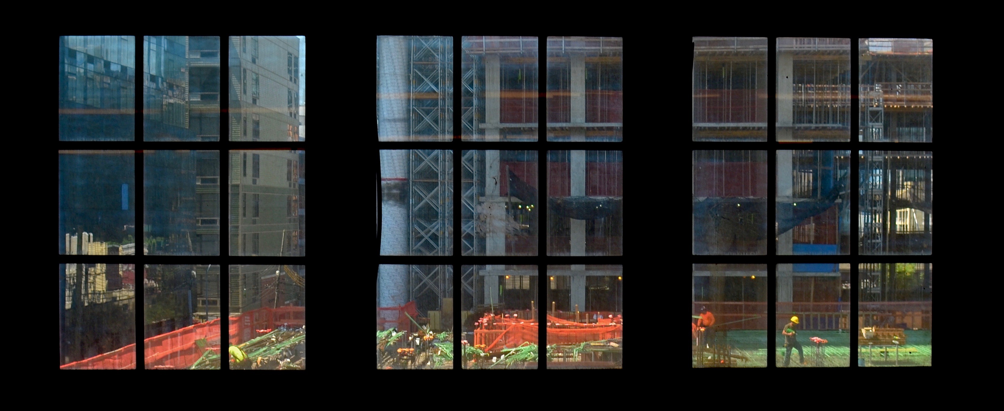
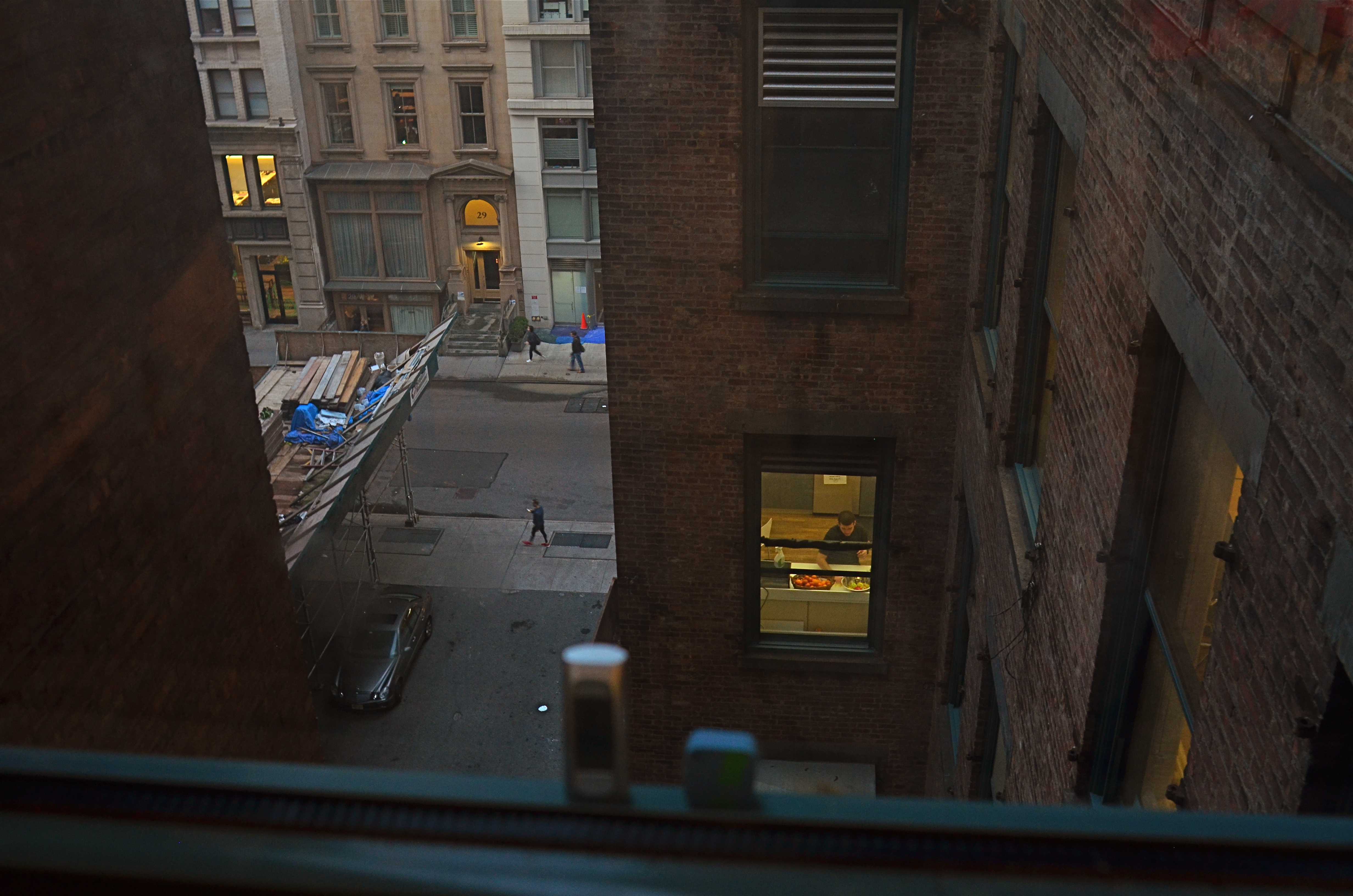
Urban images are especially challenging. Cities themselves are convulsing with steadily increasing change, altering the nature or terms of a potential picture in days or hours. Like old-time news shutterbugs, the urban photographer is truly on deadline. With that in mind, I take a shoot-it-or-lose-it stance when moving past anything I regard in a city as temporary, figuring that it is even more fleeting for me than it may be for other people. In any event, I always harvest everything I can physically shoot, and sort out the weeds later. The makeshift subway stop viewing window of construction along the 7 train line between Queens and Manhattan that you see here is gone by now, but the picture stays. Perfection? Hardly. But photography is also a game of percentages, and I am at least 100% happier for having made the attempt as not.
THE LUXURY OF LEAVING
By MICHAEL PERKINS
WE’VE SPOKEN A FEW TIMES HERE about the snapshot mentality, that hard-wired sense of urgency that seems to accompany nearly all picture-making….the flashing red light that screams Hurry. Get the shot. It’s a nagging feeling that we’re missing something great, that we’d better stop wasting time and start clicking. This hair-on-fire sensation may have come originally from cameras that were too slow or clumsy to operate, resulting in many lost opportunities. Then, as both cameras and film became more responsive, the idea that we could crank off a frame almost as quickly as the action of a special event spurred us on even further. Many generations and millions of personally precious occasions later, we almost always shoot on instinct. It takes practice and deliberation to slow down and actually plan a shot.
But the world is not composed solely of kids blowing out birthday candles or Bob being surprised by his retirement party, and there will always be times when, as far as photography is concerned, there is literally no big rush. Thing is, we have to retrain ourselves to sense what those moments are, and enjoy the luxury of being able to linger, even to leave, come back, reconsider, and re-shoot in an attempt to get the additional dimension that only comes from taking one’s time. This is an increasingly difficult habit to form, since we have so long married the instantaneous or fleeting quality of many situations to the way we take pictures. People who think too much about this kind of stuff have sold scads of books with the words contemplative or mindfulness in the title, but it really is just about slowing down long enough to let ideas percolate, for better pictures to emerge.
The Lakeshore Line, 2019
It is certainly true that technology has allowed us to make acceptable pictures of nearly anything, our cameras taking many decisions (including careless ones) out of our hands, trying, in essence, to anticipate what we probably “want” and attempt to give it to us. The aggravation of what results when we turn over the keys completely to these brilliant but non-intuitive machines, the gap between what it serves us up and what we truly seek, is the reason behind the blog you’re reading right now. The Normal Eye is dedicated to those times we wean ourselves off auto-settings, electing to both ask and answer our own questions, relegating the camera to its proper status….that of a servant. Part of the taking back of that control is placing yourself in situations where it’s okay, even optimum, for you to just simply cool your jets and think.
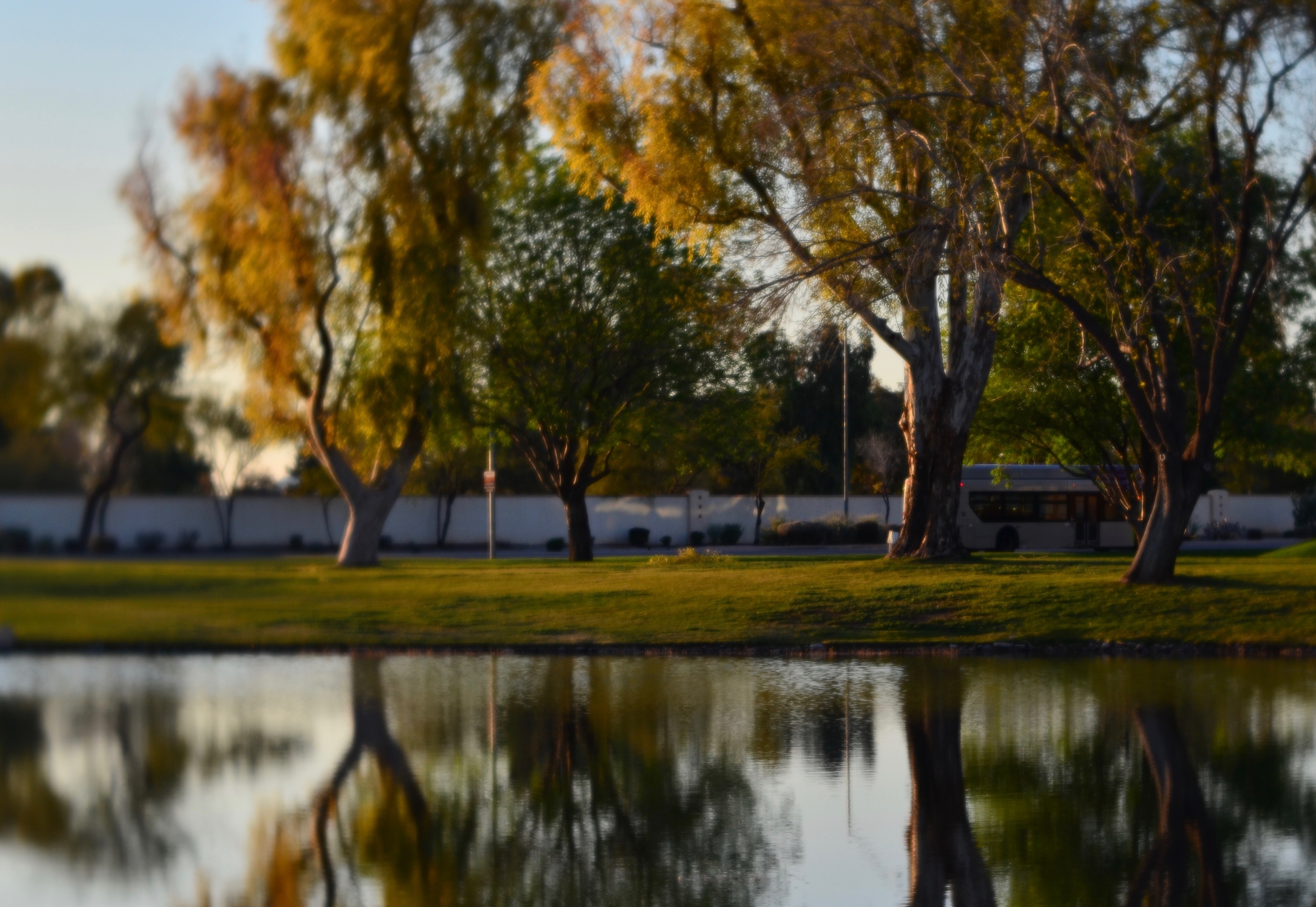
The frame you see here is #18 out of twenty shots taken toward a busy suburban road as seen from a roadside pond. The surface of this small lagoon is usually filled with concentric ripples from a centrally located fountain which is nearly always turned on, so in many cases, I could not dream of the reflections seen here. That idea alone was enough to make me pull off the road and park. Several of my first tries were framing disasters; a couple of others were taken from an opposite angle and contained too much clutter: and then there was this one, which was preceded by several in which the road was just crammed with late afternoon traffic. Frustration was mounting. I wasn’t getting what I wanted. Indeed I wasn’t sure I even knew what I was going for.
But then the lightbulb moment. This scene was going to remain stable for a while. Nothing could be lost by quitting the scene for a few minutes and approaching the whole thing with refreshed concentration.
I took a walk.
Five minutes had, indeed, made a difference in the intensity of the local traffic, which, in turn, gave me an idea for something that the picture could be about, as I saw a lone bus approaching from the leftward edge of my peripheral vision. Suddenly I had just enough context to at least imply a story. Whereas dozens of vehicles were just visual litter, a single bus could anchor the picture, add scale to the scenery, or at least tell the eye where first to focus. Ironically, I had a “snapshot’s” worth of decision time in which to snap the shutter before the bus passed out of frame, so, even though I had taken extra minutes to get the shot I wanted, I only had seconds to recognize that it had arrived. In the final analysis, I would have had, at least in my own mind, much less of a picture if I had settled for the first, perfectly adequate rendering of the scene. I had benefited by not having to make up my mind in an instant. Contemplative? Mindful? Who knows? To me, it’s just enjoying the luxury of those instances in which I can afford To. Just. Wait.
THE LUXURY TO LINGER
By MICHAEL PERKINS
PERHAPS, LIKE ME, you keep, within your photographer’s memory, a running total of many, many shots that might have been salvaged, had you only had a few extra moments to plan them better. Any approach to serious picture-making hinges not merely on conceiving an image, nor just having either technical means or talent, but on being able to weigh all one’s options within the constraints of time.
Of course, mastering all other elements of photography, from equipment to raw skill, does allow you to shoot faster, or, more correctly, to make the best use of the time you have. Still, no matter your experience level, there will always be instances where the setting, the light, or other conditions move so quickly that reaction time is minimalized and some shots simply get away. The way I sum this up is to say that we’re trying to create art on a snapshot time budget.
As is often the case, this problem becomes crystal clear in the moment of shooting. Everything about this image began as happenstance. I happened to call on a friend as he was finishing up work for the day. That, in turn, meant that he happened to conduct me to his office’s break room near a sixth-floor window. The final and most crucial bit of chance occurred when he asked me to wait while he went to close out his desk before we headed for dinner, giving me up to ten precious minutes to decide what to do with this amazing view. Ten minutes to try, reject, reframe, rethink…..all without the pressure of worrying if I was keeping anyone waiting, or fretting that the walk light would change and I’d have to move on, or any of a myriad of other picture-killing factors. I had the luxury of lingering.
Of course, I could fill another half-page discussing what I was looking for, or how the five or six frames I shot shaped what I eventually landed on, but that discussion is for another day. What’s important is that the circumstances allowed me the time to set an intention for the picture, to walk it through several iterations until I was comfortable (not an insignificant word) in making a choice.
As you can probably surmise, the purely technical aspects of getting this shot were relatively simple: the true challenge was in mentally massaging the idea of the scene until it, well, looked like a picture, and not having to do so on the fly. We’re forced, all too frequently, to do things by reflex, and so to make a picture at leisure, on purpose…..that, to me, is the very essence of photography.
SHOW US WHAT YOU SEE
By MICHAEL PERKINS
THE ACT OF PUBLISHING A PHOTOGRAPH is roughly equivalent to a lawyer’s closing argument, in that it is an attempt to persuade, to sell an idea. To make his own “case”, a photographer must be fearlessly certain of what he is trying to say, a process that begins with the conviction that what he has frozen in an exposure is the truth, because his eye is a reliable narrator. Lying eye, lying result.
The best images narrow the gap between hand and eye.
The development of the photographer’s eye is one of two parallel tracks on the road to truthful images, the other being technical mastery. The challenge, then, for the photographer, is in narrowing the gap between what the camera captures and what the eye contends is the essence of the picture. Bear in mind that, between photographer and camera, only one of those things has an imagination. You have to tell the camera what to see in such a way that, as a mere technical measuring device, it has no choice but to obey.
John Szarkowski, the legendary director of photography at the New York Museum of Modern Art and a great shooter in his own right, expressed perfectly the problem that occurs when the eye and the hand are not on the same wavelength:
No mechanism has ever been devised that recorded visual fact so clearly as photography. The consistent flaw in the system has been that it recorded the wrong “facts”: not what we “knew” was there, but what had appeared to be there.
Long story short (and isn’t about time I tried one?) : don’t blame the camera when your vision isn’t realized in the final frame. Either you need a better vision, or a better way of setting up the shot so that the camera can’t help but deliver it. If you don’t turn on the water, the best hose in the world can’t put out a fire.
Stand in front of the court and make your case.
Show us what you see.
SOFT AND SHALLOW
By MICHAEL PERKINS
IN RECENT YEARS THERE HAS BEEN A MOMENTOUS SURGE in the number of photographic optics that market themselves as “art lenses”, as if all other lenses were, what….non-artistic? This murky term essentially denotes lenses that deliver customized or selective focal effects, such as the Lensbaby “sweet spot”, a partial area of sharpness, surrounded by soft blur, that can be placed, at will, at various parts of the frame. Other so-called “art lenses” produce unique patterns of bokeh, or blur artifacts, while yet others produce vignetting, or darkening around the outside corners of the image. Some of these lenses are great overall performers, while a number of them are either one-trick ponies or muy espensivo or both.
Thing is, if you possess a fast “normal” lens, such as a 35 or 50mm “prime”, you can already achieve some of the same effects of many over-hyped proprietary lenses in the “art” arsenal. Primes have but a single focal length and thus have no telephoto function. The photographer frames by physically moving closer to, or farther away from, his subject, by, in effect, “zooming with the feet”. Since their focal range is fixed, primes are extremely simple in their construction, and therefore extremely sharp. In addition, they often will open to at least f/2.8, with many rated at f/1.8 or even faster. And that’s where the arty focus fun starts.
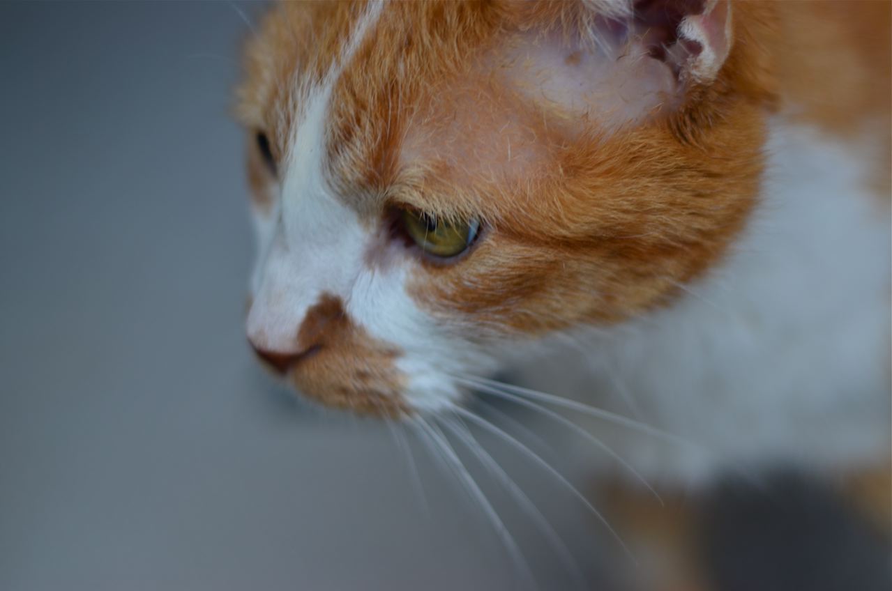
Wide open to f/1.8, the 50mm prime used for this image creates an extremely shallow depth of field. And that can be good news for flattering pics of faces. Primes of this focal length are already prized as portrait lenses, since they produce faces with normal proportions, as opposed to the Silly Putty stretching you get with wide-angles. Add to that a fast prime’s ability to deliver a very buttery transition between sharpness and blur, and you have the potential for a very finely-tuned look. Notice that there is no real hard sharpness in the cat’s face beyond one eye and about one third of his face. The rest rolls off very softly. My point is that nearly any good prime can deliver this effect: it isn’t essential to invest in a custom piece of “art” glass to get it.
One caveat: shooting this far open, at this distance, your auto-focus may endlessly gyrate back and forth trying to find a place to lock in. My advice: go manual. At this DOF, you’ll have to practice with how to nail the focus, and I personally am driven bonkers trying to find the sharpness at f/1.4 or faster: the range is so very razor-thin. Even so, before you pony up for a lens that’s designed to deliver arty focus, play with the primes you already have. You may be delighted. The focus may be shallow, but the satisfaction can run deep.
THE INVISIBLE MIDDLE
By MICHAEL PERKINS
 GIVEN THAT JOB ONE, FOR A PHOTOGRAPHER, is maximizing his ability to see, it’s worth considering how we unconsciously condition our eyes not to see….to, in a way, confer a sort of invisibility on whole big chunks of the viewable world. It’s not that those chunks can spontaneously vanish on their own: it’s that we, in the act of managing the everyday flood of sensory information, prioritize some data above others. The lowest priority data effectively becomes invisible.
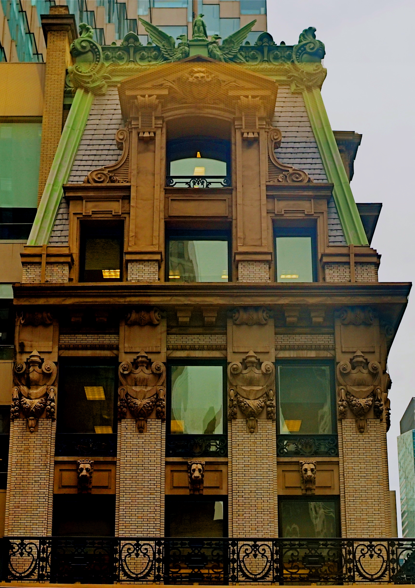
Cities provide an interesting example of this phenomenon, which I term the Invisible Middle. The upper stories of the buildings in a metropolitan are clearly noticed as “treetops”, clusters of skyscrapers easily apprehended from a distance. Equally visible are the bottom, or street-level layers of cities, the door-to-door sequences of businesses that parallel our daily journeys, the very stuff of habit. By contrast, the details of urban life from just above our line of sight all the way up to the spires and crowns of the skyline can become phantom acreage, something our schedule doesn’t demand that we notice.
As one example, the building shown here, 452 Fifth Avenue in New York City, presents a magnificent face to anyone lucky enough to be in a position to crane their neck just a few extra floors above street level. Built in 1902, when a ten-story building was still a big deal in Manhattan, the Knox Building, named for Edmund Knox and the hat factory that made him a millionaire, was an anomaly from the start. Knox decided not to engage just any architect, but to hire John Hemenway Duncan, the man who had designed both the memorial arch at Brooklyn’s Grand Army Plaza and Grant’s Tomb, an act slightly akin to hiring Frank Lloyd Wright to build you a 7-11. Decades later, however, having survived years of attempts to raze it, the Knox landed on the National Registry, and in the 1980’s, got a new glass tower wrapped around it to make it the crown jewel of a major midtown banking complex. If one of Mr. Knox’ hats were still available, giving it a tip would be an apt gesture of respect.
This particular view was chiefly available to me because I was seven floors up in the building on the other side of Fifth Avenue. Vantage point gave me access to this part of the city’s Invisible Middle, but, more importantly, it left my eye hungry for more, and just a little more trained as to the complete range of places to cast my gaze. Because of this lucky accident, I may, in future, also do other good things….on purpose.
SAFE AT HOME
By MICHAEL PERKINS
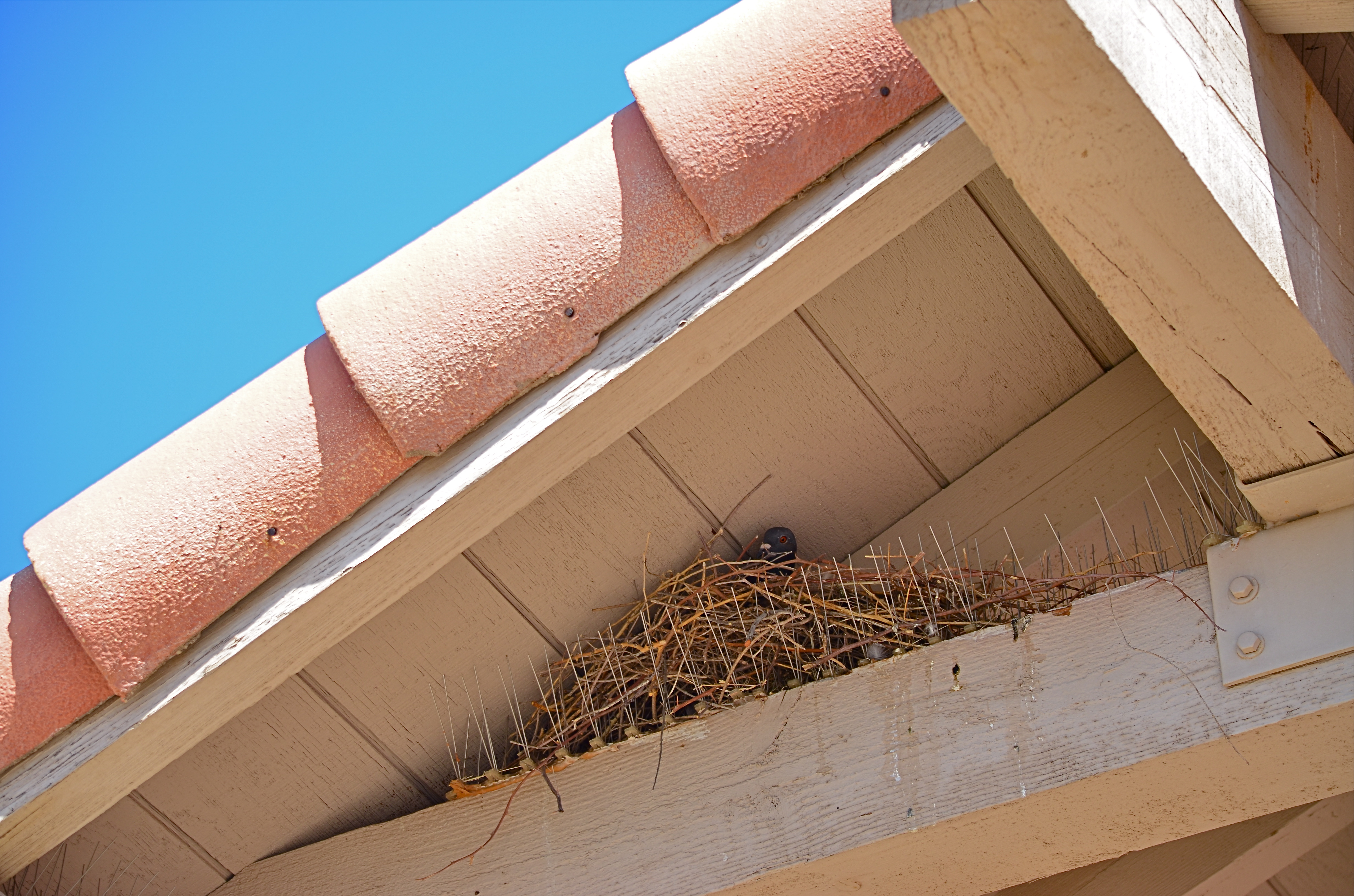
IF YOU WANT TO HEAR THE UNIVERSE LAUGH, goes the adage, make a plan. Or, in my specific case, if you want to ensure that pigeons hang around your house forever, make a plan to keep pigeons off the premises.
Start by installing tiny metal spikes in the cross beams right over the entrance to your front door. You’ve seen them, those steely porcupine quills designed to bar entry to all the nooks and crannies where birds love to assemble to conduct aerial assault on your sidewalks. Spikes go up, birds get packing, no cruelty, no pavement poo, everyone’s a winner, right?
And if you buy that story, I have bridge I want to sell you..
But, hey, I’m a humane slob, so I write the check, go for the whole spiny effect atop the house, and look forward to a lifetime of carefree maintenance and lordly leisure. Only someone forgot to send the spike company’s brochure to the curve-billed thrasher who decided to weave twigs between the spikes, further reinforcing his domicile against the elements. And wasn’t it nice of us to build the first phase of his nest for him? Sure, we’re swell that way.
So no pigeons living above the entrance, but still birds. Small hitch in the plan, however: Mama Thrasher isn’t a hit with the Neighborhood Watch Association (Avian Division) and leaves town. And here we see the fates in all their sadistic genius: a mother pigeon moves into my “pigeon-free” zone like a hobo in a rail car and proceeds to lay her own eggs. The circle of life is now complete!
So, as anyone wise enough to realize when he’s licked, I resolve to at least photograph this grand cosmic joke. Only the act of my going in and out of my front door each day spooks Mrs. Pudge to flight, and so it takes nearly a week to sneak a shot of her in residence……an ordinary, unchallenging, Photo 101 shot that a toddler could make, if only Nature can stop laughing at me long enough to say cheese.
Obviously, with this kind of outcome, I will not be rushing to bear-proof the back yard. Now if you’ll excuse me, the flowers could us a soaking rain, so I’m off to get my car washed.
THE TRUTH ACCORDING TO WHOM?
By MICHAEL PERKINS
THE FIRST DECADES OF PHOTOGRAPHY, like the earliest years of any emerging art, operated under a different set of rules than those we set for ourselves today. More accurately, we may now operate in a world in which there are no immutable rules at all. It’s hard to imagine a book with the title Why It Does Not Have To Be In Focus being published in, say, 1865.
When a different way of viewing the world comes mostly through a technical breakthrough (i.e., the invention of the camera), it can understandably be regarded, at least at first, as a measuring or recording device, a way of creating a merely physical chronicle of the world. Thus a camera can initially be regarded like a microscope or a seismograph….as a way of quantifying data…. which is precisely how early cameras were seen. Catalogue the great statesmen and authors for the ages! Assemble a library of images of the ancient world! Map the continent!
And so the first rules of photography bent toward the scientific. Make an accurate record. Not surprisingly, it took decades for picture-taking to be freed from the constraints of mere reality (as painting already was) and move toward the making of pictures, as photography eventually became an interpretive art. I often wonder if this explains why, of all the various subjects available to me, I am less comfortable in landscape work than in any other area.
There seems to be no way of escaping the pure recording function of it. I feel constrained to make it accurate, as if it’s for an official government survey, or as though I were being graded on the results by some imperious professor. I know the problem lies with me. I seem anchored to the idea of rendering scenery “real” (I hate that word), when, in fact, I could exercise just as much interpretative control over it that I do over everything else I shoot.
Is the shot shown here less real for having been partially defocused, or is it more personal because I have gently asked you to look at the subject in my own way? Do I really even have to ask these questions? Quite obviously, the rules of photography as we understand them are no longer based on pure science. Yes, it is “about” the lenses, to a degree, but it’s more completely about the human eye. We are not machines, nor should our art be purely the product of machines.
CUES
By MICHAEL PERKINS
PHOTOGRAPHIC COMPOSITION is never the mere geographic assignment of elements within a frame. Certainly, mapping out what is to go up, down, left, or right in a picture is a vital part of the process, but you have to do more than rearrange the deck chairs. You also have to make real decisions about where the ship is sailing.
Aperture, focus, the use of light…..make up your own list of contributing factors… the assembly of a composition is about setting the terms of engagement between your vision and the eyes of the audience. It is never merely about the limits or contents within the frame. This means that a picture that you would shoot in a certain way today may seem completely out of synch with your thinking a year from now, because your idea of composition will (and should) be in constant flux.
The Clearing (2016)
In my own case, I have spent a lot of the last five years re-evaluating focus, deciding in many more cases to use it selectively, where, previously, I might have applied it more evenly. This is an exploratory journey, and I am not sure where it will wind up. I don’t really feel as if I’m abandoning sharpness per se, just trying to decide how much of it I need in a given situation, making its use a lot more intentional choice than it has historically been for me.
Focus is a way of prioritizing the visual elements in a picture. It cues the audience as to what information there is and how hard to look to retrieve it. It also tells if there is no object or “mission” in a picture, as in a totally abstract arrangement. Photographer Uta Barth, describing why practically all of her work is deliberately refocused, notes that “the question, for me, is how I can make you more aware of your activity of looking. I value confusion…”
Indeed, placing incomplete information before a viewer, about focus or anything else in a photograph, is inviting him/her into an interaction…..with all parties having a conversation about what a picture means. For the viewer, it means exercising more control: for the photographer, who no longer has to spell everything out, it can be freeing.
EVERYTHING IN ITS PLACE
By MICHAEL PERKINS
EVERY PHOTOGRAPH REMOVES SOMETHING from its original context, extracting it from its proper place in the world at large. In the act of placing things in a frame, the photographer excludes whatever else once surrounded that thing, so that, in the final result, a vast valley is reduced to one tree in one part of one meadow. Our mind stipulates to the supporting reality of whatever was extracted, and we either approve or disapprove of the shooter’s arbitrary editorial choice in composing the frame.
And so pictures often annihilate an object’s “origin story”, since we can’t often search them to view what something “came from”. Objects in a photograph merely are, with little obvious evidence of what they used to be. Sometimes that means that, when we do see where something originated, a picture of it can seem exotic or strange. And, as photographers, we can train ourselves to find that one view of a thing that has been, in effect, under-explored.
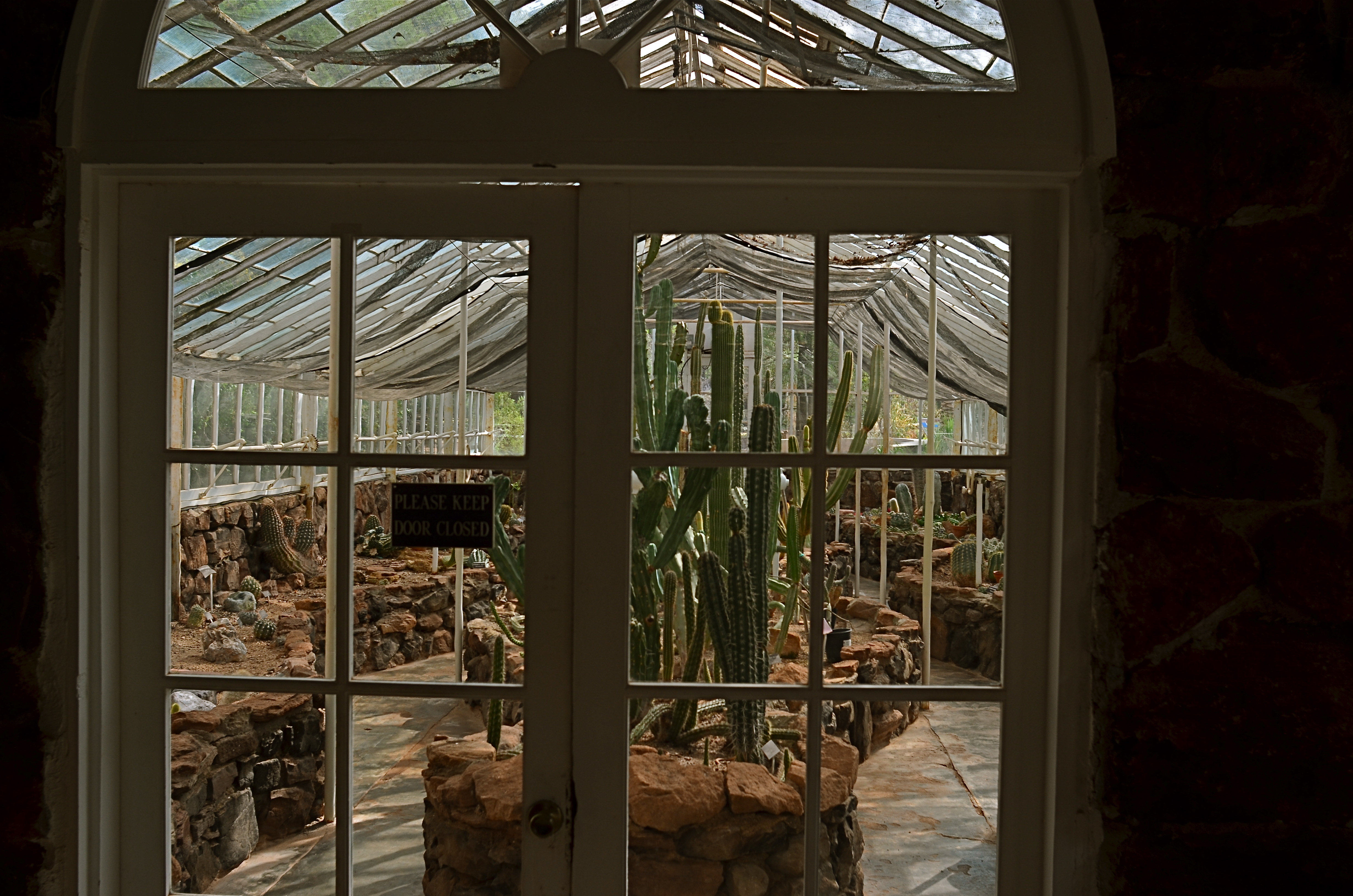
1/125 sec., f/5.6, ISO 100, 24mm.
In the above picture, something that we tend to think of as being organically “born” in a natural setting (i.e., a cactus) is shown being deliberately farmed within a controlled environment (i.e., a greenhouse). It looks a little wrong, a bit strange…..certainly not typical. And yet, an interesting picture can be made from the scene, simply because we never see a cactus’ origin story, given that most photographs don’t select that story within their frames. This picture really doesn’t display its information in an original fashion: it’s the thing, in this particular context, that makes the photograph seem novel.
As always, the choices made inside and outside the frame of a photograph set the narrative for it. It’s therefore the most important choice a photographer can make.
THE COWGIRL IN THE BLEACHERS
By MICHAEL PERKINS
I AM NEVER TRULY COMFORTABLE working with a camera that isn’t physically locked onto my eye. Shooting without a viewfinder was, for me, perhaps the hardest part of gradually embracing cel photography, and continues to be a control issue that still inclines me toward my Nikons most of the time. Part of it, I freely admit, is mere sentimental habit……maybe even, who knows, superstition?…..and yet when I’m crammed up against that little square of glass, I feel as if I’m “really” taking a picture.
That’s why it’s really a rare bird for me to “shoot from the hip” with a DSLR, to try to sneak a street candid without my camera anywhere near my face at all, holding the thing at mid-chest or waist level or even squeezing off a frame while it’s hanging from my shoulder. If the opportunity is literally too juicy to resist, and if looking like a (gasp) photographer will spook my quarry (or get a Coke thrown in my face), well, then, desperate times call for desperate measures.
I arrived at such a “desperate times” moment the other day by being caught out with the wrong lens. I had thought that I would be spending my afternoon at a horse show inside barns and stables, indicating a wide-angle to open up cramped spaces, so I packed a 24mm to go wide but keep distortion to a minimum. Once Marian and I arrived at the event, however, she got interested in an arena competition, and so in we went. Now I’m taking big shots of a cavernous hall punctuated by long lines of little tiny horses. If a rider lopes directly in front of my seat, I can almost make out his face. Otherwise I’m zoomless and story-less. Can we go home now?
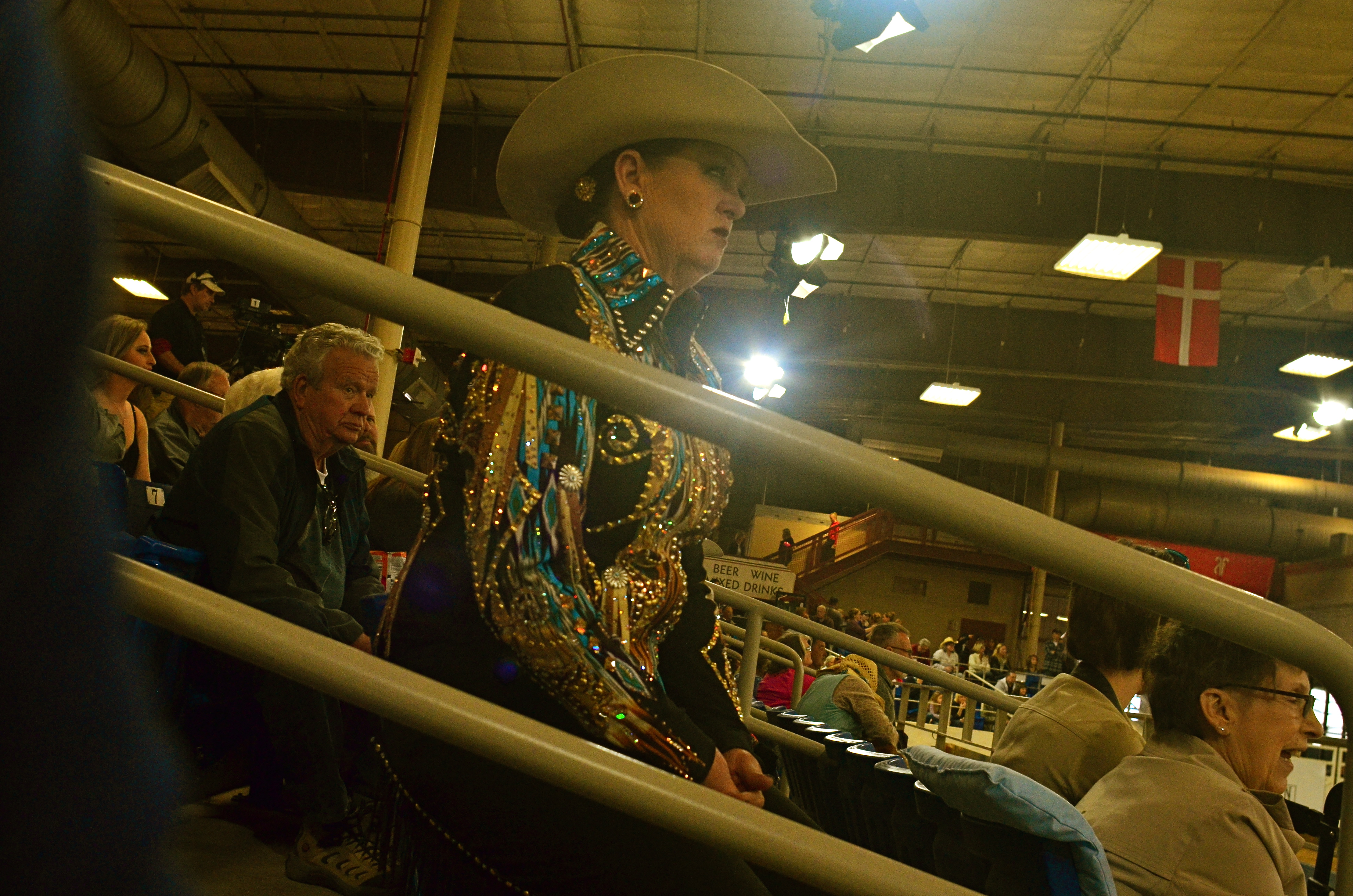
I hear a husky female drawl off to the left.
“Jus’ let her walk, Annie. She wants to walk.”
Turns out the voice belongs to a spangled matron with a Texas twang sharp enough to chop cheddar, herself apparently just off the competition track and now shouting guidelines to another woman in the field. I immediately fall in love with this woman, hypnotized by her steely stare, her no-nonsense focus, and the fact that, unlike the far-away formations of horses directly in front of me, she is a story. A story I need to capture.
But any visible sign of guy-with-a-camera will ruin it all. I will swing into the range of her peripheral vision. Her concentration will break. Worse, the change in her face will make the story all about the intrusive jerk six feet away. And so I hug the camera to the middle of my chest, the lens turned generally in her direction. Of course I have no reliable way to compose the shot, so I spend the next several minutes shooting high, low, losing her completely in the frame, checking results after every click, and finally settling on the image you see here, which, despite my “calculations” for a level horizon, looks a bit like a shot from the old Batman tv series. Holy carsickness.
Strangely, shooting at actual horses (at least with the glass I brung) was telling me nothing about horse culture. But the lady with the spangly blouse and Stetson got me there. It’s literally her beat, and I was grateful to, yes, sneak a glimpse at it.
SUBDIVISIONS
By MICHAEL PERKINS
VAN LINES USED TO GIVE OUT SMALL GRIDDED PAPER SQUARES that prospective customers could use as room diagrams for the planning of their next homes. The fancier versions even came with pre-cut geometric shapes that you could place on the squares, to see if the couch would look good next to the settee, or whether the piano should go along the north wall. It was like paper dolls for easy chairs and coffee tables.
I recall those squares whenever I’m trying to photographically visualize the optimum composition of large spaces, especially if I’m lucky enough to do so from an elevated spot. Immense rooms start to look like rectangles within rectangles, squares butted up against other squares. Dividing lines between action and dead space begin to appear. Cropping parameters suggest one scheme, then argue for another. With enough time, a kind of strategy emerges for what should go where, much like those intricate battle maps used to illustrate the engagements in Ken Burns’ The Civil War.
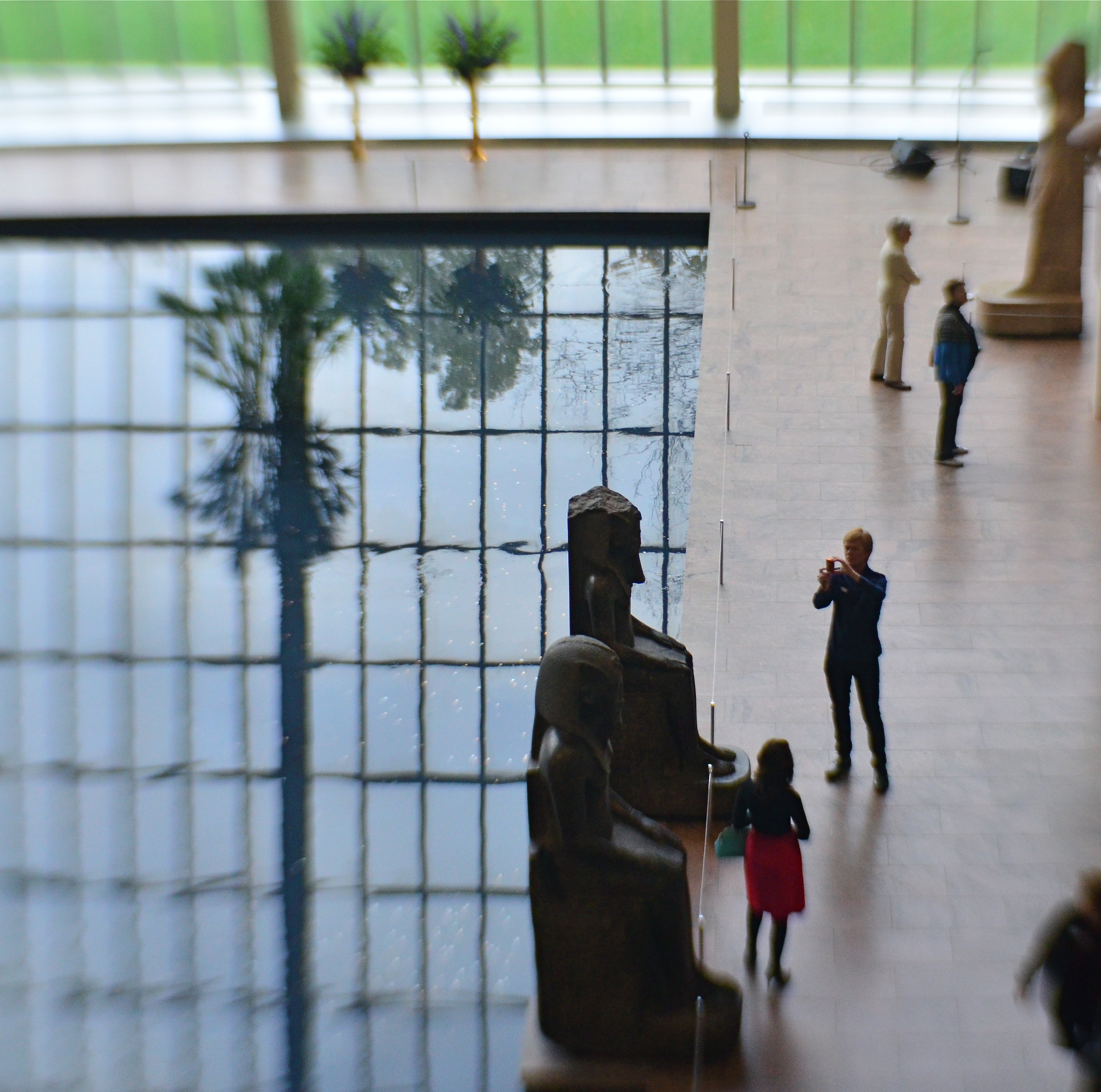
One square, or an assembly of squares?
The balance of “live” and “dead” space in public gathering places (like the museum seen here) has to carefully organized, since both kinds of space have their own special narrative power, and can intrude on each other if not orchestrated. In the above image, it’s almost as if the active roles by the tourists on the right ought to be contained, in order to avoid disturbing the abstract patterns on the left. A different method might also see the entire outer frame as a series of smaller squares and rectangles, just as a chessboard is a square composed of an infinite number of lesser squares. Depends on your eye.
Composition, if done at leisure rather than haste, is a negotiation, a bargaining session in which every inch of photographic real estate must earn its place in the final picture. It’d be glib to merely say “there’s no right answer”, but, if you look at images resulting from certain choices, it becomes apparent that such a statement cannot be true. Right will feel right. Wrong will always feel like you put the piano in front of the picture window. Not horrible… but not correct, either.
FACE FRONT
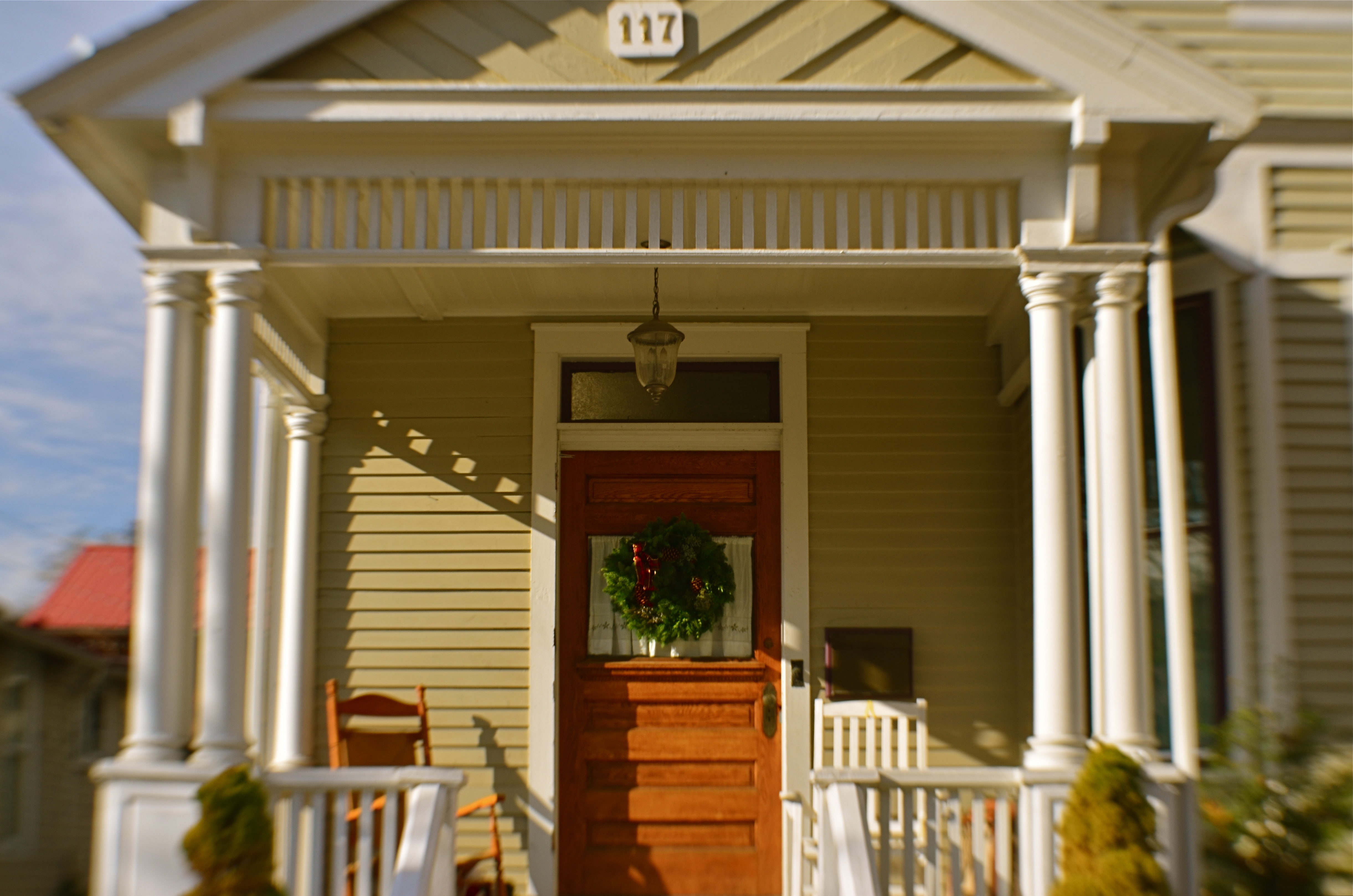
By MICHAEL PERKINS
HUMANS HAVE A DEFINITE ANTHROPOMORPHIC BIAS when it comes to faces. From dancing Disney flowers to Pixar office lamps, we tend to project our features onto nearly every kind of object or entity. And, as a photographer, I fall prey to that selfsame bias, especially when it comes to making pictures of buildings.
It’s isn’t much of a stretch, really. Windows become eyes. Doors assume the role of both noses and mouths. Overhangs and pitched rooves take on the appearance of eyebrows. And so on. For a variety of reasons, I tend to position houses in the same way I might shoot the most basic human portrait. Eyes facing straight toward the camera, face centered in the shot. No arty angles, no three quarter views. As clinical as a mug shot, or, in architectural terms, the plainspoken exposition of Walker Evans’ studies of houses and businesses in days of the New Deal.
And, like the aforementioned mug shot, I tend to frame the picture as close as I dare without sacrificing either context or impact. Again, the human face is the template, with the same decisions to be made about cropping. Do you need the top of the hair, the width of both ears? Should the shot stop at the bottom of the chin? Below the shoulders? Does any surrounding information add to the selling of the picture?
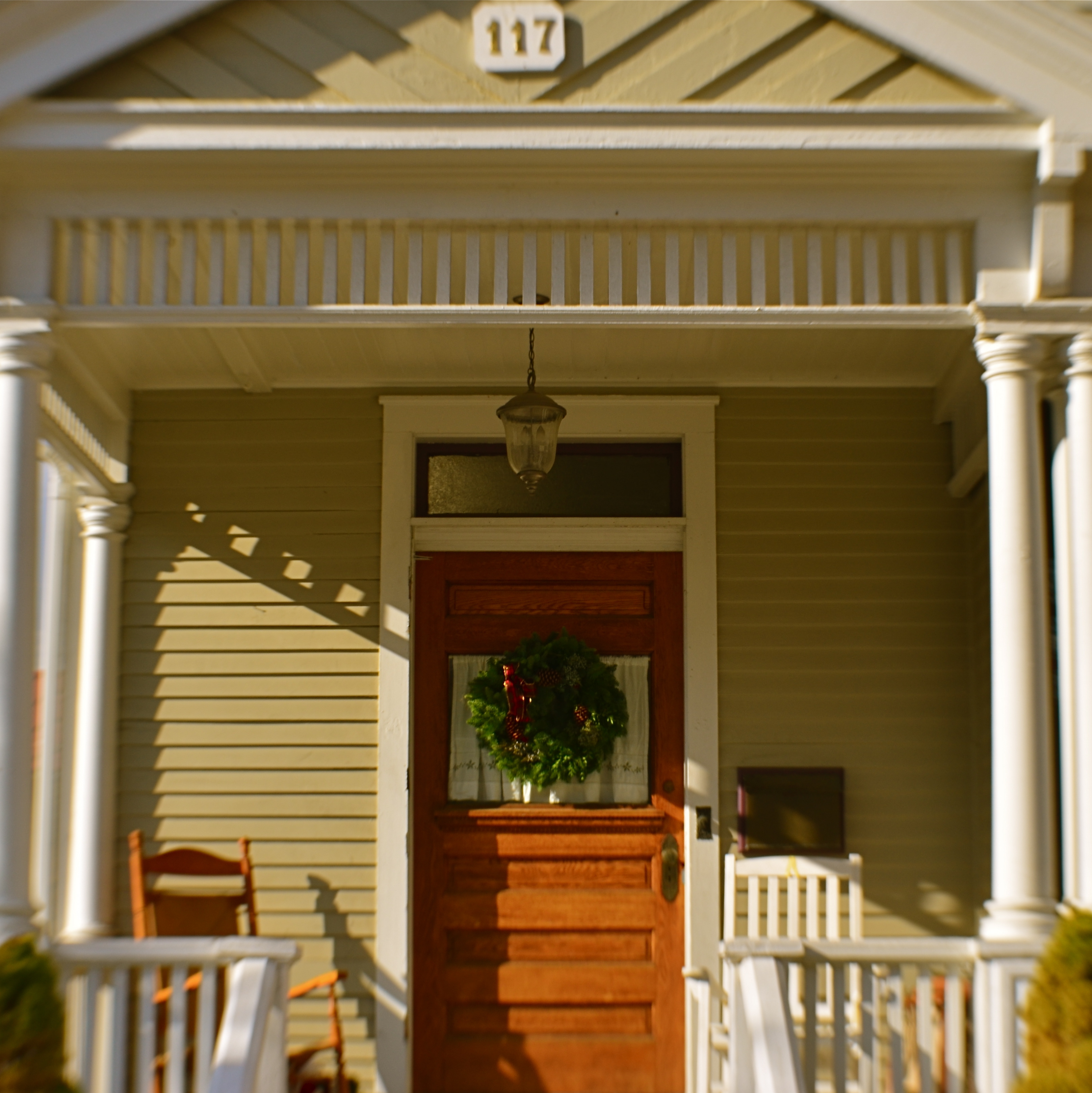
Does the traditional rectangular framing of the house in the top shot feel roomy, or merely loose? Is the square re-cropping of the same image, seen just overhead, simplified, or cramped? If the front of a building truly has the same potential impact as that of a face, it would follow that a building study might benefit from the same compositional criteria. That means that, like a face, a building has to earn every inch it occupies within the frame.

I /WE REMEMBER IT WELL
By MICHAEL PERKINS
FEW WOULD DISPUTE THE IDEA that photography forever changed the way we see. However, I also believe it has altered the way we recall. The process of accessing our memories as a reference point for our thoughts and feelings was complex even before the invention of the camera. But add the seemingly “trustworthy” or “authentic” records of things interpreted by photography, though, and the sorting of memory becomes an even greater muddle. Do we remember, or do we recognize, through the inheritance of masses of images, how someone else remembered?
Through the camera, we can confuse our actual sensory experiences of things with the trove of pictures which formed our “versions” of them beyond what we ourselves have lived. Many more of us have viewed photos of the Eiffel Tower than have actually gazed upon it. When we do first encounter a “known” thing in person, one of our first reactions is often that it “isn’t how I pictured it”……that is, our collective photographic “memory” doesn’t match authentic experience.
As photographers, we are trying to see things originally even as we hack our way through the inherited gallery of images of those things that are an unavoidable element of our visual legacy from other photographers. It is damned difficult to develop our own eye, since the after-image of everyone else’s take is always present in our consciousness.
I shot the image shown here in 2011, during a typical package tour of the Statue of Liberty and Ellis Island. Part of the circuit was a brief shuttle ride to Ellis on a boat that afforded a long, wide view of lower Manhattan. I shot the picture quite unconsciously, which is to say, oh look at that cool view. Later, in combing through the day’s shoot, I saw something else in the scene, something that connected me to photographs taken generations before me: Alfred Stieglitz’ poignant scenes of newly-arrived immigrants in steerage: grainy silent newsreels of crowded ferries passing the Statue, their passengers’ faces etched with a mixture of terror, longing and joy. Suddenly my own picture was no longer about a pleasure cruise for tourists. It was my chance to take in the same view millions had seen before me: the first glimpse of The Promised Land. The New Start. The Second Chance. And for many, Life Itself.
I had already underexposed the shot somewhat to emphasize the skyline, but the picture still contained too many distracting features on the faces of the passengers. I adjusted the exposure even more and saturated the color to further create the look of a low-light, slow film stock. Their particulars muted, my tourists now replicated the “look” of all those earlier arrivals, the ones I had inherited from other people’s experiences. Had I reached a kind of communion with those millions? Could I be adding my own story to theirs?
Well….
Even though I was traveling in the same waters as the people in the archival pictures had traveled, I wasn’t them. As a native-born American, I didn’t face the terrifying pass/fail that they had as they approached our front porch. I wouldn’t come this close, see a life beckoning just beyond that window, and yet be sent back because my eye looked odd to the doctors or my papers were not in order. I found this picture again the other day. I think I have to live inside it for a while. I may not have shot it with the eye of someone new to this country, but the inherited images of lives past have asked me, in my own limited way, to bear witness to the fact that, at some time, we have, all of us, been The Other. I really don’t want to forget that.
Share this:
November 28, 2018 | Categories: America, Cities, Framing, Interpretation | Tags: Commentary, history of photography | Leave a comment