APP-Y HOLIDAYS

You can convert a color shot through the “old Kodachrome” filter on the AltPhoto app…..
By MICHAEL PERKINS
THE HOLIDAY SEASON MAY OFTEN SEEM TO HAVE “OFFICIAL” COLORS, (red, green, etc.) but its unofficial colors reside primarily, and gloriously, in memory. Given how many iterations of photography span most of our lives, our minds tend to twist and tweak colors into highly individualized chromatic channels. Are your most treasured moments in ’50’s Black and White? ’60’s Kodachrome? In the time-tinted magentas of snaps from the 70’s? In blue-green Super 8 Ektachrome or expired Lomo film? Or do you dream in Photoshop?
This is personal stuff, very personal. It seems like we ought to agree universally on the “correct” colors of the season, but, given that our most precious holiday moments are preserved on various archival media, it might be our memory of seeing these events “played back” that is stronger than our actual remembrance of them. As Paul Simon says, everything looks worse in black and white, or in this case, what really happened pales in comparison to our print, Polaroid, movie and slide souvenirs.
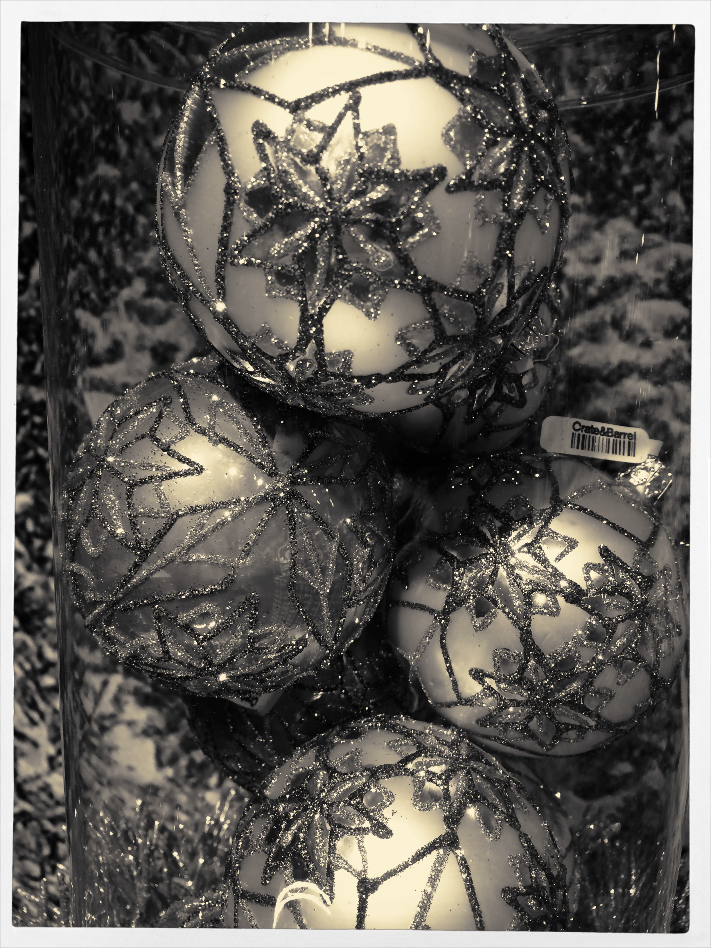
..or you can whip up this warm platinum print simulation.
This means that there are a million subliminal color “cues” that trigger memory, and not all of them come from “correctly” exposed images. Color is mood, and seasonal pictures can benefit greatly from the astounding range of processing tools suddenly available to everyone. Not all photographs benefit from apps and digital darkroom massages, for sure, but their use is perhaps more seductive, in this mental mid-point between reality and memory than at other times of the year. Fantasy is in play here, after all, and fantasy has no “right” hue. Dreams are too vast a realm to be confined to the basics, so ’tis the season to dip into a wider paintbox.
Memory needs room to breathe, and the photographs that help them fully fill their lungs become the gifts that keep on giving.

Leave a comment